
Hello :)
I’m David, a Data/AI/ML guy who is in love with trading, which means I can never resist a chart that starts telling a story before the trend-following indicators do. This is my first article here where I applied Wyckoff-like cycle analysis, with on-chain metrics used as secondary confirmation. Price still comes first, because price reveals the struggle between supply and demand. But crypto gives us something Wyckoff never had - a partial view into holder behavior, transaction intensity, and the underlying capital base. Let's dive in!
Wyckoff breaks a market cycle into four core phases:
So, in simple words, the cycle is accumulation → markup → distribution → markdown.
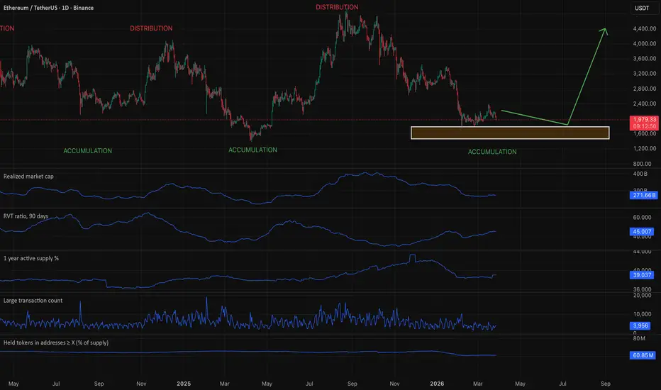
This winter, ETH has completed a textbook Wyckoff distribution, then executed a clean markdown, and is now in early-stage accumulation with on-chain data quietly confirming what price structure alone can only suggest:
My read is:
Ethereum is in early accumulation territory. The selling phase may be largely done, and the market is deciding whether to rebuild cause. The on-chain data supports stabilization, not full bullish confirmation. Price is trying to build a base, on-chain says the market is cooling rather than breaking, and the next real signal must come from price reclaiming strength out of this zone.
I’m David, a Data/AI/ML guy who is in love with trading, which means I can never resist a chart that starts telling a story before the trend-following indicators do. This is my first article here where I applied Wyckoff-like cycle analysis, with on-chain metrics used as secondary confirmation. Price still comes first, because price reveals the struggle between supply and demand. But crypto gives us something Wyckoff never had - a partial view into holder behavior, transaction intensity, and the underlying capital base. Let's dive in!
Wyckoff breaks a market cycle into four core phases:
- Accumulation is the phase where smart money quietly buys after a long decline. Price usually moves sideways, volatility cools down, and the market stops reacting as bearishly as before. It often feels boring, which is exactly why it is easy to miss.
- Markup begins when demand finally overcomes the available supply. Price breaks out of the base, trends higher, and pullbacks become shallower. This is the phase where the market starts looking obviously strong.
- Distribution is the opposite of accumulation. After a strong advance, larger players begin selling into public enthusiasm. Price may still look bullish on the surface, but it becomes choppier, less efficient, and more unstable near the highs.
- Markdown starts once supply takes control. Support levels fail, rallies weaken, and price begins accepting lower value areas. This is the phase where optimism fades and the market trends down.
So, in simple words, the cycle is accumulation → markup → distribution → markdown.
This winter, ETH has completed a textbook Wyckoff distribution, then executed a clean markdown, and is now in early-stage accumulation with on-chain data quietly confirming what price structure alone can only suggest:
- Realized Market Cap tells us about the capital base actually sitting inside the network. In accumulation, you want to see it stabilizing. In markup, it often expands as fresh capital enters. In distribution, it may flatten. In markdown, it can weaken as the market de-risks. On the chart, Realized Market Cap is slowly declining but stabilizing, suggesting the aggregate cost basis of holders is finding equilibrium.
- RVT ratio compares network valuation to transaction activity. A lower or improving RVT can support healthy expansion, especially in markup. A rising RVT often means activity is weaker relative to valuation, which fits quieter accumulation or tired late-cycle conditions better than strong bull momentum. On the chart, the RVT Ratio at 45 is in historically elevated territory meaning coins are being held, not transacted. This is accumulation behavior, not distribution.
- 1-year active supply % shows how much older supply is moving. When this rises a lot, it can mean dormant coins are waking up, often during emotional phases like distribution or strong trend transitions. When it cools, it can suggest the market is settling down, which is more consistent with accumulation than panic. On the chart, 1-Year Active Supply at 39% is declining meaning that the long-term holders are not selling. This is the quiet confidence of composite operators absorbing supply.
- Large transaction count helps track participation from bigger players. Rising large transactions during markup can confirm strong trend participation. Rising large transactions near the top can also warn of distribution. Weak or muted large transactions during a selloff may suggest panic is fading, which can matter during accumulation. On the chart, large transaction count has dropped to multi-year lows (3,956) institutional activity is subdued, consistent with the quiet, patient absorption phase of accumulation.
- Held tokens in addresses ≥ X tracks how much supply is sitting in larger wallets, meaning addresses above a chosen size threshold. In practice, it helps show whether bigger holders are accumulating, holding, or distributing. During accumulation this metric often stays stable or rises. That suggests larger players are quietly absorbing supply while price is still weak or moving sideways. On the chart, it looks stable, so this metric is neutral-to-mildly supportive, not conclusive.
My read is:
Ethereum is in early accumulation territory. The selling phase may be largely done, and the market is deciding whether to rebuild cause. The on-chain data supports stabilization, not full bullish confirmation. Price is trying to build a base, on-chain says the market is cooling rather than breaking, and the next real signal must come from price reclaiming strength out of this zone.

إخلاء المسؤولية
لا يُقصد بالمعلومات والمنشورات أن تكون، أو تشكل، أي نصيحة مالية أو استثمارية أو تجارية أو أنواع أخرى من النصائح أو التوصيات المقدمة أو المعتمدة من TradingView. اقرأ المزيد في شروط الاستخدام.
إخلاء المسؤولية
لا يُقصد بالمعلومات والمنشورات أن تكون، أو تشكل، أي نصيحة مالية أو استثمارية أو تجارية أو أنواع أخرى من النصائح أو التوصيات المقدمة أو المعتمدة من TradingView. اقرأ المزيد في شروط الاستخدام.