
Another US Recession Brewing? Part 2
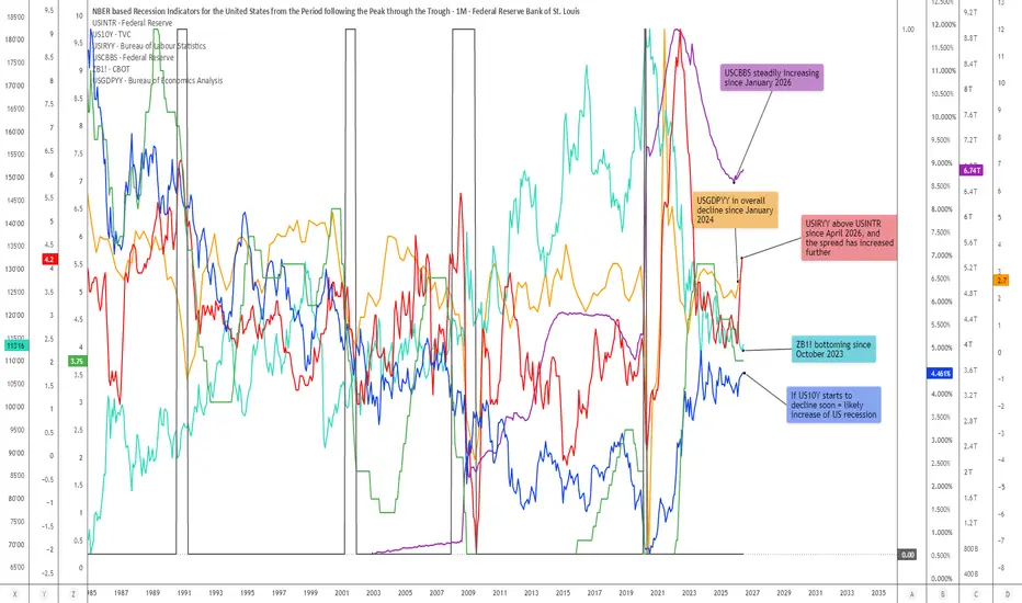
US Recession Study: Policy Rates, Inflation, Treasury Yields, GDP, Commercial Bank Balance Sheets, and Treasury Bond Futures
This chart expands on my previous US recession comparison study by adding two important macro-market variables:
USGDPYY, shown as the orange line, and ZB1!, shown as the turquoise line.
The purpose of this analysis is to compare the current macro alignment with previous historical US recession periods. The chart is not intended as a direct recession call, nor is it meant to predict an exact recession start date. Instead, the goal is to identify whether several major macro indicators are beginning to align in a similar way to previous pre-recessionary environments.
The main indicators in this study are:
USINTR — green step line
US 10Y yield — blue line
USIRYY — red line
USCBBS — purple line
USGDPYY — orange line
ZB1! — turquoise line
Together, these indicators provide a broad view of monetary policy, inflation pressure, long-term yields, banking-sector balance-sheet expansion, economic growth momentum, and long-duration Treasury bond pricing.
The key observation is that several of these indicators are once again aligning in a way that has historically appeared prior to, or around, major US recessionary periods.
________________________________________
Indicator Legend and Macro Meaning
USINTR — Green Step Line
USINTR represents the US interest rate / Federal Reserve policy rate.
On the chart, it is shown as the green step line.
Because Federal Reserve policy rates are changed in steps, this indicator naturally appears as a stair-step structure. It reflects the short-term interest-rate environment controlled by monetary policy. Historically, USINTR tends to rise during tightening cycles and then decline once the Federal Reserve begins responding to slowing growth, financial stress, credit-market deterioration, or disinflationary pressure. The important point is that a decline in USINTR is not automatically bullish. In early-cycle environments, falling policy rates can help stimulate a recovery. But in late-cycle environments, declining policy rates may instead signal that the Federal Reserve is reacting to already-developing weakness. In this analysis, the green step line is therefore important because it helps show when the Fed has moved from tightening into easing, or from restriction into attempted support.
________________________________________
US 10Y Yield — Blue Line
US 10Y represents the US 10-Year Treasury yield.
On the chart, it is shown as the blue line.
The 10-year yield reflects the market’s view of long-term inflation, growth, fiscal pressure, term premium, bond supply, and risk compensation. Historically, an important pre-recessionary warning structure appears when the Federal Reserve begins cutting short-term rates while the US 10Y yield remains elevated, rises, or does not fall quickly enough to provide relief. This matters because the US economy is not only affected by the Fed funds rate. Mortgage rates, corporate borrowing costs, discount rates, and longer-term credit conditions are strongly influenced by longer-duration yields.
So, if USINTR is falling but US10Y remains elevated, monetary policy may be easing at the short end while the long end of the bond market continues to apply pressure.
This creates a macro contradiction: the Fed may be trying to ease, but long-term yields may still be tightening financial conditions. This type of divergence has historically appeared in several recessionary or late-cycle environments.
________________________________________
USIRYY — Red Line
USIRYY represents the US inflation rate year-over-year.
On the chart, it is shown as the red line.
Inflation is one of the most important variables in this study because it determines how much flexibility the Federal Reserve has.
If inflation is falling quickly, the Fed has more room to cut rates aggressively.
But if inflation is rising again, or remains sticky, while growth is already weakening, the Fed enters a much more difficult policy environment.
In that case, the Fed may need to cut rates because the economy is slowing, but it may also be constrained from cutting too aggressively because inflation pressure remains present.
This is the classic policy trap: growth weakness argues for easier policy, but inflation pressure argues against excessive easing. Historically, when USIRYY rises or remains elevated while USINTR is no longer rising, the macro environment often becomes more fragile. It suggests that inflation is limiting the Fed’s ability to respond cleanly to economic deterioration.
In the current setup, the red line is especially important because USIRYY has moved above USINTR again and has continued to increase. That means inflation pressure is no longer simply a background variable; it is again interacting directly with the policy-rate structure.
________________________________________
USCBBS — Purple Line
USCBBS represents the US Commercial Bank Balance Sheet.
On the chart, it is shown as the purple line.
This indicator reflects the size of commercial banking-sector balance sheets.
A rising USCBBS is not automatically bearish. In many environments, balance-sheet expansion can support liquidity, lending capacity, asset prices, and broader financial conditions.
However, in recession analysis, the context matters.
When USCBBS rises while policy rates are falling, inflation is rising, long-term yields remain elevated, and growth momentum is weakening, the interpretation becomes more complex.
In that type of environment, banking-sector balance-sheet expansion may not simply reflect healthy economic expansion. It may instead reflect the system’s need for support, liquidity absorption, credit accommodation, or balance-sheet growth during a fragile transition phase.
On this chart, USCBBS has remained structurally elevated since the post-2019 and post-2020 period, and the current note highlights that it has been steadily increasing since January 2026.
That renewed rise becomes important because it is occurring alongside several other recession-comparison variables moving into alignment.
________________________________________
USGDPYY — Orange Line
USGDPYY represents US GDP year-over-year growth.
On the chart, it is shown as the orange line.
This indicator helps show the broader growth backdrop of the US economy.
While inflation, policy rates, and bond yields describe the monetary and financial environment, USGDPYY helps show whether the real economy is accelerating or losing momentum.
Historically, recessions tend to occur after growth momentum has already weakened. GDP does not always collapse immediately before a recession, but a persistent decline in year-over-year GDP growth can indicate that the economy is becoming increasingly vulnerable.
In the current chart, USGDPYY has been in an overall decline since January 2024. Although there has been some recovery since March 2025, it remains below the highs of December 2023.
This is important because it suggests that the economy may not be entering this period from a position of maximum strength. If GDP growth is already lower than previous highs, while inflation rises, policy rates decline, long-term yields remain elevated, and bank balance sheets expand, the macro structure becomes much more fragile. In other words: the growth backdrop is not confirming a clean acceleration phase. Instead, USGDPYY suggests that the economy may be operating with reduced growth momentum while financial and inflation pressures are reappearing.
________________________________________
ZB1! — Turquoise Line
ZB1! represents US Treasury Bond Futures.
On the chart, it is shown as the turquoise line.
ZB1! is important because it provides a market-based view of long-duration Treasury bond pricing. Generally, Treasury bond futures rise when long-term yields fall, and they decline when long-term yields rise. Because of that inverse relationship, ZB1! can help confirm or challenge what is happening in the US 10Y yield. In recession analysis, Treasury bond futures are useful because they often begin to bottom before or during periods when markets start anticipating lower future yields, slower growth, or eventual monetary easing.
In the current chart, ZB1! has been bottoming since October 2023.
That is important because it may suggest that the long-duration bond market has already been attempting to form a larger base, even while US 10Y yields have remained elevated.
If ZB1! continues to strengthen while the US 10Y yield begins to decline, that may indicate that bond markets are increasingly pricing in weaker growth, lower future yields, or recession risk.
This is why the note on the chart states that if US10Y starts to decline soon, it may increase the probability of a US recession signal.
The important distinction is this: elevated US10Y yields may delay recession confirmation by keeping nominal pressure high, but a decisive decline in US10Y from elevated levels may signal that bond markets are beginning to price economic slowdown more aggressively.
In that scenario, a strengthening ZB1! would become a confirming signal rather than a contradictory one.
________________________________________
Historical Recession Comparison
The chart highlights several historic recession windows and shows that different combinations of these indicators aligned before previous US recessions.
The exact structure is never identical, but the recurring theme is that recessions tend to emerge when monetary policy, inflation, bond yields, growth, and balance-sheet dynamics begin contradicting one another.
Prior to the 1990 recession
Before the 1990 recession, US10Y and USIRYY increased, while USINTR also moved higher into the late-cycle phase. This was a more traditional inflation-and-tightening recession setup.
Policy rates were high, inflation pressure had increased, and long-term yields were elevated. The combination eventually contributed to economic weakness and recessionary pressure.
This was a classic case where tight monetary conditions and inflation pressure created late-cycle stress.
________________________________________
Prior to the 2001 recession
Before the 2001 recession, US10Y and USIRYY increased while USINTR began moving lower.
This is important because the Federal Reserve had already started shifting toward easier policy, yet the recession still occurred.
That shows why falling policy rates should not automatically be interpreted as a bullish signal. In this case, falling USINTR was not a sign that everything was healthy; it was a sign that the Fed was reacting to developing weakness.
The broader macro structure was already fragile.
When policy rates are falling but other variables remain problematic, such as yields, inflation, or weakening growth momentum, the economy may already be moving toward recession despite monetary easing.
________________________________________
Prior to the 2008 recession
The 2008 recession displayed a similar warning structure.
USINTR moved lower as the Fed began responding to financial and economic stress, but the broader system continued to deteriorate.
USIRYY and US10Y remained important because inflation and long-term yields complicated the policy backdrop. Falling short-term rates did not immediately remove the stress from the credit system.
This is one of the clearest historical examples of why the Fed cutting rates is not always bullish.
Sometimes, rate cuts occur because the system is already breaking beneath the surface.
The 2008 setup demonstrates that once credit, growth, and financial-market stress begin feeding into one another, policy easing can lag the actual deterioration.
________________________________________
Prior to the 2020 recession
The 2020 recession was unique because it was triggered by an external shock. However, the macro structure was not completely clean before the recession began.
USINTR had already moved lower compared to the previous tightening phase, US10Y had declined significantly, and the system had become more vulnerable.
USCBBS became especially important from 2019 onward, as commercial bank balance sheets began to rise materially.
That means the financial system was already moving into a more liquidity-sensitive and balance-sheet-sensitive regime before the recession formally occurred.
Although the 2020 recession had a unique trigger, the chart still shows that the underlying macro environment was not as strong as headline asset prices may have suggested.
________________________________________
Current Alignment
The current setup is notable because several of these same recession-comparison variables are once again moving into alignment.
At present, the chart shows:
USINTR has declined
USIRYY has moved above USINTR and increased further
US10Y remains elevated
USCBBS has been steadily increasing since January 2026
USGDPYY has been in an overall decline since January 2024
ZB1! has been bottoming since October 2023
Taken individually, none of these signals is enough to confirm a recession.
However, taken together, the alignment becomes much more important.
The current macro structure suggests that the Federal Reserve may no longer be in a pure tightening phase, but inflation pressure has not fully disappeared. At the same time, long-term yields remain elevated, meaning the economy is still facing pressure from the long end of the bond market.
Meanwhile, USGDPYY shows that growth momentum has been weaker than the previous cycle highs, while USCBBS shows renewed banking-sector balance-sheet expansion.
Finally, ZB1! appears to have been forming a bottom since October 2023, suggesting that the long-duration bond market may already be preparing for a larger shift.
This combination resembles previous periods where the economy moved from late-cycle expansion into stress, slowdown, or recession.
________________________________________
The Core Macro Contradiction
The most important part of this chart is not one single indicator.
The most important part is the contradiction between them.
A declining USINTR can look bullish because it suggests easier monetary policy.
But if USIRYY is rising at the same time, then the Fed may have less room to ease.
An elevated US10Y yield can look like economic resilience.
But if GDP growth is weakening, then elevated yields may instead represent pressure rather than strength.
A rising USCBBS can look supportive. But if it happens during a period of slowing growth, sticky inflation, and elevated yields, it may suggest that the financial system requires more balance-sheet support. A bottoming ZB1! can look constructive for bonds.
But if Treasury bond futures begin rising because growth expectations are deteriorating, then that may become a recession-confirming signal rather than a simple risk-on signal.
This is why the current alignment deserves attention.
The signal is not simply that rates are falling, or that inflation is rising, or that bonds are bottoming. The signal is that several macro variables are beginning to tell the same story from different angles. That story is one of increasing fragility.
________________________________________
How ZB1! and US10Y May Become Important Going Forward
One of the key observations in the current chart is that US10Y remains elevated, while ZB1! has been bottoming since October 2023. This relationship may be extremely important.
As long as US10Y remains elevated, the economy continues to face pressure through borrowing costs, valuation compression, mortgage rates, corporate refinancing, and fiscal interest expense.
However, if US10Y begins to decline decisively from elevated levels while ZB1! strengthens, the market may be moving from an inflation/yield-pressure phase into a growth-scare or recession-pricing phase.
In other words:
high yields are pressure, but falling yields from high levels may become confirmation that the market is pricing slowdown. That is why the next move in US10Y and ZB1! may be critical.
If the 10Y yield rolls over while ZB1! continues to strengthen, this would likely increase the probability that the current macro structure is moving closer to a recessionary phase.
________________________________________
Relationship to My Custom FCBI Indicators
I originally intended to include my custom FCBI indicators directly in this recession analysis.
However, TradingView does not allow this particular chart idea to be published with those custom indicators attached, so I removed them from the published version of the chart.
Readers can still apply my FCBI indicators separately to perform a deeper version of this analysis. The FCBI framework is designed to measure the relationship between financial conditions and inflation pressure. In simple terms, the indicators help evaluate whether financial conditions are acting as a brake, whether they are loosening relative to inflation, or whether they are moving into a stress configuration. This is especially useful because recessions rarely emerge from one variable alone. They often emerge from the interaction between:
policy rates, inflation, long-term yields, liquidity, banking-sector balance sheets, credit conditions, and growth momentum. The FCBI indicators can therefore be used as an additional layer to assess whether the broader financial environment is confirming or diverging from the recession-comparison structure shown on this chart. In this chart, even without the FCBI indicators included, the same macro logic can still be studied through the alignment of USINTR, US10Y, USIRYY, USCBBS, USGDPYY, and ZB1!.
________________________________________
Conclusion
This expanded recession study suggests that several key macro indicators are once again aligning in a way that resembles prior historical US recession environments.
The current structure includes:
declining USINTR
rising USIRYY
elevated US10Y yields
rising USCBBS
weakening USGDPYY compared to the previous cycle highs
bottoming ZB1! since October 2023
This does not confirm that a US recession is inevitable, nor does it provide a precise timing signal. However, the alignment is important because similar macro combinations have historically appeared before or around previous recessions.
The core message of the chart is that falling policy rates are not automatically bullish when inflation pressure is rising, long-term yields remain elevated, GDP growth has lost momentum, bank balance sheets are expanding, and Treasury bond futures appear to be forming a larger bottom. The signal is not certainty. The signal is alignment. And historically, when these types of indicators begin aligning in this way, the macro environment deserves close attention.
This chart expands on my previous US recession comparison study by adding two important macro-market variables:
USGDPYY, shown as the orange line, and ZB1!, shown as the turquoise line.
The purpose of this analysis is to compare the current macro alignment with previous historical US recession periods. The chart is not intended as a direct recession call, nor is it meant to predict an exact recession start date. Instead, the goal is to identify whether several major macro indicators are beginning to align in a similar way to previous pre-recessionary environments.
The main indicators in this study are:
USINTR — green step line
US 10Y yield — blue line
USIRYY — red line
USCBBS — purple line
USGDPYY — orange line
ZB1! — turquoise line
Together, these indicators provide a broad view of monetary policy, inflation pressure, long-term yields, banking-sector balance-sheet expansion, economic growth momentum, and long-duration Treasury bond pricing.
The key observation is that several of these indicators are once again aligning in a way that has historically appeared prior to, or around, major US recessionary periods.
________________________________________
Indicator Legend and Macro Meaning
USINTR — Green Step Line
USINTR represents the US interest rate / Federal Reserve policy rate.
On the chart, it is shown as the green step line.
Because Federal Reserve policy rates are changed in steps, this indicator naturally appears as a stair-step structure. It reflects the short-term interest-rate environment controlled by monetary policy. Historically, USINTR tends to rise during tightening cycles and then decline once the Federal Reserve begins responding to slowing growth, financial stress, credit-market deterioration, or disinflationary pressure. The important point is that a decline in USINTR is not automatically bullish. In early-cycle environments, falling policy rates can help stimulate a recovery. But in late-cycle environments, declining policy rates may instead signal that the Federal Reserve is reacting to already-developing weakness. In this analysis, the green step line is therefore important because it helps show when the Fed has moved from tightening into easing, or from restriction into attempted support.
________________________________________
US 10Y Yield — Blue Line
US 10Y represents the US 10-Year Treasury yield.
On the chart, it is shown as the blue line.
The 10-year yield reflects the market’s view of long-term inflation, growth, fiscal pressure, term premium, bond supply, and risk compensation. Historically, an important pre-recessionary warning structure appears when the Federal Reserve begins cutting short-term rates while the US 10Y yield remains elevated, rises, or does not fall quickly enough to provide relief. This matters because the US economy is not only affected by the Fed funds rate. Mortgage rates, corporate borrowing costs, discount rates, and longer-term credit conditions are strongly influenced by longer-duration yields.
So, if USINTR is falling but US10Y remains elevated, monetary policy may be easing at the short end while the long end of the bond market continues to apply pressure.
This creates a macro contradiction: the Fed may be trying to ease, but long-term yields may still be tightening financial conditions. This type of divergence has historically appeared in several recessionary or late-cycle environments.
________________________________________
USIRYY — Red Line
USIRYY represents the US inflation rate year-over-year.
On the chart, it is shown as the red line.
Inflation is one of the most important variables in this study because it determines how much flexibility the Federal Reserve has.
If inflation is falling quickly, the Fed has more room to cut rates aggressively.
But if inflation is rising again, or remains sticky, while growth is already weakening, the Fed enters a much more difficult policy environment.
In that case, the Fed may need to cut rates because the economy is slowing, but it may also be constrained from cutting too aggressively because inflation pressure remains present.
This is the classic policy trap: growth weakness argues for easier policy, but inflation pressure argues against excessive easing. Historically, when USIRYY rises or remains elevated while USINTR is no longer rising, the macro environment often becomes more fragile. It suggests that inflation is limiting the Fed’s ability to respond cleanly to economic deterioration.
In the current setup, the red line is especially important because USIRYY has moved above USINTR again and has continued to increase. That means inflation pressure is no longer simply a background variable; it is again interacting directly with the policy-rate structure.
________________________________________
USCBBS — Purple Line
USCBBS represents the US Commercial Bank Balance Sheet.
On the chart, it is shown as the purple line.
This indicator reflects the size of commercial banking-sector balance sheets.
A rising USCBBS is not automatically bearish. In many environments, balance-sheet expansion can support liquidity, lending capacity, asset prices, and broader financial conditions.
However, in recession analysis, the context matters.
When USCBBS rises while policy rates are falling, inflation is rising, long-term yields remain elevated, and growth momentum is weakening, the interpretation becomes more complex.
In that type of environment, banking-sector balance-sheet expansion may not simply reflect healthy economic expansion. It may instead reflect the system’s need for support, liquidity absorption, credit accommodation, or balance-sheet growth during a fragile transition phase.
On this chart, USCBBS has remained structurally elevated since the post-2019 and post-2020 period, and the current note highlights that it has been steadily increasing since January 2026.
That renewed rise becomes important because it is occurring alongside several other recession-comparison variables moving into alignment.
________________________________________
USGDPYY — Orange Line
USGDPYY represents US GDP year-over-year growth.
On the chart, it is shown as the orange line.
This indicator helps show the broader growth backdrop of the US economy.
While inflation, policy rates, and bond yields describe the monetary and financial environment, USGDPYY helps show whether the real economy is accelerating or losing momentum.
Historically, recessions tend to occur after growth momentum has already weakened. GDP does not always collapse immediately before a recession, but a persistent decline in year-over-year GDP growth can indicate that the economy is becoming increasingly vulnerable.
In the current chart, USGDPYY has been in an overall decline since January 2024. Although there has been some recovery since March 2025, it remains below the highs of December 2023.
This is important because it suggests that the economy may not be entering this period from a position of maximum strength. If GDP growth is already lower than previous highs, while inflation rises, policy rates decline, long-term yields remain elevated, and bank balance sheets expand, the macro structure becomes much more fragile. In other words: the growth backdrop is not confirming a clean acceleration phase. Instead, USGDPYY suggests that the economy may be operating with reduced growth momentum while financial and inflation pressures are reappearing.
________________________________________
ZB1! — Turquoise Line
ZB1! represents US Treasury Bond Futures.
On the chart, it is shown as the turquoise line.
ZB1! is important because it provides a market-based view of long-duration Treasury bond pricing. Generally, Treasury bond futures rise when long-term yields fall, and they decline when long-term yields rise. Because of that inverse relationship, ZB1! can help confirm or challenge what is happening in the US 10Y yield. In recession analysis, Treasury bond futures are useful because they often begin to bottom before or during periods when markets start anticipating lower future yields, slower growth, or eventual monetary easing.
In the current chart, ZB1! has been bottoming since October 2023.
That is important because it may suggest that the long-duration bond market has already been attempting to form a larger base, even while US 10Y yields have remained elevated.
If ZB1! continues to strengthen while the US 10Y yield begins to decline, that may indicate that bond markets are increasingly pricing in weaker growth, lower future yields, or recession risk.
This is why the note on the chart states that if US10Y starts to decline soon, it may increase the probability of a US recession signal.
The important distinction is this: elevated US10Y yields may delay recession confirmation by keeping nominal pressure high, but a decisive decline in US10Y from elevated levels may signal that bond markets are beginning to price economic slowdown more aggressively.
In that scenario, a strengthening ZB1! would become a confirming signal rather than a contradictory one.
________________________________________
Historical Recession Comparison
The chart highlights several historic recession windows and shows that different combinations of these indicators aligned before previous US recessions.
The exact structure is never identical, but the recurring theme is that recessions tend to emerge when monetary policy, inflation, bond yields, growth, and balance-sheet dynamics begin contradicting one another.
Prior to the 1990 recession
Before the 1990 recession, US10Y and USIRYY increased, while USINTR also moved higher into the late-cycle phase. This was a more traditional inflation-and-tightening recession setup.
Policy rates were high, inflation pressure had increased, and long-term yields were elevated. The combination eventually contributed to economic weakness and recessionary pressure.
This was a classic case where tight monetary conditions and inflation pressure created late-cycle stress.
________________________________________
Prior to the 2001 recession
Before the 2001 recession, US10Y and USIRYY increased while USINTR began moving lower.
This is important because the Federal Reserve had already started shifting toward easier policy, yet the recession still occurred.
That shows why falling policy rates should not automatically be interpreted as a bullish signal. In this case, falling USINTR was not a sign that everything was healthy; it was a sign that the Fed was reacting to developing weakness.
The broader macro structure was already fragile.
When policy rates are falling but other variables remain problematic, such as yields, inflation, or weakening growth momentum, the economy may already be moving toward recession despite monetary easing.
________________________________________
Prior to the 2008 recession
The 2008 recession displayed a similar warning structure.
USINTR moved lower as the Fed began responding to financial and economic stress, but the broader system continued to deteriorate.
USIRYY and US10Y remained important because inflation and long-term yields complicated the policy backdrop. Falling short-term rates did not immediately remove the stress from the credit system.
This is one of the clearest historical examples of why the Fed cutting rates is not always bullish.
Sometimes, rate cuts occur because the system is already breaking beneath the surface.
The 2008 setup demonstrates that once credit, growth, and financial-market stress begin feeding into one another, policy easing can lag the actual deterioration.
________________________________________
Prior to the 2020 recession
The 2020 recession was unique because it was triggered by an external shock. However, the macro structure was not completely clean before the recession began.
USINTR had already moved lower compared to the previous tightening phase, US10Y had declined significantly, and the system had become more vulnerable.
USCBBS became especially important from 2019 onward, as commercial bank balance sheets began to rise materially.
That means the financial system was already moving into a more liquidity-sensitive and balance-sheet-sensitive regime before the recession formally occurred.
Although the 2020 recession had a unique trigger, the chart still shows that the underlying macro environment was not as strong as headline asset prices may have suggested.
________________________________________
Current Alignment
The current setup is notable because several of these same recession-comparison variables are once again moving into alignment.
At present, the chart shows:
USINTR has declined
USIRYY has moved above USINTR and increased further
US10Y remains elevated
USCBBS has been steadily increasing since January 2026
USGDPYY has been in an overall decline since January 2024
ZB1! has been bottoming since October 2023
Taken individually, none of these signals is enough to confirm a recession.
However, taken together, the alignment becomes much more important.
The current macro structure suggests that the Federal Reserve may no longer be in a pure tightening phase, but inflation pressure has not fully disappeared. At the same time, long-term yields remain elevated, meaning the economy is still facing pressure from the long end of the bond market.
Meanwhile, USGDPYY shows that growth momentum has been weaker than the previous cycle highs, while USCBBS shows renewed banking-sector balance-sheet expansion.
Finally, ZB1! appears to have been forming a bottom since October 2023, suggesting that the long-duration bond market may already be preparing for a larger shift.
This combination resembles previous periods where the economy moved from late-cycle expansion into stress, slowdown, or recession.
________________________________________
The Core Macro Contradiction
The most important part of this chart is not one single indicator.
The most important part is the contradiction between them.
A declining USINTR can look bullish because it suggests easier monetary policy.
But if USIRYY is rising at the same time, then the Fed may have less room to ease.
An elevated US10Y yield can look like economic resilience.
But if GDP growth is weakening, then elevated yields may instead represent pressure rather than strength.
A rising USCBBS can look supportive. But if it happens during a period of slowing growth, sticky inflation, and elevated yields, it may suggest that the financial system requires more balance-sheet support. A bottoming ZB1! can look constructive for bonds.
But if Treasury bond futures begin rising because growth expectations are deteriorating, then that may become a recession-confirming signal rather than a simple risk-on signal.
This is why the current alignment deserves attention.
The signal is not simply that rates are falling, or that inflation is rising, or that bonds are bottoming. The signal is that several macro variables are beginning to tell the same story from different angles. That story is one of increasing fragility.
________________________________________
How ZB1! and US10Y May Become Important Going Forward
One of the key observations in the current chart is that US10Y remains elevated, while ZB1! has been bottoming since October 2023. This relationship may be extremely important.
As long as US10Y remains elevated, the economy continues to face pressure through borrowing costs, valuation compression, mortgage rates, corporate refinancing, and fiscal interest expense.
However, if US10Y begins to decline decisively from elevated levels while ZB1! strengthens, the market may be moving from an inflation/yield-pressure phase into a growth-scare or recession-pricing phase.
In other words:
high yields are pressure, but falling yields from high levels may become confirmation that the market is pricing slowdown. That is why the next move in US10Y and ZB1! may be critical.
If the 10Y yield rolls over while ZB1! continues to strengthen, this would likely increase the probability that the current macro structure is moving closer to a recessionary phase.
________________________________________
Relationship to My Custom FCBI Indicators
I originally intended to include my custom FCBI indicators directly in this recession analysis.
However, TradingView does not allow this particular chart idea to be published with those custom indicators attached, so I removed them from the published version of the chart.
Readers can still apply my FCBI indicators separately to perform a deeper version of this analysis. The FCBI framework is designed to measure the relationship between financial conditions and inflation pressure. In simple terms, the indicators help evaluate whether financial conditions are acting as a brake, whether they are loosening relative to inflation, or whether they are moving into a stress configuration. This is especially useful because recessions rarely emerge from one variable alone. They often emerge from the interaction between:
policy rates, inflation, long-term yields, liquidity, banking-sector balance sheets, credit conditions, and growth momentum. The FCBI indicators can therefore be used as an additional layer to assess whether the broader financial environment is confirming or diverging from the recession-comparison structure shown on this chart. In this chart, even without the FCBI indicators included, the same macro logic can still be studied through the alignment of USINTR, US10Y, USIRYY, USCBBS, USGDPYY, and ZB1!.
________________________________________
Conclusion
This expanded recession study suggests that several key macro indicators are once again aligning in a way that resembles prior historical US recession environments.
The current structure includes:
declining USINTR
rising USIRYY
elevated US10Y yields
rising USCBBS
weakening USGDPYY compared to the previous cycle highs
bottoming ZB1! since October 2023
This does not confirm that a US recession is inevitable, nor does it provide a precise timing signal. However, the alignment is important because similar macro combinations have historically appeared before or around previous recessions.
The core message of the chart is that falling policy rates are not automatically bullish when inflation pressure is rising, long-term yields remain elevated, GDP growth has lost momentum, bank balance sheets are expanding, and Treasury bond futures appear to be forming a larger bottom. The signal is not certainty. The signal is alignment. And historically, when these types of indicators begin aligning in this way, the macro environment deserves close attention.

إخلاء المسؤولية
لا يُقصد بالمعلومات والمنشورات أن تكون، أو تشكل، أي نصيحة مالية أو استثمارية أو تجارية أو أنواع أخرى من النصائح أو التوصيات المقدمة أو المعتمدة من TradingView. اقرأ المزيد في شروط الاستخدام.
إخلاء المسؤولية
لا يُقصد بالمعلومات والمنشورات أن تكون، أو تشكل، أي نصيحة مالية أو استثمارية أو تجارية أو أنواع أخرى من النصائح أو التوصيات المقدمة أو المعتمدة من TradingView. اقرأ المزيد في شروط الاستخدام.