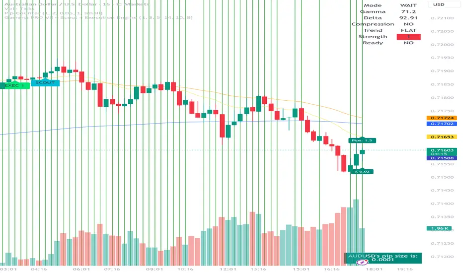
GCM Hybrid SuperTrendTittle: GCM Hybrid SuperTrend
(The Gold Bar Edge — Professional Trading System)
"Like a Dead Ball saves a Batsman even if he is bowled-out, our Gold Bar at a Dead Point saves a Trader from Blowing Out."
Overview
In the world of trading, "Choppy Markets" are the ultimate account killers. Most trend-following indicators fail miserably during sideways movement, trapping traders with false signals and frequent stop-loss hits. GCM HST (Hybrid SuperTrend) is engineered specifically to act as your shield during market noise, ensuring you only participate when the trend has true momentum.
The Philosophy: "Dead Ball Saves a Batsman"
Our core logic is inspired by Cricket: Just like a batsman remains 'Not Out' even if he is bowled out on a Dead Ball, a trader using GCM HST remains protected during a false breakout. The Gold Bar at the Dead Point creates a safety window that must be breached before a trade is considered invalid, saving your account from "Blowing Out" due to temporary market spikes.
Why GCM HST is different (and better) than Classical SuperTrend?
• Noise Filtration (The Dead Point): Classical ST flips immediately when the price touches the line, often causing "whipsaws". GCM HST fixes a Gold Bar during the initial bars of a trend change to act as a buffer.
• Hybrid Stability: It maintains the previous trend's baseline for a specific window, ensuring the trend has truly shifted before giving a signal.
• Timeframe Intelligence: The Auto-Mode adapts sensitivity based on the chart's timeframe (1m, 5m, 15m, etc.), eliminating manual tuning.
• Integrated Safety: Provides a specific Safety Exit alert to protect capital during sudden market reversals.
To prove the superiority of the GCM HST, we analyzed its performance against the Classical ST. Here are the key advantages found:
1) False Signal Reduction: Classical ST traps traders in minor retracements, whereas GCM HST uses the Gold Bar to filter out nearly 40-50% of false signals.
2) Sideways Performance: While Classical ST suffers from frequent "Whipsaws" (Stop-loss hits), GCM HST stays neutral in the Dead Zone, preserving your capital.
3) Entry Precision: GCM HST provides surgical entry points confirmed only after the Safety Window, in minor retracements Safty Bar shows the loss cutting edge, unlike the standard version's immediate flips.
4) Account Protection: Our Hybrid logic is specifically designed to prevent "Blowing Out" during sudden market spikes.
How to Trade with GCM HST?
• Long Entry (BUY): Look for the Green Triangle and the Green Hybrid Line. Ensure the price stays above the Gold Bar during the safety window.
• Short Entry (SELL): Look for the Red Triangle and the Red Hybrid Line. The price should remain below the Gold Bar.
• The Safety Exit: If the price breaches the Gold Bar during the 'Dead Ball Window', exit the trade immediately.
• Pro Tip: Use the Dashboard at the bottom-right to monitor trend strength and mode at a glance.
Disclaimer: Trading involves significant risk. GCM HST is a technical analysis tool and does not guarantee profits. Past performance is not indicative of future results. Always use proper risk management and consult a financial advisor before trading.
________________________________________
(Description in Kannada Language)
Tittle: ಜಿಸಿಎಂ ಹೈಬ್ರಿಡ್ ಸೂಪರ್ ಟ್ರೆಂಡ್
(ದಿ ಗೋಲ್ಡ್ ಬಾರ್ ಎಡ್ಜ್ — ಪ್ರೊಫೆಷನಲ್ ಟ್ರೇಡಿಂಗ್ ಸಿಸ್ಟಮ್)
"ಡೆಡ್ ಬಾಲ್ನಲ್ಲಿ ಬೌಲ್ಡ್ ಆದರೂ ಬ್ಯಾಟ್ಸ್ಮನ್ ಹೇಗೆ ಬಚಾವಾಗುತ್ತಾನೋ, ಹಾಗೆಯೇ ಡೆಡ್ ಪಾಯಿಂಟ್ನಲ್ಲಿರುವ ನಮ್ಮ ಗೋಲ್ಡ್ ಬಾರ್ ಟ್ರೇಡರ್ನನ್ನು ಅಕೌಂಟ್ ಬ್ಲೋ-ಔಟ್ ಆಗದಂತೆ ಕಾಪಾಡುತ್ತದೆ."
:ಪೀಠಿಕೆ:
ಟ್ರೇಡಿಂಗ್ ಲೋಕದಲ್ಲಿ "ಸೈಡ್ವೇಸ್ ಮಾರ್ಕೆಟ್" ಎಂಬುದು ಟ್ರೇಡರ್ಗಳ ಪಾಲಿನ ಮೃತ್ಯುಪಾಸವಿದ್ದಂತೆ. ಬೆಲೆಯ ಏರಿಳಿತವಿಲ್ಲದ ಸಮಯದಲ್ಲಿ ಸಾಮಾನ್ಯ ಇಂಡಿಕೇಟರ್ಗಳು ಸುಳ್ಳು ಸಿಗ್ನಲ್ಗಳನ್ನು ನೀಡಿ ನಿಮ್ಮ ಸ್ಟಾಪ್ಲಾಸ್ ಹಿಟ್ ಮಾಡಿಸುತ್ತವೆ. ಇದಕ್ಕೊಂದು ಕ್ರಾಂತಿಕಾರಿ ಪರಿಹಾರವೇ GCM HST (Hybrid SuperTrend). ಇದು ಮಾರ್ಕೆಟ್ನ "ನಾಯ್ಸ್" ಫಿಲ್ಟರ್ ಮಾಡಿ, ಶಕ್ತಿಯುತವಾದ ಟ್ರೆಂಡ್ ಇದ್ದಾಗ ಮಾತ್ರ ನಿಮ್ಮನ್ನು ಮಾರುಕಟ್ಟೆಗೆ ಆಹ್ವಾನಿಸುತ್ತದೆ.
ಸಿದ್ಧಾಂತ: "ಡೆಡ್ ಬಾಲ್ ಬ್ಯಾಟ್ಸ್ಮನ್ನನ್ನು ಉಳಿಸಿದಂತೆ"
ಒಬ್ಬ ಬ್ಯಾಟ್ಸ್ಮನ್ ಡೆಡ್ ಬಾಲ್ನಲ್ಲಿ ಬೌಲ್ಡ್ ಆದರೂ ಅವನು ಹೇಗೆ 'ನಾಟ್ ಔಟ್' ಆಗಿರುತ್ತಾನೋ, ಹಾಗೆಯೇ GCM HST ಬಳಸುವ ಟ್ರೇಡರ್ ಮಾರುಕಟ್ಟೆಯ ಸುಳ್ಳು ಬ್ರೇಕ್ಔಟ್ಗಳಲ್ಲಿ ಎಂಟ್ರಿ ಪಡೆದರೂ, ಅವನು Dead Point (Gold Bar) ಮೂಲಕ ಸುರಕ್ಷಿತವಾಗಿರುತ್ತಾನೆ. ಇದು ನಿಮ್ಮ ಟ್ರೇಡಿಂಗ್ ಅಕೌಂಟ್ "ಬ್ಲೋ ಔಟ್" (ಖಾಲಿ) ಆಗುವುದನ್ನು ತಪ್ಪಿಸುವ ಅಭೇದ್ಯ ಕವಚ.
ಕ್ಲಾಸಿಕಲ್ ಸೂಪರ್ಟ್ರೆಂಡ್ಗಿಂತ ಇದು ಹೇಗೆ ಭಿನ್ನ ಮತ್ತು ಶ್ರೇಷ್ಠ?
• ನಾಯ್ಸ್ ಫಿಲ್ಟ್ರೇಶನ್: ಸಾಮಾನ್ಯ ಸೂಪರ್ಟ್ರೆಂಡ್ ಬೆಲೆ ಲೈನ್ ಮುಟ್ಟಿದ ತಕ್ಷಣ ಸಿಗ್ನಲ್ ಬದಲಾಯಿಸುತ್ತದೆ. ಆದರೆ GCM HST, ಆರಂಭದಲ್ಲಿ Gold Bar ಅನ್ನು ಫಿಕ್ಸ್ ಮಾಡುವ ಮೂಲಕ ಸುಳ್ಳು ಸಿಗ್ನಲ್ಗಳನ್ನು ತಡೆಯುತ್ತದೆ.
• ಹೈಬ್ರಿಡ್ ಸ್ಟೆಬಿಲಿಟಿ: ಟ್ರೆಂಡ್ ಪಕ್ಕಾ ಆಗುವವರೆಗೂ ಹಳೆಯ ಬೇಸ್ಲೈನ್ ಅನ್ನು ಉಳಿಸಿಕೊಳ್ಳುವ ಮೂಲಕ ಹೆಚ್ಚಿನ ಭದ್ರತೆ ನೀಡುತ್ತದೆ.
• ಟೈಮ್ಫ್ರೇಮ್ ಇಂಟೆಲಿಜೆನ್ಸ್: ಪ್ರತಿ ಟೈಮ್ಫ್ರೇಮ್ಗೆ ತಕ್ಕಂತೆ ತನ್ನ ಸೆನ್ಸಿಟಿವಿಯನ್ನು ತಾನೇ ಬದಲಾಯಿಸಿಕೊಳ್ಳುತ್ತದೆ (Auto-Mode).
• ಸೇಫ್ಟಿ ಎಕ್ಸಿಟ್: ಅಪಾಯದ ಮುನ್ಸೂಚನೆ ನೀಡುವ 'ಸೇಫ್ಟಿ ಎಕ್ಸಿಟ್' ವೈಶಿಷ್ಟ್ಯ ಇದರಲ್ಲಿ ಮಾತ್ರ ಲಭ್ಯವಿದೆ.
ಸಾಮಾನ್ಯ ಸೂಪರ್ಟ್ರೆಂಡ್ಗಿಂತ GCM HST ಹೇಗೆ ಶ್ರೇಷ್ಠ ಎಂದು ನಾವು ಅಂಕಿಅಂಶಗಳ ಮೂಲಕ ಇಲ್ಲಿ ವಿವರಿಸಿದ್ದೇವೆ:
1) ಸುಳ್ಳು ಸಿಗ್ನಲ್ಗಳ ನಿಯಂತ್ರಣ: ಸಾಮಾನ್ಯ ಸೂಪರ್ಟ್ರೆಂಡ್ ಸಣ್ಣ ಏರಿಳಿತಗಳಿಗೂ ಸಿಗ್ನಲ್ ನೀಡುತ್ತದೆ. ಆದರೆ GCM HST ತನ್ನ ಗೋಲ್ಡ್ ಬಾರ್ ಮೂಲಕ ಸುಮಾರು 40-50% ಸುಳ್ಳು ಸಿಗ್ನಲ್ಗಳನ್ನು ತಡೆಯುತ್ತದೆ.
2) ಸೈಡ್ವೇಸ್ ಮಾರ್ಕೆಟ್ನಲ್ಲಿ ಸ್ಥಿರತೆ: ಬೆಲೆ ಏರಿಳಿತವಿಲ್ಲದ ಸಮಯದಲ್ಲಿ ಸಾಮಾನ್ಯ ಇಂಡಿಕೇಟರ್ಗಳು ಪದೇ ಪದೇ ಸ್ಟಾಪ್-ಲಾಸ್ ಹಿಟ್ ಮಾಡಿಸುತ್ತವೆ. GCM HST ಇಂತಹ ಸಮಯದಲ್ಲಿ ಶಾಂತವಾಗಿದ್ದು ನಿಮ್ಮ ಹಣವನ್ನು ಉಳಿಸುತ್ತದೆ.
3) ನಿಖರವಾದ ಎಂಟ್ರಿ: ಸೇಫ್ಟಿ ವಿಂಡೋ ನಂತರವಷ್ಟೇ ಕನ್ಫರ್ಮ್ ಸಿಗ್ನಲ್ ನೀಡುವುದರಿಂದ ಎಂಟ್ರಿ ಅತ್ಯಂತ ನಿಖರವಾಗಿ ಇರುತ್ತದೆ.
4) ಗರಿಷ್ಠ ಸುರಕ್ಷತೆ: ಮಾರುಕಟ್ಟೆಯ ದಿಢೀರ್ ಬದಲಾವಣೆಗಳಿಂದ ನಿಮ್ಮ ಅಕೌಂಟ್ ಖಾಲಿಯಾಗದಂತೆ (Blowing Out) ಇದು ಕಾಪಾಡುತ್ತದೆ.
GCM HST ಮೂಲಕ ಟ್ರೇಡ್ ಮಾಡುವುದು ಹೇಗೆ?
• ಬೈ ಎಂಟ್ರಿ (BUY): ಹಸಿರು ಟ್ರಯಾಂಗಲ್ ಬಂದಾಗ ಎಂಟ್ರಿ ಪಡೆಯಿರಿ. ಬೆಲೆಯು ಆರಂಭದಲ್ಲಿ Gold Bar ಗಿಂತ ಮೇಲಿರಲಿ.
• ಸೆಲ್ ಎಂಟ್ರಿ (SELL): ಕೆಂಪು ಟ್ರಯಾಂಗಲ್ ಬಂದಾಗ ಎಂಟ್ರಿ ಪಡೆಯಿರಿ. ಬೆಲೆಯು Gold Bar ಗಿಂತ ಕೆಳಗಿರಲಿ.
• ಸೇಫ್ಟಿ ಎಕ್ಸಿಟ್: ಬೆಲೆಯು Gold Bar ಅನ್ನು ದಾಟಿದರೆ, ತಕ್ಷಣ ಟ್ರೇಡ್ನಿಂದ ಹೊರಬನ್ನಿ. ಇದು ನಿಮ್ಮನ್ನು ದೊಡ್ಡ ನಷ್ಟದಿಂದ ಉಳಿಸುತ್ತದೆ.
________________________________________
ಹಕ್ಕುತ್ಯಾಗ:
ಟ್ರೇಡಿಂಗ್ನಲ್ಲಿ ಹಣಕಾಸಿನ ಅಪಾಯವಿರುತ್ತದೆ. GCM HST ಒಂದು ತಾಂತ್ರಿಕ ವಿಶ್ಲೇಷಣಾ ಸಾಧನವಾಗಿದ್ದು, ಇದು ಲಾಭದ ಖಾತರಿ ನೀಡುವುದಿಲ್ಲ. ಹೂಡಿಕೆ ಮಾಡುವ ಮೊದಲು ನಿಮ್ಮ ಆರ್ಥಿಕ ಸಲಹೆಗಾರರನ್ನು ಸಂಪರ್ಕಿಸಿ ಮತ್ತು ರಿಸ್ಕ್ ಮ್ಯಾನೇಜ್ಮೆಂಟ್ ಪಾಲಿಸಿ.
مؤشر

مؤشر

Dynamic Sigmoid ATR-Normalized EMA Distance OscillatorDynamic Sigmoid ATR-Normalized EMA Distance Oscillator
Overview
This indicator is built to evaluate trend strength and trend sustainability, not to prioritize mean-reversion calls.
It measures directional pressure relative to a long-term EMA, scales that pressure by current volatility, and maps the result into a stable 0-100 oscillator using a sigmoid transform.
The key advantage is dynamic adaptation: center and regime bands are not static references only, they adjust to evolving oscillator behavior.
This helps separate healthy trend continuation from weak, noisy movement.
Mathematical Construction (No Code Description)
1) Trend baseline:
A long-horizon exponential moving average defines structural direction.
2) Signed distance:
Distance = Price - EMA
Positive values imply price is structurally above baseline; negative values imply below-baseline pressure.
3) Volatility normalization:
Normalized Distance = Distance / ATR
This makes the signal scale-aware across different volatility environments.
4) Nonlinear compression:
Sigmoid(x) = 1 / (1 + e^(-k*x))
The multiplier k controls response sharpness.
The output is then scaled to 0-100.
5) Dynamic center:
Center = EMA of oscillator values (adaptive midpoint).
Optional fixed midpoint mode is available for a classic 50-line reference.
6) Dynamic regime bands:
Upper Band = Center + (StdDev of oscillator * multiplier)
Lower Band = Center - (StdDev of oscillator * multiplier)
These bands expand/contract with oscillator volatility, making the framework regime-aware.
How to Read It (Trend-Focused)
- Oscillator above dynamic center: bullish pressure dominates current regime.
- Oscillator below dynamic center: bearish pressure dominates current regime.
- Persistent distance from center: trend continuation probability is generally stronger.
- Oscillator flattening back toward center: trend sustainability may be weakening.
Long and Short Signal Framework
Long setup concept:
1) Oscillator crosses above dynamic center.
2) Oscillator remains above center for multiple bars (persistence confirmation).
3) Pullbacks that hold above center and re-expand upward can be treated as continuation entries.
Short setup concept:
1) Oscillator crosses below dynamic center.
2) Oscillator remains below center for multiple bars.
3) Bounces that fail near center and rotate down can be treated as continuation entries.
Strength confirmation:
- Rising histogram above zero supports long continuation quality.
- Falling histogram below zero supports short continuation quality.
Example Use Cases (Educational)
Example A - Long trend continuation:
- Market transitions from neutral to bullish as oscillator crosses and holds above center.
- Dynamic upper band begins rising, indicating expanding bullish regime capacity.
- Dips in oscillator that stay above center suggest trend remains structurally intact.
Example B - Short trend continuation:
- Oscillator breaks below center and stays suppressed under it.
- Lower band trends down while histogram remains negative.
- Failed recoveries toward center often mark lower-risk continuation timing.
Example C - Potential trend fatigue:
- Price makes a new directional push, but oscillator fails to sustain distance from center.
- Histogram contracts progressively.
- This can indicate weakening impulse and the need for tighter risk control.
Why Dynamic Components Matter
- A fixed 50-level alone can be too rigid when regime characteristics shift.
- Dynamic center adapts to the oscillator's local equilibrium.
- Dynamic bands adapt to oscillator variance, helping contextualize what is truly "extended" in current conditions.
Inputs (Configurable Parameters)
- EMA Length: structural trend anchor sensitivity.
- ATR Length: volatility normalization depth.
- Sigmoid Multiplier: nonlinear response intensity.
- Use Dynamic Center: adaptive center or fixed 50 reference.
- Center Length: smoothness of adaptive center behavior.
- Band Length: lookback horizon for oscillator variance.
- Band Stdev Multiplier: adaptive band width.
- Visual toggles: gradient and table display options.
Risk and Implementation Notes
- This is an analytical framework, not a guaranteed signal engine.
- Choppy markets can still produce false transitions.
- Parameter calibration should be done per symbol and timeframe with independent testing.
- Position sizing, stop logic, and risk limits remain essential.
Publishing and Compliance Notes
- Educational and analytical content only; not financial advice.
- No guaranteed returns, no performance promises, no misleading language.
- Real-world outcomes vary by market conditions, execution, and risk management.
مؤشر

مؤشر
استراتيجية
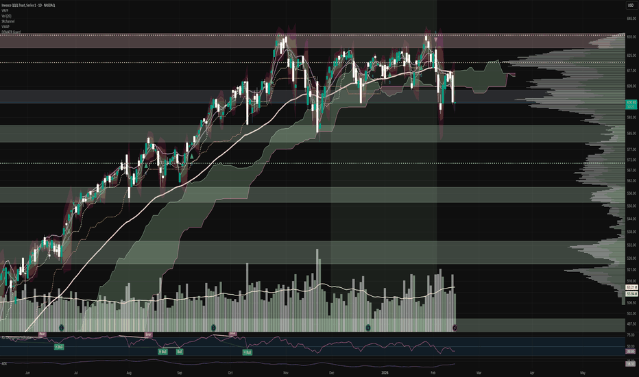
Volatility Regime Clustering# Volatility Regime Clustering (VRC) - Intelligent Volatility Classification
## The Problem
Most traders use the same position size regardless of market conditions. This leads to excessive risk during high volatility periods and missed profits during calm periods. Standard volatility indicators (ATR, Bollinger Bands) show current values but don't automatically classify market regimes.
## The Solution
**Volatility Regime Clustering** uses a machine learning algorithm (k-means clustering) to automatically identify volatility regimes based on historical data. The indicator independently finds boundaries between calm, normal, and nervous markets for each trading instrument.
## How It Works
### Technical Implementation
1. **Volatility Normalization**: ATR is converted to basis points for comparability across instruments with different prices.
2. **K-means Clustering**:
- The indicator analyzes the last N bars (default 200)
- Automatically groups historical ATR values into 2-4 clusters
- Cluster centroids are evenly distributed from minimum to maximum volatility
- The algorithm iteratively refines cluster boundaries every 5 bars
3. **False Signal Protection**:
- Threshold-based smoothing: regime changes only after 3+ consecutive confirmations
- Empty cluster protection with automatic reinitialization
- Warmup period to accumulate sufficient history
4. **Guaranteed Order**:
- Regime 0 always = low volatility
- Regime 1 always = medium volatility
- Regime 2 always = high volatility
- Regime 3 always = extreme volatility
## Visualization
- 🟢 **Green Background**: Low volatility - calm market, full position size recommended
- 🟡 **Yellow Background**: Medium volatility - standard conditions, 75-80% of normal risk recommended
- 🟠 **Orange Background**: High volatility - nervous market, reduce risk to 40-50%
- 🔴 **Red Background**: Extreme volatility - panic/news, minimum risk 25% or stay out
**Info Panel** (top right corner) displays:
- Current volatility regime
- ATR in basis points
- Current cluster center (regime mean value)
- Deviation from cluster center (how close to regime transition)
- Regime stability (% of time in current state)
- Recommended risk multiplier
- Recommended position size in %
## How to Use
### Basic Approach (Risk Management)
1. Add the indicator to any asset chart
2. Wait for warmup period completion (requires minimum 200 bars of history)
3. Monitor background color and recommendations table
4. Adjust position size according to risk multiplier
**Example**:
- You normally risk 2% of capital per trade
- Indicator shows "Risk Multiplier: 0.50x" (orange/red regime)
- Reduce risk to 1% (2% × 0.5 = 1%)
### Advanced Usage
**Entry Filtering**:
- Enter positions only in green/yellow regimes
- Avoid new positions during red background
**Open Position Management**:
- When transitioning to high volatility, move stop-losses further
- In calm regimes, use more aggressive take-profits
**Options Strategies**:
- High volatility → sell options (elevated premium)
- Low volatility → buy options before potential expansion
## Settings
### Main Parameters
- **ATR Length** (14): ATR calculation period. Lower = faster reaction, higher = smoother
- **Clustering Lookback** (200): number of bars for algorithm training. Recommended 150-300
- **Number of Regimes** (3): number of volatility regimes (2-4)
- 2 regimes: simple "calm/nervous"
- 3 regimes: "low/medium/high" (recommended)
- 4 regimes: adds "extreme" regime for rare events
- **Regime Smoothing** (3): number of confirmation bars for regime change. Higher = fewer false switches
### Visual Settings
- **Show Background Color**: enable/disable colored background
- **Show Regime Labels**: display labels on chart when regime changes
- **Show Risk Adjustment Info**: show/hide info panel
- **Info Panel Size**: panel font size (Tiny/Small/Normal/Large)
- **Colors**: customize colors for each regime
## What Makes It Different
Unlike existing volatility indicators:
1. **Automatic Adaptation**: no manual threshold configuration needed for each asset
2. **Machine Learning**: uses k-means clustering instead of fixed percentiles
3. **Self-Learning**: regime boundaries recalculated based on rolling window history
4. **Specific Recommendations**: not just volatility level display, but precise numerical multiplier for position sizing
5. **Noise Protection**: threshold-based smoothing prevents chaotic regime switching
6. **Universality**: ATR normalization allows application across any instruments (forex, stocks, crypto)
## Limitations
- Requires minimum 200 bars of history for correct operation
- On very low timeframes (M1-M5) may be overly sensitive
- Indicator reacts with slight delay due to smoothing (this protects against false signals)
## Recommendations
- **Intraday Trading**: use on H1-H4 with default parameters
- **Swing Trading**: increase Clustering Lookback to 300-500 bars
- **Scalping**: reduce Regime Smoothing to 1-2 and ATR Length to 7-10
- **Combination with Other Indicators**: use VRC as a risk filter on top of your main strategy
## Alerts
The indicator supports three alert types:
- **Regime Change**: any volatility regime change
- **Extreme Volatility**: entry into extreme volatility regime
- **Low Volatility**: entry into low volatility regime
---
**Important**: This indicator is a risk management tool, not a trading system. Use it in combination with a proven entry and exit strategy. مؤشر

Daily ATR Info Box With % BuffersDaily ATR Info Box is a compact volatility dashboard designed for traders who rely on ATR-based buffer logic, stop placement, and volatility filtering. The indicator displays key ATR information in a clean table fixed to a chart corner, avoiding chart clutter while providing essential trade-prep data at a glance.
Key Features:
Daily ATR (14-period) automatically sourced from the Daily timeframe, regardless of your current chart timeframe.
ATR expressed in pips, giving an accurate volatility measure for FX, indices, commodities, and crypto.
Auto Pip-Size Detection that adapts to the chart symbol:
FX pairs → 0.0001
JPY FX pairs → 0.01
Indices → 1
Gold → 0.1
Oil → 0.01
Crypto → 1
Other symbols → mintick
The user can override the value manually at any time.
Displays ATR, 10% ATR, and 5% ATR values for quick buffer and stop-loss calculations.
Optional Current Daily Range vs ATR classification, showing whether the market is:
Very Small
Small
Normal
Large
Very Large
Fully customizable text colour for readability on dark or light chart themes.
Panel can be positioned in any chart corner (top/bottom left/right).
How to Use:
This ATR dashboard is ideal for:
Setting buffer entries for breakouts, straddles, or volatility expansions
Placing ATR-scaled stop-losses
Evaluating whether the market is in compressed or expanded volatility
Combining with session strategies (IB ranges, London/NY, overnight ranges)
Determining if current conditions favour trend, breakout, or mean-reversion setups مؤشر

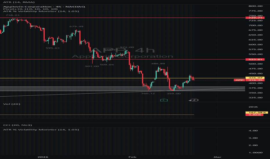
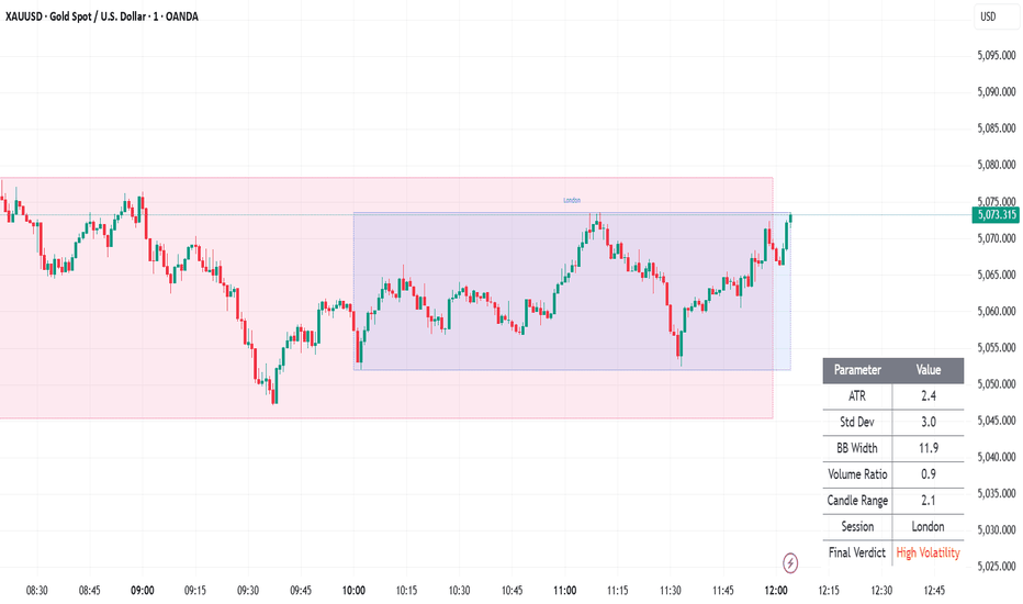
Volatility Regime DashboardVolatility Regime Dashboard
Real-Time Multi-Factor Volatility Analyzer for Crypto, Forex & Stocks
This indicator provides a structured, real-time volatility assessment using multiple market dynamics combined into a single regime-based verdict.
It is designed for traders in crypto, forex, and stocks who want a quick, objective read on whether the market is quiet, tradable, expanding, or explosive.
Instead of relying on one indicator alone, this dashboard evaluates volatility through range, deviation, volume expansion, session timing, and momentum-based expansion metrics, then produces a final regime classification:
Low | Normal | High | Extreme Volatility
📋 Table Parameters Explained
The table displays two columns:
Parameter | Value
Below is what each parameter means and how to interpret it:
1️⃣ ATR (Average True Range)
Measures how much price is moving per candle.
Higher ATR = wider price swings.
Rising ATR suggests expanding volatility.
Falling ATR suggests compression or range-bound conditions.
Use: Good for determining stop distance and scalping viability.
2️⃣ Standard Deviation
Measures how far price deviates from its average.
Expanding deviation indicates increasing momentum and instability.
Contracting deviation signals consolidation.
Use: Helps detect buildup before breakouts.
3️⃣ Bollinger Band Width
Represents volatility expansion or contraction.
Bands widening = volatility increasing.
Bands squeezing = compression phase.
Use: Ideal for breakout preparation across crypto, forex, and stock markets.
4️⃣ Volume Ratio
Current volume relative to its moving average.
Above 1.0 = above-normal activity.
Rising volume confirms genuine volatility expansion.
Use: Filters fake breakouts and low-liquidity moves.
5️⃣ Candle Range
Measures the high-low spread of the current candle.
Larger candles imply active participation.
Smaller candles indicate lack of conviction.
Use: Immediate micro-volatility reading.
6️⃣ Session (Tokyo / London / NY)
Markets behave differently across sessions:
Tokyo → Generally slower, range-based conditions.
London → Increasing momentum and liquidity.
New York (NY) → Often strongest volatility and directional moves.
Session weighting helps contextualize volatility behavior in forex, crypto, and global equities.
🔥 Final Verdict – How to Use It
The dashboard combines all metrics into a structured score and classifies the market into:
🟢 Low Volatility
Compressed movement
Range-bound conditions
Better suited for mean reversion strategies
🟡 Normal Volatility
Healthy, tradeable movement
Suitable for structured intraday trading
🟠 High Volatility
Strong expansion
Breakout or trend-following strategies favored
🔴 Extreme Volatility
Explosive movement
News-driven or institutional momentum
Suitable for experienced traders only
🎯 Why This Indicator Is Useful
Instead of guessing whether the market is active or dead, this tool provides:
Structured multi-factor confirmation
Visual clarity via regime classification
Adaptability for crypto, forex, and stocks
Volatility-based trade filtering
It is ideal for:
Intraday traders
Scalpers
Breakout traders
Session-based traders
Algorithmic/system traders
🚀 Practical Usage Ideas
Trade only when verdict = High or Extreme
Reduce size when verdict = Normal
Avoid new positions during Low
Combine with trend or structure-based strategies
This indicator does not predict direction.
It helps you understand when conditions are favorable for movement.
Because in all markets — crypto, forex, or stocks —
timing volatility is as important as timing direction. مؤشر
مؤشر

مؤشر

Relative Volume multi-timeframe ( D, W, M)Relative Volume (RVOL) measures how active the market is compared to its normal volume. This indicator calculates RVOL on a selectable higher timeframe (Daily / Weekly / Monthly) and plots it as a column histogram, with colors matched to candle direction (bull/bear) either from the source timeframe or from the current chart timeframe.
What it calculates
RVOL is computed as:
RVOL = Current Volume (TF) ÷ SMA(Volume (TF), Lookback)
Where:
TF is the selected source timeframe: D, W, or M
Lookback is the number of TF bars used to compute the SMA baseline (default 30)
Interpretation:
RVOL = 1.0 → volume is equal to the average volume over the lookback period
RVOL > 1.0 → above-average activity (more participation than normal)
RVOL < 1.0 → below-average activity (less participation than normal)
Multi-timeframe behavior
The indicator uses higher-timeframe volume data regardless of the chart timeframe:
If you are on an intraday chart and TF = Daily, RVOL represents today’s accumulated daily volume so far compared to the average daily volume over the lookback period.
On Daily charts with TF = Daily, each bar represents a full day, so RVOL is the cleanest “day vs average day” comparison.
Weekly/Monthly modes work similarly, comparing the current week/month’s volume (or volume so far) to the average of prior weeks/months.
No forward-looking data is used (lookahead off).
Column coloring (candle-matched)
You can choose how RVOL columns are colored:
1) Source timeframe (D/W/M)
Colors are based on the candle direction of the selected TF:
Bullish TF candle (Close > Open) → bull color
Bearish TF candle (Close < Open) → bear color
Doji/neutral → neutral color
2) Chart timeframe
Colors are based on the current chart candles (your active timeframe), using the same bull/bear/doji logic.
This makes it easy to visually connect “unusual volume” with “which side controlled the candle” on the timeframe you care about.
Threshold guide lines
Horizontal levels are included to classify volume intensity at a glance:
1.0 = average volume baseline
1.2 = early elevated activity
1.5 = clearly above average
2.0 = strong participation
3.0 = high momentum / “power” activity
5.0 = extreme / climax-level activity
These are guides, not signals. RVOL measures participation, not direction or trend by itself.
How to use it
Use RVOL to identify periods where volume is meaningfully above average:
Confirm breakouts, trend continuation, or major reaction candles with elevated RVOL
Spot low-interest environments where moves are more likely to fade (low RVOL)
Combine with price structure (levels, ranges, trend) to distinguish accumulation/distribution vs “noise”
Notes / limitations
On intraday charts with TF = Daily/Weekly/Monthly, the current TF bar may be in progress, so RVOL reflects volume accumulated so far versus the average baseline. This is expected behavior.
The indicator does not generate buy/sell signals; it provides volume context for your existing strategy. مؤشر

Ultimate RegimeUltimate Regime | MisinkoMaster
Ultimate Regime is an advanced market environment classification tool designed to identify whether an asset is currently operating in a trending or mean-reverting regime. Instead of focusing on entry signals, the indicator concentrates on answering a more fundamental question: what type of market are we trading right now?
By continuously evaluating market structure, volatility behavior, and directional persistence, the script provides a unified regime view that helps traders adapt strategy selection, risk management, and trade expectations to current conditions.
This makes Ultimate Regime particularly valuable for traders using multiple systems, algorithmic frameworks, or discretionary approaches that perform differently depending on market state.
Core Concept
Markets alternate between expansion phases where directional movement dominates and contraction phases where price oscillates around equilibrium. Strategies built for one condition often underperform in the other.
Ultimate Regime solves this by aggregating several environment measurements into a single regime score that expresses whether the market currently favors:
• Trend continuation strategies
• Breakout participation
• Momentum trading
or instead
• Range trading
• Mean reversion strategies
• Oscillation-based setups
The indicator therefore acts as a decision filter rather than a trade trigger.
Key Features
Unified regime classification combining multiple market characteristics
Automatic detection of trending vs mean-reverting environments
Smooth regime transitions to reduce noise and false flips
Visual histogram representing regime strength
Automatic chart candle coloring based on environment
On-chart regime change labeling for clarity
Configurable lookback and smoothing controls
Works across all timeframes and asset classes
Suitable for discretionary and systematic traders
Designed for integration into multi-indicator workflows
How It Works (Conceptual)
Instead of relying on a single measurement, Ultimate Regime evaluates several dimensions of market behavior simultaneously, such as:
• Price expansion versus contraction
• Volatility shifts
• Directional persistence
• Structural movement characteristics
These components are normalized and combined into a composite regime value. The result is then smoothed to ensure regime changes reflect genuine environment shifts rather than short-term fluctuations.
When the combined regime value turns positive, the market is considered to favor directional movement. When it turns negative, price behavior favors oscillation and mean reversion.
The internal weighting and transformation methods remain proprietary in the invite-only version.
Regime States Explained
Trending Regime
Indicates directional dominance where price tends to move persistently in one direction. Momentum and breakout systems typically perform better under these conditions.
Mean Reverting Regime
Indicates oscillatory behavior where price frequently returns toward equilibrium zones. Range strategies and reversal setups often become more effective.
Neutral Transitions
Short transition periods may occur during regime changes as the environment reorganizes before committing to a dominant state.
Visual Components
Regime Histogram
A histogram displays regime strength and direction, making it easy to gauge whether trending or reverting behavior dominates.
Colored Candles
Price candles automatically change color according to regime classification, allowing instant environment recognition directly on the chart.
Regime Change Labels
Labels appear when regime shifts occur, helping traders visually track transitions between trending and mean-reverting phases.
Reference Thresholds
Visual guide levels help users understand regime extremes and neutral zones.
Inputs Overview
Source
Selects the price data used for regime analysis.
High-Low Difference Lookback
Controls how far back structural price expansion is evaluated.
ATR Lookback
Adjusts how volatility expansion or contraction is measured.
Standard Deviation Lookback
Defines the evaluation window for statistical price dispersion.
ADX Lookback
Controls directional persistence measurement sensitivity.
Smoothing Period
Applies smoothing to regime calculations, balancing responsiveness and stability.
Higher smoothing reduces noise but delays regime changes. Lower smoothing reacts faster but may increase regime flipping.
Usage Guidelines
Use Ultimate Regime as a strategy filter rather than a direct entry signal.
Trending regime environments generally favor:
• Breakout systems
• Momentum entries
• Trend-following approaches
• Pullback continuation trades
Mean-reverting environments generally favor:
• Range trading
• Support and resistance reversals
• Oscillation strategies
• Counter-trend setups
Regime analysis works best when combined with entry and risk tools rather than used standalone.
Practical Applications
Strategy selection switching between trend and range systems
Position sizing adjustments based on environment strength
Filtering trades that conflict with prevailing market behavior
Algorithmic system optimization
Portfolio regime monitoring
Timeframe alignment analysis
Parameter Tuning Notes
Lower lookback values increase responsiveness but may produce faster regime changes.
Higher lookback values stabilize regime detection for swing or position trading.
Short smoothing periods work better for intraday trading.
Longer smoothing periods help long-term traders avoid noise.
Optimal settings vary by asset volatility and timeframe.
Best Practices
Combine regime detection with price structure and confirmation tools.
Avoid forcing trend systems in reverting environments and vice versa.
Use regime awareness to improve trade selection discipline.
Backtest strategies separately for trending and mean-reverting periods.
Summary
Ultimate Regime provides a structured and adaptive view of market conditions by classifying whether the environment favors trend continuation or mean reversion. By separating environment analysis from trade signals, traders gain clarity in strategy selection and improve consistency across changing market conditions.
The invite-only version preserves proprietary calculation methods while delivering a robust regime detection framework suitable for discretionary traders, system developers, and algorithmic strategies alike. مؤشر

Daily NATR Percentile (Regime + Alerts)Daily NATR Percentile — Volatility Regime Filter for Swing Traders
This indicator is designed to help traders objectively identify market volatility regimes and adjust risk exposure accordingly.
Rather than using ATR as a stop or entry signal, this tool treats volatility as an environmental variable — answering the question:
Is the current market condition supportive of swing trading, or is capital preservation the priority?
It calculates Daily NATR (Normalized ATR) and ranks today’s value against the previous N days using a percentile approach.
This removes price-level bias and focuses on relative volatility expansion or contraction.
The result is a normalized 0–100 volatility score:
• Low values = quiet, trend-friendly environment
• High values = unstable, distribution / forced-selling regime
⸻
Core Components
1. Daily NATR Percentile
• ATR is calculated on Daily timeframe
• Normalized by Daily Close (ATR / Close × 100)
• Current value is ranked against a configurable Daily lookback window (default: 20 days)
This answers:
How volatile is today compared to recent history?
⸻
2. Volatility Regime Levels (Customizable)
Default thresholds:
• Low Vol: 20%
• Mid: 50%
• High Vol: 80%
These levels define three behavioral modes:
🟢 Low Regime (Quiet Market)
• Trend continuation favored
• Breakouts and pullbacks work best
• Full position sizing allowed
• Pyramid / add-ons acceptable
🟡 Mid Regime (Mixed Participation)
• Selective entries only
• Reduced position sizing
• Faster profit taking
• Fewer simultaneous positions
🔴 High Regime (Distribution / Forced Selling)
• Correlation spikes
• Fake breakouts increase
• Intraday whipsaws common
Risk management mode:
• Minimal exposure
• No pyramiding
• Only tight support entries (if any)
• Cash becomes a position
Background shading visually highlights High and Low regimes.
⸻
3. Percentile Slope (Volatility Acceleration)
The slope measures how fast volatility is changing.
This is critical for detecting regime transitions:
• Slope > 0 → volatility expanding
• Slope < 0 → volatility contracting
Key patterns:
Percentile Slope Interpretation
Low Down Ideal swing environment
Low Up Early warning of instability
High Up Active volatility expansion
High Down Possible stabilization after panic
The slope is not an entry signal — it is an early feedback mechanism for adjusting exposure.
⸻
How I Personally Use This Indicator
This tool governs position sizing and portfolio exposure, not trade selection.
My workflow:
1. Identify market regime using Daily NATR Percentile
2. Observe slope for acceleration or deceleration
3. Adjust exposure progressively:
Example logic:
• Percentile < 30 AND slope < 0
→ Full risk allowed
• Percentile rising from Low + slope turning positive
→ Reduce new entries, tighten stops
• Percentile > 70 AND slope > 0
→ Defensive mode (minimal risk, capital preservation)
This creates a feedback loop:
Market environment → risk allocation → performance feedback
Exposure increases only when conditions improve, and contracts automatically when volatility expands.
⸻
Philosophy
Most drawdowns don’t come from bad stock selection —
they come from trading aggressively in hostile environments.
This indicator enforces a simple principle:
Trade the market you have, not the market you want.
⸻
Suggested Defaults
• ATR Length: 14
• Percentile Lookback: 20
• High: 80
• Low: 20
• Slope Length: 5
Designed for swing traders, but adaptable to any timeframe via Daily regime filtering. مؤشر

Gamma Hedging Pressure Gamma Hedging Pressure (Proxy) – Market Maker Gamma Exposure Estimator
This open-source, non-overlay indicator provides a **proxy** for dealer/market-maker gamma hedging pressure using only standard OHLCV data — no options chain or implied volatility required.
Core Concept
In options markets, gamma measures how much delta changes with price movement. When dealers are **net short gamma** (negative gamma), they must hedge aggressively in the direction of the move → this amplifies trends and breakouts. When **net long gamma** (positive gamma), they hedge against the move → this creates mean-reversion and pinning behavior.
Because true gamma exposure is hidden (dealer books are private), this script estimates hedging pressure indirectly by combining:
- Volatility expansion (normalized range)
- Price acceleration (second derivative)
- Abnormal volume participation
High positive values → likely negative gamma regime (trend acceleration)
High negative values → likely positive gamma regime (reversion pressure)
Near zero → neutral/chop
Why this proxy is useful
True gamma dashboards require Level 2 options data and are often delayed or paid. This lightweight version:
- Works on any instrument with volume (stocks, futures, forex proxies, crypto)
- Updates in real time
- Helps traders anticipate whether the current move is likely to accelerate (negative gamma) or fade (positive gamma)
- Useful as a regime filter alongside support/resistance, order flow, or momentum tools
How It Works – Step by Step
1. Volatility Expansion
- Normalized range = (high - low) / ATR(14)
2. Price Acceleration
- First difference: close - close
- Second difference (acceleration): diff - diff
3. Volume Participation
- Normalized volume = volume / SMA(volume, 20)
4. Raw Pressure
- rawPressure = normalized range × acceleration × normalized volume
5. Smoothed Gamma Pressure
- gammaPressure = EMA(rawPressure, 5) // short smoothing for responsiveness
6. Optional Daily Reset
- If enabled, resets to 0 at the start of each new day (useful for intraday)
7. Regime Classification
- Negative Gamma (red): gammaPressure > +threshold (default 0.5) → trend/breakout likely
- Positive Gamma (green): gammaPressure < -threshold → mean-reversion likely
- Neutral (gray): within ±threshold → chop/consolidation
Visual Output
- Histogram: colored by regime (red = negative gamma / trend accel, green = positive gamma / reversion, gray = neutral)
- Zero line reference
- Background tint: red/green during strong regimes
- Last-bar label: "NEGATIVE GAMMA – Trend / Breakout", "POSITIVE GAMMA – Mean Reversion", or "NEUTRAL"
How to Use
- Best on intraday timeframes (5m–1h) for futures (NQ, ES, GC), indices, or high-volume stocks
- Daily/4h for swing context on liquid names
- Interpretation examples:
→ Red histogram + rising pressure → dealers likely short gamma → expect trend continuation or acceleration
→ Green histogram + falling pressure → dealers long gamma → expect fading moves, pinning near strikes, or reversion
→ Gray/neutral → low gamma pressure → range-bound or low-conviction market
- Combine with:
- Key levels (VWAP, previous highs/lows)
- Volume profile or order flow
- Options-related news (expiration days, gamma flips)
- Threshold tuning: 0.3–0.8 depending on instrument volatility (lower for crypto, higher for forex)
Inputs
- ATR Length: default 14
- Volume MA Length: default 20
- Gamma Threshold: default 0.5 (sensitivity for regime coloring)
- Reset on New Session: true = daily reset (recommended for intraday)
Publishing Recommendation
- Publish with a clean chart (e.g., 15m–1h NQ1!, ES1!, or SPY)
- Show a trending period (red histogram) and a ranging/consolidation period (green/gray)
- No extra indicators/drawings needed for basic interpretation
This is an **educational proxy** — not a direct measure of actual dealer gamma. It approximates pressure from observable market behavior. Trading involves significant risk of loss. Use discretion and proper risk management.
Feedback welcome — especially threshold or smoothing suggestions for different markets! مؤشر

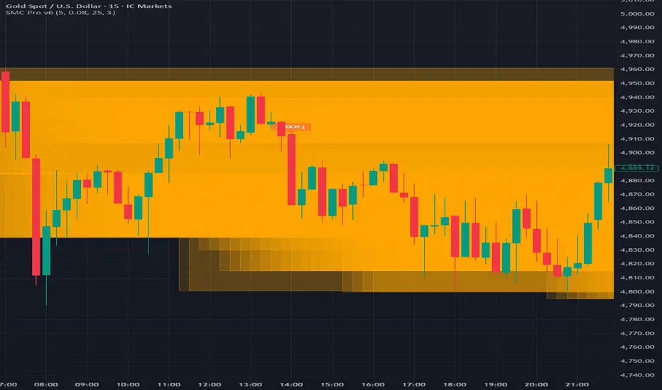
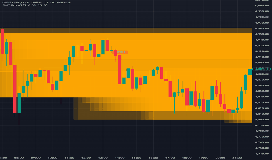
All-in-One SMC ProAll-in-One SMC Pro: CHOCH • BOS • FVG • Order Blocks • Liquidity + Discount/Premium
This open-source overlay indicator combines the five most widely used Smart Money / ICT (Inner Circle Trader) concepts into a single, customizable tool:
- Break of Structure (BOS)
- Change of Character (CHOCH)
- Fair Value Gaps (FVG)
- Order Blocks (mitigation blocks)
- Liquidity grabs (equal highs/lows)
- Discount / Premium zones
Why this combination?
SMC traders rarely use these concepts in isolation. A complete workflow typically involves:
1. Identifying market structure direction (BOS) or reversal (CHOCH)
2. Locating high-probability entry zones (Order Blocks, FVGs)
3. Confirming institutional manipulation (liquidity grabs of equal highs/lows)
4. Understanding price positioning relative to value (discount = buy bias, premium = sell bias)
Putting them all in one script reduces chart clutter, improves confluence visibility, and helps newer SMC users see how the pieces connect — without needing 5–7 separate indicators.
Core Concepts & Detection Logic
1. Break of Structure (BOS)
- Bullish BOS: price closes above previous swing high
- Bearish BOS: price closes below previous swing low
- Swing points detected with user-defined lookback (default 5 bars left/right)
2. Change of Character (CHOCH)
- Bullish CHOCH: price makes lower low but closes above previous swing high (bearish structure broken → bullish reversal signal)
- Bearish CHOCH: price makes higher high but closes below previous swing low (bullish structure broken → bearish reversal signal)
3. Fair Value Gaps (FVG)
- Bullish FVG: gap up after a bearish candle (low > high )
- Bearish FVG: gap down after a bullish candle (high < low )
- Sensitivity controlled via ATR multiplier (default 0.1 × ATR(14))
- Dashed horizontal lines mark the gap boundaries
4. Order Blocks
- Bullish OB: previous swing low after bullish BOS (potential demand zone)
- Bearish OB: previous swing high after bearish BOS (potential supply zone)
- Drawn as semi-transparent boxes extending rightward (lookback period adjustable)
5. Liquidity Grabs
- Detects clusters of equal highs/lows (default 3-bar lookback)
- Labels appear when price reverses after touching equal levels (classic stop-hunt / liquidity raid)
6. Discount / Premium Zones
- Equilibrium proxy = (H + L + C) / 3
- Discount: price below ~0.5% of equilibrium (green tint – buy bias area)
- Premium: price above ~0.5% of equilibrium (red tint – sell bias area)
Visual Customization
- Toggle each element independently (BOS, CHOCH, FVG, OB, Liquidity, Disc/Prem)
- Separate bullish/bearish colors + dedicated FVG/OB/Liquidity colors
- Max lines/labels set high (500) to handle longer histories
Alerts (built-in conditions)
- Bullish / Bearish BOS
- Bullish / Bearish CHOCH
- Bullish / Bearish FVG formation
How to Use
- Best on 5m–4h timeframes for forex, indices, crypto, gold (high-liquidity instruments)
- Typical SMC workflow example:
1. Look for CHOCH → potential trend reversal
2. Wait for BOS in new direction → structure confirmation
3. Seek entry at Order Block or FVG mitigation in discount/premium zone
4. Liquidity grabs near swing extremes often precede strong moves
- Combine with session times, news events, or higher-timeframe bias — never trade signals in isolation
- Adjust swingLen (3–10) for sensitivity: lower = more signals, higher = cleaner structure
Publishing Recommendation
- Publish with a clean chart (recommended: 15m–1h EURUSD, XAUUSD, BTCUSD, or NQ1!)
- Show a recent CHOCH → BOS → OB/FVG confluence sequence
- Remove all other indicators, drawings, and unnecessary gridlines
Always use discretion, proper risk management, and backtest thoroughly.
Feedback welcome — especially on FVG sensitivity or OB refinement ideas! مؤشر
Bank CRE Stress & Short Risk Overlay + Dashboard🏦 Bank CRE Stress & Short Risk Overlay + Dashboard
This open-source indicator overlays risk visualization and a fixed dashboard specifically for **U.S. regional bank stocks** exposed to Commercial Real Estate (CRE) lending stress (as observed in 2023–2026 cycles).
It combines:
- Static CRE exposure tiers (critical/high/elevated/short-bias/failed) based on latest known CRE loan-to-capital ratios and provisions data (sourced from FDIC Call Reports, FAU studies, FFIEC filings ~Q3/Q4 2025)
- Real-time price stress detection (EMA200 breakdown + 20-bar range low breach)
- Visual alerts (background coloring + per-bar risk labels)
- Top-right summary dashboard
Purpose & Why This Combination?
Regional banks with heavy CRE concentration became focal points during rising office/vacancy stress, higher provisions, deposit outflows, and equity pressure. This tool helps traders quickly:
- Identify which tickers carry elevated CRE risk
- See when technical breakdown aligns with fundamental vulnerability (potential short setups or high-risk avoidance zones)
- Monitor a static watchlist without needing external spreadsheets
The mashup is useful because raw fundamentals change quarterly, while price action provides real-time confirmation of stress transmission to equity. Dashboard + overlay gives instant context on any bank chart.
How It Works
1. Ticker Classification (static – update manually when new Call Reports released)
- 🔴 Critical / Short Bias: >~500% CRE exposure or high-conviction short candidates
- 🟠 High: ~375–480%
- 🟡 Elevated: ~300–350%
- ❌ Failed: Known FDIC receivership cases
- 🟢 Low/None: not in list
2. Price Stress Trigger
- Below 200 EMA (major trend break)
- Below 20-bar lowest low (range breakdown)
- (Optional stricter filter: ATR expansion – commented out by default)
3. Visuals
- Background tint: black (failed), red (critical/short + stress), orange (high + stress), yellow (elevated + stress)
- Per-bar label above candle: risk category + warning text (only shown for relevant banks)
- EMA50 (gray) & EMA200 (white) plotted for reference
4. Dashboard (top-right, updates on last bar)
- Current ticker risk level + color coding
- Price stress status
- EMA200 position
- Static high-risk watchlist
- Data freshness & disclaimer note
Alerts
- "Critical/Short Bias Breakdown" when stress triggers on red/orange tickers
- "Failed Bank Symbol" on known failed tickers
How to Use
- Apply to **regional bank stocks** (DCOM, EGBN, OZK, LOB, VLY, FLG, ZION, WAL, SNV, RF, CMA, TFC, etc.)
- Best on daily or 4h charts for swing/position trading context
- Use as a **filter / watchlist aid**:
→ Red/orange background + stress label → heightened short risk or avoidance
→ Yellow → monitor for provisioning news or CRE delinquency spikes
→ Black → avoid (historical failures)
- Update the arrays quarterly when new FDIC data drops (Q1/Q2/Q3/Q4 Call Reports)
- Combine with volume, news, sector ETFs (KRE), or broader CRE indices
Inputs & Customization
- No user inputs — risk tiers are hardcoded for simplicity & consistency
- To add/remove banks: edit the array.from() lines directly
Publishing Notes
- Publish with a clean chart (e.g., DCOM, EGBN or VLY daily/4h)
- Remove unnecessary drawings/indicators
- Screenshot showing dashboard + stress label during a breakdown period is ideal
Important Disclaimers
- Data is **static** and approximate (based on public reports up to ~Q3/Q4 2025)
- Must be manually updated — not real-time fundamental feed
- This is **not financial advice**, not investment research, and carries no accuracy guarantee
- Regional bank equities are extremely volatile — especially under CRE stress
- Trading or shorting involves substantial risk of loss
Open-source for transparency & educational use. Feedback welcome — especially updated CRE tier suggestions. مؤشر

مؤشر
ATR % V3Now I'll provide you with the fully translated script and comprehensive documentation:
ATR % V3 Indicator - Introduction
The ATR % V3 is a Pine Script indicator that displays the Average True Range (ATR) as a percentage of price, providing traders with a normalized view of market volatility. Unlike the standard ATR which shows absolute price values, this percentage-based approach allows for easier comparison across different securities and timeframes. The indicator includes advanced features such as multi-day extreme value detection, customizable horizontal reference lines, and optional coordinate inversion for specialized charting needs.
Key Features
Percentage-based ATR calculation relative to either current open or previous close
Flexible smoothing methods (RMA, SMA, EMA, WMA) for different trading styles
Multi-period extreme value markers for 3-day and 7-day highs/lows
Dynamic horizontal reference line showing current ATR% value
Optional coordinate flip for alternative visualization perspectives
Bar confirmation control to prevent repainting on live bars
Technical Explanation
ATR Percentage Calculation
The script calculates ATR% using the formula: ATR% = (ATR / Basis Price) × 100. The basis price can be either the current bar's open price or the previous bar's close price, allowing traders to choose the reference point that best suits their trading methodology.
Smoothing Methods
The indicator supports four moving average types for ATR smoothing:
RMA (Relative Moving Average): Default method, provides exponentially smoothed values similar to Wilder's original ATR implementation
SMA (Simple Moving Average): Equal weighting of all periods
EMA (Exponential Moving Average): Recent prices weighted more heavily
WMA (Weighted Moving Average): Linear weighting scheme
Extreme Value Detection
The script identifies when the current ATR% value represents a local extreme over 3-day or 7-day lookback periods. These markers appear only on the most recent bar and help traders identify volatility compression or expansion zones that may precede significant price moves.
Anti-Repainting Feature
The "Wait for Bar Close to Update" option prevents the indicator from recalculating on every tick within an unconfirmed bar. When enabled, the ATR% value updates only after each bar closes, ensuring consistent historical values that won't change retroactively.
Usage Recommendations
For Volatility Analysis: Use the percentage-based approach to compare volatility across different assets or timeframes objectively. Higher ATR% values indicate increased volatility relative to price.
For Position Sizing: ATR% can inform position size adjustments—reduce exposure when volatility (ATR%) spikes, and potentially increase when volatility contracts.
For Stop Loss Placement: The horizontal reference line provides a quick visual reference for current volatility levels, useful for setting volatility-adjusted stop losses.
For Breakout Confirmation: Watch for 3-day or 7-day extreme markers—volatility extremes often precede or confirm trend reversals or breakouts. مؤشر

Average True Range V2Here's an introduction and explanation for your ATR indicator script:
Average True Range (ATR) with Enhanced Features
This custom ATR indicator builds upon the traditional Average True Range calculation with several advanced visualization and analysis features designed for traders who need more precise market volatility insights.
Overview
The indicator calculates ATR using your choice of four smoothing methods (RMA, SMA, EMA, or WMA) and adds professional-grade tools for identifying extreme volatility levels over different time periods.
Key Features
Delayed Update Mode: Toggle the "Wait for period end before updating" option to prevent the ATR from recalculating until the current candle closes, eliminating false signals during active price action.
Scale Inversion: The "Flip scale" feature inverts the ATR values, which can be useful when comparing volatility patterns with inversely correlated indicators or when creating custom overlay strategies.
Dynamic Horizontal Line: A real-time horizontal line tracks the current ATR value across your chart, making it easier to identify when volatility reaches specific levels. Customize its color, style (solid, dashed, or dotted), and width to match your charting preferences.
Extreme Value Markers: Automatically identifies and marks 3-day and 7-day volatility extremes with customizable shapes and colors. This helps you quickly spot:
3-day low/high volatility points (shorter-term extremes)
7-day low/high volatility points (medium-term extremes)
Choose from seven different marker shapes (circle, triangle up/down, square, diamond, cross, or X cross) to distinguish between different extreme types at a glance.
Practical Applications
Use this indicator to identify optimal entry and exit points based on volatility cycles, set more accurate stop-loss levels during low volatility periods, or spot potential breakout opportunities when volatility reaches extreme lows before expanding.
The extreme markers are particularly valuable for mean-reversion strategies, helping you identify when volatility has stretched to unsustainable levels and may return to normal ranges.
Would you like me to adjust the tone to be more technical or conversational, or expand on any specific feature? مؤشر

Normalized ROC - Two Security SpreadThis is my exploratory script for comparing the movement of two securities: the one that is studied is compared to some benchmark (like QQQ etc.). The movements of both are measured as ROC(t) normalized with each others own ATR. Normalized ROCs are then subtracted to create a "spread".
The plot draws both securities' NormROC as lines and the spread as a histogram. So, histogram shows green, when the stock is stronger than the benchmark even in their normalized terms, indicating strong momentum, and vice versa as red. Furthermore, the indicator marks with triangles so called hidden strength and hidden weakness. Hidden strength occurs when Benchmark (e.g. QQQ) is weak, but the stock is not. The assumption is that when the benchmark turns positive the stock is ready to run faster. Respectively, hidden weakness is when Benchmark is strong, but the stock does not follow. Of course, there will be many false signals, these are just potential indications of strength and weakness.
Parameters can be adjusted, length of ROC and the line smoothing EMA. Also alerts can be set for histogram level and the hidden strength/weakness levels.
DISCLAIMER: Indicator has not been tested. Use with caution and own responsibility. As always, be aware of false signals. Never make decisions with one indicator only. مؤشر

مؤشر

مؤشر

ATR Structure Trail Pro & Range Filter (v6)📌 ATR Structure Trail Pro & Range Filter (v6)
Multi-purpose trend-following and consolidation detection tool
🔍 Overview
This indicator combines structure pivots, an ATR-based trailing stop, range detection, and clean visual signals to identify trend shifts and potential trade zones.
It is designed for traders who want simple, clean structure reading without unnecessary chart noise.
This indicator does not guarantee profit and is intended for educational and analytical purposes only, serving as a visual aid for reading price action.
⚙️ Main Components
1️⃣ Structure Pivot Flip (Trend Change Detection)
The indicator uses Pivot High / Pivot Low structure to detect when price creates:
Higher High → BUY bias
Lower Low → SELL bias
When a structural flip occurs:
a green arrow appears (potential bullish setup)
or a red arrow appears (potential bearish setup)
These arrows are not trade signals, but visual markers highlighting a shift in market context.
2️⃣ ATR Trail Stop (Adaptive Trend Line)
The ATR trail line automatically adapts to market volatility:
green during bullish phases
red during bearish phases
The ATR multiplier determines how far the dynamic trail is placed relative to price.
The trail line is not a guaranteed exit level — it acts as a dynamic structural reference.
3️⃣ Range/Box Zones (Consolidation Filter)
When the indicator detects that price is entering a tight consolidation range based on ATR and recent volatility, it draws a box zone:
blue in bullish context
purple in bearish context
Range zones indicate low-risk/no-trade areas where entries are typically avoided according to price action logic.
🎯 Trading Logic (Non-Signaling)
This indicator is not a trading system.
It visually highlights:
✔ structure
✔ trend
✔ volatility
✔ consolidation
✔ potential reversals
Users make trading decisions independently of these visual elements.
🧩 Inputs & Customization
You can fully customize:
ATR length & multiplier
Pivot sensitivity
Box fill and border colors
ATR trail color, width, and style (solid/dashed/dotted)
Visibility of all components individually
The indicator works across all timeframes and instruments.
💡 How to Use
Use arrows as informational markers of structure change
Use the ATR trail as a dynamic guide for current trend
Use range boxes to avoid entries during consolidation
Combine it with your own price action analysis, EMA/Kijun lines, session opens, or volume levels
⚠️ Important Notes
This indicator provides no performance guarantees
Not financial advice or a trading signal
Users are responsible for their own testing and application
Intended strictly for educational and analytical use in compliance with TradingView’s rules
📬 Author Notes
If you find this indicator useful, feel free to leave a comment or suggestion for future improvements.
All inputs are open for expansion and further development. مؤشر