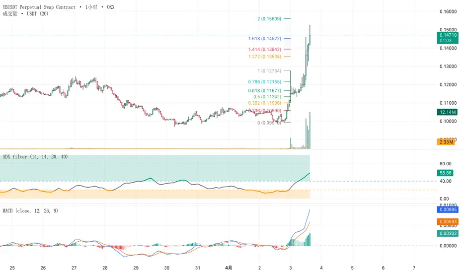
ETHDVOL based Ethereum VolatilityThis indicator maps Ethereum's expected price range across three timeframes — daily, weekly, and monthly — using the Ethereum Deribit Volatility Index (ETHDVOL) as the implied volatility source and realized historical volatility (HV7, HV14, HV30) as the measured counterpart.
ETHDVOL is Ethereum's equivalent of the VIX. It represents the market's forward-looking expectation of annualized volatility, derived from Deribit options pricing. When ETHDVOL is high, the market expects large moves. When it is low, the market expects compression. By scaling ETHDVOL and realized vol into dollar-denominated price bands anchored to key opens, this indicator gives you a structural volatility map directly on the ETH price chart — no separate pane required.
The core concept is straightforward: options market participants price expected ranges. Those ranges become levels. Price respects them — not always, not perfectly, but consistently enough to be meaningful as reference and used in comparison to what is realized.
How to Read the Bands
The Anchoring System
Each set of bands is anchored to a specific open and held fixed for its entire period. They do not drift or repaint mid-period.
**Weekly bands** lock on Saturday's opening price and ETHDVOL reading at the start of each crypto week. They hold for the full 7-day period. This Saturday anchor matters: the crypto options and perpetuals market structurally resets around the Saturday UTC open. Weekly expiries settle on Fridays, and Saturday represents the cleanest "new week" anchor available on a 24/7 market.
**Monthly bands** lock on the 1st of each calendar month and hold for the entire month. They represent the options market's expectation of how far ETH could move over a 30-day window from that open.
**Daily bands** reset each day at 00:00 UTC and reflect that day's opening price and current live volatility readings. They are the tightest, most reactive bands on the chart.
The Band Pairs
Each timeframe shows two bands — one from implied volatility (IV) and one from realized historical volatility (HV):
**IV bands** (white weekly, white monthly) represent what the options market *expects* ETH to move. These are forward-looking. They define the market's priced range for the period.
**HV14 Weekly** (orange) represents the actual realized volatility over the past 14 days, scaled to a weekly move. When HV14 is inside the IV band, the market is pricing more risk than it has been delivering — a low-volatility regime. When HV14 approaches or exceeds the IV band, realized vol is catching up to or exceeding what was priced.
**HV30 Monthly** (orange-red) is the 30-day realized volatility scaled to a monthly move. This sits alongside the monthly IV band and gives context for whether the current month's implied range is historically generous or tight.
**HV7 Today** (light yellow) is a live daily band using the most recent 7 days of realized volatility anchored to today's open. It is the most sensitive reading — useful for intraday context and identifying when daily price movement is pushing into or through the short-term realized range.
**IV Today** (faded white) is the same daily scaling but using DVOL — today's implied daily range from the options market. It is intentionally faded to keep the chart readable.
The Info Table
The top-left badge shows three live readings updated on every bar:
- **IV %** — the current ETHDVOL weekly reading with a heat emoji (🔥 above 60%, ❄️ below 40%, ⚡ in between)
- **HV14 %** — the Saturday-latched realized vol for the week
- **HV14/IV ratio** — the percentage of realized vol relative to implied. ✅ below 95% means RV is running below IV (options are pricing more than has been delivered). ⚠️ at or above 95% means RV is catching up to or exceeding IV — a higher-energy regime.
- **Daily change** — BTC price change from today's open in both % and dollar terms
The Saturday Anchor Line
The ⚓ Sat Open line marks the weekly anchor price. It is the midpoint of the weekly IV and HV14 bands. Price reclaiming or failing at this line is significant — it is the reference price that all weekly band math is built from.
Trend Channels
Two sets of dynamic trendlines auto-draw based on pivot structure — a shorter-period dashed pair and a longer-period solid pair. They update continuously as new pivots form. Green slope = bullish structure on that channel. Red slope = bearish. They reset on the 1st of each calendar month, giving enough bars to build meaningful structure across a full monthly cycle rather than resetting too frequently on the weekly.
---
Settings Walkthrough
Display Toggles
✅ Show Weekly Open Line | The ⚓ Sat Open midline
✅ Show Weekly Bands (IV + HV14) | Both white IV weekly and orange HV14 bands together
✅ Show Monthly Bands (IV + HV30) | Both white IV monthly and orange-red HV30 bands together
✅ Show HV7 Today (daily rotating) | The light yellow daily realized vol band — resets each day
✅ Show IV Today (daily rotating) | The faded white daily implied vol band — resets each day
The weekly and monthly band pairs are intentionally linked — IV and HV are most useful when compared against each other, so they toggle as a unit.
Label Proximity Gate ($)
When multiple bands converge near the same price level, the chart can become cluttered with overlapping labels. The Proximity Gate controls how close a daily band label can be to a weekly or monthly level before it is suppressed. The **line still draws** — only the text label is hidden.
**Default: $50.** At this setting, a daily HV7 or IV Today label will be hidden if it sits within $50 of any weekly or monthly band. Increase this value if you want a cleaner chart with fewer labels. Decrease it if you want to see all labels even when levels are close together.
**Practical guidance:**
💡 On wider perspectives toggle HV7/IV (daily) off and widen 'proximity label gate' to reduce screen clutter
💡 On narrow perspectives keep the daily looks with a tighter 'proximity label gate'
Trend Line Settings
Short and long pivot periods are adjustable independently. The defaults (10 and 16) are calibrated for the 30-minute timeframe. On the 1-hour chart, consider reducing both slightly. On 15-minute, increasing them gives more stable pivots. Because the trendlines reset monthly rather than weekly, they have sufficient bars to establish meaningful channel structure — particularly useful for identifying multi-week compression patterns and directional bias across the full monthly vol cycle.
🚨 General — The indicator is most powerful when used to identify when price is testing a band confluence — for example, when the weekly IV lower and monthly HV30 lower are within close range of each other. Those areas represent options-market-defined support zones where two independent vol calculations agree.
---
*Indicator is designed for ETHUSD. Requires access to DERIBIT:ETHDVOL data on TradingView. Works on intraday timeframes only — weekly and monthly band projections display for the current period.* مؤشر

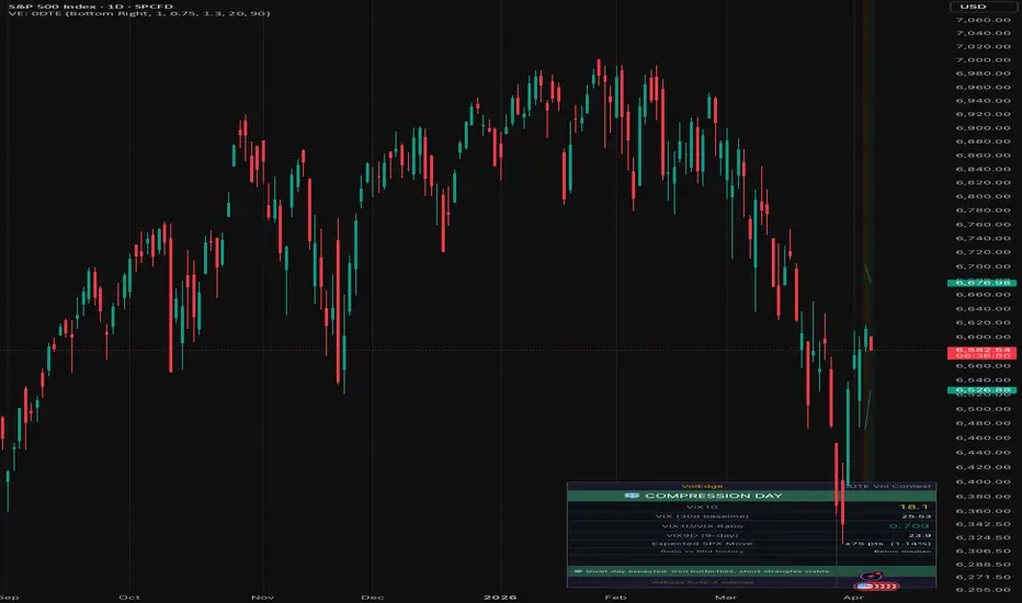
VolEdge: 0DTE Vol ContextHi everyone! Serge is here! Your feedback is highly appreciated.
Consider two mornings where VIX sits at 18. On the first, VIX1D reads 14 — the options market is pricing a quiet session, roughly ±0.9% on SPX. An iron butterfly-centered at the open makes sense. On the second morning, VIX1D reads 22 — today is expected to move nearly 40% more than the 30-day baseline implies. The same iron butterfly could blow through its short strikes before lunch.
This indicator surfaces that difference before you put on a trade.
What it does
Pulls CBOE's VIX1D index (1-day implied volatility), compares it against VIX (30-day baseline), and produces four outputs:
1. Day type classification
The VIX1D/VIX ratio is the core signal. When the ratio is at or above 1.0, the market is pricing today as more volatile than a typical day this month. When it sits at or below 0.75, today is expected to be quieter than normal. Four buckets:
EXPANSION DAY — ratio at or above 1.0. Above-average move priced in. Directional debit spreads and long straddles are better positioned than pure theta plays.
EVENT DAY — ratio at or above 1.30. Something significant is priced in — Fed minutes, CPI, or an intraday shock. This is not the environment for short premium without substantial width and reduced size.
COMPRESSION DAY — ratio at or below 0.75. Quieter than normal. Iron butterflies, short strangles, and narrow credit spreads work best when the market expects to grind.
NORMAL DAY — ratio between thresholds. Standard 0DTE setups apply; use VIX9D for the short-term weekly context.
2. Expected SPX move in points and percent
VIX1D is annualized. Dividing by the square root of 252 converts it to a single-day 1 standard deviation move. On a day where VIX1D is 16, the expected move is roughly plus or minus 1.0% — about 53 SPX points at current levels. Approximately 68% of sessions close within this range. The indicator displays both the point and percentage values, and optionally draws the bands on your chart anchored to today's open.
3. Historical context for the ratio
Today's VIX1D/VIX ratio is percentile-ranked against the past 90 days (adjustable). If the ratio is in the top 10% of recent history, the indicator flags it. A ratio that looks elevated in absolute terms may be ordinary for the current regime; percentile ranking removes that ambiguity.
4. VIX9D as a bridge
VIX1D covers today. VIX covers the next 30 days. VIX9D sits between them and captures the short-term weekly risk window — useful context when today reads Normal but a known event lands later in the week.
How to use it
Check the panel before sizing any 0DTE position. The day type and strategy tip give you the framework; the expected move and ratio percentile give you the calibration.
On an Expansion Day, widen your strikes or reduce size. The market has already priced in a larger move — selling a narrow butterfly into that environment means your tent is too small for the storm that's priced in.
On a Compression Day, tighten your structures. Theta burns fastest in quiet sessions, and the options market is telling you it expects quiet. This is where iron butterflies and short strangles earn their keep.
On an Event Day, the default answer is to sit out or cut size significantly. If you do trade, treat it as a directional bet, not a theta play — the implied move is large enough that short premium needs substantial wing width to survive.
On a Normal Day, use the expected move bands as your tent anchor and check VIX9D to make sure nothing is brewing later in the week.
Inputs
Show expected move lines on chart — draws the plus/minus 1 standard deviation bands anchored to today's SPX open
Show data table — toggle the panel on or off
Table position — top right, top left, bottom right, or bottom left
Expansion threshold — the VIX1D/VIX ratio at which the day is classified as Expansion (default 1.00)
Event threshold — the ratio at which the day escalates to Event (default 1.30)
Compression threshold — the ratio at or below which the day is classified as Compression (default 0.75)
Alert VIX1D level — fires when VIX1D crosses above this absolute level
Lookback for percentile — how many trading days to use when ranking today's ratio (default 90)
Alerts
Three alert conditions are available. Set them once and let them run pre-market.
VIX1D crosses above your chosen threshold — useful as an absolute spike warning
VIX1D/VIX ratio enters the top 10% of recent history — fires when today's relative vol is a genuine outlier, regardless of the absolute VIX level
Day type changes — fires when the classification shifts, for example from Normal to Expansion intraday
Data sources
CBOE:VIX1D, CBOE:VIX, CBOE:VIX9D, SP:SPX. All fetched on the daily timeframe. The indicator works correctly on intraday charts — all vol data is anchored to the daily close regardless of chart resolution. مؤشر

مؤشر

Supply & Demand: Cumulative Volume Delta Flow [ChartPrime]🔶 OVERVIEW
The Supply & Demand: CVD Flow indicator is a high-performance structural analysis tool that merges classic price-action Supply and Demand (S&D) zones with real-time order flow data.
Unlike traditional S&D indicators that only show price boxes, this tool embeds a Cumulative Volume Delta (CVD) Wave directly inside every active zone. This allows traders to see not just where the market turned, but the intensity of the volume delta that has accumulated within that zone since its creation.
🔶 CORE CONCEPT — VOLUME DELTA WITHIN STRUCTURE
Supply and Demand zones represent areas where a significant imbalance between buyers and sellers occurred.
Demand Zones: Created when a bearish "base" candle is followed by a high-momentum bullish breakout.
Supply Zones: Created when a bullish "base" candle is followed by a high-momentum bearish breakout.
By integrating CVD, the indicator tracks the net buying vs. selling volume (Delta) that occurs as price lives within or returns to these zones. This provides a "live" look at whether a zone is being defended by big players or if interest is fading.
🔶 THE CVD FLOW WAVE (POLYLINE ENGINE)
The standout feature of this indicator is the CVD Polyline Wave drawn inside the boxes:
Visualizing Order Flow: The wave oscillates within the zone's boundaries based on cumulative volume delta.
Demand CVD (Cyan): A rising wave suggests aggressive market buying is supporting the demand zone.
Supply CVD (Orange): A falling wave suggests aggressive market selling is reinforcing the supply zone.
Real-time Updates: The wave and the numerical CVD value in the label update dynamically with every bar, providing a clear view of the "Volume Flow" inside the structure.
🔶 SMART DETECTION & MITIGATION
To maintain technical accuracy and chart clarity, the script employs several advanced management logic:
ATR-Based Momentum: Breakouts are validated using a Momentum Multiplier . A zone is only formed if the breakout candle is significantly larger than the recent Average True Range (ATR), ensuring only high-conviction moves are captured.
Overlap Protection: The script automatically checks for redundant zones. If a new zone forms over an existing one, it filters the overlap to keep the chart clean.
Dynamic Mitigation: A Demand Zone is deleted instantly if price closes below its bottom (failed demand). A Supply Zone is deleted instantly if price closes above its top (failed supply).
🔶 INDICATOR INPUTS
ATR Length & Momentum Multiplier: Fine-tune the sensitivity of zone detection. Higher multipliers filter for "Power" breakouts.
Max Active Zones: Limits the number of zones displayed to prevent performance lag and visual clutter.
Custom Colors: Full control over zone fills, borders, and the internal CVD wave colors.
Show Signals: Toggle the "△" and "▽" markers that appear at the moment of breakout.
🔶 HOW TO USE
Zone Validation: When price returns to a Demand zone, look at the CVD label. If the CVD is strongly positive and the wave is rising, it indicates that buyers are actively defending the level.
Absorption Detection: If price is sitting in a Demand zone but the CVD wave is making lower lows, it may indicate "absorption"—where sellers are exhausting the available buy orders, potentially leading to a zone failure.
Targeting: Use Supply zones as logical take-profit areas for longs, and Demand zones for shorts, while using the internal CVD flow to judge if price is likely to bounce or break through.
🔶 CONCLUSION
Supply & Demand: CVD Flow represents a new evolution in structural trading. By moving beyond simple price boxes and incorporating a high-fidelity Cumulative Volume Delta engine, it gives traders an "X-ray" view of the order flow dynamics driving supply and demand.
It is an essential tool for traders who want to combine the reliability of market structure with the precision of volume-based order flow analysis. مؤشر

VolEdge: VRP GaugeVOLEDGE: VRP GAUGE — Is option premium rich or thin right now?
Before you sell a single option, you should know the answer to one question: are options overpriced relative to what the market is actually doing?
The Variance Risk Premium answers this. It is the single most important macro-level number for anyone who sells options for income.
Also note that reversal from rich to kind of poorer premiums tends to show market reversals.
━━━━━━━━━━━━━━━━━━━━━━━━━━━━━━━
WHAT IT DOES
Displays the Variance Risk Premium: the spread between implied volatility (VIX) and realized volatility (30-day historical vol on the S&P 500).
VRP = VIX minus HV30
When VRP is large and positive, options are expensive relative to actual market movement. Premium sellers have a statistical edge — they are being paid more than the risk they are taking on.
When VRP is near zero or negative, options are fairly priced or cheap. Selling offers little edge or no edge at all. Buying vol may be the better play.
The indicator shows the VRP value, its percentile rank over the last 90 days (configurable), a visual gauge, the underlying components (VIX and HV30), the 5-day trend, and a plain-language strategy interpretation.
It also plots a color-coded VRP histogram in its own chart pane so you can see how premium richness has evolved over time.
━━━━━━━━━━━━━━━━━━━━━━━━━━━━━━━
WHY VRP MATTERS
Most retail options traders check IV Rank on individual stocks — "is AAPL's IV high relative to its own history?" That is a useful question, but it misses the bigger picture.
VRP answers the macro question: "Is it a good day to sell options at all?"
When VIX is 20 and SPX has been realizing 20% annualized vol, there is no premium to harvest. VRP is near zero. You are selling options at fair value and taking on risk for no statistical edge.
When VIX is 20 and SPX has been realizing 12% annualized vol, VRP is +8. Options are significantly overpriced. Every strangle, iron condor, and short put you sell has a built-in statistical edge because the market is pricing in more movement than is actually occurring.
This is the fundamental asymmetry that drives institutional premium selling. Implied volatility exceeds realized volatility roughly 85% of the time — that is the variance risk premium. But the size of that premium varies enormously. Selling when VRP is rich compounds returns. Selling when VRP is thin or negative erodes them.
━━━━━━━━━━━━━━━━━━━━━━━━━━━━━━━
VRP CLASSIFICATION — FIVE LEVELS
RICH (VRP above 5, percentile above 75th):
Premium is meaningfully overpriced relative to realized vol. This is the sweet spot for premium sellers. Options are expensive, and the market is not moving as much as options pricing implies. Strangles, iron condors, short puts, and credit spreads all have favorable expected value. This is when you can be most aggressive with premium selling — within your normal risk management rules.
ABOVE AVERAGE (VRP above 5, percentile 50th–75th):
Premium is above its recent average but not at extremes. Selling conditions are favorable. Standard position sizing applies. You have an edge, but it is not as large as during RICH periods.
FAIR (VRP between 0 and 5, percentile 25th–75th):
Premium is roughly in line with realized vol. There is a small edge to selling, but it is modest. Be selective — only sell on stocks with individually elevated IV rank. Avoid aggressive sizing. This is the "be patient" zone.
THIN (VRP between 0 and 5, percentile below 25th):
Premium is below its recent average. The edge from selling is minimal. This is a good time to reduce premium selling activity, tighten existing positions, or wait for better conditions. If you do sell, stick to the highest-conviction setups only.
NEGATIVE (VRP below 0):
Options are cheap relative to realized vol. The market is moving more than options pricing implies. This is rare and typically occurs during fast-moving selloffs where realized vol spikes faster than VIX. Selling premium here is unfavorable — you are being paid less than the risk. Consider buying vol instead: long straddles, debit spreads, or VIX calls.
━━━━━━━━━━━━━━━━━━━━━━━━━━━━━━━
HOW TO USE IT — PRACTICAL WORKFLOW
Daily pre-market check:
Before entering any premium selling trade, glance at the VRP Gauge. If it reads RICH or ABOVE AVG, you have a green light to sell premium at normal or slightly increased size. If it reads FAIR, be selective. If it reads THIN or NEGATIVE, reduce activity or pivot to directional or long-vol strategies.
Combining with individual stock IV Rank:
The VRP Gauge tells you about the macro premium environment. Individual stock IV rank tells you about that specific stock. The best setup is: VRP RICH (macro edge) plus stock IV rank above 50th percentile (stock-level edge). Selling premium when both macro and stock-level conditions are favorable stacks the odds meaningfully in your favor.
Combining with the Vol Weather Report:
VRP RICH during a Normal or Low vol regime is the highest-confidence premium selling environment. VRP RICH during an Elevated or Crisis regime means premiums are rich but so is risk — size down accordingly.
Using the percentile reading:
The raw VRP number is useful, but the percentile tells you context. A VRP of +6 might be average in one market environment and exceptional in another. The percentile rank over the last 90 days (configurable) tells you whether today's VRP is historically rich or normal for recent conditions.
Using the 5-day trend:
VRP rising means the edge for sellers is improving — implied vol is expanding faster than realized vol, or realized vol is declining while VIX holds steady. VRP falling means the edge is shrinking. A falling VRP during a low-vol regime is a caution signal: realized vol may be catching up to implied vol, often before a volatility expansion.
━━━━━━━━━━━━━━━━━━━━━━━━━━━━━━━
WHAT IS ON THE DASHBOARD
Row 1 — VRP classification badge: RICH / ABOVE AVG / FAIR / THIN / NEGATIVE with color-coded background
Row 2 — VRP value: the headline number (e.g. +7.24) in large text
Row 3 — Visual gauge bar: fills from left to right as VRP increases, colored by classification
Row 4 — Percentile rank: where today's VRP sits relative to the last 90 days (configurable)
Row 5 — Implied vol: current VIX level
Row 6 — Realized vol: HV30 (or configurable lookback) calculated on SPX
Row 7 — 5-day trend: Rising / Stable / Falling, with the value from 5 days ago
Row 8 — Strategy context: plain-language interpretation of current VRP conditions
Chart pane: VRP histogram showing the daily VRP value over time. Green bars = rich, yellow = fair, red = negative. Reference lines at 0 (breakeven), +5 (rich threshold), and -2 (deeply negative).
━━━━━━━━━━━━━━━━━━━━━━━━━━━━━━━
THE CALCULATION
Realized volatility (HV30):
Standard deviation of daily log returns on the S&P 500 over the last 30 trading days, annualized by multiplying by the square root of 252.
HV = stdev(ln(close / close_previous), 30) * sqrt(252) * 100
Variance Risk Premium:
VRP = VIX - HV30
Percentile rank:
Counts what percentage of VRP values over the lookback period (default 90 days) were lower than today's reading. A reading of 82 means today's VRP is higher than 82% of the last 90 days.
━━━━━━━━━━━━━━━━━━━━━━━━━━━━━━━
SETTINGS
Realized Vol Lookback: number of days for HV calculation (default 30, range 10–60)
VRP Percentile Lookback: number of days for percentile ranking (default 90, range 30–252)
Show VRP Histogram: toggle the chart-pane histogram on or off
Show Visual Gauge Bar: toggle the gauge bar in the table on or off
Table position: choose where the panel appears
Text size: Small / Normal / Large
━━━━━━━━━━━━━━━━━━━━━━━━━━━━━━━
ALERTS
VRP Rich — fires when VRP crosses above 5 and is in the top quartile. Premium selling conditions are strong.
VRP Thin — fires when VRP drops below 2. Selling edge is diminishing.
VRP Negative — fires when VRP crosses below zero. Options are cheap vs realized vol.
VRP 90th+ Percentile — fires when VRP is in the top 10% of its recent range. Exceptionally rich premium.
VRP Bottom 10th Percentile — fires when VRP is in the bottom 10% of its recent range. Exceptionally thin premium.
━━━━━━━━━━━━━━━━━━━━━━━━━━━━━━━
WHAT MAKES THIS DIFFERENT
Several TradingView scripts calculate historical volatility. A few compare VIX to HV. None of them:
— Present VRP with a percentile rank for historical context
— Classify VRP into actionable categories (Rich / Fair / Thin / Negative)
— Show the 5-day trend in the premium environment
— Provide a strategy context sentence for each classification
— Include a visual gauge and color-coded histogram for quick pattern recognition
The Variance Risk Premium is an institutional-grade signal used by professional options market makers and vol funds as a core input to their selling decisions. This indicator makes it accessible to any options trader with a TradingView account.
━━━━━━━━━━━━━━━━━━━━━━━━━━━━━━━
ACADEMIC BACKGROUND
The variance risk premium — the tendency of implied volatility to exceed realized volatility — is one of the most documented phenomena in options markets. Key findings:
Implied vol exceeds realized vol approximately 85% of the time across major equity indices. The average VRP on the S&P 500 has been roughly 3–5 percentage points over multi-decade samples, but varies widely from negative to 15+ during stress periods.
The VRP is compensation for bearing volatility risk. When markets are calm, investors overpay for downside protection (puts), which inflates VIX relative to what actually happens. Premium sellers harvest this overpayment.
However, the VRP inverts during fast crashes when realized vol spikes above implied vol. This is exactly when premium sellers take their largest losses. Monitoring VRP in real time — not just knowing it exists on average — is critical for avoiding the trap of selling into a thin or negative VRP environment.
━━━━━━━━━━━━━━━━━━━━━━━━━━━━━━━
WHAT THIS INDICATOR IS NOT
It is not a timing signal for individual trades. VRP tells you the macro premium environment, not which stock to sell or when to enter.
It is not a guarantee of profitability. VRP being RICH means the odds favor sellers on average, but individual trades can still lose. Risk management still applies.
It uses VIX as the implied vol proxy and HV30 on SPX as the realized vol proxy. These are standard institutional measures, but they are not perfect representations of the vol surface for every product or expiration. For individual stock premium selling, combine this macro VRP reading with the stock's own IV rank.
It is not financial advice. It is an analytical tool for your own decision-making.
━━━━━━━━━━━━━━━━━━━━━━━━━━━━━━━
DISCLAIMER
This indicator is for educational and informational purposes only. It is not financial advice and should not be used as the sole basis for any trading decision. The variance risk premium is a well-documented statistical phenomenon, but past patterns do not guarantee future results. Options trading involves substantial risk of loss. Always do your own research and consider consulting a licensed financial advisor. مؤشر

VolEdge: Regime ClockVOLEDGE: REGIME CLOCK — How long can vol regime last?
Every premium seller has the same question during calm markets: "How much longer can low vol last?" Every trader caught in a VIX spike asks: "When does this end?"
This indicator gives you data-driven answers to both questions.
━━━━━━━━━━━━━━━━━━━━━━━━━━━━━━━
WHAT IT DOES
Counts consecutive trading days in the current volatility regime and compares that duration against historical benchmarks from 35+ years of VIX data (1990–2025).
The output:
"Day 47 of Low Vol. AGING phase. 72% of periods this long resolve within 10 trading days."
The duration meter shifts from green to yellow to orange to red as the regime exceeds its historical median, 75th percentile, and 90th percentile duration.
Four duration phases:
GREEN — YOUNG: below median duration, regime is fresh, no urgency
YELLOW — AGING: at or above median, regime is maturing, start monitoring
ORANGE — EXTENDED: above 75th percentile, elevated probability of transition
RED — EXTREME: above 90th percentile, historically rare, prepare for regime change
━━━━━━━━━━━━━━━━━━━━━━━━━━━━━━━
WHY DURATION MATTERS
Volatility clusters. Low vol begets low vol — until it doesn't. This has been one of the most robust findings in financial research since Mandelbrot's 1963 observation that "large changes follow large changes."
GARCH models confirm that volatility persistence parameters for equities typically hit 0.99, meaning regimes are highly persistent. But they also mean-revert. The longer a regime has persisted, the more statistical weight shifts toward a transition.
Published research on VIX mean reversion (Harbourfront Technologies, 1990–2017) found that after a 6% VIX spike in a high-vol regime, there is approximately a 73% probability of reversion within 20 days. In low-vol regimes, VIX spike reversion probability drops to about 61%. IG Markets research identified a composite vol cycle of roughly 100 days build-up, a spike, then 100 days of normalization — an asymmetric pattern that traders intuitively sense but have no tool to track.
This indicator turns that research into a live countdown on your chart.
Historical duration benchmarks hardcoded from CBOE VIX daily close data:
Low Vol regime (VIX below 15):
Median duration: approximately 35 trading days
75th percentile: approximately 65 days
90th percentile: approximately 110 days
Normal regime (VIX 15–20):
Median: approximately 25 trading days
75th percentile: approximately 50 days
90th percentile: approximately 80 days
Elevated regime (VIX 20–30):
Median: approximately 15 trading days
75th percentile: approximately 30 days
90th percentile: approximately 55 days
Crisis regime (VIX above 30):
Median: approximately 8 trading days
75th percentile: approximately 15 days
90th percentile: approximately 25 days
Key insight: Crisis regimes are short and violent. Low vol regimes can stretch for months but become increasingly fragile the longer they persist.
━━━━━━━━━━━━━━━━━━━━━━━━━━━━━━━
HOW TO USE IT — BY TRADER TYPE
Premium sellers:
When the clock is GREEN (young regime), your current strategy is fine. No adjustments needed.
When it turns YELLOW (aging), start paying closer attention to VVIX and term structure for early transition signals. Consider tightening new positions slightly.
When it turns ORANGE (extended), reduce size on new positions. An extended low-vol regime means you have been collecting thin premiums for a while and the probability of a spike is growing. This is not the time to add aggressive short vol positions.
When it turns RED (extreme), you should be at minimum position size. The statistical case for a transition is strong. If you are short vol, this is the time to take profits, tighten stops, or hedge.
Swing and directional traders:
Extended low-vol regimes often precede sharp moves in either direction. When the clock turns orange or red during low vol, consider reducing leveraged positions or adding protective options.
Extended crisis regimes (rare — above 90th percentile) are historically some of the best mean-reversion buying opportunities for equities. But timing the exact bottom requires more signals than duration alone.
Vol traders:
Regime extensions above the 90th percentile are high-probability mean reversion setups. If low vol has persisted for 100+ days, long vol positions (VIX calls, long straddles, UVXY) have favorable asymmetry. If crisis has persisted for 20+ days, short vol positions have favorable asymmetry — but size conservatively because the tail risk in crisis is enormous.
Risk managers:
Use the duration percentile as a direct input to position sizing. A simple rule: reduce maximum position size by 10% for each phase beyond YOUNG. Normal size in YOUNG, 90% in AGING, 80% in EXTENDED, 70% in EXTREME.
━━━━━━━━━━━━━━━━━━━━━━━━━━━━━━━
WHAT IS ON THE DASHBOARD
Row 1 — Regime badge: current regime with color-coded background (same classification as the VolEdge Vol Weather Report)
Row 2 — Duration: "Day 47" in large text. This is the headline number.
Row 3 — Duration meter: a visual progress bar that fills as the regime ages, colored by phase
Row 4 — Phase label: YOUNG / AGING / EXTENDED / EXTREME with the median, 75th, and 90th percentile benchmarks for the current regime
Row 5 — Resolution probability: estimated percentage of historical regimes at this duration that resolved within 10 trading days
Row 6 — Key data: VIX level and VIX/VIX3M ratio (compact reference)
Row 7 — Context sentence: plain-language interpretation that adapts to the current phase
Row 8 — Regime history strip: last 3 regime periods with their durations, showing the recent pattern
Chart background gets a subtle orange or red tint when the duration enters EXTENDED or EXTREME phase.
━━━━━━━━━━━━━━━━━━━━━━━━━━━━━━━
HOW THE REGIME IS CLASSIFIED
This indicator uses the same weighted composite scoring as the VolEdge Vol Weather Report:
VIX spot level: 40% weight
VVIX (volatility of VIX): 30% weight
VIX/VIX3M ratio (term structure proxy): 30% weight
Composite score 0–25 = Low, 25–50 = Normal, 50–75 = Elevated, 75–100 = Crisis
If you use both the Vol Weather Report and the Regime Clock, they will always agree on the current regime because they use identical classification logic.
━━━━━━━━━━━━━━━━━━━━━━━━━━━━━━━
RESOLUTION PROBABILITY — A NOTE ON METHODOLOGY
The "X% resolve within 10 days" probability is calculated from a simplified interpolation of historical VIX regime durations. It is directionally accurate — longer durations do correlate with higher transition probabilities — but the exact percentages are approximations, not precise statistical outputs.
The numbers are derived from published VIX mean reversion research and approximate survival curves for each regime. They should be used as context, not as precise predictions.
If you are a quantitative trader and want exact numbers, download the CBOE VIX daily close CSV and calculate your own survival distributions. I may update these benchmarks with more precise values in future versions.
━━━━━━━━━━━━━━━━━━━━━━━━━━━━━━━
SETTINGS
Table position: choose where the panel appears on your chart
Text size: Small / Normal / Large
Show regime history strip: toggle the historical regime sequence on or off
Show resolution probability: toggle the probability callout on or off
━━━━━━━━━━━━━━━━━━━━━━━━━━━━━━━
ALERTS
Regime Change — fires when the regime transitions in any direction
Duration Hit Median — fires when the current regime reaches its historical median duration
Extended Regime (75th percentile) — fires when duration exceeds the 75th percentile for the current regime type
Extreme Extension (90th percentile) — fires when duration exceeds the 90th percentile
Entered Crisis — fires specifically when the market enters Crisis regime
Exited Crisis — fires when the market leaves Crisis regime
To set up: click the Alerts button on your chart, select this indicator, and choose the condition.
━━━━━━━━━━━━━━━━━━━━━━━━━━━━━━━
WHAT MAKES THIS DIFFERENT
There are over a dozen volatility regime classifiers on TradingView. Every one of them classifies the current state — high vol, low vol, compression, expansion. None of them measure how long that state has persisted or what duration implies about what comes next.
This is the only indicator on TradingView that:
— Counts consecutive days in each regime
— Compares current duration against 35 years of historical VIX data
— Classifies duration into phases (young, aging, extended, extreme)
— Provides a resolution probability estimate
— Tracks regime history so you can see the recent pattern
The concept is academically grounded but has never been productized as a live trading tool. "Day X of Low Vol" is a framing that is instantly intuitive and answers the question every premium seller asks during calm markets.
━━━━━━━━━━━━━━━━━━━━━━━━━━━━━━━
WHAT THIS INDICATOR IS NOT
It is not a timing signal. "Extended regime" does not mean "the regime ends tomorrow." Regimes can persist well beyond the 90th percentile — they just rarely do.
It is not a substitute for analyzing the specific catalyst environment. A low-vol regime that is extended during a period of Fed tightening uncertainty is different from one during a goldilocks macro environment.
It is not financial advice. It is an analytical framework that adds a dimension — time — to your volatility analysis.
━━━━━━━━━━━━━━━━━━━━━━━━━━━━━━━
PART OF THE VOLEDGE SUITE
This is indicator 2 of 9 in the VolEdge volatility toolkit.
Free indicators:
Vol Weather Report — multi-factor regime classification with strategy context
Regime Clock (this one) — duration tracking with historical benchmarks
VRP Gauge — is option premium rich or thin right now? (coming soon)
0DTE Vol Context — is today an expansion day or a theta-burn day? (coming soon)
VVIX Ratio Percentile — the most underused signal in vol trading (coming soon)
Selling Bias Compass — should you sell puts or calls today? (coming soon)
Paid (VolEdge Pro Suite):
Naked Seller Risk Score — per-ticker 0–100 safety score (coming soon)
Options Timing Dashboard — strategy recommendation for any stock (coming soon)
Earnings Vol Analyzer — IV crush prediction with historical data (coming soon)
Follow VolEdge to get notified when new indicators launch.
━━━━━━━━━━━━━━━━━━━━━━━━━━━━━━━
DISCLAIMER
This indicator is for educational and informational purposes only. It is not financial advice and should not be used as the sole basis for any trading decision. Historical duration benchmarks are approximations derived from published research and may not perfectly reflect future regime behavior. Past patterns in volatility regimes do not guarantee future results. Options trading involves substantial risk of loss. Always do your own research and consider consulting a licensed financial advisor. مؤشر

DVOL based Bitcoin Volatility This indicator maps Bitcoin's expected price range across three timeframes — daily, weekly, and monthly — using the Deribit Volatility Index (DVOL) as the implied volatility source and realized historical volatility (HV7, HV14, HV30) as the measured counterpart.
DVOL is Bitcoin's equivalent of the VIX. It represents the market's forward-looking expectation of annualized volatility, derived from Deribit options pricing. When DVOL is high, the market expects large moves. When it is low, the market expects compression. By scaling DVOL and realized vol into dollar-denominated price bands anchored to key opens, this indicator gives you a structural volatility map directly on the BTC price chart — no separate pane required.
The core concept is straightforward: options market participants price expected ranges. Those ranges become levels. Price respects them — not always, not perfectly, but consistently enough to be meaningful as reference and used in comparison to what is realized.
How to Read the Bands
The Anchoring System
Each set of bands is anchored to a specific open and held fixed for its entire period. They do not drift or repaint mid-period.
**Weekly bands** lock on Saturday's opening price and DVOL reading at the start of each crypto week. They hold for the full 7-day period. This Saturday anchor matters: the crypto options and perpetuals market structurally resets around the Saturday UTC open. Weekly expiries settle on Fridays, and Saturday represents the cleanest "new week" anchor available on a 24/7 market.
**Monthly bands** lock on the 1st of each calendar month and hold for the entire month. They represent the options market's expectation of how far BTC could move over a 30-day window from that open.
**Daily bands** reset each day at 00:00 UTC and reflect that day's opening price and current live volatility readings. They are the tightest, most reactive bands on the chart.
The Band Pairs
Each timeframe shows two bands — one from implied volatility (IV) and one from realized historical volatility (HV):
**IV bands** (white weekly, white monthly) represent what the options market *expects* BTC to move. These are forward-looking. They define the market's priced range for the period.
**HV14 Weekly** (orange) represents the actual realized volatility over the past 14 days, scaled to a weekly move. When HV14 is inside the IV band, the market is pricing more risk than it has been delivering — a low-volatility regime. When HV14 approaches or exceeds the IV band, realized vol is catching up to or exceeding what was priced.
**HV30 Monthly** (orange-red) is the 30-day realized volatility scaled to a monthly move. This sits alongside the monthly IV band and gives context for whether the current month's implied range is historically generous or tight.
**HV7 Today** (light yellow) is a live daily band using the most recent 7 days of realized volatility anchored to today's open. It is the most sensitive reading — useful for intraday context and identifying when daily price movement is pushing into or through the short-term realized range.
**IV Today** (faded white) is the same daily scaling but using DVOL — today's implied daily range from the options market. It is intentionally faded to keep the chart readable.
The Info Table
The top-left badge shows three live readings updated on every bar:
- **IV %** — the current DVOL weekly reading with a heat emoji (🔥 above 60%, ❄️ below 40%, ⚡ in between)
- **HV14 %** — the Saturday-latched realized vol for the week
- **HV14/IV ratio** — the percentage of realized vol relative to implied. ✅ below 95% means RV is running below IV (options are pricing more than has been delivered). ⚠️ at or above 95% means RV is catching up to or exceeding IV — a higher-energy regime.
- **Daily change** — BTC price change from today's open in both % and dollar terms
The Saturday Anchor Line
The ⚓ Sat Open line marks the weekly anchor price. It is the midpoint of the weekly IV and HV14 bands. Price reclaiming or failing at this line is significant — it is the reference price that all weekly band math is built from.
Trend Channels
Two sets of dynamic trendlines auto-draw based on pivot structure — a shorter-period dashed pair and a longer-period solid pair. They update continuously as new pivots form. Green slope = bullish structure on that channel. Red slope = bearish. They reset on the 1st of each calendar month, giving enough bars to build meaningful structure across a full monthly cycle rather than resetting too frequently on the weekly.
---
Settings Walkthrough
Display Toggles
✅ Show Weekly Open Line | The ⚓ Sat Open midline
✅ Show Weekly Bands (IV + HV14) | Both white IV weekly and orange HV14 bands together
✅ Show Monthly Bands (IV + HV30) | Both white IV monthly and orange-red HV30 bands together
✅ Show HV7 Today (daily rotating) | The light yellow daily realized vol band — resets each day
✅ Show IV Today (daily rotating) | The faded white daily implied vol band — resets each day
The weekly and monthly band pairs are intentionally linked — IV and HV are most useful when compared against each other, so they toggle as a unit.
Label Proximity Gate ($)
When multiple bands converge near the same price level, the chart can become cluttered with overlapping labels. The Proximity Gate controls how close a daily band label can be to a weekly or monthly level before it is suppressed. The **line still draws** — only the text label is hidden.
**Default: $200.** At this setting, a daily HV7 or IV Today label will be hidden if it sits within $200 of any weekly or monthly band. Increase this value if you want a cleaner chart with fewer labels. Decrease it if you want to see all labels even when levels are close together.
**Practical guidance:**
💡 On wider perspectives toggle HV7/IV (daily) off and widen 'proximity label gate' to reduce screen clutter
💡 On narrow perspectives keep the daily looks with a tighter 'proximity label gate'
Trend Line Settings
Short and long pivot periods are adjustable independently. The defaults (10 and 16) are calibrated for the 30-minute timeframe. On the 1-hour chart, consider reducing both slightly. On 15-minute, increasing them gives more stable pivots. Because the trendlines reset monthly rather than weekly, they have sufficient bars to establish meaningful channel structure — particularly useful for identifying multi-week compression patterns and directional bias across the full monthly vol cycle.
🚨 General — The indicator is most powerful when used to identify when price is testing a band confluence — for example, when the weekly IV lower and monthly HV30 lower are within close range of each other. Those areas represent options-market-defined support zones where two independent vol calculations agree.
---
*Indicator is designed for BTCUSD. Requires access to DERIBIT:DVOL data on TradingView. Works on intraday timeframes only — weekly and monthly band projections display for the current period.*
مؤشر

مؤشر

Average Volatility ZonesDisplays the average volatility range directly on the chart as horizontal levels projected from the current period's open.
The indicator calculates the average candle size (High-Low or True Range) over a configurable period and timeframe (default: Daily, 20 bars), then draws upper and lower lines at that distance from the current timeframe open — showing how far price typically moves within one period.
Key features:
- Multi-timeframe support — measure volatility from any timeframe (M15 to Monthly)
- Scalable levels — optional 2x, 3x, and custom multiplier levels for extended volatility zones
- Zone mode — converts lines into shaded bands based on a percentage of the average volatility
- Automatic pip detection for forex pairs (supports 5-digit and 3-digit brokers)
- Each level is labeled with its timeframe, period, and value in pips
- Fully customizable colors, line styles, label positioning, and zone transparency
Useful for gauging intraday range potential, setting realistic targets, identifying overextended moves, and filtering entries near volatility extremes. مؤشر
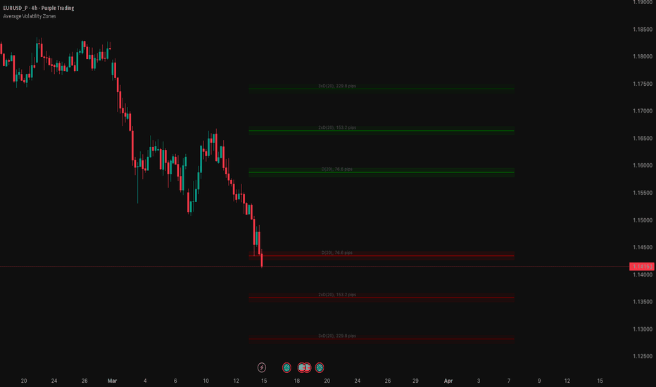
مؤشر

مؤشر
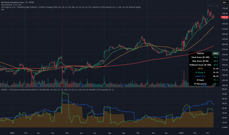
مؤشر
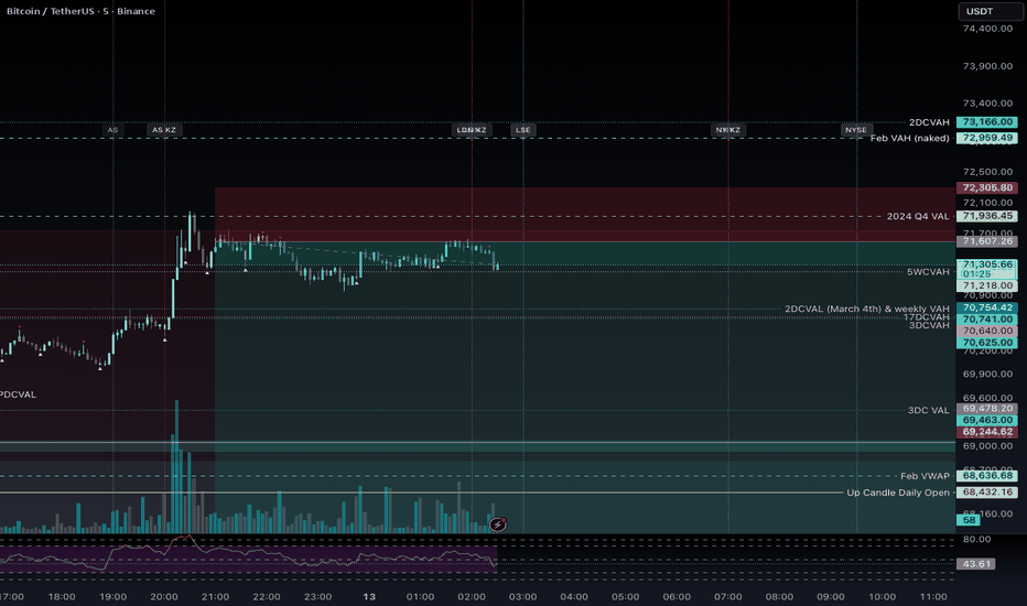
مؤشر
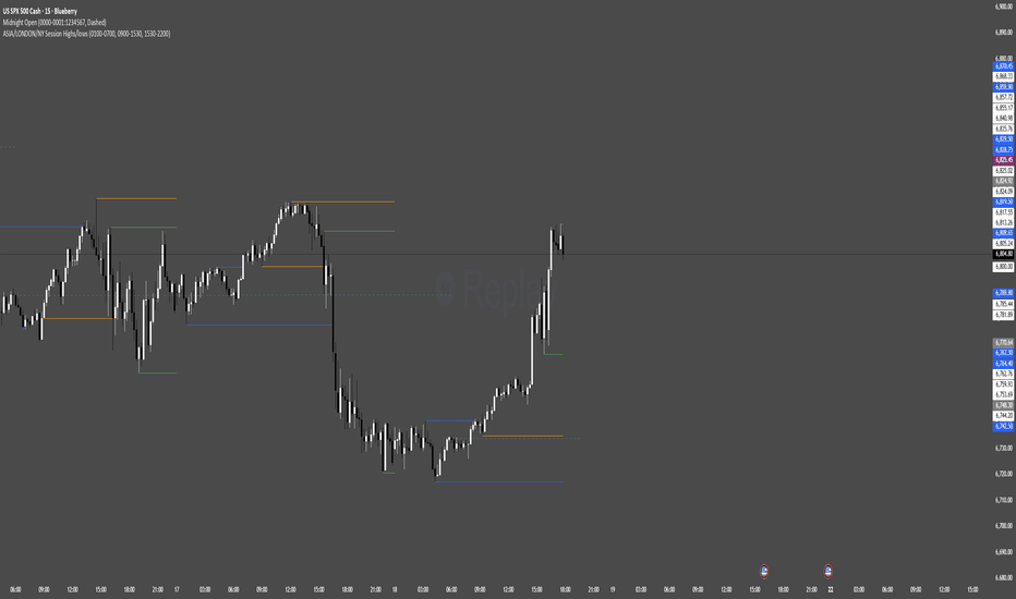
Parkinson Range Oscillator [BackQuant]Parkinson Range Oscillator
Overview
Parkinson Range Oscillator is a volatility regime indicator built around the Parkinson volatility estimator , a high-low based variance model originally proposed as a more statistically efficient alternative to close-to-close volatility. Instead of measuring volatility from closing returns, this script measures volatility from the intrabar price range using ln(H/L), then converts it into a normalized oscillator (z-score) so you can identify volatility expansion vs compression relative to the asset’s own history.
The indicator is designed to answer questions like:
Is volatility currently elevated or suppressed relative to its baseline?
Is volatility expanding (risk rising) or compressing (coiling)?
How extreme is the current vol state in percentile terms?
How does range-based vol compare to a more common ATR-based vol read?
It plots:
A Parkinson-based volatility z-score oscillator with gradient fills.
A signal line (EMA) for expansion/compression transitions.
An ATR-based z-score for context comparison.
A dashboard with current vol %, z-score, percentile rank, regime label, and ATR z-score.
Where Parkinson volatility comes from (origin and intuition)
The Parkinson estimator comes from academic finance and the study of volatility estimation. The key insight is simple:
The daily high and low contain more information about variability than the close alone.
Close-to-close volatility only uses one price per bar (the close), throwing away intrabar information. The high-low range captures the realized dispersion inside the bar, so under ideal assumptions it can estimate variance more efficiently.
The Parkinson model is derived assuming:
Price follows a continuous-time diffusion process (often framed like geometric Brownian motion).
No drift matters for the variance estimate over the interval.
No jumps and no microstructure distortions (idealized).
Even though real markets violate these assumptions (gaps, jumps, wicks from order flow), the estimator remains useful because:
Range is still a strong proxy for realized volatility.
It reacts to intrabar expansion earlier than close-based methods.
It is less dependent on where the bar closes.
Core Parkinson formula (what the script implements)
Parkinson variance for a window of n bars is:
Var = (1 / (4 * n * ln(2))) * Σ
This script computes it in the common rolling form:
logHL2 = (ln(high/low))²
parkVar = SMA(logHL2, n) / (4 * ln(2))
parkVol = sqrt(parkVar) * 100
Key details:
ln(H/L) makes the range scale-invariant (percent-like), so it behaves more consistently across price levels.
Squaring gives variance contribution.
The 1/(4 ln 2) constant comes from the expected distribution of high-low range under a Brownian diffusion.
sqrt converts variance to standard deviation (volatility).
*100 expresses it as a percentage for readability.
So parkVol is a “range-based realized volatility proxy” in percent terms.
Why range-based volatility behaves differently than ATR
ATR measures average true range, which is a linear range magnitude measure (high-low plus gaps). Parkinson uses ln(H/L) which is:
Log-scaled (closer to a return-based measure).
More directly tied to variance estimation theory.
In practice:
ATR can be driven by gaps and absolute range.
Parkinson is driven by proportional range and tends to emphasize how wide the bar is relative to its price level.
Parkinson often reacts sharply when wicks expand even if closes are stable.
Normalization into an oscillator (making it comparable through time)
Raw volatility values are hard to interpret across regimes because every market has different “normal.” This script normalizes Parkinson volatility against its own rolling baseline using a z-score:
parkMA = SMA(parkVol, baselineLen)
parkSD = stdev(parkVol, baselineLen)
osc = (parkVol - parkMA) / parkSD
Interpretation:
osc = 0 means current vol is at its baseline average.
osc = +1 means 1 standard deviation above normal (high vol).
osc = -1 means 1 standard deviation below normal (compressed).
osc > +2 flags extreme expansion states.
This is the core output. It turns “volatility” into “volatility regime” in standardized units.
Signal line and expansion/compression transitions
The oscillator is smoothed with an EMA to create a signal line:
signal = EMA(osc, signalLen)
Then transitions are defined as:
Expansion cross: crossover(osc, signal) and osc > 0
Compression cross: crossunder(osc, signal) and osc < 0
Why the extra osc > 0 and osc < 0 conditions:
It prevents treating small oscillations around zero as meaningful.
It forces expansion signals to occur in above-average volatility territory.
It forces compression signals to occur in below-average volatility territory.
So signals are regime-confirming, not constant cross spam.
Percentile rank (how extreme is vol relative to the past)
In addition to the z-score, the script computes the percentile rank of the raw Parkinson volatility:
pctRank = percentrank(parkVol, pctRankLookback)
Interpretation:
pctRank near 90–100 means current vol is among the highest levels seen in that lookback.
pctRank near 0–10 means it is among the lowest (compression).
Z-score tells you “how many SDs from mean.” Percentile tells you “how rare is this state historically.” Those are different but complementary.
ATR comparison line (context, not the main engine)
The indicator also computes an ATR-based volatility proxy and normalizes it in the same way:
atrVol = ATR(n) / close * 100
atrOsc = zscore(atrVol, baselineLen)
This gives you a direct visual comparison:
If Parkinson oscillator is high but ATR oscillator isn’t, range expansion may be happening in a way ATR is not emphasizing (or vice versa).
If both agree, you have stronger confirmation of a true volatility regime shift.
ATR is included as a “common benchmark,” not as the primary signal.
Regime classification (human-readable state mapping)
The script labels regimes from osc:
osc > 2.0 → EXTREME
osc > 1.0 → HIGH
osc > 0.0 → ABOVE AVG
osc > -1.0 → BELOW AVG
else → COMPRESSED
This is a practical mapping for dashboards and quick reads. It is not pretending that 2.0 is a universal constant, it is just a standardized “rare expansion” threshold.
Coloring follows the same logic:
More positive = more “expansion” coloring (bearCol).
More negative = more “compression” coloring (bullCol).
Note: the color naming is semantic here:
“Low Vol / Compression” is bullCol because compression often precedes trend expansion opportunities.
“High Vol / Expansion” is bearCol because high vol often implies risk, disorder, liquidation, or unstable conditions.
You can interpret those however you prefer, the tool is measuring volatility regime, not directional bias.
Plot design (why the oscillator is split into positive/negative)
The oscillator is split into two series:
oscPos = osc if osc > 0 else na
oscNeg = osc if osc < 0 else na
This is purely for visuals:
Positive region is drawn with expansion color and expansion gradient fill to zero.
Negative region is drawn with compression color and compression gradient fill to zero.
This makes it obvious at a glance which side of “normal volatility” you’re on.
How to interpret the indicator correctly
1) The oscillator is volatility regime, not price direction
High osc does not mean price will go down. It means the market is moving violently relative to its baseline. That can occur in:
Selloffs, liquidations, panic.
Breakouts and momentum expansions.
News-driven repricing.
Low osc does not mean price will go up. It means the market is quiet relative to baseline:
Ranges, coils, low realized movement.
Slow grind trends with suppressed pullbacks.
Pre-breakout compressions.
2) Compression regimes are often “setup states”
When osc is deeply negative (compressed), it often indicates that realized movement has collapsed. In many markets this precedes:
Breakouts (vol expansion from compression).
Trend acceleration.
Mean reversion bursts.
But compression can also persist. This is why the script includes signal crosses and percentile rank to judge when compression is shifting.
3) Expansion regimes are often “risk states”
When osc is positive and rising, the environment is more chaotic:
Stops are more likely to be hit.
Mean reversion can get violent.
Trend continuation can be strong but timing becomes harder.
In those regimes, the tool can be used to:
Reduce leverage.
Widen stops (if your system supports it).
Switch to volatility-aware sizing.
Wait for stabilization if you trade mean reversion.
4) Use percentile rank to identify “rare” volatility
Two markets can both show osc = +1, but one might be at the 95th percentile and the other at the 70th depending on distribution shape. Percentile tells you whether the current vol is truly rare in that lookback.
Cross dots (how to treat them)
ExpansionCross and CompressionCross are not buy/sell signals. They are “volatility phase change” markers:
ExpansionCross: vol regime moving up, above baseline, acceleration risk increases.
CompressionCross: vol regime moving down, below baseline, quieting environment.
These are useful for:
Strategy toggles (trend mode vs chop mode).
Sizing changes.
Timing filters (avoid entries during extreme expansion if your edge hates noise).
Dashboard (what it gives you at a glance)
The table summarizes everything that matters without you needing to interpret plots manually:
Parkinson Vol %: current raw range-based volatility level.
Z-Score: current standardized regime reading.
Percentile: rarity of current vol in the lookback.
Regime: discrete label based on z-score thresholds.
ATR Z-Score: comparison metric in standardized units.
The dashboard is positioned and sized via inputs so it can fit different chart layouts.
Parameter tuning guidance
Parkinson Length
Controls how quickly the raw Parkinson vol responds:
Shorter = more reactive to immediate range changes.
Longer = smoother volatility estimate, less noisy.
Baseline Length
Controls what “normal” means:
Long baseline (like 100) creates stable regime definitions.
Short baseline makes z-scores jump around and can overreact.
Signal Length
Controls how quickly you detect regime turning points:
Short signal = more crosses, earlier detection, more noise.
Long signal = fewer crosses, later detection, cleaner regime shifts.
Percentile Lookback
Controls rarity context:
252 approximates one trading year on daily charts.
On intraday, it becomes “252 bars,” so adjust to match your horizon.
Limitations and what to watch for
Parkinson assumes continuous diffusion. Jumps and gaps can distort it.
Wicks caused by illiquidity can inflate ln(H/L) and produce false “expansion.”
Z-score assumes the baseline distribution is reasonably stable. If volatility distribution shifts structurally, your z-scores can be biased until baseline catches up.
Percentile rank is lookback-dependent. Different lookbacks can change “rarity” classification materially.
Summary
Parkinson Range Oscillator converts a statistically grounded high-low volatility estimator into a regime oscillator by z-scoring Parkinson volatility against its own rolling baseline. It highlights expansion vs compression states with clear gradients, flags volatility phase changes via oscillator-signal crosses, ranks current volatility by percentile for rarity context, and overlays an ATR-based z-score for comparison. This makes it a practical tool for volatility-aware trading, regime filtering, sizing adjustments, and identifying compression-to-expansion transitions. مؤشر

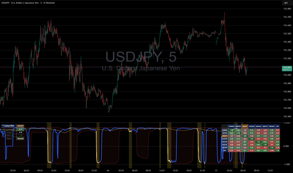
Forex Cross-Asset Correlation Mapper
Forex Cross-Asset Correlation Mapper — an indicator for tracking correlations between major currency pairs and the US Dollar Index (DXY).
The indicator automatically detects the currency pair on the current chart and calculates a rolling Pearson correlation with DXY in real time.
What it shows:
Heatmap (matrix) — visualizes correlations between all enabled pairs. Green indicates positive correlation, red indicates negative. Cells with anomalies are highlighted with a yellow marker.
Correlation plot — the dynamic correlation of the current pair with DXY over time. The yellow line represents the mean value, red dashed lines mark the normal range boundaries (±N standard deviations). When an anomaly is detected, the chart background is highlighted in yellow.
Info panel — displays the current correlation value, mean, deviation in sigma units, and status (Normal / ANOMALY).
An anomaly is triggered when the correlation moves beyond N standard deviations from its rolling mean. This signals a breakdown in the typical relationship between the pair and the dollar.
Settings: correlation period, anomaly threshold, mean calculation period, enable/disable each pair individually.
Supported pairs: EURUSD, GBPUSD, USDJPY, AUDUSD, USDCAD, USDCHF, NZDUSD + DXY (DX1!).
مؤشر
مؤشر

Volatility Visualizer Percentiles (VIXFix, ATR, VIX)Summary
A volatility regime dashboard for liquid instruments that converts three volatility lenses into 0 to 100 percentile ranks versus the last 252 closed daily bars. It is built to answer one question: is volatility unusually low or unusually high relative to the last year . Use it to adjust position sizing, stop width, and trade selectivity. It is not a directional signal.
Scope and intent
Markets : US indices and index ETFs, index futures, large cap equities, liquid crypto proxies, and other symbols where daily volatility regimes matter
Timeframes : best on Daily. It can be applied on other chart timeframes, but the reference window remains 252 closed daily bars
Default demo : SPX on Daily
Purpose : provide a simple, testable volatility context layer that you can plug into any daily system as a risk filter or risk scaler
What makes it original and useful
Most “volatility tools” show raw ATR or a single volatility index. This script standardizes three distinct sources into the same unit (percentile), so you can compare them and combine them without guessing thresholds.
Unique fusion : internal realized volatility (ATR%), internal stress proxy (VIXFix), and external implied volatility (input VIX symbol) expressed in the same 0 to 100 scale
Practical outcome : the table gives a regime read and an action posture, so the output is directly usable for risk decisions
Testable : all components are visible and thresholdable; you can backtest rules like “only trade when composite is between 30 and 75”
Portable : percentiles remove the need to hardcode market specific “ATR is high” numbers across different symbols
Method overview in plain language
Base measures
VIXFix : a price based fear proxy derived from the instrument’s own daily behavior (using the relationship between recent high closes and current lows)
ATR% : daily ATR normalized by daily close, expressed as a percentage for cross symbol comparability
External VIX : a user selected volatility index or proxy pulled via input symbol (default CBOE:VIX)
Normalization to percentiles
For each metric, the script stores the last 252 closed daily values
It then computes where the most recent closed daily value sits inside that history as a percentile from 0 to 100
Tie handling is configurable (Midrank, StrictLess, LessOrEqual) to define how repeated values are ranked
Fusion rule
Composite percentile is the simple average of the available percentiles (VIXFix, ATR%, VIX)
If one component is missing (for example the external symbol is unavailable), the composite averages the remaining components
How to use it on Daily
This tool is most effective as a risk regime layer on top of an existing strategy. Use the Composite row as the primary dial, and the individual components as confirmation.
Recommended operating zones
0–20 Very Low : quiet regime. Tight stops often survive, but breakouts can underperform. Favor mean reversion or require stronger breakout confirmation.
20–40 Low : constructive for many systems. Use baseline sizing and baseline stops.
40–60 Mid : neutral. Run your base playbook.
60–80 High : volatility expansion. Reduce size and widen stops, or trade only higher quality setups.
80–100 Very High : stress regime. Smallest size, widest stops, and skip marginal setups. Gap risk and slippage risk are higher.
How to interpret disagreements
If ATR% is high but VIX is mid , realized vol is elevated but the market is not pricing extreme fear. Treat as a caution zone, not panic.
If VIX is high but ATR% is mid , implied vol is elevated ahead of potential events. Expect expansion risk even if realized vol has not moved yet.
If all three are high , treat it as a full stress regime and enforce strict risk limits.
What you will see on the chart
A compact table with one row per metric and optional composite
For each row: last closed daily value, 252D percentile, a progress bar, and an action posture
Optional stats: min, median, max for the 252D window (useful for sanity checks, adds CPU)
Table fields quick guide
Last closed daily : the value used for ranking, taken from the last fully closed daily bar
252D percentile : where the current reading ranks versus the last 252 closed daily readings
Bar : quick visual map of percentile from 0 to 100
Action : risk posture suggestion tied to the percentile bucket
Inputs with guidance
Core
Window (closed daily bars) : default 252. Higher values make the regime slower and more structural. Lower values make it more reactive.
VIX
VIX symbol : default CBOE:VIX. You can replace it with another implied volatility proxy appropriate for your market.
VIXFix
VIXFix lookback : typical range 21/22. Smaller reacts faster, larger smooths regimes.
ATR
ATR length : typical range 10–21 on Daily
ATR as % of close : recommended on for comparability across symbols and long history
UI
Show composite volatility score : recommended on. Best single dial.
Show action guide : recommended on if you want direct posture cues.
Show min, median, max : optional. Useful for diagnostics, higher CPU.
Table position : place it where it does not cover price.
Usage recipes
Daily trend following overlay
Trade your trend system normally when Composite is between 25 and 75
If Composite is above 75, reduce size and widen stops, and require stronger trend confirmation
Daily mean reversion overlay
Focus on Composite below 40
Avoid Composite above 80 where gaps and cascading moves reduce mean reversion reliability
Daily risk parity style scaling
Use Composite percentile as a coarse risk throttle: higher percentile equals lower exposure
Example posture: 0–40 normal exposure, 40–80 reduced exposure, above 80 minimal exposure
Alerts
This script is intentionally a dashboard and does not emit buy or sell signals. If you want alerts, create them from percentile thresholds in your own fork. For conservative workflows, trigger alerts on bar close.
// Example alert conditions (add to your fork if desired)
high_vol = comp_pct > 80
low_vol = comp_pct < 20
Honest limitations and failure modes
This is not a directional predictor. Volatility can rise in both bull and bear markets.
Percentiles are relative to the last 252 closed daily bars. A “high percentile” is high versus recent history, not an absolute guarantee of future movement.
Implied volatility (VIX) can move ahead of realized volatility (ATR%). Treat divergence as information, not a signal.
Very high volatility regimes can include gap risk and slippage risk that are not visible in indicator values alone.
Legal
Education and research only. Not investment advice. You are responsible for your decisions. Test on historical data and in simulation before any live use. مؤشر

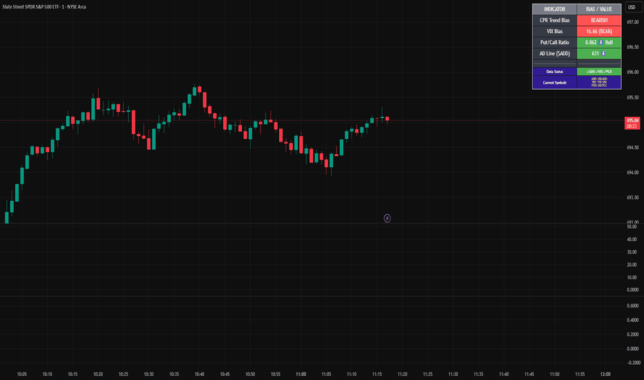
Market Internals SPY[TP]# Market Internals SPY Dashboard - TradingView Publication
## 📊 Overview
**Market Internals SPY ** is a comprehensive multi-factor market sentiment dashboard designed specifically for SPY (S&P 500 ETF) traders. This indicator combines four powerful market breadth signals into one easy-to-read interface, helping traders identify high-probability setups and avoid false breakouts.
---
## 🎯 What Makes This Indicator Unique?
Unlike single-indicator tools, this dashboard synthesizes **multiple market internals** to provide confluence-based trading signals:
- **CPR (Central Pivot Range)** - Institutional pivot levels
- **VIX (Volatility Index)** - Fear gauge
- **Put/Call Ratio** - Options sentiment with dynamic crossover alerts
- ** USI:ADD (Advance/Decline Line)** - Market breadth strength
All presented in a clean, real-time dashboard with visual alerts directly on your chart.
---
## 📈 Key Features
### 1. **Static Daily CPR Levels**
- Automatically plots Top CPR, Pivot, and Bottom CPR
- Levels remain fixed throughout the trading day (no repainting)
- **Trend Bias Indicator**: Green = Current Pivot > Previous Pivot (Bullish structure)
### 2. **Put/Call Ratio Crossover System**
- 10-period SMA smoothing for cleaner signals
- **Bullish Signal** (Green background): Put/Call crosses below SMA
- Indicates decreasing hedging activity (bullish)
- **Bearish Signal** (Red background): Put/Call crosses above SMA
- Indicates increasing hedging activity (bearish)
### 3. **Price/Breadth Divergence Detection**
- **Yellow Candles**: Highlight when price and USI:ADD diverge
- Price rising but USI:ADD falling = Potential reversal
- Price falling but USI:ADD rising = Possible bottom
### 4. **Comprehensive Real-Time Dashboard**
A top-right table displaying:
- **CPR Trend Bias**: Bullish/Bearish structure
- **VIX Level**: Current value + directional bias
- **Put/Call Ratio**: Live value + trend arrows
- **AD Line**: Breadth strength with directional indicators
### 5. **Intelligent Bar Coloring**
- **Green bars**: USI:ADD rising (breadth improving)
- **Red bars**: USI:ADD falling (breadth deteriorating)
- **Yellow bars**: Divergence warning (potential reversal)
---
## 🔧 How to Use
### Setup Instructions
1. **Add to Chart**: Apply to SPY on your preferred intraday timeframe (5m, 15m, 30m, 1H)
2. **Configure Symbols** (if needed):
- Default settings work for most platforms
- If "PCC" doesn't load, try: `PCCR`, `INDEX:PCC`, `USI:PCC`, or `CBOE:PCC`
- Ensure you have market internals data access ( USI:ADD , VIX)
### Trading Signals
#### 🟢 **Bullish Confluence** (High-Probability Long Setup)
- CPR Trend = BULLISH
- VIX falling or low (<20)
- Put/Call below SMA (or green background crossover)
- USI:ADD rising (green bars)
- **Entry**: Look for bullish price action at support levels
#### 🔴 **Bearish Confluence** (High-Probability Short Setup)
- CPR Trend = BEARISH
- VIX rising or elevated (>25)
- Put/Call above SMA (or red background crossover)
- USI:ADD falling (red bars)
- **Entry**: Look for bearish rejection at resistance
#### ⚠️ **Divergence Warning**
- Yellow candles indicate mismatch between price and breadth
- Consider profit-taking or reversals when divergence appears at extremes
### Best Practices
- **Multi-Timeframe Confirmation**: Check higher timeframes (4H, Daily) for trend alignment
- **Volume Confirmation**: Combine with volume analysis for stronger signals
- **Risk Management**: Always use stop losses; no indicator is 100% accurate
- **News Awareness**: Be cautious around major economic releases
---
## 📚 Understanding the Components
### CPR (Central Pivot Range)
Traditional floor trader pivot levels calculated from previous day's High, Low, Close:
- **Pivot (PP)** = (High + Low + Close) / 3
- **Top CPR (TC)** = (PP - BC) + PP
- **Bottom CPR (BC)** = (High + Low) / 2
### VIX (Volatility Index)
- **< 15**: Complacency, potential for sudden moves
- **15-20**: Normal conditions
- **20-30**: Elevated uncertainty
- **> 30**: High fear, potential bottoming process
### Put/Call Ratio
- **< 0.7**: Excessive optimism (contrarian bearish)
- **0.7-1.0**: Balanced sentiment
- **> 1.0**: Defensive positioning (contrarian bullish potential)
### USI:ADD (NYSE Advance/Decline)
- **> 0**: More stocks advancing than declining (bullish breadth)
- **< 0**: More stocks declining than advancing (bearish breadth)
- **Extreme readings** (±2000+): Potential exhaustion
---
## ⚙️ Customization Options
### Input Parameters
- **AD Line Symbol**: Default "ADD" (try "ADVN" or "NYSE:ADD" if needed)
- **VIX Symbol**: Default "VIX" (try "CBOE:VIX" if needed)
- **Put/Call Symbol**: Default "PCC" (alternatives listed above)
### Color Scheme
- Blue: CPR levels
- Purple: Pivot point
- Green: Bullish signals/backgrounds
- Red: Bearish signals/backgrounds
- Yellow: Divergence warnings
---
## 💡 Pro Tips
1. **Wait for Confluence**: Don't trade on a single indicator - wait for 3+ signals to align
2. **Use CPR as Dynamic S/R**: Price tends to react at TC and BC levels
3. **Watch the Crossovers**: Put/Call crossovers often precede significant moves
4. **Monitor Divergences**: Yellow candles at key levels are high-value signals
5. **Combine with Price Action**: This tool confirms direction - you still need entry triggers
---
## ⚠️ Limitations & Disclaimers
- Requires **premium data** for USI:ADD and VIX on most platforms
- Best suited for **intraday SPY trading** (may adapt to other indices)
- **Not a standalone system** - use with proper risk management
- Past performance does not guarantee future results
- Always backtest before live trading
---
## 🎓 Example Scenario
**Bullish Setup**:
- 9:45 AM EST: Price pulls back to Bottom CPR
- Dashboard shows: ✅ Bullish CPR Bias, ✅ VIX 16.5 (falling), ✅ Put/Call 0.68 ⬇️ Bull, ✅ USI:ADD +850 ⬆️
- Green background flashes (Put/Call crossunder)
- **Action**: Enter long at BC with stop below TC of previous day
---
## 📊 Ideal Timeframes
- **Primary**: 5-minute, 15-minute (day trading)
- **Secondary**: 30-minute, 1-hour (swing entries)
- **Confirmation**: Daily chart for trend context
---
## 🔄 Updates & Support
This indicator is actively maintained. If you encounter symbol loading issues:
1. Check your data provider includes market internals
2. Try alternative symbols in inputs
3. Ensure you're using a premium TradingView plan (if required)
---
## 📝 Version Information
- **Version**: 5 (Pine Script v5)
- **Type**: Overlay Indicator
- **Author**: tapaspattanaik
- **Category**: Market Internals / Breadth Analysis
---
## 🏆 Final Thoughts
This indicator is designed for **serious traders** who understand that edge comes from confluence, not single signals. By combining institutional pivot levels with real-time market internals, you gain a significant advantage in reading market sentiment and timing entries with precision.
**Remember**: The best trades happen when multiple independent factors align. Use this dashboard to find those moments.
---
## 📌 How to Add This Indicator
1. Open TradingView and navigate to Pine Editor
2. Copy the complete script code
3. Click "Add to Chart"
4. Configure symbols if needed (see Setup Instructions above)
5. Adjust position/colors to your preference
---
**Happy Trading! 📈**
*This indicator is for educational purposes. Always manage risk appropriately and never risk more than you can afford to lose.*
---
### Tags
`#SPY` `#MarketInternals` `#CPR` `#VIX` `#PutCallRatio` `#BreadthAnalysis` `#DayTrading` `#SwingTrading` `#TechnicalAnalysis` `#PivotPoints` مؤشر
EEQI [Environment Quality Index] PyraTime The Problem: Why Good Strategies Fail
The number one reason traders lose capital is not a lack of strategy—it is forced execution in poor environments.
Most indicators (RSI, MACD, Stochastic) are continuously active, generating signals even when the market is dead, choppy, or chaotic. A breakout strategy that prints money in a trend will destroy your account in a consolidation range. A mean-reversion system that works in chop will fail during a parabolic expansion.
The Solution: PyraTime EEQI The Execution Environment Quality Index (EEQI) is a "Gatekeeper" layer for your trading. It does not tell you what to buy or sell; it tells you if you should be trading at all.
By aggregating Volatility, Price Structure, and Efficiency into a single composite score, the EEQI answers the most critical question in discretionary trading: "Is the market efficient enough to deploy capital right now?"
How It Works: The 3 Core Engines
The EEQI calculates a raw "Environment Score" (from -2 to +4) by analyzing three distinct dimensions of price action.
1. Volatility Engine (Usability)
The Logic: Measures the "Alive-ness" of the market using ATR Percentiles.
The Filter: It detects "Dead Zones" (where price is too flat to hit targets) and "Chaos Zones" (where volatility is too dangerous).
Smart Feature (Parabolic Override): If price moves significantly (>2x ATR) in a single candle, the engine recognizes this as "High Momentum" rather than chaos, unlocking Green signals during breakouts.
2. Structure Engine (Bar Quality)
The Logic: Analyzes the relationship between candle bodies, wicks, and overlap.
The Filter: It penalizes "Barbed Wire" price action—candles with long wicks and high overlap—which indicate indecision and algo-chop.
The Goal: We want to trade during "Clean Flow," where candle bodies are large and overlap is low.
3. Efficiency Engine (Directional Flow)
The Logic: Compares Net Displacement (start-to-finish distance) vs. Total Distance Traveled.
The Filter: Identifies "Whipsaw" conditions where price moves a lot but goes nowhere.
Smart Feature (Velocity Lock): If price travels a massive distance quickly, the efficiency requirement is relaxed to catch explosive moves that might otherwise look "messy."
The "Smart Gatekeepers"
Even if the Core Engines look good, the EEQI applies three final safety checks before granting a PRIME status.
Regime Persistence (Stability Check): The market must hold a high score for a set number of bars (default: 1) before the signal turns Green. This prevents "fake-outs" where a single anomaly candle tricks you into entering a bad trend.
Volume Validation (Liquidity Check): Price movement without participation is a trap. The EEQI checks Relative Volume (RVOL). If volume is below average (e.g., lunch hour, holidays, or late-night sessions), the score is capped at "Fair" or "Low Vol," preventing execution in thin liquidity.
Macro Context (HTF Filter): You cannot trade against the higher timeframe. The EEQI checks the trend and volatility of the Higher Timeframe (default: Weekly). If the macro view is compressed or dead, the local signal is vetoed.
How to Read the HUD
The Dashboard (Bottom Right) gives you an instant read on the market state.
🟢 PRIME (+4): Execution Optimal. The market is trending, efficient, and backed by volume. This is the "Green Light" for your strategy.
🔵 FAIR (+1 to +3): Tradeable. Conditions are decent, but one factor (e.g., volume or structure) is imperfect. Exercise caution.
⚪ NEUTRAL (0): Indecision. The market is transitioning. Stand aside.
🟡 BUILDING: Wait. The market is good, but hasn't proven itself yet (Persistence Check).
🟠 POOR / LOW VOL: Chop. Price is messy or lacking participation.
🔴 AVOID (-2): Danger Zone. The market is either dead flat or violently chaotic. Do not trade.
Settings & Customization
The indicator comes with calibrated presets for different asset classes:
Crypto: Tolerates higher volatility and requires stronger efficiency confirmation.
Forex: Stricter dead-zone filters to handle ranging sessions.
Indices: Balanced settings for standard equity hours.
Disclaimer
This tool is designed for environment analysis only. It does not provide buy or sell signals, entry prices, or stop-losses. It is intended to be used as a filter to improve the performance of your own discretionary strategies. مؤشر

Yang-Zhang Stop Lines Yang-Zhang Stop Lines - Advanced Volatility Indicator
📊 Description
The Yang-Zhang Stop Lines is an advanced technical indicator that uses the Yang-Zhang volatility estimator to calculate dynamic stop loss and take profit levels. Unlike traditional methods such as ATR or Bollinger Bands, Yang-Zhang considers multiple components of market volatility, offering a more accurate and robust measurement.
🎯 Key Features
Superior Volatility Calculation:
Implements the complete Yang-Zhang estimator, considering overnight volatility, open-close, and Rogers-Satchell components
More accurate than traditional ATR for markets with gaps and distinct sessions
Automatically adapts to market conditions
Intelligent Levels:
Buy Stop (Green): Lower level calculated for long position protection
Sell Stop (Red): Upper level calculated for short position protection
Mirrored Levels: Additional projections based on daily amplitude
Continuous Bands: Real-time visualization of intraday volatility
Daily Anchoring:
Fixed levels calculated at the beginning of each day
Facilitates trade planning with stable references
Horizontal lines extending throughout the trading session
⚙️ Configurable Parameters
Calculation Timeframe: Defines the period for volatility analysis (default: 60min)
Period: Lookback window for statistical calculations (default: 20)
Multiplier: Adjusts level sensitivity (default: 1.0)
Base Price: Reference for stop calculations (default: close)
Visual Options: Bands, fixed lines, labels, fill, and customizable colors
💡 How to Use
For Day Traders:
Use daily fixed levels as reference for stop loss and targets
Watch for price crossovers at levels for reversal signals
Mirrored levels serve as extended targets
For Swing Traders:
Configure higher timeframes (4h, daily) for medium-term analysis
Use the multiplier to adjust to your risk/reward objectives
Combine with trend analysis and support/resistance
Risk Management:
Position stops just below/above calculated levels
Adjust position size based on amplitude
Monitor the info table to check current volatility
📈 Information Table
The indicator displays in the top-right corner:
Current Yang-Zhang Volatility (in %)
Buy Stop Level
Sell Stop Level
Calculated Amplitude
🔔 Included Alerts
Alert when price crosses Buy Stop
Alert when price crosses Sell Stop
🎨 Visual Customization
Independent colors for each element
Adjustable line width
Optional fill between bands
Optional informative labels
📝 Technical Notes
This indicator correctly implements the complete Yang-Zhang estimator formula, including:
Overnight variance
Open-close variance
Rogers-Satchell component
Optimized k weighting
Ideal for traders seeking a scientific and statistically robust approach to stop definition and volatility analysis.
Compatible with all assets and timeframes. Recommended for liquid markets. مؤشر

Toby Crabel's HisVolAs in Linda Raschke's Street smarts..... . This indicator shows the signals of Toby Crabel's Historical Volatility 6/100 strategy. The strategy assumes, that volatility contraction measured by two measures would give better results.
There is one other script that is a strategy , but it assumes that the signal requires both inside bar and narrowest range, what is not as in Linda Raschke's.
The strategy and what does the script do:
1) measures short-term unannualized volatility (by default six), long term uannualized volatility (by default 100), and measures the ratio of short volatility / long volatility.
2) checks if the current bar is an inside bar or has narrowest range out of last X bar (by default 4), or both,
3) puts an etiquette if short volatility / long volatility is equal to or smaller than 0,5 AND the day is inside bar, has narrowest range, or both.
Next day both buy-stop and sell-stop should be set. Buy-stop at the high and sell-stop at the low of the bar with etiquette.
This is by no means any financial advice, nor the historical results guarantee future gain.
مؤشر

Asset Volatility Heatmap [SeerQuant]Asset Volatility Heatmap (AVH)
AVH is a cross-sectional volatility dashboard that ranks up to 30 assets and visualizes regime shifts as a time-series heatmap.
It computes annualized historical volatility (%) on a fixed 1D basis, then maps each asset’s volatility into a configurable color spectrum for fast, intuitive scanning of risk conditions across cryptocurrencies.
⚙️ How It Works
1. Daily, Annualized Historical Volatility
Each asset is measured on a fixed 1D timeframe (independent of your chart timeframe). Volatility is annualized and expressed in percentage terms. The user can choose between 1 of 4 volatility estimators: Close-Close (log returns stdev), Parkinson (H/L), Garman-Klass or Rogers-Satchell.
2. Heatmap
A heatmap is plotted on the lower window (sorting is turned on by default). Each row represents a rank position. (Rank #1 highest vol ... Rank #30 lowest vol). This means that tokens will move between rows over time as their volatility changes. The asset labels show the current token sitting in each rank bucket. This setting can be turned off for more of a "random" look.
3. Color Scaling
The user can select how the color range is normalized for visualization.
n = (v - scaleMin) / (scaleMax - scaleMin)
Cross-Section: Scales colors using the current bar’s cross-sectional min/max across the asset list.
Rolling: Scales colors using a lookback window of cross-sectional ranges, so today’s values are judged relative to recent volatility history.
Fixed: Uses your chosen Fixed Scale Min / Max for consistent benchmarking across time.
4. Contrast Control
The Color Contrast control option changes how aggressively the palette emphasizes extremes (useful for making “risk spikes” pop vs keeping gradients smooth).
5. Summary Table + Composite Read
The table highlights the highest vol / lowest vol token, along with average / median volatility, and a simple regime read (low / medium / high cross-sectional volatility).
✨ How to Use (Practical Reads)
Spot risk-on / risk-off transitions: When the heatmap “heats up” broadly (more hot colors across ranks), cross-sectional volatility is expanding (higher dispersion / risk).
Identify which names are driving the narrative: With sorting ON, the top ranks show which assets are currently the volatility leaders — often where attention, liquidity, and positioning stress is concentrated.
Use it as a regime overlay: Low/steady colors across most ranks tends to align with calmer conditions; sharp bright bursts signal volatility events.
✨ Customizable Settings
1. Assets
30 symbol inputs (defaults to crypto, but works across markets)
2. Calculation Settings
Length (lookback)
Volatility Estimator (Close-Close / Parkinson / GK / RS)
3. Style Settings
Color Scheme (SeerQuant / Viridis / Plasma / Magma / Turbo / Red-Blue)
Color Scaling (Cross-Section / Rolling / Fixed)
Scaling Lookback (for Rolling)
Fixed Scale Min / Max (for Fixed)
Color Contrast (emphasize extremes vs smooth gradients)
Sort Heatmap (High → Low)
Gradient Legend toggle
Focus Mode (highlights the chart symbol if included)
Ticker Label Right Padding
🚀 Features & Benefits
Cross-sectional volatility at a glance (dispersion/risk conditions)
Sortable rank heatmap for tracking “who’s hot” in volatility
Multiple estimators for different volatility philosophies
Flexible normalization (current cross-section, rolling context, or fixed benchmarks)
Clean legend + summary stats for quick context
📌 Notes
Sorting changes which token appears in each row over time (rows are rank buckets).
Volatility is computed on 1D even if your chart is lower/higher timeframe.
📜 Disclaimer
This indicator is for educational purposes only and does not constitute financial advice. Past performance does not guarantee future results. Always consult a licensed financial advisor before making trading decisions. Use at your own risk. مؤشر

[GYTS] Volatility Toolkit Volatility Toolkit
🌸 Part of GoemonYae Trading System (GYTS) 🌸
🌸 --------- INTRODUCTION --------- 🌸
💮 What is Volatility Toolkit?
Volatility Toolkit is a comprehensive volatility analysis indicator featuring academically-grounded range-based estimators. Unlike simplistic measures like ATR, these estimators extract maximum information from OHLC data — resulting in estimates that are 5-14× more statistically efficient than traditional close-to-close methods.
The indicator provides two configurable estimator slots, weighted aggregation, adaptive threshold detection, and regime identification — all with flexible smoothing options via
GYTS FiltersToolkit integration.
💮 Why Use This Indicator?
Standard volatility measures (like simple standard deviation) are highly inefficient, requiring large amounts of data to produce stable estimates. Academic research has shown that range-based estimators extract far more information from the same price data:
• Statistical Efficiency — Yang-Zhang achieves up to 14× the efficiency of close-to-close variance, meaning you can achieve the same estimation accuracy with far fewer bars
• Drift Independence — Rogers-Satchell and Yang-Zhang correctly isolate variance even in strongly trending markets where simpler estimators become biased
• Gap Handling — Yang-Zhang properly accounts for overnight gaps, critical for equity markets
• Regime Detection — Built-in threshold modes identify when volatility enters elevated or suppressed states
↑ Overview showing Yang-Zhang volatility with dynamic threshold bands and regime background colouring
🌸 --------- HOW IT WORKS --------- 🌸
💮 Core Concept
The toolkit groups volatility estimators by their output scale to ensure valid comparisons and aggregations:
• Log-Return Scale (σ) — Close-to-Close, Parkinson, Garman-Klass, Rogers-Satchell, Yang-Zhang. These are comparable and can be aggregated. Annualisable via √(periods_per_year) scaling.
• Price Unit Scale ($) — ATR. Measures volatility in absolute price terms, directly usable for stop-loss placement.
• Percentage Scale (%) — Chaikin Volatility. Measures the rate of change of the trading range — whether volatility is expanding or contracting.
Only estimators with the same scale can be meaningfully compared or aggregated. The indicator enforces this and warns when mixing incompatible scales.
💮 Range-Based Estimator Overview
Range-based estimators utilise High, Low, Open, and Close prices to extract significantly more information about the underlying diffusion process than close-only methods:
• Parkinson (1980) — Uses High-Low range. ~5× more efficient than close-to-close. Assumes zero drift.
• Garman-Klass (1980) — Incorporates Open and Close. ~7.4× more efficient. Assumes zero drift, no gaps.
• Rogers-Satchell (1991) — Drift-independent. Superior in trending markets where Parkinson/GK become biased.
• Yang-Zhang (2000) — Composite estimator handling both drift and overnight gaps. Up to 14× more efficient.
💮 Theoretical Background
• Parkinson, M. (1980). The Extreme Value Method for Estimating the Variance of the Rate of Return. Journal of Business, 53 (1), 61–65. DOI
• Garman, M.B. & Klass, M.J. (1980). On the Estimation of Security Price Volatilities from Historical Data. Journal of Business, 53 (1), 67–78. DOI
• Rogers, L.C.G. & Satchell, S.E. (1991). Estimating Variance from High, Low and Closing Prices. Annals of Applied Probability, 1 (4), 504–512. DOI
• Yang, D. & Zhang, Q. (2000). Drift-Independent Volatility Estimation Based on High, Low, Open, and Close Prices. Journal of Business, 73 (3), 477–491. DOI
🌸 --------- KEY FEATURES --------- 🌸
💮 Feature Reference
Estimators (8 options across 3 scale groups):
• Close-to-Close — Classical benchmark using closing prices only. Least efficient but useful as baseline. Log-return scale.
• Parkinson — Range-based (High-Low), ~5× more efficient than close-to-close. Assumes zero drift. Log-return scale.
• Garman-Klass — OHLC-optimised, ~7.4× more efficient. Assumes zero drift, no gaps. Log-return scale.
• Rogers-Satchell — Drift-independent, handles trending markets where Parkinson/GK become biased. Log-return scale.
• Yang-Zhang — Gap-aware composite, most comprehensive (up to 14× efficient). Uses internal rolling variance (unsmoothed). Log-return scale.
• Std Dev — Standard deviation of log returns. Log-return scale.
• ATR — Average True Range in absolute price units. Useful for stop-loss placement. Price unit scale.
• Chaikin — Rate of change of range. Measures volatility expansion/contraction, not level. Percentage scale.
Smoothing Filters (10 options via FiltersToolkit):
• SMA / EMA — Classical moving averages
• Super Smoother (2-Pole / 3-Pole) — Ehlers IIR filter with excellent noise reduction
• Ultimate Smoother (2-Pole / 3-Pole) — Near-zero lag in passband
• BiQuad — Second-order IIR with configurable Q factor
• ADXvma — Adaptive smoothing, flat during ranging periods
• MAMA — MESA Adaptive Moving Average (cycle-adaptive)
• A2RMA — Adaptive Autonomous Recursive MA
Threshold Modes:
• Static — Fixed threshold values you define (e.g., 0.025 annualised)
• Dynamic — Adaptive bands: baseline ± (standard deviation × multiplier)
• Percentile — Threshold at Nth percentile of recent history (e.g., 80th percentile for high)
Visual Features:
• Level-based colour gradient — Line colour shifts with percentile rank (warm = high vol, cool = low vol)
• Fill to zero — Gradient fill intensity proportional to volatility level
• Threshold fills — Intensity-scaled fills when thresholds are breached
• Regime background — Chart background indicates HIGH/NORMAL/LOW volatility state
• Legend table — Displays estimator names, parameters, current values with percentile ranks (P##)
💮 Dual Estimator Slots
Compare two volatility estimators side-by-side. Each slot independently configures:
• Estimator type (8 options across three scale groups)
• Lookback period and smoothing filter
• Colour palette and visual style
This enables direct comparison between estimators (e.g., Yang-Zhang vs Rogers-Satchell) or between different parameterisations of the same estimator.
↑ Yang-Zhang (reddish) and Rogers-Satchell (greenish)
💮 Flexible Smoothing via FiltersToolkit
All estimators (except Yang-Zhang, which uses internal rolling variance) support configurable smoothing through 10 filter types. Using Infinite Impulse Response (IIR) filters instead of SMA avoids the "drop-off artefact" where volatility readings crash when old spikes exit the window.
Example: Same estimator (Parkinson) with different smoothing filters
Add two instances of Volatility Toolkit to your chart:
• Instance 1: Parkinson with SMA smoothing (lookback 14)
• Instance 2: Parkinson with Super Smoother 2-Pole (lookback 14)
Notice how SMA creates sharp drops when volatile bars exit the window, while Super Smoother maintains a gradual transition.
↑ Two Parkinson estimators — SMA (red mono-colour, showing drop-off artefacts) vs Super Smoother (turquoise mono colour, with smooth transitions)
↑ Garman-Klass with BiQuad (orangy) and 2-pole SuperSmoother filters (greenish)
💮 Weighted Aggregation
Combine multiple estimators into a single weighted average. The indicator automatically:
• Validates scale compatibility (only same-scale estimators can be aggregated)
• Normalises weights (so 2:1 means 67%:33%)
• Displays clear warnings when scales differ
Example: Robust volatility estimate
Combine Yang-Zhang (handles gaps) with Rogers-Satchell (handles drift) using equal weights:
• E1: Yang-Zhang (14)
• E2: Rogers-Satchell (14)
• Aggregation: Enabled, weights 1:1
The aggregated line (with "fill to zero" enabled) provides a more robust estimate by averaging two complementary methodologies.
↑ Yang-Zhang + Rogers-Satchell with aggregation line (thicker) showing combined estimate (notice how opening gaps are handled differently)
Example: Trend-weighted aggregation
In strongly trending markets, weight Rogers-Satchell more heavily since it's drift-independent:
• Estimator 1: Garman-Klass (faster, higher weight in ranging)
• Estimator 2: Rogers-Satchell (drift-independent, higher weight in trends)
• Aggregation: weights 1:2 (favours RS during trends)
💮 Adaptive Threshold Detection
Three threshold modes for identifying volatility regime shifts. Threshold breaches are visualised with intensity-scaled fills that grow stronger the further volatility exceeds the threshold.
Example: Dynamic thresholds for regime detection
Configure dynamic thresholds to automatically adapt to market conditions:
• High Threshold Mode: Dynamic (baseline + 2× std dev)
• Low Threshold Mode: Dynamic (baseline - 2× std dev)
• Show threshold fills: Enabled
This creates adaptive bands that widen during volatile periods and narrow during calm periods.
Example: Percentile-based thresholds
Use percentile mode for context-aware regime detection:
• High Threshold Mode: Percentile (96th)
• Low Threshold Mode: Percentile (4th)
• Percentile Lookback: 500
This identifies when volatility enters the top/bottom 4% of its recent distribution.
↑ Different threshold settings, where the dynamic and percentile methods show adaptive bands that widen during volatile periods, with fill intensity varying by breach magnitude. Regime detection (see next) is enabled too.
💮 Regime Background Colouring
Optional background colouring indicates the current volatility regime:
• High Volatility — Warm/alert background colour
• Normal — No background (neutral)
• Low Volatility — Cool/calm background colour
Select which source (Estimator 1, Estimator 2, or Aggregation) drives the regime display.
Example: Regime filtering for trade decisions
Use regime background to filter trading signals from other indicators:
• Regime Source: Aggregation
• Background Transparency: 90 (subtle)
When the background shows HIGH volatility (warm), consider tighter stops. When LOW (cool), watch for breakout setups.
↑ Regime background emphasis for breakout strategies. Note the interesting A2RMA smoothing for this case.
🌸 --------- USAGE GUIDE --------- 🌸
💮 Getting Started
1. Add the indicator to your chart
2. Estimator 1 defaults to Yang-Zhang (14) — the most comprehensive estimator for gapped markets
3. Keep "Annualise Volatility" enabled to express values in standard annualised form
4. Observe the legend table for current values and percentile ranks (P##). Hover over the table cells to see a little more info in the tooltip.
💮 Choosing an Estimator
• Trending equities with gaps — Yang-Zhang. Handles both drift and overnight gaps optimally.
• Crypto (24/7 trading) — Rogers-Satchell. Drift-independent without Yang-Zhang's multi-period lag.
• Ranging markets — Garman-Klass or Parkinson. Simpler, no drift adjustment needed.
• Price-based stops — ATR. Output in price units, directly usable for stop distances.
• Regime detection — Combine any estimator with threshold modes enabled.
💮 Interpreting Output
• Value (P##) — The volatility reading with percentile rank. "0.1523 (P75)" means 0.1523 annualised volatility at the 75th percentile of recent history.
• Colour gradient — Warmer colours = higher percentile (elevated volatility), cooler colours = lower percentile.
• Threshold fills — Intensity indicates how far beyond the threshold the current reading is.
• ⚠️ HIGH / 🔻 LOW — Table indicators when thresholds are breached.
🌸 --------- ALERTS --------- 🌸
💮 Direction Change Alerts
• Estimator 1/2 direction change — Triggers when volatility inflects (rising to falling or vice versa)
💮 Cross Alerts
• E1 crossed E2 — Triggers when the two estimator lines cross
💮 Threshold Alerts
• E1/E2/Aggr High Volatility — Triggers when volatility breaches the high threshold
• E1/E2/Aggr Low Volatility — Triggers when volatility falls below the low threshold
💮 Regime Change Alerts
• E1/E2/Aggr Regime Change — Triggers when the volatility regime transitions (High ↔ Normal ↔ Low)
🌸 --------- LIMITATIONS --------- 🌸
• Drift bias in Parkinson/GK — These estimators overestimate variance in trending conditions. Switch to Rogers-Satchell or Yang-Zhang for trending markets.
• Yang-Zhang minimum lookback — Requires at least 2 bars (enforced internally). Cannot produce instantaneous readings like other estimators.
• Flat candles — Single-tick bars produce near-zero variance readings. Use higher timeframes for illiquid assets.
• Discretisation bias — Estimates degrade when ticks-per-bar is very small. Consider higher timeframes for thinly traded instruments.
• Scale mixing — Different scale groups (log-return, price unit, percentage) cannot be meaningfully compared or aggregated. The indicator warns but does not prevent display.
🌸 --------- CREDITS --------- 🌸
💮 Academic Sources
• Parkinson, M. (1980). The Extreme Value Method for Estimating the Variance of the Rate of Return. Journal of Business, 53 (1), 61–65. DOI
• Garman, M.B. & Klass, M.J. (1980). On the Estimation of Security Price Volatilities from Historical Data. Journal of Business, 53 (1), 67–78. DOI
• Rogers, L.C.G. & Satchell, S.E. (1991). Estimating Variance from High, Low and Closing Prices. Annals of Applied Probability, 1 (4), 504–512. DOI
• Yang, D. & Zhang, Q. (2000). Drift-Independent Volatility Estimation Based on High, Low, Open, and Close Prices. Journal of Business, 73 (3), 477–491. DOI
• Wilder, J.W. (1978). New Concepts in Technical Trading Systems . Trend Research.
💮 Libraries Used
• VolatilityToolkit Library — Range-based estimators, smoothing, and aggregation functions
• FiltersToolkit Library — Advanced smoothing filters (Super Smoother, Ultimate Smoother, BiQuad, etc.)
• ColourUtilities Library — Colour palette management and gradient calculations مؤشر