Adaptive Reaction Zones Adaptive Reaction Zones is an adaptive price-reaction level indicator designed to automatically identify areas where the market has repeatedly reversed, slowed down, or changed direction.
Rather than plotting every local high and low, the indicator:
detects confirmed price reactions;
evaluates the quality of each reaction;
groups nearby reactions into price clusters;
ranks the resulting areas;
displays only the most relevant support and resistance levels.
The chart shows the calculated center of each identified reaction area:
🔴 Red lines represent levels above the current price.
🟢 Green lines represent levels below the current price.
Each label displays the exact level price and its percentage distance from the current market price.
🎯 Purpose of the Indicator
Adaptive Reaction Zones provides a structured map of nearby price areas that have previously generated meaningful market reactions.
The indicator can be used to:
identify nearby support and resistance areas;
measure the distance to potentially significant price levels;
plan possible profit-taking areas;
locate zones where future price behavior may require closer observation;
analyze level breakouts and potential role reversals;
create alerts for crossings of relevant price areas.
The indicator is not a standalone trading strategy and does not generate mandatory buy or sell signals.
Its purpose is to provide an objective map of historical price reactions that traders can combine with trend analysis, market structure, volume, volatility, and other forms of analysis.
⚙️ How the Algorithm Works
1. Detecting Confirmed Price Reactions
The calculation begins with confirmed local highs and lows.
Users can select one of two reaction sources:
High / Low
The algorithm analyzes the full high and low values of each candle, including its wicks.
Candle body
The algorithm uses the boundaries of the candle body and excludes the extreme wick values.
The Pivot confirmation setting determines how many bars are required on each side of a local high or low before the reaction is confirmed.
As a result, a reaction is not included in the calculations at the exact moment the extreme occurs. It is added only after subsequent bars confirm that the point was a local high or low.
A lower setting:
increases the sensitivity of the algorithm;
produces more confirmed reactions;
allows the indicator to respond to smaller local movements.
A higher setting:
selects more pronounced market extremes;
reduces the number of secondary reactions;
increases the confirmation delay.
2. Evaluating Reaction Quality
The algorithm does not treat every confirmed local high or low as equally important.
Each reaction receives an individual quality score based on two components.
Reaction Candle Structure
For a reaction from a local high, the algorithm evaluates the upper wick relative to the candle’s total range.
For a reaction from a local low, it evaluates the lower wick.
A pronounced wick may indicate that price was rejected from that area by market participants.
Subsequent Price Movement
The algorithm also measures how far price moved away from the detected extreme during the period required to confirm the reaction.
This movement is normalized using ATR, allowing reactions formed under different volatility conditions to be compared on a consistent basis.
In the final calculation, the subsequent price movement receives slightly more weight than the candle structure.
This means that an isolated or insignificant extreme receives a lower score than a reaction followed by a meaningful price move in the opposite direction.
3. Adaptive Reaction Clustering
The market rarely reacts several times at exactly the same price.
More commonly, reactions occur within the same broader price area but at slightly different values. For this reason, Adaptive Reaction Zones groups nearby reactions into adaptive price clusters.
The cluster width is not fixed. It is calculated using:
the current ATR value;
the market range over the selected lookback period;
the instrument’s minimum tick size.
The algorithm compares the width calculated from ATR with a percentage of the broader market range and uses the larger value.
This allows the clustering distance to adapt automatically to:
current volatility;
the scale of movement in the selected instrument;
the characteristics of the market and timeframe.
ATR is not used as a separate trading signal in this indicator. It is used to normalize volatility, determine the adaptive cluster width, and calculate the minimum spacing between displayed levels.
4. Calculating the Center of a Price Area
When a new reaction is confirmed, the algorithm searches for the nearest suitable cluster.
If the distance to an existing cluster is within the calculated tolerance, the reaction is added to that cluster.
If no suitable cluster exists, a new price area is created.
The center of each cluster is calculated as a weighted average of all reactions included in it.
More recent reactions receive greater weight. The influence of older reactions gradually decreases according to the Historical reaction weight setting.
For each cluster, the algorithm stores:
the number of reactions;
the combined reaction-quality value;
the upper and lower boundaries of the area;
the bar of the most recent reaction;
the number of reactions from local highs;
the number of reactions from local lows.
🧠 How Level Significance Is Evaluated
After the clusters have been created, each cluster receives a composite score.
The score is based on five main characteristics.
Number of Reactions
The more confirmed reactions that have occurred within the same price area, the higher its base significance.
Reaction Quality
Clusters containing pronounced candle rejections and stronger subsequent price movements receive a higher score.
Recency
Recent reactions receive more weight than areas that have not interacted with price for a long time.
Cluster Tightness
Reactions concentrated within a relatively narrow price range receive a higher score than reactions spread across a wider area.
Role Reversal
A cluster receives additional weight when the same price area has generated reactions from both local highs and local lows.
This allows the algorithm to recognize areas that have acted as resistance during one period and as support during another.
The significance of a level is therefore not determined by a single condition. It is based on a combination of:
repetition;
reaction quality;
recency;
cluster tightness;
historical role reversal.
📊 How Displayed Levels Are Selected
Support and resistance levels are selected independently.
Resistance levels are selected from clusters located above the current price.
Support levels are selected from clusters located below the current price.
The selection process considers:
the minimum required number of reactions;
the maximum permitted distance from the current price;
the composite cluster-quality score;
proximity to the current price;
the minimum spacing between neighboring levels.
The Proximity priority setting increases the preference given to clusters located closer to the current price.
Proximity does not replace the underlying quality score. It is added to the cluster’s base score as an additional selection factor.
The Minimum spacing setting prevents several nearly identical levels from being displayed close together.
Users can separately define the maximum number of resistance and support levels.
When fewer qualifying clusters are available, the indicator displays only the levels that meet the selected requirements rather than forcing a fixed number of lines onto the chart.
🖥 Chart Display
For every active level, the indicator displays:
the calculated center of the reaction area;
the percentage distance from the current price;
a color based on the level’s current position relative to price.
A positive percentage means that the level is above the current price.
A negative percentage means that the level is below the current price.
The percentage distance is updated dynamically as the current price changes.
Level Origin Options
From last reaction
The line begins at the most recent confirmed reaction included in the cluster.
Across chart
The line extends across the entire chart.
Users can also customize:
support and resistance colors;
line style;
line thickness;
transparency;
label position;
horizontal spacing between labels.
🔄 Why Levels May Change
Adaptive Reaction Zones is a dynamic indicator.
Whenever a new reaction is confirmed, the price clusters are recalculated.
A new reaction may:
strengthen an existing cluster;
change the calculated center of a cluster;
create a new price area;
change the ranking of previously identified areas;
cause one displayed level to be replaced by another.
The number of stored reactions is limited by the Reaction memory setting.
When older reactions move outside the selected memory limit, they are removed from the calculation.
Displayed lines should therefore not be interpreted as permanent levels that must remain unchanged on the chart.
They represent the current result of the algorithm’s analysis of the available history of confirmed price reactions.
🛠 Main Settings
Reaction Detection
Pivot confirmation
Defines the number of bars required on each side of a local reaction before it is confirmed.
Lower values increase sensitivity. Higher values select more pronounced market extremes.
Reaction memory
Defines the maximum number of recent confirmed reactions included in the calculation.
Minimum reactions
Defines the minimum number of reactions required for a price cluster to qualify as a level.
Reaction source
Selects the source used to identify reactions:
High / Low;
Candle body.
Show confirmed reactions
Displays markers for confirmed local reactions directly on the chart.
Adaptive Clustering
ATR period
Defines the ATR period used to adapt the algorithm to changing volatility.
ATR cluster width
Defines the ATR multiplier used to determine how close reactions must be to belong to the same cluster.
Market range lookback
Defines the number of bars used to calculate the broader market range.
Range cluster width
Defines the percentage of the market range used as an additional measure of cluster width.
Historical reaction weight
Controls how quickly the influence of older reactions decreases.
Lower values cause historical reactions to lose influence more rapidly.
Level Selection
Resistance levels
Defines the maximum number of displayed resistance levels.
Support levels
Defines the maximum number of displayed support levels.
Maximum distance from price
Excludes clusters located too far from the current price.
Minimum spacing
Prevents several closely positioned levels from being displayed together.
Proximity priority
Controls how strongly proximity to the current price influences the final level selection.
Premium Appearance
This section allows users to customize:
support and resistance colors;
line style;
line thickness;
line transparency;
label transparency;
label position;
spacing between labels;
the starting point of each level line.
📌 Practical Use
A conservative approach is to treat each line as the calculated center of a broader area of interest rather than as an exact price for an automatic trade entry.
When price approaches a level, traders may additionally evaluate:
candle behavior;
trend direction;
market structure;
volume;
current volatility;
the nature of the initial interaction;
a breakout and subsequent retest of the area.
To Display Fewer but More Selective Levels
Consider increasing:
Pivot confirmation;
Minimum reactions;
Minimum spacing.
To Create a More Sensitive Market Map
Consider decreasing:
Pivot confirmation;
Minimum reactions.
Higher sensitivity may also increase the number of less significant reaction areas.
For highly volatile instruments, the ATR cluster width setting may require adjustment.
For markets with broad long-term price ranges, the Range cluster width setting may have a greater influence on the calculations.
🔔 Alerts
The indicator includes two alert conditions:
price crossing above an active reaction level;
price crossing below an active reaction level.
A crossing is determined by comparing the previous bar’s closing price with the current bar’s closing price.
To receive alerts only after a candle has been confirmed, select Once Per Bar Close when creating the TradingView alert.
✨ Originality of the Method
Adaptive Reaction Zones is not a simple combination of several standard indicators.
Confirmed pivots and ATR are used only as individual components within a unified calculation process.
Pivots provide confirmed price-reaction points, while ATR allows the calculations to adapt to changing market volatility.
The core methodology follows a structured sequence:
detecting confirmed price reactions;
evaluating the quality of each reaction;
adaptively grouping nearby reactions into clusters;
weighting reactions according to their recency;
evaluating cluster tightness and historical role reversal;
calculating a composite cluster score;
selecting support and resistance levels independently;
filtering out overlapping and excessively distant levels.
The purpose of this approach is not to display every possible market extreme.
Instead, the algorithm identifies a limited number of price areas that have the highest relevance according to the combined history, quality, density, and recency of previous market reactions.
⚠️ Limitations
The indicator uses price data only and does not account for:
fundamental events;
market news;
corporate reports;
macroeconomic factors.
Confirmed pivots always appear with a delay equal to the selected Pivot confirmation value.
This delay is a necessary part of confirming a local extreme and is not a calculation error.
New reactions may change:
the composition of a cluster;
the calculated center of an area;
the ranking of a level;
the set of lines displayed on the chart.
Results may be less stable on instruments with low liquidity, large price gaps, or insufficient historical data.
A historical reaction does not mean that price will necessarily reverse from the same area in the future.
The indicator highlights algorithmically identified areas of previous price interaction, but it does not guarantee the outcome of the next interaction with a level. مؤشر

ATR Trend Band by ByblloATR Trend Band by Bybllo
This indicator plots a smoothed trend line (the "rope") that only moves once price has traveled beyond an ATR-based threshold from its last position, so small back-and-forth noise is absorbed and the line only steps in the direction of a genuine move. Around that rope line, a stepped upper/lower band tracks the highs and lows of the current directional leg, and the space between the rope and each band is filled with a true color gradient — strong color near the band, fading to transparent near the rope — so the current trend direction and its "room" are visible at a glance. When the rope's direction flips, a short transition window is highlighted with its own color and an optional cloud, so brief reversals or whipsaws are visually distinguished from an established trend.
Key Features
ATR-threshold "rope" smoother: the center line only moves once price has moved beyond (ATR length × ATR multiplier) from the line's current value, filtering out minor noise while still reacting to genuine directional moves.
Stepped upper/lower band that resets to the current high/low on a fresh directional leg and then expands to track the extremes of that leg, with the opposite band computed as rope ± the ATR threshold.
True gradient cloud fill between the rope and each band, with an adjustable steepness control for how quickly the color fades toward the rope line.
Distinct up / down / transition coloring on the rope line and the outer band lines, so the current trend direction is clear without reading numbers.
Optional transition-zone cloud that highlights the short window right after a directional flip, before the new trend is considered established.
Real-price calculation via request.security() keeps the indicator consistent regardless of chart type (Heikin Ashi, Renko, etc.).
How to Use
Treat the rope line's color and slope as the current trend direction; a color change (through the transition color) signals a potential shift in direction.
Use the stepped band as a dynamic support/resistance reference for the current leg — price re-testing the band without breaking the rope's direction can be read as a continuation, while a rope flip against the band suggests the leg may be ending.
Lower the "Gradient Steepness" input for a shorter, more intense color burst near the band edges, or raise it for a smoother gradient spread across the full band width.
Turn on "Show Transition Cloud" if you want the brief post-flip window visually flagged, which can help you avoid reacting to whipsaws immediately after a direction change.
Adjust "ATR Length" and "ATR Multiplier" together to control how sensitive the rope is: a smaller multiplier reacts faster but flips more often, while a larger multiplier is slower but more stable.
Notes
The gradient fill relies on Pine's built-in fill() gradient feature, which is supported across all account tiers (free and paid).
The transition window auto-clears after 5 bars if the rope has not resumed its prior direction, so it always reflects a short, recent window rather than an indefinitely "stuck" state. مؤشر

Volatility Squeeze Ignition [MarkitTick]💡 A multi-dimensional analytical engine designed to detect periods of extreme market consolidation and validate the subsequent directional expansion. By measuring the mathematical relationship between standard deviation and average true range, this tool identifies equilibrium zones where price action compresses and stores kinetic energy. Rather than reacting blindly to every volatility spike, the script employs a sophisticated filtration matrix that evaluates underlying volume delta, higher timeframe macro-trend alignment, directional movement strength, and immediate candlestick morphology. This creates a rigorous framework that authenticates breakout signals, ensuring that traders only focus on high-probability momentum ignitions supported by definitive market conviction.
✨ Originality and Utility
Standard volatility indicators often generate breakout signals without providing any insight into the underlying market participation or the structural validity of the move. This system distinguishes itself by integrating a state-tracking memory engine that monitors the cumulative buying and selling volume specifically during the compression phase. This continuous volume delta tracking allows the system to pre-assess the directional bias before the actual breakout materializes. Furthermore, it incorporates a dynamic risk-to-reward projection matrix mapped directly onto the chart. It calculates stop-loss zones and sequential take-profit levels based on the exact width of the preceding volatility squeeze. This creates a completely self-contained analytical environment that bridges the critical gap between signal generation and precise trade management, eliminating the need for discretionary target plotting and manual risk calculations.
🔬 Methodology and Concepts
● The Volatility Squeeze Engine
The core mechanics rely on the precise interplay between Bollinger Bands and Keltner Channels. A squeeze state is formally activated when the Bollinger Bands contract entirely within the boundaries of the Keltner Channels. This condition signifies that the market's standard deviation has fallen below its historical true range, indicating a profound period of low volatility and liquidity resting. The system mathematically locks in the exact width of the bands at the onset of this compression. An ignition signal is mathematically validated only when the price decisively breaks outside the Bollinger Bands, provided the bands have begun to expand.
● Volume Delta Profiling
While the squeeze state is active, the script meticulously aggregates the volume of up-closing bars versus down-closing bars. This builds a cumulative delta sum. When a breakout triggers, the system references this stored delta to ensure that the directional break is fully supported by the actual volume flow accumulated during the consolidation phase, preventing false breakouts engineered by low-liquidity spikes.
● Multi-Dimensional Filtering
The breakout validation process is governed by a rigorous confluence matrix:
Higher Timeframe Alignment: Evaluates a simple moving average on a higher resolution chart to ensure the breakout trades strictly in the direction of the macro trend, utilizing a secure, non-repainting data referencing architecture.
Trend Strength Evaluation: Integrates the Average Directional Index to demand a minimum trend strength threshold, actively filtering out choppy, sideways market noise.
Candlestick Morphology: Evaluates immediate, candle-by-candle price and momentum interaction. The real body of the breakout candle must constitute a specific percentage of the total high-to-low range, confirming definitive and immediate market conviction rather than relying on lagging divergences.
Volatility Expansion: Compares the current channel width against the locked width from the start of the squeeze, ensuring the breakout is accompanied by a genuine expansion in market volatility.
🎨 Visual Guide
● Chart Overlays
Active Squeeze Background: A subtle blue vertical background highlight appears when the volatility squeeze is actively compressing.
Breakout Backgrounds: A vibrant teal background signals a confirmed bullish squeeze ignition, while a vivid crimson background highlights a bearish squeeze ignition.
BB Basis Line: A solid blue line representing the central moving average of the standard deviation channel.
KC Lines: Muted, semi-transparent lines mapping the upper and lower boundaries of the true range channel.
● Trade Management UI
Entry Line: A dashed blue line marking the exact closing price of the validated breakout candle, accompanied by a dynamic price label.
Stop Loss (SL) Line: A solid, thick crimson line indicating the invalidation level. Depending on user settings, this is positioned either at the opposite channel edge or calculated via an ATR multiplier. A red translucent fill connects the Entry to the SL, visualizing the exact risk zone.
Take Profit (TP) Lines: Three distinct dashed teal lines representing sequential profit targets, derived from Fibonacci extensions of the locked squeeze width. A green translucent fill highlights the total reward zone from the Entry to TP3.
● Information Dashboard
A comprehensive heads-up display anchored to the chart corner providing real-time telemetry on the system's state:
Squeeze Status: Displays whether the compression is currently ACTIVE or OFF, alongside a graphical progress bar.
Sqz Bars: A numerical count of how long the current squeeze has been compressing.
BB Width %: A visual gauge showing the current width of the standard deviation channel relative to its basis.
Delta Bias: Highlights the dominant accumulated volume direction (BULLISH, BEARISH, or NEUTRAL) colored dynamically in teal or crimson.
R:R Metrics: Real-time calculation bars showing the exact risk-to-reward ratios for all three take-profit targets based on the current active signal.
Filter Diagnostics: Individual status readouts for HTF Trend, ADX, Body Strength, and Volume Confirmation, allowing traders to instantly see which filters are passing or failing.
📖 How to Use
● Identifying Setups
Traders should monitor the chart for the appearance of the blue active squeeze background. During this phase, direct your attention to the Dashboard to monitor the "Delta Bias" and "Sqz Bars" count. A longer squeeze accompanied by a strong, building Delta Bias indicates a high-probability impending breakout. Wait for a confirmed candle close that breaks the channel limits, triggering the vibrant teal or crimson background.
● Managing Trades
Once an ignition signal fires, the script automatically projects the entry, stop-loss, and three take-profit levels. Traders can use the SL line to place their initial protective stop. As price approaches TP1, traders may consider scaling out a portion of their position and trailing their stop loss to the Entry line to secure a risk-free trade. The graphical risk and reward fills visually assist in quickly assessing if the projected trade meets your personal risk parameters before execution.
⚙️ Inputs and Settings
● Core Parameters
BB Range: Defines the calculation range for the standard deviation channel.
BB Mult: The standard deviation multiplier determining the width of the outer bands.
KC Range: Defines the calculation range for the average true range channel.
KC Mult: The multiplier dictating the width of the Keltner Channels.
Min Squeeze Bars: The absolute minimum number of consecutive compressed bars required before a valid ignition can be fired.
● Filters
Require Volume Confirmation: Toggles the volume delta tracking engine.
HTF Trend Filter: Activates the macro-trend alignment requirement, preventing counter-trend breakout signals.
ADX Trend Strength Filter: Enables a strict momentum threshold requiring the market to be actively trending.
Candle Body Strength Filter: Enforces a structural rule where the breakout candle's body must meet a minimum size relative to its wicks.
● Trade Tools & Alerts
SL Mode: Allows traders to select between a structural stop loss at the opposite channel edge or a volatility-based ATR stop.
TP1, TP2, TP3 Fib: Customizable Fibonacci multipliers that project the profit targets based on the original width of the market squeeze.
Dashboard Settings: Toggles the visibility and positional anchoring of the telemetry table.
Alert Actions: Advanced JSON-formatted string inputs allowing traders to define precise webhook payloads for entries, exits, and target hits, enabling seamless automated execution.
🔍 Deconstruction of the Underlying Scientific and Academic Framework
● Volatility Compression Theory
The fundamental architecture of this script is rooted in the cyclical nature of market volatility, which oscillates continuously between periods of extreme contraction and aggressive expansion. By cross-referencing standard deviation against an absolute measure of true range, the algorithm quantitatively identifies the inflection points where liquidity providers pull back and the market reaches a state of unnatural equilibrium. The mathematical locking of the channel width captures the precise kinetic energy stored during this phase, applying principles of mean reversion and standard deviation expansion to project the statistical probability of the ensuing vector move.
● Order Flow and Delta Mechanics
To move beyond simple price derivatives, the system incorporates an approximated order flow model through its volume delta profiling. By segmenting traded volume into up-closing and down-closing aggregates during the compression state, the script builds a proxy for aggressive market participation. This mechanism relies on Auction Market Theory, assessing the imbalance between aggressive buyers lifting the offer and aggressive sellers hitting the bid. When the mathematical breakout aligns with the underlying delta accumulation, the script confirms that the price displacement is driven by genuine institutional or macroscopic participation, significantly reducing the statistical likelihood of a mean-reverting liquidity sweep.
⚠️ Disclaimer
All provided scripts and indicators are strictly for educational exploration and must not be interpreted as financial advice or a recommendation to execute trades. We expressly disclaim all liability for any financial losses or damages that may result, directly or indirectly, from the reliance on or application of these tools. Market participation carries inherent risk where past performance never guarantees future returns, leaving all investment decisions and due diligence solely at your own discretion. مؤشر

Buy Sell Badge with DMI by ByblloBuy Sell Badge with DMI by Bybllo
At its core, this indicator combines two independent Buy/Sell signal sources into one badge system: (1) a basic Fast/Slow EMA crossover ("BSB"), and (2) a DMI-based signal built from the golden cross (DI+ crossing above DI-) and dead cross (DI- crossing above DI+) of the Directional Movement Index, filtered by a minimum ADX threshold.
The EMA crossover generates the base Buy/Sell signal, then automatically manages an ATR-based stop loss and a risk:reward-based take profit for each signal, showing the resulting entry/stop/target levels directly on the chart along with a live status table. The DMI golden-cross / dead-cross engine can be enabled as a confirmation filter on top of that: when turned on, a badge is only shown if a matching DMI cross (with ADX above a configurable threshold) occurs within a set number of bars of the EMA signal. In practice, this acts as a noise-reduction filter — choppy, low-conviction EMA crossovers with no matching directional strength behind them are suppressed, so only badges backed by both a trend-following signal and a directional-strength signal are actually displayed.
Key Features
Fast/Slow EMA crossover generates the base Buy/Sell signal, with an optional candle-confirmation requirement (close beyond open in the signal direction).
Automatic ATR-based stop loss and configurable Risk:Reward take profit are calculated for every new signal, with intermediate take-profit levels plotted when Risk:Reward is greater than 1.
Optional "BSB + DMI" confirmation filter: a badge is only shown when a DMI golden cross or dead cross, confirmed by ADX above your threshold, occurs within a configurable bar window of the EMA signal, in either order. This suppresses noisy, low-conviction EMA crossovers and leaves only the badges that are backed by both signals.
On-chart entry / stop-loss / take-profit lines and an SL distance (in points) label, both toggleable and only shown while a badge has actually been displayed for the active position.
Take-profit, stop-loss, and "invalidated" (opposite signal fired before target/stop was hit) markers are plotted separately so you can see exactly how each trade idea played out.
A live status table (top-right) shows the current position, entry, stop loss, take profit, and realized Risk:Reward.
Real-price calculation via request.security() keeps signals consistent regardless of chart type (Heikin Ashi, Renko, etc.).
A full set of alertcondition() calls for BSB-only signals, BSB+DMI confirmed signals, take-profit hits, stop-loss hits, and invalidated entries.
How to Use
Leave "BSB + DMI" unchecked to use the EMA crossover badges on their own (fastest signals, no directional-strength filter).
Check "BSB + DMI" to require that a DMI golden cross (for Buy) or dead cross (for Sell), confirmed by ADX, also occurs near the EMA signal — this filters out noise and typically reduces the number of badges, but favors signals that also have directional strength behind them.
Watch the on-chart entry/SL/TP lines and the status table to track an open idea's risk and progress in real time.
Set up alerts on the "BSB+DMI Buy/Sell", "Buy/Sell Signal", "Take Profit Hit", "Stop Loss Hit", or "Entry Invalidated" conditions depending on which events you want to be notified about.
Notes
The "EMA Badge Spacing" and "DMI Badge Spacing" inputs each apply their own cooldown to prevent duplicate signals firing on consecutive bars; keep the DMI spacing aligned with the badge spacing you use on other DMI-based indicators if you compare them side by side.
Stop-loss and alert-sensitivity offsets are point-based and will need adjusting per instrument (see the tooltips on those inputs).
This indicator does not place real orders; it is a visual / alerting tool for tracking a rules-based EMA + DMI golden-cross/dead-cross trade idea. مؤشر

Rolling Trend Pointer. Identify the True Market TrendRolling Trend Pointer is designed to provide an objective assessment of market direction, confirm trending conditions, and filter trading signals that occur in weak or conflicting market environments. Instead of relying on a conventional moving average, the indicator analyzes price position relative to VWAP, trading volume, the statistical magnitude of price deviations, the slope of Anchored VWAP, and directional agreement across multiple calculation periods.
Its main advantage is that it does not simply show whether price is above or below an average line. It evaluates the current trend direction, the strength of the active price impulse, and the degree of agreement between short-term price behavior and the broader volume-weighted market direction.
Two Indicators Combined into One
Rolling Trend Pointer combines two interconnected indicator components:
1. "Rolling VWAP Trend Pointer", displayed in a separate indicator panel below the chart.
2. "Monthly Anchored VWAP with Multi-Period Confirmation", displayed directly on the main price chart.
The first component measures the current deviation of price from a rolling VWAP and determines whether the movement is statistically significant.
The second component determines the broader market direction based on the slope of the Monthly Anchored VWAP. It can also confirm that direction using Quarterly, Semiannual, and Annual Anchored VWAP calculations.
The "Synchronized Mode" checkbox connects both components into a single trend-confirmation system. When synchronization is enabled, the background fill on the main chart appears only when the Anchored VWAP direction agrees with the direction of the Rolling VWAP histogram.
Part 1: Rolling VWAP Trend Pointer
The first component is displayed in a separate indicator panel and consists of:
* a green and red histogram;
* an upper positive boundary;
* a lower negative boundary;
* a zero line;
* a colored background indicating a strong breakout beyond the corresponding boundary.
The calculation is based on a Rolling VWAP, which is a volume-weighted average price calculated over the selected number of bars.
After calculating the VWAP, the indicator measures the distance between price and the VWAP:
* positive values are generated when price is positioned above the VWAP;
* negative values are generated when price is positioned below the VWAP.
The green histogram represents positive price deviation from the Rolling VWAP. The red histogram represents negative deviation.
The larger the absolute histogram value, the further price has moved away from its current volume-weighted center.
Separate Positive and Negative Boundary Calculations
The upper and lower blue boundary lines are calculated independently.
The upper boundary uses only historical values above zero. It is designed to evaluate positive deviations and bullish price impulses.
The lower boundary uses only historical values below zero. The indicator analyzes the absolute magnitude of these negative deviations and then returns the calculated boundary to the negative area.
As a result, the lower boundary is not simply a mirrored version of the upper boundary. Each side adapts independently to the historical characteristics of bullish and bearish price movements.
This distinction is important because upward and downward volatility are often structurally different. Declines may occur quickly and aggressively, while bullish movements may develop more gradually and persist for longer periods.
Using separate calculations allows the indicator to adapt to this asymmetry instead of assuming that positive and negative price behavior is identical.
Detecting Strong Price Impulses
When the histogram remains between the two blue boundaries, the price deviation is considered normal for the current market environment.
When the positive histogram rises above the upper boundary, the indicator identifies a strong bullish impulse. The background of the separate indicator panel becomes green.
When the negative histogram falls below the lower boundary, the indicator identifies a strong bearish impulse. The background becomes red.
A boundary breakout should not automatically be treated as an independent entry signal. It indicates that the current movement has become significantly stronger than the price deviations recently observed in the instrument.
Part 2: Monthly Anchored VWAP
The second component is displayed directly on the main price chart.
It includes:
* the Monthly Anchored VWAP;
* upper and lower statistical bands;
* a VWAP line color based on its slope;
* a colored fill between the VWAP bands;
* optional confirmation from Quarterly, Semiannual, and Annual Anchored VWAP calculations.
The Monthly VWAP calculation resets at the beginning of every calendar month.
Unlike the Rolling VWAP, which uses a continuously moving lookback window, the Monthly Anchored VWAP accumulates price and volume data from the beginning of the current month.
When the Monthly VWAP slope is positive, the central line becomes green.
When the Monthly VWAP slope is negative, the central line becomes red.
The upper and lower bands are calculated using the volume-weighted standard deviation of price around the Monthly VWAP. These bands create a dynamic range that reflects the current price structure and volatility within the month.
Multi-Period Trend Confirmation
By default, the trend direction is determined by the Monthly Anchored VWAP.
The following additional confirmation periods can be enabled in the settings:
* "Use Quarterly VWAP Confirmation"
* "Use Semiannual VWAP Confirmation"
* "Use Annual VWAP Confirmation"
The additional confirmation periods use AND logic.
For example, when Quarterly and Annual confirmation are enabled, a bullish trend will be confirmed only when the Monthly, Quarterly, and Annual VWAP slopes are all positive at the same time.
A bearish trend will be confirmed only when all enabled VWAP periods have negative slopes.
The more confirmation periods that are enabled, the stricter the trend filter becomes.
This reduces the number of confirmed trend conditions but increases the degree of agreement across different market horizons.
Synchronized Mode
The "Synchronized Mode" setting is one of the main features of the indicator.
When synchronization is disabled, the fill between the VWAP bands on the main chart is determined only by the Monthly Anchored VWAP direction and the selected additional confirmation periods.
When synchronization is enabled, two conditions must be satisfied simultaneously:
* the Anchored VWAP direction must be confirmed;
* the Rolling VWAP histogram must be positioned on the corresponding side of the zero line.
A green fill requires:
* bullish Anchored VWAP confirmation;
* a positive Rolling VWAP histogram.
A red fill requires:
* bearish Anchored VWAP confirmation;
* a negative Rolling VWAP histogram.
When the two indicator components point in opposite directions, the background fill disappears.
This indicates that there is no complete agreement between the current price impulse and the broader Anchored VWAP trend.
How to Interpret the Background Color on the Main Chart
The background fill between the Monthly Anchored VWAP bands is one of the most important visual elements of the indicator.
Particular attention should be paid to both the color and intensity of this background.
A light green fill indicates a confirmed bullish trend.
A stronger green fill indicates a confirmed bullish trend combined with a strong positive histogram breakout above the upper statistical boundary.
A light red fill indicates a confirmed bearish trend.
A stronger red fill indicates a confirmed bearish trend combined with a strong negative histogram breakout below the lower statistical boundary.
No background fill means that the indicator has not detected a synchronized directional condition.
This may occur during:
* sideways market conditions;
* transitional periods;
* weakening trends;
* disagreement between the Rolling VWAP component and the Anchored VWAP component;
* disagreement between the enabled Anchored VWAP confirmation periods.
The background color therefore represents the confirmed trend direction, while its intensity indicates whether the trend is also accompanied by an unusually strong statistical price impulse.
Rolling Trend Pointer Settings
VWAP Length
This setting determines the amount of positive and negative historical observations used to calculate the Rolling VWAP environment and the adaptive channel boundaries.
A lower value makes the indicator more responsive to recent market changes but may produce more frequent directional changes.
A higher value creates more stable statistical boundaries but causes the indicator to adapt more slowly when volatility conditions change.
The default value is "200".
Band Multiplier
This setting controls the distance between the zero line and the independent positive and negative boundaries.
A lower value moves the boundaries closer to zero and increases the number of detected breakouts.
A higher value moves the boundaries further away from zero and filters out weaker movements, leaving only stronger price impulses.
The default value is "0.5".
Channel Mode
Two channel calculation modes are available.
Current VWAP Variance
This mode uses the current volume-weighted variance of the positive and negative samples.
It adapts more quickly to the current distribution and volatility structure of the market.
Channel Width
This mode uses the historical variance of deviations from the corresponding positive and negative mean values.
It evaluates the established width of the distribution based on accumulated historical residuals.
For most trend-detection applications, testing should begin with "Current VWAP Variance".
Histogram Smoothing
The following histogram smoothing methods are available:
* None;
* SMA;
* EMA;
* WMA;
* RMA.
Smoothing reduces small histogram fluctuations and limits unnecessary directional changes around the zero line.
It is important to understand that smoothing is applied to the displayed histogram and to the histogram breakout conditions.
The statistical upper and lower boundaries continue to be calculated from the original positive and negative observations.
Histogram Smoothing Length
This setting controls the length of the selected histogram smoothing method.
A lower value preserves responsiveness.
A higher value produces a more stable histogram but increases calculation lag.
The default value is "10".
Synchronized Mode
This checkbox synchronizes the Rolling VWAP Trend Pointer with the Monthly Anchored VWAP component.
When enabled, the background fill on the main price chart appears only when both components agree on the market direction.
For normal visual analysis, this setting should generally remain enabled.
Show Breakout Background
This setting enables or disables the green and red background in the separate indicator panel when the histogram moves beyond its corresponding statistical boundary.
Monthly Anchored VWAP Settings
VWAP Source
This setting determines the price source used for the Anchored VWAP calculation.
The default source is "HLC3", which represents the average of the high, low, and close prices.
Band Multiplier
This setting determines the width of the upper and lower bands around the Monthly Anchored VWAP.
A lower value produces a narrower range.
A higher value produces a wider range and includes more substantial price deviations.
VWAP Slope Length
This setting determines the number of bars used to evaluate the direction of the VWAP slope.
A lower value reacts more quickly to changes in direction but may create more frequent trend switches.
A higher value produces a more stable trend direction but introduces additional delay.
The default value is "2".
Line Width
This setting changes the thickness of the Monthly Anchored VWAP line and its upper and lower bands.
Show VWAP Bands
This setting enables or disables the display of the upper and lower Monthly Anchored VWAP bands.
Use Quarterly VWAP Confirmation
When enabled, the Monthly VWAP direction must agree with the Quarterly Anchored VWAP direction.
Use Semiannual VWAP Confirmation
When enabled, the Monthly VWAP direction must agree with the Semiannual Anchored VWAP direction.
Use Annual VWAP Confirmation
When enabled, the Monthly VWAP direction must agree with the Annual Anchored VWAP direction.
Trend Direction Output for Strategy Integration
The indicator outputs the detected trend direction through a separate numerical variable called `trend_dir`.
This variable can be selected as an external data source and connected to other TradingView indicators or strategies.
The output ranges from "−2 to +2".
Possible values are:
* "+2" — confirmed strong bullish trend with a bullish histogram breakout;
* "+1" — confirmed bullish trend without a strong histogram breakout;
* "0" — neutral, conflicting, or unsynchronized market condition;
* "−1" — confirmed bearish trend without a strong histogram breakout;
* "−2" — confirmed strong bearish trend with a bearish histogram breakout.
This structure allows the indicator to be used not only for visual market analysis but also as a systematic trend filter inside automated trading strategies.
For example, a strategy can:
* allow long positions only when `trend_dir` equals +1 or +2;
* allow short positions only when `trend_dir` equals −1 or −2;
* disable entries during neutral conditions;
* test the neutral value separately;
* apply different trend requirements to long and short trades;
* distinguish between regular trends and statistically strong trend impulses.
My Strategy Test Results
In my case, the strategy produced the highest long-trade win rate when the value "+1" was used as the trend filter for long entries.
For short trades, the best result was obtained when the value "0" was used.
This means that long entries performed best during a confirmed bullish trend that was not accompanied by an extreme positive histogram breakout.
Short entries performed best during neutral or unsynchronized market conditions rather than during an already confirmed bearish impulse.
The value "0" is not inherently bearish.
It indicates that the indicator has not detected complete directional agreement between its components.
These results apply to the specific strategy, instrument, timeframe, settings, and historical period that were tested.
Each of the five `trend_dir` states should be tested independently before being applied to another strategy or market.
Practical Applications
Rolling Trend Pointer can be used for:
* identifying the main market direction;
* filtering entries against the prevailing trend;
* confirming breakout conditions;
* avoiding trades during conflicting market states;
* separating regular trends from strong trend impulses;
* providing an external trend variable to automated strategies;
* optimizing different filters for long and short positions;
* identifying periods of agreement between short-term momentum and broader volume-weighted direction.
For visual trading, it is recommended to keep "Synchronized Mode" enabled and focus primarily on the fill between the Monthly Anchored VWAP bands on the main chart.
A green or red fill indicates a synchronized directional condition.
A stronger fill indicates that the synchronized trend is also supported by a statistically significant histogram breakout.
The absence of a fill indicates that the current impulse and the broader Anchored VWAP direction are not fully synchronized.
Use Rolling Trend Pointer to identify market direction, filter weak signals, and connect an objective trend state to your trading strategies.
مؤشر

Percentile Context [RC Tools]RC Tools — Percentile Context
─────────────────────────────────────────────────────────────
█ OVERVIEW
Not "is RSI over 70" — "where does today's reading actually sit in its own history?" This tool takes a metric of your choice (realised volatility, RSI, volume, rate of change, or any custom source you plug in) and ranks it as a percentile against its own trailing distribution. It's the statistical primitive underneath most technical analysis, made explicit instead of buried in a fixed threshold.
█ WHAT IT DOES
Plots a 0–100 percentile-rank line for the selected metric, flags "extreme" zones (default: below the 10th percentile or above the 90th), and shows a stats table with the current value, current percentile, all-time min/max seen on the chart, and how many bars it's been since the metric last hit either extreme.
█ THE THEORY BEHIND IT
Fixed thresholds ("RSI > 70 = overbought") assume a metric's meaningful range never changes. It does — across assets, and across time on the same asset. A percentile rank fixes this by asking a relative question instead of an absolute one: given everything this metric has done over its own trailing window, how unusual is today's reading? This is the same idea underneath the Regime Classifier's volatility-state measure, generalised to any metric.
█ HOW IT IS CALCULATED
The selected metric is computed per bar:
• Realised Volatility: stdev(log(close/close ), N)
• RSI: standard Wilder RSI
• Volume: raw bar volume
• Rate of Change %: (close − close ) / close × 100
• Custom Source: whatever series you plug into the source input (e.g. another indicator's plot)
The metric is then percentile-ranked against its own trailing window (default 750 bars ≈ 3 years on daily): what percentage of the last N readings were below today's value. Display values update ONLY on confirmed bar close — nothing here repaints.
█ SETTINGS & CONFIGURATION
• Metric (default Realised Volatility) — what gets ranked
• Custom Source — only used when Metric = Custom Source
• Realised Volatility / RSI / Rate of Change lookbacks (defaults 20 / 14 / 20)
• Percentile Ranking Window (default 750 bars) — longer = more stable, needs more history
• Low / High Extreme Thresholds (default 10 / 90)
• Paint Main Chart Background — off by default to avoid clashing with the Regime Classifier's background if you run both at once
█ HOW TO USE IT
Use it to calibrate how seriously to take a "normal" indicator reading. Example: RSI at 75 means something different on a stock that's rarely above 60 than on one that regularly touches 85 — the percentile rank makes that comparison explicit for the SAME asset over time. Also useful for volatility context ahead of position sizing: current realised vol at the 95th percentile is a different risk environment than the same absolute vol reading at the 40th percentile.
Works on any asset and timeframe with sufficient history for the percentile window.
█ LIMITATIONS
• Percentile rank describes the past relative to itself — it says nothing about direction or what happens next. A metric at its 99th percentile can stay there.
• Needs substantial history for a stable ranking. On short-history assets, treat the percentile as unreliable.
• "Extreme" is relative to the metric's OWN range. A percentile extreme on a low-volatility asset is not directly comparable in absolute terms to one on a high-volatility asset — that's the point of the tool, but it means percentiles aren't comparable across symbols.
• All-time min/max and "bars since" stats are only as long as the chart's available history, not a fixed universal record.
• This script does NOT repaint. Display values update on confirmed bar close only.
█ DISCLAIMER
For educational and informational purposes only. Nothing here is financial advice. Past behaviour of any metric does not indicate future results. Trade at your own risk.
مؤشر

Trend Context Trend Context is a market-regime indicator designed to help traders identify whether the current market environment is predominantly bullish, bearish, or neutral.
Rather than relying on a single moving-average crossover or momentum oscillator, the indicator combines several normalized market characteristics into one composite regime model:
• Price location relative to an adaptive baseline
• Direction and strength of the baseline slope
• Recent price momentum
• Position within the recent trading range
• Directional efficiency
• Current volatility relative to its historical average
The objective is not to predict the next candle. Trend Context is designed to provide structured directional context that can be used as a market filter, confirmation layer, or visual framework for an existing trading strategy.
✦ Core Concept
Not every movement above or below a moving average represents a meaningful trend.
Markets frequently move in an irregular, inefficient manner, producing price fluctuations without sustained directional progress. Trend Context evaluates both the direction of price movement and the quality of that movement before confirming a new market regime.
A directional state is activated only when several independent components support the same conclusion.
This helps reduce unnecessary regime changes caused by isolated candles or short-term market noise.
⚙️ How the Indicator Works
1. Directional Efficiency
The indicator first measures how efficiently price has moved over the selected lookback period.
Directional efficiency compares:
• The absolute distance between the current price and the price at the beginning of the measurement period
• The sum of all individual price changes during that same period
A value closer to 1 indicates a relatively direct movement.
A value closer to 0 indicates that price has moved back and forth without making meaningful directional progress.
Directional efficiency influences both the adaptive baseline and the confidence applied to the final regime score.
2. Adaptive Baseline
Trend Context calculates a fast exponential moving average and a slow exponential moving average.
The directional-efficiency value determines how these two averages are blended:
• During efficient directional movement, the baseline shifts closer to the faster average
• During noisy or inefficient movement, the baseline remains closer to the slower average
The blended value is then smoothed again to reduce unnecessary fluctuations.
This creates a baseline that can respond more quickly during directional conditions while remaining more stable during irregular or sideways markets.
3. Volatility-Adjusted Context Zone
The indicator creates an upper and lower context boundary around the adaptive baseline.
The width of this zone is based on Average True Range, or ATR. It is also adjusted by comparing current ATR with its average value over the selected volatility lookback period.
This adjustment is bounded to prevent unusually quiet or volatile conditions from producing excessively narrow or wide zones.
As a result:
• The context zone expands as volatility increases
• The context zone contracts as volatility decreases
The active boundary provides a visual representation of the current directional context. It should not be interpreted as guaranteed support or resistance.
📊 Composite Regime Score
The market regime is calculated using four normalized components.
Price Location
Measures how far price is positioned above or below the adaptive baseline.
The distance is normalized by ATR so that the calculation remains comparable across instruments with different prices and volatility levels.
Baseline Slope
Measures whether the adaptive baseline is rising or falling.
The slope is normalized using ATR and the selected slope period.
Momentum
Measures the change in price over the selected momentum period.
This component is also normalized by ATR.
Range Position
Measures where the current price is located within its recent high-to-low range.
A position near the upper part of the range supports a bullish regime, while a position near the lower part supports a bearish regime.
The four components are combined using configurable weights. The resulting value is then adjusted by directional efficiency.
The final regime score is constrained between -1 and +1:
• Positive values support a bullish regime
• Negative values support a bearish regime
• Values close to zero indicate an uncertain or neutral environment
◇ Confirmed Three-State Regime Model
Trend Context uses three market states:
UP
NEUTRAL
DOWN
UP Regime
An UP regime requires:
• The composite score to exceed the activation threshold
• Price to remain above the adaptive baseline
• Directional efficiency to meet the minimum requirement
• The conditions to remain valid for the selected number of confirmation bars
DOWN Regime
A DOWN regime requires:
• The composite score to move below the negative activation threshold
• Price to remain below the adaptive baseline
• Directional efficiency to meet the minimum requirement
• The conditions to remain valid for the selected number of confirmation bars
Neutral Regime
The indicator returns to a neutral state when the absolute regime score remains inside the defined neutral zone for the required number of bars.
Regime transitions and UP/DOWN labels are confirmed only after the candle closes.
This confirmation process is intended to reduce rapid state changes caused by individual candles.
🎯 Visual Interpretation
UP Context
During an UP regime:
• The lower context boundary is displayed
• The area between price and the lower boundary is highlighted with the selected UP color
• An optional UP label appears when the regime changes into the bullish state
The active lower boundary represents bullish market context. It is not an automatic entry level or guaranteed support zone.
DOWN Context
During a DOWN regime:
• The upper context boundary is displayed
• The area between price and the upper boundary is highlighted with the selected DOWN color
• An optional DOWN label appears when the regime changes into the bearish state
The active upper boundary represents bearish market context. It is not an automatic entry level or guaranteed resistance zone.
Neutral Context
During a neutral regime, neither directional ribbon is active.
This means that the combined calculations do not currently provide sufficient evidence for a confirmed bullish or bearish market state.
How to Use Trend Context
Directional Filter
The indicator can be used to filter trades according to the active market regime.
For example:
• Consider bullish setups while the indicator is in the UP state
• Consider bearish setups while the indicator is in the DOWN state
• Reduce directional exposure or wait for additional confirmation during neutral conditions
Trend Context is not a complete entry system. Entry timing, stop-loss placement, position sizing, and profit targets must be defined separately.
Pullback Context
The active boundary and ribbon can help traders assess pullbacks within the current directional regime.
A return toward the active context zone is not an automatic trade signal.
It may be combined with:
• Market structure
• Support and resistance
• Candlestick confirmation
• Volume analysis
• A separate execution model
Higher-Timeframe Context
Trend Context can also be applied to a higher timeframe to identify the broader market regime while entries are managed on a lower timeframe.
Because market behaviour differs between instruments and timeframes, settings should be tested on the specific market being traded.
⚙️ Main Settings
Adaptive Baseline
Price Source
Selects the price series used in the calculations.
Fast Smoothing Length
Controls the faster exponential moving average.
Slow Smoothing Length
Controls the slower exponential moving average.
Efficiency Measurement Length
Defines the period used to measure directional efficiency.
Final Baseline Smoothing
Controls the final smoothing applied to the adaptive baseline.
Regime Model
Volatility Length
Sets the ATR calculation period.
Volatility Context Length
Defines the period used to compare current ATR with its historical average.
Baseline Slope Length
Controls the period used to calculate the baseline slope.
Momentum Length
Defines the period used for the momentum component.
Range Position Length
Sets the recent high-to-low range used in the range-position calculation.
Context Zone Multiplier
Controls the width of the volatility-adjusted context zone.
Regime Activation Threshold
Determines how strong the composite score must be before a directional regime can be activated.
A higher value produces fewer and more selective regime changes. A lower value increases sensitivity.
Neutral Zone Threshold
Defines how close the composite score must be to zero before the market can return to a neutral state.
Minimum Directional Efficiency
Prevents directional states from being activated when price movement is considered too inefficient.
Direction Confirmation Bars
Defines how many consecutive confirmed bars are required before an UP or DOWN state is activated.
Neutral Confirmation Bars
Defines how many consecutive bars inside the neutral zone are required before the indicator returns to a neutral state.
Component Weights
The indicator allows users to adjust the relative contribution of:
• Price location
• Baseline slope
• Momentum
• Range position
The total weight is normalized automatically, so the settings represent the relative importance of each component.
Visual Settings
Users can independently control:
• UP, DOWN, and neutral colors
• Trend ribbon visibility
• Active boundary visibility
• Adaptive baseline visibility
• Baseline visibility during neutral conditions
• Price-bar coloring
• UP and DOWN transition labels
🔔 Alerts
Alert conditions are available for:
• A confirmed transition into the UP regime
• A confirmed transition into the DOWN regime
These alerts indicate a change in market context. They should not be interpreted as automatic buy or sell orders.
Important Limitations
Trend Context is a reactive indicator based on historical price and volatility data. It does not predict future prices.
Like all trend and market-regime tools, it may react with a delay after sudden reversals and may produce repeated state changes during sideways or unstable conditions.
Increasing the activation threshold, minimum directional efficiency, or confirmation-bar settings may reduce sensitivity, but it will also delay regime transitions.
Decreasing these values will make the indicator respond faster, but may increase the number of short-lived or false regime changes.
Trend Context should be used together with independent risk management, position sizing, and trade validation.
This indicator is provided for analytical and educational purposes and does not constitute financial advice. مؤشر

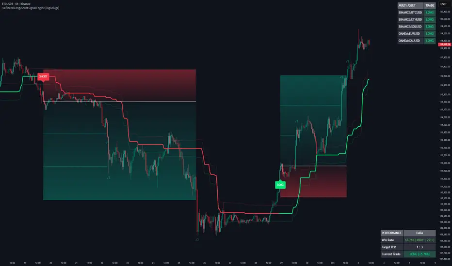
HalfTrend Long/Short Signal Engine [BigBeluga]HalfTrend Long/Short Signal Engine is an institutional-grade trend tracking toolkit built for TradingView. It filters out minor market noise to deliver definitive, non-repainting long and short entry signals based on asset volatility and structural swing pivots.
Instead of displaying standard lag-heavy moving averages, this system uses an adaptive directional engine to lock onto clean trend lines and overlay automatic risk-management matrices directly onto your chart. It calculates real-time win rates and scans multiple assets simultaneously so you can trade with systematic statistical backup.
🔵 MAIN ENGINE & MARKET CALCULATION MECHANICS
1. Pure HalfTrend Price Filter Matrix
Swing Pivot Trackers: The engine scans local high and low data using an adjustable lookback filter ( Amplitude ) to find actual structural swing points rather than temporary price spikes.
Volatility-Adjusted Bands: It establishes dynamic outer channel boundaries using a 100-period Average True Range calculation divided by two ( ATR/2 ). The total channel width automatically scales using your custom risk buffer parameter ( Channel Deviation ).
Regime Flip Architecture: The system locks into a Bullish Regime when price crosses above structural highs, shifting the main tracking baseline to Green. When price slips below structural lows, it forces a Bearish Regime and changes the tracking baseline to Red.
2. Automated Risk Matrix & Multi-Asset Scanner
Algorithmic Trade Execution: The moment a new trend regime initializes, the engine projects a strict trade tracking matrix showcasing an entry line, a clear stop-loss boundary, and three tiered profit targets (TP1, TP2, and TP3).
Live Performance Dashboard: An integrated on-screen table calculates real-time historical metrics, tracking active wins, losses, current target risk-to-reward ratios ($1:3$), and overall system win rate percentages.
Screener Security Matrix: The background engine leverages real-time multi-asset queries to stream concurrent trend statuses for five separate configurable symbols directly into a secondary visual dashboard.
// Automated Trade Risk & Multi-Asset Tracking Snippet
if buySignal
float dist = atr2 * baseRiskMult
activeSL := close - dist
activeTP1 := close + dist
activeTP2 := close + (dist * 2)
activeTP3 := close + (dist * 3)
tradeState := 1
entryPx := close
t1 = request.security(sym1, timeframe.period, trend)
🔵 WHY IT IS USEFUL
Elimination of Market Noise: Standard moving averages constantly whip back and forth during consolidations. The HalfTrend calculation filters out minor intraday fluctuations, only shifting when a definitive structural high or low is broken.
Mathematical Execution Blueprint: It takes the emotion out of trade management. Every signal comes equipped with dynamic, visually mapped stop losses and a $1:3$ risk-reward profit map that fills with real-time gradient paths.
Macro Market Synchronicity: The multi-asset side-panel allows you to keep an eye on major market drivers (like BTC, ETH, Gold, or major FX pairs) simultaneously, ensuring your trades line up with broader institutional market direction.
🔵 HOW TO USE THE SYSTEM
Trading Long Breakouts: When the system transitions from a bearish regime into a bullish regime, a Green LONG label will print beneath the breakout candle. Execute your position at the white entry line, setting your dynamic stop-loss boundary inside the red risk gradient.
Trading Short Breakdowns: Monitor the system for a shift into a bearish regime, indicated by a Red SHORT label appearing above the asset price. Execute short orders relative to the entry line and utilize the upper red gradient zone to map your protective risk ceiling.
Managing Exits and Targets: Take partial profits sequentially as the asset price moves through the Green target lines (TP1, TP2, and TP3). If a sudden trend reversal prints an opposing signal before your final targets are satisfied, the script automatically triggers a reversal exit rule to preserve accumulated gains.
Streamline your trade execution, manage portfolio risk systematically, and screen multiple sectors at once with the HalfTrend Long/Short Signal Engine workspace. مؤشر

مؤشر
مؤشر
مؤشر
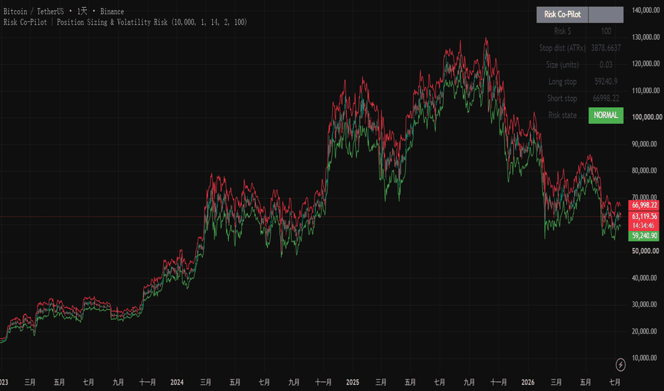
Market Regime & Risk DashboardAn analytics and risk dashboard. It tells you what state the market is in and how much to risk. It does NOT generate buy or sell signals and makes no claim of edge.
What it shows
- Volatility regime: realized volatility bucketed by its own percentile history (Low / Normal / High / Extreme)
- Realized volatility and its percentile rank
- Trend regime: Kaufman Efficiency Ratio bucketed into Trending / Mixed / Choppy
- ATR % of price, an ATR-based stop distance, and a fixed-fractional position size for your chosen risk percent
- Drawdown from the recent high
How to read it
Volatility regime drives position sizing: in Extreme regimes the same percent risk implies a far smaller position, and the dashboard does that maths for you. The trend regime is descriptive, not predictive.
Honest by design
- No buy/sell signals, no alpha claim. This is a measurement tool, not a prediction.
- Non-repainting: every value is a function of confirmed closes, no request.security, no future data. The current forming bar updates in real time, which is normal, not historical repaint.
- Every number is defined, with its limitations stated.
Open-source and MIT licensed.
Disclaimer: impersonal educational and analytics tool. This is not investment advice, not a personalised recommendation, and carries no performance guarantee. Past results do not predict future results. You are solely responsible for your own trading decisions. مؤشر

مؤشر

MHIDa ATR-Distance DipWHAT IT DOES
ATR-Distance Dip is a visual context tool that measures how far price has stretched BELOW a reference moving average - not in fixed percentage points, but in ATR units (units of volatility). The same setting adapts by itself: in a calm market a small move already counts as far, in a choppy market price must travel further before it counts.
It draws:
- The reference average (EMA, default 20).
- A dynamic threshold line at (average - N x ATR), default N = 3.5.
- A shaded stretch zone between the average and the threshold.
- A small triangle when the previous bar closed below the threshold and the current bar closes back up (the first comeback candle after the drop).
- An optional alert on that comeback event, so you can be notified to LOOK at the chart.
HOW IT IS CALCULATED
- average = EMA(close, 20)
- ATR = simple moving average of the True Range over 14 bars (a plain SMA of the true range, not Wilder's smoothing)
- threshold = average - N x ATR (N adjustable, default 3.5; a sensible exploratory range is 2.5 / 3.5 / 4.5)
- highlight condition (evaluated on closed bars): previous close below the previous threshold AND current close above the previous close.
WHY ATR INSTEAD OF A FIXED PERCENTAGE
A fixed distance like 5% below the average means different things in quiet and in volatile regimes. Measuring the stretch in ATR units keeps the meaning consistent: 3.5 ATR below the average is unusually stretched both in slow and in fast markets, because the yardstick itself follows current volatility.
HOW TO USE IT
Add it to a standard candlestick chart. Watch the shaded zone: when price falls below the threshold line, the market is unusually stretched below its average for the current volatility regime. The triangle marks only the first attempt to come back (a close above the previous close), which is where a chart reader may want to start paying attention. Adjust the average length, the ATR length and the multiple to your instrument and timeframe: the defaults are a starting point, not the one true configuration.
HONESTY NOTE
This is a context and chart-reading aid, not a trading system: it issues no entries, no exits and simulates no trades. Directional markers are drawn only on standard chart types. It is not financial advice. You always decide. مؤشر

Elaris Market Energy [Professional]Elaris Market Energy
Overview
Elaris Market Energy is a multi-factor oscillator designed to evaluate the strength, direction, participation, and sustainability of market movement.
Rather than relying on a single momentum calculation, the indicator combines several independent market characteristics into one normalized energy score. The goal is to help traders distinguish between weak price movement, developing participation, strong directional expansion, compression, and potential exhaustion.
The Market Energy score is displayed in a separate oscillator panel and generally ranges from -100 to +100.
* Positive values represent bullish market energy.
* Negative values represent bearish market energy.
* Values near zero represent neutral conditions, weak participation, or market compression.
This indicator is intended to support market analysis and confirmation. It is not presented as a complete trading system and does not guarantee future price movement.
---
Core Market Energy Model
The final Market Energy score is calculated from six configurable components.
Price Impulse
Measures directional price displacement relative to current market volatility.
This helps distinguish meaningful movement from ordinary price fluctuations.
Candle Conviction
Evaluates the structure of the current candle using:
* Candle body size
* Closing position inside the candle range
* Upper and lower wick balance
* Bullish or bearish candle direction
A strong directional candle generally contributes more energy than an indecisive candle.
Volume Participation
Compares current volume with its recent average and evaluates whether market participation supports the current directional move.
On symbols where volume data is unavailable or limited, the volume component may provide less information.
Range Expansion
Measures whether the current true range is expanding relative to recent market activity.
Range expansion can help identify periods where volatility and directional participation are increasing together.
Trend Alignment
Evaluates:
* Price position relative to an internal trend average
* Direction and slope of the trend average
* Alignment between current movement and broader market direction
This component helps reduce the influence of momentum that is moving against the prevailing trend structure.
Momentum Efficiency
Combines directional momentum with movement efficiency.
Movement efficiency compares the net price displacement with the total distance traveled. Cleaner directional movement generally produces a stronger reading than unstable or highly overlapping price action.
---
Directional Movement Confirmation
The indicator also uses Directional Movement Index information.
The relationship between positive and negative directional movement helps confirm whether bullish or bearish pressure is dominant.
ADX is used as a supporting measurement of trend strength. It does not independently determine the Market Energy score and is applied as a controlled confirmation component.
---
Market Regimes
The indicator classifies market conditions into several practical regimes.
Compression
Market Energy remains close to zero, suggesting limited directional participation or reduced momentum.
Compression can occur during consolidation, low volatility, or periods of market indecision.
Bullish or Bearish Energy
Directional participation is developing, but the movement has not yet reached the strong-energy threshold.
Strong Bullish or Bearish Energy
Multiple components are aligned and directional participation has increased.
These conditions may support continuation analysis when confirmed by price structure.
Extreme Energy
The oscillator has reached an unusually strong directional reading.
Extreme energy can represent:
* Strong continuation
* Rapid volatility expansion
* Late-stage momentum
* A condition that may eventually transition into exhaustion
An extreme reading should not automatically be interpreted as a reversal signal.
Fading Energy
Directional energy remains elevated but is beginning to weaken.
Fading energy may indicate reduced participation, consolidation, or potential exhaustion. Price confirmation remains important.
---
Signal Types
Bullish Energy Entry
A bullish signal may appear when:
* Market Energy crosses above the selected entry threshold
* Energy is above its signal line
* Energy acceleration is positive
* Enabled trend and directional filters are satisfied
* Optional volume and candle-quality filters are satisfied
Bearish Energy Entry
A bearish signal uses the opposite conditions:
* Market Energy crosses below the negative entry threshold
* Energy is below its signal line
* Energy acceleration is negative
* Enabled bearish filters are satisfied
Compression Release
Compression-release markers identify a transition from low-energy conditions into directional expansion.
These signals are intended to highlight developing volatility and participation after a compressed market phase.
Energy Exhaustion
Exhaustion markers identify situations where:
* Energy recently reached an extreme level
* The energy score begins to decline
* Energy acceleration turns against the previous direction
* Price begins showing an opposing reaction
Exhaustion markers are warnings of weakening momentum. They do not confirm a complete trend reversal on their own.
---
Visual Elements
Energy Histogram
The histogram displays both direction and intensity.
* Bullish columns represent positive energy.
* Bearish columns represent negative energy.
* Stronger opacity represents increasing directional intensity.
* Faded columns indicate weakening energy.
Energy Line
The main line shows the smoothed composite Market Energy score.
Signal Line
The signal line provides a slower reference for identifying changes in short-term energy direction.
Energy Cloud
The cloud between the Energy line and Signal line provides a quick visual representation of bullish or bearish energy alignment.
Regime Background
Optional background shading highlights:
* Strong bullish conditions
* Strong bearish conditions
* Market compression
Dashboard
The optional dashboard summarizes:
* Current Market Energy score
* Current market regime
* Energy acceleration
* Relative volume
* ADX
* Price impulse
* Candle conviction
* Volume pressure
* Range expansion
* Trend alignment
* Momentum efficiency
* Signal confirmation mode
The dashboard is intended to provide a quick overview without requiring the trader to interpret each internal calculation separately.
---
Calculation Profiles
Fast
Uses shorter internal calculation lengths.
This profile reacts more quickly but may also produce more frequent changes and additional noise.
It may be suitable for lower-timeframe analysis when combined with strict filters.
Balanced
Provides a middle ground between responsiveness and stability.
This is the default profile and is suitable as a general starting point.
Conservative
Uses longer calculation lengths.
This profile produces slower and generally more stable readings, which may be useful on higher timeframes or when fewer signals are preferred.
---
Suggested Usage
The indicator can be used for several types of market analysis.
Trend Confirmation
Bullish price structure combined with positive and increasing Market Energy may support bullish continuation analysis.
Bearish price structure combined with negative and decreasing Market Energy may support bearish continuation analysis.
Breakout Confirmation
A breakout accompanied by:
* Range expansion
* Increased relative volume
* Strong impulse
* Rising Market Energy
may have greater participation than a breakout occurring during weak or compressed energy.
Pullback Analysis
During a broader trend, temporary energy weakness followed by renewed directional acceleration may help identify continuation conditions.
Compression Monitoring
Low absolute Market Energy can help identify markets that are consolidating or losing directional participation.
A later compression release may highlight the start of renewed expansion.
Exhaustion Monitoring
Extreme energy followed by weakening acceleration may help traders identify when a mature move is losing participation.
This should be combined with price structure, support and resistance, liquidity levels, or other confirmation methods.
---
Recommended Starting Settings
For lower timeframes, traders may consider:
* Fast or Balanced profile
* Higher entry threshold
* Volume filter enabled
* Candle-quality filter enabled
* Candle-close confirmation enabled
For medium timeframes, the Balanced profile and default settings provide a practical starting point.
For higher timeframes, the Conservative profile may provide smoother regime identification and fewer short-term fluctuations.
Settings should be adjusted based on the symbol, timeframe, liquidity, and trading approach.
---
Alerts
The script includes alert conditions for:
* Bullish Energy Entry
* Bearish Energy Entry
* Bullish Compression Release
* Bearish Compression Release
* Bullish Energy Exhaustion
* Bearish Energy Exhaustion
* Strong Bullish Regime
* Strong Bearish Regime
* Energy Compression
For stable alerts, enabling candle-close confirmation and selecting “Once Per Bar Close” when creating the TradingView alert is recommended.
---
Repainting Information
Elaris Market Energy does not use future data, lookahead logic, or future-confirmed pivot calculations.
The indicator does not repaint historical closed-bar signals when candle-close confirmation is enabled.
The live Market Energy value may change while the current candle is still forming because price, volume, candle range, and volatility are still changing.
When “Confirm Signals On Candle Close” is enabled, signals are only confirmed after the candle closes.
When this setting is disabled, signals may appear during an open candle and may disappear before that candle closes.
---
Important Notes
This indicator is a technical analysis tool and should not be interpreted as financial advice.
Market Energy measures current and historical market conditions. It does not predict future results with certainty.
Signal performance can vary significantly across:
* Symbols
* Asset classes
* Timeframes
* Volatility conditions
* Liquidity environments
* Trending and ranging markets
Traders should use appropriate risk management and independently evaluate all trading decisions.
مؤشر

Capitulation Stretch Reversion [Jayadev Rana]OVERVIEW
Capitulation Stretch Reversion is a long-biased, price-action mean-reversion strategy. Its thesis is simple: in an established uptrend, sharp multi-bar pullbacks that stretch price well below its short-term mean tend to snap back. The strategy waits for that stretched, capitulating condition, enters on the first sign of a turn, and exits when price reverts to the mean.
Everything is derived from raw price and range (EMAs of price and Average True Range) - there are no oscillators or external data.
HOW IT WORKS
1. Regime filter. A long EMA (default 200) defines the regime. Long trades are only permitted while price is above it, keeping every entry aligned with the prevailing drift. A symmetric short side exists but is OFF by default (see Direction).
2. Stretch + capitulation. A setup can only arm when price has extended at least a set number of ATRs below a short reversion mean (default 0.5 x ATR from a 5-EMA) AND has printed a run of consecutive lower closes (default 2). This is the "capitulation" filter - it avoids buying shallow noise and waits for a genuine flush.
3. Entry. When the stretched, capitulating condition is met and the current bar closes back up (a reversal bar), a long is taken on the confirmed bar.
4. Exit - three ways. The target is a reversion to the mean: the position is closed once price closes back at or above the reversion EMA. A protective stop sits a wide, volatility-based distance below entry (default 3 x ATR). A time stop closes any trade that has neither hit target nor stop within N bars (default 10).
WHY THE STOP IS WIDE
Mean reversion trades a high hit-rate against an unfavourable reward-to-risk: the target (a snap back to the mean) is near, while the protective stop is deliberately wide so normal wobble does not knock you out. This produces frequent winners but occasional losers that are larger than a typical win. That trade-off is intentional and is shown honestly in the results below - read the LIMITATIONS section carefully.
BACKTEST (defaults, on the loaded history)
Tested on SPY daily with the default inputs and the properties set in the script (10,000 initial capital, 100% of equity per trade, 0.03% commission, 2 ticks slippage). On the sample available in the Strategy Tester this produced roughly a 67% win rate with a profit factor near 1.67, a max drawdown around 10%, and no margin calls, modestly ahead of buy-and-hold over the same window. This is a limited in-sample backtest, not a forward result - your own data window, symbol, fees and fills will differ.
SETTINGS
Regime EMA Length - trend filter that gates entries.
Reversion Mean Length - the EMA used as the snap-back target.
Stretch (ATR from mean) - how far price must extend before a setup arms.
Capitulation Bars - consecutive closes required to confirm exhaustion.
Protective Stop (ATR) and Time Stop (bars) - the exit envelope.
Direction - Trade Longs (on) and Trade Shorts (off by default; counter-trend shorts on up-drifting index ETFs have a much lower hit-rate).
Dashboard - live regime, position, win rate, profit factor and net profit.
LIMITATIONS
Signals are evaluated on bar close, not intraday. The reported win rate is in-sample on a finite history and will not persist unchanged out of sample. Because winners are small and losers wide, a cluster of stopped trades can still produce a meaningful drawdown despite a high win rate - position size accordingly. Percent-of-equity sizing at 100% is for demonstration; use realistic risk-based sizing in practice. Mean reversion underperforms in strong, one-directional trends where price never stretches, and can suffer if a pullback turns into a full regime change. This script is a research and educational tool, not financial advice or a guarantee of future performance.
ORIGINALITY
The contribution is the specific combination: an ATR-normalised "stretch" distance from a fast mean, gated by a consecutive-lower-close capitulation count and a regime filter, with a mean-touch target against a wide ATR stop and a time stop. It is built from first principles on price and range, not a wrapper around a built-in indicator. استراتيجية

Robust Bollinger Bands"First and foremost, full credit and massive respect to John Bollinger for inventing the original Bollinger Bands, an absolute cornerstone of technical analysis. This script does not aim to replace his legendary work, but rather to build upon his core philosophy by applying modern robust statistics to solve extreme outlier scenarios."
Description:
Overview
The "Institutional Robust Bollinger Bands" is a highly advanced, mathematically robust volatility indicator designed to solve the most common flaws of the classic Bollinger Bands. Standard Bollinger Bands rely on a Simple Moving Average (SMA) and Standard Deviation. Because standard deviation squares the distance from the mean, extreme market events (flash crashes, large gaps, or massive outlier wicks) artificially inflate the bands. This creates a "ghosting effect" where the bands remain irrationally wide long after the volatile event has passed, leading to false signals (fakeouts).
This script completely rebuilds the volatility model using Robust Statistics, Huber Weights, Kaufman-inspired Efficiency Ratios, and Asymmetric Expansion.
How It Solves the Classic Bollinger Bands Problem
Median (Q50) vs. SMA: Instead of using an SMA for the Basis line, this indicator uses the Median (Q50). The Median is statistically immune to single-bar manipulation. Even if a massive outlier wick occurs, the Basis line remains stable, completely ignoring the "fake" movement.
Huber Weighted Dispersion vs. Standard Deviation: Instead of squaring outliers, this script uses Median Absolute Deviation (MAD) and Huber Weights. Price action that falls outside a statistical threshold (1.345 * MAD) receives heavily penalized weights. This means the bands measure true continuous volatility rather than being skewed by one-off anomalies.
Asymmetric Bands: Financial markets do not follow a perfect normal distribution (Bell Curve); they exhibit skewness and fat tails. This script calculates the Skewness (Q75 + Q25 - 2 * Q50) and Kurtosis (Q95 - Q05). If the trend is aggressively skewed to the upside, the upper band expands further while the lower band tightens, adapting to the directional momentum asynchronously.
The Role of Classic Indicators & Custom Volatility Engines
While the core logic replaces classic averages with quantiles, we still utilize the classic Simple Moving Average (SMA) for a very specific, underlying purpose: Smoothing dynamic mathematical engines.
Efficiency Ratio (ER): We calculate a raw directional efficiency (netDisp / hlRange) inspired by Perry Kaufman's methodology. We then apply an SMA to smooth this raw data. This smoothed ER dynamically adjusts the Lambda (Skewness) multiplier. When the market is trending cleanly, the asymmetry expands automatically.
Gap & Body Volatility: We measure real tick-by-tick shock (disp = body + gap). We use an SMA to compare the short-term volatility of this calculation against its long-term average. This dynamically adjusts the Mu (Fat Tail) multiplier, fortifying the bands automatically when market gaps increase.
Key Features for Traders
Self-Adaptive Multipliers: You don't need to manually change settings for different assets. The internal Efficiency Ratio and Volatility engines automatically scale the Skewness and Kurtosis multipliers based on the asset's current state.
Percentile-Based Squeeze Detection (Yellow Background): Instead of looking for an absolute lowest value (which often breaks in prolonged ranging markets), the script uses a Percentile Rank logic. If the current bandwidth falls within the narrowest 15% (adjustable) of the last 100 bars, the background turns Gold/Yellow. This provides a highly stable visual cue that a major volatility breakout is building up.
QUICK COMPARISON: CLASSIC BB vs. ROBUST BB
1. BASIS LINE (MIDDLE BAND)
Classic: SMA (Simple Moving Average) - Sensitive to spikes.
Robust: Median (Q50) - Completely immune to single-candle manipulation.
2. VOLATILITY MEASUREMENT
Classic: Standard Deviation (Squared errors) - Outliers cause "Ghosting Effect".
Robust: Huber Weighted Dispersion - Punishes outliers, keeping bands stable.
3. BAND STRUCTURE
Classic: Perfectly Symmetric - Ignores market trend bias.
Robust: Asymmetric Expansion - Adapts to price skewness (Bullish/Bearish bias).
4. DYNAMIC MULTIPLIERS
Classic: Static (User-defined) - Requires manual tuning.
Robust: Self-Adaptive - Automatically scales Kurtosis and Skewness via Efficiency Ratios.
5. SQUEEZE DETECTION
Classic: Manual observation.
Robust: Percentile-Rank Based - Background turns yellow when bandwidth is in the narrowest 15% of recent history.
Usage
Use this indicator exactly as you would use classic Bollinger Bands, but with the confidence that outlier wicks will not distort your analysis. Look for continuous Squeeze (yellow) zones to prepare for breakouts, and observe the asymmetric expansion of the bands to understand the true strength and bias of a trend.
Disclaimer: This script is for educational and analytical purposes only. It does not constitute financial advice.
مؤشر

مؤشر

مؤشر

Williams VIX Fix Elite [MarkitTick]💡 The Williams VIX Fix Elite is a comprehensive, overlay-based technical analysis system designed to bring the powerful volatility-tracking properties of the traditional Williams VIX Fix directly onto the main price chart. By synthesizing statistical volatility extremes with an array of multi-timeframe trend filters, volume confirmation parameters, and dynamic risk management plotting, this tool transcends basic observation. It provides traders with a complete, structured methodology for identifying high-probability exhaustion zones and potential market reversals while strictly managing risk.
✨ Originality and Utility
Standard volatility indicators are almost exclusively relegated to separate oscillator panes at the bottom of the chart. This traditional placement forces the user to constantly shift their visual focus, often leading to a disconnect between volatility metrics and actual price action. This indicator resolves that friction by mapping volatility exhaustion directly onto the candlesticks themselves through an intuitive color-coded heatmap.
Furthermore, the utility of this script lies in its holistic approach to signal generation. Rather than providing isolated volatility alerts, it acts as a confluence engine. It mandates that a volatility spike must be corroborated by higher timeframe trend alignment, adequate localized volume, directional momentum, and specific standard deviation thresholds before generating an actionable signal. This transforms a simple oscillator concept into a robust, chart-integrated trading framework complete with dynamically calculated risk-to-reward parameters, rendering it highly useful for both discretionary analysis and automated alert integrations.
🔬 Methodology and Concepts
● The Volatility Engine
• Williams VIX Fix (WVF)
At its core, the script calculates the Williams VIX Fix. It does this by measuring the percentage drawdown of the current bar's low from the highest closing price over a user-defined lookback period. This mathematical approach creates a synthetic volatility index that mirrors the behavioral characteristics of the CBOE VIX, where high values indicate market fear and potential bottoms.
• Statistical Bounds
To determine when the WVF has reached a statistically significant extreme, the script applies Bollinger Bands to the WVF data. It calculates a Simple Moving Average (SMA) of the WVF and plots standard deviation bands around it. A "Spike" is registered when the WVF value breaches the upper Bollinger Band or a percentile-based historical high threshold.
● Confluence Filtering
• Higher Timeframe (HTF) Alignment
The script extracts moving average data from a user-selected higher timeframe. It assesses whether the higher timeframe's closing price and dual-period EMAs exhibit a bullish or bearish hierarchy, ensuring signals are not taken against the macro-directional flow.
• Volatility and Volume Validation
A signal is only considered valid if the localized volatility, measured by the Average True Range (ATR), exceeds its historical average multiplied by a strict threshold. Additionally, the localized volume must exceed its moving average, confirming that the reversal is backed by market participation.
• Signal Execution and Risk Logic
When all conditions align (a volatility spike followed by a directional reversal candle, validated by all filters), the script locks in the signal upon the bar's close. It immediately calculates a Stop Loss utilizing an ATR multiplier and projects three Take Profit levels mathematically derived from user-defined Risk-to-Reward (R:R) ratios.
🎨 Visual Guide
● Chart Overlay Elements
• Candlestick Heatmap
The indicator repaints the standard chart candles to reflect the immediate signal bias. A confirmed Long signal colors the candlestick body, borders, and wicks in a distinct bullish hue (default teal). Conversely, a confirmed Short signal paints the candle in a bearish hue (default red). Neutral periods retain a standard gray tone.
• Dynamic Trade Levels
Upon signal confirmation, the script automatically plots horizontal lines detailing the trade parameters:
Stop Loss Line: A solid, thick line plotted below (for longs) or above (for shorts) the entry price, acting as the primary risk invalidation level.
Entry Line: A dashed line marking the exact closing price of the signal candle.
Take Profit Lines: Three sequential dashed lines representing TP1, TP2, and TP3, mapping out the reward targets.
The space between the Stop Loss and Entry is highlighted with a semi-transparent risk linefill, while the space extending toward the Take Profit targets is highlighted with a reward linefill, visually contrasting the risk against the potential payout.
● The Interactive Dashboard
A dedicated data panel is rendered on the chart (default top-right) providing real-time telemetry of the script's internal calculations.
WVF Value & Spike Level: Displays the raw volatility index number alongside a visual progress bar indicating how close the current value is to the historical threshold.
HTF & Trend Bias: Textually confirms the current macro and localized trend alignment (Bullish/Bearish).
Volume & ATR: Confirms whether current volume is above or below average and displays the exact ATR value.
R:R Ratio: A visual gauge of the current signal's risk-to-reward structure.
Cooldown Status: Displays the remaining bars before a new signal can be generated, preventing over-signaling during congested price action.
📖 How to Use
● Execution Protocol
• Step 1: Signal Identification
Wait for a colored signal candle to print on the chart. A teal candle signifies a Long opportunity, while a red candle signifies a Short opportunity. Always wait for the candle to fully close, as signals are only validated upon bar confirmation to ensure accuracy.
• Step 2: Dashboard Verification
Consult the on-chart dashboard. Ensure that the "Spike Level" gauge was heavily filled prior to the signal, and visually confirm that the "HTF Bias" and "Trend Bias" align with your intended trade direction. Verify that the "Volume" metric indicates "Above Avg" for optimal setup quality.
• Step 3: Risk Assessment
Observe the plotted trade levels. The visual linefills will immediately show you the required risk (the distance from the dashed Entry line to the solid Stop Loss line). Assess whether this required risk fits within your personal account parameters. If the ATR has expanded too aggressively, the stop loss may be too wide, and the setup should be skipped.
• Step 4: Trade Management
If the trade is entered, utilize the plotted TP1, TP2, and TP3 lines as scaling-out points. The script also includes automated JSON alert outputs designed for third-party execution platforms, allowing users to fully automate the Long, Short, and Take Profit hit actions.
⚙️ Inputs and Settings
● Core Settings
• WVF Lookback: Defines the historical period used to find the highest close for the volatility drawdown calculation.
• BB Length & BB Mult: Controls the Simple Moving Average length and the standard deviation multiplier applied to the WVF. Lowering the multiplier increases sensitivity to volatility spikes.
• Percentile HH Lookback & High % Threshold: An alternative absolute-threshold filter based on a percentage of the highest historical WVF values.
● Filters
• HTF Resolution: Select the specific higher timeframe used for the macro trend validation.
• ATR Length & Min Mult: Defines the lookback for the Average True Range and the multiplier required to validate adequate localized volatility.
• Min Spike Above BB %: A Z-score threshold ensuring the volatility spike is mathematically severe before triggering a signal.
• Volume Avg Length & Min Mult: Dictates the volume moving average parameters required for trade confirmation.
• Cooldown Bars: The mandatory resting period (in bars) between valid signals to eliminate redundant alerts.
● Trade Tools & Alerts
• SL ATR Mult: The multiplier applied to the current ATR to calculate the Stop Loss distance from the entry price.
• TP1, TP2, TP3 R-Multiple: Dictates the reward distance for target lines relative to the calculated Stop Loss risk.
• Alert Actions: String inputs allowing the user to customize the JSON payload commands sent to automated webhook services.
🔍 Deconstruction of the Underlying Scientific and Academic Framework
● Behavioral Finance and Volatility Asymmetry
The underlying architecture of this indicator is deeply rooted in the academic principles of behavioral finance, specifically the asymmetry of market participant reactions. Financial markets typically exhibit a "stealth" characteristic during uptrends (low volatility, steady buying) and a "panic" characteristic during downtrends (high volatility, aggressive selling). The Williams VIX Fix capitalizes on this behavioral asymmetry by focusing exclusively on drawdowns from peak closes. By quantifying this localized panic, the script provides a mathematical representation of capitulation—a state where sell-side liquidity is exhausted, and rational market equilibrium is poised to return.
● Gaussian Distribution and Standard Deviation Anomalies
To objectively define an "exhaustion point," the script relies on the statistical concept of normal distribution. By applying a Simple Moving Average to the raw volatility data, it establishes a baseline mean of market stress. The inclusion of Standard Deviation bands (Bollinger Bands) allows the system to measure dispersion from this mean. When the volatility index breaches the upper band, it represents an anomaly—an event occurring outside the expected standard deviation threshold. Statistically, extreme deviations from the mean are unsustainable, implying an imminent reversion. This indicator isolates these rare deviations to time market entries.
● The Role of True Range in Risk Normalization
Risk management within the script is governed by the Average True Range (ATR), a concept introduced by J. Welles Wilder. The True Range accounts for absolute price movement, including gap openings, providing a more comprehensive measure of market kinetic energy than standard percentage changes. By tying the Stop Loss and Take Profit levels dynamically to the ATR, the script automatically normalizes risk across different market environments. In a highly volatile state, the ATR expands, naturally widening the stop loss to avoid premature invalidation from market noise. In a compressed state, the ATR contracts, tightening the risk parameters. This dynamic adaptation ensures that the statistical risk profile of each trade setup remains proportional to the current localized market geometry.
⚠️ Disclaimer
All provided scripts and indicators are strictly for educational exploration and must not be interpreted as financial advice or a recommendation to execute trades. We expressly disclaim all liability for any financial losses or damages that may result, directly or indirectly, from the reliance on or application of these tools. Market participation carries inherent risk where past performance never guarantees future returns, leaving all investment decisions and due diligence solely at your own discretion. مؤشر

مؤشر

Effective Spread OscillatorOverview
Effective Spread Oscillator is a liquidity gauge built from price alone. It estimates the effective bid-ask spread — the real round-trip cost of trading — from open/high/low/close bars, with no quote or order-book data, then percentile-ranks it into a 0–100 read. High = a wide effective spread: thin, illiquid, stressed conditions where slippage and gaps are large. Low = a tight spread: deep, liquid, orderly trade. It is an analytical study of market liquidity and trading friction — not a directional signal and not a strategy.
Why these parts are ONE tool (mashup justification)
Liquidity is normally invisible without Level-2 data. This reconstructs it from bars and then makes it usable, in a chain where each link fixes what the previous one can't do alone:
A low-frequency spread estimator recovers the effective spread from the geometry of OHLC prices — the cost the tape hides. Two are offered: Abdi-Ranaldo (close vs the high-low mid-range) and Corwin-Schultz (consecutive high-low ranges). Negative small-sample estimates — a known statistical artefact of these methods — are floored at zero.
Percentile ranking turns an instrument-specific cost into a universal 0–100 read, so "expensive liquidity" means the same thing on an index future, a stock, or FX. A raw spread number in basis points is not comparable across symbols; a percentile is.
A liquidity-state verdict (stressed / normal / liquid) plus a widening-vs-tightening read makes it legible at a glance, which a bare number isn't.
The calibration harness then tests the well-documented link on your instrument: does a spread spike actually precede a volatility expansion? It reports the conditional hit rate against the unconditional base rate, so you see the Edge rather than assume it.
Chained, they answer one question: is liquidity stressed right now, and has that stress preceded bigger moves here?
How it works
The estimator is computed on log prices and evaluated one bar back (so no future value is referenced), averaged over a window, optionally smoothed, and percentile-ranked over a lookback into the 0–100 oscillator. A spike arms when the spread crosses into the high band; the harness then checks whether the realised range over the next horizon exceeds k × ATR × √horizon more often than the base rate. (The √horizon term keeps the base rate informative near 50% instead of saturating on intraday charts.)
How to use it
The high band (above the upper guide) is stressed / illiquid: widen stops, expect slippage and gaps, and treat breakouts with care — this is where volatility expansions cluster. The low band is liquid / orderly: tighter behaviour, cleaner fills. Use it as a risk and position-sizing context that sits behind your directional tools, and read the Edge row to see whether spread spikes have actually preceded bigger ranges on this symbol. Spikes are marked in the pane and, optionally, on the price chart. The dashboard has a Compact layout (default) and a Pro layout (estimator in use, spread in bps, spike sample, base rate). Context — never a standalone trigger.
Universal across markets
The high / low / close inputs are configurable, so it runs on any instrument and timeframe. Defaults target intraday index futures. Crucially, it needs no volume, so it also works on volume-less feeds (cash indices, spot FX) where flow-based tools cannot.
Non-repainting
The estimator is evaluated one bar back, so it never references a future value, and the calibration harness logs and resolves only on confirmed bars, so its statistics never inflate intrabar. The live oscillator value updates each bar, like any oscillator.
Originality
The spread estimators are published academic work, credited below. What's original here is the construction around them: the percentile normalisation that makes the cost comparable across instruments, the liquidity-state and widening/tightening read, the price-overlay stress marker, and — most of all — the forward-calibration harness that tests the spread-spike → volatility-expansion link against a base rate on your own symbol rather than asserting it. Clean-room implementation; no third-party code reused.
Concept credits
Serial-covariance spread estimator — Richard Roll (1984)
High-low range spread — Shane Corwin & Paul Schultz (2012)
Close-high-low spread — Farshid Abdi & Angelo Ranaldo (2017)
The current state of the art generalising this family to the full OHLC information set is the EDGE estimator of David Ardia, Emanuele Guidotti & Tim Kroencke (Journal of Financial Economics, 2024). This script implements the Corwin-Schultz and Abdi-Ranaldo estimators.
Honest limits
These are estimates of the effective spread from bar geometry, not measured quotes — accurate in aggregate, noisy bar to bar, which is exactly why a window and smoothing are used. Estimates can be small and are floored at zero in tiny samples. The Edge figures are in-sample, with overlapping forward windows and no costs — descriptive context, not a verified backtest. Nothing here predicts direction.
Disclaimer
Research and educational tool only. Not financial advice and no guarantee of profitability or accuracy. Indicators describe past behaviour; they do not predict the future. Trading carries risk of loss. Test out-of-sample and make your own decisions. The author accepts no liability. مؤشر

Keltner Position Divergence with Reliability ScoringOverview
Keltner-Position Divergence with Reliability Scoring turns where price sits inside its Keltner channel into a bounded oscillator, reads it for divergence against price, and then scores — in real time — whether those divergences have actually been worth acting on for the symbol on your chart, and which direction is carrying the edge. It is a context / research read, not a standalone buy or sell signal.
The idea
A Keltner channel frames price with an ATR envelope around a moving average. Where price sits inside that envelope — pinned to the upper band, mid, or pinned to the lower band — is a bounded read of stretch. When price makes a new high but its Keltner position does not confirm (a lower band-position high), that non-confirmation can precede a turn. This script measures the divergence between price and its Keltner position, then keeps a self-updating track record of whether such divergences pay.
Why these parts are combined (mashup rationale)
Three components form one pipeline, not three separate signals:
A Keltner-position oscillator — price's location within the ATR envelope (0 centre, +1 upper band, −1 lower band), z-scored so the bands and zones mean the same on every asset.
Confirmed-pivot divergence — regular and hidden, between that position line and price, with an optional triple-pivot mode for rarer, stronger disagreements.
A reliability harness — a binomial-proportion confidence test that asks whether each class of divergence has preceded a favourable move (a k×ATR travel over a fixed horizon) more often than a same-zone baseline, reported per direction with a Wilson confidence bound.
Part 1 builds the bounded stretch read, part 2 fires only where price and position disagree, part 3 decides whether that disagreement has actually paid on this instrument. Remove any one and the tool can no longer answer "is this Keltner divergence worth trading here?"
How to use it
Read the verdict panel first. GREEN = these divergences have beaten a same-spot baseline here; RED = they've lost to it (skip, or change the band width / timeframe); AMBER = not statistically established yet; GREY = still gathering data. "Best signal" names the direction with the strongest measured edge; "Reward : risk" is the average best-vs-worst move after a signal, in ATR. A divergence is price making a higher high / lower low while the Keltner-position line does the opposite — marked in the pane and, optionally, on the price chart. It is context, never a standalone trigger.
Settings worth knowing
The regime filter ("Only count signals in regime") restricts the track record to signals that fired in a chosen regime — reverting markets suit divergence, strong trends punish it — so you can measure the edge where it's supposed to work. Costs subtracted (×ATR) raises the bar a signal must clear so the score is net of costs. Band width, MA length and the z-score window adapt the read to any instrument.
Universality & non-repainting
It reads only the chart's own price (configurable source), so it runs on any symbol, any timeframe, with no external data. Pivots confirm a fixed number of bars after the fact, and the track-record harness logs, updates and resolves only on confirmed (closed) bars, so its statistics never inflate or shift intrabar. The live oscillator updates each bar like any oscillator. All figures are in-sample and past-only.
Outputs for other scripts
Generic EXP_* plots — oscillator, signal, probability, edge, edge lower-bound, sample count, regime, band position — are published to the Data Window for use from other scripts via input.source().
Originality
Standard Keltner tools just plot the channel. This one turns band-position into a divergence oscillator and keeps a self-updating, confidence-scored, per-class track record against a same-zone baseline — so you see not just that a divergence printed, but whether and how it has paid on the current market. Clean-room implementation; no third-party Pine code reused.
Concept credits
Keltner channel — Chester Keltner; ATR-band refinement — Linda Raschke
Average True Range — J. Welles Wilder
Binomial score confidence interval — Edwin B. Wilson
Trend-efficiency regime measure — Perry Kaufman
Disclaimer
For research and education only. Not financial advice, not a recommendation, and not a guarantee of future results. All figures are in-sample and past-only. Markets carry risk; do your own research and manage your own risk. مؤشر