
There is a particular kind of madness that comes with watching crypto markets in real time. Candles flipping red, your telegram groups screaming, Twitter threads telling you the bull market is over because the price dropped 8% on a Tuesday morning. Everyone is talking, everyone is urgent, and almost nobody is saying anything meaningful.
The cure for that madness is almost always the same: zoom out. Not metaphorically, literally. Pull the chart back until the panic of this week looks like a single pixel in a decade-long painting. And when you do that, something remarkable happens. The chaos starts to look like a pattern. The noise starts to reveal the signal underneath it.
This piece is about that signal. It is about looking at Bitcoin, and its closest companions, Ethereum and Solana, through a lens that most participants never use: the log-log regression framework. Power law. Deviation bands. Oscillators built on standard deviation, not just gut feeling.
We are going to walk through each chart, image by image, and tell the story they are collectively trying to tell you. No hype. No moon calls. Just structure, context, and honest interpretation.
------------------------------------------
"First, the Philosophy: Why Log-Log?"
------------------------------------------
Before we touch a single chart, we need to understand what we are even looking at when we say "log-log measurement."
Most people are familiar with a regular price chart, time on the x-axis, price on the y-axis. The problem with that for Bitcoin is brutal: a move from $100 to $1,000 looks tiny compared to a move from $50,000 to $60,000, even though the first was a 10x gain and the second was only 20%. A linear scale distorts Bitcoin's history so severely that everything before 2020 is practically invisible.
The first fix is a logarithmic price axis. Instead of equal dollar intervals, you get equal percentage intervals. A 10x move looks the same whether it happens at $1 or at $10,000. This is standard practice for long-term crypto charts.
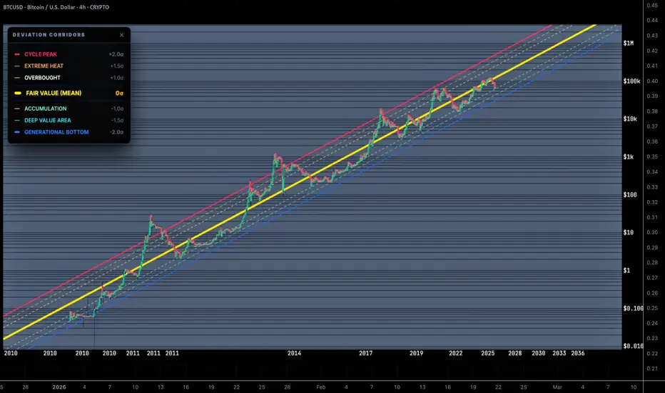
But a log-log chart goes one step further. It applies logarithmic scaling to both axes, price AND time. When you do this, something beautiful happens: assets that follow a power law growth model appear as a straight line. Bitcoin, over its entire history, has followed a power law with remarkable consistency. Its price growth, measured in log-log space, is not exponential, it is a compounding straight line with predictable deviation corridors on either side.
This is not a new idea. Scientists use log-log relationships to describe everything from earthquake magnitudes to city population sizes. The insight that Bitcoin's price follows a power law was formalized by researchers and practitioners who noticed that its long-term growth, stripped of noise, traces almost exactly a straight line in log-log space.
What the charts you are about to see are doing is taking that framework and squeezing every possible insight out of it: how far price is from the power law mean, whether that deviation is increasing or decreasing, and how Bitcoin's regression statistics compare to younger, less mature assets like ETH and SOL.
Now, let's go image by image.
------------------------------------------
"The Oscillator Comparison (Full Context: BTC, ETH, SOL)"
------------------------------------------


(Two views of the same underlying story: one in standard deviations (σ), one in raw percentage distance from the regression mean.)
>>++The Setup++<<
These are Oscillator Comparison charts. The oscillator in question measures how far each asset's price is from its own log-log power law regression line, its own "fair value" in log-log space. Three lines are shown: BTC in cyan, ETH in yellow, and SOL in pink.
The first image (σ mode) expresses this distance in standard deviations, a normalized, universally comparable unit. The second image (% mode) expresses it as raw percentage deviation from the mean regression line.
>>++Reading the History++<<
Look at the σ chart going back to 2013. BTC's oscillator reaches extreme highs, well above +2σ, during the parabolic peaks of 2013, 2017, and 2021. These are the famous bubble tops, the moments everyone remembers where Bitcoin "went too far." On the other end, the deep troughs dip toward or past −2σ, which corresponds to the capitulation bottoms, the "everything is dead, sell everything" moments.
The percentage chart tells the same story but with visceral numbers: during the 2017 peak, BTC was at several hundred percent above its regression line. During bear market bottoms, it was trading at 75% or more below its fair value.
This is what euphoria and despair look like in data.
>>++Where Are We Now?++<<
The current reading, as of mid-February 2026, is BTC at approximately −0.35σ to −0.84σ and 0.57x (−43%) below its regression peak in percentage terms.
Take a moment to absorb what that means. Bitcoin is below its regression mean. It is not at a generational bottom, it is not screaming oversold in the way 2018 or 2022 were. But it is meaningfully below fair value in the context of its own long-term power law. Historically, readings in the negative standard deviation zone have been periods of accumulation, not panic.
ETH sits at −0.46σ, and SOL at −0.62σ, both below their respective means as well. The entire ecosystem, as measured by these oscillators, is in a mild-to-moderate undervaluation zone relative to where its own power law says it should be.
This is not a signal to blindly buy. But it is a signal to stop panicking and to pay attention.
>>++The Dashed Lines and What They Mean++<<
Notice the vertical dashed lines on both charts, yellow and pink. These mark moments in history where each asset's oscillator made an extreme deviation, either to the upside or downside. The yellow dashed lines correspond to ETH's extreme deviation events (including a deep crash during its bear market). The pink dashed lines show SOL's major devation events, including the brutal 2022 collapse during the FTX contagion, where SOL's oscillator spiked to −2σ and beyond in the % chart.
What this tells you is that younger assets, with shorter histories, have more violent oscillations. SOL's swings are wider than ETH's, which are wider than BTC's. This is a predictable function of maturity and liquidity depth, and the charts make it unmistakably visible.
------------------------------------------
"Regression Evolution: All Three Assets Compared"
------------------------------------------


(Growth slope (M) and R² confidence, charted across time for BTC, ETH, and SOL.)
>>++Two Panels, Two Questions++<<
These images show the Regression Evolution chart with all three assets overlaid. There are two panels:
1) The top panel shows the Growth Slope (M), this is the exponent in the power law. In plain English: how fast is each asset's fair value growing per unit of log-time? A higher M means a steeper slope, a faster compounding growth rate baked into the long-run structure.
2) The bottom panel shows R² (Coefficient of Determination), this measures how well the power law model actually fits the data. An R² of 1.0 means perfect fit. An R² of 0.5 means the model explains about half the variance. An R² approaching zero means the model explains almost nothing.
>>++The Growth Slope Story++<<
In the top panel, BTC's slope (cyan) starts astronomically high in Bitcoin's early years, peaking above 10, because the early growth was explosive and the data set was tiny. Over time, as more cycles complete and more data accumulates, the slope decays and stabilizes. By January 2026, it has settled around 5.69 to 5.70. This means Bitcoin's power law regression says its fair value roughly compounds at a rate proportional to time raised to the power of ~5.7.
ETH's slope (yellow) is lower, currently around 2.03. SOL's slope (pink) is lower still, at approximately 1.32. This is not bad news for ETH or SOL, it simply reflects that they have shorter histories and different growth dynamics. It also means that if you were to project forward, the rate of structural growth embedded in BTC's model is higher than ETH's or SOL's, though with correspondingly higher R² confidence.
>>++The R² Story — This Is the Critical One++<<
The bottom panel is where the real insight lives.
BTC's R² (cyan) started chaotically during the very early years, but has been climbing steadily and relentlessly. As of late January 2026, it reads 0.9609, meaning the log-log power law model explains over 96% of Bitcoin's long-run price variance. That is an extraordinary statistical fit for any financial asset, let alone one this volatile in the short term.
ETH's R² (yellow) is at 0.8360. Solid. Meaningful. This is a maturing asset whose price behavior is increasingly well described by a power law. Still, it is 13 percentage points below Bitcoin's confidence level.
SOL's R² (pink) is the most interesting and instructive: 0.6753. Notice on the chart how SOL's R² line dipped sharply near 2021-2022, that is the FTX collapse distorting the regression. It has since recovered, but it is still well below ETH and BTC. This tells you that SOL's power law is real but still less mature, less reliable as a predictive structure, and more susceptible to idiosyncratic events.
The message is not "SOL is bad." The message is: BTC has the most structurally reliable long-term model. ETH is building one. SOL is still early in that process. Each asset is at a different stage of the same journey toward becoming a statistically mature, model-describable asset.
------------------------------------------
"Regression Evolution: BTC Alone"
------------------------------------------


(Isolating Bitcoin's growth slope and R² confidence in pristine clarity.)
>>++Why Look at BTC in Isolation?++<<
When you have three assets on the same chart, the eye naturally gets distracted comparing them. These two images strip everything away and show only Bitcoin's Regression Evolution. The result is one of the cleanest, most reassuring long-term charts you can look at when the market is acting chaotic.
>>++The Growth Slope in Isolation++<<
BTC's growth slope is labeled at 5.6954 as of January 26, 2026. The line is smooth, descending slowly from early extreme heights (above 10 in Bitcoin's first years), leveling off through the 2015-2018 period, and then gently converging toward its long-run stabilization around 5.6-5.7.
This is a maturing power law exponent. Every additional year of data, every additional cycle completed, pulls the slope slightly downward toward a stable floor. The decreasing rate of decrease itself is decelerating, suggesting that BTC's power law exponent is approaching its long-run equilibrium. We are no longer in the era of wildly uncertain slopes. The structure is setting.
>>++The R² in Isolation++<<
Bottom panel shows BTC's R² with the clarity it deserves. As of January 26, 2026, it reads 0.9609.
Look at the history. The R² started near zero in the very early years, no surprise, there was almost no data. It crashed violently during 2013-2014 as Bitcoin's first speculative mania and crash disrupted the emerging pattern. Then it slowly, steadily climbed. Through 2016. Through 2017. Through 2018's bear market. Through 2020-2021's bull run. Through 2022's brutal drawdown. And now it sits just below 0.97, approaching 1.0 asymptotically.
Every cycle that completes adds more data. Every bear market that does NOT destroy Bitcoin adds more confirmation. The model becomes more and more powerful. The 96% R² is not just a number, it is a monument to the idea that Bitcoin's price, in log-log space, follows a law of nature more closely than almost any other human-traded asset.
When people ask "what gives Bitcoin value?", here is one answer. Decade after decade, its price has followed a power law regression with increasing precision. That consistency is a form of value. It is the market, collectively and over enormous time scales, converging on a shared model of what Bitcoin is worth.
------------------------------------------
"The BTC-Only Oscillator"
------------------------------------------


(The oscillator for Bitcoin alone, in both σ and % modes.)
>>++The Picture in σ Mode++<<
This is perhaps the most practically useful chart for a long-term Bitcoin holder or investor.
The y-axis goes from −4.4σ at the bottom to +4.4σ at the top. The deep red zone above +2σ is labeled in the deviation corridors chart as "Overbought" through "Cycle Peak", historically, these are the zones where people who bought near cycle tops were punished. The blue zone below −2σ is the realm of "Deep Value" and "Generational Bottom", the zone where, looking back, every single major dip proved to be a historic buying opportunity for those with the patience and conviction to act.
Trace the peaks: the 2013 highs went well above +3σ. The 2017 top pushed to roughly +2.5σ. The 2021 top reached approximately +1.8-2.0σ, notably lower than previous cycle peaks in σ terms, which is consistent with a maturing asset whose extremes moderate over time.
Now trace the bottoms: the 2018-2019 bottom dipped below −1.5σ. The 2022 bottom after the FTX crash was a sharp dip toward −1.5σ before recovering.
And the current reading as of February 14, 2026: BTC at −0.84σ.
This is not at the bottom. It is not screaming "buy everything." But it is below the mean, in mild undervaluation territory, with the oscillator having drifted downward through late 2025 and early 2026 as the post-ATH consolidation has played out.
>>++The Picture in % Mode++<<
The % mode version of the same oscillator tells you: BTC is currently trading at 0.56x, or −44% below its regression mean.
In practical terms: if you were to place Bitcoin exactly on its power law fair value line right now, the price would need to be approximately 78% higher than it currently is. Bitcoin is nearly half-price relative to its own long-run structural average.
Again, this does not mean a crash cannot happen. Price can always go lower before it goes higher. But in the historical context of this chart, being at −44% relative to the power law mean has been, without exception across Bitcoin's history, a zone of eventual recovery and long-term reward for patient holders.
The % chart also makes the cycle peaks vivid in a different way. The 2017 peak shows Bitcoin trading at +304% or more above its mean. At those levels, when price was 3x above its structural fair value, that is when euphoria peaks and distribution should be happening, not accumulation.
We are nowhere near that. We are in the opposite quadrant of this chart.
------------------------------------------
"The Summary"
------------------------------------------

(BTC Growth Slope: 5.6916. R² Confidence: 0.9610.)
>>++Two Numbers That Tell You Everything++<<
If you had to distill the entire framework into two numbers, this numbers does it for you.
1) Growth Slope (M): 5.6916. This is the power law exponent of Bitcoin's long-run regression. It means that in log-log space, Bitcoin's fair value grows proportionally to time raised to the power of 5.69. It is the steepness of the incline, the rate at which the structural fair value compounds upward year after year.
2) R² Confidence: 0.9610. The coefficient of determination. 96.1% of Bitcoin's long-run price variance is explained by the power law model. Only 3.9% is "unexplained."
Think about what it means for a human-traded financial asset, subject to regulation, geopolitics, technological competition, macroeconomic shifts, exchange hacks, government bans, and pure animal spirits of markets, to have 96% of its long-run price behavior explained by a single mathematical model. It is, frankly, astonishing. And it is the foundation on which all of the other charts in this analysis are built.
It is a reminder of what Bitcoin is: a structurally consistent, compounding, power-law-governed system masquerading as a chaotic volatile asset in the short term.
>>++The Forward Projection++<<
Look to the right edge of the main chart, out toward 2028-2030. The fair value line continues its steady diagonal ascent. The deviation corridors widen in absolute dollar terms (because we are in a log scale) but remain the same distance apart in log-log space. By 2028, the yellow fair value line is in the hundreds of thousands of dollars per BTC. By 2033-2036, if the power law holds, the projections become extraordinary.
This is not a promise. But the model has held for fifteen years across multiple hostile environments. It held through government bans, through exchange hacks, through regulatory crackdowns, through bear markets that lasted years. The R² is 0.96. That is not luck. That is structure.
------------------------------------------
"Synthesis: What This All Means Together"
------------------------------------------

Bitcoin is below its structural fair value. Its power law has one of the highest R² fits of any tradeable asset in financial history. The same model that described its behavior in 2013 continues to describe it in 2026. Every panic, every crash, every "this time it's different" moment has resolved in the same direction: back toward the mean, and eventually, above it.
You do not need to predict the next short-term move. You do not need to know whether BTC will bounce next week or fall another 10% before recovering. The power law does not care about weeks. It cares about years.
And when you zoom out to years, when you look at where the current price sits relative to the deviation corridors, when you look at the R² approaching 1.0, when you look at the growth slope stabilizing at 5.7, the picture is not one of a broken asset or a dying trend. It is one of a maturing, increasingly predictable system doing exactly what it has always done between its cycle peaks.
Keep it simple.
The cure for that madness is almost always the same: zoom out. Not metaphorically, literally. Pull the chart back until the panic of this week looks like a single pixel in a decade-long painting. And when you do that, something remarkable happens. The chaos starts to look like a pattern. The noise starts to reveal the signal underneath it.
This piece is about that signal. It is about looking at Bitcoin, and its closest companions, Ethereum and Solana, through a lens that most participants never use: the log-log regression framework. Power law. Deviation bands. Oscillators built on standard deviation, not just gut feeling.
We are going to walk through each chart, image by image, and tell the story they are collectively trying to tell you. No hype. No moon calls. Just structure, context, and honest interpretation.
------------------------------------------
"First, the Philosophy: Why Log-Log?"
------------------------------------------
Before we touch a single chart, we need to understand what we are even looking at when we say "log-log measurement."
Most people are familiar with a regular price chart, time on the x-axis, price on the y-axis. The problem with that for Bitcoin is brutal: a move from $100 to $1,000 looks tiny compared to a move from $50,000 to $60,000, even though the first was a 10x gain and the second was only 20%. A linear scale distorts Bitcoin's history so severely that everything before 2020 is practically invisible.
The first fix is a logarithmic price axis. Instead of equal dollar intervals, you get equal percentage intervals. A 10x move looks the same whether it happens at $1 or at $10,000. This is standard practice for long-term crypto charts.
But a log-log chart goes one step further. It applies logarithmic scaling to both axes, price AND time. When you do this, something beautiful happens: assets that follow a power law growth model appear as a straight line. Bitcoin, over its entire history, has followed a power law with remarkable consistency. Its price growth, measured in log-log space, is not exponential, it is a compounding straight line with predictable deviation corridors on either side.
This is not a new idea. Scientists use log-log relationships to describe everything from earthquake magnitudes to city population sizes. The insight that Bitcoin's price follows a power law was formalized by researchers and practitioners who noticed that its long-term growth, stripped of noise, traces almost exactly a straight line in log-log space.
What the charts you are about to see are doing is taking that framework and squeezing every possible insight out of it: how far price is from the power law mean, whether that deviation is increasing or decreasing, and how Bitcoin's regression statistics compare to younger, less mature assets like ETH and SOL.
Now, let's go image by image.
------------------------------------------
"The Oscillator Comparison (Full Context: BTC, ETH, SOL)"
------------------------------------------
(Two views of the same underlying story: one in standard deviations (σ), one in raw percentage distance from the regression mean.)
>>++The Setup++<<
These are Oscillator Comparison charts. The oscillator in question measures how far each asset's price is from its own log-log power law regression line, its own "fair value" in log-log space. Three lines are shown: BTC in cyan, ETH in yellow, and SOL in pink.
The first image (σ mode) expresses this distance in standard deviations, a normalized, universally comparable unit. The second image (% mode) expresses it as raw percentage deviation from the mean regression line.
>>++Reading the History++<<
Look at the σ chart going back to 2013. BTC's oscillator reaches extreme highs, well above +2σ, during the parabolic peaks of 2013, 2017, and 2021. These are the famous bubble tops, the moments everyone remembers where Bitcoin "went too far." On the other end, the deep troughs dip toward or past −2σ, which corresponds to the capitulation bottoms, the "everything is dead, sell everything" moments.
The percentage chart tells the same story but with visceral numbers: during the 2017 peak, BTC was at several hundred percent above its regression line. During bear market bottoms, it was trading at 75% or more below its fair value.
This is what euphoria and despair look like in data.
>>++Where Are We Now?++<<
The current reading, as of mid-February 2026, is BTC at approximately −0.35σ to −0.84σ and 0.57x (−43%) below its regression peak in percentage terms.
Take a moment to absorb what that means. Bitcoin is below its regression mean. It is not at a generational bottom, it is not screaming oversold in the way 2018 or 2022 were. But it is meaningfully below fair value in the context of its own long-term power law. Historically, readings in the negative standard deviation zone have been periods of accumulation, not panic.
ETH sits at −0.46σ, and SOL at −0.62σ, both below their respective means as well. The entire ecosystem, as measured by these oscillators, is in a mild-to-moderate undervaluation zone relative to where its own power law says it should be.
This is not a signal to blindly buy. But it is a signal to stop panicking and to pay attention.
>>++The Dashed Lines and What They Mean++<<
Notice the vertical dashed lines on both charts, yellow and pink. These mark moments in history where each asset's oscillator made an extreme deviation, either to the upside or downside. The yellow dashed lines correspond to ETH's extreme deviation events (including a deep crash during its bear market). The pink dashed lines show SOL's major devation events, including the brutal 2022 collapse during the FTX contagion, where SOL's oscillator spiked to −2σ and beyond in the % chart.
What this tells you is that younger assets, with shorter histories, have more violent oscillations. SOL's swings are wider than ETH's, which are wider than BTC's. This is a predictable function of maturity and liquidity depth, and the charts make it unmistakably visible.
------------------------------------------
"Regression Evolution: All Three Assets Compared"
------------------------------------------
(Growth slope (M) and R² confidence, charted across time for BTC, ETH, and SOL.)
>>++Two Panels, Two Questions++<<
These images show the Regression Evolution chart with all three assets overlaid. There are two panels:
1) The top panel shows the Growth Slope (M), this is the exponent in the power law. In plain English: how fast is each asset's fair value growing per unit of log-time? A higher M means a steeper slope, a faster compounding growth rate baked into the long-run structure.
2) The bottom panel shows R² (Coefficient of Determination), this measures how well the power law model actually fits the data. An R² of 1.0 means perfect fit. An R² of 0.5 means the model explains about half the variance. An R² approaching zero means the model explains almost nothing.
>>++The Growth Slope Story++<<
In the top panel, BTC's slope (cyan) starts astronomically high in Bitcoin's early years, peaking above 10, because the early growth was explosive and the data set was tiny. Over time, as more cycles complete and more data accumulates, the slope decays and stabilizes. By January 2026, it has settled around 5.69 to 5.70. This means Bitcoin's power law regression says its fair value roughly compounds at a rate proportional to time raised to the power of ~5.7.
ETH's slope (yellow) is lower, currently around 2.03. SOL's slope (pink) is lower still, at approximately 1.32. This is not bad news for ETH or SOL, it simply reflects that they have shorter histories and different growth dynamics. It also means that if you were to project forward, the rate of structural growth embedded in BTC's model is higher than ETH's or SOL's, though with correspondingly higher R² confidence.
>>++The R² Story — This Is the Critical One++<<
The bottom panel is where the real insight lives.
BTC's R² (cyan) started chaotically during the very early years, but has been climbing steadily and relentlessly. As of late January 2026, it reads 0.9609, meaning the log-log power law model explains over 96% of Bitcoin's long-run price variance. That is an extraordinary statistical fit for any financial asset, let alone one this volatile in the short term.
ETH's R² (yellow) is at 0.8360. Solid. Meaningful. This is a maturing asset whose price behavior is increasingly well described by a power law. Still, it is 13 percentage points below Bitcoin's confidence level.
SOL's R² (pink) is the most interesting and instructive: 0.6753. Notice on the chart how SOL's R² line dipped sharply near 2021-2022, that is the FTX collapse distorting the regression. It has since recovered, but it is still well below ETH and BTC. This tells you that SOL's power law is real but still less mature, less reliable as a predictive structure, and more susceptible to idiosyncratic events.
The message is not "SOL is bad." The message is: BTC has the most structurally reliable long-term model. ETH is building one. SOL is still early in that process. Each asset is at a different stage of the same journey toward becoming a statistically mature, model-describable asset.
------------------------------------------
"Regression Evolution: BTC Alone"
------------------------------------------
(Isolating Bitcoin's growth slope and R² confidence in pristine clarity.)
>>++Why Look at BTC in Isolation?++<<
When you have three assets on the same chart, the eye naturally gets distracted comparing them. These two images strip everything away and show only Bitcoin's Regression Evolution. The result is one of the cleanest, most reassuring long-term charts you can look at when the market is acting chaotic.
>>++The Growth Slope in Isolation++<<
BTC's growth slope is labeled at 5.6954 as of January 26, 2026. The line is smooth, descending slowly from early extreme heights (above 10 in Bitcoin's first years), leveling off through the 2015-2018 period, and then gently converging toward its long-run stabilization around 5.6-5.7.
This is a maturing power law exponent. Every additional year of data, every additional cycle completed, pulls the slope slightly downward toward a stable floor. The decreasing rate of decrease itself is decelerating, suggesting that BTC's power law exponent is approaching its long-run equilibrium. We are no longer in the era of wildly uncertain slopes. The structure is setting.
>>++The R² in Isolation++<<
Bottom panel shows BTC's R² with the clarity it deserves. As of January 26, 2026, it reads 0.9609.
Look at the history. The R² started near zero in the very early years, no surprise, there was almost no data. It crashed violently during 2013-2014 as Bitcoin's first speculative mania and crash disrupted the emerging pattern. Then it slowly, steadily climbed. Through 2016. Through 2017. Through 2018's bear market. Through 2020-2021's bull run. Through 2022's brutal drawdown. And now it sits just below 0.97, approaching 1.0 asymptotically.
Every cycle that completes adds more data. Every bear market that does NOT destroy Bitcoin adds more confirmation. The model becomes more and more powerful. The 96% R² is not just a number, it is a monument to the idea that Bitcoin's price, in log-log space, follows a law of nature more closely than almost any other human-traded asset.
When people ask "what gives Bitcoin value?", here is one answer. Decade after decade, its price has followed a power law regression with increasing precision. That consistency is a form of value. It is the market, collectively and over enormous time scales, converging on a shared model of what Bitcoin is worth.
------------------------------------------
"The BTC-Only Oscillator"
------------------------------------------
(The oscillator for Bitcoin alone, in both σ and % modes.)
>>++The Picture in σ Mode++<<
This is perhaps the most practically useful chart for a long-term Bitcoin holder or investor.
The y-axis goes from −4.4σ at the bottom to +4.4σ at the top. The deep red zone above +2σ is labeled in the deviation corridors chart as "Overbought" through "Cycle Peak", historically, these are the zones where people who bought near cycle tops were punished. The blue zone below −2σ is the realm of "Deep Value" and "Generational Bottom", the zone where, looking back, every single major dip proved to be a historic buying opportunity for those with the patience and conviction to act.
Trace the peaks: the 2013 highs went well above +3σ. The 2017 top pushed to roughly +2.5σ. The 2021 top reached approximately +1.8-2.0σ, notably lower than previous cycle peaks in σ terms, which is consistent with a maturing asset whose extremes moderate over time.
Now trace the bottoms: the 2018-2019 bottom dipped below −1.5σ. The 2022 bottom after the FTX crash was a sharp dip toward −1.5σ before recovering.
And the current reading as of February 14, 2026: BTC at −0.84σ.
This is not at the bottom. It is not screaming "buy everything." But it is below the mean, in mild undervaluation territory, with the oscillator having drifted downward through late 2025 and early 2026 as the post-ATH consolidation has played out.
>>++The Picture in % Mode++<<
The % mode version of the same oscillator tells you: BTC is currently trading at 0.56x, or −44% below its regression mean.
In practical terms: if you were to place Bitcoin exactly on its power law fair value line right now, the price would need to be approximately 78% higher than it currently is. Bitcoin is nearly half-price relative to its own long-run structural average.
Again, this does not mean a crash cannot happen. Price can always go lower before it goes higher. But in the historical context of this chart, being at −44% relative to the power law mean has been, without exception across Bitcoin's history, a zone of eventual recovery and long-term reward for patient holders.
The % chart also makes the cycle peaks vivid in a different way. The 2017 peak shows Bitcoin trading at +304% or more above its mean. At those levels, when price was 3x above its structural fair value, that is when euphoria peaks and distribution should be happening, not accumulation.
We are nowhere near that. We are in the opposite quadrant of this chart.
------------------------------------------
"The Summary"
------------------------------------------
(BTC Growth Slope: 5.6916. R² Confidence: 0.9610.)
>>++Two Numbers That Tell You Everything++<<
If you had to distill the entire framework into two numbers, this numbers does it for you.
1) Growth Slope (M): 5.6916. This is the power law exponent of Bitcoin's long-run regression. It means that in log-log space, Bitcoin's fair value grows proportionally to time raised to the power of 5.69. It is the steepness of the incline, the rate at which the structural fair value compounds upward year after year.
2) R² Confidence: 0.9610. The coefficient of determination. 96.1% of Bitcoin's long-run price variance is explained by the power law model. Only 3.9% is "unexplained."
Think about what it means for a human-traded financial asset, subject to regulation, geopolitics, technological competition, macroeconomic shifts, exchange hacks, government bans, and pure animal spirits of markets, to have 96% of its long-run price behavior explained by a single mathematical model. It is, frankly, astonishing. And it is the foundation on which all of the other charts in this analysis are built.
It is a reminder of what Bitcoin is: a structurally consistent, compounding, power-law-governed system masquerading as a chaotic volatile asset in the short term.
>>++The Forward Projection++<<
Look to the right edge of the main chart, out toward 2028-2030. The fair value line continues its steady diagonal ascent. The deviation corridors widen in absolute dollar terms (because we are in a log scale) but remain the same distance apart in log-log space. By 2028, the yellow fair value line is in the hundreds of thousands of dollars per BTC. By 2033-2036, if the power law holds, the projections become extraordinary.
This is not a promise. But the model has held for fifteen years across multiple hostile environments. It held through government bans, through exchange hacks, through regulatory crackdowns, through bear markets that lasted years. The R² is 0.96. That is not luck. That is structure.
------------------------------------------
"Synthesis: What This All Means Together"
------------------------------------------
Bitcoin is below its structural fair value. Its power law has one of the highest R² fits of any tradeable asset in financial history. The same model that described its behavior in 2013 continues to describe it in 2026. Every panic, every crash, every "this time it's different" moment has resolved in the same direction: back toward the mean, and eventually, above it.
You do not need to predict the next short-term move. You do not need to know whether BTC will bounce next week or fall another 10% before recovering. The power law does not care about weeks. It cares about years.
And when you zoom out to years, when you look at where the current price sits relative to the deviation corridors, when you look at the R² approaching 1.0, when you look at the growth slope stabilizing at 5.7, the picture is not one of a broken asset or a dying trend. It is one of a maturing, increasingly predictable system doing exactly what it has always done between its cycle peaks.
Keep it simple.

Aviso legal
As informações e publicações não se destinam a ser, e não constituem, conselhos ou recomendações financeiras, de investimento, comerciais ou de outro tipo fornecidos ou endossados pela TradingView. Leia mais nos Termos de Uso.
Aviso legal
As informações e publicações não se destinam a ser, e não constituem, conselhos ou recomendações financeiras, de investimento, comerciais ou de outro tipo fornecidos ou endossados pela TradingView. Leia mais nos Termos de Uso.