OPEN-SOURCE SCRIPT
Exogenous Heatmap [invincible3]
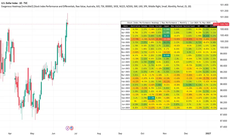
Exogenous Heatmap [invincible3]
The Exogenous Heatmap is a multi-country macro and market-performance dashboard designed to help traders and investors monitor external economic forces that may influence currencies, equities, commodities, and broader risk sentiment.
Instead of focusing only on price action from the current chart, this indicator visualizes key exogenous variables across major economies in a clean historical heatmap format. Users can compare countries by interest rates, GDP growth, balance of trade, foreign exchange reserves, and major stock index performance.
The indicator supports two calculation modes:
1. Raw Value
Displays the actual macroeconomic value or stock index performance for each country.
2. Differential vs Base
Compares each country against a selected base country. This is useful for identifying relative macro strength or weakness. For example, if the base country is set to the USA, the indicator shows how Australia, Japan, the UK, Europe, China, and other countries compare against the United States.
The heatmap includes the following datasets:
Interest Rates and Differentials
Displays policy interest rates or interest-rate differentials between countries. This is especially useful for forex analysis because higher relative interest rates can influence capital flows and currency strength.
GDP and Differentials
Displays GDP year-over-year growth or GDP growth differentials. This helps identify which economies are expanding faster or slower relative to the selected base country.
Balance of Trade and Differentials
Displays trade balance data. A stronger trade surplus may indicate external demand strength, while a deficit may reflect import pressure or weaker export competitiveness.
Reserves and Differentials
Displays foreign exchange reserve levels. This can help assess external liquidity strength and a country’s ability to manage currency or balance-of-payment stress.
Stock Index Performance and Differentials
Displays the performance of major stock indexes from leading economies. This adds a global risk-on/risk-off component to the indicator. Strong equity index performance may reflect improving investor sentiment, while weak performance may signal risk aversion.
The default stock index symbols include:
Australia: ASX 200
Canada: TSX Composite
China: Shanghai Composite
Europe: Euro Stoxx 50
Japan: Nikkei 225
New Zealand: NZX 50
Switzerland: SMI
United Kingdom: FTSE 100
United States: S&P 500
Users can manually change these symbols from the settings panel if they prefer alternative benchmarks.
Example 1: Interest Rate Differential
Suppose the selected dataset is Interest Rates and Differentials and the base country is set to USA.
If:
USA interest rate = 5.50%
Japan interest rate = 0.50%
Then Japan’s differential versus the USA is:
0.50% - 5.50% = -5.00 pp
This means Japan’s policy rate is 5.00 percentage points lower than the USA. In the heatmap, this would appear as a negative differential and would be colored toward the negative side of the gradient.
Example 2: Stock Index Performance Differential
Suppose the selected dataset is Stock Index Performance and Differentials and the timeframe is set to Monthly.
If:
USA S&P 500 monthly return = +4.20%
Japan Nikkei 225 monthly return = +2.10%
Then Japan’s stock index performance differential versus the USA is:
2.10% - 4.20% = -2.10 pp
This means Japan’s equity market underperformed the USA by 2.10 percentage points during that monthly period.
Example 3: Raw Stock Index Performance
If the calculation mode is set to Raw Value, the indicator displays each country’s own index return for the selected period.
For example:
USA: +4.20%
Japan: +2.10%
UK: -1.30%
Europe: +0.80%
This allows users to quickly identify which regions are leading or lagging in global equity performance.
Color Interpretation
Positive values are shown using the positive color gradient.
Negative values are shown using the negative color gradient.
Neutral or near-zero values are shown near the neutral color.
The indicator includes both automatic and manual color scaling. Auto Scale adjusts the heatmap based on the strongest visible value, while Manual Scale lets the user set a fixed range for more consistent comparisons.
How Traders Can Use It
Forex traders can use interest-rate and GDP differentials to evaluate relative currency strength.
Macro traders can use trade balance and reserve data to identify external economic pressure or resilience.
Equity and index traders can use global stock index performance to track international risk sentiment.
Commodity traders can use the dashboard as a macro backdrop because global growth, rates, and risk appetite often influence commodity demand and capital flows.
Important Notes
For percentage-based datasets such as interest rates, GDP growth, and stock index returns, differential values are displayed in percentage points, abbreviated as “pp.”
For balance of trade and reserves, raw values may often be more meaningful than differentials because countries may report values in different scales or currencies.
This indicator is designed as a macro and risk-sentiment visualization tool. It should be used together with technical analysis, fundamental analysis, and proper risk management.
The Exogenous Heatmap is a multi-country macro and market-performance dashboard designed to help traders and investors monitor external economic forces that may influence currencies, equities, commodities, and broader risk sentiment.
Instead of focusing only on price action from the current chart, this indicator visualizes key exogenous variables across major economies in a clean historical heatmap format. Users can compare countries by interest rates, GDP growth, balance of trade, foreign exchange reserves, and major stock index performance.
The indicator supports two calculation modes:
1. Raw Value
Displays the actual macroeconomic value or stock index performance for each country.
2. Differential vs Base
Compares each country against a selected base country. This is useful for identifying relative macro strength or weakness. For example, if the base country is set to the USA, the indicator shows how Australia, Japan, the UK, Europe, China, and other countries compare against the United States.
The heatmap includes the following datasets:
Interest Rates and Differentials
Displays policy interest rates or interest-rate differentials between countries. This is especially useful for forex analysis because higher relative interest rates can influence capital flows and currency strength.
GDP and Differentials
Displays GDP year-over-year growth or GDP growth differentials. This helps identify which economies are expanding faster or slower relative to the selected base country.
Balance of Trade and Differentials
Displays trade balance data. A stronger trade surplus may indicate external demand strength, while a deficit may reflect import pressure or weaker export competitiveness.
Reserves and Differentials
Displays foreign exchange reserve levels. This can help assess external liquidity strength and a country’s ability to manage currency or balance-of-payment stress.
Stock Index Performance and Differentials
Displays the performance of major stock indexes from leading economies. This adds a global risk-on/risk-off component to the indicator. Strong equity index performance may reflect improving investor sentiment, while weak performance may signal risk aversion.
The default stock index symbols include:
Australia: ASX 200
Canada: TSX Composite
China: Shanghai Composite
Europe: Euro Stoxx 50
Japan: Nikkei 225
New Zealand: NZX 50
Switzerland: SMI
United Kingdom: FTSE 100
United States: S&P 500
Users can manually change these symbols from the settings panel if they prefer alternative benchmarks.
Example 1: Interest Rate Differential
Suppose the selected dataset is Interest Rates and Differentials and the base country is set to USA.
If:
USA interest rate = 5.50%
Japan interest rate = 0.50%
Then Japan’s differential versus the USA is:
0.50% - 5.50% = -5.00 pp
This means Japan’s policy rate is 5.00 percentage points lower than the USA. In the heatmap, this would appear as a negative differential and would be colored toward the negative side of the gradient.
Example 2: Stock Index Performance Differential
Suppose the selected dataset is Stock Index Performance and Differentials and the timeframe is set to Monthly.
If:
USA S&P 500 monthly return = +4.20%
Japan Nikkei 225 monthly return = +2.10%
Then Japan’s stock index performance differential versus the USA is:
2.10% - 4.20% = -2.10 pp
This means Japan’s equity market underperformed the USA by 2.10 percentage points during that monthly period.
Example 3: Raw Stock Index Performance
If the calculation mode is set to Raw Value, the indicator displays each country’s own index return for the selected period.
For example:
USA: +4.20%
Japan: +2.10%
UK: -1.30%
Europe: +0.80%
This allows users to quickly identify which regions are leading or lagging in global equity performance.
Color Interpretation
Positive values are shown using the positive color gradient.
Negative values are shown using the negative color gradient.
Neutral or near-zero values are shown near the neutral color.
The indicator includes both automatic and manual color scaling. Auto Scale adjusts the heatmap based on the strongest visible value, while Manual Scale lets the user set a fixed range for more consistent comparisons.
How Traders Can Use It
Forex traders can use interest-rate and GDP differentials to evaluate relative currency strength.
Macro traders can use trade balance and reserve data to identify external economic pressure or resilience.
Equity and index traders can use global stock index performance to track international risk sentiment.
Commodity traders can use the dashboard as a macro backdrop because global growth, rates, and risk appetite often influence commodity demand and capital flows.
Important Notes
For percentage-based datasets such as interest rates, GDP growth, and stock index returns, differential values are displayed in percentage points, abbreviated as “pp.”
For balance of trade and reserves, raw values may often be more meaningful than differentials because countries may report values in different scales or currencies.
This indicator is designed as a macro and risk-sentiment visualization tool. It should be used together with technical analysis, fundamental analysis, and proper risk management.
Script de código aberto
Em verdadeiro espírito do TradingView, o criador deste script o tornou de código aberto, para que os traders possam revisar e verificar sua funcionalidade. Parabéns ao autor! Embora você possa usá-lo gratuitamente, lembre-se de que a republicação do código está sujeita às nossas Regras da Casa.

Aviso legal
As informações e publicações não se destinam a ser, e não constituem, conselhos ou recomendações financeiras, de investimento, comerciais ou de outro tipo fornecidos ou endossados pela TradingView. Leia mais nos Termos de Uso.
Script de código aberto
Em verdadeiro espírito do TradingView, o criador deste script o tornou de código aberto, para que os traders possam revisar e verificar sua funcionalidade. Parabéns ao autor! Embora você possa usá-lo gratuitamente, lembre-se de que a republicação do código está sujeita às nossas Regras da Casa.
Aviso legal
As informações e publicações não se destinam a ser, e não constituem, conselhos ou recomendações financeiras, de investimento, comerciais ou de outro tipo fornecidos ou endossados pela TradingView. Leia mais nos Termos de Uso.