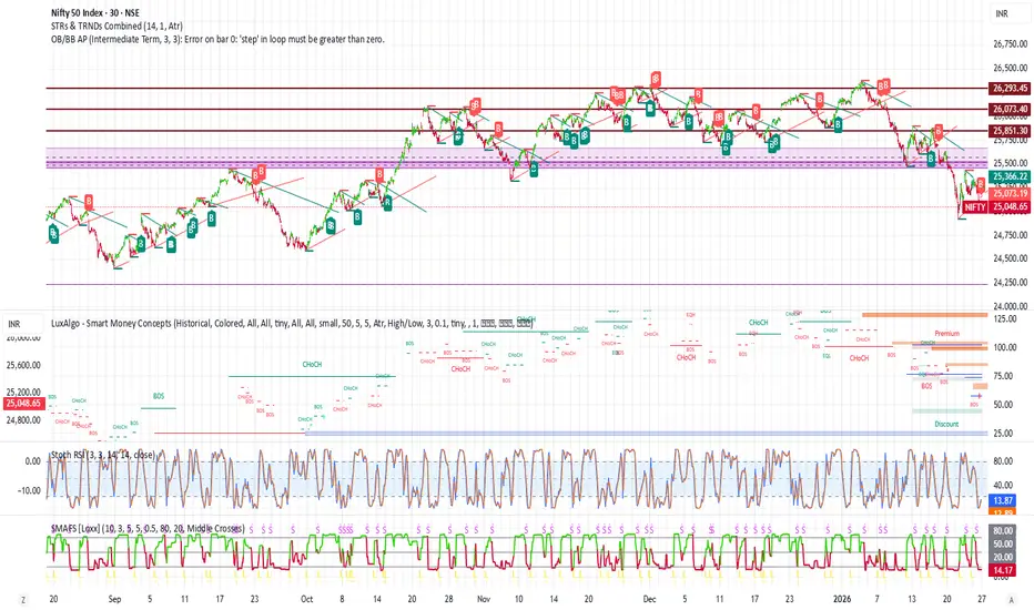
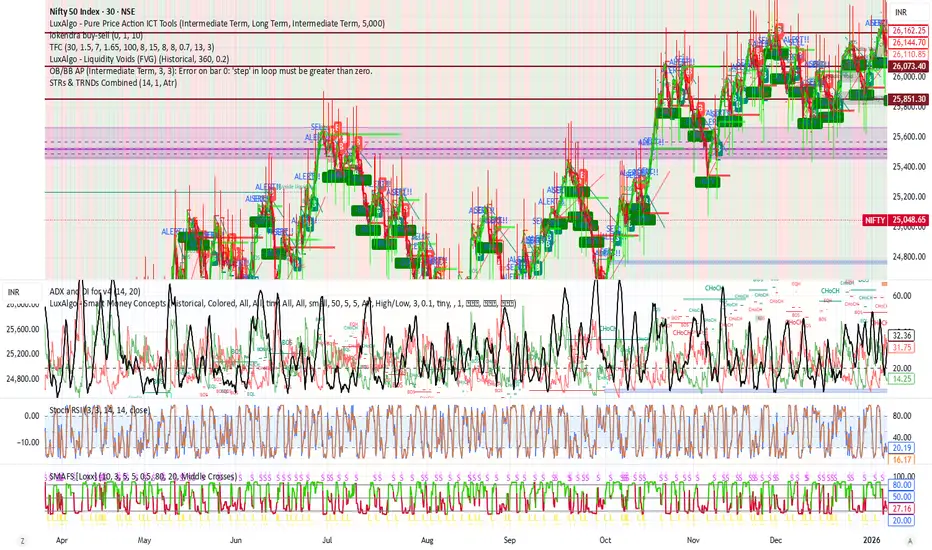
Indicador

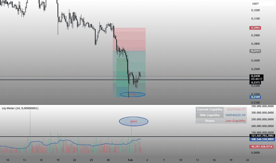
Asset Liquidity Meter by Funded RelayAsset Liquidity Meter by Funded Relay
This indicator estimates the liquidity of any asset by calculating the volume traded per unit of price movement (volume / (high - low)).
Higher values generally indicate better liquidity (more volume in a smaller price range → easier to enter/exit positions with less slippage).
Lower values suggest thinner liquidity (higher risk of price impact and volatility).
The indicator displays:
• Histogram: raw liquidity per bar (green = above SMA, red = below SMA)
• SMA line: smoothed liquidity trend
• Real-time info table in the top-right corner
• Built-in alert conditions
How to Use – Step by Step
1. Adding the Indicator
- Open any chart on TradingView
- Click the "Indicators" button at the top
- Search for "Asset Liquidity Meter v6" (or find it in Community Scripts / My Scripts)
- Click to add it to the chart
- It will appear in a separate pane below the price chart
2. Customizing Settings
Double-click the indicator name in the pane (or right-click → Settings):
• SMA Length (default: 14)
- Controls the smoothing period of the liquidity trend line
- Smaller values (5–10) → more responsive, good for intraday/scalping
- Larger values (20–50) → smoother trend, better for swing/position trading
• Epsilon (default: 0.00000001)
- Tiny value that prevents division-by-zero errors on flat bars (high = low)
- Almost never needs to be changed
• Colors
- High Liquidity Color: histogram bars when liquidity > SMA
- Low Liquidity Color: histogram bars when liquidity < SMA
- SMA Line Color: color of the smoothed trend line
• Show Alert Conditions in Menu
- Keep enabled (true) to see the built-in alert options when creating alerts
3. Reading & Interpreting the Indicator
• Histogram Bars (Raw Liquidity)
- Height = amount of volume per unit of price range
- Tall bars = high liquidity (market is "thick")
- Short bars = low liquidity (market is "thin")
- Green = current liquidity is stronger than the average (SMA)
- Red = current liquidity is weaker than the average
• Blue SMA Line
- Shows the average liquidity over the selected period
- Rising line → liquidity improving (more participants, easier trading)
- Falling line → liquidity decreasing (thinner market, caution advised)
• Info Table (top-right corner)
- Displays current raw liquidity, SMA value, and status ("High Liquidity" / "Low Liquidity")
- Updates in real-time on the last bar
• Zero Line (dotted gray)
- Visual reference — everything above zero is positive liquidity
4. Practical Trading Applications
• High Liquidity Zones (green bars + rising SMA)
- Favorable conditions for entering or scaling into positions
- Lower expected slippage
- Better for large orders
• Low Liquidity Zones (red bars + falling SMA)
- Higher risk of slippage and exaggerated price moves
- Consider smaller position sizes or waiting for better conditions
- Common during session opens/closes, holidays, or low-volume periods
• Crossovers
- Liquidity crossing above SMA → potential increase in market participation
- Liquidity crossing below SMA → potential drying up of interest
5. Setting Up Alerts
1. Right-click on the chart → "Add Alert"
2. In "Condition", select "Asset Liquidity Meter v6"
3. Choose one of the available alert conditions:
- Liquidity ↑ Crosses Above SMA
- Liquidity ↓ Crosses Below SMA
- Very High Liquidity (2× SMA)
- Very Low Liquidity (<30% SMA)
4. Set frequency (Once Per Bar Close is usually best)
5. Configure notification (email, popup, sound, webhook, etc.)
6. Create the alert
6. Tips for Best Results
• Works on all markets: stocks, forex, crypto, futures, indices
• Best on timeframes with meaningful volume data (5 min and higher usually give clearest signals)
• Compare liquidity across different assets or timeframes using multiple charts
• Combine with support/resistance, volume profile or order flow tools for confirmation
• Not a standalone signal — use in context with your overall strategy
Limitations & Notes
• This is an estimation based on OHLCV data — it does not show real order book depth
• Results vary significantly between centralized exchanges, brokers and instruments
• Zero-volume bars will show zero liquidity (expected behavior)
Enjoy safer and more informed trading!
Questions or suggestions? Feel free to comment below. Indicador
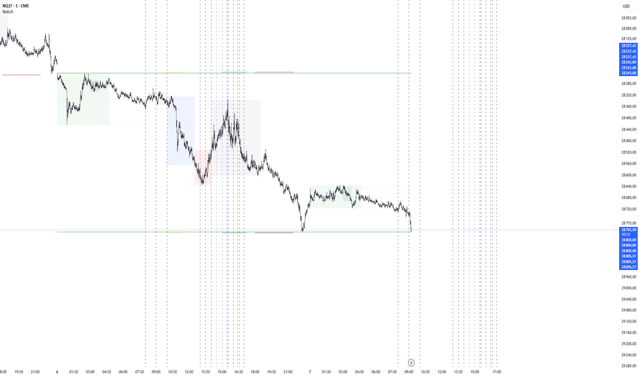
Smart Money Range + Displacement🧠 How This Indicator Works
This indicator is based on Smart Money Concepts, which follow how institutions actually move the market:
Build liquidity → Take liquidity → Show intent → Move price
It does not predict the market.
It reacts only after confirmation.
1️⃣ Trend Filter (EMA) – Market Direction
What it does:
The Exponential Moving Average (EMA) shows the dominant market direction.
How it’s used:
Price above EMA → bullish bias → only BUY signals
Price below EMA → bearish bias → only SELL signals
Why it matters:
Institutions usually push price in the direction of the higher-timeframe trend.
This filter removes low-probability counter-trend trades.
2️⃣ Smart Money Range – Liquidity Zone
What it does:
The indicator calculates the highest high and lowest low over a fixed number of candles to create a trading range.
Why this range matters:
Equal highs and equal lows form inside ranges
Retail stop-loss orders accumulate at range boundaries
These areas become liquidity pools
Institutions need liquidity to enter large positions — this shows where it is.
3️⃣ Liquidity Sweep – Stop Hunt Detection
What it does:
The indicator detects when price breaks above or below the range but fails to close outside it.
What this means:
Stops above highs or below lows are triggered
Retail traders are trapped
Smart money absorbs liquidity
This is manipulation, not a real breakout.
4️⃣ Displacement Candle – Institutional Entry
What it does:
The indicator checks for a candle with a body significantly larger than recent candles.
Why displacement is important:
Large candle bodies show strong order flow
Confirms that institutions have entered the market
Filters out weak or fake moves
No displacement = no trade.
5️⃣ Trade Confirmation Logic – Final Signal
BUY Signal Conditions
Liquidity taken below the range
Strong displacement candle
Price above EMA
SELL Signal Conditions
Liquidity taken above the range
Strong displacement candle
Price below EMA
Meaning:
Only trade after liquidity is taken and real momentum appears in trend direction.
6️⃣ Signal Plotting – Clear Execution
What you see on the chart:
BUY label below the candle
SELL label above the candle
Signals appear only after candle close, ensuring no repainting.
🔁 Market Behavior This Indicator Reads
Market moves sideways (range formation)
Liquidity builds
Stops are taken (false breakout)
Displacement confirms intent
Price expands in one direction
This is how institutional trading works.
⚠️ Best Usage Guidelines
Best timeframes: 15m, 30m, 1H
Avoid major news releases
Wait for candle close
Use structure-based stop loss, not fixed pips
🎯 Why This Indicator Is Effective
Logic-based, not lag-based
No repainting
Works on Gold, BTC, Forex, Indices
Filters noise and emotional trading Indicador

Indicador
Indicador

Indicador
Bullish Divergent Bar DCA Strategy [Skyrexio]Overview
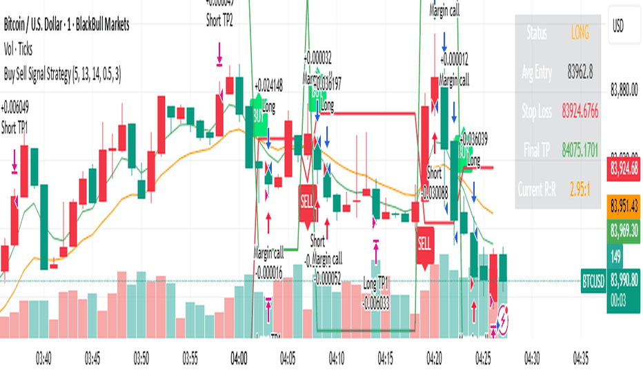
Bullish Divergent Bar DCA Strategy is a long-only, multi-layer Dollar-Cost Averaging (DCA) strategy that builds positions around bullish divergent bars formed below the Williams Alligator. It detects potential local bottoms and then scales into the move using up to four pyramiding entries, each with its own size and price threshold. The strategy optionally incorporates Market Facilitation Index (MFI) and Awesome Oscillator (AO) momentum to strengthen reversal confirmation and uses ATR-based take profit on the averaged entry price.
Unique Features
Layered DCA entries with equity-based sizing . It supports up to four DCA layers, where each additional layer is opened only after a configurable percentage drawdown from the first entry and position size is computed as a fraction of current equity via a geometric weighting scheme.
Optional AO and MFI confirmation . Users can require Awesome Oscillator momentum divergence, MFI/volume “squat” bars, or both to confirm that the reversal bar is accompanied by capitulation and weakening downside momentum.
ATR-based dynamic take profit . Take profit is defined as a multiple of ATR added to the current average entry price, automatically adjusting exits to prevailing volatility.
Built-in DCA visualization . The script can plot the initial entry level and all DCA thresholds to make the averaging structure and risk visually transparent on the chart.
Methodology
The core entry logic starts from a bullish divergent bar definition: the bar must close above its midpoint (close > hl2) and be the lowest low within the user-defined lookback window, flagging a local swing low. On top of this, the bar must form entirely below all three Alligator lines, ensuring that the pattern appears after a sustained downside move rather than inside noise.
If enabled, AO adds a momentum filter by requiring the Awesome Oscillator difference to be negative (descending bar on AO histogram), signaling fading downside momentum at the potential bottom. If the MFI filter is enabled, the bar (or one of the last two bars) must be a “squat” bar where spread narrows while volume increases, approximating effort vs. result exhaustion.
Once a valid bullish reversal bar is detected and the time is within the configured trading window, the strategy opens the first DCA layer using a stop entry at the bar’s high (confirmation level), only entering if price actually breaks the bar high. Additional layers (second, third, and fourth entries) are only allowed if price trades below percentage thresholds from the first entry price and a new valid bullish reversal bar forms, thereby averaging down into deep pullbacks while still requiring fresh reversal evidence.
While any DCA position is open, the strategy continuously recalculates the take profit as the current volume-weighted average entry price plus ATR multiplied by a user-defined factor. All individual entries share the same take profit level through separate strategy exit calls, so the entire stacked position exits together once price has moved sufficiently above the averaged entry.
Strategy settings
In the inputs window, users can configure the following strategy settings:
sourceUuid / secretToken: Identifiers used to format JSON alerts for automated execution through webhooks.
Trade Start Date/Time: Beginning of the backtest/live-trading window.
Trade Stop Date/Time: End of the backtest/live-trading window.
Show DCA Levels (default = false): Toggles plotting of the initial entry level and all three DCA thresholds on the chart.
Enable MFI (default = false): Enables the MFI-style volume/spread filter.
Enable AO (default = false): Enables Awesome Oscillator confirmation.
Number Of Bar For Lowest Bar (default = 7): Lookback window used to identify the lowest low bar for the bullish reversal bar condition.
Layer 2 Threshold Percent (default = 4.0): Percentage drop from the first layer price that must be reached to allow the second DCA entry.
Layer 3 Threshold Percent (default = 10.0): Percentage drop from the first layer price required to unlock the third DCA layer.
Layer 4 Threshold Percent (default = 22.0): Percentage drop from the first layer price required to unlock the fourth DCA layer.
Position Size Multiplier (default = 2.0): Multiplier used in the geometric weighting scheme to determine how much equity is allocated to each additional DCA layer.
Number Of ATR For Take Profit (default = 2.0): ATR multiple added to the current average entry price to calculate the shared take profit for all open layers.
Users can refine these parameters during backtesting to fit the volatility profile and structure of the specific asset and timeframe.
Justification of Methodology
Before understanding why this particular combination of indicator has been chosen let's briefly explain what is Williams Alligator, MFI and AO.
let’s start with the Williams Alligator. Developed by Bill Williams, the Alligator is a technical indicator that identifies trends and potential market reversals. It consists of three smoothed moving averages:
Jaw (Blue Line): The slowest of the three, based on a 13-period smoothed moving average shifted 8 bars ahead.
Teeth (Red Line): The medium-speed line, derived from an 8-period smoothed moving average shifted 5 bars forward.
Lips (Green Line): The fastest line, calculated using a 5-period smoothed moving average shifted 3 bars forward.
When the lines diverge and align in order, the "Alligator" is "awake," signaling a strong trend. When the lines overlap or intertwine, the "Alligator" is "asleep," indicating a range-bound or sideways market. This indicator helps traders determine when to enter or avoid trades.
The Awesome Oscillator (AO), developed by Bill Williams, is a momentum indicator designed to measure market momentum by contrasting recent price movements with a longer-term historical perspective. It helps traders detect potential trend reversals and assess the strength of ongoing trends.
The formula for AO is as follows:
AO = SMA5(Median Price) − SMA34(Median Price)
where:
Median Price = (High + Low) / 2
SMA5 = 5-period Simple Moving Average of the Median Price
SMA 34 = 34-period Simple Moving Average of the Median Price
The Market Facilitation Index (MFI) is a technical indicator that measures the price movement per unit of volume, helping traders gauge the efficiency of price movement in relation to trading volume. Here's how you can calculate it:
MFI = (High−Low)/Volume
MFI can be used in combination with volume, so we can divide 4 states. Bill Williams introduced these to help traders interpret the interaction between volume and price movement. Here’s a quick summary:
Green Window (Increased MFI & Increased Volume): Indicates strong momentum with both price and volume increasing. Often a sign of trend continuation, as both buying and selling interest are rising.
Fake Window (Increased MFI & Decreased Volume): Shows that price is moving but with lower volume, suggesting weak support for the trend. This can signal a potential end of the current trend.
Squat Window (Decreased MFI & Increased Volume): Shows high volume but little price movement, indicating a tug-of-war between buyers and sellers. This often precedes a breakout as the pressure builds.
Fade Window (Decreased MFI & Decreased Volume): Indicates a lack of interest from both buyers and sellers, leading to lower momentum. This typically happens in range-bound markets and may signal consolidation before a new move.
For our purposes we are interested in squat bars. This is the sign that volume cannot move the price easily. This type of bar increases the probability of trend reversal. In this indicator we added to enable the MFI filter of reversal bars. If potential divergent bar or two preceding bars have squat state this bar can be interpret as a reversal one.
The strategy intentionally focuses on bullish divergent bars forming at local lows and below the Alligator to catch potential exhaustion points in downtrends where risk/reward becomes asymmetric. The Alligator (Jaw, Teeth, Lips) acts as a dynamic structure filter: requiring price to be below all three lines before reversal helps avoid chasing minor pullbacks inside an ongoing uptrend and instead concentrates entries on deeper corrections where mean reversion potential is higher.
The custom bullish divergent bar rule (close above midpoint and being the lowest low over N bars) approximates a local capitulation candle, which often precedes short squeezes or at least strong reactions. By combining this with AO and MFI-style filters, the strategy further increases the likelihood that the pattern coincides with downside momentum(as a confirmation that current trend is downward, AO difference < 0) and effort vs. result anomalies (squat bars), which is common signatures of trend exhaustion.
The DCA structure is designed to deploy capital progressively rather than all at once: the first entry is triggered only if price confirms the reversal by breaking above the bar’s high, while subsequent layers require both a deeper discount relative to the initial entry and a new bullish reversal signal. Percentage thresholds from the first entry ensure that each additional allocation is made at meaningfully better prices, improving the blended entry level and reducing the break-even distance.
Finally, using ATR as the basis for take profit aligns exits with current volatility. A fixed-percentage target can be too tight in volatile regimes or too loose in quiet markets, whereas ATR-based targets scale with average bar range. Applying ATR to the evolving average entry price of all open layers keeps the risk/reward framework consistent across different volatility regimes and DCA configurations.
Backtest Results
Operating window: Date range of backtests is 2025.01.01 - 2026.01.01. It is chosen to let the strategy to close all opened positions.
Commission and Slippage: Includes a standard Binance commission of 0.1% and accounts for possible slippage over 5 ticks.
Initial capital: 10000 USDT
Maximum Single Position Loss: -6.56%
Maximum Single Profit: +4.92%
Net Profit: +934.08 USDT (+9.34%)
Total Trades: 121 (82.64% win rate)
Profit Factor: 2.948
Maximum Accumulated Loss: 624.72 USDT (-6.15%)
Average Profit per Trade: 7.72 USDT (+0.37%)
Average Trade Duration: 60 hours
These results are obtained with realistic parameters representing trading conditions observed at major exchanges such as Binance and with realistic trading portfolio usage parameters.
You should run your own backtests on the target asset and timeframe (for example, BTC/USDT on intraday charts) and adjust threshold percentages, layer sizing, and ATR take profit factor to match your risk tolerance and market conditions.
How to Use
Add the script to favorites for easy access.
Apply to the desired timeframe and chart.
Configure settings using the dropdown choice list in the built-in menu.
Set up alerts to automate strategy positions through web hook with the text: {{strategy.order.alert_message}}
Disclaimer:
Educational and informational tool reflecting Skyrex commitment to informed trading. Past performance does not guarantee future results. Test strategies in a simulated environment before live implementation Estratégia

Indicador

Estratégia
Indicador

Estratégia

Indicador

Indicador

Indicador

Indicador

Indicador

Indicador

Luminous Market Flux [Pineify]Luminous Market Flux - Dynamic Volatility Channel with Breakout Detection
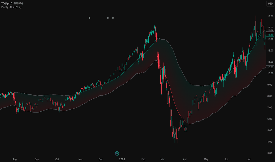
The Luminous Market Flux indicator is a sophisticated volatility-based trading tool that combines dynamic channel analysis with breakout detection and squeeze identification. This indicator helps traders visualize market conditions by creating an adaptive envelope around price action, highlighting periods of compression (low volatility) and expansion (high volatility) while generating actionable buy and sell signals at key breakout moments.
Key Features
Dynamic volatility channel that adapts to changing market conditions using ATR-based calculations
Visual squeeze detection system that warns traders when volatility is contracting
Automatic breakout signal generation for both bullish and bearish scenarios
Luminous gradient fill that provides instant visual feedback on price position within the channel
Bar coloring feature that highlights strong volatility breakouts
Built-in alert conditions for automated trading notifications
How It Works
The indicator operates on three core calculation layers:
1. Baseline Calculation (Central Tendency)
The foundation uses a Running Moving Average (RMA) of the closing price over the specified Flux Length period. RMA was specifically chosen over SMA or EMA because it provides smoother trend detection similar to how RSI and ATR calculations work, reducing noise while maintaining responsiveness to genuine price movements.
2. Volatility Measurement
The channel width is determined by the Average True Range (ATR) multiplied by the Flux Expansion Factor. ATR captures the true volatility of the market by accounting for gaps and limit moves, making the channel responsive to actual market conditions rather than just closing price variations.
3. Squeeze Detection Logic
The indicator compares the current channel width against a 100-period simple moving average of historical channel widths. When the current range falls below 80% of this average, a squeeze condition is identified, signaling that volatility is compressing and a significant move may be imminent.
Trading Ideas and Insights
Breakout Trading: Enter long positions when price breaks above the upper flux channel with a BUY signal, and short positions when price breaks below the lower channel with a SELL signal. These breakouts indicate strong momentum in the direction of the move.
Squeeze Anticipation: When squeeze circles appear at the top of the chart, prepare for a potential explosive move. Squeezes often precede significant breakouts as the market coils before releasing energy in one direction.
Trend Confirmation: Use the bar coloring feature to confirm trend strength. Colored bars indicate that price is trading outside the volatility envelope, suggesting strong directional momentum.
Mean Reversion: When price is within the channel (no bar coloring), the gradient fill helps identify whether price is closer to the upper or lower boundary, potentially useful for mean-reversion strategies.
How Multiple Indicators Work Together
This indicator integrates several technical concepts into a cohesive system:
The RMA baseline provides the trend anchor, while the ATR-based envelope adapts to volatility conditions. These two components work together to create a channel that expands during volatile periods and contracts during quiet markets. The squeeze detection layer adds a third dimension by comparing current volatility to historical norms, alerting traders when the market is unusually quiet.
The visual elements reinforce this analysis: the gradient fill shows price position within the channel at a glance, bar coloring confirms breakout strength, and shape markers provide discrete entry signals. This multi-layered approach ensures traders receive consistent information across different visualization methods.
Unique Aspects
The "Luminous" visual design uses color gradients that dynamically shift based on price position, creating an intuitive heat-map effect within the channel
Unlike traditional Bollinger Bands that use standard deviation, this indicator uses ATR for volatility measurement, making it more responsive to actual price range movements
The squeeze detection compares current volatility to a longer-term average (100 periods), providing context-aware compression signals rather than arbitrary thresholds
Signal generation uses proper state tracking to ensure breakout signals only fire on the initial breakout, not on every bar during an extended move
How to Use
Add the indicator to your chart. It will overlay directly on price with the volatility channel visible.
Watch for BUY labels appearing below bars when price breaks above the upper channel - these indicate bullish breakout opportunities.
Watch for SELL labels appearing above bars when price breaks below the lower channel - these indicate bearish breakout opportunities.
Monitor for small circles at the top of the chart indicating squeeze conditions - prepare for potential breakouts when these appear.
Use the colored bars as confirmation of breakout strength - green bars confirm bullish momentum, red bars confirm bearish momentum.
Set up alerts using the built-in alert conditions to receive notifications for buy signals, sell signals, and squeeze warnings.
Customization
Flux Length (default: 20): Controls the lookback period for both the baseline and ATR calculations. Lower values create more responsive but noisier channels; higher values create smoother but slower-reacting channels.
Flux Expansion Factor (default: 2.0): Multiplier for the ATR value that determines channel width. Higher values create wider channels with fewer signals; lower values create tighter channels with more frequent signals.
Smooth Signal : Toggle for signal smoothing preference.
Bullish Energy : Customize the color for bullish breakouts and upper channel highlights.
Bearish Energy : Customize the color for bearish breakouts and lower channel highlights.
Compression/Neutral : Customize the color for squeeze indicators and neutral channel states.
Conclusion
The Luminous Market Flux indicator provides traders with a comprehensive volatility analysis tool that combines channel-based trend detection, squeeze identification, and breakout signaling into a single, visually intuitive package. By using ATR-based volatility measurement and RMA smoothing, the indicator adapts to changing market conditions while filtering out noise. Whether you are a breakout trader looking for momentum entries or a swing trader waiting for volatility expansion after compression periods, this indicator offers the visual clarity and signal precision needed to make informed trading decisions.
Indicador
Indicador

Indicador
Indicador

Indicador

Indicador