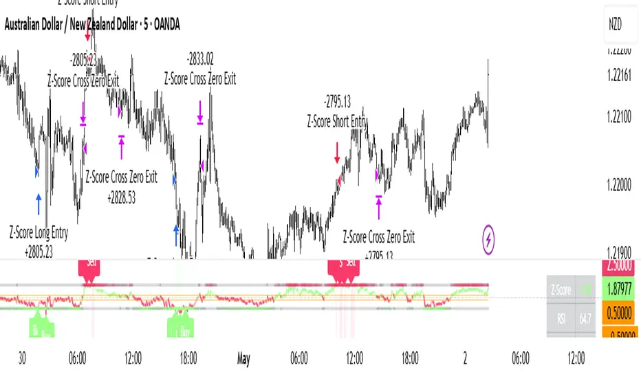
Z-Score Mean Reversion ProZ-Score Mean Reversion Pro is a Strategy designed to identify high-probability mean reversion setups by combining statistical Z-Score extremes with RSI momentum confirmation, Bollinger Band volatility filtering, and EMA trend alignment. It provides clean buy/sell signals, visual trade zones, dashboard data, and alert outputs to assist in short-term reversal trading, intraday setups, and swing mean reversion trades.
🔑 FEATURES
Z-Score Mean Reversion Engine: Detects statistically stretched price moves and highlights potential reversal zones when price deviates too far from its rolling mean.
Multi-Layer Signal Confirmation: Combines RSI exhaustion, Bollinger Band Width volatility checks, and EMA trend filtering to reduce false signals and improve trade quality.
Built-In Risk Management: Includes ATR-based stop loss and take profit logic, plus optional mean reversion exits when price returns toward equilibrium.
⚠️ NOTES & DISCLAIMERS
This script works best on 5m, 15m, 1H, and 4H charts across Forex, Crypto, Indices, and liquid Stocks.
Best suited for mean reversion traders looking to capture exhaustion moves and short-term reversals.
ATR exits are ideal for structured risk management, while Z-Score exits are better for pure statistical reversion setups.
Always use risk management (Stop Loss).
This script is for educational and research purposes only. Always forward test before using live capital.
Estratégia

Indicador

Price oscillator [Session Adjusted]Price Oscillator
This indicator combines directional momentum bias with dynamic volatility analysis, helping traders identify both trend direction and potential exhaustion zones.
Core Concept
The oscillator calculates the percentage deviation of price from a session-adjusted moving average (close / MA - 1).
The histogram is plotted as always-positive columns (green when price is above the MA, red when below). This design enables a clear visual comparison between momentum strength and the Bollinger Band Width (BBW).
When the colored columns cross above the BBW line, it signals an over-extended condition, often indicating a high probability of imminent correction or mean reversion.
Volatility Analysis
The blue BBW line is a key element of the indicator:
- Rising BBW (positive slope) indicates volatility expansion — typically associated with strong trending moves or breakout phases.
- Falling BBW (negative slope) indicates volatility contraction — often signaling consolidation periods or impending explosive moves.
Main Features
Adaptive Lookback Period:
Automatically adjusts based on the selected session duration (default 24 hours), providing timeframe consistency.
Flexible Smoothing:
Choose between SMA, EMA, RMA, or WMA for the reference moving average.
Dual Signal System:
Colored columns show momentum direction and strength.
BBW line reveals both the level and the direction (slope) of volatility.
Exhaustion Zones:
Crosses between momentum columns and BBW act as dynamic overbought/oversold signals.
How to Use
Directional Bias Filter: Green columns = bullish bias | Red columns = bearish bias.
Volatility Regime: Use the slope of the BBW line to distinguish between trending (expanding volatility) and consolidating (contracting volatility) environments.
Correction Signals: Watch for strong momentum columns crossing above the BBW line — this frequently precedes pullbacks or reversals.
Particularly effective on Forex pairs and European indices (DAX, CAC40, FTSEMIB, etc.) on 1H to 4H, and Daily timeframes.
Indicador

Indicador

Lumina Trend Channels & Bands [Pineify]Pineify - Lumina Trend Channels & Bands
Lumina Trend Channels & Bands is an overlay indicator that builds a volatility-adjusted trend channel around a Volume-Weighted Moving Average (VWMA). VWMA forms the baseline, while ATR bands define how far price must move before trend state changes.
Key Features
VWMA midpoint weighted toward higher-volume closes.
ATR-based upper and lower bands that adapt to current range.
Persistent trend state while price remains inside the channel.
Triangle markers on the first cross above the upper band or below the lower band.
How It Works
The script calculates a VWMA of close, then adds and subtracts ATR multiplied by the Band Multiplier. A close above the upper band sets bullish state; a close below the lower band sets bearish state. Between the bands, the prior state is preserved.
Compute the VWMA baseline.
Measure ATR and scale it by the Band Multiplier.
Plot upper and lower channel bands around the VWMA, then mark the first crossover or crossunder.
How the Components Work Together
VWMA supplies the directional anchor, while ATR decides how much evidence price needs before a breakout is treated as meaningful. In high volatility the bands widen and demand a stronger close; in quiet conditions the channel tightens and reacts sooner. The cloud fill emphasizes the active side of the trend.
Trading Ideas and Insights
A bullish triangle may indicate continuation after price clears the upper boundary.
A bearish triangle may flag downside momentum when price loses the lower band.
Inside-channel movement is a drift zone. Wait for bar close on live bars; fast reversals can lag, and ranges can whipsaw.
Unique Aspects
Trend state is retained inside the ATR channel, reducing flip-flopping around the VWMA.
The asymmetric cloud emphasizes the active trend side while keeping the opposite band visible.
How to Use
Add the indicator to a clean price chart.
Use the midline and channel to judge bullish, bearish, or undecided territory.
Treat triangles as potential breakout starts, then look for confirmation.
No built-in alert conditions are included in this version.
Customization
Trend Baseline Length (default: 50) - VWMA lookback. Higher values smooth the channel but add lag.
Volatility (ATR) Length (default: 14) - ATR lookback for band width.
Band Multiplier (default: 2.0) - Channel distance. Higher values reduce breakouts; lower values are more sensitive.
Bullish/Bearish Trend Colors - Adjust line, cloud, and marker colors.
Conclusion
Lumina Trend Channels & Bands is for traders who want a clean VWMA trend channel with volatility-aware breakout markers. Use it as context alongside structure, volume, and risk management rather than as a standalone system.
Indicador

Indicador

DMI ADX Bollinger BandsThis Pine Script code merges the classic DMI (Directional Movement Index) and ADX (Average Directional Index) indicators with Bollinger Bands, but with a unique twist: the Bollinger Bands are applied to the ADX line itself rather than the price.
This structure allows you to analyze not just the strength of the trend, but the volatility of that trend's momentum.
1. Components of the Indicator
+DI (Navy Line): Represents the strength of the bullish (upward) momentum.
-DI (Red Line): Represents the strength of the bearish (downward) momentum.
ADX (Green Line): Measures the absolute strength of the trend.
Bollinger Bands (Gray Lines & Blue Shading): Measure the volatility of the ADX line (i.e., how rapidly the trend is gaining or losing momentum).
2. How to Interpret the Signals
A. Trend Direction (DMI)
+DI > -DI: The market is trending upward.
-DI > +DI: The market is trending downward.
B. Trend Strength (ADX Levels)
Below 20: The market lacks a clear trend or is in a "ranging" (sideways) state.
20 – 40: A trend is forming and gaining strength. This is usually the prime area for trend-following strategies.
Above 40: The trend is very strong, but it also indicates the market is becoming "overextended" or at risk of exhaustion.
C. Trend Momentum (ADX + Bollinger Bands)
This is the core feature of your script:
ADX crosses above the Upper Band: The trend is gaining momentum explosively. This often indicates a strong breakout or an acceleration in the current price move.
ADX nears the Lower Band: The trend is losing steam or entering a consolidation/sideways phase.
ADX is between the bands: The trend is moving at a consistent, sustainable pace.
3. Trading Strategies
Trend-Following (Entry)
Entry: Look for a cross where +DI > -DI (for long) or -DI > +DI (for short), while the ADX is above 20.
Confirmation: Ideally, you want to see the ADX line moving upward, ideally heading toward the Upper Bollinger Band, confirming that the momentum is building.
Profit Taking / Reversal (Exhaustion)
When the ADX reaches the 40–50 level and touches or exceeds the Upper Bollinger Band, the trend is likely "overextended." This is a strong signal to consider taking profits or tightening your stop-loss, as the market may be due for a correction.
Identifying Ranging Markets
If the ADX line drops below the Lower Bollinger Band, the market has officially entered a low-volatility/sideways phase. Avoid trend-following strategies in this zone and consider strategies better suited for choppy markets. Indicador

SwissTradeAcademy Money PrinterThe SwissTradeAcademy Money Printer is a professional-grade, multi-component trading indicator developed in Pine Script v6. It combines three powerful analysis methodologies into a single, high-performance tool, designed to keep your TradingView charts clean while providing comprehensive market insights.
Core Components
1. Super Bollinger Trend (SBT)
A dynamic trend-following system based on Bollinger Band volatility.
Trend Tracking: Uses an adaptive baseline that shifts based on price action and volatility.
Integrated ZigZag: Automatically identifies and connects local highs and lows to visualize market structure.
Signal Labels: Provides clear visual markers for trend shifts and price targets.
2. MACD Price Overlay
Unlike standard oscillators that sit in a separate pane, this MACD is projected directly onto the price chart.
Trend Momentum: Features a dual-line MACD (Fast/Slow) and a Signal line that change color based on momentum direction.
Visual Fill: Uses a dynamic color cloud to represent the gap between the MACD and Signal lines, highlighting bullish and bearish strength.
SMA 89 Filter: Includes a long-term 89-period Simple Moving Average to identify the "Golden Mean" and primary market direction.
3. 4-in-1 Multi-Timeframe MAs
A flexible Moving Average engine that allows for deep customization.
Versatile Types: Choose from SMA, EMA, WMA, RMA, HMA, or VWMA.
Multi-Timeframe (MTF) Support: Plot MAs from higher timeframes (e.g., 1H or Daily) directly onto your current lower-timeframe chart.
Custom Sources: Calculate averages based on Open, High, Low, Close, or HL2.
Key Features
Pine Script v6 Optimized: Built with the latest TradingView standards for maximum execution speed and reliability.
Organized Settings: All parameters are logically grouped in the "Inputs" tab for easy configuration.
Clean Interface: Combines three indicators into one, saving valuable indicator slots for free-tier users and reducing chart clutter.
How to Use
Trend Confirmation: Look for alignment between the Super Bollinger Trend color and the MACD cloud color.
Support & Resistance: Use the 89 SMA and the 200 EMA (MA 1) as major "institutional" levels for trade entries or exits.
Volatility Alerts: The ZigZag labels help track the distance of moves, assisting in setting realistic Take Profit levels. Indicador

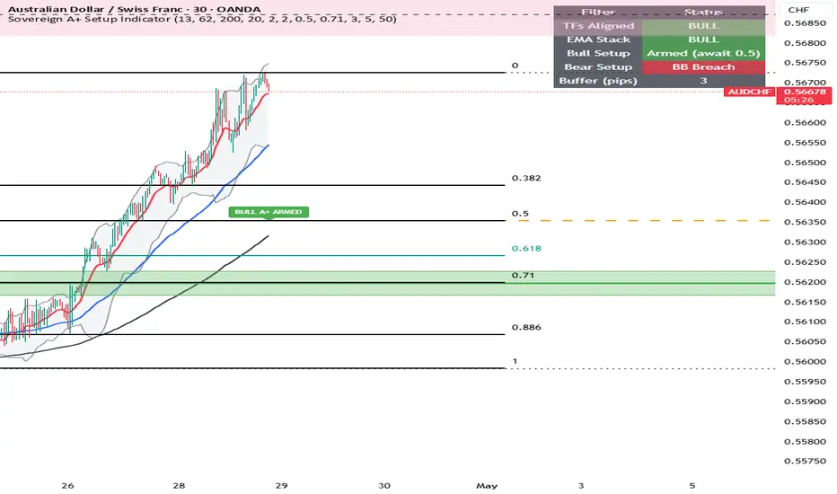
Bollinger Walk Quality [AGPro Series]📌 Bollinger Walk Quality
Bollinger Walk Quality is built for one specific question: when price starts walking the outer Bollinger Band, is that walk strong enough to support continuation, or is the structure beginning to fail?
Many Bollinger Band tools focus on band touches, volatility contraction, width percentiles, or squeeze-style expansion setups. This script takes a different approach. It studies the behavior that comes after expansion: persistent upper-band or lower-band walking, directional pressure around the outer lane, pullback quality inside the band structure, and the point where the walk begins to lose control.
The goal is to make Bollinger Band continuation easier to read directly on the chart. Instead of treating every band touch as meaningful, the script scores whether price is staying in the correct outer lane, whether the Bollinger basis supports the active direction, whether pressure is persisting across multiple bars, and whether a pullback is holding in a healthy continuation pocket.
🧭 What The Script Measures
1. Walk Side
The panel identifies whether the active environment is an Upper Walk, Lower Walk, Cooling Walk, or Neutral state.
Upper Walk means price is persistently operating near the upper Bollinger lane while the basis supports upward continuation pressure.
Lower Walk means price is persistently operating near the lower Bollinger lane while the basis supports downward continuation pressure.
Cooling states appear when a recent walk is no longer fully active, but the script is still monitoring pullback quality and failure risk for a limited memory window.
2. Band Pressure
Band Pressure is a quality score for the active or developing walk. It combines outer-lane position, persistence, band contact behavior, basis slope support, and candle direction. A higher score means the walk has stronger structural pressure. A lower score means price is no longer showing durable outer-band control.
This keeps the script focused on continuation quality instead of simple band interaction. The chart can show a band touch, but the panel helps separate a weak touch from a real band-walk environment.
3. Pullback Quality
Healthy band walks often reset toward the middle of the Bollinger structure before continuing. Bollinger Walk Quality tracks that reset through a concept-native pullback pocket.
The pullback pocket is not a generic support or resistance rectangle. It is projected from the current Bollinger structure and represents the area where a band walk can cool off while still keeping its continuation profile intact.
The panel can show states such as Awaiting Pullback, Testing Pocket, Clean Hold, or Weak Reset. This helps distinguish a controlled continuation reset from a walk that is losing quality.
4. Failure Risk
Failure Risk is designed to catch the moment when an active or recently active band walk starts to break down. It rises when price loses the outer lane, pressure falls, the basis slope weakens, or price begins to threaten the Bollinger basis.
The failure label is intentionally restrained. It appears only on fresh failure events, so the chart remains clean and readable instead of filling with repeated warnings.
🎯 Core Features
- Outer-band walk detection for upper and lower Bollinger continuation phases
- Band pressure scoring based on lane position, persistence, slope support, and band contact behavior
- Pullback-to-band quality state for continuation resets
- Projected pullback pockets that show where a healthy walk can reset without losing structure
- Failure warning labels when the active walk loses pressure or threatens the basis
- Clean AG Pro panel with walk side, band pressure, pullback quality, and failure risk
- Adjustable panel location, theme, font sizes, label spacing, label clearance, zone projection, and visual density
📊 Visual Design
The default view is designed for a clean public TradingView chart.
The script displays Bollinger Bands, highlights the active walk track, projects a limited number of pullback zones, and uses event labels with spacing controls. Labels are anchored outside the local candle envelope so they do not disappear inside candles or cover important price action.
The chart remains active enough to be visually informative, but the object count and label density are controlled by default. This keeps the indicator suitable for repeated use across different symbols and timeframes.
🧩 Panel
The AG Pro panel summarizes the current state in four compact rows:
- Walk Side
- Band Pressure
- Pullback Quality
- Failure Risk
Panel location, panel theme, panel font size, label font size, label spacing, label clearance, zone projection, zone opacity, and object limits are all adjustable from the settings menu.
🔎 How This Is Different
Bollinger Walk Quality is not a squeeze map and does not rely on compression logic. It does not use Keltner confirmation, volatility percentile ranking, or width contraction states.
Its lane is continuation after expansion:
- Is price walking the band?
- Which side controls the walk?
- Is the walk supported by pressure and basis slope?
- Is the pullback still healthy?
- Is the walk beginning to fail?
That makes it a separate Bollinger Band workflow from squeeze-focused tools. It is designed for traders who want to evaluate trend continuation rhythm, pullback behavior, and outer-band pressure in a more structured way.
✅ Best Use Cases
- Studying Bollinger Band walk continuation
- Reviewing trend pressure after expansion
- Identifying controlled pullbacks inside active band-walk environments
- Monitoring when a walk is cooling or losing quality
- Comparing upper-band and lower-band pressure across market phases
- Keeping Bollinger Band continuation analysis clean and visual
⚙️ Settings Overview
Engine settings control the Bollinger length, multiplier, source, basis slope lookback, and ATR normalization.
Band Walk Logic settings control the outer-lane depth, minimum walk persistence, minimum walk score, pullback memory, and failure warning threshold.
Visual settings control Bollinger Bands, walk highlight, pullback zones, event labels, label spacing, label count, label offset, label clearance, and label font size.
Pullback Zone settings control zone projection length, maximum visible zones, and opacity.
Panel settings control the information panel, location, theme, and font size.
🏁 Design Intent
Bollinger Walk Quality is designed to make Bollinger Band continuation more readable without turning the chart into a crowded signal dashboard.
The script focuses on structure, persistence, pullback quality, and failure behavior. It gives the chart a clear visual rhythm while keeping the panel concise and the labels controlled.
This makes the script useful as a premium public Bollinger continuation tool and keeps it clearly differentiated from Bollinger squeeze, compression, and volatility expansion maps.
Indicador

Volatility Prism [JOAT]Volatility Prism
Introduction
Volatility Prism is an open-source dual Bollinger Band envelope system with percentile-based bandwidth squeeze detection and Stochastic RSI confirmation. It renders two independent envelopes — an inner band at a configurable standard deviation multiplier and an outer band at a wider multiplier — with gradient fills that color dynamically based on whether price is in a bullish or bearish position relative to the moving average basis. When the bandwidth compresses to a historically low percentile, a squeeze state is declared. When the squeeze releases, an expansion signal fires.
The problem Volatility Prism solves is that volatility states are cyclical: periods of compression (squeeze) reliably precede periods of expansion (breakout), and the direction of the breakout is where the opportunity lies. By combining a statistically-based squeeze detector — which uses percentile thresholds rather than fixed bandwidth levels — with Stochastic RSI extreme confirmation, Volatility Prism identifies both the compression state and the likely directional bias of the coming expansion simultaneously.
Core Concepts
1. Dual Bollinger Band Structure
Two separate Bollinger Band pairs share the same basis (SMA of the source) but use different standard deviation multipliers. The inner band (default 2.0x) is the primary envelope. The outer band (default 3.0x) defines the extreme extension zone. Price trading beyond the inner band but inside the outer band is in the elevated zone. Price trading beyond the outer band is in a statistical extreme:
basis = ta.sma(src, bbLen)
dev = ta.stdev(src, bbLen)
upper1 = basis + bbMult1 * dev // Inner upper
lower1 = basis - bbMult1 * dev // Inner lower
upper2 = basis + bbMult2 * dev // Outer upper
lower2 = basis - bbMult2 * dev // Outer lower
The trend bias is determined by whether the close is above or below the basis. When bullish, all envelope lines and fills render in the bullish color. When bearish, they render in the bearish color. This makes the trend state immediately visible from the envelope color alone.
2. Gradient Envelope Fills
Four gradient fills create the visual envelope structure. The inner fills gradient from a near-opaque shade at the band edge to a nearly transparent shade at the basis, creating a density effect that visually represents how far price is from the center. The outer fills extend this gradient into the extreme zone at reduced opacity, cleanly separating the normal, elevated, and extreme price zones:
fill(basisPlot, upper1Plot, upper1, basis, color.new(envCol, 85), color.new(envCol, 98), "Upper Inner Fill")
fill(upper1Plot, upper2Plot, upper2, upper1, color.new(envCol, 75), color.new(envCol, 88), "Upper Outer Fill")
3. Percentile-Based Bandwidth Squeeze Detection
The bandwidth (the width of the inner band as a percentage of the basis) is computed on each bar and added to a rolling history array of configurable length. The current bandwidth is compared to the percentile threshold of that history — if the current bandwidth is below the configured percentile (default 15th percentile), the squeeze state is active:
bandwidth = basis > 0 ? (upper1 - lower1) / basis * 100 : 0.0
// Sort history and find threshold at configured percentile
threshIdx = int(array.size(sorted) * sqzPctile / 100) - 1
sqzThreshold = array.get(sorted, threshIdx)
isSqueezing = bandwidth <= sqzThreshold
This approach adapts to the instrument and timeframe automatically — a 15th percentile squeeze on a low-volatility bond future and on a high-volatility crypto asset will both correctly identify when that specific instrument is in an unusually compressed state relative to its own history.
4. Stochastic RSI Extreme Confirmation
The Stochastic RSI (an oscillator that applies Stochastic logic to RSI values) provides momentum extreme confirmation. Overbought and oversold readings from the K and D lines confirm when band extremes coincide with momentum extremes, strengthening band rejection signals:
rsiVal = ta.rsi(src, rsiLen)
stochVal = ta.stoch(rsiVal, rsiVal, rsiVal, stochLen)
kLine = ta.sma(stochVal, smoothK)
dLine = ta.sma(kLine, smoothD)
stochOB = kLine > upperLim and dLine > upperLim // Overbought
stochOS = kLine < lowerLim and dLine < lowerLim // Oversold
5. Band Rejection Signals and Squeeze Breakout
Three signal types are generated. Bullish band rejection fires when price was below the inner lower band on the previous bar and closes back above it, with Stochastic RSI confirming oversold — a failed breakdown with momentum confirmation. Bearish band rejection fires on the symmetric condition above the inner upper band. Squeeze Breakout fires on the first bar that transitions from squeeze to non-squeeze state — the moment the bandwidth begins expanding:
bearRejection = close > upper1 and close <= upper1 and stochOB
bullRejection = close < lower1 and close >= lower1 and stochOS
sqzBreakout = isSqueezing and not isSqueezing
6. Band Price Labels at the Right Edge
All five band lines (U2, U1, MA, L1, L2) receive price labels at the right edge of the chart. These labels update every bar to show the current price of each level, eliminating the need to hover over lines or read the y-axis to determine band values:
if barstate.islast and showBandLbls
lblU2 := label.new(bar_index + 2, upper2,
"U2 " + str.tostring(upper2, format.mintick),
style=label.style_label_right, ...)
Features
Dual Bollinger Band envelopes: Inner and outer bands with independently configurable multipliers
Adaptive gradient fills: Four gradient fills (inner upper, inner lower, outer upper, outer lower) color dynamically with trend bias
Dynamic trend coloring: All envelope elements switch between bullish and bearish colors based on close vs. basis
Percentile-based squeeze detection: Bandwidth compared to a configurable percentile of its rolling history — adapts to any instrument's volatility profile
Configurable squeeze lookback: Rolling bandwidth history window from 20 to 500 bars
Squeeze background shading: Optional chart background shading during active squeeze state
Stochastic RSI confirmation: K and D line extreme zones confirm band rejection signal quality
Three signal types: Bull Rejection, Bear Rejection, and Squeeze Breakout markers with distinct shapes
Band price labels at right edge: Live price labels for all five band levels (U2, U1, MA, L1, L2) at bar_index + 2
Institutional dashboard (top right): 11-row table with Volatility state (SQUEEZE/EXPANDING), Bandwidth %, Trend, StochRSI state, K and D values, Basis price, and Envelope range
Fully configurable inputs: BB length, both multipliers, squeeze lookback and percentile, Stochastic RSI parameters, and all colors independently adjustable
Alerts: Bull Rejection, Bear Rejection, Squeeze Breakout, and Squeeze Entry alertconditions
Input Parameters
Bollinger Bands:
Source: Price source (default: close)
BB Length: MA and standard deviation period (default: 20)
Inner Mult: Standard deviation multiplier for inner bands (default: 2.0)
Outer Mult: Standard deviation multiplier for outer bands (default: 3.0)
Squeeze Detection:
Bandwidth Lookback: Rolling history window for percentile calculation (default: 120 bars)
Squeeze Percentile: Bandwidth percentile below which squeeze is active (default: 15th)
Stochastic RSI:
K Smoothing (default: 3), D Smoothing (default: 3)
RSI Length (default: 14), Stochastic Length (default: 14)
Overbought level (default: 80), Oversold level (default: 20)
Display:
Show Dashboard toggle
Squeeze Background toggle
Band Price Labels toggle
Bullish Envelope color, Bearish Envelope color, Basis Line color, Squeeze Background color
How to Use This Indicator
Step 1: Identify the Volatility State
The dashboard's Volatility row shows SQUEEZE (yellow) or EXPANDING (gray). When SQUEEZE is active, the chart background shades yellow. A squeeze state means bandwidth has compressed to a historically low percentile — the market is loading energy for a directional move.
Step 2: Watch for Squeeze Breakout Signals
The cross (x) marker appears at the first bar that exits a squeeze. This is the moment bandwidth begins expanding. The direction of the breakout bar (bullish or bearish candle) combined with the trend color of the envelope provides the directional lean for the expansion phase.
Step 3: Interpret Envelope Color for Trend Bias
When all envelope elements are teal, price is above the basis — bullish bias. When all elements are orange, price is below the basis — bearish bias. Use the envelope color as a continuous trend indicator overlaid directly on the price.
Step 4: React to Band Rejection Diamonds
Diamond markers at the band edge indicate price failed to sustain a move beyond the inner band and recovered inside, with Stochastic RSI confirming the extreme. These are mean-reversion entry signals — price rejected the statistical extreme with momentum confirmation.
Step 5: Reference Band Price Labels
The right-edge labels show the current price of each band level. Use these when planning take-profit targets (opposite band) or stop-loss placement (outer band beyond entry) without needing to manually read prices from band lines.
Indicator Limitations
The squeeze detector requires a minimum of sqzLen bars of bandwidth history to activate. On short charts or immediately after the indicator is applied, the squeeze state will not register until enough history is accumulated
The percentile-based squeeze threshold adapts to the lookback window. A longer lookback produces a more stable threshold; a shorter lookback adapts faster but may produce more frequent squeeze entries and exits
Band rejection signals require the close to recover inside the band on the bar immediately following the outside close. Multi-bar breakouts that recover more slowly are not detected as rejections
Squeeze Breakout markers fire on the first bar exiting a squeeze regardless of candle size or direction. They do not independently confirm the breakout direction — the envelope trend color and Stochastic RSI must be used to assess directional bias
Stochastic RSI is a double-transformed oscillator (RSI → Stochastic). It can reach and hold extreme levels for extended periods in strong trends, producing frequent overbought or oversold readings that reduce the specificity of band rejection confirmation
Originality Statement
Volatility Prism is original in its adaptive, percentile-based squeeze detection combined with a dual-envelope gradient structure and Stochastic RSI extreme confirmation with right-edge band price labels. This indicator is published because:
Using the rolling percentile of bandwidth history — rather than fixed bandwidth values or the classic Keltner Channel comparison method — for squeeze detection provides an instrument-adaptive and timeframe-adaptive threshold that requires no manual calibration
The dual-envelope structure (inner and outer bands) with four independent gradient fills that change color based on real-time trend bias creates a visually rich, information-dense chart overlay without adding separate indicator panes
The right-edge band price labels for all five band levels eliminate a common usability friction point in Bollinger Band analysis, where traders must hover over lines or estimate prices from the y-axis scale
The three-signal system (Bull Rejection, Bear Rejection, Squeeze Breakout) operating from two independent mechanisms (band geometry + Stochastic RSI for rejections, bandwidth percentile for breakout) provides distinct signal categories suited to different trading styles
Disclaimer
This indicator is provided for educational and informational purposes only. It is not financial advice or a recommendation to buy or sell any financial instrument. Trading involves substantial risk of loss. Bollinger Bands and Stochastic RSI readings are historical statistical tools. Squeeze states can persist for extended periods without producing a breakout, and breakouts can occur in either direction. Band rejection signals do not guarantee price will reverse from the band. Always use proper risk management. The author is not responsible for any trading losses resulting from the use of this indicator.
-Made with passion by jackofalltrades
Indicador

Indicador

Indicador

RSI+BB BANDS[jackieee]RSI + BB Bands
This indicator combines RSI, a moving average of RSI, and Bollinger Bands built on RSI into one panel, helping traders evaluate momentum, volatility, and market rhythm in a clearer way.
The core idea is simple:
RSI shows momentum strength and overbought/oversold conditions
RSI MA helps smooth short-term noise and makes shifts in momentum easier to read
Bollinger Bands on RSI show whether RSI is expanding, compressing, or pushing toward relative extremes within its own recent range
What this indicator includes
RSI line
RSI moving average
Bollinger Band basis line
Upper and lower Bollinger Bands
Custom overbought and oversold reference lines
How it can be used
This tool can help traders:
identify when RSI is stretching toward the upper or lower side of its recent range
observe whether momentum is accelerating or fading
track short-term pullbacks and recoveries with the RSI moving average
spot periods of compression and expansion in RSI behavior through the Bollinger Bands
Basic interpretation
When RSI pushes near or above the upper band, momentum is strengthening and price may be entering an extended phase
When RSI moves near or below the lower band, momentum is weakening and the market may be approaching an exhaustion area
The RSI MA can be used as a smoother guide for short-term momentum direction
Wider bands suggest stronger RSI volatility, while tighter bands suggest compression and possible expansion ahead
Inputs
The script allows full customization of:
RSI source
RSI length
overbought / oversold thresholds
RSI MA length
Bollinger Band length
Bollinger Band multiplier
This makes the indicator flexible for different markets, timeframes, and personal trading styles.
Notes
This indicator is designed as a visual analysis tool and should be used together with price structure, trend context, and risk management. Indicador

Indicador

Indicador

Indicador

Indicador

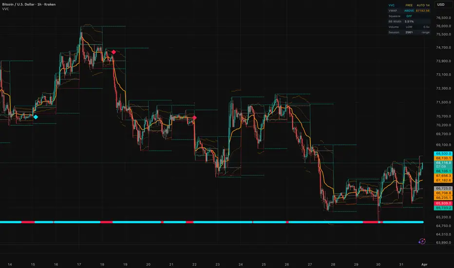
Volume & Volatility Companion█ VOLUME & VOLATILITY COMPANION (VVC)
Complete Volume Dynamics & Volatility Analysis
A comprehensive overlay indicator that combines anchored VWAP with standard-deviation bands , Bollinger Squeeze detection , volume strength analysis , and session level tracking — all with automatic timeframe adaptation. It gives you a complete read on volume dynamics and volatility conditions directly on your price chart.
Free and Open Source.
█ THE CONCEPT: WHY VOLUME + VOLATILITY TOGETHER?
Volume and volatility are the two most overlooked edges in technical analysis. Price alone only tells half the story. Volume confirms conviction — a breakout on high volume is real, on low volume it's suspect. Volatility compression (squeeze) precedes explosive moves. VVC brings both dimensions together in one overlay so you never miss these critical signals.
█ CORE FEATURES
1. VWAP + Standard Deviation Bands
The Volume-Weighted Average Price acts as the institutional fair-value anchor:
VWAP Line — Dynamic equilibrium price. Institutions track this level religiously.
Band 1 (1 StdDev) — Inner value zone. Mean-reversion entries when price touches and bounces.
Band 2 (2 StdDev) — Outer extreme zone. Overextension signals when price reaches here.
Configurable anchor period: Session (daily), Week, or Month.
2. Bollinger Squeeze Detection
Detects the classic volatility compression setup where Bollinger Bands contract inside Keltner Channels:
Squeeze ON (red dots) — BB inside KC = low volatility, energy building
Squeeze OFF (cyan dots) — Normal volatility
Squeeze Release (diamond markers) — BB breaks out of KC after sustained compression = breakout imminent
Momentum direction at release determines the breakout bias.
3. Volume Analysis
Classifies each bar's volume relative to its moving average:
EXTREME — Volume > 2.5x average (institutional footprint)
HIGH — Volume > 1.5x average (above-average interest)
NORMAL — Average range
LOW — Volume < 0.5x average (thin market, low conviction)
4. Session Levels
Key reference levels plotted directly on the chart:
Session High/Low — Current intraday range boundaries
Previous Day High/Low — Breakout/rejection levels
Previous Day Close — Settlement level (bias reference)
5. Auto-Timeframe Adaptation
All calculation parameters automatically adjust to your chart timeframe. Toggle to manual mode for full control.
█ DASHBOARD
A compact, dark-themed info panel showing:
VWAP — Current position (ABOVE / BELOW / AT) + value
Squeeze — ON with bar count or OFF
BB Width — Percentage bandwidth for volatility context
Volume — Classification (EXTREME / HIGH / NORMAL / LOW) + ratio vs MA
Session — Current session range in price units
█ ALERTS (4 CONDITIONS)
Bullish Squeeze Release — Squeeze fires with upward momentum
Bearish Squeeze Release — Squeeze fires with downward momentum
Squeeze Building — Consecutive squeeze bars hit threshold
Extreme Volume — Detected on any bar
█ PRO VERSION
The PRO version adds:
MACD Analysis — Full MACD with signal/zero crossovers and divergence detection
Cumulative Volume Delta (CVD) — Net buying/selling pressure tracking
Bull/Bear Confluence Scoring — Combined score from all modules for directional bias
5 Additional Alerts — MACD crosses, volume confirmation signals
█ NON-REPAINTING
VWAP uses cumulative volume data (non-repainting by design). Bollinger Squeeze uses standard BB/KC calculations. Volume analysis uses simple moving average. Previous day levels use confirmed daily data. No repainting.
█ WORKS ON
Crypto, Forex, Stocks, Futures, Indices — any timeframe from 1 minute to Weekly+.
█ DISCLAIMER
This indicator is for educational and informational purposes only. It does not constitute financial advice. Always do your own research and manage your risk. Past performance does not guarantee future results. Trading involves substantial risk of loss.
Indicador

AK MACD BB EMA RSI Scalper Gold ProOverview
The AK MACD BB + EMA/RSI Scalper is a high-precision momentum oscillator designed primarily for Gold (XAUUSD) and high-volatility assets. This indicator reimagines the traditional MACD by wrapping it within Bollinger Bands, allowing traders to identify momentum "breakouts" and "exhaustion" points in real-time.
By integrating a multi-layer trend filter (EMA 200) and a momentum oscillator (RSI), this tool is built to capture "Power Scalps" while avoiding the dangerous "chop" of sideways markets.
The Core Strategy (The Triple-Filter Logic)
To ensure high-probability entries, the script uses a confluence of three technical layers:
MACD-Bollinger Breakout: Unlike standard MACD, this script signals an entry when the MACD line breaks outside its own Bollinger Band. This represents a surge in volatility that is statistically significant.
The Trend Shield (EMA 200): Only allows "Buy" signals when the price is above the 200 EMA and "Sell" signals when below. This keeps you on the right side of the institutional trend.
Momentum Confirmation (RSI): Signals are further filtered by the RSI (Relative Strength Index). Buys are only valid when RSI > 50, and Sells when RSI < 50, ensuring the "wind is at your back."
Key Features
Adaptive MACD: The MACD line changes color dynamically (Lime for Bullish Breakout, Red for Bearish Breakout).
Visual Signal Cues: The chart background highlights in Lime for Buys and Red for Sells. Additionally, the bars turn Yellow/Aqua to ensure you never miss a candle close entry.
Fully Customizable: You can toggle the EMA and RSI filters On/Off in the settings to adapt the script for "Contrarian/Reversal" trading or strict "Trend Following."
Gold Optimized: Tuned specifically for the fast-paced movements of XAUUSD.
How to Use
🟢 LONG Entry: Price > 200 EMA + RSI > 50 + MACD crosses above Upper Bollinger Band.
🔴 SHORT Entry: Price < 200 EMA + RSI < 50 + MACD crosses below Lower Bollinger Band.
Recommended Timeframes: M1, M5, and M15 for Scalping. H1 for Day Trading.
Parameters
MACD Lengths: Standard 12/26 (Adjustable).
BB Deviations: Default 1.0 (Tight for scalping). Increase to 1.5 or 2.0 for a more conservative approach.
Filter Toggle: Switch Use EMA & RSI Filters? to False if you want to see every MACD-BB breakout regardless of the main trend. Indicador

[ A L P H A X ] Bollinger/Keltner Volatility Pressure SystemAlphaX Volatility Pressure System — Bollinger/Keltner Squeeze Detection, Linear Regression Forecast, Multi-Confluence Band Touch Signals, Volatility Regime Classification & Institutional Dashboard
AlphaX Volatility Pressure System (VPS) is a professional-grade volatility analysis and signal system built on the interaction between Bollinger Bands and Keltner Channels — the foundation of squeeze-based trading. It combines a proprietary multi-layer squeeze engine, linear regression band forecasting, a six-factor confluence scoring system, and a comprehensive real-time dashboard into a single cohesive overlay. Designed and default-tuned for XAUUSD (Gold) on the 1-minute timeframe, fully adaptable to any instrument or timeframe.
━━━━━━━━━━━━━━━━━━━━━━━━━━━━━━━━━━━━━━━━
📸 Visual Overview
The indicator displays Bollinger Bands as a gradient cloud, Keltner Channel boundaries as dotted lines, squeeze status dots on the basis line, a projected forecast envelope extending into the future, confidence-scored entry signals at band touches, mean reversion exit markers, and a full diagnostic dashboard — all in a clean, non-cluttered layout with a consistent yellow-green / red / gray color theme.
━━━━━━━━━━━━━━━━━━━━━━━━━━━━━━━━━━━━━━━━
🔬 The Volatility Pressure Architecture — How It Works
At the core of AlphaX VPS is the principle that volatility is cyclical — periods of compression (low volatility) are followed by periods of expansion (high volatility), and vice versa. The system detects exactly where you are in this cycle and provides actionable intelligence at every stage.
The system operates through seven integrated layers:
Layer 1 — Bollinger Bands (Volatility Envelope)
A Simple Moving Average (SMA) basis line with standard deviation bands above and below
Default: 30-period SMA with 2.2x multiplier — tuned for gold's micro-noise on 1-minute charts
The bands expand during volatile moves and contract during consolidation
Price touching or piercing the outer bands represents statistical extremes — potential reversal zones
The space between upper and lower bands is rendered as a gradient cloud that shifts color based on price position relative to the basis — yellow-green when price is above basis (bullish pressure), red when below (bearish pressure)
Layer 2 — Keltner Channels (ATR Volatility Wrapper)
An Exponential Moving Average (EMA) center line with Average True Range (ATR) bands
Default: 30-period EMA with 1.8x ATR multiplier using 20-period ATR — calibrated for gold
Keltner Channels represent the "normal" volatility range based on true range, while Bollinger Bands represent statistical deviation — the relationship between them reveals compression and expansion states
Plotted as subtle dotted lines at the channel boundaries for clean visual reference without chart clutter
Layer 3 — Squeeze Engine
Squeeze ON — detected when Bollinger Bands contract inside the Keltner Channel (BB upper < KC upper AND BB lower > KC lower). This means volatility has compressed below normal levels — a spring is being loaded
Squeeze Release — the first bar where BB breaks back outside KC after a squeeze period. This is the explosive moment where the compressed energy releases into a directional move
Squeeze status is displayed as colored dots on the BB basis line: red dots during active squeeze, yellow-green dots on squeeze release, gray dots during normal conditions
Squeeze Momentum — a John Carter-style linear regression calculation determines the direction of the squeeze release: bullish momentum (price likely to break upward) or bearish momentum (price likely to break downward)
Squeeze release events generate flash markers on the chart: "⚡ SQ↑" for bullish releases, "⚡ SQ↓" for bearish releases
The dashboard tracks how many of the last 20 bars were in squeeze state — prolonged squeezes (12+ bars) tend to produce the most explosive releases
Layer 4 — Linear Regression Forecast
A forward-looking projection of the Bollinger Band envelope using linear regression slopes
The system calculates the current slope of both the BB basis and the BB deviation, then projects them forward by the configured number of bars (default: 20 bars = 20 minutes on 1-minute chart)
The projection is smoothed using a weighted blend from current values to forecasted values, preventing jarring visual jumps
Displayed as a projected envelope with upper, basis, and lower forecast lines, plus a filled forecast cloud
Forecast color reflects projected direction: yellow-green if the basis is projected to rise, red if projected to fall
Price labels at the forecast endpoints show the projected upper and lower band values — giving you concrete target levels
A minimum bandwidth floor prevents the forecast from collapsing to zero during extreme compression
Layer 5 — Trend EMA
A 100-period Exponential Moving Average provides macro trend context
Color-coded: yellow-green when price is above (bullish structure), red when below (bearish structure)
The EMA slope direction (rising vs. falling over 3 bars) is factored into the confluence scoring system
Acts as a structural filter — signals aligned with the EMA trend receive bonus confidence, signals against it receive penalties
Layer 6 — RSI Filter
A 14-period Relative Strength Index provides momentum confirmation
Oversold threshold at 30, overbought at 70 — stricter than typical settings to filter gold noise
RSI must be in a supportive zone for signals to fire: below 45 for bullish signals, above 55 for bearish signals
Deeply oversold or overbought RSI readings contribute up to 15 points to the confluence score
Layer 7 — Volatility Regime Classification
The system continuously classifies the current market state into one of five regimes:
SQUEEZE 🔴 — BB inside KC, volatility compressed, spring loading
RELEASE ⚡ — first bar after squeeze ends, explosive move initiating
EXPANSION 📈 — bandwidth increasing and price trending directionally
COMPRESSION — bandwidth decreasing, volatility contracting
RANGING — no clear volatility trend, sideways movement
The current regime is displayed prominently in the dashboard and influences signal generation — signals during active squeeze are blocked entirely
━━━━━━━━━━━━━━━━━━━━━━━━━━━━━━━━━━━━━━━━
📊 Signal System — Band Touch Signals
AlphaX VPS generates two types of chart signals: Entry Signals at band extremes and Exit Markers at mean reversion.
Entry Signals ( ⬆ / ⬇ )
Entry signals appear when price touches or pierces a Bollinger Band while multiple confluence factors align to confirm a high-probability reversal setup.
Bullish Entry (⬆) — a yellow-green label below the bar indicating a potential long opportunity:
Price touches or pierces the lower Bollinger Band
Confluence score meets the minimum confidence threshold (default: 60%)
RSI is below 45 (supportive of oversold bounce)
Volume is above average (institutional participation confirmed)
A swing low structure is present near the band (not just a random wick)
Candle shows bullish rejection — either a bullish close or a long lower wick (>50% of candle range)
Market is NOT in active squeeze (signals blocked during compression)
Cooldown period has elapsed since last bullish signal (default: 15 bars)
Bearish Entry (⬇) — a red label above the bar indicating a potential short opportunity:
Price touches or pierces the upper Bollinger Band
Confluence score meets the minimum confidence threshold
RSI is above 55 (supportive of overbought reversal)
Volume is above average
A swing high structure is present near the band
Candle shows bearish rejection — either a bearish close or a long upper wick
Market is NOT in active squeeze
Cooldown period has elapsed since last bearish signal
Each signal label displays the tier rating and confidence percentage :
S-Tier (80%+) — exceptional setup, maximum confluence — highest probability
A-Tier (70–79%) — strong setup, most factors aligned
B-Tier (60–69%) — decent setup, adequate confluence for a trade with proper risk management
Signals below B-Tier are automatically filtered out and never displayed.
━━━━━━━━━━━━━━━━━━━━━━━━━━━━━━━━━━━━━━━━
Exit Markers ( ✕ )
After an entry signal fires, the system tracks position direction and monitors for mean reversion to the BB basis line :
Long Exit ✕ — appears when price crosses back above the BB basis after a bullish entry, indicating the mean reversion target has been reached
Short Exit ✕ — appears when price crosses back below the BB basis after a bearish entry, indicating the mean reversion target has been reached
Exit markers serve as profit-taking signals — the statistical edge of a band touch trade is the reversion to the mean (basis line). Once price reaches the basis:
Take partial or full profit
Tighten stop loss to breakeven
Wait for the next band touch signal before re-entering
━━━━━━━━━━━━━━━━━━━━━━━━━━━━━━━━━━━━━━━━
🧠 Multi-Confluence Confidence Scoring System
Every entry signal is evaluated by a real-time scoring engine that produces a confidence percentage from 0% to 100%. This is not a simple threshold check — it is a weighted multi-factor assessment that rewards alignment and penalizes contradiction.
Scoring Factors — Bullish Signals:
Band Touch Quality (up to 20 points)
How deeply price pierced the lower Bollinger Band
Pierce depth >5% of band width = 20 points (strong penetration)
Any pierce = 15 points
Near-touch (within 0.1%) = 10 points
%B Position (up to 10 points)
Bollinger %B measures where price sits within the band range (0 = lower band, 1 = upper band)
%B below 0 (outside lower band) = 10 points
%B below 0.05 = 8 points
%B below 0.15 = 5 points
RSI Depth (up to 15 points)
RSI below 20 = 15 points (deeply oversold)
RSI below 25 = 12 points
RSI below 30 = 10 points
RSI below 40 = 3 points
EMA Trend Alignment (up to 10 points)
Price above 100 EMA AND EMA slope rising = 10 points (full alignment)
Price above 100 EMA only = 5 points
Squeeze Release Confluence (up to 10 points)
Squeeze just released with bullish momentum = 10 points (explosive setup)
Bullish squeeze momentum without active squeeze = 5 points
Candle Rejection Pattern (up to 10 points)
Long lower wick (>50% of range) + bullish close = 10 points (textbook rejection)
Long lower wick only = 7 points
Bullish close only = 3 points
Volume Confirmation (up to 10 points)
Above-average volume + bullish close = 10 points (institutional buying)
Above-average volume only = 5 points
MACD Momentum (up to 8 points)
MACD line above signal line OR histogram rising for 2+ bars = 8 points
200 SMA Structure (up to 7 points)
Price above 200 SMA = 7 points (macro trend support)
Penalty Deductions:
Price BELOW EMA trend = -15 points (counter-trend signal)
RSI above 55 = -12 points (momentum doesn't support reversal)
Active squeeze = -8 points (wait for release)
Expanding but directionless = -5 points
No volume spike when volume filter enabled = -5 points
Bearish candle rejection present = -10 points (wrong candle structure)
The same structure applies to bearish signals with inverted logic — upper band touch, overbought RSI, price below EMA, bearish rejection candles, etc.
━━━━━━━━━━━━━━━━━━━━━━━━━━━━━━━━━━━━━━━━
🛡 Signal Quality Gates — Why This Indicator Produces Clean Signals
Beyond the confidence score, every signal must pass through six independent quality gates before it can appear on the chart. If any single gate fails, the signal is blocked entirely — regardless of the confidence score:
Gate 1 — Band Touch Gate
Price must actually reach or pierce the Bollinger Band (within 0.1%)
Signals near the middle of the bands are impossible — only statistical extremes qualify
Gate 2 — RSI Zone Gate
Bullish signals require RSI below 45
Bearish signals require RSI above 55
This prevents signals when momentum is neutral or contradictory
Gate 3 — Volume Gate
Volume must exceed the 20-period volume moving average multiplied by 1.2x
Low-volume band touches are often noise — this gate requires institutional participation
Can be toggled off for instruments with unreliable volume data
Gate 4 — Swing Structure Gate
A swing low must be present within the last 3 bars for bullish signals (price formed a local bottom)
A swing high must be present within the last 3 bars for bearish signals (price formed a local top)
This prevents signals on through-band breakdowns where price is accelerating through the band, not bouncing off it
Can be toggled off for faster signal generation
Gate 5 — Candle Confirmation Gate
Bullish signals require either a bullish candle close (close > open) or a bullish rejection wick (lower wick > 50% of total range)
Bearish signals require either a bearish candle close or a bearish rejection wick
This confirms that price is actually rejecting the band level, not just touching it on the way through
Gate 6 — Squeeze Block Gate
No signals fire during active squeeze (BB inside KC)
During squeeze, volatility is compressed and band touches are unreliable — the bands themselves are artificially narrow
Signals resume after squeeze releases
Gate 7 — Cooldown Gate
A minimum of 15 bars (15 minutes on 1-minute chart) must elapse between signals of the same direction
Prevents signal spam during choppy band-walking conditions
This seven-gate architecture is why AlphaX VPS produces significantly fewer but higher-quality signals compared to basic Bollinger Band indicators.
━━━━━━━━━━━━━━━━━━━━━━━━━━━━━━━━━━━━━━━━
⚠ Identifying Choppy / Ranging Markets — When NOT to Trade
Knowing when to stay out is just as important as knowing when to enter. AlphaX VPS provides multiple visual cues for choppy, range-bound conditions:
How to identify choppy conditions:
BB Cloud is extremely narrow — when the Bollinger Bands contract tightly, the cloud between upper and lower bands becomes paper-thin. Narrow bands = low volatility = no clean directional moves.
Squeeze dots are RED for extended periods — prolonged red dots on the basis line mean BB is trapped inside KC. While this predicts an eventual explosive move, trading during the squeeze is a losing strategy. Wait for the yellow-green release dot.
Forecast cloud is flat and narrow — if the projected envelope shows no significant expansion or directional slope, the system expects continued compression. No expansion forecast = no trade.
Regime dashboard shows "COMPRESSION" or "RANGING" — the volatility regime classifier explicitly tells you the current state. These regimes have the lowest signal quality.
No signals appearing despite price touching bands — this means the quality gates are doing their job. If you see band touches but no labels, the confluence score is too low or a gate is blocking. Trust the filter.
EMA (100) is flat and price is oscillating around it — no trend, no edge.
Basis distance in dashboard shows very small percentage — price is hugging the basis line, meaning there is no stretched rubber band to snap back. Mean reversion trades need extension first.
What to do during choppy markets:
Do not force trades — wait for squeeze release (yellow-green dot + ⚡ marker)
Watch for the forecast cloud to start expanding and tilting directionally
Monitor the regime dashboard — wait for "RELEASE ⚡" or "EXPANSION 📈" to appear
Consider moving to a higher timeframe where structure may be clearer
Use the squeeze bar counter in the dashboard — once squeeze bars reach 12+/20, the release is likely imminent
━━━━━━━━━━━━━━━━━━━━━━━━━━━━━━━━━━━━━━━━
🚀 How to Trade with AlphaX VPS — Step by Step
Step 1 — Assess Market Regime
Check the dashboard REGIME field: Is it EXPANSION, COMPRESSION, SQUEEZE, or RANGING?
Check the Bollinger Band cloud width: Is it expanded or collapsed?
Check squeeze dots: Red = stay out. Gray = normal. Yellow-green = just released.
If the regime is SQUEEZE or COMPRESSION → do not trade. Wait for RELEASE or EXPANSION.
Step 2 — Monitor the Forecast
Look at the projected envelope ahead of current price
Is the forecast expanding or narrowing? What direction is the basis slope?
A widening forecast with a clear directional slope tells you where the bands are heading
The forecast upper and lower price labels give you concrete projected targets
Step 3 — Wait for a Band Touch Signal
Do not chase price in the middle of the bands — wait for price to reach an extreme
A ⬆ or ⬇ label will appear only when all seven quality gates pass and the confidence score meets your threshold
The label shows the tier (S/A/B) and exact confidence percentage — use this to size your position (higher confidence = larger size)
Step 4 — Enter the Trade
Enter on the signal bar's close (signals are confirmed on bar close, non-repainting)
Place your stop loss beyond the Bollinger Band that was touched (for bullish: below the lower band, for bearish: above the upper band)
Your profit target is the BB basis line (mean reversion target) — the system will mark this with a ✕ when reached
Step 5 — Manage and Exit
Watch for the ✕ exit marker — this appears when price crosses back to the BB basis
Take partial or full profit at the basis line
If price continues past the basis toward the opposite band, you can trail your stop using the basis line as your new stop level
If a new signal appears in the same direction before the exit triggers, it can be used to add to the position
Step 6 — Squeeze Release Trades (Advanced)
When you see the "⚡ SQ↑" or "⚡ SQ↓" release marker, this is a momentum breakout setup
The squeeze release direction (bull/bear) is determined by the squeeze momentum calculation
Enter in the direction of the release
These moves tend to be explosive — use wider stops and larger targets than mean reversion trades
The forecast projection will often show an expanding envelope in the direction of the release — use the forecast band endpoints as extended targets
━━━━━━━━━━━━━━━━━━━━━━━━━━━━━━━━━━━━━━━━
📋 Real-Time Dashboard — Complete Market Intelligence
The dashboard provides a comprehensive snapshot of every metric the system monitors, organized into five sections:
─── VOLATILITY ───
REGIME — Current volatility state (Squeeze / Release / Expansion / Compression / Ranging) with color-coded background
BANDWIDTH — Current BB width as percentage of basis, colored relative to its 50-period average (narrow = green/opportunity, wide = red/extended)
BB %B — Where price sits within the bands (0% = lower band, 100% = upper band). Extreme readings are color-highlighted
SQUEEZE BARS — How many of the last 20 bars were in squeeze (higher = more compressed = bigger expected release)
KC RELATION — Whether BB is inside KC (squeeze), above KC (expansion), or near KC (transition)
─── MOMENTUM ───
RSI — Current RSI value with zone label (OB/OS/HIGH/LOW/MID) and appropriate coloring
EMA — Trend direction based on price vs. 100 EMA and EMA slope (▲ BULL / ▲ RISING / ▼ BEAR / ▼ FALLING)
SQ MOMENTUM — Squeeze momentum direction and strength (▲▲ STRONG UP / ▲ RISING / ▼▼ STRONG DOWN / ▼ FALLING / — FLAT)
MACD — MACD momentum status (▲ BULLISH / ▼ BEARISH / — NEUTRAL)
VOLUME — Whether current volume exceeds the moving average threshold (▲ ABOVE AVG / — NORMAL)
─── CONFIDENCE ───
BULL CONF — Current bullish confluence score with tier rating (S-TIER / A-TIER / B-TIER / C-TIER / LOW)
BEAR CONF — Current bearish confluence score with tier rating
These update in real-time so you can see confluence building before a signal fires
─── FORECAST ───
BASIS SLOPE — Direction the BB basis is heading (▲ RISING / ▼ FALLING / — FLAT)
BAND FORECAST — Whether bands are projected to widen (▲ WIDENING) or narrow (▼ NARROWING) or remain stable
─── STRUCTURE ───
SMA 200 — Price position relative to 200 SMA (▲ ABOVE / ▼ BELOW) — macro trend context
─── TRADE STATE ───
POSITION — Current tracked position direction (▲ LONG / ▼ SHORT / — FLAT) with color-coded background
BASIS DISTANCE — How far price is from the BB basis as a percentage — measures extension and mean reversion potential
Dashboard position (Top Left / Top Right / Bottom Left / Bottom Right) and text size (Tiny / Small / Normal) are configurable.
━━━━━━━━━━━━━━━━━━━━━━━━━━━━━━━━━━━━━━━━
⚡ Key Features
📊 Bollinger Bands with gradient trend cloud — instant visual of price position within the volatility envelope
🔷 Keltner Channels with ATR-based boundaries — the volatility reference for squeeze detection
🔴 BB/KC Squeeze Engine — detects compression, tracks squeeze duration, classifies release direction
⚡ Squeeze Release Flash Markers — "⚡ SQ↑" and "⚡ SQ↓" labels mark the explosive moment
🔭 Linear Regression Forecast — projects the band envelope forward with directional slope and price targets
🎯 Multi-confluence band touch signals — six-factor scoring with seven independent quality gates
📐 Volume filter — requires above-average volume for signal confirmation (toggleable)
🏗 Swing structure filter — requires local swing formation near bands (toggleable)
🕯 Candle rejection analysis — wick ratio and close direction confirmation
📈 MACD momentum integration — histogram trend confirmation within the scoring system
📏 200 SMA macro structure — long-term trend context for scoring
📐 100 EMA trend filter — intermediate trend direction and slope analysis
✕ Mean reversion exit markers — automatic profit target detection at the BB basis
🏷 Tiered signal labels — S / A / B tier with confidence percentage for position sizing decisions
📋 22-row real-time dashboard — complete market intelligence across volatility, momentum, confidence, forecast, structure, and trade state
🎨 Cohesive dual-tone color theme — yellow-green for bullish, red for bearish, orange for neutral, gray for inactive
🔔 11 alert conditions — S-Tier, A-Tier, and any-tier for both bull and bear, plus squeeze releases and exits
⚙ Fully configurable — all periods, multipliers, thresholds, colors, gates, and dashboard settings adjustable from the settings panel
🚫 No candle coloring — clean chart by default, your candles remain untouched
📏 Non-repainting — all signals confirmed on bar close
━━━━━━━━━━━━━━━━━━━━━━━━━━━━━━━━━━━━━━━━
⚙ Settings Reference
📊 Bollinger Bands
BB Length — SMA period for the basis line (default: 30)
BB Multiplier — standard deviation multiplier for band width (default: 2.2)
Source — price source for calculations (default: close)
Show BB Cloud — toggle the gradient band fill
🔷 Keltner Channel
KC Length — EMA period for the center line (default: 30)
KC ATR Multiplier — ATR multiplier for channel width (default: 1.8)
KC ATR Length — ATR calculation period (default: 20)
Show KC Lines — toggle Keltner boundary display
⚡ Squeeze
Show Squeeze Dots — toggle colored dots on the basis line
Alert on Squeeze Release — enable squeeze release alerts
🔭 Forecast
Show Regression Forecast — toggle the projected envelope
Forecast Bars — how many bars forward to project (default: 20)
🎯 Signals
Show Band Touch Signals — master toggle for entry labels
Min Confidence % — minimum confluence score required (default: 60%)
Signal Cooldown — minimum bars between same-direction signals (default: 15)
Show Mean Reversion Exits — toggle ✕ exit markers
📈 RSI Filter
RSI Length — calculation period (default: 14)
RSI Oversold — threshold for oversold scoring bonus (default: 30)
RSI Overbought — threshold for overbought scoring bonus (default: 70)
📐 EMA Trend Filter
Show Trend EMA — toggle the 100 EMA display
EMA Length — EMA period (default: 100)
📊 Volume Filter
Use Volume Confirmation — enable/disable volume gate (default: ON)
Volume Threshold Multiplier — how far above average volume must be (default: 1.2x)
Volume MA Length — period for volume moving average (default: 20)
🏗 Structure Filter
Use Swing Structure Filter — enable/disable swing gate (default: ON)
Swing Lookback — bars to check for swing formation (default: 3)
🎨 Colors
Bull Primary — yellow-green family for all bullish elements
Bear Primary — red family for all bearish elements
Basis / Neutral — orange for basis and neutral elements
Squeeze ON / OFF / Neutral — dot colors for squeeze states
Forecast Bull / Bear — projection envelope colors
Dashboard BG / Text / Neutral — dashboard styling
📋 Dashboard
Show Dashboard — master toggle
Position — corner placement (default: Top Right)
Text Size — Tiny / Small / Normal (default: Small)
━━━━━━━━━━━━━━━━━━━━━━━━━━━━━━━━━━━━━━━━
🔔 Alert Conditions
S-Tier Bull Band Touch — fires when a bullish signal with 80%+ confidence appears
A-Tier Bull Band Touch — fires when a bullish signal with 70–79% confidence appears
Any Bull Band Touch — fires on any bullish signal meeting minimum threshold
S-Tier Bear Band Touch — fires when a bearish signal with 80%+ confidence appears
A-Tier Bear Band Touch — fires when a bearish signal with 70–79% confidence appears
Any Bear Band Touch — fires on any bearish signal meeting minimum threshold
Any Band Touch Signal — fires on any entry signal regardless of direction
Squeeze Release — Bullish — fires on bullish squeeze release
Squeeze Release — Bearish — fires on bearish squeeze release
Any Squeeze Release — fires on any squeeze release
Long Exit — Mean Reversion — fires when a long position reaches the BB basis
Short Exit — Mean Reversion — fires when a short position reaches the BB basis
All alert messages include {{ticker}}, {{interval}}, and {{close}} placeholders for webhook integration.
━━━━━━━━━━━━━━━━━━━━━━━━━━━━━━━━━━━━━━━━
🎯 Default Settings — Optimized For
The default configuration is specifically tuned for XAUUSD (Gold) on the 1-minute timeframe :
BB Length 30 and Multiplier 2.2 — smooths gold's micro-noise and widens bands to reduce false touches
KC Length 30 and ATR Multiplier 1.8 — matched to BB for proper squeeze detection on gold
Confidence threshold at 30% — aggressively filters low-quality signals while keeping genuine setups
Cooldown at 4 bars (4 minutes) — prevents signal spam during volatile gold transitions
Volume filter enabled with 1.2x threshold — confirms institutional participation
Swing structure filter enabled — requires actual price structure, not random wicks
100 EMA provides ~1.5 hours of trend context on 1-minute
20-bar forecast projects 20 minutes ahead — practical for scalping decisions
For other instruments or timeframes, adjust:
Higher timeframes (5m, 15m, 1H) — reduce BB Length to 20–25, reduce confidence to 45–55%, increase forecast bars to 30–50
Forex majors (EURUSD, GBPUSD) — reduce BB Multiplier to 2.0, reduce KC ATR Multiplier to 1.5, keep confidence at 50–60%
Indices (NAS100, US30, SPX500) — use defaults or increase BB Length to 35–40 for broader structure
Crypto (BTCUSD, ETHUSD) — increase BB Multiplier to 2.5, increase cooldown to 20–25 bars due to higher volatility
Less noise / fewer signals — increase Min Confidence to 70%+, increase Cooldown, enable all gates
More signals / aggressive scalping — decrease Min Confidence to 40–50%, reduce Cooldown to 8–10, disable Swing Structure gate
━━━━━━━━━━━━━━━━━━━━━━━━━━━━━━━━━━━━━━━━
👥 Who This Is For
🥇 Gold (XAUUSD) scalpers and intraday traders — built and default-tuned specifically for gold's volatility, noise profile, and session structure
📊 Bollinger Band traders — if you trade band touches and mean reversion, this system adds institutional-grade filtering to your existing strategy
⚡ Squeeze traders — the BB/KC squeeze engine with momentum direction and release markers provides a complete squeeze trading system
📉 Forex and index traders — applicable to all major instruments with minor setting adjustments
🧠 Systematic traders — the confidence scoring system provides a quantitative framework for position sizing and trade selection
📈 Traders who value clean charts — no indicator clutter, no candle painting, no overlapping signals. One cohesive system with consistent color coding
⚠ Traders who struggle with overtrading — the seven quality gates physically prevent low-quality signals from appearing. You cannot overtrade what you cannot see
🔭 Forward-looking traders — the regression forecast gives you a projected roadmap that most indicators do not provide
━━━━━━━━━━━━━━━━━━━━━━━━━━━━━━━━━━━━━━━━
📝 Notes
All calculations are non-repainting — signals are confirmed on bar close only
The linear regression forecast updates on each new bar — the projection is a mathematical estimate, not a guarantee of future price action
Volume filter uses the volume data provided by your broker/data feed — for instruments or exchanges with unreliable volume, consider disabling the volume gate
The 200 SMA used in scoring requires 200 bars of history to calculate — on very short chart histories, this factor may not contribute to early signals
Maximum 500 labels per chart are supported by TradingView — on very low timeframes with extended history, oldest labels may be automatically removed
The forecast polyline uses TradingView's polyline drawing objects — a maximum of 100 polylines are allocated
Dashboard uses a table object that updates on the last bar — it reflects real-time values on live charts
Squeeze momentum calculation uses the John Carter method — linear regression of the midline-basis deviation over the BB length
━━━━━━━━━━━━━━━━━━━━━━━━━━━━━━━━━━━━━━━━
⚠ Disclaimer
This indicator is a technical analysis and visualization tool intended for educational and informational purposes only. It does not constitute financial advice or a recommendation to buy or sell any financial instrument. All signals are generated from historical and real-time price data using mathematical calculations — their accuracy or profitability is not guaranteed. Past performance of any signal type does not guarantee future results. Always conduct your own analysis, use proper risk management, and consult a licensed financial advisor before making any trading decisions. The author accepts no responsibility for any losses incurred from the use of this indicator.
━━━━━━━━━━━━━━━━━━━━━━━━━━━━━━━━━━━━━━━━
Built for traders who demand clarity, precision, and institutional-grade filtering from their volatility analysis. Indicador

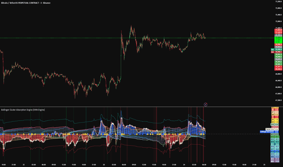
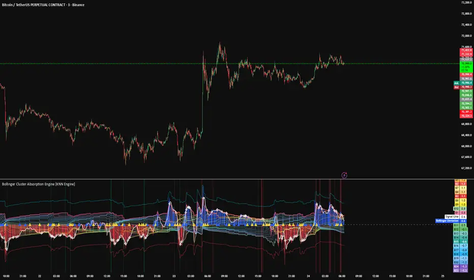
Bollinger Cluster Absorption targets [KNN Engine]Bollinger Cluster Absorption - On-Chart Visualizer & HUD
This indicator is an advanced, machine-learning-assisted structural mapping tool. It moves beyond traditional momentum oscillators by evaluating standard deviation and mean reversion relative to a dynamically anchored cluster of Bollinger bands, utilizing a 6-Dimensional K-Nearest Neighbors (KNN) classification algorithm.
Operating purely as an on-chart interface and risk management suite, it overlays structural geometries, Maximum Favorable Excursion (MFE) tracking boxes, and simulated Kelly Criterion position sizing directly onto your price chart.
The Core Engine: Dynamic Bollinger Basis Clusters
Unlike standard Bollinger Bands that measure standard deviation over fixed periods (e.g., 20 periods), this engine measures the tension of price relative to an entirely dynamic array of Liquidity Anchors.
Anomaly Detection (The Anchor): The script continuously tracks volume using a rolling Z-score. When a significant institutional liquidity event occurs (volume spikes above your defined Z-score threshold), the script drops an "Anchor."
Dynamic 24x Array: Upon an anchor trigger, the script initializes a new Simple Moving Average (the "Basis" line of a Bollinger Band) from that exact bar. It tracks up to 24 of these anchored basis lines simultaneously, recalculating their averages bar-by-bar.
Z-Score Standardization (Meta-Mean): To distill 24 different basis lines into a single readable metric, the script calculates their cross-sectional average (the "Meta-Mean" of the cluster). It then calculates the Z-Score of the current Price relative to this cluster's mean and standard deviation. This provides a standardized measure of whether price is extremely overbought or oversold compared to the aggregate institutional baseline.
The Machine Learning Module (KNN)
The engine evaluates market conditions by feeding a 6-Dimensional sensory matrix into a K-Nearest Neighbors (KNN) classification algorithm. The six features evaluated are:
Bollinger Deviation (Z-Score): The current standardized distance of price from the dynamic cluster center.
Deviation Velocity: The bar-to-bar momentum of price moving toward or away from the cluster.
Price Velocity: Z-Scored rate of change of price from a baseline 50-SMA.
Cluster Consensus: The ratio of the 24 active basis lines positioned above versus below current price (measuring mean-reversion pressure).
Historical Rate of Change: An 8-bar lookback of the Bollinger Deviation.
Cluster Squeeze (Compression): Standard deviation of the 24 anchors themselves to identify tightly coiled structural energy (the famous "Bollinger Squeeze").
The algorithm maps this 6D state and calculates the Euclidean distance to a memory bank of the last 500 historical setups. It isolates the K most mathematically identical past environments and evaluates their success rates, returning a real-time Probability Score.
On-Chart Visuals & MFE/LFE Box Engine
Rather than cluttering your chart with disjointed arrows, this visualizer groups continuous, same-direction KNN signals into clean structural "Streaks."
Independent Line Mitigation: The AI projects forward-looking target lines (Scalp target and Stop Loss floor). These lines actively track price tick-by-tick. The exact moment price intersects a target, that specific line halts, solidifies, and stops extending, leaving a permanent structural footprint.
Profit Box (Blue): Stretches vertically from your initial entry up to the projected target. It dynamically expands to the right, snapping exactly to the bar that achieved the Maximum Favorable Excursion (MFE).
Risk Box (Red): Drops from the entry to the absolute minimum anchored stop loss, highlighting the exact Lowest Favorable Excursion (LFE) (Maximum Adverse Excursion) of the active structural streak.
Streak Termination: A structural streak only ends when the absolute minimum Stop Loss is breached or an opposing KNN signal flips the mathematical momentum.
The Agent Diagnostic Dashboard (HUD)
The built-in dashboard provides real-time diagnostic transparency into the engine's internal state:
Market Context: Live metrics for Bollinger Deviation (Z), Trend Vector, Cluster Squeeze (Z), and Cluster Consensus.
AI Probability: The live win-rate probability generated by the companion 6D KNN engine.
Live Portfolio Tracking: Simulates a compounding equity curve. It tallies the Hit Rate of the KNN algorithm and computes a simulated dollar PnL based on your starting capital.
Dynamic Bet Sizing (Kelly Criterion): Utilizing the KNN probability and your defined Risk/Reward parameters, the dashboard simulates optimal position sizing via a dampened Kelly Criterion formula. It actively scales simulated risk up during high-probability setups and scales down when the edge decreases, capping at a strict maximum to prevent ruin.
Disclaimer: The portfolio tracker and Kelly sizing metrics are simulated diagnostic tools meant for the educational evaluation of the KNN algorithm's historical efficacy. This tool provides statistical classification of historical data, which does not constitute financial advice, predictive guarantees, or real-world trading results. Indicador

Indicador

Bollinger Cluster Absorption Engine [KNN Engine]Bollinger Cluster Absorption Engine
1. What the Script Does
The Bollinger Cluster Absorption Engine is a high-order structural consensus oscillator designed to identify major trend exhaustion and mean-reversion opportunities. It moves beyond standard Bollinger Bands by evaluating price action across 24 simultaneous Simple Moving Average (SMA) time-horizons.
Furthermore, it introduces a built-in K-Nearest Neighbors (KNN) Machine Learning Algorithm to calculate the statistical probability of a structural mean-reversion bounce based on historical market data.
Rather than relying on a single, arbitrary SMA length, this indicator mathematically aggregates 24 distinct cost-basis cycles to verify if the entire institutional ecosystem is overextended. It visualizes this data through a dynamically scaling histogram, a multi-ribbon fan, and rolling volatility boundaries.
2. The Core Innovation: How it Calculates Everything
Standard moving averages rely on fixed lookback periods (e.g., a 20-SMA), which inherently drop relevant historical data simply because a fixed amount of time has passed. This script is fundamentally original because it abandons fixed lookbacks in favor of Anomaly Anchoring, Expanding SMA Recursion, and Predictive Classification.
Anomaly Anchoring: The engine constantly scans volume for statistical deviations. When it detects a volume spike exceeding a 2.5 Z-Score, it drops a mathematical "Anchor." It tracks the last 24 of these institutional liquidity events simultaneously.
Expanding SMA Recursion: From each of the 24 anchor points, the script begins calculating an independent Simple Moving Average. Unlike EMAs which decay quickly, these SMAs act as a "slow-burn" anchor, retaining the true structural memory of the original volume event.
The Consensus Meta-Mean: The script calculates the absolute average of all 24 active SMA lines. This "Meta-Basis" represents the true structural equilibrium of the market. The distance of price from this average is converted into a Z-Score, standardizing the deviation across any asset class.
The K-Nearest Neighbors (KNN) Engine: When the script detects 100% Consensus (e.g., all 24 active SMAs are simultaneously above or below price), it captures the exact numerical fingerprint of the market (Basis Deviation, Deviation Velocity, and Price Velocity). The KNN engine calculates the Euclidean Distance between the current fingerprint and the last 300 historical fingerprints. It finds the 5 nearest neighbors (the 5 times history looked mathematically identical) and checks their win/loss results to generate a live probability score.
3. Justifying the Methodology
Why combine 24 expanding SMAs with a KNN machine learning model? Because true structural "Fair Value" is rarely defined by a single moving average.
While Exponential Moving Averages (EMAs) are great for tracking fast momentum, Simple Moving Averages (SMAs) are the benchmark for long-term structural stability. By anchoring 24 separate SMAs to actual volume anomalies, we verify if the entire market ecosystem—even the slowest, most structurally sound metrics—agrees on the overextension. By passing that data through a KNN algorithm, we filter out low-quality traps by asking the data: "The last 5 times the structural basis snapped this aggressively, did price successfully reverse by at least 0.1%?"
4. How to Use the Indicator
Visual Layout:
The Structural Fan (Ribbons): 24 individual SMA lines plotted on a standardized Z-axis. When tightly compressed, the structural basis is unanimous. When fanned out, the structural basis is conflicted.
The Engine Histogram: Visualizes the standardized deviation of price from the Meta-Basis using a clean, standardized color baseline: Blue for upward deviation and Red for downward deviation.
Expansion (Bright): Bright Blue or Bright Red bars indicate that price is actively accelerating away from its structural equilibrium.
Contraction (Dark): Dark, highly transparent bars indicate that the move is decaying or cooling off back toward the zero-line.
Tactical Trade Execution:
Spot the Structural Purge: Watch the histogram expand into extreme territory (Bright Blue for bullish potential, Bright Red for bearish potential). Because this is an SMA engine, this happens when price has completely disconnected from its slow-burn institutional fair value. Do not enter yet.
Wait for the Machine Learning Confirmation: Wait for the background to flash Lime (Bullish) or Red (Bearish) with a printed percentage (e.g., 80%). This means the KNN algorithm has verified that identical historical structural snaps successfully reversed price.
The Trigger: Wait for the white Signal Line to peak (often printing an Exhaustion ✧ marker) and begin receding back toward the zero-line, ultimately "re-enveloping" the histogram bars. This confirms that the extreme directional friction has officially snapped, signaling a high-probability mean reversion. Indicador