Estratégia

Indicador

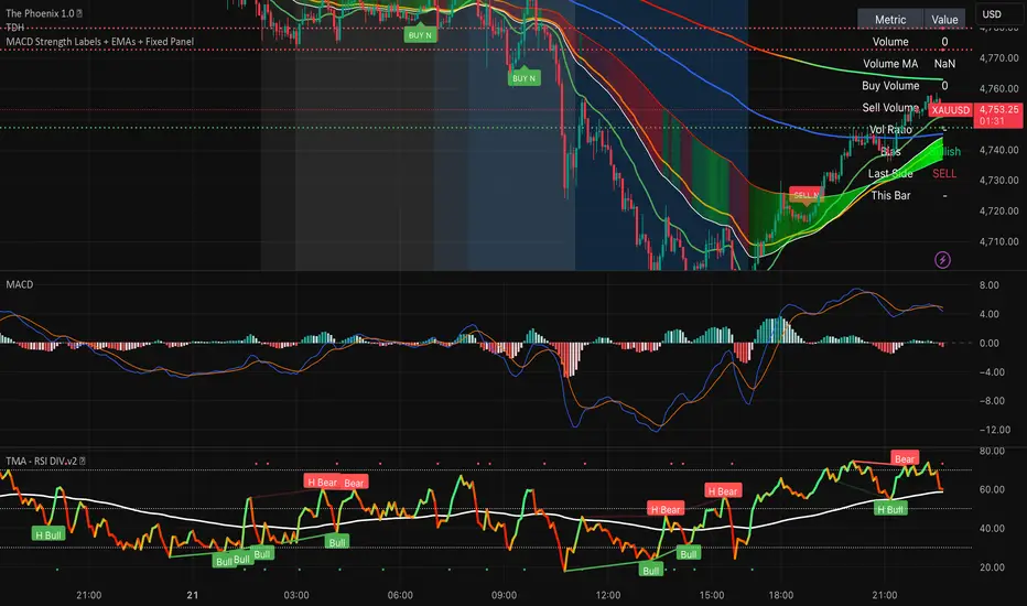
Smart Buy Sell MultiConfluence GerardMali⚡ Smart Buy/Sell — Multi-Indicator Confluence System
A high-confluence buy and sell signal indicator that combines seven of the most reliable technical indicators into a single, easy-to-read system. Instead of relying on one indicator alone — which produces too many false signals — this script requires multiple conditions to align simultaneously before triggering a signal. The result is fewer signals, but with significantly higher probability.
How It Works
Every bar, each indicator casts a vote — bullish or bearish. The votes are tallied into a score out of 7. A buy or sell signal only fires when the score meets your minimum threshold AND a crossover event (MACD, Stochastic, EMA, or RSI) acts as the trigger. This two-step requirement — background setup + timing trigger — filters out noise and keeps you out of choppy, low-conviction conditions.
Indicators Used
EMA Alignment (9 / 21 / 50 / 200) — trend direction and stack confirmation
RSI (14) — momentum and overbought/oversold zones
MACD (12, 26, 9) — trend momentum and crossover trigger
Stochastic (14, 3, 3) — entry timing from overbought/oversold levels
ADX (14) — trend strength filter
Bollinger Bands (20, 2) — price position relative to volatility range
Volume — confirms conviction behind each move
What You See on the Chart
🟢 Green triangle = BUY signal with score (e.g. "BUY 6/7")
🔴 Red triangle = SELL signal with score (e.g. "SELL 5/7")
Dashed lines = ATR-based Stop Loss and two Take Profit levels (auto-calculated from the most recent signal)
Background shading = green during bullish EMA alignment, red during bearish alignment
Top-right table = live dashboard showing the real-time status of every indicator
Settings
All indicator lengths are fully customizable. The key setting is Min Score to Trigger — set it to 4 for balanced signals, 5–6 for high-quality setups only, or 3 for more frequent entries. Stop loss and take profit distances are set using ATR multipliers, making them adaptive to current volatility on any timeframe.
Works on any timeframe and any instrument — indices, forex, crypto, commodities, and stocks.
Disclaimer: This indicator is for educational and informational purposes only. It does not constitute financial advice. Always use proper risk management and do your own research before trading.
Indicador

Indicador

Indicador

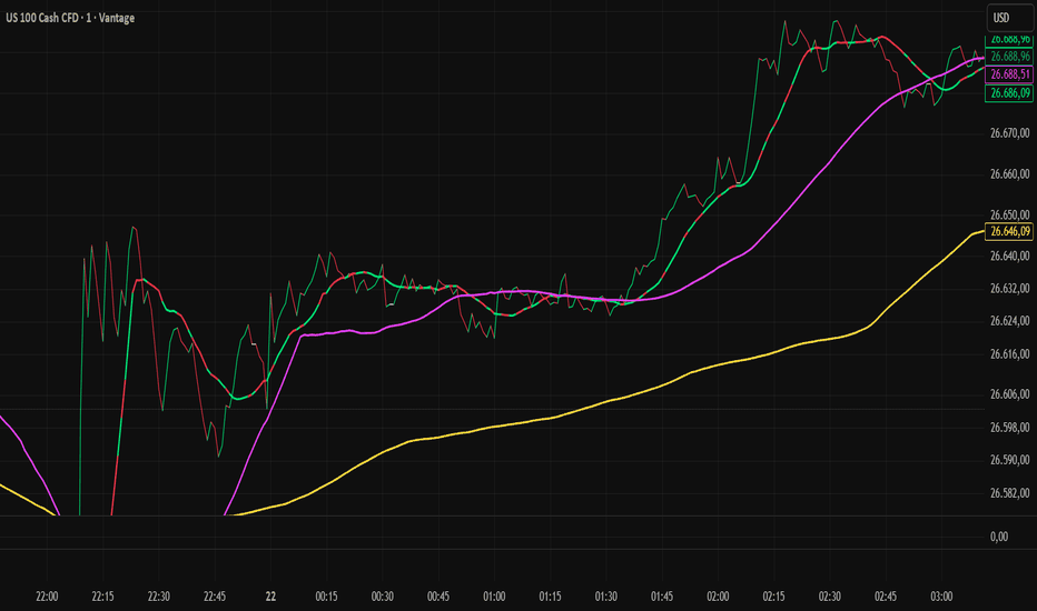
MTF Price Line SNIPER AUTOA professional multi-timeframe price line overlay designed to visualize market structure, momentum, and higher-timeframe context in a single, clean view. This tool replaces traditional candles with smooth price lines and provides flexible combinations for different trading styles—from fast M1 scalping to higher-timeframe bias analysis.
Core Concept
The indicator plots multiple dynamically scaled price lines based on the current chart timeframe:
Chart TF (M1 / current TF) → Entry & execution
x5 → Short-term flow
x15 → Intraday trend structure
H1 → Higher-timeframe context
H4 → Macro direction
All higher timeframes are automatically recalculated relative to your current chart timeframe. This ensures consistency whether you are on M1, M5, or M15—without using traditional HTF requests (no step-like plotting).
Key Features
Smooth Line Rendering
No stair-stepping. All lines are synthetically calculated for a continuous, fluid appearance.
Auto Multi-Timeframe Scaling
Timeframes adjust automatically when switching charts (e.g., M1 → M5 → M15).
Independent Visibility Controls
Each timeframe (Chart, x5, x15, H1, H4) can be individually enabled or disabled.
Customizable Appearance
Fully adjustable colors and line widths for each timeframe.
Momentum Coloring (M1)
Optional neon-based momentum coloring on the chart timeframe:
Green → bullish momentum
Red → bearish momentum
Momentum Overlay on x15 (Optional)
The x15 line can reflect M1 momentum, allowing you to view lower-timeframe pressure within higher-timeframe structure.
RSI-Based Coloring (Optional)
Global RSI filter for overbought/oversold conditions across all lines.
How to Use
1. Pure Line Chart Mode
Disable TradingView candles
Use only the indicator lines
→ Clean structure view (ideal for flow & trend reading)
2. Hybrid Mode (Recommended)
Keep TradingView candles ON
Disable selected lines (e.g., Chart TF or x5)
Example:
Candles ON
Chart line OFF
x5 ON
→ You get candles for execution + x5 flow overlay
Typical Configurations
Scalping (M1)
Chart TF: ON
x5: ON
x15: optional
H1/H4: OFF
Sniper Entries
Chart TF: ON
x5: ON
x15: ON
Bias / Direction
x15: ON
H1: ON
H4: ON
Chart TF: optional
Interpretation
Alignment across timeframes → high-probability moves
Chart TF leads, higher TFs follow → confirms trend development
Divergence between TFs → pullback or weak structure
Flat / crossing lines → ranging market (low quality conditions)
Important Notes
This is a synthetic MTF model, not a direct higher-timeframe feed
Designed for clarity and responsiveness, not lagging confirmation
Best used in combination with your execution logic
Summary
MTF Price Line SNIPER transforms raw price into a structured, multi-layered visual system:
Entry timing (M1)
Flow (x5)
Trend (x15)
Context (H1 / H4)
All in one adaptive, customizable overlay. Indicador
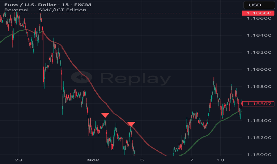
Reversal SMC/ICT Edition Reversal — SMC/ICT Edition
**Original concept by © HasanRifat — Extended & rebuilt for SMC/ICT confluence trading**
---
### Overview
This is a fully reworked version of HasanRifat's original Reversal indicator, rebuilt from the ground up to address its core structural weaknesses and align with a serious SMC/ICT trading framework. The original logic was sound — but it fired signals without trend context, volume conviction, or session awareness. This version fixes all of that.
The result is a precision **liquidity sweep + displacement detector** that gates every signal through five confluent layers before plotting. Fewer signals. Higher quality.
---
### What The Indicator Actually Detects
The core pattern this indicator hunts is a two-step sequence that SMC/ICT traders will immediately recognise:
**Step 1 — The Sweep**
A candle closes below the lows (or above the highs) of a configurable percentage of recent candles. This is a programmatic representation of a **BSL/SSL liquidity grab** — price reaching down to where stop losses and buy/sell orders are clustered, then preparing to reverse.
**Step 2 — The Reclaim (Confirmation)**
Within a tight confirmation window (default 3 bars), price closes back above the sweep candle's high (bullish) or below its low (bearish). This is the **displacement** — the market maker move away from the liquidity pool. Without this reclaim happening quickly, the setup is invalidated.
This two-step sequence maps directly onto the **sweep → displacement → BOS** structure that underpins ICT-based entry models.
---
### Five-Layer Signal Gate
Every signal must pass all active filters simultaneously before plotting:
**Layer 1 — Flexible Sweep Threshold**
The original indicator required *exactly* `lookback - 1` candles to be swept — a rigid rule that missed perfectly valid setups by one candle. This version uses a percentage-based threshold (default 85%). At lookback 20, this means 17 out of 20 prior candles must have their low (or high) breached. Tighten toward 1.0 for stricter sweeps, loosen toward 0.75 to catch more setups. The threshold is tunable without breaking the logic.
**Layer 2 — HTF Trend Filter**
A higher timeframe EMA (default: 1H, 50 EMA) gates the signal direction. Bullish reversals only fire when HTF close is above the HTF EMA. Bearish reversals only fire when below. Trading reversals against the HTF trend is where the majority of retail losses come from — this filter eliminates that entire category of setups. The HTF EMA is plotted directly on chart as a colour-coded ribbon (green above, red below) so bias is always visually obvious.
**Layer 3 — Volume Displacement Confirmation**
The confirming candle's volume must exceed the 20-bar volume moving average by a configurable multiplier (default 1.2× — 20% above average). A weak, low-volume close back above the sweep candle's high is not a displacement. It's noise. This filter requires the market to show actual conviction on the reclaim bar, consistent with genuine institutional participation.
**Layer 4 — Session Filter**
Signals only fire within a defined session window. Default is `0700–1630 UTC` (London open through New York close). This eliminates Asian session chop, pre-market fakes, and low-liquidity reversals that have no follow-through. The session window is fully customisable in settings.
**Layer 5 — Non-Repainting (Default ON)**
The single most common reason retail traders lose money on reversal indicators is repainting. The original indicator had non-repainting mode *off* by default, meaning backtests looked significantly better than live performance. This version has it **on by default**. All conditions are evaluated on the previous fully closed bar. What you see in history is exactly what would have fired in real time — no exceptions.
---
### Inputs Reference
| Parameter | Default | Description |
|---|---|---|
| Candle Lookback | 20 | Number of prior candles scanned for the sweep |
| Confirm Within | 3 | Max bars allowed for price to reclaim after sweep |
| Sweep Threshold % | 0.85 | % of lookback candles that must be breached |
| Non-Repainting Mode | ✅ ON | Signals based on closed bars only |
| Enable Trend Filter | ✅ ON | Gates signals by HTF EMA direction |
| HTF Timeframe | 60 (1H) | Timeframe for trend EMA calculation |
| Trend EMA Length | 50 | EMA length on HTF for bias determination |
| Enable Volume Filter | ✅ ON | Requires above-average volume on confirmation bar |
| Volume MA Length | 20 | Lookback for volume moving average |
| Min Volume Multiplier | 1.2 | Confirmation bar volume must exceed MA × this value |
| Enable Session Filter | ✅ ON | Restricts signals to defined trading hours |
| Session Window (UTC) | 0700-1630 | Active signal window |
---
### How To Use This In An SMC/ICT Framework
This indicator is designed as a **precision entry trigger**, not a standalone system. It performs best as the final confirmation layer in a structured top-down analysis:
1. **Establish HTF bias** on the 1H chart — is price in a bullish or bearish swing structure? The built-in trend filter enforces this, but your manual HTF read should come first.
2. **Identify premium/discount zones** — only look for bullish signals from discount, bearish from premium. The indicator fires in both directions; your zone analysis determines which signals are tradeable.
3. **Mark key liquidity pools** — EQH/EQL levels where BSL/SSL is resting. The sweep pattern is most powerful when it targets a known liquidity pool, not a random low.
4. **Wait for the signal** — when the lime triangle (bullish) or red triangle (bearish) appears, the sweep + reclaim + volume + trend + session conditions have all been met simultaneously.
5. **Drop to LTF for entry** — use a 1M BOS or CHoCH as final entry trigger. The signal on your execution timeframe marks the area; the 1M structure break marks the precise moment.
6. **Place entry at structure** — Fibonacci retracement of the displacement move, or the 50% of the confirming candle, depending on your model.
---
### What This Indicator Is Not
- It is **not** a complete trading system. No indicator is.
- It does **not** replace HTF structure analysis, premium/discount identification, or liquidity mapping.
- It does **not** account for high-impact news events. Manage your own news calendar.
- It will **not** fire on every valid setup — the five-layer gate is intentional. Missing a signal is better than taking a bad one.
---
### Alerts
Two alert conditions are included:
- `Bullish Reversal ` — fires when all bullish conditions are met
- `Bearish Reversal ` — fires when all bearish conditions are met
Set alerts on **Once Per Bar Close** to remain consistent with non-repainting mode.
---
### Credits
Core sweep detection logic based on the original **Reversal** indicator by © HasanRifat. Extended with trend, volume, session filtering and non-repainting defaults for professional SMC/ICT application.
---
*This indicator is a tool for analysis. All trading decisions remain your own responsibility. Past signal performance does not guarantee future results.*
Indicador
Indicador

Indicador

Estratégia

Indicador

Indicador

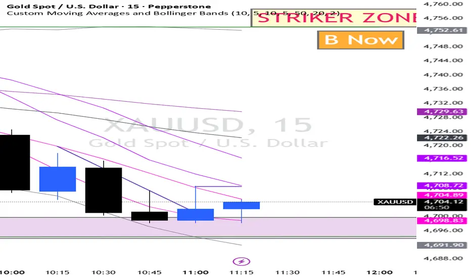
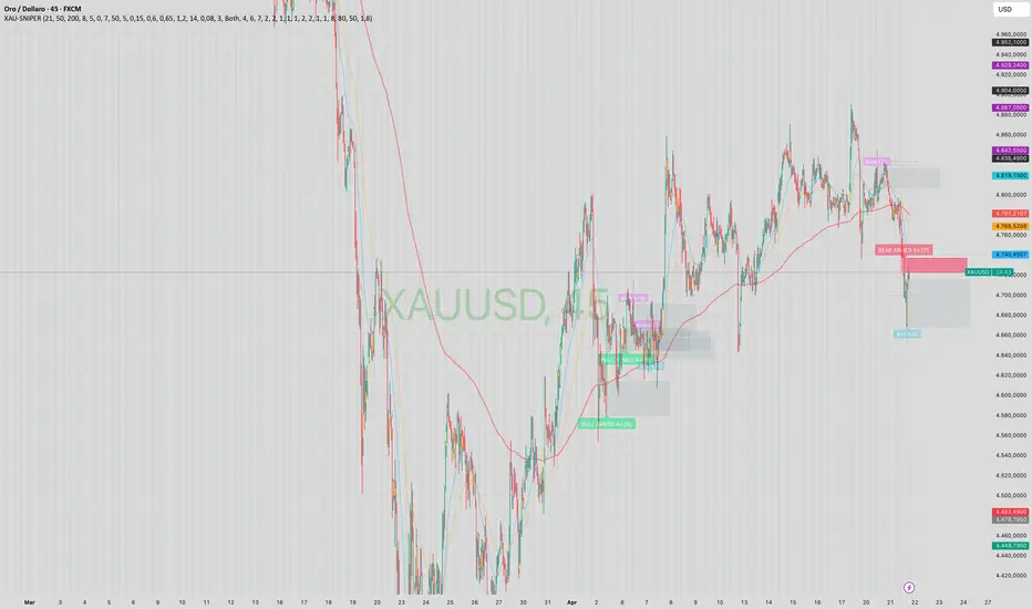
XAUUSD Zone Sniper v1XAUUSD Zone Sniper is an intraday liquidity-based indicator built for gold traders who want a more structured way to read sweep-and-reversal conditions on lower timeframes. The script is designed for XAUUSD and overlays the chart with key liquidity levels, displacement events, and actionable reaction zones derived from post-sweep price behavior.
The indicator uses a multi-factor workflow instead of a single trigger. First, it builds a directional bias using a combination of EMA alignment, EMA slope, and recent swing structure. It then tracks key reference levels such as Asia session high/low, previous day high/low, recent swing liquidity, and nearby round numbers. When price wicks through one of those levels and closes back inside, the event is treated as a potential liquidity sweep.
After a sweep, the script looks for displacement. In this context, displacement is defined as a strong impulsive candle with a minimum body-to-range ratio and a minimum expansion versus ATR. If displacement occurs within a short window after the sweep, the script can mark a potential reaction area using either a Fair Value Gap, an Order Block, or both, depending on the selected settings.
Each zone is then scored using several contextual factors. The score can include liquidity quality, displacement, inefficiency, session timing, higher-timeframe bias alignment, and retest confirmation, while poor context such as dead-session conditions can reduce quality. This allows the indicator to separate weaker candidates from stronger A and A+ setups instead of plotting every possible zone equally.
The script also includes a zone state model. A newly created zone starts as a candidate, can later become armed after a valid retest, and is eventually marked as mitigated or no longer relevant if price trades too deeply into it, closes beyond it, or enough bars pass without confirmation. This helps reduce chart clutter and keeps the focus on fresh areas.
What you see on the chart:
- EMA fast, EMA slow, and HTF EMA for bias context
- Asia high/low, previous day high/low, and nearby round numbers
- Sweep markers when liquidity is taken above or below key levels
- Displacement arrows after valid sweep reactions
- Bullish and bearish zones drawn as boxes
- Optional score labels showing setup quality and class
Suggested use:
- Best suited to XAUUSD intraday charts
- Typically most relevant on lower timeframes such as M1 to M15
- Can be used to frame reaction trades after a liquidity event rather than to predict price in advance
- Stronger signals generally occur when a sweep, displacement, session timing, and directional bias align together
Important notes:
- This script is a decision-support tool, not a fully autonomous trading system
- Zones are context-dependent and should be evaluated together with execution, risk management, and nearby targets/liquidity
- Session filters and scoring thresholds can materially change how selective the script becomes
- The default settings are optimized for a liquidity/reaction style workflow on gold, but users may still need to tune them to their broker feed and timeframe
Main inputs:
- HTF Bias: EMA fast/slow/HTF, structure lookback, slope length
- Key Levels: Asia range, previous day high/low, round number logic, swing lookback
- Sweep Detection: tolerance and wick quality filters
- Displacement: body/range threshold, ATR expansion, ATR length
- Zone Logic: FVG / OB / Both
- Scoring: minimum score to draw, alert thresholds, class thresholds, factor weights
- Zone Management: max active zones, expiry bars, mitigation depth, minimum R:R filter
- Alerts: armed bull/bear zones, sweeps, and displacement events
This indicator is for educational and analytical purposes only. It does not guarantee future performance, and all trading decisions remain the responsibility of the user. Indicador

Estratégia

Indicador

Conflux Engine | AnonycryptousConflux Engine | Anonycryptous
Description & user manual
Why this indicator is different?
Most signal indicators work the same way. One condition triggers. One signal fires. The trader either takes it or does not.
The problem is that a single condition — a crossover, a level break, a momentum read — is almost never enough to define a genuinely high-quality trade. Markets are too complex and too noisy for that.
Conflux Engine works differently.
It does not fire on one condition. It requires multiple independent market forces to align simultaneously before a signal appears. Structure has to agree. Volume has to confirm. Momentum has to support. Volatility has to be in the right zone. Session positioning has to be favorable. And optionally, the higher timeframe trend and the ribbon have to be aligned too.
Only when enough of these forces agree — and agree clearly — does the indicator produce a signal.
This is what confluence means in practice. Not one thing being right. Multiple independent things being right at the same time.
The result is fewer signals. But the signals that do appear carry more weight than anything a single-condition system can produce.
Important notice
Conflux Engine generates trading signals based on a multi-factor scoring engine.
These signals are not financial advice.
They do not predict the future.
They do not guarantee profitability.
They are a systematic read of current market conditions across multiple dimensions.
All trading decisions are made entirely by the user.
Always manage your own risk. Always apply your own judgment.
1. Overview
Conflux Engine is a scoring-based signal indicator for traders who want structured, high-conviction entries rather than frequent, noisy ones.
Six independent pillars evaluate the market continuously. Each pillar scores independently. The scores combine into a total out of 100. When the total exceeds the signal threshold — and the dominant direction leads the opposite direction by a minimum gap — a signal fires.
Additional hard gates can be enabled: an ADX noise filter to block signals during choppy markets, a VWMA filter to ensure macro trend alignment, a Supertrend filter for dynamic trend confirmation, and an Ultra Ribbon filter using 15 Hull Moving Averages for the fastest momentum read.
The result is an indicator that is selective by design. It is not built to fire constantly. It is built to fire well.
2. The six pillars
2.1 Structure
Evaluates market structure using swing pivot highs and lows. A higher high combined with a higher low defines a bullish structure. A lower high combined with a lower low defines a bearish structure.
This pillar answers the most fundamental question in trading: is the market making progress in a direction, or is it deteriorating?
Weight: up to 16 points.
2.2 Volume
Uses OBV slope via linear regression to determine whether volume is accumulating in the direction of price or diverging from it.
Rising OBV slope on a bullish signal means participation supports the move. Falling OBV slope on a bullish signal is a warning. This pillar separates moves with institutional backing from moves without it.
Weight: up to 16 points.
2.3 Momentum
Evaluates three independent momentum reads: KAMA position (a Kaufman adaptive moving average that adjusts its speed to market conditions), RSI relative to the 50 midline with slope direction, and Williams %R for price positioning within the recent range.
Two of three aligned scores partial points. All three aligned scores full points.
Weight: up to 16 points.
2.4 Liquidity
Detects sweep events — moments where price wicks beyond a recent swing high or low and closes back inside. These events mark liquidity grabs and often precede directional moves.
A confirmed bull sweep sets up a long bias context. A confirmed bear sweep sets up a short bias context. The context remains active for a configurable number of bars, decaying over time.
Weight: up to 16 points.
2.5 Volatility
Measures ATR relative to its own moving average to identify the volatility sweet spot. Signals during dead, flat markets carry less meaning. Signals during chaotically explosive moves are harder to execute cleanly. This pillar rewards the in-between: active, directional, manageable volatility.
Weight: up to 16 points.
2.6 Session
Evaluates price positioning within the current day's developing range. Price in the lower portion of the range (discount) favors long bias. Price in the upper portion (premium) favors short bias.
This pillar can be toggled independently from the session time filter — you can use session scoring without restricting signals to specific hours, or vice versa.
Weight: up to 20 points.
3. Hard gates
Beyond the six scoring pillars, Conflux Engine includes four optional hard gates. These do not add points. They block signals entirely when their condition is not met.
3.1 ADX noise filter
Blocks signals when ADX is below a configurable threshold. ADX measures trend strength. A low ADX means the market is ranging and directionless — exactly the environment where momentum signals fail most often. Default threshold: 35. Adjustable up to 100 for maximum selectivity.
3.2 VWMA filter
Price must be above the Volume Weighted Moving Average for long signals, and below it for short signals. The VWMA is slower than a standard EMA and reflects the average price weighted by volume — a more meaningful macro reference than a simple average. Default length: 200.
3.3 Supertrend filter
The Supertrend must confirm the signal direction. This is a dynamic trend line based on ATR bands that flips cleanly between bull and bear states. It acts as an additional structural confirmation that the trend environment supports the entry.
3.4 Ultra Ribbon filter
The fastest gate. Built from 15 Hull Moving Averages spanning a range of lengths. When the fastest HMA is above the slowest HMA, the ribbon is bullish. When below, bearish. Because Hull MAs minimize lag, this gate reacts to trend changes earlier than most moving average systems.
The ribbon also serves as a trailing stop option in the backtest — the slowest HMA tracks trend without being too reactive.
4. Signal scoring
Every bar, both a bullish and bearish score are computed from the six pillars. The scores are added together.
A signal fires when:
- The dominant score meets or exceeds the signal threshold (default 70)
- The dominant score exceeds the opposite score by at least the directional lead (default 20)
- All enabled hard gates are cleared
This two-condition check — threshold plus gap — prevents marginal signals from appearing when the market is ambiguous. Both bull and bear can score reasonably high during mixed conditions. The gap requirement ensures the dominant direction is meaningfully ahead.
Pillar weights are individually adjustable. The system allows traders to prioritize the factors most relevant to their trading style and instrument.
The Extreme Threshold (default 90) flags signals where the confluence score is exceptionally high. These are the highest-conviction setups in the system.
5. The Ultra Ribbon
The Ultra Ribbon is a 15-layer Hull Moving Average ribbon that sits on the chart as both a visual trend tool and a momentum gate. Three themes are available:
Classic — green and red. Clear, functional, no ambiguity.
Phantom — cyan and pink with purple exhaustion. A darker, stylized read of the same data. (the default)
Custom — full color control for bull, bear, and exhaustion states.
The ribbon color adapts dynamically. When the spread between the fastest and slowest HMA is wide relative to its historical average, the ribbon fades toward the exhaustion color — a visual signal that the trend may be overextended. When the spread is moderate, the ribbon shows its full trend color.
Candle coloring follows the ribbon's bull/bear state continuously, giving an immediate read of trend direction on every bar.
The dashboard accent color and signal indicators follow the active theme, giving the entire indicator a unified visual identity across chart and panel.
6. Multi-timeframe filter
When enabled, the MTF filter evaluates the trend on a higher timeframe using a 50-period EMA. If the higher timeframe trend agrees with the signal direction, a weight bonus is added to the total score. If it disagrees, no bonus is added — but the signal is not blocked unless the score falls below threshold as a result.
This behavior is intentional. The HTF filter adds weight to aligned signals without making every counter-trend setup impossible. It rewards confluence with the bigger picture without enforcing hard alignment.
Default timeframe: 240 (4-hour).
Default weight bonus: 20 points.
7. Backtest and performance tracking
Confluence Engine includes a built-in performance tracker that logs every signal, applies configurable stop and target multipliers based on the current regime, and tracks wins, losses, and win rate across the visible history.
Stop loss modes:
- ATR — a fixed multiple of ATR from the entry price. Simple and consistent.
- Pivot — stop placed at the most recent swing low (for longs) or swing high (for shorts). Respects structure.
- Supertrend — stop placed at the dynamic Supertrend level at the time of entry. Tighter and adaptive.
- Trailing (h15) — stop follows the slowest HMA of the Ultra Ribbon. Trends with the market and gives winners more room.
Target multipliers are adjustable for each regime: Scalp, Intraday, and Swing. The regime is determined by the current ADX value.
Recent log shows the last three trade results in R multiples. This gives a quick read on recent system performance without requiring a separate journaling tool.
Note: the backtest uses bar close logic and approximated fill prices. It is a directional performance reference, not a precise simulation. Session filtering does not retroactively apply to historical trades — enabling session filtering after a test period will affect forward signals but not past performance data.
8. Dashboard reference
The dashboard updates on every bar and shows:
- Header: indicator name and current timeframe
- Pillar rows 1–6: score per pillar, colored by direction
- HTF Trend: higher timeframe alignment and weight (when MTF enabled)
- Signal: LONG / SHORT / WAIT with direction color
- Win Rate: percentage of tracked signals that hit target
- Recent Log: last three results in R multiples
- Score: total confluence score out of 100
- Session: OPEN or FILTERED
The dashboard header and accent colors follow the active ribbon theme.
Tiny, Small, and Normal size options are available.
9. Settings reference
General Settings
- Signal Threshold: minimum score to trigger a signal (50–95, default 70)
- Extreme Threshold: score above which extreme confluence is flagged (80–100, default 90)
- Directional Lead: minimum gap between bull and bear score (default 20)
Multi-Timeframe Trend
- Enable MTF Filter
- HTF Timeframe (default 240)
- HTF Weight (default 20)
Quality Filters (Noise Reduction)
- Enable ADX Noise Filter
- Min ADX Value (0–100, default 35)
Trend Confirmation
- Enable VWMA Filter + length
- Enable Supertrend Filter + ATR length + multiplier
- Show/hide Supertrend and VWMA lines
Pillar Weights
- Individual weight for each of the six pillars
Session Filtering
- Filter Entries by Session (time gate)
- Enable Session Pillar Scoring (premium/discount scoring)
- Trading Session input
Trade Suggestions (ATR Multipliers)
- SL and TP multipliers for Scalp, Intraday, and Swing regimes
Ultra Ribbon
- Enable Ribbon Filter
- Show Ribbon on Chart
- Base Length and Length Step
- Theme: Classic / Phantom / Custom
- Custom color inputs (bull, bear, elite)
Backtest & UI
- Enable Performance Tracking
- Start Year
- Show Active Trade Lines
- Show Recent Trade Log
- Stop Loss Mode: ATR / Pivot / Supertrend / Trailing (h15)
UI Settings
- Show Dashboard
- Dashboard Position
- Dashboard Size: Tiny / Small / Normal
10. How to use
10.1 Initial setup
1. Load the indicator on your preferred chart and timeframe.
2. Select a ribbon theme that matches your visual preference.
3. Set the signal threshold based on your desired selectivity. Start at 70.
4. Set the directional lead. 15–20 is a balanced starting point.
5. Enable the hard gates relevant to your style. For intraday trading, ADX + Supertrend is a strong combination. For swing trading, VWMA + MTF adds macro context.
6. Configure the session scoring if you trade specific sessions. NY traders: set session to 1330–2000 UTC (or your local equivalent).
7. Set your backtest start year and stop mode preference.
10.2 Reading a signal
When a signal appears:
- Check the dashboard. Which pillars are active? A signal with Structure + Volume + Momentum all scoring is stronger than one carried primarily by Session and Volatility.
- Check the score. A signal at 72 with a 20-point gap is valid but tight. A signal at 88 with a 30-point gap is a high-conviction setup.
- Check the ribbon. Is it cleanly bullish or bearish? Is it near exhaustion color? Signals during ribbon exhaustion carry more risk.
- Check the hard gates. They cleared — but were they close? A signal that barely cleared ADX 35 is different from one with ADX at 55.
10.3 Managing entries
Confluence Engine does not tell you the exact entry price. It tells you when conditions align. Your entry technique — pullback, breakout, limit at structure — remains your decision.
Use the stop mode that fits your trade: ATR for consistency, Pivot for structure-respect, Supertrend for dynamic adaptation, Trailing h15 for trend trades you want to hold.
10.4 Interpreting win rate
The built-in win rate is a useful reference, not a guarantee of future performance. A 65% win rate over 50 signals on a specific asset and timeframe tells you the system has been profitable in that environment. It does not guarantee the next signal wins.
Win rate should always be evaluated alongside average RR. A 60% win rate at 2R average beats a 70% win rate at 0.8R average. Use the recent log and the trade lines together to assess both dimensions.
10.5 Optimizing settings
If you see too many signals: raise the threshold, raise the directional lead, raise the ADX minimum, or enable additional hard gates.
If you see too few signals: lower the threshold slightly, reduce the directional lead, or disable one or two hard gates.
Do not optimize purely for win rate without considering signal frequency. A system that fires once per week at 80% win rate is different in practice from one that fires daily at 65%. Both can be profitable. Choose what fits your trading style.
11. Timeframe guide
1m–5m — Ultra Ribbon filter on, ADX threshold 30–40, Supertrend on, session scoring on. Focus on fast momentum signals during active sessions.
15m–30m — Full filter stack recommended. Threshold 70–75. Strong balance of frequency and quality.
1H–4H — VWMA and MTF filter add significant value. Threshold 75–80. Fewer signals, higher conviction.
Daily — Disable session scoring. Enable VWMA and MTF only. Use as swing context, not scalp tool.
12. What this indicator does not do
- Does not predict price direction with certainty
- Does not guarantee profitability
- Does not replace your own risk management
- Does not account for news events, gaps, or liquidity voids
- Does not track open positions in real time
- Does not connect to any broker or execution system
- Does not replace the Risk Management Engine for position sizing and account compliance
For position sizing, drawdown compliance, and trade logging, pair with Risk Management Engine | Anonycryptous.
For complete session analysis and market context, pair with Environment | Anonycryptous.
Together, the three tools cover strategy context, signal generation, and risk execution — a complete framework for structured trading.
13. Disclaimer
This indicator is provided for educational and informational purposes only. Nothing in this document constitutes financial advice or any form of recommendation.
All trading decisions are made entirely by the user. The indicator provides signal analysis based on configurable parameters — the relevance of any output depends on how those parameters are set and the market conditions in which the indicator is used.
Trading financial instruments involves substantial risk of loss. Past performance of the backtest function is not indicative of future results. You may lose all of your invested capital.
Anonycryptous accepts no responsibility or liability for any losses incurred as a result of using this indicator or any content in this manual.
Indicador

Indicador

NASDAQ Flow Profile PRO CLEAN MTF + LTFThis indicator delivers a multi-timeframe volume-weighted flow profile designed specifically for fast markets like NASDAQ. It combines Main TF, Higher Timeframes (HTF), and Lower Timeframe (LTF) structure into a single, clean visual framework — without repainting or external data requests.
🔍 Core Concept
Instead of using traditional fixed volume profile tools, this script dynamically calculates:
POC (Point of Control) → volume-weighted average price
VAH (Value Area High) → upper deviation from POC
VAL (Value Area Low) → lower deviation from POC
All levels are derived using:
Pure price × volume weighting
Rolling lookback windows
Standard deviation–based value areas
This creates a live, adaptive flow profile that reacts instantly to market conditions.
⚙️ Multi-Timeframe Engine
🟡 Main Timeframe (Chart TF)
Core structure of the current market
Smoothed using EMA for clarity
Defines the active trading range
🟠 HTF x5 (Higher Timeframe)
Mid-term directional bias
Filters noise and highlights institutional flow zones
🔵 HTF x15 (Higher Timeframe)
Macro structure
Identifies major accumulation/distribution areas
All HTF levels are calculated internally using length multiplication, not request.security, ensuring:
No repainting
Perfect alignment with the current chart
⚡ LTF Precision Layer
⚪ Lower Timeframe (LTF)
Ultra-fast microstructure detection
Uses reduced lookback + tighter value area (ltfTight)
Ideal for:
Entries
Scalping confirmation
Fine-tuning execution
🎯 Key Features
✅ True volume-weighted POC calculation (not approximated)
✅ Dynamic Value Areas using variance & standard deviation
✅ Full MTF stacking (x1 / x5 / x15)
✅ Integrated LTF microstructure layer
✅ Independent visibility toggles for all components
✅ Clean EMA smoothing (no lag-heavy filters)
✅ Fully customizable colors
✅ Overlay directly on price chart
🚀 What’s Improved vs. Standard / Original Versions
🔥 Added LTF Layer
→ Most flow/profile indicators only show HTF bias.
→ This version adds a true lower timeframe execution layer.
🔥 No request.security Usage
→ Eliminates repainting and sync issues
→ Uses mathematical TF projection (length scaling) instead
🔥 Cleaner Visualization
→ Removed unsupported dashed styles
→ Replaced with transparency-based hierarchy
🔥 Optimized for NASDAQ
→ Faster reaction via shorter default lookback
→ Better suited for M1 / M5 scalping
🔥 More Accurate VA Calculation
→ Uses volume-weighted variance, not simple price deviation
🔥 Performance Optimized
→ Lightweight loops
→ No external data calls
→ Stable even on low timeframes
🧠 How to Use
Price above POC → bullish control
Price below POC → bearish control
VAH = potential resistance
VAL = potential support
Best Confluence:
LTF aligns with HTF direction → high-probability entry
Price reacts at HTF VA zones → institutional levels
Compression between VAH/VAL → breakout potential
🏁 Summary
This is not a classic volume profile.
It’s a real-time flow engine that maps:
Microstructure (LTF)
Current structure (Main TF)
Macro bias (HTF)
All in one — clean, fast, and built for precision trading. Indicador
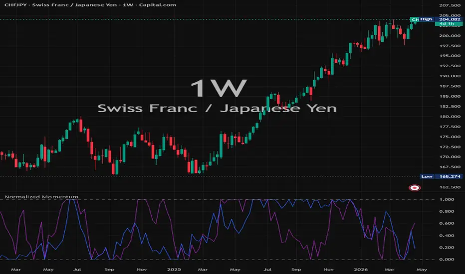
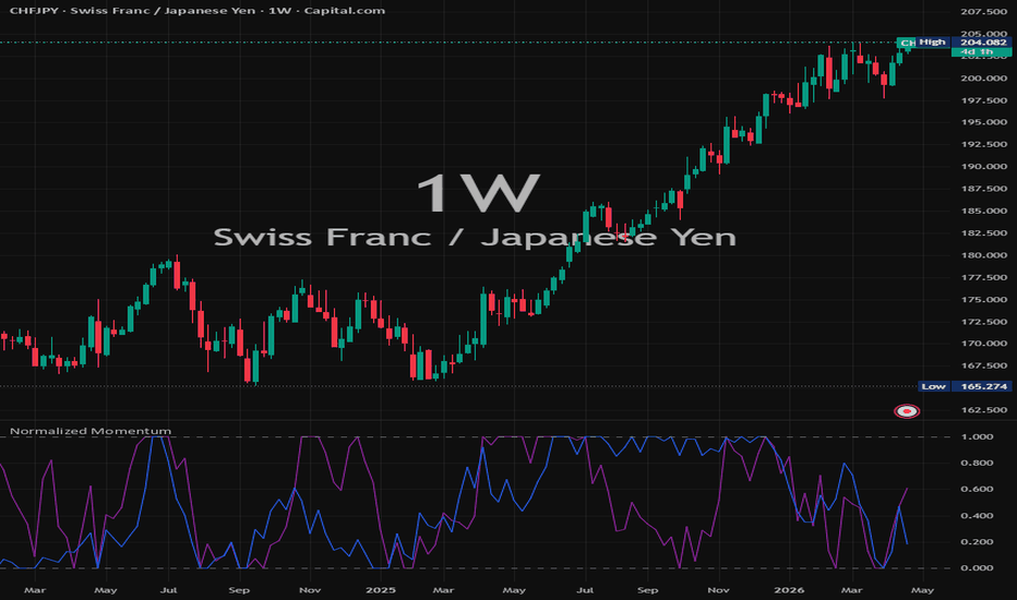
Normalized Momentum Indicator Description:
This indicator is designed to help traders identify market structure, trend direction, volatility conditions, and potential reversal zones. It combines price‑action logic with dynamic calculations to highlight key areas of interest and improve decision‑making across different timeframes.
The tool automatically analyzes recent price behavior and visualizes important signals such as trend shifts, momentum changes, breakout conditions, and support/resistance reactions. It can be used for scalping, intraday trading, swing trading, or long‑term analysis.
Key Features:
Detects trend direction and potential trend reversals
Highlights important support and resistance zones
Identifies momentum strength and volatility changes
Works on all markets (Forex, Crypto, Stocks, Indices, Commodities)
Fully customizable parameters for fine‑tuning
Suitable for beginners and advanced traders
Helps filter noise and improve entry/exit timing
How to Use:
Look for confluence between trend direction, momentum, and price reaction
Use signals as confirmation, not as a standalone entry trigger
Combine with volume, market structure, or higher‑timeframe analysis
Adjust sensitivity based on your trading style Indicador
Indicador

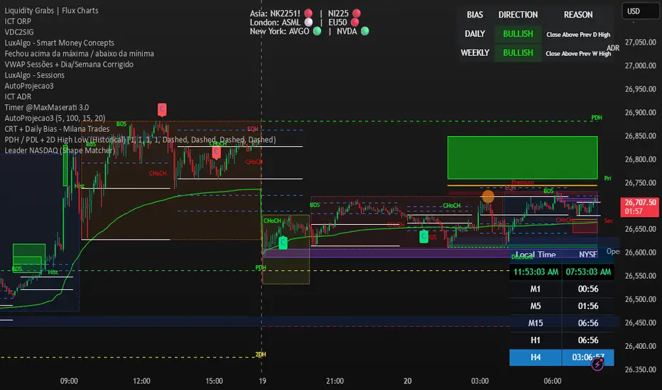
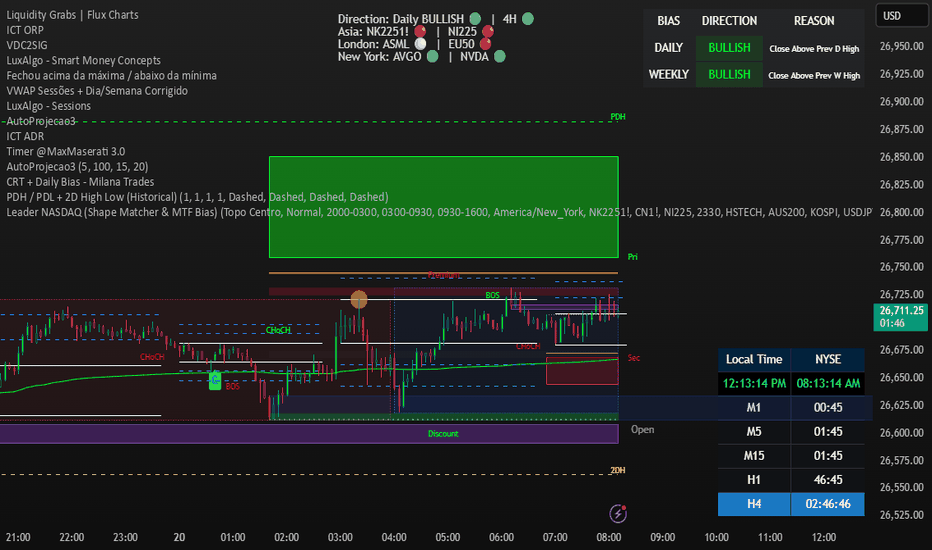
Leader NASDAQ (Shape Matcher & MTF Bias) (LACERDA)The Leader NASDAQ is an advanced, real-time correlation dashboard designed for index traders who want to track the global macro ecosystem and identify which assets are currently driving the NASDAQ's price action.
Instead of just showing absolute percentage changes, this script utilizes a sophisticated "Shape Matcher" (Cumulative Deviation) algorithm. At the exact opening of each major global liquidity session (Asia, London, and New York), the script anchors the opening price of the NASDAQ and your custom watchlist to 0%. Minute by minute, it calculates the cumulative deviation between the NASDAQ's intraday performance curve and every tracked asset's curve.
The dashboard actively filters and displays the Top 2 "Leaders" for each active session—meaning it isolates the specific assets whose intraday price action most perfectly correlates with the NASDAQ at that exact moment.
✨ Key Features:
Three-Session Tracking: Automatically segmented into Asia (Pacific liquidity), London (European macro), and New York (Core volume) sessions.
Shape-Matching Logic: Finds the "gravitational pull" of the market. If NVIDIA or TSMC is dictating the Nasdaq's movement, the script will mathematically identify them as the session leaders by having the lowest cumulative error.
Live Trend Indicators: Quick-glance visual cues next to each leader. A Green circle (🟢) means the asset is currently trading above its session open (bullish pull), while a Red circle (🔴) indicates it's dragging below its open (bearish pull).
Highly Customizable: You can input up to 8 assets for Asia, 8 for London, and 9 for New York via the indicator settings. Perfect for monitoring the "Magnificent Seven", key semiconductors (like ASML, TSMC), and global indices (DAX, Nikkei 225, KOSPI).
Non-Intrusive HUD: A sleek, borderless table overlay that can be positioned anywhere on your chart (Top Right, Bottom Left, etc.) without cluttering your technical analysis.
How to Use:
Apply the indicator to your chart (optimally a NASDAQ/MNQ chart).
Open the Indicator Settings (⚙️).
Type in your favorite market-driving tickers for each session (e.g., AAPL, NVDA, NI225, FDAX1!, USDJPY).
Watch the dashboard dynamically update to show you where the smart money and heavy correlation currently reside! Indicador
Leader NASDAQ (Shape Matcher) NY,ASIA,LondonThe Leader NASDAQ is an advanced, real-time correlation dashboard designed for index traders who want to track the global macro ecosystem and identify which assets are currently driving the NASDAQ's price action.
Instead of just showing absolute percentage changes, this script utilizes a sophisticated "Shape Matcher" (Cumulative Deviation) algorithm. At the exact opening of each major global liquidity session (Asia, London, and New York), the script anchors the opening price of the NASDAQ and your custom watchlist to 0%. Minute by minute, it calculates the cumulative deviation between the NASDAQ's intraday performance curve and every tracked asset's curve.
The dashboard actively filters and displays the Top 2 "Leaders" for each active session—meaning it isolates the specific assets whose intraday price action most perfectly correlates with the NASDAQ at that exact moment.
✨ Key Features:
Three-Session Tracking: Automatically segmented into Asia (Pacific liquidity), London (European macro), and New York (Core volume) sessions.
Shape-Matching Logic: Finds the "gravitational pull" of the market. If NVIDIA or TSMC is dictating the Nasdaq's movement, the script will mathematically identify them as the session leaders by having the lowest cumulative error.
Live Trend Indicators: Quick-glance visual cues next to each leader. A Green circle (🟢) means the asset is currently trading above its session open (bullish pull), while a Red circle (🔴) indicates it's dragging below its open (bearish pull).
Highly Customizable: You can input up to 8 assets for Asia, 8 for London, and 9 for New York via the indicator settings. Perfect for monitoring the "Magnificent Seven", key semiconductors (like ASML, TSMC), and global indices (DAX, Nikkei 225, KOSPI).
Non-Intrusive HUD: A sleek, borderless table overlay that can be positioned anywhere on your chart (Top Right, Bottom Left, etc.) without cluttering your technical analysis.
How to Use:
Apply the indicator to your chart (optimally a NASDAQ/MNQ chart).
Open the Indicator Settings (⚙️).
Type in your favorite market-driving tickers for each session (e.g., AAPL, NVDA, NI225, FDAX1!, USDJPY).
Watch the dashboard dynamically update to show you where the smart money and heavy correlation currently reside! Indicador

DAX Breadth [AM]DAX Breadth — Publication Description
TradingView Pine Script Library
---
Title
DAX Breadth
Tagline
The breadth data DAX traders never had — until now.
---
Full Description
The Problem
If you trade the DAX40 intraday, you already know this frustration: breadth data simply does not exist for European indices on retail platforms. NYSE traders have TICK, ADD, VOLD and TRIN available as standard symbols. DAX traders have nothing equivalent. There is no XETR:TICK. There is no XETR:ADD. The Deutsche Börse publishes no aggregated breadth feed accessible to retail platforms.
This indicator solves that problem from the ground up.
---
What It Does
DAX Breadth reconstructs five institutional-grade breadth metrics for the DAX40 by individually scanning all 40 Xetra components on every bar using `request.security()` calls. It creates data that does not otherwise exist on TradingView.
This is not a mashup of existing indicators. It is a full reconstruction of breadth internals from raw component data.
---
The Five Metrics
TICK
Net advancing minus declining components on each bar. A reading of +25 means 32 stocks up, 7 down. Mirrors NYSE TICK methodology applied to the DAX40 universe. Reacts instantly — your fastest breadth signal.
CUMT (Cumulative TICK)
Running sum of TICK readings since the Xetra session open (09:00 CET), resetting daily. A rising CUMT throughout the session confirms sustained buying pressure. A falling CUMT despite a rising DAX price flags a breadth divergence — one of the most powerful signals in this indicator.
UVOL% (Up-Volume Ratio)
Volume of all advancing components as a percentage of total DAX40 volume. This is the critical institutional participation metric. A narrow rally driven by SAP or Siemens alone will show moderate TICK but low UVOL%. Readings above 75% confirm broad institutional buying. Below 30% on a rising index is a red flag.
ADV% (Advancing Percentage)
Raw count of advancing stocks as a percentage of the 40 components. Simple, fast, and useful for immediate visual confirmation of breadth width.
A/D Thrust (EMA-smoothed)
Advance/decline ratio smoothed with a configurable EMA (default 5 bars). Slower than TICK and ADV% by design — it filters noise and confirms the sustained directional bias of the session. Read it last, alongside CUMT.
---
The Dashboard
Each metric is displayed in a compact floating table with five columns:
INT VALUE TIER TRD ROC
Metric name Current reading Strength tier Direction arrow Rate of change
TIER classifies each metric into five levels using adaptive thresholds that widen during the first 15 bars of the session (early-session noise reduction):
+2 Strong Bull — dark green
+1 Bull — light green
0 Neutral — grey
−1 Bear — red
−2 Strong Bear — dark red
TRD shows the directional change vs the previous bar (↑ ↓ →).
ROC shows the delta vs N bars ago (configurable, default 5). All ROC values use a consistent delta format with explicit +/− sign so momentum direction is immediately readable.
---
Composite Score & Conclusion Block
Below the separator, three summary rows provide the analytical conclusion:
COMP — A weighted composite of all five metrics on a scale of −100 to +100.
Weights: UVOL% 30% · A/D 25% · TICK 20% · ADV% 15% · CUMT 10%
Includes its own ROC value and direction arrow.
Labels: Strong (≥50) · Moderate (≥25) · Weak (<25)
BIAS — Session directional bias derived from the composite score:
Bullish · Mild Bull · Neutral · Mild Bear · Bearish
MODE — Operating mode:
NORMAL — standard session conditions
NO_EDGE — composite score too low to confirm direction
90PCT_DAY — rare extreme breadth event (≥90% or ≤10% advancing) signalling high-probability trend continuation for the remainder of the session
---
How to Use It in Your Trading
Confirmation tool, not a signal generator.
Use DAX Breadth to confirm or challenge what you see on price. Before entering a long setup, check: Is UVOL% above 60%? Is CUMT rising? Is ADV% above 55%? If breadth contradicts the price setup, reduce size or skip the trade.
Divergence detection.
The most actionable signal: DAX index making new session highs while CUMT is declining. This breadth divergence frequently precedes sharp reversals. Watch it closely during the 10:00–11:00 CET window.
Opening Range context.
At 09:15 CET, after the Opening Range has formed, read the initial TICK and CUMT direction. A CUMT already moving strongly in one direction within the first 15 minutes is a high-conviction session bias signal.
90PCT_DAY awareness.
When MODE switches to 90PCT_DAY, the historical edge for trend continuation is significant. These sessions occur 2–5 times per quarter. On these days, fade setups should be avoided and trend-following setups sized up.
---
Technical Notes
Timeframe: Designed for 1-minute and 5-minute charts during the Xetra session (09:00–17:30 CET / Europe/Berlin timezone). Do not use on higher timeframes — CUMT accumulation becomes meaningless outside intraday context.
Data source: 39 XETR-listed components + Covestro (FWB:1COV, post-ADNOC acquisition). All other 39 components use Xetra primary listing data.
Session reset: CUMT resets automatically at 09:00 CET each trading day.
Adaptive tiers: Tier thresholds widen automatically during the first 15 bars of each session to prevent false extreme readings during the volatile open.
Overlay indicator: Renders as a floating table on the price chart. No separate pane required.
---
Settings
Setting Default Description
Table Position Right Top Floating table placement
Text Size Normal Tiny / Small / Normal
A/D EMA Smoothing 5 bars EMA length for A/D Thrust
ROC Lookback 5 bars Bars back for rate of change
---
Why This Is Different
Most breadth indicators available for European indices either:
(a) rely on pre-existing index breadth feeds that don't exist for DAX, or
(b) use price-only proxies that approximate breadth without volume confirmation.
DAX Breadth reconstructs five distinct breadth dimensions — including volume-weighted participation — from raw component data on every bar. The result is an institutional-grade breadth dashboard that did not previously exist for DAX40 intraday traders on any retail platform.
---
Designed and built for professional DAX40 intraday trading.
Optimised for use on 1M and 5M XETR:DAX charts during the Xetra session. Indicador