Wyckoff [theUltimator5]This indicator was designed to be a comprehensive, intuitive, overly engineered algorithm that plots Wyckoff accumulation and distribution patterns on the chart as they arise. It shows the current status of the regime on a side panel, while also overlaying the accumulation or distribution schematic over the chart for added visual aid. While most indicators use pivot points to create the structure, this indicator uses a complex algorithm to map the progress through numerous checks and structural matching techniques.
I designed this indicator to be both instructional and actionable, so people unfamiliar with the Wyckoff Method can jump in and learn about the phases with a clean and intuitive user interface and also make informed decisions based on the structure of the chart. People who have used the Wyckoff Method for years can use this indicator as confluence.
Here is a description of the Wyckoff Method and the different phases within:
Phase A - Stopping action. The prior trend halts. In an accumulation range, a Selling Climax (SC) arrives: heavy volume, a wide spread, and a close well off the low, marking panic selling being absorbed. An Automatic Rally (AR) follows as selling pressure exhausts and price snaps back. A Secondary Test (ST) then revisits the climax area on lighter volume and narrower spread, confirming that supply is genuinely diminished. The SC and AR together define the boundaries of the trading range. In distribution, the same sequence runs inverted with a Buying Climax (BC) and an Automatic Reaction.
Phase B - Building cause. Price oscillates within the range, often for a long time. This is where the institutional position is actually built. The range is tested repeatedly at both edges, and each successive test should show less volume and tighter spread than the last. Wyckoff's "cause and effect" principle holds that the time and work spent here determines the size of the move that follows.
Phase C - The test. The range makes a final probe against the dominant participants. In accumulation, this is a Spring: a brief break below support that fails and is quickly reclaimed, flushing out remaining sellers and confirming that little supply is left. In distribution, an Upthrust After Distribution (UTAD) breaks above resistance and fails back into the range. A low-volume Test of the Spring or UTAD usually follows. Not every range produces an excursion; some resolve on a quiet terminal test at an edge instead.
Phase D - Trend within the range. The evidence tips decisively. A Sign of Strength (SOS) drives across the range on expanding volume, or a Sign of Weakness (SOW) does the opposite. Price then pulls back to a Last Point of Support (LPS) or rallies to a Last Point of Supply (LPSY), holding above the broken resistance or failing below the broken support. This is the classic entry location because the risk point is well defined.
Phase E - Trend out of the range. Price is accepted outside the range and the markup or markdown proceeds. The old range now acts as support or resistance.
Now for how to use it:
Manually Adjustable Schematic
When you first turn on the indicator, you will notice that it requires you to select two points. This is something that I couldn't figure out a way around, and is used to plot a manually adjustable Wyckoff schematic over the chart that you can move around.
The manual schematic is disabled by default, but the two points still need to be chosen when you first open the indicator. You select the top left and bottom right points, which can be moved to scale or shift the adjustable schematic. You can move it to overlay on the chart to check the strength of the pattern you are looking at.
Again, the manually adjustable schematic is DISABLED by default and must be enabled in the user settings.
Historical Patterns
The next feature is that historical patterns plot the schematic above (accumulation) or below (distribution) the chart when the chart reaches a certain point within the regime. The default setting is phase C, but that can be changed in the user settings. There is a small red 'x' where the schematic gets invalidated so you can see where the pattern broke. The schematic that gets plotted at historical events may not look exactly like the ideal Wyckoff accumulation or distribution patterns since it creates pivot markers where each point on the chart confirms the points. There is also a background highlight to give additional visual aid to the phases.
Side Panels
You probably notice that there are schematics plotted off to the side of the chart with highlighted segments. These side panels are a visual aid to show you, at a glance, where the current chart is in the Wyckoff Method. They highlight the chart up to the point that has been last confirmed, and keeps the unconfirmed parts of the method grayed out. This gives a very intuitive and quick glance where the chart is sitting currently within the regime.
Tables
There are two tables that can be enabled individual in the user settings, which have completely different functions.
1) Status table - This table shows the current state of the chart. Which phase the chart is currently on, the last confirmed event, the progression through the phase, and which timeframe the farthest progressed phase has been found on.
2) Debug table - This table shows the individual requirements for the current phase in order to progress to the next phase. It gives you the exact checks that the indicator is looking for in order to keep progressing. This indicator uses numerous requirements to progress phases rather than simple pivot points. It provides weights to the requirements and has some requirements be hard, and some soft. Hard requirements must be met in order to progress to the next phase, while soft requirements must meet a minimum cumulative threshold.
Chart overlays
When a certain phase is reached (default B - user adjust) on the current timeframe, a schematic will be overlaid on top of the chart, event names will be labeled, and a trading range box will populate over the accumulation or distribution zone. These can be toggled on or off, but are enabled by default.
Informational bubbles
If you hover your mouse over an event label, information about that event will display. It will provide a brief description of what the event is and how it builds into the Wyckoff phases.
Entry points
The chart will display a label for an entry (buy or sell) when the schematic reaches a certain level that is defined within the algorithm. It generally happens within phase C, but it is calculated based on a confidence score. The strictness of the entry points can be adjusted in the user settings. The point of entry will also be shown on the label.
Additional Features
Higher timeframe searching can be disabled, so you are only looking at the current timeframe on for patterns. It is enabled by default because chart patterns don't always follow set lengths.
Side panels can be resized and moved in the user settings.
Overlay schematic has a smart collision detection so side panels will automatically adjust their position so there isn't overlap
Side panels can be manually set to show user defined schematics when no pattern is identified. As soon as there is a valid pattern, only the valid pattern schematic will display.
Alerts available for entry conditions and events
This indicator is extremely complex, which creates countless unique conditions that may result in it not finding a pattern that appears to be textbook, or finding patterns that visually don't meet the criteria of the Wyckoff Method. Creating an indicator to algorithmically detect the structure is non-trivial and may contain errors. This was designed as a visual aid tool only. Indicador

XeL OnlineRecursionXeL OnlineRecursion is a Pine Script library for online and streaming statistical estimation on continuous numerical and financial data.
The library is designed around recursive statistical populations whose retained state is updated observation by observation. Most recursive components use constant retained memory and O(1) work per observation, making them suitable for indicators and models that require adaptive statistics without repeatedly recalculating an entire historical window.
OnlineRecursion is statistical infrastructure rather than a trading signal, strategy, or standalone indicator. It is intended to be imported and composed by other Pine scripts.
CORE DESIGN
The library separates four conceptual layers:
Streaming and population mechanics.
Generic retained statistical state.
Derived statistical interpretations.
Finance-oriented evidence and recursive weighting models.
A central design principle is that retained state represents a statistical population. Statistics that can be derived from an existing population are computed from that state rather than introducing unnecessary independent recursions.
STATISTICAL TOOLS
The library includes:
First-order recursive filtering and recursive extrema estimation.
Sample-and-hold, settlement, accumulation, and exact rolling-sum tools.
Fixed-memory P2 cumulative quantile estimation.
Adaptive quantile and expectile estimation.
Adaptive conditional tail-mean estimation.
Adaptive Huber location estimation.
Adaptive MAD and Gaussian-equivalent robust scale.
Recursive univariate moments through fourth order.
Variance, sigma, skewness, kurtosis, and effective sample size.
Recursive covariance and correlation.
Recursive linear-regression views including beta, intercept, and R-squared.
Recursive Heavy-Tail distribution estimation.
Relative-return, relative-projection, and additive-moment transforms.
Recursive decay, anchored, participation, and composite-alpha constructors.
Market-participation models.
Market-dispersion models.
POPULATION SEMANTICS
OnlineRecursion treats population geometry as part of the mathematical definition of an estimator.
Depending on the component, the represented population may be:
Cumulative.
Finite rolling.
Exponentially weighted.
Anchored.
Conditional.
Observation-clock.
Event-clock.
These population interpretations are not assumed to be interchangeable.
Initialization, missing observations, reset behavior, recursive coefficients, and population boundaries are therefore explicit estimator semantics rather than incidental implementation details.
Where defined as a recursive feedback coefficient, alpha generally follows a convention. Exact initialization behavior is defined by each estimator because creation of a new statistical population is not always equivalent to an ordinary recursive update.
FINANCE-ORIENTED EVIDENCE
The library includes reusable tools for constructing adaptive market evidence, including time-decay weighting, participation-based weighting, relative-return transformations, and recursive market-dispersion models.
Available dispersion interpretations include:
Mean displacement.
Realized movement.
Drawdown.
Upthrust.
Directional stress peaks.
Average directional stress.
Participation models allow recursive weighting to respond to different market-population relationships rather than treating every observation as equally informative.
The chart accompanying this publication demonstrates library mechanics on NQ continuous futures using hourly observations and Open Interest participation.
The upper and lower dispersion plots, recursive mean, and lower-pane statistic illustrate one possible composition of exported library functionality.
These plotted outputs are demonstrations of statistical mechanics. They are not trading signals or recommended parameter settings.
HEAVY-TAIL MODEL
The Heavy-Tail estimator combines generic recursive moment state with additional model-specific interpretations such as Student-t degrees of freedom, t-distribution scale, and absolute-innovation scale.
HeavyTail is one statistical interpretation built on the generic moment backbone. The library does not assume that this model is appropriate for every market, instrument, or application.
USAGE
Import the library from another Pine Script and use the exported state types, methods, enumerations, or functional interfaces required by the application.
Stateful interfaces provide explicit control over retained state and update timing. Functional interfaces are also provided where convenient for series-oriented use.
Some estimator compositions intentionally require caller-controlled timing.
For example, when one adaptive estimator supplies a threshold, center, or scale to another estimator, the caller may need to use the previously retained value to avoid unintended same-observation feedback.
MISSING DATA AND CALLER POLICY
Market-data-dependent functions can return na when required information is unavailable or when the requested statistical relationship is not currently defined.
Fallback behavior intentionally remains with the importing application when the library cannot define the relationship mathematically.
This prevents unavailable data from being silently converted into a different statistical assumption.
LIMITATIONS
OnlineRecursion does not provide:
Entry or exit logic.
Trading recommendations.
Profitability claims.
A guarantee that any estimator is appropriate for a particular market.
Recursive estimators depend on their coefficient policy, population definition, and initialization semantics.
A recursive population is not automatically equivalent to a finite rolling-window population merely because their outputs may appear similar.
Users should therefore select estimators and coefficient models according to their statistical meaning rather than treating all recursive parameters as interchangeable smoothing controls.
DESIGN INTENT
OnlineRecursion is intended to provide reusable statistical infrastructure from which higher-level models can be composed.
The architecture follows this separation:
Foundational state represents the retained population.
Derived statistics interpret that population.
Models add model-specific assumptions.
Applications decide how statistical evidence is used.
This separation is intended to keep generic statistical machinery independent from application-specific trading logic.
VERSION
This first TradingView library publication corresponds to XeL OnlineRecursion development release 1.0.0-rc.2 , dated 2026-09-04.
TradingView library publication revisions such as /1 are independent of the project's development release numbering. Biblioteca

Dual-Phase Reversal by DGTDual-Phase Reversal • Exhaustion, Pivots & Pressure
Dual-Phase Reversal (DPR) is a two-phase market exhaustion framework that tracks directional momentum through Momentum Exhaustion and Terminal Exhaustion . It combines sequential price conditions, Momentum Shift initiation, phase qualification, exhaustion progression, invalidation levels, Range Pivots, Volume Pressure, and Volume-Weighted Bars to provide a structured view of potential trend exhaustion and reversal conditions.
The framework is designed to distinguish between an initial loss of directional momentum and a subsequent terminal phase, while keeping the two stages logically independent.
Dual-Phase Exhaustion Framework
Momentum Exhaustion identifies an initial phase of directional overextension using a four-bar close relationship. A new phase begins only when a Momentum Shift occurs — a change in the direction of the four-bar close relationship. Sustained one-directional momentum therefore does not automatically initiate a new count.
The Momentum Exhaustion phase progresses through its sequential conditions and can receive a Q (Qualification) classification based on the corresponding price structure. Qualification describes the completed setup itself and is not required for the subsequent Terminal Exhaustion phase to begin.
Terminal Exhaustion begins when a Momentum Exhaustion phase completes count 9. It uses a separate set of price conditions to track the continuation of exhaustion toward a terminal phase. The Terminal Exhaustion phase progresses independently and can include an additional validation/failure condition during its progression.
Phase Levels & Invalidation
Upon completion of Momentum Exhaustion, the framework can project dynamic Support & Resistance levels derived from the completed phase. These levels remain active until price crosses the corresponding level.
Optional Invalidation Levels are provided for both Momentum Exhaustion and Terminal Exhaustion. These levels are derived from the price extremes established during the respective phase and provide a structural reference for when the exhaustion condition is considered invalidated.
Terminal Exhaustion can additionally calculate a Target Level from the price structure developed during its progression.
Range Pivots
The optional Range Pivot framework provides higher-timeframe Support (S), Pivot (P), and Resistance (R) levels.
The timeframe can be selected manually or determined automatically according to the chart timeframe, with support for 1H, 4H, Daily, Weekly, Monthly, Quarterly, and Yearly ranges.
Optional Developing Range Pivot projects Support, Pivot, and Resistance levels from the current, still-forming range — an early, real-time preview of the next range's pivot before it closes. Optional Historical Range Pivot instead displays the completed pivot levels of prior ranges, allowing the current range to be compared against past structure.
Volume Pressure
The optional Volume Pressure Oscillator evaluates buying and selling pressure by combining price movement within each bar's range with traded volume.
The resulting oscillator is normalized to a 0–100 scale, with configurable upper and lower bands. A signal line and histogram provide additional context for changes in pressure.
The pressure calculation excludes zero-range bars and handles markets where volume data is unavailable.
Dashboard
An optional, repositionable Dashboard table provides a compact, at-a-glance summary of the framework's current state on the last bar:
Momentum — which side (buy-side or sell-side) is currently progressing, and its step count out of 9
Terminal — which side is currently progressing, and its step count out of 13
Pivot — signed percentage distance from price to the nearest Range Pivot level
Pressure — the current Volume Pressure ratio, shown as a buying/selling percentage split
Each row includes a tooltip with additional detail. The table can be toggled on or off and repositioned to any chart corner.
Visuals & Reading the Framework
The All Sequence Steps display mode shows the progression of the Momentum and Terminal Exhaustion phases using compact sequential markers. Completed phases can instead be displayed selectively for a cleaner chart.
Volume-Weighted Bars optionally highlight bars according to their volume relative to a configurable volume moving average, helping distinguish unusually high and low volume activity.
DPR is best used as a contextual framework rather than a standalone reversal signal . Momentum Exhaustion identifies an initial state of directional overextension, while Terminal Exhaustion represents a later-stage continuation of that exhaustion process. Range Pivots, Support/Resistance, Invalidation, and Volume Pressure can be used together to assess the broader market context.
Alerts
Alerts are available for:
Momentum Exhaustion phase completion
Terminal Exhaustion phase completion
Momentum Exhaustion Support / Resistance crossings
Momentum & Terminal Exhaustion invalidation level crossings
Range Pivot level crossings
Volume Pressure entering overbought / oversold zones
High-volume bars
Alerts include the instrument and relevant price level where applicable.
DISCLAIMER
This script is intended for informational and educational purposes only. It does not constitute financial, investment, or trading advice. All trading decisions made based on its output are solely the responsibility of the user.
Indicador

Zeiierman Trend Pressure (Zeiierman)█ Overview
Zeiierman Trend Pressure (Zeiierman) is a multi-layer trend pressure and exhaustion oscillator designed to visualize short-term momentum, persistent trend structure, directional pressure, and exhaustion states within a normalized 0 to -100 range.
Instead of relying on a single oscillator calculation, the indicator separates market behavior into three distinct components:
• Z-Pulse = fast reactive pressure
• Z-Trend = slower macro-weighted trend pressure
• Pressure Core = broader directional pressure and regime structure
Z-Pulse reacts quickly to changes in local range position, while Z-Trend blends fast, structural, and macro range measurements with a strong weighting toward the longer-term trend. The Pressure Core then evaluates candle position, candle body, wick behavior, and recent impulse to provide an additional view of directional pressure.
The indicator also contains a persistent Pressure Exhaustion model. When both Z-Pulse and Z-Trend reach an extreme region, an exhaustion state can become active. Instead of disappearing immediately when either line moves slightly away from the extreme, the state uses confirmation and release logic to remain active until pressure has meaningfully weakened.
Pressure Core coloring identifies the broader directional environment:
• Core Bull = positive directional pressure
• Core Bear = negative directional pressure
• Core Neutral = mixed or insufficient directional pressure
Dots show active pressure states, while triangles identify the beginning of an upper or lower pressure event. Price boxes can also be projected directly onto the chart while an exhaustion state remains active.
█ How It Works
⚪ Z-Pulse
Z-Pulse is the indicator's fast component. It first measures where the current close sits inside the recent price range using a Williams-style normalized range calculation.
rangePosition = 100 * (close - highest) / (highest - lowest)
A stochastic transformation of this fast range reading is then blended back into the original value.
Z-Pulse Raw =
rangePosition * 0.72
+ stochasticPulse * 0.28
The result is smoothed with an EMA to create Z-Pulse. This gives the indicator a responsive line that can quickly detect changes in local market pressure while staying within the 0 to -100 oscillator range.
⚪ Z-Trend
Z-Trend is designed to represent the more persistent side of market pressure.
Three normalized range measurements are calculated using the Pulse Range, Trend Range, and Macro Trend lengths. These readings are combined using fixed internal weights, with the macro component receiving the largest influence.
Z-Trend Target =
Fast Range * 0.10
+ Trend Range * 0.18
+ Macro Range * 0.72
The engine then measures agreement between the three range layers and the efficiency of recent price movement.
When the market is moving efficiently and the range layers agree, Z-Trend becomes more resistant to short counter-trend movements. Persistent occupation of the upper or lower oscillator region also increases the Trend Persistence effect.
This makes Z-Trend slower and more stable than Z-Pulse, allowing it to represent the underlying directional structure instead of reacting to every short-term fluctuation.
⚪ Pressure Core
Pressure Core measures each candle's internal structure relative to a larger price range.
It combines five components:
• closing location inside the range
• average candle location
• candle-body direction
• upper versus lower wick pressure
• recent five-bar price impulse
pressure =
closeLocation * 0.42
+ meanLocation * 0.23
+ bodyBias * 0.13
+ wickBias * 0.12
+ impulse * 0.10
A reactive pressure model and a slower regime model are then combined using the Regime Weight setting.
Pressure Core =
Regime Pressure * Regime Weight
+ Reactive Pressure * (1 - Regime Weight)
This creates a third view of market pressure that is independent of the Z-Pulse / Z-Trend relationship.
⚪ Pressure Exhaustion
Pressure Exhaustion begins when both Z-Pulse and Z-Trend occupy the same extreme region.
upperPressure = Z-Pulse >= upperLevel
and Z-Trend >= upperLevel
lowerPressure = Z-Pulse <= lowerLevel
and Z-Trend <= lowerLevel
The state does not use a simple one-bar threshold cross. It includes entry confirmation and a separate release distance so temporary fluctuations do not immediately terminate a persistent pressure state.
This creates a hysteresis effect, where entry and release conditions are intentionally different.
At normal and higher sensitivity settings, both Z-Pulse and Z-Trend must move away from the extreme before the state is released. At the lowest sensitivity settings, the state is deliberately allowed to become much less stable.
█ How to Use
Zeiierman Trend Pressure can be used in three main ways: Trend Trading, Continuation Trading, and Reversal Trading.
Z-Pulse reacts faster to short-term changes in pressure, while Z-Trend shows the slower and more persistent trend direction. Pressure Core can then be used as an additional confirmation of the broader market bias.
⚪ Trend Trading
Use Z-Trend and Pressure Core to identify the main directional environment.
When Z-Trend is holding in the upper half of the oscillator and Pressure Core is Bull-colored, bullish pressure is dominant. This favors looking for long setups.
When Z-Trend is holding in the lower half , and Pressure Core is Bear-colored, bearish pressure is dominant. This favors looking for short setups.
⚪ Continuation Trading
For continuation setups, look for temporary pullbacks within an already established trend.
• Bullish Continuation Setup
During a bullish trend, Z-Trend and Pressure Core should remain bullish while Z-Pulse temporarily moves lower. This shows that short-term pressure has weakened, but the broader trend structure is still intact.
• Z-Trend remains bullish
• Pressure Core remains Bull-colored
• Z-Pulse drops lower during the price pullback
• Z-Pulse then turns higher again
• Price begins continuing in the direction of the broader bullish trend
• Bearish Continuation Setup
During a bearish trend, Z-Trend and Pressure Core should remain bearish while Z-Pulse temporarily moves higher. This shows that short-term pressure has strengthened against the trend, but the broader bearish structure is still intact.
• Z-Trend remains bearish
• Pressure Core remains Bear-colored
• Z-Pulse temporarily pushes higher during a price bounce
• Z-Pulse then turns lower again
• Price begins continuing in the direction of the broader bearish trend
The important distinction is that Z-Pulse is allowed to move against the trend temporarily. That is the pullback. As long as Z-Trend and Pressure Core remain aligned with the broader direction, the move can be treated as a potential continuation setup rather than a full trend reversal.
⚪ Reversal Trading
The pressure boxes highlight areas where the market has remained under extreme directional pressure for a period of time.
The box itself shows the price range formed while the pressure state is active. The triangle at the end of the box marks the Pressure Release, which is the important confirmation for a potential reversal.
• Bullish Reversal
A blue box forms when Z-Pulse and Z-Trend remain under strong downside pressure.
While the box is active, bearish pressure is still present, so the box alone is not a buy signal.
When the blue triangle appears, the Lower Pressure state has been released. This shows that downside pressure is weakening and can mark a potential bullish reversal area.
• Blue Box = downside pressure is active
• Blue Triangle = downside pressure has released
• Bearish Reversal
A red box forms when Z-Pulse and Z-Trend remain under strong upside pressure.
While the box is active, bullish pressure is still present, so the box alone is not a sell signal.
When the red triangle appears, the Upper Pressure state has been released. This shows that upside pressure is weakening and can mark a potential bearish reversal area.
• Red Box = upside pressure is active
• Red Triangle = upside pressure has released
The key idea is to wait for the pressure release rather than trying to predict the reversal while the box is still developing.
█ Settings
Pulse Range: Controls the primary range window used by Z-Pulse.
Pulse Stochastic: Controls the stochastic transformation applied to the fast range reading.
Pulse Smoothing: Controls EMA smoothing of Z-Pulse. Higher values create a smoother and slower response.
Trend Range: Controls the medium-term structural range used by Z-Trend.
Macro Trend: Controls the longest range component used by Z-Trend. This component has the largest internal weighting.
Trend Smoothing: Controls the final smoothing of Z-Trend.
Trend Persistence: Controls how strongly persistent occupation of an extreme region influences Z-Trend.
Exhaustion Zone: Controls the base location of the upper and lower pressure regions.
Sensitivity: Controls exhaustion selectivity, confirmation, release distance, and state persistence. Lower values are looser and more inconsistent, while higher values are stricter and more persistent.
Reactive Smoothing: Controls smoothing of the reactive component inside Pressure Core.
Regime Weight: Controls how much influence the slower Pressure Core regime receives relative to reactive pressure.
-----------------
Disclaimer
The content provided in my scripts, indicators, ideas, algorithms, and systems is for educational and informational purposes only. It does not constitute financial advice, investment recommendations, or a solicitation to buy or sell any financial instruments. I will not accept liability for any loss or damage, including without limitation any loss of profit, which may arise directly or indirectly from the use of or reliance on such information.
All investments involve risk, and the past performance of a security, industry, sector, market, financial product, trading strategy, backtest, or individual's trading does not guarantee future results or returns. Investors are fully responsible for any investment decisions they make. Such decisions should be based solely on an evaluation of their financial circumstances, investment objectives, risk tolerance, and liquidity needs.
Indicador

Volume Delta Footprint Map (Zeiierman)█ Overview
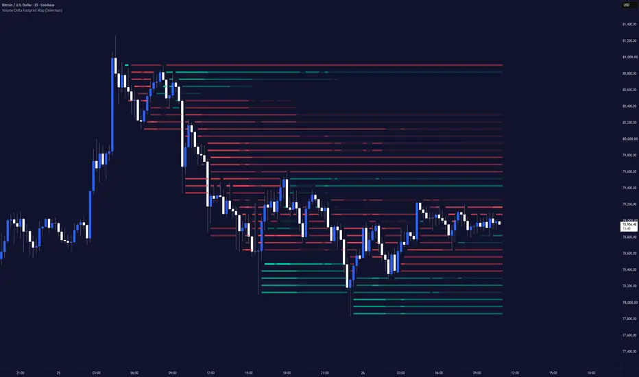
Volume Delta Footprint Map (Zeiierman) is a lower-timeframe volume delta mapping indicator that visualizes where buying and selling pressure develops across both price and time.
The indicator uses lower-timeframe data to estimate the buying and selling activity occurring inside each chart candle. This activity is then mapped across the price levels where it occurred, creating a detailed view of how volume delta develops around price.
The result is a dynamic footprint-style map built directly around price.
Positive Delta stripes highlight areas where estimated buying activity dominated, while Negative Delta stripes highlight areas where estimated selling activity dominated. Stronger concentrations appear with greater visual intensity, allowing important areas of directional participation to stand out immediately.
█ How It Works
⚪ Lower-Timeframe Delta
The indicator analyzes lower-timeframe candles inside each chart candle to estimate directional volume delta.
Bullish candles contribute positive volume, while bearish candles contribute negative volume.
delta = direction × volume
⚪ Price Stripe Mapping
The calculation range is divided into horizontal Price Stripes. Each lower-timeframe candle distributes its delta across the price levels it traded through, creating the footprint-style map around price.
⚪ Delta Persistence
Delta is carried forward using exponential decay, allowing strong buying or selling pressure to remain visible while older activity gradually fades.
⚪ Stripe Strength
Each stripe is ranked by its relative delta magnitude and directional dominance.
strength = relativeDelta × 0.70 + deltaDominance × 0.30
Stronger concentrations appear more prominently, while weaker activity can be filtered using Minimum Stripe Strength.
⚪ Price Interaction
When enabled, sections of a stripe disappear once price trades through that level, making untouched delta areas easier to identify.
█ How to Use
⚪ Identify Buying Pressure
Strong Positive Delta stripes highlight price areas where lower-timeframe buying activity became dominant.
When several strong positive stripes develop around the same area, it can indicate concentrated bullish participation.
Monitor these areas for continuation, support, absorption, or renewed buying interest if price returns.
⚪ Identify Selling Pressure
Strong Negative Delta stripes highlight areas where lower-timeframe selling activity became dominant.
Clusters of negative delta can reveal areas where sellers became particularly active and may help identify rejection, resistance, bearish continuation, or renewed selling pressure.
⚪ Find Delta Concentrations
The strongest stripes are often more important than isolated weak readings.
A dense area containing several high-intensity stripes shows that directional activity repeatedly concentrated around a similar price region.
These areas can help traders identify where meaningful participation entered the market.
⚪ Find Trapped Buyers and Sellers
• Strong Positive Delta near a high followed by rejection can indicate buyers being absorbed by sellers. If price moves lower, those buyers may be forced to close their positions.
• Strong Negative Delta near a low followed by rejection can indicate sellers being absorbed by buyers. If price moves higher, those sellers may be forced to close their positions.
These areas can become especially important when the Delta concentration forms near key highs, lows, support, resistance, or liquidity zones.
⚪ Find Buyers and Sellers in Control
• Strong Negative Delta near a local swing high followed by continued downside can indicate sellers taking control and pushing price lower.
• Strong Positive Delta near a local swing low followed by continued upside can indicate buyers taking control and pushing price higher.
When price continues to move away from these areas, the Delta concentration can help confirm which side is controlling the move.
█ Settings
Automatic Lower Timeframe: Automatically selects an appropriate lower timeframe based on the active chart timeframe.
Manual Lower Timeframe: Selects the lower timeframe used for delta calculations when automatic selection is disabled.
Lookback Bars: Controls how many historical chart candles are included in the Delta Map.
Price Stripes: Sets the number of horizontal price levels used to construct the map. More stripes provide greater price resolution.
Delta Persistence: Controls how long accumulated buying or selling pressure remains active before gradually decaying.
Minimum Stripe Strength: Filters weaker delta concentrations. Higher values display only stronger directional activity.
Intensity Steps: Controls how many visual strength levels are used between weak and strong Delta stripes.
Create Gap When Price Touches Stripe: Removes sections of a stripe where price has already traded through its corresponding price level.
█ Important
Volume Delta Footprint Map estimates directional volume from lower-timeframe candle behavior and available volume data.
It does not require TradingView’s Footprint data and does not represent exchange-level bid and ask transactions.
Instead, it provides a universal footprint-style visualization designed to reveal where directional volume pressure developed, how strong that pressure was, and how its influence evolved across price and time.
-----------------
Disclaimer
The content provided in my scripts, indicators, ideas, algorithms, and systems is for educational and informational purposes only. It does not constitute financial advice, investment recommendations, or a solicitation to buy or sell any financial instruments. I will not accept liability for any loss or damage, including without limitation any loss of profit, which may arise directly or indirectly from the use of or reliance on such information.
All investments involve risk, and the past performance of a security, industry, sector, market, financial product, trading strategy, backtest, or individual's trading does not guarantee future results or returns. Investors are fully responsible for any investment decisions they make. Such decisions should be based solely on an evaluation of their financial circumstances, investment objectives, risk tolerance, and liquidity needs.
Indicador

Initial Balance Auction Intelligence by DGTInitial Balance Auction Intelligence (ɪʙAUC) - Market State Engine
ɪʙAUC is an Auction Market Theory framework that tracks how price develops after the Initial Balance (IB), rather than treating it as static support/resistance. Using configurable post-IB auction windows, it identifies:
Acceptance · Failed Auction · Retest / Continuation · Rejection · Two-Sided Auction
combining price location, extension relative to IB width, close strength, and retest behavior - producing Regime, Bias, Phase, Auction State, cumulative Pressure, Quality, Maturity, and Invalidation levels, with an optional dashboard and alerts on confirmed transitions.
Initial Balance & Auction States
The Initial Balance (IB) is the range established during the selected opening session, with IBH / IBL as boundaries and IBM as midpoint. Session and timezone are configurable (chart Exchange timezone or a range of predefined markets), allowing the framework to adapt to different markets and sessions.
Once the IB completes, ɪʙAUC evaluates each subsequent auction window ( 5/10/15/30 min , configurable) against it:
* PROBING ABOVE/BELOW - live, tentative; price beyond a boundary while the window is still forming
* ACCEPTED ABOVE/BELOW - a completed window closes outside the IB
* FAILED ABOVE/BELOW - price extends beyond a boundary but closes back inside
* CONTINUATION - after acceptance, a retest of that boundary holds
* REJECTION - after acceptance, a retest fails and price moves back through it
* TWO-SIDED AUCTION - both IB extremes tested and rejected - a more rotational, conflicted read
Only completed windows confirm a state transition; probing states are live/developing information.
Visuals: Decision Candles & Projections
Decision Candles (optional) visualize the developing auction window's High/Low and Open/Close, highlighted when the window interacts with IBH or IBL - live information until the window completes.
Initial Balance Projections (optional) extend reference levels above IBH and below IBL at 0.5×, 1.0×, and 1.5× the IB range . These are reference levels for evaluating potential range extension - not predicted or guaranteed targets .
Metrics & Dashboard
Conviction/Quality combines close strength, IB-relative extension, and retest behavior to grade confirmed events - Acceptance/Continuation use acceptance criteria, while Failed/Rejection/Two-Sided use failure criteria. Maturity tracks how long a state has held (Early → Developing → Mature → Exhausted).
Pressure is a bounded −100..+100 reading, accumulated across the whole session from confirmed transitions. Bias reflects only the current event. These are deliberately different questions and can disagree - Pressure is not order-flow, volume, or a probability.
Regime (session character: Balanced / Rotational / Expansion / Failed Expansion / Trend Auction) and Phase (lifecycle stage: Balance → Probe → Acceptance → Retest → Expansion/Rotation → Exhaustion) provide higher-level context on top of the raw auction state.
The optional dashboard shows Regime, Bias, Phase, Auction State, Pressure, Quality, and Next (the next structural event or retest level plus its invalidation price), each with a contextual tooltip.
How to Read It
ɪʙAUC is a contextual framework, not a standalone signal . Read Regime, Bias, Phase, Pressure, Quality, and Invalidation together - acceptance can support continuation, failed auctions can signal reversion toward balance, and two-sided auctions can favor rotation.
Alerts fire on confirmed transitions ( Accepted/Failed Above/Below, Two-Sided, Continuation, Rejection ) and include the relevant level, instrument, and IB session context.
Important Notes
Designed for intraday timeframes ≤ 30 minutes ; the engine operates only when this condition is met.
Session and timezone should match the market being analyzed.
Uses 1-minute lower-timeframe data on higher intraday charts for precise auction-window construction.
Live probes/Decision Candles are developing information; state transitions confirm only when the selected auction window completes.
DISCLAIMER
This script is intended for informational and educational purposes only. It does not constitute financial, investment, or trading advice. All trading decisions made based on its output are solely the responsibility of the user.
Indicador

BYO Pattern V1 [Trendoscope]🎲 Overview
BYO Pattern V1 (Build Your Own Pattern) is a highly flexible open-source indicator that empowers traders to design, define, and automatically detect custom geometric patterns based on Fibonacci ratios between zigzag pivots.
Unlike traditional harmonic or chart pattern indicators that come with fixed, pre-defined rules, this tool puts the power of pattern creation entirely in your hands. You choose the number of pivots (5 or 6), enable the specific ratio conditions you care about, set exact values or ranges, and the indicator scans the chart in real time for matching structures.
Default configuration is set to the classic Three Drives pattern, but you can reconfigure it in seconds to detect almost any ratio-based pattern — including custom variations of ABCD, Gartley-style structures, Three Drives, 5-0, or completely original patterns of your own invention.
🎲 Core Concept
The indicator works on the principle that many powerful reversal and continuation patterns can be described as a sequence of alternating pivots (X-A-B-C-D or X-A-B-C-D-E) whose price legs satisfy specific Fibonacci retracement or extension relationships.
You define those relationships. The script does the heavy lifting:
Builds a zigzag of the required depth
Extracts the most recent 5 or 6 pivots
Calculates the relevant Fibonacci ratios between those pivots
Validates them against your enabled ratio rules (with optional tolerance)
Draws the valid pattern with labels, ratio annotations, and a Potential Reversal Zone (PRZ)
This approach is especially useful for traders who want to:
Test proprietary ratio combinations
Adapt classical patterns to different markets or timeframes
Explore less common structures that commercial indicators ignore
Create rules-based patterns for systematic trading or research
🎲 Supported Pattern Structures
5-Pivot Patterns (X-A-B-C-D) - Classic XABCD-style and many harmonic variations.
6-Pivot Patterns (X-A-B-C-D-E) - Three Drives and more complex multi-leg structures.
🎲 Available Ratio Conditions
You can independently enable and configure the following ratios:
XAB - Retracement of XA by AB
ABC - Retracement of AB by BC
BCD - Retracement of BC by CD
CDE - Retracement of CD by DE (6 pivots only)
XAD - Retracement of XA by AD
XCD - Retracement of XC by CD
ABE - Retracement of AB by BE (6 pivots only)
ADE - Retracement of AD by DE (6 pivots only)
Each ratio can be set as:
An exact value (the Error Percent setting expands it into a tolerance band)
A range (Start Value → End Value)
At least one terminal ratio must be enabled depending on the pivot count (validation is enforced at runtime). For example,
5 pivot pattern should at least have one of the ratio enabled among BCD, XAD or XCD.
6 pivot pattern should at least have one of the ratio enabled among CDE, ABE and ADE
🎲 Key Features
Fully Customizable Pattern Definition — Name, pivot count, and all ratio rules
Error Tolerance — Built-in percentage tolerance for practical real-world matching
Log Scale Support — Calculate ratios on logarithmic scale when needed
Automatic Pattern Drawing - draws patterns with labelling of pivots and ratios
Potential Reversal Zone (PRZ) — Automatically calculated and displayed as a shaded box based on the active terminal ratios
Color Theme Support — Dark / Light theme with automatic color cycling so multiple patterns remain distinguishable
Duplicate Filtering — Prevents redrawing identical pivot sets
Summary Table — Live table showing pattern name, pivot count, active ratio ranges, and total patterns identified
Real-time or Confirmed Bars — Option to include or exclude forming bars
🎲 How Detection Works
A zigzag is calculated using the user-defined length.
When a new pivot is confirmed (and enough pivots exist), the script extracts the latest 5 or 6 points.
All relevant Fibonacci ratios are calculated.
Each enabled ratio is validated against its defined range (or exact value ± error percent).
If all enabled ratios pass validation and the pattern is not a duplicate of an already drawn one, it is accepted.
The pattern is drawn with the next available theme color, labels, ratio annotations, and PRZ (if applicable).
🎲 Settings Guide
🎯 Zigzag Group
Length — Controls the sensitivity of the underlying zigzag (higher = fewer, more significant pivots)
Depth - Depth of zigzag level 1 to be considered for recursive zigzag calculation. Higher depth will result in more recursive levels and hence will scan higher number of patterns. However, this will also slow down the algorithm and can lead to runtime errors
Use Real Time Bars — Include the current forming bar in calculations
🎯 Pattern Group
Title — Custom name that appears in the summary table and can help you identify different configurations
Number of Pivots — Choose 5 or 6
Error Percent — Tolerance applied when a ratio is set as an exact value
Log Scale — Use logarithmic price differences for ratio calculations
🎯 Ratios Group
Individual enable toggles + Start/End value inputs for every supported ratio
Only the ratios you enable are checked
CBE, ABE, and ADE ratios are only available for 6 pivot patterns
🎯 Display Group
Theme (Dark / Light)
Show / Hide Pivot Labels
Show / Hide Ratio Labels
Show / Hide Summary Table
🎲 Example Use Cases
Load the default Three Drives configuration and study how frequently it appears on your instruments
Recreate a classical ABCD pattern by setting 5 pivots and enabling XAB + ABC + BCD with the classic ratios
Design a proprietary 6-leg structure and backtest its appearance across multiple symbols
Use tight error percentages for high-precision setups or wider ranges for more frequent signals
You can also try out some other simple harmonic patterns. There are lots of educational ideas published in tradingview about harmonic ratios. One such example is Advanced Harmonic Pattern Ratios by cmjohnson36
However, the real power of this indicator is that you can build your own set of ratio combinations and come up with new patterns.
🎲 Important Notes
This is a detection and visualization tool. It does not generate buy/sell signals or manage trades.
Pattern quality still depends on the quality of the underlying zigzag. Experiment with different Length values.
For 6-pivot patterns, at least one of CDE / ABE / ADE must be enabled.
For 5-pivot patterns, at least one of BCD / XAD / XCD must be enabled.
Your Patterns. Your Rules. Design it. Detect it. Trade it. Indicador

TASC 2026.09 Adaptive SuperSmoother█ OVERVIEW
This script implements the Adaptive SuperSmoother by John F. Ehlers, as presented in the "Improved Filter Performance" article from the September 2026 edition of the TASC Traders' Tips . The script demonstrates a simple technique to adapt the SuperSmoother's critical period to improve the filter's responsiveness.
█ CONCEPTS
In his article, Ehlers explains that many adaptive smoothers rely on Exponential Moving Averages (EMAs) at their core. Typically, these smoothers dynamically adjust an EMA's smoothing factor (alpha) based on specific volatility measures, often to reduce sensitivity during periods of volatile or choppy price movements. However, he suggests that EMAs are not great filters; they are first-order smoothers that offer very limited reduction, or attenuation, of high-frequency (low-period) signals in the dataset. For example, for an EMA with a critical period of 12 bars, the maximum gain reduction of smaller-period cycles is only about -17 decibels (dB). At this level of attenuation, a significant amount of high-frequency noise remains in an EMA-filtered series.
Ehlers proposes that traders should use the SuperSmoother instead of an EMA in most applications, including adaptive filtering. The SuperSmoother is a second-order filter. It has a second-degree polynomial in its transfer function and a zero of transmission at the Nyquist frequency . Thanks to these characteristics, the SuperSmoother offers a substantially greater reduction of higher frequencies than an EMA. Additionally, Ehlers notes that the filter's computational lag is not perceptibly greater than that of an EMA, further underscoring its usefulness as an improved filter.
Ehlers notes that there are many ways to make the SuperSmoother adaptive to market conditions. He demonstrates his preferred method, dubbed the Adaptive SuperSmoother , in the article's code. Rather than tuning the smoothing factor of an EMA based on a volatility measure, the Adaptive SuperSmoother dynamically adjusts the critical period of one SuperSmoother based on the rate of change (ROC) in another. The steps to calculate the filter are as follows:
Calculate a SuperSmoother filter using a fixed critical period.
Measure the one-bar ROC in the first filter, and calculate the RMS (Root Mean Square) of the result over a specified length (81 bars by default, as per the article).
Scale the ROC by the RMS, and limit the maximum scaled value to 2.
Calculate the factor for adjusting the final filter's period. The value is the square of one minus half of the scaled ROC.
Multiply the first filter's period by the factor from step 4, then limit the result to a minimum value of 2, to calculate the adaptive period.
Calculate a separate SuperSmoother using the adaptive period from step 5. This filter is the Adaptive SuperSmoother.
The resulting filter dynamically reduces its critical period to increase responsiveness when changes in the fixed-period SuperSmoother increase relative to the RMS. This behavior applies reasonable smoothing, while offering significantly reduced lag for aligning with market movements.
█ USAGE
This indicator plots a fixed-period SuperSmoother (red) and the Adaptive SuperSmoother (blue) on the main chart as well as an oscillator showing the relationship between the filters in the separate pane. Ehlers recommends analyzing the difference between these two filters to derive trading signals. The preferred trading direction is long when the Adaptive SuperSmoother is above the fixed-period SuperSmoother, and short otherwise. Ehlers also suggests that peaks and valleys in the difference between the filters can help identify turning points.
This script includes three inputs for customizing the filter calculations:
Source : The source series to process. The default is "Close".
Base period : The base period of the filters. The default is 20.
RMS length : The number of bars in the RMS calculation. The default is 81.
The snapshot below shows the indicator's outputs using default settings on a 1D S&P 500 Futures chart. The Adaptive SuperSmoother responds to market movements more quickly than the fixed-period SuperSmoother, while still smoothing out high-frequency noise in the data:
Indicador

std_timestd_time is a full calendar for Pine Script v6: the class of time infrastructure other ecosystems get from java.time, C++20 chrono and exchange_calendars, written natively in Pine. Civil dates, durations and periods, time zones with real daylight-saving rules, twelve exchange calendars (NYSE, LSE, CME, JPX, EUREX, HKEX, ASX, TSX, SSE, BSE, SGX, and 24/7 crypto) with holidays, half days and lunch breaks, trading-day arithmetic, sessions with on-the-bar close markers, option expiries including VIX settlement, ISDA day counts and business-day conventions, an economic release calendar, and an ISO-8601 formatter and parser. A calendar, not a bag of helpers.
One conversion sits at the bottom: Hinnant's civil-to-epoch pair, the algorithm C++20 chrono adopted. Weekdays, ISO weeks, DST boundaries, adjusters and holiday rules all derive from it, so no second implementation exists to quietly disagree with the first. The API keeps calendar arithmetic and instant arithmetic as separate families, because plus one day across a clock change is not plus 24 hours, and it treats an offset and a zone as different things, because they are. When a DST transition makes a local time impossible or ambiguous, you choose the resolution policy instead of inheriting one.
Rules do the work wherever the world runs on rules: VIX settlement is derived, not tabled, and reproduces every published Cboe settlement from 2021 through 2026, including all four Tuesday exceptions. The calendars are checked date-by-date against reference records over their stated ranges: NYSE and LSE on every single day from 1976 to 2035, HKEX through 2049, EUREX across its full window with zero differences. Every calendar declares the years it answers exactly, and past that horizon it returns UNKNOWN, a real three-valued answer, rather than reading an untabled holiday as a trading day. Completeness is a claim with a date on it, and every calendar states its date.
Full documentation, per-calendar coverage windows, the error model, and design rationale: github.com Biblioteca

OptiPine: High-Performance Caching and Data PipelinesOptiPine is a high performance architecture library for Pine Script™, built for algorithms that push beyond ordinary indicator workloads. It turns caching, sparse updates, reusable storage and workload-aware data structures into practical APIs that stay small at the call site.
In a small indicator, optimization is often optional. In a rendering engine, machine learning library, simulation, dashboard or object system, it can determine whether a feature runs at all. The problem is rarely one slow formula. It is the thousands of unnecessary operations around it: recalculating unchanged results, shifting rolling arrays, scanning large collections for a few changes, and moving stored objects when one disappears.
OptiPine attacks that layer with techniques used in projects such as Pine3D and NeuraLib . The idea is simple: do less work, move less data, and let the representation follow the workload.
Compared with conventional Pine implementations of the same task, OptiPine's optimized paths commonly ran 15% to 40% faster . Sparse updates and indexed lookups exceeded 90% when the alternative scanned or searched the full collection.
Most users can stay entirely within the high-level API. A Memo cache with several dependencies looks like this:
// Pseudocode: trendRegime and volatilityRegime are floats;
// rebuildModel() is a pure calculation.
var op.FloatMemo model = op.floatMemo()
if model.staleOn(trendRegime, volatilityRegime)
model.store(rebuildModel(trendRegime, volatilityRegime))
float result = model.get()
// Output: rebuildModel() runs once, then only when either regime changes.
Memo owns the previous dependencies, first-run state, validity and cached result. The caller only declares what the result depends on.
----------------------------------------------------------------------------------------------------------------
🔷 DO NOT CALCULATE THE SAME THING TWICE
The fastest expensive calculation is the one that never needed to run. Models, simulations and generated geometry often remain valid across many script executions.
Memo is the direct choice when the cached result is an int, float, bool, string or color. staleOn() checks up to four floats, two integers, one Boolean and one string; store() saves a rebuilt value, and get() returns it.
Many models respond to regimes rather than every tiny change in raw data. Round the inputs into meaningful regimes, pass them to staleOn() , and the model runs only when a regime changes.
In practice: Memo is useful for scenario models, parameter sweeps, numerical solvers and other expensive pure calculations that reduce to one primitive result. If its dependencies repeat on nine out of ten executions, it avoids roughly 90% of those model runs.
For collections or a variable dependency list, use Memo's explicit begin() , dependencies.watch*() and miss() lifecycle.
Keep guarded work pure: Stateful ta.* and similar history-dependent calls must remain outside Memo and Watch guards. Compute them every bar, then pass their results into the guarded calculation.
🔸 WATCH: CHANGE DETECTION WITHOUT RESULT STORAGE
Watch is the lighter choice when the caller already owns the result. Several consumers can observe the same producer independently by giving each its own Watch. changed() returns true on the first observation and whenever one scalar, primitive array or OptiPine row ring changes. Row rings expose an internal revision, so checking them is O(1).
For a single source, the dependency check should take less attention than the calculation it protects. Here another component supplies one caller-owned feature array:
// Pseudocode: getFeatureSnapshot() supplies an array.
array features = getFeatureSnapshot()
var op.Watch featureWatch = op.watch()
var float modelScore = na
if featureWatch.changed(features)
modelScore := evaluateModel(features)
// Output: modelScore is rebuilt only when the features array changes.
Because OptiPine does not own features , it compares the array with a retained snapshot and rewrites that snapshot only after a change. Supported row rings use their internal revision instead. The call stays the same, and this compare-first array pattern measured roughly 35% to 60% faster than rewriting the snapshot every time.
The array comparison is still O(N), so use it when the avoided calculation costs more than the comparison. If the producer already provides one reliable change flag, use the flag directly.
For several dependencies, use an explicit pass. begin() starts the comparison, the typed watch*() methods add dependencies, and finish() returns true if the completed set changed. A Watch remembers dependencies; it does not store the result.
// Pseudocode dependencies: int length, float multiplier,
// and array features.
var op.Watch settingsWatch = op.watch()
var float result = na
settingsWatch.begin()
settingsWatch.watchInt(length)
settingsWatch.watchFloat(multiplier)
settingsWatch.watchFloats(features)
bool dependenciesChanged = settingsWatch.finish()
if dependenciesChanged
result := rebuild(length, multiplier, features)
// Output: result is rebuilt when any observed dependency changes.
Construct the Watch once with var , then run begin() and finish() on every comparison pass. For one dependency, changed(source) is the shorter path.
In practice: Watch fits module boundaries: a model can observe a feature array, a renderer can observe a managed ring, or a cache can observe several mixed settings without duplicating the producer's change logic.
CadenceGate limits how often work may run. due() is periodic; dueWhenChanged() also requires a producer revision and remembers changes until the cadence opens. Use it for intentionally delayed work such as periodic model fitting, not results that must update immediately.
----------------------------------------------------------------------------------------------------------------
🔷 ROLLING HISTORY WITHOUT SHIFTING IT
Rolling histories often perform work that adds nothing to the result. If an array keeps the latest 200 events, removing the oldest one and shifting the other 199 entries is unnecessary.
FloatRowRing and IntRowRing keep fixed-width rows in reusable storage. Once full, the next row overwrites the oldest physical slot while reads remain chronological.
var op.FloatRowRing history = op.floatRowRing(200, 3)
float atr14 = ta.atr(14)
if barstate.isconfirmed
history.push(array.from(close, volume, atr14))
float oldestPrice = history.at(0, 0)
float latestPrice = history.newestAt(0, 0)
// Output: after a confirmed push, these are the oldest and newest retained closes.
A push costs O(width), or O(1) through pushValue() for a width-one ring. Rings also provide chronological windows and gathered rows. When several producers can mutate a ring, a separate consumer can detect its revision with Watch.changed(ring) in O(1).
In practice: Row rings fit pivots, completed trades, sampled features and other fixed event histories.
Performance: A full ring overwrites one row instead of shifting every retained row. Its chronological output uses at most two native contiguous copies, which measured 90% faster than rebuilding a 512-cell, width-four output row by row.
Use RingCursor when several caller-owned arrays need the same circular layout. Ordinary series history such as close should remain native Pine.
----------------------------------------------------------------------------------------------------------------
🔷 KEEP DYNAMIC OBJECTS STABLE
Dynamic objects become surprisingly expensive when identity is tied to array position. If one object is removed from several parallel arrays, every later entry shifts, every synchronized payload array needs the same removal, and every external reference to those positions becomes fragile.
StablePool is not the zone storage itself. It keeps one association: an object ID supplied by the script points to a reusable array slot. The ID answers "which zone is this?" while the slot answers "where is this zone's data stored?"
The example has three different logical zones named A, B and C. Their IDs, 1001, 1002 and 1003, are arbitrary unique values chosen for readability. Real IDs may come from a pivot bar, timestamp, order number or incrementing counter.
const int ZONE_A_ID = 1001
const int ZONE_B_ID = 1002
const int ZONE_C_ID = 1003
var op.StablePool zonePool = op.stablePool()
// This example never has more than two active zones.
var array prices = array.new(2, na)
if barstate.isfirst
// A receives slot 0. B receives slot 1.
= zonePool.acquire(ZONE_A_ID)
= zonePool.acquire(ZONE_B_ID)
prices.set(slotA, 100.0)
prices.set(slotB, 200.0)
// Zone A no longer exists. Its slot becomes available.
zonePool.release(ZONE_A_ID)
// C is a new zone with a new identity, but it can reuse A's old slot.
= zonePool.acquire(ZONE_C_ID)
prices.set(slotC, 300.0)
// Output: B keeps slot 1. C has ID 1003 but reuses A's released slot 0.
// prices is .
Why C needs a new ID: C is a different zone, even though it occupies the same array position A once used. Reusing 1001 would describe A returning, not a new zone C. IDs preserve object identity; slots are only reusable storage addresses.
Several fields, one slot: In production, the same slot usually addresses every field belonging to the object. Continuing the A, B and C lifecycle with four parallel arrays:
const int ZONE_A_ID = 1001
const int ZONE_B_ID = 1002
const int ZONE_C_ID = 1003
var op.StablePool zonePool = op.stablePool()
var array zonePrices = array.new()
var array zoneTimes = array.new()
var array zoneStrengths = array.new()
var array zoneColors = array.new()
if barstate.isfirst
= zonePool.acquire(ZONE_A_ID)
= zonePool.acquire(ZONE_B_ID)
// Grow every payload array to cover the allocated slots.
int required = zonePool.slotCount()
op.ensureSizeFloat(zonePrices, required, na)
op.ensureSizeInt(zoneTimes, required, na)
op.ensureSizeFloat(zoneStrengths, required, na)
op.ensureSizeColor(zoneColors, required, na)
zonePrices.set(slotA, 100.0)
zoneTimes.set(slotA, 10)
zoneStrengths.set(slotA, 0.40)
zoneColors.set(slotA, color.blue)
zonePrices.set(slotB, 200.0)
zoneTimes.set(slotB, 20)
zoneStrengths.set(slotB, 0.80)
zoneColors.set(slotB, color.red)
zonePool.release(ZONE_A_ID)
= zonePool.acquire(ZONE_C_ID)
// C reuses A's slot, so every field at that slot must be overwritten.
zonePrices.set(slotC, 300.0)
zoneTimes.set(slotC, 30)
zoneStrengths.set(slotC, 0.60)
zoneColors.set(slotC, color.lime)
// Output: B keeps slot 1 in every array. C owns slot 0 in every array.
// Nothing is removed or shifted.
acquire(id) returns the slot and whether the ID was newly added. Calling it again for an active ID returns the same slot. release(id) frees the slot, but does not erase its array data, so every field must be overwritten when that slot is reused.
The example preallocates two values because it has at most two active zones. A dynamic script can grow its payload arrays with ensureSize*() whenever acquire() reports a new ID. zonePool.slots() returns the currently active slots as a read-only view.
In practice: One zone slot can index its price, time, color, strength and line across several arrays. In the complete example later, the pivot bar and event type form each zone ID. Releasing one zone frees its slot without shifting other zones or breaking saved positions.
Performance: StablePool is independent of payload layout: its slots can index parallel arrays or one array of UDTs. acquire() , release() and find() are O(1), and releasing an object never shifts caller-owned payloads.
For a few fixed objects, manual indices are simpler. StablePool becomes useful when IDs appear and disappear over time, several payload arrays share the same slots, or other parts of the script retain those positions.
SlotCache is the frame-based alternative. Call begin() , acquire every active key, then call finish() ; previously active keys that were not touched are retired automatically.
----------------------------------------------------------------------------------------------------------------
🔷 UPDATE ONLY WHAT CHANGED
Large state does not imply large change. A dashboard may contain 10,000 cells while only a few change on one bar, or a large object system may need to refresh only a handful of entries.
A conventional dirty-flag array must be cleared and scanned in full. DirtySet stores only the changed indices, removes duplicate marks and begins a new cycle without clearing the entire universe. It is a work list, not payload storage or an ID-to-slot map.
Here StablePool resolves zoneId , the arrays store zone data, and DirtySet schedules the slots that need rebuilding. The event values are pseudocode:
int MAX_ZONES = 50000
var op.StablePool zones = op.stablePool()
var op.DirtySet dirtySlots = op.dirtySet(MAX_ZONES)
var array tops = array.new()
var array bottoms = array.new()
var array midpoints = array.new()
// Start this bar's sparse-work cycle.
dirtySlots.begin()
if zoneGeometryChanged
// StablePool converts the logical ID into a reusable physical slot.
= zones.acquire(zoneId)
if created
op.ensureSizeFloat(tops, zoneSlot + 1, na)
op.ensureSizeFloat(bottoms, zoneSlot + 1, na)
op.ensureSizeFloat(midpoints, zoneSlot + 1, na)
tops.set(zoneSlot, newTop)
bottoms.set(zoneSlot, newBottom)
dirtySlots.mark(zoneSlot)
if zoneStyleChanged
int styleSlot = zones.find(zoneId)
if styleSlot >= 0
dirtySlots.mark(styleSlot) // A second mark of the same slot is ignored.
// Process only the distinct physical slots marked during this bar.
for dirtySlot in dirtySlots.values()
float midpoint = (tops.get(dirtySlot) + bottoms.get(dirtySlot)) * 0.5
midpoints.set(dirtySlot, midpoint)
redrawZone(zones.keyAt(dirtySlot), midpoint)
// Output: one zone is rebuilt once even if geometry and style both mark it.
Repeated marks are deduplicated, and unmarked zones are never visited. Work scales with the number of changed slots, not the size of the collection. If the natural address is already a dense index, mark it directly without StablePool.
In practice: Several producers can mark work, then one consumer updates each affected cell, drawing or record once. With 1% of entries changed, this measured 93% faster than clearing and scanning the full universe.
----------------------------------------------------------------------------------------------------------------
🔷 KEYED LOOKUP WITHOUT GUESSWORK
Keyed lookup appears throughout object systems, caches and grouped data, but no structure fits every key set. Distribution, rebuild frequency and query volume change the best choice. OptiPine sees the completed keys at build() , then selects the lookup shape that fits them.
🔸 TYPED STORES: ONE VALUE PER KEY
A typed store maps each integer key to one primitive value. build() pairs entries at matching positions in the key and value arrays. Consecutive IDs allow direct addressing:
var op.IntFloatStore scores = op.intFloatStore()
if barstate.isfirst
// Four entries are shown for readability; both arrays may be much larger.
scores.build(
array.from(410, 411, 412, 413),
array.from(0.80, 0.30, 0.95, 0.50))
float selected = scores.get(412)
// Output: integer key 412 resolves to float value 0.95.
Lookup is one-way: get(412) returns 0.95 , but values may repeat, so get(0.95) has no general meaning.
What automatic mode chooses:
Consecutive ascending keys: Direct arithmetic indexing.
Compact key ranges: A dense lookup table.
Other unordered keys: A native map when within Pine's map limit.
Ascending sparse keys: Binary search, or a map within that limit when expectedQueries justifies its build cost.
Linear lookup remains available for unusual workloads that rebuild far more often than they query. Automatic mode only selects it for non-empty stores when linearMaxEntries is deliberately configured.
The same API avoids hashing when direct addressing fits, uses a map when it pays, and remains usable beyond Pine's map capacity. Automatic mode is the normal default. Use op.indexConfigDynamic() when future query volume is unknown and the store may need to promote itself later.
build(keys, values, expectedQueries) accepts two same-length arrays. The optional hint tells OptiPine how many lookups to expect before the next build. Stores support int, float, bool, string and color values. Use one IntIndex for several payload fields, or IntBuckets when a key owns several integers.
In practice: Batch-build IDs to scores, states or metadata, then query them without committing to a representation. Direct integer addressing measured 21% faster than a map, while a map measured 91% faster than repeated linear lookup with 32 entries.
🔸 INTBUCKETS: ONE KEY TO MANY INTEGER VALUES
A Store returns one value for each key. IntBuckets returns a group of integers, usually object IDs or physical slots. Repeating a key adds another member instead of replacing the previous one.
var op.IntBuckets cellMembers = op.intBuckets()
var array matches = array.new()
if barstate.isfirst
// Six (cell, object slot) pairs. Cell 7 appears three times.
array cellKeys = array.from(7, 2, 7, 5, 2, 7)
array objectSlots = array.from(101, 205, 412, 990, 777, 888)
cellMembers.buildFromPairs(cellKeys, objectSlots)
// Read cell 7's group from flat storage. matches is only demo output.
= cellMembers.rangeByKey(7)
if count > 0
for position = start to start + count - 1
matches.push(cellMembers.valueAt(position))
// Output: matches contains , the object slots assigned to cell 7.
What happens: Each key is paired with the slot at the same array position. Cell 7 appears three times, so its group contains 101, 412 and 888. rangeByKey() returns where that group starts and how many values it contains. A missing key returns a count of 0.
Lifecycle: buildFromPairs() replaces all previous groups. Use buildBegin() , add() and buildFinish() only when pairs arrive one at a time.
In practice: A price cell can own several zone slots, a graph node can own several neighbors, or a category can own several record IDs. One query visits only that group.
Why use it: A native map stores one value per key, and Pine does not allow an array directly as that value. Giving one key several values therefore requires a small wrapper UDT containing an array. IntBuckets provides that relationship directly, packing every group into shared contiguous storage. It suits batch rebuilds followed by repeated traversal, while the wrapper approach is more convenient when individual groups change constantly. In the tested 64-key traversal workload, IntBuckets averaged 19% faster across four runs.
----------------------------------------------------------------------------------------------------------------
🔷 REUSE STATE INSTEAD OF REBUILDING IT
IntDoubleBuffer and FloatDoubleBuffer retain current and previous arrays. swap() exchanges their references in O(1), preserves the old result and clears the new current buffer for reuse. That clear still costs O(N).
This is useful when one pass must remain readable while the next is built. In this small search, node n has children 2n and 2n + 1 . Each pass reads the active level and writes the next one:
var op.IntDoubleBuffer searchFrontier = op.intDoubleBuffer()
if barstate.isfirst
searchFrontier.current.push(1)
for depth = 1 to 3
= searchFrontier.swap()
for nodeId in activeFrontier
nextFrontier.push(nodeId * 2)
nextFrontier.push(nodeId * 2 + 1)
// Output: current contains .
// previous contains .
What happens: swap() makes the completed level available as activeFrontier and returns the other retained array, already empty, as nextFrontier . No level is copied and no replacement array is created. The same pattern supports graph searches, flood fills, iterative clustering and simulations. Use swapSized() when every pass needs a fixed-size output.
A var array can also be reused. The ensureSize*() , resize*() and refill*() families modify existing storage, while sameExact*() compares primitive arrays without Pine's float-comparison rounding.
Revision handles caller-owned state that OptiPine cannot observe. The producer calls bump() after a change; each consumer compares its own saved token with changedSince() instead of keeping a snapshot.
----------------------------------------------------------------------------------------------------------------
🔷 WEIGHTED SELECTION FOR STATIC AND DYNAMIC SYSTEMS
Weighted selection chooses entries in proportion to their weights. It is useful in simulations, randomized search and priority sampling.
WeightedSampler is the high-level interface. Set weights, then supply a fraction to select a slot. The sampler does not generate randomness; use math.random() or a repeatable fraction sequence:
var op.WeightedSampler sampler = op.weightedSampler(512)
if barstate.isfirst
sampler.setWeight(10, 0.25)
sampler.setWeight(11, 0.80)
sampler.setWeight(12, 0.10)
float fraction = 0.50
int selected = sampler.sample(fraction)
// Output: selected is 11 for the supplied fraction of 0.50.
The default cumulative prefix suits stable weights. Pass op.weightConfigSparseUpdates() and the sampler can move to an update-friendly Fenwick tree as the workload changes. sample() stays the same. Use WeightedIndex for circular ranges or explicit policy control.
In practice: Each slot can represent a candidate model, simulation outcome or work item. Update its weight when its score changes, then sample repeatedly through the same interface.
----------------------------------------------------------------------------------------------------------------
🔷 THREE LEVELS OF CONTROL
OptiPine is layered so high-level code describes the problem rather than the mechanism. Start with Tier 1 and move deeper only when the workload requires more control:
Tier 1, Quick: Ready-to-use APIs with automatic defaults, including Watch, Memo, CadenceGate, typed stores, StablePool, DirtySet, row rings, double buffers and WeightedSampler.
Tier 2, Composable: Explicit lifecycles, configuration and representation policies through IntIndex, IntBuckets, SlotCache, RingCursor and Revision.
Tier 3, Expert: Physical addressing, unchecked operations and scoped raw mutation for measured hot paths. Ordinary read-only views are not Tier 3.
Editor warnings: Methods such as get() , set() , push() and clear() intentionally match Pine's collection vocabulary. Any shadowing-method warning is cosmetic; the receiver's type determines which method runs.
----------------------------------------------------------------------------------------------------------------
🔷 COMPLETE, COPY-PASTE EXAMPLES
The fragments above isolate one idea at a time. These two copy-paste indicators combine them in practical workflows, using native Pine where it is simpler and OptiPine where it removes real work.
🔸 Complete example 1: high-level cached stress model
What it does: The indicator plots a probability-weighted downside estimate for the current trend and volatility regime, while exposing both regime values in the Data Window.
The EMA and ATR calculations run normally on every bar. Their rounded regimes change less often, so Memo recalculates the 401-scenario model only when one of those regimes changes and serves the cached result between changes.
//@version=6
indicator("OptiPine - Cached Regime Stress", overlay = false)
import Alien_Algorithms/OptiPine/1 as op
// Test 401 possible moves, giving more weight to common moves.
// This function is pure: its result depends only on its inputs.
estimateDownside(float trendInAtr, float atrPercent) =>
float result = na
if not na(trendInAtr) and not na(atrPercent) and atrPercent > 0
float weightedDownside = 0.0
float totalWeight = 0.0
for scenario = -200 to 200
float standardShock = scenario / 40.0
float weight = math.exp(-0.5 * standardShock * standardShock)
float projectedMove = (trendInAtr + standardShock) * atrPercent
float downside = math.max(-projectedMove, 0.0)
weightedDownside += downside * weight
totalWeight += weight
result := totalWeight > 0 ? weightedDownside / totalWeight : na
result
// Stateful Pine calculations stay outside the Memo guard.
float ema20 = ta.ema(close, 20)
float ema50 = ta.ema(close, 50)
float atr14 = ta.atr(14)
float trendInAtr = atr14 > 0 ? (ema20 - ema50) / atr14 : na
float atrPercent = close > 0 ? atr14 / close * 100.0 : na
// Quantization makes the dependencies describe a regime, not every tick.
float trendRegime = math.round(
math.max(-3.0, math.min(3.0, trendInAtr)) * 10.0) / 10.0
float volatilityRegime = math.round(atrPercent * 4.0) / 4.0
var op.FloatMemo downsideStress = op.floatMemo()
if downsideStress.staleOn(trendRegime, volatilityRegime)
downsideStress.store(
estimateDownside(trendRegime, volatilityRegime))
float stress = downsideStress.get()
plot(stress, "Expected downside (%)", color.orange, linewidth = 2)
plot(trendRegime, "Trend regime (ATR units)", display = display.data_window)
plot(volatilityRegime, "Volatility regime (%)", display = display.data_window)
🔸 Complete example 2: advanced zone-cluster engine
What it does: The indicator draws recent pivot levels, thickens those near the current price, plots the strongest price cluster and reports its key statistics in the Data Window.
StablePool preserves drawing slots, the ring tracks retirement order, DirtySet queues redraws, IntBuckets forms price clusters and IntFloatStore looks up their strength.
Relevant benchmarks: These are component results, not a total for this 32-zone indicator. In larger matching workloads, DirtySet saved 93% at 1% dirty and IntBuckets averaged 19% with 64 keys. For typed lookup, direct addressing saved 21% over a map on compact keys, while a map saved 91% over linear search at 32 entries. Automatic mode selects the representation.
StablePool and the ring manage recycling. The script still scans live zones for proximity changes, then DirtySet avoids unnecessary drawing updates.
//@version=6
indicator("OptiPine - Zone Cluster Engine", overlay = true, max_lines_count = 100)
import Alien_Algorithms/OptiPine/1 as op
int pivotLength = input.int(5, "Pivot length", minval = 1)
int maxZones = input.int(32, "Maximum zones", minval = 4, maxval = 100)
int bucketTicks = input.int(25, "Cluster size in ticks", minval = 1)
float bucketSize = syminfo.mintick * bucketTicks
// Stateful Pine calculations remain outside every conditional rebuild.
float pivotHigh = ta.pivothigh(high, pivotLength, pivotLength)
float pivotLow = ta.pivotlow(low, pivotLength, pivotLength)
float pivotStrength = math.max(nz(volume , 1.0), 1.0)
float highlightDistance = ta.atr(14)
var op.StablePool zones = op.stablePool()
var op.IntRowRing zoneOrder = op.intRowRing(maxZones, 1)
var op.DirtySet dirtyZones = op.dirtySet(maxZones)
var array zonePrices = array.new(maxZones, na)
var array zoneStrengths = array.new(maxZones, 0.0)
var array zoneTimes = array.new(maxZones, na)
var array resistance = array.new(maxZones, false)
var array highlighted = array.new(maxZones, false)
var array zoneLines = array.new(maxZones)
var op.IntBuckets zonesByBucket = op.intBuckets()
var op.IntFloatStore strengthByBucket = op.intFloatStore()
// Retained build storage is resized and overwritten, never cleared and repopulated.
var array bucketKeyByPosition = array.new()
var array aggregateKeys = array.new()
var array aggregateStrengths = array.new()
var int strongestBucketKey = na
var float strongestBucketStrength = na
var int strongestZoneCount = 0
dirtyZones.begin()
bool topologyChanged = barstate.isfirst
// Logical pivot IDs receive stable, reusable physical drawing slots.
for event = 0 to 1
float level = event == 0 ? pivotHigh : pivotLow
if barstate.isconfirmed and not na(level)
int pivotBar = bar_index - pivotLength
int pivotTime = time
int zoneId = pivotBar * 2 + event
int slot = zones.find(zoneId)
// Only a new logical pivot enters the retirement queue.
if slot < 0
if zoneOrder.rowCount() == maxZones
int oldestId = zoneOrder.at(0, 0)
zones.release(oldestId)
= zones.acquire(zoneId)
slot := newSlot
zoneOrder.pushValue(zoneId)
zonePrices.set(slot, level)
zoneStrengths.set(slot, pivotStrength)
zoneTimes.set(slot, pivotTime)
resistance.set(slot, event == 0)
highlighted.set(slot, false)
dirtyZones.mark(slot)
topologyChanged := true
// Proximity can mark a newly created slot again; DirtySet still stores it once.
for slot in zones.slots()
bool isHighlighted = math.abs(close - zonePrices.get(slot)) <= highlightDistance
if isHighlighted != highlighted.get(slot)
highlighted.set(slot, isHighlighted)
dirtyZones.mark(slot)
// Only changed drawings cross the line API boundary.
for slot in dirtyZones.values()
float level = zonePrices.get(slot)
color baseColor = resistance.get(slot) ? color.red : color.lime
line zoneLine = zoneLines.get(slot)
if na(zoneLine)
zoneLine := line.new(zoneTimes.get(slot), level, time, level,
xloc = xloc.bar_time)
zoneLines.set(slot, zoneLine)
line.set_xy1(zoneLine, zoneTimes.get(slot), level)
line.set_xy2(zoneLine, time, level)
line.set_extend(zoneLine, extend.right)
line.set_width(zoneLine, highlighted.get(slot) ? 3 : 1)
line.set_color(zoneLine,
color.new(baseColor, highlighted.get(slot) ? 0 : 55))
// Rebuild grouped lookup only after the explicit creation event.
if topologyChanged
array liveSlots = zones.slots()
int liveCount = liveSlots.size()
op.resizeInt(bucketKeyByPosition, liveCount, 0)
if liveCount > 0
for position = 0 to liveCount - 1
int slot = liveSlots.get(position)
int bucketKey = int(math.round(zonePrices.get(slot) / bucketSize))
bucketKeyByPosition.set(position, bucketKey)
// Repeated bucket keys accumulate several physical zone slots.
zonesByBucket.buildFromPairs(bucketKeyByPosition, liveSlots)
int bucketCount = zonesByBucket.bucketCount()
op.resizeInt(aggregateKeys, bucketCount, 0)
op.resizeFloat(aggregateStrengths, bucketCount, 0.0)
strongestBucketKey := na
strongestBucketStrength := na
strongestZoneCount := 0
if bucketCount > 0
for bucketSlot = 0 to bucketCount - 1
int bucketKey = zonesByBucket.keyAt(bucketSlot)
= zonesByBucket.rangeBySlot(bucketSlot)
float totalStrength = 0.0
if count > 0
for position = start to start + count - 1
int zoneSlot = zonesByBucket.valueAt(position)
totalStrength += zoneStrengths.get(zoneSlot)
aggregateKeys.set(bucketSlot, bucketKey)
aggregateStrengths.set(bucketSlot, totalStrength)
if na(strongestBucketStrength) or totalStrength > strongestBucketStrength
strongestBucketKey := bucketKey
strongestBucketStrength := totalStrength
strongestZoneCount := count
strengthByBucket.build(aggregateKeys, aggregateStrengths)
// Query the current price cluster directly and display the strongest cluster.
int currentBucketKey = int(math.round(close / bucketSize))
float nearbyStrength = strengthByBucket.get(currentBucketKey, 0.0)
float strongestClusterPrice = na(strongestBucketKey) ?
na : strongestBucketKey * bucketSize
plot(strongestClusterPrice, "Strongest zone cluster", color.orange,
linewidth = 2, style = plot.style_stepline)
plot(nearbyStrength, "Strength near current price", display = display.data_window)
plot(strongestBucketStrength, "Strongest cluster strength",
display = display.data_window)
plot(strongestZoneCount, "Zones in strongest cluster",
display = display.data_window)
plot(dirtyZones.size(), "Drawings updated", display = display.data_window)
----------------------------------------------------------------------------------------------------------------
🔷 API REFERENCE
This is a compact index of the main public entry points.
🔸 Watch and Memo: changed(source) handles one scalar, primitive array or row ring. For several dependencies, use begin() , watch*() and finish() . Typed Memos add staleOn() , store() , get() and invalidate() .
🔸 Revision and Cadence: revision() exposes bump() , current() and changedSince() for manual change tracking. cadenceGate() provides due() and change-aware dueWhenChanged() scheduling.
🔸 Row Rings: floatRowRing() and intRowRing() provide push() , width-one pushValue() , at() , setAt() , newestAt() , chronological() and gather() .
🔸 RingCursor: Circular addressing for caller-owned arrays. Use reserve() to advance, physical() and logical() to translate positions, and newest() or oldest() to locate retained rows.
🔸 StablePool: acquire() and release() manage stable key-to-slot assignments. Lookup and traversal use find() , contains() , keyAt() , slots() and size() . Recycled slots retain their caller-owned payload until overwritten.
🔸 SlotCache: Frame-based stable allocation follows begin() , acquire() , finish() . active() , retired() and size() expose its state.
🔸 DirtySet: begin() starts a cycle; mark() , markMany() and markRange() add entries. Read the distinct work list with values() and size() .
🔸 Typed Stores: intIntStore() , intFloatStore() , intBoolStore() , intStringStore() and intColorStore() map integer keys to primitive values. Build with build() , then use get() , set() , contains() or getMany() .
🔸 IntIndex: A shared integer key-to-slot directory for custom payloads and explicit lookup policy. Build with buildBegin() , add() or addMany() and buildFinish() ; query with find() , keyAt() and findMany() . IndexConfig controls representation and duplicate policy.
🔸 IntBuckets: A one-key-to-many-integers index. Build directly with buildFromPairs() , or incrementally with buildBegin() , add() or addMany() and buildFinish() . Read groups with rangeByKey() and valueAt() .
🔸 Double Buffers: intDoubleBuffer() and floatDoubleBuffer() retain current and previous arrays. swap() exchanges them; swapSized() also sizes and refills the new current buffer.
🔸 Weighted Sampling: weightedSampler() provides weight updates, sample() , sampleMany() , probability() and total() . It maps caller-supplied fractions; it does not generate randomness. weightedIndex() adds circular ranges and explicit policy control.
🔸 Storage Utilities: ensureSize*() , resize*() , refill*() and sameExact*() handle primitive arrays. Other helpers cover flat/matrix conversion, transposition and bulk ring reads.
----------------------------------------------------------------------------------------------------------------
🔷 WHY OPTIPINE EXISTS
Pine's limits are real, but standard architecture often reaches them long before the idea itself has to. Repeating unchanged calculations, shifting rolling storage, scanning mostly untouched collections and rebuilding state all consume the same execution budget the feature needs to exist.
OptiPine reclaims that budget. Expensive models can run only when their inputs change. Large dashboards can refresh only what moved. Dynamic object systems can grow and recycle storage without reorganizing everything around them. The APIs stay approachable, while the architecture underneath is built for workloads that would normally force a Pine project to scale back.
At large scale, optimization is no longer simply about feature speed. It is the factor that dictates whether an ambitious idea can ship at all.
----------------------------------------------------------------------------------------------------------------
This work is licensed under (CC BY-NC-SA 4.0) , meaning usage is free for non-commercial purposes given that Alien_Algorithms is credited in the description for the underlying software. For commercial use licensing, contact Alien_Algorithms
The publication diagram has been rendered natively by Pine3D .
Biblioteca

LTF Volume Microburst Bubbles (Zeiierman)█ Overview
LTF Volume Microburst Bubbles (Zeiierman) is a lower-timeframe volume indicator designed to identify short bursts of unusually strong buying or selling activity occurring inside each chart candle.
Rather than analyzing only the total volume of the chart candle, the indicator looks inside the candle using lower-timeframe data and searches for individual volume spikes.
A lower-timeframe candle qualifies as a Microburst when it combines:
• Significantly elevated volume relative to its normal baseline.
• Sufficient directional candle body strength.
These qualifying spikes are combined into a directional Microburst Score that helps show whether bullish or bearish activity is dominating inside the candle.
⚪ Volume Microbursts
The indicator compares each lower-timeframe candle against an EMA-based volume baseline.
A qualifying Microburst requires:
• Lower-timeframe volume above the selected Spike Threshold.
• Candle body efficiency above the minimum requirement.
• Activity occurring inside an enabled trading session when session filtering is used.
The stronger and more concentrated the activity becomes, the larger the resulting Microburst Score.
█ How It Works
⚪ Lower-Timeframe Volume Detection
The script automatically selects a practical lower timeframe or allows the user to choose one manually.
Each lower-timeframe candle is compared with its normal volume baseline.
ratio = volume / volumeBaseline
A volume spike must exceed the selected Spike Threshold before it can contribute to a Microburst.
⚪ Directional Efficiency
Volume alone is not enough.
The lower-timeframe candle must also show sufficient directional movement relative to its full range. This helps filter out high-volume candles dominated by wicks or indecision.
⚪ Microburst Score
Qualifying spikes are separated into bullish and bearish activity.
The indicator measures the balance between both sides and combines it with the concentration and strength of the detected volume bursts.
• Positive scores indicate bullish dominance.
• Negative scores indicate bearish dominance.
When the score reaches the selected Signal Threshold, a bullish or bearish Microburst signal is generated.
█ How to Use
⚪ Identify Aggressive Participation
Microburst bubbles highlight candles where lower-timeframe activity suddenly expands above normal conditions.
Large bubbles can help traders quickly identify areas where unusually strong participation entered the market.
⚪ Microbursts for Trend Continuation
A strong bullish or bearish Microburst can confirm that aggressive participation is entering in the direction of the prevailing move. In these situations, the Microburst can help confirm that directional participation is supporting the existing move.
Bullish continuation signals may appear when:
• Price is already trending higher.
• A pullback ends, and bullish Microburst activity expands.
• Price breaks through resistance with strong bullish lower-timeframe participation.
Bearish continuation signals may appear when:
• Price is already trending lower.
• A retracement ends, and bearish Microburst activity expands.
• Price breaks through support with strong bearish lower-timeframe participation.
⚪ Microbursts for Potential Reversals
Strong Microbursts can also appear near the end of an extended move, where unusually aggressive participation may signal a potential reversal.
For example, a strong bullish Microburst appearing after a sharp decline may indicate aggressive buying entering near a low.
Likewise, a strong bearish Microburst appearing after an extended rally may indicate aggressive selling entering near a high.
Potential reversal signals become more relevant when they appear around:
• Previous swing highs or lows.
• Support and resistance levels.
• Liquidity sweeps.
• Extended directional moves.
• Failed breakouts or breakdowns.
The Microburst itself does not determine whether price will continue or reverse. Its context relative to market structure helps determine how the signal should be interpreted.
█ Settings
Auto Lower Timeframe: Automatically selects a practical lower timeframe for Microburst detection.
Manual Lower Timeframe: Sets the lower timeframe used when automatic selection is disabled.
Volume Baseline: Controls the EMA length used to determine normal lower-timeframe volume.
Spike Threshold: Sets how far above the volume baseline a lower-timeframe candle must trade before qualifying as a spike.
Min Body Efficiency: Controls how directional a lower-timeframe candle must be before it can qualify.
Signal Threshold: Sets the Microburst Score required for bullish and bearish signals.
Session Time Zone: Controls how enabled trading session times are interpreted.
Sydney / Tokyo / London / New York: Enables or disables Microburst detection during each trading session.
New Level Cooldown: Controls how many bars must pass before another same-direction level can form.
Max Level Age: Sets how long first-burst levels may remain on the chart.
-----------------
Disclaimer
The content provided in my scripts, indicators, ideas, algorithms, and systems is for educational and informational purposes only. It does not constitute financial advice, investment recommendations, or a solicitation to buy or sell any financial instruments. I will not accept liability for any loss or damage, including without limitation any loss of profit, which may arise directly or indirectly from the use of or reliance on such information.
All investments involve risk, and the past performance of a security, industry, sector, market, financial product, trading strategy, backtest, or individual's trading does not guarantee future results or returns. Investors are fully responsible for any investment decisions they make. Such decisions should be based solely on an evaluation of their financial circumstances, investment objectives, risk tolerance, and liquidity needs.
Indicador
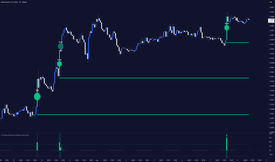
Regression_ToolkitThis is toolkit/library bridges advanced regression approaches not natively supported in Pinescript, to Pinescript. Advanced regression frameworks that can be critical to ticker data, such as Ridge, Lasso, ElasticNET, and Logistic (normalized) regression, colinarity measuring and quantile regression. As well as approaches to linear based feature selection and importance assessments.
I hope you find it helpful!
Library "Regression_Toolkit"
multipleRegression(y, x1, x2, length)
Parameters:
y (float)
x1 (float)
x2 (float)
length (simple int)
ridgeRegression(y, x1, x2, x3, x4, nVars, length, lambda)
Parameters:
y (float)
x1 (float)
x2 (float)
x3 (float)
x4 (float)
nVars (simple int)
length (simple int)
lambda (simple float)
lassoRegression(y, x1, x2, x3, x4, nVars, length, lambda, iterations)
Parameters:
y (float)
x1 (float)
x2 (float)
x3 (float)
x4 (float)
nVars (simple int)
length (simple int)
lambda (simple float)
iterations (simple int)
logisticRegression(y, x1, x2, x3, x4, nVars, length, learningRate, iterations)
Parameters:
y (float)
x1 (float)
x2 (float)
x3 (float)
x4 (float)
nVars (simple int)
length (simple int)
learningRate (simple float)
iterations (simple int)
featureSelection(y, x1, x2, x3, x4, nVars, length)
Parameters:
y (float)
x1 (float)
x2 (float)
x3 (float)
x4 (float)
nVars (simple int)
length (simple int)
regressionStats(y, x1, x2, x3, x4, nVars, length, b0, b1, b2, b3, b4)
Parameters:
y (float)
x1 (float)
x2 (float)
x3 (float)
x4 (float)
nVars (simple int)
length (simple int)
b0 (float)
b1 (float)
b2 (float)
b3 (float)
b4 (float)
elasticNetRegression(y, x1, x2, x3, x4, nVars, length, lambda, alpha, iterations)
Parameters:
y (float)
x1 (float)
x2 (float)
x3 (float)
x4 (float)
nVars (simple int)
length (simple int)
lambda (simple float)
alpha (simple float)
iterations (simple int)
huberRegression(y, x1, x2, x3, x4, nVars, length, huberK, iterations)
Parameters:
y (float)
x1 (float)
x2 (float)
x3 (float)
x4 (float)
nVars (simple int)
length (simple int)
huberK (simple float)
iterations (simple int)
quantileRegression(y, x1, x2, x3, x4, nVars, length, tau, learningRate, iterations)
Parameters:
y (float)
x1 (float)
x2 (float)
x3 (float)
x4 (float)
nVars (simple int)
length (simple int)
tau (simple float)
learningRate (simple float)
iterations (simple int) Biblioteca

Time-of-Day/Session Performance Stats [QuantAlgo]🟢 Overview
The Time-of-Day/Session Performance Stats is a comprehensive time-based analysis tool built for traders who want clear, ranked insight into when markets actually move. It measures average range, volume, bullish bias, and drift across every hour of the day and the four major sessions, then surfaces the strongest and weakest windows so you can focus activity where the data supports it. Whether you trade crypto around the clock or equity and forex sessions on a weekday schedule, the indicator turns raw historical bars into practical rankings, session comparisons, and non-repainting chart overlays.
🟢 What is Time-of-Day and Session Performance?
Markets are not uniform across the 24-hour cycle. Liquidity, volatility, and participation concentrate in specific hours and sessions. Sydney is typically the thinnest of the four major centers, Tokyo drives Asian activity, London often produces the widest ranges of the day, and the London-New York overlap is usually the busiest window. By averaging range, volume, the share of up closes, and net drift for each hour and each session over a configurable lookback, this tool converts those recurring patterns into ranked statistics instead of leaving you to rely on memory or anecdotal observation.
🟢 How It Works
The indicator walks a configurable window of past bars (limited by lookback days and a hard max-bar ceiling) in the timezone you select. Every usable bar is assigned to its hour of day and to any sessions it falls inside. Range can be measured in percent of close or in raw price units. Volume, directional closes, and drift are accumulated in parallel. Hours that do not meet a minimum bar-count threshold are dropped from every ranking so tiny samples cannot distort the boards.
Five ranking boards are produced: Activity (average range), Volume (when the symbol reports it), Bias (percentage of directional bars that closed higher), Drift (mean close-minus-open percentage), and Aggregated (the mean percentile of range, volume, and directional edge). Sessions are ranked solely on average range per bar and can be toggled or given custom windows. Overlaps count toward every session involved rather than being forced into one.
Chart overlays read a trailing window of the same length rather than the final ranking, so background shading and bar coloring never repaint. The Focus Hours panel converts the Aggregated ranking into three practical allocation plans plus the single quietest hour to avoid.
🟢 Key Features
▶ Ranking Boards
Five independent boards list every qualifying hour from strongest to weakest.
1. Activity Ranking: Orders hours by average bar range. Rank 1 is the hour with the most room; the last row is the quietest. This is the simplest and often most useful single board.
2. Volume Ranking: Orders hours by average volume. Read it alongside Activity. High range on low volume signals thin participation. The board is hidden automatically on symbols that report no volume.
3. Bias Ranking: Orders hours by the percentage of directional bars that closed above their open. Flat bars are excluded, so the figure reflects only bars that actually moved. There is no separate bearish column; the bottom of the board is the most bearish reading.
4. Drift Ranking: Orders hours by mean percentage change from open to close. An hour can post a high bull rate yet still show negative drift if its losing bars are larger than its winning ones. Divergences between Bias and Drift are often the most interesting signals.
5. Aggregated Ranking: Combines percentile ranks of range, volume (when present), and directional edge into a single composite score. This is the ranking that feeds both the Focus Hours panel and the Aggregated overlay option.
▶ Session Ranking Panel
The four major sessions are ranked by average range per bar and displayed with their window, bull rate, drift, and bar count. Rank 1 takes the bullish color and the last rank takes the bearish color on the same continuous gradient used by the boards. Because a bar inside an overlap is counted toward every session it belongs to, session bar totals can exceed the overall sample size.
▶ Focus Hours Panel
The Aggregated ranking is translated into four labeled plans: Aggressive (top hour only), Mix (top two with 80/20 weights), Conservative (top three with 50/30/20 weights), and Avoid (the single quietest hour by average range). Each row shows the relevant hours, their session affiliation, bull rate, drift, and score so the reading can be acted on immediately.
▶ Chart Overlay
Background shading and price-bar coloring can be driven independently by Session Ranking, Activity Ranking, Volume Ranking, Bias Ranking, Drift Ranking, Aggregated Ranking, or Focus Hours. All overlays are computed from a trailing window so they never repaint. Transparency controls let you keep the ranking obvious or keep it subtle enough not to compete with price.
▶ Session and Filter Controls
Sydney, Tokyo, London, and New York can each be enabled or disabled and given custom HHMM-HHMM windows in the selected timezone. A weekdays-only filter removes weekend bars for forex, futures, and equities while leaving crypto fully intact. The Bars To Include setting can restrict the entire study to all bars, any enabled session, or one named session.
▶ Built-in Alerts
Ready-made alert conditions fire when price enters the peak activity hour, the quietest hour, the peak volume hour, the most bullish or most bearish hour, or the top Aggregated hour. Separate alerts cover the open and close of each individual session, any session start or end, and the start and end of the London-New York overlap.
▶ Color Presets
Six presets (Classic, Aqua, Cosmic, Cyber, Neon, Custom) apply a continuous gradient from the bullish color at rank 1 to the bearish color at the last rank across every board, panel, and overlay. Custom mode exposes individual bullish and bearish color pickers; text contrast is calculated automatically so any chosen colors remain readable.
▶ Interval Warning
When the chart interval is higher than 1 hour, most of the 24 hour buckets never receive a bar, leaving the rankings incomplete. The indicator displays a clear warning label on the chart that explains the limitation and recommends switching to 5m, 15m, 30m, or 1h, for example. The warning can be turned off once the restriction is understood and a clean chart is preferred.
Indicador

Universal Signal Backtester [LuxAlgo]The Universal Signal Backtester indicator is a tool designed to simulate and analyze the performance of virtually any trading signal, ranging from moving average crossovers to external indicator triggers. By providing a professional-grade backtesting environment directly on the chart, it allows users to optimize entry logic, exit strategies, and cost management in real-time.
🔶 USAGE
The script operates by selecting a Source Mode to define how trades are initiated. Users can choose between built-in MA crosses, external source crossovers, or discrete signal triggers from other indicators. Once a signal is detected, the script simulates a trade using up to three Take Profit (TP) and three Stop Loss (SL) levels.
🔹 Trade Visualization
* Sign Posts: Upon entry, the script plots a "Sign Post" label below or above the bar. This label dynamically suggests which TP level is currently the most effective based on the selected metric (e.g., Hit Rate or Expected Profit).
* Active Exit Lines: Horizontal dashed lines extend from the entry point to visualize the selected TP and SL targets. These lines update in real-time and mark hits with a checkmark (✓) or an "X" (✗).
* MA Ribbon: When using predefined crosses, a gradient ribbon is displayed to visualize the trend strength and crossover points.
🔹 Signal Modes
* Predefined Crosses: Quickly test standard strategies like the 9/21 EMA, 12/26 EMA, or the Golden/Death Cross (50/200 SMA).
* External Sources (Crossovers): Select two external plots (e.g., RSI and a level, or two custom MAs) to test their crossover performance.
* External Signals (Triggers): Connect the script to discrete signals such as Plotshapes or Boolean conditions. This is ideal for testing "Buy" and "Sell" signals from specialized indicators.
🔶 DETAILS
🔹 Advanced Analytics Dashboard
The indicator features a robust dashboard providing institutional-level metrics:
* Core Metrics: Total trades, Win Rate, Profit Factor, Sharpe Ratio, and Recovery Factor.
* Equity Curve: A sparkline representation of the account growth over time.
* Hourly Histogram: A performance breakdown by the hour of the day, helping identify the most profitable trading sessions.
* Heatmaps: A "Days of the Week" or "Monthly" heatmap that colors cells based on profitability, allowing for the identification of seasonal or periodic performance patterns.
🔹 Cost Simulation
To ensure realistic results, the script includes a cost engine. Users can select from profiles like Forex, Crypto, or Stocks to automatically apply industry-standard spreads and commissions, or input manual values to match a specific broker's fee structure.
🔶 SETTINGS
🔹 Source Settings
Source Mode: Determines the logic for trade entries (Predefined, External Crossover, or External Trigger). Signal Logic: Defines how external triggers are interpreted (e.g., Value Changes, Crosses 0, or Not NA). Trade Direction: Filters signals to allow only Longs, only Shorts, or Both.
🔹 Filters
Use ATR Choppiness Filter: When enabled, the script ignores signals that occur during low-volatility "choppy" periods.
🔹 Target Settings
Distance Type: Sets the measurement unit for TP/SL levels (ATR, Ticks, or Points). Take Profit (1-3): Toggles and sets the distance for up to three partial take-profit levels. Stop Loss (1-3): Toggles and sets the distance for up to three stop-loss levels.
🔹 Costs
Simulate Spread & Commission: Enables the cost engine for more realistic PnL calculations. Cost Profile: Presets for Forex, Crypto, and Stocks, or "Manual" for custom inputs.
🔹 Dashboard & Visuals
Heatmap Period: Switches the dashboard heatmap between "Days of Week" and "Months". Suggested TP Metric: Chooses the criteria the "Sign Post" uses to suggest the best TP level. Gradient Candle Coloring: Colors candles based on the distance between the fast and slow sources. Indicador

MACD with HTF Panels [theUltimator5]This indicator uses the standard MACD signal and displays it on multiple timeframes off to the side of the chart as separate panels. It allows you to view up to 5 (current + 4) separate timeframes at once without changing the chart timeframe.
The core of this indicator is a normal MACD. Line, signal, and histogram, fully adjustable lengths, four-way histogram coloring based on sign and slope so you can read momentum shifts at a glance.
Alongside it, the indicator draws up to four independent higher-timeframe panels directly in the pane. Each panel is a self-contained mini-chart: recent candles (if enabled) plus that timeframe's own MACD line, signal, and histogram.
The default settings show (4) HTF panels, that are automatically set based on what the current chart timeframe is. The HTF panels can be manually adjusted as desired.
The number of HTF panels can be adjusted between 0 and 4. 0 panels is set by disabling the "Show HTF panels" option in the settings. Disabling the HTF panels simply makes this indicator appear as a standard MACD, which isn't unique and can probably be found in 1000 other indicators elsewhere.
The uniqueness comes from the HTF panels on the side.
The panels settings will match for all timeframes.
When there are between 1 and 3 HTF panels enabled, they will appear vertically stacked on each other.
The following image shows (3) panels stacked.
When 4 panels (default) is selected, the stack is 2x2.
The chart price candles can be enabled in the settings to show the candles overlaid on the MACD signals for a complete picture. These are disabled by default to reduce visual clutter.
Here is an image showing (4) panels with chart candles enabled within the panels.
The scaling and position of the panels can be adjusted in the settings.
The vertical scaling is based on ATR, so the height of the candles is always proportional to the chart itself.
The horizontal position is calculated in bars, so it can be shifted left or right relative to the current bar.
Finally, there is a table (default position = bottom right)
The table shows the values of the MACD, Signal, and Histogram for all (4) HTF panels. The table position and size can be modified, but it will always show all (4) HTF panel values. If you have only one HTF panel enabled, it will still show you all values. The Histogram column changes color based on the color of the HTF histogram for that timeframe to give a better visual representation of the signal.
This indicator was made to showcase the method for converting custom signals into HTF side panels for custom and complex indicators. The logic used in this indicator can be used on any plotting indicator to display the signals off to the side. Indicador
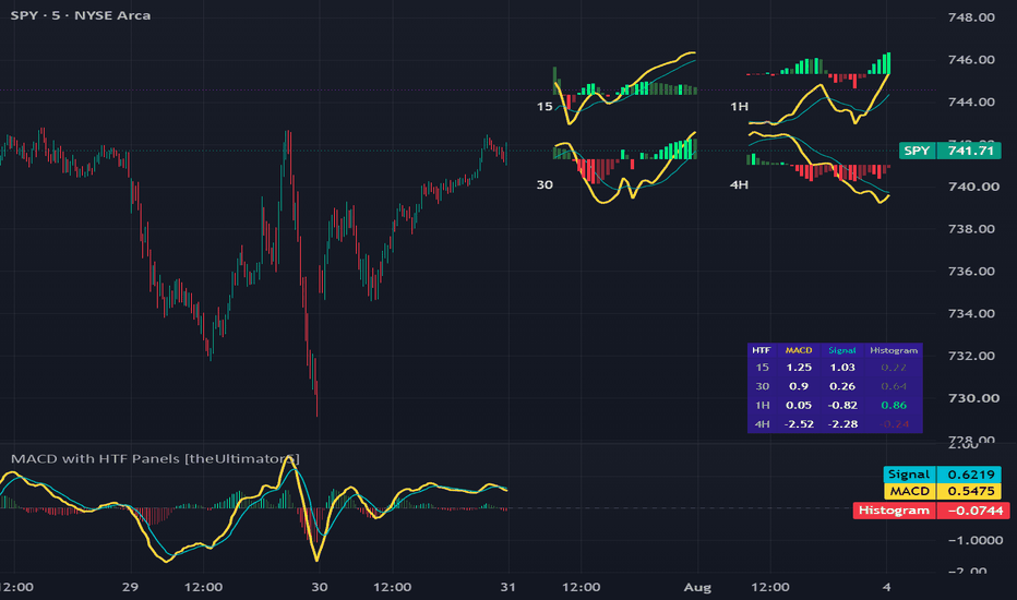
ChessPlay real, full games of Chess against the computer , live on your chart. The first playable chess on TradingView.
🟩 HIGHLIGHTS
⭐ Genuine independent gameplay - infinite different games possible.
⭐ The computer ranked over 1200 at Blitz across 100+ rated games on a popular online chess website.
⭐ Optional trash talk from the computer.
⭐ Play as White or Black, with the board flipped so your pieces sit at the bottom.
⭐ The computer thinks and responds fast.
⭐ Only legal moves are allowed.
⭐ The computer knows all the rules of chess including en passant, castling, check, checkmate, and the threefold repetition draw.
⭐ The to and from squares of the most recent move from both sides are highlighted on the board.
⭐ Captured pieces are displayed; just-captured pieces are highlighted.
⭐ The colour scheme adjusts to light or dark chart backgrounds.
⭐ The computer sometimes resigns if it's about to lose, and sometimes lets you complete the win 🎉
🟩 SET UP THE FIRST GAME
Add the script to a chart with some history (it warns you if there's not enough); any timeframe, doesn't matter if the market is open or not.
The script opens on a separate pane below the main chart, appearing cut-off.
1. Don't panic.
2. Double-click the chart background to maximise the Chess pane and hide your chart (double-click again to get your chart back).
3. As an alternative, you can click the three dots next to the Chess script name and choose Move to > Existing pane above and then Hide the chart symbol.
4. The default settings should be good to get you started playing, although you might need to adjust the square height and width so that the chess board looks nicely square on your particular chart.
🟩 PLAY THE GAME
Let's play.
1. Open the indicator Settings dialog and move it to the side so you can see the board.
2. Type your move into the Moves text field. Use coordinate notation: `e2e4`, `g1f3`, `e7e8q`, etc.
3. Don't click OK , 'cos then you'll have to re-open the Settings. Instead, hit Enter . This makes the script pick up the changed text input.
4. The computer thinks a little (on my system, almost instantly) and then announces its move. It will say something like `Add my move d7d5 to the Moves input field`. The table cell goes orange.
5. Type that move into the Moves input field and hit Enter . The cell's orange colour disappears, and it tells you that it's your move. If you have trash talk on, it might comment about your move or its move.
If you enter an illegal move, the computer will tell you. It will try to help you if it recognises what you might have meant.
If you enter a move wrong, you can just delete it and press Enter and the game resumes from that point.
To save a game or show it to someone else with the same Chess script loaded, just copy the text out of the Moves input field (you'll need Replies: Deterministic set to ensure it makes the same next move).
Have fun! The computer will joke around with you even as it beats you (or you beat it).
🟩 RELOAD THE CHART TO PLAY THE NEXT GAME
To ensure that the computer can (if it wants) play different moves against the same position next game, leave Replies set on Random, and save and reload the board in between games.
Note that moves that are already entered are not changed. Only a pending move - one that the computer announced but you haven't yet typed in - can change if you reload the chart or change input values, and only if Replies: Random is selected in the settings.
🟩 ALL THE SETTINGS
Here are all the settings and what they do.
Moves : Holds your moves and the computer's moves. You can separate moves with a comma or a space or a new line. Only a new line, or some other change to the settings, triggers a script refresh and another move.
Play as : Choose who you want to play as. The board flips so that your pieces are always closest to you.
Thinking : Choose Deep so that the computer uses all of its tiny brain against you. Or Quick if you feel that it's responding too slowly or you run into timeout errors.
Replies : Choose Random so that the computer can play different moves against the same position next game (requires a chart reload to clear cache). It often still plays its favourite move but if it has two favourites, it can also choose between them. Choose Deterministic so that the computer always plays the same move given the same position (move sequence), even on a different chart, tab, or after a reload. This is useful for saving games or playing through saved games. For casual play, choose Random . Note : If you change any inputs to a new combination, the computer might choose a different reply if Random is selected.
Trash Talk : Enable this setting so the computer can misquote pop culture references at you.
Board : Move the board to the left, right, or centre.
Piece size : Make the pieces more bigger or smallerer.
Square width, height : Adjust the percentage sizes so that the squares look, well, square. The right ratio depends on your monitor.
Calculated Bars : This setting is precautionary to prevent any slowdown on long charts. Leave this at the default.
🟩 CREDITS
Thanks to @The_Peaceful_Lizard for discussions all that time ago about whether gameplay is possible in Pine.
Thanks to my beta testers for valuable usability feedback.
🟩 HOW TO CODE GAMEPLAY IN PINE
Turn-based gameplay as we know it is almost impossible. To play a game you need to make a move. So you need to tell the script something. All the possible ways to interact with a script are:
- Changing an input value (including interactive `input.time()` and `input.price()` lines).
- A value output from another script changing, if the consuming script reads it using `input.source()`.
- Scrolling or zooming the chart, if the script uses `chart.left_visible_bar_time()` or `chart.right_visible_bar_time()`.
- Changing the chart symbol or timeframe.
The latter two are not informative enough to build a game move from. And in any case, any change from this list reloads the script.
What happens when the script reloads? It forgets everything . This is actually a good thing, and by design, because a chart indicator needs to read from bar zero again if any of its inputs change, so that it can do all its calculations again and make sure they are accurate with the new settings. However, it means that there is nowhere to keep the game state :
- All variables reset, even `var` and `varip` ones.
- All drawings, plots, shapes, etc disappear.
- Pine cannot write to any external data source.
- Logs start from zero.
The only thing that persists is the most recent input values.
This means that the entire game state must be deterministically derivable from the values of inputs. Practically speaking, you must enter both your move and the computer's reply into inputs. That's the trick: the board is not stored between edits, it is re-derived from the move record (the computer checks ALL moves again, every move, that they are legal).
This pattern is actually already demonstrated in the only example of true gameplay in Pine that I was able to find: "Tic Tac Toe (For Fun)" by the Wizard @LonesomeTheBlue
🟩 HOW TO MAKE CHESS POSSIBLE IN PINE
The problem with chess is that there are so many possible moves that trying to foresee the responses to your move and the responses to that move and so on quickly becomes computationally impossible. Especially in a lightweight scripting language like Pine, which has limits on how long a script can take to run a loop or perform all its calculations.
The main thing you need to do is narrow it all down . So in building this thing from scratch, I started with some heuristics. What are some patterns when you play chess? If you're in check, you have to get out. If you're attacked, you defend. If you still have minor pieces on the back rank, you should probly get them out. And so on.
I quickly realised that not only did these rules hugely narrow down the number of things you need to calculate, but they stack in order of importance . The number one rule, for example, is: if you can win the game this move, you should. Nothing else can go before that. Developing your pieces, by contrast, comes somewhere at the back of the queue. And the others fall in line in between.
Another thing that comes fairly cheap is knowing the openings . I was always too lazy to memorise chess openings, but that's not a problem for a computer. I also figured that nailing the opening would put my engine in a good place for the midgame, and maybe cover up some weaknesses. Many of the rules are pitched slightly aggressive for the same reason 😆
🟩 MY LADDER
When you put a bunch of rules in priority order, you get a ladder .
SPOILER: If you want to enjoy a fresh game against the script, stop reading and play. Going further will give you insight into how it thinks (or avoids thinking) and allow you to beat it more easily.
Here's my chess ladder:
1. Mate in one .
2. Opening book .
3. Avoid checkmate .
4. Defence .
5. Win material .
6. Safe check .
7. Exchange when ahead .
8. Endgame .
9. Develop .
10. Any other safe move .
When you follow this ladder in order, it turns out, it looks quite a lot like you're playing chess. After I'd finished the script I found out that some very early chess engines did something similar (they likely had far weaker performance than mine), but modern ones function mainly by crunching predictions and even the most handicapped Stockfish engine is still stronger than this script.
On top of the ladder, you do need to layer in a little bit of actual looking ahead, or the engine makes terrible blunders. And you need to constrain that lookahead in turn with its own heuristics, so that you only map out a few moves and not an exponential number.
And there is a lot, lot more after that, like how we value pieces (we will deliberately lose material in an exchange when we're up big, because it hurts our opponent more), how we avoid forks, how we avoid repeating the same moves, and so on.
Still this is all smoke and mirrors - the engine doesn't really understand what makes a good position, or a good attack, or an elegant defence. It just does stuff.
🟩 HOW THIS SCRIPT WORKS END TO END
Here's what happens when you type a move and hit Enter:
Parse (bar zero). The input move text becomes board coordinates (via the ChessCore library). The tidied-up record also produces the random seed (via ChessAI), and the opening book (ChessBook) and the trash-talk banks (ChessTalk) get built.
Replay (one bar per move). For each move in the record, in order: generate every legal move in the current position, check that the next typed move is one of them, and if so apply it to the board. Along the way it collects captured pieces, watches for Game Over, and takes a fingerprint of each position so it can spot a threefold repetition. All ChessCore.
Prepare (one bar). If it's now the computer's turn: generate ALL its legal moves (ChessCore), note how well defended each move's landing square is, and flag moves that weaken the king's cover or just undo the previous move (ChessAI).
Foresee (up to three bars per candidate move). Score every potential move by how its story ends, in material: the opponent's best captures played all the way down the exchange, his checks, his quiet threats. The ChessAI library plays the stories out on ChessCore scratch boards.
The ladder (one rule per bar). Try the ten rules top down. The first that fires chooses the move. The scores from the foresee veto the doomed candidates in every rule, and break ties in some. ChessAI does all this, and rule 2 reads the ChessBook openings.
Done. The live bar draws the board and the status row announces the computer's move for you to type in. The live bar computes nothing - it only reads what the historical bars decided. The main Chess script draws, and any one-liners came from ChessTalk's banks.
Then you add its move to yours, hit Enter, and the entire thing runs again from bar zero: approves every past move, rebuilds the whole board, and chooses the next reply.
🟩 ARCHITECTURAL LESSONS
There are some things we did here that apply also to non-chess Pine scripts.
✨ "Library-first" design
Every large chunk was designed from the beginning to be its own library:
- Chess is the user-facing script that imports all the libraries.
- ChessAI decides the next move.
- ChessBook holds the openings.
- ChessCore does rules, the board, and what's legal.
- ChessTalk stores the trash talk.
Some libraries only hold data, and this split of calculations and data allows us to, for example, add more talk lines without republishing other libraries.
The main script and libraries together total ~5,000 lines, far too much to be manageable for a single script. Using libraries keeps everything organised and makes such a complex script possible.
Library-first design keeps you in control, as opposed to being forced to refactor functions into libraries when a script gets too big.
✨ Split work across bars
We do the work across historical bars, one small step per bar, so the live bar only has to draw the finished board. This prevents any one bar exceeding any timeouts. The ladder architecture makes this quite natural. For robustness, each stage declares its own completion, rather than using a hardcoded number of bars. We predict how many bars we'll need and warn if there's not enough. This pattern can help scripts with heavy calculations stay within budget.
✨ Draw once
We do all the calculations during historical bars and draw the board only on the last bar. In general, separating calculations from drawing is a good idea.
✨ Seeded randomness
If you want a random result (technically, pseudorandom) in Pine you can use `math.random()`. This returns a different number each time. We use random numbers to choose between equally promising options for the computer's moves.
However, sometimes you want a reproducible random result. You want the same random number each time the script runs. Fortunately, `math.random()` can take a `seed` parameter, and if this seed is the same, then the sequence of random numbers is the same.
For chess, the computer's choice of move must remain stable and not change to something else on the next tick of a realtime bar (seeing this happen in testing was quite a surprise). So we derive a seed from the move record . This means that for any given game, the computer's move is both random and repeatable. This helps a lot with testing.
For real games though, we want the user to be able to play the same moves next game and get a different reply from the computer (potentially; remember the computer can't remember what it did in any previous game). So for this reason, if Replies is set to Random, we also mix the script's loading time into the random seed (and each new move loads the script again). Reloading the chart now gives a new stable random sequence even for the same moves.
Understanding seeded randomness can be necessary for some scripts to use variety properly.
✨ Objects and library hierarchy
Libraries can import each other, but not in a circular way. Our lowest-level library declares object types, for example, for moves, but doesn't put data in them; the higher libraries do that.
When a more foundational library needs data that a higher-level library creates, a good pattern is for the lower library to create an object with fields that the higher library fills in. This avoids having to maintain parallel arrays so they don't get out of synch. Indicador
Directional Volume Shapes (Zeiierman)█ Overview
Directional Volume Shapes (Zeiierman) is a regime-classification oscillator that reframes volume analysis around a different question: not simply “how much volume traded,” but “what statistical shape has directional pressure been forming, and which way is it leaning?”
Instead of plotting raw buy and sell volume bar by bar, the indicator scores each candle for directional pressure using a triangular intrabar distribution model. It collects those scores in a rolling window, classifies the pattern into one of seven distribution shapes, and displays a smooth synthetic template of the detected shape.
The result is less like a traditional volume indicator and more like a distribution-regime display, showing the type of pressure environment currently developing.
⚪ Why Is This One Unique?
Most volume tools show exactly what happened: green bar up, red bar down, and taller bar equals more volume. This indicator uses a two-stage process: classify, then synthesize.
It combines:
• A triangular CDF candle scorer that estimates directional pressure from OHLC data
• A rolling shape classifier using skewness, Gaussian-smoothed peak detection, and time correlation
• Seven possible classifications: Bell, Right-skewed, Left-skewed, J-shaped, Reverse-J, Bimodal, and Multimodal
• A template generator that displays an idealized mathematical version of the active shape
• A separate EMA-based polarity engine that controls bullish or bearish direction
█ How It Works
⚪ 1. Scores Each Candle’s Directional Pressure
Instead of using a simple “close above open equals bullish” rule, the indicator models the candle’s high-low range as a triangular probability distribution centered at the close.
The scr() function evaluates the candle’s full OHLC structure and returns a value between 0 and 1. That result is then converted into a signed pressure score between -1 and +1.
dm = scr(open, high, low, close)
ps = 2.0 * dm - 1.0
Values near +1 represent stronger bullish pressure, while values near -1 represent stronger bearish pressure. Values near zero indicate a more balanced candle.
⚪ 2. Optionally Weights Pressure by Volume
When Volume Weighting is enabled, the pressure score is multiplied by raw volume.
src = vw ? volume * ps : ps
This gives high-volume bars more influence over the rolling shape-classification window. When disabled, the classifier uses directional pressure alone.
Volume still controls the height of the plotted columns regardless of this setting.
⚪ 3. Classifies Pressure Shape, Not Direction
The indicator stores recent pressure values in a rolling window. Before classification, it converts each value into its absolute magnitude.
for i = 0 to buf.size() - 1
mag.set(i, math.abs(buf.get(i)))
Using math.abs() removes bullish and bearish direction from the classification stage. The classifier analyzes how pressure strength has been distributed, not which direction it points.
It measures:
• Skewness in the raw pressure magnitudes
• Local peaks in a Gaussian-smoothed version of the data
• Whether pressure strength is generally increasing or decreasing through time
The final shape is selected using a fixed priority order:
if peaks >= 2
out := peaks == 2 ? "Bimodal" : "Multimodal"
else if corr > 0.5
out := "J-shaped"
else if corr < -0.5
out := "Reverse-J"
else if skew > 0.1
out := "Right-skewed"
else if skew < -0.1
out := "Left-skewed"
else
out := "Bell"
Multiple peaks are checked first, followed by rising or falling behavior, then skewness. Bell is used when no other condition is detected.
⚪ 4. Requires Persistence Before Changing Shapes
The active shape changes only after five consecutive bars produce a classification different from the shape currently displayed.
if ns != sh
sc += 1
else
sc := 0
if sc >= 5
sh := ns
ph := 0.0
sc := 0
The five classifications do not need to match each other. They only need to differ from the current active shape.
When the fifth differing classification arrives, the indicator switches to that bar’s shape and restarts the template cycle.
⚪ 5. Tracks Polarity Separately
Bullish or bearish polarity is calculated independently from the shape classification.
A short EMA is applied to the original signed pressure score:
pr = ta.ema(ps, pl)
string np = pr >= 0 ? "Bull" : "Bear"
When the EMA is above or equal to zero, polarity is Bull. When it is below zero, polarity is Bear.
Because polarity can change as soon as the EMA crosses zero, it usually reacts faster than the shape classifier.
⚪ 6. Displays a Synthetic Shape Template
Once a shape is selected, the indicator does not plot the original pressure values.
Instead, it generates an idealized mathematical template for the active shape. For example, Bell uses a Gaussian curve, J-shaped uses a squared rising curve, and Bimodal combines two separate Gaussian peaks.
The generated template is then scaled by recent average volume and signed according to polarity.
p = pol == "Bull" ? ph : 1.0 - ph
tv = tpl(sh, p)
sgn = pol == "Bull" ? 1.0 : -1.0
amp = ta.sma(volume, 3) * 1.8
y = amp * tv * sgn
The template advances by a fixed amount on each bar. Template Cycle Length controls how many bars are used to complete one full cycle.
█ Assumptions We Are Explicitly Making
The indicator’s usefulness depends on whether its modeling assumptions are suitable for the instrument and timeframe being analyzed.
These are not facts about market behavior. They are simplifying assumptions used because Pine Script does not provide true intrabar tick or order-flow data.
⚪ Intrabar Activity Is Approximated With a Triangular Distribution
The model approximates intrabar activity using a triangular distribution centered at the close. It does not know where price actually spent the most time within the candle.
Using another reference point, such as VWAP, the midpoint, or the open, could produce a different pressure score.
⚪ Shape and Direction Are Treated Separately
The shape classifier analyzes the magnitude of pressure but removes its bullish or bearish direction. Two windows with similar pressure-strength patterns but opposite directional bias can therefore receive the same shape classification.
The shape describes how pressure has been distributed, while the separate polarity calculation determines whether it is leaning Bull or Bear.
⚪ Seven Shapes Are Used to Describe Pressure Behavior
Every window is placed into one of seven fixed categories using predefined thresholds:
• Skewness thresholds of ±0.1
• Correlation thresholds of ±0.5
• Peak prominence above 10% of the smoothed envelope’s maximum
The classifier follows a fixed priority order rather than selecting the mathematically closest-fitting shape.
There is also no statistical significance test behind these thresholds, so borderline classifications may change because of noise.
⚪ The Displayed Curve Represents the Classification, Not the Raw Data
After classification, the indicator displays an idealized template rather than the original pressure values. Two different pressure windows classified as Bell will use the same normalized Bell template.
The final column height and direction can still differ because the template is scaled by recent volume and signed by polarity.
█ How to Use
⚪ Directional Volume Reading
Use the indicator as you would a traditional volume oscillator.
• Readings above zero indicate bullish volume strength.
• Readings below zero indicate bearish volume strength.
⚪ Divergences
Use the columns to identify divergences in volume strength.
• Bullish divergence: Price makes a lower low while the indicator forms a higher low.
• Bearish divergence: Price makes a higher high while the indicator forms a lower high.
⚪ Interpreting the Shape Labels
• Bell: Pressure intensity is relatively symmetric and contains one main area of activity.
• Right-skewed / Left-skewed: Pressure intensity is uneven and has a longer tail on one side of the distribution.
• J-shaped: Pressure intensity has generally increased toward the most recent bars.
• Reverse-J: Pressure intensity was stronger earlier in the window and has weakened toward the present.
• Bimodal / Multimodal: The smoothed pressure path contains two or more separate periods of stronger activity within the detection window.
⚪ Choosing the Shape Speed
Template Cycle Length controls how quickly the displayed shape moves through its synthetic cycle. It changes the visual speed of the columns, not the shape-detection window or Bull/Bear polarity.
• 3 bars, Fast: Creates tight, fast-moving shapes. This is the most responsive and active-looking setting.
• 4 bars, Balanced: Gives each shape slightly more time to develop while remaining responsive.
• 5 to 7 bars, Slow: Stretches the shape across more bars, creating smoother and slower visual cycles.
A value of 3 is useful when you prefer compact, fast-moving shapes. Increase the value when you want each shape to develop more gradually and remain visible for longer.
█ Settings
Use Volume Weighting: Controls whether volume multiplies directional pressure before shape classification. Volume still controls the plotted column height when this setting is disabled.
Detection Window: Sets the number of recent bars used to classify the current shape. Higher values produce slower and more stable classifications. Lower values react faster and may change shape more often.
Polarity Smoothing: Sets the EMA length used to determine Bull or Bear polarity. Higher values create steadier polarity. Lower values react faster.
Template Cycle Length: Sets the number of bars used to complete one synthetic shape template. Lower values create faster and tighter cycles. Higher values stretch the template over more bars.
Show Moving Average: Shows or hides a moving average of the final plotted output.
Type: Selects the moving-average method: SMA, EMA, RMA, or WMA.
Length: Sets the moving-average period.
Maximum Transparency: Sets the maximum transparency applied near the lower points of each template. A value of 0 disables the transparency fade.
-----------------
Disclaimer
The content provided in my scripts, indicators, ideas, algorithms, and systems is for educational and informational purposes only. It does not constitute financial advice, investment recommendations, or a solicitation to buy or sell any financial instruments. I will not accept liability for any loss or damage, including without limitation any loss of profit, which may arise directly or indirectly from the use of or reliance on such information.
All investments involve risk, and the past performance of a security, industry, sector, market, financial product, trading strategy, backtest, or individual's trading does not guarantee future results or returns. Investors are fully responsible for any investment decisions they make. Such decisions should be based solely on an evaluation of their financial circumstances, investment objectives, risk tolerance, and liquidity needs.
Indicador
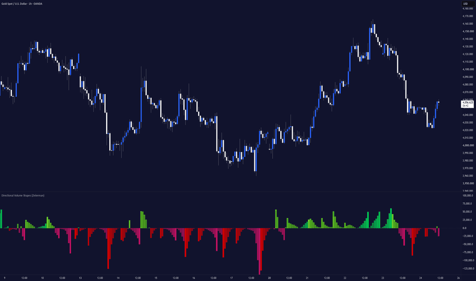
IQ Trend Beams [TradingIQ]🔹 OVERVIEW
IQ Trend Beams is a trend assistant that draws your trendlines the way a disciplined chartist would - and then holds them accountable. It maintains two channels, support and resistance , each always showing one working line. A line is born forming : it moves and re-shapes freely, polished every bar by a perceptual score toward the line a skilled trader would actually draw. When its geometry settles and it has earned enough tangency credit, it locks - and from that moment the ink is frozen forever; it never moves again. Locked ink extends until break evidence fires, then it is broken : restyled but never relocated, holding the screen as history until its successor locks.
Riding each live beam is its own forecast ; a calibration band, a reach profile, and ghost levels, all built from the volume that has actually traded around that line.
This is an honest visualization and modeling tool , not a signal service. It draws structure clearly and states its own confidence out loud; it is not a validated edge or a promise of profit. Read the limitations section - it is not window dressing.
🔹 THE TWO CHANNELS - AN AUDITED PROMISE
Most trendline tools quietly redraw the past so the line always looks right in hindsight. Trend Beams refuses to. A line lives through three visible states:
• Forming (dotted) - the assistant sketching. It is free to move and re-fit while it hunts for the right geometry. This is the only state in which a support/resistance line moves, and it is dotted precisely so you can tell a guess from a commitment.
• Locked (solid) - the geometry has stilled and earned its tangency credit, so the line is frozen . It will never move again. A locked beam is a promise the tool has to keep in public.
• Broken (restyled) - break evidence fired. The ink is re-styled to show it failed, but it is never relocated ; it holds its original slope as an honest record and, if you keep history on, dims into the background once its successor locks.
Because a locked line cannot move, what you saw at lock time is what you keep. This is the core design commitment of the tool.
Two rails, either direction by design. Support is the lower rail, fit to the swing lows on the underside of price; resistance is the upper rail, fit to the swing highs above it. Neither is locked to a single slope: in a falling market the support rail angles down with the lows (the floor of the down-channel), and in a rally the resistance rail angles up with the highs (the ceiling of the up-channel). That is deliberate. A tool that forces support to only ever point up would go blind to the lower boundary of a downtrend - and miss exactly the moves that matter. Trend Beams instead always draws both boundaries of the channel price is actually in , so a strong move is framed on both sides rather than half-missed. If you prefer to read it the classical way, follow the rail that agrees with the trend and treat the other as the opposite wall of the same channel.
🔸 HOW A LINE EARNS ITS LOCK
While forming, each line is scored every bar by a perceptual fit , a running measure of how well its geometry matches what a careful trader would draw against the recent swing structure, blended with a one-pole toward its fitted slope so it settles rather than twitches. A lock is granted only when the geometry has gone still for long enough, the line has accumulated real tangency credit (genuine touches, not a single graze), and it spans a minimum bar count - and it is refused outright if it would invert the channel. The Mode dial sets how much evidence this takes.
🔹 THE AUDIT BADGE
Locked ink can carry a small measurement badge that reports, in plain terms, how the line is actually holding up:
• Wick-through - recent piercing of the line, exponentially weighted, measured against the tool's 10% design target . A well-behaved line lets price kiss it, not knife through it.
• Survival probability - the current modeled odds that the line is still valid.
• Maturity - how far through its estimated total run the move is, so a young trend reads differently from an exhausted one.
The badge is the tool grading its own work on the chart, not a trade instruction.
🔸 THE FORECAST - EACH BEAM READS ITS OWN VOLUME
Every live beam carries its own forecast, built entirely from the volume that has traded around that line. Trend Beams bins the intrabar volume by its distance from the beam, smooths it into a continuous density (a kernel-density estimate), and renders three things that ride the line:
• Calibration band - translucent ribbons hugging the beam, one per density bin, showing where the trend has held its volume. Strength is encoded as colour vibrancy at a constant perceptual lightness (the Oklab principle - a dense core reads vivid, the thin tails fade), so nothing is made brighter or darker than its weight warrants.
• Reach profile - a smooth filled contour fanning into the future margin, where each level's forward extent is its density times the trend's estimated remaining length . It answers, at a glance: if this trend keeps going, how far - and around which prices - does its own volume say it reaches?
• Ghost levels - dashed lines at the distribution's densest peaks, riding parallel to the beam, marking the prices this trend keeps returning to.
The forecast attaches only to a beam's currently-visible live element - its forming sketch, or its locked ink - and keeps no history . It is a read of the present trend, refreshed at the live edge, not a replay of the past.
🔸 THE ENGINE DIALS
• Mode - the tempo. Fast locks, breaks and re-forms sooner (short swings); Slow demands more evidence and holds through more noise (long moves); Medium is the balanced reference.
• Precision - how much data the engine reads: the perceptual fit window and the intrabar sample rate. Higher tiers resolve finer structure at more load. Sampling is timeframe-aware and never drops below one minute.
🔹 LAYERS, COLOUR & LEGIBILITY
Every layer is a toggle - forming lines, broken history, audit badges, and the forecast - so you can run it as a bare two-line channel or a fully dressed read. Colours come from three clean anchors: Support , Resistance , and Chrome (badges and neutral furniture). The whole translucent forecast - band, profile, and ghost levels - is coloured in the Oklab perceptual space, so strength shows up as vibrancy at a constant lightness rather than as glare, and a single Contrast dial scales the entire forecast from a whisper to bold.
🔸 HOW TO READ IT
• Treat a forming (dotted) line as a hypothesis and a locked (solid) line as a committed level - the tool is telling you which is which on purpose.
• Watch the audit badge : rising wick-through and falling survival probability say a locked line is wearing out.
• Read a broken line as a failed level that still marks where the structure gave way.
• Use each beam's band to see where its trend has held its volume, its reach profile for how far the trend's own volume says it can run, and its ghost levels for the prices it keeps returning to.
🔹 INPUTS
• Trend Engine - Mode (tempo) and Precision (data depth).
• Layers - show forming lines, broken history, audit badges, and the forecast.
• Colors - Support, Resistance, and Chrome anchors, plus a Contrast control for the translucent forecast.
• Channels - enable the support and/or resistance side independently.
🔸 LIMITATIONS AND HONEST NOTES
• This is a drawing and modeling assistant , not a validated strategy. It makes no performance claim and no edge claim . Nothing here is financial, investment or trading advice.
• Locked and broken lines do not repaint - once a line locks, its geometry is frozen. Forming lines move by design (they are the live sketch, and are dotted to say so), and each beam's forecast (band, profile, ghost levels) refreshes at the live edge as new volume arrives and attaches only to the current live element. These are live reads, on purpose; none of them rewrites confirmed history.
• Survival probability, maturity, remaining length and the reach profile are model estimates from the trend's own statistics - projections, not guarantees, and not forecasts of price.
• Intrabar sampling is subject to your plan's intrabar data limits ; higher Precision tiers read more intrabar data.
• Drawing budgets are finite. The tool caps its lines, labels and polylines internally, but very long histories with everything enabled push against TradingView's per-script drawing limits - trim the layers you don't need.
Indicador
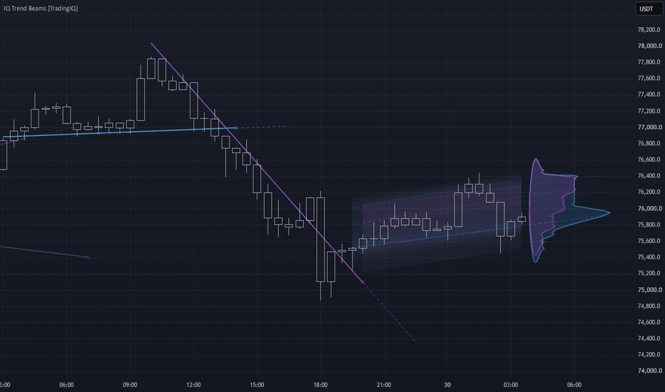
TASC 2026.08 An Ag Selling Model█ OVERVIEW
This strategy implements the "Ag Selling Model" as presented by Perry J. Kaufman in the August 2026 edition of the TASC Traders' Tips "Identifying The Best Price Levels For Selling Commodity Futures". The article describes a long-hold selling strategy for agricultural commodity futures based around the seasonal harvest timing of crops, mainly US grains traded on the CBOT and KCBOT, both which have been acquired by CME.
█ CONCEPTS
This model was originally presented in 1978 by the author to a group of commodity producers as an attempt to identify the best price levels to sell their products.
The core idea is that if there is only one crop per year, crop prices will be lowest around harvest and highest around peak growing season. Based on this timing, the strategy spaces out its sell orders up to three times throughout the year, and covers its position at harvest.
The goal of this strategy is simply to beat the average price. Since selling at harvest should typically provide a lower-than-average price exit, success for this strategy means having the average of its entries above the average price.
The level to sell at can be determined by finding a moving average that reflects seasonal changes. Once found, we measure volatility using Average True Range (ATR).
With these two figures, the volatility is added to the average based on a multiplication factor.
This creates a reasonable extreme at which to position short entries.
█ THE RULES
Sell short at the selling level.
Delay these sells to ensure two sells are not in the same rally.
Avoid selling immediately after harvest, as a long period of low prices typically follows.
Exit positions (cover shorts) at harvest.
▌Properties
IMPORTANT NOTE: The strategy parameters have been adjusted specifically for Corn Futures (ZC1!). This ticker operates in Cents (USX) rather than Dollars (USD); all the strategy values have been translated to account for this. To apply this strategy to other markets it is important to properly adjust the strategy parameters to simulate realistic conditions.
Initial Capital : 15,000,000¢ == $150,000; see note above.
Position Sizing : This strategy sells in one-contract increments up to three times per year.
Commissions : Commission value is set to 300¢ ($3) per order, which is a generous estimate.
Slippage : Slippage is set to one tick to simulate reasonable execution conditions.
█ INPUTS
Source : Source for calculations.
MA length : Moving Average length (Simple Moving Average). A 20 to 60 day range is recommended; with 40 as a starting point.
ATR length : Average True Range length.
ATR factor : Factor by which to multiply ATR when calculating selling level. 2.5 to 3.5 is generally recommended but higher has been seen for more volatile grains.
Month of Harvest : Set the month of harvest for the crop being traded, which changes depending on the seasonality of the commodity.
Delay in months after harvest : Set this to the typical downtime after harvest where prices are typically lowest. This can vary per instrument but 2 months is the suggested point for tuning.
Days between trades : Days to wait between sales.
Estratégia
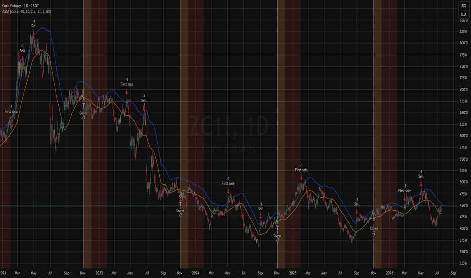
Machine Learning Neural Network EngineMachine Learning Neural Network Engine turns complex Daily market behavior into three clear states: LONG, WATCH and CASH.
Instead of relying on one fixed trend signal, the indicator combines an adaptive neural network, continuous model validation and an independent crisis detector. The result is a simple visual interface backed by a fully causal machine-learning process.
HOW IT WORKS
At its core is a compact 6-5-1 neural network trained directly on the chart.
It analyzes six normalized features:
Short- and medium-term trend structure
RSI momentum
Deviation from linear regression
Directional price efficiency
Relative volatility
Candle pressure adjusted by relative volume
The network learns sequentially from completed market outcomes. On each confirmed Daily bar, it can only train on information from an earlier bar whose result has become known. Current predictions never use future data.
Training uses nonlinear neurons, RMS-scaled gradient updates, error clipping and regularization. This is an adaptive online model, not a set of fixed coefficients labelled as machine learning.
SELF-AUDITING MACHINE LEARNING
The neural network is continuously compared with an independent structural trend model.
When the network’s matured predictions provide useful additional information, its influence increases. When its recent error becomes worse than the structural baseline, its influence is automatically reduced.
This live validation mechanism prevents the indicator from trusting its machine-learning component unconditionally.
CRISIS DETECTION
A separate stress engine monitors:
Rapid 10-day declines
Drawdown from the 63-day high
Abnormal ATR expansion
Long-term price structure
This layer can trigger a defensive state independently of the neural model, helping the indicator respond to sudden market deterioration.
HOW TO READ IT
LONG — Green
The model, trend structure and confirmation rules support a constructive market environment.
WATCH — Amber
The market remains structurally LONG, but risk or exit evidence is increasing.
CASH — Red
The environment is defensive because of persistent weakness or confirmed crisis stress. The indicator never takes short positions.
The colored neural axis and surrounding halo display the active state without covering the chart with labels. Transition pulses identify confirmed changes, while the dashboard shows bull probability, neural risk and the current machine-learning audit.
WHAT MAKES IT DIFFERENT
The script integrates four distinct functions:
1. Online neural-network learning
2. Live error-based model validation
3. Independent downside-stress detection
4. A confirmed state machine designed to limit excessive switching
These components are not combined as a simple indicator vote. Each has a separate role in learning, validation, protection or state stabilization.
SETTINGS
ML response controls adaptation speed and signal stability:
Fast reacts sooner.
Balanced is the recommended starting point.
Smooth prioritizes stability.
ML selectivity controls how much evidence is required before LONG or CASH is confirmed.
The indicator is designed exclusively for standard Daily charts.
BUILT-IN COMPARISON
The dashboard includes a lagged long/cash comparison with buy-and-hold. It applies the selected transition cost and openly displays periods when the model underperforms.
This comparison is a diagnostic tool, not a complete strategy backtest. It does not include every possible spread, slippage, tax, financing or execution constraint.
IMPORTANT LIMITATIONS
The bull probability is an internal normalized score, not a statistically calibrated probability of profit. The model can react late, generate false transitions in sideways markets and cannot eliminate gap risk.
The developing Daily bar may change before closing. Confirmed historical states use no future data, no lookahead and no higher-timeframe security calls.
This indicator provides market context, not financial advice or guaranteed performance. Online learning does not imply future outperformance.
Indicador
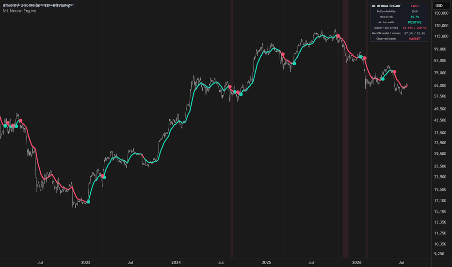
Intrabar Profile [Kioseff Trading]Hello Traders!
🔹 Intrabar Profile
Intrabar Profile is a lower-timeframe profile tool designed to draw a volume profile or delta profile on each individual candle .
Instead of only looking at where a candle opened, closed, wicked, or changed color, this indicator attempts to show:
Where did volume actually trade inside the bar?
It focuses on answering a deeper question:
What happened inside the candle that normal candlesticks do not show?
volume profile on every visible bar
delta profile on every visible bar
lower-timeframe volume distribution
POC detection per candle
value area visualization
buy-side vs sell-side imbalance display
optional volume-at-level labels
adaptive scaling as the chart zooms in or out
🔹 What the indicator shows
🔸 Intrabar Volume Profile
The indicator reconstructs a mini volume profile for each candle using lower timeframe data.
This allows you to see:
where volume was concentrated inside each bar
which price level had the highest volume
how volume was distributed across the candle range
whether volume was balanced or concentrated near specific levels
This shifts your perspective from:
“this candle closed bullish or bearish”
to:
“where did participation actually take place inside this candle?”
🔸 POC Per Candle
Each intrabar profile includes a Point of Control , or POC.
The POC marks the price level inside the candle where the highest amount of volume was detected.
This helps identify:
where the most trading activity occurred inside the bar
whether volume was concentrated near the high, low, or middle of the candle
potential areas of intrabar acceptance or rejection
where participation clustered before price moved away
🔸 Value Area Per Candle
The indicator can also display a value area for each profile.
The value area is calculated from total volume and highlights the region where the majority of volume occurred inside the bar.
This helps separate:
high-participation areas
lower-participation areas
balanced candles
thin or inefficient areas of the candle
Together, the POC and value area help show the internal structure of each candle instead of only the candle body and wick.
🔸 Intrabar Delta Profile
Intrabar Profile can also switch from standard volume profile mode to delta profile mode .
Delta mode estimates buy-side and sell-side pressure using lower timeframe price movement and volume.
This allows you to see:
where positive delta appeared inside the candle
where negative delta appeared inside the candle
whether aggressive activity was concentrated at the top, middle, or bottom of the bar
when total volume and directional pressure tell different stories
This can help answer:
Was volume only present, or was it meaningfully skewed toward buyers or sellers?
🔸 Volume Profile vs Delta Profile
The indicator includes two profile modes:
VP - displays total volume distribution inside each candle
Delta - displays directional volume imbalance inside each candle
Volume profile mode focuses on:
where participation occurred
where volume was concentrated
where the candle’s POC and value area formed
Delta profile mode focuses on:
which side had more pressure
where buy-side or sell-side imbalance appeared
whether pressure was distributed evenly or concentrated at specific levels
🔸 Adaptive Mini Profiles
The profiles are drawn directly on top of the chart candles and are designed to stay proportional as the chart is adjusted.
This means the visual structure adapts as you:
zoom in
zoom out
stretch the chart
compress the chart
The goal is to keep the profile readable without turning the chart into visual clutter.
🔹 Granularity Options
The indicator uses lower timeframe data to build each intrabar profile.
Available granularity options include:
5-minute
1-minute
1-second
1-tick
Lower granularity can provide a more detailed reconstruction of intrabar activity, depending on the symbol and data available from TradingView.
Important Note
Some lower timeframe data options may require specific TradingView data access or plan availability. If a selected granularity is not available on your chart or account, the indicator can only work with the data TradingView provides.
🔹 How to read it
Each candle can be read as its own mini profile.
larger profile rows show more volume or stronger absolute delta
the POC marks the highest-volume level inside the candle
the value area highlights the primary participation zone
gray areas show volume outside the selected value area
positive delta shows stronger buy-side pressure
negative delta shows stronger sell-side pressure
This helps you compare:
where the candle closed
where the most volume traded
where delta was strongest
whether the candle’s appearance matches its internal activity
🔹 Example interpretations
bullish candle + volume concentrated near the high → possible acceptance higher
bullish candle + heavy volume near the low → possible absorption or delayed response
bearish candle + negative delta near the low → aggressive selling into the bottom of the bar
large candle + thin profile → fast movement with less balanced participation
small candle + heavy profile → high activity with limited price movement
strong delta but weak candle movement → potential absorption or opposition
🔹 Why this indicator is useful
Intrabar Profile gives you a way to look beyond standard candles.
It helps you see:
where volume formed inside each candle
where the candle’s POC developed
whether participation was concentrated or spread out
whether buyers or sellers dominated specific levels
how volume and delta behaved inside the bar
whether the candle’s structure supports or contradicts the price action
Instead of only asking:
“Did this candle close green or red?”
you can ask:
“Where did the trading actually happen inside this candle?”
🔹 Best use cases
studying intrabar volume structure
analyzing candle quality
identifying high-volume zones inside individual bars
spotting possible absorption or imbalance
comparing price action against internal volume distribution
enhancing volume profile, order flow, or liquidity-based analysis
🔹 Inputs you can customize
profile type: VP or Delta
granularity: 5-minute, 1-minute, 1-second, or 1-tick
number of profile rows
buy-side and sell-side colors
POC color
mini profile transparency
value area visibility
volume-at-level labels
🔹 Important note
This script uses lower timeframe data to approximate intrabar volume and delta structure.
This means:
accuracy depends on available lower timeframe data
different symbols may behave differently
1-second or tick data may not be available for every user or market
delta is estimated from lower timeframe price movement and volume
this is an analytical visualization tool, not a predictive engine
Closing Notes
Intrabar Profile is built to show the internal volume structure of each candle .
It helps turn a normal candlestick chart into a more detailed profile-based view of participation, imbalance, and intrabar activity.
As always, thank you TradingView! Indicador
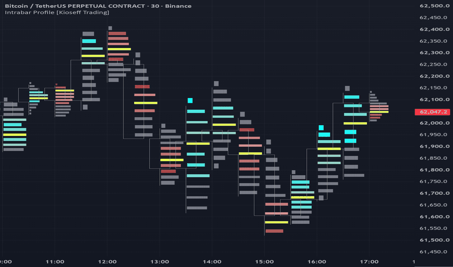
Kinetic Slippage Index (KSI)Overview
The Kinetic Slippage Index (KSI) is an advanced volume-volatility oscillator designed to measure market efficiency—or the lack thereof. Inspired by order book microstructure and liquidity gaps, KSI calculates the "cost of price movement." It helps traders identify hidden institutional distribution, retail exhaustion, and high-probability false breakouts.
Unlike standard momentum oscillators (RSI, Stochastic) that only track price speed, KSI analyzes how much raw volume was required to achieve a specific price range.
The Theoretical Concept
In a highly liquid and efficient market, large trading volumes are absorbed by dense limit orders, causing the price to move smoothly and tightly.
However, when liquidity clears out (an "empty order book" or "liquidity vacuum"), even a small market order can cause a massive price jump. This phenomenon is called slippage.
KSI mathematically captures this by squaring the True Range and dividing it by the current Volume and its long-term EMA.
- High KSI: Price is flying or dropping fast, but on critically low volume. The market is "hollow."
- Low KSI: Enormous volume is pouring in, but the price is compressed into tight bars. Heavy institutional absorption is taking place.
How to Trade with KSI (Key Use Cases)
1. Fading False Breakouts (The "SPIKE" Signal)
- Scenario: The price breaks out of a key resistance or support level, creating a new local high/low.
- KSI Behavior: A purple "SPIKE" marker appears, meaning KSI has crossed above the critical threshold.
- Interpretation: The breakout is happening on a "hollow" market without institutional backing. It is highly likely a liquidity hunt (stop-run).
- Strategy: Look for a reversal pattern on the price chart and trade against the breakout (Fade).
2. Trend Exhaustion & Climax
- Scenario: The asset is in a strong, prolonged trend. Suddenly, a massive price bar occurs in the direction of the trend.
- KSI Behavior: KSI prints a series of extreme high histogram bars or triggers a "SPIKE" alert.
- Interpretation: This is a buying/selling climax (exhaustion). Smart money is withdrawing their limit orders, letting late retail buyers push the price into a vacuum right before the crash.
- Strategy: Tighten trailing stops on current positions or prepare for a counter-trend setup.
3. Institutional Accumulation / Compression
- Scenario: Price enters a tight, boring consolidation (flat).
- KSI Behavior: The histogram bars turn red and get tightly compressed near the zero line, staying significantly below the orange Signal Line.
- Interpretation: Huge trading volume is being injected, but the price isn't moving. Big players are quietly accumulating or distributing positions using iceberg orders.
- Strategy: Do not trade inside this zone. Prepare for a massive, explosive breakout. Wait for the KSI histogram to flip green and cross above the Signal Line to confirm the direction.
Inputs & Customization
- ATR / Range Period (Default: 14): Controls the lookback window for measuring the price range.
- Volume EMA Period (Default: 20): Smooths out volume to create a reliable benchmark for average liquidity.
- Signal Line Period (Default: 9): An EMA of the KSI itself, used to detect shorter-term shifts in momentum (Green/Red histogram flips).
- Spike Signal Level (Default: 50000): Critical value line for alerts.
Indicador
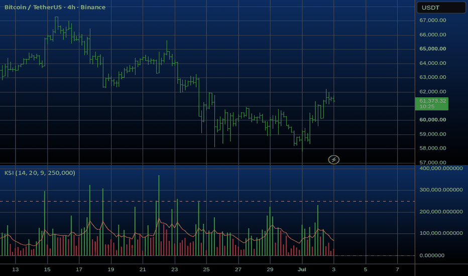
Session Edge Profiler | Flux ChartsGENERAL OVERVIEW:
The Session Edge Profiler is a statistical dashboard indicator that profiles up to five configurable trading sessions (Asia, London, NY AM, NY Lunch, NY PM by default) across the available completed trading days loaded on the chart. The indicator records each session's range, volume, directional outcome, and smart money structure (Fair Value Gaps, swing breaks, higher highs, lower lows) on every completed day, then surfaces the resulting statistics in a configurable on-chart dashboard with progress bars and best value markers.
For every metric, the indicator filters history by the selected weekdays. Range-based metrics are normalized against the previous daily ATR for cross-volatility comparison, while volume, directional, extreme, and structure metrics are calculated directly from completed session records. The indicator also computes percentile rankings of the current session range against its historical distribution. Session boxes can be plotted for visual reference, and a live label tracks the active session's running range against its historical average and percentile rank in real time. The indicator is statistical, session based, dashboard driven, and includes one alert condition for sessions exceeding the 90th percentile of their historical range distribution.
WHAT IS THE THEORY BEHIND THE INDICATOR?:
Markets do not move uniformly across the day. Each trading session carries different participant types, different volume profiles, and different structural behaviors. The Asia session tends to be range bound and accumulative. The London session frequently sweeps overnight liquidity. NY AM often produces the largest expansions of the day. NY Lunch is typically the lowest volume window. NY PM frequently reverses or extends NY AM moves into the close.
These tendencies are widely cited but rarely measured per instrument. The Session Edge Profiler quantifies them. By recording per session statistics across the historical window available on the chart, and by filtering by selected weekdays, the indicator builds an empirical profile of how each session has actually behaved on a specific symbol rather than relying on generalized assumptions. The result is a session level statistical profile that can be compared against the current session in real time, identifying when a given session is behaving unusually large, unusually quiet, or consistent with its historical edge.
SESSION EDGE PROFILER FEATURES:
◇ Session tracking with customizable times, names, and colors
◇ Statistical dashboard with up to thirteen configurable metrics
◇ ATR normalized range comparison across sessions
◇ Today percentile ranking of the live session range
◇ Daily extremes tracking (HOD %, LOD %)
◇ Directional statistics (Bull %, Continuation %)
◇ Volume profiling (Vol Share %, Avg Vol)
◇ Smart money structure analytics (FVGs, Swing Breaks, FVG Survival, HH, LL)
◇ Active session live label with real time percentile and average comparison
◇ Session range boxes with current and historical display
◇ Weekday filtering applied uniformly across all statistics
◇ Dashboard theming (Dark or Light), nine position options, and five text sizes
◇ High percentile range alert
SESSION TRACKING AND RANGE BOXES:
🔹What is Session Tracking?
Session Tracking is the foundation of the indicator. Five configurable session windows are monitored on every bar. When price enters a session window, the indicator opens an active tracking object that records the session's high, low, open price, total volume, and structural events. When price leaves the session window, the active object is closed and its values are committed to the historical record for that session.
🔹Why is Session Tracking important?
Every statistic computed by the indicator depends on accurately segmenting the trading day into sessions. Without a reliable session lifecycle, range comparisons, HOD/LOD attribution, volume share, and structure counts would be inconsistent. The session lifecycle also defines what gets drawn on the chart: the live range box for the current session and, optionally, persistent boxes for historical sessions.
🔹How is Session Tracking detected and calculated?
Every bar is checked against the configured session time windows in New York time. The moment price enters a session window, a new session opens: the session's high, low, open, and volume start fresh, and the FVG, swing break, HH, and LL counters reset to zero. While the session is active, the high updates to the running maximum, the low updates to the running minimum, and volume accumulates with each new bar. When price leaves the session window, the session is closed: the final high, low, open, close, and volume are committed and the session is marked complete for the day.
A trading day boundary is determined by shifting time forward by 6 hours and comparing the resulting calendar date in New York time. This shift causes a new day to register at 18:00 NY time, aligning the trading day with the start of the Asia session at 19:00 NY. When a new trading day begins, the completed session statistics from the previous day are added to each session's history along with the weekday they were recorded on, the daily fields reset, and a new tracking cycle begins.
🔹Settings: Sessions Group
◇ Enable Toggle: Turns the session on or off. Disabled sessions are excluded from the dashboard, the live label, and all calculations.
◇ Session Name: Custom label used in the dashboard column header, on the session box, and in the active session label. Defaults: Asia, London, NY AM, NY Lunch, NY PM.
◇ Session Time: The session window in NY time using HHMM,HHMM format. Defaults: Asia 1900,0200, London 0200,0830, NY AM 0830,1200, NY Lunch 1200,1330, NY PM 1330,1600.
◇ Session Color: Color applied to the dashboard column header (when active), the session box border and background, and the active session label.
🔹Customization
Display Group
◇ Show Session Ranges: When enabled, plots a translucent box around the current session showing its running high and low, with the session name labeled in the top left corner. Historical session boxes are also retained on the chart for visual reference.
◇ Show Active Session Stats: When enabled, plots a live label next to the most recent bar of the active session displaying the session name, current range, current range as a percentage of historical average, and current percentile rank.
◇ Label Size: Sets the text size of the active session label. Options: Tiny, Small, Normal, Large, Huge.
STATISTICAL DASHBOARD:
🔹What is the Statistical Dashboard?
The Statistical Dashboard is a configurable table that summarizes the historical statistical profile of every enabled session. Rows correspond to metrics. Columns correspond to sessions. Each cell shows the metric value for that session, optionally rendered with a unicode progress bar and a star marker (★) for the session with the highest value on metrics where "highest" is the meaningful target.
🔹Why is the Statistical Dashboard important?
The dashboard is where the indicator's measurements surface. Rather than requiring a trader to scroll through chart history and visually estimate session behavior, the dashboard reduces the entire weekday filtered history of every session to a compact table of directly comparable numbers. The header line shows the active weekday filter and the maximum number of historical days used in any cell, providing immediate context for the statistical sample size.
🔹How is the Statistical Dashboard calculated?
On the most recent bar of the chart, the indicator reviews each enabled session's stored history. For every past session, it checks whether the weekday it was recorded on is included in the selected weekday filter. If yes, the session contributes to the running totals: range sums, volume sums, HOD/LOD counts, bull counts, continuation counts, FVG counts, swing break counts, HH counts, LL counts, and volume share. After the review, totals are converted to averages or percentages and written to the dashboard cells.
Best value markers are computed by tracking the maximum value across all enabled sessions for the metrics where "highest" is the intended target: Avg Range, HOD %, LOD %, Avg FVGs, and FVG Survival %. For metrics where directional bias matters (Bull %, Continuation %) or where higher is not strictly better (Vol Share %, Avg Swing Breaks, Avg HH, Avg LL), no best marker is shown.
[Screenshot: Full dashboard table screenshot in Dark Mode with every metric row enabled. Header line showing the active weekday filter and sample size, column headers in each session's color, progress bars rendered in percentage cells, and the SMART MONEY divider row visible separating the structural metrics from the range and directional metrics above.
🔹Settings: Dashboard Group
◇ Show Dashboard: Master toggle for the entire dashboard. When disabled, no table is rendered.
◇ Theme: Dark Mode or Light Mode. Controls background, row, header, and text colors. The best value highlight cell uses a deeper accent color on the selected theme.
◇ Position: Table placement on the chart. Options cover all nine combinations of vertical (Top, Middle, Bottom) and horizontal (Left, Center, Right) anchoring.
◇ Text Size: Tiny, Small, Normal, Large, Huge. Affects every cell.
◇ Show Progress Bars: When enabled, percentage and percentile cells render an 8 segment unicode bar alongside the numeric value, scaling from 0% to 100%. When disabled, only the numeric value is shown.
🔹Customization
Metric Toggles
Each of the following dashboard rows can be independently shown or hidden:
◇ Avg Range (ATR%)
◇ Vol Share %
◇ Avg Vol
◇ HOD %
◇ LOD %
◇ Bull %
◇ Continuation %
◇ Today Percentile
◇ Avg FVGs
◇ Avg Swing Breaks
◇ FVG Survival %
◇ Avg HH
◇ Avg LL
🔹Signal Colors
◇ High: Color applied to high tier values (Today Percentile at or above 75, FVG Survival at or above 70). Default: green.
◇ Mid: Color applied to mid tier values (Today Percentile between 25 and 75, FVG Survival between 40 and 70). Default: orange.
◇ Low: Color applied to low tier values (Today Percentile at or below 25, FVG Survival below 40). Default: red.
ATR NORMALIZED RANGE STATISTICS:
🔹What is ATR Normalized Range?
The Avg Range (ATR%) metric expresses each session's average range as a percentage of the daily Average True Range. A value of 45% means the session, on average, covered 45% of a full day's ATR.
🔹Why is ATR Normalized Range important?
Raw range values cannot be compared across instruments or across volatility regimes. A 200 point range means very different things in calm versus volatile markets. Normalizing by daily ATR removes that distortion: the resulting percentage is directly comparable between sessions, between symbols, and between months of history.
🔹How is ATR Normalized Range calculated?
For each completed session, the raw range (session high minus session low) is divided by the daily ATR value of the previous completed day. The daily ATR uses a configurable length (default 14) and is always read from the previous daily bar, which means the value is fixed for the entire current trading day and never repaints. The session's normalized range is stored alongside its weekday in the history. When the dashboard renders, the indicator averages all normalized ranges from sessions whose weekday passes the filter, then multiplies by 100 to produce the displayed percentage.
🔹What is Today Percentile?
Today Percentile expresses where the current session's live range sits within the historical distribution of that same session's past ranges. The comparison stays within the session: today's London is compared only against past Londons, today's NY AM only against past NY AMs, and so on, all filtered by the selected weekdays. A value of 80 means the live range is larger than 80% of past occurrences of the same session on those weekdays.
🔹How is Today Percentile calculated?
For each enabled session, the indicator computes the current normalized range (current session range divided by daily ATR). It then walks through that session's own past history, counting how many past sessions have a normalized range less than or equal to the current value, while skipping any past session whose weekday is not enabled in the filter. The percentile is the percentage of qualifying past sessions at or below the current value.
The cell color reflects the tier: at or above 75 uses the High color, at or below 25 uses the Low color, otherwise the Mid color. The numeric value is rendered with an ordinal suffix (1st, 2nd, 3rd, 4th, and so on) for readability, and the progress bar segments scale from 0 to 100.
🔹Settings:Filters Group
◇ ATR Length: Lookback for the daily ATR used in normalization. Range: 5 to 50. Default: 14.
DAILY EXTREMES TRACKING:
🔹What are HOD % and LOD %?
HOD % measures how often a given session contained the day's highest price. LOD % measures how often it contained the day's lowest price. Both are expressed as a percentage of the total weekday filtered days in history.
🔹Why are HOD/LOD statistics important?
Knowing which session historically sets the daily extreme on a given instrument helps frame intraday liquidity expectations. A session with a high HOD % is the session that most frequently posts the day's selling extreme. A session with a high LOD % most frequently posts the day's buying extreme. On many instruments NY AM dominates both, but the ratio shifts by symbol and by weekday, which is why measuring rather than assuming is useful.
🔹How are HOD % and LOD % calculated?
While the trading day is in progress, the indicator continuously tracks the day's running high and running low across all bars, not just within session windows. When a new trading day begins, every completed session from the previous day is checked: if the session's recorded high matches the day's high, that session is tagged as the HOD session; if its low matches the day's low, it is tagged as the LOD session. These tags are stored with the session in history. When the dashboard renders, it counts how many sessions in the weekday filtered history carry each tag and converts those counts to percentages. The session with the highest HOD % across all enabled sessions receives a star marker, and the same applies to LOD %.
DIRECTIONAL STATISTICS:
🔹What are Bull % and Continuation %?
Bull % is the percentage of historical sessions that closed higher than they opened. Continuation % is the percentage of historical sessions whose direction matched the previous occurrence of the same session.
🔹Why are directional statistics important?
Bull % captures the session's directional skew. A session with Bull % consistently above 60% on a particular instrument and weekday set has a measurable upward tendency. Continuation % captures the session's persistence: a high continuation rate means the session frequently extends the previous day's same session direction, while a low rate suggests the session tends to reverse the prior day's bias.
🔹How are Bull % and Continuation % calculated?
For each completed session, Bull is true when the session's close (the chart close at the bar where the session ended) exceeds its open. Continuation is true when the previous occurrence of the same session was bullish in the same direction (both bullish or both bearish). The very first occurrence in history has no previous reference and is excluded from the continuation calculation. The dashboard divides the bullish session count by the total session count for Bull %, and the matched continuation count by the continuation eligible count for Continuation %.
No best value marker is shown for either metric, since "highest" is not inherently better: directional bias and continuation are interpretive measurements rather than competitive ones across sessions.
VOLUME PROFILING:
🔹What is Volume Profiling?
The indicator tracks two volume metrics per session: Vol Share % (the session's average share of total daily volume) and Avg Vol (the session's average absolute volume).
🔹Why is Volume Profiling important?
Volume distribution across the day reveals participant activity. Sessions that historically account for a disproportionate share of daily volume are the sessions where flow is most concentrated. Sessions with low volume share (typically NY Lunch) are statistical low conviction windows where moves are more likely to be lower quality.
🔹How is Volume Profiling calculated?
While each session is active, the indicator accumulates bar volume into the session's running total. When the trading day rolls over, total day volume is computed as the sum of all completed session volumes for that day. Each session's Vol Share is then computed as its session volume divided by total day volume, multiplied by 100, and saved into the session's history alongside the absolute volume. When the dashboard renders, Avg Vol is the simple weekday filtered mean of recorded session volumes, and Vol Share % is averaged across the weekday filtered history.
SMART MONEY STRUCTURE ANALYTICS:
🔹What are the Smart Money metrics?
The Smart Money section of the dashboard surfaces four structural counters per session:
◇ Avg FVGs: average number of Fair Value Gaps formed during the session.
◇ Avg Swing Breaks: average instances where the close pierces a previously confirmed pivot high or pivot low.
◇ FVG Survival %: percentage of FVGs that were not invalidated within the same session in which they formed.
◇ Avg HH and Avg LL: average count of new higher highs and lower lows in pivot structure during the session.
🔹Why are Smart Money metrics important?
These metrics quantify the structural activity of each session. High FVG counts indicate aggressive displacement and gap creation. High Swing Break counts indicate liquidity sweeps and structural inflection. FVG Survival measures how often gaps formed during the session are respected (not immediately filled in the opposite direction), giving a session level reliability score for the FVG concept. HH and LL counts profile each session's tendency to extend structure in one direction versus the other.
🔹How are Smart Money metrics calculated?
A Fair Value Gap is detected as a 3 bar pattern: a bullish FVG forms when the current bar's low sits above the high from two bars ago, and a bearish FVG forms when the current bar's high sits below the low from two bars ago. Whenever an FVG forms during an active session, the session's FVG counter increments and the gap level (the high from two bars ago for a bullish FVG, the low from two bars ago for a bearish FVG) is added to a list of active gaps for that session, along with its direction.
On every later bar within the same session, the indicator checks each active gap. If price closes below a bullish FVG's level, or closes above a bearish FVG's level, the gap is treated as invalidated and removed from the active list, and the session's invalidation counter increments. At the end of the session, FVG Survival % is computed as the count of total FVGs minus invalidated FVGs, divided by total FVGs, expressed as a percentage. The cell is color coded by tier: at or above 70 uses High, at or above 40 uses Mid, otherwise Low.
Swing breaks use a configurable pivot strength (default 5 bars on each side). When a pivot high confirms and price subsequently closes above that pivot level, a bullish swing break fires and the pivot is consumed (cleared from active tracking). The same applies symmetrically for pivot lows. Each break increments the active session's Swing Break counter.
HH and LL counts use the same pivot detection. When a new pivot high confirms with a level greater than the session's previous tracked pivot high, the session's HH counter increments. When a new pivot low confirms with a level less than the session's previous tracked pivot low, the LL counter increments.
🔹Settings: Filters Group
◇ Pivot Strength: Bars on each side required to confirm a pivot high or pivot low for the swing break and HH/LL calculations. Range: 2 to 20. Default: 5. Higher values produce fewer, more significant pivots; lower values produce more frequent, noisier pivots.
ACTIVE SESSION LIVE LABEL:
🔹What is the Active Session Live Label?
A floating label that appears next to the most recent bar of the active session, displaying live statistics for the session currently in progress.
🔹Why is the Active Session Live Label important?
The dashboard summarizes completed historical sessions. The live label answers a different question: how does the session that is currently developing compare to history, right now? It allows a trader to see, mid session, whether the current session is tracking above, near, or below its average range and what percentile it currently occupies, without waiting for the session to close.
🔹How is the Active Session Live Label calculated?
The label content includes the session name, the live range (current session high minus current session low), the ratio of the live normalized range to the historical average normalized range expressed as a percentage, and the current percentile. The percentile is computed by iterating the session's weekday filtered history and counting how many records have a normalized range at or below the live value.
The label position updates every bar to track the right edge of the current session at its current high. When the session ends, the label is deleted.
🔹Settings
◇ Show Active Session Stats: Toggle for the label.
◇ Label Size: Sets text size. Options: Tiny, Small, Normal, Large, Huge.
WEEKDAY FILTERING:
🔹What is Weekday Filtering?
A set of seven toggles (Sunday through Saturday) that determines which weekdays contribute to every statistic on the dashboard, the live label, and the alert condition.
🔹Why is Weekday Filtering important?
Session behavior is not uniform across the week. Monday open behavior differs from midweek behavior. Friday afternoon often shows reduced participation. By filtering history to only the selected weekdays, traders can profile each session under conditions that match the current trading day, rather than averaging in unrelated days.
🔹How is Weekday Filtering applied?
Each session in history is tagged with the weekday it was recorded on. Every calculation in the dashboard, the live label, and the alert checks that weekday against the user's selection and skips any session whose weekday is not enabled. The dashboard header line displays a compact label of the active filter: "All" when every weekday is enabled, "Weekdays" when only Monday through Friday are enabled, or a custom combination such as "M/Tu/W" otherwise. The header also shows the largest number of sessions any column was able to use after filtering, which serves as the sample size indicator.
🔹Settings: Filters Group
◇ Sun, Mon, Tue, Wed, Thu, Fri, Sat: Individual toggles. Defaults: Mon, Tue, Wed, Thu, Fri enabled; Sun and Sat disabled.
ALERTS:
🔹What alerts are available?
A single alert condition is provided:
◇ Range > 90th Percentile: Fires when an active session's current normalized range exceeds the 90th percentile of its weekday filtered historical normalized range distribution.
🔹When does it fire?
On every bar where at least one enabled, active session has a current normalized range above which 90% of its history sits. The alert fires once per qualifying bar, allowing traders to be notified when a session is in the process of becoming statistically large relative to its own history.
IMPORTANT NOTES:
◇ All session times are evaluated in New York time regardless of the chart's display timezone. Adjust session times if profiling instruments where session timing conventions differ from the defaults.
◇ Trading day boundaries are anchored to 18:00 NY time (the 6 hour shift before midnight) so that the Asia session opens at the start of each new trading day. This is the convention used for HOD/LOD attribution and for pushing completed session records to history.
◇ Daily ATR is always read from the previous completed daily bar. This means the value used for normalization is fixed for the current trading day and does not repaint as new bars print, while still giving the live percentile calculations a stable reference.
◇ The session history for each session is built progressively as the chart loads. Sessions on the very first day on the chart cannot contribute to continuation statistics because no earlier occurrence of the same session exists to compare against.
◇ Best value markers (★) are shown only on metrics where "highest" is the meaningful target: Avg Range, HOD %, LOD %, Avg FVGs, and FVG Survival %. Other metrics intentionally omit the marker.
◇ FVG Survival counts gaps that survive to the end of the session in which they formed. A gap that survives the session but is invalidated on a later day is still counted as survived for the session that created it.
UNIQUENESS:
The Session Edge Profiler distinguishes itself from common session indicators in several ways. Most session tools plot boxes and stop there, while this indicator extends session tracking into a full statistical profile with thirteen configurable metrics per session, reducing the entire history of every session to a single, scannable table. Range comparisons use ATR normalization rather than raw point values, making the dashboard meaningful across volatility regimes and instruments without per chart recalibration, and percentile ranking of the live session against history provides a single number answer to a question many traders ask intuitively: is this session unusually large or unusually small for this time and this weekday? FVG and swing break tracking are integrated into the session profile rather than treated as separate indicators, allowing direct comparison of which session produces the most structural activity and how reliable that structure tends to be on a given instrument. FVG Survival % quantifies a concept that is rarely measured anywhere else: how often each session's FVGs actually hold within their own session, converting a qualitative idea into a session level reliability score. Weekday filtering applies uniformly to every statistic on the dashboard, the live label, and the alert, allowing traders to profile sessions only on days that match the current trading day rather than diluting the sample with unrelated weekdays. Best value markers and progress bars make the dashboard scannable at a glance, with the strongest session per metric immediately visible without parsing numbers. Finally, the active session live label provides real time positional context that complements the historical dashboard: the dashboard answers what a session usually does, while the label answers what the session is doing right now, with both views driven by the same underlying statistical model. Indicador