Estratégia
Indicador
Indicador

Indicador
Indicador

Fractal Exhaustion Band [QuantAlgo]🟢 Overview
The Fractal Exhaustion Band is a trend-following indicator that replaces the fixed ATR multiplier common to most adaptive bands with the Fractal Dimension Index, scaling the buffer width in real time based on how efficiently price is consuming its recent range. Additionally, an extremum tracker accumulates swing highs and lows since the last confirmed flip to form an outer Band Edge, giving traders a structured range to position within the trend, identify exhaustion near its boundaries, and treat extensions beyond the edge as potential deviation signals ahead of a directional flip across any instrument or timeframe.
🟢 How It Works
The core methodology is built around three sequential stages: a fractal dimension calculation that quantifies the structural quality of recent price movement, a dynamic buffer derived from that measurement, and a ratcheting trend line that advances only when market conditions justify it.
First, the Fractal Dimension Index (FDI) is calculated by comparing the total path length price has travelled over the lookback window against the straight-line distance between its highest and lowest point. A value near 1 indicates clean, efficient trending. A value near 2 indicates erratic, space-filling movement. The ratio is log-normalised by the window size to keep it comparable across different FDI Period settings:
fdi = high_ - low_ > 0 ? (math.log(len) - math.log(high_ - low_)) / math.log(power) : 0
Next, the FDI is fed directly into the buffer calculation as a scaling factor on top of the Band Width Multiplier and a 10-period ATR. This means the buffer is never fixed; it inflates when price behaviour is erratic and compresses when price is trending with conviction:
dynamic_mult = sensitivity * (1 + fdi)
buffer = atr * dynamic_mult
The trend line then ratchets in the direction of the current trend, but only on bars where the FDI is below 1.5. This gate prevents the line from being dragged by price during high-fractal-dimension conditions, even if price has not yet breached the buffer threshold. A trend flip is only registered when price closes beyond the buffer on the opposite side:
if fdi < 1.5
trend_line := math.max(trend_line, close - buffer)
Finally, an extremum tracker accumulates the running high or low since the last confirmed flip, forming the outer Band Edge. A midline is derived as the average between this extremum and the trend line, creating a three-layer structure that encodes both the structural anchor of recent price extremes and the adaptive trend line beneath it:
ex := trend_dir != trend_dir ? (trend_dir == 1 ? high : low)
: trend_dir == 1 ? math.max(nz(ex , high), high)
: math.min(nz(ex , low), low)
mid = math.avg(ex, trend_line)
🟢 Signal Interpretation
▶ Bullish Trend (Band Rising with Bullish Colour): When price moves upward with sufficient efficiency to produce a low FDI reading and close above the trend line's buffer threshold, the trend direction flips to bullish and the entire band shifts to the bullish colour. From that point, the Fractal Line ratchets upward on each bar where the FDI remains below 1.5, while the extremum tracker accumulates successive highs to form the outer Band Edge above. The flat segments visible in the band reflect bars where the FDI gate suppressed movement, while upward steps reflect bars where trending conditions were confirmed.
Within the bullish band, the Fractal Line and Band Edge define a structured trading range. Price oscillating between the two represents normal trend continuation behaviour, and pullbacks toward the Fractal Line can be treated as higher-probability long entries with the trend, using the Fractal Line itself as the logical invalidation level. The Band Mid serves as a directional gauge within that range; price holding above it reflects stronger momentum, while price drifting below it signals weakening conviction worth monitoring. When price pushes into the Band Edge zone and begins interacting with the accumulated swing highs, treat that as an exhaustion area rather than a continuation signal. Longs initiated near the Band Edge carry elevated risk of a short-term mean reversion back toward the Fractal Line. If price then extends meaningfully beyond the Band Edge, treat the extension as a deviation from the established structure. A deviation of this kind, particularly when accompanied by a rising FDI indicating deteriorating trend quality, is a preparatory signal to begin tightening long exposure and watching for the Fractal Line to be breached on the downside, which would confirm the bias flip to bearish.
▶ Bearish Trend (Band Declining with Bearish Colour): When price moves downward with sufficient efficiency to produce a low FDI reading and close below the trend line's buffer threshold, the trend direction flips to bearish and the band shifts to the bearish colour. The Fractal Line ratchets lower on each bar where the FDI gate permits, while the extremum tracker accumulates successive lows to form the outer Band Edge below. As with the bullish state, the filter holds its last value on bars where fractal dimension is elevated, and the direction state remains unchanged on those bars.
Within the bearish band, the same structural logic applies in reverse. Price oscillating between the Fractal Line above and the Band Edge below represents normal bearish continuation, and bounces toward the Fractal Line can be treated as higher-probability short entries with the trend, using the Fractal Line as the invalidation level. The Band Mid again acts as a momentum gauge; price holding below it indicates sustained selling pressure, while recovery above it suggests the downtrend is losing conviction. When price pushes into the Band Edge zone and interacts with the accumulated swing lows, treat that region as exhaustion rather than confirmation of further downside. Shorts initiated near the Band Edge carry elevated mean-reversion risk back toward the Fractal Line. If price extends beyond the Band Edge to the downside, treat that extension as a structural deviation. A deviation paired with a rising FDI is a signal to begin reducing short exposure and watching for an upward breach of the Fractal Line, which would confirm the directional flip back to bullish.
🟢 Features
▶ Preconfigured Presets: Three parameter sets cover a range of trading styles and timeframes. "Default" delivers balanced noise filtering suited to swing trading on 4-hour and daily charts. "Fast Response" tightens the buffer and shortens the fractal measurement window for intraday and scalping use on 1-minute to 1-hour charts, producing earlier trend flips in response to smaller directional moves. "Smooth Trend" widens the buffer and extends the measurement window for position trading on daily and weekly charts, requiring a more sustained and efficient directional move before a trend flip is registered.
▶ Built-in Alerts: Three alert conditions support automated monitoring of trend transitions. Bullish Trend fires on the first bar where trend direction flips from bearish to bullish. Bearish Trend fires on the first bar where trend direction flips from bullish to bearish. Any Signal Change triggers on either transition for traders who want a single unified alert regardless of direction. All alerts include the exchange, ticker, and timeframe in the message for immediate context.
▶ Visual Customisation: Six colour presets (Classic, Aqua, Cosmic, Cyber, Neon, and Custom) provide coordinated bullish and bearish colour pairings suited to different chart themes and personal preferences. Selecting Custom exposes independent colour pickers for full manual control over both states. The three-layer band fill uses graduated transparency across the outer edge, midline, and trend line zones to clearly distinguish structural from adaptive components at a glance. Optional bar colouring tints price candles with the active trend colour using a configurable transparency level, and optional background colouring extends the trend state tint across the full chart pane at a separately configurable transparency.
Indicador

HTF CISD Detector 2.7HTF CISD Detector — Pine Script v6
Detects Change in State of Delivery (CISD) signals using ICT / Smart Money Concepts methodology on a higher timeframe (HTF) auto-selected based on your current chart resolution.
How it works:
The indicator monitors the HTF automatically (M5 → H1, H1 → H4, H4 → D1, etc.) for Order Blocks (OB): the last bullish candle before a bearish move, or the last bearish candle before a bullish move. A CISD is confirmed when a candle closes strictly beyond the OB open on the lower timeframe chart, signaling a potential Change in State of Delivery.
Features:
Auto HTF selection — no manual timeframe input needed
Draws horizontal price lines at the CISD level with label (e.g. "CISD H1")
Plots SL/TP boxes using swing-based Stop Loss detection and configurable Risk:Reward ratio
Auto-removes boxes when SL or TP is hit
Supports up to N simultaneous CISDs (configurable)
Optional: show only first active CISD per direction
Optional: minimum OB candle size filter
Optional: candle body size label on confirmation bar
Full color, transparency, line width, and box width customization
Settings:
Show/hide bullish and bearish CISDs independently
SL lookback and swing strength (pivot length min/max)
RR ratio for TP calculation
Box width in candles (adjusts in real time)
Auto-remove on SL/TP hit
Methodology:
Based on ICT Inner Circle Trader concepts. Best used on NQ/ES futures, Forex, and Crypto during active sessions. Combine with liquidity sweeps and session bias for higher-probability entries. Indicador

Estratégia

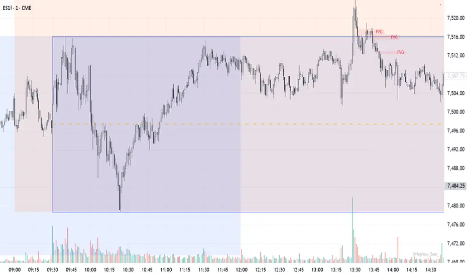
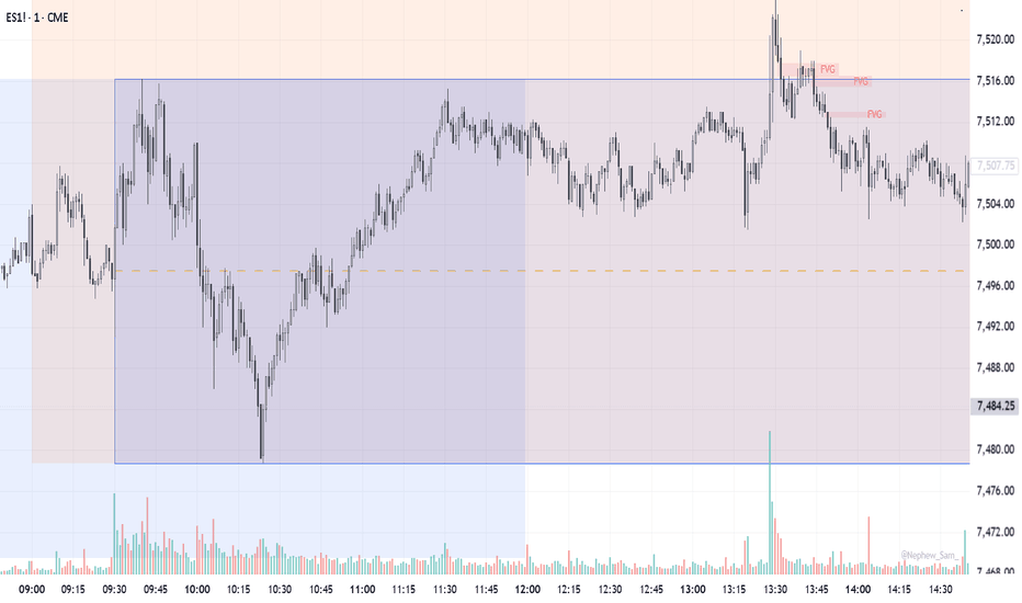
CandelaCharts - First P.FVG Killzone📝 Overview
The First P.FVG Killzone indicator automatically maps out user-defined trading sessions (Killzones) and highlights the First Presented Fair Value Gap (FVG) that forms within them.
Based on ICT concepts, killzones are specific time windows where high probability setups often occur. The first FVG to form in these sessions can act as a crucial reference point for the market's direction. This tool helps traders visualize the session range, the first institutional imbalance, and historical sweep probabilities.
📦 Features
Customizable Killzone Sessions (Asia, London, NY AM, NY Launch, NY PM, and Custom sessions)
First Presented FVG Detection within each session
Session Range Visualization (High, Low, and Mean lines with invalidation tracking)
FVG Visibility Filters (All, Bullish, Bearish, None)
Advanced FVG Styling (Midline, Borders, Labels, Extension Modes)
Session Dividers and Timeframe Separators
Historical Sweep Statistics (Probability of session High/Low sweeps)
⚙️ Settings
General: Adjust global text size and visibility of the brand watermark.
Imbalance Settings: Control the filtering, styling, and extension behavior (Fixed, Session End, Full) of the First P.FVG.
History: Set the total number of historical sessions to display.
Sessions (First to Eighth): Toggle visibility, set timeframes, and customize colors for each killzone.
Styles: Customize the appearance of the session box, borders, labels, and extended High/Low/Mean lines.
Statistics: Enable and configure historical probability tracking for session sweeps (Total Sweep vs. Session Overlap).
Dividers: Manage the style, width, and color of vertical session dividers and timeframe separators.
⚡️ Showcase
Killzone Sessions
Visualizing the different killzones with their defined ranges.
First Presented FVG
Highlighting the first FVG that forms inside the session.
Sweep Statistics
Displaying the historical probability of the session high or low being swept.
📒 Usage
The indicator is highly customizable, allowing you to use various session models and automatically detect the first Fair Value Gap (FVG) that forms within each defined session.
How to use in trading
The first Fair Value Gap of a specific session often sets the tone for subsequent price action. Price frequently gravitates towards and interacts with these initial imbalances later in the trading day. Because of this, the First Presented FVG can serve as a key intraday reference point, acting as strong dynamic support or resistance (S/R) levels. Traders can watch these extended FVG zones for high-probability continuation setups or potential reversal points when the price retraces back into them.
Below are some common reference times you can use when setting up your sessions:
ICT Killzones:
Asia: 2000-0000
London: 0200-0500
NY AM: 0930-1100
NY Launch: 1200-1300
NY PM: 1330-1600
Classic Sessions:
Sydney: 1700-0200
Tokyo: 1900-0400
London: 0300-1200
New York: 0800-1700
Harmonic Series:
Origin: 0000-0300
Prime: 0300-0600
Ascent: 0600-0900
Apex: 0900-1200
Meridian: 1200-1500
Entropy: 1500-1800
Vector: 1800-2100
Convergence: 2100-0000
🚨 Alerts
This script provides alert options for when a new First Presented FVG is formed in any of the configured Killzones.
Bearish Signal
A bearish signal is triggered when the first bearish P.FVG is formed within an active Killzone.
Bullish Signal
A bullish signal is triggered when the first bullish P.FVG is formed within an active Killzone.
⚠️ Disclaimer
Trading involves significant risk, and many participants may incur losses. The content on this site is not intended as financial advice and should not be interpreted as such. Decisions to buy, sell, hold, or trade securities, commodities, or other financial instruments carry inherent risks and are best made with guidance from qualified financial professionals. Past performance is not indicative of future results.
Indicador

Indicador

Indicador

Estratégia

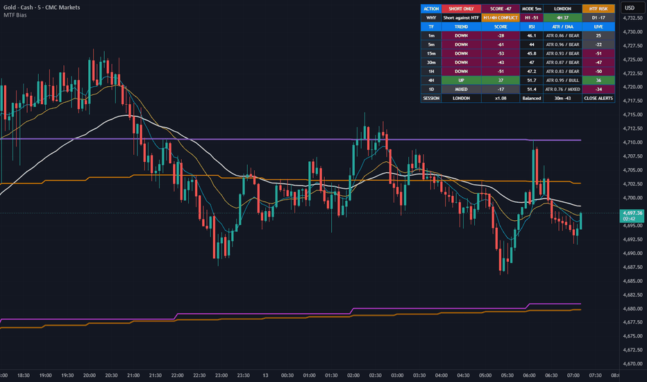
MTF Bias DashboardMTF Bias Dashboard
MTF Bias Dashboard is a multi-timeframe trend and confluence dashboard for traders who want fast directional context across liquid markets. It is designed to answer one question quickly:
Is this symbol aligned enough to trade, or should I wait?
The indicator combines 1m, 5m, 15m, 30m, 1H, 4H, and 1D trend data on the active chart symbol, so you can see whether a short-term move is likely part of the bigger trend, a pullback, or a lower-quality conflict.
The Dashboard: Read It From Top To Bottom
ACTION - This is the first cell to read. It gives the current bias state: NO TRADE, WAIT, LONG WATCH, SHORT WATCH, LONG ONLY, SHORT ONLY, LONG BIAS, or SHORT BIAS.
WHY - Explains the main reason behind the action, such as H1/4H disagree, Low volatility, HTF risk, Strong bull confluence, or Bear regime only.
TF Rows - These are diagnostics for each timeframe. Use them to see which timeframe agrees or disagrees.
SESSION - Shows London, New York, London/New York overlap, Asia, or off-hours, plus the session multiplier.
How To Decide If It Is A Good Time To Enter
Start with ACTION .
If ACTION says NO TRADE , do not enter. The dashboard is blocking the setup.
If ACTION says WAIT , there is no clean edge yet.
If ACTION says LONG WATCH or SHORT WATCH , the intraday regime is starting to lean one way, but confluence is not strong enough yet.
If ACTION says LONG ONLY or SHORT ONLY , only look for your own setups in that direction. Do not chase immediately unless your execution plan confirms.
If ACTION says LONG BIAS or SHORT BIAS , confluence is strong in that direction, but entries are still discretionary.
Check WHY before entering. If it says H1/4H disagree, Low volatility, HTF risk, or No clean setup, the trade quality is weaker.
Use the 5m, 15m, 30m, and 1H rows to confirm your entry chart agrees with the active intraday direction.
Dashboard Terms
SCORE - A confluence score from -100 to +100. Positive favors long bias. Negative favors short bias.
H1+4H BULL - 1H and 4H are both bullish enough to prefer long setups.
H1+4H BEAR - 1H and 4H are both bearish enough to prefer short setups.
H1/4H CONFLICT - 1H and 4H disagree. In Aggressive and Balanced presets this is a context warning; in Conservative preset it blocks trades.
HTF RISK - The active intraday direction is fighting 4H or 1D context.
LIVE - Preview score from the currently forming candle. It can change before that timeframe closes.
ATR / EMA - Shows volatility condition and whether that timeframe's EMA stack is bullish, bearish, or mixed.
Chart Lines
The indicator can plot local and higher-timeframe moving averages. These are visual context lines, not automatic entry signals.
Local EMA 9 - Cyan. Fast current-chart momentum.
Local EMA 21 - Yellow. Short-term pullback/momentum guide.
Local EMA 50 - White. Current-chart trend guide.
1H EMA 50 - Orange. 1-hour dynamic support/resistance.
1H EMA 200 - Dark orange. Major 1-hour structure level.
4H EMA 50 - Magenta. 4-hour dynamic support/resistance.
4H EMA 200 - Purple. Major 4-hour structure level.
Practical use: if the dashboard is bearish and price bounces into a level you care about, such as a fib zone or moving average area, the dashboard helps confirm whether the broader intraday context still supports short-only thinking. The same applies in reverse for bullish pullbacks.
How The Trend Score Works
Each timeframe is scored using:
EMA stack alignment.
EMA slope normalized by ATR.
RSI regime and RSI direction.
Price location versus the EMA band.
VWAP location when available.
Volatility quality using ATR versus its baseline.
Bias Presets And Default Weighting
Aggressive - Prioritizes 5m, 15m, 30m, and 1H. 4H is light context.
Balanced - Default. Uses 15m, 30m, and 1H as the main intraday stack, with 4H as context.
Conservative - Requires stronger 1H/4H agreement and gives 4H more influence.
1D - Shown as regime context only. It is not part of the confluence weight.
Confirmed vs Live Preview
The main ACTION, WHY, SCORE, and alerts use confirmed multi-timeframe values to reduce repainting. The LIVE column is only an early preview and can change before the candle closes.
Session Weighting
London, New York, and the London/New York overlap receive higher confidence. Asia and off-hours receive lower confidence because intraday conditions can be less reliable.
Alerts Included
Strong Long Bias
Strong Short Bias
HTF Conflict / No-Trade Warning
Important Notes
This is an indicator, not an automated strategy.
Use it with your own risk management and execution rules.
The dashboard shows multi-timeframe bias and context. It does not mark exact entries.
The cleanest intraday setups usually come when 5m, 15m, 30m, and 1H agree, then price pulls back into a meaningful zone and stalls according to your own execution plan.
4H and 1D are context layers. In Aggressive and Balanced presets they warn about regime risk instead of automatically blocking every trade.
For the cleanest alerts, keep "Alerts only on confirmed chart bars" enabled.
Indicador
Indicador

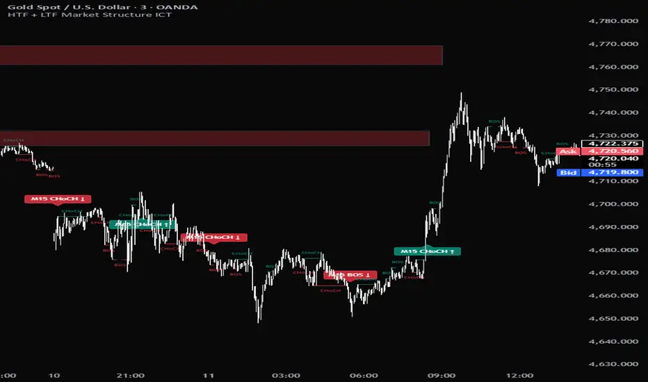
HTF + LTF Market Structure ICTHTF + LTF Market Structure ICT
A dual-stream ICT-style market structure tool that detects MSS (Change of Character) and BOS (Break of Structure) events on both a higher timeframe and the current chart timeframe simultaneously — so you can read HTF context and LTF structure on a single chart.
What it does
The indicator runs the same fractal-based structure detector twice in parallel:
HTF stream (default M15) — runs via request.security with lookahead_off, so events are confirmed at the HTF candle close. Each event renders as a small labeled ribbon tag (e.g. M15 CHoCH ↑) on the LTF bar where the HTF candle closed. Bull tags sit below the bar, bear tags above. No projected lines.
LTF stream — runs on the chart TF directly. Each event renders as a break-level line spanning the broken fractal pivot to the firing bar, plus a minimal CHoCH / BOS text label at the line's midpoint — colored text only, no background fill. Bull text floats above the line, bear below.
Each stream tracks its own trend state, so the HTF and LTF can disagree — that disagreement is the actionable read (e.g. HTF still bullish while LTF just printed a CHoCH down = first sign of a pullback against trend).
How structure is classified
Each stream maintains its own directional bias:
MSS / CHoCH — the first break against the prior structural trend (reversal signal).
BOS — a break in the same direction as the current trend (continuation).
The very first event of each stream is classified as MSS by default since there's no prior reference. Line style differs: solid for MSS, dashed for BOS by default.
Detection logic
A fractal swing pivot is confirmed when a high/low is the extreme over a configurable length (default 5).
A break fires when the bar's close crosses through the most recent unbroken fractal (above for bull, below for bear), with barstate.isconfirmed so events don't repaint.
Auto-suppression
When the chart timeframe equals the chosen HTF (e.g. you're viewing the M15 chart with HTF = M15), the HTF ribbon is hidden — both streams would otherwise detect the exact same events on the same bars.
Inputs
HTF stream — HTF (15min / 30min / 1H / 4H / 1D), fractal length, MSS / BOS toggles
LTF stream — fractal length, MSS / BOS toggles
Display — line on/off, forward-extend latest line, LTF text on/off, history depth
Style — line styles (MSS solid / BOS dashed), line width, HTF ribbon size + transparency, LTF text size, bull / bear colors
Alerts
Ten preconfigured alertconditions:
HTF Bull CHoCH / Bear CHoCH / Bull BOS / Bear BOS
LTF Bull CHoCH / Bear CHoCH / Bull BOS / Bear BOS
LTF bull aligned with HTF-bull bias (confluence)
LTF bear aligned with HTF-bear bias (confluence)
Suggested use
Works on any symbol or timeframe. Default M15 HTF on an M1 / M3 / M5 chart gives a clean intraday read; for swing structure, try chart TF = 1H with HTF = 4H or 1D. The fractal length controls signal density — drop to 3 for more frequent events on lower-volatility instruments, raise to 7+ to filter for stronger swings.
This is a structure visualization tool, not a trading system — it doesn't take trades, manage risk, or compute lot sizes. Use it to read HTF context and LTF trigger timing.
Disclaimer
This script is for educational and analytical purposes only. It does not provide financial advice and does not guarantee profitability. Past performance of any structural pattern does not imply future results. Always combine with your own analysis and risk management.
Quick adjustments you might want before publishing: short title for TV (e.g. HTF+LTF MSS ICT), and grab a chart screenshot showing both HTF ribbons and LTF text active. Indicador

Indicador

Indicador

Indicador
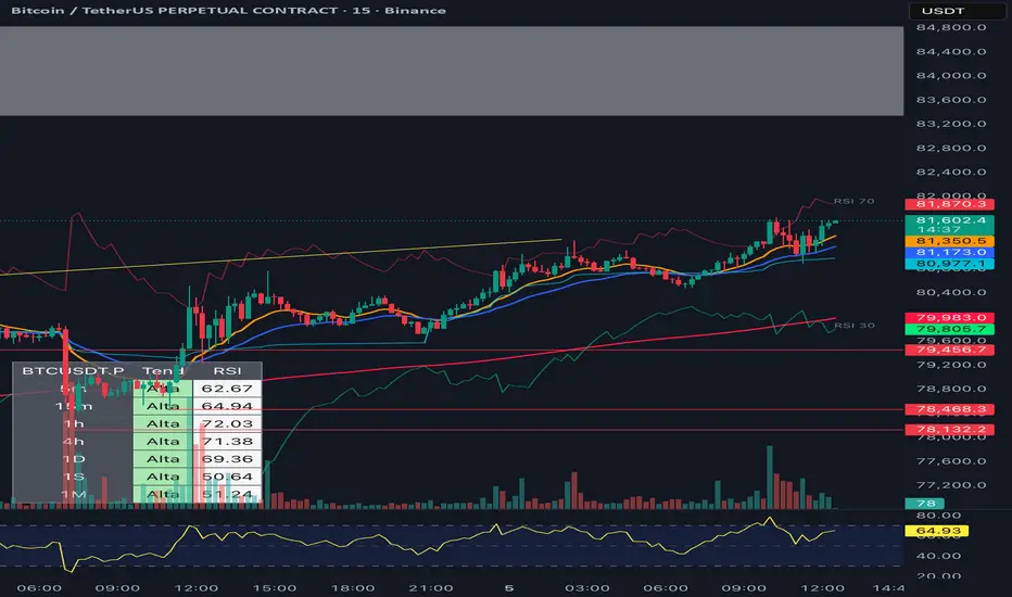
FagoriTools 1.0**FagoriTools — Multi-TF Trend + Reverse RSI Levels**
All-in-one indicator that combines three utilities into a single script to reduce visual clutter on the chart:
**1) Configurable EMAs**
Five independent exponential moving averages, each with its own period, color, and on/off toggle. Default values follow common combinations: 9, 12, 26, 50, and 200. Useful for those who rely on classic crossovers (12/26, 50/200) and want all references consolidated within one indicator.
**2) Reverse RSI Levels**
Instead of displaying the RSI in a separate panel, this module plots two lines directly over price, indicating the exact value at which the asset would need to close for the RSI to reach the oversold (default 30) and overbought (default 70) thresholds.
The calculation inverts the RSI formula: starting from the current gain and loss averages (RMA), it solves the equation for the `close` value that would produce the target RSI, accounting for Wilder's smoothing. This allows you to see at a glance, "if it drops to X, it becomes oversold" or "to turn overbought, it needs to rise to Y," without switching between panels.
Both the RSI levels and the period (default 14) are fully customizable.
**3) Multi-Timeframe Table**
A consolidated panel displaying the asset's reading across seven timeframes: 5m, 15m, 1h, 4h, 1D, 1W, and 1M (each can be toggled on or off individually).
For each timeframe, the table shows:
* Trend — trend direction (Up/Down) based on the close relative to the slow EMA. Green = Up, Red = Down.
* RSI — numeric RSI value for that timeframe, with the background color reflecting the trend.
* Fixed (optional) — the same trend reading applied to a fixed pair chosen by the user (e.g., SPX500, DXY, BTCUSDT). Useful for tracking correlation with a benchmark without switching charts.
The table position is configurable across two dimensions (vertical: Top/Middle/Bottom; horizontal: Left/Right).
**How to Use**
1. Enable the EMAs that align with your strategy.
2. Adjust the RSI levels according to your style (some prefer 20/80 in crypto, 30/70 in stocks).
3. Use the multi-TF table to align your trades with the higher timeframe trend. Entries against the trend of larger timeframes typically have a lower win rate.
**Notes**
* The Reverse RSI is a deterministic calculation, not a projection. The value displayed is the current price required for the RSI to reach the target, and it updates with every candle.
* The "Fixed" column depends on the chosen symbol being available on the broker. Otherwise, it remains blank.
* Indicator is overlaid on price, working with any asset and timeframe. Indicador

Indicador
CandelaCharts - Killzone HTF Candles📝 Overview
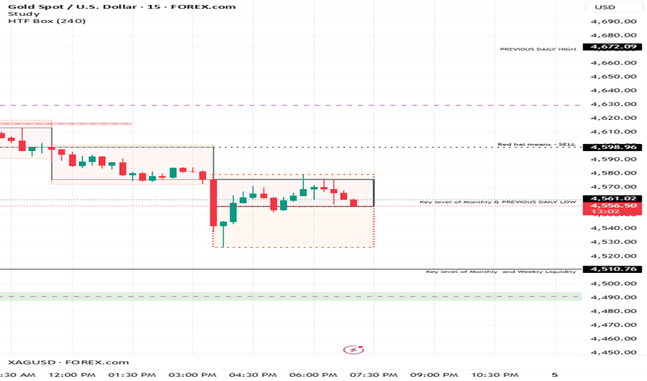
The Killzone HTF Candles indicator is a professional visual tool designed for ICT and SMC traders who prioritize session-based price action. It bridges the gap between Lower Timeframe (LTF) execution and Higher Timeframe (HTF) context by projecting session-specific data (Asia, London, New York) directly onto your chart as discrete candles.
This tool allows you to monitor the "Daily Narrative" by seeing how session ranges interact without ever leaving your execution timeframe, helping you identify liquidity sweeps and trend transitions at a glance.
📦 Features
Multi-Session Tracking : Pre-configured with 8 primary Killzones: Asia (AS), London Open (LO), NY AM, NY Lunch (LA), NY PM, and 3 additional custom sessions.
Dual Projection Logic :
Mapped to Chart : Overlays HTF boxes and wicks directly on the price action for historical study and zone identification.
Ghost Display : Projects the most recent sessions as a "Rolling Dashboard" on the right side of the chart, keeping your current price action clear.
Dynamic Chronology : Ghost candles automatically rotate, ensuring the most recent session is always positioned on the far right.
Premium Aesthetics : Built with glassmorphism design principles, featuring customizable body opacity, line widths, and font styles.
Timezone Sync : Integrated timezone support (Default: America/New_York) ensures your sessions align perfectly with global markets.
⚙️ Settings
HTF Candle Mechanics
Candle Size : Adjusts the width of the ghost candles.
Bull/Bear Colors : Set your preferred color scheme for bullish/bearish closes.
Ghost Offset/Spacing : Fine-tune the position and gap of the ghost candles on the right side.
Line Width : Controls the thickness of wicks and candle borders.
Opacity : Adjust the transparency of the candle body fills.
Session Configuration (I - VIII)
Show Session : Enable/Disable tracking for specific Killzones.
Display Name : Customize labels (e.g., "LO", "NY AM").
Session Time : Define precise time ranges for each session.
Map to Chart : Toggle the HTF candle overlay for specific sessions.
⚡️ Showcase
The "Session Transfer" Logic
By using the Ghost Candles , you can quickly identify the relationship between different trading periods:
AS Range : Often sets the initial consolidation or liquidity pool.
LO Expansion : Typically creates the high or low of the day.
NY AM Reversal : Often trades back into the LO or AS ranges to fill gaps or sweep liquidity.
Highly customizable, build your own custom killzones
🚨 Alerts
This version is optimized for visual analysis. While it does not include internal logic alerts, it provides a comprehensive real-time dashboard for manual confluence and bias confirmation.
⚠️ Disclaimer
Trading involves significant risk, and many participants may incur losses. The content on this site is not intended as financial advice and should not be interpreted as such. Decisions to buy, sell, hold, or trade securities, commodities, or other financial instruments carry inherent risks and are best made with guidance from qualified financial professionals. Past performance is not indicative of future results.
Indicador

Indicador

Cody Zig ZagCody Zig Zag Indicator - Complete Explanation
This is a Zig Zag indicator that replicates the MetaTrader 4 (MT4) version, which works differently than TradingView's built-in Zig Zag. Here's what it does:
🎯 What is a Zig Zag Indicator?
It filters out minor price movements to show only significant swing highs and swing lows, helping you identify trends and chart patterns (head & shoulders, double tops/bottoms, etc.).
⚙️ User Settings (Inputs)
Setting Default What It Does
Depth 6 Lookback period to find local highs/lows
Deviation 5 Minimum price change (in ticks) to form a new swing point
Backstep 2 Minimum bars between swing points
Line Thickness 2 Zig Zag line width
Bull Color Lime Color for upward moves
Bear Color Red Color for downward moves
Repaint Levels true If ON, lines/labels adjust real-time; if OFF, they lock on close
🔍 How It Works (The "Bake" Section)
Step 1: Find Potential Pivot Points
p_lw = Most recent low within Depth bars
p_hg = Most recent high within Depth bars
Checks if price moved enough (Deviation * tick size) to qualify
Step 2: Determine Direction
down = Boolean (true = bearish/downward leg, false = bullish/upward leg)
Tracks whether we're connecting a high→low (down) or low→high (up)
Step 3: Draw Zig Zag Lines
Connects alternating swing highs and swing lows
Labels each point as:
HH = Higher High
LH = Lower High
LL = Lower Low
HL = Higher Low
🏷️ Labels Explained
When price makes a new swing point, you'll see:
HH (Higher High) - Bullish continuation signal
LH (Lower High) - Bearish reversal signal
LL (Lower Low) - Bearish continuation signal
HL (Higher Low) - Bullish reversal signal
📊 Visual Features
Colored Zig Zag lines: Green for up-legs, Red for down-legs
Background color: Green during bullish legs, Red during bearish legs (90% transparent)
Labels: Tiny triangles pointing up/down with text
⚠️ Repaint Behavior (Important!)
Repaint = ON (default) Repaint = OFF
Lines/labels update in real-time Locks on bar close
Can "repaint" history More reliable for backtesting
Good for real-time trading No historical repainting
Warning: Zig Zag indicators naturally repaint because they need future bars to confirm pivot points. The repaint option controls HOW they repaint.
🚨 Alerts
This script triggers alerts when:
Direction Changed - Zig Zag switches from up to down or down to up
Bullish Direction - Switches from down to up
Bearish Direction - Switches from up to down
📈 How to Use
Identify Trend: Upward Zig Zag = Uptrend; Downward = Downtrend
Find Patterns: Look for HH/HL patterns (bullish) or LH/LL patterns (bearish)
Divergence: Compare Zig Zag swings with oscillator indicators
Support/Resistance: Swing points act as natural S/R levels
⚡ Quick Summary
This indicator draws a line connecting significant price swings, ignoring small noise. It's great for:
Visualizing trend structure
Identifying chart patterns
Finding entry/exit levels
Spotting trend reversals Indicador