FVG & OB Quality ScorerICT FVG & OB Quality Scorer
Core idea: Not all Fair Value Gaps and Order Blocks are created equal. This indicator answers the question "Which FVG or Order Block will actually work?" by scoring every detected zone on 10 confluence pillars derived from ICT's (InnerCircleTrader) 2022–2024 Mentorship methodology.
How It Works
Every time an FVG or Order Block forms on the chart, the indicator runs it through a 10-factor scoring engine (each factor scored 0–10, total 0–100):
# Pillar What It Checks
❶ Displacement / CISD Was the move impulsive? Body > 70% of candle range = institutional candle. Also checks for Change in State of Delivery (close crossing prior candle's open).
❷ Liquidity Sweep Was BSL or SSL taken before the zone formed? Checks swing pivots, Prior Day High/Low, and IPDA 20-day levels.
❸ Premium / Discount Bullish zones in discount (< 50% of range) score high. Bearish zones in premium (> 50%) score high.
❹ Market Structure Is the zone aligned with the current trend (BOS)? With-trend = 10, counter-trend = 1.
❺ HTF Bias Does the Daily (configurable) candle direction agree with the zone? Misalignment = low probability.
❻ OTE Fibonacci Is the zone inside the 62%–79% Optimal Trade Entry retracement? The 70.5% "sweet spot" scores perfect 10.
❼ FVG + OB Overlap Is there a confluence zone where an FVG and Order Block exist at the same price level? This is ICT's highest-probability setup.
❽ Volume Was displacement volume above the 20-bar average? 3x+ average = clear institutional activity.
❾ Kill Zone Timing Formed during London KZ, NY AM KZ, or Silver Bullet windows? "Time supersedes price."
❿ Freshness First-touch zones score highest. Zones decay in score and fade in color as they age.
Grading Scale
Score Grade Meaning
86–100 S Elite — high conviction, full size
71–85 A/A+ Strong — tradeable with confirmation
51–70 B/B+ Above average — needs extra confluence
26–50 C/C+ Below average — watch only
0–25 D Weak — skip entirely
What You See On The Chart
Color-graded zones: Red (weak) → Orange → Gold → Green → Bright Green (elite)
FVGs = solid-border boxes labeled BISI / SIBI
Order Blocks = dashed-border boxes labeled +OB / -OB
CE line = dotted midline (Consequent Encroachment — ICT's 50% level)
MT line = solid midline on OBs (Mean Threshold — ICT's precision entry)
Score labels with letter grade — hover for full 10-pillar tooltip breakdown
Dashboard table ranking all active zones by score with market context (Structure, HTF Bias, Kill Zone status)
Zones fade in color as they age (freshness decay) and are removed/dimmed on mitigation
Key Settings
Min Score to Display — Set to 60+ to only see B+ and above (recommended for clean charts)
Mitigate On — Wick vs Close (ICT uses Close for higher conviction)
HTF Timeframe — Defaults to Daily; change to 4H for swing setups
IPDA Reference Lines — Toggle 20-day high/low institutional levels
Kill Zone sessions — All configurable in NY time Indicador

Asian & London Session Highs/LowsDescription:
This indicator automatically detects and plots the highest and lowest price points of the Asian and London trading sessions. It is designed specifically for day traders, particularly those using Smart Money Concepts (SMC), Inner Circle Trader (ICT) methodologies, or classic Price Action strategies, who rely on session liquidity and daily market structure.
Session highs and lows act as major liquidity pools. A common trading concept involves waiting for the London or New York session to sweep the Asian session liquidity (High or Low) before anticipating a reversal or a strong trend continuation. This tool visually highlights these crucial levels directly on your chart, saving you time and keeping your analysis precise.
Key Features:
1. Accurate High/Low Detection: Pinpoints the exact highest and lowest wicks within your defined session windows.
2. Fully Customizable Session Times: Adjust the start and end times for both the Asian and London sessions directly from the indicator settings. Perfect for isolating specific timeframes like the "Asian Killzone".
3. Native Timezone Support: Built with Pine Script v6, it handles timezones flawlessly. You don't need to do any complex UTC math—just input your session string (e.g., 0000-0800) and the indicator does the rest.
4. Clean & Uncluttered Charts: Draws clean horizontal lines extending to the right for easy visibility. The script automatically removes lines from previous days, ensuring your current chart remains neat and focused on the active session.
5. Visual Customization: Easily change line colors, thickness, and how far the lines extend to the right to perfectly match your personal chart theme.
How to Use:
1. Apply the indicator to your intraday chart (e.g., 5m, 15m, 30m, 1H).
2. Open the indicator Settings.
3. Adjust the Asian Session Time and London Session Time to match your trading strategy (default is set to standard broad sessions, but can be narrowed down to specific killzones).
4. Watch for price action reactions, breakouts, or liquidity sweeps around these key structural lines during the trading day.
Note: This indicator is designed for intraday timeframes. It will not display lines on Daily (1D) or higher timeframes.
Indicador

Indicador

Market Euphoria Index - MEI1. The Three Core Factors
The script measures market sentiment by evaluating three different "factors" of price action and assigning a score from 0 to 100 for both Euphoria and Panic.
RSI Factor (Momentum Extremes): It checks if the traditional RSI is overextended.
If RSI is above 70, it scales the value into an Euphoria Score. For example, an RSI of 85 will have a higher Euphoria score than an RSI of 75.
If RSI is below 30, it scales into a Panic Score.
VWAP Stretch Factor (Overextension): It measures how far the current price has stretched away from the Volume Weighted Average Price (VWAP), normalized by the Average True Range (ATR).
If the price shoots up higher than the VWAP by a multiple of the ATR (default is 2.0x), it triggers a maximum 100 Euphoria Score (indicating the asset is heavily overvalued relative to its average volume-weighted baseline).
If it crashes below the VWAP by the same distance, it triggers a 100 Panic Score.
Price Momentum / K's Factor (Candlestick Sentiment): This looks purely at the candlesticks over the last 14 periods (by default).
It counts how many candles closed higher than they opened (Bullish candles) and converts that ratio into an Euphoria Score.
It does the inverse for Bearish candles to create a Panic Score.
2. The Composite Blend
Once the script has the three Euphoria scores and three Panic scores, it averages them:
pinescript -
euphoriaScore = (rsiEuphoria + vwapEuphoria + momEuphoria) / 3
panicScore = (rsiPanic + vwapPanic + momPanic) / 3
Finally, it subtracts the panicScore from the euphoriaScore to get the final mei value.
3. Interpretation & Visuals
The indicator plots as a histogram with dynamic colors and static threshold lines:
> +50 (Red): Extreme Euphoria. The market is firing on all cylinders (RSI overbought, stretched far above VWAP, heavily bullish candles). High risk of a blow-off top reversal.
> +20 (Orange): Standard Euphoria/Strong Uptrend.
Between -20 and +20 (Gray): Neutral market.
< -20 (Teal): Standard Panic/Strong Downtrend.
< -50 (Green): Extreme Panic. The market is oversold, stretched far below VWAP, and showing heavy bearish momentum. High probability of a capitulation bottom bounce.
The script also includes built-in alert conditions (Extreme Euphoria Alert and Extreme Panic Alert) so you can automate notifications when the market reaches these psychological extremes! Indicador

Ultimate Hull SuiteGreymyst Ultimate Hull Suite
The Greymyst Ultimate Hull Suite is a premium, multi-functional trend-following indicator designed to provide traders with highly accurate, low-lag momentum signals. Built entirely from the ground up for professional trading, this suite combines advanced Moving Average variations with dynamic volatility filters and multi-timeframe analysis to offer extreme confluence in a single tool.
🌟 Core Concepts & Features
1. Advanced Hull Variations
Traditional moving averages often suffer from lag. The Hull Moving Average solves this by prioritizing recent price action. This suite allows you to toggle between three powerful variations:
HMA (Standard Hull): The classic low-lag moving average.
EHMA (Exponential Hull): Uses exponential calculations to react even faster to sudden price spikes.
THMA (Triple Hull): Offers ultra-smooth trend detection, practically eliminating market noise and false signals during choppy ranges.
2. Multi-Timeframe (MTF) Alignment
Trading against the macro trend is a common pitfall. The built-in MTF engine allows you to anchor your Hull Moving Average to a higher timeframe (e.g., viewing the 4-Hour Hull trend on a 15-minute chart). This ensures you are only taking trades that align with the dominant market direction.
3. Dynamic Volatility Bands (Hull Envelopes)
Instead of static support and resistance, this suite wraps the Hull Moving Average in ATR-based Volatility Bands.
Trend Cloud: The area between the Hull and the bands is filled with a bullish (green) or bearish (red) cloud.
Mean Reversion: When price action aggressively pierces the upper or lower bands, it signals an overextended market, warning you of potential pullbacks or mean-reversion opportunities.
4. Squeeze Momentum Confluence Filter
A trend is only as strong as the volume and volatility behind it. This indicator integrates a hidden Squeeze Volatility Engine (combining Bollinger Bands and Keltner Channels).
The Filter: Buy and Sell signals are strictly suppressed if the market is stuck in a low-volatility "squeeze" (consolidation).
Signals are only generated when the Hull changes direction AND volatility is actively expanding, keeping you out of flat, choppy markets.
5. Automated Signals & Alerts
The suite visually prints clear B (Buy) and S (Sell) markers on your chart when high-probability confluence is met (Trend Shift + Volatility Expansion).
It includes comprehensive, ready-to-use Alert Conditions so you can automate your trading via webhooks or receive notifications directly to your phone.
⚙️ How to Use It for Confluence
Trend Confirmation: Use the color of the Hull MA (Green for Up, Red for Down) as your primary directional bias.
Entry Triggers: Look for Buy/Sell markers printed by the indicator. Because of the built-in Squeeze filter, these markers represent moments where price is reversing with momentum.
Take Profit / Stop Loss: Use the outer ATR bands as dynamic profit targets or trailing stop-loss zones.
(Created by greymyst) Indicador

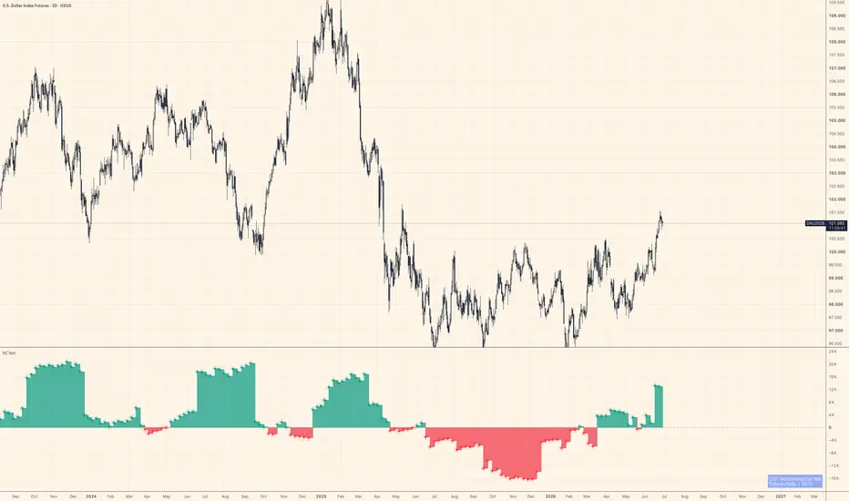
COT: Noncommercial Net (Futures)The CFTC publishes Commitment of Traders data every Friday. Inside that report, the "Noncommercial" category — large speculators, managed money, trend-followers — is the one most traders actually want to watch. This script strips everything else away and shows their net stance: Long minus Short, futures contracts only.
Positive values mean large speculators are net long. Negative means net short. A move across zero often marks a meaningful shift in positioning, not just noise.
How it works
The indicator auto-detects the correct CFTC code from the chart's symbol using TradingView's official LibraryCOT, so you don't need to configure anything. Open it on BTC futures, gold, crude oil, the yen — it resolves the code and pulls the right data automatically.
A teal/red histogram shows whether net positioning is positive or negative. A step-line sits on top for precise bar-by-bar reading. Zero is marked with a dashed reference line.
What it doesn't do
It doesn't tell you when to buy or sell. COT data is released weekly and lags several days behind the reporting cutoff — it's positioning context, not a signal. Use it alongside price action and other tools to understand who is leaning which way, not as a standalone trigger.
Notes
Futures only (not futures + options combined)
Noncommercial Long − Noncommercial Short = Net
Data source: CFTC Legacy report via TradingView's LibraryCOT v6
Works on any symbol that has a CFTC code in TradingView's database
Not financial advice. Position sizing and risk management are your responsibility. Indicador

Indicador

Indicador

Liquidity Structure Framework [PakunFX]Liquidity Sequence Framework
Liquidity Sequence Framework (LSF) is a market structure analysis indicator designed to visualize the progression of liquidity events, structure shifts, and Fair Value Gaps (FVGs) within a single analytical framework.
Instead of focusing on individual signals, the indicator organizes multiple market events into a sequential process, helping traders observe how price structure develops over time. The script combines swing structure, liquidity sweeps, trend filtering, and Fair Value Gap detection into a unified charting tool.
Features
External and Internal Swing Structure detection
Liquidity Sweep identification (SSL / BSL)
Bullish and Bearish Structure Shift detection
Automatic Fair Value Gap (FVG) detection
EMA-based trend filter
Premium / Discount (Equilibrium) filter
Configurable setup conditions
Visual sequence tracking with alerts
How it Works
The indicator monitors market structure using external and internal swing highs and lows. When liquidity is swept beyond a previous swing level, a new sequence begins. The script then tracks whether price confirms a structure shift and subsequently forms a Fair Value Gap within a configurable sequence window.
Trend filtering can be applied using Fast and Slow EMA conditions, while optional Premium / Discount and Fair Value Gap requirements allow users to customize how potential setups are displayed.
Display Elements
External Swing High / Low
Internal Swing High / Low
Liquidity Sweep markers (SSL / BSL)
Structure Shift markers
Active Fair Value Gap zones
Fast and Slow EMA
Equilibrium level
Setup markers
Alerts
Alerts are available for:
Liquidity Sweep
Bullish Structure Shift
Bearish Structure Shift
Bullish Sequence Setup
Bearish Sequence Setup
These alerts are intended to notify users when predefined analytical conditions are detected.
Notes
Liquidity Sequence Framework is designed as a market analysis tool. It visualizes structural relationships between liquidity events and price development but does not generate trading recommendations or predict future market direction.
Disclaimer
This script is provided for educational and research purposes only.
All calculations are based on historical price data. The displayed structures, Fair Value Gaps, and sequence conditions are intended to support chart analysis and should not be interpreted as guarantees of future market behavior or trading performance.
Indicador

Hidden Liquidity Profile [Alpha Extract]A sophisticated liquidity-mapping and support/resistance profiling framework that analyzes historical candle structure, volume, wick behaviour, and price distribution to identify hidden supply and demand zones across the chart. Hidden Liquidity Profile is designed to reveal where meaningful liquidity may be concentrated by separating sell-side and buy-side pressure into price bins, then projecting those zones forward as heat boxes, horizon lines, key price tags, and a real-time support/resistance dashboard.
Rather than relying on simple pivot highs and lows, the system evaluates how volume interacted with candle ranges, upper wicks, lower wicks, candle bodies, and recency weighting. This creates a dynamic liquidity profile that highlights where price may encounter resistance, support, absorption, or reaction zones.
🔶 Hidden Liquidity Profiling Engine
Builds separate supply and demand profiles across the selected lookback range. The system divides price into configurable bins, then distributes liquidity strength into those bins based on volume, candle range, wick size, body size, and age decay.
energy = vol * rng * decay
sellStrength = energy * (upWick * wickWeight + body * bodyWeight * sellBias)
buyStrength = energy * (dnWick * wickWeight + body * bodyWeight * buyBias)
This allows the indicator to estimate where sell liquidity and buy liquidity are most likely concentrated rather than only marking obvious visible highs and lows.
🔶 Supply & Demand Separation
The profile separates upper-wick and lower-wick pressure into two distinct liquidity maps.
Upper wick activity contributes to the supply profile, helping identify areas where sellers may have previously absorbed price movement. Lower wick activity contributes to the demand profile, helping identify zones where buyers may have previously defended price.
This separation gives traders a clearer view of whether nearby levels are more likely to behave as resistance, support, or balanced liquidity.
🔶 Age-Weighted Liquidity Decay
Applies a recency decay model so newer candles have stronger influence than older candles. This keeps the profile focused on liquidity that is more relevant to the current market environment while still preserving broader historical context.
The Age Decay Power setting controls how aggressively older liquidity fades. Higher values emphasize recent price action more strongly, while lower values retain more historical structure.
🔶 Price Bin Distribution System
Divides the analyzed price range into configurable price bins and assigns liquidity strength into each level. The Price Bins setting controls the resolution of the profile.
More bins create a finer, more detailed liquidity map. Fewer bins create a smoother, broader view of major supply and demand areas.
🔶 Distribution Radius Smoothing
Uses a configurable distribution radius to spread liquidity strength around nearby bins. This prevents the profile from becoming too fragmented and helps form smoother liquidity clusters.
This is especially useful on volatile assets where important liquidity zones often form across small ranges rather than at one exact tick.
🔶 Liquidity Heat Box Visualization
Displays supply and demand as horizontal heat boxes projected to the right side of the chart.
Supply liquidity is shown on the sell side using the selected sell color, while demand liquidity is shown on the buy side using the selected buy color. Wider and brighter boxes represent stronger normalized liquidity at that price level.
This creates a visual depth-style map that helps traders quickly identify where meaningful liquidity may be stacked above and below current price.
🔶 Forward Horizon Lines
Projects stronger liquidity levels forward using horizontal lines. These lines act as future reference zones where price may react, pause, reject, or accelerate through.
The Line Trigger setting controls how strong a liquidity level must be before it is projected. The Line Width Scale setting adjusts how visually dominant stronger levels appear.
🔶 Key Level Detection Framework
Identifies the strongest supply and demand levels from the profile and labels them directly on the chart.
The system can prioritize local peaks, helping avoid overcrowding and ensuring that selected levels represent distinct liquidity clusters rather than multiple nearby bins from the same zone.
This scoring model favors levels with strong dominant liquidity while still accounting for total combined activity.
🔶 Supply HVN & Demand HVN Labels
Marks high-volume liquidity nodes as Supply HVN or Demand HVN depending on which side of the profile dominates at that price.
Each label includes the level type, normalized strength percentage, and exact price. This allows traders to quickly identify the most important liquidity levels without manually reading the full heat map.
🔶 Nearest Support & Resistance Logic
Calculates the most relevant resistance above price and support below price using both liquidity strength and distance from current price.
Levels closer to current price receive more practical importance, while still needing enough liquidity strength to qualify. This helps the dashboard focus on actionable nearby zones instead of simply displaying the strongest level anywhere in the lookback range.
🔶 Aura Point Of Control
Identifies the strongest combined liquidity level across the profile. This Aura POC represents the price zone with the highest combined supply and demand activity.
The POC can act as a major reference point for balance, rotation, acceptance, rejection, or future retests.
🔶 Liquidity Pressure Balance
Compares total normalized demand against total normalized supply to estimate the broader pressure bias across the analyzed range.
When demand is meaningfully stronger, the dashboard shows a demand bias. When supply dominates, it shows a supply bias. When the two sides are close, the market is classified as balanced.
🔶 Real-Time S/R Dashboard
Includes a compact dashboard showing the most important liquidity information directly on the chart:
• Nearest resistance level
• Nearest support level
• Aura POC
• Supply, demand, or balanced pressure
• Active liquidity level count
• Current ticker reference
This gives traders a quick summary of where the strongest nearby reaction zones are and whether the broader liquidity profile is tilted toward supply or demand.
🔶 Customizable Visual Controls
Provides flexible display controls for heat boxes, horizon lines, key level tags, dotted key level lines, and the dashboard.
Traders can adjust the number of analyzed bars, price bin resolution, liquidity smoothing, projection distance, box width, line width, and trigger thresholds to match different assets and timeframes.
🔶 Clean Overlay Design
The full liquidity map is displayed directly on price without requiring a separate oscillator pane. Heat boxes appear to the right of the chart, while key levels and labels extend across the active lookback area.
This keeps the chart readable while still providing a detailed view of hidden supply and demand structure.
🔶 Why Choose Hidden Liquidity Profile ?
Hidden Liquidity Profile provides a more advanced way to identify potential support, resistance, and liquidity reaction zones by analyzing volume-weighted candle structure across the full price range. Instead of marking only visible swing highs and lows, it evaluates where supply and demand pressure may be concentrated based on wick behaviour, candle body participation, volume energy, and recency-weighted price distribution.
The heat boxes reveal liquidity density, the horizon lines project important levels forward, the HVN labels highlight the strongest zones, and the dashboard summarizes nearest support, resistance, POC, and pressure bias in real time.
Perfect for liquidity traders, support/resistance traders, intraday traders, swing traders, and market structure analysts who want a cleaner way to visualize hidden supply and demand zones directly on the chart. Indicador

Indicador

Indicador

Indicador

MGI & Momentum TrendThe suite of indicators plotted here serves as an analytical foundation for capturing market "structure" from multiple perspectives. They are designed to facilitate everything from a broad assessment of the market environment based on weekly charts to precise, tactical entry decisions using daily charts.
Below is an explanation of the logic and role of each indicator, along with guidance on adapting them to market conditions.
This system is designed to deliver its full value when customized by the user to suit changing market environments and the specific characteristics of the assets being monitored.
The display is primarily based on weekly charts, with daily charts used as needed.
MarketGoingIndex (MGI) – Macro Liquidity Environment
Look for buying opportunities when the background indicator lights up while the purple line is rising.
Purpose:
This indicator utilizes the yield spread between US junk bonds and US Treasury bonds—one of the metrics most strongly inversely correlated with capital inflows into the stock market (risk-on sentiment). This spread widens sharply when large-scale investors become anxious about the economic outlook. By calculating the "cumulative 4-week momentum" of this spread and inverting the result, we create a leading indicator for the stock market.
Logic:
It is based on the credit spread of US high-yield bonds (junk bonds). A widening spread signifies rising credit risk, while a narrowing spread indicates abundant liquidity.
Role of the Index:
By calculating the "cumulative change" in the spread, it visualizes the direction of capital flow (risk-on vs. risk-off).
Usage (Market Adaptation):
For the US market: It functions using the default settings. Another suitable alternative is FRED:BAA10Y (Moody's Seasoned Baa Corporate Bond Yield Relative to Yield on 10-Year Treasury). Major recessions like the COVID-19 crash (where stock prices drop by nearly 20%) often occur in years ending in "9" or "0" and during the first or second year of a U.S. presidential term. In such cases, it is more effective to gauge the timing of a market bottom reversal by using indicators that offer stronger leading signals for recessions than the standard 10-year/2-year spread—specifically, the spread between 10-year and 3-month Treasury yields (FRED:T10Y3M), which the Federal Reserve prioritizes.
During major recessions like the COVID-19 crash, the FRED:BAMLH0A0HYM2 indicator is too slow to react.
Image
Focus on short-term Treasury yields, to which the Fed is likely to respond quickly (using the FRED:T10Y3M setting).
For the Japanese market: Since it is highly correlated with the U.S. market, I recommend using this as a leading indicator while also monitoring the momentum of the USD/JPY exchange rate and trends in the Nikkei 225 Volatility Index (NI225VI) for supplementary analysis.
2.Intermediate Trend Background Signal (A/D Difference)
Logic:
Uses the SMA of the Advance/Decline (A/D) line to indicate market overheating and trend direction via the background color.
Role:
An indicator that measures market "breadth." Areas with background coloring suggest the market is in an overheated zone with a clear trend.
Operation (Adjustment Method):
Thresholds (-1000, -1500) vary depending on the liquidity of the target market.
If the background color does not appear when you want it to, make the threshold looser (closer to 0).
If there is too much noise, adjust the threshold to be stricter (increase the negative value).
System Usage Workflow
Broad Perspective (Weekly Chart):
Check the capital environment using MGI and assess market "heat" via the background color. When the background turns green or pink, it indicates a phase requiring special attention.
Tactical Decision (Daily Chart):
Check the direction of the VStop line and the price position; consider trend-following trades aligned with the direction seen on the weekly chart.
Temporal Edge (Seasonality Chart):
Check where the current price stands relative to historical anomalies to increase your confidence when buying dips or selling rallies.
Key Points for Use
This system does not provide a single "answer"; rather, it is a tool to assist you in interpreting the current market environment. If you find yourself wondering, "Why did the background color appear but the price didn't follow suit?", try fine-tuning the parameters mentioned above.
Please make investment decisions calmly and at your own risk.
Indicador

Indicador
Estratégia

Estratégia

Endogenous Macro Heatmap [invincible3] Endogenous Macro Heatmap
The Endogenous Macro Heatmap is a multi-factor macroeconomic dashboard designed to show the internal economic condition of a selected country in a compact table format directly on the chart.
Unlike cross-country or exogenous comparison models, this indicator focuses on domestic macro conditions : growth, production, demand, liquidity, rates, inflation, employment, fiscal position, debt pressure, and central bank balance sheet behavior.
The goal is to help traders, investors, and macro analysts quickly assess whether a country’s internal economic backdrop is improving, neutral, weakening, or entering a stress phase.
The indicator uses a heatmap structure so that changes in the macro environment can be understood visually. Stronger readings are shown through the positive color gradient, weaker readings through the negative color gradient, and balanced or transition zones through the neutral color.
What This Indicator Measures
The heatmap tracks a broad set of endogenous macro variables, including:
GDP year-over-year growth
Manufacturing production / manufacturing index
New orders or capacity utilization
Building permits, construction output, construction orders, or housing starts depending on the selected country
Retail sales year-over-year
Money supply
10-year government bond yield
Interest rate
Inflation year-over-year
Employment-related data
Debt-to-GDP
Government budget
Central bank balance sheet
Because macro data availability differs across countries, the script automatically substitutes certain fields where required. For example, some countries may use construction output, construction orders, housing starts, or capacity utilization depending on what is available in the TradingView economic database.
Supported Countries
The dashboard currently supports:
United States
United Kingdom
Euro Area
Germany
France
Italy
Canada
Japan
China
Australia
South Korea
New Zealand
Each country uses its corresponding TradingView economic code where available.
Composite Macro Score
The final Score column converts multiple macro readings into a single composite score from 0 to 100.
The score is grouped into four macro blocks:
1. Growth Block
Includes GDP, manufacturing, new orders, construction/building activity, retail sales, and employment.
This block has the largest weight because real economic momentum is the primary driver of macro regime strength.
2. Liquidity Block
Includes money supply and central bank balance sheet data.
This block helps identify whether domestic liquidity conditions are expanding or contracting.
3. Tightness Block
Includes 10-year yield and interest rate conditions.
This block helps measure whether financial conditions are becoming easier or tighter.
4. Stability Block
Includes inflation, debt/GDP, and government budget data.
This block helps detect macro pressure from inflation, fiscal stress, or excessive debt burden.
The composite score is weighted as follows:
Growth: 45%
Liquidity: 20%
Tightness: 20%
Stability: 15%
Score Interpretation
The score is displayed as a clean numeric value without extra symbols, making the table easier to read.
General interpretation:
70–100: Strong macro condition
55–69: Positive / improving condition
45–54: Neutral / transition condition
30–44: Weak condition
Below 30: Stress condition
The score should not be interpreted as a direct buy or sell signal. It is a macro regime filter designed to provide context.
Heatmap Color Logic
The table uses a simple and consistent three-color structure:
Positive color: stronger or favorable macro readings
Neutral color: balanced or mid-range readings
Negative color: weaker or unfavorable macro readings
The color system is intentionally matched with the Exogenous Heatmap style, allowing both dashboards to be used together with a consistent visual language.
Each macro field also includes an **Up Good** setting. This allows the user to define whether higher values are favorable or unfavorable for each metric.
For example:
Higher GDP growth is generally positive.
Higher manufacturing activity is generally positive.
Higher liquidity can be positive.
Higher inflation, debt, or rates may be interpreted differently depending on the user’s macro framework.
This flexibility allows the heatmap to be adapted for different economic regimes and analytical preferences.
Auto and Manual Scaling
The indicator includes an automatic macro gradient scale.
When auto scaling is enabled, the heatmap normalizes each metric based on the visible historical table range. This makes the table visually adaptive and easier to compare across different periods.
Manual scaling is also available for users who prefer fixed macro ranges.
This is useful when comparing the same country across different time periods or when the user wants a stable visual reference.
Timeframe and History Controls
Users can select the table period:
Yearly
Quarterly
Monthly
Weekly
Daily
The data can be fetched by:
A fixed number of periods
A selected start date
This gives flexibility for short-term macro monitoring as well as longer-term economic cycle analysis.
Table Customization
The dashboard includes several table display settings:
Show or hide table
Select table position
Select table size
Customize positive, neutral, and negative colors
The table automatically adapts to the chart background and foreground colors for better readability on both dark and light chart themes.
How to Use
This indicator is best used as a macro context tool.
A practical workflow:
1. Select the country you want to analyze.
2. Choose the table period, such as monthly or quarterly.
3. Review the color trend across the macro fields.
4. Watch whether growth, liquidity, tightness, and stability are improving or deteriorating together.
5. Use the composite score as a broad internal macro regime filter.
6. Combine the macro backdrop with price action, trend, liquidity, sector rotation, and risk management.
For example:
A rising score with improving growth and liquidity may support a risk-on environment.
A falling score with weakening growth and tightening conditions may warn of macro deterioration.
A neutral score may indicate a transition period where markets can become more sensitive to new economic data.
Suggested Use Cases
This heatmap can be useful for:
Macro regime analysis
Country-level economic monitoring
Risk-on / risk-off context
Equity index analysis
Bond market context
Currency market macro background
Sector rotation research
Long-term investment cycle analysis
Comparing domestic conditions with external macro pressure when used together with an exogenous heatmap
Important Notes
Economic data can be revised, delayed, or unavailable depending on the country and TradingView’s data coverage.
Some fields may not exist for every country, so the script uses alternative fields where possible.
The heatmap is designed for macro analysis and educational research. It does not predict price direction by itself and should not be used as a standalone trading system.
Always combine macro signals with technical analysis, market structure, liquidity conditions, and proper risk management.
Disclaimer
This script is for educational and analytical purposes only. It is not financial advice, investment advice, or a recommendation to buy or sell any asset.
Markets are influenced by many factors beyond macroeconomic data, including positioning, liquidity, earnings, policy changes, geopolitical events, and sentiment. Use this tool as one layer of a broader decision-making process.
Indicador

Futures Rollover Volume MonitorFutures Rollover Volume Monitor
This indicator helps futures traders identify the most actively traded contract months in real time and spot the exact moment when volume begins rotating from the front-month contract to the next one — the rollover window that typically occurs 1–2 weeks before expiry.
How it works
The script automatically detects the root symbol from whatever futures instrument is on your chart (GC, ES, NQ, CL, SI, HG, and any other futures root). It then builds a list of individual contract tickers across all 12-month codes (F G H J K M N Q U V X Z) for the selected start year and number of years to scan, fetches the daily volume for each one via request.security(), filters out expired contracts using their last bar timestamp, and ranks the remaining active contracts by volume. Only the top 3 are displayed.
Key features
Auto-detects root symbol — works on any futures instrument without manual configuration
Always uses daily volume so numbers match your watchlist regardless of chart timeframe
Filters expired contracts by checking whether the contract's last bar is more than 7 days old
Ranks top 3 active contracts by today's volume, highest at the top
Shows previous day's volume and percentage change vs previous day for each contract
Rollover alert fires when the 2nd contract reaches 80% or more of the front month volume, turning the table frame red and displaying a warning banner
All 12 month codes enabled by default so it works across different futures schedules (quarterly, monthly, or custom)
Fully customisable colours, table position, and text size
How to use
Add the indicator to any continuous or individual futures chart. The table updates automatically. When you see the 2nd-ranked contract closing the gap on the 1st — especially in the days approaching expiry — that is your signal that the market is beginning to roll. Once rank 1 and rank 2 are very close in volume, most professional traders have already begun rolling their positions to the next contract.
Settings
Start Year — the first year of contracts to scan (set to current year to avoid showing expired contracts from prior years)
Years to scan — how many years forward to include (1 or 2)
Active Month Codes — toggle individual months on or off to match the contract schedule of your instrument
Show Previous Bar Volume — toggle the Prev and vs Prev columns
Highlight Rollover Alert — toggle the red frame and banner when rollover is imminent
Position / Text Size / Colours — visual customisation
Notes
Requires TradingView Pro or higher due to the number of request.security() calls (24 per chart)
Best used on a daily chart or any intraday chart — volume is always fetched at the daily timeframe
If fewer than 3 active contracts are found the table will show only the contracts available
The footer displays how many active contracts were detected for the current instrument Indicador

Pakistan Macro Dashboard [invincible3] Pakistan Macro Dashboard
Pakistan Macro Dashboard is a macroeconomic cycle oscillator and dashboard designed to analyze Pakistan’s equity-market environment using policy-rate, inflation, currency, liquidity, external-balance, commodity, and KSE100 trend conditions.
The core oscillator focuses on Pakistan’s monetary cycle. It uses the Pakistan policy rate, its cumulative historical mean, inflation trend, inflation level, and real-rate balance to create a macro score from 0 to 100. Higher values suggest improving liquidity and a more supportive equity backdrop, while lower values suggest restrictive conditions and elevated macro pressure.
A key feature of this indicator is the policy-rate cycle background. The background color is based on the relationship between the current Pakistan policy rate and its cumulative mean:
Red background: policy rate is above its mean and rising, indicating restrictive tightening.
Orange background: policy rate is above its mean but falling, indicating early easing or potential recovery.
Green background: policy rate is below its mean and falling, indicating liquidity expansion.
Yellow background: policy rate is below its mean but rising, indicating early tightening or late-cycle caution.
The oscillator pane also includes optional curves for the macro oscillator, policy rate, cumulative mean policy rate, and inflation rate. Users can independently enable or disable each curve, each label, the background cycle color, and the horizontal risk levels.
The dashboard is displayed on the main chart and provides a structured macro view of Pakistan’s market conditions. It includes policy and inflation readings, real rates, GDP growth, unemployment, USD/PKR, FX reserves, current account, trade balance, remittances, external debt, Brent oil, DXY, emerging-market risk, gold, KSE100 trend, RSI, and sector tilt readings.
The table is divided into two parallel panels:
Left panel: policy cycle, core macro, growth, liquidity, FX view, inflation action, sector tilt, and final PSX bias.
Right panel: external pressure, global commodity pressure, KSE100 trend, and sector read.
The scoring system uses a simple green/yellow/orange/red color structure:
Green: supportive or improving conditions.
Yellow: neutral, mixed, or transition phase.
Orange: caution or pressure building.
Red: high macro risk or unfavorable condition.
This tool is designed for top-down macro analysis of the Pakistan equity market. It can help traders and investors understand whether the broader environment is supportive, neutral, or defensive before evaluating individual stocks or sectors.
Important: This indicator is for educational and analytical use only. It is not financial advice and should not be used as a standalone buy or sell signal. Users should combine it with price action, market structure, risk management, and their own independent analysis.
Indicador

Indicador

Market Structure Mechanics - MSSThis script is an automated structural mapping tool designed to read price action through the strict lens of the ICT (Inner Circle Trader) algorithmic framework. It doesn't just mark every high and low; it intelligently categorizes how price interacts with structural levels to tell you whether the trend is continuing, reversing, or manipulating.
Here is a breakdown of how the script interprets market mechanics:
1. Trend Tracking & Pivot Identification
The script actively tracks the most recent swing high (sh) and swing low (sl) to determine the current trend (bullish or bearish). It uses a customizable pivot length (default 5 bars) to identify these structural turning points.
2. Break of Structure (BOS)
A BOS signals that the current trend is continuing.
If the trend is Bullish and a candle closes decisively above the active Swing High, the script draws a solid blue line and labels it BOS.
If the trend is Bearish and a candle closes decisively below the active Swing Low, it draws a solid red line labeled BOS.
3. Market Structure Shift (MSS) with Displacement
An MSS is a high-probability signal that the overall trend has reversed. However, the script is designed to filter out fake reversals by enforcing the Displacement Rule.
If the trend is Bullish, but price suddenly closes below the active Swing Low, the algorithm checks the recent down-move to see if a Bearish Fair Value Gap (FVG) was formed.
If an FVG is present, it means the move had massive institutional momentum (Displacement). It will draw a thick red line labeled MSS, and the trend will officially shift to bearish.
If it breaks the low but no FVG is found, the script flags it as a low-probability, invalid break (drawn as a dotted gray line).
4. Liquidity Sweeps (Stop Hunts)
This is where the script shines at reading manipulation.
If price pushes past a structural high or low to trigger retail stop losses, but the candle ultimately fails to close beyond the level (leaving a wick), the script immediately recognizes this as a stop hunt.
It will draw a dashed orange line and label it Sweep.
The script also features a built-in "Smart Label Merger", meaning if a level gets Swept and then Broken on the exact same candle, the labels will neatly combine (e.g., "Sweep, BOS") instead of creating a messy, overlapping clump of text on your chart. Indicador

Internal and External LiquidityThis script is designed to visualize one of the most fundamental concepts in the ICT algorithmic framework: The cycle between Internal and External Liquidity.
According to ICT, the Interbank Price Delivery Algorithm continuously moves price in a loop—from drawing on resting orders at the absolute highs/lows of a dealing range (External Liquidity), back down into inefficiencies within that range (Internal Liquidity), and then back out again.
Here is exactly how the script brings this concept to life on your chart:
1. External Liquidity (The Dealing Range)
To identify the macro boundaries of the current dealing range, the script tracks "Major Swings" (which default to 15-bar pivots).
Ext BSL & Ext SSL: When a major high or low forms, it draws a thick, solid line extending forward in time. This acts as the outer boundary where the heaviest cluster of retail stop losses rests.
2. Internal Liquidity (Minor Swings & FVGs)
Once the dealing range is established, price will often consolidate or retrace within it. The script maps two types of internal liquidity that the algorithm uses to re-price before attacking the external bounds:
Minor Swings: These are short-term highs and lows (default 3-bar pivots) trapped inside the dealing range. They are marked with thinner, dashed lines.
Fair Value Gaps (FVGs): The script automatically highlights active bullish and bearish FVGs with slightly transparent boxes. FVGs act as massive internal magnets for price.
3. Dynamic Mitigation & Sweeps
The true power of this script is that it dynamically updates to reflect real-time liquidity consumption:
If price wicks past an External or Minor Swing line, the line stops extending (because the liquidity has been swept).
If price dips into an FVG box and completely fills the gap, the box immediately stops drawing (because the inefficiency has been rebalanced).
How to use it:
By watching the interplay between these drawings, you can track the algorithmic narrative. For example, if you see price completely fill an internal FVG (Internal Liquidity), you can immediately look up to the thick "Ext BSL" line (External Liquidity) to identify the algorithm's likely next target. Indicador