Indicador

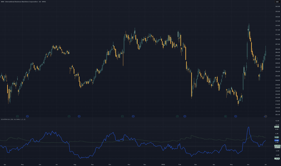
GreenStar ATR% Extension MonitorGreenStar ATR% Extension Monitor
The GreenStar ATR% Extension Monitor answers two questions in one window:
1) How volatile is the name? (14-period ATR as a percent of price)
2) How far has price stretched from a moving average, in relation to historical data?
Some names routinely stretch to 10-12x before mean-reverting. Others rarely clear 5x.
Scroll back on a daily chart to see extension habits for that symbol.
Why extension matters
Dollar distance from a 50-day MA does not compare a $15 name to a $400 name.
Dividing percent gain from the MA by ATR% provides a multiple of normal daily range.
That is the blue xFromMA line.
The green ATR% stepline shows the denominator: typical range relative to price.
These are separate formulas on the same pane and timeline to show correlation.
(It does not draw on the price chart.)
Two plots with independent calculations
ATR% (green stepline): 14-period ATR as a percent of price. Typical daily range relative to price level.
xFromMA (blue line): how many ATR% units price sits above or below the MA.
ATR% = ATR(14) / close x 100
xFromMA = ((close - MA) / MA x 100) / ATR%
Zero on xFromMA means price is at the MA.
A negative value indicates price is currently below the MA level.
Reading the pane
Both lines declining together often means the name is compressing toward the MA. Volatility and stretch easing at the same time.
Both rising means it's expanding.
Diverging slopes happen too.
xFromMA climbing while ATR% falls can mean price drifting from the MA while day-to-day volatility cools.
Read each line first, then note whether they agree.
Note: The lines share a pane for context, not because they combine into a signal.
A green/blue touch or cross is not a buy or sell event.
Visible-range markers (optional)
High, low, and mean for xFromMA are calculated from the visible bars on the chart.
There is no fixed lookback period.
They update on scroll or zoom, comparing current stretch to recent visible history.
The mean is the average xFromMA over those visible bars, not the midpoint between high and low.
Visible-range mean requires high/low lines enabled in the same settings group.
Optional zero line (dotted): xFromMA = 0, full width of the pane.
ATR% high/low bands exist too, off by default.
Settings
MA period (default 50)
MA type (default SMA)
ATR period (default 14)
Line colors and widths (default: dark green ATR%, blue xFromMA)
Zero line (default on)
High/low bands, xFromMA (default on)
Visible-range mean (default on)
ATR% high/low bands (default off)
Disclaimer
Context tool only. Not a signal, not financial advice. No entry or exit triggers. Past extension habits do not predict future price action.
Indicador
Indicador

Multi Talent Tool ProThis Multi Talent Tool Pro
Is a comprehensive, all-in-one TradingView indicator designed to streamline your technical analysis by centralizing three critical trading components into one clean, professional interface.
Key Features
Multi-EMA Suite: Includes eight customizable Exponential Moving Averages (9, 15, 20, 25, 50, 100, 200, 400). You can toggle each one on/off, change colors, and adjust line thickness directly from the settings.
Higher Timeframe (HTF) Dashboard: Provides a "Heads-Up" view of market structure by drawing the last three candles of a higher timeframe directly onto your current chart. It features a smart-tinted background that changes color based on the HTF trend (Bullish vs. Bearish) and includes a live countdown timer until the next HTF candle closes.
Automated Pattern Recognition: Identifies high-probability reversal and indecision signals, specifically Bullish/Inverted Hammers, Dojis, and Engulfing Patterns. These are plotted as clean, professional labels directly on the chart for quick visual reference.
Server-Side Alerts: Every feature is alert-enabled. You can set custom triggers for EMA crossovers, pattern detection, and HTF candle closures, ensuring you never miss a trade setup even when you aren't looking at the screen.
Why It's a "Pro" Tool
Instead of cluttering your chart with multiple indicators, this tool uses garbage collection logic to ensure your screen remains clean. The HTF drawings and pattern labels are calculated to be unobtrusive, allowing you to maintain focus on your primary trading strategy while having all necessary context at your fingertips.
Quick Setup Guide
Right Margin: For the HTF candles to display clearly, right-click your price scale > Settings > Canvas > set your Right Margin to 25 or more.
Alerts: Access these by clicking the clock icon on the right sidebar. Select Multi Talent Tool Pro as the condition, and choose your preferred signal from the dropdown list.
This tool is optimized for traders who demand high-level situational awareness without the distraction of a "busy" chart. Indicador

Smart Ichimoku | GainzAlgoOverview
Most Ichimoku indicators give you the same signal everyone else gets, a raw cloud cross with no filter, no context, and no target. This indicator rethinks the system from the ground up by combining a smoothed Ichimoku cloud with an inline logistic regression classifier that scores every cloud break in real time, then projects statistically-derived price targets the moment a confirmed signal fires.
The result is a cleaner, higher conviction version of one of the most respected trend frameworks in technical analysis.
The Foundation: Why Smooth the Ichimoku?
Traditional Ichimoku uses simple high-low midpoints (Donchian midlines) for its Tenkan, Kijun, and Senkou components. This makes the cloud visually choppy and prone to false crosses on noisy, volatile instruments like crypto or high-beta equities.
This indicator replaces all three components with Hull Moving Averages (HMA), which are designed to be simultaneously smooth and responsive, reducing lag without the whipsaw of standard smoothing. The cloud body itself becomes cleaner, the baseline is less noisy, and the cross events that trigger signals are more structurally meaningful.
All default periods match classic Ichimoku settings (9 / 26 / 52 / 26 displacement) so the logic stays true to the original system, it's just rendered with better math underneath.
The Signal: Logistic Regression Cloud Break Classifier
Here's where this indicator separates itself. A cloud cross alone is not a signal, it's a candidate. What actually matters is whether the market conditions at the moment of the cross are consistent with a real, sustained breakout or breakdown.
The classifier answers that question with a probability score.
How it works
At the exact bar where price exits the cloud body, four normalized features are computed and fed into a logistic regression model:
1. RSI (centered at 50, scaled by 25)
Measures momentum. On a bearish break, is RSI already extended to the downside? On a bullish break, is it pointing up? RSI near 50 adds little conviction; RSI at 30 on a bear break adds a lot.
2. Stochastic Oscillator (centered at 50, scaled by 25)
Short-term overbought/oversold confirmation. Works similarly to RSI but captures faster-cycle momentum, giving the model a second read on the same question.
3. Z-Score (price vs 20-bar mean, normalized by standard deviation)
Measures how statistically extended price is relative to recent history. A cloud break accompanied by a Z-Score of -2 is much more meaningful than one at Z = -0.2. This feature effectively asks: "Is this break happening from an already-stretched position?"
4. Cloud Break Depth (normalized by ATR)
How far did price close through the cloud boundary, relative to recent volatility? A close that barely clips the edge is very different from one that punches through by a full ATR. This is the most direct measure of breakout conviction.
The Math
Each feature is multiplied by a weight and summed into a single score (z). That score is passed through the sigmoid function:
P = 1 / (1 + e^(-z))
This compresses the output to a probability between 0 and 1. If the probability clears the threshold (default 0.60), the break is confirmed and a signal fires. Below threshold, the cross is rejected — instead of being ignored, it's labeled with a risk tier so you can see exactly how close (or far) it came to confirming.
The probability score is displayed as a small percentage label directly on the signal bar so you always know how strong the classifier rated that particular break.
Self-Calibrating Weights — No Manual Tuning
Unlike a typical multi-feature model, none of the four weights are set by hand. Each one is derived automatically from that feature's own rolling correlation with next-bar returns, recalculated continuously over a user-set lookback window (the "Self-Calibration Window," default 100 bars).
In practice this means: if RSI has been a genuinely useful predictor of direction on this instrument and timeframe recently, its weight rises on its own. If Z-Score has been mostly noise in the current regime, its weight shrinks toward zero — automatically, without anyone touching a slider.
This was a deliberate design choice. Letting people hand-tune regression weights invites a lot of well-intentioned guesswork that usually overfits to a handful of recent candles. By having the model score its own features based on demonstrated, rolling predictive power, the classifier adapts to changing market conditions instead of running on opinions baked in at setup time.
Rejected Crosses: Risk-Tiered Labels
Not every cloud cross clears the threshold, and that's the point. Rather than silently discarding rejected crosses, this indicator labels every one of them with a risk tier so you know exactly what the model saw and how close it came to confirming:
Low Risk: Probability fell just short of the threshold (within 10 points below). A near-miss — the break had real conviction behind it, it simply didn't clear the bar.
Moderate Risk: Probability landed meaningfully below threshold (10–25 points). A weaker break with mixed signals underneath it.
High Risk: Probability came in far below threshold (25+ points). A break with little to no underlying conviction — most consistent with chop or noise.
Each label shows its tier and the actual probability (e.g. "Low Risk ▼ 54%"), so nothing is a black box. A cluster of Low/Moderate Risk labels in one zone often signals a contested area that's likely to resolve into a real breakout once it's worked through — useful context even though no trade signal fired. These labels can be toggled off entirely in settings if you'd rather only see confirmed signals.
The Targets: Mean, Median, Mode
Once a confirmed break fires, three dashed horizontal target lines project from the signal bar. These are not arbitrary multiples, they are derived from the actual statistical distribution of bar-to-bar price moves over the lookback window.
Mean (Yellow): The average absolute bar move over the lookback period, scaled by the target multiplier. This is the "expected" target under normal conditions.
Median (Cyan): The 50th percentile of historical moves. Because move distributions are right-skewed (a few large moves pull the mean up), the median is typically more conservative than the mean and often a more realistic first target.
Mode (Hot Pink): The most frequently occurring move size, derived by bucketing historical moves into ATR-width bins and finding the most populated bin. This represents what the market most commonly does — not what it averages, not the middle value, but the single most likely outcome based on observed frequency.
Together, the three targets give you a realistic range rather than a single arbitrary level — grounded in what this instrument has actually done over the recent past. Bull and bear target sets are tracked independently, so a new bearish break won't erase an active bullish target set still in play, and vice versa.
The Target Multiplier (default 3×) scales all three targets proportionally. Lower it for tighter, shorter-term targets; raise it for swing trades or higher-volatility instruments.
Reading the Chart
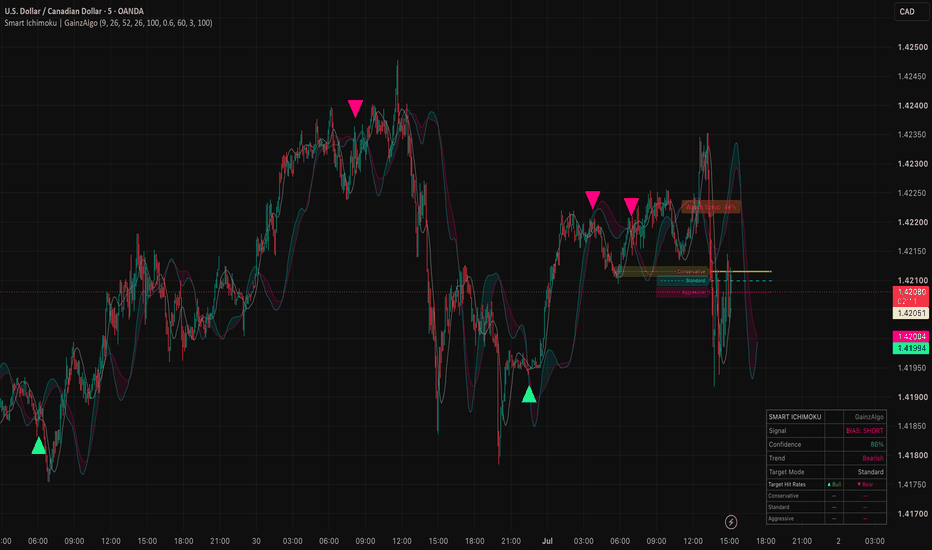
Green triangle (▲) below bar: Confirmed bullish cloud break. Price has exited the top of the cloud with sufficient classifier probability. Three upward target lines appear.
Pink triangle (▼) above bar: Confirmed bearish cloud break. Price has exited the bottom of the cloud with sufficient classifier probability. Three downward target lines appear.
Percentage label: The LR probability score for that break (e.g. "73%"). Higher is stronger.
Risk-tiered label (amber/orange/red): A cloud cross that was rejected, with its tier and probability shown.
Yellow dashed line: Mean target
Cyan dashed line: Median target
Hot pink dashed line: Mode target (thicker, as it represents the highest-frequency outcome)
Settings Guide
Smooth Ichimoku
Tenkan / Kijun / Senkou Period: Standard Ichimoku periods. Default 9/26/52 follows the classic system. Shorter periods = more sensitive, more signals. Longer = slower, fewer but stronger signals.
Displacement: How far forward the cloud is projected. Default 26.
Break Classifier
Self-Calibration Window: How many past bars the model uses to learn each feature's weight from its recent correlation with price moves. Shorter windows adapt faster to regime changes but can be noisier; longer windows are more stable but slower to react. Default 100.
Break Probability Threshold: The minimum probability required to confirm a signal. Default 0.60. Raise toward 0.75+ for fewer, higher-conviction signals. Lower toward 0.50 to see more cloud breaks confirmed (effectively turns the filter off at 0.50).
Targets
Lookback (bars): How many bars of historical move data to use for the distribution calculation. Default 60. Longer lookback = more stable targets based on longer-term behavior. Shorter = more reactive to recent volatility.
Target Multiplier: Scales all three target lines proportionally from the signal close. Default 3×. Adjust based on your timeframe and typical holding period.
Risk Labels
Show Risk Labels on Rejected Crosses: Toggles the Low/Moderate/High Risk labels on rejected cloud crosses. Off by default for a cleaner chart; turn on to see every cross the model evaluated, not just the confirmed ones.
How to Use It
As a trend confirmation tool: Use the cloud direction (cyan dominant = bullish structure, pink dominant = bearish) as your bias filter, and only trade signals that align with the cloud color. Bull signals below a cyan cloud, bear signals above a pink cloud.
As a breakout entry trigger: Wait for price to consolidate inside or near the cloud, then take the confirmed break as an entry signal. The probability label tells you how much conviction the model has at that moment.
Using rejected crosses as context: A string of Low Risk labels in a zone suggests the cloud is being tested seriously without quite breaking — often a precursor to a real move once the level finally gives.
For target setting: Use the median as a conservative first target, the mean as a mid-range objective, and the mode as a guide to where the most "normal" move tends to land. The hot pink mode line is often the most useful for setting realistic profit expectations.
For alerts — Four alert conditions are built in: "Confirmed Bull Break," "Confirmed Bear Break," "Rejected Bull Cross," and "Rejected Bear Cross." Set them on your preferred timeframe and let the classifier notify you rather than watching the chart.
Timeframe Notes
This indicator works across all timeframes but behaves differently depending on context:
1H–4H: Good balance of signal frequency and reliability. Recommended starting point.
Daily: Fewer signals, higher structural significance. Best for swing traders.
15m and below: More signals, more noise. Consider raising the threshold to 0.65–0.70 and reducing the lookback to 30. Watch the risk-tiered labels here in particular — they're most useful for filtering chop on fast timeframes.
Example on the Daily with SPY ETF:
Example on the 4 Hour with BTCUSD;
Example on the 15 Minute with QQQ:
A Note on the Model
The logistic regression here is not trained on historical data in the machine learning sense, and it no longer relies on manually-set weights either. Each feature's weight is derived from its own rolling correlation with subsequent price action, recalculated continuously. Think of it less as a black-box ML model and more as a structured, self-adjusting way to combine four momentum and positioning indicators into a single probability score, similar to our Directional Logistic Oscillator.
The advantage over a traditional multi-condition filter (RSI < 40 AND stoch < 30 AND...) is that the sigmoid function produces a continuous probability rather than a binary pass/fail, which means the model degrades gracefully, a break with three strong features and one neutral one still scores well, rather than getting blocked by an arbitrary threshold on the weak feature. And because every rejected cross is shown with its tier and score rather than discarded silently, nothing the model does is hidden from you.
We hope you enjoy! Indicador
Indicador
Indicador
Indicador

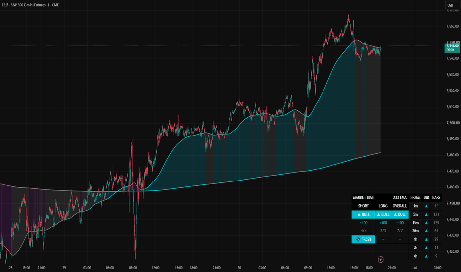
STRYK Market BiasMulti-timeframe EMA-alignment dashboard: short-term, long-term, and overall bias boxes, plus an optional two-line color band.
# STRYK Market Bias
A multi-timeframe EMA-alignment dashboard. It reads one moving average across several timeframes at once and summarizes how those timeframes line up into two composite readings — a short-term read and a long-term read — plus a combined overall read. It can also draw a two-line band on the chart. This is a descriptive context tool for discretionary analysis. It does not generate buy or sell signals.
## What it does
For each of several timeframes, it checks whether price is above or below that timeframe's EMA. Above reads bull, below reads bear. Those individual reads are combined into a weighted score for each group and shown as simple BULL / BEAR / NEUTRAL boxes, so you can see multi-timeframe alignment at a glance instead of loading the same moving average on seven separate charts.
## How it works
**One EMA, many timeframes.** A single EMA length (default 233) is applied to each timeframe: fast frames (5m / 15m / 30m, with an optional 1m) and slow frames (1h / 2h / 4h). All higher-timeframe values are taken from the last closed bar by default, so they do not repaint.
**Each frame votes.** Price above its EMA = +1 (bull), below = −1 (bear).
**Two composites, weighted differently on purpose:**
- **Short-term** emphasizes *freshness*. A fast frame that has just flipped receives a temporary extra weight that decays back to normal over a set number of bars, so recent changes on the fast frames carry more emphasis than stale ones.
- **Long-term** emphasizes *persistence*. The longer a slow frame has held its side, the more its vote weighs (up to a cap), so a slow frame that has stayed on one side for a long time carries more of the read.
Each group's score runs from −100 to +100 and is mapped to BULL / BEAR / NEUTRAL with an adjustable threshold. The **Overall** box is a blend of the two (default 60% long-term / 40% short-term, adjustable). A **fresh flag** lights when a fast frame flips within the fresh window in the same direction as the short-term read.
**Per-frame grid (optional).** Expand it to see every timeframe's own arrow and its own bars-since-flip, so you can tell which timeframe is driving or breaking the score.
## The band (optional)
Pick any two timeframes (default 1m and 4h). The EMA of each is drawn as a line and the area between them is filled. The band and lines are colored by where price sits relative to the two lines: above both, between them, or below both. A **fade** option holds the current color until price stays in a new zone for a set number of bars, so a brief poke into the band does not immediately change the color.
## How to use it
Treat it as context, not instructions. When all the boxes agree and sit at their extremes, the timeframes are simply aligned. The more informative moments are when the short-term and long-term reads diverge, or when a fresh flip appears against the current read. Use the per-frame grid to see exactly which timeframe is responsible.
Everything is adjustable: the EMA length and source, which timeframes are used, the weighting mode per group, the fresh and persistence settings, the threshold and overall blend, and the band and its colors, transparency and fade.
## Notes
- With non-repaint on (default), higher-timeframe reads are delayed by one bar of that timeframe in exchange for values that do not change after the fact. Turn it off for live intrabar values, which repaint.
- Timeframes smaller than your chart timeframe are sampled at chart resolution.
- Alerts are provided for short-term, long-term, and overall state changes.
## Disclaimer
This script is for informational and educational purposes only. It does not produce buy or sell signals and makes no claim about future results. Do your own analysis and manage your own risk. Indicador
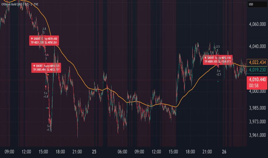
Auto Fib + EMA200 MTF [SamoAlgo] - FIXED# Auto Fib + EMA200 MTF
**A multi-timeframe trend-confirmation strategy combining automatic Fibonacci retracement detection with EMA200 alignment across four timeframes.**
## Overview
This strategy automatically detects swing structures (pivot highs/lows) and looks for high-probability retracement entries at a configurable Fibonacci level (default 61.8%), but only when the broader trend is confirmed across multiple timeframes simultaneously.
Unlike simple Fib tools that fire on every retracement, this script requires trend agreement across 1m, 5m, 15m, and 60m EMA200 readings before considering an entry valid — reducing false signals during choppy, directionless conditions.
## How it works
**1. Swing & Fibonacci detection**
The script identifies confirmed pivot highs and lows (adjustable strength), measures the swing size against current ATR to filter out insignificant moves, and calculates an entry zone at your chosen Fibonacci retracement level. Setups expire automatically after a configurable number of bars if price never reaches the entry zone.
**2. Multi-timeframe trend filter**
Before any entry, the script checks EMA200 position across four timeframes (1m/5m/15m/60m). You control how many of the four must agree (1–4) — requiring all four is strictest; lowering the threshold allows more signals during transitional market conditions.
**3. Risk management**
- Position sizing is equity-based (% risk per trade)
- Stop and target can be ATR-based or Fibonacci-extension based (your choice)
- Optional minimum Risk:Reward filter — trades below your threshold are skipped
- Optional ADX-based trend-strength filter to avoid ranging markets
- Optional max-trades-per-day cap
- Optional cooldown period between trades to avoid clustering on the same swing
**4. Visual feedback**
Confirmed trades (not just signals — actual filled positions) draw persistent entry/stop/target lines and a labeled marker directly on the chart, so every alert you receive corresponds to a real, verified trade in the strategy's backtest.
## Inputs (fully customizable)
- Pivot strength, Fib entry level, Fib target extension, minimum swing size
- ATR-based or Fib-based stop/target
- Risk % per trade
- EMA200 length and timeframe-agreement threshold
- Volatility filter, session filter, ADX filter, R:R filter, daily trade cap, cooldown
- Independent long/short enable toggles
## Important notes
- This is a **strategy** script (uses `strategy()`), meaning results shown are backtested performance, not a guarantee of future results. Always forward-test on a demo account before risking real capital.
- The multi-timeframe EMA filter is inherently asymmetric to current market regime: in a sustained downtrend it will naturally favor short setups (and vice versa in an uptrend). This is expected behavior of trend-following logic, not a bug — adjust the timeframe-agreement threshold if you want more balanced signal frequency across both directions.
- `request.security()` calls use `barmerge.lookahead_off` — no repainting from future data.
- Past performance, including any results shown on the published chart, does not guarantee future performance. Trade at your own risk and use proper position sizing.
— SamoAlgo Estratégia
Indicador

Indicador

Indicador

Adaptive Supertrend [ForexCracked]🔷 OVERVIEW
Adaptive Supertrend is a trend-following tool that automatically adjusts its sensitivity to current market volatility. A classic Supertrend uses one fixed factor, which whipsaws in choppy conditions and lags in calm ones. This version measures the live volatility regime and scales the ATR factor between a low and a high setting, so the trail tightens when volatility is low and widens when volatility is high.
🔷 CONCEPTS
Supertrend trails price using an ATR band whose width is set by a "factor." Instead of one fixed factor, this script ranks the current ATR against its own recent range (a 0–100 volatility percentile) and maps that rank onto a factor between your Min and Max settings:
• Low volatility → smaller factor → tighter trail, earlier signals. • High volatility → larger factor → wider trail, fewer false flips.
🔷 HOW TO USE
• Stay with the trend while the line sits below price (up) or above price (down). • A flip of the line marks a potential trend change, shown with a Buy or Sell label. • Read the Info panel for the live trend and the current volatility regime (Low / Medium / High). • Combine it with structure or support and resistance for confirmation, and always use a stop. No single indicator is a complete system.
🔷 SETTINGS
• ATR Length — lookback for the ATR band. • Min Factor / Max Factor — the range the factor adapts between. • Volatility Lookback — bars used to rank the current volatility. • Style — Buy/Sell labels, gradient fill, info panel, bar coloring, and colors.
🔷 ALERTS
• Buy (flip up) and Sell (flip down).
Free and open-source. Educational tool, not financial advice. Indicador

Indicador

MTF MA Cross Table Pro**Multi-Timeframe MA Cross**
Multi-Timeframe MA Cross is a moving average dashboard and overlay tool designed to help traders quickly see whether price is trading above or below key exponential moving averages across multiple timeframes.
The indicator displays a table showing the relationship between price and the selected EMA lengths across several major timeframes, including:
* 1 Minute
* 5 Minute
* 15 Minute
* 1 Hour
* 4 Hour
* 1 Day
* 1 Week
Each timeframe is checked against the 20, 50, 100, and 200 EMA.
The table shows whether price is **Above** or **Below** each moving average.
**Table Colour Rules**
* **Green** = price is above the selected EMA
* **Red** = price is below the selected EMA
This gives a quick visual map of trend strength and moving average positioning across multiple timeframes.
**Main Features**
* Multi-timeframe EMA dashboard
* Tracks 20, 50, 100, and 200 EMA conditions
* Green/red table cells for fast trend reading
* Adjustable MA lengths
* Adjustable table text size
* Current timeframe EMA overlays
* Optional 20, 50, 100, and 200 EMA plots
* Optional weekly EMA overlays
* Designed for quick multi-timeframe trend confirmation
**Overlay Moving Averages**
The indicator can also plot moving averages directly on the chart, including:
* Current timeframe 20 EMA
* Current timeframe 50 EMA
* Current timeframe 100 EMA
* Current timeframe 200 EMA
* Weekly 20 EMA
* Weekly 50 EMA
* Weekly 100 EMA
Each moving average can be turned on or off from the settings panel.
**Suggested Use**
This indicator can be used to quickly assess whether price is aligned above or below important moving averages across short-term, intraday, daily, and weekly timeframes.
It may help traders identify broader trend alignment, support and resistance zones, and areas where multiple timeframe moving averages are acting as confirmation.
For example, if price is above the 20, 50, 100, and 200 EMA across multiple higher timeframes, this may suggest stronger bullish trend alignment. If price is below those averages, it may suggest weaker or bearish conditions.
**Disclaimer**
This indicator is designed as a visual trend and moving-average reference tool only. It is not financial advice and should not be used on its own for trade entries or exits. Always combine it with your own analysis, market structure, risk management, and trading plan.
Indicador

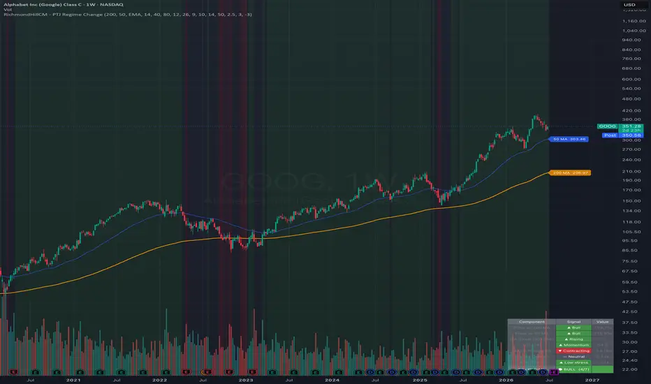
RichmondHillCM - PTJ Regime ChangePTJ Regime Change — Bull / Bear / Neutral Market Gauge
A composite market-regime indicator inspired by the trend-following, 200-day-moving-average philosophy popularised by Paul Tudor Jones. Instead of relying on a single signal, it polls s even independent technical components, each casting a +1 (bullish) or −1 (bearish) vote, then sums them into one score from −7 to +7 and classifies the market into a Bull, Bear, or Neutral regime.
The 7 components:
Price vs 200 MA — primary trend filter
Price vs 50 MA — intermediate trend filter
MA slope — are both averages rising?
RSI — momentum inside a healthy band (not weak, not euphoric)
MACD histogram — momentum expanding vs contracting
Volume — does volume confirm the day's direction?
ATR stress — is volatility calm or spiking?
How to use it:
• Background and candle colours show the live regime at a glance.
• The bottom-right table breaks down every component, its signal, and the total score.
• Optional labels mark the exact bar where the regime flips.
• Built-in alerts for regime changes, 200-MA crosses (above/below), and RSI blow-off/euphoria warnings.
Every input is configurable: MA type (SMA/EMA) and lengths, RSI/MACD/ATR settings, volume period, and the bull/bear score thresholds — so you can tune sensitivity to your symbol and timeframe.
Works on any symbol and any timeframe.
Credits: methodology inspired by Paul Tudor Jones' trend/200-MA approach; original scoring framework concept by RichmondHillCM.
Disclaimer: For educational purposes only. This is not financial advice and does not guarantee future performance. Always do your own research. Indicador

Time Flow Money Flow DashboardTime Flow Money Flow Dashboard is a multi-timeframe bias and execution dashboard designed to show money-flow direction, dot signals, divergence, and 1/16th strategy alignment in one compact row.
Each box represents a configurable higher timeframe. The box turns green when smoothed Money Flow Index is rising and red when it is lowering. The dashboard also reports whether that timeframe has a fresh green dot, red dot, or no new dot.
The script includes:
• Multi-timeframe money-flow direction
• Green dot / red dot flip detection
• Bullish and bearish money-flow divergence detection
• 1/16th strategy alignment
• Automatic lower-timeframe derivation from each higher timeframe
• Lower-timeframe EMA crossover confirmation
• Configurable dashboard position
• Configurable MFI length, smoothing, divergence pivots, and EMA crossover settings
The 1/16th strategy logic uses the higher timeframe for directional bias and the 1/16 lower timeframe for execution timing. A long setup appears when higher-timeframe bias is bullish, lower-timeframe money flow is rising, and the lower timeframe fast EMA crosses above the slow EMA. A short setup appears when higher-timeframe bias is bearish, lower-timeframe money flow is lowering, and the lower timeframe fast EMA crosses below the slow EMA.
This tool is intended as a visual confluence dashboard, not a standalone buy/sell system. Always confirm with market structure, liquidity, volume, and risk management.
Indicador

Indicador

Indicador

Indicador
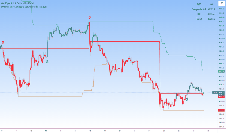
Ultimate Moving Averages Crossover1. Massive Moving Average Library (19 Types)
Instead of loading a different indicator for each type of average, this script has a built-in mathematical library that calculates 19 unique MA formulas. You can select any of these for each line:
Basic MAs: SMA (Simple), EMA (Exponential), WMA (Weighted)
Smoothed MAs: RMA (Running), HMA (Hull), DEMA (Double EMA), TEMA (Triple EMA), ZLEMA (Zero-Lag EMA)
Adaptive MAs: KAMA (Kaufman Adaptive), FRAMA (Fractal Adaptive), VAMA (Volatility Adjusted), McGinley Dynamic
Advanced MAs: ALMA (Arnaud Legoux), LSMA (Least Squares / Regression), TMA (Triangular), T3 (Tillson)
Volume Weighted MAs: VWMA (Standard Volume Weighted), EVWMA (Elastic Volume Weighted)
Symmetrical MAs: SWMA (Symmetrically Weighted)
2. Multi-Line Architecture (Up to 10 Lines)
You can plot up to 10 independent moving average lines on a single chart. For each line, the settings UI allows you to fully configure:
Toggle On/Off: Only plot the lines you need.
Type Selection: Choose any of the 19 types from the dropdown.
Source Data: Calculate based on close, open, high, low, hl2, hlc3, etc.
Length (Period): Define the lookback period (e.g., 20, 50, 200).
Visuals: Customize the color and line thickness.
3. Integrated Crossover Engine
The script functions as a built-in crossover scanner. You can explicitly assign any of the 10 MAs to act as your "Fast MA" and "Slow MA":
Visual Signals: When the Fast MA crosses above the Slow MA, it plots a green "Bullish Cross" triangle below the candle. When it crosses below, it plots a red "Bearish Cross" triangle above the candle.
Automated Alerts: It includes alertcondition functions. You can set up TradingView alerts to ping your phone or webhook when a "Bullish MA Crossover" or "Bearish MA Crossover" occurs.
Summary
In essence, it is an All-in-One Trend & Confluence Hub. By combining 19 algorithms, 10 customizable lines, and an automated crossover detection system, it gives you complete freedom to build any moving average strategy—like a 3-EMA ribbon, a Golden Cross scanner, or a Hull MA scalping setup—without ever leaving the script's settings. Indicador

Ultimate Hull SuiteGreymyst Ultimate Hull Suite
The Greymyst Ultimate Hull Suite is a premium, multi-functional trend-following indicator designed to provide traders with highly accurate, low-lag momentum signals. Built entirely from the ground up for professional trading, this suite combines advanced Moving Average variations with dynamic volatility filters and multi-timeframe analysis to offer extreme confluence in a single tool.
🌟 Core Concepts & Features
1. Advanced Hull Variations
Traditional moving averages often suffer from lag. The Hull Moving Average solves this by prioritizing recent price action. This suite allows you to toggle between three powerful variations:
HMA (Standard Hull): The classic low-lag moving average.
EHMA (Exponential Hull): Uses exponential calculations to react even faster to sudden price spikes.
THMA (Triple Hull): Offers ultra-smooth trend detection, practically eliminating market noise and false signals during choppy ranges.
2. Multi-Timeframe (MTF) Alignment
Trading against the macro trend is a common pitfall. The built-in MTF engine allows you to anchor your Hull Moving Average to a higher timeframe (e.g., viewing the 4-Hour Hull trend on a 15-minute chart). This ensures you are only taking trades that align with the dominant market direction.
3. Dynamic Volatility Bands (Hull Envelopes)
Instead of static support and resistance, this suite wraps the Hull Moving Average in ATR-based Volatility Bands.
Trend Cloud: The area between the Hull and the bands is filled with a bullish (green) or bearish (red) cloud.
Mean Reversion: When price action aggressively pierces the upper or lower bands, it signals an overextended market, warning you of potential pullbacks or mean-reversion opportunities.
4. Squeeze Momentum Confluence Filter
A trend is only as strong as the volume and volatility behind it. This indicator integrates a hidden Squeeze Volatility Engine (combining Bollinger Bands and Keltner Channels).
The Filter: Buy and Sell signals are strictly suppressed if the market is stuck in a low-volatility "squeeze" (consolidation).
Signals are only generated when the Hull changes direction AND volatility is actively expanding, keeping you out of flat, choppy markets.
5. Automated Signals & Alerts
The suite visually prints clear B (Buy) and S (Sell) markers on your chart when high-probability confluence is met (Trend Shift + Volatility Expansion).
It includes comprehensive, ready-to-use Alert Conditions so you can automate your trading via webhooks or receive notifications directly to your phone.
⚙️ How to Use It for Confluence
Trend Confirmation: Use the color of the Hull MA (Green for Up, Red for Down) as your primary directional bias.
Entry Triggers: Look for Buy/Sell markers printed by the indicator. Because of the built-in Squeeze filter, these markers represent moments where price is reversing with momentum.
Take Profit / Stop Loss: Use the outer ATR bands as dynamic profit targets or trailing stop-loss zones.
(Created by greymyst) Indicador