Liquidity Zones + VWAP & EMA SystemLiquidity Zones + VWAP & EMA System
Educational Guide for New Traders
⚠️ IMPORTANT DISCLAIMER
This indicator is provided for educational purposes only. It is not financial advice, investment advice, or a recommendation to buy or sell any financial instrument. Trading involves substantial risk of loss and is not suitable for every investor. Past performance of any trading system or methodology is not indicative of future results. You are solely responsible for all trading decisions you make. Always consult a licensed financial advisor before making any investment decisions. The creator of this indicator accepts no liability for any losses incurred from the use of this tool.
What Is This Indicator?
The Liquidity Zones + VWAP & EMA System is a multi-layered technical analysis tool designed to help traders identify:
Where significant market orders are concentrated (Liquidity Zones)
What the current trend and momentum direction is (VWAP + EMA System)
Whether the market is bullish, bearish, or neutral (Sentiment Background)
A real-time summary of all signals (Dashboard)
This indicator combines four powerful concepts into one clean, easy-to-read tool — making it especially useful for traders who want to understand market structure without switching between multiple charts.
Part 1 — Liquidity Zones
What Are Liquidity Zones?
Liquidity zones are price areas where a large number of buy or sell orders are likely to be sitting. These zones form around swing highs and swing lows — price levels where the market has previously reversed. Institutional traders (banks, hedge funds, market makers) tend to place large orders at these levels, which is why price often reacts strongly when it returns to them.
What Does the Indicator Show?
Each zone is drawn as a colored horizontal band:
🟢 Teal/Green zone — More bullish volume was traded at this level (buyers in control)
🔴 Red zone — More bearish volume was traded at this level (sellers in control)
⚫ Gray zone — Balanced between buyers and sellers (neutral)
The Label — Bull %, Bear % and Delta (Δ)
Each zone shows three pieces of information:
Label Part What It Means R or SR = Resistance (zone above current price) / S = Support (zone below) Price The exact price level of the zone Bull % / Bear %How much of the volume at that level was buying vs sellingΔ (Delta)The difference between bull and bear volume. Positive = more buyers. Negative = more sellers.
Example: A label reading S 1.2345 — 68% Bull / 32% Bear Δ +15,230 means:
This is a Support zone at price 1.2345
68% of the volume traded here was bullish (buyers)
The delta of +15,230 confirms buyers dominated
This is considered a high-probability support zone to watch for bounces
How to Use Liquidity Zones
✅ Look for price to return to a zone — when price pulls back to a bull-dominated support zone, it may bounce upward. When price rallies into a bear-dominated resistance zone, it may reject downward.
✅ Stronger zones have a higher bull/bear % skew — a 75% bull zone is stronger than a 55% bull zone.
✅ A large positive delta at a support zone means institutions were buying heavily there — price is likely to be defended when it returns.
⚠️ Zones can break — if price closes strongly through a zone with high volume, the zone may no longer hold. Always use a stop loss.
Part 2 — VWAP (Volume Weighted Average Price)
What Is VWAP?
VWAP stands for Volume Weighted Average Price. It is the average price of an asset, weighted by how much volume was traded at each price level. It resets at the start of each session (or week/month, depending on your settings).
VWAP is one of the most widely used tools by institutional traders and market makers because it represents the true "fair value" of an asset for the day.
The Golden Rule of VWAP
Price above VWAP = Bullish. Price below VWAP = Bearish.
When price is above VWAP, it means buyers are in control and the market is trading above its fair value — a bullish sign.
When price is below VWAP, sellers are in control — a bearish sign.
VWAP Bands (±1σ and ±2σ)
The indicator also shows standard deviation bands around VWAP:
BandMeaning+1σ (upper band 1)Price is moderately extended above fair value+2σ (upper band 2)Price is significantly overextended — potential reversal zone-1σ (lower band 1)Price is moderately extended below fair value-2σ (lower band 2)Price is significantly oversold — potential reversal zone
How to use the bands:
Price touching +2σ while overbought = consider tightening stops or watching for reversal
Price touching -2σ while oversold = potential buying opportunity (with confirmation)
Price bouncing off VWAP itself = strong continuation signal in the direction of the trend
Part 3 — EMA System (Exponential Moving Averages)
What Are EMAs?
An Exponential Moving Average (EMA) is a line that shows the average price over a set number of bars, with more weight given to recent prices. EMAs help identify the direction of the trend.
This indicator uses three EMAs by default:
EMA Default Length Purpose EMA 1 (Blue)9 bars Fast — shows short-term momentum EMA 2 (Orange)21 bars Medium — shows intermediate trend EMA 3 (Purple)200 bars Slow — shows the major long-term trend
How to Read the EMAs
All three EMAs pointing up + price above all three = strong uptrend
All three EMAs pointing down + price below all three = strong downtrend
EMA 1 crossing above EMA 2 = short-term bullish signal (golden cross)
EMA 1 crossing below EMA 2 = short-term bearish signal (death cross)
Part 4 — The Trend Sentiment Background
The chart background color gives you an instant visual summary of market sentiment:
Background Color Meaning🟢 Light Green Highly Bullish — price is above EMA 1, EMA 2, AND VWAP🔴 Light Red Highly Bearish — price is below EMA 1, EMA 2, AND VWAP⬜ No Color Neutral — mixed signals, no clear directional bias
The Most Powerful Setup
When the background is green AND price is approaching a teal (bull) liquidity zone from above — this is a high-probability long setup.
When the background is red AND price is approaching a red (bear) liquidity zone from below — this is a high-probability short setup.
Part 5 — The Dashboard (Top Right Table)
The dashboard gives you a real-time summary of everything at a glance:
Row What It Shows SENTIMENT Highly Bullish / Highly Bearish / Neutral vs VWAP How far price is from VWAP as a percentage vs EMA 1/2/3Whether price is above or below each EMABAR DELTA Current bar's bull volume minus bear volume VWAP BAND Which VWAP band price is currently in SIGNAL STRONG BUY / BUY / SELL / STRONG SELL / WAIT
Complete Trading Checklist (How to Use All Parts Together)
Before entering any trade, go through this checklist:
✅ For a Long (Buy) Trade:
Sentiment background is green (price above EMA 1, EMA 2, and VWAP)
Price is at or approaching a teal (bull-dominated) liquidity zone
Zone shows high bull % and positive delta
VWAP band shows price is above VWAP but not overextended past +2σ
Dashboard shows BUY or STRONG BUY
✅ For a Short (Sell) Trade:
Sentiment background is red (price below EMA 1, EMA 2, and VWAP)
Price is at or approaching a red (bear-dominated) liquidity zone
Zone shows high bear % and negative delta
VWAP band shows price is below VWAP but not overextended past -2σ
Dashboard shows SELL or STRONG SELL
❌ Avoid Trading When:
Background has no color (neutral/mixed signals)
Price is between liquidity zones with no clear level nearby
Dashboard shows WAIT
Volume is very low (no spike, ratio below 1x average)
Recommended Settings for Different Markets
Market VWAP Anchor EMA 1EMA 2EMA 3Stocks (Day Trading)Session921200ForexSession or Week921200CryptoSession921200Swing TradingWeek2150200
Important Risk Management Rules
⚠️ Never risk more than 1-2% of your account on any single trade.
Always use a stop loss — place it just below the liquidity zone for longs, just above for shorts
Never trade against the major trend (EMA 200 direction)
Wait for confirmation — do not enter the moment price touches a zone; wait for a candle to close at or above/below the zone
The indicator does not guarantee profits — it is a tool to help identify probability, not certainty
Practice on a demo account first before using real money
Final Notes
This indicator works best when used alongside other analysis tools such as:
Support and Resistance levels
Candlestick patterns
Market Structure (Higher Highs, Higher Lows)
News and economic calendar awareness
No single indicator is 100% accurate. The goal is to stack multiple confirmations before entering a trade to improve your probability of success.
Trade safe. Manage your risk. Always keep learning.
This document is for educational purposes only and does not constitute financial advice. Trading carries significant risk of loss. Indicador

Indicador
Top Volume + EMAs + RSI [Chart TF] - Westtown TradesTop Volume + EMAs + RSI This powerful scanner displays a clean, real-time table of the top volume stocks from your chosen watchlist, sorted by today's trading volume. It combines high-volume activity with key technical signals (EMAs and RSI) all in one compact overlay-free table — perfect for quickly spotting momentum, unusual volume, and potential breakout candidates.Key Features:Volume Leaderboard — Shows today's volume, 7-day average volume, and the Volume Ratio (how many times above average).
Multi-Timeframe EMA Direction — Instant visual arrows (▲/▼) for EMA 10, 20, 50, and 200 on the chart's current timeframe.
RSI Analysis — Current RSI value with color coding: Green = Oversold
Red = Overbought
White = Neutral
Fully Customizable — Add any tickers (comma separated)
Choose how many to display (Top 5–25)
Table position, background colors, and header style
RSI length and levels
How to Use:Add your favorite tickers in the settings (default: NVDA, AAPL, MSFT, GOOGL, AMZN).
Set your desired number of rows and table position.
Switch chart timeframes — the indicator automatically updates volume, EMAs, and RSI for the active timeframe.
Look for high Volume Ratio + bullish EMA alignment + healthy RSI for strong momentum plays.
Ideal for day traders, swing traders, and momentum scanners who want to instantly see which stocks are seeing the heaviest activity combined with technical confirmation.Works on any chart timeframe and any symbol — the scanner runs independently of the chart’s main ticker.Pro Tip: Use this on a 5m or 15m chart during market hours to catch real-time volume surges.Enjoy spotting the next big movers!
Indicador

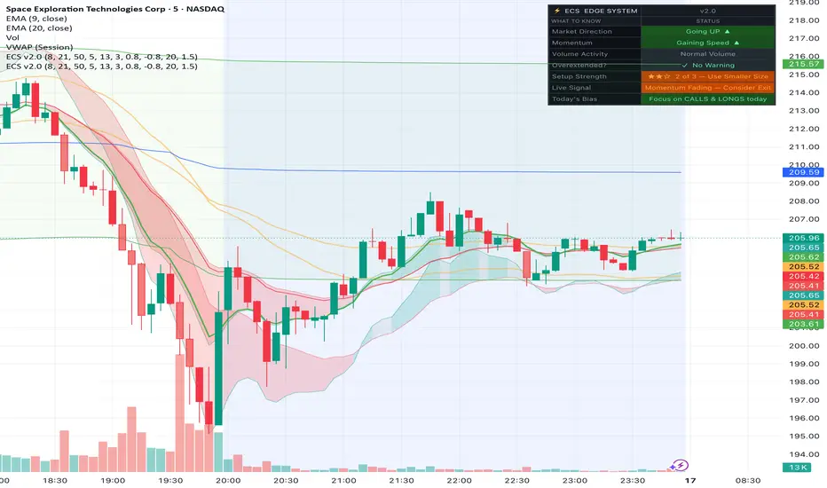
Edge Confirmation System (ECS) v2.0ECS — Edge Confirmation System v2.0
A multi-layer confluence indicator built for SPX and SPY options traders who scalp and day trade. Instead of relying on a single signal, ECS combines three independent layers — trend direction, momentum, and volume — and only fires a BUY or SELL label when all three agree. No more entering too early or chasing moves.
What's inside:
Trend Ribbon — Three EMAs (8, 21, 50) form a color-coded ribbon. Green means the market is moving up, red means down, grey means choppy. If the ribbon is grey, there is no trade.
Momentum Pulse — A custom normalized oscillator (not RSI, not MACD) that measures price velocity and filters out flat, low-energy moves before they waste your time or money.
Volume Surge Detector — Identifies candles where institutional-level volume is present. Entries are blocked on weak low-volume moves, which is where most retail traders get chopped up.
BUY / SELL Labels — Clean text labels print directly on price only when all three layers confirm. No clutter, no noise.
Live Dashboard — A real-time panel in plain English showing market direction, momentum, volume activity, setup strength (★★★ rated), live signal, and today's bias so you know whether to focus on calls or puts before the open.
5 Built-in Alerts — BUY signal, SELL signal, exit warning, and volume surge, ready to connect to your phone or automation.
This indicator does not repaint. Signals are confirmed on the current bar close. Past performance does not guarantee future results. Always use proper risk management. Indicador

TK Cloud v2
# TK Cloud v2: TradingView Technical Indicator Manual
**TK Cloud v2** is an institutional-grade, multi-faceted technical overlay engineered for Pine Script v6. By flipping the mechanics of the traditional Ichimoku Kinko Hyo system, this script replaces the standard Senkou Span "Kumo Cloud" with a dynamic, highly responsive cloud formed directly between the **Tenkan-Sen (Conversion Line)** and the **Kijun-Sen (Base Line)**.
To create a complete trading workstation in a single script, it integrates a customizable high-order **Moving Average** filter and an auto-anchoring **Multi-Timeframe VWAP (Volume-Weighted Average Price)**.
---
## 1. Core Structural Components
### The Modified TK Cloud
In standard Ichimoku systems, the cloud (Kumo) is projected 26 periods into the future, acting as a trailing support/resistance metric. **TK Cloud v2** utilizes the immediate relationship between the short-term and medium-term equilibriums:
* **Tenkan-Sen (Blue Line by default):** Calculated as the midpoint of the highest high and lowest low over the past 9 periods ($\frac{\text{Highest High} + \text{Lowest Low}}{2}$). It represents short-term market momentum.
* **Kijun-Sen (Red Line by default):** Calculated as the midpoint of the highest high and lowest low over the past 26 periods. It represents medium-term market equilibrium.
* **The Cloud Fill:** The script fills the exact structural space between these two lines.
* A **Bullish Cloud (Green)** forms when the Tenkan-Sen trades above the Kijun-Sen, indicating accelerating upward velocity.
* A **Bearish Cloud (Red)** forms when the Tenkan-Sen trades below the Kijun-Sen, flashing localized structural decay.
### Lagging Span (Chikou Span)
True to the traditional Ichimoku layout, the **Lagging Span** plots the current close price shifted backward 26 periods. This allows traders to visually check current price action against historical price action to identify potential blockades or breakouts without shifting focus away from the current bar.
### Custom Trend Filter (Moving Average)
To ensure traders remain on the correct side of the primary macro trend, the script provides a built-in Moving Average tool. It defaults to a **200-period Simple Moving Average (SMA)**, widely recognized as the institutional boundary line between bull and bear markets. Traders can seamlessly toggle this element on or off and swap between:
* **SMA** (Simple Moving Average)
* **EMA** (Exponential Moving Average)
* **WMA** (Weighted Moving Average)
* **HMA** (Hull Moving Average)
### Multi-Timeframe Anchored VWAP
Volume-Weighted Average Price is the ultimate benchmark for intraday and swing liquidity. **TK Cloud v2** implements an automated anchor selector that bypasses native Pine Script script limitations, allowing users to track structural VWAP levels across macro intervals regardless of what chart timeframe they are looking at:
* **Daily:** Resets calculations at the start of each trading session.
* **Weekly:** Resets at the opening bar of Monday's session.
* **Monthly / Quarterly / Yearly:** Tracks institutional and corporate flow benchmarks by anchoring calculations to the opening of major fiscal periods.
---
## 2. Parameter Configurations & Inputs
The user interface inside TradingView is cleanly compartmentalized into three primary input blocks for rapid adjustment:
| Setting Group | Variable Parameter | Default Input | Available Configurations |
| --- | --- | --- | --- |
| **Ichimoku Settings** | Tenkan-Sen Length | `9` | Any integer value ($>0$) |
| | Kijun-Sen Length | `26` | Any integer value ($>0$) |
| | Lagging Span Offset | `26` | Any integer value ($>0$) |
| **Moving Average Settings** | Show Moving Average? | `True` (Checked) | Boolean Toggle |
| | MA Type | `SMA` | Dropdown: `SMA`, `EMA`, `WMA`, `HMA` |
| | MA Length | `200` | User choice (e.g., `50`, `100`, `200`) |
| **VWAP Settings** | Show VWAP? | `True` (Checked) | Boolean Toggle |
| | VWAP Anchor | `Daily` | Dropdown: `Daily`, `Weekly`, `Monthly`, `Quarterly`, `Yearly` |
---
## 3. Practical Trading Strategies & Interpretations
### Strategy 1: The TK Cloud Compression & Expansion
Because the cloud tracks the distance between the 9-period and 26-period midpoints, the thickness of the cloud represents market volatility:
* **Squeeze / Flattening:** When the cloud thins to a narrow strip, it indicates a tight volatility squeeze. A major breakout is often imminent.
* **Trend Confirmation:** When the cloud expands rapidly with a deep green or red fill, it validates strong structural momentum. Traders can look to buy or short pullbacks to the inner edge (Kijun-Sen) of the cloud.
### Strategy 2: Multi-Confluence Confluence Filtering
Traders can run an exhaustive checklist for high-probability setups directly using this indicator:
1. **Macro Bias:** Is the price trading above the 200 SMA? (Bullish Bias)
2. **Value Bias:** Is the price holding above the Anchor VWAP (e.g., Weekly or Monthly)? (Institutions are buying)
3. **Execution Trigger:** Wait for a pullback into the **TK Cloud**. Enter long when a bar closes green out of the cloud while the cloud remains strongly bullish.
Indicador

Flipped Inverted Z-Score (Subpane)Flipped Inverted Z-Score (Subpane) Indicator
What It Does
This indicator measures how far an asset's current price deviates from its long-term average, expressed as a Z-Score — a statistical measure of standard deviations from the mean.
The description "flipped inverted" means the score rises when price is above its long-term average (bullish territory) and falls when price is below it (bearish territory), making it intuitive to read at a glance.
The indicator also highlights when an asset is overheated (orange) and when the asset has cooled off significantly (blue). Oftentimes when an asset is overheated investors are taking profit, and when an asset is oversold investors are accumulating. It's important though to note that an asset can be overbought or oversold for a long period of time (or may in fact never return to prior highs or lows). The z-score highlights bright green and bright red at extreme values, further enhancing these overbought and oversold areas.
The indicator occupies a separate subpane below your main chart, so it never clutters your price action.
Core Calculations
Three values drive everything:
1-Year Moving Average (MA) — the long-term baseline representing "fair value"
Standard Deviation Proxy MA — a shorter MA used to normalize the deviation, making the score comparable across different assets and price ranges
Flipped Z-Score — computed as -(1Y MA - Price) / Std Dev MA, so positive = price above fair value, negative = price below
The Z-Score is dimensionless and asset-agnostic, meaning it works equally well on Bitcoin at $100k or a stock at $15. This normalization is the key benefit over a plain moving average crossover indicator.
Visual Elements
Z-Score Line
The main line changes color dynamically:
🟢 Lime — Strongly above threshold (bullish momentum)
🟩 Green — Mildly positive (above zero, below threshold)
🟥 Maroon — Mildly negative (below zero, above threshold)
🔴 Red — Strongly below threshold (bearish momentum)
Slow & Fast Moving Averages of the Z-Score
Two smoothed MAs are overlaid on the Z-Score line itself, helping filter noise and identify trend direction within the indicator. Both turn green above zero and red below zero.
Background Highlighting (Hot/Cold Zones)
An optional orange or blue background appears when conditions align for potentially overbought or oversold readings:
🟠 Orange background — Z-Score is elevated, above both MAs, and exceeds the hot threshold → potential overbought/overheated zone
🔵 Blue background — Z-Score is depressed, below both MAs, and exceeds the cold threshold → potential oversold/undervalued zone
Crossover Dots (Optional Alerts)
Small colored dots mark moments when the Z-Score crosses above or below the Slow MA — useful as entry/exit signal triggers or for setting TradingView alerts.
Baseline Reference Line
A horizontal line at zero marks the dividing line between price being above or below long-term fair value. (Additional lines can be added to help as references. You may find that certain assets are less volatile, and therefore deviate less from the base reference line. This difference may also occur over time for example in the case of a new asset versus a more mature asset.)
User-Configurable Settings
Setting Default — What It Controls
Price Source (Close) — Which OHLCV value drives the calculation
1-Year MA Period (365 bars) — Long-term "fair value" baseline length
Std Dev Proxy Period (150 bars) — Normalization window, shorter = more sensitive
Z-Score Deviation Threshold (±SD) (0.50) — Where the line color flips from mild to strong
Background Hot Threshold (0.34) — Minimum Z-Score to trigger orange background
Background Cold Threshold (0.40) — Minimum Z-Score depth to trigger blue background
Enable Background Highlighting (On) — Toggle hot/cold background on or off
Show Horizontal Reference Lines (On) — Toggle the zero baseline line
Show Z-Score Moving Averages (On) — Toggle the slow and fast MA lines
Slow MA Period (50 bars) — Smoothing period for the trend-following MA
Fast MA Period (3 bars) — Smoothing period for the responsive MA
Show Crossover Dots (Off) — Toggle the MA crossover signal dots
Practical Use Cases
Macro cycle positioning — on daily/weekly charts with default 365-bar settings, the score gives a birds-eye view of where an asset sits in its broader cycle, useful for sizing positions larger or smaller
Overbought/oversold screening — orange and blue backgrounds highlight historically stretched conditions worth watching for reversals
Trend confirmation — when the Z-Score, Slow MA, and Fast MA are all aligned on the same side of zero, it confirms the broader trend direction
Cross-asset comparison — because the score is normalized, you can apply identical settings to BTC, ETH, SPY, or any stock and compare readings directly
Alert triggers — crossover dots (when enabled) give discrete signal events you can attach TradingView alerts to, removing the need to watch the chart constantly
Tips for Tuning
Shorter timeframes (1H, 4H): consider reducing the 1-Year MA period and Std Dev period proportionally, and uncomment the threshold lines in the source code for finer visual guidance
More sensitive signals: lower the Fast MA period toward 1–2 and tighten the deviation threshold
Reduce noise: raise the Slow MA period and increase the hot/cold thresholds so backgrounds only appear during truly extreme readings
Indicador

TA (Miles) Adaptive TrendTA (Miles) Adaptive Trend
TA (Miles) Adaptive Trend is a volatility-gated trend follower. At its core is a 21/55 EMA pair, but unlike a plain EMA cross, a flip only counts when the market proves it.
What makes it different
A raw EMA cross is only the starting point. Before it becomes a trend flip it must clear a stack of gates, and that gating is the whole point of the tool:
1. Volume must run above its 20-bar average (default 1.2x).
2. Volatility must be alive (ATR above a minimum percent of price).
3. The EMAs must be spread far enough apart to mean something (default 0.12 percent).
4. Price must hold the new side for a confirmation period (default 2 bars).
5. A cooldown since the last flip must have passed (default 8 bars).
Optional extras: an ADX floor, and a higher-timeframe filter that only allows flips agreeing with the daily 200 MA. The result is a trend follower that sits out the chop that bleeds plain MA-cross systems dry in sideways markets.
What you see
The 21 and 55 EMAs with a fill colored by the confirmed trend state (blue bull, orange bear, gray neutral). Flip triangles mark confirmed changes. Gray X markers show blocked crosses, the raw EMA crosses the anti-chop engine rejected, which is half the value: you see exactly the whipsaws you were spared. A compact info table reports the current trend, EMA spread, chop status, and ATR percent.
Strategy integration
Exports trend state and flip events as data-window plots you can wire into companion strategy scripts.
Best timeframes
Tuned for daily charts; works well on 4H and weekly. On lower timeframes, raise the confirmation bars and cooldown.
Alerts
Two conditions: Bull trend flip and Bear trend flip, confirmed flips only, never raw crosses. Indicador

Daily Levels + EMA + ORB + Fib + VWAP + Vol🚀 Ultimate Intraday Power Toolkit – PDH/PMH/CHL + Fib7 + VWAP + ORB + Patterns
The complete all-in-one intraday trading indicator designed for serious day traders and scalpers who want every key level, momentum signal, and high-probability setup on a single clean chart.
🔥 Key Features:
Daily Market Structure Levels
Bold Previous Day High/Low (solid green/red)
Lighter Pre-Market High/Low (dashed)
Live Current Day HOD/LOD (very light dotted) — updates in real-time
7-Day Fibonacci Retracements – Automatically drawn every new trading day with unique vibrant colors for each level (0%, 23.6%, 38.2%, 50%, 61.8%, 78.6%, 100%)
EMA 9/20 Cloud – Instant visual bias (green = bullish, red = bearish)
Opening Range Breakout (ORB) – Clear ↑↓ arrows on 30-min (customizable) breakouts
Powerful Candlestick Patterns – Automatic callouts for Hammer, Shooting Star, Bullish & Bearish Engulfing with detailed descriptions. Signals get larger and brighter on high volume for strong confluence.
VWAP – Standard session Volume Weighted Average Price
Volume Histogram – Color-coded bars (easy to move to separate pane)
High-Volume Enhancement – Major signals automatically enlarge and intensify when volume confirms the move.
Perfect For:
Day traders & scalpers
Breakout & reversal strategies
Fibonacci & VWAP traders
Volume-confirmed setups
Works best on 5min, 15min, and 30min charts during US Regular Trading Hours.
One indicator. Every essential tool. Stop flipping between multiple scripts — get clean, professional-grade market structure, momentum, and confluence all in one place.
Add it now and take your intraday trading to the next level! ⚡ Indicador

Indicador

Daily Levels + EMA Clouds + ORB Arrows V2Daily Levels + EMA Clouds + ORB Arrows
This powerful intraday indicator combines key market structure levels with dynamic momentum visualization and Opening Range Breakout signals.
Key Features:
Previous Day High & Low — Solid, bold green (high) and red (low) lines for clear reference to the prior session's extremes.
Pre-Market High & Low — Lighter green/red dashed lines showing today's pre-market (4:00–9:30 ET) range.
Current Day Live High & Low (HOD/LOD) — Very light green/red dotted lines that update in real-time with the developing high and low of the current session.
EMA 9 & 20 Cloud — Plots the 9-period and 20-period Exponential Moving Averages with a filled cloud between them. The cloud turns green when EMA 9 is above EMA 20 (bullish bias) and red when below (bearish bias).
Opening Range Breakout (ORB) Arrows — Automatically detects your chosen opening range (default 30 minutes after 9:30 ET) and plots clear green ↑ arrows below candles on bullish breakouts and red ↓ arrows above candles on bearish breakouts.
Customization Options:
Toggle each level group on/off (Previous Day, Pre-Market, Current Day)
Adjust line extension length
Change EMA lengths and cloud opacity
Set custom Opening Range duration (5–120+ minutes)
Enable/disable ORB arrows and OR level plots
Best Used On:
1min, 3min, 5min, 15min charts (intraday)
US equities, futures, and forex during RTH (Regular Trading Hours)
Perfect for day traders, scalpers, and momentum traders who rely on daily levels, pre-market structure, and opening range breakouts for high-probability setups.
Time Zone: Built for America/New_York (standard US market hours). Lines and sessions automatically reset on new trading days. Indicador

Daily Levels + EMA Clouds + ORB Arrows V2Daily Levels + EMA Clouds + ORB Arrows
This powerful intraday indicator combines key market structure levels with dynamic momentum visualization and Opening Range Breakout signals.
Key Features:
Previous Day High & Low — Solid, bold green (high) and red (low) lines for clear reference to the prior session's extremes.
Pre-Market High & Low — Lighter green/red dashed lines showing today's pre-market (4:00–9:30 ET) range.
Current Day Live High & Low (HOD/LOD) — Very light green/red dotted lines that update in real-time with the developing high and low of the current session.
EMA 9 & 20 Cloud — Plots the 9-period and 20-period Exponential Moving Averages with a filled cloud between them. The cloud turns green when EMA 9 is above EMA 20 (bullish bias) and red when below (bearish bias).
Opening Range Breakout (ORB) Arrows — Automatically detects your chosen opening range (default 30 minutes after 9:30 ET) and plots clear green ↑ arrows below candles on bullish breakouts and red ↓ arrows above candles on bearish breakouts.
Customization Options:
Toggle each level group on/off (Previous Day, Pre-Market, Current Day)
Adjust line extension length
Change EMA lengths and cloud opacity
Set custom Opening Range duration (5–120+ minutes)
Enable/disable ORB arrows and OR level plots
Best Used On:
1min, 3min, 5min, 15min charts (intraday)
US equities, futures, and forex during RTH (Regular Trading Hours)
Perfect for day traders, scalpers, and momentum traders who rely on daily levels, pre-market structure, and opening range breakouts for high-probability setups.
Time Zone: Built for America/New_York (standard US market hours). Lines and sessions automatically reset on new trading days. Indicador

TA Moving AveragesTA Moving Averages
An all-in-one moving average overlay: eight timeframe-anchored MAs (the 20 / 50 / 100 / 200 day and 20 / 50 / 100 / 200 week) plus five fully customizable slots, all on one indicator.
The point of difference is that every predefined MA is calculated with request.security, so it shows the correct daily or weekly value no matter what timeframe your chart is on. The 200-day reads the true daily 200-period SMA whether you are viewing a 5-minute, hourly, daily, or weekly chart. No switching timeframes to check where the big averages sit.
Daily structure
20-Day (bright pink), short-term reference
50-Day (royal blue), common swing reference
100-Day (deep orange), stronger short-term floor
200-Day (yellow), the most-watched long-term trend line across equities and crypto
Weekly structure
20-Week (green), accumulation zone often defended during pullbacks
50-Week (cyan), primary long-term trend filter; above is structural bull, below is structural bear
100-Week (amber), intermediate structural zone for multi-year cycles
200-Week (purple), long-term structural anchor and the classic bull-market floor for crypto
Custom slots
Five extra slots, each with any length, SMA or EMA type, a Chart / Daily / Weekly anchor, and a color picker. Off by default. Enable a 34 EMA, an 89-day Fibonacci reference, a 300-week anchor, or whatever your method calls for.
Built for every style
Day traders lean on the 20D / 50D for intraday support and resistance. Swing traders use the 50D / 100D with the 20W / 50W for cycle structure. Position traders watch the 100W / 200W as long-term anchors. Multi-timeframe analysts see all eight at once.
Notes
All MAs use lookahead off, so there is no repaint risk. Each line has its own toggle and color picker, and values are kept out of the chart legend to keep the title clean (still visible on the price scale and in the Data Window). Works on any timeframe; the weekly MAs reveal structure best on daily and weekly charts.
Indicador

Indicador
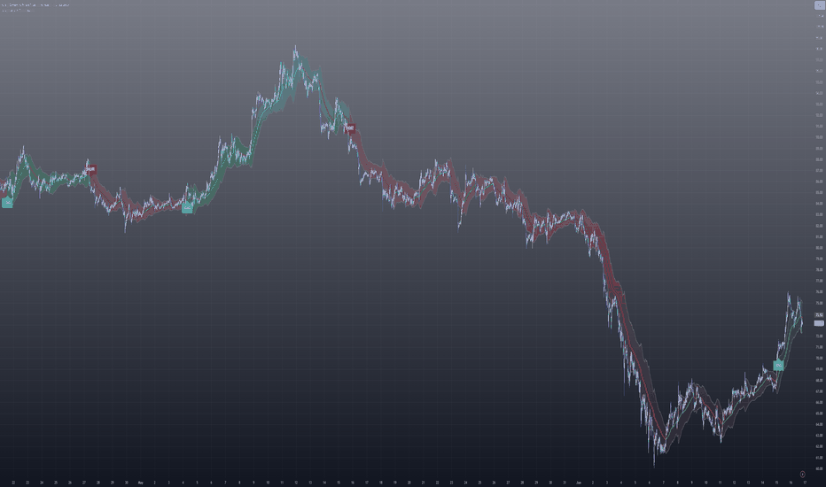
Indicador

Market Adaptive Trend [Interakktive]Market Adaptive Trend (MAT) is a diagnostic trend tool that re-tunes its own responsiveness to the live volatility regime — and shows you, in plain English, why it tightened or loosened.
Most "adaptive" trend tools hide their adaptation behind math you cannot audit. MAT does the opposite: it adapts AND it narrates. Every adjustment it makes is shown on the chart, in words, so you can see the reasoning rather than trust a black box.
This is a market-state diagnostic tool, not a signal generator.
█ THE CORE IDEA
A fixed-length moving average has one flaw: it responds the same way in calm markets and violent ones. In a clean trend it lags; in a chop it whipsaws. MAT addresses this by letting the live volatility regime govern how responsive the trend line is — the link most adaptive tools never expose.
MAT continuously measures relative volatility: current ATR divided by its own longer-run average. A reading near 1.00 means volatility is at this market's own baseline; above means more volatile than usual; below means calmer. That single ratio classifies the market into one of three regimes, and each regime changes how the line behaves.
█ THE THREE REGIMES
RIDING (calm) — Volatility below baseline. The line loosens and leans toward its slower estimate, so it rides a clean trend without being shaken out by minor noise.
TIGHTENING (balanced) — Volatility near baseline. The line sits in a balanced blend — neither chasing nor lagging — typical of coiling, pre-expansion conditions.
GUARDED (volatile / stretched) — Volatility above baseline. The line damps its response and becomes slow to flip, and candles tint amber as a caution that conditions are stretched and a flip here is lower-confidence.
█ HOW THE LINE IS BUILT
MAT blends a fast and a slow estimate of price. The blend weight is not fixed — it shifts with the regime above, scaled by an Adaptation Strength input (0 = a fixed blend, 1 = full regime governance). The blended target then drives the visible line through an error-feedback step, so the line moves toward its target proportionally rather than snapping. The calculation uses only confirmed historical data, contains no lookahead, and does not repaint.
█ THE HUD
A compact on-chart panel reports, in plain language:
- Trend — UP / DOWN
- Regime — RIDING / TIGHTENING / GUARDED, with a plain-English volatility descriptor (very calm → below normal → near normal → slightly elevated → high)
- Responsiveness — LOW / MED / HIGH (how reactive the line currently is)
- Read — a one-line summary of the current state
No raw scores are presented as the message — the panel is meant to be read at a glance.
█ HOW TRADERS USE MAT
MAT is designed to provide context, not entries. Common uses:
- Reading whether the current environment favours riding (RIDING) or caution (GUARDED)
- Avoiding low-confidence flips when the regime is GUARDED and conditions are stretched
- Using the regime read as a filter alongside your own entry method
- Framing trend direction with an honest sense of how much to trust it right now
█ SETTINGS OVERVIEW
Adaptive Baseline
- Source, Fast estimate length, Slow estimate length
- Adaptation Strength (how strongly the regime governs responsiveness)
Regime Governor
- Volatility baseline length, ATR length
- Calm threshold (below = RIDING), Volatile threshold (above = GUARDED)
Visual
- Adaptive line, Gradient fill, Edge glow, Color candles, Line width
HUD
- Show HUD, Position, Size
█ DISCLAIMER
This indicator is a market context and diagnostic tool only. It does not generate trade signals, entries, or exits. Past behaviour does not guarantee future price action. Always combine with independent analysis and proper risk management. Indicador

Plexus - Tendency Planimetry (Bundles)The first implementation of the Tendency Planimetry method on TradingView
Works on any market and timeframe: forex, stocks, futures, crypto, indices, commodities.
This indicator overlays a family of moving averages computed on the (H+L)/2 price, with progressively increasing period steps. Where many MAs converge into a narrow price band, a "bundle" forms — a dynamic support/resistance level that carries its own direction (slope).
What it draws:
- a "fabric" of moving averages (fast = cool tones, slow = warm tones);
- the automatically detected bundle on the current bar, with a highlighted zone and a center line;
- bounce markers when price rejects the bundle in the direction of its slope (long/short);
- an info table: bundle size, level and slope;
- built-in alerts for upward and downward bounces.
How it differs from a regular MA ribbon:
- MA periods use a progressive step, not a uniform one;
- the bundle is detected automatically as a dense cluster of converged averages;
- signals are filtered by the slope of the bundle itself — only in the direction of the trend.
About the method. The Tendency Planimetry method is described in public sources; one of its early authors is Valeriy Kim (known as Insen) and the trading community around him. This code is written from scratch as an independent implementation of a publicly described idea. Credit and thanks to the method's authors.
⚠️ This is a visualization and alert tool, not financial advice and not a trading bot. It does not execute orders. Any signal is a prompt for your own analysis. Trading involves risk of loss.
Indicador

Indicador

Indicador
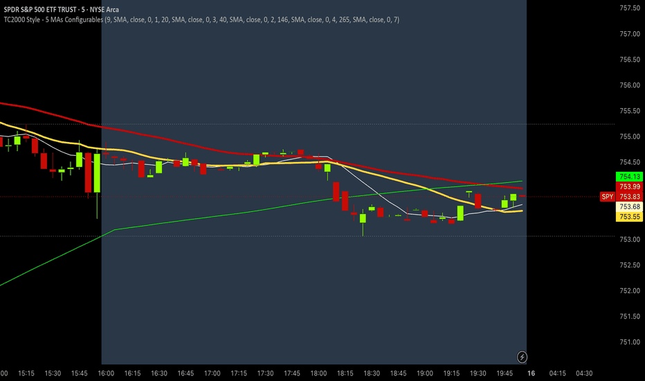
Indicador

Multi-Timeframe MA 10 EMA SMA WMA HMA RMA█ OVERVIEW
This indicator displays up to 10 moving average lines, each on its own independently configurable timeframe.
The core idea is simple: instead of recalculating periods manually when switching chart timeframes, you set each line to a specific timeframe once and it stays there regardless of what timeframe you are viewing.
For example, set MA1 to the Daily 200 EMA and it will always show the Daily 200 EMA — whether you are looking at a 1-minute chart or a 4-hour chart.
█ FEATURES
• Up to 10 MA lines, each with independent timeframe, period, type, and color settings
• MA types: EMA, SMA, WMA, HMA, RMA
• Lines 7 to 10 are hidden by default — enable only what you need
• Each line has a Show toggle so you can turn individual lines on and off without losing your settings
█ MA TYPES
• EMA — Exponential Moving Average. Weights recent bars more heavily. The most widely used MA among traders.
• SMA — Simple Moving Average. Treats all bars equally. Often watched by institutional traders.
• WMA — Weighted Moving Average. Similar to EMA but with a more straightforward weighting curve.
• HMA — Hull Moving Average. Designed to minimize lag while staying smooth. Reacts faster than EMA.
• RMA — Wilder's Moving Average. The same MA used inside RSI calculations. Smoother and slower than EMA.
█ HOW TO USE
Set each line to a timeframe and period that matches your trading approach. A few common setups:
Upper timeframe confluence — Set MA1, MA2, MA3 to the Daily, 4H, and 1H 200 EMA respectively. Keeps key support and resistance levels visible on any chart.
MA ribbon — Set multiple lines to the same timeframe with different periods (e.g. 20, 50, 100, 200). The order and spacing of the lines reflects trend strength.
Cross-timeframe comparison — Set the same period (e.g. 50 EMA) across multiple timeframes to see whether they are aligned in the same direction.
█ NOTES
• Lines set to a higher timeframe than the current chart may repaint on the forming bar — this is normal behavior for request.security() in Pine Script
• If a line appears flat or missing, check that the selected timeframe is higher than or equal to your current chart timeframe Indicador

Indicador

Indicador

Indicador