Volatility Shock Half-Life MonitorHow long does a volatility shock actually stay elevated?
The Volatility Shock Half-Life Monitor turns that question into an event-based measurement. Instead of only labeling volatility as “high” or “low,” it detects a fresh shock, freezes the pre-shock baseline, follows subsequent volatility peaks, and counts the bars until the excess volatility has decayed to a chosen fraction.
WHAT THE INDICATOR SHOWS
🟠 Shock detected — Fast realized volatility crosses above the selected multiple of baseline volatility.
🟣 Reheat — Volatility makes a meaningfully higher peak. The decay target is recalculated and the half-life clock restarts from that peak.
🟢 Half-life reached — Excess volatility falls to the selected remaining fraction. With the default 50% setting, half of the excess above the frozen baseline has dissipated.
⬜ Window ended — The episode did not reach its decay target within the maximum observation window.
The aqua curve is fast volatility as a percentage of baseline volatility. The yellow segment is the active decay target. A compact dashboard reports the current state, excess volatility remaining, bars since the latest peak, the most recently observed half-life, and completed versus timed-out episodes.
EXAMPLE
Suppose baseline volatility is 1.0 and a shock peaks at 2.0. With “excess volatility remaining” set to 50%, the target is 1.5:
1.0 + 50% × (2.0 − 1.0) = 1.5
If volatility later reheats to 2.4, the new target becomes 1.7 and the clock restarts from that new peak. This prevents an early measurement from understating a renewed shock.
SUGGESTED USES
• Compare how quickly different assets absorb volatility shocks.
• Delay mean-reversion entries until excess volatility has materially cooled.
• Identify persistent stress when an episode repeatedly reheats or times out.
• Build confirmed-bar alerts for shock, reheat, recovery, timeout, and data-gap events.
METHOD AND LIMITATIONS
Volatility is the rolling standard deviation of logarithmic returns by default. The baseline is frozen on the initial shock bar. “Half-life” here means the observed number of chart bars from the latest volatility peak to the first target crossing; it is not an estimated exponential-decay parameter. Results depend on timeframe, symbol, lookback lengths, and threshold settings. The indicator is a research and risk-context tool, not a forecast or trading strategy.
AI-assisted disclosure: The concept, Pine implementation, validation model, and documentation were developed with AI assistance and reviewed by BotTradeLab. Indicador

HTF 3-Candle System (Zeiierman)█ Overview
HTF 3-Candle System (Zeiierman) is a higher-timeframe market structure indicator designed to analyze the relationship between three consecutive HTF candles and identify the price pattern that currently best describes the developing structure.
Instead of looking for a single fixed candlestick formation, the indicator evaluates multiple bullish and bearish three-candle structures simultaneously. Each pattern receives a dynamic quality score based on factors such as candle direction, range, body strength, liquidity sweeps, displacement, imbalance, compression, expansion, and the developing behavior of the live third candle.
The three higher-timeframe candles are defined as:
• C1 = the completed HTF candle two periods back
• C2 = the previous completed HTF candle
• C3 = the current live HTF candle
C3 updates continuously while the higher-timeframe candle is forming, allowing the pattern ranking and projected levels to evolve with current price action.
The System evaluates 12 three-candle structures:
• Bullish Sweep Reversal
• Bearish Sweep Reversal
• Bullish FVG Displacement
• Bearish FVG Displacement
• Bullish PO3 Sequence
• Bearish PO3 Sequence
• Bullish Expansion
• Bearish Expansion
• Bullish Compression Break
• Bearish Compression Break
• Morning Star Reversal
• Evening Star Reversal
The three highest-ranked structures are displayed in the 3-CANDLE SYSTEM table together with their current scores. The highest-ranked pattern also controls the live state message and the projected structural levels.
█ How It Works
⚪ 3-Candle HTF Structure
The indicator analyzes three candles from the selected higher timeframe:
• C1 = two HTF candles back
• C2 = previous HTF candle
• C3 = current live HTF candle
C1 = HTF
C2 = HTF
C3 = current HTF
C1 and C2 are completed candles, while C3 updates live until the current higher-timeframe candle closes.
⚪ Pattern Quality Scoring
The System evaluates 12 bullish and bearish three-candle structures and assigns each one a quality score.
The score combines structural conditions with softer proximity measurements, so a setup can begin ranking before every condition is fully completed.
Factors include liquidity sweeps, candle direction, body strength, range, displacement, FVGs, compression, expansion, and recovery or rejection around key levels.
score = structure + proximity + candle strength
⚪ Top 3 Pattern Ranking
All pattern scores are ranked from highest to lowest.
The strongest structure becomes the active pattern, while the second and third highest scores remain visible for additional context.
patterns.sort(order.descending, sort_field="qualityScore")
⚪ Live Pattern State
The top-ranked structure also shows its current stage, such as:
• sweep or reclaim developing
• FVG live
• breakout or breakdown developing
• compression
• PO3 distribution
• reversal developing
⚪ Projected Pattern Levels
The active pattern projects the levels most relevant to that structure, including sweep levels, breakout levels, FVG boundaries, CE 50%, equilibrium, recovery levels, and invalidation.
Nearby levels can automatically merge to reduce visual clutter.
⚪ Projected HTF Candles
C1, C2 and C3 are reconstructed to the right of price using their actual higher-timeframe OHLC values. C3 updates live as the current HTF candle develops.
⚪ HTF Mapping
The System can map C1, C2 and C3 directly over the lower-timeframe candles that formed them.
High and low dots identify the exact lower-timeframe candles that created each HTF extreme. Completed C1 and C2 levels can also change from Active to Mitigated after being traded through.
█ How to Use
The examples below show how the System behaves across different three-candle structures. The table identifies the highest-ranked pattern, while the bottom row shows the pattern's current live state.
⚪ Bearish Expansion
Here, Bearish Expansion is the highest-ranked pattern at 85.0%, and the state reads BEARISH EXPANSION LIVE.
C1, C2, and C3 progressively shift lower, with C3 extending strongly through the previous structure. The projected levels identify the Breakdown, the level price should Hold Below, and the Invalidation level above.
⚪ Bearish FVG Displacement
In this example, Bearish FVG Displacement reaches a 100.0% score and the state reads BEARISH FVG LIVE.
The strong downside movement leaves C3 separated below C1, creating the bearish imbalance. The System projects the FVG Upper, CE 50%, C3 High, and Invalidation levels around the active structure.
⚪ Bearish FVG With Merged Levels
This is another Bearish FVG Displacement, ranked at 98.1%.
Here, the FVG Upper and CE 50% are close enough to be merged into a single projected level. This demonstrates how the System combines nearby structural references when they overlap.
⚪ Bullish FVG Displacement
This example shows a Bullish FVG Displacement with a 100.0% score and BULLISH FVG LIVE state.
Strong upside displacement leaves the C3 low above the earlier C1 structure. The projected FVG Lower, CE 50%, C3 Low, and Invalidation levels define the active bullish imbalance.
⚪ Bearish Compression Setup
Here, Bearish Compression Break ranks first at 91.2%, but the state still reads COMPRESSION - WATCH RANGE LOW.
This is important because the bearish break has not yet confirmed. C2 is contained within the C1 range and C3 is pressing toward the lower boundary. The Range Low / Breakdown level shows where bearish confirmation would occur, while Equilibrium and Range High define the rest of the compression structure.
⚪ Bullish Power of 3
In this example, Bullish PO3 Sequence ranks first at 85.0%, with the state PO3 DISTRIBUTION LIVE.
The sequence shows a downside manipulation followed by a strong bullish C3 expansion. The System highlights the Manipulation Low, the Distribution level above, and the structural Invalidation level.
⚪ Bearish Sweep Reversal
Here, Bearish Sweep Reversal is ranked first, but the state reads HIGH SWEPT - NEED RECLAIM.
Price has already swept above the C1 high, but the reversal is not yet fully confirmed. The next requirement is for C3 to move back below the projected C3 Close < level. The swept high and invalidation have merged into one structural level.
⚪ Bullish Sweep Reversal
This example shows Bullish Sweep Reversal ranked first at 82.0%, but the state is still WATCHING C1 LOW.
This is an earlier-stage setup. The System is identifying the bullish sweep structure as the best current match, but the C1 low has not yet been swept. The projected Sweep Low + Invalidation level shows the liquidity area being watched, while C3 Close > marks the bullish confirmation level.
⚪ Evening Star Reversal
Here, Evening Star Reversal ranks first at 80.6%, with the state AWAITING REJECTION BELOW C1 MID.
The reversal structure is developing, but C3 has not yet moved far enough below the C1 midpoint to confirm stronger rejection. The projected levels show 50% Rejection, Full Rejection, and Invalidation.
⚪ Bullish Compression Setup
In the final example, Bullish Compression Break ranks first at 84.3%, while the live state reads COMPRESSION - WATCH RANGE HIGH.
C2 remains compressed inside the C1 structure and C3 is moving toward the upper boundary. The bullish breakout is not confirmed until price pushes through the projected Range High / Breakout level. Equilibrium and Range Low provide the remaining structural references.
█ Settings
Higher Timeframe: Selects the higher timeframe used to construct C1, C2 and live C3. The selected timeframe must be higher than the chart timeframe.
Strong Match Threshold: Sets the minimum quality score required for the highest-ranked pattern to be treated as a strong match.
Show Projected HTF Candles: Shows or hides the reconstructed C1, C2 and C3 candles to the right of current price.
Offset: Controls how far the projected candle structure appears from current price.
Candle Spacing: Controls the horizontal spacing between projected C1, C2 and C3.
Merge: Controls how close two projected levels can be before they are combined.
Spacing: Controls horizontal spacing between pattern level labels.
-----------------
Disclaimer
The content provided in my scripts, indicators, ideas, algorithms, and systems is for educational and informational purposes only. It does not constitute financial advice, investment recommendations, or a solicitation to buy or sell any financial instruments. I will not accept liability for any loss or damage, including without limitation any loss of profit, which may arise directly or indirectly from the use of or reliance on such information.
All investments involve risk, and the past performance of a security, industry, sector, market, financial product, trading strategy, backtest, or individual's trading does not guarantee future results or returns. Investors are fully responsible for any investment decisions they make. Such decisions should be based solely on an evaluation of their financial circumstances, investment objectives, risk tolerance, and liquidity needs.
Indicador

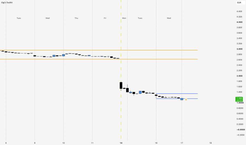
Sessions, Opening Levels and Day Separators=====================================================================
⚠️⚠️ PLEASE READ BEFORE USING ⚠️⚠️
⚠️ This is an EDUCATIONAL AND ANALYTICAL tool. It is not financial
advice, it is not a trading system, and it is not a signal service.
It produces no buy or sell signals of any kind.
⚠️ Every number and level this script draws is a HISTORICAL
MEASUREMENT of where price has already been. None of it is a
probability, a forecast, a prediction, or an expectation. A line at
yesterday's high tells you where yesterday's high was. It tells you
nothing whatsoever about whether price will reach it, respect it, or
reverse at it.
⚠️ Past market behaviour does not guarantee, imply or suggest future
market behaviour. Levels that held ten times can fail on the eleventh.
⚠️ You are solely responsible for every trading decision you make and
for every loss you incur. Trading leveraged instruments carries a real
risk of losing more than your deposit. If you are unsure, seek advice
from a licensed professional. Nothing here is a recommendation to buy
or sell anything.
---------------------------------------------------------------------
WHAT THIS IS
Most intraday traders end up running four or five separate indicators
just to answer four simple questions: where does today start, which
session are we in, where was yesterday's high and low, and where did
this week open? Each of those scripts adds its own indicator slot, its
own settings panel, and its own idea of when a "day" begins.
This is those four tools in one script. It draws vertical lines where
each trading day and week begins, shades the four major trading
sessions, marks the high and low of previous days, weeks and months,
and draws horizontal lines at reference opening prices. It does not
interpret any of that for you. It draws context and stops.
It is open source. Every calculation below is in the code, and you are
encouraged to read it.
---------------------------------------------------------------------
WHAT IT DRAWS
1. DAY AND WEEK VERTICAL LINES
A thin vertical line where each trading day begins and a thicker one
where each trading week begins. Where a week line is drawn, the day
line for that same moment is left out, so the two never sit on top of
each other. The weekday name is written at the TOP of the pane,
positioned midway between two consecutive day lines rather than beside
one, so it labels the day rather than the boundary. There is an
alternative "Background" mode that tints the whole bar instead of
drawing a line.
2. SESSIONS
Four shaded boxes: Asia, London, New York AM and New York PM. Each box
opens when its session opens and then grows, bar by bar, to contain
every high and low the session has made so far. The box you see is the
literal price range of that session up to that point. A large letter
is written faintly inside each box so you can tell them apart at a
glance. Default times, in New York time, are Asia 20:00-02:00, London
02:00-08:30, NY AM 08:30-11:30, NY PM 13:30-16:00. All four are fully
editable.
3. PREVIOUS HIGHS AND LOWS
Two horizontal lines per period, at the highest and lowest price
reached during a previous COMPLETED day, week or month. The line is
anchored at the start of the period it measures and extends to the
right. You can show more than one previous period, and older ones can
be faded so the most recent stands out.
4. OPENING LEVELS
Horizontal lines at reference opening prices, each with a short text
label written at the right-hand end: the 00:00 open, the 10:00 open,
today's open, this week's open, this month's open, this year's open,
and the all-time high. When two or more of these land on exactly the
same price, their labels merge into one line of text instead of
printing on top of each other.
5. WARNING BANNER
A small amber note in the bottom-right corner when something is
switched on but not being drawn. It exists because this script has
twelve independent timeframe filters, and "why is my chart empty?" is
by far the most likely thing to go wrong. Each note names the cause and
what to change. It can be switched off under General once you no longer
need it. Nothing is drawn at all when there is nothing to report.
---------------------------------------------------------------------
HOW IT IS CALCULATED
Nothing here is hidden. This is the actual method.
DAY BOUNDARY — five modes
A "trading day" is not midnight for most instruments. CME futures roll
over at 17:00 Chicago. Stocks start at the opening bell. Crypto starts
at midnight UTC. Rather than guess this from the asset type, which
gets stocks, Euronext, CBOT grains, ICE, VIX and CFD indices wrong,
the script reads it from TradingView's own session data for the
symbol.
Auto (exchange session)
timeframe.change("D") — fires exactly where TradingView starts a
new daily bar for this symbol.
Market open only
session.ismarket and (not session.ismarket or timeframe.change("D"))
then kept only on the FIRST such bar of each calendar day.
That is the transition out of the pre-market where the chart
carries one, and the trading day's own boundary where it does not.
The once-per-day rule matters: on an extended-hours chart the two
halves of that test do not always land on the same bar, and it also
stops a lunch-break reopen counting as a second trading day.
See limitation 2 below — on most symbols this mode legitimately
produces the same lines as Auto.
Midnight (exchange time) / Midnight (New York) / Custom time
For each bar, build the target instant for THAT BAR'S OWN
calendar date:
timestamp(tz, year(time,tz), month(time,tz),
dayofmonth(time,tz), HH, MM)
and fire when all three of these are true:
time >= that instant
time < that instant
time - that instant < (chart timeframe in seconds x 1000)
timestamp() is timezone- and daylight-saving-aware, so the
boundary does not slide by an hour on the two DST changeover
days each year. The third condition — the boundary must fall
INSIDE the bar that just opened — is what stops the Sunday
evening double-line: CME reopens Sunday 18:00 New York, and the
weekend gap technically straddles Sunday midnight, so without it
you would get both an 18:00 line and a midnight line the same
night.
WEEK BOUNDARY — three modes
Exchange Week timeframe.change("W")
Specific Day a day boundary whose session weekday matches the
day you choose
Follow Day Start the script watches for timeframe.change("W"),
records WHICH weekday the exchange's week opens
on, then fires on the day boundary that lands on
that weekday
The session weekday is taken from the MIDPOINT of the daily bar:
mid = time("D") + (time_close("D") - time("D")) / 2
dow = dayofweek(mid, exchange timezone)
The midpoint always falls inside the session, so a CME Wednesday
session that opens on Tuesday evening correctly counts as Wednesday.
All three modes are then de-duplicated against time("W"), so you get
at most one week line per exchange week even when a day boundary and a
daily-bar boundary disagree.
DAY NAME POSITION
The name goes midway between the separator that opens its day and the
one that closes it. The closing separator has not happened yet when the
name must be plotted, so the midpoint is predicted, and the prediction
differs by mode.
Auto mode — the separators ARE the daily-bar edges, so the daily bar
hands over both ends:
sessionMid = time("D") + (time_close("D") - time("D")) / 2
name drawn on the first bar of the day where
time + chart timeframe > sessionMid
Both values come from the session schedule, carry no lookahead, and read
the same on every bar inside the day. Written as one comparison rather
than a pair so that a midpoint landing in a gap — a lunch break, or the
hours a holiday session sits closed — is claimed by the first bar after
the gap instead of by no bar at all; a latch, reset at each day boundary,
keeps the rest of the day from claiming it too.
Every other mode — the boundary is a clock time or the opening bell, not
a daily-bar edge, so there is no end to read and the day is measured:
barsPerDay = bar_index(this separator) - bar_index(previous one)
name drawn where bar_index - lastSeparator == floor(barsPerDay / 2)
floor() rather than a plain division: an odd bar count would land on x.5
and match no bar at all, silently dropping that day's name. This estimate
still mis-centres the day after an unusually long or short one, but those
modes are immune to the merged-session case that motivated the Auto-mode
anchor, because a clock boundary falls inside a merged session and splits
it into two named days anyway.
On an ordinary day the two anchors pick the SAME bar — a 23-hour CME
session at 1 hour puts both on bar 11, a 6.5-hour equity session at 15
minutes puts both on bar 13 — so the change is visible only on the
irregular days it exists for.
SESSIONS
inSession = not na(time(chart timeframe, "HHMM-HHMM", timezone))
isNew = inSession and not inSession
On isNew, create a box with top = high, bottom = low. On every later
bar in the session:
top = max(top, high)
bottom = min(bottom, low)
right = current bar
PREVIOUS HIGHS AND LOWS
= request.security(symbol, "D" / "W" / "M",
,
lookahead = barmerge.lookahead_on)
periodChanged = t != t
When a period changes, the line pair belonging to the period that just
ENDED is given its length and its final price, taken from h and
l — the settled values of the period that has now closed. The new
period's own line pair is created zero-length, which makes it
invisible, and stays that way until that period in turn closes.
ON LOOKAHEAD, STATED PLAINLY: this script does use
barmerge.lookahead_on with a plain high and low. On historical bars
that returns the containing period's FINISHED value, which is
information from that period's own future. Nothing is ever drawn
from it. Every visible line takes its price from the offset
above, which is settled history by the time it is read, and no line
becomes visible before its period has closed. The Data Window values
use the same settled offsets. If you would rather verify this than
take my word for it, the code is open — look for the block commented
"LOOKAHEAD, stated plainly".
The consequence you WILL see: because a period's line is anchored at
the START of the period it measures, on historical bars the line
runs back across the period it summarises. That is intentional and
is how period range lines are conventionally drawn. It is not a
prediction, and the line did not exist on your chart while that
period was still forming.
FADE
color.from_gradient(i, 0, n-1, fully transparent, fully opaque)
where i is the line's position in the history, so the oldest is the
faintest.
OPENING LEVELS
00:00 level time("1", "0000-0001", timezone) becomes non-na
-> level = that bar's open
10:00 level time("1", "1000-1001", timezone) becomes non-na
-> level = that bar's open
Daily timeframe.change("D") -> open
Weekly timeframe.change("W") -> open
Monthly timeframe.change("M") -> open
Yearly timeframe.change("12M") -> open
ALL-TIME HIGH
Tracked incrementally as a running maximum of the chart's own highs,
never by scanning backwards through history. One additional request
(with lookahead OFF) runs the same running maximum on the daily
timeframe, purely to catch a peak that occurred before the chart's
loaded history begins. If that beats the chart-native high, the peak
is off screen to the left and the line simply starts as far left as
TradingView allows a drawing to anchor.
LABEL MERGE
Levels are held in a fixed array whose ORDER is the merge priority.
Every level compares its price against every lower-priority level; on
an exact match the higher-priority label absorbs the lower one's text
("00:00 + W.O") and the lower one renders an empty label. Its line is
still there, at the identical price.
---------------------------------------------------------------------
HOW IT COMPARES TO THE CLOSEST ALTERNATIVE
The closest well-known free alternative is ICT Killzones + Pivots,
which covers the same broad ground: session boxes, previous
day/week/month levels, opening prices and separators. TradingView also
ships a built-in "Session breaks" option in Chart Settings that draws
vertical session dividers for free, without using an indicator slot.
WHERE THIS SCRIPT GOES FURTHER
1. THE DAY BOUNDARY IS A REAL SETTING, NOT AN ASSUMPTION.
Five modes: the exchange's own session, the market open only,
midnight in exchange time, midnight in New York, or any clock time
in any of eleven timezones. Most session tools fix the separator to
the exchange session or to a single hardcoded hour.
2. THE WEEK LINE CAN FOLLOW THE DAY LINE.
If you set your day to start at midnight New York on a CME symbol,
most tools still put the week line at the Sunday 18:00 exchange
open, leaving it stranded between two of your day lines. "Follow
Day Start" learns which weekday opens the exchange's week and puts
the week line on the day boundary that lands on it.
3. TWELVE INDEPENDENT TIMEFRAME FILTERS, NOT ONE.
Each element has its own "Apply Below" cutoff. You can have week
lines on the 4-hour, previous-day levels down to the 12-hour,
session boxes only at 15 minutes and below, and the 00:00 level
only at 45 minutes and below — all in one saved profile, with no
switching. Comparable tools use a single global cutoff that hides
everything at once.
4. DAY NAMES ARE CENTRED ON THE DAY, NOT PINNED TO A CLOCK.
In Auto mode the position comes from the session's own midpoint, so
it is right on a half day, and right on a holiday that TradingView
folds into the neighbouring session and prints as one trading day —
the 47-hour block gets its name in the middle of 47 hours, and the
day after it is unaffected. The other modes measure the previous
day's width in bars, which is what spacing on screen actually is.
5. IT TELLS YOU WHY YOUR CHART IS EMPTY.
With twelve filters, an empty chart is the most likely failure. A
note appears bottom-right naming the cause.
6. IT HAS AN ALL-TIME HIGH LEVEL, tracked without a backward scan.
7. IT REPORTS NO STATISTICS, DELIBERATELY.
See the next section — this is a genuine trade-off, not only a
feature.
WHERE THE ALTERNATIVE IS BETTER, OR THIS ONE IS WEAKER
Read this section as carefully as the one above. If any of these
matter to you, use the other tool.
1. NO SESSION HIGH AND LOW LEVELS. ICT Killzones + Pivots stores each
session's high and low as horizontal lines and extends them
forward until price trades through them. That is the single most
used feature of that script and this one has no equivalent at all.
Here the box is the whole record, and it stops at the session end.
2. NO ALERTS. None. The alternative can alert you on session highs and
lows and on daily, weekly and monthly levels. If you need to be
notified rather than to watch, this script cannot do it.
3. ONLY TWO FIXED CLOCK LEVELS. You get 00:00 and 10:00 and you cannot
move them or add a third. The alternative lets you type in eight or
more opening times at any hour you like, with your own labels and
colours.
4. ONLY FOUR SESSIONS. Asia, London, NY AM, NY PM, and you cannot add
a fifth. The alternative has five or six configurable slots
including London Close and a regular-trading-hours slot.
5. NO STANDARD DEVIATION OR RANGE PROJECTION LEVELS. The alternative
can plot levels at multiples of a session's average, median or
standard deviation range. This script has nothing comparable.
6. NO STATISTICS TABLE AND NO HIT RATES. The alternative shows how
often each level was reached, with sample sizes. That is
information this script deliberately does not give you. I left it
out because a hit rate presented on a chart reads as a probability
and it is not one — but if you specifically want measured
historical frequencies, this script cannot provide them and the
alternative can.
7. NO SESSION MIDPOINTS.
8. CAPPED HISTORY. Previous-level counts are limited to 50 each, and
day and week separators are capped at 250 with the oldest dropped.
The alternative offers an unlimited history mode.
9. IF ALL YOU WANT IS SEPARATORS, YOU DO NOT NEED THIS SCRIPT.
TradingView's built-in "Session breaks" setting is free, uses no
indicator slot, and costs no computation. This script is only worth
a slot if you want two or more of its four modules.
---------------------------------------------------------------------
HOW TO USE IT
None of the following are recommendations, and none of them are
strategies. They are simply the ways context tools of this kind are
commonly read. Test anything you take from here yourself.
TREND AND CONTINUATION
The previous day's high and low, and the week's opening price, are the
levels most often referenced when describing whether a market is
extending or retracing. A market trading and holding above the prior
day's high is described differently from one that reached it and fell
back. Watch what happens AT the level, not the fact that price arrived
there. Suggested setup: previous day and week levels on, sessions off,
day and week lines on, on the 1-hour or 4-hour.
RANGE AND MEAN REVERSION
The session boxes give you a visible container. When the London box
and the NY AM box overlap heavily in price, the market has not gone
anywhere, and the box edges are the boundaries other participants can
see too. The 00:00 open and the daily open are frequently used as the
"middle" that a rangebound day oscillates around. Suggested setup:
all four sessions on, 00:00 and daily open on, previous-day levels on,
on the 15-minute.
SCALPING
Use the session boxes as a filter on WHEN rather than as a signal on
what. The boundary between one session box ending and the next
beginning is where participation changes hands, and thin periods
between boxes are visibly thin. Turn the day and week vertical lines
off — at 1 to 5 minutes they add clutter without adding information.
Suggested setup: sessions on, previous day on, everything else off,
on the 1-, 2- or 5-minute.
SWING
Switch to the weekly and monthly side. Previous week and previous
month highs and lows, plus the monthly and yearly opens and the
all-time high, give you the small set of levels that a multi-week
position is measured against. Set Previous Week and Previous Month
counts to 3 or 4 and turn on "Fade Older Lines" so the most recent
reads clearly. Suggested setup: previous week and month on, weekly,
monthly and yearly opens on, sessions off, on the 4-hour or daily.
MULTI-TIMEFRAME WORKFLOW
Because every element has its own "Apply Below" cutoff, you can set
this up once so that scrolling from a daily chart down to a 1-minute
chart progressively reveals more detail without you touching a
setting. That is what the twelve filters are for.
---------------------------------------------------------------------
KNOWN BEHAVIOURS AND LIMITATIONS
These are expected. They are listed so they do not look like bugs.
1. "MARKET OPEN ONLY" MATCHES "AUTO" ON MOST SYMBOLS. This mode exists to
skip the pre-market and post-market. All futures, all forex and all
crypto trade one continuous session and have neither, and a stock
chart has neither unless you switch Extended Hours on. Where there is
nothing to skip, the mode falls back to the trading day's own boundary
— which on a regular-hours stock chart is the opening bell anyway —
and a note bottom-right tells you that is what happened. To see the
mode do something different from Auto, put it on a US stock with
Extended Hours enabled: the line lands on the 09:30 open rather than
the 04:00 pre-market start.
2. THE 00:00 AND 10:00 LEVELS DO NOT APPEAR ON STOCKS. They need a
candle that OPENS at exactly that clock time, and that fails for
two separate reasons. First, the market may be shut then — every
stock is closed at midnight, so the 00:00 level can never be drawn
on one, whatever timeframe you use. These two levels are built for
markets that trade around the clock: futures, forex and crypto.
Second, the market may be open but the timeframe's bar grid steps
over the exact minute, which happens on 45-minute and 3-hour charts.
The bottom-right note distinguishes the two, because only the second
one is fixed by changing timeframe.
3. PREVIOUS-PERIOD LINES RUN BACK ACROSS THEIR OWN PERIOD. A line is
anchored at the start of the day, week or month whose high or low
it marks. On historical bars this means the line crosses the period
it summarises. It is not a prediction: the line was invisible while
that period was still forming, and only gained its length and its
final price when the period closed.
4. THE CURRENT PERIOD HAS NO LINE. Today's high and low are not drawn
until today ends. That is the point of the tool.
5. LOOKAHEAD IS USED. See the calculation section above. It is used
for period detection and for reading settled values; nothing
visible is derived from unsettled future data.
6. SATURDAY AND SUNDAY NAMES APPEAR ONLY ON CRYPTO SYMBOLS. On
weekday markets a Sunday evening reopen belongs to Monday's trading
session, so labelling it "Sunday" would be wrong. On crypto every
day is a real day and all seven names appear.
7. THE FIRST DAY ON THE CHART GETS NO NAME. Both anchors only speak for
a day whose opening separator was actually seen, and the chart's
first day is usually a partial one that began before the data did.
8. A LARGE GAP CAN SWALLOW A DAY BOUNDARY. If a holiday or weekend gap
contains the boundary instant entirely, no day line is drawn for
that day. This is deliberate: the alternative is a line at an
arbitrary point inside the gap.
9. BACKGROUND MODE IGNORES YOUR TRANSPARENCY. In "Background" draw
mode the colour swatch supplies the hue but the transparency is
forced to a fixed value. A swatch tuned to look right on a
1-pixel line renders almost opaque when it fills a whole bar.
10. DRAWINGS ARE CAPPED. TradingView allows a script 500 lines, 500
boxes and 500 labels. Day and week separators are capped at 250,
oldest dropped first, so they cannot starve the level lines. If you
request more previous levels than the remaining budget allows, a
note appears and the oldest are dropped.
11. VERY DEEP HISTORY IS TRIMMED. A drawing anchored to a bar index
can only reach about 10,000 bars back. A month is roughly 28,000
bars on a 1-minute chart, so the oldest levels are clamped rather
than allowed to throw an error, and a note says so.
12. SESSION BOXES DISAPPEAR ON VERY LONG CHARTS. TradingView deletes
the oldest box once 500 exist. On a 1-minute chart with four
sessions that is about 125 days.
13. NON-TIME-BASED CHARTS. On Renko, Range, Kagi, Point and Figure or
Line Break charts the "Apply Below" filters cannot work reliably,
because those chart types have no fixed bar duration. A note
appears. The script does not stop you.
14. DELAYED DATA. The script reads only bar data, so on a delayed feed
everything is drawn correctly but arrives late by the length of
the delay. Nothing recalculates differently and nothing breaks.
The only visible effect is that the currently-forming session box
lags real time.
15. THE SETTINGS PANEL USES INVISIBLE SPACING CHARACTERS to line the
dropdowns up into columns. This is purely cosmetic and affects
nothing the script calculates.
16. SOME LABELS USE NON-ASCII CHARACTERS by default: the yen, pound
and dollar signs on the session boxes, and bold letters on the
opening-level labels (D.O = daily open, W.O = weekly open, M.O =
monthly open, Y.O = yearly open, A.T.H = all-time high). If any
render as empty boxes on your system, type over them — every one
of those is a free-text field.
---------------------------------------------------------------------
SETTINGS REFERENCE
GENERAL
Timezone Used by the session times and the 00:00 and
10:00 levels. Handles daylight saving
automatically. Day and week lines read their own
timing from the market instead.
Show Warning The amber notes in the bottom-right corner. On by
Messages default. Turn them off once the behaviour is
familiar; turn them back on first if the chart
ever looks wrong.
DAY AND WEEK VERTICAL LINES
Enable Master switch for this section.
Apply Below Highest chart timeframe this section appears on.
Day Line On/off, plus line style, thickness and colour.
Week Line Same, for the week line. Where a week line is
drawn, that moment's day line is omitted.
Day Starts At Auto (exchange session) / Market open only /
Midnight - exchange time / Midnight - New York /
Custom time. Market open only skips the pre-market
and post-market; on markets that have neither it
matches Auto and says so on the chart.
Custom Time Hour and minute, used only in Custom time mode.
Custom Zone Which timezone that clock time is read in.
Week Starts Follow Day Start / Exchange Week / Specific Day,
plus the weekday for Specific Day.
Day Names Off / Short (Mon) / Full (Monday), plus text
colour and a manual horizontal nudge.
Draw As Lines, or Background tint of the whole bar.
SESSIONS
Enable Master switch.
Apply Below Highest chart timeframe this section appears on.
Asia / London / Each row: on/off, session times as HHMM-HHMM,
NY AM / NY PM box colour, and the letter written inside it.
Label Size Text size, and opacity of the letter (higher is
more visible).
PREVIOUS HIGHS & LOWS
Enable Master switch.
Extend Lines Right On/off, plus how many bars past the last bar.
Previous Day / Each row: on/off, colour, and how many previous
Week / Month periods to show (1 to 50).
Apply Below One per period type - three independent filters.
Line Style Style and thickness for every level here.
Fade Older Lines Older levels fade so the newest stands out.
OPENING LEVELS
Enable Master switch.
00:00 AM / 10:00 AM Each row: on/off, colour, the text written on
Daily / Weekly / the chart, and its own "apply below" timeframe.
Monthly / Yearly /
All-Time High
Line Style Style and thickness for every level here.
Text Colour Colour and size of all the labels.
Line Length How far past the last bar the lines and their
labels sit.
---------------------------------------------------------------------
ALERTS
This version has NO built-in alerts. That is a deliberate scope
decision, not an oversight: everything this script draws is context,
and context is not an event. An alert saying "a session started" fires
at a time you already knew in advance.
If you want to be notified when price reaches one of these levels, the
practical method today is a manual TradingView price alert:
1. Read the price off the level you care about - hover the line, or
open the Data Window (the icon on the right toolbar, or Alt+D on
Windows / Option+D on Mac) and read DH, DL, WH, WL, MH or ML.
2. Press Alt+A (Windows) or Option+A (Mac) to open the alert dialog.
3. In the first Condition dropdown, choose the SYMBOL, not the
indicator.
4. Set the second dropdown to Crossing.
5. Type the price you read in step 1.
6. Set Trigger to Only Once, choose your notification method, and
click Create.
This alert is on the price, not on the script, so it will not move
when the level moves. Re-create it each session.
Built-in alerts are the most requested thing this script does not
have, and they are the most likely addition to a future version.
---------------------------------------------------------------------
⚠️ FINAL REMINDER: this tool measures the past. It does not forecast
the future. Nothing it draws is a signal, a recommendation, or a
statement about what price will do next. Every trading decision, and
every consequence of it, is yours alone.
===================================================================== Indicador
SMT Divergence ICT, Smart Money Technique & Correlation [LunqFX]Two instruments that normally move together stop agreeing. One makes a higher high, the other fails to. That disagreement is the SMT divergence — the Smart Money Technique — and it is one of the few reversal reads that comes from outside the chart you are trading rather than from the chart itself.
Every SMT divergence indicator marks the divergence and stops there. This one does two things they do not.
It draws the correlated symbol on your chart. Its path is rescaled into your own price range, so the moment the two structures part company is something you SEE rather than something a marker announces after the fact. And it measures the correlation between the two live, because an SMT divergence between instruments that are no longer moving together is not a signal at all — it is a coincidence, and by default those are not marked.
Included: automatic SMT detection at confirmed swing highs and lows, the correlated symbol drawn as a rescaled path, a live correlation reading with a warning state, a minimum-disagreement filter, swing-to-swing connectors, a dashboard and alerts.
❶ THE CORRELATED SYMBOL, DRAWN
The instrument yours is measured against is picked from the chart's own asset class — EURUSD against GBPUSD, ES against NQ, gold against silver, Bitcoin against Ethereum, SPX against NDX, a stock against SPY — or named by you, and its path appears on your chart as a grey line. The panel always shows which symbol is in use.
It is rescaled: the second symbol's range over a rolling window is mapped onto your chart's range over the same window, so the two can be compared by shape. The line therefore carries no price of its own. Reading a level off it would be meaningless; reading its STRUCTURE against yours is the entire point.
This is what makes an SMT divergence visible instead of asserted. When your chart pushes to a new high and the grey line rolls over beneath it, you are looking at the divergence itself rather than at a label telling you one occurred.
❷ THE CORRELATION CHECK — the part that decides whether any of it means anything
SMT rests on an assumption nobody states out loud: that the two instruments are correlated. When they are not, they disagree constantly, and every disagreement would print as a divergence.
So the correlation is measured over a window you choose and shown as a number with a bar. Above your threshold the number is white and the panel reads "marks armed". Below it the number turns amber, the panel reads "marks held", and by default no new marks are placed — because a divergence between two instruments that have stopped tracking each other is noise wearing the costume of a signal. The panel also counts how many divergences were held back this way, so a quiet chart is explained rather than mysterious.
That switch can be turned off if you want to see them anyway. The panel keeps telling you what the reading is worth.
❸ HOW A DIVERGENCE IS DETECTED
Swing points come from confirmed pivots, so a pivot only exists once the bars on both sides of it have closed.
At each new pivot the script compares two directions: the way your symbol moved from its previous pivot, and the way the correlated symbol moved between those same two points. When the signs disagree — yours made a higher high, theirs did not, or the reverse — that is the divergence.
The correlated symbol's extreme is read over a three-bar window centred on your pivot rather than off one bar, because two instruments rarely put their swing on exactly the same candle. The window is placed so that its latest bar is always a closed one.
Inverse pairs are handled. EURUSD against the dollar index is a classic SMT pairing, and their swings are mirrored: your high lines up with their low. When the measured correlation is negative the script reads their lows at your highs and their highs at your lows, and asks whether they confirmed in the mirror. The dashboard says "inverse pair" next to the symbols when this is the mode in use, so the marks are never a surprise.
One more condition has to be met. The correlated symbol must have travelled far enough the other way to count, measured against its own average bar range. Without that floor a second symbol that barely moved registers as a divergence, and the chart fills with marks that mean nothing. The threshold is adjustable and it is the setting worth changing first.
A bearish SMT prints at highs, a bullish SMT at lows, each joined to the swing it diverged from by a dashed line. The connector has a maximum length: a divergence is always against the previous pivot, and when that pivot is far back the mark still prints but the line is left out, because a dashed line reaching months across a chart tells you nothing.
❹ THE DASHBOARD
The header is the most recent divergence — bearish or bullish — and how many bars ago it confirmed, so the state of the pair is read in one line. While the divergence is recent the header is lit in its colour; once it is more than a few swings old it dims and reads "last SMT", because a reversal cue from two hundred bars back is history rather than a state. Beneath it: the two symbols, whether the partner was picked automatically, and whether they are being read as a direct or an inverse pair, the correlation right now with a bar and whether marks are armed or held, the number of bearish and bullish divergences found on the chart, and the number held back by weak correlation. When the correlated symbol is the same as the chart's, the header says so rather than showing a flat line and zero results.
The correlation shown is the reading now. A mark already on the chart was placed when the correlation at that bar cleared the threshold; the reading may have dropped since, and that does not remove the mark.
HOW TO USE IT
1 — Check the correlated symbol first. The automatic choice is the classic partner for your asset class and suits most charts; if you trade a pair it does not know, switch automatic selection off and name the instrument yourself. Nothing below works until the partner genuinely tracks yours.
2 — Read the correlation before the divergences. Strong correlation makes an SMT meaningful. Weak correlation means the two have decoupled, which is itself worth knowing and is a reason to stand aside rather than to trade the marks.
3 — Trade the divergence as a reversal cue, not a trigger. The instrument that failed to confirm is the one showing weakness. Combine it with your own entry model — SMT tells you the structures disagree, not where to enter.
4 — Watch the grey line as the swing forms. The divergence is visible before the pivot confirms; the mark simply makes it official. Traders who use SMT live are watching the second symbol fail, not waiting for a label.
5 — Raise the swing length on higher timeframes. At eight bars on a 5-minute chart you get many small divergences; at twenty on an hourly you get the ones that matter to a swing.
HOW IT WORKS
The partner symbol is chosen from the chart's ticker and asset type when automatic selection is on, otherwise taken from the input. Its high, low and close are requested on the chart's own timeframe with lookahead off. Correlation is the standard rolling coefficient between the two closes over your window; its sign decides whether the pair is read directly or in the mirror. The rescaled path maps the second symbol's close from its own rolling high-low range into your chart's, which preserves shape and discards level. Pivots come from the standard confirmed pivot functions. At each pivot the script stores your extreme and the correlated symbol's extreme over a three-bar window centred on that bar, together with the mode in use, and compares the direction of both moves at the next pivot. A divergence is registered when the directions disagree, the correlated move clears the minimum against its own average range, and — unless you switch the gate off — the correlation is above your threshold. If the correlation changes sign between two pivots, the stored pivot is discarded rather than compared across the change.
Works on any pair of instruments and any timeframe. It is most used on forex majors, index futures and the metals, where reliable correlated pairs exist.
LIMITATIONS — read before relying on it
▸ The automatic partner is a convention, not knowledge. It is chosen from the chart's asset class — forex, crypto, index, futures, metals, stocks — and a chart outside those, or one where a different partner is the right one, needs the symbol set by hand. A wrong partner is the fastest way to make this indicator produce nonsense, and the correlation reading is there to catch it.
▸ The rescaled path is shape, not price. It is fitted to a rolling window, so it moves when the window moves. Do not read levels, support or targets off it.
▸ Correlation is measured, not guaranteed. Two instruments can be strongly correlated over the window and uncorrelated during the hours you actually trade. The number describes the window you set and nothing else.
▸ Both directions of disagreement count. Yours making a higher high while theirs does not, and theirs making a higher high while yours does not, are both SMT. They read differently to a trader, and the script marks both.
▸ A pair whose correlation flips sign is unstable, and the script treats it that way: a stored pivot from one mode is never compared against a new pivot from the other. The first pivot after a sign change therefore produces no mark. If you see the panel alternating between direct and inverse, the pair is not one to trade SMT on.
▸ Marks arrive at the pivot's confirmation, not at the swing. That is the cost of not repainting: the swing must have bars closed on both sides of it before it exists. Lower the swing length for earlier marks and more of them.
▸ Different instruments keep different sessions and holidays. A gap in one and not the other can produce a divergence that is a data artefact rather than a market event. Comparing instruments from the same venue and asset class avoids most of this.
▸ On a very long chart the counts and the drawings drift apart. TradingView caps a script at five hundred lines and five hundred labels, and once past that the oldest marks are dropped while the dashboard keeps counting everything it found. Scroll far enough back and the marks stop before the numbers do.
▸ A divergence is a fact about two charts. What price does afterwards is not, and no count in the dashboard should be read as a success rate.
WHY IT IS ORIGINAL
The detection rule itself is the standard one — SMT is a published concept and there would be no point disguising it. What is not published is an SMT tool that draws the second symbol so the divergence can be seen, and that measures whether the two instruments are still correlated before it is willing to call a disagreement a signal.
The three parts need each other. The rescaled path without the correlation reading is a picture with no test behind it. The correlation without the path is a number with nothing to look at. The detection without either is what every other SMT script already is: a marker that asks you to trust its assumption.
SETTINGS
▸ The pair being compared — automatic partner selection or a manual correlated symbol, swing length, minimum disagreement.
▸ Correlation check — window, warning threshold, and whether marks are gated by it.
▸ Visuals — five candle palettes plus off, the correlated path with its rescaling window and line width, swing connectors and their maximum length, mark size, dashboard and its position.
ALERTS — bearish SMT divergence, bullish SMT divergence, and any SMT divergence. All fire on confirmed pivots.
NON-REPAINTING — divergences are built from confirmed pivots and the second symbol is requested on the chart's own timeframe with lookahead explicitly off. A mark that has printed never moves and never disappears.
This indicator is an educational market-analysis tool, not financial advice. It describes a disagreement between two instruments that has already happened and does not predict what either will do next. Always confirm with your own analysis and manage your risk. Indicador

Overnight Session StateOvernight Session State
Overnight drift is a well-known concept in equities and index futures. This indicator asks a narrower question. Does that drift depend on where price sat relative to the moving averages when the session began?
"If the close prints above the 1H EMA stack, does the night behave differently than if it prints below? Is a night that starts inside the stack a coin flip, or something else?"
That is the whole question this tool was built to answer. It reads where price sits against the EMA stack (20/50/100) at the 16:00 ET close, labels the night above, below or mixed, and draws what happened. The panel then keeps score for each label: average drift, win rate and average range.
🔶 USAGE
Load the indicator on a 1H chart. It was built and tested on index futures (MNQ, MES, NQ, ES), but it runs on anything with an overnight session — set the entry and exit hours to suit the market you're on.
Each overnight session is one shaded box, from the 16:00 ET entry bar to the 07:00 ET exit bar. The box height is the session high to low. The colour is the outcome: green if the 07:00 close finished above the 16:00 entry, red if below.
Inside each box, the solid line is the entry price and the dashed line is the exit price. The gap between them is the overnight drift.
The glyph on the top edge of each box is the state the night started in:
▲ ABOVE — price above all three EMAs at entry
▼ BELOW — price below all three EMAs at entry
• MIXED — price inside the stack at entry
Look at the ▼ nights and see if they look different from the ▲ nights. Then check the panel to see if you notice any trends.
The panel shows which state the current session is in, then a row for above, below and mixed with the number of nights, average drift in bp, win rate and average range in bp across the chart's loaded history. The last bar's time is written at the bottom so you know the numbers are current.
🔶 DETAILS
The state is set once, on the 16:00 bar, using the EMA values from the bar before. It doesn't change after that. The box colour updates as the night goes on and locks in at 07:00. Nothing repaints.
Drift is measured from the 16:00 open to the 07:00 close. Range is the high to low of the whole session. Both are in basis points (1 bp = 0.01%) so the numbers compare across contracts at different price levels.
Nights with no 07:00 bar within 16 hours (holidays, data gaps) are skipped. Sunday's entry is 18:00 ET. Session times are worked out in the session timezone, not the chart's, so the numbers don't change if you switch chart timezones, but the boxes will only line up with the time axis if the chart is set to New York.
🔶 SETTINGS
EMA Stack
EMA 1 / EMA 2 / EMA 3 — the three averages that set the state (20 / 50 / 100)
Show EMA stack — draw the three lines on the chart
EMA colours follow chart theme — lines pick a neutral colour to suit light or dark charts; untick to set your own
EMA 1 / 2 / 3 colour — used when the theme option is off
Session
Session timezone — America/New_York by default; the session hours below are read in this zone
Entry hour Mon–Thu — 16
Entry hour Sunday — 18
Exit bar hour — 7
Drop segment if no exit within (h) — nights with no exit bar inside this window are skipped
Style
Night paid — box and line colour when the exit closes above entry
Night lost — colour when it closes below
Box transparency — 80 by default
Show state glyph — the ▲ ▼ • marker on each box
Panel
Show panel
Corner — move the stats table if it overlaps something
🔶 SUMMARY
Most charts don't give you a clean look at the overnight session. This one does. Each night is labelled by where it started against the averages, boxed by what it did, and counted in the panel so you can see how each group has behaved over the history you've got loaded. What you make of it is up to you. Some people will see a pattern, some won't.
It's not a buy signal and it doesn't include commission or slippage. It's just a way to see how price moved during the overnight session.
Indicador

Adaptive Pivot Trend Levels [ChartPrime]⯁ OVERVIEW
The Adaptive Pivot Trend Levels indicator identifies market structure shifts by dynamically detecting swing pivots and converting them into adaptive support and resistance bands.
These levels update in real time and are removed once price violates them, allowing traders to clearly see which structural barriers remain respected during a trend.
The indicator builds a continuously adjusting trend line based on recent pivot averages and tracks how many levels remain intact vs. how many have been breached, offering a quantitative view of trend strength.
⯁ KEY FEATURES
Real-Time Pivot Detection
Automatically detects swing highs and lows using a user-defined pivot length.
Adaptive Trend Line
The average of recent pivots forms a dynamic trend line that shifts with market structure rather than price alone.
Active vs. Crossed Levels Tracking
Each pivot becomes a level that remains active until price breaks it.
When broken, the level is removed and counted as crossed, giving an objective measure of structural deterioration.
Trend Recalculation on Structure Shift
When trend direction changes, the indicator resets tracking, clearing outdated levels and starting a new structure phase.
Visual Level Management
• Active levels remain solid and labeled
• Crossed levels turn dotted and fade
• Cleared levels are deleted once irrelevant
Trend Classification
Trend direction is determined by the relationship between price and the adaptive trend line, providing uptrend, downtrend, or neutral states.
Compact Dashboard
A top-right table displays:
• Current trend direction
• Number of active levels
• Number of crossed levels
⯁ HOW TO USE
Evaluate Trend Strength:
A strong trend shows multiple active levels and few crossed ones, confirming structural respect.
Watch for Structural Breaks:
When several consecutive levels are crossed, the current trend is weakening and a reversal or consolidation may be forming.
Use as Context with S/R or Order Blocks:
Active levels frequently align with meaningful support/resistance and institutional reaction points.
Confirm Trend Shifts:
A reset in level tracking plus a change in trend line bias signals a fresh trend phase.
⯁ CONCLUSION
The Adaptive Pivot Trend Levels indicator provides a clean structural framework by tracking how price interacts with pivot-based levels.
Its adaptive trend line and real-time level management make it a powerful tool for assessing trend strength, identifying breakdowns in structure, and supporting confluence with other technical tools. Indicador

Fed Funds Pricing [BackQuant]Fed Funds Pricing
Overview
Fed Funds Pricing is a rates-monitoring indicator that uses 30-Day Federal Funds futures available on TradingView together with FRED policy-rate and Treasury-yield data to visualize the path currently implied by the futures strip.
The script displays:
The current federal funds target range.
The Effective Federal Funds Rate (EFFR).
An expected path across upcoming FOMC meetings.
A most-likely discrete target-range path.
A meeting-by-meeting distribution of possible target ranges.
Cut / unchanged / hike probabilities relative to the current target range.
Recent repricing across the next three meetings.
Cumulative 25 bp-equivalent moves priced by the December meeting.
The US Treasury yield curve and daily yield changes.
2s10s and 5s30s curve spreads.
The indicator is intended as a compact way to inspect what is currently embedded in Fed funds futures pricing alongside the current policy rate and Treasury curve.
Data Used
The script uses several TradingView-accessible data series.
Federal Funds Target Range
The lower and upper target-range boundaries come from:
FRED: DFEDTARL
FRED: DFEDTARU
Their midpoint is used as the current target-range reference.
EFFR
The Effective Federal Funds Rate is read from:
FRED: EFFR
EFFR is shown independently because the effective overnight rate can sit at a different level from the midpoint of the target range.
Fed Funds Futures
The script reads a strip of monthly ZQ contracts from TradingView.
For each contract:
Implied Monthly Average Rate = 100 - Futures Price
A ZQ contract therefore represents the market-implied average effective federal funds rate across its delivery month.
Treasury Yields
The rates matrix also reads:
3-month Treasury yield.
6-month Treasury yield.
1-year Treasury yield.
2-year Treasury yield.
5-year Treasury yield.
10-year Treasury yield.
30-year Treasury yield.
These are displayed with their one-day change and spread versus EFFR.
From Monthly Futures to Meeting Rates
A monthly Fed funds futures contract represents an average rate across the entire calendar month.
When an FOMC meeting occurs inside that month, the monthly average can contain:
Days before the meeting at one expected rate.
Days after the meeting at another expected rate.
The script uses the scheduled meeting date and the implied monthly average rate to separate those two portions.
For a meeting month, the basic relationship is:
Monthly Average × Days in Month = Pre-Meeting Days × Start Rate + Post-Meeting Days × End Rate
The script works backward from a later month without an FOMC meeting to derive the implied start and end rates around each meeting.
This creates an estimated rate change associated with each upcoming meeting.
25 Basis Point Step Assumption
Meeting changes are expressed in units of:
0.25 percentage points = 25 basis points
For each meeting:
Expected Meeting Steps = (End Rate - Start Rate) / 0.25
For example:
-1.0 step = one 25 bp cut.
0.0 steps = unchanged.
+1.0 step = one 25 bp hike.
-0.4 steps = an expected change lying between no move and one 25 bp cut.
How the Probability Distribution is Built
The probability distribution shown by the indicator is calculated by the script from the futures-implied fractional 25 bp change.
It is not a separate probability series imported from a data provider.
If the implied move lies between two adjacent 25 bp outcomes, the script assigns probability between those two outcomes so that their weighted average equals the futures-implied move.
For example, an implied meeting change of:
-0.40 steps
is represented by a mixture of:
0 steps.
-1 step.
whose weighted expected value equals -0.40.
If the implied move is exactly an integer number of 25 bp steps, the full local probability is assigned to that outcome.
Cumulative Meeting Distribution
The local distribution for each meeting is combined sequentially with the distributions from earlier meetings.
This produces a cumulative distribution of possible target-rate levels by each future meeting.
That distinction is important.
The table's:
Cut
Hold
Hike
columns describe the probability that the cumulative target range by that meeting is:
Below the current target range.
At the current target range.
Above the current target range.
They are not simply the probability of a cut, hold or hike occurring at that individual meeting.
Most Likely
The Most Likely column shows the target range with the highest probability in the cumulative distribution for that meeting.
The adjacent probability is the probability assigned to that modal target range.
This should be interpreted as:
the highest-probability cumulative rate level produced by the script's distribution
rather than a certainty about the meeting outcome.
Expected Rate
The Expected column uses the probability-weighted average of the cumulative 25 bp distribution.
Conceptually:
Expected Rate = Current Target Midpoint + Expected Cumulative Steps × 0.25
Unlike the Most Likely path, the expected value can sit between discrete 25 bp target levels.
Expected Path
The blue expected path connects the current target-range midpoint with the expected rate calculated at each upcoming meeting.
It therefore represents the probability-weighted path derived from the futures strip.
The path is drawn as steps around scheduled meeting dates.
Most-Likely Path
The dashed most-likely path follows the modal discrete target range at each meeting.
This can differ from the expected path.
For example, the most likely individual range may remain unchanged while enough probability is assigned to a cut that the expected rate already sits below the current midpoint.
Detailed Meeting Distribution
The Detailed Meeting setting selects one upcoming meeting.
The lower-right table then displays the individual cumulative target ranges generated for that meeting and the probability assigned to each.
Meeting 1 is the nearest upcoming meeting, Meeting 2 is the next, and so on.
This provides more detail than the summary table's Cut / Hold / Hike grouping.
Next 3 Meetings Repricing
The rates matrix compares the current futures-implied meeting changes with the previous daily futures observations.
For the first three available meetings, the script sums the expected meeting changes and compares that combined expectation with the previous day.
The result is displayed in basis points.
A positive change means the strip has repriced toward a higher expected policy path.
A negative change means it has repriced toward a lower expected policy path.
The indicator labels these changes:
HAWKISH = higher expected rates versus the previous observation.
DOVISH = lower expected rates.
UNCHANGED = little or no change.
These labels refer only to the direction of futures repricing.
Moves Priced by December
The rates matrix also reports the cumulative expected policy movement by the first upcoming December FOMC meeting included in the script.
It is shown both as:
25 bp-equivalent moves.
Basis points.
For example:
-2.0 cuts = approximately 50 bp of cumulative easing priced relative to the current range.
Fractional values are possible because the figure is an expected value rather than a single discrete outcome.
Target Range and EFFR History
The indicator can plot the historical upper and lower target-range boundaries as a shaded band.
EFFR can be plotted alongside them.
This provides historical context for:
Policy-rate changes.
Where the effective overnight rate trades within the target range.
The starting point used by the forward pricing display.
FOMC Meeting Markers
Scheduled meeting dates can be displayed directly on the main chart.
Optional labels show the meeting month.
The meeting calendar is explicitly defined inside the script rather than downloaded dynamically.
Important Calendar Limitation
The current source contains hard-coded FOMC meeting dates for 2026 and 2027.
It also requests a predefined range of monthly ZQ contracts.
The script therefore requires source updates as the calendar and futures horizon move forward.
If future meeting dates change or additional years are required, the hard-coded meeting schedule needs to be updated.
Treasury Rates Matrix
The upper-left table provides a compact Treasury curve view.
For each maturity it displays:
Current yield.
One-day change in basis points.
Spread versus EFFR.
This allows the futures-implied policy path to be viewed alongside broader Treasury pricing.
2s10s
Calculated as:
10Y Yield - 2Y Yield
and displayed in basis points.
5s30s
Calculated as:
30Y Yield - 5Y Yield
and also displayed in basis points.
The table includes the one-day change in each curve spread.
How to Read the Indicator
The indicator is mainly designed around three questions.
1. What cumulative policy path is currently priced?
Use:
Expected path.
Most-likely path.
Meeting summary table.
2. How has that pricing changed?
Use:
Next 3 meetings repricing.
This shows whether the near-term strip moved toward a higher or lower expected policy path versus the previous daily observation.
3. How does the broader rates market look?
Use:
Treasury yield matrix.
Spreads versus EFFR.
2s10s.
5s30s.
Important Interpretation Notes
The displayed probabilities are model-derived from the futures-implied meeting changes.
They depend on:
The ZQ futures prices available through TradingView.
The scheduled meeting dates defined in the script.
The assumption of discrete 25 bp policy steps.
The calendar-day decomposition of meeting months.
The output should therefore be read as a transparent transformation of futures pricing, not as a direct observation of future policy decisions.
The futures market itself can also reprice continuously as economic data and expectations change.
Limitations
The probability distribution is derived by the script rather than imported as an independently calculated probability dataset.
Meeting outcomes are represented using discrete 25 bp steps.
Unusual policy moves may not be represented as naturally as standard 25 bp changes.
The meeting calendar is hard-coded.
The requested futures strip covers a fixed contract horizon.
Futures pricing reflects market expectations and risk premia; it is not a guarantee of future policy.
Missing or unavailable TradingView contracts can prevent some meetings from being calculated.
Expected paths can change materially as futures prices move.
Summary
Fed Funds Pricing converts the monthly ZQ futures strip into a meeting-by-meeting view of expected US policy rates.
Each futures price is converted into its implied monthly average federal funds rate. For months containing an FOMC meeting, the script uses the meeting date and surrounding monthly rates to estimate the implied pre- and post-meeting rate.
That meeting change is expressed in 25 bp steps and converted into a simple discrete distribution between adjacent outcomes. These meeting distributions are then combined to produce cumulative target-range probabilities for later meetings.
The indicator displays the resulting expected path, most-likely path, meeting distributions and near-term repricing alongside the current target range, EFFR and Treasury yield curve.
It is intended as a transparent visualization of rates-market pricing from the underlying data used by the script, rather than as a prediction of what the Federal Reserve will do.
Indicador

Ljung-Box Serial Dependence MonitorLjung-Box Serial Dependence Monitor
Explore serial correlation in returns and in the size of price changes.
This indicator calculates a rolling Ljung-Box Q statistic and its approximate chi-square p-value. It combines the joint test with individual autocorrelations and a compact summary table in a separate pane.
THREE TEST SERIES
• Returns: log returns by default, with simple percentage returns available as an alternative.
• Squared returns: applies the calculation to squared returns.
• Absolute returns: applies the calculation to absolute returns.
The latter two modes explore dependence in return magnitude, including patterns consistent with volatility clustering. They do not establish a particular ARCH/GARCH model.
HOW THE TEST WORKS
For each window, the script subtracts the sample mean and estimates autocorrelations at lags 1 through h. It calculates:
Q = n × (n + 2) × sum , for k = 1…h.
The p-value uses an approximate chi-square distribution with h degrees of freedom. No fitted time-series model or residual degrees-of-freedom adjustment is applied.
A p-value below the selected significance level flags evidence against the joint hypothesis of zero autocorrelation at the tested lags. A larger p-value does not prove independence or unpredictability.
READING THE DISPLAY
• Yellow line: rolling p-value, on a 0–1 scale.
• Dashed level: selected significance threshold; 5% is shown as 0.05.
• Colored background: windows flagged as significant.
• Optional ACF lines: autocorrelation at lags 1, 2 and 3, where included in the lag setting.
• Table: sample size, lag count, Q, p-value, first three ACF values, summed ACF and a descriptive verdict.
The optional ACF band is the simple normal-approximation reference ±z/sqrt(n), labeled “Bartlett” in the script. It is not a simultaneous confidence band across all lags.
WHAT THE REGIME LABELS MEAN
The Ljung-Box statistic squares autocorrelations and does not determine the direction of dependence. This implementation adds a separate heuristic based on the sign of the sum of the tested autocorrelations.
For significant return windows, a positive sum produces the “Momentum / persistence” label; a negative sum produces “Mean reversion.” For transformed-return windows, the corresponding labels describe positive or negative dependence in return magnitude.
These labels summarize the sampled ACF pattern. They are not directional price forecasts or validated trading signals. Positive and negative correlations at different lags can offset one another in the sum.
ILLUSTRATIVE EXAMPLE
With 250 observations, 10 lags and a 5% threshold, a hypothetical p-value of 0.02 is below 0.05 and is highlighted. A p-value of 0.20 is not highlighted.
The first result does not mean a 98% probability that a trade will succeed. The sign-based label requires separate inspection of the ACF pattern. These numbers are illustrative, not backtest results.
SETTINGS AND ALERTS
Defaults are 250 observations, 10 lags, log returns and a 5% significance level. A full window must be available, and the implementation requires h < n/4. Choose a lookback strictly greater than four times the lag count; otherwise the script remains in its warm-up state.
Four alert conditions are included: dependence becomes significant, dependence disappears, positive-sum regime begins and negative-sum regime begins. The last two retain the script's “Momentum regime” and “Mean-reversion regime” alert names even in squared/absolute-return modes; in those modes they concern return magnitude, not price direction.
Values and conditions can change during an open bar. For alerts based on completed candles, select Once Per Bar Close when creating the alert in TradingView.
INTERPRETATION AND LIMITATIONS
Rolling windows overlap, and repeated tests are not independent. There is no multiple-testing correction. The chi-square approximation and the simple ACF reference band rely on statistical assumptions; changing volatility and other departures from these assumptions can affect interpretation.
Missing values are skipped by the sample buffer, so gaps may cause the window to represent the latest valid observations rather than consecutive chart bars. A constant window has no defined autocorrelation; absent Q or p-values must not be read as evidence of independence. Extreme tail probabilities can round to zero numerically. Larger lookbacks and lag counts increase computation substantially.
This is a statistical research display. It does not place trades, estimate expected returns or establish a profitable strategy.
METHOD REFERENCE
NIST: Box-Ljung Test — www.itl.nist.gov Indicador

Adaptive Ehlers Filtered PercentileAdaptive Ehlers Filtered Percentile is a trend-regime indicator that combines a volatility-adaptive moving average, a displacement-weighted nonlinear filter, and percentile-based price-deviation bands.
The indicator is designed to separate three tasks: adapt the baseline response to changing price variability, further filter that baseline according to historical displacement, and derive regime thresholds from the observed distribution of price-to-trend deviations rather than from a fixed percentage or standard-deviation multiplier.
🟣How It Works
The first stage measures the standard deviation of one-bar price changes.
That volatility measurement is compared with a rolling reference range. The resulting position inside the range determines the effective moving-average period between the user-defined Minimum MA Period and Maximum MA Period.
Higher volatility favors the shorter period, while lower volatility favors the longer period.
The adaptive period is converted into a smoothing coefficient and applied recursively to produce the Adaptive MA.
🟣Displacement-Weighted Filter
The Adaptive MA is then processed through a nonlinear weighted filter.
For each observation in the filter window, the script compares the current Adaptive MA value with another Adaptive MA value separated by the Momentum Length.
The absolute displacement between those observations becomes the weighting coefficient.
Observations associated with larger displacement therefore contribute more heavily to the final filtered trend value, while observations with little displacement contribute less.
If valid weighting coefficients are unavailable, a simple moving average of the Adaptive MA is used as a fallback.
🟣Percentile Bands
The indicator measures the absolute distance between price and the filtered trend:
Absolute Deviation = |Price - Filtered Trend|
These deviations are ranked over the selected Percentile Length.
The chosen Percentile Level determines the historical deviation used as the base band distance.
Unlike standard-deviation bands, this approach does not assume a particular distribution of deviations. The band width instead comes directly from the ranked historical observations.
Separate upper and lower multipliers allow the two sides of the structure to be adjusted independently.
🟣Regime Logic
A bullish regime begins when the selected source moves above the upper percentile band.
A bearish regime begins when the selected source moves below the lower percentile band.
When price remains between the two bands, the previous regime is retained.
LONG and SHORT markers are therefore displayed only when the persistent regime changes rather than on every bar that remains outside a threshold.
🟣Main Settings
Minimum MA Period / Maximum MA Period define the response range of the volatility-adaptive moving average.
Volatility Period controls how much recent price-change history is used to determine the adaptive response.
Filter Length determines how many Adaptive MA observations contribute to the displacement-weighted filter.
Momentum Length determines the historical separation used when measuring displacement for the filter weights.
Percentile Length defines the sample of historical price-to-filter deviations.
Percentile Level determines which ranked deviation becomes the base band width. Higher percentiles generally create more selective thresholds.
Upper Band Multiplier / Lower Band Multiplier independently scale the bullish and bearish thresholds.
🟣Design Purpose
The indicator uses each component for a specific role:
Price-change volatility → Adaptive MA response
Adaptive-MA displacement → Nonlinear filtering weights
Historical absolute deviation → Percentile band width
Band breakout → Persistent market regime
The percentile stage is applied to the actual distance between price and the adaptive filtered baseline. This allows the threshold structure to adjust to the historical distribution of deviations rather than relying only on a fixed volatility multiplier.
The asymmetric upper and lower multipliers also allow the bullish and bearish breakout requirements to be configured independently.
🟣Limitations
This indicator is a trend-regime tool and not a complete trading system. LONG and SHORT labels identify changes in the indicator's internal regime; they do not imply guaranteed trade outcomes or future performance.
Percentile thresholds are based on historical observations within the selected lookback. A change in market behavior can therefore alter the band width as new deviations enter the sample.
The adaptive moving average and nonlinear filter are derived from current and historical price information and remain dependent on the selected parameters.
The script does not use higher-timeframe requests or lookahead logic. Indicador

Session Gap Board [BSL]Session Gap Board tracks the holes this market leaves at its session
opens: which ones are still open, and for how long.
A session gap is the distance between a settled close and the next session's
open. It is not a fair-value gap. That is a three-bar intrabar imbalance and a
different object, tracked by other tools. Mixing the two would make both
counts meaningless, so this board tracks only session gaps.
Every gap is an object on the chart with a state you can read without any
text. A gap still open is a hollow box with a dashed border, extended to the
right. A gap that closed is a shaded box with a solid border, its right edge
fixed at the bar that closed it. Optional age labels read "17 sessions open"
or "closed after 3 bars". They start hidden because nearby gaps can otherwise
produce overlapping labels. Enable them in Age labels when needed.
THE NUMBER THAT IS NOT HERE
There is no fill percentage on this board. Not in the panel, not on a label,
not in a tooltip. That absence is the product, so here is the reasoning in
full.
A gap has two possible endings and, while it is open, neither has happened. A
closed gap is a finished observation. An open gap is an unfinished one: the
only true thing to say about it is "not yet".
Any percentage has to put the unfinished ones somewhere, and every available
choice distorts the answer in a direction you can name in advance:
- Count them as failures: closed divided by all gaps. Every unfinished
observation becomes a zero, so the figure is dragged down, and it moves on
every bar for reasons that have nothing to do with the market.
- Drop them: closed divided by gaps whose ending is known. This reads 100%
whenever every finished gap happens to have closed, which is common and
meaningless.
- Cut by age: closed divided by gaps older than some threshold. This changes
which gaps are being counted, and depends on a number nobody printed.
There is a further problem with the first choice. The set of gaps still open
is not a random sample of gaps. It is the set that has survived, and survival
is exactly what is being measured. A percentage built on it is measuring its
own selection.
So the board publishes counts and never a rate. Filled. Still open. Retired at
the cap. No hole. Sessions observed. They are tied by an identity you can
check on the panel rather than by a division:
sessions observed = no hole + filled + still open + retired at the cap
If you do want a rate, it comes from somewhere else. Eligible-Window Curtain
aligns unequal exposure at a common cutoff before anything is divided,
and this board names it on the chart so you know the number exists and why it
is not here.
WHAT COUNTS AS WHAT
A session that opens exactly at the prior settled close leaves no hole. It is
counted as NO HOLE and never as a fill, because nothing was ever open.
An X marks the bar that closed a gap: below the bar for a closed up gap, above
for a closed down gap. A bar that closes gaps on both sides shows both marks,
which is the honest picture rather than a choice between them.
A close still forming on the open bar is drawn as a CIRCLE, not a faded X. A
lighter X would say "the same thing, weaker". The true statement is "a
different thing, not yet confirmed", and a different shape says that.
YOUNGER GAPS ARE MARKED, NOT REMOVED
A gap that opened three sessions ago has had three sessions in which to close.
A gap from last year has had a year. Comparing them without saying so would be
unfair to the young one.
So a still-open gap younger than the maturity horizon is drawn with a fainter
border and a dimmed label. It is not filtered and not removed from any count.
The panel prints "younger than the horizon: 3 of 6 still open", two counts
side by side, no quotient. The marking says it has had less opportunity. It
says nothing about whether it will close.
THE CAP LIMITS THE DRAWING, NEVER THE COUNTING
Counters accumulate over the whole loaded history and are never decremented.
The drawing is capped, because boxes and labels are a finite resource. When a
new gap arrives and every slot is taken, the oldest ALREADY-CLOSED gap gives
up its box first: it has contributed everything it ever will, and nothing
moves in the counts.
Only when every slot holds a still-open gap does an unfinished one lose its
box. That is a real loss of information, so it gets its own counted row,
RETIRED AT THE CAP, and stays inside sessions observed rather than vanishing.
SETTINGS, AND WHAT THEY DO NOT CHANGE
- Tracked gaps, cap: 40
- Maturity horizon: 20 sessions
- Age labels: none
- Mark the bar that closed a gap: on
- Panel detail: Compact
- Panel position: Bottom center
The board offers six positions and starts at the bottom center. It is a wide
panel, the right-hand side is already busy with the price scale, and the
bottom-left corner has the TradingView logo in it, which would sit on top of the
first cell.
None of the display settings changes a count.
ON SYNTHETIC CHARTS IT STOPS
Heikin Ashi, Renko, Kagi, Point & Figure and Range charts do not draw the
market's own bars; they draw a construction from them. A gap between two
constructed prices is not a hole the market left. So on those chart types the
boxes, labels, marks and exported data are switched off and the table
collapses to one row naming the chart type. Switch to standard candles and the
board returns.
TWO EVENTS AND TWO STATES
Four series are published for other indicators to pick up in their Source
setting.
Two of them are EVENTS: a gap opening and a gap closing. Each is +1 on the bar
an up-side event happens, -1 for the down side, and 0 between events. Both are
shaped for Signal Audit Lab , where a still-open gap is carried as an
unfinished observation rather than as a blank.
Two of them are STATES, not events: whether the bar is a session boundary, and
whether both sides filled together. A state sits at 1 for as long as the
condition holds. Anything that reads events will treat the moment it turns
from 0 to 1 as an entry that nobody signalled. These two are for reading, not
for connecting to an event input.
All four carry no value at all before the board has an opinion, which is not
the same as a value of zero. When both sides of a session fill on the same
bar, the event series carries 0 and the two-sided state carries 1, so the
collision stays visible instead of being silently resolved one way.
The dropdown will also list the marks the board draws on closing bars, and its
four alert conditions. The marks are turned off by a display box, and a
switched-off mark hands a reader a steady 0 while carrying a name that reads
like an event. Take the four named here.
WHAT THE BOARD WILL NOT TELL YOU
It says nothing about what a still-open gap will do next. It does not rank
gaps, does not shade them by size, and does not suggest that age makes closure
more or less likely. There is no projection, no target and no "gap fill zone".
There is no entry, exit or stop anywhere in it, because it is a status board
and not a method.
This tool reports the state of session gaps as counts. It does not predict
price, guarantee performance or provide trading advice. Validate the behaviour
on your own symbols, timeframes and execution assumptions before making
decisions.
Open-source Pine Script® v6. Educational use only. Indicador

Z-Score Range Boxes Breakout [BigBeluga]🔵 OVERVIEW
The Z-Score Range Boxes Breakout is an advanced technical analysis indicator designed by BigBeluga to identify statistical extremes using a smoothed Z-Score oscillator and automatically project consolidation range boxes and dynamic breakout levels directly on the chart. Traditional momentum indicators often generate false signals during choppy market conditions or fail to map physical price boundaries when assets reach overbought or oversold thresholds. To solve this limitation, this script triggers range-building boxes whenever the Z-Score crosses predefined statistical boundaries, tracking price extremes over a configurable period to establish key support, resistance, and midpoint extension lines.
The indicator visualizes real-time Z-Score oscillators in a separate pane with gradient coloring, dynamic range boxes, extended channel lines, and breakout markers. The core calculations track rolling standard deviation and mean values, smooth the resulting Z-Score, and manage box boundaries dynamically before issuing breakout alerts and line cleanups. Customizable threshold levels, box durations, and color palettes allow traders to fine-tune the system across various timeframes and asset classes.
🔵 HOW IT WORKS
The system operates through an integrated architecture where each component dynamically influences chart behavior:
1 — Z-Score Statistical Engine
Oscillator Calculation: Computes standard deviation and mean based on the Z-Score Length input to derive the statistical Z-Score, which is then smoothed using the Smoothing Line Length parameter.
Threshold Triggers: Monitors when the smoothed Z-Score crosses below the Oversold Trigger Level (default -2.0 ) or above the Overbought Trigger Level (default 2.0 ) to initiate range-building sequences.
2 — Dynamic Range Box Engine
Box Tracking Phase: When a trigger fires, a range box tracks rolling high and low prices over the duration specified by the Box Period Length (Bars) input.
Level Extension: Upon completion of the box period, the script establishes top, bottom, and midpoint levels, extending horizontal lines across the chart to map active structural boundaries.
3 — Breakout Detection & Clearing System
Breakout Monitoring: Detects bullish breakouts when price crosses above the established range top, or bearish breakouts when price crosses below the range bottom.
Line Management: Automatically clears extended lines and places visual markers upon a confirmed breakout to reset the tracking state for subsequent signals.
🔵 HOW TO USE
Apart from serving as a statistical range and breakout mapping tool, the indicator can be applied in several ways:
Identify Statistical Extremes: Monitor the separate oscillator pane to spot when the smoothed Z-Score breaches overbought or oversold boundaries.
Trade Range Breakouts: Wait for the box period to finalize and use the extended top, bottom, and midpoint lines as key breakout or reversal levels.
Track Momentum Shifts: Utilize the gradient-colored Z-Score line and threshold fills to gauge underlying market momentum and volatility expansion.
🔵 NOTES
Why this implementation is unique:
It bridges statistical Z-Score oscillator analysis with automated price range box generation and breakout tracking.
Features dynamic box resizing, multi-line level extensions, and clean oscillator pane gradient fills optimized for Pine Script version 6.
Provides robust modular inputs for threshold configuration, box durations, and custom color themes.
Indicador

ATK/DEF Temporal Session Liquidity Flow ATK/DEF - Temporal Session Liquidity Flow is a new quantitative framework for observing market liquidity movement across defined sessions.
The system uses Asia, London, and New York as independent temporal environments and restructures session analysis around liquidity movement, directional movement, momentum, impact, structural breaks, and ATK/DEF events**.
Rather than functioning as a conventional session-based decision system, the framework separates the underlying market-event components and reorganizes them into a dedicated liquidity observation layer.
### Core Framework
* **Temporal Session Structure**
Asia, London, and New York are treated as independent market-session environments.
* **Liquidity Movement**
Price movement is analyzed through defined breakout, breakdown, and rejection relationships within each session.
* **Directional Movement**
ATK and DEF classify defined upward and downward breakout structures based on preceding price ranges.
* **Momentum & Volume Impact**
Candle-body magnitude and volume are quantitatively compared with their 20-period averages. A High Impact event is defined when both exceed 1.5 times their respective averages.
* **Break & Reject Structure**
Breakout and rejection conditions identify changes in price interaction with previously defined reference levels.
* **Impact & Destruction**
The framework focuses on observable price and volume conditions surrounding market impact and structural disruption.
### Quantitative Liquidity Observation
The system converts defined price, volume, and temporal relationships into structured market events.
Its primary analytical dimensions include:
**Direction → Momentum → Impact → Break → Reject → ATK / DEF**
These components form the of the system and provide a quantitative session environments.
### Reconstructed Session Architecture
The original session framework is reorganized from a decision-oriented structure into a market-movement observation structure:
**Session → Liquidity Movement → Direction → Momentum → Impact → Break / Reject → ATK / DEF**
The session therefore functions as the temporal environment in which liquidity-related market events are observed and classified.
### Analytical Purpose
This indicator is designed for:
* Market liquidity observation
* Session-based market analysis
* Price movement analysis
* Momentum and volume analysis
* Impact and structural-break observation
* ATK / DEF structural analysis
The indicator is intended only for **market observation, quantitative analysis, and -defined decision-making**.
All ATK, DEF, Break, Reject, Impact, and related structures are analytical classifications generated from the defined conditions within the script.
**Market observation, quantitative analysis, and -defined decision-making only.** Indicador

Biblioteca

CatalystCalendarDataData component of the Catalyst economic calendar indicator.
WHAT THIS CONTAINS
A compiled release schedule for economic and commodity events across US, Euro
Area, UK, Japan, Australia, New Zealand, Canada, Switzerland and China, plus
energy and agricultural reports, Treasury auctions and market-structure dates.
Roughly 24 months of history and 12 months of forward schedule.
The schedule is compiled offline from official agency calendars: the Federal
Reserve, FRED, the US Bureau of Labor Statistics, the US Energy Information
Administration, and the published policy meeting calendars of the ECB, Bank of
England, Bank of Canada, Reserve Bank of Australia, Reserve Bank of New Zealand,
Bank of Japan and Swiss National Bank.
This library holds dates only. Released values are read separately through
request.economic().
EXPORTS
monthChunk(year, month) the encoded occurrence records for one UTC month
keyTable() event metadata, one record per line
buildStamp() UTC milliseconds at which this data was generated
horizon() the first and last timestamp covered
FORMAT
Each occurrence is a fixed-width 10-character record, DDHHMMKKKI. The encoding is
documented inline in the source in enough detail to decode a record by hand.
UPDATE CADENCE
Regenerated and republished quarterly. Scripts pin a version number, so an
existing import keeps working until it is deliberately updated.
``` Biblioteca

Simple Scalper PRO V1.1 (Alx_Sport_Tour)# Simple Scalper PRO
## 🇬🇧 ENGLISH
**Clear signals. Clean chart. Simple rules.**
Simple Scalper PRO is a practical intraday and scalping indicator designed for traders who want to quickly identify potential market entries and dynamic exits without filling the chart with unnecessary information.
The indicator combines **EMA 9/20/50/100/200** with **ATR-based volatility analysis** to create a simple, structured trading framework.
### 🚀 ENTRY SIGNALS
**LONG**
EMA 9 crosses EMA 50 upward.
**SHORT**
EMA 9 crosses EMA 50 downward.
Signals are displayed directly on the chart with clean **L** and **S** markers, making potential entry points easy to identify.
### 🛡️ ATR-BASED STOP LOSS
Stop Loss is calculated using:
**1.5 × ATR**
ATR timeframe, ATR period and Stop Loss multiplier are fully configurable in the indicator settings, allowing the tool to be adapted to different instruments and trading styles.
### 🎯 DYNAMIC EXIT
Simple Scalper PRO does **not** use fixed Take Profit targets.
Instead, exits are generated dynamically using the relationship between **EMA 9 and EMA 20**.
**LONG → EXIT**
EMA 9 crosses EMA 20 downward.
**SHORT → EXIT**
EMA 9 crosses EMA 20 upward.
This approach allows the exit signal to react to changing market conditions instead of relying on a predetermined price target.
### 📊 BUILT-IN DASHBOARD
The compact dashboard provides the most important information at a glance:
• Position
• Entry Price
• ATR
• ATR Timeframe
• ATR Period
• Exit Price
• Current Trend
No unnecessary TP levels or overloaded statistics — just the information needed for quick decision-making.
### ⚙️ FULLY CONFIGURABLE
The indicator gives you control over the main parameters:
• EMA 9 Period
• EMA 20 Period
• EMA 50 Period
• EMA 100 Period
• EMA 200 Period
• ATR Timeframe
• ATR Period
• Stop Loss × ATR
### 🔔 ALERTS
TradingView alerts are available for:
🟢 LONG
🔴 SHORT
The indicator intentionally keeps alerts focused on entry signals.
### 💡 DESIGNED FOR
Simple Scalper PRO can be useful for:
• Scalping
• Intraday trading
• Short-term trend following
• Fast market analysis
• Traders who prefer clean and uncomplicated charts
**Simple Scalper PRO focuses on one thing: keeping your trading view simple, structured and easy to read.**
Use it as part of your own trading strategy and always consider market conditions, risk management and confirmation from additional analysis.
*Simple Scalper PRO is a technical analysis tool and does not provide financial advice or guarantee trading results.*
━━━━━━━━━━━━━━━━━━━━━━━━━━━━━━━━━━━━━━
# 🇷🇺 РУССКАЯ ВЕРСИЯ
**Чёткие сигналы. Чистый график. Простые правила.**
Simple Scalper PRO — практичный индикатор для **скальпинга и внутридневной торговли**, созданный для трейдеров, которым важно быстро видеть потенциальные точки входа и динамические выходы без перегруженного графика.
Индикатор объединяет **EMA 9/20/50/100/200** и анализ волатильности на основе **ATR**, создавая простую и понятную структуру для принятия торговых решений.
### 🚀 СИГНАЛЫ ВХОДА
**LONG**
EMA 9 пересекает EMA 50 снизу вверх.
**SHORT**
EMA 9 пересекает EMA 50 сверху вниз.
Сигналы отображаются непосредственно на графике в виде компактных меток **L** и **S**, благодаря чему потенциальные точки входа легко заметить даже при быстром движении рынка.
### 🛡️ STOP LOSS НА ОСНОВЕ ATR
Stop Loss рассчитывается по формуле:
**1.5 × ATR**
Таймфрейм ATR, период ATR и множитель Stop Loss полностью настраиваются в параметрах индикатора.
Это позволяет адаптировать расчёт под различные инструменты и торговые стили.
### 🎯 ДИНАМИЧЕСКИЙ ВЫХОД
Simple Scalper PRO **не использует фиксированный Take Profit**.
Вместо заранее заданных целей выход определяется динамически с помощью пересечения **EMA 9 и EMA 20**.
**LONG → EXIT**
EMA 9 пересекает EMA 20 сверху вниз.
**SHORT → EXIT**
EMA 9 пересекает EMA 20 снизу вверх.
Такой подход позволяет сигналу выхода реагировать на изменение рыночной динамики, а не зависеть от заранее установленной ценовой цели.
### 📊 ВСТРОЕННЫЙ DASHBOARD
Компактная информационная панель показывает всё самое необходимое:
• Position
• Entry Price
• ATR
• ATR Timeframe
• ATR Period
• Exit Price
• Current Trend
Без лишних уровней Take Profit и перегруженной статистики — только ключевая информация для быстрого анализа.
### ⚙️ ПОЛНАЯ НАСТРОЙКА
В параметрах индикатора можно настроить:
• EMA 9 Period
• EMA 20 Period
• EMA 50 Period
• EMA 100 Period
• EMA 200 Period
• ATR Timeframe
• ATR Period
• Stop Loss × ATR
### 🔔 ALERTS
Алерты TradingView доступны для:
🟢 LONG
🔴 SHORT
Алерты специально ограничены сигналами входа, чтобы не перегружать уведомления.
### 💡 ДЛЯ КОГО ПОДХОДИТ
Simple Scalper PRO может быть полезен для:
• Скальпинга
• Внутридневной торговли
• Краткосрочной торговли по тренду
• Быстрого анализа рынка
• Трейдеров, предпочитающих чистый и понятный график
**Simple Scalper PRO создан с одной главной идеей: сделать торговый график простым, структурированным и удобным для чтения.**
Используйте индикатор как часть собственной торговой системы и учитывайте рыночные условия, управление рисками и дополнительные подтверждения.
*Simple Scalper PRO является инструментом технического анализа, не является финансовой рекомендацией и не гарантирует прибыльность торговли.*
Indicador

Indicador

Swing High Low - Definition and SequenceSwing High Low - Definition and Sequence marks confirmed swing highs and lows and studies how their interpretation changes with confirmation time and price definition.
Its central question is practical: does a swing identified from a wick also exist at the same candle when using body edges or closes, and how does price behave after that first confirmation?
The script connects three observations: the same origin across progressively longer confirmation windows, its dependence on wick/body/close definitions, and the subsequent sequence of outside excursions, consecutive outside closes and inside returns. Comparison groups are fixed using information available at Stage I, rather than defined by which origins later survive Stage III.
The chart stays compact. Detailed measurements are available through table tooltips and the Data Window. This is an open-source research indicator, not an automatic entry system, a best-parameter selector or a strategy backtest.
Quick start
Use standard candles and begin with the default Confirmation bars placement. Magenta downward triangles mark high confirmations; mint upward triangles mark low confirmations. A triangle identifies the candle that confirmed an earlier extreme, not necessarily the extreme candle itself.
For the detailed research, open settings group 07, Definition and ordered-path study. Set Inspect record (0 = latest origin, 1 = latest completed) to 1. Then hover over the numeric cells on the relevant HIGH or LOW side:
Origin price: the selected origin's wick/body/close definition tests.
Origin age: its ordered post-confirmation path.
Depth / ATR: signed isolation margins and first-confirmation group statistics.
N / open: sample admission, completion, pending observations and exclusions.
An inspection offset of 0 follows the latest accepted origin, which may still be unfinished. Offsets 1, 2 and higher select successively older completed admitted records. Each inspected record identifies its own time and price. Inspection changes only these tooltip sections: the printed latest-origin values and chart markers retain their usual meanings. An unavailable offset displays no record rather than substituting another one.
Three confirmation stages
The defaults use six left-context bars and right-side windows of 3, 8 and 21 bars. Stage II is entered as five additional bars after Stage I; Stage III adds another thirteen bars. The left context remains fixed. These are not three independent symmetric pivot detectors.
Stage I accepts an origin only when its initial right window has closed and the configured conditions are satisfied. Stages II and III test that same origin after their longer right windows have elapsed. Later stages do not replace it with a nearby, more convenient extreme. Failure to reach a later stage does not retrospectively remove the Stage-I event from the observation population.
Highs and lows are processed separately. Alternating highs and lows are not forced, and no order is inferred when both sides qualify from the same candle.
Price definition selects Wicks, Bodies or Close. Wicks uses high/low; Bodies uses max(open, close) for highs and min(open, close) for lows; Close uses closing prices for both sides.
Equal-extreme selection controls ties within the specified windows. Rightmost allows equal older extremes but no equal newer extreme. Leftmost allows equal newer extremes but no equal older extreme. Strict allows no equality on either side. These rules do not merge equal prices across unlimited history.
The optional two-sided shoulder-depth filter excludes the origin candle, measures the selected-source retreat on each side, and takes the smaller retreat divided by origin ATR. Its default minimum is 0.20 ATR; zero disables this filter. Minimum same-side spacing defaults to three bars between accepted origins. ATR length defaults to 14, and research normalization uses ATR frozen at the origin rather than a later volatility value.
HH, LH and EH compare each accepted high with the preceding accepted high. HL, LL and EL do the corresponding comparison for lows. EH and EL use the configurable equality tolerance, initially one tick. This tolerance affects the classification labels, not the pivot tie rule. With no preceding accepted same-side origin, the initial classification is H or L.
Chart symbols and timing
Triangles represent Stage I, circles Stage II, and diamonds Stage III. The default presentation limits primary markers to 30 per side, later-stage symbols to six per side within the most recent 100 visible closed bars, and primary text captions to one per side. Colors, sizes, transparency, pins, captions and limits are configurable.
Hovering over a symbol provides its origin price and time, confirmation time, stage, delay, depth and normalized drift. Use the origin timestamp to associate different confirmation symbols with the same swing.
Confirmation bars is the default placement. Origin bars (backdated) places only Stage I on its earlier origin after confirmation, with a dotted trace to the confirmation candle. This is delayed historical annotation: the marker was not available on the origin candle. Later-stage symbols, event outputs and alerts are not shifted backward.
Adaptive density selects chart symbols using visible-bar spacing, not subsequent success or failure. Zooming, panning or adding bars can change which symbols are displayed and their vertical clearance. Fixed spacing and All within limits are alternatives; count, age and finite-cache limits still apply. Each of the two presentation caches holds up to 2,400 events for the selected viewport.
These display controls do not change detection, research samples or alerts. Consequently, a label can compare against an accepted origin that is not currently visible. Chart marks are not an exhaustive event ledger, and presentation recalculation should not be confused with a claim that every historical drawing remains permanently visible.
Same-origin definition tests
For every accepted origin, the definition study asks whether that exact candle is also an extreme under wick, body-edge and closing-price representations. Each representation uses its own price on the same origin candle; the study does not search for replacement pivots.
Each of the three scheduled stages tests all three price definitions against Rightmost, Leftmost and Strict: up to 27 geometry checks. These are related conditions, not 27 independent models. Strict implies both other tie rules; without relevant ties, those rules can give identical answers.
The Origin price tooltip displays W for wick, B for body edge and C for close. Within each bracket, R/L/S indicates the tie rules that pass; a dash indicates failure and a question mark indicates unavailable data. A pending stage has not reached its scheduled confirmation close.
For example, W B C describes an origin that is strictly isolated as a wick extreme, but not as a body-edge or closing-price extreme. The accompanying 0-3 count is the number of source definitions passing the currently selected tie rule, not a confidence score or reversal probability.
Later definition rows are evaluated even when the main selected-source origin fails Stage II or III. They do not promote the main detector's marker. Alternative depth filters and accepted-origin spacing are not rerun, so this is a fixed-candle geometry comparison, not three complete alternative detector histories.
Signed isolation margins
The Depth / ATR tooltip includes a separate margin for each price definition and stage:
High margin = (origin source price - highest competing source price) / origin ATR.
Low margin = (lowest competing source price - origin source price) / origin ATR.
Competitors are the fixed left context and the relevant right window, excluding the origin candle. Positive means strictly isolated, zero means tied, and negative means exceeded by another candle. Missing or nonpositive origin ATR leaves the margin unavailable.
These margins measure separation from the strongest competing extreme. They differ from the shoulder-depth filter, which measures retreat on both sides. The visible Depth / ATR number remains shoulder depth; margins are not summed into a quality score.
Ordered path after Stage I
This study observes the next 24 closed candles after Stage I by default. Its horizon is adjustable from 1 to 150. The confirmation candle is excluded.
For a high, outside means above the selected origin price and inward means downward. For a low, outside means below the origin and inward means upward. Wick excursions always use chart highs and lows, even when the main detector uses Bodies or Close.
The outside boundary is beyond the origin by max(outside ATR buffer, minimum tick buffer). Defaults are 0.05 origin ATR and one tick. A wick or close must strictly cross that boundary; equality does not qualify. The inside-return clearance defaults to 0.05 origin ATR. These distances remain fixed for the record.
The record identifies the first outside wick; the first inward excursion of the configured size from the Stage-I confirmation close, initially 1.0 origin ATR; the first run of consecutive outside closes, initially two; and the first subsequent run of closes inside the origin by the return clearance, initially one.
A nonqualifying close resets an unfinished run. An inside return must follow completion of the outside-close run on later candles; it cannot be inferred from that acceptance candle's wick. Acceptance is simply the name of a price condition, not evidence of participant intent.
Path codes have the following meanings:
0: No outside wick within the observed window.
1: Outside wick occurred, but the required outside-close run did not complete.
2: Outside-close run completed, but no subsequent required inside-return run completed.
3: Outside-close run completed and was followed by the required inside-return run.
-1 in the Data Window: Unusable path, excluded from path-group statistics.
Code 1 can include isolated outside closes: it does not mean every excursion was wick-only. Code 3 records a return milestone, not a guarantee that the final candle remains inside. Code 0 applies only to the configured observation window.
The tooltip also reports event delays, outside-close count, maximum outward distance, maximum inward movement before the first outside-wick candle, and confirmation-to-horizon close drift. The confirmation candle's own outside wick is reported separately. First means first within this post-confirmation window, not necessarily first since the swing origin.
When the first outward wick and first inward excursion occur on the same candle, their order is recorded as SAME BAR - intrabar order unknown. The complete first outside-wick candle is excluded from the pre-outside inward-movement measurement. No favorable intrabar route or executable trade fill is assumed.
Groups fixed at first confirmation
At Stage I, origins with complete definition data are assigned to either All three definitions at I or Definition-sensitive at I, using the selected tie rule. That membership remains fixed even if later definition results or main-stage retention change.
Completed usable paths are compared by group. The tooltip provides sample counts, outside-wick and outside-close-run counts, inside-return counts, outside acceptance as a percentage of the group, returns as a percentage of completed outside-close acceptances, mean return delay among records that returned, ending close drift and event-order counts.
This answers a specific research question: how did the subsequent paths of definition-consistent and definition-sensitive origins differ in the selected sample? It does not establish that either group is a profitable filter. Initial price shapes differ, the main detector already conditions the sample, and observations may be dependent. Late outside acceptance leaves less time for a return before the horizon ends. No observed return means none within that window, not none forever.
Confirmation-retention readout
Latest shows the most recent accepted origin's classification and attained stage. A clock or ellipsis indicates observation in progress; a square means the observation window ended, not that all stages passed. An attained stage is a historical fact, not a statement that the level remains unbroken now.
Origin price, Origin age and the printed Depth / ATR refer to that latest accepted origin. Age is measured in chart bars.
II / I and III / I use the same rolling sample of initial origins that completed the full Stage-III observation horizon with usable source data. The default capacity is 100 per side. Pending observations do not enter either denominator. These percentages are extreme-retention frequencies, not win rates or forecasts.
Extra III / ATR measures additional origin-to-close drift while waiting from Stage I to Stage III, restricted to origins that attained III with usable ATR. Positive means downward additional close movement for a high, or upward for a low. It can be negative. This is distinct from movement after confirmation.
N / open shows the retention sample size and its pending observations. Detailed studies have separate populations and completion times; their counts are available in the tooltip, not substituted into this visible value.
Equal-length windows after each confirmation
The post-confirmation study measures the next H closed candles after each attained stage, with H = 12 by default. Each measurement starts from that stage's confirmation close and excludes its confirmation candle.
It records signed close drift, maximum movement away from and toward the confirmation close, and whether the selected source retained the original extreme throughout that window under the selected tie rule. Distances use origin ATR. Maximum excursions use wick highs/lows, are floored at zero and do not imply an order of execution.
All stage measurements for one admitted origin enter the completed sample together at origin + Stage-III right bars + H. This common deadline applies even when later stages are absent. Missing later-stage results are not zero observations.
A separate matched comparison uses the same Stage-III-retained origins for all three stage means and reports their paired III-minus-I difference. It remains conditional on later Stage-III attainment. Earlier measurement windows can overlap the interval required to qualify Stage III. Matching origin identities and waiting for a common deadline do not remove that selection effect or demonstrate a causal benefit of waiting.
Hover HIGH or LOW for Stage-I post-confirmation statistics, II / I and III / I numeric values for later-stage statistics, and Extra III / ATR for the matched comparison. These details do not replace the printed retention values.
Worked timing and interpretation example
Number the swing origin as bar 0. With the defaults, Stage I becomes known after bar 3 closes, Stage II can become known after bar 8, and Stage III after bar 21. Each stage concerns the same origin.
The ordered path uses bars 4 through 27. Its definition/path record becomes complete after bar 27 closes: origin + max(21, 3 + 24).
The equal-length post-confirmation study uses bars 4-15 after Stage I, 9-20 after Stage II when attained, and 22-33 after Stage III when attained. Its entire record becomes available after bar 33 closes. The retention readout, definition/path record and equal-length study therefore have different deadlines: +21, +27 and +33 in this example.
For an illustrative swing-high origin at 100 with origin ATR of 2 and a tick size of 0.01, the default outside boundary is 100.10. Two consecutive post-confirmation closes strictly above 100.10 complete outside acceptance. A later close strictly below 99.90 completes the default inside return. If these events occur within the path horizon, the record reaches code 3, irrespective of whether Stage III was attained.
If that origin had W B C at Stage I, it remains in the definition-sensitive group. The later return does not retroactively improve its initial agreement. This example illustrates the rules, not a measured trading result or a recommended setup.
Sampling, missing data and historical inspection
Both detailed studies default to All accepted origins and offer their own Non-overlapping per side setting. Non-overlap admits an origin only when its Stage-I confirmation is strictly after the preceding admitted origin's common deadline on that side. Admission is decided at Stage I. A later failure or exclusion does not cause retrospective replacement with a skipped origin. Opposite-side windows may overlap; non-overlap does not prove independence.
The equal-length study excludes whole records with missing required OHLC/source data between first confirmation and common maturity, or unusable origin ATR. Its rolling capacity counts usable completed initial origins.
The definition/path study retains completed admitted records, including records whose paths are unusable. Such paths are excluded from path-group statistics, while usable definition tests can remain in their respective denominators. Unknown initial definitions cannot enter either initial-definition group. Missing or malformed required path OHLC and missing or nonpositive origin ATR do not become successful holds. Counts of pending records, exclusions and admission skips are reported separately.
The table shows the latest closed-bar state of the loaded execution, not the historical bar under the cursor. Panning changes chart presentation, not the table's statistical cutoff. Use historical Data Window outputs or Bar Replay to inspect earlier available information. Tooltip timestamps identify bar-open times in the exchange timezone; observations become available only after the relevant bar closes.
Data Window, alerts and controls
The Data Window includes six stage-price event series; optional historical post-confirmation means, held frequencies and sample sizes; individual results on their common completion candle; matched comparisons and sample accounting; and six definition/path event outputs containing origin time, initial agreement and path code for each side. Outcome timestamps identify earlier origins without moving those outcomes backward in time.
Eleven alert conditions cover the six stage confirmations, any stage confirmation, retention-horizon completion, the two side-specific post-confirmation completions, and definition/path completion. Conditions commit at bar close. A completion notification may include an unusable record and is not a successful-outcome notification. Ordered-path completion is not a real-time breach or return alert.
Detection rules, confirmation spans, price sources, depth and spacing filters, ATR length, research horizons, buffers, required close runs, sample capacities, admission policies and record inspection are editable. Presentation has separate controls for placement, density, marker budgets, ages, captions, colors, typography and table position. Research can be enabled or disabled without changing the primary detector. Hiding Data Window outputs does not disable the corresponding study calculations.
Scope and limitations
The contribution is the connected same-origin research workflow: definition sensitivity at first confirmation, progressively longer confirmation records, and subsequent paths compared under explicitly defined observation windows. Pivots, ATR, tie handling and price-path analysis are established building blocks; their number is not evidence of independent confirmation or exclusive novelty.
The script uses chart OHLC without external data requests or imported indicator libraries. It is published as open-source Pine Script v6 under the Mozilla Public License 2.0. It does not identify market participants, infer hidden orders, recommend a best stage or definition, or simulate trades, costs or portfolio returns.
Results depend on settings, available history, feed revisions and chart construction. Non-standard charts describe constructed OHLC. Finite samples, serial dependence, overlapping windows, conditional comparisons and repeated parameter exploration limit interpretation. No significance test, predictive accuracy or trading-performance claim is implied. Drawing caches and platform resource limits are finite; extreme settings can increase processing time.
Use the indicator to inspect swing definitions and confirmation behavior, with clear separation between what was known at confirmation and what was observed afterward. Indicador

Comparative Relative Strength Multi-Mode [MDT]===============================================================
SUGGESTED TITLE (English only, as required)
===============================================================
Comparative Relative Strength Multi-Mode
===============================================================
SHORT TITLE (chart label)
===============================================================
CRS
===============================================================
DESCRIPTION - ENGLISH (must appear first)
===============================================================
OVERVIEW
Comparative Relative Strength measures how one instrument is performing
against another instrument, rather than against its own past. It answers a
different question from Wilder's RSI. RSI is internal: it compares a stock to
its own recent closes. This indicator is external: it compares the chart
symbol to a benchmark you choose, such as an index, a sector index, or a
second stock.
The core relationship is simply the price of the chart symbol divided by the
price of the benchmark. When that ratio rises, the chart symbol is gaining
ground on the benchmark. When it falls, the chart symbol is losing ground.
The absolute level of the ratio carries no meaning, because it depends
entirely on the two price scales involved. Only the direction of the line
matters.
An important reading point: a rising line does not mean price is going up. In
a falling market a rising line means the symbol is falling less than the
benchmark. Relative strength is relative, not directional.
WHAT THIS VERSION ADDS
The raw price relative is a well known idea and is available through the
built-in compare function. This script exists because the raw ratio alone is
hard to work with in practice, for three reasons: its level is arbitrary, it
cannot be compared across two different symbols, and it gives no structure to
read. This version addresses all three in one pane.
1. Four normalizations of the same relationship, switchable from one input,
so you can move between an absolute view and a comparable view without
changing indicators.
2. A Mansfield style normalization, which rebases the ratio around a zero
line and therefore makes readings comparable across different symbols.
3. Relative strength structure detection. The script tracks new highs and
new lows of the relative strength line itself over a lookback window, and
marks them on the pane. This is what lets you see relative strength break
out while price is still inside a base.
4. A moving average applied to the relative strength line, with the line
colour and a shaded band both driven by the line's position against that
average, so a change in relative leadership is visible at a glance.
5. A reading table that states the current benchmark, the current relative
strength value, whether the symbol is currently outperforming or
underperforming, and the raw percentage gap over the chosen lookback.
CALCULATION
Let BASE be the selected price source of the chart symbol and COMP be the
same source requested from the benchmark symbol on the same timeframe, with
lookahead off and gaps off.
Mode 1, Ratio:
CRS = BASE / COMP
Mode 2, Ratio x100:
CRS = (BASE / COMP) * 100
Identical to mode 1 but scaled so the numbers read comfortably on most
instruments.
Mode 3, Percent out or under-performance:
symbol return = (BASE / BASE - 1) * 100
benchmark return= (COMP / COMP - 1) * 100
CRS = symbol return - benchmark return
This is a rate rather than a level. It expresses, in percentage points,
how much the symbol has gained on or lost to the benchmark over the last
n bars. It oscillates around zero.
Mode 4, Mansfield relative strength:
ratio = BASE / COMP
CRS = ((ratio / SMA(ratio, m)) - 1) * 100
This rebases the ratio against its own longer average. A positive value
means the symbol is stronger against the benchmark than it has been on
average over the base period, and a negative value means the opposite.
Because the output is a deviation from a self-referencing average rather
than an absolute ratio, readings from two different symbols can be
compared to each other. Stan Weinstein used a 52 period base on weekly
charts.
A moving average of the selected output is then computed. All three moving
average types are calculated on every bar and only then selected, so
switching type does not create a broken calculation history.
Note that mode 3 and mode 4 can disagree with mode 1 and 2 over short
windows. That is expected, not an error. Mode 3 measures a rate of change
over a fixed window while modes 1 and 2 measure a level.
HOW TO READ THE PANE
Main line
Rising means the chart symbol is outperforming the benchmark. Falling
means it is underperforming. Flat means it is tracking the benchmark.
Line colour and shaded band
By default the colour is set by whether the line sits above or below its
own moving average. The colour flip is the moment relative leadership is
changing, which usually precedes the visual change in slope.
Grey moving average line
A smoothed reference for the relative strength line, used for the colour
logic and for the crossover alerts.
Zero line
Drawn automatically in the percentage and Mansfield modes only, because
those two modes are centred on zero and the ratio modes are not.
Triangles
An up triangle at the bottom of the pane marks a new high in relative
strength over the lookback window. A down triangle at the top marks a new
low. These fire on the relative strength line, not on price.
Table
Top right. Shows the active benchmark, the current reading, the current
outperforming or underperforming state, and the percentage gap over the
chosen lookback.
HOW TO USE IT
Selecting candidates against a broad index
Set the benchmark to a broad index and use Ratio x100. Names whose
relative strength line is making higher highs are your long side
candidates. Names making lower lows are your short side candidates. You
are filtering for where money is actually rotating, before deciding
anything about entry.
Two stage top down filter
First put a sector index on the chart with the broad index as benchmark,
to see whether the sector is leading. Then put an individual stock on the
chart with that sector index as the benchmark, to see whether the stock
is leading inside its own sector. A stock that is strong inside a strong
sector is a higher quality candidate than a stock that is merely strong
in isolation.
Relative strength leading price
Watch for an up triangle, that is a new relative strength high, while
price itself is still inside a range or base. This often appears before
the price breakout. The inverse is a warning: price makes a new high but
the relative strength line does not, which suggests the move is being
carried by the whole market rather than by demand specific to that name.
Longer term positional filter
Switch to Mansfield relative strength with a 52 period base on a weekly
chart. Treat the zero line as a regime filter and only consider long side
setups while the reading is above zero.
Comparing two indices intraday
Put one index on the chart with a second index as the benchmark and use
the percentage mode with a short lookback. This tells you which of the
two is leading on the day, which is useful when deciding which instrument
to express a directional view in.
Spread work
Because the ratio is literally the spread between two instruments, mode 1
can be used directly as the input for pair or spread analysis between two
correlated symbols.
INPUTS
Benchmark symbol
The instrument you are comparing against. Default is a broad index.
Price source
Which price of each bar is used, for both the chart symbol and the
benchmark. Close is the usual choice.
Display mode
Selects between the four calculations described above.
RS moving average type and length
The smoothing applied to the relative strength line, used for colour and
for the crossover alerts.
Mansfield base length
The base period for the Mansfield normalization. 52 on weekly charts
follows the original use. On daily charts a longer base, around 200, is
the closer equivalent.
Percent performance lookback
The window used by mode 3 and by the percentage figure in the table.
New RS high and low lookback
The window used to decide whether the relative strength line has made a
new extreme.
Visual settings
Toggles for the moving average, the shading, the triangles and the table,
plus the two colours used for the outperforming and underperforming
states.
ALERTS
Four alert conditions are available:
Relative strength crossing above its moving average.
Relative strength crossing below its moving average.
A new relative strength high over the lookback.
A new relative strength low over the lookback.
LIMITATIONS AND WHAT THIS IS NOT
This is a selection and context tool. It tells you where relative leadership
sits. It does not tell you when to enter or exit, and it is not designed to
be used as a standalone signal.
The output has no fixed bounds, so there are no overbought or oversold levels
to read. Attempting to use it that way will produce poor results.
Raw ratio values from two different symbols are not comparable to each other,
because each pair of price scales produces its own arbitrary level. Use the
Mansfield or percentage mode if you need to rank several symbols.
Unadjusted data will distort the line. If the chart symbol has had a split,
bonus or similar corporate action and the data series is not adjusted, the
ratio will show a break that has nothing to do with relative strength.
If the benchmark does not trade during the same session as the chart symbol,
readings near session edges can be unreliable.
DISCLAIMER
This script is published as an educational technical analysis tool. It is not
investment advice and it is not a recommendation to buy or sell any security.
No claim is made or implied regarding past or future performance. Trading and
investing in securities and derivatives carries a substantial risk of loss.
Please consult a SEBI registered investment adviser before making any
investment decision, and take responsibility for your own risk management.
===============================================================
DESCRIPTION - TELUGU (place immediately below the English block)
===============================================================
పరిచయం
Comparative Relative Strength అంటే ఒక స్క్రిప్ట్ (షేరు లేదా ఇండెక్స్) పనితీరును
దాని స్వంత గతంతో కాకుండా, మరొక ఇన్స్ట్రుమెంట్తో పోల్చి కొలవడం. ఇది RSI కాదు.
RSI అనేది అంతర్గతమైనది, అది షేరును దాని సొంత గత ధరలతో పోలుస్తుంది. ఈ ఇండికేటర్
బాహ్యమైనది, ఇది చార్ట్లో ఉన్న స్క్రిప్ట్ను మీరు ఎంచుకున్న బెంచ్మార్క్తో
పోలుస్తుంది. బెంచ్మార్క్ అనేది ఒక బ్రాడ్ ఇండెక్స్ కావచ్చు, సెక్టార్ ఇండెక్స్
కావచ్చు, లేదా మరొక షేరు కూడా కావచ్చు.
లెక్క చాలా సరళం. చార్ట్ స్క్రిప్ట్ ధరను బెంచ్మార్క్ ధరతో భాగిస్తే వచ్చే
నిష్పత్తి (ratio) ఇక్కడ ప్రధానం. ఆ లైన్ పైకి వెళ్తుంటే చార్ట్ స్క్రిప్ట్
బెంచ్మార్క్ కంటే మెరుగ్గా పని చేస్తోంది (outperforming). కిందికి వెళ్తుంటే
వెనుకబడుతోంది (underperforming). ఆ నిష్పత్తి యొక్క సంఖ్యా విలువకు అర్థం లేదు,
ఎందుకంటే అది రెండు ధరల స్థాయిలపై ఆధారపడి ఉంటుంది. లైన్ దిశ (direction) మాత్రమే
ముఖ్యం.
ఇక్కడ ఒక కీలకమైన విషయం గుర్తుంచుకోవాలి. లైన్ పైకి వెళ్తోంది అంటే ధర పైకి
వెళ్తోందని అర్థం కాదు. మార్కెట్ పడుతున్నప్పుడు లైన్ పైకి వెళ్తోందంటే, ఆ స్క్రిప్ట్
బెంచ్మార్క్ కంటే తక్కువగా పడుతోందని అర్థం. రిలేటివ్ స్ట్రెంత్ అనేది సాపేక్షమైనది,
దిశను సూచించేది కాదు.
ఈ వెర్షన్లో అదనంగా ఏముంది
ప్రైస్ రిలేటివ్ అనే భావన కొత్తది కాదు. కానీ ముడి నిష్పత్తిని ఆచరణలో వాడటం కష్టం.
దానికి మూడు కారణాలు: దాని స్థాయికి అర్థం ఉండదు, రెండు వేర్వేరు స్క్రిప్ట్ల
విలువలను పోల్చలేము, మరియు చదవడానికి ఎలాంటి స్ట్రక్చర్ ఉండదు. ఈ స్క్రిప్ట్ ఆ
మూడింటినీ ఒకే పేన్లో పరిష్కరిస్తుంది.
1. ఒకే రిలేషన్షిప్ను నాలుగు వేర్వేరు రూపాల్లో చూపిస్తుంది, ఒకే ఇన్పుట్ నుంచి
మార్చుకోవచ్చు. ఇండికేటర్ మార్చకుండానే absolute view నుంచి comparable view కు
వెళ్ళవచ్చు.
2. Mansfield తరహా నార్మలైజేషన్ ఉంది. ఇది నిష్పత్తిని జీరో లైన్ చుట్టూ
అమరుస్తుంది, అందువల్ల వేర్వేరు స్క్రిప్ట్ల రీడింగ్లను ఒకదానితో ఒకటి
పోల్చవచ్చు.
3. రిలేటివ్ స్ట్రెంత్ స్ట్రక్చర్ను గుర్తిస్తుంది. ఎంచుకున్న లుక్బ్యాక్లో
రిలేటివ్ స్ట్రెంత్ లైన్ కొత్త హై లేదా కొత్త లో చేసిందా అన్నది గుర్తు
పెడుతుంది. ధర ఇంకా బేస్లోనే ఉండగా రిలేటివ్ స్ట్రెంత్ బ్రేక్ అవడాన్ని
చూడటానికి ఇది ఉపయోగపడుతుంది.
4. రిలేటివ్ స్ట్రెంత్ లైన్పై ఒక మూవింగ్ యావరేజ్ వేయబడుతుంది. లైన్ రంగు మరియు
షేడెడ్ బ్యాండ్ రెండూ ఆ యావరేజ్తో పోలిస్తే లైన్ ఎక్కడ ఉందో దాన్ని బట్టి
మారతాయి. దీనివల్ల లీడర్షిప్ మార్పు ఒక్క చూపులో కనిపిస్తుంది.
5. ఒక రీడింగ్ టేబుల్ ఉంది. ప్రస్తుత బెంచ్మార్క్, ప్రస్తుత విలువ, outperforming
లేదా underperforming స్థితి, మరియు ఎంచుకున్న లుక్బ్యాక్లో శాతం తేడా
చూపిస్తుంది.
లెక్కింపు విధానం
BASE అంటే చార్ట్ స్క్రిప్ట్ యొక్క ఎంచుకున్న ప్రైస్ సోర్స్. COMP అంటే అదే
టైమ్ఫ్రేమ్లో బెంచ్మార్క్ నుంచి తీసుకున్న అదే సోర్స్ (lookahead ఆఫ్, gaps ఆఫ్).
మోడ్ 1, Ratio:
CRS = BASE / COMP
మోడ్ 2, Ratio x100:
CRS = (BASE / COMP) * 100
మోడ్ 1 లాంటిదే, కానీ సంఖ్యలు చదవడానికి సౌకర్యంగా ఉండేలా స్కేల్ చేయబడింది.
మోడ్ 3, శాతం అవుట్ లేదా అండర్ పెర్ఫార్మెన్స్:
స్క్రిప్ట్ రిటర్న్ = (BASE / BASE - 1) * 100
బెంచ్మార్క్ రిటర్న్ = (COMP / COMP - 1) * 100
CRS = స్క్రిప్ట్ రిటర్న్ - బెంచ్మార్క్ రిటర్న్
ఇది స్థాయి కాదు, రేటు. గత n బార్లలో స్క్రిప్ట్ బెంచ్మార్క్పై ఎన్ని శాతం
పాయింట్లు సంపాదించిందో లేదా కోల్పోయిందో చెబుతుంది. ఇది సున్నా చుట్టూ
కదులుతుంది.
మోడ్ 4, Mansfield రిలేటివ్ స్ట్రెంత్:
ratio = BASE / COMP
CRS = ((ratio / SMA(ratio, m)) - 1) * 100
ఇది నిష్పత్తిని దాని సొంత దీర్ఘకాలిక సగటుతో పోల్చి రీబేస్ చేస్తుంది. విలువ
ధనాత్మకంగా ఉంటే, ఆ స్క్రిప్ట్ బెంచ్మార్క్పై తన సగటు కంటే బలంగా ఉందని అర్థం.
రుణాత్మకంగా ఉంటే దానికి వ్యతిరేకం. అవుట్పుట్ ఒక absolute ratio కాకుండా తన
సొంత సగటు నుంచి విచలనం (deviation) కాబట్టి, రెండు వేర్వేరు స్క్రిప్ట్ల
రీడింగ్లను పోల్చవచ్చు. Stan Weinstein వీక్లీ చార్ట్లపై 52 బేస్ వాడేవారు.
తరువాత ఎంచుకున్న అవుట్పుట్పై మూవింగ్ యావరేజ్ లెక్కించబడుతుంది. మూడు రకాల
మూవింగ్ యావరేజ్లూ ప్రతి బార్పై లెక్కించి, ఆ తర్వాతే ఎంపిక జరుగుతుంది. అందువల్ల
టైప్ మార్చినప్పుడు లెక్కింపు చరిత్ర దెబ్బతినదు.
గమనిక: తక్కువ వ్యవధిలో మోడ్ 3 మరియు మోడ్ 4, మోడ్ 1 మరియు 2 తో విభేదించవచ్చు. అది
తప్పు కాదు, సహజం. మోడ్ 3 ఒక నిర్ణీత విండోలో మార్పు రేటును కొలుస్తుంది, మోడ్ 1
మరియు 2 స్థాయిని కొలుస్తాయి.
పేన్ను ఎలా చదవాలి
ప్రధాన లైన్
పైకి వెళ్తుంటే చార్ట్ స్క్రిప్ట్ బెంచ్మార్క్ కంటే మెరుగ్గా ఉంది. కిందికి
వెళ్తుంటే వెనుకబడి ఉంది. ఫ్లాట్గా ఉంటే బెంచ్మార్క్తో పాటే కదులుతోంది.
లైన్ రంగు మరియు షేడెడ్ బ్యాండ్
డిఫాల్ట్గా లైన్ తన మూవింగ్ యావరేజ్ పైన ఉందా కిందా అన్నదాన్ని బట్టి రంగు
మారుతుంది. రంగు మారిన క్షణమే లీడర్షిప్ మారుతున్న క్షణం, ఇది సాధారణంగా
లైన్ వాలు (slope) కంటితో కనిపించే ముందే వస్తుంది.
బూడిద రంగు మూవింగ్ యావరేజ్ లైన్
రిలేటివ్ స్ట్రెంత్ లైన్కు స్మూత్ చేసిన రిఫరెన్స్. రంగు లాజిక్కు మరియు
క్రాస్ఓవర్ అలర్ట్లకు ఇదే ఆధారం.
జీరో లైన్
శాతం మోడ్లో మరియు Mansfield మోడ్లో మాత్రమే ఆటోమేటిక్గా వస్తుంది.
ఎందుకంటే ఆ రెండు మోడ్లే సున్నా చుట్టూ కేంద్రీకృతమై ఉంటాయి.
త్రిభుజాలు (Triangles)
పేన్ కింద పైకి చూపే త్రిభుజం అంటే లుక్బ్యాక్లో రిలేటివ్ స్ట్రెంత్ కొత్త హై
చేసింది. పైన కిందికి చూపే త్రిభుజం అంటే కొత్త లో చేసింది. ఇవి ధరపై కాదు,
రిలేటివ్ స్ట్రెంత్ లైన్పై పని చేస్తాయి.
టేబుల్
కుడి పైన ఉంటుంది. ప్రస్తుత బెంచ్మార్క్, ప్రస్తుత రీడింగ్, outperforming
లేదా underperforming స్థితి, మరియు లుక్బ్యాక్లో శాతం తేడా చూపిస్తుంది.
ఎలా ఉపయోగించాలి
బ్రాడ్ ఇండెక్స్తో పోల్చి స్క్రిప్ట్లను ఎంచుకోవడం
బెంచ్మార్క్గా బ్రాడ్ ఇండెక్స్ పెట్టి Ratio x100 వాడండి. ఏ స్క్రిప్ట్ల
రిలేటివ్ స్ట్రెంత్ లైన్ హయ్యర్ హైస్ చేస్తోందో అవి లాంగ్ వైపు అభ్యర్థులు.
లోయర్ లోస్ చేస్తున్నవి షార్ట్ వైపు అభ్యర్థులు. డబ్బు ఎక్కడికి
తిరుగుతోందో ఫిల్టర్ చేయడమే ఇక్కడ పని, ఎంట్రీ నిర్ణయం ఇంకా కాదు.
రెండు దశల టాప్ డౌన్ ఫిల్టర్
ముందు సెక్టార్ ఇండెక్స్ను చార్ట్లో పెట్టి, బ్రాడ్ ఇండెక్స్ను
బెంచ్మార్క్గా పెట్టండి. సెక్టార్ లీడ్ చేస్తోందా అన్నది తెలుస్తుంది.
తర్వాత ఒక్కో స్క్రిప్ట్ను చార్ట్లో పెట్టి, ఆ సెక్టార్ ఇండెక్స్ను
బెంచ్మార్క్గా పెట్టండి. బలమైన సెక్టార్ లోపల బలంగా ఉన్న స్క్రిప్ట్,
ఒంటరిగా బలంగా ఉన్న స్క్రిప్ట్ కంటే మెరుగైన అభ్యర్థి.
ధర కంటే ముందు రిలేటివ్ స్ట్రెంత్
ధర ఇంకా రేంజ్లో లేదా బేస్లో ఉండగానే పైకి చూపే త్రిభుజం వస్తే గమనించండి.
ఇది తరచుగా ప్రైస్ బ్రేక్అవుట్ కంటే ముందే కనిపిస్తుంది. దీనికి వ్యతిరేకం
ఒక హెచ్చరిక: ధర కొత్త హై చేస్తోంది కానీ రిలేటివ్ స్ట్రెంత్ లైన్ చేయడం
లేదు. అంటే ఆ కదలికను మొత్తం మార్కెట్ మోస్తోంది, ఆ స్క్రిప్ట్కు ప్రత్యేకమైన
డిమాండ్ కాదు.
దీర్ఘకాలిక పొజిషనల్ ఫిల్టర్
వీక్లీ చార్ట్పై Mansfield మోడ్కు మారి, బేస్ 52 పెట్టండి. జీరో లైన్ను ఒక
రెజీమ్ ఫిల్టర్గా వాడండి. రీడింగ్ సున్నా పైన ఉన్నప్పుడు మాత్రమే లాంగ్ వైపు
సెటప్లను పరిశీలించండి.
ఇంట్రాడేలో రెండు ఇండెక్స్లను పోల్చడం
ఒక ఇండెక్స్ను చార్ట్లో పెట్టి, రెండో ఇండెక్స్ను బెంచ్మార్క్గా పెట్టి,
తక్కువ లుక్బ్యాక్తో శాతం మోడ్ వాడండి. ఆ రోజు ఏ ఇండెక్స్ లీడ్ చేస్తోందో
తెలుస్తుంది. దిశాత్మక అభిప్రాయాన్ని ఏ ఇన్స్ట్రుమెంట్లో వ్యక్తపరచాలో
నిర్ణయించుకోవడానికి ఇది ఉపయోగపడుతుంది.
స్ప్రెడ్ విశ్లేషణ
నిష్పత్తి అంటే రెండు ఇన్స్ట్రుమెంట్ల మధ్య స్ప్రెడ్ కాబట్టి, రెండు
కోరిలేటెడ్ స్క్రిప్ట్ల పెయిర్ విశ్లేషణకు మోడ్ 1 నేరుగా వాడుకోవచ్చు.
ఇన్పుట్లు
Benchmark symbol
దేనితో పోల్చాలో ఆ ఇన్స్ట్రుమెంట్. డిఫాల్ట్గా ఒక బ్రాడ్ ఇండెక్స్.
Price source
ప్రతి బార్లో ఏ ధరను వాడాలి అన్నది. చార్ట్ స్క్రిప్ట్కు మరియు
బెంచ్మార్క్కు ఇదే వర్తిస్తుంది. సాధారణంగా close వాడతారు.
Display mode
పైన చెప్పిన నాలుగు లెక్కల్లో ఒకదాన్ని ఎంచుకుంటుంది.
RS moving average type and length
రిలేటివ్ స్ట్రెంత్ లైన్పై వేసే స్మూతింగ్. రంగు మరియు క్రాస్ఓవర్
అలర్ట్లకు ఇది ఆధారం.
Mansfield base length
Mansfield నార్మలైజేషన్కు బేస్ పీరియడ్. వీక్లీ చార్ట్లపై 52 అనేది అసలు
పద్ధతి. డైలీ చార్ట్లపై 200 దగ్గర ఉండే విలువ దానికి దగ్గరి సమానం.
Percent performance lookback
మోడ్ 3 వాడే విండో, టేబుల్లో చూపే శాతానికి కూడా ఇదే విండో.
New RS high and low lookback
రిలేటివ్ స్ట్రెంత్ లైన్ కొత్త ఎక్స్ట్రీమ్ చేసిందా అని నిర్ణయించే విండో.
Visual settings
మూవింగ్ యావరేజ్, షేడింగ్, త్రిభుజాలు, టేబుల్ ఆన్ ఆఫ్ చేసే టోగుల్లు,
మరియు outperforming, underperforming స్థితులకు రెండు రంగులు.
అలర్ట్లు
నాలుగు అలర్ట్ కండిషన్లు ఉన్నాయి:
రిలేటివ్ స్ట్రెంత్ తన మూవింగ్ యావరేజ్ను పైకి దాటడం.
రిలేటివ్ స్ట్రెంత్ తన మూవింగ్ యావరేజ్ను కిందికి దాటడం.
లుక్బ్యాక్లో కొత్త రిలేటివ్ స్ట్రెంత్ హై.
లుక్బ్యాక్లో కొత్త రిలేటివ్ స్ట్రెంత్ లో.
పరిమితులు, మరియు ఇది ఏమి కాదు
ఇది ఒక సెలక్షన్ మరియు కాంటెక్స్ట్ టూల్. లీడర్షిప్ ఎక్కడ ఉందో చెబుతుంది.
ఎప్పుడు ఎంటర్ కావాలో, ఎప్పుడు ఎగ్జిట్ కావాలో చెప్పదు. దీన్ని ఒంటరిగా సిగ్నల్గా
వాడేలా రూపొందించలేదు.
దీని అవుట్పుట్కు నిర్దిష్ట పరిమితులు (bounds) లేవు. కాబట్టి ఓవర్బాట్,
ఓవర్సోల్డ్ స్థాయిలు అంటూ ఏమీ ఉండవు. అలా వాడితే ఫలితాలు సరిగా ఉండవు.
రెండు వేర్వేరు స్క్రిప్ట్ల ముడి నిష్పత్తి విలువలను ఒకదానితో ఒకటి పోల్చలేము,
ఎందుకంటే ప్రతి జతకు దాని సొంత ఏకపక్ష స్థాయి ఉంటుంది. చాలా స్క్రిప్ట్లను
ర్యాంక్ చేయాలంటే Mansfield లేదా శాతం మోడ్ వాడండి.
అడ్జస్ట్ చేయని డేటా లైన్ను వక్రీకరిస్తుంది. స్ప్లిట్, బోనస్ వంటి కార్పొరేట్
యాక్షన్ జరిగి డేటా సిరీస్ అడ్జస్ట్ కాకపోతే, రిలేటివ్ స్ట్రెంత్తో సంబంధం లేని
ఒక బ్రేక్ లైన్లో కనిపిస్తుంది.
బెంచ్మార్క్ మరియు చార్ట్ స్క్రిప్ట్ ఒకే సెషన్లో ట్రేడ్ కాకపోతే, సెషన్ అంచుల
దగ్గర రీడింగ్లు నమ్మదగినవి కాకపోవచ్చు.
నిరాకరణ (Disclaimer)
ఈ స్క్రిప్ట్ విద్యాపరమైన సాంకేతిక విశ్లేషణ సాధనంగా మాత్రమే ప్రచురించబడింది. ఇది
పెట్టుబడి సలహా కాదు, ఏ సెక్యూరిటీని కొనమని లేదా అమ్మమని ఇచ్చే సిఫారసు కాదు. గత
లేదా భవిష్యత్ పనితీరు గురించి ఎటువంటి వాదన చేయడం లేదు. సెక్యూరిటీలు మరియు
డెరివేటివ్లలో ట్రేడింగ్, పెట్టుబడులకు గణనీయమైన నష్ట ప్రమాదం ఉంటుంది. ఏదైనా
పెట్టుబడి నిర్ణయం తీసుకునే ముందు SEBI రిజిస్టర్డ్ ఇన్వెస్ట్మెంట్ అడ్వైజర్ను
సంప్రదించండి, మరియు మీ సొంత రిస్క్ మేనేజ్మెంట్కు మీరే బాధ్యత వహించండి. Indicador

Indicador

Indicador

Wyckoff [theUltimator5]This indicator was designed to be a comprehensive, intuitive, overly engineered algorithm that plots Wyckoff accumulation and distribution patterns on the chart as they arise. It shows the current status of the regime on a side panel, while also overlaying the accumulation or distribution schematic over the chart for added visual aid. While most indicators use pivot points to create the structure, this indicator uses a complex algorithm to map the progress through numerous checks and structural matching techniques.
I designed this indicator to be both instructional and actionable, so people unfamiliar with the Wyckoff Method can jump in and learn about the phases with a clean and intuitive user interface and also make informed decisions based on the structure of the chart. People who have used the Wyckoff Method for years can use this indicator as confluence.
Here is a description of the Wyckoff Method and the different phases within:
Phase A - Stopping action. The prior trend halts. In an accumulation range, a Selling Climax (SC) arrives: heavy volume, a wide spread, and a close well off the low, marking panic selling being absorbed. An Automatic Rally (AR) follows as selling pressure exhausts and price snaps back. A Secondary Test (ST) then revisits the climax area on lighter volume and narrower spread, confirming that supply is genuinely diminished. The SC and AR together define the boundaries of the trading range. In distribution, the same sequence runs inverted with a Buying Climax (BC) and an Automatic Reaction.
Phase B - Building cause. Price oscillates within the range, often for a long time. This is where the institutional position is actually built. The range is tested repeatedly at both edges, and each successive test should show less volume and tighter spread than the last. Wyckoff's "cause and effect" principle holds that the time and work spent here determines the size of the move that follows.
Phase C - The test. The range makes a final probe against the dominant participants. In accumulation, this is a Spring: a brief break below support that fails and is quickly reclaimed, flushing out remaining sellers and confirming that little supply is left. In distribution, an Upthrust After Distribution (UTAD) breaks above resistance and fails back into the range. A low-volume Test of the Spring or UTAD usually follows. Not every range produces an excursion; some resolve on a quiet terminal test at an edge instead.
Phase D - Trend within the range. The evidence tips decisively. A Sign of Strength (SOS) drives across the range on expanding volume, or a Sign of Weakness (SOW) does the opposite. Price then pulls back to a Last Point of Support (LPS) or rallies to a Last Point of Supply (LPSY), holding above the broken resistance or failing below the broken support. This is the classic entry location because the risk point is well defined.
Phase E - Trend out of the range. Price is accepted outside the range and the markup or markdown proceeds. The old range now acts as support or resistance.
Now for how to use it:
Manually Adjustable Schematic
When you first turn on the indicator, you will notice that it requires you to select two points. This is something that I couldn't figure out a way around, and is used to plot a manually adjustable Wyckoff schematic over the chart that you can move around.
The manual schematic is disabled by default, but the two points still need to be chosen when you first open the indicator. You select the top left and bottom right points, which can be moved to scale or shift the adjustable schematic. You can move it to overlay on the chart to check the strength of the pattern you are looking at.
Again, the manually adjustable schematic is DISABLED by default and must be enabled in the user settings.
Historical Patterns
The next feature is that historical patterns plot the schematic above (accumulation) or below (distribution) the chart when the chart reaches a certain point within the regime. The default setting is phase C, but that can be changed in the user settings. There is a small red 'x' where the schematic gets invalidated so you can see where the pattern broke. The schematic that gets plotted at historical events may not look exactly like the ideal Wyckoff accumulation or distribution patterns since it creates pivot markers where each point on the chart confirms the points. There is also a background highlight to give additional visual aid to the phases.
Side Panels
You probably notice that there are schematics plotted off to the side of the chart with highlighted segments. These side panels are a visual aid to show you, at a glance, where the current chart is in the Wyckoff Method. They highlight the chart up to the point that has been last confirmed, and keeps the unconfirmed parts of the method grayed out. This gives a very intuitive and quick glance where the chart is sitting currently within the regime.
Tables
There are two tables that can be enabled individual in the user settings, which have completely different functions.
1) Status table - This table shows the current state of the chart. Which phase the chart is currently on, the last confirmed event, the progression through the phase, and which timeframe the farthest progressed phase has been found on.
2) Debug table - This table shows the individual requirements for the current phase in order to progress to the next phase. It gives you the exact checks that the indicator is looking for in order to keep progressing. This indicator uses numerous requirements to progress phases rather than simple pivot points. It provides weights to the requirements and has some requirements be hard, and some soft. Hard requirements must be met in order to progress to the next phase, while soft requirements must meet a minimum cumulative threshold.
Chart overlays
When a certain phase is reached (default B - user adjust) on the current timeframe, a schematic will be overlaid on top of the chart, event names will be labeled, and a trading range box will populate over the accumulation or distribution zone. These can be toggled on or off, but are enabled by default.
Informational bubbles
If you hover your mouse over an event label, information about that event will display. It will provide a brief description of what the event is and how it builds into the Wyckoff phases.
Entry points
The chart will display a label for an entry (buy or sell) when the schematic reaches a certain level that is defined within the algorithm. It generally happens within phase C, but it is calculated based on a confidence score. The strictness of the entry points can be adjusted in the user settings. The point of entry will also be shown on the label.
Additional Features
Higher timeframe searching can be disabled, so you are only looking at the current timeframe on for patterns. It is enabled by default because chart patterns don't always follow set lengths.
Side panels can be resized and moved in the user settings.
Overlay schematic has a smart collision detection so side panels will automatically adjust their position so there isn't overlap
Side panels can be manually set to show user defined schematics when no pattern is identified. As soon as there is a valid pattern, only the valid pattern schematic will display.
Alerts available for entry conditions and events
This indicator is extremely complex, which creates countless unique conditions that may result in it not finding a pattern that appears to be textbook, or finding patterns that visually don't meet the criteria of the Wyckoff Method. Creating an indicator to algorithmically detect the structure is non-trivial and may contain errors. This was designed as a visual aid tool only. Indicador

Atty Strategy SeekerSearches up to 1,536 simple strategies on your chart, ranks them, and then spends most of its panel explaining why the winner probably means nothing. That second half is the point of the tool.
Every strategy search has the same three problems. This one answers all three on screen instead of leaving them invisible.
1. FILLS
A backtest that fills a stop AT the stop deletes its own left tail. Here a stop pays the WORSE of the level and the bar open, stop exits pay extra slippage on top of the normal amount, and the panel prints how many stop exits gapped straight through the level and how many ticks worse they actually filled. It also prints how many exits hit stop and target on the same bar, which is a question the bar data cannot settle. Those are resolved as the stop by default, and you can flip it to see how much of the result rests on that assumption.
2. TIMING
A signal computed from a bar close is not knowable until that close prints, so entries fill at the NEXT bar open by default. Trailing stops test the level carried in from the previous bar BEFORE ratcheting on this bar close. Doing it the other way around lets a stop that was lifted by the closing price be tested against a low that happened before that price existed, and it always flatters the result. Exit-on-reverse-signal is queued to the next open for the same reason. The optimistic settings are included deliberately so you can measure how much of any result is the assumption rather than the signal.
3. SELECTION
The best of N strategies is the maximum of N draws, not an estimate of anything. Four rows address this:
LUCK - what the best of N scores on pure noise. Computed from the Gumbel limit for the maximum of N standard normals: a typical best, and a 95th percentile ceiling, both shown against the champion's own t-stat.
NULL - how many of the N qualified, how many of those made money, the median t and the median net across the whole search. If a large share of a random search is profitable, a profitable champion is not evidence of anything.
HOLDOUT - the top K are frozen at a split point and then tracked with no re-ranking at all.
WALK-FORWARD - an equal-weight basket credited only from trades whose strategy was already ranked in before the trade existed, and credited from the strategy's own realised trade returns rather than a close-to-close proxy, so what is measured is what was ranked.
Everything in-sample is labelled FITTED, including the leaderboard and the champion curve. The drawn trades of the selected row carry an on-chart stamp saying they are on the chart because they won.
HONEST LIMITS
- The strategies are heavily correlated, since 24 entry signals are reused across exits and filters. The effective independent count is therefore below N and the true luck bar sits below the printed one. The test errs toward rejecting a real edge rather than passing a fake one.
- The t-stat treats trade returns as independent and identically distributed. Overlapping trades and fat tails both inflate it.
- A frozen holdout is one split, not a proper cross-validation, and it is still the same symbol and the same period.
- Positions open at the right edge are not in the statistics.
SETTINGS
24 entry signals, 8 exit rules, 6 market filters, long and short. Search sizes 288 / 768 / 1536. Rank by t-stat, profit factor, net, expectancy, return over drawdown, or win rate. Slippage and commission per side with a separate stop-slippage charge, ATR length and distance scaling, six themes, eight panel positions, and every layer individually toggleable.
All signals evaluate on chart data and every alert is gated on barstate.isconfirmed, so no alert here can fire and then un-fire.
This is a measurement tool. It makes no performance claim, it is not a signal service, and a result it likes is still in-sample. Read the WF and HOLDOUT rows before anything else on the panel. Indicador

Sassy CCI: Reversion, Divergence, & CompressionSassy CCI
Reading the Mood Behind Price
1. CCI (Commodity Channel Index). At its simplest, CCI measures **how far price has moved away from its normal average**.
Why I like CCI? I believe CCI often **moves before the larger price move becomes obvious**.
That makes it difficult to use CCI alone for traditional alerts—because it can move quickly and create signals before price has actually confirmed anything.
But that same characteristic makes CCI extremely useful for:
* 👀 **Seeing movement early**
* ⚡ **Scalping**
* 🔄 **Spotting reversals**
* 📦 **Recognizing compression**
* 🧠 **Understanding the relationship between momentum and price**
That is where **Sassy CCI** comes in.
---
2. Why "Sassy"?
Stock trading is ultimately about **psychology**.
Price moves because people make emotional decisions about the future.
Someone thinks:
> "This is going higher."
They buy.
Someone else thinks:
> "This move is over."
They sell.
Fear, confidence, excitement, uncertainty, greed, hesitation and exhaustion all become reflected in the movement of price.
So instead of looking at CCI as simply **overbought or oversold**, I wanted to think about it differently:
### What mood is the market in right now?
Sassy CCI combines CCI, price movement, compression and divergence with additional formulas designed to focus on the **important moments where that relationship changes.**
It isn't designed to predict the future.
It is designed to help **confirm what the market is already beginning to reveal.**
---
3. The Six Moods
### 🔵 CALM
**"Nothing important is happening yet."**
Price and momentum aren't showing a strong relationship or developing pressure.
**Response:**
🧘 **Wait.**
Don't force a trade just because the market is moving.
---
### 🟦 BUILDING
**"Something is starting to develop."**
Price is becoming compressed and conditions are tightening.
Think of it like a spring beginning to load.
**Response:**
👀 **Watch closely.**
This isn't necessarily the entry.
It means the market may be preparing for a larger move.
---
### ⭐ INTENSE
**"Pressure is building inside compression."**
The market has entered a significant compression state.
Price isn't necessarily moving much yet—but something is happening underneath the surface.
**Response:**
🎯 **Prepare for expansion.**
Watch for price, CCI and other confirmation to agree on the direction of the eventual move.
---
### 🩷 GROOVING
**"Price and momentum are working together."**
This is alignment.
Price and CCI are moving in the same general direction rather than fighting each other.
**Response:**
➡️ **Look for continuation.**
This can be especially useful for scalping because the momentum and price action are cooperating.
---
### 🟧 AGITATED
**"Price and momentum aren't agreeing."**
This is where things get interesting.
Price may be moving one way while CCI is telling us something different.
That disagreement can indicate:
* ⚠️ weakening momentum
* 🔄 a possible reversal
* 🪤 a failed move
* ⏳ a move that needs confirmation
**Response:**
🛑 **Slow down.**
Don't chase the move.
Look for confirmation before entering—or consider whether the current move is losing strength.
---
### 🔴 EXHAUSTED
**"The pressure has reached an extreme."**
This corresponds with the strongest pressure zone in Sassy CCI.
The move may still continue, but the market is showing signs that the current emotional push has become extreme.
**Response:**
🔄 **Look for a reaction.**
This is where reversal setups become especially interesting.
---
# 4. The Big Picture
Sassy CCI isn't saying: BUY or SELL.
Instead, it asks: "What is the market doing—and how are momentum and price responding to each other?"
Think of the moods as a progression:
**🔵 CALM**
↓
**🟦 BUILDING**
↓
**⭐ INTENSE**
↓
**🩷 GROOVING**
↓
**🟧 AGITATED**
↓
**🔴 EXHAUSTED**
The indicator is not trying to force a story onto the market.
It is trying to help identify **when the market's behavior changes.**
---
# 5. How I Use It
My goal isn't to use Sassy CCI as a standalone trading system.
I use it as a **confirmation tool**.
I want price action, important levels and Sassy CCI to tell a similar story.
Sassy CCI Alerts
---
# The Most Important Rule
### Don't trade the alert.
### Investigate the alert.
Sassy CCI is designed to **get my attention at important moments.**
Once it does, I look at:
**1. Price action**
**2. Key levels**
**3. Volume / participation**
**4. Market direction**
**5. Sassy CCI confirmation**
The indicator helps answer:
> **"Is something important happening right now?"**
Price action helps answer:
> **"Is there actually a trade here?"**
---
# A Simple Hierarchy
If I had to simplify the entire alert system:
| Signal | Attention Level | My Response |
| ----------------------- | --------------: | --------------------- |
| 🔵 Calm / no alert | Low | Wait |
| 🟦 Compression Start | Medium | Start watching |
| ⭐ Compression / Intense | High | Prepare |
| 🟢 Compression Bias | High | Watch that direction |
| 🩷 Grooving | High | Look for continuation |
| 🟧 Agitated | High | Be cautious |
| 🟡 Pressure 1 | Medium | Momentum increasing |
| 🟠 Pressure 2 | High | Momentum is intense |
| 🔴 Pressure 3 | Very High | Watch for exhaustion |
| 🔄 Divergence | High | Look for a change |
| ⭐ Divergence+ | Very High | Look for confirmation |
### The goal isn't more alerts.
The goal is **better attention.**
Sassy CCI is designed to reduce the amount of time I spend staring at charts and increase the chance that I look at the chart **when something meaningful is developing.**
Indicador


