INDEX Dashboard + Round Number MagnetThis TradingView indicator plots a pre-market dealer map for SPX based on the levels described by @azrael_options.
It draws the daily expected-move envelope from a reference close and the ATM straddle (1σ budget), the halfway shelves, the reference/magnet level, and two user-defined gamma walls (typically the nearest heavy-OI round strikes). A light box highlights the session range so you can see at a glance whether price is trading inside dealer parameters or outside them.
Each morning you update four numbers: previous close (or cash-converted overnight ES reference), ATM straddle points, lower gamma wall, and upper gamma wall. The script then draws the ±1σ walls, ±0.5σ shelves, and gamma levels automatically. A close beyond the outer walls is treated as the session invalidation.
The overlay is meant to replace discretionary chart lines with the same coordinates used in the five-minute open routine: mark the gap, price the straddle as the day’s budget, plot the boundaries, and size to 1R against those fixed levels. Indicador

Daily Stock Stats | ADR, Levels & LiquidityDaily Stock Stats displays key stock metrics in a compact panel that can be positioned anywhere on your chart.
• ADR%: Average high-to-low percentage range over the selected lookback, defaulting to 20 daily bars. Choose Daily or Chart timeframe calculations.
• Move: Today’s percentage change from the previous regular-session close, expressed as a multiple of ADR. A stock up 4% with a 2% ADR displays +2.00x.
• LOD / HOD: Percentage distance from the current price to today’s low and high, using the current price as the denominator.
• Avg $ Volume: Average daily close × volume over completed trading days, defaulting to 20 days and adjustable to 30 or another lookback.
• Market Cap: Latest available shares outstanding × current price, converted to USD and formatted with two decimals and K/M/B suffixes.
• Sector / Industry: TradingView’s classifications for the symbol.
Customization includes nine panel positions, text size, background color, line order, and separate colors for each label—including its colon—and value. Set a line’s order to 0 to hide it.
Daily statistics use regular-session candles. Intraday HOD and LOD include the sessions visible on the chart. Daily ADR includes the developing day. Unavailable data displays as N/A. Indicador

MACD Momentum StructureMACD Momentum Structure
MACD Momentum Structure transforms the traditional MACD into a visual momentum framework designed to make changes in market momentum easier to interpret.
Instead of relying only on the conventional MACD histogram and signal-line crossover, the script organizes momentum into a dynamic visual structure that highlights how momentum develops, expands, slows, and transitions.
What It Shows
Momentum Wave
A smoothed representation of MACD that makes the underlying momentum structure easier to follow.
Momentum Phases
The indicator identifies different stages of momentum development, including:
* Bullish Acceleration
* Bullish Expansion
* Bullish Deceleration
* Bearish Acceleration
* Bearish Expansion
* Bearish Deceleration
* Transition
These phases help visualize whether momentum is strengthening, continuing, weakening, or transitioning.
Momentum Turning Points
Confirmed swing points are highlighted on the momentum wave to make important changes in momentum structure easier to identify.
Momentum Flow
A visual flow element extends the current momentum direction to illustrate the potential continuation path of the current momentum structure. This is a visual aid, not a prediction or guarantee of future price movement.
Momentum Divergence
The indicator can highlight potential bullish and bearish divergence between price structure and MACD momentum, helping identify situations where price movement and underlying momentum may be developing differently.
MACD Structure
The traditional MACD, signal line, histogram, and zero-line relationship remain visible, while the additional visual structure provides greater context around those familiar signals.
How to Read It
The visual structure can be interpreted as a sequence of momentum development:
Acceleration → Expansion → Deceleration → Transition
Strong acceleration and expansion indicate increasing momentum, while deceleration can indicate that the current momentum is losing strength. A transition phase highlights a change in the relationship between momentum and its signal structure.
The purpose is not to predict the market with certainty, but to make momentum behavior more visible and easier to analyze.
Important Note
This indicator is a visual analytical tool based on MACD calculations and momentum structure. Turning points and divergence signals are confirmed using historical data and may appear with a delay.
It does not provide guaranteed future price predictions, entry signals, or trading results.
Use it together with price action, market structure, volatility, and other forms of technical analysis as part of a broader trading process.
Indicador

CyclesCycle Days — Weekdays & Month Dates
A visual cycle-analysis tool for TradingView. It highlights the days you care about so weekly and monthly patterns are easy to see on any timeframe.
Use it to mark Mondays, Fridays, the 15th, month-end, or any mix of those dates. Background tint, vertical lines, and labels are optional.
What it does
The indicator colors every bar that matches your rules:
> selected weekdays (Mon–Sun)
> selected calendar dates of the month (for example 15 or 1,15,31)
> optionally the last calendar day of each month
On lower timeframes the whole day is shaded. The vertical line and label appear only on the first bar of that day so the chart stays readable.
Features
> Three modes: Weekdays, Month dates, or Both
> Separate on/off switch and color for each weekday
> Month dates entered as a comma-separated list (15, 1,15,31)
> Optional last-day-of-month highlight
> Optional shift: if the chosen date falls on a weekend, mark the nearest weekday instead (useful for stocks and futures)
> Timezone: Exchange, UTC, Moscow, Kyiv, London, New York, Shanghai
> Display toggles: background fill, dotted vertical line, label
> Labels show MON / 15 / 31 (month end)
How to use:
Add the script to the chart from Pine Editor → Add to chart.
Open indicator settings.
Pick a mode.
Enable the weekdays you want, or type month dates in the input field.
Adjust colors and display options.
Notes
Time is taken from the bar open in the selected timezone. Overnight sessions can sit on the previous calendar day.
Weekend shift is meant for markets that are closed Sat–Sun. Leave it off for 24/7 crypto.
This is a visual aid only. It does not generate buy/sell signals.
Disclaimer
For educational and charting use. Not financial advice. Always verify the script on your instrument and timeframe before relying on it. Indicador

Volatility# Volatility — Body vs. Wick Decomposition
**Every standard volatility tool collapses a candle into one number. That number throws away the
only thing you actually needed to know: whether the range was earned or rejected.**
ATR tells you a bar was 12 points. It cannot tell you whether that was a 12-point body driving t
hrough offers, or a 1-point body with 11 points of wick where price went there and got slammed b
ack. Those two bars have identical ATR. They are opposite trades.
This indicator refuses to average them together.
---
## What it does
**Two independent histograms, volume-style.**
- **Bodies** plot up from zero — the portion of the range that *held*. Committed movement. What
actually printed a close somewhere new.
- **Wicks** plot down from zero — the portion that was *rejected*. Price went, and price came ba
ck. Failed exploration.
Each histogram has its own rolling average and its own spike threshold. A wick spike and a body
spike are different events, and the indicator scores them separately instead of blending them in
to one meaningless mean.
That separation is the whole idea. Range is not a single quantity — it is two opposing forces th
at happen to share a bar.
---
## How to read it
**Tall bodies, short wicks** — trend. The range is being converted into progress. Continuation s
etups work, mean-reversion gets ru
**Short bodies, long wicks** — a fut nobody keeps it. Fades work, brea
kouts fail. This is the state that looks identical to a trend on ATR and costs people money.
**Both compressing** — a coil. Genuine low volatility, not just quiet direction. Expansion pendi
ng.
**Wick spike with no body spike** e tried, got rejected, and the tape
told you so in real time.
**Body share of range** (in the readout) is the single cleanest number here. High share = convic
tion. Low share = indecision. Watc
Split the wick histogram into **upich side* is doing the rejecting. A
run of long upper wicks under a flat high is supply, plainly drawn.
---
## The average candle
On the price pane, the indicator draws a single synthetic candle built from the lookback: averag
e body, average upper wick, averagd separately and drawn to scale.
Crucially, the body is the **net s− open`, not the absolute average. T
his matters more than it sounds:
- In a **trend**, the moves don't cancel — you get a tall body pointing the way the market is ac
tually going.
- In **consolidation**, up and down bars cancel each other out and the body **collapses to a stu
b**, with the wicks left standing
An absolute average can't do that. body in pure chop, because it has d
iscarded the sign. Here, the shape of the average candle *is* the market regime — you read it th
e same way you read any candle, be
Switch to `Body represents: Absolulassic reading where body + wicks eq
uals the average range.
---
## Settings
**Average over** — `Candles` for a fixed bar count (default 50), or `Time` for a clock window co
nverted to bars on your timeframe.urrent leg; long windows describe th
e session's character. A very long window on a fast chart will read flat by design, because that
is the truth about a long window.
**Layout** — `Mirrored` for two ind a zero line, or `Stacked` for one
range column with the body solid inside it, preserving body + wick = range.
**Color mode** — `Above/below average` (default), `Up/down candle` for classic direction tinting
, or `Flat`.
**Spike threshold** — multiple of drawn as a step line on both.
**Avg candle** — position, width, r the body reads net or absolute.
Every color is exposed.
---
## Honest limitations
- Mirrored mode auto-scales to whiwicks routinely dwarf bodies on your
instrument, the body histogram will look compressed — use Stacked.
- The average candle is anchored iight of price, so it drifts closer a
s you zoom out. Adjust the offset.
- Wicks are measured to the extrem will distort a short lookback. That
is a feature when you want to see it and a nuisance when you don't.
---
## Why bother
Volatility is not one number. It is a *composition*. A market can be loud and going nowhere, or
quiet and going somewhere, and thet distinguish those cases because th
e information is destroyed before it reaches you.
This puts the composition back on the chart. Indicador

Adaptive Statistical Location + Pressure Engine V1Adaptive Statistical Location + Pressure Engine — V1
ASLP describes where price sits relative to historical daily and session excursions, whether the current movement is directional or two-sided, and whether expansion is strengthening or deteriorating. When enough comparable resolved events exist, it also displays empirical first-touch outcome estimates.
Its distinguishing design combines separate upside/downside excursion distributions, independent daily/session context, non-overlapping pressure observations, and a causal event database. It keeps statistical location, movement consumption and future outcomes separate.
A high percentile describes an extended location. It does not, by itself, imply a reversal or provide a buy/sell instruction.
1. Reading the display
Teal curve: signed location relative to the selected session open.
Purple curve: signed location relative to the trading-day open.
Positive values: price is above the corresponding open; magnitude is its upper-excursion percentile.
Negative values: price is below the corresponding open; magnitude is its lower-excursion percentile. A reading of -90 means the 90th percentile of downside excursion, not the 10th percentile of a symmetric price distribution.
Zero: the corresponding open. Location is not a distance scale: a 10-point change on the pane does not mean a fixed price change.
State ribbon: green indicates expansion, darker green strong expansion, gold two-sided volatility, blue an extreme state, orange/red an exhaustion candidate, and purple reversion in progress. Gray shades represent normal, compressed or unavailable context. The ribbon's vertical position is a layout choice, not a score.
Small pane markers: circles identify extreme entries; red diamonds identify exhaustion candidates. Price-chart text and event paths are off by default.
Dashboard: Compact emphasizes location, state, pressure and the most recent event forecast. Detailed and Research expose additional diagnostics.
Curves deliberately break when their session/day reference changes or a valid estimate is unavailable. Connecting different opens would imply continuity that does not exist. The subtle daily boundary tint appears in the indicator pane.
2. What location measures
For each completed historical period, the engine stores percentage Open-to-High and Open-to-Low excursions separately. During an active period it compares the current close's displacement from that period's open with the appropriate historical distribution.
Upper location = 100 × fraction of matched historical upper excursions less than or equal to the current upward displacement.
Lower location = 100 × fraction of matched historical lower excursions less than or equal to the current downward displacement.
For example, an upper reading of 90 means the current upward displacement equals or exceeds 90% of sampled historical upper excursions. It does not mean a 90% chance of continuation or reversal. Finite-sample readings can reach 100 without imposing a price ceiling.
Movement matching uses weekday, session, completed-day volatility regime and previous completed-period state where supported, then relaxes conditioning when samples are sparse. The selected historical distributions are frozen at the start of the active period.
Default location regions
Below 25: Central.
25 to below 75: Normal.
75 to below 90: Stretch.
90 to below 95: Extreme.
95 and above: Tail.
The direction is reported separately as Upper or Lower. These are empirical descriptive regions, not fair-value estimates. Daily and session location use independent opens and distributions; a stretched session can coexist with a normal daily reading. Benchmarks are completed-period distributions, not same-minute-of-session distributions, so an early session can naturally look compressed.
3. Range, efficiency and pressure
Range percentile: ranks the active High-Low range against historical completed ranges. It measures total movement, not where the close sits.
Consumption: current range divided by historical Q50, Q75 or Q90 range. Consumption above 100% means that historical quantile has been exceeded; it does not mean price has exhausted a fixed allowance.
Directional efficiency: abs(Close-Open)/(High-Low). High values indicate net displacement accounts for much of the observed range.
Close Location Value: ((Close-Low)-(High-Close))/(High-Low). Its -1 to +1 scale identifies where the close sits inside the active range. A separate direction-adjusted close rank evaluates proximity to the movement's own extreme.
Marginal progress: over completed non-overlapping blocks, the engine divides signed close progress by incremental range, with a denominator floor of 0.05 × frozen Q50 by default. This limits instability when range barely grows. The value can exceed 1 and is not a probability.
Marginal progress is ranked against historical blocks from the same session and elapsed-age bucket. The direction must remain consistent across the block. Default blocks are 30 minutes.
Pressure categories
Strengthening: efficiency and direction-adjusted close ranks are at least the 75th percentile, marginal progress rank is at least the 50th percentile, signed progress is positive, and price extends the directional extreme.
Weakening: efficiency declines, price retreats from the directional extreme, and either marginal rank is at or below the 25th percentile or signed progress is negative.
Stable: a rated block meets neither condition.
Unrated: insufficient valid block history. This is not evidence of stable pressure.
Pressure reflects completed blocks and can remain unchanged between them. Efficiency and close ranks use completed-period benchmarks; they are descriptive comparisons, not calibrated future-outcome probabilities.
4. State and exhaustion logic
Compressed so far: range percentile is below the Central boundary. This does not predict that the completed session will remain compressed.
Directional expansion: range percentile reaches the Stretch threshold, while efficiency and directed-close ranks both reach 75.
Strong expansion: directional expansion plus strengthening pressure.
Two-sided volatility: range reaches the Stretch threshold while efficiency rank is 25 or lower.
Statistical extreme: location reaches the Extreme threshold when a higher-priority state does not apply.
Exhaustion candidate: the same direction previously expanded during this session, location remains extreme, range reaches the Stretch threshold, and pressure weakens.
Reversion in progress: after an exhaustion candidate, price crosses the session open in the opposing direction.
States follow an explicit precedence rather than displaying overlapping categories. Exhaustion requires deterioration after expansion. The separate toward-open event outcome below can occur before any cross of the session open.
5. Empirical first-touch outcomes
Eligible observations come from expansion, extreme-entry and post-expansion weakening states. Their forecasts and barriers are frozen at the confirmed entry close. Observation starts on the following candle.
With default settings, an event records which of these happens first:
Continuation first (C): price travels another 0.25 × frozen session Q50 in the event direction.
Toward-open first (R): price travels 0.35 × Q50 against that direction, capped at the distance back to the session open. R means a retracement toward the open, not necessarily a full trend reversal.
Timeout: neither barrier is reached within 120 minutes or before the source session ends, whichever comes first.
Ambiguous: both barriers are touched in the same candle and OHLC cannot establish their order. If the candle opens beyond a barrier, that known first observation is used; otherwise the event remains a separate ambiguous class.
Invalid/gapped observations can be censored and excluded from outcome training. There is one pending event across the engine at a time. Each session instance can admit each direction/family combination only once, with optional admission at completed-block checkpoints. This prevents repeatedly labeling every candle of one sustained condition.
The dashboard percentages belong to the timestamped last admitted event. They are not continuously recalculated predictions for the latest candle. Compact shows C and R; Detailed also shows Timeout and Ambiguous. The four classes sum to 100% before display rounding.
6. Samples, fallback and uncertainty
A forecast requires at least 40 resolved events in its selected bucket by default. Total learned events can be much larger than the number matching a particular state.
Core matching uses session, location and pressure, while always preserving direction, elapsed-age bucket and event family. Fallback progressively removes session, pressure and location. The optional broadest fallback also pools event families while retaining direction and age. Such estimates are explicitly labeled broad/pooled; they are not precise forecasts for one narrow state.
When at least 20 records exist in the broader parent group outside the selected bucket, estimates are shrunk toward that disjoint group's frequencies. The default prior weight is 20. Otherwise raw frequencies are used. Prior weight never increases the reported observed sample count.
Optional regime, weekday or previous-state refinement is selected only when supported by paired historical forecast errors: at least 60 evaluations and mean Brier improvement greater than 2.4 estimated standard errors. Only one additional feature is selected at a time. This is a practical screening rule, not proof that a feature will remain useful.
Reliability labels follow explicit rules:
Insufficient: fewer observations than Minimum outcome bucket n.
Low / broad fallback: location-only, family-base or pooled-family matching.
Moderate: a more specific bucket with at least 80 events and maximum raw class-wise Wilson interval width no greater than 22 percentage points.
Good (nominal): a more specific bucket with at least 160 events and maximum interval width no greater than 16 percentage points.
Low: other supported forecasts.
Research mode reports raw 95% Wilson intervals for C and R. These are nominal binomial intervals around unshrunk class frequencies, not posterior intervals around the displayed shrunk probabilities. Serial dependence and market change can make actual uncertainty larger.
7. Setup and daily/session timing
Use standard time-based candles on a positive-priced instrument. Start with 5-minute or 15-minute charts. The script accepts 1–30 minutes; pressure blocks and outcome horizons must be exact multiples of the selected timeframe.
Leave Daily reset reference at Symbol trading day to follow the data feed's daily-bar boundaries. Use Custom timezone boundary only when a different analytical day is intended. DAY START shows the active anchor and its timezone.
Configure sessions to match available trading hours. Session candles must not straddle configured boundaries. Each session's IANA timezone handles its own daylight-saving changes; changing the chart's display timezone does not redefine these sessions.
For 24/7 crypto, enable Include weekends. Defaults exclude weekends.
Wait for movement and event warm-up. Start with Compact, then use Detailed to inspect consumption and Research to inspect forecast evidence.
Default independent session windows:
Asia: 09:00–17:00, Asia/Tokyo.
London: 08:00–12:00, Europe/London.
London/NY overlap: 12:00–16:00, Europe/London.
New York: 09:00–15:00, America/New_York.
NY PM: 15:00–17:00, America/New_York; disabled by default.
These are configurable analytical windows, not universal exchange definitions. The overlap window is London-timed and does not automatically recalculate the true intersection of London and New York hours during differing DST transition weeks. Auto priority selects the highest-numbered enabled active session: NY PM, New York, overlap, London, then Asia. Independent session statistics continue to update, but event admission follows the focus session.
8. Parameter guide
Sampling: completed session/day/block caps default to 1200/500/2400. Minimum distribution n is 30. These caps bound retained records, not how much data TradingView loads. Completed-day regime mean length defaults to 10; the period-range data guard is 50%. Regime and previous-state movement conditioning are enabled.
Daily gap treatment: Observed feed permits maintenance closures inside daily aggregation. Strict contiguous rejects gaps. The default cannot distinguish planned closures from missing data; analytical sessions, pressure blocks and outcome labels still apply gap checks.
Location / pressure: Central/Stretch/Extreme/Tail boundaries default to 25/75/90/95. Pressure blocks default to 30 minutes; the marginal denominator floor is 0.05 × Q50. These thresholds are explicit model choices, not statistically optimized constants.
Outcome storage and support: retain up to 1200 resolved events; minimum bucket size 40; prior strength 20. Pooled-family fallback and completed-block checkpoint admission are enabled by default.
Outcome definition: horizon 120 minutes, continuation distance 0.25 × Q50, toward-open distance 0.35 × Q50, minimum entry displacement 0.10 × Q50. Changing these settings changes the question being estimated and rebuilds the historical labels.
Optional feature gate: enabled by default; paired evaluation window 200 and minimum evaluations 60. Turning it off uses the core/fallback model rather than forcing every optional feature into conditioning.
Probability alerts: default threshold 60%. These can fire only on a newly admitted event with sufficient empirical support.
Display: Compact, Detailed or Research; Light/Dark theme; Small/Normal/Large font. Dashboard, historical location and state ribbon are enabled by default. Price labels, nearest-level tags, active price zone and event paths are optional.
Label controls: text on price requires the master Research: allow text labels on price switch plus the relevant marker/path option. Marker cap defaults to 100; event-path retention defaults to 70. These affect drawing retention, not learning.
Historical research / audit: defaults to the last 300 eligible resolved observations. Entry-from and resolution-through timestamps filter audit inclusion, not the underlying training history. The audit table appears only in Research mode. Session-reset dots can be enabled independently.
9. Historical evaluation and alerts
Research mode compares forecasts frozen at entry with later first-touch outcomes. It reports model and broader-base Brier loss on the same supported events, Brier skill, most-likely-class accuracy, and mean predicted versus observed R frequency. Lower Brier loss is better. Zero skill means no improvement over the baseline; negative skill means worse performance. This is a forecast-quality audit, not a trading strategy backtest: it has no entries/exits, costs, slippage or portfolio P&L.
Supported historical entry forecasts, barrier prices and entry/result timestamps are available in the Data Window. Use the entry timestamp to associate an outcome with its original forecast. Unscored warm-up observations are not retroactively assigned predictions using later data.
Available alerts cover upper/lower extreme entry, strong expansion, weakening pressure, upper/lower exhaustion candidates, empirical C/R thresholds, and resolved C/R outcomes. Configure alerts for Once Per Bar Close. Statistical alerts describe observed conditions or empirical event forecasts; they are not order instructions.
10. Training and limitations
State changes use confirmed chart bars. Resolved outcomes enter training only on a later bar, never while their future outcome is unknown.
Training is reconstructed from the chart data available on each execution. There is no persistent external model, imported pretrained weights, or hidden additional intraday history.
A historical lookup buffer is different from the total number of executed chart bars. Increasing record caps cannot manufacture older candles or independent events.
Session coverage, symbol feed, chart timeframe and loaded start date affect samples and results. Some instruments cannot supply complete coverage for the default sessions.
Incomplete starting periods and invalid observations are excluded where applicable. Missing estimates remain unavailable instead of being filled with invented values.
No lower-timeframe reconstruction is used to resolve within-candle ordering. Ambiguous outcomes remain visible as their own class.
Changing parameters, chart history or feed data rebuilds the study and can change results. Confirmed-bar processing does not make the study invariant to those changes.
Adjacent events can remain dependent despite de-duplication. Small samples, feature selection and changing market structure limit inference. No predictive advantage or profitability is claimed.
Author and license
V1 is the first public release by uPaSKaL. Source code is distributed under the Mozilla Public License 2.0. Indicador

Crypto Directional Score Oscillator [FibonacciFlux]A causal OHLCV direction score for crypto with a fixed-coefficient mode and two Bayesian-regime modes - published with measurements showing that the default mode ranks outcomes only weakly, that its percentages are not probabilities, and that the two Bayesian modes do not rank outcomes at all.
This plots an Up score and a Down score from 0 to 100 against a threshold. Neither is a chance of anything. It was saved as "Crypto Directional Probability Oscillator" and renamed before publishing, because the measurements below show the number is not a probability.
🔶 USAGE
In Fixed mode the oscillator blends five features of the current bar - trend, momentum, mean reversion, volume-weighted close location and path efficiency - into a logistic score from 0 to 100; the Bayesian modes add a volatility-regime input. Markers print where the score crosses a threshold. Read it as a compact summary of which features dominate right now. Do not read it as a forecast: its best measured ranking ability is an AUC of 0.55, before any trading cost, and its markers do not beat chance.
🔹 Reading the pane
Up score, teal, and Down score, red, are mirror images: the Down score is 100 minus the Up score. They are one number drawn twice.
The grey guides sit at the threshold, at 50, and at 100 minus the threshold.
A marker prints on a confirmed bar when either line crosses up through the threshold. Every marker sits on the upper guide, bearish ones included, because a bearish marker is the red Down score crossing up through it; nothing prints at the lower guide. C means efficiency is at or above the Trend Regime Threshold and trend agrees in sign; R is every other crossing.
The table, bottom right: the active mode; what the number is and its measured AUC range; in the Bayesian modes the dominant regime and its posterior; in Bayesian + Adaptive the number of scored samples each expert holds (weights apply from 12); and a warning when volume is missing or the timeframe is outside 1h-4h.
In the Bayesian modes the Data Window also lists the four regime posteriors (Bull, Bear, Range, Stress) in percent.
🔹 The modes have opposite signs
A HIGH Fixed reading means price below its fast EMA with negative momentum - a dip-buy read. A high reading in either Bayesian mode means an established uptrend above it - a continuation read. Across all four symbol-timeframe pairs, the Up score correlates +0.51 to +0.60 with mean reversion and -0.09 to +0.02 with trend in Fixed, against -0.46 to -0.41 and +0.78 to +0.81 in both Bayesian modes. Switching the dropdown reverses what a high number means.
🔹 Warm-up and repainting
Fixed needs 55 bars and the Bayesian modes 64 - about 2.3 and 2.7 days on 1h, 9 and 11 days on 4h. Adaptive weights go live after roughly 150-160 bars; the exact count depends on where the chart's history starts, because adaptation samples every eighth bar by timestamp. The lines move while a bar is open. The regime filter, the adaptation and every marker update on confirmed bars only, so historical markers do not repaint.
🔶 DETAILS
🔹 The mechanism
Fixed mode, every coefficient asserted rather than estimated:
logit = 1.6 * (eff * (0.55*trend + 0.30*momentum) + (1 - eff) * 0.65*meanRev + 0.25*flow)
pUp = 1 / (1 + exp(-logit))
The Bayesian modes run a four-state filter (Bull, Bear, Range, Stress) with Student-t likelihoods and gate four expert logits by the posterior. Two constants flip the sign, and only together: the gate gives mean reversion 0.05 of the weight under a Bull or Bear posterior (0.55 under Range), and a 0.90 * (pBull - pBear) term adds a directional-state signal driven mostly by trend. Changing either alone leaves the mean-reversion correlation at -0.21 to -0.29; changing both turns it to +0.44 to +0.49. None of the roughly 80 constants in the file was fitted to data.
🔹 Measured result
Binance BTCUSDT and ETHUSDT, 1h (21,567 bars per symbol) and 4h (5,392 per symbol), 2024-04-01 to 2026-09-16. The code attaches no forward horizon to the score, so outcomes were scored at 1, 8 and 24 bars: 12 cells per mode. Nulls are circular shifts of the outcome series, seeded, with the observed statistic pooled into the draws.
Fixed ranks outcomes, weakly. AUC 0.509 to 0.550, above 0.5 in 12 of 12 cells, significant in 8 (400 draws), family-wise p 0.027 - but the 12 cells are not independent: they share three overlapping horizons and two nested timeframes, and BTCUSDT and ETHUSDT log returns correlate 0.82. Uneven: 6 of 6 ETHUSDT cells, 2 of 3 BTCUSDT 1h, 0 of 3 BTCUSDT 4h (p 0.24-0.63).
Its percentages overstate that by roughly 4 to 24 times. At 8 bars the top Fixed decile (mean printed 63.0-63.7) rose 50.7-52.5% of the time; the bottom decile (36.9-37.5) rose 44.1-49.5%. A printed spread of about 26 points is a realized spread of 1.1 to 6.8, an overstatement of 3.9x, 4.5x, 9.7x and 23.8x in the four cells. Brier skill against always predicting the base rate is negative in 11 of 12 Fixed cells (-0.004 to -0.021; one cell +0.003).
The Bayesian modes do not rank outcomes. AUC 0.467 to 0.505 across 24 cells, none significant (smallest p 0.095), family-wise p 0.91, Brier skill -0.156 to -0.205. Their extreme tails lean the wrong way - the top decile rose less often than the bottom in 24 of 24 cells, mean -0.062 - but the ranking as a whole is not detectably inverted.
The markers do not separate from chance. 138 tests (144 marker-type x horizon x symbol x timeframe x mode combinations, less 6 with fewer than 5 events): 13 reach p <= 0.05 where 6.9 are expected, family-wise p 0.120. The two strongest are the same marker with opposite signs, both Bayesian + Adaptive one bar ahead: bearish continuation +54.89bp on BTCUSDT 4h, -72.52bp on ETHUSDT 4h.
🔹 Known limits
Between 28% and 42% of the threshold slider does nothing in Fixed mode. Neither Fixed line can exceed 85.32 (logit bound 1.760), and the larger of the two peaked at 75.5 to 80.5, so 14, 15, 10 and 12 of the 36 positions printed no marker in 2.4 years on BTCUSDT 1h, BTCUSDT 4h, ETHUSDT 1h and ETHUSDT 4h. Both Bayesian modes reach about 93. At 0.70 on BTCUSDT 1h: 97 markers in Fixed, 574 in Bayesian Regime, 619 in Bayesian + Adaptive.
The Stress state is almost unused: dominant on 0.1% to 0.3% of bars, median posterior 0.004. Moving Stress Sensitivity from 0.5 to 2.0 changes the Up score by 0.34 to 0.40 points on average.
Adaptation moves the Up score by 1.1 to 1.3 points on average and at most 19, and leaves the Bayesian tail pattern in place in 12 of 12 cells.
Two instruments, two timeframes, no transaction costs.
🔹 How the numbers were checked
The model was reimplemented outside Pine and compared with the chart's Data Window: 271 values over 14 bars - Fixed and Bayesian Regime on BTCUSDT 4h (2026-06-13 to 2026-08-19), Bayesian + Adaptive on BTCUSDT 1h (2026-09-10 to 2026-09-15). Fixed and Bayesian Regime agree to 4.9e-9. The largest adaptive difference, 0.004 points of the Up score on one bar, is volume: TradingView's BINANCE feed showed 349.12 where Binance's API reports 363.19, and flow is the only input that reads it.
Three reviews of the draft changed its conclusions, and the corrections are recorded because each wrong version looked finished. The draft said the score did not discriminate at all and that the Bayesian modes rank outcomes in reverse; a re-test found Fixed does rank weakly and the reversal is confined to the tails. The marker family-wise p was first 0.0010 (each null draw was compared against a set containing itself), then 0.0605 (observed and null p on different grids), and is 0.120 with the pooled estimator. The two estimator errors both made the markers look better than they are; the first-draft error ran the other way and understated Fixed.
🔶 SETTINGS
🔹 Model Mode
Model Mode - Fixed, Bayesian Regime, or Bayesian + Adaptive; the modes have opposite signs (default: Fixed)
🔹 Features and Signals - used by every mode
Fast EMA - trend and mean-reversion anchor (default: 21, range 5-80)
Slow EMA - trend reference (default: 55, range 20-200)
Momentum Horizon - bars in the normalized return (default: 8, range 2-30)
Normalization Length - return deviation and volume average (default: 20, range 10-100)
Efficiency Length - bars in the path-efficiency ratio (default: 20, range 5-100)
Signal Threshold - marker level; prints nothing in Fixed from 0.76-0.81 upward (default: 0.70, range 0.55-0.90)
Trend Regime Threshold - efficiency needed to label a crossing C rather than R (default: 0.35, range 0.10-0.80)
🔹 Bayesian Regime
Trend-State Persistence - probability a trend state carries to the next bar (default: 0.90, range 0.70-0.98)
Student-t Degrees of Freedom - tail weight of the likelihoods (default: 5, range 3-15)
Stress Sensitivity - Bayesian modes only; lowers the volatility level at which Stress engages; nearly inert (default: 1.0, range 0.5-2.0)
🔹 Optional Adaptation
Outcome Horizon - Bayesian + Adaptive only; bars before an expert's call is scored, and the sampling cadence (default: 8, range 2-24)
Matured Observations - Bayesian + Adaptive only; scored samples kept per expert; at least 12 before weights apply (default: 48, range 12-120)
Greediness - how sharply lower loss raises an expert's weight (default: 2.0, range 0.25-6.0)
Minimum Expert Weight - floor on an expert's raw score before the four weights are normalized, so the realized minimum weight is higher than this: 0.10 to 0.17 in the measured data (default: 0.05, range 0.01-0.20)
🔹 Two-Color Style
Up / Bullish - colour of the Up score line and the bullish markers (default: #14B8A6)
Down / Bearish - colour of the Down score line and the bearish markers (default: #F43F5E)
Line Width - width of both score lines (default: 2, range 1-4)
Open source under the Mozilla Public License 2.0. Nothing here is a forecast, a signal service, or a claim of profitability. Indicador

Silvara-Mcx-ComexSilvara MCX-COMEX Arbitrage Monitor
This indicator tracks the price gap between India's MCX and the international COMEX market for Silver and Gold. It converts the COMEX price to Indian rupees (INR), adds import duty, and compares it with the live MCX price. It shows how much MCX is trading at a premium or discount to the international price, which is the gap arbitrage traders watch.
WHAT IT SHOWS
A dashboard in the centre of the chart with three sections:
- Silver Deviation and Gold Deviation: COMEX day-change %, MCX day-change %, the difference between them, the converted landed price and MCX price in INR, and the live percentage gap.
- Ratio Dashboard: daily open, high, low and close of Gold/Silver, Gold/Platinum and Platinum/Silver.
HOW IT IS CALCULATED
1. Daily divergence % = COMEX % change since the previous day's close minus MCX % change since the previous day's close, calculated separately for Silver and Gold.
2. Landed price (INR):
- Silver (per kg) = COMEX USD/oz x USDINR x (1000 / 31.1034768) x (1 + duty%)
- Gold (per 10 g) = COMEX USD/oz x USDINR x (100 / 311) x (1 + duty%)
3. Difference (INR) = landed price minus MCX price.
4. Difference % = difference / MCX price x 100.
Import duty is an input (default 15%).
Symbols used: MCX:SILVER1!, MCX:GOLD1!, COMEX:SI1!, COMEX:GC1!, VANTAGE:USDINR, TVC:GOLD/TVC:SILVER, TVC:GOLD/TVC:PLATINUM, TVC:PLATINUM/TVC:SILVER.
ALERTS
1. Timer-lock alerts (the main feature). The daily divergence % is split into bands at every 0.5 level from +5.0 to -5.0, each band 0.2 wide (level +/- 0.1). The landed-price difference % is split into bands at every 0.5 level from -1.5 to -15.0, also 0.2 wide. Instead of alerting every time a value touches a band, the script alerts once, only after the value has stayed continuously inside the same band for a set number of seconds (3 to 300, default 30). Leaving the band resets the timer. This gives one alert per sustained stay instead of repeated alerts when the value flickers around a band edge. It runs separately for Silver and Gold, and for both measures. The alert conditions are "Silver / Gold Deviation Timer Locked" and "COMEX-MCX Deviation Timer Locked".
2. Touch alerts on the INR difference. Set your own Entry Upside, Exit and Entry Downside levels for Silver and Gold. These trigger immediately on a cross.
3. Ratio alerts. Set your own Buy, Sell and Free levels for Gold/Silver, Gold/Platinum and Platinum/Silver. Buy triggers when the ratio crosses down through the level, Sell when it crosses up, and Free on a cross in either direction.
HOW TO USE
1. Add the indicator to any chart. The dashboard is drawn in the centre of the chart.
2. Set Import Duty % to match your own landed-cost assumption.
3. Set "Target seconds to lock" for each timer-lock alert in the Timer Settings groups.
4. Set your touch and ratio levels in the alert input groups (default 0 means unused).
5. Create an alert on this indicator and pick the condition you want.
LIMITATIONS
- Continuous front-month contracts (1!) can be in different contract months on MCX and COMEX, and can show gaps at roll time.
- Import duty is a manual input. GST, freight, premiums and dealer margins are not included, so real landed cost will differ.
- COMEX symbols need the appropriate CME market data on your TradingView plan.
- Timer-lock logic runs only on realtime updates, not on historical bars. Its timers reset when the script reloads.
- Timer-lock bands cover -5 to +5 for the daily divergence and only -1.5 to -15 for the landed-price difference. Positive landed-price premiums are not covered by timer-lock alerts.
- Alert messages are fixed text and do not include the live value.
- For monitoring only. Not financial advice.
SOURCE CODE
This script is open-source, so you can check the calculations and reuse them with credit. Indicador

Planting & Harvesting Seasons V1.1Overview
As a commodity trader, seasonal patterns play a big role in my analysis. This script visually overlays the typical planting and harvesting periods for key agricultural futures directly on the chart. It automatically detects the underlying commodity based on the symbol (e.g. ZC, ZW, ZS, CT) and displays color-coded zones for each seasonal window.
These zones are based on historical crop calendars and help identify when planting or harvesting typically takes place, so technical setups can be better aligned with fundamental seasonal factors.
How It Works
The script reads the chart's symbol root and matches it against a built-in table of crop development and harvest windows (month ranges) for supported futures. Two background zones are drawn:
Development (green) — the typical crop development/growing period
Harvest (red) — the typical harvest period
Labels mark the start and end of each zone as the chart crosses into or out of it. Month ranges that cross the calendar year boundary (e.g. harvest starting in one year and ending in the next) are handled correctly.
Supported Markets
Chicago Wheat (ZW), Corn (ZC), Soybeans (ZS), Rough Rice (ZR), Cotton (CT), Oats (ZO), Cocoa (CC), Coffee (KC), Sugar (SB), Orange Juice (OJ).
What This Script Does Not Do
This is a visual aid only — it does not generate buy or sell signals, does not predict price direction, and is not a standalone trading system. Crop calendars are based on typical/historical timing and can vary by growing region and year.
Limitations
Actual planting and harvest timing can shift from year to year due to weather, regional differences, and other agronomic factors. The zones shown are typical historical windows, not a forecast for the current season.
Changelog (V1.1)
Improved terminology inside the script (crop development and harvest phases)
Improved month-range handling for seasons that cross the calendar year boundary
Updated futures-relevant windows for ZC, CC, KC, SB and OJ
Feedback is always appreciated! Indicador

Biblioteca

Biblioteca

Biblioteca

Biblioteca

Biblioteca

Azrael Dealer Map (SPX Pattern)This TradingView indicator plots a pre-market dealer map for SPX based on the levels described by @azrael_options.
It draws the daily expected-move envelope from a reference close and the ATM straddle (1σ budget), the halfway shelves, the reference/magnet level, and two user-defined gamma walls (typically the nearest heavy-OI round strikes). A light box highlights the session range so you can see at a glance whether price is trading inside dealer parameters or outside them.
Each morning you update four numbers: previous close (or cash-converted overnight ES reference), ATM straddle points, lower gamma wall, and upper gamma wall. The script then draws the ±1σ walls, ±0.5σ shelves, and gamma levels automatically. A close beyond the outer walls is treated as the session invalidation.
The overlay is meant to replace discretionary chart lines with the same coordinates used in the five-minute open routine: mark the gap, price the straddle as the day’s budget, plot the boundaries, and size to 1R against those fixed levels. Indicador

Historical Context LevelsHistorical Context Levels displays supplied distributions of high, low and finishing moves as reference levels on a compatible chart. It separates the research sample from chart placement: change the anchor to translate the levels, while keeping their sample counts unchanged.
The indicator does not discover patterns or calculate conditional history from TradingView bars. It reads an explicitly supplied data snapshot. The default demonstration uses ten invented observations and is marked SYNTHETIC DEMO; it is provided so anyone can explore the controls without an account or external data purchase.
Inputs and use
Choose Synthetic demo to explore the example. For your own research, choose Imported data and paste compatible MLV4 or MLV5 text into Research data. Set the chart anchor and check the product and source information. US500 data requires a chart quoted in compatible index points; an ETF price is not interchangeable. The recognised product families are US500, AUS200, UK100, BTC and VIX. Recognition does not eliminate provider basis differences.
The three layers measure different things:
- HIGH: proportion of supplied observations whose high was at or above the offset.
- LOW: proportion whose low was at or below the offset.
- EDGE: proportion whose finish was at or above a nonnegative offset, or at or below a negative offset. At zero both inclusive counts are displayed.
These are frequencies from the supplied sample, not estimated future touch probabilities. A finish is different from an intraday excursion. Source window, anchor and filter definitions must be read alongside any percentage.
Select Levels to see each observation or five supplied percentile placements. Compact labels combine nearby text while retaining the individual lines. Hover to inspect individual values and counts. MLV5 adds Profile and Levels + Profile: these show sample frequencies in bands, not volume or cumulative reach.
Worked synthetic example
The ten demonstration offsets are -20, -10, 0, 10, 20, 30, 40, 50, 60 and 70 points. Seven finish at or above +10, so the +10 level displays 70%. Two finish at or below -10, so the -10 level displays 20%. The demo reference is 7,633; changing it does not change the observations or these fractions.
Distinct functionality
The renderer carries separate sample sizes and inclusive counts for high, low and finishing distributions, explicit source references, product-scale checks and frequency profiles. It supports re-anchoring and dense-label grouping without changing supplied statistics. Its role is transparent display of externally prepared research, not a conventional price-derived indicator.
Limitations
Inputs are author-supplied and not independently authenticated. Structural validation cannot prove that research conditions, sample counts or outcomes are correct. Data does not refresh automatically. Replacing the data does not replace the chart anchor or display settings. Displayed chart prices are tick-rounded; counts refer to original offsets. Lines extend from the latest bar, and optional backward extension does not mean the information was available on earlier bars. There is no strategy backtest or automated trading functionality. Profiles require MLV5. Range-width payloads are unsupported.
Before using real research, specify its instrument, sample window, outcome period, reference and conditions. Historical observations do not guarantee future outcomes.
Indicador

Day/Session Separator for TTWTTW — Session Ranges, Opens & Border Suite
Overview
Introducing TTW, an all-in-one session and range-mapping toolkit built on ICT-style concepts such as Killzones, CBDR, the Asian Range, and Flout, alongside key opening price references. Rather than stacking several separate scripts on your chart, TTW consolidates the session structure most day-to-day price action traders reference into a single, configurable indicator.
Features
Session Highlighting — Toggle background highlighting and vertical session boundary lines for London, New York, London Close, PM, Asia, and a fully custom "Free Session," each with independently adjustable start/end times and colors.
Session High/Low Border Lines (Asia, London, NY) — Draws a running high line, low line, and optional range fill for the Asia, London, and New York sessions using a robust hour-based session engine, so each session's range is fully self-contained and never bleeds into the next day's session across the midnight boundary. Colors, line width, and fill are shared across all three sessions so they read as one congruent system.
CBDR, Asia & Flout Range Boxes — Auto-plots the high/low box for the Central Bank Dealer's Range, Asian Range, and Flout, each with optional text labels and up to 4 standard deviation projection lines (upside only, downside only, or both directions).
Auto Standard Deviation Table — An optional table compares the CBDR and Asian Range pip counts on forex pairs and recommends which range's standard deviation projections are best suited for the session, based on typical range-size thresholds.
Opening Price Lines — Plots Midnight, New York, Equities, and Afternoon opening price levels, each with an optional label showing the time or a custom description, with price values shown or hidden.
HTF Weekly & Monthly Opens — Displays the current week's and month's opening price as a horizontal reference line with an optional label.
Historical Session Control — Choose to display only today's sessions, the current week's sessions, or the last four weeks of sessions, with automatic cleanup of older drawing objects to keep the chart light.
Day-of-Week Labels — Optional labels marking each day of the week at a chosen hour and chart location.
Bias & Notes Tables — Optional, fully customizable tables for logging directional bias on key correlated markets and freeform session notes, positionable anywhere on the chart.
Global Timezone Selection — All sessions, opens, and labels shift together based on a single timezone input covering all standard UTC offsets, so the whole indicator stays aligned regardless of your exchange's default timezone.
Auto-Interval Guard — Automatically hides session/box drawing above a configurable timeframe so the chart doesn't become cluttered on higher timeframes. Indicador

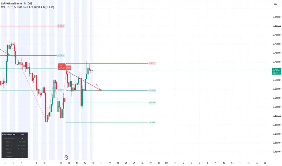
MSX Harmonic ProMSX HARMONIC PRO — XABCD Pattern Detection with Scored Entries and 3 Targets
OVERVIEW
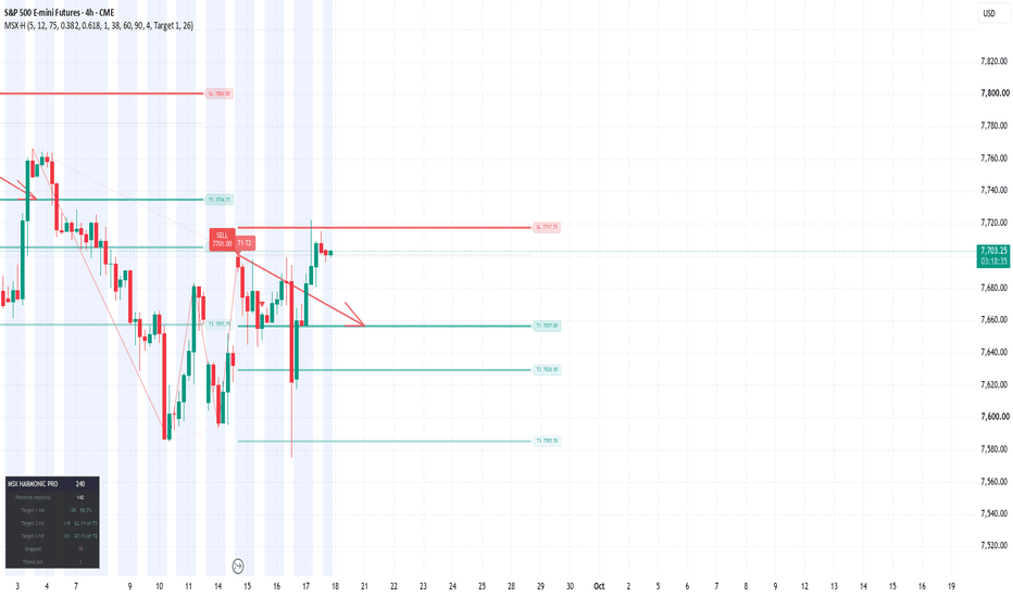
MSX Harmonic Pro detects five-point XABCD harmonic patterns, scores each one on how closely its legs match the ideal Fibonacci proportions, and projects a complete trade plan from the completion point: entry, stop loss, and three take-profit levels drawn as horizontal price lines.
Every pattern is then tracked to resolution. The stats table reports the measured hit rate for each target on your symbol and timeframe — not a claimed rate, but what actually happened on the chart in front of you.
Nothing else is plotted. No moving averages, no oscillators, no bands, no fills.
HOW IT WORKS
PIVOT LADDER Swing highs and lows are detected with a configurable pivot length and pushed into an alternating ladder. When two consecutive pivots are the same type, only the more extreme one is retained, so the X-A-B-C-D sequence always alternates direction and never collapses into noise.
PATTERN MATCHING Each new five-pivot sequence is measured against six harmonic types:
Gartley AB/XA 0.618 · BC/AB 0.382-0.886 · CD/BC 1.13-1.618 · AD/XA 0.786 Bat AB/XA 0.382-0.5 · BC/AB 0.382-0.886 · CD/BC 1.618-2.618 · AD/XA 0.886 Butterfly AB/XA 0.786 · BC/AB 0.382-0.886 · CD/BC 1.618-2.24 · AD/XA 1.27-1.618 Crab AB/XA 0.382-0.618 · BC/AB 0.382-0.886 · CD/BC 2.618-3.618 · AD/XA 1.618 Shark AB/XA 0.382-0.618 · BC/AB 1.13-1.618 · CD/XC 0.886 Cypher AB/XA 0.382-0.618 · BC/AB 1.13-1.414 · CD/XC 0.786
Ratios defined as a single value are scored by proportional distance from that value. Ratios defined as a range score zero error anywhere inside the range and are penalised only for how far outside it they fall. The four leg errors are averaged and converted to a 0-100 score, where 100 is a geometrically perfect pattern. The best-scoring type wins the sequence; patterns below your minimum score are discarded and never drawn.
TRADE LEVELS Entry the D point, drawn as a grey dotted line Stop a percentage of the D-to-T1 distance placed beyond D, drawn as a thick red line Target 1 0.382 of the AD leg, measured back from D Target 2 0.618 of the AD leg Target 3 1.000 of the AD leg — a full retracement, which lands at point A
All four extend to the right of D and carry a price-tagged label.
PROJECTION ARROW A drawn arrow runs from the D point to your chosen target, showing the measured move the pattern's geometry implies. Select T1, T2 or T3 as the destination.
OUTCOME TRACKING Targets must be reached in order — T2 only registers after T1, T3 only after T2 — so a candle that spans several levels at once does not inflate the record. The score label at D builds up as the trade resolves:
82.4 still open 82.4 T1 reached target 1 82.4 T1 T2 T3 reached all three 82.4 X stopped out
Patterns that neither hit T1 nor stop within the timeout period are recorded separately as timed out and excluded from the hit rate.
STATS TABLE Patterns resolved completed trades with a definite outcome Target 1 hit count and percentage of resolved patterns Target 2 hit count and percentage of patterns that reached T1 Target 3 hit count and percentage of patterns that reached T2 Stopped count of losses Timed out expired without resolution
SETTINGS
PATTERNS Pivot length swing sensitivity. Lower finds more, smaller patterns. Allowed fib error % how far a ratio may deviate and still qualify. Minimum pattern score the main quality filter. Raise it for fewer, cleaner setups. Pattern toggles enable or disable each of the six types, and each direction.
ENTRY / STOP / TARGETS Target 1 / 2 / 3 Fibonacci multiples of the AD leg. Stop percentage of the D-to-T1 distance, placed beyond D. Level length how far the price lines extend right of D. Pattern timeout bars before an unresolved pattern expires. Patterns tracked how many run concurrently.
PROJECTION ARROW Arrow points to T1, T2 or T3. Arrow length horizontal reach in bars.
SIGNALS Buy / Sell labels at D, with the completion price shown on the label.
HOW TO USE IT
Start with the defaults and let the stats table fill on your symbol and timeframe. The three rates read together tell you where patterns stop working: if T1 converts well but T2-to-T3 conversion is weak, close the remainder at T2 rather than holding for a target the market is not reaching.
Minimum pattern score is the dial that matters. Raising it reduces signal count and raises average quality. Lower pivot length for intraday charts, higher for swing.
Harmonic completion points are reversal zones, not guarantees. The script is a structure and level tool — it identifies where a reversal is geometrically expected and what the measured move would be if it happens. Combine it with your own read of trend, session and higher-timeframe context.
ON THE SCORE
The number at the D point is Fibonacci ratio accuracy — how closely that pattern's legs match the textbook proportions of its type. It is a measure of geometric quality, not a probability of success. A 95-scoring pattern is a well-formed pattern; it can still fail. The stats table is the separate and more useful number, because it reports what actually happened rather than how good the shape looked.
NOTES
Original implementation. Pattern detection, scoring, level projection and outcome tracking are written from scratch — no external libraries, no reused code.
Harmonic pattern theory itself is public domain, developed through the work of H.M. Gartley, Larry Pesavento and Scott Carney.
This indicator is a technical analysis tool for study and planning. It is not financial advice and does not predict future price movement. Trading carries substantial risk of loss. Test any approach thoroughly before committing capital. Indicador
Quad Stochastic Divergence Toolkit# Quad Stochastic Divergence Toolkit
## Short Description
A four-stochastic divergence toolkit designed to streamline the identification of bullish and bearish stochastic divergences across multiple stochastic speeds.
Inspired by concepts taught in Day Trading Rock Star's Quad Rotation Stochastic Divergence methodology.
---
# Full Description
## Quad Stochastic Divergence Toolkit
The **Quad Stochastic Divergence Toolkit** is a visual trading indicator designed to make it easier to monitor divergence across four stochastic oscillators simultaneously.
The indicator was created to streamline the process of identifying potential bullish and bearish stochastic divergences when using a multi-stochastic approach.
It is inspired by concepts I learned from **Day Trading Rock Star and the Quad Rotation Stochastic Divergence methodology**.
This is an independently developed TradingView tool and is **not an official Day Trading Rock Star indicator, product, or publication**.
### What the Indicator Shows
The indicator displays four independently configured stochastic oscillators in one pane.
Each stochastic can identify two types of regular divergence:
**Bullish / Long Divergence**
Price makes a **lower low** while the corresponding stochastic makes a **higher low**.
This can indicate that downside momentum is weakening even though price has continued lower.
**Bearish / Short Divergence**
Price makes a **higher high** while the corresponding stochastic makes a **lower high**.
This can indicate that upside momentum is weakening even though price has continued higher.
The indicator is intended as a visual analysis tool. A divergence is not, by itself, a trade entry or exit signal.
---
## Four Stochastic Speeds
The toolkit contains four stochastic oscillators with separate settings.
The default configuration uses:
**Stochastic 1**
Length: 9
K Smoothing: 1
D Smoothing: 3
**Stochastic 2**
Length: 14
K Smoothing: 1
D Smoothing: 3
**Stochastic 3**
Length: 40
K Smoothing: 1
D Smoothing: 4
**Stochastic 4**
Length: 60
K Smoothing: 1
D Smoothing: 10
Each oscillator is vertically offset so all four can be viewed clearly within the same indicator pane.
Users can modify the stochastic settings if they prefer a different configuration.
---
## Independent Long and Short Divergence Settings
One of the main purposes of this toolkit is to allow bullish and bearish divergence detection to be tuned independently.
Each stochastic contains two divergence detection groups:
**Div A** — shorter/smaller pivot structure
**Div B** — longer/larger pivot structure
For both Div A and Div B, bullish and bearish divergences have separate pivot settings.
For example:
Long Left A
Long Right A
Short Left A
Short Right A
This allows the user to use different pivot sensitivity for long and short divergences rather than forcing both directions to use identical settings.
The same independent controls are available for all four stochastic oscillators.
---
## Divergence Display
Bullish divergence lines are displayed in green/lime by default.
Bearish divergence lines are displayed in red/maroon by default.
Both the price divergence and the corresponding stochastic divergence are drawn so the relationship between price and momentum can be visually compared.
Div A and Div B can also use different:
* Colors
* Line widths
* Line styles
* Pivot sensitivities
This helps distinguish shorter-term divergence structures from larger ones.
---
## Value Labels
Each stochastic has a current-value label displayed near the right side of the oscillator.
The user can independently control:
* Whether the label is shown
* How many bars to the right of the current bar it appears
* The number/text color of the label
This helps keep the current stochastic readings visible without requiring the labels to sit directly on the most recent candle.
---
## Important: Pivot Confirmation
Divergences in this indicator are based on **confirmed pivot highs and pivot lows**.
A pivot cannot be confirmed until the selected number of **Right** bars has occurred.
For example, if a divergence uses a Right setting of 3, the pivot is not known until three bars after the actual pivot bar.
Once confirmed, the divergence line is drawn back to the originating pivot.
Therefore, a historical divergence line appearing on an earlier candle **does not mean the divergence was known on that candle in real time**.
The actual confirmation occurs only after the required right-side bars have completed.
Increasing the Right setting generally produces more selective pivot structures but also increases the amount of time required before a divergence can be confirmed.
---
## How I Use the Toolkit
The purpose of the indicator is to quickly see whether momentum across multiple stochastic speeds is diverging from price.
Rather than treating every divergence as a trade signal, I use the toolkit as a way of identifying areas that may deserve additional attention.
Possible additional considerations include:
* Market structure
* Support and resistance
* Trend direction
* Higher-timeframe context
* Price action
* Volume
* Session timing
* Risk/reward
* Other confirmation methods used in the trader's own process
Different traders may interpret stochastic divergence differently, so the indicator intentionally provides extensive configuration options rather than prescribing a single trading method.
---
## Customization
Each stochastic can be independently configured, including:
* Enable/disable oscillator
* Stochastic length
* K smoothing
* D smoothing
* Vertical offset
* Stochastic line color
* Value label visibility
* Value label horizontal offset
* Value label number color
* Bullish divergence enable/disable
* Bearish divergence enable/disable
* Independent Long Left/Right pivot settings
* Independent Short Left/Right pivot settings
* Div A settings
* Div B settings
* Divergence line colors
* Divergence line widths
* Divergence line styles
This makes it possible to use the indicator as a starting framework and then adapt it to a trader's own divergence methodology.
---
## Attribution
This indicator was independently developed as a tool to help streamline concepts I learned from **Day Trading Rock Star**, particularly the **Quad Rotation Stochastic Divergence** approach.
Credit for those educational concepts belongs to Day Trading Rock Star.
This TradingView implementation is my own tool for visualizing and organizing stochastic divergence and is not presented as an official Day Trading Rock Star product, indicator, endorsement, or publication.
Users interested in the original trading methodology should refer to Day Trading Rock Star's own educational material for his explanation and application of the strategy.
---
## Disclaimer
This indicator is provided for educational and analytical purposes only.
Divergence does not guarantee a market reversal and should not be interpreted as a prediction of future price movement.
Historical examples are not evidence of future performance.
The indicator does not provide investment advice, financial advice, or individualized trading recommendations.
Trading involves risk. Users are responsible for their own trading decisions, position sizing, risk management, and evaluation of any trading methodology.
# Release Notes — Version 1.0
**Quad Stochastic Divergence Toolkit — Initial Release**
Version 1.0 includes:
* Four independently configurable stochastic oscillators
* Vertically stacked stochastic display
* Bullish regular divergence detection
* Bearish regular divergence detection
* Separate Div A and Div B pivot structures
* Independent Long Left/Right pivot settings
* Independent Short Left/Right pivot settings
* Separate bullish and bearish divergence styling
* Price-chart divergence lines
* Stochastic-pane divergence lines
* Adjustable stochastic value-label positioning
* Selectable hover-label number colors
* Independent controls for all four stochastic oscillators Indicador

Indicador

Indicador

Pressure Release Confirmation Engine [PhenLabs]📊 Pressure Release Confirmation Engine
Version: PineScript™ v6
📌 Description
Pressure Release Confirmation Engine waits for trend-pressure to print a real extreme, then it does nothing until that pressure releases back through a hysteresis band on a closed bar. That release is the trade decision: fade a divergent extreme, or (optionally) take an aligned capitulation/extension release.
It is built for the exhaustion / trend-pressure workflow traders are actually using right now — without another locked-in oscillator recipe and without a Premium data gate. Use the built-in Range Position Pressure, or point Source at any plot you already trust (RSI, MACD, WaveTrend, a paid oscillator). Same arm → release → divergence gate either way. Markers print on price from this pane script, alerts fire both directions, and two numeric plots are Pine Screener columns.
🚀 Points of Innovation
Discrete release trigger, not a paint-the-trend oscillator. Nothing fires at the extreme. The signal is the closed-bar hysteresis cross that ends the extreme.
Any-source engine via input.source — run the same gate on built-in pressure or on an oscillator you already have on the chart.
Divergence quality at the trigger, not as a second indicator. DIVERGENT = price refused to confirm the pressure extreme (higher-low / lower-high). ALIGNED = price confirmed it.
One live arm at a time, timeout expiry, no same-bar arm-and-release, no dual-direction fire.
Pane oscillator plus force_overlay price markers from a single script — no second indicator to add.
Full value on every TradingView plan. No footprint, no tick chart, no lower-timeframe request as a requirement.
Pine Screener columns (PRCE Signal, PRCE State) plus four alertconditions.
🔧 Core Components
Range Position Pressure: close located inside the N-bar high/low, EMA-smoothed to 0–100. External mode replaces this with your selected plot (optionally min-max normalized so 80/20 still mean something).
Extreme arm: pressure must be the lookback highest/lowest and through Overbought/Oversold. The engine stores the arm-bar high or low as the price-confirmation reference.
Hysteresis release: bullish cross of Oversold+Hysteresis, bearish cross of Overbought−Hysteresis, evaluated only on barstate.isconfirmed.
Quality gate: while armed, a new price low (bull) or new price high (bear) marks ALIGNED. No new extreme marks DIVERGENT. Default markers show divergent releases only.
Dashboard: source mode, pressure, phase, quality, bars armed, last signal, screener codes.
🔥 Key Features
Built-in and External source modes with progressive disclosure (dependent inputs stay inactive until External is selected).
Readable defaults: divergent triangles only, arm dots off, short dashboard, no extra labels on price.
Timeout so stale arms die instead of lingering into the next swing.
Named alerts for divergent-only and any-release, both directions, plus alert() on the close.
Screener-ready numeric plots hidden from the pane (data window / screener only).
Armed-state background and dashed/dotted level plots so the hysteresis band is visible.
🎨 Visualization
Pressure line (pane): colored by live arm. Green = bull arm, red = bear arm, gray = idle.
Dashed Overbought/Oversold, dotted mid-line and release levels.
Green triangle below the bar = bullish divergent release (force_overlay on price).
Red triangle above the bar = bearish divergent release.
Optional tiny circles = aligned releases (off unless Price Markers = All releases).
Top-right dashboard: Source, Phase, Quality, Bars Armed, Last Signal, Screener codes. Hover any value cell for the definition.
📖 Usage Guidelines
Pressure Source — Default: Built-in Pressure — Built-in uses this chart. External applies the identical gate to another indicator’s plot.
External Plot — Default: close — Active only in External mode. Add your oscillator first, then pick its plot here.
Normalize External to 0–100 — Default: true — Leave on for MACD, delta, unbounded sources. Off if the source is already 0–100 (RSI, Stochastic, %R flipped).
Pressure Length — Default: 14 — Range: 3–100 — Lookback of built-in range-position pressure.
Pressure Smooth — Default: 3 — Range: 1–30 — EMA on the raw pressure series (both modes).
Extreme Lookback — Default: 10 — Range: 3–50 — Highest/lowest test that qualifies an arm.
Overbought / Oversold — Default: 80 / 20 — Arm thresholds.
Hysteresis — Default: 10 — Range: 1–25 — Release band. Bull fires on a close-bar cross of 30 with defaults; bear on a cross of 70.
Arm Timeout — Default: 25 bars — Armed extremes that never release expire with no signal.
Price Markers — Default: Divergent only — Divergent only / All releases / Hide shapes.
Show Arm Markers — Default: false — Tiny pane dots at the arm bar.
Table Size — Default: Small — Tiny / Small / Normal / Large.
✅ Best Use Cases
Intraday and swing fade of exhausted pressure on indices, FX, gold, and crypto — the engine is asset-agnostic.
Traders who already have a favorite oscillator and want a closed-bar trigger instead of reading slope by eye.
Screening a watchlist for PRCE Signal = 2 (divergent bull) or −2 (divergent bear) on the Pine Screener.
Pairing Built-in Pressure with a higher-timeframe chart for swing, then dropping External Source onto an RSI/MACD on the execution timeframe.
⚠️ Limitations
This is a confirmation engine, not a full system. It does not size positions or place stops. Use your own invalidation (arm-bar extreme is the natural reference).
External mode is only as honest as the plot you feed it. If that plot repaints, PRCE will inherit it. Built-in pressure does not.
Hysteresis will miss V-reversals that never cross the release level before timeout. That is intentional.
One live arm. A new opposite extreme cancels the previous arm.
Not financial advice. Past pressure releases do not guarantee future results.
💡 What Makes This Unique
The product is the release gate , not a new oscillator brand. Removing the arm → hysteresis → divergence sequence removes every signal.
Works as a standalone pane tool and as a meta-tool on any other plot, without a Premium data dependency.
Default chart shows only the higher-quality divergent events, so the picture stays readable.
⚙️ Under the Hood
input.source() : the same extreme/release/divergence state machine can run on close-derived Range Position Pressure or on any other script’s plot. That is the core method — not a decorative source picker. Built-in mode is the default so the script is complete on a blank chart.
input.enum + active : External Plot and Normalize stay inactive until Source = External. Progressive disclosure, not a 40-input wall.
force_overlay on plotshape : a pane oscillator that still marks the price candle from one script. Solves the “add two indicators” friction.
plot() linestyle : dashed thresholds and dotted release/mid levels with zero drawing-object budget.
Closed-bar gate : ta.crossover / ta.crossunder and all arm/release mutations sit behind barstate.isconfirmed. Historical and realtime agree. No lookahead.
Data mode / plan note : no plan-gated APIs. Dashboard row Source = BUILT-IN or EXTERNAL is the only mode flag, and both modes are available on every plan.
Screener & alerts : PRCE Signal (2 divergent bull, 1 aligned bull, −1 aligned bear, −2 divergent bear) and PRCE State (1 armed bull, −1 armed bear, 0 idle) are data-window plots. alertcondition exists for divergent and any-release, both directions.
🔬 How It Works
Pressure is computed (or ingested) onto a 0–100 scale and smoothed. Overbought/Oversold are the arm lines; hysteresis sits inside them as the release line.
On a confirmed bar, if pressure is the lookback extreme and through the arm line, the engine stores that bar’s low (bull) or high (bear) and waits. Opposite arms cancel each other.
While armed, any new price low/high versus the arm reference flips quality from DIVERGENT to ALIGNED. If the hysteresis line is not crossed before timeout, the arm expires silent.
A closed-bar crossover of Oversold+Hysteresis (bull) or crossunder of Overbought−Hysteresis (bear) consumes the arm and emits the signal, quality tag, price marker (if enabled), screener value, and alerts.
Read the dashboard: Phase tells you whether to wait or act; Quality tells you whether price confirmed the extreme; Source tells you which series the gate is running on.
💡 Note:
Add the script, leave defaults, and wait for a triangle. Hover the dashboard cells the first time — they are the legend. For External mode, add your oscillator first, switch Pressure Source, pick its plot, and keep Normalize on unless that plot is already 0–100. Alerts: use “PRCE Bull/Bear Divergent Release” unless you explicitly want aligned events. Screener: filter PRCE Signal = 2 or −2.
This is an analytical aid, not financial advice. You are responsible for risk, execution, and whether a release is worth taking in the current market. Indicador

Indicador