Coasyn Directional Order BlocksCoasyn Directional Order Blocks
Coasyn Directional Order Blocks identifies directional supply and demand zones created around market-structure breaks with displacement.
The indicator is designed to help traders visualize potential areas of prior institutional participation without turning those zones into automatic trade signals.
It tracks both:
Demand Order Blocks
Supply Order Blocks
Each block remains active until it is touched, invalidated, or removed according to the settings selected by the user.
How blocks are created
A new block requires two things:
1. A structure break
The indicator tracks recent swing highs and swing lows using the configured Structure Swing Length.
A demand block requires price to break above the most recent tracked swing high.
A supply block requires price to break below the most recent tracked swing low.
2. Displacement
The structure break must occur with a directional displacement candle.
The displacement filter uses:
ATR-relative candle range
minimum candle-body percentage
bullish direction for demand
bearish direction for supply
This helps prevent every minor structure break from automatically becoming an order block.
Origin candle
After a valid structure break, the indicator searches backward for the opposing candle that preceded the move.
For a Demand Block, it searches for a bearish candle.
For a Supply Block, it searches for a bullish candle.
The number of candles searched is controlled by:
Origin Candle Search
Order Block Zone
The Order Block Zone setting determines how much of the origin candle becomes the displayed zone.
Available options:
Full Candle
Uses the full high-to-low range of the origin candle.
Body
Uses only the candle body.
Refined
Uses a directional refinement of the candle range.
For demand, the refined zone uses the candle low through the top of the body.
For supply, the refined zone uses the bottom of the body through the candle high.
Block states
Each block begins as a fresh active zone.
The indicator then tracks whether price returns to the zone.
The Touched When setting controls when a block is considered touched.
Available options:
First Contact
The block becomes touched as soon as price reaches the outer edge of the zone.
50% Reached
Price must reach the midpoint of the order block.
Full Fill
Price must travel completely through the block to its opposite boundary.
Keeping touched blocks
Enable:
Keep Touched Blocks
to leave previously contacted blocks visible.
Touched blocks are displayed with increased transparency so they can be visually distinguished from fresh zones.
Disable this setting if you want a block removed after its first qualifying interaction.
Invalidation
The Invalidated When setting determines when a block is considered structurally broken.
Available options:
Close Beyond
A candle must close beyond the invalidation boundary.
Wick Beyond
Any wick through the invalidation boundary is sufficient.
For demand blocks, invalidation occurs below the zone.
For supply blocks, invalidation occurs above the zone.
Keeping invalidated blocks
Enable:
Keep Invalidated Blocks
if you want failed blocks to remain visible for review.
Invalidated blocks are converted to a neutral gray appearance and stop extending forward.
When disabled, invalidated blocks are removed from the chart.
Maximum active blocks
Maximum Active Blocks per Direction controls how many demand and supply zones can remain active at once.
Older blocks are removed automatically when the configured maximum is exceeded.
Demand and supply limits are tracked independently.
Forward projection
Forward Projection determines how far active order blocks extend to the right of the chart.
The zone continues updating forward while it remains active.
50% midline
Enable:
Show 50% Line
to display the midpoint of each order block.
This provides a visual reference for traders who use partial mitigation or midpoint interaction as part of their own process.
Structure break markers
Enable:
Show Structure Break Marker
to mark the candle where a valid displacement-driven structure break created a new order block.
These markers are optional and are disabled by default.
Labels
Enable:
Show Demand / Supply Label
to display the directional identity of each block directly inside the zone.
Colors
Demand and supply colors are fully configurable.
Users can also adjust:
fresh-block transparency
touched-block transparency
invalidated-block color
Alerts
The indicator includes alert conditions for:
New Demand Order Block
New Supply Order Block
Demand Order Block Entered
Supply Order Block Entered
Demand Order Block Invalidated
Supply Order Block Invalidated
Alerts must still be configured by the user through TradingView's alert system.
Example workflow
A trader may use the indicator to identify a demand zone created after a strong bullish displacement through prior structure.
The trader can then observe whether price:
remains away from the block → returns to the block → reaches the selected touch threshold → holds or invalidates
The indicator reports the state of the zone.
It does not determine whether the trader should enter.
Important
Coasyn Directional Order Blocks is a market-structure visualization tool.
It does not provide:
automatic entries
buy or sell recommendations
targets
stop placement
position sizing
automated execution
Order blocks should be interpreted within the trader's own market structure, risk, and strategy framework.
A displayed block is a reference zone, not a guarantee of future support, resistance, reversal, or continuation.
Built by Coasyn Market Systems. Indicador

MTF Supply & Demand (PropFirmGorilla)This indicator detects supply and demand zones across eight timeframes at once — 15m, 30m, 1H, 90m, 2H, 4H, 690m and Daily — and draws them on whatever chart you're viewing, so you don't have to flip timeframes to map higher-timeframe levels.
How a zone is found
Each zone is built from an impulse candle and the basing candle immediately before it:
Demand: a bullish impulse candle that moves up at least a set % (open→close) and closes in the top portion of its range, preceded by a small down-closing basing candle whose body is no larger than a set % of the impulse body. The zone runs from the basing candle's open down to its low.
Supply: the mirror — a bearish impulse that closes near its low, preceded by a small up-closing basing candle. The zone runs from the basing candle's high down to its open.
A zone is removed automatically once price trades back through it (through the zone low for demand, the zone high for supply), so the chart only shows levels that are still unmirrored.
Non-repainting
Higher-timeframe zones are read from closed bars only (confirmed history, no lookahead), so a zone appears after its impulse candle closes and does not repaint on reload.
Features:
8 timeframes, each toggled on/off independently.
Simplify Zones: when same-side zones overlap, merge them into one rectangle labeled with every timeframe involved (e.g. "90m / 30m / 15m") to reduce clutter.
Box or line display: filled zones, or a single line at each zone's origin.
Separate colors and adjustable opacity for demand vs supply.
Each zone is labeled with its timeframe.
Adjustable detection thresholds (impulse move %, close-in-range %, basing body %) and a cap on zones per timeframe.
How to use
Add it to any chart. Zones from all enabled timeframes appear as colored areas extended to the right. Treat demand zones as potential support and supply zones as potential resistance; a zone disappears once price closes through it. Tune the detection inputs to match the instrument's volatility, and enable Simplify Zones on lower timeframes where many zones stack up.
Inputs
Zone Detection: Impulse min move (%), Impulse close in range (%), Basing body max vs impulse (%), Max zones per timeframe.
Timeframes: 15m / 30m / 1H / 90m / 2H / 4H / 690m / Daily.
Appearance: Show demand / Show supply, Demand & Supply colors, Fill opacity, Fill boxes (off = origin line only), Simplify Zones, Show timeframe label.
Notes
90m and 690m are requested as custom minute resolutions; if your plan or symbol doesn't return one, untick that timeframe.
Higher-timeframe zones need that timeframe's history to be available; extend the chart's loaded history if a timeframe looks sparse.
This tool is for chart analysis and education only. It is not financial advice; test any approach before trading it.
Indicador

KevindicatorMTF Supply & Demand Zones
A multi-timeframe supply and demand zone indicator that scans the chart's own timeframe and every higher timeframe you enable (15m through 1D) and automatically draws zones based on a strict base-candle → impulse → follow-through pattern.
How zones are detected:
Demand: a small-bodied red base candle with a lower rejection wick, followed by a visibly large green impulse candle (measured against ATR-14) that closes above the base, with no candle closing back inside the zone during the continuation window.
Supply: the mirror image — a small-bodied green base candle with an upper rejection wick, followed by a visibly large red impulse candle that closes below the base.
Zones are boxed from the base candle's open to its wick extreme, and only wicks (not closes) may re-enter the zone while it's forming.
Zone management:
Zones extend live until broken by a 15-minute close through the zone.
Overlap suppression: when a new zone would sit on top of an existing, still-active zone in the same direction, the lower-timeframe zone is dropped — either the new one is skipped, or the older lower-TF zone is replaced by the new higher-TF one. This keeps the chart from filling up with redundant stacked boxes across timeframes.
Auto-hide broken zones: once a zone breaks, it's automatically removed from the chart after a user-set number of hours (1–72), so invalidated zones don't clutter historical price action.
Inputs:
Toggle which timeframes to scan (15m, 30m, 90m, 1H, 2H, 4H, Daily)
Detection sensitivity (base body size, wick size, impulse strength vs. ATR, continuation candle count)
Zone cleanup controls (overlap % threshold, broken-zone hide duration)
Display options (colors, transparency, timeframe labels, 50% equilibrium line, distance-based hiding, alerts on new zone formation) Indicador

Support & Resistance Zones [HexaTrades]
This indicator automatically finds the price levels where the market has turned around before the places where buyers stepped in (support) and where sellers took over (resistance) and draws them as clean rectangular zones on your chart.
Instead of a thin line, each level is drawn as a zone with real thickness, because support and resistance are never one exact price; they are areas where price reacts. The zones update live, extend forward as long as they are valid, and turn into light "ghost" boxes once price finally breaks through them, so you always keep the full picture of the market's history.
Bitcoin 4h: the indicator marking support and resistance zones
How it works
- Finds swing points. A swing high is a candle whose high is higher than the 10 candles on each side of it (the "Swing Length" setting). A swing low is the same idea upside down. These are the exact spots where the market turned.
- Builds a zone from the candle. The zone covers the candle's wick from the extreme tip to the candle body. That wick is where orders actually pushed price back, so it becomes the zone.
- Keeps zone size sensible. Very small wicks get padded to a minimum height, and no zone can grow taller than a maximum height (both measured in ATR, so they adapt automatically to each market's volatility).
- Merges duplicate levels. If a new swing forms at a level that already has a zone, the two are combined into one box instead of stacking clutter on your chart.
- Watches for breaks. When a candle closes beyond a zone, the zone is "broken." what happens next is up to you (see below).
What happens after a zone breaks?
The indicator provides three different zone-management options.
Keep As Past Zone: The broken zone stops extending and remains visible as a faded historical zone. This makes it easier to review how price behaved around previous levels.
Flip Support/Resistance: A broken resistance zone becomes support, while a broken support zone becomes resistance.
This is useful for studying the common market concept of role reversal, where old resistance may act as new support and old support may act as new resistance.
Delete Zone: The zone is completely removed after it breaks. This option is useful for traders who prefer a cleaner chart showing only active zones.
Optional volume filter:
Volume-Confirmed Zones Only can be enabled to filter out lower-volume swing points.
When enabled, the volume of the swing candle must be higher than: Average Volume × Volume Multiplier
For example, with a Volume Multiplier of 1.2, the swing candle’s volume must be greater than 120% of its average volume.
The volume filter is automatically ignored when volume data is unavailable. Volume quality can vary between markets, exchanges and brokers.
Indicator settings
- Swing Length: Controls how significant a swing must be. Lower values create more zones, while higher values create fewer but potentially more significant zones.
- Maximum Zones: Limits the number of active zones displayed. When the limit is exceeded, the oldest active zone is removed.
- ATR Length: Sets the calculation period used to measure volatility.
- Minimum Zone Height: Sets the minimum zone thickness as a multiple of ATR.
- Maximum Zone Height: Prevents zones from becoming excessively wide.
- Merge Overlapping Zones: Combines overlapping or nearby active zones.
- Merge Distance: Controls the ATR-based distance used when deciding whether zones should be merged.
- Maximum Past Zones: Limits how many broken historical zones remain on the chart.
- Past Zone Transparency: Controls how clearly broken zones are displayed.
Alerts
- Built-in alerts
- Zone Touched — price entered a support or resistance zone.
- Resistance Broken — a candle broke above a resistance zone.
- Support Broken — a candle broke a support zone below.
- Set them up from TradingView's alert dialog: Create Alert → Condition → S/R Zones.
How to use it in trading
🔶Bounce trades: when price falls into a support zone and prints a rejection candle, that's a long setup with a stop just below the zone.
A blue support zone represents an area where buyers previously entered the market.
When price returns to support:
- Wait for price to enter or test the zone.
- Look for evidence that buyers are responding.
- Consider an entry only after confirmation.
- Place the stop beyond the opposite side of the zone, with an appropriate buffer.
- Use the next resistance zone as a possible target.
Possible bullish confirmation includes:
- A candle rejecting the lower part of the zone.
- A long lower wick followed by a bullish close.
- A bullish engulfing candle.
- Price closing back above the support zone.
- Increasing volume during the reaction.
- A higher low forming near the zone.
A support touch by itself is not a long signal. Price can move directly through the zone, especially during a strong downtrend.
Example image below:
🔶Rejection from resistance
A pink resistance zone represents an area where sellers previously entered the market.
When price reaches resistance:
- Wait for price to test the zone.
- Look for signs of selling pressure.
- Consider an entry only after bearish confirmation.
- Place the stop beyond the upper edge of the zone, with a suitable buffer.
- Use the next support zone below as a possible target.
Possible bearish confirmation includes:
- A long upper wick inside the resistance zone.
- A bearish engulfing candle.
- Price entering the zone and closing back below it.
- A lower high forming near resistance.
- Increasing selling volume during the rejection.
A resistance touch alone is not a short signal. Strong bullish momentum can break through resistance without producing a meaningful reversal.
Example image:
🔶Trading a breakout
A breakout occurs when price moves beyond an active zone.
- A break above resistance may indicate increasing bullish strength.
- A break below support may indicate increasing bearish strength.
For more conservative confirmation, select Close under Break Confirmation. In this mode, a resistance zone breaks only after a candle closes above it, while a support zone breaks only after a candle closes below it.
The Wick option reacts as soon as price trades beyond the zone. It responds faster but is more sensitive to temporary spikes and false breakouts.
Before considering a breakout trade, traders may look for:
- A strong candle closing beyond the zone.
- A candle body that closes clearly outside the zone.
- Higher-than-average volume.
- Momentum in the breakout direction.
- Alignment with the broader market trend.
- A successful retest of the broken zone.
🔶Trading a role reversal
Support and resistance can sometimes exchange roles after a breakout.
-Broken resistance may later act as support.
- Broken support may later act as resistance.
Select Flip Support/Resistance under the When Broken setting to display this behaviour automatically.
For example, after price closes above a pink resistance zone, the indicator converts that area into a blue support zone. If price later returns to it, traders can watch for a bullish reaction.
Similarly, when price breaks below blue support, the indicator converts the zone into pink resistance. A later retest may provide an area to watch for bearish confirmation.
Role reversal is a commonly observed price-action concept, but it does not occur successfully after every breakout. Wait for confirmation instead of entering only because price has returned to a flipped zone.
🔶Using zones for targets and stops
Zones can also help organise trade management.
For a long setup:
- A stop may be placed below the support zone.
- The next resistance zone may be used as an initial target.
- A higher resistance zone may be considered as a secondary target if momentum remains strong.
For a short setup:
- A stop may be placed above the resistance zone.
- The next support zone may be used as an initial target.
- A lower support zone may be considered as a secondary target.
Avoid placing the stop exactly on the edge of a zone. Price may briefly move beyond the boundary before reacting. The appropriate buffer depends on the symbol, timeframe, volatility and the trader’s risk plan.
Always calculate the potential risk and reward before entering a trade. A visible zone does not automatically make a setup worth taking.
🔶 Using multiple timeframes
Higher-timeframe zones can provide broader market context, while lower timeframes can help refine entries.
A simple process is:
- Identify important support and resistance on a higher timeframe.
- Determine whether the broader structure is bullish, bearish or ranging.
- Move to the preferred trading timeframe.
- Wait for price to reach a relevant zone.
- Use candle structure, volume or momentum for confirmation.
Higher timeframes generally produce fewer but more widely watched zones. Lower timeframes produce more zones and may contain more market noise.
Support and Resistance Zones help traders identify and manage important price areas with less chart clutter. Its volatility-based sizing, zone merging, break confirmation, role reversal, and alerts make it suitable for different markets and timeframes. Use the zones as areas to watch—not automatic trade signals and always combine them with price confirmation, broader market structure and proper risk management.
We would love to hear your suggestions. If you have ideas for new features, indicators, analytics, or improvements, please share your feedback. Your input helps guide future updates and improve the indicator for all traders.
Wedge pattern detector indicator is for educational and analytical purposes only. It is not financial advice. Trading involves risk. Always use proper risk management and combine this indicator with your own analysis before taking any trade.
Indicador

Demand Supply Zone MatrixDemand Supply Zone Matrix by DayTradeSetup
Demand Supply Zone Matrix is an automatic Demand & Supply Zone indicator designed to help traders identify important price areas more clearly without manually drawing every zone.
The system detects potential Supply and Demand zones based on market momentum, volume activity, and the strength of price movement. It also includes zone grading, touch tracking, mitigation reference levels, alerts, and a dashboard summary to help traders filter key zones more efficiently.
Key Features
• Automatic Demand & Supply Zones
Automatically detects potential Supply and Demand zones based on strong directional price movement.
• Strength Grade / Score
Each zone is graded with an A / B / C score to help traders evaluate the quality and strength of each zone more easily.
• 50% Mitigation Line
Displays the midpoint of each zone, which can be used as a reference area for mitigation, retest, or reaction analysis.
• Touch Counter
Tracks how many times price has returned to test a zone, helping traders identify whether a zone is still fresh or has already been tested.
• Zone Retest Alert
Sends an alert when price comes back to test an active Supply or Demand zone.
• Zone Break Alert
Sends an alert when a zone is invalidated or broken by price action.
• Dashboard Summary
Includes a dashboard showing Supply/Demand zone count, best grade, total volume, and overall market bias.
How to Use
This indicator is designed to be used as a technical analysis tool for identifying areas where buying or selling pressure may appear.
Suggested workflow:
1. Check whether Supply or Demand is currently dominant.
2. Focus on higher-grade zones such as A or B.
3. Wait for price to return and test the zone.
4. Use additional confirmation such as Price Action, Market Structure, Trend Direction, or Risk Management before entering a trade.
Suitable For
This indicator is suitable for traders who use concepts such as:
Demand & Supply
Smart Money Concepts
Price Action
Retest Zones
Momentum Trading
Intraday Trading
It can be applied to multiple markets, including XAUUSD, Forex, Crypto, Indices, and different timeframes depending on the trader’s strategy.
Disclaimer
This indicator is a technical analysis tool only. It is not a direct Buy/Sell signal and does not guarantee trading results. Traders should always combine it with their own trading plan, risk management, and additional confirmation before making any trading decisions.
Risk Warning: Trading involves risk. Please study and understand the risks carefully before making any investment or trading decision. Indicador

Supply and Demand Zones | Flux ChartsGENERAL OVERVIEW
Supply and Demand Zones indicator uses a simple but effective mechanism to find the most useful supply and demand zones on any chart. Most tools draw every zone they can find and leave the trader to sort through the clutter. This indicator does the opposite: it watches how price actually behaves at each zone and keeps only the levels that have earned attention.
The mechanism is straightforward. Each zone is built from a confirmed price swing, and from that moment it is tracked as a living object. Every time price returns, the indicator records what happened — a clean rejection (retest), a failed push-through that snaps back (also a retest), or a decisive break. From that record it computes one honest number, Held: the share of retests where the zone successfully pushed price away. A zone that has held four of five tests is immediately separated from one that keeps breaking.
That same track record then drives what you see. Instead of showing every zone, the indicator surfaces a small set of the most useful ones — ranked by how reliably they have held, how often they have been tested, and how close they are to current price. The result is a clean chart focused on the zones that have actually proven themselves, rather than a wall of boxes you have to filter by eye.
WHAT IS THE THEORY BEHIND THE INDICATOR?
Supply and demand trading is built on a simple idea: where price reversed sharply once, it often reacts again, because unfilled orders and trapped traders remain at that level. The problem is that not every zone is equal. Some levels are respected again and again; others break the first time they are tested. Most supply and demand tools draw every zone the same way and leave the trader to guess which ones still matter.
This indicator takes the position that a zone's history is more informative than its existence. A level that has been tested five times and held four of them is telling you something a fresh, untested level cannot. So instead of treating zones as static boxes, the indicator watches every interaction — bounces, failed breakouts, and clean breaks — and turns that record into a measurable hold rate. A zone earns its place on your chart by performing, not just by existing.
FEATURES
Finds the most useful zones — instead of drawing every zone, it tracks how each one behaves and surfaces only the levels that have proven themselves
Automatic zone detection — supply and demand zones are built from confirmed price swings, with boundaries sized by the average wick so each box covers the real reaction area
Per-zone track record — every zone carries its own data: how many times it has been retested, how many times it has broken, and how reliably it has held
Held statistic — each zone shows the share of its retests that successfully held, turning its history into one honest reliability number you can read at a glance
Retest tracking — every test of a zone is recorded and marked on the chart, including failed breakouts that snap back into the zone
Breakout & flip tracking — clean breaks are recorded, and the zone flips from supply to demand (or vice-versa) while keeping its full history
Strongest / Nearest ranking — shows the most useful zones, ranked by how reliably they have held, how often they have been tested, and how close they are to price
Clear, data-rich visuals — gradient zone fills, glowing retest markers, colour-coded flip segments, and a per-zone stats label that displays its retests, breakouts, and Held % right beside it
Clean-chart controls — minimum spacing hides near-duplicate zones, and a smooth fade-out dims zones as they drop off the list
Four alerts — retests and breakouts, on both supply and demand
ZONE DETECTION AND BOUNDARIES
What is a zone?
A zone is a price area drawn around a recent swing high or swing low. A swing high becomes a supply zone (an area sellers defended); a swing low becomes a demand zone (an area buyers defended). New zones are only created when they don't overlap an existing one, so the chart never stacks duplicate boxes on the same level.
Why does it matter?
Swings are where the market actually changed its mind, which makes them the most natural place to expect a future reaction. Building zones only from confirmed swings — and skipping overlaps — keeps the set of zones meaningful instead of cluttered. Clean, non-overlapping detection is the foundation everything else builds on: the track record and ranking are only as useful as the zones they start from.
How is it detected and calculated?
The indicator waits for a swing to confirm using the Swing Period: a high or low only counts once that many bars have printed on both sides of it. The zone's outer edge sits at the swing's extreme (the high for supply, the low for demand). The inner edge is set using the average wick of the candles around the swing, so the zone covers the real reaction area rather than a single thin line. Because a swing needs bars on both sides to confirm, each zone appears a fixed number of bars after the swing itself — a normal, non-repainting delay rather than a level that appears and disappears.
Settings
Swing Period — how many bars must confirm a swing on each side before it forms a zone. Higher = fewer, more significant zones; lower = more zones that react faster to price. Default 30.
Lookback — how far back the indicator looks for zones, in bars. Higher keeps older zones on the chart; lower focuses on recent price action. Default 2000.
RETESTS AND FAILED BREAKOUTS
What is a retest?
A retest is when price returns to a zone, touches it, and is rejected — closing back out on the same side it came from. This is the classic supply/demand reaction: price revisits the area and the zone pushes it away. A failed breakout — price pushing through the zone but then closing back inside it — is also counted as a retest, because the zone ultimately won.
Why does it matter?
Retests are the evidence that a zone is still active. A level that keeps rejecting price is one the market is clearly watching. Counting failed breakouts as retests is important too: a level that traps breakout traders and reclaims is often the strongest kind of level, and ignoring those events would understate a zone's true strength.
How is it detected and calculated?
On each closed bar, a zone is checked for a reaction: for a supply zone, price reaching into the zone but closing back below it counts as a retest; for a demand zone, reaching in but closing back above. To avoid over-counting when price lingers at a level, a Retest Cooldown requires a minimum number of bars between two counted retests on the same zone. Separately, if price closes clean through a zone and then closes back inside it on the next resolution, that failed breakout is recorded as a retest as well. All events are evaluated only on confirmed (closed) bars, so nothing is counted on an unfinished candle.
Settings
Retest Cooldown — waits this many bars before counting another test of the same zone, so price lingering at a level isn't counted as many separate retests. Default 3.
Retests (toggle + marker) — show or hide retest markers and choose their shape (Circle, Triangle, Cross, Diamond).
BREAKOUTS AND ZONE FLIPS
What is a breakout?
A breakout is when price closes decisively through a zone and keeps going, rather than being rejected. When a zone breaks, it flips: a broken supply zone becomes a demand zone, and a broken demand zone becomes a supply zone — the same idea as old resistance becoming new support. Crucially, the zone keeps its history through the flip; it doesn't start over.
Why does it matter?
A clean break is the opposite of a hold, and tracking it is what makes the Held statistic meaningful. The flip behaviour also reflects how these levels really work in practice — a level that breaks rarely disappears; it changes role. Keeping each zone's full history across flips means a level that has been a battleground through several cycles is shown as exactly that.
How is it detected and calculated?
When price first closes through a zone, the zone enters a pending state. The very next resolution decides what happened: if price closes through again, it is confirmed as a breakout and the zone flips its side; if price instead closes back inside, it is recorded as a failed breakout (a retest). This two-step confirmation avoids calling a breakout on a single bar that immediately reverses. Each flip also starts a new coloured time segment, so the zone's box visually records when it was supply and when it was demand across its life.
Settings
Breakouts (toggle + marker) — show or hide breakout markers and choose their shape. Off by default to keep the chart clean.
THE HELD STATISTIC
What is Held?
Held is the heart of the indicator. It answers a simple question: when price comes back to this zone, how often does the zone actually hold? It is shown on each zone's stats label as a count and a percentage, for example "Held: 4 (80%)" — meaning four of the zone's five retests successfully held.
Why does it matter?
This is the number that separates a level worth trading from one that just happens to be on the chart. A high Held % means the zone has repeatedly done its job; a low one warns you the level is leaky. Because it is measured from the zone's own history rather than assumed, it gives you an honest, at-a-glance read on reliability.
How is it detected and calculated?
After each retest, the indicator looks forward over the Hold Window — a set number of candles — and checks whether the zone was broken during that window. If the zone survived the window without a breakout, that retest counts as a hold. Only retests old enough to have a full window behind them are judged, so a very recent retest doesn't distort the number before its outcome is known. Held is then the count of successful holds, shown alongside its percentage of all retests.
Settings
Hold Window — after a retest, the zone must avoid a breakout for this many candles to count as a successful hold. Drives the Held stat and the Strongest ranking. Default 10.
STRONGEST AND NEAREST RANKING
What is the ranking?
Rather than crowd the chart with every zone it finds, the indicator shows a limited number per side and chooses which ones using one of two modes. Nearest simply shows the zones closest to current price. Strongest shows the zones that have most reliably held, weighted by how often they've been tested and how close they are to price.
Why does it matter?
Most charts have far more historical zones than are useful at once. Nearest is best when you care about the levels price is about to interact with regardless of their record. Strongest is best when you want the chart to surface proven levels — the ones that have repeatedly held — so your attention goes to the areas with the best track record.
How is it detected and calculated?
The Strongest score combines three things. Reliability is the zone's hold rate, but smoothed so a zone tested only once can't look perfect — its record is trusted more as it accumulates more tests. Evidence rewards zones that have been tested more often, with diminishing returns so one ancient zone doesn't dominate forever. Proximity favours zones closer to price. A small bonus is given to zones already on screen so the displayed list stays steady instead of swapping every bar. Nearest mode, by contrast, simply ranks by distance to price.
Settings
Rank By — Strongest (most reliable, weighted by tests and proximity) or Nearest (closest to price). Default Strongest.
Show — how many supply and how many demand zones to show at once; each side is counted separately. Default 5.
ZONE SPACING AND FADE-OUT
What are spacing and fade-out?
Two features keep the chart readable. Minimum spacing hides a zone that sits too close to one already shown, so you don't get several near-identical boxes stacked together. Fade-out smoothly dims a zone as it drops off the visible list, instead of having it vanish abruptly.
Why does it matter?
A clean chart is easier to act on. Spacing prevents visual clutter at congested levels, and the fade-out makes it obvious when a zone is no longer among the top picks without the chart jumping around distractingly.
How is it detected and calculated?
When selecting which zones to show, the indicator skips any candidate sitting within the Min Zone Spacing distance (a percentage of price) of a zone already chosen. When a previously shown zone is no longer selected, it is moved to a fade list and dimmed over a fixed number of bars before being removed. Drawing is also budgeted internally so the gradient zone fills always stay within the platform's object limits.
Settings
Min Zone Spacing (%) — hides zones sitting too close to one already shown, to keep the chart clean. Set to 0 to show every zone. Default 0.1%.
Supply / Demand colours — the colours used for supply and demand zones, their gradient fills, and their markers.
ALERTS
What alerts are available?
Bullish Retest — price bounced from a demand zone.
Bearish Retest — price rejected from a supply zone.
Bullish Breakout — price broke above a supply zone.
Bearish Breakout — price broke below a demand zone.
When do they fire?
Each alert fires on a confirmed bar at the moment the matching event is recorded, so you are notified of bounces and breaks as they are confirmed rather than on an unfinished candle.
IMPORTANT NOTES
All retests, breakouts and flips are evaluated only on closed (confirmed) bars, so events are not counted on an in-progress candle.
A breakout requires price to close through a zone and then confirm on the next resolution. A single bar that closes through and immediately closes back in is recorded as a retest (failed breakout), not a breakout.
Held only judges retests that have a full Hold Window of bars behind them, so the most recent retest may not yet be reflected in the Held count until its outcome is known.
When a zone breaks it flips side and keeps its full history, so a single long-lived zone can show interactions from several supply/demand cycles.
The number of zones shown is limited per side by the Show setting; other valid zones continue to be tracked in the background and can appear later as conditions change.
UNIQUENESS
Most supply and demand indicators draw zones and stop there, leaving the trader to guess which levels still matter. Supply and Demand Zones treats each zone as a tracked object with a measurable record. Every retest, failed breakout and clean break is recorded over the zone's life, and the Held statistic turns that record into a single, honest reliability number shown right on the zone — a level that has held four of five tests is immediately distinguishable from one that keeps breaking. Failed breakouts are folded into retests rather than ignored, capturing the trap-and-reclaim behaviour that often marks the strongest levels, and broken zones flip side while keeping their entire history instead of resetting. The Strongest ranking is driven by that same measured record — reliability, number of tests, and proximity — with smoothing so a single lucky test can't masquerade as a perfect level, meaning the chart automatically surfaces the zones that have actually proven themselves. The result is a supply and demand tool that doesn't just show you where zones are, but how much each one has earned your trust.
DISCLAIMER
This indicator is an analytical and educational tool. It does not predict future price movement and does not provide financial advice. A zone's past hold rate describes what has already happened and does not guarantee future behaviour. Always use proper risk management and combine this tool with your own analysis. Indicador

Hidden Liquidity Profile [Alpha Extract]A sophisticated liquidity-mapping and support/resistance profiling framework that analyzes historical candle structure, volume, wick behaviour, and price distribution to identify hidden supply and demand zones across the chart. Hidden Liquidity Profile is designed to reveal where meaningful liquidity may be concentrated by separating sell-side and buy-side pressure into price bins, then projecting those zones forward as heat boxes, horizon lines, key price tags, and a real-time support/resistance dashboard.
Rather than relying on simple pivot highs and lows, the system evaluates how volume interacted with candle ranges, upper wicks, lower wicks, candle bodies, and recency weighting. This creates a dynamic liquidity profile that highlights where price may encounter resistance, support, absorption, or reaction zones.
🔶 Hidden Liquidity Profiling Engine
Builds separate supply and demand profiles across the selected lookback range. The system divides price into configurable bins, then distributes liquidity strength into those bins based on volume, candle range, wick size, body size, and age decay.
energy = vol * rng * decay
sellStrength = energy * (upWick * wickWeight + body * bodyWeight * sellBias)
buyStrength = energy * (dnWick * wickWeight + body * bodyWeight * buyBias)
This allows the indicator to estimate where sell liquidity and buy liquidity are most likely concentrated rather than only marking obvious visible highs and lows.
🔶 Supply & Demand Separation
The profile separates upper-wick and lower-wick pressure into two distinct liquidity maps.
Upper wick activity contributes to the supply profile, helping identify areas where sellers may have previously absorbed price movement. Lower wick activity contributes to the demand profile, helping identify zones where buyers may have previously defended price.
This separation gives traders a clearer view of whether nearby levels are more likely to behave as resistance, support, or balanced liquidity.
🔶 Age-Weighted Liquidity Decay
Applies a recency decay model so newer candles have stronger influence than older candles. This keeps the profile focused on liquidity that is more relevant to the current market environment while still preserving broader historical context.
The Age Decay Power setting controls how aggressively older liquidity fades. Higher values emphasize recent price action more strongly, while lower values retain more historical structure.
🔶 Price Bin Distribution System
Divides the analyzed price range into configurable price bins and assigns liquidity strength into each level. The Price Bins setting controls the resolution of the profile.
More bins create a finer, more detailed liquidity map. Fewer bins create a smoother, broader view of major supply and demand areas.
🔶 Distribution Radius Smoothing
Uses a configurable distribution radius to spread liquidity strength around nearby bins. This prevents the profile from becoming too fragmented and helps form smoother liquidity clusters.
This is especially useful on volatile assets where important liquidity zones often form across small ranges rather than at one exact tick.
🔶 Liquidity Heat Box Visualization
Displays supply and demand as horizontal heat boxes projected to the right side of the chart.
Supply liquidity is shown on the sell side using the selected sell color, while demand liquidity is shown on the buy side using the selected buy color. Wider and brighter boxes represent stronger normalized liquidity at that price level.
This creates a visual depth-style map that helps traders quickly identify where meaningful liquidity may be stacked above and below current price.
🔶 Forward Horizon Lines
Projects stronger liquidity levels forward using horizontal lines. These lines act as future reference zones where price may react, pause, reject, or accelerate through.
The Line Trigger setting controls how strong a liquidity level must be before it is projected. The Line Width Scale setting adjusts how visually dominant stronger levels appear.
🔶 Key Level Detection Framework
Identifies the strongest supply and demand levels from the profile and labels them directly on the chart.
The system can prioritize local peaks, helping avoid overcrowding and ensuring that selected levels represent distinct liquidity clusters rather than multiple nearby bins from the same zone.
This scoring model favors levels with strong dominant liquidity while still accounting for total combined activity.
🔶 Supply HVN & Demand HVN Labels
Marks high-volume liquidity nodes as Supply HVN or Demand HVN depending on which side of the profile dominates at that price.
Each label includes the level type, normalized strength percentage, and exact price. This allows traders to quickly identify the most important liquidity levels without manually reading the full heat map.
🔶 Nearest Support & Resistance Logic
Calculates the most relevant resistance above price and support below price using both liquidity strength and distance from current price.
Levels closer to current price receive more practical importance, while still needing enough liquidity strength to qualify. This helps the dashboard focus on actionable nearby zones instead of simply displaying the strongest level anywhere in the lookback range.
🔶 Aura Point Of Control
Identifies the strongest combined liquidity level across the profile. This Aura POC represents the price zone with the highest combined supply and demand activity.
The POC can act as a major reference point for balance, rotation, acceptance, rejection, or future retests.
🔶 Liquidity Pressure Balance
Compares total normalized demand against total normalized supply to estimate the broader pressure bias across the analyzed range.
When demand is meaningfully stronger, the dashboard shows a demand bias. When supply dominates, it shows a supply bias. When the two sides are close, the market is classified as balanced.
🔶 Real-Time S/R Dashboard
Includes a compact dashboard showing the most important liquidity information directly on the chart:
• Nearest resistance level
• Nearest support level
• Aura POC
• Supply, demand, or balanced pressure
• Active liquidity level count
• Current ticker reference
This gives traders a quick summary of where the strongest nearby reaction zones are and whether the broader liquidity profile is tilted toward supply or demand.
🔶 Customizable Visual Controls
Provides flexible display controls for heat boxes, horizon lines, key level tags, dotted key level lines, and the dashboard.
Traders can adjust the number of analyzed bars, price bin resolution, liquidity smoothing, projection distance, box width, line width, and trigger thresholds to match different assets and timeframes.
🔶 Clean Overlay Design
The full liquidity map is displayed directly on price without requiring a separate oscillator pane. Heat boxes appear to the right of the chart, while key levels and labels extend across the active lookback area.
This keeps the chart readable while still providing a detailed view of hidden supply and demand structure.
🔶 Why Choose Hidden Liquidity Profile ?
Hidden Liquidity Profile provides a more advanced way to identify potential support, resistance, and liquidity reaction zones by analyzing volume-weighted candle structure across the full price range. Instead of marking only visible swing highs and lows, it evaluates where supply and demand pressure may be concentrated based on wick behaviour, candle body participation, volume energy, and recency-weighted price distribution.
The heat boxes reveal liquidity density, the horizon lines project important levels forward, the HVN labels highlight the strongest zones, and the dashboard summarizes nearest support, resistance, POC, and pressure bias in real time.
Perfect for liquidity traders, support/resistance traders, intraday traders, swing traders, and market structure analysts who want a cleaner way to visualize hidden supply and demand zones directly on the chart. Indicador

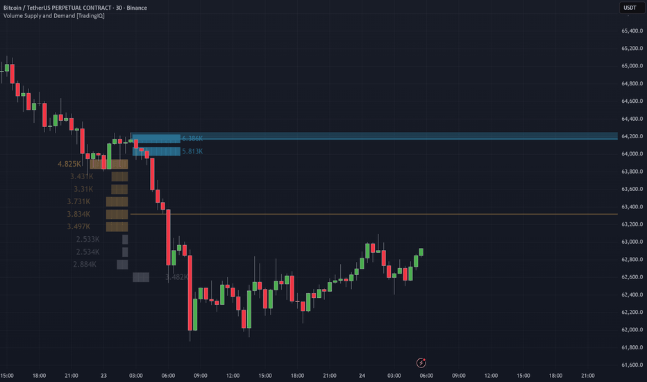
Volume Supply and Demand [TradingIQ]The Next Generation of Supply and Demand
You haven't seen a single good Supply and Demand indicator until today.
Let's be honest: almost every S/D indicator you've tried is either too late, constantly repaints, or simply flags every single random pivot on the chart as a "zone." That is not how institutional trading works. Traditional support and resistance might teach you to draw lines at every turning point, but if you've been trading for more than two weeks, you know that not every pivot holds weight in the future.
This tool was built to fix that. It is designed to filter out the low-quality noise, bypass the common structural flaws of basic chart metrics, and isolate nothing but genuine liquidity shock events where massive market orders actually took place.
Welcome to the Volume Supply and Demand engine.
---
How the Algorithm Works (The "Why")
Easier said than done, right? Finding a level that actually has institutional defense behind it requires deep mathematical screening. Instead of just looking for simple highs and lows, this algorithm detects explosive price moves via an advanced multi-step screening system.
First, the script calculates the True Range of consecutive candles to establish a baseline of normal market volatility. Once that baseline is set, it actively scans for sudden, abnormal expansions in price. It analyzes the specific angle, slope, and velocity of the expansion to ensure the move is statistically anomalous.
Demand Zones: These are flagged when extreme buying pressure forces a rapid, high-velocity move upwards, leaving behind a massive footprint of unfilled passive limit orders.
Supply Zones: These are flagged when intense selling aggression ramps up instantly, completely rejecting higher prices and driving the market down with severe negative velocity.
We strictly filter out the low-quality, minor pivot points. Once the strict qualifications of velocity and range expansion are met, the zone is detected and locked in instantly.
---
Structure vs. Normal Support & Resistance
To trade effectively, you must understand why these zones behave differently than standard horizontal support and resistance lines.
Traditional support and resistance lines can theoretically be drawn anywhere the market decides to turn around, regardless of the volume or speed behind the move. This creates messy charts cluttered with hundreds of psychological lines that offer no real edge.
This engine is different because it maps out an entire premium or discount zone based on the exact candle structural properties where the initial institutional imbalance occurred. It targets the literal origin of the reaction , creating a highly precise boundary where a major market participant stepped in aggressively to flip the auction control.
---
Deep-Dive Order Flow Features
We didn't just build a box-drawing tool. We added an entirely new dimension of volume analysis to help you gauge the actual internal strength of these levels.
Origin Volume Profiles: This is the game-changer. For every valid Supply or Demand zone generated, the indicator dynamically projects a micro Volume Profile directly inside the specific structural move that created the zone . You get an immediate, visually clear picture of exactly where the heavy volume was transacted during that specific liquidity event.
Delta & POC Lines: The algorithm identifies the Point of Control (POC) for both the buy-volume side and the sell-volume side independently. By plotting these lines, you can see precisely where the buyers or sellers exhibited their maximum aggression right before the major expansion occurred.
Time-Based Profiles: Volume isn't the only metric that matters. You can change the profile type inside the settings to "Time" to generate a profile that maps out exactly where the price spent the most time consolidating before exploding out of the zone.
Auto Hit-Deletion: The more a level is traded into, the weaker it gets as the resting passive orders are continuously matched and filled. To prevent you from trading dead levels, the indicator includes an automated hit-deletion toggle. The moment the price decisively pierces through a zone, the script recognizes the liquidity exhaustion and wipes the zone from your chart.
---
Settings & Optimization Guidelines
Because this script relies on heavy historical array calculations and complex request structures, proper optimization is essential for a smooth charting experience:
S/D Zone Style (Wick, Body, Candle): This dictates the strictness of your zone boundaries.
Wick (Default & Strongly Recommended): Draws the zone across the precise wick of the origin candle, capturing the maximum premium/discount extremity.
Body / Candle: Alternative constraints that alter the vertical width of the boxes based on the candle open and close values.
Max Zone Age (Bars): A zone created hundreds of bars ago losing its relevance because the participants holding those orders have likely closed their positions. This setting expires old zones to keep your chart fresh. If your chart experiences loading delays, lower this setting to roughly 200 bars.
Calculated Bars: To manage the calculation weight of the Epanechnikov kernel filtering and volume slice matrices, you can adjust the total calculation window. If your chart shows a red runtime error, lower this setting from 5000 down to 2000 bars.
Show Volume at Level: Turning this on overlays the raw numerical transaction data over each individual profile block, allowing for precise order flow calculation.
---
The Core Trading Logic
When a zone is formed by a massive imbalance of aggressive market orders, institutional participants frequently leave resting passive limit orders behind because the market moved too quickly to fill their entire block. When price returns to this exact zone for the first time, those resting orders are triggered. This acts as a defense line, forcing an aggressive, fast reversal.
If price returns to a zone multiple times, or if it begins to grind and spend a long time consolidating inside a box, that is a major warning sign. It means liquidity is actively depleting, the passive orders are being entirely consumed, and a massive liquidity shock breakout is right around the corner.
Disclaimer: This is not financial advice. Always test the mechanics against your own personal edge, backtest thoroughly, and integrate it properly within your broader risk management plan. Indicador
BreakoutBreakout is an overlay indicator for identifying pre-breakout trade context using supply/demand zones, higher-timeframe alignment, moving-average structure, and confluence scoring.
This script is for analysis and planning only. It does not place orders or guarantee results.
What it does
Breakout helps visualize potential long and short setups before price breaks out of a key zone. It combines:
- Key magnet supply/demand zones (strongest reaction levels only)
- HTF trade zones auto-anchored by chart timeframe
- Pre-trade setup boxes with entry, stop, and target
- Diamond markers for high-confluence turning points
- Liquidity levels for potential sweep/SFP context
- Optional info panel with bias, levels, and active setup details
How it works
Magnet zones: pivot highs/lows cluster into levels. Levels price revisits gain strength. Only the strongest are drawn.
HTF trade regime: each chart timeframe uses two higher anchor timeframes. Long ideas can be filtered to HTF demand zones; shorts to HTF supply zones. Zones use confirmed HTF swing highs/lows with ATR-based width and reach.
Setup engine: setups form when zone context, trend/MA structure, confidence score, and cooldown align. Stops use risk percent, MA support/resistance, swing levels, and a max distance cap. Targets use a configurable minimum risk/reward.
Diamond signals: require structure (SFP, reversal, or MA setup), zone context, and supporting momentum/trend. Optional volume spike and RSI divergence add confluence. Not every pivot prints a diamond.
Volume and divergence: abnormal volume spikes (relative volume and z-score) can combine with RSI divergence in diamonds and setup scoring.
MTF data uses request.security() with barmerge.lookahead_off to avoid lookahead on higher-timeframe context.
How to use
1. Add Breakout to your chart.
2. Choose your execution timeframe.
3. Keep HTF zone filter on for higher-timeframe alignment.
4. Wait for price at HTF zone plus key magnet zone, then diamond or setup box with confidence at or above Min Confidence.
5. Use entry, stop, and target from the active setup box for planning.
6. Manage risk with your own rules.
Main settings
- Risk: risk per trade, min R/R, max hold bars
- Filters: min confidence, approach distance, cooldown, volume, vol spike and divergence
- HTF zones: trade inside HTF S/D only, auto anchors, zone width and reach
- Display: zones, setups, liquidity, labels, info panel, EMAs, diamond spacing
Alerts
- Breakout Long Setup
- Breakout Short Setup
- Breakout Approaching Demand
- Breakout Approaching Supply
Alerts reflect script conditions at alert time. They are not trade recommendations.
Disclaimer
Educational and informational use only. Not financial advice. Trading involves risk, including loss of capital. Past results do not guarantee future performance. Use at your own discretion. Indicador

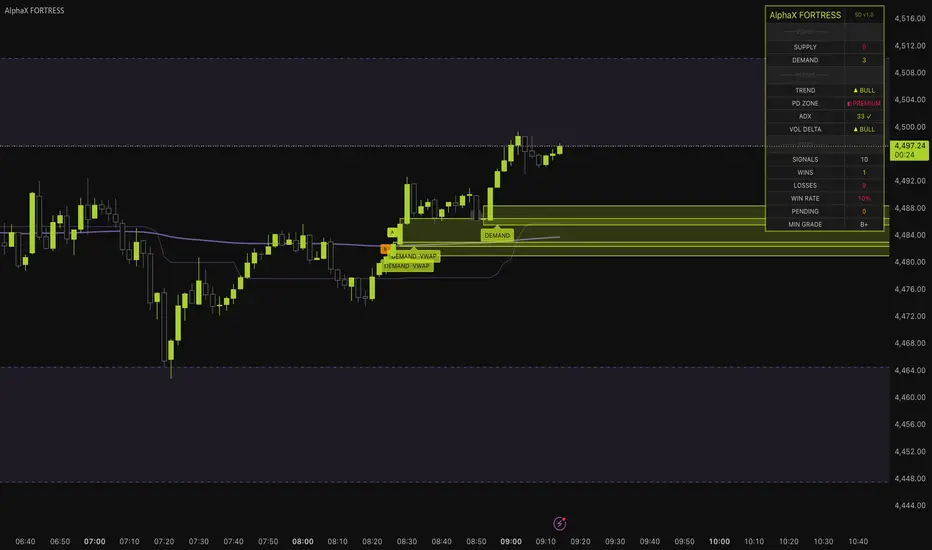
[ A L P H A X ] FORTRESS - Supply & Demand Zone EngineAlphaX FORTRESS — Supply & Demand Zone Engine with Zone Grading, Session VWAP Confluence, Liquidity Sweep Signals, HTF Zone Overlay & Live Backtest Statistics
AlphaX FORTRESS is a professional-grade supply and demand system built around an institutional zone detection engine that identifies, grades, and tracks every significant supply and demand zone on the chart — then fires precision entry signals only when price returns to those zones with genuine rejection confirmation, multi-layer filter alignment, and a qualifying zone grade. Where most supply and demand indicators simply draw boxes and leave the trader to decide what to do, FORTRESS integrates a five-factor zone grading algorithm (A+ through C), session VWAP confluence scoring, higher timeframe zone overlay, liquidity sweep detection, a full suite of entry quality filters, and a live on-chart backtest statistics tracker that counts wins, losses, and win rate in real time directly from the chart's history. Every signal is supported by zone grade verification, trend alignment, ADX confirmation, volume delta pressure, premium/discount positioning, and rejection wick quality — producing a complete, self-contained supply and demand trading system. Designed for active traders across crypto, forex, gold, and indices on any timeframe.
━━━━━━━━━━━━━━━━━━━━━━━━━━━━━━━━━━━━━━━━
🏛 Supply & Demand — The Institutional Framework
Supply and demand zones are the foundational building blocks of institutional price delivery. Unlike horizontal support and resistance drawn from price memory, genuine supply and demand zones are identified from the origin of explosive moves — the exact price range where institutions accumulated or distributed their positions before driving price aggressively in one direction.
Demand Zone: Formed when price makes an explosive bullish move away from a base. The base — one or more low-momentum candles directly preceding the explosive candle — represents the range where institutional buyers accumulated their full position. When price returns to this zone, unfilled buy orders are waiting. The most reliable demand zone retests produce sharp, rejection-candle bounces from within the zone.
Supply Zone: The mirror image. An explosive bearish move preceded by a base of low-momentum candles. Institutions distributed their position in the base before driving price aggressively lower. On return, unfilled sell orders produce sharp rejection moves downward from within the zone.
Why FORTRESS detects zones differently from most indicators: Most zone detectors use a simple pivot or pattern check. FORTRESS requires three simultaneous conditions for a zone to qualify — the departure candle must be explosive (ATR-scaled range), the body must represent a minimum proportion of the total range (body quality filter), and volume must confirm when enabled. Only zones formed by genuine institutional displacement are registered.
━━━━━━━━━━━━━━━━━━━━━━━━━━━━━━━━━━━━━━━━
🔬 Zone Detection Engine — Quality Filters
Every zone formed by FORTRESS passes three mandatory quality gates before being registered:
Explosive Move Filter:
The departure candle (the candle that leaves the base and drives price) must have a total range exceeding the ATR by a configurable multiplier (default: 1.2×). This filters out zones formed by slow, grinding moves — only impulsive, institutionally driven departures qualify. Smaller ATR multipliers produce more zones; larger values produce fewer, higher-quality zones.
Body Quality Filter:
The departure candle's body must represent at least a configurable percentage of its total range (default: 55%). A small body in a large-range candle indicates indecision — the candle moved far but closed near its midpoint, suggesting weak directional conviction. A large body relative to range confirms genuine one-directional pressure on the departure move.
Volume Confirmation (optional):
When enabled, the departure candle's volume must exceed the average volume (configurable period, default: 20 bars) by a minimum multiplier (default: 1.1×). High-volume departures carry more institutional weight than same-range moves on average volume. The volume filter is off by default — this allows the system to work effectively on instruments where volume data is unreliable (forex spot, crypto perpetuals) while providing an additional quality gate when reliable volume is available.
Base Detection:
The base candles immediately preceding the explosive departure are automatically detected — up to the configurable maximum (default: 2 candles). Base candles must have a body smaller than 0.5× ATR and must not themselves be explosive. The full base range is incorporated into the zone boundaries, accurately reflecting the complete accumulation or distribution range rather than just the departure candle alone.
━━━━━━━━━━━━━━━━━━━━━━━━━━━━━━━━━━━━━━━━
🏅 Zone Grading System — A+ Through C
Not all supply and demand zones are equal. A zone formed on massive volume with VWAP confluence during a premium price area carries fundamentally more institutional weight than the same pattern on average volume in a random price area. FORTRESS quantifies this difference with a five-factor algorithmic grading system that assigns every zone a grade of A+, A, B, or C at the moment of formation.
Grading factors and their weights:
Move Strength (up to 30 points) — the ratio of the departure candle's range to ATR, capped at 30 points. Stronger, more explosive departures score higher. A 3× ATR departure scores maximum; a 1.2× departure (the minimum threshold) scores proportionally lower
Volume Ratio (up to 20 points) — when volume confirmation is enabled, the ratio of departure volume to average volume, capped at 20 points. When volume confirmation is off, a flat 10 points is awarded to maintain grade comparability across instruments. High-volume departures receive the full bonus
VWAP Confluence (20 points) — full 20 points awarded when the session VWAP is within a configurable ATR tolerance of the zone boundaries at the time of formation. A zone that forms directly at the institutional session reference level carries significantly more weight than a zone formed far from VWAP. This is the VWAP Boosts Grade feature
HTF Zone Match (20 points) — full 20 points when the zone overlaps with an active higher timeframe supply or demand zone. Confluence between the current timeframe zone and the HTF zone indicates institutional activity at multiple timeframe levels simultaneously — the strongest possible zone quality condition
PD Zone Match (15 points) — awarded when the zone forms in the institutionally correct price area: supply zones in premium (above dealing range equilibrium) and demand zones in discount (below equilibrium). A supply zone in premium and a demand zone in discount are positioned where institutions naturally distribute and accumulate respectively
Base bonus (5 points) — a flat quality bonus applied to all qualifying zones
Grade thresholds:
A+ (80+ points) — elite institutional zone. All or most factors aligned. Maximum conviction
A (65–79 points) — strong zone with multiple confirming factors. High quality
B (50–64 points) — solid zone with partial confirmation. Standard quality
C (below 50 points) — low-quality zone. Formed with minimal supporting factors
The grade badge is displayed directly on the zone box on the chart. The minimum grade filter (default: B) blocks signals from C-grade zones entirely — preventing entries at the lowest-quality institutional levels.
━━━━━━━━━━━━━━━━━━━━━━━━━━━━━━━━━━━━━━━━
🌐 Session VWAP Confluence
The session VWAP is plotted as a continuous purple line and serves two distinct roles in FORTRESS.
Visual reference: The VWAP line and optional ±1σ bands provide the institutional session fair value reference directly on the price chart. Optional band display shows the first standard deviation envelope around VWAP.
Grade booster: When VWAP Boosts Grade is enabled (default: on), every zone that forms within ATR tolerance of the session VWAP receives 20 additional grade points — frequently elevating a B-grade zone to A or A+ when VWAP proximity confirms institutional positioning at that level.
Why VWAP at the zone matters: The session VWAP is the single most widely watched intraday reference level by institutional desks, algorithms, and market makers. When a supply or demand zone forms directly at the VWAP, it means the institutional activity that created the zone coincided with the session's fairest price level — the most contested and significant price in the session. Retests of these zones carry the highest probability of generating a sharp institutional response.
━━━━━━━━━━━━━━━━━━━━━━━━━━━━━━━━━━━━━━━━
📡 HTF Zone Overlay
FORTRESS pulls supply and demand zones from a configurable higher timeframe (default: 60-minute) and overlays them on the current chart as purple dashed boxes.
What HTF zones represent: A supply or demand zone on H1 was created by a significantly larger impulsive move than anything visible on M5 or M1. These zones represent institutional positioning decisions made on a multi-hour timeframe — they carry far more weight than same-pattern zones on the current timeframe. When a current timeframe demand zone overlaps with an active H1 demand zone, two independent timeframes of institutional evidence are concentrated at the same price level.
Zone matching in the grader: When a newly formed current timeframe zone overlaps with an active HTF zone of the same type, it receives the full 20-point HTF Match bonus in the grading system — frequently pushing the zone from B to A or A+ grade. The label also appends ·HTF to confirm the match.
HTF zone lifecycle: HTF zones are maintained in real time. When price closes above an HTF supply zone or below an HTF demand zone, the zone is deleted automatically — mitigated zones are no longer relevant and are removed to keep the chart clean.
━━━━━━━━━━━━━━━━━━━━━━━━━━━━━━━━━━━━━━━━
💧 Liquidity Sweep Signal Mode
In addition to standard zone rejection signals, FORTRESS detects a powerful second entry type: the liquidity sweep — where price wicks through a zone's boundary to grab stop orders before reclaiming back inside.
Demand sweep (bull): Price wicks below the demand zone bottom by at least the minimum sweep depth (default: 0.15× ATR), then closes back above the zone bottom. Retail stops placed just below the demand zone have been triggered — institutions used that liquidity to accumulate. The reclaim close is the entry signal.
Supply sweep (bear): Price wicks above the supply zone top by at least the minimum sweep depth, then closes back below the zone top. Buy stops above supply have been triggered; the close back below is the entry.
Why sweeps are powerful: A standard zone rejection is a clean, textbook entry. A zone sweep adds an additional dimension — institutions have actively manufactured a liquidity event at the zone boundary, triggered counterparty stops to fill their own orders, and then reversed. This sequence is a clear signature of institutional stop hunting followed by directional commitment. Sweep signals are marked with an orange circle rather than a triangle to distinguish them visually from standard rejections.
Stop placement for sweeps: The SL for sweep entries is placed at the wick extreme (the sweep low for bull sweeps, the sweep high for bear sweeps) plus a small ATR buffer — anchored to the actual manipulation point rather than the zone boundary.
━━━━━━━━━━━━━━━━━━━━━━━━━━━━━━━━━━━━━━━━
🧠 Signal Entry Logic — Multi-Layer Filtering
A FORTRESS signal fires when a zone touch is detected with candle rejection and all configured filters pass. The full filter stack applied to every potential entry:
Zone touch verification:
The current bar's low must reach within the demand zone (for longs) or the current bar's high must reach within the supply zone (for shorts). Touch detection includes a small ATR tolerance (0.05×) to account for minor overshoot or spread differences.
Rejection candle confirmation:
The bar must close in the correct direction — bullish close (close above open) for demand entries, bearish close for supply entries. Additionally, the rejection wick must meet the minimum wick percentage requirement (default: 50% of bar range). A bar touching a zone with a tiny lower wick but a large body is a weak rejection — the minimum wick filter ensures the zone produced a genuine, visible rejection impulse.
Filter stack (all must pass):
Trend EMA — price must be above the trend EMA (default: 50-period) for demand longs, below for supply shorts. Prevents counter-trend entries
ADX minimum — market must be trending above the configured ADX threshold (default: 18). Blocks zone entries in choppy, ranging conditions
Volume Delta — estimated directional volume pressure must agree with the signal direction. Bull volume dominance for longs, bear for shorts
PD Zone requirement — price must be in discount for demand entries (below dealing range equilibrium) and in premium for supply entries (above equilibrium)
Zone grade minimum — only zones at or above the configured minimum grade (default: B) can trigger signals
Fresh zone filter — when enabled, only zones that have not been previously tested can trigger signals. A zone that has already been retested once carries less institutional fresh-order weight
One signal per zone — when enabled, each zone can only generate one signal regardless of how many valid touches occur. Prevents repeated entries at the same level
Signal cooldown — minimum bars between any two signals (default: 5). Prevents signal clustering during complex multi-touch zone reactions
Session filter — when enabled, restricts all signals to the configured active hours window
━━━━━━━━━━━━━━━━━━━━━━━━━━━━━━━━━━━━━━━━
📊 Zone Mitigation & Lifecycle Management
FORTRESS tracks the full lifecycle of every zone from formation through mitigation. The mitigation mode is configurable:
Body Close (default): A zone is mitigated when price closes beyond its boundary — a close above a supply zone top or a close below a demand zone bottom. This is the stricter, lower-noise mode. Wicks through the zone do not count as mitigation unless they are accompanied by a body close — consistent with the idea that a wick through the zone is a sweep (an opportunity) rather than a genuine break.
Wick Touch: A zone is mitigated as soon as any price touches the boundary — high above supply top, low below demand bottom. This is a more aggressive mitigation mode that removes zones faster, keeping the chart cleaner but potentially removing zones that could have produced more entries.
When a zone is mitigated under either mode, its box, label, and grade badge are immediately deleted from the chart. The system maintains a rolling maximum of the configured number of active zones per side (default: 3), automatically removing the oldest zones when the limit is exceeded.
━━━━━━━━━━━━━━━━━━━━━━━━━━━━━━━━━━━━━━━━
📈 Live Backtest Statistics Tracker
One of FORTRESS's most distinctive features is its on-chart live backtest statistics system . Every signal fired is tracked in memory with its entry price, ATR at signal time, direction, and grade. On every subsequent bar, the tracker evaluates whether each open signal has hit the configured target (default: 2.0× ATR) or stop (default: 1.0× ATR).
Statistics tracked and displayed on the dashboard:
Total Signals — the total count of signals logged in the tracking window
Wins — signals that reached the target before the stop
Losses — signals that hit the stop before the target
Win Rate — wins as a percentage of all closed (decided) signals. Color-coded yellow-green when at or above 50%, red when below
Pending — signals still open — neither target nor stop hit yet. Shown in orange
What this tells you: The win rate displayed is not a theoretical backtest result — it is computed directly from the current chart's historical signals using the exact filter configuration currently active. Change the zone grade minimum and the win rate updates. Enable the ADX filter and it updates. This gives you immediate, live feedback on how your configuration is performing on the current instrument and timeframe without leaving the chart.
Important note on interpretation: The statistics reflect signals fired at the current settings on the current chart's visible history. They are not forward-tested results and do not account for slippage, spread, or live execution. They serve as a real-time tuning tool — not a performance guarantee.
━━━━━━━━━━━━━━━━━━━━━━━━━━━━━━━━━━━━━━━━
📊 Live Dashboard
The real-time dashboard displays the complete internal state across four sections.
ZONES
Supply — count of currently active, unmitigated supply zones on the chart
Demand — count of currently active, unmitigated demand zones on the chart
FILTERS
Trend — current EMA trend state: ▲ BULL, ▼ BEAR, or —
PD Zone — current premium/discount position: ◧ DISCOUNT, ◧ PREMIUM, or — EQ
ADX — live ADX value with ✓ or ✗ pass/fail indicator
Vol Delta — current volume delta direction: ▲ BULL, ▼ BEAR, or —
STATS
Signals — total signals tracked in the current window
Wins — confirmed target-hit signals
Losses — confirmed stop-hit signals
Win Rate — live win percentage across all closed signals, color-coded
Pending — signals awaiting outcome
Min Grade — the currently configured minimum zone grade filter
━━━━━━━━━━━━━━━━━━━━━━━━━━━━━━━━━━━━━━━━
📈 Chart Visual System
Demand Zone Boxes (yellow-green) — semi-transparent yellow-green filled boxes with solid yellow-green borders. Extend right until mitigated
Supply Zone Boxes (red) — semi-transparent red filled boxes with solid red borders. Extend right until mitigated
DEMAND / SUPPLY Labels — appear at zone formation with ·VWAP and ·HTF suffixes when those confluences are present
Grade Badges (A+ / A / B / C) — small labels at the zone's left edge showing the computed quality grade. Color-coded: A+ bright yellow-green, A yellow-green, B orange, C gray
HTF Zone Boxes (purple dashed) — higher timeframe supply and demand zones overlaid from the configured HTF. Automatically deleted when mitigated
Session VWAP Line (purple) — continuous VWAP anchored to each session's first bar
VWAP Bands (purple, optional) — ±1σ envelope around the session VWAP
Equilibrium Line (purple dotted) — the 50% midpoint of the dealing range
Trend EMA (optional gray line) — the trend filter EMA plotted when Show EMA is enabled
▲ Triangle (below bar, yellow-green) — standard demand rejection long signal
▼ Triangle (above bar, red) — standard supply rejection short signal
● Circle (below bar, orange) — liquidity sweep long signal at demand zone
● Circle (above bar, orange) — liquidity sweep short signal at supply zone
SL Guide (red dotted circles) — stop loss reference level on signal bars
TP Guide (yellow-green dotted circles) — take profit reference level on signal bars
━━━━━━━━━━━━━━━━━━━━━━━━━━━━━━━━━━━━━━━━
🚀 How to Trade with AlphaX FORTRESS — Step by Step
Step 1 — Assess the Zone Landscape
Check the dashboard: how many supply and demand zones are active? Multiple demand zones stacked in the same price area indicate a strong institutional accumulation cluster — a high-priority retest target
Identify the highest-grade zones on the chart. An A+ demand zone with ·VWAP ·HTF in the label is the highest-conviction level FORTRESS can display. Mark these as priority levels
Note the equilibrium line — are you in discount (favorable for longs) or premium (favorable for shorts)?
Step 2 — Confirm the Filter Environment
Check the dashboard: Trend ▲ BULL, PD Zone ◧ DISCOUNT, ADX ✓, Vol Delta ▲ BULL — all four green simultaneously is the ideal filter state for long entries
If any critical filter is failing, reduce position size on signals or skip the setup entirely
Watch the VWAP line — is it near the zone you are watching? VWAP proximity at the zone level confirms the highest-grade setups
Step 3 — Enter on the Signal
A ▲ triangle below the bar is a confirmed demand rejection — all quality and filter conditions met. Enter on the close or next bar open
An orange ● circle below the bar is a sweep long — the zone was violated, stops triggered, and price reclaimed. Enter on the close. Place the stop at the wick extreme
Both signal types display SL and TP guide levels (dotted circles) when Show SL / TP on Signal is enabled
Step 4 — Monitor with the Stats Dashboard
Watch the Win Rate row on the dashboard. If the current configuration is producing a win rate below 50% on this instrument and timeframe, consider tightening the filters — raise the minimum grade, increase the ADX threshold, or enable the volume filter
The Pending count tells you how many trades are currently open and unresolved — useful for position sizing decisions
If Losses are rising without corresponding Wins, check whether the market has entered a choppy regime (ADX dropping) and consider pausing trading until ADX recovers
Step 5 — Zone Management and Exit
When price reaches the TP guide level, take partial or full profit
If price closes through the zone boundary opposite to your entry (body close mitigation), the zone is invalidated — this is also your stop signal if not already stopped out
Watch for the zone to be deleted from the chart — when the box disappears, the zone has been mitigated and the trade thesis is over
━━━━━━━━━━━━━━━━━━━━━━━━━━━━━━━━━━━━━━━━
⚠ Identifying Low-Quality Conditions — When Not to Trade
Stand aside when:
ADX ✗ on the dashboard — the market is ranging. Supply and demand zones in range conditions are frequently tested and broken repeatedly without producing clean continuation moves. The ADX filter blocks signals in these conditions automatically
All active zones are grade C — no high-quality institutional levels are present. The zones on the chart were formed by weak, low-displacement moves and are unlikely to produce sharp institutional responses on retest
Win Rate is below 40% on the live stats tracker — the current configuration is underperforming on this instrument and timeframe. Tighten filters or review whether the instrument is suitable for zone-based trading at this time
Zones are being mitigated rapidly before retesting — fast, impulsive markets break through zones without retesting them. In this environment, wait for a new zone to form in the direction of the impulse rather than trying to catch retests of quickly broken levels
PD Zone shows — EQ — price is at the dealing range midpoint. Entries from equilibrium carry the worst risk/reward — the institutional advantage of buying in deep discount or selling in deep premium is absent
Vol Delta opposes the signal direction — institutional volume pressure is working against the zone entry. Even if all other conditions pass, a demand zone long with bearish volume delta means selling pressure is still dominant — the zone may not hold
No HTF zones visible and current timeframe zones are grading mostly B and C — the institutional context on the higher timeframe is not confirming the current timeframe levels. Wait for HTF supply or demand to align before entering aggressively
━━━━━━━━━━━━━━━━━━━━━━━━━━━━━━━━━━━━━━━━
⚡ Key Features
🏛 Institutional supply and demand zone detection — explosive move filter, body quality filter, and optional volume confirmation identify only genuine displacement zones
📦 Automatic base detection — incorporates up to the configured maximum of low-momentum candles preceding the explosive departure into the zone boundaries
🏅 Five-factor algorithmic zone grading — Move Strength, Volume Ratio, VWAP Confluence, HTF Match, and PD Zone together produce an A+/A/B/C grade for every zone at formation
🌐 Session VWAP integration — plotted live with optional bands, boosts zone grades when VWAP is within tolerance of the zone, and confirmed in zone labels
📡 Higher timeframe zone overlay — pulls supply and demand zones from a configurable HTF and overlays them as purple dashed boxes. HTF-matching zones receive maximum grade bonus
💧 Liquidity sweep detection — identifies stop-hunt sequences where price wicks through a zone boundary and reclaims, marking these with distinct orange circle signals
🧠 Multi-layer filter stack — Trend EMA, ADX, Volume Delta, PD Zone, Zone Grade, Fresh Zone, One-Shot, Cooldown, and Session filters all independently configurable
⚖ Premium/Discount zone requirement — enforces institutionally correct entry positioning using a dynamic equilibrium across the dealing range
📊 Live backtest statistics tracker — tracks every signal's win/loss outcome in real time on the chart, displaying signal count, wins, losses, win rate, and pending count on the dashboard
🔀 Two zone mitigation modes — Body Close (stricter, lower noise) and Wick Touch (more aggressive zone clearance)
📝 Zone labels with confluence indicators — DEMAND / SUPPLY labels append ·VWAP and ·HTF when those confluences are present at formation
🏷 Grade badges — A+/A/B/C badges displayed directly on each zone box with color-coded visual hierarchy
🎯 SL and TP guide levels — dotted circle plots at the stop and target levels on every signal bar
📊 16-row live dashboard — Zones, Filters, and Stats sections updated in real time
🔔 6 alert conditions — demand long, supply short, sweep long, sweep short, new demand zone formation, new supply zone formation
🎨 Fully cohesive dual-tone color system — yellow-green for all demand/bullish elements, red for supply/bearish, orange for sweeps and pending stats, purple for VWAP/HTF/equilibrium
⚙ Fully configurable — all zone detection thresholds, grading weights, filter settings, mitigation mode, backtest parameters, display options, and colors are independently adjustable
━━━━━━━━━━━━━━━━━━━━━━━━━━━━━━━━━━━━━━━━
⚙ Settings Reference
Zone Detection
Max Base Candles — maximum number of low-momentum base candles to incorporate into zone boundaries (default: 2)
Move Strength (ATR x) — minimum departure candle range as a multiple of ATR (default: 1.2)
ATR Length — lookback for ATR calculation (default: 14)
Volume Multiplier — minimum volume relative to average when volume confirmation is enabled (default: 1.1)
Volume Avg Length — lookback for volume average (default: 20)
Min Body % of Range — minimum body size as a fraction of the departure candle's total range (default: 0.55)
Require Volume Confirmation — when on, departure candle must exceed the volume average by the configured multiplier (default: off)
Signal Filters
Fresh Zones Only — when on, only zones that have not been previously touched can trigger signals
One Signal Per Zone — when on, each zone produces a maximum of one signal regardless of subsequent valid touches
Min Rejection Wick % — minimum lower/upper wick as a fraction of bar range for rejection confirmation (default: 0.50)
Cooldown Bars — minimum bars between consecutive signals (default: 5)
Chart EMA Trend Filter — when on, requires price to be on the correct side of the trend EMA
Trend EMA Length — EMA period for the trend filter (default: 50)
Min Zone Grade — minimum grade required for a zone to generate signals. A+ / A / B / C (default: B)
ADX Filter — toggle the ADX trend strength gate
ADX Length / ADX Minimum — ADX calculation and threshold parameters (defaults: 14 / 18)
Volume Delta Filter — toggle the directional volume pressure requirement
Volume Delta Length — smoothing length for volume delta calculation (default: 14)
Require PD Zone — when on, longs require discount positioning, shorts require premium
Dealing Range Length — bars used for the equilibrium midpoint calculation (default: 50)
Liquidity Sweep
Enable Sweep Signals — toggle the sweep entry signal mode
Min Sweep Depth (ATR x) — minimum wick extension beyond the zone boundary to qualify as a sweep (default: 0.15)
HTF Zones
Show HTF Zones — toggle the higher timeframe zone overlay
HTF Resolution — the timeframe to pull HTF zones from (default: 60-minute)
VWAP Confluence
Show Session VWAP — toggle the VWAP line on the chart
VWAP Boosts Grade — when on, zones within VWAP tolerance receive 20 additional grade points
VWAP Tolerance (ATR x) — maximum distance from VWAP to qualify for the grade boost (default: 0.5)
Show VWAP Bands — toggle ±1σ band plots around the session VWAP
Backtest Stats
Track Signal Stats — toggle the live win/loss tracking system
Target (ATR x) — take-profit distance for stat tracking purposes (default: 2.0)
Stop (ATR x) — stop-loss distance for stat tracking purposes (default: 1.0)
Max Signals Tracked — rolling window size for the statistics tracker (default: 50)
Display
Max Active Zones / Side — maximum supply zones and demand zones maintained simultaneously (default: 3 per side)
Mitigation — Body Close or Wick Touch zone invalidation mode
Extend Zones Right — when on, zone boxes extend indefinitely to the right until mitigated
Show Zone Labels — toggle SUPPLY/DEMAND text labels on zones
Show Grade Badge — toggle A+/A/B/C grade badges on zone boxes
Show Stats Dashboard — toggle the full dashboard panel
Plot Trend EMA — toggle the trend EMA line on the chart
Show SL / TP on Signal — toggle stop and target guide circle plots on signal bars
Dashboard Position — Top Left / Top Right / Bottom Left / Bottom Right
Session
Buy / Sell Signals — master toggle for all entry signals
Session Filter — toggle the active hours restriction
Active Session — configurable session window string
Colors
Demand / Bull / Bull Bright — yellow-green family for all demand zones, signals, and labels
Supply / Bear / Bear Bright — red family for all supply zones, signals, and labels
HTF Zone — purple for higher timeframe zone overlays
VWAP / Equilibrium — purple for VWAP and equilibrium lines
SL Guide / TP Guide — stop and target circle colors
Sweep Signal — orange for liquidity sweep entry circles
Dash Text / Neutral / Dash BG / Dash Header / Dash Section / Dash Frame — full dashboard color control
━━━━━━━━━━━━━━━━━━━━━━━━━━━━━━━━━━━━━━━━
🔔 Alert Conditions (6 total)
Entry Alerts
Fortress Demand Long — standard demand zone rejection long signal. All quality and filter conditions met
Fortress Supply Short — standard supply zone rejection short signal
Fortress Sweep Long — liquidity sweep and reclaim at demand zone. Sweep entry confirmed
Fortress Sweep Short — liquidity sweep and reclaim at supply zone
Zone Formation Alerts
New Demand Zone — a qualifying demand zone has been detected and added to the chart
New Supply Zone — a qualifying supply zone has been detected and added to the chart
All alert messages are formatted as const strings for clean webhook and notification platform integration.
━━━━━━━━━━━━━━━━━━━━━━━━━━━━━━━━━━━━━━━━
🎯 Recommended Settings by Instrument & Timeframe
The default configuration is optimized for XAUUSD, major forex pairs, and crypto on M1–M15 :
Move Strength at 1.2× ATR — sensitive enough to catch meaningful departures on fast-moving intraday instruments
Min Grade at B — filters out the lowest-quality zones while allowing solid B-grade setups to signal
Fresh Zones Only on — fresh, untested zones carry the most unfilled institutional orders
HTF at 60-minute — provides meaningful confluence context for intraday M1–M15 trading
Volume Confirmation off — reliable for futures and equities, unreliable for spot forex and crypto perpetuals
For other instruments or timeframes, adjust:
Higher timeframes (H1, H4) — increase Move Strength to 1.5–2.0× ATR, set HTF to Daily or Weekly, raise Min Grade to A, increase Dealing Range Length to 100–200
Crypto (BTC, ETH) — enable Volume Confirmation with 1.2× multiplier on exchanges with reliable volume data, increase Move Strength to 1.4–1.6, increase Min Sweep Depth to 0.25×
Indices (NAS100, US30) — enable Session Filter to 09:30–16:00, enable Volume Confirmation, set Min Grade to A for cleaner signal quality
More zones and signals — reduce Move Strength to 1.0, lower Min Grade to C, disable Fresh Zones Only, disable One Signal Per Zone
Fewer, highest-quality signals only — raise Min Grade to A or A+, enable Volume Confirmation, enable HTF Zones, set VWAP Boosts Grade on. Only A+ zones with VWAP and HTF alignment will produce signals
━━━━━━━━━━━━━━━━━━━━━━━━━━━━━━━━━━━━━━━━
👥 Who This Is For
🏛 Supply and demand traders — FORTRESS is the most complete quantitative implementation of supply and demand zone trading available in the AlphaX suite. Every concept — zone quality, freshness, grade, mitigation, sweep detection — is encoded objectively and applied consistently
📊 Traders who want data on their strategy — the live backtest statistics tracker provides immediate, chart-specific feedback on how the current configuration is performing without leaving the platform
🥇 Gold (XAUUSD) and forex traders — supply and demand zone mechanics are most consistent on highly liquid institutional instruments. Default settings are calibrated for gold and major pairs
🌐 Multi-timeframe traders — the HTF zone overlay and VWAP confluence create a natural two-timeframe framework within a single indicator
🧠 Systematic traders — every entry parameter is quantified and configurable. The grading system replaces subjective zone quality assessment with objective numerical scoring
💧 Stop hunt and sweep traders — the dedicated sweep signal mode is purpose-built for traders who specifically want to enter on liquidity grab and reclaim events at institutional zones
⚠ Traders who want to stop chasing entries — FORTRESS enforces patience by design. You wait for institutional zones to form, wait for price to return, wait for the rejection candle, and wait for all filters to confirm — discipline is built into the system architecture
━━━━━━━━━━━━━━━━━━━━━━━━━━━━━━━━━━━━━━━━
📝 Notes
All signals are confirmed on bar close — the indicator is non-repainting by design. Zone detection, grading, mitigation, and signal logic all finalize on confirmed bars only
The live backtest statistics use ATR-based fixed targets and stops for tracking purposes. These are not the same as any broker-level trade execution. The purpose is configuration tuning, not performance reporting
Maximum 200 boxes, 200 labels, and 100 lines are rendered. On charts with long history and frequent zone formation, the oldest zones are automatically removed by TradingView's rendering limits. The Max Active Zones / Side setting provides additional control over zone count
HTF zone detection uses Pine Script's request.security function with lookahead off — HTF zones are non-repainting and reflect the HTF close price at each lower timeframe bar
The PD Zone equilibrium is calculated from the highest high and lowest low over the Dealing Range Length. On strongly trending instruments this level will shift progressively — it is a relative measure within the recent range, not a fixed level
The session VWAP resets at each session's first bar. For 24-hour crypto instruments, the VWAP anchors to the first bar of each calendar day. Consider disabling the VWAP grade boost on instruments where session definition is ambiguous
The sweep signal mode and standard zone rejection signal mode are independent. A zone that produces a sweep signal is marked as used (when One Signal Per Zone is enabled), preventing a subsequent standard rejection signal from the same zone — ensuring only one entry per zone regardless of which entry type fires first
━━━━━━━━━━━━━━━━━━━━━━━━━━━━━━━━━━━━━━━━
⚠ Disclaimer
This indicator is a technical analysis and visualization tool intended for educational and informational purposes only. It does not constitute financial advice or a recommendation to buy or sell any financial instrument. All signals are generated from historical and real-time price data using mathematical calculations — their accuracy or profitability is not guaranteed. Past performance of any signal type does not guarantee future results. Always conduct your own analysis, use proper risk management, and consult a licensed financial advisor before making any trading decisions. The author accepts no responsibility for any losses incurred from the use of this indicator.
━━━━━━━━━━━━━━━━━━━━━━━━━━━━━━━━━━━━━━━━
Built for traders who believe that the strongest entries are not found by predicting where price will go — but by knowing exactly where institutions have left their orders waiting. Indicador

Meridian Structure Lattice [JOAT]Meridian Structure Lattice
Introduction
Meridian Structure Lattice is an open-source market structure and zone-mapping overlay designed to visualize how price interacts with prior swing liquidity, displacement, fair value gaps, structural blocks, and supply-demand regions. It focuses on the structural side of chart reading rather than on generic trend-following averages.
The problem this script solves is fragmentation. Traders often need separate tools for BOS detection, sweep identification, imbalance mapping, and supply-demand marking. Meridian Structure Lattice consolidates those ideas into one coordinated structure model so the user can see which event happened, where it happened, and which zones remain active or invalidated afterward.
Core Concepts
1. Pivot-Based Structure Engine
Confirmed swing highs and lows are tracked with symmetric pivot logic. Those pivots become the active structural reference points for bullish and bearish breaks, as well as the levels that can later be swept without closing through them.
2. BOS Versus Shift Logic
When price closes beyond the latest active pivot high or low, the script classifies the event relative to the existing structure bias. Continuation breaks are labeled as BOS, while breaks against the prior bias are labeled as shifts.
3. Liquidity Sweeps
Sweeps occur when price trades beyond a stored pivot but closes back through it. These are displayed with event lines anchored to the original pivot zone rather than floating labels only.
4. Zone Families
The script can create and maintain fair value gaps, structural blocks, and ATR-width supply-demand zones. Each zone extends forward, can display a midpoint, can show a live price label on the right edge, and changes state when price mitigates it.
Features
Pivot-confirmed structure model: Swing highs and lows drive all event logic
Bullish and bearish BOS detection: Confirmed continuation breaks
Bullish and bearish shift detection: Regime-sensitive structural reversals
Liquidity sweep detection: Wick-through and close-back behavior against stored pivots
Fair value gap zones: Bullish and bearish imbalance regions
Structural blocks: Structure-derived reaction zones that can be upgraded after displacement
Supply and demand mapping: ATR-scaled zones projected forward
Zone midlines and price labels: Optional midpoint and right-edge price tagging
Mitigation logic: Zones can retire on close-through or wick-through behavior
Dashboard: Active zone counts, last event, sweep age, displacement state, and pivot spread
Confirmed-bar mode: Events can be restricted to confirmed candles only
Input Parameters
Structure:
Swing Length controls structural sensitivity
BOS, sweep, and label toggles control the event layer
Zones And Display:
Fair value gap, structural block, and supply-demand toggles
Supply-demand ATR width and maximum active zones per side
Displacement threshold, mitigation mode, confirmed-bar requirement, midline, price label, dashboard, and forward extension settings
How to Use This Indicator
Step 1: Identify the most recent event in the dashboard to understand whether structure is breaking or only sweeping.
Step 2: Use BOS and shift labels to determine whether the current break is continuation or reversal behavior.
Step 3: Use sweeps as failed acceptance signals around prior liquidity.
Step 4: Use active zones as forward reference areas for mitigation, continuation, or rejection.
Step 5: Monitor whether a zone remains active or has already been invalidated before treating it as tradeable.
Indicator Limitations
Pivot logic confirms after the pivot forms, so structural labels intentionally appear with delay to avoid repainting
Fast moves may skip through multiple nearby zones before the chart can display a clean response
Zone families are analytical references, not guaranteed reversal areas
Dense structure on lower timeframes can still require selective display settings for clarity
Originality Statement
Meridian Structure Lattice is original in the way it coordinates structural events and multiple forward zone families inside a single non-repainting framework. The different components are not merged for convenience alone; they are combined because BOS, shifts, sweeps, blocks, gaps, and supply-demand zones describe different parts of the same structure narrative.
Disclaimer
This indicator is provided for educational and informational purposes only. It does not provide financial advice or guaranteed support and resistance levels. Structural events and zones are derived from historical price behavior and should be used with disciplined risk management.
-Made with passion by jackofalltrades
Indicador

Golden Pocket ReduxeGolden Pocket Reduxe
Golden Pocket Reduxe is a single overlay that combines two of the most reliable kinds of price levels — Fibonacci Golden Pocket retracement zones and Supply/Demand order blocks — and shows you where they line up. It is built to give you a clean read of where price is most likely to react, across as many timeframes as you want to see at once, without the chart turning into spaghetti.
The Golden Pocket is the area inside a swing where pullbacks most often pause or reverse. The Reduxe applies this concept across multiple timeframes and trading styles at once, and pairs it with order-block detection so you can see when a Fib pullback is also landing on a level where institutional buyers or sellers stepped in.
Why this exists
Most Golden Pocket indicators draw one set of zones based on one set of pivot rules. That works great, but you might have issues when you change timeframes, switch from stocks to futures, or want to see a 1-hour zone while you trade a 5-minute chart. This indicator was built to address all of that:
It runs up to five GP setups at once — two on the chart timeframe and three from any higher timeframes you pick — without redrawing the same zone twice.
It detects supply and demand zones the way professional order-block traders do, with filters for break of structure, volume confirmation, and zone shrinkage on retest.
It highlights confluence — places where multiple signals overlap — so you can immediately see the highest-probability levels.
It handles futures session rollovers, non-standard chart types like Heikin Ashi and Renko, and Regular Trading Hours filtering for equities, all without you having to think about it.
Golden Pocket zones
The indicator tracks pivot highs and lows on whatever timeframe you point it at and draws the Golden Pocket retracement band between each pair. Each zone stays anchored to the specific pivot pair that created it, so an unrelated swing on the opposite side of the market does not destroy a still-valid zone. Bullish GPs mark pullback support in uptrends. Bearish GPs mark rally resistance in downtrends. Both can be color-coded, labeled, or hidden independently.
When a new pivot forms in the same direction, the previous zone can either be archived as a Closed GP (kept on the chart in a different color so you can see historical levels that may still matter) or removed entirely. Closed GPs can be cleaned up automatically by max count, by price invalidation, or both.
There is also an optional Active GP invalidation rule: if price closes beyond a zone for a set number of consecutive bars, the zone is closed automatically. While the counter is running, the box border can recolor as a warning so you can see at a glance which zones are about to be invalidated.
Supply and Demand zones
When an impulsive candle breaks recent structure, the indicator draws an order block at the last opposing candle before the impulse — the precise level where the previous side lost control. This is the classic order-block construction, not a wide consolidation range.
The S/D engine includes:
Break of Structure filter — only confirm a zone when the impulse actually breaks the recent high or low, not just any large candle inside a range. Toggleable.
Shrink on retest — each time price comes back to a zone, it shrinks from the tested edge to visually represent orders being absorbed. After the configured number of retests, the zone is removed.
Cross-invalidation — opposing zones that overlap heavily are automatically removed, since they cannot both be valid.
Volume protection — high-volume zones (marked with a ★) resist invalidation from weaker opposing impulses.
Overlap deduplication — prevents the same level from being marked twice.
Persistent GPs (Day / Week / Month)
Three calendar-period boxes drawn from the live High and Low of the current calendar day, week, or month. These are different from pivot-based GPs — they update continuously as the period's range expands and reset cleanly at the start of each new period. Each period has its own enable toggle, color, fib levels, position, label, midpoint extension, and Regular Trading Hours mode. They are anchored to calendar boundaries in the symbol's timezone, which means they stay stable across futures session rollovers and behave the same way on every symbol.
Useful for higher-timeframe context that does not move as fast as pivot-based GPs, intraday targets off the day range, and weekly or monthly bias zones for swing trading.
Profiles
Instead of forcing you to manually retune pivot distance, ATR multiplier, and zone height every time you change charts, the indicator ships with preset bundles tuned for different trading styles:
Auto — picks the best profile based on the chart's timeframe.
Scalping — tighter pivots and faster zones, suited to charts under 5 minutes.
Intraday — balanced settings for session trading on 15–30 minute charts.
Swing — wider, slower zones for institutional levels on 1-hour charts and above.
Custom — full manual control over every parameter.
GP profiles and S/D profiles are independent — you can run a Scalping GP and a Swing S/D on the same chart, or any other combination.
Multi-timeframe layout
Chart GP Profile 1 / 2 — two profile slots that draw on the chart timeframe with no higher-timeframe lag. Each has its own color.
Overlay Timeframe 1 / 2 / 3 — three slots that each have their own timeframe, GP profile checkboxes (Scalping, Intraday, Swing, Custom), and S/D profile selector. If an overlay slot's timeframe matches the chart and a chart profile already covers that profile, the overlay slot suppresses just that profile to avoid drawing the same zone twice.
So a typical setup might be: chart Profile 1 set to Auto for the chart timeframe, Overlay TF1 set to 1H for medium-term context, and Overlay TF2 set to 4H for higher-timeframe bias — all running simultaneously, each with its own color, all drawn on the same chart.
Confluence detection
Automatically highlights places where two GPs overlap, or where a GP overlaps an S/D zone. Confluence boxes are drawn in their own color and labeled "GP + GP" or "GP + S/D" so you can immediately tell which kind of agreement you're looking at. These are typically the highest-probability levels on the chart.
Volume enhancement
Zones that form on above-average volume are visually boosted (more opaque) and marked with a ★ in the label. The intuition is simple: a level made by real participation is more likely to hold than one made by thin price action. The volume MA length and the opacity boost are both configurable.
MA filter
Optional trend filter that restricts which GP boxes are drawn based on a configurable Fast/Slow MA pair. You can filter by trend direction (only draw GPs that align with the trend), by price position (only draw GPs whose pivots are on the right side of the MA), or turn the filter off entirely. Each MA has its own type (SMA or EMA), length, color, and line style (Solid / Dashed / Dotted).
Use Real OHLC
Forces the indicator to use actual market prices on non-standard chart types like Heikin Ashi, Renko, and Kagi. Without this, pivots and zones would be drawn from modified candle values that don't reflect real traded levels, and your entries, exits, and alerts would all sit at the wrong prices. Keep this on unless you specifically want zones based on the chart's modified candles.
Alerts
Two alert paths, usable independently or together:
Specific conditions — pick from the dropdown: Bull GP Touch, Bear GP Touch, Day GP Touch, Week GP Touch, Month GP Touch, Demand Zone Touch, Supply Zone Touch, Confluence Zone Touch, or Any Zone Touch.
All-Events Alert Stream — set the alert condition to "Any alert() function call" and every zone touch fires a detailed message with direction, timeframe, profile, and symbol — for example "Bull 15 Intraday Golden Pocket Hit on BTCUSD". Persistent GP touches fire as "Day GP Hit", "Week GP Hit", or "Month GP Hit".
Visual customization
Bull, Bear, Day, Week, Month, and Confluence labels each toggle independently. Volume ★ markers have their own toggle. GP box borders can be Solid, Dashed, or Dotted. Active GPs have separate cosmetic offset inputs that control visual width and position without affecting any underlying calculations. An optional GP anchor dot marks the pivot bar where each zone originated. Midpoint lines can optionally be extended back to the originating pivot to make the zone's history easier to read.
How to start
Open Settings → Inputs.
Pick a Chart GP Profile (Auto is a fine default) and a color.
Optionally enable one or more Overlay Timeframe slots if you want higher-timeframe GPs on the same chart.
Leave the S/D engine on its defaults to start; tune later if you want fewer or wider zones.
Enable Persistent GPs (Day / Week / Month) for fixed bias zones that don't depend on pivots.
To set up alerts, right-click the chart → Add alert → set the Condition to this indicator → pick a specific event or choose "Any alert() function call" with the All-Events stream toggle on.
Credit
Based on the original Golden Pocket script by TradingWolf , heavily extended from there.
Most features were inspired by Terry ( Terryztrade ), who taught myself and many others the true value of fibs.
Alert plumbing uses the RecursiveAlerts library by HeWhoMustNotBeNamed .
License
Open-source under the Mozilla Public License 2.0. Indicador

Indicador
Supply & Demand Zones XLDescription
Supply & Demand Zones XL is a non-repainting supply and demand indicator designed to model market structure with a focus on stability, clarity, and quantitative strength evaluation.
The script identifies supply and demand zones using pivot-based structure and sizes each zone dynamically using ATR, ensuring consistent scaling across different market conditions. Zones are extended forward in real time and maintained as either active or historical depending on user preference.
Each zone is scored using a composite strength model that incorporates volume participation, zone width efficiency, time in market, and touch frequency. The resulting strength rating is normalized to a simple X/10 format and displayed at the end of each zone for immediate readability.
A non-repainting mode ensures that zones are only confirmed after pivot completion, preventing forward-looking bias. An optional volume filter allows users to require above-average participation before a zone is formed.
The script includes logic to prevent redundant structure by disallowing overlapping zones of the same type while the current zone remains valid. Once a zone is broken, new zones are allowed to form, preserving structural continuity.
Zones are considered broken only on confirmed closes beyond their boundaries, not intrabar wicks. Broken zones are downgraded in strength and can be visually differentiated using customizable color controls. Users can independently control coloring for active and historical broken zones, as well as define separate colors for supply, demand, broken supply, and broken demand.
Historical zones can be toggled on or off, with optional strength labels, allowing users to balance context versus chart clarity.
The result is a structured, state-driven supply and demand model that avoids noise, reduces duplication, and provides a consistent framework for evaluating zone quality and market behavior. Indicador

Smart Money: Auto Order Blocks [identityKa]Overview
The Smart Money: Auto Order Blocks is a professional-grade volume and structural mapping tool designed for SMC (Smart Money Concepts) traders. Order Blocks represent areas where large financial institutions have accumulated significant buy or sell positions. Unlike basic pivot indicators that leave cluttered lines on the chart indefinitely, this script introduces a Smart Mitigation Engine that automatically tracks the validity of these institutional zones in real-time.
Core Mechanics & Detection
The algorithm uses pivot sensitivity to locate origin points of major market imbalances:
Bearish Order Blocks (Supply): Detected at the absolute high of a structural swing before a major downward move. The box is drawn from the wick's high to the highest candle body in that cluster, encapsulating the entire institutional sell zone.
Bullish Order Blocks (Demand): Detected at the absolute low of a structural swing before a major upward move. The box encapsulates the wick's low up to the lowest candle body.
The Smart Mitigation Engine
A fundamental rule of SMC is that once an Order Block is fully pierced and the price closes beyond it, the institutional orders within that zone are considered filled or "Mitigated."
This script constantly monitors the closing price. If a candle strictly closes above a Bearish OB, or strictly below a Bullish OB, the algorithm mathematically invalidates the zone.
Upon mitigation, the box is instantly deleted from the chart, ensuring that only "Fresh" and highly reactive unmitigated zones are visible to the trader. This keeps the workspace incredibly clean.
HUD Dashboard & AI Logic
The on-chart intelligence panel evaluates the proximity of the live price to the active Order Blocks:
Dangerous: Displayed actively whenever the current live price is trading inside the coordinates of an unmitigated Order Block. This serves as a warning that the price is in an institutional high-friction area where sharp rejections and high volatility are imminent.
LONG / SHORT: The engine tracks the macro bias based on the last mitigation event. If a Bearish OB was broken upwards (invalidated resistance), the macro bias shifts to LONG. If a Bullish OB was broken downwards, the bias shifts to SHORT.
How to Use It
This tool provides exceptional context for trade entries. When the AI Suggestion reads "LONG," traders should patiently wait for the price to pull back into a green Bullish OB zone. Once the price enters the zone (triggering the "Dangerous" state), traders can drop to a lower timeframe (e.g., 5-minute) to spot a micro-reversal pattern before executing a trade aligned with the macro trend. Indicador

Auto Dynamic S/R Zones Pro [identityKa]Overview
The Auto Dynamic S/R Zones Pro is a structural Price Action utility that automatically identifies, draws, and manages Supply (Resistance) and Demand (Support) liquidity zones. Unlike traditional pivot indicators that draw single horizontal lines, this script constructs volumetric "boxes" to represent areas of historical institutional interest. Furthermore, it incorporates a Smart Mitigation Engine that automatically cleans the chart by deleting zones once they have been functionally broken or fully mitigated by price action.
Core Zone Calculation Methodology
The script utilizes historical pivot detection (ta.pivothigh and ta.pivotlow) based on a user-defined lookback/lookforward sensitivity. Once a structural extreme is found, the engine calculates the boundaries of the zone to capture the entire rejection area rather than just the wick tip:
Resistance Zones (Supply): The top of the box is anchored to the absolute high of the pivot candle. The bottom of the box is calculated using the maximum value between the open and close of that same candle (capturing the wick-to-body spread).
Support Zones (Demand): The bottom of the box is anchored to the absolute low of the pivot candle. The top of the box is calculated using the minimum value between the open and close (capturing the lower wick-to-body spread).
The Smart Mitigation Engine (Chart Cleanup)
To prevent chart clutter and outdated data, the script utilizes dynamic arrays to manage the drawn boxes.
The script continuously monitors the closing price relative to all active zones.
If a candlestick closes strictly above the upper boundary of a Resistance box, or strictly below the lower boundary of a Support box, the zone is mathematically considered "Mitigated" (broken).
Upon mitigation, the script instantly deletes the box and its associated label from the chart history, firing a breakout alert and leaving only fresh, untested zones visible.
HUD Dashboard & AI Logic
The integrated on-chart panel evaluates the immediate relationship between the current price and the active S/R arrays:
Dangerous: Triggered whenever the current closing price is actively printing inside the coordinates of any active Support or Resistance box. This indicates price is in a high-friction decision zone where rejections are highly probable.
LONG / SHORT: The engine tracks the most recent structural breakout. If the last mitigated zone was a Resistance, it adopts a "LONG" bias indicating bullish structure. If the last mitigated zone was a Support, it adopts a "SHORT" bias indicating bearish structure, provided the price is not currently stuck inside another zone.
How to Use It
This indicator simplifies top-down analysis. Traders can use a higher timeframe (e.g., 1H or 4H) to let the script automatically map out major untested supply and demand zones. When the price enters an active zone (triggering the "Dangerous" AI state), traders can drop to a lower timeframe to look for reversal patterns. Alternatively, traders can trade the momentum of the breakouts by setting alerts for when a zone is officially broken/mitigated. Indicador

Supply Demand Zones ProSupply Demand Zones PRO
Version: 1.0
Built with: Pine Script v6
________________________________________
🧭 HOW TO USE Start Here
🧠 What it does default behavior
• ✅ Automatically identifies Supply & Demand zones on your chart
• ✅ Automatically ranks each zone from 0 to 10 higher = stronger
• ✅ Works across most TradingView symbols and timeframes with default settings
⚙️ Default settings recommended for most instruments
Use the default settings for:
• 💱 Forex
• 🪙 Crypto
• 📊 Indices
• 🛢️ Commodities
• 🏛️ Stocks
Defaults are tuned to provide a balanced mix of quality zones + clean charts.
🎯 How to trade with it high-level workflow
1. 🥇 Prioritize strong zones
o Focus on higher scores commonly 7–10 for best reversal potential.
2. 🔄 Wait for a reversal setup at the zone
o Example triggers: rejection wick, engulfing candle, strong reaction candle, structure shift.
3. ✅ Confirm with other indicators before entering
o Use confirmation tools (your choice), such as:
📈 Trend filter (MA / market structure)
🧪 Momentum (RSI / Stoch / MACD)
📉 Volume / volatility tools
o Then take BUY from demand or SELL from supply *only when confirmation aligns
🧩🖤 Executive Summary: PRO Features Overview
The Supply Demand Zones PRO indicator is a professional-grade tool built on the latest Pine Script v6, designed to automatically identify and score high-probability supply and demand zones.
It moves beyond simple zone plotting by incorporating a suite of advanced features that provide a deeper, more actionable market context. This helps traders filter out noise, focus on significant levels, and make more informed decisions.
The indicator is universally compatible and works seamlessly across all major asset classes and timeframes:
• Forex: EURUSD, GBPUSD, USDJPY
• Commodities: Gold/XAUUSD, Silver, Oil
• Indices: NQ, ES, DAX, FTSE
• Cryptocurrencies: Bitcoin, Ethereum, Altcoins
• Stocks: Individual equities
Most symbols available on TradingView are fully supported.
Notice on repainting 🕯️⬛
Active zones won’t repaint unless they are invalidated. Gray/Historic zones may repaint, and that’s fine—this script only displays the most recent and stronger historic zones (if historic zones are enabled).
________________________________________
⬛🛠️Key PRO Features Overview
⚙️ Feature 📌 Description
Zone Strength Ranking ||| Each zone is dynamically scored from 1–10 based on its age and number of retests. Fresher, less-tested zones are stronger, helping prioritize high-impact levels.
Real-Time Distance ||| Each active zone’s info label shows the exact distance (in pips) from current price to the zone edge for quick risk/opportunity assessment.
Trading Session Tracking ||| Zones are tagged by formation session (Asian / London / New York) for added context—high-volume session zones often matter more.
Automated Retest Markers ||| The script tracks retests and places an “R” marker for each retest, giving a clear visual history of price interaction.
Advanced ATR Filtering ||| Volatility-based filters control zone quality: set min/max zone height and optionally enforce a consistent zone height using ATR.
Minimum Zone Distance ||| Reduces clutter by requiring a minimum number of bars between new zones, ensuring zones are distinct and well-separated.
Dual Label Controls Independently toggle info labels for Active vs Historic zones to keep charts clean while preserving key detail.
Built on Pine Script v6 ||| Uses the newest Pine Script version for better efficiency, reliability, and smoother handling of complex logic/drawings.
________________________________________
Detailed Feature Breakdown ⬛
Zone Strength Ranking ⬛
The strength score is a proprietary calculation that helps traders instantly gauge the potential of a supply or demand zone. It is calculated in real time using:
1. Age of the Zone: As zones age, they may lose relevance. Strength decreases as the number of bars since creation increases.
2. Number of Retests: The first test is often the highest-probability reaction. Each retest reduces strength as liquidity is absorbed.
✅ A high score (7/10+) indicates a fresh, less-tested zone that may produce a strong reaction.
⚠️ A low score suggests a zone is old and/or heavily tested—use extra caution.
________________________________________
🧱⬛Invalidation & Historic Zones
A zone becomes invalidated broken when price closes beyond its outer boundary or wicks beyond it, depending on settings. Once broken, it becomes a Historic Zone and turns gray.
This matters for structure: a broken supply zone can become future demand a flip zone, and vice versa.
________________________________________
🧪⬛Advanced Filtering Explained
Three ATR-based filters control zone quality:
• Max Zone Height (ATR Multiplier): Blocks zones that are too large to trade effectively. Example: 1.0 ignores zones taller than 1× ATR.
• Min Zone Height (ATR Multiplier): Filters out zones that are too thin and likely noise. Example: 1.0 rejects zones smaller than 1× ATR.
• Force Zone Height (ATR Multiplier): Normalizes zone heights by expanding smaller valid zones up to the minimum ATR target. Example: 1.0 expands zones to at least 1× ATR.
________________________________________
🧾⬛Configuration Guide
⚙️⬛Zone Detection
⚙️ Setting 🔧 Default 📝 Description
Swing Length (Sensitivity) 12 Lookback bars for pivot high/low detection. Higher = fewer, stronger zones.
Max Zones to Display 10 Max number of active Supply + Demand zones shown.
Max Zone Height (ATR) 1.0 Rejects zones taller than this ATR multiplier.
Min Zone Height (ATR) 1.0 Rejects zones smaller than this ATR multiplier.
Force Zone Height (ATR) 1.0 Expands valid zones to be at least this ATR multiplier.
Min Distance Between Zones 44 Minimum bars required between consecutive zones of the same type.
________________________________________
🧱⬛Zone Settings
⚙️ Setting 🔧 Default 📝 Description
Zone Invalidation Close “Close” = candle must close past zone; “Wick” = wick past zone breaks it.
Show Historic Zones On Toggles visibility of broken (historic) zones.
Active Zones Lookback 1000 Hides active zones older than this many bars.
Historic Zones Lookback 1000 Hides historic zones older than this many bars.
________________________________________
🖥️⬛Display
⚙️ Setting 🔧 Default 📝 Description
Show Active Zone Info On Toggles text labels for active (unbroken) zones.
Show Historic Zone Info Off Toggles text labels for historic (broken) zones.
Label Size Small Adjusts the font size of zone info labels.
Indicador

Indicador
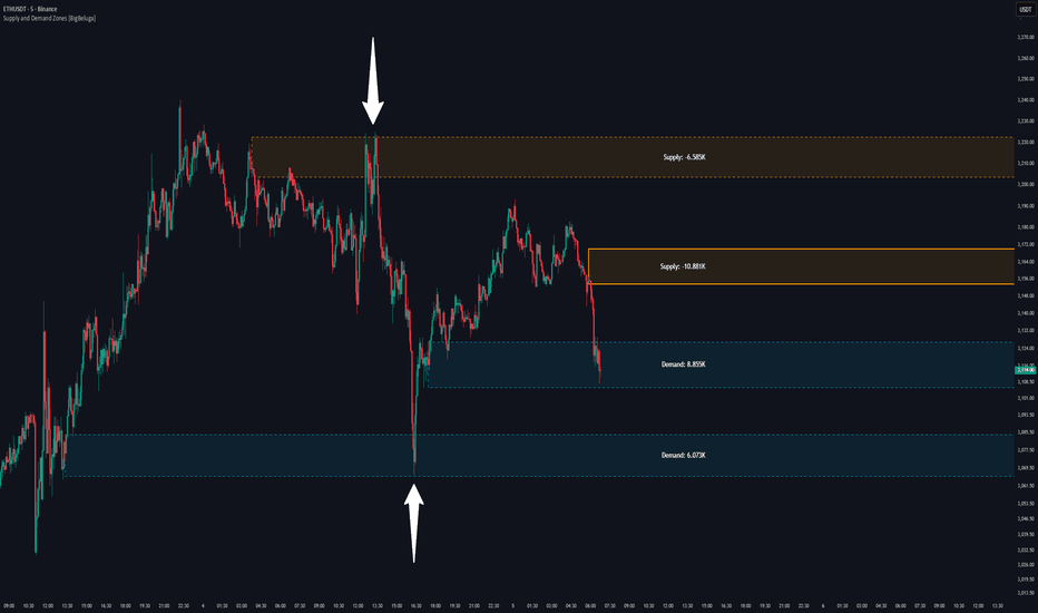
Hidden Zone Detector AI - Crypto/Forex/StockHidden Zone Detector AI - Crypto Forex Stock
Hidden Zone Detector AI is a professional TradingView indicator designed to find hidden supply and demand zones across markets — crypto, forex and stocks — and surface high-probability areas earlier than classical pivot-only methods. It combines price structure analysis, volatility/ATR sizing, volume profiling and multi-mode AI heuristics (Fast / Balanced / Accurate) to generate prediction zones, highlight tested areas, and visually mark zone breakouts. Built with practical trader workflow in mind: configurable anti-repaint options, adaptable Light/Dark UI, clear labels, and candle-coloring for immediate visual context.
How it works
• Detects hidden zones by scanning pivot formations and finding internal “hidden” bars that represent real institutional activity (not just visible swing points).
• Scores zones by size (ATR-relative), volume, and touch characteristics to produce a strength percentage (Weak/Medium/Strong).
• AI heuristics aggregate price, momentum, moving averages, RSI/MACD signals and volume patterns to propose prediction zones — adjustable for speed vs. accuracy.
• Zones are drawn as persistent boxes with optional midlines, labels, and tailored styling when broken or tested.
Main advantages
• Early edge: finds hidden zones that often act before obvious pivots.
• Actionable visuals: labeled zones, color-coded candles, and breakout styling speed decision-making.
• Flexible AI modes: choose Fast for responsiveness, Balanced for day-to-day use, or Accurate for stricter signals.
• Anti-repaint controls: require confirmed bars for predictions to improve signal reliability.
• Multi-market ready: tuned for crypto, forex and stock chart behavior.
• Light/Dark friendly: UI color handling ensures labels remain readable on any chart background.
• Open & reusable: released under Mozilla Public License 2.0 (MPL-2.0) — use and adapt freely with attribution.
Best practices & tips
• Start with Balanced mode and sensitivity ~5; increase sensitivity for earlier but noisier predictions.
• Use prediction confirmation (Require AI Prediction Confirmation) for lower repaint risk.
• Combine zone reads with higher-timeframe context and orderflow/volume tools for stronger entries.
• Adjust max active zones and opacity to keep charts clean on lower timeframes.
License & author
Mozilla Public License 2.0 (MPL-2.0).
Author: a_jabbaroff — created with care for the TradingView community and fellow traders. Indicador

Twisted Forex's Doji + Area StrategyTitle
Twisted Forex’s Doji + Area Strategy
Description
What this strategy does
This strategy looks for doji candles forming inside or near supply/demand areas . Areas are built from swing pivots and sized with ATR, then tracked for retests (“confirmations”). When a doji prints close to an area and quality checks pass, the strategy places a trade with the stop beyond the doji and a configurable R:R target.
How areas (zones) are built
• Swings are detected with a user-set pivot length.
• Each swing spawns a horizontal area centered at the pivot price with half-height = zoneHalfATR × ATR .
• Duplicates are de-duplicated by center distance (ATR-scaled).
• Areas fade when broken beyond a buffer or after an optional age (expiry).
• Retests are recorded when price touches and then bounces away from the area; repeated reactions increase the zone’s “strength”.
Signal logic (summary)
Doji detection: strict or loose body criteria with optional minimum wick fractions and ATR-scaled minimum range.
Proximity: price must be inside/near a supply or demand area (proxATR × ATR).
Side resolution: overlap is resolved by (a) which side price penetrates more, (b) fast/slow EMA trend, or (c) nearest distance. Optional “previous candle flip” can bias long after a bearish candle and short after a bullish one.
Optional 1-bar confirmation: the bar after the doji must close away from the area by confirmATR × ATR .
Quality filter (Off/Soft/Strict): four checks—(i) wick rejection past the edge, (ii) doji closes in an edge “band” of the area, (iii) fresh touch (cooldown), (iv) approach impulse over a short lookback. In Strict , thresholds auto-tighten.
Orders & exits
• Long: stop below doji low minus buffer; Short: above doji high plus buffer.
• Target = rrMultiple × risk distance .
• Pyramiding is off by default.
Position sizing
You can size from the script or from Strategy Properties:
• Script-driven (default): set Position sizing = “Risk % of equity” and choose riskPercent (e.g., 1.0%). The script applies safe floors/rounding (FX micro-lots by default) so quantity never rounds to zero.
• Properties-driven : toggle Use TV Properties → Order size ON, then pick “Percent of equity” in Properties (e.g., 1%). The header includes safe defaults so trades still place.
Key inputs to explore
• Zone building : pivotLen, zoneHalfATR, minDepartureATR, expiryBars, breakATR, leftBars, dedupeATR.
• Doji & proximity : strictDoji, dojiBodyFrac, minWickFrac, minRangeATR, proxATR, minBarsBetween.
• Overlap resolution : usePenetration, useTrend (EMA 21/55), “previous candle flip”, needNextBarConf & confirmATR.
• Quality : qualityMode (Off/Soft/Strict), minQualPass/kStrict, wickPenATR, edgeBandFrac, approachLookback, approachMinATR, freshTouchBars.
• Zone strength gating : minStrengthSoft / minStrengthStrict.
• HTF confluence (optional) : useHTFTrend (HTF EMA 34/89) and/or useHTFZoneProx (HTF swing bands).
Tips to make it cleaner / higher quality
• Turn needNextBarConf ON and use confirmATR = 0.10–0.15 .
• Increase approachMinATR (e.g., 0.35–0.45) to require a stronger pre-touch impulse.
• Raise minStrengthSoft/Strict (e.g., 4–6) so only well-reacted zones can signal.
• Use signalsOnlyConfirmed ON if you prefer trades only from zones with retests (the script falls back gracefully when none exist yet).
• Nudge proxATR to 0.5–0.6 to demand tighter proximity to the level.
• Optional: enable useHTFTrend to filter counter-trend setups.
Default settings used in this publication
• Initial capital: 100,000 (illustrative).
• Slippage: 1 tick; Commission: 0% (you can raise commission if you prefer—spread is partly modeled by slippage).
• Sizing: Risk % of equity via inputs; riskPercent = 1.0% ; FX uses micro-lot floors by default.
• Quality: Off by default (Soft/Strict available).
• HTF trend gate: Off by default.
Backtesting notes
For a meaningful sample size, test on liquid symbols/timeframes that yield 100+ trades (e.g., majors on 5–15m over 1–2 years). Backtests are modelled and broker costs/spread vary—validate on your feed and forward-test.
How to read the chart
Shaded bands are supply (above) and demand (below). Brighter bands are the nearest K per side (visual aid). BUY/SELL labels mark entries; colored dots show entry/SL/TP levels. You can hide zones or unconfirmed zones for a cleaner view.
Disclaimer
This is educational material, not financial advice. Trading involves risk. Always test and size responsibly. Estratégia

Indicador
Indicador

Futures Trade Entry Indicator (MTF)Work in Progress with the help of Claude. Not ready for active trading. Public for help improving. This will be a multi-timeframe futures trading indicator with supply/demand zones, Fair Value Gaps (FVGs), and sophisticated entry/exit logic.I've created a comprehensive Pine Script v6 indicator that matches all your specifications! Here's what the script includes:
## **Key Features Implemented:**
### **🔄 Multi-Timeframe Logic**
- **1H Chart Data**: Detects Supply Zones, Demand Zones, and Fair Value Gaps
- **Current Timeframe**: Monitors for re-entry and confirmation signals
### **📊 Zone Detection**
- **Supply Zones**: Identified using pivot highs with configurable strength
- **Demand Zones**: Identified using pivot lows with touch validation
- **Fair Value Gaps**: Both bullish and bearish FVGs detected automatically
- **Auto-Expiry**: Zones expire after 24 hours (configurable)
### **⚡ Entry Logic**
- **Dual Confirmation Required**:
- ✅ Engulfing candle pattern (bullish/bearish)
- ✅ Market structure shift (HH→LL or LL→HH)
- **Zone Re-entry**: Price must be within identified zones/FVGs
### **🎯 Probability System**
- **Smart Scoring**: Based on zone age, strength, and risk/reward ratio
- **Color-Coded**: Green (High), Yellow (Medium), Red (Low)
- **Real-time Calculation**: Updates with each potential entry
### **🎨 Visual Elements**
- **Colored Zones**: Supply (red), Demand (green), FVGs (blue/orange)
- **Entry Labels**: 🟩 LONG / 🟥 SHORT markers
- **Probability Labels**: Display confidence levels
- **Confirmation Shapes**: Triangle indicators for pattern completion
### **⚙️ Manual Controls**
All the requested toggles are available in the settings panel:
- Show/Hide Supply Zones
- Show/Hide Demand Zones
- Show/Hide FVGs
- Show/Hide Labels
- Show/Hide Probability
- Zone strength and expiry settings
- Custom colors for all elements
### **🔔 Alert System**
- Entry opportunity alerts
- Includes probability assessment
- Ticker symbol identification
## **Usage Instructions:**
1. **Apply to 15m chart** for active trading signals
2. **Configure settings** based on your preferences
3. **Set up alerts** for automated notifications
4. **Monitor probability levels** for trade quality assessment
The script automatically handles the complex multi-timeframe analysis while keeping the interface clean and user-friendly. All zones update dynamically and expire appropriately to avoid clutter.
Would you like me to adjust any specific parameters or add additional features? Indicador