Indicador

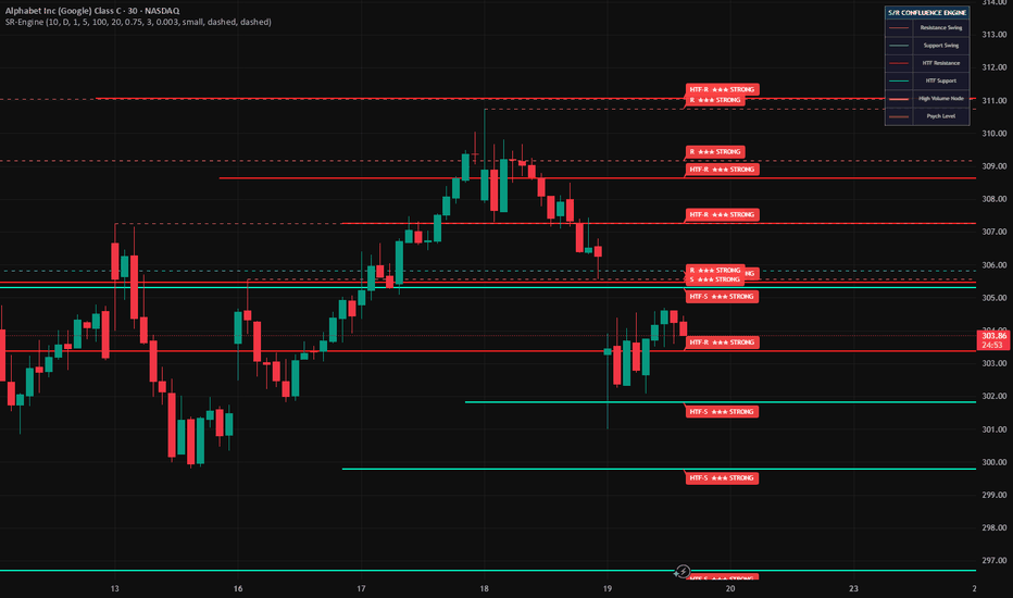
S/R Confluence Engine [AvantCoin]S/R Confluence Engine
─────────────────────────────────────────────────────────────────────────────
This indicator takes a different mechanism:
Every level is scored across three independent factors, and only levels that pass a minimum confluence threshold are promoted as tradeable.
HOW THE SCORING WORKS?
─────────────────────────────────────────────────────────────────────────────
Each detected swing level starts with a base score of 1. Up to 3 additional
points are added based on the following conditions:
+1 The level falls inside a High Volume Node (HVN)
— meaning significant volume was traded at or near this price.
Price tends to slow down and react at levels where market participants
have a large amount of open positions anchored.
+1 The level originates from the Higher Timeframe (HTF)
— a daily swing high visible on a 5-minute chart carries more weight
than a local 5-minute pivot. HTF structure reflects institutional
positioning, not just retail order flow.
+1 The level is within a configurable tolerance of a psychological level
— round numbers and half-levels attract resting orders from both
discretionary and algorithmic participants. Confluence with a psych
level adds a fourth layer of confirmation.
Final score interpretation:
Score 1 → Plain swing (structural only, no confluence)
Score 2 → ★★ GOOD (one additional factor confirmed)
Score 3+ → ★★★ STRONG (two or more factors confirmed)
Labels are drawn directly on the chart at each qualifying level so you can
assess confluence at a glance without manually cross-referencing indicators.
DETECTION METHODS
─────────────────────────────────────────────────────────────────────────────
Swing Structure (Current TF)
Pivot highs and lows are detected using a configurable lookback length.
Resistance levels are drawn in red, support in teal.
Swing Structure (Higher TF)
The same pivot detection runs on a user-selected higher timeframe
(default: Daily). HTF lines are drawn thicker and solid to visually
separate them from current-TF swings. Their visibility is controlled
independently from the score filter.
Volume Profile Nodes
The lookback range is divided into price buckets and volume is accumulated
per bucket. Buckets exceeding the HVN threshold percentile are drawn as
gold highlight zones. Optionally, Low Volume Nodes (price gaps) can also
be displayed.
Psychological Levels
Round numbers are auto-detected based on the magnitude of the visible
price range — the indicator adapts whether you are trading a $0.001 token
or a $50,000 asset. Half-levels can be enabled optionally.
VISIBILITY CONTROLS
─────────────────────────────────────────────────────────────────────────────
All four level types have independent show/hide toggles:
☑ Show Higher Timeframe Swings — HTF structure lines
☑ Show Good Levels ★★ — score 2 levels only
☑ Show Strong Levels ★★★ — score 3+ levels only
☑ Show Psychological Levels — round / half numbers
Turning off Good and Strong levels leaves only raw unconfirmed swings
visible, which is useful for studying structure without score bias.
FULL SETTINGS REFERENCE
─────────────────────────────────────────────────────────────────────────────
⚙️ Swing Structure
Swing Lookback Length Bars required on each side to confirm a pivot (3–50)
Show Higher Timeframe Swings Toggle HTF lines independently
Show Good Levels ★★ Toggle score-2 levels
Show Strong Levels ★★★ Toggle score-3+ levels
HTF Resolution Timeframe for the higher-TF pivot scan
Swing Line Width Line thickness (1–4)
Resistance / Support Colors Individual color pickers for all four line types
Extend Lines to Right Project lines forward on the chart
Max Swing Levels to Show Cap on how many pivots are kept per type (1–20)
📊 Volume Nodes
Show Volume Nodes Toggle HVN highlight boxes
Volume Lookback (bars) How many bars back to analyze (20–500)
Price Buckets Number of buckets to divide the range into (5–40)
HVN Threshold Percentile cutoff for qualifying as an HVN (50–99%)
Show Low Volume Nodes Toggle LVN gap zones
Node Box Width Width of the drawn boxes in bars (1–10)
🎯 Confluence Scoring
Show Confluence Labels Toggle ★★ / ★★★ labels on chart
Confluence Zone Distance tolerance for psych level proximity (0.1–2%)
Label Size tiny / small / normal / large
🧠 Psychological Levels
Show Psychological Levels Toggle round/half number lines
Round Numbers Enable major round number detection
Half Numbers Enable 0.5 level detection
Line Style solid / dashed / dotted
🎨 Display
Show Legend Toggle the on-chart legend table
Swing Line Style solid / dashed / dotted for current-TF swings
NOTES
─────────────────────────────────────────────────────────────────────────────
- Volume Nodes and score labels are redrawn on the last bar only to keep
performance efficient on long histories.
- Swing candidates are collected on every bar into persistent arrays, so
no pivots are missed regardless of when the indicator is loaded.
- The scoring system is additive and transparent — each contributing factor
is visible in the label type prefix (R, S, HTF·R, HTF·S), so you always
know which timeframe and direction a level belongs to.
- HTF line visibility is intentionally decoupled from the score filter.
A daily swing high will always show when HTF display is enabled, even if
its score does not reach the GOOD or STRONG threshold. Indicador
Support Band of TrendSupport Band of Trend
by MasterTony
**Support Band with Dynamic Ichimoku Boundaries**
This indicator combines three layered tools into a single clean overlay: a trend-adaptive support/resistance band using golden moving averages, dynamic Ichimoku Tenkan/Kijun boundaries, and price pivot S/R levels. Together they define a structured zone where price is expected to find support in bull trends and resistance in bear trends.
---
**How It's Calculated**
**Trend Direction (ADX + 200 SMA)**
The indicator continuously reads market direction using two inputs. The DMI system compares DI+ against DI− to determine which side has directional dominance. The 200-period SMA acts as a tiebreaker when DI+ and DI− are equal. There is no neutral state — the indicator always commits to bull or bear based on whichever side is dominant at that moment.
**Inner Support Band (SMA 20 / EMA 21)**
The core of the indicator is a filled zone between the 20-period Simple Moving Average and the 21-period Exponential Moving Average. Because the SMA and EMA are nearly identical in length but calculated differently, the fill between them defines a tight dynamic zone that price frequently interacts with. In a bull trend the band is green, acting as a floor. In a bear trend it turns red, acting as a ceiling.
**Outer Boundary (Tenkan-Sen / Kijun-Sen Band)**
Wrapping the inner band is a filled zone between the Tenkan-Sen and Kijun-Sen, ported from a full adaptive Ichimoku engine. Both lines use dynamic lengths driven by a volume oscillator (OBV), ATR volatility, and a Chikou trend filter. When conditions are bullish the lengths compress toward their minimums (9 and 20), making the lines react faster. When conditions are bearish the lengths expand toward their maximums (30 and 60), making them slower and more resistant. The Tenkan and Kijun lines themselves are colored teal when Tenkan is above Kijun and purple when below. The filled zone between them matches the overall bull/bear color of the indicator.
**Price Pivot S/R Lines**
The indicator identifies the last three swing highs and swing lows using a 5-bar left/5-bar right pivot calculation. Each level is drawn as a horizontal dashed line extended to the right — red for resistance, green for support. These are static reference points showing where price has previously reversed.
**200 SMA**
Plotted as a light blue reference line. Used internally for trend bias and visually as the macro trend anchor.
---
**How to Read It**
The indicator is designed to be read as a layered zone, not a single line.
When the bands are **green**, the entire filled area from the outer TK boundary down to the inner SMA/EMA band is a **support zone**. Price pulling back into this zone during an uptrend is expected behavior. The tighter the band compression, the stronger the trend.
When the bands are **red**, the same zone becomes **resistance**. Price rallying back up into it during a downtrend is a selling opportunity. A failure to break above the zone confirms bearish continuation.
The **Tenkan/Kijun color** gives you a secondary read. Teal means the fast line is above the slow line — momentum is bullish within the Ichimoku framework. Purple means the fast line has crossed below — momentum has shifted bearish. When the band color and the TK color agree, the signal is stronger.
The **pivot S/R lines** give you price memory. A green pivot level sitting just below the band in a bull trend creates a confluence support cluster. A red pivot level just above the band in a bear trend creates a confluence resistance cluster.
---
**How to Trade With It**
**Bull Trend Pullback Entry**
Wait for the band to be green. Let price pull back into the inner SMA/EMA band or the wider TK zone. Look for a candle reversal or momentum shift back upward while inside the zone. Enter long with a stop below the outer TK boundary. The nearest green pivot S/R line below acts as your invalidation level.
**Bear Trend Rally Entry**
Wait for the band to be red. Let price rally back up into the inner band or TK zone. Look for rejection or a momentum shift downward while inside the zone. Enter short with a stop above the outer TK boundary. The nearest red pivot S/R line above acts as your invalidation level.
**Trend Change Warning**
When the band flips from green to red or red to green, it signals a shift in directional dominance. This is not an immediate entry signal — it is a warning to stop trading in the previous direction and wait for the new color to confirm with a pullback setup.
**Confluence Filter**
The highest probability setups occur when all three layers agree: the band color matches the trade direction, the Tenkan is above Kijun (for longs) or below (for shorts), and a pivot S/R level is nearby providing additional structure.
---
Indicador

Prior Day Range BoxPrior Day Range Box
Prior Day Range Box plots the previous trading day’s high and low directly on the current chart and displays that range as a visual box with optional reference lines. The script pulls the prior day’s high and low from the daily timeframe, then projects those levels onto the active chart so traders can track how current price behaves around important higher-timeframe levels.
At the start of each new trading day, the indicator creates a new prior day range using the previous day’s high and low. A box can be drawn between those levels to clearly show the full prior day range, while separate horizontal lines mark the prior day high and prior day low. These levels are widely used by intraday traders as key areas for support, resistance, breakout confirmation, rejection, and liquidity interaction.
An optional midpoint line can also be displayed. This line marks the 50% level of the prior day’s range and can serve as an added reference for balance, mean reversion, or directional bias during the session.
The script also includes an optional historical lookback mode. When enabled, it can display prior day range levels from multiple past sessions, making it easier to study how price reacts to historical daily ranges over time. The number of displayed lookback days can be adjusted to fit the user’s preference.
All visual elements are customizable. Users can choose whether to show the range box, enable the midpoint, extend the prior day high and low across the chart, display historical lookback days, and adjust the colors and line width to match their chart setup.
This indicator is designed for traders who use prior day high and low levels as part of their intraday process and want a clean visual framework for tracking previous session range structure on any intraday chart. Indicador

Opening Range BoxOpening Range Box
Opening Range Box highlights the high and low of a user-defined opening session and visualizes the range directly on the chart. The script tracks price during the selected session window and dynamically builds a range using the highest high and lowest low that occur within that period. As the session progresses, the range updates in real time so traders can see the developing structure of the opening market activity.
Once the session begins, the indicator starts calculating the opening range and draws a box around the price action between the session high and low. At the same time, horizontal lines are plotted at the high and low levels of the range. These levels represent important reference points that many intraday traders use to identify potential breakout, breakdown, or support and resistance zones.
After the opening session ends, the final range is locked in. If enabled, the high and low levels can automatically extend to the right side of the chart so they remain visible for the rest of the trading session. This allows traders to easily monitor how price interacts with the opening range throughout the day.
An optional midpoint line can also be displayed. This dashed line represents the 50% level of the opening range and can be used as an additional reference level for balance, mean reversion, or intraday bias.
All visual elements can be customized. Users can control the session time, enable or disable the range box, show or hide the midpoint, extend the range levels across the chart, and adjust colors and line width to match their chart layout.
The default session is set to 09:30–10:00 to match the first thirty minutes of the U.S. equities market open, but it can be changed to any time window to suit different markets or trading strategies. The indicator is designed for intraday charts and is commonly used for opening range breakout strategies and early-session support and resistance analysis. Indicador

Liquidity Flow Surge Profile [ChartPrime]🔶 OVERVIEW
LiquidityFlow Surge Profile is an advanced orderflow visualization suite that maps institutional transaction density and detects climactic liquidation events in real time. By combining a 25-bin structural heatmap with an intelligent "Liquidation Surge" engine, this indicator identifies where market energy is being absorbed and where it is being aggressively released.
The tool focuses on the relationship between high-contrast structural "Heat" and immediate volume surges, providing traders with a high-conviction roadmap of the market's internal mechanics.
• 25-Bin High-Contrast Structural Liquidity Map
• Dynamic Liquidation Surge Bubbles (5 Tier Scaling)
• Real-Time Analytics Dashboard
• ATR-Adaptive Signal Placement
• Automated Fair-Value Visibility Clearout
🔶 CORE CONCEPT — STRUCTURAL THERMAL MAPPING
Liquidity is the fuel of the market. This indicator uses a proprietary single-pass volume distribution algorithm to identify the most significant transaction clusters over three user-definable depths (Short, Medium, Long).
Structural Clusters: The 25-bin heatmap highlights price levels where the most volume has transacted, acting as psychological and institutional floors or ceilings.
Fair-Value Visibility: To ensure the trader can always see immediate price action, the heatmap dynamically clears its coloring around the active candle, maintaining structural context without obscuring the bars.
🔶 LIQUIDATION SURGE ENGINE
The "Liquidation Bubble" system monitors current volume relative to the highest transaction peaks over the last 500 bars. These surge events are often where stop-losses are triggered, positions are forcefully closed, and major institutional entries are filled.
Relative Intensity: Bubbles scale across 5 tiers (Tiny, Small, Normal, Large, Extreme) based on volume size, ranging from 40% to 100%+ of the lookback high.
Directional Context: Bubbles are plotted above the bar for bullish surges (Short Liquidations) and below the bar for bearish surges (Long Liquidations).
Visual Weight: As volume intensity increases, the bubbles become more opaque and larger, creating an immediate visual hierarchy of market conviction.
🔶 REAL-TIME ANALYTICS DASHBOARD
The Pro version includes a dedicated real-time dashboard positioned in the top right corner of the chart.
This table tracks the absolute latest liquidation event, displaying:
• Event Type: Identifies if the last surge was a Long or Short liquidation.
• Volume Magnitude: Displays the exact transaction volume of the surge.
• Contextual Coloring: The dashboard text dynamically matches the bubble colors (Mint/Rose) for instant situational awareness.
🔶 HOW TO USE
Absorption & Reversal: Look for price entering a thick "Heat" cluster while printing an Extreme (Large) liquidation bubble. This often signals a climactic "Stop Run" followed by a reversal.
Breakout Confirmation: When price slices through a thermal zone accompanied by a sequence of rising bubbles, it confirms high-conviction institutional participation.
Liquidity Magnets: Use the high-intensity bins as primary magnets for profit-taking or as structural levels to defend with your stop-loss.
🔶 CONCLUSION
LiquidityFlow Surge Profile transforms raw transaction data into a structured map of market energy. By identifying exactly where the "Heat" is concentrated and where the "Surge" is occurring, it allows traders to move beyond price action and stay aligned with the strongest institutional footprints in the market. Indicador

Indicador
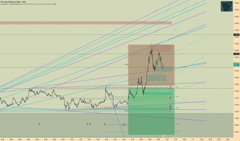
Esco Theory V3.1Esco Theory Geometry Model V3 is a structural analysis overlay that maps market geometry, supply and demand, liquidity, fair value gaps, and volatility compression in one framework.
The tool combines market structure, liquidity mapping, supply and demand zones, fair value gaps, and volatility squeeze detection into a single structural system.
It does not generate buy or sell signals. It shows the structural conditions that often precede large moves so traders can plan trades around them.
Built for discretionary traders who read price action and structure.
Originally developed for crypto futures but it works on any liquid market.
Every feature can be toggled on or off. Every color, lookback period, tolerance, and threshold is adjustable. You can run only rails and support resistance or the full system. It adapts to your trading style and timeframe.
WHAT IT SHOWS
V3 draws the structural architecture of price directly on the chart.
Geometric rails and trend channels from swing pivots
Horizontal support and resistance from clustered pivot levels
Supply and demand zones validated by displacement
Fair value gaps from three candle imbalances
Inverse fair value gaps from filled imbalances
Equal highs and equal lows that often act as liquidity targets
Confluence zones where multiple levels overlap
Volatility compression detection with squeeze and expansion signals
Each component is independent. Turn on what you use. Turn off what you do not.
GEOMETRIC RAILS
The indicator connects significant swing highs and lows with diagonal trendlines and projects them forward.
Minor rails track recent structure.
Major rails map the larger cycle.
Cross rails connect highs to lows for diagonal support and resistance.
Cycle fans project from cycle extremes through opposing pivots.
These rails form structural corridors that price often travels inside.
When a rail aligns with a horizontal level or a supply demand zone the reaction tends to be stronger.
Rail color, width, extension distance, and cross rail count are adjustable.
SUPPORT AND RESISTANCE
Nearby pivot points are clustered into horizontal levels.
Each level includes a touch count so you can see how many times price has reacted there.
More touches usually means a stronger level.
Levels automatically flip between support and resistance depending on where price trades relative to the level.
You control minimum touch count and clustering tolerance so detection can be tuned for your timeframe or market.
SUPPLY AND DEMAND ZONES
Zones are detected at pivots where price displaced strongly away from the origin candle.
A valid zone requires clear displacement.
Supply zones represent potential distribution areas.
Demand zones represent potential accumulation areas.
Zones are removed when price closes through them.
New in V3 zones track retests.
Each time price revisits a zone the color fades slightly and the label updates with the retest count.
A fresh zone with zero retests is strongest.
A zone labeled S x3 has been tested three times and is weaker.
Zone count, pivot lookback, mitigation behavior, fade behavior, and colors are configurable.
FAIR VALUE GAPS
V3 detects fair value gaps using three consecutive candles where a price gap forms around the middle candle.
Bullish FVG occurs when candle one high does not overlap with candle three low.
Bearish FVG is the inverse.
Fair value gaps represent price inefficiency where the market moved too quickly.
These areas often get revisited as price rebalances.
Minimum gap size, lifespan, and automatic removal after midpoint fill can be configured.
INVERSE FAIR VALUE GAPS
When a fair value gap is fully mitigated it becomes an inverse fair value gap.
A filled bullish FVG becomes resistance.
A filled bearish FVG becomes support.
The zone remains on the chart with a different color until price closes through it again.
This captures the common behavior where filled imbalance zones flip direction.
CONFLUENCE
The indicator scans all detected levels and highlights areas where several structures cluster together.
When rails, horizontals, and supply demand overlap the probability of a reaction increases.
Confluence zones show how many levels overlap in the same area.
Cluster width and minimum level count can be adjusted.
COMPRESSION AND SQUEEZE
Volatility compression is detected using ATR ratio, Bollinger Band width, and Keltner Channel containment.
When volatility contracts the chart highlights compression.
This means price is coiling and energy is building.
Optional wedge detection shows converging pivot structure during compression.
Compression thresholds and pivot lengths can be tuned.
SQUEEZE AND FIRE
The squeeze system identifies when Bollinger Bands sit inside Keltner Channels.
Red diamonds mark squeeze bars.
Volatility is compressed and a move is building.
This does not predict direction.
Green triangles mark the fire bar where compression releases and volatility expands.
Expansion often appears as breakouts or displacement candles.
LIQUIDITY
The indicator detects equal highs and equal lows.
These areas often act as liquidity pools where stops accumulate.
Price frequently moves toward these levels before reversing or continuing.
Tolerance for equal highs and lows can be adjusted.
HOW TO USE IT
Strong setups occur when several tools agree.
Typical workflow.
Read the rails and understand the direction of structure.
Identify key levels from support resistance, supply demand, and fair value gaps.
Look for confluence where several levels overlap.
Watch compression. Squeeze near a key level means energy is building.
Wait for fire. Expansion from a confluence area often produces the move.
Confluence matters more than any single signal.
The indicator is meant to be tuned to your style and timeframe. The default settings are a starting point.
MARKETS
Originally built for Bitcoin and crypto perpetual futures.
It works well on other liquid markets including Ethereum, forex majors, index futures, and high volume equities.
Default settings are tuned for crypto on 5 minute to 4 hour charts.
Adjust swing lookback and pivot length when switching markets or timeframes.
ESCO THEORY
Markets move through repeating cycles.
Compression
Liquidity grab
Expansion
Most traders only see the breakout.
Structural traders map the conditions that lead to it.
Esco Theory focuses on identifying those structural conditions.
Geometry Model V3 visualizes them on the chart.
DISCLAIMER
This indicator is for market structure analysis only.
It does not provide financial advice or automated trade signals.
Always use proper risk management.
Trade safe.
Esco Indicador
Liquidity Structure Mapper [JOAT]Liquidity Structure Mapper
Introduction
The Liquidity Structure Mapper is an advanced market structure analysis tool designed to identify and visualize the key levels where institutional traders place their orders. This indicator goes beyond simple support and resistance by detecting swing points, equal highs/lows, liquidity zones, and the patterns that reveal professional market participation. Understanding market structure and liquidity is fundamental to successful trading - institutions don't enter at random levels, they hunt liquidity at specific price points, and this tool reveals those locations.
This indicator is built for traders who understand that markets are driven by liquidity - the accumulation and distribution of orders at key levels. Whether you're a day trader timing entries at structure, a swing trader identifying major turning points, or a position trader mapping long-term levels, this mapper provides the institutional-grade structural analysis needed to trade with the smart money rather than against it.
Why This Indicator Exists
Most traders draw support and resistance lines arbitrarily or use basic pivot points without understanding the underlying liquidity dynamics. This indicator addresses that limitation by:
Swing Point Detection: Identifies true market structure turning points
Equal Level Analysis: Finds equal highs and lows that form liquidity pools
Liquidity Zone Mapping: Visualizes areas of concentrated order flow
Zone Strength Scoring: Quantifies the reliability of each level
Sweep Detection: Identifies liquidity grabs before reversals
Proximity Analysis: Shows distance to nearest key levels
The mapper transforms abstract market structure concepts into concrete, actionable levels with measurable strength and reliability.
Core Components Explained
1. Swing Point Detection
The indicator identifies true swing points using pivot analysis:
// Swing point detection
float pivot_high = ta.pivothigh(high, i_swing_left, i_swing_right)
float pivot_low = ta.pivotlow(low, i_swing_left, i_swing_right)
// Process new swing high
if not na(pivot_high) and barstate.isconfirmed
int pivot_bar = bar_index - i_swing_right
SwingPoint new_sh = SwingPoint.new()
new_sh.price := pivot_high
new_sh.bar_idx := pivot_bar
new_sh.direction := 1
new_sh.is_valid := true
Swing features:
Left Bars: Bars to the left of pivot (default: 10)
Right Bars: Bars to the right for confirmation (default: 5)
Validation: Only confirmed swing points are marked
Visual Markers: Clear labels showing price and level type
Historical Tracking: Maintains history of all swing points
True swing points represent where the market actually changed direction - these are the foundation of market structure.
2. Equal Highs/Lows Detection
The indicator finds equal levels that form liquidity zones:
f_find_equal_levels(array swings, float threshold, int zone_type, color zone_col, float atr_val) =>
int sz = array.size(swings)
if sz >= 2 and barstate.isconfirmed
SwingPoint latest = array.get(swings, sz - 1)
for i = 0 to sz - 2
SwingPoint compare = array.get(swings, i)
if compare.is_valid and latest.is_valid
float pct = f_pct_diff(latest.price, compare.price)
if pct <= threshold
// Found equal level - create liquidity zone
float zone_top = math.max(latest.price, compare.price)
float zone_bottom = math.min(latest.price, compare.price)
// Add ATR buffer to zone
zone_top := zone_top + atr_val * 0.1
zone_bottom := zone_bottom - atr_val * 0.1
Equal level features:
Threshold: Percentage tolerance for equality (default: 0.1%)
Zone Creation: Forms zones around equal levels
ATR Buffer: Adds small buffer based on volatility
Zone Types: EQH (equal highs) and EQL (equal lows)
Liquidity Pools: Areas where stops cluster
Equal highs/lows are where stop losses and pending orders accumulate - they're liquidity magnets.
3. Liquidity Zone Management
The indicator tracks and manages liquidity zones dynamically:
// Zone interaction tracking
if array.size(liq_zones) > 0 and barstate.isconfirmed
for i = array.size(liq_zones) - 1 to 0
LiquidityZone zone = array.get(liq_zones, i)
if zone.is_active
// Check if price swept the zone
bool swept_high = zone.zone_type == 1 and high > zone.top
bool swept_low = zone.zone_type == -1 and low < zone.bottom
// Update zone age
zone.age_bars := zone.age_bars + 1
// Check for zone touches
bool touching_high = zone.zone_type == 1 and high >= zone.bottom and high <= zone.top
bool touching_low = zone.zone_type == -1 and low <= zone.top and low >= zone.bottom
if (touching_high or touching_low) and not (swept_high or swept_low)
zone.touch_count := zone.touch_count + 1
Zone features:
Active Zones: Zones that haven't been swept yet
Touch Count: Number of times price has tested the zone
Zone Age: How long the zone has existed
Sweep Detection: Identifies when liquidity is taken
Strength Updates: Zones get stronger with more touches
Zones that are tested multiple times become stronger and more significant.
4. Zone Strength Calculation
Each zone is assigned a strength score:
f_calc_zone_strength(int touches, int age, float zone_width, float atr_val) =>
float touch_score = math.min(float(touches) / 5.0 * 40, 40)
float age_score = math.max(30 - float(age) / 50.0 * 30, 0)
float width_score = math.min(atr_val / zone_width * 30, 30)
touch_score + age_score + width_score
Strength components:
Touch Score: More touches = stronger level (max 40 points)
Age Score: Fresher zones are more relevant (max 30 points)
Width Score: Tighter zones are more precise (max 30 points)
Total Strength: 0-100 indicating zone reliability
Visual Updates: Zone color intensifies with strength
Strength scoring helps prioritize which levels deserve more attention.
5. Structure Analysis Metrics
The indicator calculates structural relationships:
// Calculate structure metrics
float nearest_resistance = na
float nearest_support = na
// Find nearest resistance above current price
if array.size(swing_highs) > 0
for i = array.size(swing_highs) - 1 to 0
SwingPoint sh = array.get(swing_highs, i)
if sh.price > close and (na(nearest_resistance) or sh.price < nearest_resistance)
nearest_resistance := sh.price
// Find nearest support below current price
if array.size(swing_lows) > 0
for i = array.size(swing_lows) - 1 to 0
SwingPoint sl = array.get(swing_lows, i)
if sl.price < close and (na(nearest_support) or sl.price > nearest_support)
nearest_support := sl.price
// Structure bias calculation
float structure_bias = 0.0
if not na(dist_to_resistance) and not na(dist_to_support)
structure_bias := (dist_to_support - dist_to_resistance) /
(dist_to_support + dist_to_resistance)
Metrics include:
Nearest Resistance: Closest swing high above price
Nearest Support: Closest swing low below price
Distance Percentages: How far price is from each level
Structure Bias: Overall structural directional bias
Proximity Score: How close price is to key levels
These metrics provide context for current price position within the structure.
6. Proximity Analysis System
The indicator measures how close price is to key levels:
f_proximity_score(float price, float zone_top, float zone_bot) =>
float zone_mid = (zone_top + zone_bot) / 2
float dist = math.abs(price - zone_mid)
float zone_height = zone_top - zone_bot
math.max(100 - (dist / zone_height * 100), 0)
// Dynamic proximity labels
if i_show_prox_labels and barstate.islast
if not na(nearest_resistance) and resistance_proximity > 30
string res_label = "RESISTANCE " + str.tostring(nearest_resistance, "#.##") +
" Proximity: " + str.tostring(resistance_proximity, "#") + "%"
Proximity features:
Proximity Score: 0-100% showing closeness to levels
Dynamic Labels: Shows level price and proximity
Warning System: Alerts when approaching key levels
Background Colors: Visual warnings at high proximity
Distance Tracking: Real-time distance monitoring
Proximity analysis helps prepare for potential reactions at key levels.
Visual Elements
Swing Points: Clear markers for highs and lows with labels
Liquidity Zones: Color-coded zones with glow effects
Zone Strength: Visual intensity based on reliability
Swept Zones: Different styling for taken liquidity
Proximity Labels: Dynamic labels showing nearest levels
Warning Markers: Visual alerts at key level approaches
Dashboard: Comprehensive structure metrics
Background Shading: Subtle warnings at critical levels
The dashboard displays:
1. Active EQH and EQL zone counts
2. Nearest support and resistance levels
3. Proximity percentages to key levels
4. Zone strength distribution
5. Structure bias and metrics
6. Recent sweep activity
7. Level age and touch statistics
8. Trading recommendations based on structure
Input Parameters
Swing Detection:
Left Bars: Pivot lookback period (default: 10)
Right Bars: Confirmation period (default: 5)
Max Swings: Maximum swing levels to track (default: 20)
Show Swings: Display swing point markers
Equal Levels:
Equal Threshold: Percentage tolerance (default: 0.1%)
Show EQH/EQL: Display equal high/low zones
Zone Extension: How far zones extend (default: 50 bars)
Zone Settings:
Show Zones: Display liquidity zones
Zone Lookback: Historical zone tracking (default: 100)
Min Touches: Minimum touches for strength (default: 2)
ATR Buffer: Zone size multiplier (default: 0.15)
Visual Settings:
Color Scheme: Customizable colors for all elements
Glow Effects: Enable visual enhancements
Label Sizes: Adjustable text sizes
Dashboard Display: Show/hide metrics panel
How to Use This Indicator
Step 1: Identify Key Structure
Start by identifying major swing highs and lows. These form the foundation of market structure and define the overall market direction.
Step 2: Locate Liquidity Zones
Look for equal highs and lows that form liquidity zones. These are where stop losses accumulate and where institutions often target for liquidity grabs.
Step 3: Assess Zone Strength
Pay attention to zone strength scores. Zones with multiple touches (3+) and high strength (>70%) are more reliable for reactions.
Step 4: Monitor for Sweeps
Watch for price sweeping liquidity zones (breaking slightly beyond levels) and then reversing. These are often reversal signals.
Step 5: Use Proximity Analysis
When price approaches key levels (proximity > 70%), prepare for potential reactions. This is where entries or exits should be considered.
Step 6: Track Structure Bias
The structure bias shows whether price is closer to support or resistance. This can guide your directional bias.
Best Practices
The most reliable levels have multiple touches and high strength scores
Liquidity grabs (sweeps) often precede strong reversals
Fresh zones (newly formed) are often more significant than old ones
Combine structure with price action for confirmation
Higher timeframe structure overrides lower timeframe levels
Zone strength increases with each successful test
Be cautious at zones with very wide spreads - they're less precise
Watch for clusters of zones - these form major support/resistance areas
Keep a structure journal to track which levels hold best
Use structure for stop placement - just beyond key levels
4HR TF On BTC:
Trading Applications
Support/Resistance Trading:
Enter long near strong support zones
Enter short near strong resistance zones
Place stops just beyond the zone boundaries
Target the opposite zone or midpoint
Breakout Trading:
Wait for clear breaks of structure
Confirm with volume and momentum
Enter on retests of broken levels
Use zones as new support/resistance
Reversal Trading:
Look for liquidity sweeps beyond zones
Enter on first signs of reversal
Confirm with candlestick patterns
Target the opposite structure level
Strategy Integration
This indicator enhances any trading system:
Use structure levels for stop placement
Filter trades based on proximity to key levels
Time entries at strong support/resistance
Identify high-probability reversal zones
Export structure metrics for custom logic
Combine with trend analysis for optimal results
Technical Implementation
Built with Pine Script v6 featuring:
Advanced swing point detection with pivot analysis
Equal level identification with customizable thresholds
Dynamic liquidity zone management and tracking
Zone strength scoring with multiple factors
Real-time proximity analysis and warnings
Comprehensive structure metrics calculation
Visual effects including glow and gradient fills
Interactive dashboard with 8 key metrics
Alert conditions for all major structural events
Export functions for strategy integration
The code uses confirmed bars for all calculations to prevent repainting and ensure reliable structure identification.
Originality Statement
This indicator is original in its comprehensive approach to liquidity structure analysis and zone management. While swing point detection is a known concept, this indicator is justified because:
It synthesizes swing analysis with equal level detection to identify liquidity zones
The zone strength scoring system provides objective measures of level reliability
Dynamic zone management tracks the lifecycle of each liquidity area
Proximity analysis adds practical trading context to structure identification
Sweep detection identifies the patterns of liquidity grabs
The dashboard presents complex structural analysis in an accessible format
Visual elements including glow effects and gradients enhance readability
Export functions enable integration with any trading system
Each component provides unique insights: swing points show structure, equal levels show liquidity, strength shows reliability, and proximity shows opportunity
The indicator solves the real problem of identifying where institutions place orders rather than just drawing arbitrary lines
The indicator's value lies in transforming abstract market structure concepts into concrete, actionable levels with measurable properties that traders can use to make informed decisions about entries, exits, and risk management.
Disclaimer
This indicator is provided for educational and informational purposes only. It is not financial advice or a recommendation to buy or sell any financial instrument. Market structure analysis is a tool for understanding price levels, not a prediction system.
Support and resistance levels can break without warning due to news events, economic data, or changes in market sentiment. Past reactions at levels do not guarantee future behavior. The indicator's levels are mathematical calculations based on historical price action and should be used in conjunction with other forms of analysis.
Always use proper risk management, including stop losses placed beyond key levels. Never assume a level will hold - always have a plan for when it breaks. Liquidity zones can be swept multiple times before a final reversal.
The author is not responsible for any losses incurred from using this indicator. Users assume full responsibility for all trading decisions made using this system.
-Made with passion by officialjackofalltrades
Indicador

Indicador
Indicador

Murphy Visual DNA Module🧬 INTRODUCTION
The MURPHY VISUAL DNA MODULE is the second building block of the MURPHY SUITE.
Inspired by Chapter 3 of John J. Murphy’s classic “Technical Analysis of the Financial Markets”, this indicator acts as a STRUCTURAL SCANNER for price action.
Markets often look chaotic. Candles overlap, wicks spike, and intraday noise hides the true story of the market.
This module focuses on one objective:
NOISE REDUCTION.
Instead of reacting to every movement, the indicator highlights only the moments where the MARKET STRUCTURE actually changes.
Think of it as a DNA scanner for price.
Where Module 1 determines the TREND REGIME, the Murphy Visual DNA Module reveals the STRUCTURAL SIGNATURE of the market.
🧠 CORE CONCEPTS — THE BIBLE LOGIC (CHAPTER 3)
John Murphy explains that price can be interpreted through different visual lenses. This indicator combines three of the most powerful ones.
THE CRITICAL CLOSE
The closing price is the most important price of the session.
It represents the final agreement between buyers and sellers after all intraday volatility has played out.
This module visualizes that principle using the CRITICAL CLOSE LINE (the yellow line).
Rising slope → underlying bullish pressure
Falling slope → underlying bearish pressure
This line filters out intraday noise and reveals the true direction of the market.
INTRADAY SENTIMENT
Murphy highlights the psychological importance of the relationship between the OPEN and CLOSE.
This indicator transforms that concept into a quick sentiment read.
Green bars → Bulls controlled the session
Red bars → Bears dominated the session
This helps traders understand the daily battle between buyers and sellers.
SYNTHETIC POINT & FIGURE
Traditional Point & Figure charts remove TIME from the equation and focus purely on PRICE STRUCTURE.
This module recreates that concept through a SYNTHETIC P&F ENGINE.
Instead of drawing a full P&F chart, the engine marks the exact moment when price structure changes.
X below the bar → Bullish structural reversal
O above the bar → Bearish structural reversal
The system includes an ANTI-CONFETTI FILTER so signals appear only when the market structure truly shifts.
🛠️ FEATURES
TRIPLE DISPLAY MODE
Switch between three analytical views:
Murphy Bar View
Critical Line View
P&F Signal Overlay
FLOOR & CEILING ENGINE
Structural reversals appear as clear signals:
X below the bar = Market found a floor
O above the bar = Market hit a ceiling
ADAPTIVE BOX SIZE
The P&F logic can scale to different markets:
ATR-based sizing
Percentage-based sizing
Fixed box sizing for futures
This allows the indicator to work across:
Indices (US30, SPX, Futures)
Crypto markets
Multiple timeframes
MODULE 1 INTEGRATION
Hidden data exports allow integration with the MURPHY DOW STATE ENGINE.
🚦 HOW TO USE — THE 3 STEP DNA SCAN
STEP 1 — THE TIDE
Look at the slope of the YELLOW CRITICAL CLOSE LINE.
Rising line → bullish pressure
Falling line → bearish pressure
This defines the overall market tide.
STEP 2 — THE STRUCTURE
Wait for a structural signal from the P&F engine.
X below the bar → STRUCTURAL FLOOR → Long bias
O above the bar → STRUCTURAL CEILING → Short bias
These signals indicate a genuine shift in market structure.
STEP 3 — THE SENTIMENT
Confirm the signal using bar sentiment.
Green bar → bullish confirmation
Red bar → bearish confirmation
When TIDE, STRUCTURE and SENTIMENT align, the probability of a directional move increases.
🔄 EXIT STRATEGY — DNA MUTATION
Markets constantly evolve. When the structural DNA changes, the trade should too.
Exit a position when one of the following occurs:
An opposite structural signal appears (X vs O)
The price breaks the Critical Close Line
The slope of the yellow line changes direction
These events indicate a STRUCTURAL DNA MUTATION in the market.
⚠️ DISCLAIMER
This indicator is designed for educational and analytical purposes only.
Trading financial markets involves significant risk. Past performance does not guarantee future results.
Always combine technical tools with proper risk management and personal judgment before making trading decisions. Indicador

[ A L P H A X ] Edge - Support/Resistance | Breakout EntryAlphaX Edge — Support/Resistance × Breakout × Trend Confluence | Multi-Factor Confidence Scoring, Smart S/R Zones & Squeeze Detection
AlphaX Edge is a professional multi-confluence trading system that combines six independent analytical layers into a single unified signal engine. Rather than relying on any single indicator, it requires agreement across Support/Resistance structure, trend direction, momentum, volume, ADX strength, and squeeze dynamics before generating a signal — producing fewer, higher-quality setups and filtering out the noise that plagues single-indicator systems. Designed for intraday and swing traders across all instruments and timeframes.
━━━━━━━━━━━━━━━━━━━━━━━━━━━━━━━━━━━━━━━━
📸 Visual Overview
The chart displays color-coded S/R zones, breakout and retest labels, trend structure labels, EMA ribbons, RSI divergence diamonds, and triangle entry signals — all governed by a real-time dashboard showing every active market condition at a glance.
━━━━━━━━━━━━━━━━━━━━━━━━━━━━━━━━━━━━━━━━
🔬 The Six Analytical Layers
1 — Smart Support & Resistance Zones
AlphaX Edge automatically detects, merges, and manages S/R zones using pivot-based swing detection. Each zone is:
Built from confirmed swing highs and lows using a configurable swing length
Merged automatically when two levels fall within a user-defined ATR multiplier — preventing zone clutter
Color-coded by role: yellow-green for confirmed support, red for confirmed resistance, gray for untested levels
Aged out after a configurable number of bars to keep the chart clean and relevant
Upgraded from neutral to confirmed only after a minimum number of touches — preventing weak levels from triggering signals
When price approaches a confirmed zone from above, the zone acts as resistance. When approached from below, it acts as support. Broken zones flip polarity — a broken resistance becomes support and vice versa — and are tracked for retest opportunities.
2 — Breakout Detection with Anti-Fake Filter
A breakout is confirmed only when all of the following conditions are met simultaneously:
The candle body closes convincingly beyond the zone boundary (not just a wick poke)
The candle body represents at least 40% of the total candle range — no doji or indecision candles
Volume confirms participation (configurable: require spike or simply above-average volume)
A cooldown timer prevents repeated breakout labels during choppy back-and-forth action
RSI is not at an extreme overbought/oversold level — unless ADX confirms the trend is genuinely strong (preventing exhaustion breakout entries)
3 — Trend Structure Analysis
AlphaX Edge tracks market structure using higher swing pivots — independently from the S/R zone engine. It identifies:
Higher Highs + Higher Lows → confirmed uptrend structure
Lower Highs + Lower Lows → confirmed downtrend structure
Trend line drawn automatically connecting the most recent pivot lows (uptrend) or pivot highs (downtrend)
UPTREND ▲ and DOWNTREND ▼ labels fire when structure shifts — with a configurable cooldown to prevent label spam
4 — EMA Trend Ribbon
Three EMAs provide structural context at all times:
Fast EMA (21) — yellow-green cross marks — immediate momentum direction
Medium EMA (50) — gray line — intermediate trend filter
Slow EMA (200) — dark gray thick line — macro structural backbone
When all three are fanned in sequence (Fast > Medium > Slow for bull, reverse for bear), the trend is healthy and signals carry higher weight in the confluence engine. When they converge and flatten, the market is ranging — a visual warning to stand aside.
5 — Momentum Engine (RSI + MACD + Stochastic)
Three oscillators run simultaneously and vote on momentum direction:
RSI slope direction with smoothing — avoids single-bar noise
MACD line vs signal cross and histogram direction
Stochastic K vs D with overbought/oversold zone filtering
A minimum of two out of three must agree before momentum is considered bullish or bearish. This voting approach prevents a single oscillator spike from generating false signals.
6 — Bollinger Squeeze Detection
The squeeze engine monitors when Bollinger Bands contract inside Keltner Channels — indicating coiled volatility about to expand. When the squeeze fires (bands break outside the channels), directional momentum is assessed to determine which way the expansion is likely to break. Squeeze entries carry bonus weight in the confluence scoring system.
━━━━━━━━━━━━━━━━━━━━━━━━━━━━━━━━━━━━━━━━
🧠 Confluence Scoring & Confidence System
Every signal is evaluated across 10 independent factors , each contributing one point to the confluence score. Only signals meeting your configured minimum score threshold are displayed.
The 10 factors per direction:
✓ SUP — Price is at a confirmed support zone (bull) or resistance zone (bear)
✓ BRK — A valid breakout has just occurred in the signal direction
✓ RET — A confirmed post-breakout retest is occurring
✓ TRD — Trend structure (HH+HL or LH+LL) aligns with signal direction
✓ MOM — At least 2 of 3 momentum oscillators confirm direction
✓ PAT — A candlestick pattern is present (engulfing, pin bar, or RSI divergence)
✓ VOL — Volume is above average and candle closes in the signal direction
✓ EMA — EMA ribbon is aligned or price is on the correct side of the 200 EMA
✓ ADX — ADX confirms a trending market with directional dominance
✓ SQZ — Squeeze has fired or is expanding in the signal direction
Alongside the 10-point score, a confidence percentage (0–100%) is calculated using a weighted system that gives higher importance to structural factors (retest = 20 pts, breakout = 16 pts, support/resistance = 14 pts) and applies heavy penalties for counter-trend signals, overbought/oversold exhaustion, no-trend conditions, overextension from EMAs, and low volume. The resulting grade ranges from D to A+.
━━━━━━━━━━━━━━━━━━━━━━━━━━━━━━━━━━━━━━━━
📊 Signal Types — Complete Entry Guide
AlphaX Edge produces four distinct signal types. Below is a ranked guide to how each should be traded, from highest to lowest quality.
━━━━━━━━━━━━━━━━━━━━━━━━━━━━━━━━━━━━━━━━
🥇 RANK 1 — Breakout + Volume Spike Confirmation (Highest Quality)
What it looks like: A BREAKOUT ▲ or BREAKOUT ▼ label appears, and within 1–2 candles a volume spike dot (●) appears in the same direction. The confluence triangle signal fires.
Why it's the strongest: The volume spike occurring immediately after or alongside the breakout label confirms that institutional participation is behind the move. A breakout without volume is frequently a trap — a breakout with a volume spike right after is significantly more likely to follow through.
How to enter:
Wait for the breakout label to appear AND see the volume spike dot on the same or next 1–2 candles
Enter at market on the close of the volume spike candle, or on a small pullback into the broken level
Stop loss: just below the broken resistance (for longs) or just above the broken support (for shorts) — beyond the zone boundary
Target: next S/R zone visible on the chart, or a 1.5–2x ATR minimum
⚠ If BREAKOUT ▲/▼ shows "⚠ STRETCHED": This means price is already significantly extended from the EMA ribbon at the moment of the breakout. A volume spike dot within 1–2 candles still validates the move — but be aware that a pullback to the EMAs is likely before continuation. In this case, reduce position size or wait for the retest instead of chasing the initial breakout.
━━━━━━━━━━━━━━━━━━━━━━━━━━━━━━━━━━━━━━━━
🥈 RANK 2 — Retest Entry (High Quality, Lower Risk)
What it looks like: After a BREAKOUT label fires, price pulls back to the broken level within the retest window. A RETEST ▲ or RETEST ▼ label appears, and the confluence triangle signal fires.
Why it's strong: The retest is the classic institutional entry — the breakout already proved the level was breakable, and the pullback offers an optimal risk/reward entry with a nearby and well-defined stop.
How to enter:
Wait for the RETEST label — do not anticipate it. Price must close back in the broken zone's range and show a reversal candle (engulfing or pin bar adds confidence)
Enter on the close of the confirming candle at the retest zone
Stop loss: a close back below the retest zone (not a wick — a full candle body close on the wrong side)
Target: the breakout high/low target or the next S/R zone
Highest conviction retest setup: RETEST label + confluence triangle + volume above average + RSI not at extreme = A or A+ grade signal. These are the setups to size up on.
━━━━━━━━━━━━━━━━━━━━━━━━━━━━━━━━━━━━━━━━
🥉 RANK 3 — Trend Confluence Signal at S/R (Medium-High Quality)
What it looks like: Price reaches a confirmed support or resistance zone while the trend structure, EMA alignment, momentum, and ADX all agree. The confluence triangle fires without a preceding breakout — price is bouncing from the zone within an established trend.
Why it works: This is the classic trend continuation pullback entry — price returns to a key level inside an ongoing trend, and multiple independent factors confirm the bounce has begun.
How to enter:
The UPTREND ▲ or DOWNTREND ▼ label must have already appeared — do not take confluence signals at S/R during a ranging market (no active trend label = lower confidence)
Wait for a confirming candle at the zone — a bullish engulfing, pin bar, or strong close in the trend direction adds significant weight
Enter on the close of the confirming candle
Stop loss: beyond the S/R zone boundary plus one ATR buffer
Target: the prior swing high/low, next resistance zone, or 2x ATR
━━━━━━━━━━━━━━━━━━━━━━━━━━━━━━━━━━━━━━━━
4 — Trend Structure Label Entry (Use With Additional Confirmation)
What it looks like: An UPTREND ▲ or DOWNTREND ▼ label appears, marking a confirmed shift in market structure (a new Higher High + Higher Low, or Lower High + Lower Low).
Important — do not enter directly on the label: The trend label confirms that structure has already shifted — it is not an entry signal by itself. Price has typically already moved significantly by the time the label fires, and entering immediately carries the risk of chasing an extended move.
How to use the trend label:
Treat it as a directional bias reset — from this point forward, only look for long setups (after UPTREND ▲) or short setups (after DOWNTREND ▼)
Wait for the first confluence triangle signal that appears after the trend label — this is your primary entry in the new trend direction
Alternatively, wait for price to pull back to the nearest S/R zone or EMA and generate a confluence signal there
The closer the first post-label triangle is to an S/R zone and the 21 or 50 EMA, the higher the trade quality
━━━━━━━━━━━━━━━━━━━━━━━━━━━━━━━━━━━━━━━━
⚠ The Stretched Breakout — When to Be Careful
When a breakout label shows "⚠ STRETCHED" , it means the breakout is occurring while price is already significantly extended from the EMA ribbon — the gap between price and the Fast EMA, or between the Fast and Slow EMA, has reached a level where mean reversion risk is elevated.
Stretched breakout without volume spike → Stand aside or reduce size significantly. The move has likely already travelled the bulk of its range for this leg, and a snapback to the EMAs is the more probable next event.
Stretched breakout with volume spike within 1–2 candles → Momentum is genuine, but manage it differently:
Do not chase — wait for a small pullback toward the broken level or the Fast EMA
Use a tighter stop and reduced position size
Take profit earlier than you normally would — the extended distance from EMAs means the move is borrowing from the next leg
Watch for RSI divergence forming quickly after the breakout — this is a sign the stretched move is exhausting
━━━━━━━━━━━━━━━━━━━━━━━━━━━━━━━━━━━━━━━━
⚠ Identifying Choppy / Ranging Markets — When NOT to Trade
AlphaX Edge has multiple visual signals that tell you to step aside:
EMAs converging and flattening — when all three EMAs cluster together and move sideways, there is no directional bias. Signals in this environment are lower quality regardless of score.
No active trend label — if neither UPTREND ▲ nor DOWNTREND ▼ has appeared recently, the market is in a structural no-man's-land. Wait for structure to develop.
Dashboard shows WEAK TREND — STAND ASIDE or MIXED — STAND ASIDE — these verdict states indicate that ADX is below threshold or bull and bear scores are close. Both are warning signs.
Squeeze is ON (● SQUEEZE ON in dashboard) — do not enter during an active squeeze. Wait for the squeeze to fire (◆ SQUEEZE FIRED) and for a directional confluence signal to follow.
Rapid alternating UPTREND/DOWNTREND labels — if the trend structure labels are flipping frequently, the market is whipsawing. The cooldown filter reduces this, but the message is clear: no clean trend is present.
━━━━━━━━━━━━━━━━━━━━━━━━━━━━━━━━━━━━━━━━
📐 The Dashboard — Reading Your Market State at a Glance
The real-time dashboard displays 12 live metrics organized into three sections:
Structure Section:
Price Position — whether price is at support, resistance, breaking out, or retesting
Trend — current trend direction with active structure state (HH+HL, LH+LL, etc.)
EMA Trend — EMA ribbon alignment and price position relative to the 200 EMA
ADX — trend strength with numeric value
Squeeze — current squeeze state
Momentum Section:
Momentum — oscillator vote count (how many of the three confirm each direction)
RSI — current RSI state (rising, falling, overbought, oversold) with numeric value
Rel Volume — current volume relative to the moving average (Dry / Normal / High / Spike)
Scoring Section:
Bull Score — current confluence count out of 10 and confidence percentage with grade
Bear Score — same for bearish direction
Verdict — system's current market assessment (High Confidence Long/Short, Lean Long/Short, Mixed, Squeeze, Weak Trend)
Last Signal — direction, grade, confidence %, score, active factors, entry price, and bars since signal
━━━━━━━━━━━━━━━━━━━━━━━━━━━━━━━━━━━━━━━━
🔔 Alert Conditions
Edge Long Signal — confluence triangle long entry fires
Edge Short Signal — confluence triangle short entry fires
Bullish Breakout — confirmed resistance breakout
Bearish Breakout — confirmed support breakdown
Bullish Retest — post-breakout bullish retest confirmed
Bearish Retest — post-breakout bearish retest confirmed
RSI Bull Divergence — bullish RSI divergence detected
RSI Bear Divergence — bearish RSI divergence detected
All alert messages include {{ticker}} and {{interval}} for clean webhook integration.
━━━━━━━━━━━━━━━━━━━━━━━━━━━━━━━━━━━━━━━━
⚡ Key Features
🔬 Six-layer confluence engine — S/R, breakout, trend structure, EMA, momentum, squeeze must agree before a signal fires
🏷 Smart S/R zones — auto-merged, touch-confirmed, polarity-flipping, age-managed
⚠ Stretch filter — warns when breakouts occur at EMA-extended levels with visual label modification
🧠 10-factor confluence scoring with weighted confidence percentage and A+ to D grading
📊 Anti-fake breakout engine — body strength, volume, margin close, and RSI/ADX filter required
◆ Bollinger Squeeze integration — coiled volatility detection with directional momentum bias
📐 Three-EMA structural ribbon (21 / 50 / 200) with fan analysis
💎 RSI divergence detection with pivot-confirmed highs and lows
🕯 Candlestick pattern recognition — engulfing, pin bar, strong body candles
📋 Real-time 12-metric dashboard with live verdict and last signal tracker
🔔 8 alert conditions with ticker and interval placeholders
⚙ Fully configurable — all periods, thresholds, zone parameters, stretch filters, label sizes, and colors adjustable
━━━━━━━━━━━━━━━━━━━━━━━━━━━━━━━━━━━━━━━━
⚙ Settings Reference
Support / Resistance
S/R Swing Length — pivot detection sensitivity (default: 7)
Merge Zones Within (x ATR) — how close two levels must be to merge (default: 1.2)
Max Active Zones — maximum number of zones displayed simultaneously (default: 6)
Zone Max Age (bars) — bars before an untouched zone is removed (default: 250)
Min Touches to Confirm — touches required before a zone is considered confirmed (default: 2)
Show S/R Zones / Show S/R Level Lines — visibility toggles
Breakout Detection
Show Breakout Labels — toggle breakout label display
Require Volume on Breakout — whether volume confirmation is required (default: on)
Breakout Volume Multiplier — volume threshold relative to average (default: 1.4x)
Breakout Cooldown (bars) — minimum bars between breakout labels (default: 10)
Show Retest Labels / Retest Window (bars) — retest detection controls
Trend Structure
Trend Swing Length — pivot length for structure analysis (default: 12)
Show Trend Lines / Show Trend Shift Labels — visibility toggles
Trend Label Cooldown — minimum bars between trend labels (default: 18)
Momentum
RSI Length (default: 14) — Show RSI Divergence toggle
ADX Length (default: 14) — ADX Trend Threshold (default: 22)
Volume
Volume MA Length (default: 20) — Show Volume Spike Dots toggle
Squeeze Filter
Bollinger Band Length / Multiplier — BB parameters for squeeze detection
Keltner Channel Length / Multiplier — KC parameters for squeeze detection
EMA Settings
Fast / Medium / Slow EMA lengths (defaults: 21 / 50 / 200) with individual visibility toggles
Stretch Filter
Stretch: Fast EMA Distance (x ATR) — how far price must be from Fast EMA to trigger stretch warning (default: 2.0)
Stretch: EMA Spread (x ATR) — how wide the EMA ribbon must be to trigger stretch warning (default: 3.0)
Confluence Engine
Min Confluence Score — minimum out of 10 factors required for a signal (default: 4)
Show Entry Signals — toggle triangle signals
Signal Cooldown (bars) — minimum bars between entry signals (default: 12)
Display
Show Dashboard — toggle dashboard visibility
Dashboard Position — Top Right / Top Left / Bottom Right / Bottom Left
Dashboard Text Size — Tiny / Small / Normal
Dashboard Background color
Label Size — controls size of all chart labels (Tiny / Small / Normal, default: Tiny)
Theme
Bull Primary / Bright / Dim — yellow-green family for all bullish elements
Bear Primary / Bright / Dim — red family for all bearish elements
Support / Resistance / Untested Zone Colors
Neutral color for inactive states
Individual EMA colors
━━━━━━━━━━━━━━━━━━━━━━━━━━━━━━━━━━━━━━━━
🎯 Recommended Settings by Instrument
XAUUSD 1m–5m — defaults work well. Increase ADX threshold to 25 on 5m for cleaner trend filter.
Forex Majors — reduce S/R Swing Length to 5, reduce Breakout Volume Multiplier to 1.2
Indices (NAS100, US30) — increase Trend Swing Length to 15–18, increase Min Confluence to 5
Higher Timeframes (1H+) — increase all swing lengths by 30–50%, increase signal cooldowns
More signals — reduce Min Confluence Score to 3, reduce ADX threshold to 18
Cleaner signals — increase Min Confluence Score to 5–6, enable volume requirement
━━━━━━━━━━━━━━━━━━━━━━━━━━━━━━━━━━━━━━━━
👥 Who This Is For
🥇 Breakout traders — the anti-fake breakout engine with volume, body strength, and RSI/ADX filters is built specifically to eliminate the false breakouts that destroy breakout strategies
📉 Pullback and retest traders — the retest detection system with polarity-flipping zones provides textbook entries at confirmed levels
📊 Trend followers — trend structure analysis with EMA ribbon and ADX ensures signals only fire in genuine trending conditions
🧠 Systematic traders — the 10-factor scoring and confidence grading give a quantitative framework, not just colored arrows
📈 Traders who want clean charts — everything is on one indicator with a consistent visual language. No indicator soup.
⚠ Traders who struggle with overtrading — the confluence requirements, ADX filter, squeeze gate, and cooldown timers physically prevent low-quality signals from appearing
━━━━━━━━━━━━━━━━━━━━━━━━━━━━━━━━━━━━━━━━
📝 Notes
All signals are confirmed on bar close — no repainting
S/R zones use extend.right — they project forward until broken or aged out
The squeeze engine compares Bollinger Bands against Keltner Channels on every bar — no external squeeze indicator required
RSI divergence uses confirmed pivot highs and lows with a minimum separation requirement — single-bar spikes do not qualify
Maximum 500 labels, boxes, and lines are used — on very low timeframes with extended history, oldest drawings may be removed by TradingView's rendering limits
The confidence percentage and grade are recalculated on every bar in real time — the dashboard always reflects the current bar's conditions
━━━━━━━━━━━━━━━━━━━━━━━━━━━━━━━━━━━━━━━━
⚠ Disclaimer
This indicator is a technical analysis and visualization tool intended for educational and informational purposes only. It does not constitute financial advice or a recommendation to buy or sell any financial instrument. All signals are generated from historical and real-time price data using mathematical calculations — their accuracy or profitability is not guaranteed. Past performance of any signal type does not guarantee future results. Always conduct your own analysis, use proper risk management, and consult a licensed financial advisor before making any trading decisions. The author accepts no responsibility for any losses incurred from the use of this indicator.
━━━━━━━━━━━━━━━━━━━━━━━━━━━━━━━━━━━━━━━━
Built for traders who need more than arrows — a full analytical system that thinks before it signals. Indicador

Indicador

Indicador

Indicador

Estratégia
Indicador

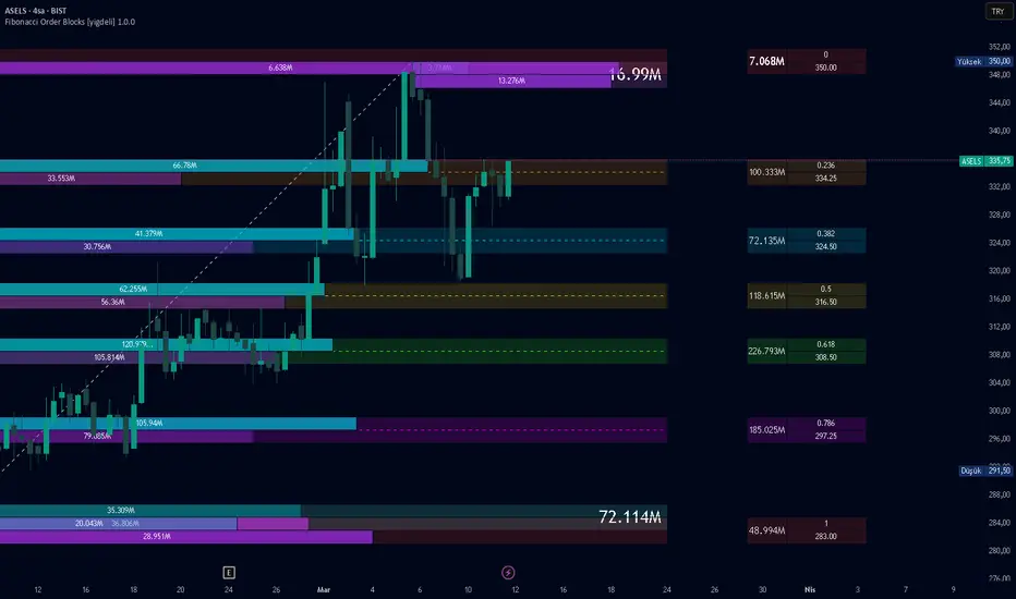
Fibonacci Order Blocks [yigdeli]Fibonacci Order Blocks
Overview
Fibonacci Order Blocks is a rule-based structural analysis and visualization tool that combines pivot-based Fibonacci mapping with volume-distributed support and resistance zones.
The Fibonacci foundation used in this script was built on auto Fibonacci correction techniques available on TradingView. Thanks to the original technical groundwork and to the TradingView Pine community for the structural ideas that helped shape this project. On top of that base, this script extends the framework with Fibonacci zone boxes, internal buy/sell volume split, right-side information boxes, and support/resistance order block visualization.
This script is designed for structural chart analysis and visual interpretation.
It does not predict future price direction.
It does not provide standalone entry or exit signals.
It does not provide investment advice.
Fibonacci Structure
The script automatically builds a Fibonacci leg between the latest confirmed structural pivots.
Each enabled Fibonacci level can display:
the Fibonacci line itself
a local main zone box
a buy-side sub-box
a sell-side sub-box
This makes each level readable as a price zone rather than as a line only.
Image 1 — Fibonacci Lines
Shows the pivot-based Fibonacci structure used as the main framework of the script.
Image 2 — Fibonacci Level Boxes
Shows the Fibonacci main boxes and the internal buy/sell sub-boxes for enabled levels.
Fibonacci Information Boxes
Each Fibonacci zone can also display separate right-side information boxes.
These boxes are used to show:
total volume for the zone
Fibonacci level value
exact price value
They are separated from the main Fibonacci box to improve readability and make the chart easier to interpret visually.
Image 3 — Fibonacci Info Boxes
Shows the separate total-volume box and the level/price information boxes displayed to the right of Fibonacci zones.
Support and Resistance Zones
The indicator also builds structural support and resistance zones using the active chart context and lookback settings.
Each zone includes:
a main support or resistance box
total zone volume displayed on the main box
internal buy and sell sub-boxes
These zones are intended to help visualize how localized volume is distributed inside broader structural areas.
Image 4 — Support and Resistance Zones
Shows the main support and resistance block structure.
Internal Buy / Sell Volume Split
Both Fibonacci zones and support/resistance zones use internal buy/sell volume distribution logic.
This volume split is derived from historical chart data and internal overlap calculations. It is a chart-based analytical representation, not exchange-native bid/ask data and not a direct order book feed.
The purpose of the split is to provide visual context about how volume is distributed inside each displayed zone.
Image 5 — Support / Resistance Buy-Sell Split
Shows the complete box-based layout of the script, including Fibonacci zone boxes, buy/sell sub-boxes, right-side information boxes, and support/resistance volume blocks.
Customization
The script includes adjustable settings for:
pivot detection behavior
Fibonacci direction and extension
visible Fibonacci levels
line style and colors
support/resistance colors
volume box widths
right-side info box widths
support/resistance lookback behavior
This allows users to adapt the visualization to different chart layouts and analysis preferences.
What This Script Does Not Do
It does not forecast future price levels
It does not guarantee reversals or continuations
It does not generate standalone trading signals
It does not provide broker, exchange, or true order book execution data
It does not provide financial advice or trading recommendations
Notes
All calculations are derived from chart data, user-defined settings, and rule-based internal logic.
This script should be used as a structural and visual analysis tool. It is intended to help users study price structure, Fibonacci mapping, and localized volume behavior inside predefined zones. Indicador

Structural Pivot Mapper [JOAT]Structural Pivot Mapper
Introduction
The Structural Pivot Mapper (SPM) is an advanced open-source structural analysis indicator that combines W/M pattern detection, dynamic support/resistance level mapping, pivot point analysis, volume profile integration, and break-retest detection to identify institutional structural pivots and key price levels. This indicator reveals market structure through systematic detection of swing highs/lows, classical chart patterns, and volume-based price levels, providing traders with a comprehensive structural framework for identifying high-probability entry and exit zones.
Unlike basic pivot indicators that simply mark swing points, SPM employs sophisticated pattern recognition algorithms to detect W patterns (bullish reversal), M patterns (bearish reversal), Head & Shoulders formations, and tracks level strength through touch counting and volume analysis. The indicator automatically manages support/resistance levels, removes outdated levels, and highlights Point of Control (POC) from volume profile analysis to show where institutional activity is concentrated.
Why This Indicator Exists
This indicator addresses the challenge of identifying key structural levels where institutional players are likely to defend positions or initiate new trades. Market structure provides the framework for understanding price behavior, and SPM systematically reveals:
W/M Pattern Detection: Identifies classical reversal patterns with strict validation rules
Dynamic Support/Resistance: Tracks pivot-based levels with automatic strength scoring
Level Touch Counting: Quantifies level importance through historical price interaction
Volume Profile Integration: Identifies Point of Control (POC) where maximum volume traded
Break & Retest Detection: Monitors level breaks and subsequent retests for confirmation
Head & Shoulders Patterns: Detects both regular and inverse H&S formations
Smart Level Management: Automatically removes weak levels and maintains only strongest
Each component provides unique intelligence. W/M patterns show reversal zones, pivots show swing structure, touch counting shows level strength, volume profile shows institutional interest, break-retest confirms level validity, and H&S patterns show major reversals.
Core Components Explained
1. W Pattern Detection (Bullish Reversal)
SPM detects W patterns through systematic analysis of 5 pivot points (A-B-C-D-E):
f_detect_w_pattern(float src, int lookback, int offset, bool strict) =>
// Find 5 pivot points forming W shape
// E = current, D = first low, C = middle high, B = second low, A = left high
// Validation: E > C, D < E, D < C, B <= D (strict), B < A
found := a > 0 and a != b and c != 0 and d != 0 and
src > src and src < src and src < src and
(src <= src or not strict) and src < src
W patterns indicate bullish reversal when:
- Price forms double bottom (D and B)
- Middle high (C) is lower than current price (E)
- Second low (B) is higher than or equal to first low (D) in strict mode
- Pattern completes with breakout above middle high (C)
Entry level is at middle high (C), stop loss at second low (B).
2. M Pattern Detection (Bearish Reversal)
M patterns are detected through inverted W logic:
f_detect_m_pattern(float src, int lookback, int offset, bool strict) =>
// Find 5 pivot points forming M shape
// E = current, D = first high, C = middle low, B = second high, A = left low
// Validation: E < C, D > E, D > C, B >= D (strict), B > A
found := a > 0 and a != b and c != 0 and d != 0 and
src < src and src > src and src > src and
(src >= src or not strict) and src > src
M patterns indicate bearish reversal when:
- Price forms double top (D and B)
- Middle low (C) is higher than current price (E)
- Second high (B) is lower than or equal to first high (D) in strict mode
- Pattern completes with breakdown below middle low (C)
Entry level is at middle low (C), stop loss at second high (B).
3. Dynamic Support/Resistance Level Management
SPM tracks pivot-based support and resistance levels with automatic management:
float pivot_high = ta.pivothigh(high, pivot_left, pivot_right)
float pivot_low = ta.pivotlow(low, pivot_left, pivot_right)
// Store levels in arrays
if not na(pivot_high) and barstate.isconfirmed
if array.size(resistance_levels) < max_levels
array.push(resistance_levels, pivot_high)
array.push(resistance_touches, 1)
else if auto_cleanup
array.shift(resistance_levels) // Remove oldest
array.push(resistance_levels, pivot_high)
Level strength is calculated through touch counting:
1 touch: New level (weak)
2 touches: Confirmed level (moderate)
3+ touches: Strong level (high importance)
Levels are automatically removed when max_levels is reached and auto_cleanup is enabled.
4. Level Touch Counting & Strength Scoring
SPM tracks how many times price interacts with each level:
float zone_size = atr_value * zone_width
if high >= level - zone_size and high <= level + zone_size
array.set(resistance_touches, i, array.get(resistance_touches, i) + 1)
Strength score (0-100) is calculated based on:
Touch Count (0-40 points): More touches = stronger level (8 points per touch, max 40)
Age Factor (0-30 points): Older levels = more established (based on level_strength_period)
Volume Factor (0-30 points): Higher volume at level = more institutional interest
Only levels with 2+ touches and strength >60 are displayed to reduce clutter.
5. Volume Profile & Point of Control (POC)
SPM calculates volume profile to identify price levels with maximum trading activity:
f_volume_profile(int bins, int lookback) =>
float price_range = price_high - price_low
float bin_size = price_range / bins
// Accumulate volume in 20 price bins
for i = 0 to lookback - 1
float bar_price = hlc3
int bin = math.floor((bar_price - price_low) / bin_size)
array.set(vp_volumes, bin, current_vol + bar_vol)
// Find POC (highest volume bin)
float poc_price = array.get(vp_prices, poc_bin)
POC represents the price level where most volume traded - typically where institutions have significant positions. Value Area High (VAH) and Value Area Low (VAL) define the range containing 70% of volume.
6. Break & Retest Detection
SPM monitors when price breaks through resistance levels and subsequently retests:
// Detect break (close above resistance)
if not was_broken and close > level and close <= level
array.set(level_broken, i, true)
array.set(break_bar_index, i, bar_index)
// Detect retest (price returns to broken level within 3-20 bars)
if was_broken
int break_bar = array.get(break_bar_index, i)
bool is_retest = bar_index - break_bar >= 3 and bar_index - break_bar <= 20
bool touching_level = math.abs(close - level) < atr_value * 0.5
if is_retest and touching_level
label.new(bar_index, level, "RT", color=c_support_strong)
Successful retests confirm level validity and often provide high-probability entry opportunities.
7. Head & Shoulders Pattern Detection
SPM detects both regular and inverse Head & Shoulders formations:
f_detect_head_shoulders(float src, int lookback) =>
// Find 3 pivot highs: left shoulder, head, right shoulder
float ph1 = ta.pivothigh(src, lookback, lookback)
float ph2 = ta.pivothigh(src, lookback, lookback)
float ph3 = ta.pivothigh(src, lookback, lookback)
// Validate: head higher than shoulders, shoulders roughly equal
if ph2 > ph1 and ph2 > ph3 and math.abs(ph1 - ph3) < (ph2 - ph1) * 0.3
found := true
neckline := math.min(low , low )
H&S patterns are major reversal formations indicating trend exhaustion and potential reversal.
Visual Elements
Support Lines: Blue horizontal lines with strength-based width (2-3px)
Resistance Lines: Pink horizontal lines with strength-based width (2-3px)
Level Labels: "S: price " for support, "R: price " for resistance (N = touch count)
Pivot Markers: Small circles at swing highs (pink) and lows (blue)
POC Line: Yellow dotted line showing Point of Control from volume profile
Retest Markers: "RT" labels when price retests broken levels
Pattern Lines: Optional dashed lines showing W/M pattern structure (disabled by default)
Dashboard: Real-time metrics showing resistance count, support count, pattern status, POC price
Input Parameters
Pattern Detection:
Pattern Range: Lookback period for W/M detection (default: 9)
Pattern Offset: Additional bars to check (default: 0)
Strict Pattern Validation: Enforce stricter pattern rules (default: false)
Pivot Settings:
Pivot Left Bars: Bars to left of pivot (default: 6)
Pivot Right Bars: Bars to right of pivot (default: 1)
Show Pivot Labels: Toggle pivot markers (default: true)
Level Management:
Maximum Levels: Max support/resistance levels to track (default: 3)
Level Strength Period: Lookback for strength calculation (default: 50)
Auto-Cleanup Old Levels: Remove oldest when max reached (default: true)
Visualization:
Show Support/Resistance Zones: Toggle level display (default: true)
Zone Width (ATR %): Width of level zones (default: 0.5)
Show Pattern Lines: Toggle W/M pattern visualization (default: false)
How to Use This Indicator
Step 1: Identify Key Structural Levels
Look for blue (support) and pink (resistance) lines. Thicker lines with higher touch counts are strongest.
Step 2: Monitor Pattern Formations
Watch dashboard for "W Pattern" (bullish) or "M Pattern" (bearish) status. These indicate potential reversal zones.
Step 3: Check POC Proximity
Yellow POC line shows where maximum volume traded. Price often gravitates toward POC or bounces from it.
Step 4: Wait for Break & Retest
When price breaks resistance and retests (RT label), it confirms level as new support. High-probability long entry.
Step 5: Use Level Strength for Confidence
Levels with 3+ touches are most reliable. Dashboard shows total support/resistance count.
Step 6: Combine with Higher Timeframe Structure
Use SPM on multiple timeframes. Daily/weekly levels are stronger than intraday levels.
Best Practices
Focus on levels with 3+ touches - these have proven institutional interest
W/M patterns work best at major support/resistance levels
POC acts as magnet - price often returns to POC after deviating
Break-retest setups have highest win rate when combined with volume confirmation
Disable pattern lines to reduce chart clutter - use dashboard for pattern status
Adjust zone width based on instrument volatility (higher ATR = wider zones)
Auto-cleanup keeps chart clean but may remove valid older levels
H&S patterns are most reliable on higher timeframes (4H+)
Level strength score >70 indicates institutional-grade level
Smart spacing prevents overlapping levels - only strongest levels shown
Indicator Limitations
Pattern detection requires sufficient historical data and clear pivot formation
W/M patterns can produce false signals during strong trends
Level touch counting is historical - doesn't predict future touches
Volume profile requires consistent volume data - may not work on illiquid instruments
Break-retest detection has time window (3-20 bars) - may miss delayed retests
Maximum level limit means some valid levels may be removed
Pivot detection lags by pivot_right bars - not real-time
H&S patterns are rare and require specific market conditions
Level strength scoring is multi-factor but still subjective
Smart spacing may hide valid levels that are too close to stronger levels
Technical Implementation
Built with Pine Script v6 using:
Custom W/M pattern detection with 5-point validation
Pivot-based support/resistance tracking with arrays
Touch counting system with ATR-based zone detection
Multi-factor level strength scoring (touches + age + volume)
Volume profile calculation with 20-bin price distribution
POC detection through maximum volume identification
Break-retest monitoring with time window validation
Head & Shoulders pattern detection (regular and inverse)
Smart level spacing to prevent overlapping (1.5 ATR minimum)
Automatic level cleanup when maximum reached
Dynamic line and label management to prevent memory issues
Real-time dashboard with 4 key metrics
The code is fully open-source and can be modified to suit individual trading styles.
Originality Statement
This indicator is original in its comprehensive structural analysis approach. While pivot detection and pattern recognition are established concepts, this indicator is justified because:
It combines W/M pattern detection with dynamic support/resistance management in a unified system
The multi-factor level strength scoring (touches + age + volume) provides quantitative level assessment
Volume profile integration with POC detection adds institutional perspective to structural analysis
Break-retest detection with time window validation automates a manual trading technique
Smart level spacing prevents chart clutter while maintaining strongest levels
Head & Shoulders detection (both regular and inverse) adds major reversal pattern recognition
Automatic level cleanup maintains chart readability without manual intervention
Integration of classical patterns (W/M, H&S) with modern volume analysis creates layered confirmation
Each component contributes unique information: W/M patterns show reversals, pivots show structure, touch counting shows strength, volume profile shows institutional interest, break-retest confirms validity, H&S shows major reversals, and strength scoring quantifies importance. The indicator's value lies in presenting these complementary perspectives simultaneously with intelligent level management.
Disclaimer
This indicator is provided for educational and informational purposes only. It is not financial advice. Structural levels and patterns do not guarantee price behavior. Trading involves substantial risk of loss. Past performance does not guarantee future results. Always use proper risk management and never risk more than you can afford to lose.
-Made with passion by officialjackofalltrades Indicador

Reverse ZigZagReverse ZigZag
A reimagined ZigZag indicator that processes price data from the most recent bar backwards, solving the biggest frustration with traditional ZigZag implementations: the inaccurate last leg.
━━━━━━━━━━━━━━━━━━━━━━━━
THE PROBLEM
Standard ZigZag indicators process bars left-to-right. This means the last leg is always "tentative" — it often anchors to the current bar instead of the actual swing extreme. If the true low was 3 bars ago but price has since bounced, the traditional ZigZag either misses it entirely or draws to the wrong bar. This makes the indicator unreliable precisely where it matters most: at the current price action.
THE SOLUTION
This indicator flips the logic. Instead of walking forward through history, it starts at the most recent bar and walks backwards. The result:
→ The last leg is always accurate — it finds the true extreme first, then works outward
→ No tentative or "pending" pivots — every swing point is drawn to the correct bar
→ No repainting — pivots don't shift around as new bars form
→ Clean, consistent results that match what your eyes see on the chart
━━━━━━━━━━━━━━━━━━━━━━━━
HOW IT WORKS
Phase 1 — Initialization
Starting from the current bar, the indicator walks left until it finds a price range that exceeds the deviation threshold. The more recent extreme becomes the first confirmed pivot.
Phase 2 — Backward Walk
From that first pivot, the algorithm continues left, tracking running highs and lows. When price reverses by more than the deviation %, a pivot is confirmed and the direction flips. This continues across the full lookback window.
Phase 3 — Drawing
Lines and labels are drawn between all confirmed pivots. Labels show the price and the magnitude of each swing move.
━━━━━━━━━━━━━━━━━━━━━━━━
SETTINGS
• Deviation % — Minimum reversal required to confirm a new pivot (default: 5%). Lower values capture smaller swings, higher values show only major structure.
• Lookback Bars — How far back to calculate (default: 500). Increase for longer history.
• Show Price Labels — Toggle pivot labels showing price and swing magnitude.
• Line Color / Width — Customize appearance.
• High/Low Pivot Colors — Separate colors for swing highs and lows.
━━━━━━━━━━━━━━━━━━━━━━━━
USE CASES
• Swing traders identifying reversal points and market structure
• Harmonic pattern recognition where accurate pivot placement is critical
• Elliott Wave analysis requiring precise swing labeling
• Support/resistance identification from confirmed swing levels
• Measuring swing magnitude to gauge momentum shifts
━━━━━━━━━━━━━━━━━━━━━━━━
NOTES
• The indicator recalculates on the last bar, so all drawing happens once per bar update — this is efficient and avoids the overhead of managing state across bars.
• Works on any timeframe and any instrument.
━━━━━━━━━━━━━━━━━━━━━━━━
Indicador

Structural SVM Ranker [LuxAlgo]The Structural SVM Ranker indicator is a market structure tool that utilizes a linear Support Vector Machine (SVM) algorithm to classify and rank structural breaks based on volume, momentum, and price magnitude. By assigning a score from 0 to 100 to every Break of Structure (BOS) and Change of Character (CHoCH), it aims to help traders differentiate between high-conviction structural shifts and low-probability price action.
🔶 USAGE
The indicator identifies key pivot highs and lows to map out the market structure. When price closes beyond these levels, a structural break is identified and assigned a score based on the quality of the move.
BOS (Break of Structure): Represented by solid lines, these indicate a continuation of the current local trend.
CHoCH (Change of Character): Represented by dashed lines, these indicate a potential reversal in the trend direction.
SVM Score: Displayed on labels and the dashboard. A higher score suggests the break occurred with significant relative volume, strong RSI momentum, and a meaningful price distance beyond the pivot level.
Traders can use the SVM score to filter trade quality. For example, a "CHoCH" with a score above 70 indicates a high-conviction reversal backed by volume and momentum, whereas a score below 30 might suggest a "fakeout" or a weak structural shift.
🔶 DETAILS
The core of the script is a linear classification logic inspired by Support Vector Machines. It takes three primary features into account to determine the "strength" of a break:
Relative Volume: Compares current volume to its 20-period average to ensure the break is supported by market participation.
RSI Momentum: Measures the distance of the RSI from its midpoint (50) to confirm trend strength.
Break Distance: Measures how far the price closed beyond the structural level, normalized by the Average True Range (ATR).
These features are multiplied by user-defined weights and then passed through a Sigmoid function to produce a normalized score between 0 and 100.
🔶 SETTINGS
🔹 Market Structure
Pivot Lookback: Determines the number of bars required to confirm a pivot high or low.
Show BOS/CHoCH: Toggles the visibility of structural break lines and labels.
🔹 SVM Ranking Parameters
Relative Volume Weight: Adjusts the influence of volume on the final score.
RSI Momentum Weight: Adjusts the influence of RSI deviation from 50 on the final score.
Break Distance Weight: Adjusts the influence of the price distance beyond the pivot (relative to ATR).
ATR Length: The period used for the ATR normalization of the break distance.
🔹 Dashboard
Dashboard: Toggles the visibility of the real-time ranking table.
Position: Moves the dashboard to different corners of the chart (Top Right, Bottom Right, Bottom Left).
Size: Adjusts the scale of the dashboard text.
Indicador
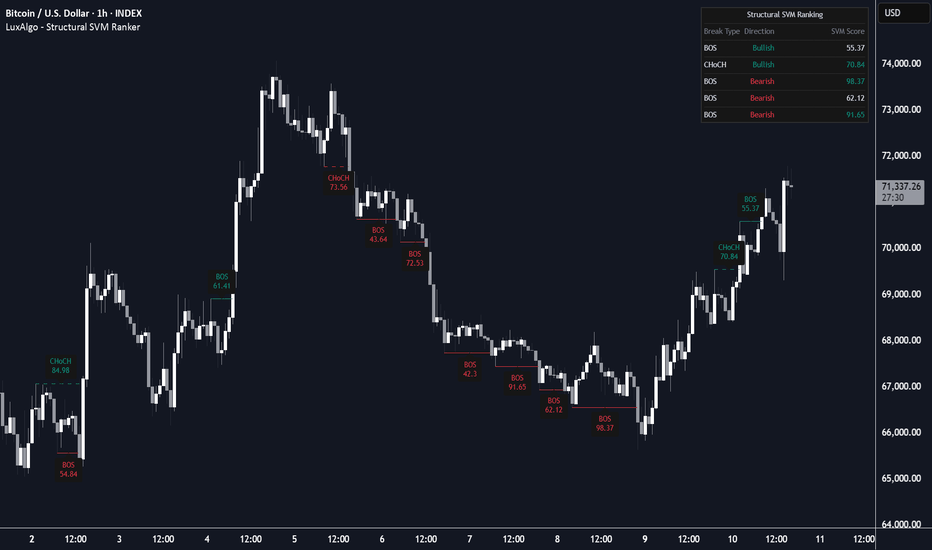
Indicador