Round Number GridRound Number Grid is a visual price reference tool that draws psychological round-number levels around the current market price.
The purpose of this script is to help traders quickly see nearby round-number levels such as 50, 100, 150, 200, 250, 300, 500, or other clean price steps depending on the symbol and its volatility.
This is a visual tool only. It does not generate buy or sell signals, does not predict future price movement, and does not claim that round numbers will act as support or resistance.
How it works
The script can calculate the grid step in two ways:
- Auto from ATR: the script uses recent volatility to estimate a suitable distance between levels, then converts that distance into a clean round-number step.
- Manual: the user can manually choose the distance between grid levels.
In Auto mode, the script converts the ATR-based distance into a clean step such as:
- 1
- 2.5
- 5
- 10
- 25
- 50
- 100
This helps the grid adapt to different symbols and price ranges.
What the script shows
- Round-number levels above and below current price
- The nearest round-number level above price
- The nearest round-number level below price
- Optional major levels every selected number of steps
- Optional labels for visible levels
- A compact state label showing:
- Current grid step
- Nearest round level above
- Nearest round level below
- Percentage distance to the nearest levels
Visual features
The nearest level above price can be highlighted with a separate color and width.
The nearest level below price can also be highlighted separately.
Users can control:
- Number of levels shown above and below price
- Step mode: Auto or Manual
- Auto step multiplier from ATR
- Manual step size
- Major level frequency
- Line colors
- Line width
- Line style
- Label size
- Label visibility
- State label visibility
- Right-side line extension
Right extension
The script includes a right-extension setting so users can extend the grid lines farther to the right.
Users can choose between:
- Manual bars: extend levels by a selected number of bars
- Infinite right: extend the grid lines continuously to the right side of the chart
This makes the grid easier to read when the user wants more space between price, labels, and the right edge of the chart.
Alerts
The script includes alert conditions for:
- Round level crossed
- Nearest upper round level crossed
- Nearest lower round level crossed
These alerts are descriptive price-reference events only. They are not buy or sell signals.
Important note
Round numbers are psychological reference levels. They may be watched by market participants, but they are not guaranteed support or resistance levels.
A reaction near a round number does not guarantee a reversal, continuation, breakout, or rejection.
This indicator is intended for visual analysis, education, and chart context. It should be used together with broader market structure, trend, volume, support and resistance, and risk management.
Repainting / behavior note
This script does not use pivot confirmation, future-looking calculations, or predictive signals.
However, the visible grid is centered around the current price area. When price moves significantly, the displayed grid can recenter around the new price area. This is normal behavior for a visual round-number grid and should not be interpreted as a signal change.
The script is not a strategy, not financial advice, and not a standalone trading system. Indicador

Cardwell Dual Confluence [MarkitTick]💡 A comprehensive momentum and trend-following framework built to identify high-probability market shifts. By synthesizing Andrew Cardwell's established Relative Strength Index (RSI) range rules with dynamic trend filtering and volatility metrics, this tool provides a unified analytical engine. It moves beyond standard oscillator readings to map the underlying momentum regime, ensuring that signals are structurally aligned with the dominant trend.
● ✨ Originality and Utility
Traditional momentum oscillators often produce premature reversal signals during strong trends, leading to false entries in directionless markets. This indicator solves that problem by integrating a dual-tier confluence model. It does not rely solely on an isolated RSI moving average crossover; instead, it demands structural validation through Cardwell's defined momentum ranges.
The primary utility lies in its objective structural filtering: a momentum cross is only validated if the broader market regime structurally supports the direction of the momentum.
By combining a base timeframe momentum cross with a Higher Timeframe (HTF) trend regime and Average Directional Index (ADX) volatility filtering, this tool prevents overtrading in choppy, non-directional environments.
This deliberate combination of an oscillator, a trend filter, and a volatility metric acts as a logical confluence engine. It avoids the pitfalls of disjointed indicator mashups by ensuring every component serves a distinct mathematical purpose in validating the signal before it is printed to the chart.
● 🔬 Methodology and Concepts
The logic engine of this tool evaluates multiple distinct criteria before registering a valid signal.
• Momentum Crossover
The script calculates a base RSI and smooths it using two Running Moving Averages (RMA): a Fast RMA and a Slow RMA. A baseline momentum shift occurs when the Fast RMA crosses the Slow RMA, indicating a localized surge in buying or selling pressure.
• Regime Mapping
A structural trend is evaluated by comparing the closing price to a Simple Moving Average (SMA). Simultaneously, a secondary RSI is evaluated against Cardwell's defined structural ranges. A Bullish Regime requires the price to be above the SMA and the RSI to hold within a specific upper tier (defaulting to 40-80). A Bearish Regime requires the price to be below the SMA and the RSI to hold within a lower tier (defaulting to 20-60).
• Confirmation and Confluence
Regimes must persist for a user-defined number of consecutive bars to filter out transient market noise. Confluence is achieved when an RMA momentum crossover occurs within a tight, predefined window of a regime shift, ensuring both immediate momentum and the structural trend are perfectly aligned.
• Higher Timeframe and Volatility Verification
An optional HTF module checks the regime state of a larger timeframe using a strict non-repainting historical offset. Furthermore, the ADX is calculated to measure pure trend strength. If the ADX is below the user-defined minimum threshold, the market is deemed too choppy, and all signals are suppressed.
• Dynamic Trade Architecture
Once a signal is validated strictly on a confirmed bar close, the script projects dynamic Stop Loss and Take Profit levels using a multiplier of the Average True Range (ATR), actively adapting the trade geometry to current market volatility.
● 🔍 Deconstruction of the Underlying Scientific and Academic Framework
The analytical foundation of this tool rests on advanced momentum physics and statistical distribution theories.
• Cardwell RSI Range Theory
Developed by Andrew Cardwell, this theory posits that the Relative Strength Index is not merely an overbought/oversold oscillator, but a powerful trend-identifying metric. In a mathematically robust uptrend, the RSI establishes a baseline support near the 40 level and frequently reaches 80. Conversely, in a downtrend, it establishes resistance near 60 and drops to 20. The indicator algorithmically enforces these limits to objectively classify market environments.
• Running Moving Average (RMA) Dynamics
The script utilizes the RMA, also known as the Modified Moving Average (MMA) or SMMA, to smooth the RSI base. The RMA applies an exponential smoothing weight defined exactly as 1 / length . This specific mathematical weighting retains a longer memory of past data compared to a standard SMA, preventing the abrupt drop-offs that occur when large data points exit a simple moving average window. This makes the RMA crossover highly sensitive to genuine shifts in cumulative momentum without the lag of a standard exponential moving average.
• Average Directional Movement Index (ADX)
Created by J. Welles Wilder, the ADX quantifies trend strength independent of directional vector. By calculating the smoothed moving averages of the +DI and -DI directional movement indicators, the ADX isolates the absolute magnitude of price expansion. The script uses this mathematical isolation to construct an absolute threshold; requiring ADX to exceed a base level ensures that the statistical probability of trend continuation is mathematically viable before capital is exposed.
• Volatility-Scaled Projection (ATR)
Take profit and stop loss coordinates are mapped using Wilder's Average True Range. The ATR measures the greatest of the current high minus the current low, the absolute value of the current high minus the previous close, and the absolute value of the current low minus the previous close. By scaling targets using ATR multipliers, the tool shifts from fixed-point geometry to dynamic, standard-deviation-aligned targeting, ensuring targets expand during high volatility and contract during consolidation.
● 🎨 Visual Guide
The tool employs a clean, visually dynamic chart interface to transmit complex data instantly without cluttering the workspace.
• Heatmap Candles
Candle bodies and wicks are dynamically colored based on the active regime. Teal indicates a confirmed Bullish Regime, Red indicates a Bearish Regime, and Gray indicates a Neutral market state.
• Signal Labels
When all confluence parameters are met on a confirmed bar close, a solid blue "BUY" label appears below the bar, or an orange "SELL" label appears above the bar, complete with strict execution markers.
• Dynamic Trade Levels
Upon signal generation, the tool plots projected trade levels extending to the right of the price action. A solid Red line indicates the Stop Loss threshold. A dashed Blue line denotes the Entry price. Dashed Teal lines represent Take Profit 1, 2, and 3. Labels accurately print the precise price levels directly on the chart axis.
• Risk and Reward Fills
A semi-transparent Red linefill is plotted between the Entry and Stop Loss lines to visualize risk exposure, while a Teal fill between Entry and TP3 visualizes the total projected reward structure, allowing for instant visual evaluation of the trade setup.
• Integrated Dashboard
A comprehensive table is positioned on the chart, displaying real-time operational metrics. It details the current Cross Trend, Regime State, Confirm Bar count, Signal Gap status, Last Signal source, Trade Status, live ATR value, TP3:SL ratio, and HTF/Chop Filter states in an easy-to-read grid.
● 📖 How to Use
Deploying this tool requires patience and strict adherence to structural confirmation.
Wait for the Heatmap Candles to shift from Gray (Neutral) to Teal (Bullish) or Red (Bearish). This indicates that the broader moving average trend and the internal RSI ranges have aligned into a confirmed structural regime.
Observe the chart for a printed BUY or SELL label. This confirms that the RMA momentum cross has achieved mathematical confluence with the active regime within the defined allowable window.
Check the Dashboard to ensure the HTF Regime and Chop Filter (ADX) read as PASS. If the market is blocked by the Chop Filter, do not force an entry, as the statistical probability of a sustained run is low.
Upon entry, utilize the plotted ATR lines to structure your risk. Place your stop loss exactly at the solid red line, and scale out of your position at the dashed TP1, TP2, and TP3 levels as price action develops.
Wait for the Signal Gap cooldown period to elapse before considering consecutive entries in the same direction. This engineered delay prevents overexposure during erratic, volatile spikes.
● ⚙️ Inputs and Settings
The script features highly customizable parameters grouped logically for maximum workflow efficiency.
• Core Settings
Adjust the lengths for the Cross RMA (Fast/Slow) and the primary RSI source. Modify the Trend MA length and explicitly set the boundaries for the Bull Range (default 40-80) and Bear Range (default 20-60). Configure the Confluence Window to define exactly how close a cross and regime shift must occur to trigger a valid signal, and set the Signal Gap cooldown timer.
• Filters
Toggle the HTF Confirmation logic and select the desired higher timeframe for broader structural alignment. Enable the ADX Chop Filter and set the minimum required trend strength to strip out low-probability environments.
• Trade Tools
Define the ATR lookback length and customize the specific multipliers for the Stop Loss and the three Take Profit targets to match your unique risk-to-reward requirements. Modify the Line Extend Bars input to control how far into the future the trade levels are drawn.
• Visuals and Dashboard
Toggle individual visual components, including candle coloring, signal labels, and trade level plotting. Position the dashboard to any corner of the chart to prevent the obstruction of live price action.
• Alerts
Input specific JSON string payloads for Long, Short, Close Long, Close Short, SL, and TP actions. This allows the indicator to integrate seamlessly with automated execution platforms or third-party webhooks without requiring manual code modifications.
⚠️ Disclaimer
All provided scripts and indicators are strictly for educational exploration and must not be interpreted as financial advice or a recommendation to execute trades. We expressly disclaim all liability for any financial losses or damages that may result, directly or indirectly, from the reliance on or application of these tools. Market participation carries inherent risk where past performance never guarantees future returns, leaving all investment decisions and due diligence solely at your own discretion. Indicador

Native Timeframe Moving Average📈 Native Timeframe Moving Average
Overview
Native Timeframe Moving Average allows you to plot a moving average that is always calculated from its own selected timeframe, regardless of the chart timeframe you're viewing.
Instead of recalculating the MA using the current chart bars, this indicator performs the entire moving-average calculation inside the selected source timeframe before mapping the result back onto your chart. This ensures the moving average always remains true to its native timeframe.
For example, selecting a 200 SMA on the Daily timeframe will always display the genuine 200-day SMA whether you're viewing a 15-minute, 1-hour, 4-hour, Daily, Weekly, or any other timeframe.
✨ Features
✔ Native timeframe moving averages
✔ SMA, EMA, WMA, RMA & VWMA
✔ Any TradingView timeframe
✔ Developing and Confirmed calculation modes
✔ Connected and Native display modes
✔ Standard MA Offset
✔ Uses TradingView Style settings for colour and line width
✔ No repainting or future leakage
✔ Lightweight and fast
⚙️ Value Modes
📡 Developing (Default)
Includes the active source-timeframe candle in the calculation.
This behaves like traders generally expect when viewing a higher-timeframe moving average on a lower-timeframe chart, allowing the MA to update as the source candle develops.
Perfect for discretionary chart analysis.
🔒 Confirmed
Uses only completed source-timeframe candles.
The plotted value remains unchanged until the next source-timeframe candle closes.
Ideal for:
• Strategies
• Alerts
• Stable signal generation
• Any workflow requiring confirmed higher-timeframe values
📉 Line Modes
🔗 Connected (Default)
Connects each source-timeframe moving-average value using straight lines.
This provides a cleaner, smoother appearance that most traders prefer when analysing trends across multiple timeframes.
Note: The connecting segments are visual interpolation between confirmed source-timeframe values. They improve readability but should not be interpreted as the exact value that existed on every individual chart bar.
🪜 Native
Displays the actual sampled moving-average value available on every chart bar.
When the selected timeframe is higher than the chart timeframe, the line naturally appears as a staircase because the source-timeframe value only updates when that timeframe produces a new value.
This mode is recommended whenever the output is being used for:
• Strategy logic
• Alerts
• Numerical comparisons
• Other indicators
💡 Typical Uses
• Overlay a Daily 200 SMA while trading the 15-minute chart
• View Weekly trend direction without changing chart timeframe
• Display Monthly moving averages on swing-trading charts
• Compare multiple native timeframe moving averages by adding multiple indicator instances
• Keep important higher-timeframe trend references visible while executing on lower timeframes
🎯 Why use this instead of a standard Moving Average?
A standard Moving Average is always calculated from the timeframe of the chart you're viewing.
This indicator keeps the calculation anchored to the timeframe you choose.
That means a 200 Daily SMA always remains a 200 Daily SMA, regardless of whether you're looking at a 5-minute chart or a Weekly chart. It never silently becomes a 200-bar moving average of the current chart timeframe.
🚀 Final Notes
This indicator was designed to provide a clean, reliable and flexible way to work with native timeframe moving averages across any chart.
Whether you're monitoring long-term trend structure while trading intraday or building multi-timeframe confluence into your analysis, Native Timeframe Moving Average keeps your moving averages true to their original timeframe while giving you the flexibility to choose between the smooth appearance of Connected mode and the mathematically exact representation of Native mode. Indicador

Indicador

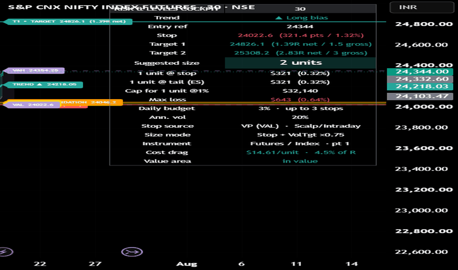
Risk & Levels CockpitRisk & Levels Cockpit
Risk & Levels Cockpit answers one question on any market and any timeframe: if I take this trade, where is my stop, what size should I trade, and what can I lose? It is a risk-and-levels tool, not a buy/sell signal — it does not predict direction, it bounds risk around a trade you have already decided to take.
HOW IT WORKS
Three components chain one-way:
Theil-Sen robust channel — fits a trend line as the median of all pairwise slopes over the lookback. Being a median, it cannot be tilted by a single spike or wick the way ordinary regression can, so the rails give you a stable structure to trade against.
Extreme Value Theory tail model (Peaks-Over-Threshold, Generalized Pareto) — estimates how far price can realistically move against you at a chosen tail quantile, replacing a guessed 2xATR stop with a distance grounded in the actual tail of the return distribution. The channel rail acts as a structural floor, so your stop is never tighter than the channel edge.
Fixed-fractional sizer — turns that stop into a position size: units = floor(risk-budget / (risk distance x point value)). When the stop is wider than your risk budget, size correctly floors to zero and the panel shows what one unit would cost and the capital that would make one unit equal your target risk, so a zero is a decision, not a dead end.
TWO SIZING BASES
Stop distance risks your fraction at the drawn stop. Expected Shortfall risks your fraction at the mean loss beyond the stop (McNeil-Frey POT form, from the same tail fit) — wider, so fewer units, so that gapping through your stop still respects your budget. The panel always shows both the at-stop and at-tail loss per unit, so gap risk is visible in either mode. An optional vol-target overlay (on by default) scales size to keep portfolio volatility steadier across regimes; the Size-mode row always shows the live multiplier.
WORKS ON ANY MARKET, ANY TIMEFRAME
No session, expiry, or clock anchors; every lookback is in bars and volatility annualization self-scales — identical behavior from 1-minute scalping to daily positional, on stocks, futures, forex, crypto, and indices worldwide. Set the currency symbol and point value (money per point per unit) to your instrument: stocks/crypto/spot = 1; index and futures = the contract multiplier (for example NIFTY 65, S&P E-mini 50, Nikkei 1000, DAX 25); forex = point value per lot; options = point value x delta.
A Scalp/Intraday, Positional, or Custom preset adjusts the tail horizon and quantile. Scalp/Intraday is the default (tighter stops); positional traders should switch to the Positional preset for wider, conservative stops.
ON THE CHART
A slope-colored robust trend line with a TREND pill and a channel band, plus solid, pill-labeled decision levels — red STOP, amber BREAK (invalidation), and green T1 and T2 TARGET, each showing price and R-multiple. The panel gives the full sizing and risk readout, including a daily-loss-budget line.
LIMITATIONS (read before use)
Not a signal and not investment advice. Stops and targets are model references, not guarantees — gaps and slippage can exceed them. The tail quantile is scaled to the holding horizon by square-root-of-time, a deliberate approximation chosen over overlapping h-bar fitting which violates independence. The daily-loss cap is a display aid; a single-chart indicator cannot track or enforce live fills. The vol-target overlay multiplies the fixed-fractional size and can nudge per-trade risk above the nominal percent in calm markets — set Size clamp max to 1.0 to only reduce size, or turn it off for a strict fixed-percent rule. Position sizing does not create an edge; it bounds risk.
CREDITS
Original implementation. Theil (1950) and Sen (1968) robust slope; Pickands-Balkema-de Haan / Peaks-Over-Threshold Generalized Pareto tail estimation and Expected Shortfall (McNeil-Frey); fixed-fractional position sizing (Tharp / Vince). Indicador
Nebbia Session Map & HTF Levels Nebbia Market Sessions & Liquidity Levels is an open-source intraday market-mapping indicator designed to combine session structure, liquidity references, higher-timeframe levels and the US Initial Balance in a single charting tool.
The script is intended primarily for traders who work on lower intraday timeframes and want a clear view of where price is trading relative to important session ranges, historical highs and lows, confirmed swing levels, opening prices and Initial Balance projections.
Market Sessions
The indicator can display the main intraday trading sessions:
Asia
London
New York AM
New York Lunch
New York PM
Each session can be enabled or disabled independently and has customizable hours, colors and transparency.
The first hour of the Asia and London sessions can also be highlighted separately, making it easier to identify their initial range and early-session price development.
Session times use timezone-aware calculations, allowing daylight-saving changes to be handled correctly when IANA timezones such as America/New_York, America/Chicago, Europe/London, Europe/Rome and Asia/Tokyo are selected.
Killzone Pivots
For every enabled killzone, the script can track the session high and low and extend them forward as potential liquidity levels.
These pivots can remain active according to three different expiration rules:
until the end of the trading day;
until the next occurrence of the same session;
until the level is mitigated.
A pivot stops extending once price trades through it.
Alerts can also be enabled for killzone pivot breaks.
Higher-Timeframe Liquidity Levels
Nebbia can display historical liquidity references from several timeframes:
past daily highs and lows;
past weekly highs and lows;
past monthly highs and lows;
two optional confirmed swing-timeframe slots.
The two swing slots are fully configurable. They may be used, for example, for:
4-hour swings;
1-hour swings;
30-minute swings;
or any other supported timeframe.
Swing highs and lows are confirmed only after the selected number of right-side bars has closed, preventing an unconfirmed pivot from being displayed prematurely.
The timeframe name is generated automatically in the label, producing references such as:
4H H
4H L
1H H
30M L
When two swing levels occur at the same price, the higher timeframe takes priority.
Level Confluence
When multiple liquidity references share the same price, Nebbia merges them instead of drawing several overlapping lines.
The hierarchy is:
Monthly → Weekly → Daily → higher swing timeframe → lower swing timeframe
The highest-priority line remains visible, while the label can report the relevant confluence.
Examples:
W LOW 09.06 / 4H L
D HIGH 16.07 / 1H H
M LOW 01.07 / W LOW 07.07
This keeps the chart readable while preserving the information contained in lower-timeframe confirmations.
Active and Mitigated Levels
Active liquidity levels are displayed using the selected active line style.
Once price trades through a level, it can be converted into a mitigated level using a separate broken-line style and transparency.
A dedicated setting allows mitigated levels to be shown or hidden completely.
This means the chart can be configured either to retain historical interaction points or to display only liquidity levels that remain untouched.
Level labels can also be enabled or disabled independently.
High labels are positioned above their level, while low labels are positioned below it.
Current Trading-Day High and Low
An optional developing mode can display the high and low of the current Chicago trading day.
These levels update throughout the session and are treated as provisional rather than as already-confirmed historical levels.
At the beginning of the next trading day, the completed daily range is transferred into the normal historical daily-level logic.
ADR5 Distance Filter
Nebbia includes an optional ADR5 filter, based on the average daily range of the five most recently completed trading days.
The ADR5 value is calculated and frozen at the beginning of each new trading day.
Only levels located within the selected ADR5 distance multiplier are displayed.
This can reduce chart clutter by hiding historical liquidity references that are too far away from current price.
For example:
1.0 displays levels within one ADR5;
1.5 displays levels within one and a half ADR5;
2.0 displays levels within two ADR5.
Opening Prices
The indicator can display the latest opening price for:
Daily Open — 00:00 Rome
Tokyo Open — 09:00 Tokyo
London Open — 08:00 London
US Cash Open — 08:30 Chicago
Each opening price has an independent visibility option, color and editable label text.
Only the latest relevant opening line is retained, preventing older opening levels from unnecessarily accumulating on the chart.
Time Markers and Separators
Optional vertical timestamps can identify:
00:00 Rome;
08:30 Chicago.
Daily, weekly and monthly separators can also be displayed independently.
Optional day-of-week labels may be placed at the top or bottom of the chart, with the possibility of hiding weekend labels.
US Initial Balance
Nebbia includes a dedicated US Initial Balance module based on the first hour of the US cash session:
08:30–09:30 America/Chicago
The Initial Balance can display:
IB High;
IB Low;
50% midpoint;
optional ×2 and ×3 extensions;
optional 50% levels between the main extensions;
a highlighted IB time window;
a tinted area between IB High and IB Low;
optional price labels;
configurable extension direction and line styles.
When lines are extended to the right, they remain active until the beginning of the next trading day’s Initial Balance rather than extending indefinitely.
The script can also calculate statistics from the previous 20 completed Initial Balance sessions.
Customization
Most visual components can be configured independently, including:
session colors and transparency;
swing timeframes and pivot sensitivity;
level colors and widths;
active and mitigated line styles;
label visibility and distance;
opening-price labels;
timestamp styles;
Initial Balance colors, widths and extensions;
timeframe visibility limits;
session-history drawing limits.
Credits
This open-source project was inspired in part by:
ICT Killzones + Pivots
by tradeforopp
Full recognition is given to the original author for the concepts and foundation that helped inspire the session and pivot components of this project.
Nebbia Market Sessions & Liquidity Levels is an independent expansion and redesign that adds higher-timeframe liquidity mapping, swing-timeframe slots, confluence management, ADR5 filtering, opening prices, timestamps and a complete US Initial Balance module.
Disclaimer
This indicator is provided for educational and analytical purposes only.
It does not constitute financial advice, investment advice or a recommendation to enter or exit any trade. Historical levels, session ranges, pivots and Initial Balance projections do not guarantee future market behavior. Indicador

Anchored VWAP Engine [Quantum Algo]Anchored VWAP Engine
====================================================
🔶 OVERVIEW
Anchored VWAP Engine is a multi-stream anchored Volume Weighted Average Price indicator that removes the hardest part of trading with anchored VWAP: choosing the anchor. The engine runs up to seven independently anchored VWAP streams that place and reset their own anchors automatically — the week open (the default stream), session open, month open, confirmed swing highs and swing lows, the highest-volume bar in a lookback, and a liquidity-sweep anchor that re-anchors from the exact bar where a stop run occurred. On top of the streams it adds volume-weighted deviation bands, automatic confluence cluster zones where multiple streams converge, band-rejection signals, and a stability metric that names which VWAP the market is currently respecting most.
Out of the box the chart shows a single clean line: the week-anchored Volume Weighted Average Price with its deviation bands. Every additional stream is one checkbox away.
🔶 WHAT IS AN ANCHORED VWAP?
The Volume Weighted Average Price is the average price of an instrument weighted by traded volume — the closest public approximation of the average position price of everyone who transacted since a chosen starting point. An anchored VWAP starts that calculation from a meaningful event rather than an arbitrary date: a weekly open, a swing low, a high-volume climax bar. Price above an anchored VWAP means the average participant since that event is in profit; price returning to it often behaves as a decision level, because it is where the average position breaks even. The power of the tool depends entirely on where it is anchored — which is exactly what this engine automates.
🔶 WHY THIS SCRIPT IS ORIGINAL
1. Automatic multi-anchor engine. Seven streams anchor and re-anchor themselves from objectively defined events — no manual anchor placement, no stale anchors, no guessing.
2. The liquidity-sweep anchor. When a swing level is wicked through and rejected — a stop run — the sweep stream re-anchors from that exact bar and colors itself by implication: the accumulation tone after a sell-side sweep, the distribution tone after a buy-side raid. Averaging from the stop-run bar tracks the entry basis of the participants who engineered it. To our knowledge this anchor type has not been published before.
3. Exact swing anchoring. Swing-anchored streams rebuild their sums retroactively from the true pivot bar once the pivot confirms, so the calculation is mathematically identical to a VWAP hand-anchored on the swing itself — not started late at the confirmation bar.
4. Confluence clusters. When two or more active streams converge within an Average True Range tolerance, the engine draws a cluster zone and labels its strength. Multiple independent volume-weighted averages agreeing on one price is the strongest form of VWAP confluence, detected automatically.
5. The In Control metric. An exponentially decayed crossing-rate measures how cleanly price is respecting each stream; the dashboard names the stream currently in control. Users learn which anchor matters today instead of watching all of them equally.
6. True volume-weighted deviation bands. The bands are built from the volume-weighted variance of the primary stream — not a simple price standard deviation — at two configurable widths, with band-rejection signals printed as a single σ character whose full context lives in the hover tooltip, protected by a signal cooldown.
7. Quiet by default. One stream, one set of bands, capped signals, and a compact dashboard. The engine detects everything; the chart shows only what is asked of it.
🔶 HOW IT WORKS
Streams: Each stream maintains volume-weighted price and variance sums that reset on its anchor event — new week, new session, new month, a confirmed swing, a lookback volume record, or a qualified liquidity sweep. Between events the sums accumulate bar by bar, producing the stream's live anchored VWAP.
Sweep detection: A sweep qualifies when price wicks through the last confirmed swing level but closes back inside it, with per-level memory so the same level cannot re-trigger. The sweep stream then re-anchors from that bar.
Deviation bands: The primary stream (selectable; week open by default) carries inner and outer bands at configurable sigma multiples computed from its own volume-weighted variance, with softly tinted zones between them.
Signals: A wick beyond the outer band with a close back inside, on the correct side of the VWAP, prints the σ rejection signal — reversion bias toward the average — evaluated on closed bars only and rate-limited by the cooldown.
Clusters: On the live bar the engine groups all active stream values within the tolerance and draws a labeled zone for each group of two or more.
Dashboard: A fully themeable panel lists every stream with its live distance from price in Average True Range units and side, plus the In Control stream, active cluster count, and the current band width.
Non-repainting: Anchors use confirmed events, sweeps and signals are evaluated at bar close, and swing streams rebuild exactly rather than approximately.
🔶 HOW TO USE IT
1. Works on any market with reliable volume — cryptocurrency, stocks, indices, futures. On the default settings, read the week-anchored VWAP as the institutional benchmark: above it with rising distance means the average weekly participant is in profit.
2. Treat the VWAP itself as the decision level and the outer bands as stretch: σ rejections at the outer band carry a reversion bias back toward the average.
3. Enable the swing and sweep anchors to study reactions: price returning to a sweep-anchored VWAP is returning to the average entry of the stop-run — a level worth watching.
4. Cluster zones are the highest-value levels the engine produces: several independent volume-weighted averages agreeing on one price. Watch how price behaves on first touch.
5. Use the In Control row to pick which stream deserves your attention today, and the distance column to see what is nearby before it is hit.
6. Intraday traders can switch the primary stream to Session Open; swing traders can promote Month Open.
🔶 SETTINGS
- Anchors: independent toggles for all seven streams, swing pivot length, highest-volume lookback. Default: Week Open only.
- Primary stream selection with inner and outer band multiples.
- Cluster detection with Average True Range tolerance.
- Signals: toggle, cooldown, and signals to keep.
- Individual colors for every stream plus accent and neutral colors.
- Themeable dashboard: position, four text sizes, title band, background, frame, grid, and three text colors.
🔶 ALERTS
- Bullish / Bearish Band Rejection — price rejected the outer deviation band of the primary stream.
- Price Crossed Above / Below Primary VWAP.
- VWAP Cluster Formed — two or more streams converged into a confluence zone.
- Sweep Anchor Reset — a liquidity sweep occurred and the sweep stream re-anchored from the stop-run bar.
🔶 FREQUENTLY ASKED QUESTIONS
Does the indicator repaint? No. Anchor events are confirmed before they act, swing streams rebuild exactly from the confirmed pivot bar, and signals are evaluated on closed bars. Swing confirmation carries its standard pivot lag by design.
Why do I only see one line? By default only the week-anchored stream is enabled for a clean first chart. Every other anchor is a checkbox in settings.
What makes the sweep anchor special? It averages price and volume from the exact bar where stops were run — the basis of the participants who engineered the move — rather than from a calendar date or swing alone.
Why is there no cluster or In Control reading? Both features compare multiple streams; enable two or more anchors and they activate.
Which markets should avoid it? Any Volume Weighted Average Price tool is only as good as the volume feed. On symbols with unreliable or synthetic volume reporting, treat every stream with caution.
🔶 CREDITS
The Volume Weighted Average Price was introduced by Stephen Berkowitz, Dennis Logue and Eugene Noser (1988), and the anchored application was popularized by Brian Shannon, whose work established anchoring from meaningful events as a discipline. This script gratefully acknowledges both. The multi-stream auto-anchoring engine, the liquidity-sweep anchor, the exact retroactive swing rebuild, confluence clustering, the In Control stability metric, and all code in this script are original work — no third-party or open-source script code was reused.
🔶 LIMITATIONS
Volume quality determines VWAP quality; symbols with unreliable volume produce unreliable averages. Deviation bands need bars to mature after each re-anchor. Cluster detection reports convergence, not a guarantee of reaction. The In Control metric measures recent respect, not future behavior. No indicator replaces independent analysis.
🔶 DISCLAIMER
This script is provided strictly for educational and informational purposes. It is not financial advice, an investment recommendation, or a solicitation to buy or sell any financial instrument. Past behavior of any average, band, or cluster does not guarantee future results. Trading involves substantial risk. Always do your own research and manage risk independently. Indicador

3m Cycles3m Cycles is a TradingView indicator that draws vertical lines on your chart at fixed clock-based time intervals — every 20 seconds, every 1 minute, and every 3 minutes — to help you visually track recurring market cycles.
Each cycle is fully independent and configurable: you can set the line color, width, and style (solid, dashed, or dotted), control how far back and ahead the lines project, and choose which chart timeframes each cycle appears on. The 3-minute cycle acts as the master clock — all three cycles' visible windows shift forward together every time a new 3-minute boundary is crossed, keeping everything in sync. Lines are pre-drawn into the future so they're already on the chart before the candle forms, and they automatically disappear once they fall outside your configured lookback window. Indicador

Auto Support and Resistance [3Commas]Auto Support and Resistance
This indicator maps market structure automatically. Instead of drawing levels by hand, it derives them from recent price action and volatility, then presents a single, consistent read of where price is trading, the zones around it, and the two most likely paths from here.
How it works (the method):
- Macro ceiling & floor — the highest high and lowest low over a configurable lookback window define the outer boundary of the current regime (Macro Resistance / Macro Support).
- Local decision levels — the indicator tracks confirmed swing pivots (a high or low with a set number of bars on each side) and selects the nearest significant pivot above and below price, ignoring any that hug the current price so the levels stay meaningful. These become the Local High / Decision and Local Low. Equilibrium marks the current price.
- Volatility-scaled zones — the Resistance, Support and Accumulation zones are sized from Average True Range (ATR), so they widen on volatile symbols and tighten on calm ones, staying meaningful across different assets and timeframes.
- Two scenario paths — from equilibrium the script projects a bullish and a bearish path as multi-leg zig-zags scaled to ATR, each ending at a target. You choose what the targets represent: an ATR-based measured move (default), the nearest local levels, or the macro boundary. Measured-move targets are capped to the macro range so they always stay on the chart.
How to use it:
1. Add it to any chart and timeframe. Levels, zones and paths populate automatically.
2. Tune detection in Settings: "Macro lookback" sets how far back the ceiling/floor is measured; "Swing sensitivity" controls how strong a pivot must be to count; "Min level distance", "Zone width" and "Scenario swing size" refine spacing; "Scenario target" picks what the arrows aim at.
3. Read it as a decision map: is price nearer the ceiling or the floor, which local level must break first, and which scenario path is in play.
Optional manual mode: turn "Auto-detect" off to enter your own levels, zones and targets — useful for presenting a pre-planned idea.
Colors: red = resistance/ceiling, blue = equilibrium/current price, green = support/floor. White = projected scenario paths.
This tool is for chart visualisation and educational purposes only and is not financial advice. It does not generate buy/sell signals. Indicador

Regime-Conditional Correlation [RC Tools]RC Tools — Regime-Conditional Correlation
─────────────────────────────────────────────────────────────
█ OVERVIEW
Plain rolling correlation between two assets is well-covered ground. The angle here: correlation is not a constant — it changes with the market regime. This tool computes rolling correlation against a second symbol of your choice and buckets it by the same regime framework as the Regime Classifier, so you can see whether a correlation you're relying on actually holds up across market conditions, or only shows up in one of them.
█ WHAT IT DOES
Plots rolling correlation (Pearson, default 20-bar window) between the current chart's symbol and a compare symbol you choose. Colours the background by the current market regime (Trending — Expansion/Exhaustion, Ranging — Quiet/Volatile), using the identical directionality × volatility-percentile logic as the Regime Classifier. A table shows the current regime and correlation, plus the average correlation, its standard deviation, and the sample count for each of the four regimes historically.
█ THE THEORY BEHIND IT
A single "the correlation is 0.8" number hides a lot. Two assets can be tightly linked during calm trending markets and decouple completely during volatile chop — or vice versa. Regime-conditioning the correlation surfaces that structure instead of averaging it away. This matters directly for anything relying on a stable cross-asset relationship: hedges, pairs, or diversification assumptions that quietly break exactly when you need them most (in the volatile regime).
█ HOW IT IS CALCULATED
CORRELATION: standard Pearson correlation between the current symbol's close and the compare symbol's close (fetched via request.security on the same timeframe), over a rolling window (default 20 bars).
REGIME: identical to the Regime Classifier — Efficiency Ratio for directionality, percentile-ranked realised volatility for volatility state, crossed to give four states. Regime is measured on the CURRENT chart's own price action, not the compare symbol. See the Regime Classifier's description for the full methodology.
The correlation reading and the regime are both "as of now" — contemporaneous — so unlike the Regime Classifier's forward-return table, no forward-looking attribution is needed here: each confirmed bar's correlation is added directly to the running average for whichever regime was active on that same bar.
█ SETTINGS & CONFIGURATION
• Compare Symbol (default BTCUSD) — the second asset to correlate against
• Correlation Length (default 20 bars)
• Regime settings mirror the Regime Classifier exactly (Efficiency Ratio lookback, directionality threshold, realised vol lookback, percentile window, volatility percentile threshold) — keep these in sync if you run both indicators together
• Paint Main Chart Background — off by default; enable on only one of the two indicators if running both, to avoid overlapping backgrounds
█ HOW TO USE IT
Check whether a correlation you're relying on is regime-dependent before trusting it. Example: if a hedge shows strong negative correlation in Ranging — Quiet but the average correlation flips or weakens in Ranging — Volatile, that hedge may not protect you exactly when volatility spikes. Always check the sample count (N) per regime before drawing conclusions — a regime with few historical bars hasn't been tested enough to trust its average.
█ LIMITATIONS
• Correlation is measured over a short rolling window and is noisy by nature — it will swing even when the underlying relationship is stable.
• The compare symbol is fetched via request.security on the same timeframe; illiquid symbols, different exchange sessions, or timezone misalignment can introduce lag or missing values.
• Regime classification carries the same caveats as the Regime Classifier: it is backward-looking by construction, unstable near threshold boundaries, and needs substantial history to be reliable.
• Per-regime correlation statistics accumulate only from where the chart's loaded history begins — early sample counts are small and not yet statistically meaningful.
• This script does NOT repaint. All classification and correlation display values update on confirmed bar close only.
█ DISCLAIMER
For educational and informational purposes only. Nothing here is financial advice. Past correlation between any two assets does not indicate future results. Trade at your own risk.
Indicador

Auto Support/Resistance ZonesAuto Support Resistance Zones is a visual support and resistance mapping tool built from confirmed pivot highs and pivot lows.
The script automatically detects confirmed swing pivots, clusters nearby pivot prices into horizontal zones, and displays the most relevant zones around current price. Instead of drawing single-price support or resistance lines, it builds price areas because real market reactions often occur around ranges rather than exact levels.
What the script shows
- Horizontal support and resistance zones
- Zones built from confirmed pivot highs and pivot lows
- Touch count for each zone
- Zone role: S, R, or Inside
- Relative strength label: Valid, Good, or Strong
- Pivot source label: H, L, or H/L
- Zone price range
- A compact state label showing the nearest support and resistance context
- Optional alerts for zone entry, zone exit, support break, and resistance break
How it works
The script uses confirmed pivot highs and confirmed pivot lows. A pivot is only available after the selected Pivot strength bars have passed.
Nearby pivot prices are grouped into zones using an ATR-based clustering method. If multiple pivots occur close to the same price area, they are merged into one zone. The script then evaluates each zone using touch count, recency, and zone width.
The displayed zones can be selected using:
- Nearest to price
- Most touches
- Balanced strength
Balanced strength is designed to keep the chart cleaner by considering both the number of touches and the freshness of the zone.
Zone labels
Each zone label can show:
- S: price is above the zone, so the zone is currently acting as support
- R: price is below the zone, so the zone is currently acting as resistance
- Inside: price is currently trading inside the zone
- x count: number of confirmed pivot touches
- H: zone mainly built from pivot highs
- L: zone mainly built from pivot lows
- H/L: mixed pivot-high and pivot-low area
- Valid / Good / Strong: a relative descriptive strength label
The strength label is not a prediction. It is only a descriptive score based on the zone’s structure.
State label
The state label summarizes the current relationship between price and nearby zones. It can show whether price is inside a zone or between zones, and it displays the nearest resistance and support areas when available.
Main inputs
Pivot Detection:
- Pivot strength
- Lookback bars
Zone Building:
- Cluster width x ATR
- Zone padding x ATR
- Maximum zone height x ATR
- Minimum touches
- Minimum bars between touches
- Maximum zones shown
- Zone selection mode
Display:
- Zone starts from first touch or last touch
- Show zone labels
- Show S/R role
- Show touch counts
- Show strength
- Show pivot source H/L
- Show price ranges
- Show state label
- State label offset
- Right-side zone extension
- Label size
Style:
- Zone border width
- Zone fill transparency
- Zone border transparency
- Support color
- Resistance color
- Inside-zone color
- State label text color
Alerts
The script includes alert conditions for:
- Zone entered
- Zone exited
- Resistance broken
- Support broken
These alerts are descriptive chart events. They are not buy or sell signals.
Repainting and confirmation note
This script uses confirmed pivot highs and confirmed pivot lows. Because pivots require confirmation, a new pivot appears only after the selected Pivot strength bars have passed.
When new pivots are confirmed, zones can be rebuilt, merged, or reclassified as support, resistance, or inside-zone areas depending on current price. This is normal behavior for a confirmed-pivot support and resistance tool.
The script does not use future-looking signals to predict price movement. It displays zones derived from confirmed historical pivot structure.
Limitations
Support and resistance zones are visual reference areas, not guaranteed reaction levels.
A zone with more touches or a stronger label does not guarantee that price will reverse, hold, reject, or break from that zone.
The script is intended for chart analysis, education, and visual review of horizontal price structure. It is not a trading system, financial advice, or a standalone buy/sell tool. Indicador

Momentum Cascade | Lyro RSOverview:
Momentum Cascade is a rate-of-change momentum tool that passes a single momentum reading through three sequential smoothing stages to filter out early, unconfirmed moves. Rather than reacting to the first sign of a shift, it waits for the momentum signal to "cascade" through instant, reactive, and committed stages before confirming a trend, giving a cleaner read on when a move has genuine follow-through.
Key Features
Three-Stage Cascade Engine: Calculates a rate-of-change momentum value, then passes it through two successive EMA smoothing stages. Stage 1 is the raw instant impulse, Stage 2 is the first reactive smoothing, and Stage 3 is the fully committed signal.
Trend Confirmation Score: Each stage contributes +1 or -1 depending on its direction. A trend only confirms when all three stages agree (score of +3 or -3), filtering out momentum blips that fade before they cascade through.
Gradient Strength Visualization: The committed Stage 3 line and candle coloring use a gradient blend based on how strong the current agreement is across all three stages, giving an at-a-glance read on conviction.
Multi-Layer Plotting: Displays all three cascade stages simultaneously (thin instant line, mid-weight reactive line, and a glow-effect committed line) so you can see momentum building in real time, not just the final confirmation.
Candle Coloring: Optionally recolors chart candles using the same gradient logic as the oscillator, aligning price action visually with the cascade's current trend strength.
Customizable Visuals: Choose from 4 preset palettes — Classic, Mystic, Accented, Royal — or define your own custom bullish/bearish colors.
Built-In Signals: Automatically plots long/short labels on confirmed trend flips (when the score crosses into full +3 or -3 agreement).
How It Works
Momentum Calculation – Computes rate-of-change of price over the chosen length as the raw momentum impulse (Stage 1).
Cascade Smoothing – Passes that momentum through an EMA to produce Stage 2 (reactive), then smooths again to produce Stage 3 (committed).
Scoring – Assigns +1/-1 per stage based on sign, summing to a score between -3 and +3.
Trend Confirmation – A trend state only flips when the score reaches full agreement (+3 or -3), meaning all three stages point the same direction.
Signal Plotting – Trend flips are marked with long/short labels, and candle/line coloring reflects both direction and agreement strength via gradient.
Practical Use
Trend Confirmation – Use full cascade agreement (score of ±3) as confirmation that a momentum shift has enough follow-through to be tradeable, rather than acting on Stage 1 alone.
Early Warning – Watch Stage 1 and Stage 2 for early signs of a potential shift before the full cascade confirms, useful for anticipating entries.
Conviction Reading – Use the gradient strength on Stage 3 and candles to gauge how strongly the current trend is holding versus weakening.
Combine with Structure – Pair cascade confirmations with support/resistance or market structure levels for higher-quality entries.
Customization
Adjust Momentum Length and Stage Smoothing independently to tune responsiveness vs. lag.
Toggle signal labels and candle coloring on/off.
Pick a preset palette or define fully custom bullish/bearish colors.
⚠️Disclaimer
This indicator is a tool for technical analysis and does not provide guaranteed results. It should be used in conjunction with other analysis methods and proper risk management practices. The creators of this indicator are not responsible for any financial decisions made based on its signals. Indicador

Advanced Fibonacci Golden Zone [HexaTrades]Advanced Fibonacci Golden Zone automatically finds the market's significant swing legs and projects the Fibonacci Golden Zone, the 0.5 – 0.618 retracement pocket of the latest leg. That band is where trend-continuation entries are classically hunted. No manual fib drawing: the script detects the swing, anchors the retracement correctly for both directions, draws the zone the moment the swing confirms, manages the setup's whole lifecycle, and drives a duplicate-free alert stream.
⭐️How it works
True late-zone detection:
When a swing confirms, the script scans every bar from the actual pivot through the confirmation bar (wicks or closes, per Zone Touch Source). If the price has already reached the zone's near edge anywhere in that window, the zone is late and is skipped; no zone is ever painted behind a reaction that already happened. Strict rule: exactly touching the edge counts as late.
Superseded setups :
A skipped candidate retires the previously active setup immediately: status “Superseded”, zone frozen/faded, and total silence no false “Invalidated” alert (that one is reserved for setups price actually broke).
Invalidation frozen ATR buffer:
A setup dies when a bar closes beyond the protective swing by more than the Invalidation Buffer (× ATR). The buffer is measured once, at setup creation, and the invalidation price stays fixed for the setup's lifetime; later ATR changes can't move it. Dead zones gray out instantly and can never alert again; a broken leg is “poisoned” so its later extensions can't spawn a fresh setup.
Zone anchoring retracements vs projections
Bullish (up-leg): Retracement anchored at 0.0 at the high, 1.0 at the low → the 0.5–0.618 band sits below price as potential support.
Bearish (down-leg) : Mirror-anchored → the 0.5–0.618 band sits above the price as potential resistance.
Retracements (0–1.0) and continuation projections (1.272× / 1.618× of the impulse, beyond the extreme) are computed by separate functions and labelled separately projections are targets, not retracement ratios.
True late-zone detection :
When a swing confirms, the script scans every bar from the actual pivot through the confirmation bar (wicks or closes, per Zone Touch Source). If the price has already reached the zone's near edge anywhere in that window, the zone is late and is skipped; no zone is ever painted behind a reaction that already happened. Strict rule: exactly touching the edge counts as late.
Superseded setups:
A skipped candidate retires the previously active setup immediately: status “Superseded”, zone frozen/faded, and total silence no false “Invalidated” alert (that one is reserved for setups price actually broke).
Invalidation frozen ATR buffer:
A setup dies when a bar closes beyond the protective swing by more than the Invalidation Buffer (× ATR). The buffer is measured once, at setup creation, and the invalidation price stays fixed for the setup's lifetime; later ATR changes can't move it. Dead zones gray out instantly and can never alert again; a broken leg is “poisoned” so its later extensions can't spawn a fresh setup.
⭐️ Features
- Automatic Golden Zone (default 0.5 – 0.618, both ratios configurable)
- Optional fib levels: retracements 0 · 0.236 · 0.382 · 0.5 · 0.618 · 0.786 · 1.0 + separately labelled 1.272× / 1.618× projections
- ZigZag + HH / HL / LH / LL structure labels with live structure bias
- Historical zones stay frozen & softened; optional “One zone per leg” replaces same-leg drafts in place (off by default)
- Zone lifecycle: Waiting → Inside Zone → Rejected / Broke Out → Invalidated / Superseded dead zones gray out and go permanently silent
⭐️How to use it
- Wait for a fresh zone in the direction of the structure (HH+HL → longs, LH+LL → shorts).
- Let price come into the zone covered by the “Price Enters Golden Zone” .
- Look for the rejection: a candle that gets into the zone and closes back out in the trend direction.
- Targets & invalidation: Target 1 = the 0.0 level (the impulse extreme), Target 2 = the 1.272× projection, Target 3 = the 1.618× projection; status “Invalidated” (close beyond the protective swing + buffer) is the classical exit.
⭐️Alert
1 · Golden Zone Invalidated: close beyond the protective swing + frozen ATR buffer — kills the setup
2 · 1.618× Projection Reached: continuation target hit (also completes 1.272× if reached directly)
3 · 1.272× Projection Reached: continuation target hit
4 · Bullish / Bearish Rejection: candle gets into the zone, closes back out in trend direction (completes the entry latch too)
5 · Zone Breakout: price closes straight through the zone
6 · Price Enters Golden Zone: first touch of the zone
No zone-interaction alert can fire on the candle that creates a setup; signals are eligible from the following confirmed candle.
Bar-close confirmation is enforced in code (barstate.isconfirmed is part of every alert condition); alerts cannot trigger intrabar regardless of the frequency you pick. Still select “Once Per Bar Close”.
Advanced Fibonacci Golden Zone combines confirmed market structure, automatic Fibonacci mapping and complete setup management in one tool. It helps traders identify fresh retracement opportunities without manually drawing Fibonacci levels while keeping invalidation, projections and alerts consistent. Use it alongside trend context, price action and proper risk management—not as a standalone entry signal.
We would love to hear your suggestions. If you have ideas for new features, indicators, analytics, or improvements, please share your feedback. Your input helps guide future updates and improve the indicator for all traders.
Wedge pattern detector indicator is for educational and analytical purposes only. It is not financial advice. Trading involves risk. Always use proper risk management and combine this indicator with your own analysis before taking any trade.
Indicador

EMA Ribbon Trend Filter [StrixEDGE]EMA Ribbon Trend Filter is a multi-layered trend analysis system built around a triple EMA ribbon (8/21/55) enhanced with squeeze detection, a composite momentum score, multi-timeframe confluence, and dynamic slope-adaptive coloring.
This is not another moving average overlay. It is a full trend diagnostics dashboard designed to answer five questions at a glance: what is the trend, how strong is it, how long has it been running, is the ribbon compressing toward a breakout, and do higher timeframes agree.
🔹 CORE CONCEPT
Three exponential moving averages — fast (8), mid (21), and slow (55) — form a visual ribbon on the chart. When the EMAs stack in order (fast > mid > slow), the trend is bullish. When they invert, the trend is bearish. Anything else is a transitional state labeled neutral.
The ribbon is more than directional. The distance between the fastest and slowest EMA (the "spread") measures trend strength as a percentage, and the rate at which the ribbon expands or contracts reveals momentum shifts before price confirms them.
🔹 WHAT MAKES THIS DIFFERENT
Most EMA ribbons stop at direction and color. This indicator adds four analytical layers that standard ribbons lack:
▸ Ribbon Squeeze Detection
The indicator continuously measures ribbon width against its own moving average. When the three EMAs converge below a configurable threshold (default: 30% of average width), the ribbon turns yellow and the dashboard flags an active squeeze. Compression precedes expansion — a squeeze ending often marks the start of a directional move. Dedicated markers appear on the chart when a squeeze releases into a bullish or bearish trend.
▸ Composite Momentum Score (0–100)
A single number synthesizing four components, each weighted equally at 25 points:
— EMA alignment: full bullish or bearish stack scores 25, mixed scores 0
— Slope agreement: all three EMAs rising or all falling scores 25, partial agreement scores 12
— Spread strength: scaled between 0–25 based on where the current spread falls relative to the user-defined weak and strong thresholds
— Price position: price above the ribbon in a bullish trend (or below in bearish) scores 25, inside the ribbon scores 10, on the wrong side scores 0
The score is color-coded: cyan (80+), teal (60–79), orange (40–59), red (below 40).
▸ Dynamic Slope-Adaptive Colors
When enabled, each EMA line independently changes color based on its own slope — rising EMAs render green, falling EMAs render red. This provides an early visual warning when individual EMAs begin to flatten or turn, even while the overall stack remains intact. A bullish stack where the slow EMA has turned red is a qualitatively different signal than one where all three are green.
▸ Multi-Timeframe Dashboard
A built-in table displays trend state, spread, and grade across five timeframes simultaneously: the current chart timeframe plus 15-minute, 1-hour, 4-hour, and daily. The active chart timeframe is marked with ► in the MTF rows if it matches one of the fixed timeframes. A confluence row at the bottom counts how many timeframes are bullish versus bearish and outputs a directional bias: Strong Bull (4–5 aligned), Bull Lean (3), Neutral (mixed), Bear Lean (3 bearish), or Strong Bear (4–5 bearish).
🔹 CROSSOVER SIGNAL HIERARCHY
Not all EMA crossovers carry equal weight. The indicator differentiates three tiers with distinct marker sizes and shapes:
▸ Fast × Mid (tiny triangles) — Early signal. The 8 EMA crossing the 21 EMA indicates short-term momentum shift. Frequent, noisy, best used as an alert rather than a trigger.
▸ Fast × Slow (standard triangles) — Confirmation signal. The 8 EMA crossing the 55 EMA has more significance and filters out minor pullbacks.
▸ Mid × Slow (diamonds) — Trend shift signal. The 21 EMA crossing the 55 EMA typically marks a genuine change in trend direction. This is the least frequent and most reliable crossover in the set.
All crossover markers can be toggled off independently.
🔹 DASHBOARD COMPONENTS
The top-right dashboard (position and size adjustable) contains:
Row 1 — TREND: Current trend state (▲ Bullish / ▼ Bearish / ◆ Neutral) with bar count showing how long the trend has been active.
Row 2 — ZONE: Where price sits relative to the ribbon (Above / Inside / Below) alongside the momentum score out of 100.
Row 3 — SQUEEZE: Active squeeze status with a visual strength bar (██████░░░░) showing current spread intensity relative to its recent range.
Rows 4–9 — MTF OVERVIEW: Trend, spread, and grade for the current chart, 15m, 1H, 4H, and 1D timeframes.
Row 10 — BIAS: Multi-timeframe confluence verdict with bull/bear count.
🔹 SETTINGS
EMA Settings
▸ Fast / Mid / Slow EMA Period — Default 8/21/55. Periods must be in ascending order.
▸ Source — Close, Open, High, Low, HL2, HLC3, or OHLC4.
Overlay Settings
▸ Background Transparency — Controls the intensity of the trend-colored chart background (0–99).
▸ Crossover Signals — Toggle the three-tier crossover markers.
▸ Ribbon Fill — Toggle the colored fill between EMA lines. Fill turns yellow during active squeeze.
▸ Dynamic EMA Colors — Toggle slope-based EMA coloring (green = rising, red = falling).
▸ Bar Coloring — Optional candle coloring by trend state and price position. Off by default.
▸ Squeeze Detection — Toggle squeeze markers and dashboard squeeze status.
Dashboard
▸ Table Size — Tiny, Small, Normal, or Large.
▸ Table Position — 8 positions (corners, centers, sides).
Thresholds
▸ Weak/Strong spread thresholds (%) — Define what constitutes a weak, moderate, or strong trend spread. These should be adjusted per asset class (e.g., lower for forex, higher for crypto).
▸ Squeeze Lookback — Number of bars used to calculate the average ribbon width for squeeze detection.
▸ Squeeze Ratio — The compression threshold. A ribbon narrower than this ratio × average width triggers a squeeze flag.
🔹 ALERTS
Nine configurable alert conditions:
▸ Bullish / Bearish EMA Crossover (any tier)
▸ Mid × Slow Bullish / Bearish Shift
▸ Bullish / Bearish Stack Formed
▸ Squeeze Detected (compression begins)
▸ Squeeze Released (expansion starts)
▸ High Momentum (score crosses above 80)
🔹 SUGGESTED USE
This indicator works as a trend filter, not a standalone entry signal. Use it to:
▸ Confirm directional bias across timeframes before entering trades
▸ Identify compression phases where breakouts are likely
▸ Gauge trend quality and exhaustion via the momentum score and bar duration
▸ Filter crossover signals — a Fast × Mid cross during an active squeeze with MTF confluence is a higher-probability setup than the same cross in isolation
Pairs well with oscillators (RSI, Stochastic), volume-based indicators, or support/resistance tools for entry timing. Indicador

Auto Fibonacci ZonesAuto Fibonacci Zones is a visual Fibonacci retracement tool built around confirmed swing pivots.
The script automatically detects the most recent significant swing leg using confirmed pivot highs and pivot lows, then draws Fibonacci retracement levels from that leg. It is designed to reduce the need for manually redrawing Fibonacci levels each time a new swing structure forms.
What the script shows
- Fibonacci retracement levels from the latest confirmed swing leg
- Optional Fibonacci extension levels
- A highlighted 0.5 - 0.618 retracement zone
- A dashed anchor leg showing the selected swing
- A compact state label describing the current retracement condition
- Optional alerts for key retracement events
How it works
The script uses confirmed pivot highs and confirmed pivot lows to define the current swing leg. A new Fibonacci sheet is accepted only when the detected high-low leg is large enough relative to ATR. This helps avoid redrawing levels on very small price movements.
The main retracement levels include:
- 0
- 0.382
- 0.5
- 0.618
- 0.786
- 1
The script can also show optional extension levels:
- 1.272
- 1.618
Extensions are disabled by default because they are reference geometry only and should not be interpreted as price forecasts.
Level sets
The user can choose between three level display modes:
- Core: shows 0, 0.5, 0.618, and 1
- Major: shows the main Fibonacci levels with a cleaner chart layout
- Standard: shows the common retracement levels
Golden zone
The script highlights the area between 0.5 and 0.618. This zone is commonly watched by traders as a retracement area, but it should not be treated as a guaranteed reversal zone or standalone trading signal.
State label
The state label gives a quick reading of the current retracement condition, such as:
- Shallow retracement
- Deep retracement
- Inside 0.5 - 0.618 zone
- Near full retrace
- Full retrace exceeded
- Beyond 0 level
The state label is only a descriptive reading of where price is relative to the current Fibonacci sheet.
Old or inactive sheets
The script includes options to fade older or fully retraced Fibonacci sheets. This helps keep the chart clean when the selected swing leg is no longer fresh or has already been fully retraced.
Main settings
Swing Detection:
- Pivot strength
- Minimum leg height x ATR
Levels:
- Level set
- Show extensions
- Shade 0.5 - 0.618 zone
Display:
- Show anchor leg
- Show level labels
- Show level prices
- Show state label
- State label offset
- Fade old / invalid sheet
- Expire sheet after bars
Lines and colors:
- Level line width
- Key level line width
- Anchor leg width
- Level colors
- Golden zone color
- Extension color
- Label colors
- Transparency controls
Alerts
The script includes alert conditions for:
- Price entering the 0.5 - 0.618 zone
- Price exiting the 0.5 - 0.618 zone
- Price crossing the 0.618 level
- Price touching or exceeding the 1.0 retracement level
- Price retesting the 0 level
These alerts are descriptive chart events. They are not buy or sell signals.
Repainting and confirmation note
This script uses confirmed pivot highs and confirmed pivot lows. A pivot can only be confirmed after the selected pivot-strength bars have passed.
Because of this, Fibonacci anchors appear only after confirmation. When a newer valid swing leg is confirmed, the current Fibonacci sheet can be replaced by the new one.
This is normal confirmation delay for pivot-based tools. The script does not use lookahead, and the levels are based on confirmed swing structure.
Limitations
Fibonacci levels are visual reference levels, not predictive levels.
A price reaction near any Fibonacci level does not guarantee continuation, reversal, support, or resistance.
The selected swing leg is determined automatically by the script. In some cases, a trader may manually choose a different swing leg based on broader market context.
This indicator is intended for chart analysis, education, and visual review of retracement structure. It is not a trading system, financial advice, or a standalone buy/sell tool. Indicador

Key Levels - By DukleKEY LEVELS — current day dH / dO / dL and previous day pdH / pdL
WHAT IT DOES
Draws the five reference levels most day traders check first, as clean horizontal lines with small tags to the right of each line: the current day's Open (dO), High (dH) and Low (dL), plus the previous day's High and Low (pdH, pdL) in a second color.
HOW IT WORKS
The levels are computed directly from the chart's own intraday bars — no higher-timeframe security calls. The day boundary follows the symbol's exchange trading day, the same boundary the built-in daily candles use. dO is fixed at the session open. dH and dL update in real time: the moment price prints a new high or low of the day, the line moves with it — that is by design, since "today's high so far" is a moving value until the session closes. At the daily rollover, the finished day's high and low become the new pdH and pdL, and the current-day lines reset to the new open.
HOW TO USE IT
Works on any intraday timeframe (it deliberately draws nothing on Daily and above, where the current candle already is the day). Typical uses: pdH/pdL as breakout or rejection zones for the session, dO as the intraday bull/bear line, dH/dL as the developing range. All five lines can be toggled individually; colors, line width and how far the lines extend to the right of price are configurable in the settings.
NOTES
The current-day lines updating with new highs/lows is intended behavior, not lookahead — the previous-day levels never change during the session. Nothing here is financial advice.
Indicador

MRB Cycle Oscillator Alpha**Overview**
The "MRB Cycle Oscillator Alpha" is a highly advanced, multi-dimensional momentum and trend-analysis tool. It is not just another MACD; it upgrades traditional momentum concepts by combining Triple Exponential Smoothing (TES), mathematically derived momentum "Cycle Candles," RSI-confluent Bollinger Bands, and an ADX/DMI-driven background. This provides traders with a unified dashboard for trend direction, momentum strength, and mean-reversion zones without cluttering the main chart.
**What makes it original? (Core Concepts)**
This script brings originality to the Community Scripts by fusing several independent mathematical concepts into a single cohesive oscillator:
1. **TES-MACD (Triple Exponential Smoothing):** Instead of standard EMAs, this indicator calculates the MACD utilizing a custom Triple Exponential Smoothing (TES) algorithm. This significantly reduces market noise and lag compared to a traditional MACD.
2. **Momentum Cycle Candles:** Instead of displaying a raw oscillator line, the script extracts the open, high, low, and close values directly from the TES-MACD's historical delta. It then applies a custom smoothing algorithm to generate "Cycle Candles." This unique transformation visualizes momentum shifts and trend persistence much more clearly than a standard line or histogram.
3. **RSI-Dynamic Bollinger Bands:** Bollinger Bands are applied directly to the oscillator (users can choose to base it on the MACD Line EMA or the Signal Line TES). Furthermore, the outer bands dynamically change color based on the traditional chart's RSI values (e.g., turning green when RSI is overbought, red when oversold). This provides a dual-confirmation for extreme conditions.
4. **ADX/DMI Background Matrix:** The indicator calculates ADX and ±DI in the background. If the ADX crosses a user-defined threshold, the chart background changes color based on the dominant DI (green for uptrends, red for downtrends). This acts as a macro-trend filter.
**How to use it**
* **Trend Confirmation:** Use the background color (driven by ADX/DMI) to filter your trades. Only look for long setups when the background is green, and short setups when red.
* **Momentum Shifts:** Watch the color and body of the Cycle Candles in the oscillator pane. A transition from red to green indicates a shift to bullish momentum.
* **Overextended Zones (Mean Reversion):** When the Cycle Candles pierce the outer Bollinger Bands, AND the bands themselves change color (triggered by RSI extremes), it signals a highly overextended market, warning of a potential reversal or pullback.
**Customization**
Every element is modular. Traders can disable the Cycle Candles view in favor of a standard line, toggle the Bollinger Bands, adjust the RSI thresholds for band coloring, and fine-tune the ADX/DMI periods for background filtering. Indicador

Liquidity Sweep Detector ProLiquidity Sweep Detector Pro with Smart Trade Setups
Overview
Liquidity Sweep Detector Pro with Smart Trade Setups is an advanced Pine Script® v6 indicator designed to identify one of the most important institutional price action concepts in modern financial markets: Liquidity Sweeps.
Instead of relying on traditional indicators that simply react to price movement, this indicator focuses on how liquidity is collected around swing highs and swing lows, how false breakouts occur, and where institutions may trigger stop-loss orders before reversing price.
The indicator automatically detects Buy-Side Liquidity, Sell-Side Liquidity, confirmed liquidity sweeps, and then generates a structured trade setup complete with Entry, Stop Loss, and Take Profit zones. Every sweep is evaluated using a proprietary scoring system that combines multiple market factors into a single confidence score.
The purpose of this indicator is not to predict the future, but to organize liquidity-based market behavior into a clear visual framework that helps traders identify high-quality reversal opportunities and potential institutional activity.
---
Why This Indicator Was Created
Most liquidity indicators only highlight swing highs and swing lows or draw simple liquidity lines. They often leave traders with the difficult task of manually deciding whether a sweep is genuine, whether the rejection is strong enough, and where a logical trade setup should be placed.
Liquidity Sweep Detector Pro was created to automate this entire workflow.
Instead of requiring multiple indicators, it combines liquidity detection, sweep confirmation, scoring, trend filtering, session filtering, dynamic trade setup generation, and live market statistics into a single comprehensive tool.
The objective is to simplify institutional liquidity analysis while keeping the chart clean, organized, and easy to interpret.
---
How the Indicator Works
The indicator continuously scans the chart for confirmed swing highs and swing lows.
These swing points become potential liquidity pools where market participants commonly place stop-loss orders.
Once a sufficient number of highs or lows cluster together, the indicator identifies them as:
• Buy-Side Liquidity
• Sell-Side Liquidity
These liquidity areas remain active until price interacts with them.
When price temporarily moves beyond one of these liquidity pools but quickly closes back inside the previous range, the indicator identifies this behavior as a Liquidity Sweep rather than a genuine breakout.
After confirmation, the sweep is analyzed using multiple filters before being displayed on the chart.
---
Buy-Side & Sell-Side Liquidity Detection
The indicator automatically marks important liquidity locations throughout the market.
Buy-Side Liquidity
Buy-Side Liquidity represents areas above previous highs where stop-loss orders from short positions and breakout buy orders commonly accumulate.
When price briefly trades above these highs but immediately returns back below them, the indicator identifies a Bearish Liquidity Sweep.
The chart labels these levels as:
Buy Side Liq
---
Sell-Side Liquidity
Sell-Side Liquidity represents areas below previous lows where stop-loss orders from long positions are typically concentrated.
When price temporarily trades below these lows before rapidly reversing back upward, the indicator identifies a Bullish Liquidity Sweep.
The chart labels these levels as:
Sell Side Liq
---
Liquidity Sweep Confirmation
A sweep is not confirmed simply because price trades beyond a previous high or low.
Several confirmation filters are applied before the signal becomes valid.
These include:
• ATR displacement confirmation
• Relative volume confirmation
• Market structure validation
• Candle rejection strength
• Liquidity cluster quality
• Session filtering
• Trend filtering (optional)
Only when these conditions align does the indicator generate a confirmed liquidity sweep.
This helps reduce false signals while focusing on stronger market reactions.
---
Smart Strength Score
Every detected sweep receives a proprietary Strength Score ranging from 0 to 100.
The score is calculated using multiple components including:
• Liquidity quality
• Number of liquidity touches
• ATR displacement
• Relative volume
• Rejection candle strength
• Market structure
• Age of the liquidity level
Higher scores indicate stronger technical confirmation.
The indicator also displays a star rating to provide an instant visual assessment of signal quality.
Example:
★★★★★ Elite
★★★★ Strong
★★★ Good
★★ Moderate
★ Weak
This allows traders to prioritize higher-confidence setups.
---
Automatic LONG & SHORT Trade Setups
One of the most unique features of this indicator is its ability to automatically generate a complete trade setup immediately after a confirmed liquidity sweep.
After a Bullish Liquidity Sweep
When the indicator detects that Sell-Side Liquidity has been swept, it automatically builds a LONG setup.
The setup includes:
• Entry Zone
• Stop Loss Zone
• Target Zone
• Risk-to-Reward calculation
---
After a Bearish Liquidity Sweep
When the indicator detects that Buy-Side Liquidity has been swept, it automatically builds a SHORT setup.
The setup includes:
• Entry Zone
• Stop Loss Zone
• Target Zone
• Risk-to-Reward calculation
This provides traders with a structured trade framework instead of only highlighting the sweep itself.
---
Automatic Risk Management Visualization
Each generated setup includes clearly displayed trading zones.
The indicator automatically draws:
• Green Target Zone
• Red Stop Loss Zone
• Entry Price
• Stop Loss Price
• Target Price
These zones remain visible on the chart, allowing traders to easily evaluate the trade structure and monitor price progression after the sweep.
---
Liquidity Zones
Following each confirmed sweep, the indicator creates a liquidity reaction zone.
These zones represent the area where institutional rejection occurred.
Users can configure how these zones behave after price revisits them.
Available options include:
• Extend
• Fade
• Delete
This provides flexibility depending on individual trading preferences.
---
Trend Filter
An optional trend filter helps align liquidity sweeps with the broader market direction.
Supported filters include:
• EMA 50
• EMA 200
• EMA 50 + EMA 200
When enabled, the indicator prioritizes sweeps that occur in alignment with the selected trend.
---
Session Filter
The indicator can restrict sweep detection to specific Forex trading sessions.
Supported sessions include:
• Sydney
• Tokyo
• London
• New York
Users can analyze liquidity behavior only during preferred institutional trading hours.
---
Dashboard
A real-time dashboard summarizes important market statistics, including:
• Bullish Sweeps Today
• Bearish Sweeps Today
• Strong Sweeps
• Weak Sweeps
• Average Strength Score
• Highest Score
• Current Market Trend
• Active Trading Session
This allows traders to quickly evaluate current market conditions without manually reviewing the entire chart.
---
Alerts
The indicator includes alert conditions for:
• Bullish Liquidity Sweep
• Bearish Liquidity Sweep
• Strong Sweep
• Elite Sweep
• Liquidity Zone Filled
• LONG Setup Created
• SHORT Setup Created
• Target Hit
• Stop Loss Hit
These alerts allow traders to monitor liquidity events without continuously watching the chart.
---
Works on Any Market
Although designed primarily for institutional Forex trading, the indicator also performs effectively on:
• Forex
• Gold
• Silver
• Indices
• Futures
• Commodities
• Cryptocurrency
• CFDs
• Stocks
Because liquidity exists in every actively traded market, the underlying methodology remains applicable across multiple asset classes.
---
Works on Any Timeframe
The indicator automatically adapts to every TradingView timeframe, including:
• 1 Minute
• 3 Minute
• 5 Minute
• 15 Minute
• 30 Minute
• 1 Hour
• 4 Hour
• Daily
• Weekly
Lower timeframes are generally more suitable for scalping and intraday liquidity analysis, while higher timeframes provide broader institutional market context.
---
Typical Trading Workflow
A common workflow using this indicator is:
1. Allow the indicator to identify Buy-Side and Sell-Side Liquidity.
2. Wait for a confirmed liquidity sweep.
3. Review the Strength Score and star rating.
4. Confirm the setup using your preferred market analysis.
5. Use the automatically generated LONG or SHORT setup as a structured trading framework.
6. Monitor the trade using the predefined Entry, Stop Loss, and Target zones.
7. Manage risk according to your personal trading plan.
---
Key Features
✔ Automatic Buy-Side Liquidity Detection
✔ Automatic Sell-Side Liquidity Detection
✔ Liquidity Sweep Confirmation
✔ Proprietary Strength Score (0–100)
✔ ATR Confirmation
✔ Relative Volume Confirmation
✔ Market Structure Confirmation
✔ Session Filter
✔ Trend Filter
✔ Automatic LONG Setup Generation
✔ Automatic SHORT Setup Generation
✔ Entry, Stop Loss & Target Visualization
✔ Dynamic Liquidity Zones
✔ Real-Time Dashboard
✔ Custom Alerts
✔ Fully Customizable Inputs
✔ Supports All Markets
✔ Compatible with All Timeframes
✔ Clean Institutional Chart Visualization
---
Important Note
This indicator is designed as a liquidity and market structure analysis tool. It does not guarantee profitable trades, predict future market direction, or provide financial advice. All automatically generated trade setups are based on predefined liquidity sweep conditions and should be used alongside your own technical analysis, market context, and disciplined risk management.
---
Originality & Author Verification
Liquidity Sweep Detector Pro with Smart Trade Setups is an original Pine Script® v6 implementation independently researched, designed, and developed by Forex_Market_Insights.
The complete concept, indicator architecture, liquidity workflow, visualization, scoring methodology, trade setup generation, dashboard design, user interface, confirmation logic, and overall implementation were created specifically for this project from first principles.
This script is not a clone, copy, conversion, or modification of any existing TradingView publication. While concepts such as liquidity, swing highs/lows, ATR, volume, market structure, and price action are widely known within technical analysis, the way they are combined, processed, scored, and presented in this indicator represents an original implementation developed by the author.
Author: Forex_Market_Insights
Pine Script® Version: v6
Implementation: Original
Concept & Design: Original
Algorithm: Original
Visualization: Original
Trading Workflow: Original
Developed by: Forex_Market_Insights Indicador

Indicador

Points from open price marker**Points From Open Price Marker**
The Points From Open Price Marker is a customizable tool designed to help traders visualize how far price moves above and below a selected candle's opening price.
The indicator identifies a user-selected reference candle and marks:
• The exact opening price
• The highest price reached above the open
• The lowest price reached below the open
• The total point expansion in both directions from the opening price
Each marker displays the actual price level and the number of points gained or lost from the candle's open, allowing traders to quickly measure volatility, expansion, and range development.
Features include:
✅ Select any candle timeframe
✅ Select any reference candle start time
✅ Measure upward and downward price expansion from the open
✅ Display price values, point distance, or both
✅ Customizable marker colors and sizes
✅ Optional open price bubble for quick reference
This tool can be used for studying opening ranges, session behavior, volatility expansion, market structure, and price movement patterns. Traders can apply it to futures, stocks, forex, or crypto to analyze how far price typically travels from important opening levels.
The indicator does not predict direction or provide trade signals. It is designed as a visual measurement tool to help traders understand price movement relative to a key candle open.
Indicador

Trendlines [FEELS]Auto trendline tools tend to draw every line they can find, then quietly redraw them when price disagrees. This indicator does the opposite: a line is drawn only after price has respected it three times, and once drawn it never moves. Every line carries its own proof, a plain-text counter of how many times price has touched it.
HOW IT WORKS
The engine pairs confirmed swing pivots and validates the segment between them: if price closed through it anywhere along the way, the pair is rejected. Survivors become invisible candidates. A candidate is promoted to a real chart line only when a third touch confirms that the market actually respects it, and from that moment the geometry is locked.
- Touch counter: every line is labeled in plain text, "Support · 3 touches". More touches also make the line thicker, so the most respected line on the chart is the most visible one.
- Two scales: the base set tracks the swings you trade, the Major set (thicker, built from roughly 3x bigger swings) tracks the macro structure.
- Breaks: a break is a close beyond the line plus an ATR buffer, marked on the chart when it happens. Wicks through the line do not count.
- Flip watch: a broken line is not deleted. It stays on the chart as a dotted grey ghost, and when price returns to it from the other side, a Retest marker prints: broken support acting as resistance, tracked automatically. Ghosts expire on their own.
- Housekeeping: near-duplicate lines merge into the stronger one, and lines nobody has touched for a long time, or that drifted more than 10 ATR away from price, retire quietly. The chart stays at a few lines that matter instead of a fan of guesses.
HOW TO READ IT
1. The touch counter is a strength ranking. A line with 5 touches has proven itself more than a line with 3, and the strongest lines are where reactions have historically been most consistent.
2. Touches and breaks read differently. Price returning to a rising support with a high touch count is the classic trend pullback structure. A close through the line (Break marker) means the structure that carried the trend is gone.
3. Retest markers show the flip. After a break, the old line often gets tested from the other side; the Retest marker prints when that happens, with the line itself as the natural invalidation level of the pattern.
HONESTY
- Confirmation has a cost. A swing pivot confirms only after the "Swing size" number of bars, so a line appears on the chart only once its third touch is confirmed, and at that moment it is drawn back to its origin. On a bar replay this looks like a line appearing into the past out of nowhere. That is the price of the no-repaint rule, not a glitch.
- After a line is drawn its position never changes. Breaks are evaluated on closed bars only, and Break/Retest markers stay where they printed.
- The touch badges at the right edge follow the last bar for readability; that movement is cosmetic, not a signal.
- Touch and break tolerances are ATR-based, so they adapt to each symbol's volatility instead of using fixed percentages.
- Works on any symbol and timeframe with enough history to form swings.
ALERTS
New support line · New resistance line · Support touched · Resistance touched · Support broken · Resistance broken · Flip retest.
SETTINGS
Every input has a tooltip. The ones that change the picture most: "Swing size" sets how big a swing must be to anchor a line, "Touches to confirm" is the promotion rule (3 by default), "Max lines per side" caps the chart at the lines that matter, "Macro lines" adds the thicker second scale, "Line width" and "Text size" scale the visuals for presentations.
ORIGINALITY
Most auto-trendline scripts connect the latest two pivots and update the line as new pivots print, so the line you see today is not the line you saw yesterday. This engine is built the other way around: lines must earn their place through touch-count validation before they exist, their geometry is locked after, near-duplicates are merged, and broken lines move to a ghost stage that keeps tracking them for the support/resistance flip. The pivot pairing, segment validation, touch accounting and the line lifecycle are written from scratch for this script.
This is a descriptive tool for reading trendline structure. It is not financial advice and does not predict price. Indicador

ICT IRL ERL Liquidity Rotation Indicator v1This indicator automates a full ICT-style liquidity rotation model: it builds dealing ranges for the Daily, London, and NY AM sessions, plots OTE (Optimal Trade Entry) fib zones on each, locates a confirming Fair Value Gap inside that OTE zone across multiple timeframes (1H → 15m → 5m), and then tracks a full setup lifecycle — tap, manipulation leg, inversed-1m-FVG or CISD confirmation, and entry — from IDLE through HUNTING to TRIGGERED. A second, independent engine does the reverse: it watches key session highs/lows (London and Asia) for a liquidity sweep and runs the same manipulation-leg / iFVG / CISD confirmation logic in the opposite direction (ERL → IRL).
What it plots
Session highs/lows (Asia, London, NY AM, NY PM) with live and locked untaken-liquidity levels
NDOG/NWOG opening gaps
Daily, London, and NY Killzone dealing ranges with OTE fib levels (0, 0.5, 0.62, 0.705, 0.79, 1)
The specific FVG (labelled by timeframe and range) sitting inside each range's OTE zone
LONG/SHORT labels the moment a setup's entry trigger fires
How to use it
Run the indicator on a 1-minute chart — the entry-trigger logic is designed specifically for 1m confirmation.
Watch the two status tables (top-right: IRL→ERL per session; bottom-right: ERL→IRL per level) to see each setup's current state: IDLE (nothing happening), HUNTING (tapped and watching for confirmation), TRIGGERED (entry signal fired), or COMPLETED.
A LONG/SHORT forecast appears on the chart when a setup triggers — that's your entry signal.
All key parameters — session times, swing sensitivity, FVG timeframe priority, minimum displacement for a valid trigger — are adjustable in the settings.
Note: This is a decision-support tool, not signal-and-forget automation — always apply your own judgment and risk management before acting on any label. Indicador

Candlestick Edge Auto-Preset MTF Self-CalibratingCandlestick Edge only fires a candlestick pattern when it is "rightly placed" — confirmed by a higher-timeframe trend AND by where price sits in the developing volume profile. Then it does what most pattern tools don't: it forward-tests every signal and reports the MEASURED edge per pattern, so you read realized performance instead of a marketing claim.
WHY THIS IS ONE TOOL (not a bundle)
The parts answer one question about one candle: "is this pattern in a place that has historically paid, and does it beat a coin-flip here?"
PATTERN detection says WHAT printed (24 classic candlestick patterns).
HTF ALIGNMENT says whether the bigger trend agrees.
VOLUME-PROFILE POSITIONING says WHERE it printed — reversals only at value-area edges, naked POC, HVN support/resistance, or liquidity sweeps; continuations only through low-volume voids or on a value breakout.
The CALIBRATION SPINE forward-resolves each signal with a triple barrier and reports Hit% vs a matched Base% (Edge) with a Wilson confidence interval, so a placed-and-confirmed pattern can be told apart from a small-sample fluke.
One pattern substrate, one location read, one calibration spine.
MEASUREMENT (the differentiator)
Each signal opens at close with target = ±TP·ATR, stop = ∓SL·ATR, over a fixed horizon. The first barrier touched decides win/loss (same-bar tie counts as the stop — conservative). Base% is the unconditional same-barrier win-rate for that direction. Edge = Hit% − Base%; a "*" marks rows whose Wilson 95% lower bound clears the base rate. A leave-one-out row prices each filter's marginal contribution, and a footer lists only the patterns that are green AND have enough samples to trust in the current configuration.
AUTO PRESET (default on)
Candlestick edges are timeframe-specific. Auto Preset reads the chart's timeframe and switches on the pattern subset plus higher-timeframe distance that performed best for that timeframe in the author's study of NSE index futures, and forces the two filters on. Turn it OFF for full manual research mode: all 24 patterns selectable, filters and HTF distance (3x / 5x / 15x / custom) under your control. Nothing is ever removed — the preset only curates which patterns are active by default per timeframe.
HOW TO USE
Leave Auto Preset on and read the labelled signals (teal = bullish, red = bearish, each tagged with the pattern name). Open "Show scoreboard" to see measured Edge per pattern — trust the EDGE column and the "*", never a raw hit-rate. Best behaviour is on intraday timeframes (1H and below).
ORIGINALITY
Standard techniques are credited below. What is original is the combination: a location-gated pattern engine whose every signal is forward-calibrated, a timeframe-adaptive auto-preset, a leave-one-out filter attribution, and an auto-surfaced tradeable set — measured edge, not asserted.
NON-REPAINT
Signals open on confirmed bars; triple-barrier outcomes resolve on bars AFTER the trigger; all higher-timeframe / lower-timeframe / prior-day-POC requests use lookahead_off and confirmed intrabars. Pivots used by sweeps confirm first.
DATA & MARKETS
Runs on any symbol that reports volume; the developing profile needs volume to be meaningful. Defaults are tuned for intraday index futures. On the Enhanced data tier the delta read uses intrabar aggregation (richer on paid plans) and auto-falls-back to an OHLCV proxy when intrabars aren't served — safe to leave on for any plan.
CONCEPT CREDITS (methods operationalized — original Pine re-derivations)
Candlestick patterns — Nison; pattern-performance framing per Bulkowski
Market / auction profile, POC / Value Area — Steidlmayer; Dalton
Bulk Volume Classification — Easley, Lopez de Prado & O'Hara (2012)
Triple-barrier labelling — Lopez de Prado
Wilson score interval — Wilson (1927)
HONESTY / LIMITS
The profile is an ATR-binned developing session profile (not tick POC). Delta is an estimate (proxy or intrabar reconstruction), not true bid/ask. Reported edge is context measured on loaded history — not a prediction or a promise. The preset defaults were tuned on one instrument over a recent window, so treat them as a well-measured hypothesis, not proven alpha.
Educational tool. Not financial advice — you alone are responsible for your trading decisions. Indicador