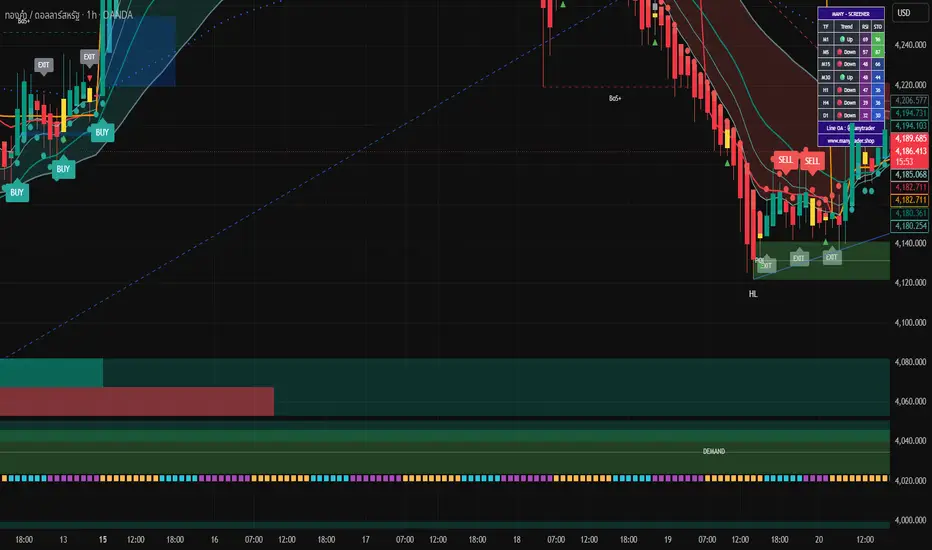
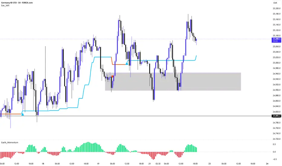
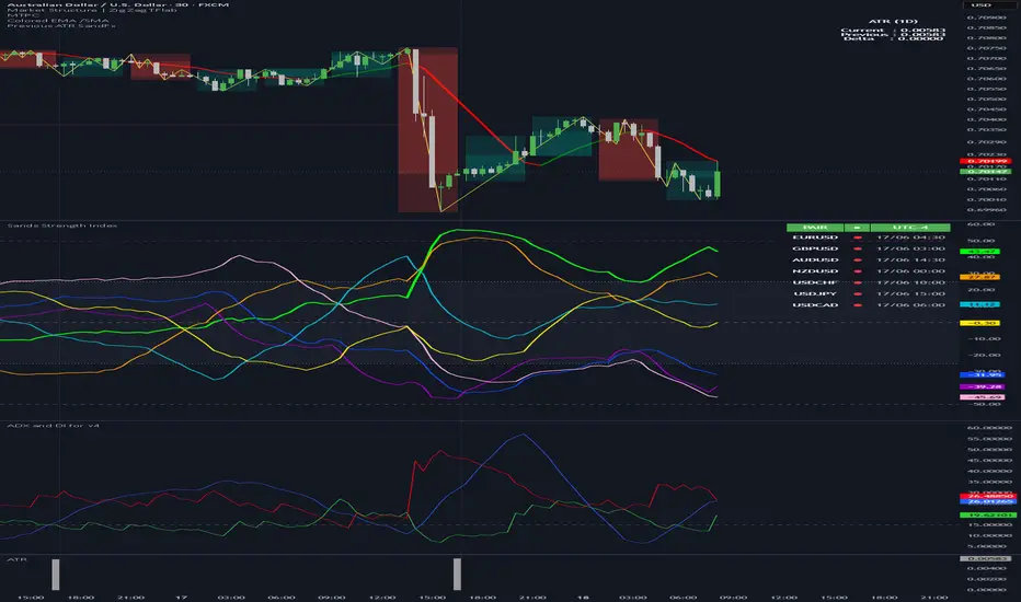
Indicador

Indicador

Indicador

Ease Flow Reclaim [ZOM]Ease Flow Reclaim is a clean overlay for spotting reclaim and rejection behavior when movement efficiency returns after localized stress.
The script combines a lesser-used Ease of Movement style pressure read with Ulcer Index stress relaxation and light VWMA/HMA trend context. The goal is to identify moments where price begins moving more efficiently after a drawdown or upside stress phase starts easing.
What it uses:
- Ease of Movement / EMV-style flow pressure
- Ulcer Index downside stress for bullish reclaims
- Inverted upside stress context for bearish rejections
- VWMA trend ribbon for volume-weighted direction
- HMA reclaim/rejection spine for cleaner confirmation
- Signal Mode: Early, Balanced, Strict
- Cooldown filtering to reduce repeated chop signals
- Price-locked watch and confirmed markers
Signal logic:
- Small amber watch circles mark setups that are close to confirmation.
- Teal crosses mark bullish ease-flow reclaim signals.
- Magenta crosses mark bearish ease-flow rejection signals.
- The ribbon shifts with VWMA/HMA trend context while staying subtle enough to keep candles readable.
Best use cases:
- ES, NQ, and other liquid futures
- BTCUSD and ETHUSD
- Liquid equities and ETFs
- Intraday continuation/reclaim review
- Spotting efficiency returning after stressful swings
Visuals:
The default Neon Slate template uses a slim VWMA flow ribbon, muted HMA spine, and compact price-series markers. No labels, boxes, lines, dashboards, or static drawings are used, so the plots stay attached to chart time and price while panning or zooming.
This script is not a prediction engine. It is a context and confirmation tool for traders studying movement efficiency, volume-weighted trend, Ulcer Index stress relief, and reclaim/rejection behavior.
Open-source Pine Script by ZenOutMan.
Keywords: Ease of Movement indicator, EMV, Ulcer Index, VWMA, HMA, reclaim signal, rejection signal, movement efficiency, volume weighted trend, futures trading, crypto indicator, TradingView overlay, Pine Script, ZOM. Indicador

Ulcer Efficiency Reclaim [ZOM]Ulcer Efficiency Reclaim is a clean overlay signal system built around three ideas that work well together: VWAP location, Kaufman-style Efficiency Ratio, and Ulcer Index pressure resets.
The goal is simple: highlight moments where price reclaims or rejects VWAP while directional efficiency is improving and drawdown pressure is cooling or building. It is designed for traders who want a lightweight trend continuation and pullback confirmation tool without a crowded dashboard.
What it uses:
- VWAP anchor for intraday fair-value context
- Efficiency Ratio to filter cleaner directional movement
- Ulcer Index pressure logic to separate panic, reset, and continuation phases
- ATR-based efficiency bands around VWAP
- Optional bar coloring for momentum and pressure shifts
- Simple price-locked signal markers that stay attached to the chart
Signal logic:
- Long markers appear when price reclaims VWAP or rejects the lower efficiency band while efficiency improves and pressure resets.
- Short markers appear when price loses VWAP or rejects the upper efficiency band while efficiency improves and downside pressure builds.
- A cooldown filter reduces repeated signals in noisy chop.
Best use cases:
- Futures such as ES, NQ, YM, and RTY
- Forex majors
- Crypto trend sessions
- Liquid equities and ETFs
- Intraday VWAP continuation and pullback trading
Visuals:
The script includes multiple aesthetic templates, including Ice Pop, Terminal, Solar, and Mono. The default view keeps the overlay readable, with soft VWAP bands and small price-anchored signal dots.
This is not meant to predict every move. It is a context and confirmation tool for spotting cleaner reclaim/reject conditions around VWAP when efficiency and pressure agree.
Open-source Pine Script by ZenOutMan.
Keywords: VWAP indicator, Efficiency Ratio, Ulcer Index, trend continuation, pullback trading, TradingView overlay, futures trading, forex indicator, crypto indicator, Pine Script, ZOM. Indicador

Indicador

ICT Sessions & Killzones - VWAP + Asia Mid [Dots3Red]█ ICT SESSIONS & KILLZONES — VWAP + ASIA MID
This script visualizes the four major forex trading sessions alongside the four ICT killzone windows, with three analytical additions that most session scripts do not include: a per-session VWAP line, a Daily Open reference, and an Asia range midpoint that extends forward into the London and New York sessions.
It works on intraday timeframes. The number of historical session days displayed is configurable.
█ SESSIONS
Four sessions are available, each independently toggleable:
• Tokyo — 09:00–18:00 Asia/Tokyo
• London — 08:00–17:00 Europe/London
• New York — 09:30–16:00 America/New_York
• Sydney — 07:00–16:00 Australia/Sydney (off by default)
Each session draws a high/low line pair with a soft glow layer behind it, a midpoint dotted line at 50% of the session range, and optional quartile lines at 25% and 75%. A semi-transparent fill box covers the active session range and fades when the session closes. Historical sessions are preserved as lighter boxes and lines, controlled by the Historical Sessions (days) setting.
Session labels are positioned at the horizontal midpoint of the session and display the session name, current range in points, the range as a percentage of ATR(14), and the live VWAP value.
When two sessions are active simultaneously — London and New York from approximately 13:00–17:00 UTC, or Tokyo and London around 07:00–09:00 UTC — an overlap box is drawn over that window in a distinct color.
█ ICT KILLZONES
All four ICT killzone windows are implemented, each individually toggleable under a master switch:
• Asia KZ — 20:00–00:00 America/New_York
• London Open KZ — 02:00–05:00 America/New_York
• NY Open KZ — 07:00–10:00 America/New_York
• London Close KZ — 10:00–12:00 America/New_York
Each killzone box uses a dotted border when closed and switches to a solid border while the window is currently active. This makes it immediately clear at a glance whether a killzone is live or historical.
Most published session scripts include only two killzones (London Open and NY Open). The Asia and London Close windows are included here because they are part of the complete ICT framework — the Asia killzone in particular is where a significant portion of daily liquidity is engineered before the London session opens.
█ SESSION VWAP
A VWAP line is calculated independently for each session. It resets to zero at each session open and accumulates using the standard (High + Low + Close) / 3 × Volume formula throughout the session. This is not a daily or weekly VWAP — it is a session-scoped VWAP that resets with each new Tokyo, London, and New York open.
Price above the session VWAP indicates the session is currently net bullish in terms of volume-weighted price. Price below indicates net bearish. The VWAP value is also shown in the live metrics table and in the session label.
Sydney VWAP is not calculated as volume data on that session is generally unreliable outside of ASX-listed instruments.
█ DAILY OPEN LINE
A horizontal line is drawn at the price level at which the new day opened — specifically at midnight New York time (00:00 America/New_York). This corresponds to the ICT "00:00 line" or daily open reference, which is used in ICT methodology as a key intraday reference level for assessing whether price is trading at a premium or discount relative to the daily range.
The line extends forward through the trading day and refreshes at each midnight NY transition.
█ ASIA RANGE MIDPOINT EXTENSION
When the Tokyo session closes, the midpoint of its high-low range is calculated and projected forward as a dashed line into the London and New York sessions. This level — the 50% point of the Asian range — is referenced in ICT methodology as a key intraday equilibrium. London and New York sessions frequently interact with this level before establishing directional bias.
This extension is drawn automatically and requires no manual input. It is toggled by the Asia Range Mid Extension setting.
█ LIVE METRICS TABLE
A table in the corner of the chart displays eight columns for each active session:
• SESSION — name, color-coded to the session
• STATUS — ACTIVE or CLOSED
• RANGE (PTS) — current range in price ticks
• % ATR — range expressed as a percentage of ATR(14)
• VWAP DEV — current close deviation from session VWAP in percent (green = above, red = below)
• VS PREV % — current session range versus the equivalent previous session's range (green = larger, red = smaller)
• HIGH / LOW — current session extremes
The bottom row shows whether a session overlap is currently active.
█ HISTORICAL DISPLAY
The Historical Sessions (days) input controls how many past session blocks remain visible. The script uses a millisecond-based time window rather than a bar count, so the lookback is stable across different timeframes. Setting this to 1 shows only the current day's sessions. Setting it to 5 retains the last five days. Objects beyond the limit are deleted automatically to manage Pine's drawing object limits.
█ ALERTS
Eleven alert conditions are available:
• Tokyo, London, New York session opens and closes (6 alerts)
• Asia KZ, London Open KZ, NY Open KZ, London Close KZ starts (4 alerts)
• London + New York overlap start (1 alert)
█ NOTES
• Designed for intraday timeframes. Most useful at 5-minute through 1-hour.
• Session times adjust automatically for daylight saving time because timezone identifiers (America/New_York, Europe/London, etc.) are used rather than fixed UTC offsets.
• The Tokyo session uses Asia/Tokyo exchange hours (09:00–18:00). Forex traders who prefer the broader Asian session window (00:00–09:00 UTC) can adjust the time string in the source code.
• All session boxes and killzone boxes are gated to the historical window. Objects outside the configured lookback are not drawn, which keeps performance stable on lower timeframes with many bars.
█ DISCLAIMER
This is a visualization tool for session timing and reference levels. It does not generate trade signals and does not constitute financial advice. Past price behavior within or around session windows does not predict future results. Indicador

Estratégia

Vola-Index (Historisch)Volatilität, 1. Welche Vola brauchst du aktuell?
Du brauchst immer den Zusammenhang zwischen der weißen Linie und der roten Linie:
Weiße Linie (Vola Aktuell): Das ist deine ATR-basierte Volatilität. Sie zeigt dir, wie stark der Markt gerade "atmet".
Rote Linie (Limit): Das ist deine statistische Schwelle (Vola-Basis + Multiplikator).
Deine Entscheidungshilfe:
Wenn die weiße Linie über der roten Linie liegt, ist der Markt in einem "Extremzustand" (sehr hohe Volatilität). Das ist der Moment, in dem du besonders vorsichtig sein musst, weil Trends entweder sehr schnell explodieren oder (bei Übertreibung) sofort in sich zusammenbrechen.
Wenn die weiße Linie niedrig ist (nahe der Basis), ist der Markt in einer "ruhigen" Phase. Das ist oft die Zeit für Seitwärtsstrategien oder den Aufbau von Positionen vor einem Ausbruch.
2. Was bedeuten die 3 Farben (Linien)?
Im Sub-Chart siehst du drei Linien, die dir genau sagen, wo die Reise hingeht:
Weiße Linie (Vola %): Das ist der aktuelle Wert. Er bewegt sich dynamisch.
Graue Linie (Basis): Das ist der gleitende Durchschnitt der Volatilität über die letzten 20 Perioden (dein volaBandsLength). Sie zeigt dir das "Normalmaß" der Volatilität für den aktuellen Zeitrahmen an.
Rote Linie (Limit/Upper Band): Das ist deine Sicherheitslinie. Sie berechnet sich aus Basis + 2.0 * Standardabweichung. Sie markiert den Bereich, in dem der Markt "ungewöhnlich" volatil wird.
3. Was bedeuten die Hintergrundfarben?
In deinem Screenshot sieht man an einigen Stellen dunkelrote, senkrechte Streifen im Hintergrund des Sub-Charts:
Das ist genau der Moment, in dem die weiße Linie das rote Limit durchbrochen hat.
Die Bedeutung: Das sind deine "Vola-Alarm-Zonen". Wenn du diese roten Balken siehst, hast du eine Phase von hoher Volatilität. Das ist das visuelle Signal, nach dem du gesucht hast – es ist viel intuitiver als eine Zahl in einer Tabelle, weil du den Verlauf über die Zeit siehst.
Mein Tipp für dein Backtesting:
Schau dir die Stellen an, an denen die weißen Punkte (du hast dort kleine blaue Kreise/Marker auf der weißen Linie) auftauchen und die rote Linie berühren. Wenn du dort in den Hauptchart schaust, wirst du oft sehen, dass genau das die Punkte sind, an denen der Markt entweder einen starken Ausbruch gestartet hat oder an denen eine Trendwende (Reversal) stattfand. Indicador

Dealer Pin Release Map [ZOM]Dealer Pin Release Map is an intraday dealer-magnet model for traders who want a cleaner read on pinning, fade pressure, and volatility release around synthetic strike levels.
The script estimates the nearest live magnet from a configurable strike step, then scores pin pressure using price proximity, ATR compression, relative participation, and synthetic delta pressure. When price compresses around the magnet, the tool highlights the active pin. When price rejects the pin edge or expands away from a prior pin state, it marks potential fade or release conditions.
What it shows:
- Live pin magnet: the current strike-style level price is clustering around.
- Release rails: upside/downside levels where a pinned auction can begin to unwind.
- Pin Fade signals: wick and delta-confirmed rejection from the pin edge.
- Gamma Release alerts: expansion signals after prior pin pressure, relative volume, and directional delta confirm.
- Dashboard: current state, magnet, pin score, release energy, relative volume, and delta pressure.
This is intentionally not a traditional moving-average or support/resistance indicator. It is built to frame the auction as a dealer-style pin/release map, especially on liquid futures and index products where round-number and strike-style magnets can matter.
Notes:
- The model uses proxy calculations from price, volume, ATR, and candle location. It does not read live options open interest or broker order flow.
- Best used with liquid symbols and sensible strike steps, such as 25 or 50 points on major equity index futures.
- Signals are contextual. Use the rails and dashboard as a map, not as standalone financial advice.
Indicador

Imbalance Repricing Engine [ZOM]Imbalance Repricing Engine
The Imbalance Repricing Engine is an overlay framework designed to map displacement imbalances, fair-value-gap style zones, repricing reactions, mitigation behavior, and failed imbalance structures using standard OHLCV data.
The idea behind the tool is that strong displacement often leaves inefficient price areas behind. When price later returns to those zones, the reaction can provide useful context: continuation, mitigation, rejection, or failure.
This script attempts to visualize that process directly on the chart.
Core features:
- Bullish and bearish imbalance zone detection
- Displacement filtering using ATR expansion, candle body share, and relative volume
- Active zone tracking with forward projection
- Midpoint traces for each imbalance
- Zone state changes for active, mitigated, and failed areas
- VWAP cloud for premium/discount context
- Estimated delta-pressure score derived from OHLCV structure and volume
- LONG REPRICE and SHORT REPRICE labels with setup scores
- Optional failure labeling
- Latest projection lines for entry, invalidation, target 1, and target 2
- Compact ZOM dashboard with active zone count, last event, delta pressure, relative volume, VWAP state, and score
- Multiple visual templates: Rogue, Emerald, Gold Rush, Arctic, and Mono
How to read it:
Bullish imbalance zones are areas where upside displacement left a gap-like inefficiency behind. If price later revisits the zone and responds with supportive structure, the tool can mark a LONG REPRICE signal.
Bearish imbalance zones work the opposite way. If price revisits a bearish imbalance and rejects with confirming structure, the tool can mark a SHORT REPRICE signal.
Mitigated zones show areas where price has traded back into the imbalance. Failed zones show areas where price closed through the structure strongly enough to weaken the original imbalance thesis.
This tool is most useful on liquid futures and index products where displacement and repricing behavior are easy to observe. The default view was staged for ES / NQ style 15m and 5m analysis with enough structure to be visually useful without flooding the chart.
Important note:
TradingView Pine scripts do not have access to true order book, time-and-sales, or full market depth. Delta pressure, imbalance behavior, and absorption-style context here are modeled from OHLCV-based proxies. Treat this as a contextual framework, not financial advice or a predictive system. Indicador

Liquidity Trap Absorption Matrix [ZOM]Liquidity Trap Absorption Matrix
The Liquidity Trap Absorption Matrix is an overlay framework built to visualize liquidity sweeps, wick rejection, absorption zones, VWAP displacement, and estimated delta pressure using standard OHLCV data.
The core idea is simple: when price raids a prior swing high/low or opening-range level, then closes back inside with meaningful wick rejection and elevated relative volume, the move may represent a failed breakout, stop run, or liquidity trap rather than clean continuation.
This script attempts to map those moments visually so the trader can evaluate where liquidity was taken, where absorption appeared, and how price behaves after the reclaim/rejection.
Core features:
- Confirmed swing-high and swing-low liquidity levels
- Opening-range high/low context for futures-style intraday review
- Bullish and bearish trap detection using sweep + reclaim/rejection logic
- Wick absorption scoring
- Relative volume filter
- VWAP displacement cloud with adaptive deviation bands
- Estimated delta-pressure score from candle structure and volume
- 0-100 setup scoring model
- Absorption zone boxes extended forward from the sweep area
- Compact BUY TRAP / SELL TRAP labels with scores
- Optional TP1 / TP2 / SL projection map from the latest signal
- Small ZOM Trap Matrix dashboard
- Multiple visual templates, including Rogue, Emerald, Gold Rush, Arctic, and Mono
How to read it:
A BUY TRAP appears when price sweeps below a tracked liquidity level and reclaims back above it with enough rejection, volume, and contextual confirmation.
A SELL TRAP appears when price sweeps above a tracked liquidity level and rejects back below it under similar conditions.
The absorption zone shows the area where the sweep and reclaim/rejection occurred. The VWAP cloud gives broader mean/displacement context. The dashboard summarizes regime, trap bias, estimated delta pressure, relative volume, active zones, and the latest score.
This works best on liquid instruments where intraday liquidity sweeps are common, especially index futures such as NQ, MNQ, ES, and MES. The default settings were tuned to show meaningful structure on 5m and 15m futures charts without becoming overly noisy.
Important note:
TradingView Pine scripts do not have access to true order book, time-and-sales, dealer positioning, or full market depth. Delta pressure, absorption, and liquidity behavior here are modeled from OHLCV-based proxies. Treat the output as a contextual decision-support framework, not a predictive system or financial advice. Indicador

Indicador
3D: Real Smartphone Monitor Pro3D Real Smartphone Monitor Pro: Master Discipline and The Art of "No Position"
IMPORTANT: First-Time Setup and Size Adjustment
Because TradingView automatically scales the Y-axis (price) and X-axis (time) differently depending on the asset and your screen resolution, this 3D monitor may appear stretched, squashed, or incorrectly sized upon initial application. This is a standard limitation of projecting 3D elements onto 2D charts.
How to resolve this immediately:
Open the Indicator Settings.
Navigate to the "3D Manual Scaling & Camera Settings" group.
Adjust the "Y-Axis Scale (Height)" and "X-Axis Scale (Width)" sliders.
Tweak the "Master Scale Multiplier" until the smartphone perfectly fits your screen layout.
Note: Because the optimal scale varies entirely depending on the specific asset, we have provided comprehensive manual scale adjustment settings. If you find any parameters lacking or require further adjustments, please notify us in the comments, and we will respond promptly.
Concept: The Purpose of a Chart Smartphone
Trading is not solely about identifying entries; it is about mastering psychology. Overtrading is a trader's greatest adversary. This monitor serves as a visual anchor to ground you in reality and reinforce the power of discipline.
When compelled to force a trade, look at this monitor and read the scrolling proverbs. Remember that maintaining "no position" is a highly strategic position. Stepping away from the chart is frequently the most profitable decision you can make.
Features and Technical Synchronization:
Time Awareness: A built-in clock keeps you grounded in reality, preventing time distortion while analyzing charts.
Battery Level (RSI Sync): The battery percentage reflects the 14-period RSI, instantly indicating market exhaustion (oversold/overbought conditions).
Antenna Signal (ADX Sync): The signal bars represent the 14-period ADX. A full signal indicates a massive trend, while a weak signal suggests a flat market—ideal for determining whether to engage or step away.
Dynamic Interface: Designed with meticulous attention to realism, featuring titanium-style edges, glass glare, a dynamic top notch, and native emoji app icons.
Stay disciplined, protect your capital, and sometimes, just put the monitor down.
Pine Script Calculation Details
Calculation: int msg_idx = int(bar_index / 20) % 10
Mathematical Rationale: The bar_index (current candle number) is divided by 20 to create a trigger that changes the output every 20 bars. The modulo operator (% 10) ensures the resulting index loops sequentially from 0 to 9, which maps perfectly to the 10 proverb elements stored in the array.
Actual Output Values:
At bar_index 100: int(100 / 20) % 10 outputs 5 (Displays array element index 5).
At bar_index 110: int(110 / 20) % 10 outputs 5 (Message remains the same).
At bar_index 120: int(120 / 20) % 10 outputs 6 (Message switches to the next index). Indicador

Indicador

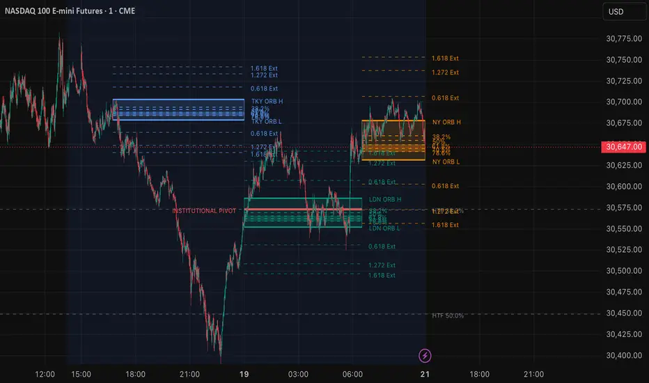
Nexus Global 15m ORBIntroduction
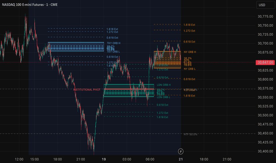
The Nexus Global 15m ORB indicator is a comprehensive opening range tool designed to map the initial 15-minute price action across the three major global trading sessions: Tokyo, London, and New York. Beyond simply marking the high and low of the opening range, this script integrates Fibonacci-based Optimal Trade Entry (OTE) zones, mathematical trend extensions, and Higher Timeframe (HTF) structural confluence to help traders identify high-probability reversal and continuation zones.
Core Concepts & What It Does
Opening Range Breakout (ORB) strategies rely on the volatility generated at the start of a trading session. The first 15 minutes often establish a support and resistance framework for the hours that follow. This indicator automatically detects these 15-minute windows and projects the range forward until the next session begins.
However, a standard ORB is often not enough to build a complete trading plan. To address this, the indicator incorporates:
- Internal Fibonacci Levels & OTE Zone: Calculates key retracement levels (38.2% and 50%) and highlights a specific Optimal Trade Entry (OTE) box between the 61.8% and 78.6% levels of the session's range.
- Session Trend Extensions: Projects standard Fibonacci extensions (0.618, 1.272, and 1.618) outward from the ORB high and low to serve as dynamic take-profit targets or exhaustion levels.
- HTF Institutional Pivots: Pulls structural swing highs and lows from a user-defined higher timeframe (e.g., 4-hour) and calculates its own macro Fibonacci levels. When these macro levels intersect with the micro 15m ORB range, the indicator highlights them as "Institutional Pivots."
How It Calculates (Underlying Logic)
- Session Tracking: Uses time() functions to detect the exact 15-minute timeframe of the Tokyo (0845-0900 JST), London (0800-0815 GMT), and New York (0930-0945 EST) opens. It dynamically tracks the high and low during this window and locks the values once the window closes.
- Internal Mathematics: The range size (rng) is calculated as ORB High - ORB Low. Internal levels are found by subtracting percentages of the range from the ORB High (e.g., ORB High - (rng * 0.5) for the 50% level).
- HTF Confluence: Utilizes request.security() alongside ta.highest() and ta.lowest() over a customizable lookback period to establish the macro structural range. It then checks if the macro 38.2%, 50%, or 61.8% levels fall sequentially inside the current active ORB boundaries, plotting them distinctly when true.
- Performance Optimization: To ensure the indicator does not cause chart lag (a common issue with heavy line/box drawing scripts), the drawing engine is restricted to update visual arrays strictly on barstate.islast, ensuring lightning-fast load times even on the 1-minute chart.*
How to Use It
- Breakout & Retest: Watch for price to break the ORB High or Low, and then wait for a retracement back to the 38.2% or 50% internal levels to join the trend toward the 1.272 or 1.618 extensions.
- OTE Reversals: If a false breakout (fake-out) occurs, look for price to return to the highlighted OTE Zone (61.8% - 78.6%). This zone often acts as a strong area of defense for institutional order flow, providing excellent risk-to-reward entries back toward the opposite side of the ORB.
- Institutional Pivots: When an HTF line populates inside the session range, treat it as a heavy magnet or resistance. Trades taken in confluence with these pivots carry a much higher structural weighting.
Originality & Usefulness
While there are many ORB tools on TradingView, the vast majority only display horizontal lines for the high and low. This script is highly original because it combines micro-session timing with macro-structural Fibonacci confluence. By mashing up session tracking with HTF swing analysis and deep optimization drawing methods, it provides a complete, lag-free institutional framework in a single indicator, saving traders from needing multiple overlapping scripts to achieve the same result. Indicador
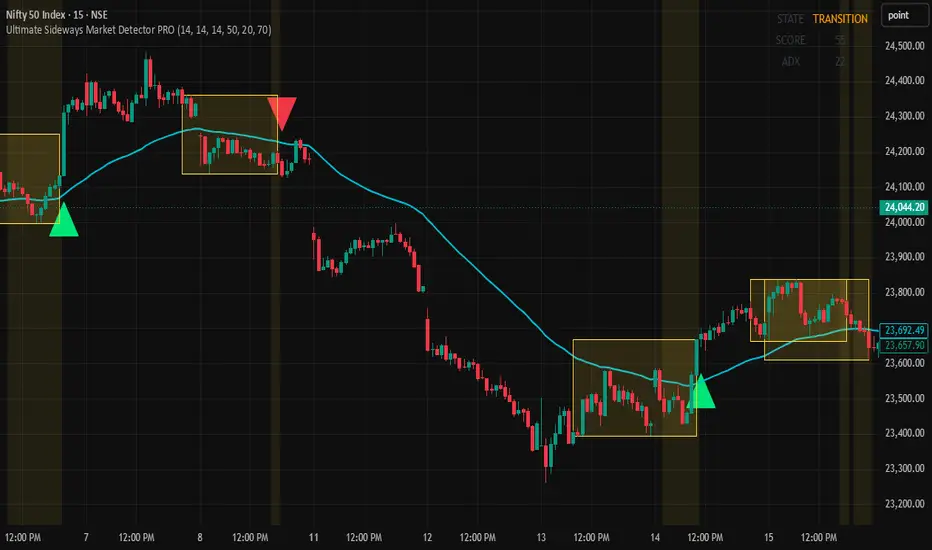
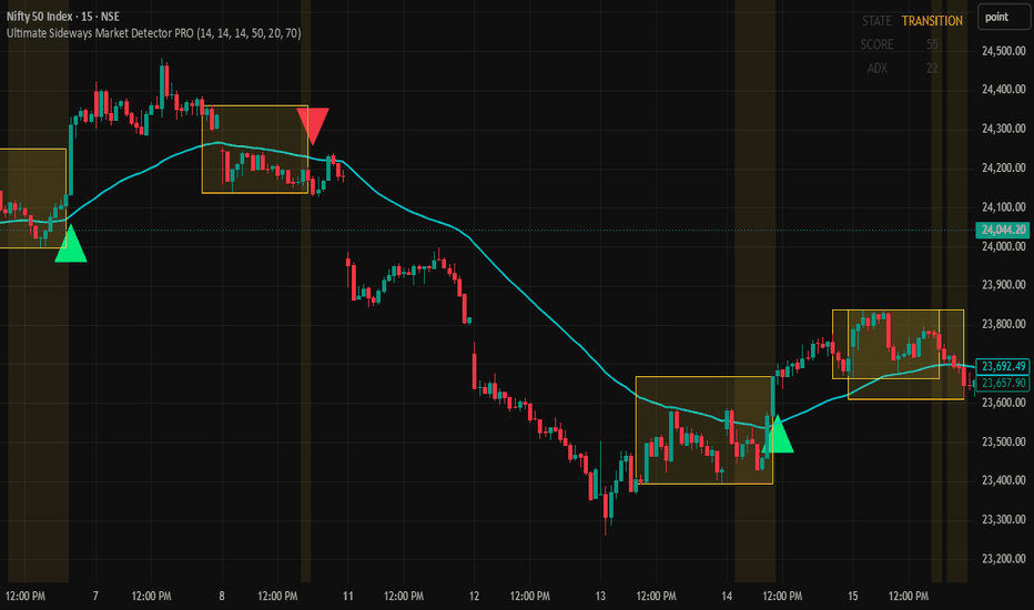
Ultimate Sideways Market Detector PROUltimate Sideways Market Detector PRO
Advanced Sideways Market, Consolidation, Trend & Volatility Analysis System
OVERVIEW
Ultimate Sideways Market Detector PRO is a multi-factor market condition analysis indicator designed to identify whether the market is currently trending, consolidating, compressing, or preparing for a breakout.
Most traders struggle because they apply trend-following strategies in sideways markets or breakout strategies in trending markets. This indicator helps solve that problem by analyzing multiple market conditions simultaneously and classifying the current market environment.
Instead of relying on a single indicator, this script combines trend strength, volatility compression, range analysis, moving average behavior, and market structure filters into one easy-to-read system.
━━━━━━━━━━━━━━━━━━━━━━━━━━━━━━━━━━
WHAT PROBLEM DOES THIS SOLVE?
One of the biggest reasons traders lose money is entering trades in the wrong market condition.
Examples:
• Trend-following strategy used inside a range
• Breakout strategy used during low volatility
• Scalping against strong trends
• Entering before consolidation is complete
• Trading fake breakouts without confirmation
This indicator helps traders understand the current market condition before taking a trade.
━━━━━━━━━━━━━━━━━━━━━━━━━━━━━━━━━━
HOW THE INDICATOR WORKS
The script combines multiple independent filters.
1. ADX Trend Strength Filter
Measures trend strength.
Low ADX values usually indicate weak trends and higher probability of sideways movement.
Helps identify:
• Weak trends
• Sideways conditions
• Transition phases
━━━━━━━━━━━━━━━━━━━━━━━━━━━━━━━━━━
2. Choppiness Index
Measures how directional or non-directional the market is.
Higher values indicate the market is moving sideways instead of trending.
Helps identify:
• Choppy markets
• Range-bound environments
• Consolidation phases
━━━━━━━━━━━━━━━━━━━━━━━━━━━━━━━━━━
3. ATR Compression
Measures volatility contraction.
Low ATR values often occur before major market expansion.
Helps identify:
• Volatility compression
• Potential breakout preparation
• Quiet market conditions
━━━━━━━━━━━━━━━━━━━━━━━━━━━━━━━━━━
4. Bollinger Band Width Compression
When Bollinger Bands contract, price is often entering a squeeze phase.
Helps identify:
• Squeeze setups
• Compression zones
• Breakout preparation
━━━━━━━━━━━━━━━━━━━━━━━━━━━━━━━━━━
5. EMA Flatness Detection
Trending markets generally create angled moving averages.
Sideways markets often create flat moving averages.
Helps identify:
• Flat markets
• Range environments
• Trend exhaustion
━━━━━━━━━━━━━━━━━━━━━━━━━━━━━━━━━━
6. Range Compression Analysis
The script measures recent price range width.
Small price ranges usually indicate consolidation.
Helps identify:
• Sideways zones
• Consolidation structures
• Support and resistance clusters
━━━━━━━━━━━━━━━━━━━━━━━━━━━━━━━━━━
7. Optional Volume Compression
Volume often decreases before major expansion moves.
This filter can be enabled or disabled according to preference.
Helps identify:
• Reduced participation
• Compression environments
• Potential breakout setups
━━━━━━━━━━━━━━━━━━━━━━━━━━━━━━━━━━
SIDEWAYS STRENGTH SCORE
All enabled filters contribute to a combined Sideways Strength Score.
Higher score = Higher probability of consolidation.
General Interpretation:
0 – 40
Trending Market
40 – 70
Transition Market
70+
Strong Sideways Market
The threshold can be adjusted in settings.
━━━━━━━━━━━━━━━━━━━━━━━━━━━━━━━━━━
MARKET STATES
The dashboard automatically classifies market conditions into:
UPTREND
Strong bullish directional market.
Best suited for:
• Pullback entries
• Trend continuation setups
• Trend-following systems
━━━━━━━━━━━━━━━━━━━━━━━━━━━━━━━━━━
DOWNTREND
Strong bearish directional market.
Best suited for:
• Short setups
• Pullback shorts
• Trend continuation trades
━━━━━━━━━━━━━━━━━━━━━━━━━━━━━━━━━━
SIDEWAYS
Market is consolidating inside a range.
Best suited for:
• Range trading
• Support and resistance trading
• Waiting for breakout confirmation
━━━━━━━━━━━━━━━━━━━━━━━━━━━━━━━━━━
VOLATILE
Volatility expansion is occurring.
Best suited for:
• Momentum trades
• Breakout trades
• Expansion strategies
━━━━━━━━━━━━━━━━━━━━━━━━━━━━━━━━━━
SIDEWAYS ZONE DETECTION
When enough filters confirm consolidation, the script highlights the area as a Sideways Zone.
These zones help traders:
• Avoid poor-quality entries
• Identify consolidation structures
• Detect accumulation/distribution areas
• Prepare for breakout opportunities
• Visualize support and resistance regions
━━━━━━━━━━━━━━━━━━━━━━━━━━━━━━━━━━
BREAKOUT DETECTION
The script monitors consolidation zones and identifies breakout conditions.
Bullish Breakout
Price closes above the consolidation range.
Potential Uses:
• Trend continuation confirmation
• Momentum entries
• Breakout trading systems
━━━━━━━━━━━━━━━━━━━━━━━━━━━━━━━━━━
Bearish Breakout
Price closes below the consolidation range.
Potential Uses:
• Short opportunities
• Momentum trades
• Breakdown setups
━━━━━━━━━━━━━━━━━━━━━━━━━━━━━━━━━━
HOW TO USE THIS INDICATOR
Method 1: Market Condition Filter
Before taking any trade, check the dashboard.
UPTREND
Focus on long opportunities.
DOWNTREND
Focus on short opportunities.
SIDEWAYS
Avoid trend-following entries.
VOLATILE
Expect larger price movement.
━━━━━━━━━━━━━━━━━━━━━━━━━━━━━━━━━━
Method 2: Sideways Breakout Trading
Step 1:
Wait for Sideways Zone detection.
Step 2:
Allow price to remain inside the range.
Step 3:
Wait for breakout signal.
Step 4:
Use the breakout as confirmation within your own strategy.
━━━━━━━━━━━━━━━━━━━━━━━━━━━━━━━━━━
Method 3: Avoiding Bad Trades
Many losing trades occur during random consolidation.
Use this indicator to avoid:
• Choppy conditions
• Low volatility environments
• False trend assumptions
━━━━━━━━━━━━━━━━━━━━━━━━━━━━━━━━━━
BEST TIMEFRAMES
Scalping:
1 Minute
3 Minute
5 Minute
Intraday:
5 Minute
15 Minute
30 Minute
Swing Trading:
1 Hour
4 Hour
Daily
Works on:
• Stocks
• Indices
• Forex
• Crypto
• Commodities
━━━━━━━━━━━━━━━━━━━━━━━━━━━━━━━━━━
SETTINGS GUIDE
Enable ADX Filter
Adds trend strength analysis.
Enable Choppiness Filter
Adds range detection.
Enable ATR Compression
Adds volatility analysis.
Enable BB Width Compression
Adds squeeze detection.
Enable EMA Flatness
Adds trend slope analysis.
Enable Range Compression
Adds consolidation analysis.
Enable Volume Compression
Adds participation analysis.
Users can enable or disable any filter depending on trading style and market conditions.
━━━━━━━━━━━━━━━━━━━━━━━━━━━━━━━━━━
ALERTS INCLUDED
• Sideways Market Detected
• Bullish Breakout
• Bearish Breakout
To create alerts:
1. Add indicator to chart.
2. Click TradingView Alert.
3. Select this indicator.
4. Select desired alert condition.
5. Create alert.
━━━━━━━━━━━━━━━━━━━━━━━━━━━━━━━━━━
WHO CAN BENEFIT FROM THIS?
✔ Scalpers
✔ Intraday Traders
✔ Swing Traders
✔ Breakout Traders
✔ Trend Followers
✔ Price Action Traders
✔ Options Traders
✔ Forex Traders
✔ Crypto Traders
━━━━━━━━━━━━━━━━━━━━━━━━━━━━━━━━━━
IMPORTANT
This indicator is designed to analyze market conditions and provide context for decision-making.
It should not be considered a standalone trading system.
Always combine indicator signals with proper risk management, price action analysis, and your overall trading plan.
No indicator can predict future price movement with certainty.
━━━━━━━━━━━━━━━━━━━━━━━━━━━━━━━━━━
Open-Source Script
Feel free to study, modify, improve, and adapt the code for your own trading workflow. Indicador
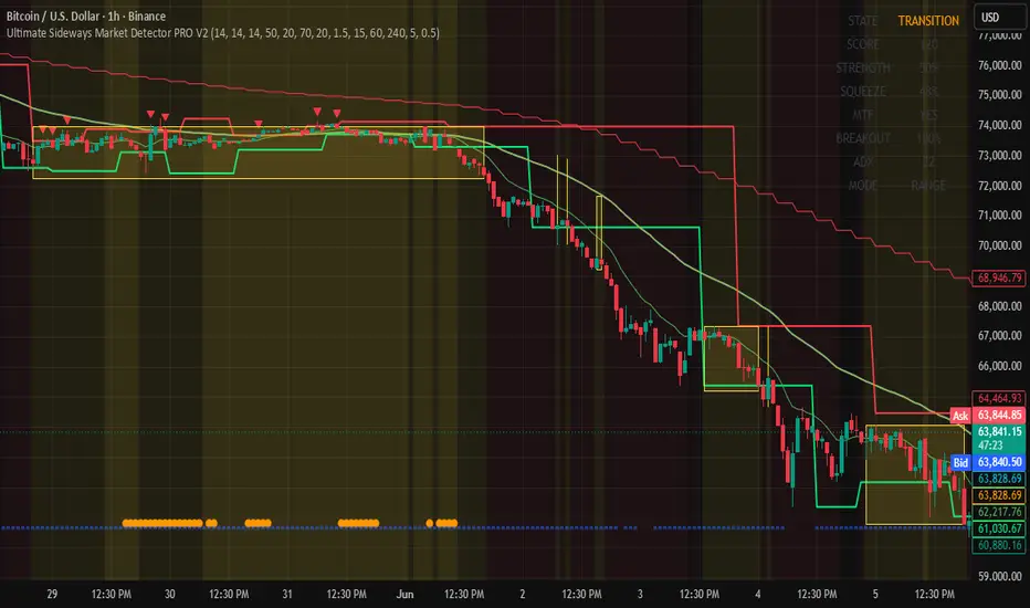
Ultimate Sideways Market Detector PRO V2 Ultimate Sideways Market Detector PRO V2
Advanced Market Structure, Consolidation & Breakout Detection System
Ultimate Sideways Market Detector PRO V2 is an advanced all-in-one TradingView indicator designed to identify sideways markets, consolidation zones, volatility compression, liquidity sweeps, smart money activity, and potential breakout opportunities before major price movements occur.
Instead of relying on a single indicator, this system combines multiple market analysis techniques into one powerful scoring engine that helps traders understand current market conditions and prepare for future market expansion.
Suitable for Crypto, Forex, Stocks, Indices, and Commodities.
---
# Core Features
✅ Sideways Market Detection
✅ ADX Trend Strength Analysis
✅ Choppiness Index Analysis
✅ ATR Compression Detection
✅ Bollinger Band Width Compression
✅ EMA Flatness Detection
✅ Range Compression Analysis
✅ Volume Compression Filter
✅ Volatility Squeeze Detection
✅ Keltner Channel Compression
✅ Multi-Timeframe Confirmation
✅ Smart Money Consolidation Detection
✅ Liquidity Sweep Detection
✅ Fake Breakout Filter
✅ Auto Support & Resistance
✅ Breakout Probability Engine
✅ Sideways Strength Meter
✅ Market State Dashboard
✅ Trend Cloud Visualization
✅ Real-Time Alerts
---
# Market States
The dashboard automatically classifies market conditions into the following states:
### SIDEWAYS
Market is consolidating inside a range.
Best Use:
• Buy near support
• Sell near resistance
• Prepare for breakouts
---
### UPTREND
Strong bullish market.
Best Use:
• Focus on long opportunities
• Buy pullbacks
---
### DOWNTREND
Strong bearish market.
Best Use:
• Focus on short opportunities
• Sell pullbacks
---
### VOLATILE
High volatility environment.
Best Use:
• Reduce position size
• Expect larger price swings
---
### TRANSITION
Market is changing conditions.
Best Use:
• Wait for confirmation
• Avoid aggressive entries
---
# Dashboard Guide
### STATE
Current market condition.
### SCORE
Overall consolidation score.
Below 40 = Trending
40-70 = Moderate Consolidation
70-90 = Strong Sideways Market
Above 90 = Extreme Compression
---
### STRENGTH
Measures consolidation quality.
0-30 = Weak
30-60 = Moderate
60-80 = Strong
80-100 = Very Strong
Higher values often indicate stronger breakout potential.
---
### SQUEEZE
Measures volatility compression intensity.
Higher values indicate stronger energy build-up.
---
### MTF
Multi-Timeframe Agreement.
YES = Multiple timeframes agree.
NO = Timeframes disagree.
---
### BREAKOUT
Breakout Probability Meter.
0-40% = Low Probability
40-60% = Moderate Probability
60-80% = Strong Probability
80-100% = Very High Probability
---
### ADX
Trend Strength Measurement.
Below 20 = Weak Trend
Above 25 = Strong Trend
Above 35 = Very Strong Trend
---
### MODE
RANGE = Sideways Market
TREND = Trending Market
---
# Feature Breakdown
### ADX Analysis
Measures trend strength.
Low ADX often indicates consolidation.
High ADX often indicates trending conditions.
---
### Choppiness Index
Measures how directional or random price action is.
High Choppiness = Sideways Market
Low Choppiness = Trending Market
---
### ATR Compression
Measures volatility contraction.
Low ATR often appears before major expansion phases.
---
### Bollinger Band Width
Measures market compression.
Narrow Bands = Compression
Wide Bands = Expansion
---
### EMA Flatness
Flat EMA often indicates consolidation.
Steep EMA often indicates trend strength.
---
### Range Compression
Detects narrow trading ranges that may lead to future breakouts.
---
### Volume Compression
Detects reduced participation before volatility expansion.
---
### Volatility Squeeze
Compares Bollinger Bands and Keltner Channels to identify volatility compression.
Strong squeeze conditions often appear before significant market moves.
---
### Multi-Timeframe Confirmation
Uses multiple timeframes to improve signal quality and reduce false setups.
---
### Smart Money Consolidation
Highlights accumulation and distribution zones where larger market participants may be active.
---
### Liquidity Sweeps
Identifies potential stop hunts and liquidity grabs.
Bull Sweep:
Price breaks below support and quickly recovers.
Bear Sweep:
Price breaks above resistance and quickly rejects.
---
### Fake Breakout Filter
Attempts to eliminate weak breakout attempts and improve signal quality.
---
### Auto Support & Resistance
Automatically detects important swing levels for entries, exits, stop placement, and breakout validation.
---
# How To Use This Indicator
### Step 1
Check STATE.
Determine whether the market is Sideways, Trending, Volatile, or in Transition.
---
### Step 2
Check SCORE.
Higher scores indicate stronger consolidation.
---
### Step 3
Check STRENGTH.
Higher strength means stronger compression and greater breakout potential.
---
### Step 4
Check Volatility Squeeze.
Compression often precedes expansion.
---
### Step 5
Check MTF Agreement.
Signals become stronger when multiple timeframes agree.
---
### Step 6
Check Breakout Probability.
Higher values indicate stronger breakout potential.
---
### Step 7
Wait for a Valid BUY or SELL Breakout Signal.
---
### Step 8
Apply proper risk management.
---
# Best High-Probability Breakout Setup
Look for:
✅ STATE = SIDEWAYS
✅ SCORE Above 80
✅ STRENGTH Above 70
✅ Volatility Squeeze Active
✅ MTF Agreement = YES
✅ Breakout Probability Above 70
Then wait for:
✅ Valid BUY Breakout
or
✅ Valid SELL Breakout
---
# Best Reversal Setup
Look for:
✅ Bull Sweep near Support
or
✅ Bear Sweep near Resistance
Then wait for confirmation.
These setups often indicate trapped traders and liquidity grabs.
---
# Alerts Available
• Sideways Started
• Sideways Ended
• Bullish Breakout
• Bearish Breakout
• Bull Liquidity Sweep
• Bear Liquidity Sweep
• Volatility Squeeze Active
---
# Recommended Markets
✅ Crypto
✅ Forex
✅ Stocks
✅ Indices
✅ Commodities
---
# Recommended Timeframes
Scalping:
5M, 15M
Intraday:
15M, 30M, 1H
Swing Trading:
4H, 1D
---
# Important Notice
This indicator is intended for educational and decision-support purposes only.
No indicator can predict future price movements with complete accuracy.
Always use proper risk management, position sizing, and independent analysis before entering any trade.
Thank you for using Ultimate Sideways Market Detector PRO V2.
Indicador

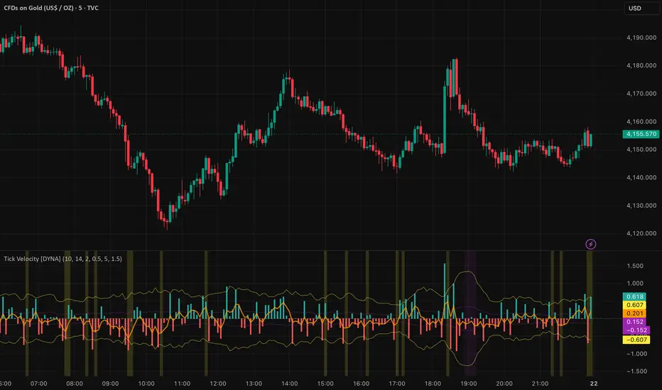
Tick Velocity [DYNA]Tick Velocity measures the speed of price movement on every bar, normalized by ATR and log-compressed so the reading works consistently across any instrument and any timeframe. Instead of asking "did price go up or down?" it asks "how fast did price move?" -- and that distinction makes all the difference when you need to spot momentum bursts and exhaustion in real time.
Most momentum tools tell you the direction of a move but not its intensity relative to normal conditions. A 50-point move on a major index means something very different during a quiet afternoon versus an opening-bell surge. Tick Velocity strips away that ambiguity by expressing every bar's price change as a multiple of recent volatility with log compression, giving you a clean, comparable speed reading that doesn't get crushed by outlier spikes.
Key Features
ATR-Normalized Velocity -- price change divided by ATR, so readings are comparable across instruments and timeframes without manual adjustment
Log-Compressed Scale -- extreme spikes are tamed so the histogram uses its full visual range, making normal-range momentum readable even after outlier moves
Signal Line -- a smoothed EMA overlay shows sustained momentum direction, filtering out bar-to-bar noise
Dynamic Spike Detection -- automatically identifies bars where velocity exceeds a configurable multiple of its recent average, with separate bullish and bearish alerts
Smart Exhaustion Detection -- flags fading momentum only after periods of genuine activity, so you don't get false exhaustion signals during quiet consolidation
Confirmed-Bar Logic -- all signals are evaluated on the completed bar, so what you see on the chart stays on the chart with no repainting
Clean Visual Design -- color-coded histogram with dynamic threshold lines and signal line makes it easy to read momentum state at a glance
How It Works
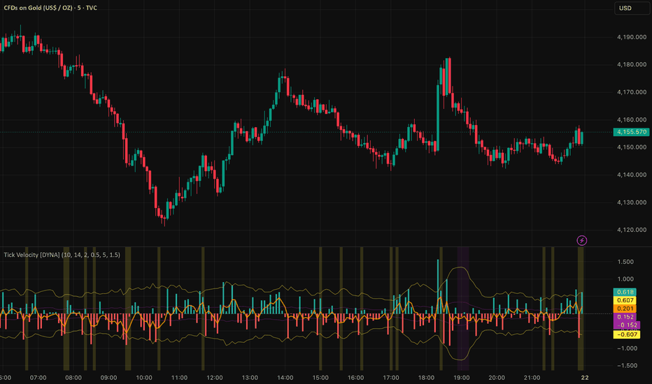
When you add Tick Velocity to your chart, a histogram appears in a separate pane below price. Each bar in the histogram represents the speed of that candle's price change: green bars mean price moved up, red bars mean price moved down, and the height of each bar shows how fast the move was. Log compression keeps the scale readable -- a massive gap-up spike won't flatten everything else into an invisible line.
An orange signal line (EMA) overlays the histogram, smoothing out bar-to-bar noise to show you the sustained momentum direction. When the signal line holds above zero, bulls are in control; when it dips below, bears are driving.
Two sets of threshold lines frame the histogram. The outer yellow lines mark the spike threshold -- when a bar pushes beyond these lines, price moved significantly faster than normal, indicating a momentum burst. The inner purple lines mark the exhaustion threshold -- when bars shrink inside these lines after a period of elevated activity, momentum is fading and the market may be pausing or preparing to reverse. The smart exhaustion gate ensures purple zones only appear after real momentum -- not during quiet consolidation.
Background shading reinforces these conditions. A yellow tint appears on confirmed spike bars, and a purple tint appears on confirmed exhaustion bars, making it easy to scan through the chart and see where momentum surged or faded.
Tick Velocity histogram showing bullish and bearish velocity bars, with spike threshold lines (yellow) and exhaustion bands (purple). Background highlights mark confirmed spike and exhaustion events.
Settings
The core settings control sensitivity. The Velocity Lookback (default 10) determines how many bars are used to calculate the average velocity -- lower values make the indicator more responsive for scalping, higher values smooth it out for swing trading. The ATR Period (default 14) controls the normalization window. The Signal Smoothing (default 5) sets the EMA period for the orange signal line.
The Spike Multiplier (default 2.0) sets how far above average a bar must travel to count as a spike. Raise it to 2.5 or 3.0 if you only want the strongest bursts. The Exhaustion Multiplier (default 0.5) sets how far below average velocity must drop to flag exhaustion. The Exhaustion Gate Multiplier (default 1.5) ensures exhaustion only triggers when recent activity exceeds the longer-term baseline by this factor -- preventing false signals during quiet consolidation. Threshold lines, background highlights, and the signal line can each be toggled independently under Visual settings.
Alerts
Bullish Velocity Spike -- fires when upward velocity exceeds the spike threshold on a confirmed bar. Message: "Bullish velocity spike -- strong upward momentum burst."
Bearish Velocity Spike -- fires when downward velocity exceeds the spike threshold on a confirmed bar. Message: "Bearish velocity spike -- strong downward momentum burst."
Velocity Exhaustion -- fires when velocity drops below the exhaustion threshold after a period of elevated activity. Message: "Tick Velocity exhaustion detected -- momentum fading after active period, possible pause or reversal."
To set up alerts: click the TradingView Alerts button, select "Tick Velocity " from the indicator dropdown, choose "Any alert() function call" as the condition, and set your preferred notification method.
Best Practices
Use velocity spikes at key support and resistance levels to confirm breakouts -- a spike adds conviction that the level break is real
Watch for exhaustion signals after extended trends to time profit-taking or tighten stop-loss placement
Combine with volume indicators for added confirmation -- a velocity spike on high volume is more meaningful than one on thin volume
Adjust the lookback period to match your trading style: 5-7 for scalping, 10-15 for intraday, 20+ for swing trading
On lower timeframes (1-3 minute), consider raising the spike multiplier to reduce noise from normal market fluctuations
Part of the DYNA Ecosystem
Tick Velocity is a free indicator built with the same design standards as the DYNA premium suite. For complete trade management with automatic stop loss, break-even, trailing stops, and multi-target systems, explore the full DYNA indicator collection.
Disclaimer
This indicator is a technical analysis and educational tool only -- it is not financial advice and makes no guarantee of any outcome. Past performance does not predict future results. Always do your own research and use proper position sizing and risk management.
Created by Varun Nidhi · varunnidhi.com
A free DYNA indicator — self-contained, no repainting.
Indicador
Spread Compression Alert [DYNA]Markets don't move in straight lines -- they alternate between periods of compression and expansion. Spread Compression Alert detects when candle ranges shrink to unusually low levels, warning you that a sharp move is building beneath the surface. Instead of reacting after a breakout has already happened, you can position yourself before it begins.
Most traders miss the quiet before the storm. They stare at flat price action and look away, only to catch the tail end of a big move. This indicator solves that problem by continuously comparing short-term volatility to its longer-term baseline and flagging the exact moments when the market is coiling tightest -- right when you should be paying the most attention.
Key Features
ATR Compression Ratio -- Compares fast ATR to slow ATR to objectively measure how compressed current price action is relative to normal conditions
Diamond Markers -- Small orange diamonds appear above each compressed bar, giving you an instant visual scan of where the market is tightening
Cluster Detection -- When multiple consecutive bars are compressed, the background highlights orange, signaling that expansion pressure is building to extreme levels
Confirmed-Bar Logic -- All signals are calculated on confirmed (closed) bars, so markers never appear and disappear mid-bar
How It Works
As you watch a chart, you will notice small orange diamond markers appearing above certain bars. Each diamond indicates that the bar's range is significantly smaller than the recent average -- the market is compressing. A single diamond is worth noting but not necessarily actionable.
When diamonds appear on several consecutive bars, the background turns a soft orange. This is the cluster highlight, and it tells you the market has been compressing for an extended period. Many traders study these clusters as periods of consolidation that can precede a range expansion. The longer the compression lasts, the more notable the eventual breakout in range can be.
Orange diamonds mark individual compressed bars. The background highlight appears when consecutive compressed bars reach the threshold, flagging an extended period of compression.
Settings
The indicator works out of the box with sensible defaults. The Fast ATR Length (default 5) measures recent candle ranges, while the Slow ATR Length (default 50) establishes the normal volatility baseline. The Compression Ratio (default 0.6) sets how tight the range must get before flagging compression -- lower values require more extreme compression. The Consecutive Bar Threshold (default 3) controls how many compressed bars in a row trigger the cluster highlight and extreme compression alert.
For lower timeframes like 1-5 minute charts, you may want to reduce the Slow ATR Length to 30 so the baseline adapts faster. For stricter signals on any timeframe, try lowering the Compression Ratio to 0.3.
Alerts
Compression Detected -- Fires when a single compressed bar is confirmed. Message: "Spread Compression Alert : Candle range compression detected. ATR ratio dropped below threshold -- watch for expansion."
Extreme Compression -- Fires when consecutive compressed bars reach the threshold. Message: "Spread Compression Alert : Extreme compression -- multiple consecutive compressed bars. Expansion is imminent."
To set up alerts: click the TradingView Alerts button, select "Spread Compression Alert " from the indicator dropdown, choose "Any alert() function call" as the condition, and set your preferred notification method.
Best Practices
Compression tells you when a move is coming, not which direction. Pair this indicator with a trend or momentum tool for directional bias.
Compression clusters near key support or resistance levels tend to produce the most tradeable breakouts.
This indicator is especially useful before scheduled news events or market opens, when volatility is temporarily suppressed.
On higher timeframes (4H, Daily), compression signals can indicate multi-day consolidation patterns worth monitoring for swing entries.
Part of the DYNA Ecosystem
Spread Compression Alert is a free indicator built with the same design standards as the DYNA premium suite. For complete trade management with automatic stop loss, break-even, trailing stops, and multi-target systems, explore the full DYNA indicator collection.
Disclaimer
This indicator is a technical analysis and educational tool only -- it is not financial advice and makes no guarantee of any outcome. Past performance does not predict future results. Always do your own research and use proper position sizing and risk management.
Created by Varun Nidhi · varunnidhi.com
A free DYNA indicator — self-contained, no repainting.
Indicador

Scalper's Moving Average [DYNA]Scalper's Moving Average is an adaptive overlay line that automatically adjusts its speed based on market conditions. In trending markets it tracks price closely, keeping you in the move. In choppy, sideways markets it flattens out, filtering noise and keeping you from getting whipsawed. It is built on the Kaufman Adaptive Moving Average (KAMA) algorithm, tuned specifically for 1-5 minute scalping charts.
Most moving averages force you to choose between speed and smoothness. A fast MA gives early signals but generates constant false flips in chop. A slow MA filters noise but lags behind real moves, costing you ticks on every entry. Scalper's Moving Average solves this tradeoff by measuring how efficiently price is moving and adjusting its responsiveness in real time.
Key Features
Adaptive Speed -- Automatically speeds up when price is trending and slows down when the market is chopping, so you get one line that does the work of two
Slope Color Coding -- The KAMA line changes color based on its slope direction: teal for rising, red for falling, gray for flat. Instant visual read of trend bias
Distance Fill -- Optional shaded area between price and KAMA shows how far price has stretched from its adaptive mean, helping you spot overextension and pullback entries
Slope Flip Markers -- Small triangle markers appear on the chart when the KAMA slope changes direction, flagging potential trend shifts at a glance. An ATR-based filter and cooldown system suppress noise flips in choppy markets
No Repainting -- Slope flip signals use confirmed-bar logic and will not change once printed
How It Works
When you add the indicator to your chart, you will see a single colored line overlaid on your candles. This is the KAMA line. Unlike a standard EMA or SMA, it does not move at a fixed speed. Instead, it calculates an efficiency ratio on every bar -- comparing how far price has moved in one direction versus how much total back-and-forth movement occurred. When that ratio is high (strong trend), the line speeds up and hugs price closely. When the ratio is low (chop), the line barely moves.
The line color tells you the current slope direction at a glance. A teal line means KAMA is rising and momentum favors the bulls. A red line means KAMA is falling and momentum favors the bears. A gray line means the slope is flat and the market has no clear direction -- a signal to stay patient.
When the slope changes direction, a small triangle marker appears directly on the KAMA line. An "UP" triangle marks a bullish flip, and a "DN" triangle marks a bearish flip. These transitions are the earliest indication that the adaptive trend bias has shifted. To keep the chart clean, flips are filtered by an ATR-scaled minimum slope threshold -- tiny wiggles in chop are ignored -- and a cooldown period prevents rapid-fire labels from stacking up.
KAMA line hugging price tightly during a trending move, with distance fill showing the stretch between price and the adaptive average.
Distance Fill
The optional distance fill shades the area between the close price and the KAMA line. When price is above KAMA the fill is teal; when below, the fill is red. When price is hugging KAMA closely (within the dead-zone threshold), the fill turns neutral gray, giving you an instant visual cue that the market is chopping and there is no meaningful stretch to trade. The width of the colored fill tells you how far price has stretched from its adaptive mean. A wide fill suggests the move may be overextended -- not the ideal time to chase. A narrowing fill as price pulls back toward KAMA can highlight better entry zones where risk-to-reward improves.
Distance fill expanding during a strong move, then narrowing as price pulls back to KAMA -- a potential re-entry zone.
Settings
The core settings control the KAMA calculation. KAMA Length (default 10) sets the lookback window for the efficiency ratio -- lower values make the line more reactive, higher values smooth it out. Fast Constant (default 2) determines the fastest the line can move when the trend is strong. Slow Constant (default 30) determines how sluggish the line becomes in chop. The defaults are tuned for 1-3 minute charts and work well for most scalping scenarios.
The flip filter settings control label quality. Min Slope (ATR %) (default 0.15) sets the minimum slope magnitude as a fraction of ATR -- raise it to filter out more noise flips in choppy conditions. Cooldown Bars (default 5) enforces a minimum gap between flip labels, preventing clusters of rapid UP/DN markers. Both settings also define the neutral dead-zone for slope coloring and fill.
Under visual settings, you can toggle the distance fill on or off and adjust the KAMA line thickness.
Alerts
Slope Flip Bullish -- Fires when the KAMA slope turns from flat or falling to rising. Message: "Scalper's Moving Average : KAMA slope flipped bullish. Trend may be turning up."
Slope Flip Bearish -- Fires when the KAMA slope turns from flat or rising to falling. Message: "Scalper's Moving Average : KAMA slope flipped bearish. Trend may be turning down."
To set up alerts: click the TradingView Alerts button, select "Scalper's Moving Average " from the indicator dropdown, choose "Any alert() function call" as the condition, and set your preferred notification method.
Best Practices
Start with the default 10/2/30 settings on 1-3 minute charts before making adjustments
When the KAMA line is flat and gray, avoid trend-following trades -- the market is chopping
Use the distance fill to time entries: enter on pullbacks toward KAMA rather than chasing extended moves
Combine slope flip signals with volume or support/resistance levels for higher-confidence entries
If trading 5-minute charts, consider increasing KAMA Length to 14 or 20 for smoother signals
Part of the DYNA Ecosystem
Scalper's Moving Average is a free indicator built with the same design standards as the DYNA premium suite. For complete trade management with automatic stop loss, break-even, trailing stops, and multi-target systems, explore the full DYNA indicator collection.
Disclaimer
This indicator is a technical analysis and educational tool only -- it is not financial advice and makes no guarantee of any outcome. Past performance does not predict future results. Always do your own research and use proper position sizing and risk management.
Created by Varun Nidhi · varunnidhi.com
A free DYNA indicator — self-contained, no repainting.
Indicador

Range Box Scalper [DYNA]Range Box Scalper detects when price compresses into a tight consolidation zone and visually draws a box around it in real time. When price breaks out of the box with above-average volume, the indicator marks the exact breakout bar with a directional arrow, so you can act on the expansion move without second-guessing the setup.
Most traders know that consolidation leads to expansion, but spotting the range in real time and confirming the breakout with volume is tedious manual work. Range Box Scalper automates the entire process: it watches for price to stay within an ATR-defined corridor for a minimum number of bars, draws the consolidation zone as a visible box on the chart, and then waits for a decisive close outside the box backed by strong volume before signaling the breakout.
Key Features
Automatic Range Detection -- Identifies consolidation zones based on ATR-calibrated price width and minimum bar count. No manual drawing required.
Live Box Drawing -- Shaded boxes appear and extend in real time as price continues to range, giving you a clear visual boundary to watch.
Volume-Confirmed Breakouts -- Breakout arrows only appear when volume exceeds a configurable multiple of the 20-bar average, filtering out weak, low-conviction exits.
Breakout Strength Filter -- Requires the breakout candle to close a minimum distance (ATR-based) beyond the range boundary, eliminating marginal breakouts.
Built-in Trend Filter -- Optional EMA-based trend filter ensures breakouts only fire in the direction of the prevailing trend, so you can focus on with-trend setups.
Directional Breakout Arrows -- Green upward triangles for bullish breakouts, red downward triangles for bearish breakouts, placed right at the breakout bar.
No Repainting -- All signals use confirmed-bar logic. Once a box or arrow appears, it stays.
How It Works
As price action unfolds, Range Box Scalper continuously monitors whether recent bars are staying within a narrow corridor. The corridor width is derived from ATR, so it automatically adapts to the volatility of whatever instrument you are trading. When price stays inside this corridor for your configured minimum number of bars, a shaded gray box appears on the chart marking the consolidation zone. You will also see a small orange diamond labeled "Range" on the bar where the consolidation is first confirmed.
The box continues to extend to the right as long as price remains inside the boundaries. The moment price closes decisively outside the box and the breakout bar carries above-average volume, the indicator marks the breakout with a colored arrow: a green triangle below the bar for a bullish breakout, or a red triangle above the bar for a bearish breakout. The box border also changes color to match the breakout direction, giving you a quick historical reference for which zones broke which way.
If price drifts out of the range on weak volume, no breakout signal fires. The indicator simply resets and begins looking for the next consolidation. This volume filter is what separates genuine expansion moves from false exits that quickly reverse.
A consolidation box forming over several bars, followed by a bullish breakout arrow when price closes above the range with strong volume.
Settings
The core settings control how the indicator defines a consolidation zone. Min Range Bars (default: 6) sets how long price must stay compressed before a box is drawn -- lower values on fast timeframes, higher values on daily charts. ATR Multiplier (default: 1.5) controls the maximum allowed range width relative to ATR; lower values mean tighter, more compressed boxes, while higher values detect more consolidation zones. Volume Confirmation (default: 1.2x) sets the volume threshold for breakout signals; increase this if you want only the strongest breakouts.
Min Breakout Strength (default: 0.1x ATR) requires the breakout candle to close at least this distance beyond the range boundary, filtering out marginal breakouts that barely clear the box edge. The Trend Filter (default: off, EMA 50) optionally restricts breakouts to the trend direction -- bullish breakouts only fire above the EMA, bearish breakouts only below. Enable this if you want to filter counter-trend setups.
Visual toggles let you show or hide the consolidation boxes and breakout arrows independently. Each alert type can also be toggled on or off.
Alerts
Consolidation Forming -- Fires when price has ranged for the minimum number of bars and a new consolidation zone is confirmed. "Range Box Scalper: Consolidation zone detected. Price is ranging in a tight range."
Breakout Up -- Fires when price closes above the consolidation box with volume confirmation. "Range Box Scalper: Bullish breakout from consolidation zone with volume confirmation."
Breakout Down -- Fires when price closes below the consolidation box with volume confirmation. "Range Box Scalper: Bearish breakout from consolidation zone with volume confirmation."
To set up alerts: click the TradingView Alerts button, select "Range Box Scalper " from the indicator dropdown, choose "Any alert() function call" as the condition, and set your preferred notification method.
Best Practices
On lower timeframes (1m-5m), reduce Min Range Bars to 5-6 to catch shorter consolidation periods that match the faster price action.
On higher timeframes (4H and above), increase Min Range Bars to 12-15 so only significant consolidation zones are flagged.
Increase the Volume Confirmation multiplier or Min Breakout Strength if you are getting too many signals -- this ensures only the strongest breakouts are marked.
The built-in trend filter (EMA 50) ensures breakouts align with the prevailing trend. Disable it if you want to trade counter-trend setups.
After a breakout, the box boundaries (top and bottom) often act as support or resistance on a retest.
Part of the DYNA Ecosystem
Range Box Scalper is a free indicator built with the same design standards as the DYNA premium suite. For complete trade management with automatic stop loss, break-even, trailing stops, and multi-target systems, explore the full DYNA indicator collection.
Disclaimer
This indicator is a technical analysis and educational tool only -- it is not financial advice and makes no guarantee of any outcome. Past performance does not predict future results. Always do your own research and use proper position sizing and risk management.
Created by Varun Nidhi · varunnidhi.com
A free DYNA indicator — self-contained, no repainting.
Indicador

PVRPLE ORACLE - 250%# PVRPLE ORACLE
PVRPLE ORACLE is a Smart Zone and Order Block strategy designed to identify potential momentum continuation setups after a price retest of an active trading zone.
The strategy detects bullish and bearish Order Block candles, validates them through an ATR-based momentum filter, and creates dynamic trading zones.
Once price revisits a zone, PVRPLE ORACLE waits for confirmation before opening a trade:
* **Blue Zone:** price returns into the bullish zone and breaks above the upper confirmation trigger → LONG entry.
* **Red Zone:** price returns into the bearish zone and breaks below the lower confirmation trigger → SHORT entry.
## Core Features
* Automatic bullish and bearish Order Block detection
* ATR-based momentum filter
* Dynamic Smart Zone visualization
* Configurable entry confirmation distance
* Configurable Take Profit and Stop Loss
* One trade per zone
* Long and Short signal visualization
* Supports fixed cash sizing or percentage-of-equity sizing
* Designed for backtesting and strategy optimization
## Tested Configuration
* Timeframe: **1 Hour**
* Initial Capital: **50,000 USDT**
* Position Size Tested: **50% of equity**
* Entry Confirmation: **100 points**
* Take Profit: **300 points**
* Stop Loss: **50 points**
* Maximum Trades per Zone: **1**
## Important Disclaimer
PVRPLE ORACLE is designed for backtesting, research, and educational purposes.
Historical performance does not guarantee future results. Before using the strategy in live conditions, test it with realistic trading costs, commissions, slippage, and Bar Magnifier settings.
For a 50,000 USDT prop account, a more conservative starting allocation such as **5%–10% of equity per trade** is recommended until the strategy has been validated across multiple market conditions, symbols, and timeframes.
Estratégia