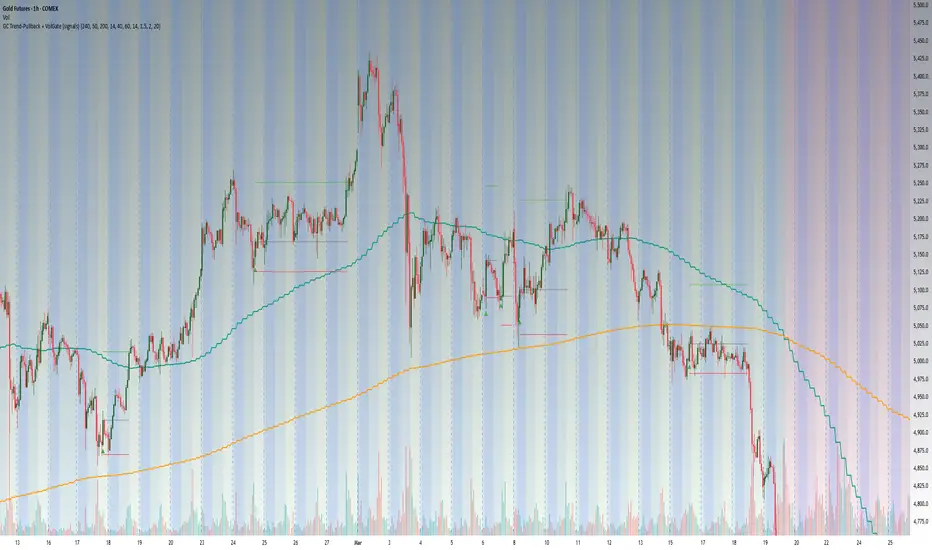
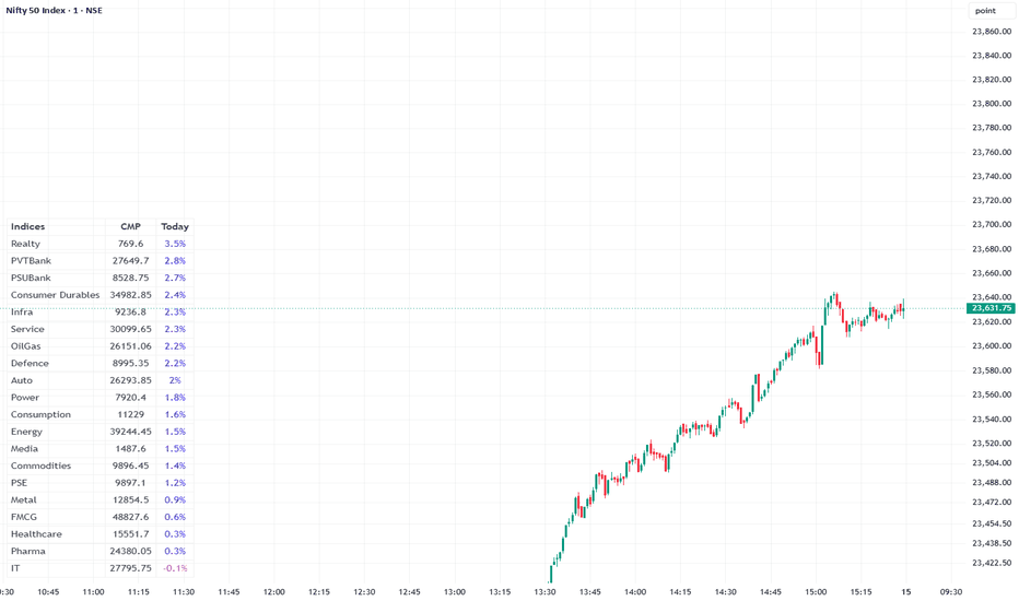
Market Monitor by ASHISH
**Market Monitor — Sectoral Returns Dashboard**
A clean, customizable table-based dashboard that displays **live CMP (Current Market Price)** and **percentage returns** for up to 20 indices or symbols — all in one glance.
**Key Features:**
- 📊 **Multi-Timeframe Returns** — View 1D, 1W, 1M, 3M, 6M, and 12M returns simultaneously with combo display modes
- 💹 **Live CMP** — Real-time current price for each index alongside returns
- 🔃 **Smart Sorting** — Sort by best/worst performers or alphabetically
- 🎨 **Dual Themes** — Light (Blue/Green) and Dark mode support
- ⚙️ **Fully Customizable** — Toggle any of the 20 symbol slots, rename labels, adjust table size, position, and offset
Perfect for traders who want a **quick sectoral overview** without switching charts.
Indicador
Volatility Pressure & Regime AnalyzerVolatility Pressure & Regime Analyzer
## What this script does
VPRA estimates **when a market is loading energy for an outsized move, how large that move could be, and whether the current regime favors chasing or fading the breakout**. It condenses this into one on-chart verdict panel, directional signal markers, a regime ribbon, and a forecast of the expected move in ATR and points.
It works on **any symbol, any market, any timeframe**. A related volatility index and a companion symbol (the underlying if you chart a derivative, or vice versa) are optional inputs that sharpen the analysis; both can be disabled and the model renormalizes to price-only mode automatically.
## Why these components are combined (mashup justification)
Each module answers a question the others cannot, and the signal only fires when their answers agree. None of them is a stock indicator pasted alongside another — they are inputs to a single pressure model:
1. **Compression (ATR percentile)** answers *"is energy being stored?"* Quiet ranges precede expansion, but compression alone says nothing about direction or timing.
2. **Implied-vs-realized volatility dislocation** (optional vol index) answers *"is the options market mispricing the calm?"* A large gap between implied and realized volatility marks complacency or stress that compression alone cannot see.
3. **Basis tension** (optional companion symbol) answers *"is positioning leaning?"* Momentum in the derivative-to-underlying spread, and outright backwardation, reveal funding pressure and de-risking invisible in a single price series.
4. **Convexity and trend inefficiency** (return acceleration, efficiency ratio) answer *"is price behavior becoming unstable?"*
These four are blended into one **Pressure score (0–100)**, percent-ranked against its own history so thresholds adapt to every symbol and timeframe.
5. **A variance-ratio regime filter** answers *"will the break run or get faded?"* The ratio of k-bar to 1-bar return variance classifies the tape as mean-reverting (pinning) or trending (amplifying). Breakouts in a pinning regime are statistically more likely to fail, so the script can label or skip them.
6. **A multi-timeframe trend filter (Ichimoku cloud bias on the chart TF + three higher TFs)** answers *"is the release direction supported by structure?"* It grades signals rather than generating them. Higher-timeframe values are taken from **closed bars by default, so the confluence grade does not repaint**.
7. **Session, expiry, gap and event context** scale the expected-move forecast: an expiry-afternoon release during a volatility spike forecasts a larger move than a sleepy mid-session one.
Removing any module degrades a specific, named capability — that is the test the combination was built to pass.
## How a signal is generated
A marker prints only when **all** of the following align: pressure has reached a high percentile of its own history within a short lookback ("loaded"), the current bar shows a genuine range expansion ("release"), the condition persists for a confirmation bar count, a debounce gap has passed, and (optionally) the regime and trend filters pass. Direction is scored from **trigger-break** (close beyond the prior N-bar extreme), **close location** within the bar, and short momentum.
Marker color encodes the inferred event type: expiry-session releases, volatility-co-movement squeezes (price and vol index moving together — a short-covering tell), or plain expansions. The glow ring encodes how many higher timeframes agree. An ⓘ label stores a full diagnostic snapshot (pressure, regime, instability, basis, energy, session, expected move) in its tooltip for every signal.
## How to use it
- Apply to a liquid symbol; set "This chart is" to Derivative or Underlying, point the companion and volatility-index inputs at your market's related symbols (or disable them), and set your session hours and expiry weekday.
- Read the panel top-down: **Regime** (chase vs fade), **Pressure/Energy** (how loaded), **Move size** (forecast), **Trend align / HTF** (structure), **Triggers** (the price levels that confirm).
- Use the "Filter" modes to suppress signals against regime or higher-timeframe structure, or leave them as badges and judge manually.
- The advanced rows show per-type follow-through statistics (hit rate, average favorable and adverse excursion in ATR) and an early-vs-late history split as a coarse robustness check. **These are in-sample descriptive statistics, not a backtest.** A companion strategy script with identical logic is available for proper backtesting with costs.
- Alerts: per-signal dynamic alert with all values (webhook-ready), plus static conditions for expiry signals, releases, critical pressure, and vol shocks.
## Originality
The pressure blend (compression x vol-dislocation x basis tension x convexity x inefficiency, percent-rank normalized), the variance-ratio regime gate applied to breakout qualification, the compression-energy budget, and the per-type MFE/MAE statistics with an early/late split are original constructions written from first principles for this script. The only classical components used are public-domain building blocks (ATR, Bollinger/Keltner-style compression logic via ATR percentile, Ichimoku cloud bias as a trend filter, Kaufman efficiency ratio), each justified above.
## Limitations (please read)
- Dealer-positioning effects (often discussed as gamma/vanna/charm) are **inferred from price, volatility and basis behavior**. This script does not and cannot read option-chain open interest. Labels such as "gamma blast" describe an expiry-session release pattern, not a measured dealer position.
- All on-panel statistics are computed on the loaded chart history and will differ across symbols, timeframes and history length.
- Higher-timeframe confluence uses closed HTF bars by default (no repaint); the current chart bar still forms in real time, as with any script.
- Expected-move figures are model estimates, not guarantees.
This script is for education and analysis. It is **not financial advice**; trade at your own risk and test before use.
Indicador

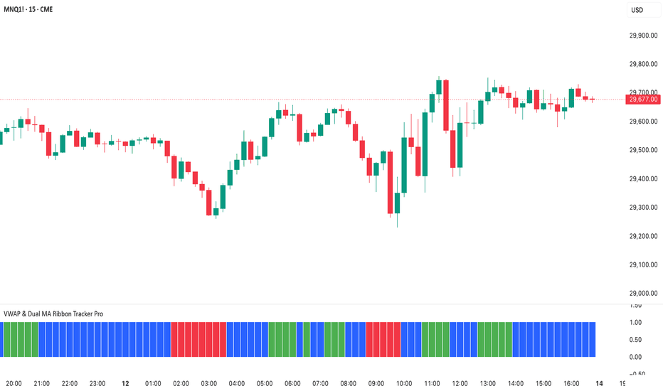
VWAP & Dual MA Ribbon Tracker ProThe Master Trigger Breakdown
* For Longs (Green): The 4 EMA must be above the VWAP. If the 4 EMA is below the VWAP, a long trade is completely blocked, no matter how bullish the rest of the chart looks.
* For Shorts (Red): The 4 EMA must be below the VWAP. If the 4 EMA is above the VWAP, a short trade is completely blocked.
The Complete Logic Chain (How it fits together)
Your indicator only gives a trading color when all three layers of your rules agree with that master trigger:
1. The Structural Trigger: Is the 4 EMA on the correct side of VWAP? (Above for Long / Below for Short)
2. The Momentum Confirmation: Is the 4 EMA accelerating away from the 9 EMA? (Above 9 EMA for Long / Below 9 EMA for Short)
3. The Institutional Force: Is the Elder Force Index (EFI) confirming the volume pressure? (Above 0 for Long / Below 0 for Short)
If any single one of these three layers disagrees, the master trigger pulls the plug and forces the ribbon to stay Blue (No Trading).
How the ATR Cushion Protects Your NASDAQ Trades
In the script, the ATR calculation creates a dynamic "buffer zone" around the VWAP and the 9 EMA.
* For Longs (Green): The 4 EMA can’t just be a fraction above the VWAP and 9 EMA. It must clear both of them by a margin of 0.2 * ATR.
* For Shorts (Red): The 4 EMA must drop below the VWAP and 9 EMA by a margin of 0.2 * ATR.
Why This Asset-Specific Math is Important
The NASDAQ's range changes drastically throughout the day.
* At 9:30 AM EST (NY Open): The market is highly volatile. The ATR expands because the bars are large. The indicator automatically widens the cushion so you don't get trapped by massive, wild price swings.
* At 1:00 PM EST (Lunch Hour): The market slows down. The ATR shrinks because the bars are small. The indicator automatically tightens the cushion so you can still catch a genuine, breakout move if it happens.
How to Tune It in Your Settings
If you feel the indicator is reacting perfectly but missing the exact start of a move, you can adjust the ATR Multiplier Cushion input:
* Lower it to 0.1: Makes the indicator more aggressive, giving you faster entries but a slightly higher risk of a false signal.
* Raise it to 0.3: Makes the indicator more conservative, filtering out more noise but delaying your entry.
* Turn it off: Uncheck the "Use ATR Cushion Filter" box in your settings to see the pure EMA rules without any volatility buffer.
Volume
This upgraded system swaps out rigid, raw volume for the Elder Force Index (EFI). Instead of blindly measuring how many shares were traded, the indicator now calculates true institutional momentum by multiplying volume against net price direction. This ensures you get highly accurate signals on the NASDAQ without missing trades during steady, trending moves.
Visual Layout & Interface
* Upper Main Chart: Your candles, the VWAP line, the 4 EMA, and the 9 EMA remain active here to map structure.
* Lower Separate Panel: Houses your solid color-blocked ribbon, updating instantly as the trend and market force align.
The 3 Market States & Color Codes
* 🟩 SOLID GREEN (Premise to Go Long)
* The Structural Rule: The 4 EMA is above the VWAP AND above the 9 EMA (plus your ATR cushion).
* The EFI Filter: The 13 or 2-period smoothed Elder Force Index must be above 0.
* Market Context: Buyers are in absolute control. The trend has broken out, and it is actively backed by positive institutional buying power.
* 🟥 SOLID RED (Premise to Go Short)
* The Structural Rule: The 4 EMA is below the VWAP AND below the 9 EMA (minus your ATR cushion).
* The EFI Filter: The 13 or 2 setting-period smoothed Elder Force Index must be below 0.
* Market Context: Sellers are dominant. Price is aggressively pushing lower, backed by true institutional distribution force.
* 🟦 SOLID BLUE (No Trading / Neutral Zone)
* The Rule: Triggered if the EMAs conflict OR if the EFI doesn't match the price direction (e.g., the 4 EMA pushes up, but EFI is below 0).
* Market Context: Weak, diverging, or manipulative market action. This protects your capital by sidelining you when the NASDAQ is trying to trap retail breakout buyers.
Indicador
Daily Speed Exhaustion OscillatorDaily Speed Exhaustion Oscillator
OVERVIEW
The Daily Speed Exhaustion Oscillator is a momentum tool that measures how far price has traveled from the daily open relative to how much the asset typically moves in a full day. Its single purpose is to detect speed exhaustion: the moment when a fast directional move has spent its typical daily range and is likely to lose momentum.
This indicator does not measure direction or predict reversals. It measures the velocity of the current move relative to the asset's normal daily behavior.
WHAT IT IS MADE OF
The oscillator is built from three components:
1. Daily open reference. The indicator captures the opening price of the current daily session and uses it as the zero line. All measurement is relative to this point.
2. Average daily range. Each asset has its own typical daily range. The indicator stores a configurable average daily range per asset (Gold and EURUSD), with market-based default values that can be adjusted manually.
3. Normalized distance. The current distance of price from the daily open is divided by the average daily range and expressed as a percentage.
CALCULATION
The core formula is:
oscillator = (close - daily open) / average daily range * 100
A reading of 0% means price is sitting at the daily open. A reading of +100% means price has moved away from the open by an amount equal to one full typical day, entirely to the upside. A reading of -100% means the same to the downside. Readings beyond +/-150% indicate the move has exceeded one and a half times the normal daily range.
The daily open is captured directly on the chart by detecting the change of the daily session, which keeps the value stable across any intraday timeframe without repainting.
BANDS
Two band pairs are drawn:
- Upper and lower bands at +/-100%: price has covered a full typical day in one direction.
- Extreme bands at +/-150%: price has covered one and a half typical days in one direction.
The asset is auto-detected from the chart symbol, or can be selected manually. Each asset uses its own average daily range, so the same percentage scale is comparable regardless of the instrument.
HOW TO INTERPRET IT
The interpretation is simple and focused on one idea: when the oscillator line enters a band, expect the price to decelerate.
Once price has traveled more than its normal daily range, it cannot keep accelerating indefinitely. Reaching a band means the fast portion of the move has been spent. From that point, the move is statistically likely to slow down.
The line returning toward the center after touching a band is the signal that the fast move has ended and speed is normalizing. Because the indicator measures speed and not direction, the line returning to the center simply confirms that the sprint is over, regardless of what price does next.
The deeper the penetration into a band (especially beyond the extreme +/-150% level), the stronger the signal that the current pace will not continue.
HOW TO USE IT
Use this indicator to identify deceleration. When the oscillator enters a band, treat it as a signal that the rapid move is exhausting and is likely to slow down. This is useful as a filter to avoid chasing a move that has already covered its typical daily range and is about to lose momentum.
Watch for the line touching or penetrating a band, then observe price decelerate as the line returns toward the center.
NOTES
Default ranges are set for Gold (30 USD) and EURUSD (0.0070), based on typical average daily range values. These can be adjusted in the settings to match current volatility. For best results, observe the values your asset reaches and calibrate the average daily range so the bands are reached only on genuinely fast moves. Indicador

Adaptive MTF Trend Fusion [AlgoPro]Adaptive MTF Trend Fusion is an advanced multi-timeframe trend modeling system. It is engineered to combine multi-timeframe moving average structure, multi-timeframe VWAP-based price weighting, volatility-adjusted trend bands, and adaptive visual confirmation into one clean decision framework.
Rather than relying on a single moving average, fixed trendline, or static channel, this tool creates a dynamic fusion midline by blending multiple timeframe calculations together. The result is a smoother, more context-aware trend anchor that adapts to market structure, volatility, and directional pressure across different chart environments.
🔵 SYSTEM ARCHITECTURE & CORE TREND ENGINE
Multi-Timeframe Fusion Engine
Adaptive Timeframe Mapping: The system can automatically select lower, middle, or higher timeframe combinations based on the chart you are viewing. This allows the indicator to build a broader trend model without requiring manual timeframe adjustments every time you switch charts.
Auto Higher / Auto Middle / Auto Lower Modes: Traders can choose whether the fusion engine should lean into higher-timeframe confirmation, balanced multi-timeframe structure, or lower-timeframe responsiveness. Manual mode is also available for full custom timeframe selection.
Confirmed Higher-Timeframe Logic: Higher-timeframe values are handled with confirmation logic to help prevent future-leak behavior and keep the model grounded in completed higher-timeframe data.
Advanced Moving Average Fusion Core
Selectable Smoothing Models: The moving-average engine supports multiple smoothing types, including SMA, EMA, WMA, HMA, RMA, VWMA, DEMA, TEMA, THMA, and JMA. This allows the trader to tune the fusion line from slower institutional-style trend tracking to faster adaptive response.
Weighted Calculation Control: The moving average component can be enabled, disabled, or weighted independently. This lets traders decide how much influence the selected moving average structure should have in the final fusion midline.
Multi-Timeframe MA Blending: The script calculates the selected moving average across three chosen timeframes, then blends those values into a single adaptive trend anchor.
VWAP-Based Price Alignment Engine
Rolling VWAP Support: The VWAP engine can use a rolling VWAP calculation over a user-defined length, helping the system identify price positioning relative to recent volume-weighted value.
Daily VWAP Support: A daily-reset VWAP mode is also included for traders who prefer a session/day-based value anchor.
Weighted VWAP Influence: The VWAP component can be enabled, disabled, or weighted separately from the moving-average component. This allows the final fusion line to lean more toward volume-weighted value, moving-average structure, or a balanced blend of both.
Volatility-Scaled Trend Confirmation Bands
ATR-Based Volatility Framework: The fusion midline is surrounded by volatility-adjusted upper and lower confirmation thresholds. These bands expand and contract with market volatility, helping reduce false flips during noisy conditions.
Trend Confirmation Candles: A trend state does not flip immediately from a single cross. The system requires a user-defined number of confirming candles above or below the volatility structure before locking into a bullish or bearish state.
Directional State Machine: Once a bullish or bearish condition is confirmed, the indicator maintains that structural state until the opposite side earns confirmation. This helps traders avoid reacting to every minor pullback or midline test.
🔵 VISUAL TREND STRUCTURE & MARKET INTERPRETATION
Adaptive Fusion Band
Fusion Band Around the Midline: A separate internal band is plotted around the fusion midline to help define the core trend zone. This acts as a visual center-of-gravity area for the current market structure.
Dynamic Color Behavior: The fusion band shifts color based on price position and trend state. When price is interacting with the band, the color can remain more neutral. As price pushes away from the band, the visual structure becomes stronger in the active trend color.
Clean Trend Zone Visualization: The band is designed to make trend structure easy to read without overwhelming the chart. It gives traders a clear view of whether price is compressing near the midline or expanding away from it.
Volatility Gradient Fill
Trend Expansion Visualization: When price is moving in the direction of the confirmed trend, the script creates a gradient fill between price and the active volatility buffer.
Volume-Based Brightness: The gradient fill responds to volume pressure. Stronger directional volume can make the fill appear more active, while weaker volume pressure fades the visual intensity.
Directional Market Context: This helps traders quickly identify whether a move has supportive pressure behind it or whether price is simply drifting away from the midline without strong participation.
Trend Flip Signals
Confirmed Bullish Flip Signals: When the system confirms a bullish transition, a clean signal marker is printed near the lower volatility structure.
Confirmed Bearish Flip Signals: When the system confirms a bearish transition, a clean signal marker is printed near the upper volatility structure.
Glow-Based Signal Styling: The signal markers are designed with layered glow circles to make important trend shifts visible without cluttering the chart.
Midline Retest Signals
Bullish Retest Logic: During a bullish trend, if price pulls below the fusion midline and then crosses back above it, the script can print a bullish retest marker.
Bearish Retest Logic: During a bearish trend, if price pushes above the fusion midline and then crosses back below it, the script can print a bearish retest marker.
Continuation Setup Assistance: These retest markers are designed to help identify possible trend continuation opportunities after a pullback into the fusion structure.
🔵 SYSTEMATIC TRADING INTERPRETATION
Trend Following Bias: Use the confirmed market state as the primary directional bias. Bullish states favor long-side planning, while bearish states favor short-side planning.
Midline Pullback Continuations: During a confirmed trend, watch for price to pull back toward or through the fusion midline. A retest signal can help identify when price is attempting to reclaim trend direction.
Volatility Buffer Confirmation: Strong trend flips occur only when price closes beyond the volatility structure for the required number of confirming candles. This helps filter weak crosses and reduce premature entries.
Trend Strength Expansion: A rising trend strength value means price is moving farther away from the midline. This can indicate strong momentum, but it can also warn that price is becoming extended depending on market context.
Volume Pressure Confirmation: Use the volume pressure reading to determine whether the current move is being supported by directional participation. Strong trend state plus matching volume pressure can suggest better continuation quality.
Fusion Band Compression: When price is hovering near the fusion band, the market may be compressing, ranging, or preparing for a larger directional move. When price expands away from the band, the system helps visualize directional strength.
🔵 INTERFACE CONFIGURATION & PARAMETERS
Multi-Timeframe Controls: Choose Auto Higher, Auto Middle, Auto Lower, or Manual mode depending on whether you want broader confirmation, balanced structure, lower-timeframe responsiveness, or full custom control.
Moving Average Settings: Select from multiple moving average types and adjust the moving average length to control how responsive or smooth the fusion engine becomes.
VWAP Settings: Choose between Rolling VWAP and Daily VWAP, then adjust the rolling length when using the rolling mode.
Volatility Settings: Tune the ATR length, volatility multiplier, smoothing, and confirmation candle count to adjust how strict or responsive the trend engine should be.
Fusion Band Settings: Control the internal band visibility, width, and multiplier to fit your preferred chart style.
Visual Settings: Customize bull, bear, and neutral colors, signal sizes, dashboard position, dashboard size, and chart display options.
Adaptive MTF Trend Fusion transforms a standard chart into a multi-timeframe trend modeling dashboard. By combining moving average structure, VWAP value, volatility confirmation, trend strength, and volume pressure into one unified system, it gives traders a cleaner way to read market direction, trend health, and pullback continuation opportunities. Indicador

Indicador

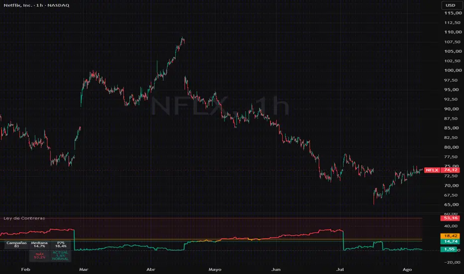
Campaign Map - Contreras Law Version en espanol mas abajo. · English version first, Spanish below.
─────────────────────────────────
CAMPAIGN MAP — CONTRERAS' LAW
WHAT IT MEASURES
This indicator builds the historical distribution of a symbol's
campaign corrections (peak→trough declines confirmed by reversal) and
places the CURRENT correction inside that map: is it normal breathing,
a deep pullback, or statistically unusual territory?
THE OBSERVATION BEHIND IT
Contreras' Law (Jacinto Contreras, June 2026): in US large-cap
technology stocks, the typical depth of campaign corrections converges
to a structural constant (~14-15% median at campaign scale),
regardless of the symbol. What differentiates each stock is not its
median but its historical maximum tail (observed: from ~25% to ~53%
depending on the symbol, across ~11 years of hourly data on 9 names).
Operational takeaway: MONITOR WITH THE MEDIAN, SIZE WITH THE TAIL.
HOW IT WORKS
· A reversal-threshold zigzag detects campaign peaks and troughs.
· Only COMPLETED corrections (confirmed by reversal) enter the
statistics: median, 75th percentile, and historical maximum.
· The main line plots the depth of the ongoing correction, colored by
zone: normal (teal), deep (orange), unusual (red).
· Summary table with the symbol's map and current status.
· Two alerts: median cross and P75 cross.
HOW TO USE IT
· Below the median: normal breathing; the pullback alone carries no
trend-change information.
· Between median and P75: deep but normal correction.
· Above P75: statistically unusual territory. The correct reading is
NOT "it must bounce now" — it is: look for exhaustion evidence
(divergences, capitulation) and demand confirmation.
· The historical maximum (the tail) is the worst-case reference for
position sizing and campaign stops.
INPUTS
· Reversal (%): rally confirming the end of a bearish campaign.
8% = campaign scale (default). 3% = swing scale.
· Minimum depth (%): smaller corrections are excluded from the map.
10% campaign / 5% swing.
LIMITATIONS (read before use)
· Statistics do NOT repaint (completed corrections only), but the
ONGOING correction is provisional by nature: its campaign peak may
extend until the reversal confirms.
· The median convergence was observed in US large-cap tech on the
hourly timeframe; it may not hold in other sectors, assets or
timeframes. Verify it on your symbol before relying on it.
· Enough campaigns (>8-10) are required for the map to be
statistically meaningful; the indicator shows "calibrating…" until
then.
· This is a MEASUREMENT and context tool. It does not generate buy or
sell signals and guarantees no outcome. Not financial advice.
─────────────────────────────────
VERSIÓN EN ESPAÑOL
MAPA DE CAMPAÑAS — LEY DE CONTRERAS
QUÉ MIDE
Este indicador construye la distribución histórica de las correcciones
de campaña de un valor (caídas máximo→mínimo confirmadas por reversión)
y sitúa la corrección actual dentro de ese mapa: ¿es una respiración
normal, una corrección profunda o territorio inusual?
LA OBSERVACIÓN QUE LO ORIGINA
Ley de Contreras (Jacinto Contreras, junio de 2026): en valores
tecnológicos estadounidenses de alta capitalización, la profundidad
típica de las correcciones de campaña converge en una constante
estructural (~14-15% de mediana, escala campaña), independiente del
símbolo. Lo que diferencia a cada valor no es su mediana, sino su cola
máxima histórica (observado: desde ~25% hasta ~53% según el símbolo,
sobre ~11 años de datos horarios en 9 valores).
Moraleja operativa: VIGILAR CON LA MEDIANA, DIMENSIONAR CON LA COLA.
CÓMO FUNCIONA
· Un zigzag por umbral de reversión detecta picos y valles de campaña.
· Solo las correcciones COMPLETADAS (confirmadas por reversión) entran
en la estadística: mediana, percentil 75 y máximo histórico.
· La línea principal muestra la profundidad de la corrección en curso,
coloreada según la zona: normal (verde), profunda (naranja),
inusual (rojo).
· Tabla resumen con el mapa del símbolo y el estado actual.
· Dos alertas: cruce de la mediana y cruce del P75.
CÓMO USARLO
· Por debajo de la mediana: respiración normal; el retroceso no es,
por sí solo, información de cambio de tendencia.
· Entre mediana y P75: corrección profunda pero dentro de lo normal.
· Por encima del P75: territorio estadísticamente inusual. La lectura
correcta no es "ya tiene que rebotar", sino: buscar señales de
agotamiento (divergencias, capitulación) y exigir confirmación.
· El máximo histórico (la cola) es la referencia de peor caso para
dimensionar posición y stops de campaña.
PARÁMETROS
· Reversión (%): rally que confirma el fin de una campaña bajista.
8% = escala campaña (por defecto). 3% = escala swing.
· Profundidad mínima (%): correcciones menores no entran al mapa.
10% campaña / 5% swing.
LIMITACIONES (léelas antes de usar)
· Las estadísticas NO repintan (solo correcciones completadas), pero
la corrección EN CURSO es provisional por naturaleza: su máximo de
campaña puede extenderse hasta que la reversión confirme.
· La convergencia de medianas está observada en tecnológicas USA de
alta capitalización en marco horario; en otros sectores, activos o
marcos puede no cumplirse. Compruébalo en tu símbolo antes de usarlo.
· Se necesitan suficientes campañas (>8-10) para que el mapa tenga
valor estadístico; el indicador muestra "calibrando…" mientras tanto.
· Es una herramienta de MEDICIÓN y contexto. No genera señales de
compra/venta ni garantiza resultado alguno. No es asesoramiento
financiero. Indicador

Volatility Regime Compass [JOAT]Volatility Regime Compass
Introduction
Volatility Regime Compass is an open-source volatility state classifier that continuously measures where current ATR stands relative to its own historical distribution and maps it to one of four named regimes: Compressed, Normal, Elevated, and Extreme. The classification is not binary (high or low) — it uses a rolling percentile ranking against configurable lookback windows so the regime reflects where current volatility stands within its recent history, not against a fixed absolute threshold that becomes stale as market conditions evolve.
The practical value is in strategy switching: mean-reversion techniques tend to work in compressed regimes, breakout and momentum techniques in elevated ones. Knowing which regime is active before selecting a technique reduces category errors that produce losses.
Core Concepts
1. ATR Percentile Ranking
Rather than comparing ATR to a static multiplier, the indicator ranks the current ATR value within a rolling distribution of historical ATR values. This produces a percentile score from 0 to 100 that is self-normalizing across different instruments and timeframes:
float atrHi = ta.highest(atrVal, i_rankLen)
float atrLo = ta.lowest (atrVal, i_rankLen)
float atrPct = (atrHi - atrLo) > 0 ?
(atrVal - atrLo) / (atrHi - atrLo) * 100.0 : 50.0
A reading of 80 means current ATR is in the 80th percentile of its recent range — clearly elevated. A reading of 15 means ATR is near multi-period lows — compressed.
2. Four-State Regime Classification
The percentile score maps to four regimes with configurable boundary thresholds. Defaults are: Compressed (below 25th percentile), Normal (25th to 60th), Elevated (60th to 85th), Extreme (above 85th). Crossing a regime boundary triggers a transition event labeled on the chart.
3. Multi-Band Visualization
Five ATR bands project above and below close at configurable multiples (0.5×, 1×, 1.5×, 2×, 2.5× ATR). Each band is color-coded by regime — tighter bands in compressed regimes shade cooler, wider bands in extreme regimes shade hotter using a 5-stop gradient. This gives instant visual calibration of price's relationship to current volatility structure.
4. Volatility Trend
The rate of change of ATR is computed and smoothed. Positive volatility trend (ATR rising) is labeled differently from negative trend (ATR contracting). This distinguishes a currently-elevated but contracting regime from one that is expanding — the former is more likely to produce consolidation, the latter continuation.
Features
ATR percentile ranking: Self-normalizing volatility score relative to recent history
Four volatility regimes: Compressed, Normal, Elevated, Extreme with configurable boundaries
Regime transition labels: On-chart labels at every regime change event
Five ATR expansion bands: Projected above and below close, gradient-colored by regime
Volatility trend direction: Rising vs contracting ATR tracked independently of level
Candle coloring: Candles reflect current volatility regime in real time
Regime background shading: Chart background tint corresponds to current regime
Dashboard: Current ATR, percentile, regime, trend direction, and band levels
Input Parameters
ATR Settings:
ATR Period: ATR calculation length (default: 14)
Percentile Lookback: Rolling window for ATR percentile ranking (default: 100)
Regime Thresholds:
Compressed Below: Percentile below which regime is Compressed (default: 25)
Elevated Above: Percentile above which regime is Elevated (default: 60)
Extreme Above: Percentile above which regime is Extreme (default: 85)
How to Use This Indicator
Step 1: Check the Current Regime
Read the REGIME row in the dashboard. This tells you whether to expect range-bound or trending behavior in the near term.
Step 2: Watch for Regime Transitions
A transition from Compressed to Elevated is the setup for breakout strategies. A transition from Extreme back toward Normal may signal trend exhaustion.
Step 3: Use Bands as Structural Reference
The ATR bands define statistically reasonable price excursion limits for the current volatility state. Closes beyond the 2× or 2.5× band while in a Compressed regime are structurally significant events.
Step 4: Combine with Directional Indicators
This indicator classifies volatility magnitude, not direction. Pair it with a trend or momentum tool to apply regime context to directional decisions.
Indicator Limitations
Percentile ranking depends on lookback length; very short lookbacks can produce unstable regime classifications during sudden volatility spikes
The four-state classification is a simplification; volatility is continuous and regime boundaries are heuristic
Volatility expansion does not indicate direction — it only measures magnitude of movement
Originality Statement
The combination of a self-normalizing ATR percentile ranking, a four-state regime classifier with configurable percentile boundaries, gradient-coded multi-band projection, and a simultaneous volatility trend tracker in a single Pine Script v6 publication constitutes the original contribution. Standard ATR indicators display the raw value or a fixed-multiple band without regime classification or percentile normalization.
Disclaimer
This indicator is provided for educational and informational purposes only. It is not financial advice. Volatility regime classifications are statistical summaries of historical data and do not predict future price movement. Trading involves substantial risk of loss.
-Made with passion by jackofalltrades
Indicador

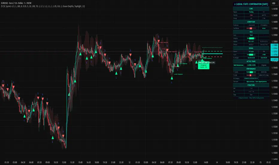
Casual State Confirmation [DAFE]Casual State Confirmation
This is a market-state classification and signal-generation system. Designed for professional proprietary firms and systematic retail traders, this overlay indicator operates on a profound technical thesis: "Confirm the state casually, trade with anticipation.
Most modern trading systems fail because they rely on lag-heavy digital filters, suffer from the "curse of dimensionality" when processing historical charts, or ignore institutional order flow context. ⟡ CSC solves these structural challenges by fusing five cutting-edge quantitative methodologies into a single, cohesive, self-learning visual script:
A Shift-Invariant Stationary Wavelet Transform (SWT) Engine running 5 selectable Mother Wavelet families with unsmoothed detail bands to capture immediate high-frequency energy shocks.
A 13-Feature Non-Euclidean Lorentzian k-Nearest Neighbors (k-NN) Classifier with a strict, delayed-outcome training loop that dynamically updates a localized memory database.
A LogicWeights Reinforcement Learning (RL) Processor that constantly optimizes pattern weight parameters based on realized win/loss trade outcomes.
A Native Microstructure Footprint & Market Structure Levels (MSL) Engine to verify institutional liquidity zones, Value Areas (VA), and POC locations.
An Advanced Rotational Market State (RCM) Conviction Engine that continuously calculates structural trend integrity and damage.
DEEP MATHEMATICAL ARCHITECTURE
A. Shift-Invariant Stationary Wavelet Transform (SWT)
Traditional digital moving averages (EMA, SMA, HMA) introduce significant phase lag. ⟡ CSC bypasses this limitation using a discrete Stationary Wavelet Transform (SWT) , which decomposes price into a series of time-localized frequency sub-bands:
f(t) = a_J(t) + \sum_{j=1}^{J} d_j(t)
Where a_J represents the low-frequency approximation of the trend, and d_j represents the high-frequency detail bands at scale j .
Smoothing Splitting : To preserve high-frequency market shocks, an Exponential Moving Average (EMA) is applied only to the approximation bands ( a_1–a_4 ). The detail bands ( d_1–d_4 ) remain completely unsmoothed. This mathematical partition ensures that while trend tracking is smoothed, raw energy and volatility spikes are captured with zero time delay.
Regime Classification via Hurst Exponent (H) : The script extracts log-scale variations across multiple wavelet steps to estimate the Hurst Exponent. If H > 0.55 , the market state is classified as Trending (persistent). If H < 0.45 , it is classified as Mean Reverting (anti-persistent). Otherwise, it is flagged as Random (Gaussian noise).
B. 13-Feature Non-Euclidean Lorentzian k-NN Classification
Standard machine learning models often suffer from high-dimensional distortion. ⟡ CSC projects 13 distinct features (ranging from Hurst exponents and wavelet energy to order flow absorption and RCM integrity) into a non-Euclidean space. Rather than relying on simple Euclidean distances, it uses a Lorentzian Cauchy-like Distance Metric :
d_{Lorentz}(x, y) = \sum_{i=1}^{N} \ln(1 + |x_i - y_i|^2)
By using a logarithmic distance curve, the Lorentzian metric limits the influence of outlier data, preserving cluster relationships in high-dimensional spaces.
Training Loop Protection (Outcome Delay) : To prevent lookahead bias, the k-NN engine implements a delayed-outcome training loop (lorentz_delay). The system waits for a user-defined bar window to pass before evaluating whether a historical pattern resolved as a win ( +1.0 ) or a loss ( -1.0 ). Only once this outcome is locked is the pattern committed to the database.
C. LogicWeights Reinforcement Learning (RL) Engine
Rather than treating all pattern categories equally, ⟡ CSC deploys an adaptive reinforcement learning layer (`LW`). The system categorizes the 21 detectable patterns into four distinct buckets: Original , Candle , Structure , and VSA .
When an execution signal is generated, its category weight is adjusted based on subsequent price action:
Success (T1 Target Hit) : The category weight is increased by a learning step of +0.04 .
Failure (Stop Loss Hit) : The category weight is reduced by -0.04 .
This feedback loop ensures that the engine automatically prioritizes pattern types that are currently outperforming under active market conditions.
INPUTS
🌊 Wavelet Engine Parameters
Family (Default: db4): Selects the Mother Wavelet filter coefficients used to compute the SWT.
Haar: Step-like square wavelet. Highly responsive to sudden structural shocks, though prone to jagged bands.
db2 / db4: Orthogonal Daubechies wavelets. Balances time-domain precision and frequency-domain smoothing to preserve trend structures.
sym4: Near-symmetric Symlet wavelet designed to limit phase distortion and asymmetry.
coif2: Coiflet wavelet featuring vanishing moments for both scaling and wavelet functions. Highly localized approximation of micro-trends.
Approximation Smoothing (Default: 3): Applies an EMA filter to smooth approximation bands. Increasing this filters out short-term noise; decreasing it makes wavelet alignment signals more responsive to near-term momentum shifts.
Show Wavelet Bands (Default: true): Renders multi-scale volatility bands calculated directly from SWT detail-band energy coefficients on the chart.
Highlight Energy Surges (Default: false): Highlights the chart background when the combined square of the detail coefficients exceeds its historical average.
🌌 Lorentzian Parameters
Enable Lorentzian (Default: true): Toggles the 13-feature non-Euclidean k-NN classification engine.
K Neighbors (Default: 5): Sets the number of historical nearest neighbors ( K ) used to construct the prediction vector. Lower values (3-5) respond to localized anomalies; higher values (7-9) demand a broader historical consensus.
Gamma (match strictness) (Default: 1.0): The scale parameter ( \gamma ) for the Cauchy-like distance kernel. Larger values accept broader historical matches; smaller values enforce strict similarity requirements.
Pattern Memory (Default: 180): Defines the maximum size of the historical feature database.
Outcome Delay (bars) (Default: 8): Enforces a strict temporal window before evaluating trade outcomes to prevent lookahead bias.
Min Confidence for Signal Boost (Default: 0.35): The minimum neighbor similarity percentage required to validate a k-NN signal boost.
🎯 Patterns & Signal Quality Parameters
Original 8 Patterns (Default: true): Toggles the original 8 core patterns (Momentum, Flags, Reversals, Double Tops/Bottoms, Breakouts, Wavelet alignment, and Energy surges).
Candle Patterns (6) (Default: true): Toggles candlestick patterns (Hammer/Shooting Star Absorptions, Exhaustion Wicks, Pin Bars, Engulfing bars, Marubozus, and Dojis).
Structure Patterns (4) (Default: true): Toggles structural patterns (BOS, CHoCH, Liquidity Sweeps, and Order Block Reclaims).
VSA Patterns (3) (Default: true): Toggles Volume Spread Analysis patterns (No Demand, No Supply, Buying/Selling Climaxes, and Stopping Volume).
Minimum Signal Score (of 8) (Default: 6): Sets the minimum confirmation score required to validate an entry signal. The score is calculated across an 8-point validation matrix.
Signal Cooldown (bars) (Default: 12): Establishes a minimum bar interval between consecutive signals to prevent rapid, overlapping trades.
Require Structural Proximity (Default: true): When enabled, signals are blocked unless the entry price is trading near a key MSL level (POC, VAH, VAL, Siege Corridors, or major swing points).
Require RCM Integrity ≥ 50% (Default: true): Blocks signals if the RCM Engines structural integrity falls below 50%, filtering out signals during choppy, low-confidence trend transitions.
🏗 Footprint Parameters
Use Native Footprint (Premium) (Default: true): Requests real-time, tick-level footprint data to calculate exact buying and selling volume distributions at each price level. If unavailable, the system automatically falls back to sub-timeframe volume distributions.
Ticks per Row (Default: 100): Set this to match the tick structure of your instrument.
Value Area % (Default: 70): Sets the statistical boundary of the Value Area.
Fallback TF1 / Fallback TF2 (Default: 1 / 3): The primary and secondary sub-timeframes used to estimate sub-candle volume distributions when native footprint data is unavailable.
🧭 MSL Structure Parameters
Enable MSL (Default: `true`): Toggles the Market Structure Levels engine.
Pivot Length (Default: 5): The lookback period used to identify swing highs and lows for structural calculations.
Plot POC/VAH/VAL (Default: `true`): Renders the POC, VAH, and VAL lines directly on the chart.
🛡 RCM Parameters
Enable RCM (Default: `true`): Toggles the Rotational Market State Engine.
Wavelet → Impulse Injection (Default: 1.2): Adjusts the sensitivity of wavelet energy surges injected into the RCM engine.
Delta → Structure Injection (Default: 1.1): Adjusts the sensitivity of footprint delta imbalances injected into the RCM engine.
Siege → Compression Injection (Default: 1.0): Adjusts the sensitivity of MSL siege proximity metrics injected into the RCM engine.
⚡ Risk Parameters
ATR Stop Multiplier (Default: 0.75): The multiplier applied to ATR to determine the initial stop-loss distance.
R:R Target 1 / R:R Target 2 (Default: 1.0 / 2.0): The target prices for take-profit orders, calculated as a multiple of the initial risk distance.
Show Trade Lines (Default: `true`): Renders entry, stop-loss, and take-profit trade lines on the chart.
DASHBOARD & CHART VISUALS
To help you monitor complex market environments, the system features a real-time Head-Up Display (HUD) and dynamic chart indicators:
A. On-Chart Visuals
Neon Trade Lines : Renders entry ( Purple ), stop-loss ( Crimson ), and take-profit targets ( Neon Green ) trade lines.
Pattern Boxes & Labels : Displays dashed boxes around pattern-triggering candles, accompanied by text badges showing the pattern name, category, and score.
Signal Arrows : Displays L (Long) or S (Short) shapes indicating validated entry zones.
B. Real-Time HUD Table Columns Explained
CORE Section :
Regime : Displays the active market state (Trending, Mean Reverting, or Random), along with the exact Hurst exponent value ( H ).
Wavelet : Shows wavelet alignment (Bullish, Bearish, or Flat) and active scale.
Energy : Highlights active wavelet energy surges.
LORENTZIAN Section :
Prediction : Shows the k-NN models directional bias (Bullish, Bearish, or Neutral) and its numerical score.
Confidence : Displays a loading-bar visual of neighbor similarity.
RCM Section :
State : Displays active trend states (Bullish, Bearish, or Neutral) and highlights structural damage.
Integrity : Displays a trend strength bar indicator.
Impulse / Exhaust : Compares buy/sell volume conviction and exhaustion levels.
SIGNAL Section :
Pattern / Category / Score : Shows active pattern details and its validation status.
RL Weights : Displays active category weights ( O : Original, C : Candle, S : Structure, V : VSA) updated by the reinforcement learning engine.
ACTIVE TRADE Section :
Displays details of the active trade, including name, category, direction, and live unrealized profit/loss.
PERFORMANCE Section :
T1 / T2 Win Rate : Tracks performance at both Target 1 and Target 2, alongside a detailed breakdown of wins and losses by pattern category.
NARRATION Section :
Provides live commentary on structural conditions, warning you of trend transitions or consolidation phases.
STRUCTURE Section :
Displays current POC, VAH, and VAL values, indicating whether price is trading inside the Value Area or near structural siege zones.
OPTIMIZATION FOR VARIOUS TIMEFRAMES & SECTORS
A. 5-Minute Timeframe (Scalping & Order Flow Focus)
Designed to capture rapid, intraday price action and short-term liquidity pools:
Wavelet settings : Family = Haar (highest response rate to sudden price breaks), Approximation Smoothing = 2.
Lorentzian settings : K Neighbors = 3 (highly sensitive to localized historical patterns), Gamma = 0.8 (demands strict similarity matching), Outcome Delay = 5 (speeds up learning feedback).
Signal settings : Minimum Signal Score = 5 (increases trade frequency), Require Structural Proximity = true (ensures trades occur at high-probability location zones).
Asset pairings : Highly effective for high-volume stock index futures (NQ, ES), blue-chip equities (TSLA, NVDA), and liquid currency pairs (EUR/USD, GBP/USD).
B. 10-Minute Timeframe (Intraday Day Trading)
Optimized to capture midday trends while filtering out noise and false breakouts:
Wavelet settings : Family = db2 or db4, Approximation Smoothing = 4.
Lorentzian settings : K Neighbors = 5, Gamma = 1.1, Outcome Delay = 8.
Signal settings : Minimum Signal Score = 6, Require RCM Integrity ≥ 50% = true (filters out choppy consolidation ranges).
Asset pairings : Recommended for major commodity futures (Gold, Crude Oil) and high-market-cap cryptocurrency assets (BTC/USD, ETH/USD).
C. 1-Hour Timeframe (Swing Trading & Structural Position Trading)
Designed for capturing major macroeconomic trends and holding swing positions over days or weeks:
Wavelet settings : Family = sym4 or coif2 (reduces phase distortion), Approximation Smoothing = 6.
Lorentzian settings : K Neighbors = 7 or 9 (demands broad historical consensus), Gamma = 1.5, Outcome Delay = 12 or 15.
Signal settings : Minimum Signal Score = 7 (demands high confluence), Require Structural Proximity = true (requires price to be near major daily or weekly key levels).
Asset pairings : Ideal for spot forex pairs, commodity CFDs, global treasury bonds, and mid-cap equity portfolios.
* These are generalized suggestions. The main suggestion would be to play with the inputs until you find something you are comfortable with.
WEBHOOK & LIVE EXECUTION INTEGRATION BLUEPRINT
Because ⟡ CSC is an overlay indicator rather than a strategy, it utilizes specialized Pine Script `alertcondition` triggers. To bridge these signals to external brokers, prop accounts, or trade routers (such as PineConnector, 3Commas, or Capitalise.ai), you must use TradingViews dynamic placeholder tokens to pass real-time order data through your webhooks.
A. Available Indicator Alert Triggers
The script features four automated alert conditions that you can select in the TradingView alert creation menu:
CSC Long Signal (Triggered on validated long patterns meeting all score and filter gates).
CSC Short Signal (Triggered on validated short patterns meeting all score and filter gates).
RCM Damage (Alerts you when structural integrity is compromised).
Energy Surge (Alerts you when wavelet energy expands, signaling an upcoming volatility breakout).
B. Dynamic JSON Webhook Templates
By using TradingView’s Placeholder Tokens in the Alert Message box, you can pass dynamic execution data to your routing gateway:
Template 1: PineConnector (MetaTrader 4 / MetaTrader 5 Bridge)
To route trades to MT4/MT5, configure your alert message exactly as follows:
{"license":"YOUR_PINECONNECTOR_ID", "action":"{{strategy.order.action}}", "symbol":"{{ticker}}", "risk":"1", "sl":"{{plot_0}}", "tp":"{{plot_1}}"}
(Note: Replace (sl) and (tp) values with your preferred risk parameters or your brokers specific layout).
Template 2: 3Commas Multi-Bot Trigger
To execute signals on spot or futures crypto exchange accounts, enter the following JSON format in your Alert Message box:
{
"message_type": "bot",
"bot_id": "12345678",
"email_token": "your-unique-email-token-1234",
"delay_seconds": 0,
"pair": "{{exchange}}:{{ticker}}",
"action": "trigger_signal"
}
Template 3: Universal Webhook JSON (For custom programmatic servers)
If you route signals to a custom API or private trading bot server, use this format to pass comprehensive market-state data:
{
"strategy": "CSC_DAFE",
"ticker": "{{ticker}}",
"exchange": "{{exchange}}",
"close": {{close}},
"time": "{{timenow}}",
"volume": {{volume}},
"interval": "{{interval}}",
"message": "{{alertstring}}"
}
C. Setting Up Your Webhook in TradingView
Open the ⟡ CSC indicator settings on your chart and calibrate your inputs.
Click the Alert icon on your TradingView menu.
Set the Condition to Casual State Confirmation .
Select the desired signal condition (e.g., CSC Long Signal or CSC Short Signal ).
Set the Trigger Option to Once Per Bar Close (highly recommended to preserve k-NN and machine learning logic).
In the Alert Actions tab, check Webhook URL and paste your gateway’s API link.
In the Message box, paste one of the JSON templates shown above.
Click Create .
PLATFORM COMPLIANCE & RISK DISCLAIMERS
No Guarantee of Financial Returns : This software tool is designed for educational and informational purposes only. It is not financial or investment advice. Systematic trading carries high risks of capital loss.
Hypothetical Backtesting Limitations : All performance statistics displayed in the HUD table are calculated in real time using historical data and are completely simulated. Simulated results have inherent limitations and do not represent live market transactions, brokerage fees, or execution slippage.
User Operational Responsibility : The user is solely responsible for determining position sizing, risk limits, and broker connections. ⟡ CSC is not a financial advisor. Always test Webhook JSON integrations in simulated paper-trading environments before risking live capital.
— Dskyz, Trade with insight. Trade with anticipation. (Don't follow the trend, be the trend) Indicador

Indicador

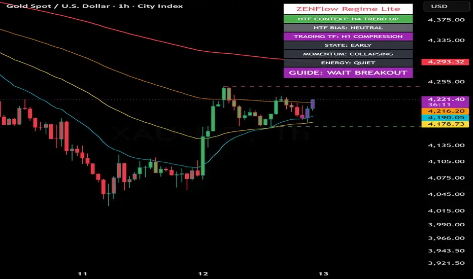
ZENFlow Regime Lite | Market Context GuideZENFlow Regime Lite | Market Context Guide
ZENFlow Regime Lite is an open-source market regime and context-reading indicator designed to help traders understand the current market environment before looking for trade setups.
The main idea behind this script is simple:
Read the market first.
Then decide whether the market is trending, ranging, compressing, or unclear.
This Lite version is designed as a beginner-friendly market context guide. It does not provide direct entry, stop-loss, or take-profit levels. Instead, it helps users identify the broader condition of the market so they can make more informed decisions using their own trading method.
Core Concept
Many traders start by asking:
Should I buy?
Should I sell?
Where is the entry?
ZENFlow Regime Lite starts from a different question:
What kind of market are we in right now?
The indicator uses a multi-timeframe context approach. It reads the current chart timeframe together with a higher timeframe context to help classify the market into broad conditions such as trend, range, compression, chop, or breakout-watch environments.
What This Indicator Shows
HTF Context
The higher timeframe context helps users understand the broader market environment.
Examples:
• Trend Up
• Trend Down
• Range
• Compression
• Chop
HTF Bias
The bias row summarizes whether the higher timeframe favors long, short, range mode, breakout watch, or neutral conditions.
Examples:
• Long Bias
• Short Bias
• Range Mode
• Wait Breakout
• Neutral
Trading Timeframe Regime
The script also reads the current chart timeframe to show whether the trading timeframe is trending, ranging, compressing, or choppy.
Market State
The state classification helps users understand the phase of the move.
Examples:
• Early
• Healthy
• Mature
• Exhaustion
Momentum
Momentum is based on directional pressure and DI gap behavior.
Examples:
• Rising
• Strong
• Fading
• Collapsing
Energy
Energy is based on ATR behavior compared with its baseline.
Examples:
• Quiet
• Normal
• Expanding
• Extreme
Guide
The Guide row provides a broad market-reading suggestion.
Examples:
• Follow Long Bias
• Follow Short Bias
• Avoid Chase
• Range Market
• Wait Breakout
• Wait
The Guide is not an entry signal. It is a market-context summary.
Calculation Logic
ZENFlow Regime Lite combines several market components:
• ADX and DI
Used to detect trend strength and directional pressure.
• Bollinger Band Width
Used to identify range and compression conditions.
• ATR and ATR Baseline
Used to measure volatility and market energy.
• Stochastic
Used as part of state and exhaustion interpretation.
• Multi-Timeframe Context
Used to compare the current chart timeframe with a higher timeframe environment.
The purpose of combining these components is to avoid reading price action from a single signal only. The script is designed to provide a broader context before trade planning.
How to Use
Start with HTF Context
Check whether the higher timeframe is trending, ranging, compressing, or choppy.
Read HTF Bias
Use this to understand whether the broader environment favors long, short, range, breakout watch, or neutral behavior.
Check the Trading Timeframe
Compare the current chart timeframe with the higher timeframe. Alignment between both timeframes usually provides a cleaner reading.
Read State, Momentum, and Energy
These rows help determine whether the current move is still developing, healthy, late, or losing strength.
Use the Guide row carefully
The Guide row is only a broad context suggestion. It should not be treated as an automatic buy or sell instruction.
Suggested Interpretation
A stronger long-side context may appear when:
• HTF Bias favors Long
• Trading timeframe is also Trend Up
• State is Early or Healthy
• Momentum is Rising or Strong
• Energy is Normal or Expanding
A stronger short-side context may appear when:
• HTF Bias favors Short
• Trading timeframe is also Trend Down
• State is Early or Healthy
• Momentum is Rising or Strong
• Energy is Normal or Expanding
A caution condition may appear when:
• State is Mature or Exhaustion
• Momentum is Fading or Collapsing
• Energy is Extreme
• The market is in Range, Compression, or Chop
• Price has already moved too far and the Guide shows Avoid Chase
What This Lite Version Does Not Include
This Lite version is intentionally limited to broad market-regime reading.
It does not include:
• Final Plan
• Action row
• ZSS setup events
• CHoCH / BOS engine
• Liquidity target engine
• Entry / Stop-loss / Take-profit planner
• Tactical reversal layer
• Trade execution system
This keeps the script simple, educational, and suitable for users who want to learn how to read market context first.
Alerts
The script includes broad context alerts such as:
• Follow Long Bias
• Follow Short Bias
• Avoid Chase
• Range Market
• Wait Breakout
• Wait
These alerts are designed to notify users when the market context changes. They are not standalone trade signals.
Recommended Use
ZENFlow Regime Lite can be used as:
• A market-regime dashboard
• A trend/range/compression context reader
• A top-down market filter
• A learning tool for reading market condition
• A companion to a trader’s own entry method
Limitations
This indicator does not predict future price movement.
It does not guarantee profitable trades.
It does not replace risk management.
It should not be used as a standalone trading system.
Market behavior can change quickly, especially during news events, low-liquidity periods, or highly volatile conditions.
All trading decisions remain the responsibility of the user.
Educational Use Only
This script is intended for educational and analytical use only.
It is not financial advice.
──────────────────── Indicador

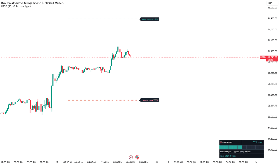
Range Fuel GaugeRANGE FUEL GAUGE — HOW MUCH OF TODAY'S RANGE IS LEFT, AS EXACT PRICES
Every instrument has a typical daily range. Once today's session has consumed most of it, breakout odds statistically fade and mean-reversion setups gain relevance. This indicator turns that idea into two things you can actually trade with: a live fuel gauge and two concrete price levels.
WHAT IT SHOWS
- Fuel panel — how much of the typical daily range today has already used (e.g. "79% used"), with a 10-segment bar that shifts green → amber → red, plus today's range, the typical range, and the points still left
- Upper room level — day low + typical range: the statistical ceiling for today if this session behaves like a typical recent session
- Lower room level — day high − typical range: the statistical floor on the same basis
- A side's room level automatically hides once that side of the range is fully consumed
HOW IT WORKS
1. The indicator stores the high-low range of the last N completed sessions (default 20)
2. Typical range = the Nth percentile of those ranges (default P80, adjustable 50-95)
3. Fuel used = today's developing range ÷ typical range
4. Room levels are simple arithmetic from today's day high / day low and the typical range — they tighten as the day's range expands
HOW TRADERS USE IT
- Fuel below 60% (green) — the day still has energy; breakout and continuation trades have statistical room
- Fuel 60-90% (amber) — range maturing; trail tighter, be selective with fresh breakouts
- Fuel above 90% (red) — the typical range is nearly spent; chasing moves is statistically poor, fade setups toward the day's value become relevant
- Room levels act as realistic intraday targets — for example, a long taken mid-session can use the upper room price as a statistically grounded objective
NOTES
- The room levels are statistical references built from this symbol's own recent history — they are not a forecast, and price can and does exceed them on trend days
- Historical ranges come only from completed sessions and never change after the fact; today's reading updates live as the session develops (by design)
- Alert included: fires when today's range crosses 100% of the typical range
- Panel position is selectable (8 positions); prices are shown as integers
- Works on any symbol; designed for intraday timeframes
This is an original implementation in Pine Script v6. The percentile logic and level arithmetic are fully described above.
Educational tool for market context — not financial advice. Indicador
Indicador

Estratégia

Garman-Klass-Yang-Zhang Regime Map [forexobroker]Garman-Klass-Yang-Zhang Regime Map combines three of the most efficient single-bar volatility estimators — the overnight gap return, the open-to-close drift term, and Rogers-Satchell intraday variance — into one GKYZ sigma with a drift-correction constant k. Each bar's GKYZ value is then ranked against its rolling 100-bar percentile and the regime is colored Low (green), Medium (yellow), or High (red) directly on the price chart. The unique angle is using a research-grade variance estimator instead of plain ATR, then trading the transitions — not the levels — of the regime ribbon.
🔶 ALGORITHM
1. Three components per bar: overnight gap log(open/prev close)^2, open-to-close log(close/open)^2, Rogers-Satchell log(H/C) log(H/O) + log(L/C) log(L/O).
2. Drift-correction k = 0.34 / (1.34 + (N+1)/(N-1)) (Yang-Zhang scaling); GKYZ per-bar variance = gap + k oc + (1-k) RS.
3. Rolling GKYZ variance over volatility window (default 20) divided by N, then sqrt; this is sigma_GKYZ.
4. Sigma_GKYZ is ranked across a percentile window (default 100); thresholds default to 33 and 66.
5. Regime classification: Low if below 33rd percentile, Medium if between, High if above 66th.
6. Signals fire on transitions, not on levels: a Low->Medium->High ladder over three confirmed bars is a momentum-direction breakout entry; a High-then-Low contraction (regime hit 2 within the last five bars and is now 0) is a counter-momentum mean-reversion entry.
🔶 SIGNAL LOGIC
- Buy: (Low->Medium->High three-bar ladder AND close > close ) OR (recent High then current Low AND prior momentum was bearish) AND session filter passes AND position is not already long AND cooldown bars elapsed AND barstate.isconfirmed.
- Sell: (Low->Medium->High three-bar ladder AND close < close ) OR (recent High then current Low AND prior momentum was bullish) AND session filter passes AND position is not already short AND cooldown bars elapsed AND barstate.isconfirmed.
The ladder is a breakout pattern, the spike-back is a mean-reversion pattern, both gated by direction.
🔶 INPUTS
- GKYZ Calculation group: volatility window default 20, percentile window default 100, Low/High percentile defaults 33/66.
- Signal Logic group: momentum lookback default 5, cooldown bars default 15.
- Filters group: session restriction (default 0000-2400).
- Visual group: regime ribbon toggle, dashboard, 3-layer glow, three regime colors, buy and sell colors.
🔶 ALERTS
GKYZ Buy, GKYZ Sell, GKYZ Any Signal, GKYZ Enter High, GKYZ Enter Low, GKYZ Ladder Up, GKYZ Spike Back, GKYZ Regime Change, GKYZ Vol Up, GKYZ Vol Down, GKYZ Webhook JSON.
🔶 LIMITATIONS
- GKYZ assumes log-OHLC are jointly normal; very large gaps or limit moves can produce occasional outliers that dominate the variance term.
- The percentile window classifies the current bar relative to a 100-bar history; on a brand-new regime that lasts longer than the window, the script will eventually re-rank the new baseline and stop firing fresh entries.
- The ladder pattern needs three consecutive confirmed bars to transition Low->Medium->High; sharp single-bar moves that skip Medium will not fire that path.
- Defaults are tuned for NQ and other index futures on intraday timeframes; instruments with persistent overnight gaps inflate the gap term and bias the regime high.
- The spike-back path uses the highest regime over the last five bars, so an isolated High bar followed by a brief retracement can register as a contraction even if the broader regime is still elevated.
Indicador

Indicador

Keltner Channel ATR StretchKeltner Channel ATR Stretch is a Keltner Channel variant designed to show trend bias, price stretch, and volatility width in one compact view.
The script uses an EMA basis with ATR-scaled upper and lower bands. In addition to the channel itself, it normalizes the selected Source's distance from the EMA basis as Stretch, normalizes the EMA basis slope in ATR units as Bias, and ranks the current channel width against its recent min-max range as Width Rank.
The goal is not to create trade signals. The goal is to make the current chart state easier to read: whether price is inside the channel, moving with a trend bias, pulling back toward the basis, stretching beyond the outer band, reaching an extreme band, or returning inside the channel after an outside move.
Dashboard reading:
Bias shows the EMA basis direction normalized by ATR:
Bullish, Bearish, or Neutral.
Position shows where the selected Source is relative to the channel:
Trend Zone, Pullback, Upper Stretch, Lower Stretch, Extreme, or Inside.
Volatility shows the current channel width regime:
Quiet, Normal, or Expanded.
Stretch shows the distance from the EMA basis in outer-channel units.
A value near +1 means price is near the upper outer band.
A value near -1 means price is near the lower outer band.
Slope shows the EMA basis slope in ATR units.
Width Rank shows the current channel width relative to its recent min-max range.
It is a simple 0-100 rank of the current width inside its own recent range, not a statistical percentile.
How it works:
The basis is an EMA of the selected Source.
The outer bands are calculated as:
Basis plus or minus ATR multiplied by the ATR Multiplier.
The inner bands are a fractional zone inside the outer channel.
The optional extreme bands are a wider reference zone outside the outer channel.
Stretch is calculated as:
Source minus Basis, divided by the outer channel half-width.
Slope is calculated as:
Current EMA basis minus the basis from the selected lookback, divided by ATR.
Width Rank compares the current channel width to the lowest and highest channel width over the selected Width Rank Lookback.
Markers and alerts:
Upper stretch and lower stretch mark movement beyond the outer bands.
Upper extreme and lower extreme mark movement beyond the optional extreme band level.
Upper return inside and lower return inside mark when the selected Source moves back inside the outer channel after being outside it.
Trend bias changed marks a change in the ATR-normalized EMA basis direction.
Width regime changed marks a change between Quiet, Normal, and Expanded width states.
The Confirmed bars only setting is enabled by default. When it is enabled, markers and alerts evaluate only on closed bars. The dashboard reflects the current chart state, including the still-forming bar.
This is not a trading system. It is a visual analysis tool for reading channel position, trend bias, and volatility context. It does not provide trade instructions, entries, exits, or performance claims.
Limitations:
Keltner Channels are volatility-based bands and can expand or contract as ATR changes.
A stretch beyond a band does not necessarily mean price must reverse.
A quiet width regime does not guarantee expansion.
A bullish or bearish bias does not predict future direction.
Use this tool together with your own market context and risk management.
No financial advice.
This open-source script was written from scratch using Pine Script built-ins. No third-party Pine code was reused.
日本語補足:
Keltner Channel ATR Stretch は、EMAを中心にATR幅のチャネルを表示しながら、価格の伸び、EMAの傾き、チャネル幅の状態を同時に確認するためのインジケーターです。
右上のDashboardでは、Bias、Position、Volatilityを中心に、現在のチャート状態をすばやく確認できます。
Bias はATRで正規化したEMAの傾きです。
Position は価格がチャネル内、トレンドゾーン、押し目、上方向または下方向の伸び、極端な伸びのどこにあるかを示します。
Volatility はチャネル幅がQuiet、Normal、Expandedのどの状態にあるかを示します。
このスクリプトは売買システムではありません。
BUY/SELL、エントリー、利確、損切りを指示するものではなく、トレンド・行き過ぎ・ボラティリティの状態を読みやすくするための視覚補助ツールです。 Indicador

Indicador

VXX True Session Expansion Card# VXX True Session Expansion Card
## Overview
The VXX True Session Expansion Card is a volatility analysis tool designed for futures traders who want to understand how much of the market's expected daily movement has already been consumed throughout the trading session.
Unlike traditional volatility indicators that only display expected range, this indicator compares projected volatility against actual session expansion and helps traders determine whether the market still has room to move or is becoming stretched.
The indicator was developed specifically for session-based trading of futures markets such as MNQ, NQ, MES, ES, MGC, and similar instruments.
---
## Core Concept
The indicator treats volatility as a daily "budget."
First, an estimated daily range is calculated using the VXX volatility index:
VXX ÷ 16 = Expected Daily Volatility %
The expected percentage move is then applied to the Globex session opening price (6:00 PM Eastern Time):
Globex Open × Volatility % = Projected Daily Range
This projected range represents the market's estimated daily volatility budget.
The indicator then measures how much of that budget has been consumed as the trading day progresses.
---
## Session-Based Expansion Analysis
The indicator divides the futures trading day into three primary sessions:
• Asia Session (6:00 PM ET – 2:00 AM ET)
• London Session (3:00 AM ET – 8:00 AM ET)
• New York Session (8:00 AM ET – 5:00 PM ET)
Instead of measuring overlapping session ranges, the indicator focuses on non-overlapping expansion.
### Asia Range
Asia establishes the initial trading range.
Asia Range = Asia High − Asia Low
### London Expansion
London only counts new movement outside of the established Asia range.
Examples:
• New highs above Asia High
• New lows below Asia Low
Any movement occurring inside the Asia range is ignored.
### New York Expansion
New York only counts new movement outside of the combined Asia and London range.
This approach prevents double-counting volatility and provides a more accurate measure of true market expansion.
---
## Volatility Budget Tracking
The indicator calculates:
• Projected Daily Range
• Actual Expanded Range
• Remaining Range Available
This allows traders to determine whether the market has:
• Significant room left to expand
• Consumed most of its expected daily volatility
• Exceeded projected volatility
---
## Volatility Status System
To simplify interpretation, the indicator automatically classifies market conditions into four categories.
### 🟦 Plenty Left
Less than 50% of projected volatility has been consumed.
Interpretation:
The market still has substantial room for expansion.
### 🟩 Healthy
50%–80% of projected volatility has been consumed.
Interpretation:
Normal market conditions.
### 🟨 Caution
80%–100% of projected volatility has been consumed.
Interpretation:
The market is becoming extended and traders should be more selective when pursuing continuation trades.
### 🟥 Stretch
More than 100% of projected volatility has been consumed.
Interpretation:
The market has exceeded projected volatility expectations and may be more vulnerable to consolidation, profit-taking, failed breakouts, or reversals.
---
## News Day Volatility Adjustment
Major economic events can cause actual volatility to significantly exceed standard projections.
The indicator includes a Volatile Day Multiplier that allows traders to adjust expected range calculations.
Suggested values:
• 1.00x = Normal Trading Day
• 1.25x = Moderately Volatile Day
• 1.50x = High Volatility Day
• 1.75x–2.00x = Extreme Volatility Events
Examples include:
• CPI
• FOMC
• Non-Farm Payrolls (NFP)
• Major Central Bank Announcements
• Unexpected Geopolitical Events
---
## Compact Dashboard Mode
The indicator includes a Compact Mode designed for traders who prefer a simplified view.
Users can selectively display:
• News Day Reminder
• Globex Open
• Adjusted Full Range
• True Percent Used
• Volatility Status
Additional fields can be enabled or disabled individually to create a personalized dashboard.
---
## Intended Use
This indicator is designed to assist traders with:
• Session-based trading
• ICT / Smart Money Concepts
• Liquidity sweeps
• Session range expansion studies
• Market structure analysis
• Intraday volatility assessment
• Trade management
• Risk management
The indicator is not intended to generate buy or sell signals.
Instead, it provides contextual information about volatility consumption and remaining expansion potential throughout the trading day.
---
## Disclaimer
This indicator provides volatility estimates and market context only. Projected ranges are not guarantees of future market movement. Traders should combine this tool with their existing analysis, risk management, and trading methodology.
Indicador

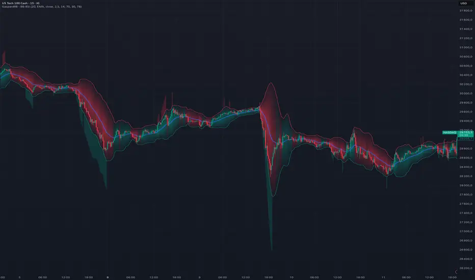
Gaspard98 - Bollinger Bands - RSI# Gaspard98 — Bollinger Bands · RSI
**Bollinger Bands reimagined: a dynamic trend background painted inside the bands, and overbought/oversold RSI readings projected directly outside them.**
---
## Overview
This indicator takes the classic Bollinger Bands and adds two layers of visual reading designed to help you decide faster, without leaving the price chart:
1. **A dynamic trend background** painted *only inside* the bands (between the upper band, the basis, and the lower band). Its color shows the bias (bullish / bearish) and its **intensity changes in real time** with the strength of the move.
2. **Overbought / oversold (RSI) zones** projected *above and below* the bands, lighting up only when the RSI crosses its thresholds. This lets you combine volatility (Bollinger) and momentum (RSI) at a single glance, without a separate oscillator at the bottom of the screen.
The goal: keep the readability of a clean chart while making the context (trend + momentum extremes) immediately obvious.
---
## The concept
Bollinger Bands measure volatility around a moving average, but on their own they say nothing about either **directional bias** or **momentum state**. This tool fills both gaps directly on the overlay:
- **Trend** — price above the basis = bullish context; below = bearish context. The background turns this bias into color.
- **Strength** — the further price moves from the basis relative to current volatility, the denser the background — a sign that a push is either fading or accelerating.
- **Momentum extremes** — the RSI flags overbought/oversold zones. Instead of a separate panel, the information is brought back onto the price, exactly where it matters.
---
## How it works
### 1. Bollinger Bands
Basis = a moving average (SMA, EMA, SMMA/RMA, WMA or VWMA, your choice). The upper and lower bands sit at `± StdDev × standard deviation` from the basis. Standard settings: length 20, multiplier 2.0.
### 2. Dynamic trend background
The background is gradient-based: dense color at the basis, fading progressively toward each band, creating a "trend core" effect rather than a flat fill.
- **Green** when price is above the basis (bullish bias).
- **Red** when price is below it (bearish bias).
- In **dynamic intensity** mode, the background density is derived from `|price − basis| / standard deviation`. In practice: a trend that pushes hard produces a vivid background, a market reverting to its mean produces a more subdued one.
### 3. RSI OB/OS zones (outside the bands)
An RSI computed in the background triggers two colored zones projected outside the bands:
- **Red zone above the upper band** when the RSI reaches the **overbought** threshold.
- **Green zone below the lower band** when the RSI reaches the **oversold** threshold.
These zones only appear on the bars where the condition is met, making them a punctual marker rather than a permanent fill.
---
## Inputs
**Bollinger**
- *Length* — moving-average period (default 20).
- *Basis MA Type* — moving-average type: SMA, EMA, SMMA (RMA), WMA, VWMA.
- *Source* — calculation source (default: close).
- *StdDev* — standard-deviation multiplier for band width (default 2.0).
**Trend**
- *Color inside the bands* — toggles the background on/off.
- *Dynamic intensity* — modulates density by strength; off = constant fill.
- *Bullish / Bearish* — customizable colors.
**RSI**
- *OB/OS zones outside bands* — toggles the zones on/off.
- *RSI Length* — RSI period (default 14).
- *Overbought (OB)* — upper threshold (default 70).
- *Oversold (OS)* — lower threshold (default 30).
- *Zone transparency* — opacity of the projections.
---
## How to use it
- **Read the context first.** A dense green background = bullish push underway; a background that pales as price returns toward the basis = loss of momentum / mean reversion.
- **Spot the extremes.** A red zone above the upper band (RSI overbought) while price tags that band signals possible exhaustion; the mirror logic applies to the green oversold zone.
- **Combine both signals.** The most telling context appears when background and RSI zone line up: for example, a bullish background that intensifies *without* triggering overbought suggests a healthy trend; a bullish background *with* clear overbought at the upper band calls for more caution.
Adapt the RSI thresholds and the multiplier to your instrument and timeframe. The defaults suit indices and CFDs on intraday timeframes but deserve tuning to the volatility of the underlying.
---
## Originality
Most Bollinger derivatives simply color the space between the bands or add crossover signals. Here, two specific ideas:
- The background is **bounded inside the bands** and **gradient-mapped around the basis**, with intensity indexed to volatility — not a binary solid fill, but a continuous reading of strength.
- The RSI zones are **projected outside the bands** rather than shown in a separate panel, fusing momentum and volatility onto a single reading plane.
---
## Disclaimer
This indicator is a market-reading and visualization tool. It does not constitute investment advice or a buy/sell recommendation. Past performance is not indicative of future results. You remain solely responsible for your decisions and your risk management.
---
*Published by Gaspard98. Feedback and suggestions welcome in the comments.* Indicador
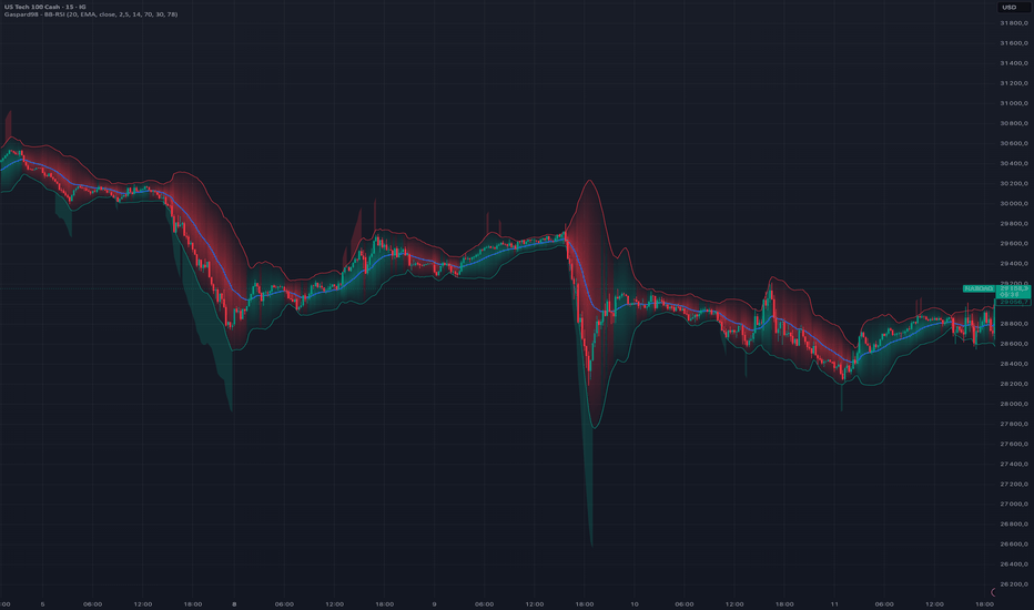
Volatility Band Cloud with Overextension SignalsVolatility Band Cloud with Overextension Signals is a Bollinger Band-style volatility envelope designed to make price overextension easier to visualize.
The script uses a 100-period simple moving average as the centerline and plots volatility bands based on standard deviation from that average. The outer bands are set at +/- 2.5 standard deviations, while the inner bands are set at +/- 1.0 standard deviations.
The area between the centerline, inner bands, and outer bands is shaded to create a visual volatility cloud. This helps traders quickly see whether price is trading near the middle of its range, pushing into an upper extension zone, or falling into a lower extension zone.
The indicator also includes optional overextension markers:
- Upper Band Tag: price crosses above the upper outer volatility band
- Lower Band Tag: price crosses below the lower outer volatility band
These markers are not intended to be automatic buy or sell signals. They are visual alerts showing when price has moved outside the selected volatility envelope. Traders can use them as potential exhaustion, mean-reversion, or risk-management reference points when combined with trend, volume, support/resistance, and broader market context.
What makes this script useful is the combination of:
- Adjustable volatility band length
- Adjustable inner and outer standard deviation levels
- Multi-zone cloud shading
- Optional overextension markers
- Cleaner visual interpretation of volatility expansion and contraction
This script is published open-source so users can inspect the calculations and adapt the settings to their own process. Indicador

ADR percentage Completion Table Real-Time Daily Range Tracker ET📊 ADR % Completion Table
Track how much of the Average Daily Range (ADR) has been consumed in real time — works correctly on every timeframe from 1 minute to weekly.
─────────────────────────────────
🔍 WHAT IT DOES
─────────────────────────────────
This indicator calculates the 14-day Average Daily Range and compares it to the current day's high-to-low range, showing you exactly what percentage of the ADR has been reached so far today.
The daily session resets at 00:00 UTC-4 (New York midnight), making it ideal for forex, indices, and US equity traders.
─────────────────────────────────
📋 TABLE DISPLAY
─────────────────────────────────
- ADR (14d) — the average daily range over the last 14 completed days
- Day High / Day Low — intraday extremes since session open (00:00 UTC-4)
- Today Range — current high-to-low range in price points
- ADR % — percentage of ADR consumed (color-coded)
- Remaining — how many points are left to complete the ADR
─────────────────────────────────
🎨 COLOR CODING
─────────────────────────────────
🔘 Grey → 0–49% (early in the day)
🔵 Blue → 50–74% (halfway through)
🟠 Orange → 75–99% (nearing completion)
🟢 Green → 100%+ (ADR fully reached)
─────────────────────────────────
⚙️ SETTINGS
─────────────────────────────────
- ADR Lookback — customize the number of days (default: 14)
- Table Position — 8 placement options
- Text Size — Tiny to Huge
- Show/hide Day High & Low lines on the chart
─────────────────────────────────
✅ KEY FEATURES
─────────────────────────────────
✔ Timeframe-independent — ADR value is identical on 1m, 15m, 1h, 4h, and daily charts
✔ Session-accurate — day range always starts at 00:00 UTC-4 regardless of chart timezone
✔ Clean overlay table — no clutter, just the numbers that matter
✔ Works on all instruments — forex pairs, indices, stocks, futures, crypto
─────────────────────────────────
💡 HOW TO USE IT
─────────────────────────────────
When ADR % is low (grey/blue) early in the session, the market still has room to move. When it reaches orange or green, price has covered most or all of its expected daily range — useful for managing targets, avoiding late entries, and timing exits.
Best used alongside your existing strategy as a context filter, not a standalone signal.
Indicador

GC Trend-Pullback Volume Gate Signal Indicator A trend-following pullback signal tool for COMEX gold, ported from a strategy validated on GC 1H data. It marks re-entries in the direction of the higher-timeframe trend, confirmed by a volume gate, and plots the intended stop/target frame for each signal.
What it does
Trades only with the trend: long signals when the 4H EMA-50 is above EMA-200, shorts when below. The trend filter reads the previous completed HTF bar with lookahead_off, so it does not repaint.
Signals on RSI(14) re-entry after a pullback — cross up through 40 in uptrends, cross down through 60 in downtrends.
Fires only when volume is at or above its 20-bar average. This volume gate is the validated edge.
Plots an entry/stop/target frame (1.5×ATR stop, 2.0 R:R by default) so you can see the geometry of each signal. The frame is illustrative — this is an indicator, not a backtest, so it shows intent, not fills.
Built-in alerts: named conditions for long/short in the Create Alert dialog, plus a dynamic-price alert() option. Set alerts to Once Per Bar Close to match the tested bar-close logic.
Data requirement — read before using
The volume gate depends on real volume, so a real-time data feed for the instrument is needed for live signals. On GC and other CME/COMEX futures, TradingView volume is true contract volume — exactly what this was built on. On spot/CFD gold (XAUUSD), volume is only tick volume, a different quantity, and the edge does not carry over. Run it on the futures.
Suggested use
GC1! (or the live front month) on the 1H timeframe, with the higher-timeframe trend filter at 240 (4H) — the configuration it was validated on. Note that GC1! is an auto-rolled continuous contract, so expect minor discontinuities at each roll; trade the actual front month live. Real-time COMEX volume on TradingView requires the CME/COMEX real-time data add-on — without it the feed is delayed and live signals will lag.
Scope
The underlying logic was validated on a single ~10.5-month gold uptrend, so treat signals as a starting point, not a finished system, and confirm behavior across other regimes before relying on it.
Research and educational tool, not financial advice. Markets carry risk; past behavior does not guarantee future results. Indicador