Adaptive Momentum Strength Score (AMSS)There is a specific kind of frustration that every serious trader knows.
The setup looks right. The candle closes with conviction. The oscillator confirms. You enter and the move immediately stalls, reverses, or dissolves into noise. Later you realize the volume was weak, volatility never truly expanded, or directional pressure had already started fading before the entry.
That frustration is not a discipline problem. It is an information problem.
Most momentum indicators measure one piece of the puzzle. RSI measures price velocity. Volume indicators measure participation. Bollinger Bands measure volatility state. Each tells part of the story. The Adaptive Momentum Strength Score was built on the conviction that momentum quality can only be evaluated meaningfully when several complementary market forces are read together, not after the fact, but simultaneously, on every bar.
The Core Framework
The purpose of the composite score is straightforward: to answer not just whether price is moving, but whether the move is supported by the conditions that tend to give momentum its staying power.
The score is normalized between 0 and 100 and built from three independent components. The first measures candle impulse relative to ATR not raw candle size, but how decisive the current bar is in the context of what normal looks like for this asset right now. The second measures volume participation by comparing current volume against its moving average, distinguishing genuine momentum expansion from the kind of low-participation drift that precedes failed breakouts far more often than it precedes continuation. The third measures volatility expansion through Bollinger Band width relative to its own average, detecting the transition from compression into expansion as a market begins releasing stored energy.
Each component is independently normalized before combining. By default, volume participation carries the greatest weight of the three — a deliberate choice reflecting the observation that genuine participation tends to be the most reliable differentiator between momentum that follows through and momentum that fades. Candle impulse and volatility expansion carry equal secondary weight, acknowledging that decisive price movement and volatility expansion both contribute meaningfully to momentum quality without either being treated as a primary condition on its own. All weights remain fully adjustable for traders who prefer a different emphasis across different assets or timeframes.
What separates this framework from most traditional oscillators is that momentum strength, directional pressure, market regime, momentum acceleration, and signal confirmation are kept as independent layers that work together while remaining individually interpretable. The goal is not to compress everything into a single binary output but to provide a structured view of how momentum is developing and whether broader conditions are genuinely supportive.
Adaptive Thresholds
A composite score is only as useful as the threshold that determines when it becomes meaningful.
The indicator supports two threshold modes. Fixed mode works cleanly in stable trending environments where volatility expression is consistent. Adaptive mode the recommended default calculates the threshold dynamically using rolling score averages and standard deviation scaling, then clamps it within a defined range. As market character shifts, the threshold recalibrates automatically rather than forcing traders to manually adjust a static level every time volatility conditions change.
The practical consequence is worth understanding directly. In a static-threshold oscillator, a compression phase floods the chart with false crossovers while a genuine expansion phase can produce delayed or missed signals. The adaptive threshold adjusts to both conditions without intervention. The active level is always displayed as the orange reference line, there is never ambiguity about where the signal boundary sits.
The score is additionally classified into Weak, Moderate, and Strong states relative to the active threshold, allowing momentum quality to be evaluated quickly without relying on raw numerical values alone.
Directional Pressure
The score measures momentum magnitude. Direction is handled through a completely separate layer.
Directional bias is established through a two-part confirmation test on every bar. Price must sit on the correct side of a short-period directional EMA, and the average ATR-normalized candle direction over the recent lookback must clear a pressure threshold, meaning a single extended wick or isolated candle cannot flip the directional label on its own. The result is a three-state classification that updates in real time: Bullish, Bearish, or Neutral. This label colors the score line and feeds directly into the signal confirmation logic.
Regime Classification
Not all momentum signals carry equal weight. A score crossover during an expanding market is a categorically different event from the same crossover inside a compressed, coiling environment and treating them identically is one of the more common ways momentum-based approaches produce inconsistent results.
The indicator measures the range of the score over a lookback window and classifies conditions into three states. Compressed means the score has been operating within a narrow band, the market is coiling, energy may be building, and momentum signals in this state generally exhibit lower follow-through and greater variability, although strong expansions can emerge from prolonged compression. Balanced reflects normal trending or ranging conditions. Expanding means the score range has broken above the expansion threshold the market is releasing energy, and momentum signals carry stronger continuation characteristics during this state.
Regime classification can be applied as a filter to triangle signals or used purely as context within the dashboard.
Momentum Velocity
Knowing where the score is tells you the current momentum level. Knowing how fast it is changing tells you something more useful, where momentum is likely heading before price makes it obvious.
The velocity engine calculates the rate of change of the score relative to its own standard deviation, producing a normalized reading that classifies momentum as Accelerating, Decelerating, or Flat. When the score is rising rapidly against its recent volatility baseline, conditions are classified as Accelerating. When the score is fading even if it remains above the threshold the label shifts to Decelerating, and the score line renders at reduced opacity as a visual signal that underlying momentum may be exhausting before price visibly reacts.
For traders who have held into momentum reversals that showed no obvious price-level warning, this layer provides an early internal warning signal within the indicator's architecture that conditions are beginning to shift.
Two Signal Tiers
The indicator produces signals on two distinct levels, and the distinction between them is worth understanding precisely.
Threshold dots appear whenever the score crosses the active threshold while directional pressure is already aligned. They are intentionally sensitive as early directional momentum awareness signals indicating that conditions are beginning to strengthen, even though the broader filter stack may not yet be confirmed. Experienced traders use them to shift attention and begin evaluating whether a fuller setup is developing.
Triangle signals are the fully confirmed output. A triangle only appears when the score crosses the threshold, directional pressure agrees, and every enabled filter in the active gate stack also confirms simultaneously. This is not a smoothed version of the dot signal. It is a categorically different signal type representing the convergence of multiple independent conditions at the same moment.
The separation is deliberate. Dots keep traders informed of developing momentum. Triangles reserve the strongest visual output for the moments that genuinely earn it.
The Signal Gate Stack
Before any triangle reaches the chart it passes through up to four independent gates, stackable in any combination.
The current-timeframe EMA filter blocks signals running counter to local trend structure. The higher-timeframe EMA filter adds a structural second opinion from a broader timeframe, 4-hour by default with an option to use only confirmed closed bars to avoid incomplete higher-timeframe calculations. The regime filter restricts signals during compressed conditions or limits them to expanding phases only. The cooldown gate enforces a minimum bar gap between consecutive signals, suppressing the cluster of repeat triggers that commonly fire around a single momentum event and dilute signal quality.
The dashboard always displays exactly which gates are active. Traders never need to guess why a triangle did or did not appear, the filter logic is visible at all times.
Reading the Indicator: A Practical Workflow
1. Assess market regime first . Check the Info Table before anything else. Compressed conditions mean the score has been coiling in a tight range crossovers here often require greater selectivity, as follow-through tends to be less reliable until expansion begins, and participation should be approached more selectively. Expanding conditions deserve closer attention, as momentum signals generally carry stronger continuation characteristics during these phases.
2. Verify directional alignment. Confirm that the score line color and the Direction label in the dashboard match your intended trade direction. A technically valid score crossover against prevailing directional pressure is a lower-quality setup by design.
3. Watch for the threshold dot on the score pane . A small circle plots on the score line the moment momentum crosses the active threshold while directional pressure is already aligned. This is your early awareness signal. It means conditions are beginning to strengthen, but the broader confirmation stack may not yet be complete. Use it to shift attention to the price chart, not necessarily to trigger execution.
4. Wait for the triangle on the price chart . The triangle is the confirmed execution signal. It only appears when the score has crossed the threshold, directional pressure agrees, and every enabled gate in your active filter stack has confirmed simultaneously. Depending on your settings, this may include EMA alignment, regime validation, and cooldown logic. No triangle means at least one required condition has not been met, regardless of how the score looks in the pane below.
5. Check momentum velocity before entry. An Accelerating label at the point of the triangle adds meaningful weight to the setup. A Decelerating label on an otherwise valid triangle is a caution not necessarily a reason to avoid the trade, but a reminder that momentum quality may be less aggressive, follow-through may develop more gradually, or reversal risk may be beginning to increase.
6. Manage the trade with velocity as context, not as a standalone exit signal . If the score remains above or near the threshold but the line has dimmed signaling Decelerating momentum the move may be losing force even while price continues in the same direction. This does not automatically invalidate the trade or imply immediate exit. Instead, use velocity as an additional layer of context alongside price structure, trend conditions, and your existing risk-management framework.
What This Indicator Is Designed For
The Adaptive Momentum Strength Score is not a standalone trading system and does not attempt to be one. It is a momentum context engine — a structured framework for evaluating whether the conditions behind a price move reflect genuine strength and participation or whether they represent the kind of isolated, low-quality momentum that tends to produce less reliable continuation.
Every design decision in this script traces back to a single conviction: durable edge in trading does not come from reacting faster to a single signal. It comes from reading multiple independent market forces simultaneously and acting only when they converge. That is what this indicator was built to do and that is the only thing it claims to do well.
My Scripts/Indicators/Systems are for educational purposes only! Indicador

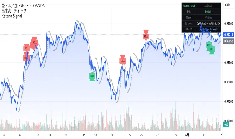
Katana Signal AUDCAD Mean-Reversion Entry IndicatorThis indicator visualises the entry logic behind Katana EA v1.4
— an MT4 Expert Advisor I developed privately in 2022 and have
been running on a live account ever since.
━━━━━━━━━━━━
HOW THE SIGNAL WORKS
━━━━━━━━━━━━
Entry is triggered only when TWO conditions align on the prior
closed bar (shift=1, no repainting):
BUY signal:
• RSI reaches oversold extreme
• Parabolic SAR is below the prior bar's low
SELL signal:
• RSI reaches overbought extreme
• Parabolic SAR is above the prior bar's high
Both conditions must be true simultaneously.
Single-indicator entries are filtered out.
━━━━━━━━
WHY AUDCAD
━━━━━━━━━
AUD and CAD are both commodity-linked currencies that move
together the majority of the time. When they temporarily
diverge — due to oil price moves, RBA/BOC policy divergence,
or risk sentiment shifts — mean-reversion setups have strong
structural reasons to work.
This makes AUDCAD one of the cleanest pairs for this type
of strategy. The correlation rarely breaks permanently,
which limits the risk of runaway adverse moves.
━━━━━━━━
DISPLAY SETTINGS
━━━━━━━━━
• BUY signal → green triangle below bar
• SELL signal → red triangle above bar
• Parabolic SAR → grey dots (standard display)
• Background highlight on signal bars (can be disabled)
• Info table top-right: SAR direction, current signal status
Strategy parameters are optimised internally and not exposed
— this prevents unintended parameter changes that could
degrade performance.
━━━━━━━━━
MT4 AUTOMATION
━━━━━━━━━━
This indicator shows the entry signals visually.
The automated version (Katana EA v1.4) executes these
entries on MT4 with:
• Dynamic lot sizing — auto-scales with account balance
• Martingale position scaling (max 8 positions)
• Hard stop-loss + 8-hour cooldown after each SL event
• Active hours filter (London + New York session only)
51-month backtest results (Mar 2022 – May 2026):
✓ Net profit: +6,717% on ¥150,000 starting capital
✓ Win rate: 96.5% per trade cycle
✓ Profit factor: 1.54
✓ Stop-losses: 33 in 51 months
✓ Modelling quality: 90% (Every Tick, 60M+ real tick data)
Includes: 2022 Ukraine war oil spike, Trump tariffs,
Middle East conflict periods.
Free 14-day trial + full licence: payhip.com/b/j4d6F
Licence delivery & support: Telegram @KaTa4649
⚠ Requires broker with 500:1 leverage (XM Global recommended)
⚠ Not compatible with US / Canada / UK retail accounts
━━━━━━━━━
RECOMMENDED SETUP
━━━━━━━━━━━━
For visual analysis: use on AUDCAD 1H or 4H
For the automated EA: runs on AUDCAD M5
Broker: XM Global Standard Account (JPY or USD)
Min capital: ¥150,000 or $1,000 USD Indicador

Fair Value Gap Fill Probability [PickMyTrade]Fair Value Gap Fill Probability applies a Gaussian Naive Bayes classifier — trained entirely within Pine Script® v6 — to every Fair Value Gap it detects, in order to estimate the posterior probability that each gap will be filled before it expires. Instead of treating all FVGs as equal, it asks a different question: given this gap's order-flow signature, geometry, and the time price has already spent nearby, how likely is it to actually fill?
――――――――――――――――――――――――――――――――――――――
🔷 WHAT IT MEASURES
🔸 Fair Value Gaps
A Fair Value Gap is the three-candle imbalance where an impulsive move leaves a price range untraded. A bullish FVG forms when the high of two bars ago sits below the current low; a bearish FVG forms when the low of two bars ago sits above the current high. Each gap is detected only on confirmed bar closes and is filtered by a minimum size relative to ATR, so noise gaps are ignored.
🔸 Three classifier features
When a gap forms, the classifier records three z-score normalised features that describe its context:
F1 — CVD Momentum : the rate of change of Cumulative Volume Delta at the moment the gap is created, normalised by its rolling mean and standard deviation. This encodes whether aggressive order flow was accelerating or fading as the imbalance formed.
F2 — Gap Geometry : the size of the gap expressed as a multiple of ATR. Larger relative gaps behave differently from small ones, and this feature lets the model separate the two.
F3 — Time-at-Price : the fraction of recent bars whose close fell inside the gap's price band. A zone the market has already revisited carries different fill odds than fresh, untested space.
🔸 Fill vs no-fill outcomes
Every gap is followed until one of two things happens: price trades to the gap's midpoint (a fill ), or the gap survives past the expiry window untouched (a no-fill ). Each resolved gap becomes a labelled training example, so the model learns continuously from the chart's own history.
――――――――――――――――――――――――――――――――――――――
🔷 THE CLASSIFIER
🔸 Welford online learning
Rather than storing arrays of past gaps, the classifier keeps running sufficient statistics — count, mean and variance — for each (feature × outcome) pair using Welford's numerically stable online update. Parameters shift gradually as market conditions change, with no fixed lookback buffer.
🔸 Gaussian likelihood + Bayesian posterior
Each feature is modelled as a Gaussian distribution under both the fill and no-fill classes. The three per-feature likelihoods are multiplied under the Naive Bayes independence assumption, combined with an empirically updated class prior, and normalised via Bayes' theorem to produce P(fill | F1, F2, F3) for the live gap. A warmup gate suppresses probabilities until enough fill and no-fill samples have accumulated, at which point the info table switches to LIVE.
――――――――――――――――――――――――――――――――――――――
🔷 SIGNALS AND DISPLAY
🔸 Probability-shaded zones
Each active FVG is drawn as a translucent zone with a crisp coloured border — blue for bullish, orange for bearish. The fill intensity scales with the posterior across three tiers, so a high-conviction gap reads instantly against a faint, low-probability one. Filled gaps turn grey so mitigation is obvious.
🔸 Live probability labels
Every open gap carries a running " X% fill " label that updates each bar as the classifier re-evaluates it. When a gap clears the high-probability threshold, a bold callout (" Bullish FVG · 81% fill prob ") marks it directly on the chart.
🔸 Info table
The corner table reports the live state — fill samples, no-fill samples, active gaps, CVD flow direction, and a LIVE / WARMUP status flag so you always know whether the model has enough data to be trusted.
――――――――――――――――――――――――――――――――――――――
🔷 INPUTS
ATR Period — basis for the minimum gap-size filter.
Min Gap Size (ATR ×) — gaps smaller than this multiple of ATR are ignored.
Max Active FVGs — cap on simultaneously tracked gaps.
Expire after N bars — unfilled gaps retire as no-fill samples after this many bars.
CVD Momentum Period — lookback for feature F1.
Z-Score Window — normalisation window for all three features.
Warmup Samples Per Class — minimum fill and no-fill samples before probabilities display.
High-Prob Threshold — posterior level that marks a gap as high-conviction.
――――――――――――――――――――――――――――――――――――――
🔷 REQUIREMENTS AND LIMITATIONS
The classifier requires a warmup period before probabilities are valid; on instruments with little history the table will read WARMUP until enough gaps have resolved. The CVD estimator is synthetic — derived from intrabar price position, not true bid/ask data — and is noisier on illiquid symbols. Because all three features are CVD- and geometry-derived, the Naive Bayes independence assumption is only approximately satisfied, so the posteriors are best read as relative confidence scores rather than calibrated frequentist probabilities. Fill rates are also regime- and timeframe-dependent and are historically associated with, not predictive of, future behaviour.
――――――――――――――――――――――――――――――――――――――
Built natively in Pine Script® v6. No external libraries, no data feeds, no fixed lookback arrays. The Gaussian Naive Bayes classifier trains continuously from the chart's own gap history using Welford's online algorithm. Open source — Mozilla Public License 2.0. Indicador

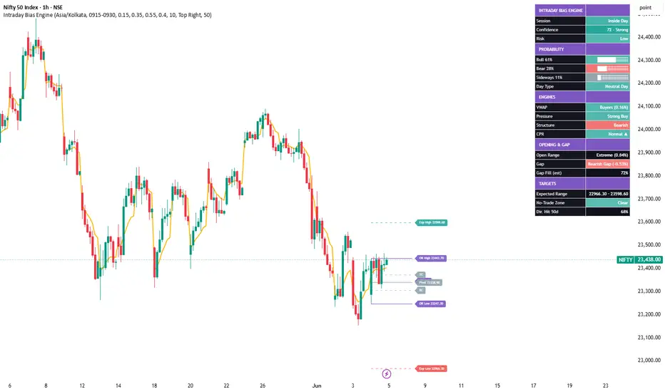
Intraday Bias EngineIntraday Bias Engine
OVERVIEW
A probability-based intraday decision dashboard. After the opening auction it
estimates the highest-probability scenario for the session (bullish, bearish or
sideways), the likely day-type, an expected range and a confidence grade - by
combining several classic intraday models into one read. It is a context and
decision-support tool, not a buy/sell signal generator.
WHAT IT COMBINES
- Opening Range: high/low/mid, width vs the day's ATR, classified Narrow / Normal
/ Wide / Extreme.
- Gap: size and direction vs the previous close, with a transparent gap-fill
estimate (smaller gaps tend to fill more often).
- CPR: pivot, TC, BC, width classification and directional bias.
- VWAP: position, distance and who is in control.
- Market structure: higher-high / higher-low vs lower-high / lower-low.
- Smart-money pressure: a 0-100 score from a volume-delta approximation, relative
volume, range expansion, momentum and VWAP distance.
- Directional probability: a weighted blend of the above, normalised so Bull,
Bear and Sideways always total 100%.
- Day-type, expected range, confidence grade and a basic risk read.
DASHBOARD
A movable panel shows session classification, confidence and grade, Bull/Bear/
Sideways probability meters, the individual engine reads, opening-range and gap
context, the expected range, a no-trade (compression) status and a simple
directional hit-rate over the recent sessions.
ON-CHART
Opening Range, CPR (P/TC/BC), VWAP and expected-range bands are drawn for the
current day only. Compression conditions are highlighted as a faint no-trade zone.
HOW TO USE
1. Use an intraday timeframe on a symbol with reliable volume.
2. The read finalises after the opening-range window closes.
3. Favour setups that agree with the dominant probability and a higher confidence
grade; stand aside when the no-trade zone is active.
4. Treat the levels and probabilities as context for your own plan and risk
management.
NOTES
- Daily anchors use confirmed prior sessions; current-day levels draw forward
only and do not repaint historical bars. The live read updates as the day
develops, which is expected for an intraday model.
- The gap-fill figure and the directional hit-rate are simple estimates, not
performance guarantees.
- This script is for research and education only and is not financial advice. Indicador

ID009 Liquidity Path [ReconHK] A liquidity-focused chart indicator designed to help traders study whether price is reclaiming or holding above a key liquidity pivot, while also checking structural liquidity, traded activity, trend context, relative volume, and buyer-pressure confirmation.
------------------------------------------------------------------------------------------------
## 1. What this indicator is for 🧭
------------------------------------------------------------------------------------------------
Liquidity Path is designed to help traders understand whether price is moving through a healthier liquidity area instead of chasing random breakouts. The indicator builds a liquidity profile from the selected lookback period, finds the main activity area, and marks the Liquidity Pivot, also known as the profile point of control.
The main idea is simple: price action near a high-activity area can be more meaningful than price action in a thin or fragmented area. When price reclaims or holds above the Liquidity Pivot with volume, buyer pressure, and trend support, the setup may show a stronger liquidity path.
This indicator is not a buy-or-sell system by itself. It is a decision-support tool for reviewing liquidity structure, participation, and price behavior around the profile pivot.
The purpose is to help traders avoid late or weak breakouts by checking whether price is close to the main liquidity pivot and supported by participation.
------------------------------------------------------------------------------------------------
## 2. What you see on the chart 👀
------------------------------------------------------------------------------------------------
The indicator can show several visual elements:
Blue liquidity profile : a right-side profile showing where more trading activity happened during the selected lookback.
Orange Liquidity Pivot : the main profile pivot, based on the highest activity area of the profile.
Lookback zone : the chart area used to build the liquidity profile.
EMA 20 and EMA 50 : optional trend-context lines.
Optional bias background : subtle background showing whether price is above or below the Liquidity Pivot.
The blue profile helps the user see where activity is concentrated. Thicker profile areas mean more activity was detected at that price zone. The orange Liquidity Pivot is the key reference level used by the path logic.
When price is above the Liquidity Pivot, the market is trading above the main activity reference. When price is below it, price is trading under that reference and may need a reclaim before the path setup improves.
------------------------------------------------------------------------------------------------
## 3. How to read the Liquidity Pivot 🟠
------------------------------------------------------------------------------------------------
The Liquidity Pivot is the central level of this indicator. It represents the price area with the strongest smoothed activity inside the selected profile lookback.
A reclaim above the Liquidity Pivot can be useful because it shows that price has moved back above a major activity reference. A hold or retest above the pivot can also be important because it may show acceptance above that area instead of only a short-lived breakout.
The indicator checks whether price is:
above the Liquidity Pivot,
not too far above the pivot,
not too extended from the short-term trend,
supported by relative volume,
showing buyer-pressure behavior,
aligned with the trend filter when enabled.
This helps separate cleaner liquidity-path situations from late, extended, or weak moves.
A reclaim is more useful when it happens near the pivot with participation. A move that is already too far above the pivot may be late and riskier.
------------------------------------------------------------------------------------------------
## 4. Suggested workflow ✅
------------------------------------------------------------------------------------------------
A practical workflow:
Start with the default settings.
Keep Liquidity quality on Balanced for most liquid stocks and crypto.
Use the blue liquidity profile to see where activity is concentrated.
Watch the orange Liquidity Pivot as the main reference level.
Check whether price is reclaiming or holding above the pivot.
Use the relative volume setting to require real participation.
Use the trend filter if you want signals to prefer EMA trend alignment.
Avoid acting when price is already too far above the pivot or too extended from the EMA.
Use alerts as chart-review reminders, not automatic trade instructions.
Confirm the setup with your own support, resistance, market structure, news, and risk plan.
The indicator is most useful when the user wants to study whether price is moving from a high-activity base into a stronger continuation path. It is less useful when the market is illiquid, fragmented, or moving with large gaps and weak participation.
------------------------------------------------------------------------------------------------
## 5. Risk notes and correct expectations ⚠️
------------------------------------------------------------------------------------------------
This indicator does not guarantee that price will continue higher after reclaiming the Liquidity Pivot. A reclaim can fail, especially during weak market conditions, low-volume moves, news shocks, or broad market selloffs.
Important reminders:
The Liquidity Pivot is a reference level, not a guaranteed support level.
A path signal is a confirmation event, not a complete trading plan.
Relative volume can confirm participation, but it does not remove risk.
Trend alignment can improve context, but trends can reverse.
Thin or fragmented symbols may produce less reliable readings.
Always define risk, stop logic, invalidation, and exit planning separately.
This script does not place trades, manage positions, set stops, or calculate position size. It should be used only as a decision-support tool.
Use the indicator to organize your liquidity and participation review. Do not use it as a substitute for risk management.
------------------------------------------------------------------------------------------------
## 6. Script structure and originality
------------------------------------------------------------------------------------------------
Liquidity Path is an overlay indicator. It is not a strategy.
The script uses:
* indicator(..., overlay = true)
* plot() for the Liquidity Pivot / POC line
* plot() for optional EMA 20 and EMA 50 lines
* bgcolor() for optional bias background
* box.new() for the right-side liquidity profile
* box.new() for the lookback zone
* label.new() for the pivot label
* alertcondition() for signal and pivot events
The script does not use:
* strategy.entry()
* strategy.exit()
* strategy.close()
* automatic order placement
* automatic risk management
The originality of the script is in how it combines several liquidity concepts into one path framework.
The main components are:
1. Structural liquidity filter
2. Continuity check
3. Profile-based Liquidity Pivot
4. Smoothed activity profile
5. Value area calculation
6. Trend context using EMA 20 and EMA 50
7. Relative volume confirmation
8. Buyer-pressure confirmation
9. POC reclaim or retest logic
10. Extension control
11. Path-mode strictness
12. Cooldown control
13. Visual profile and pivot tools
14. Alerts for reclaim, loss, and path signal
These components are not just displayed separately. They work together to answer one practical question:
Is price reclaiming or holding above an important liquidity area with enough structure, volume, trend context, and buyer pressure?
This is what makes the script different from a basic moving-average, volume, or profile-only display.
------------------------------------------------------------------------------------------------
## 7. Structural liquidity filter
------------------------------------------------------------------------------------------------
The script first checks whether the symbol has acceptable structural liquidity. This helps reduce signals on thin, fragmented, or unreliable markets.
The structural liquidity data is calculated from daily data:
dClose
dOpen
dHigh
dLow
dVol
The script calculates daily dollar volume:
addvD = daily close * daily volume
Then it calculates:
addv20 = 20-period average daily dollar volume
p10Addv20 = 10th percentile of daily dollar volume over the short liquidity window
This means the script does not only check average liquidity. It also checks whether the lower-end liquidity is acceptable. A symbol can have one large-volume day and still be unreliable if many other days are weak.
The script also checks gap behavior:
gapPct = absolute difference between current daily open and prior daily close
gapHit = gap is counted when it is greater than the internal gap threshold
gapFreqPct = percentage of recent days with meaningful gaps
This helps identify symbols that move with frequent gaps instead of continuous trading behavior.
The continuity check uses the selected continuity timeframe:
contTfInput = 30, 60, 120, or 240 minutes
It checks whether volume is missing or zero on that secondary timeframe:
deadBar = continuity timeframe volume equals zero
deadBarPct = percentage of dead bars in the recent window
The script also checks stability:
cvAddv = coefficient of variation of daily dollar volume
rangeFrac = daily range divided by daily close
medRangeFrac = median range fraction
The Liquidity quality setting changes thresholds:
Strict requires higher average dollar volume, stronger lower-percentile dollar volume, fewer dead bars, fewer gaps, lower dollar-volume variation, and lower median range fraction.
Balanced uses medium thresholds and is intended for most liquid stocks and crypto.
Loose allows weaker structure and can produce more signals, but may also accept less reliable symbols.
The script creates:
structAddvOk
structP10Ok
structDeadOk
structGapOk
structCvOk
structRangeOk
The main path setup uses:
structuralQualified = structAddvOk and structP10Ok and structDeadOk
The script also calculates:
structuralRobust = structuralQualified and structGapOk and structCvOk and structRangeOk
This gives the script a liquidity-quality foundation before it evaluates the profile path signal.
------------------------------------------------------------------------------------------------
## 8. Liquidity profile and pivot calculation
------------------------------------------------------------------------------------------------
The script builds a custom right-side liquidity profile from the selected lookback period.
The profile range is:
highs = highest high over the lookback
lows = lowest low over the lookback
priceRange = highs - lows
The profile is divided into a fixed number of bins:
BINS_COUNT = 120
Each bar in the lookback contributes activity to one price bin using hlc3:
p = hlc3
The script adds volume to the selected bin:
v = volume * weight
The weighting is enabled internally:
weightedInput = true
This means newer bars receive more weight than older bars:
w = 1.0 - i / lookbackInput
This creates a profile that still uses the full lookback but gives more importance to recent activity.
After raw bin activity is built, the script smooths the profile. It loops around each bin and averages nearby bins with distance-based weights. This reduces noise and avoids making the pivot depend too heavily on one single sharp bin.
The script finds the strongest smoothed bin:
maxVol = highest smoothed bin activity
pocIdx = index of strongest bin
pocRaw = price at the center of that bin
This raw pivot is then smoothed:
pocSmoothed = EMA of pocRaw
The final Liquidity Pivot is clamped inside the calculated value area:
pocPrice = clamp(pocSmoothed, value area low, value area high)
The value area is calculated from the POC outward:
1. Start at the POC bin.
2. Add the neighboring bin with more activity.
3. Continue expanding up or down until the selected value-area percentage is reached.
The script calculates:
vah = value area high
val = value area low
The plotted Liquidity Pivot is the final smoothed and clamped POC:
plot(pocPrice, title = "Liquidity Pivot / POC")
This profile design is useful because the pivot is not just the highest raw volume bin. It is smoothed, recent-weighted, and constrained by the internal value area.
------------------------------------------------------------------------------------------------
# 9. Liquidity Path signal logic
------------------------------------------------------------------------------------------------
The Liquidity Path signal is built from several gates.
First, the script checks where price is relative to the Liquidity Pivot:
abovePocNow = close > pocPrice
belowPocNow = close < pocPrice
Then it measures distance from the pivot:
pocDistancePct = distance between close and pocPrice in percent
This is important because the script tries to avoid late entries. A price that is far above the pivot may already be extended.
The script also measures distance from the fast EMA:
emaDistancePct = distance between close and EMA 20 in percent
The path mode changes strictness:
Early allows more signals and a wider reclaim window.
Balanced uses medium behavior.
Strict requires tighter confirmation.
The script detects:
crossClosePoc = close crosses above the Liquidity Pivot
crossUnderPoc = close crosses below the Liquidity Pivot
It also detects recent reclaim behavior:
barsSinceReclaim
recentReclaim
The reclaim window changes by path mode:
Strict = shorter window
Balanced = medium window
Early = longer window
The script also allows a recent retest:
recentPocRetest
A retest means price recently touched near the Liquidity Pivot but closed back above it. This supports the idea that the pivot may be acting as an accepted liquidity reference.
The POC break-quality check requires:
* price above the pivot
* close meaningfully above the pivot
* high above the pivot
The POC slope check changes by mode:
Strict requires the pivot to be rising recently.
Balanced allows the pivot to be stable or rising over a short comparison.
Early allows a more flexible pivot condition.
The extension filters are:
nearPocPath = price is above POC but not too far above it
notExtendedPath = price is not too far from EMA 20
The trend filter checks:
* EMA 20 above EMA 50
* close above EMA 20
* EMA 20 not falling
This filter can be disabled by the user.
The volume confirmation checks:
* relative volume is not na
* relative volume is above the user threshold
* current volume is above volume moving average
The buyer-pressure confirmation checks:
* bullish candle
* close location value is above the bullish threshold
* delta is improving, or recent buy-share estimate is strong, or price closed above the prior high
The final setup requires:
liquidityPathSetup =
structuralQualified
and price above POC
and POC break quality
and price near POC
and price not extended
and recent reclaim, recent retest, or current reclaim
The final raw path signal requires:
liquidityPathSetup
and trendPathOk
and volumePathOk
and pressurePathOk
and path-mode slope condition
The final signal also uses a cooldown:
pathCooldownBars depends on Early, Balanced, or Strict mode
pathSignal = pathSignalRaw and pathCooldownOk
This makes the signal more selective than a simple POC cross. It must pass liquidity quality, pivot location, extension control, trend context, participation, buyer pressure, and cooldown logic.
------------------------------------------------------------------------------------------------
## 10. Inputs, visuals, alerts, and publication notes
------------------------------------------------------------------------------------------------
The script includes user inputs grouped into four sections.
Core inputs:
1. Liquidity quality
Controls the structural liquidity filter.
Strict = cleaner but fewer symbols and signals.
Balanced = recommended default.
Loose = more permissive.
2. Continuity timeframe
Secondary timeframe used to check whether trading activity is continuous or fragmented.
3. Use trend filter
When enabled, path signals prefer EMA 20 above EMA 50, close above EMA 20, and non-falling EMA 20.
Liquidity Profile inputs:
4. Profile lookback
Number of bars used to build the blue profile and calculate the Liquidity Pivot.
5. Value area %
Percent of profile activity used to define the value area.
6. Show blue liquidity profile
Displays the right-side profile.
7. Show pivot label
Displays the right-side label for the Liquidity Pivot.
8. Show lookback zone
Highlights the exact chart area used to build the profile.
Liquidity Path inputs:
9. Path signal mode
Early, Balanced, or Strict.
10. Max distance above POC %
Prevents late signals when price is already too far above the pivot.
11. Min RVOL confirmation
Minimum relative volume required for participation confirmation.
Visual inputs:
12. Show EMA lines
Displays EMA 20 and EMA 50.
13. Show PATH labels
This input exists in the current script, but the uploaded version does not show a plotted path label command. If a visible label is intended, a plotshape() or label.new() condition should be added for pathSignal.
14. Show subtle bias background
Optional green or red background based on price above or below the Liquidity Pivot.
15. Pivot name
Custom name shown beside the pivot label.
Visual drawing:
The right-side profile is drawn using boxes. Each box represents one price bin. Wider boxes mean more normalized activity at that price area.
The lookback zone is drawn with a box covering:
* selected lookback bars
* highest high and lowest low of that lookback
The pivot label is drawn on the right side at the current Liquidity Pivot price.
Alerts:
The script includes three alert conditions:
1. Liquidity Path Signal
Triggered when price reclaimed or held above the POC with liquidity, volume, and buyer-pressure confirmation.
2. POC Reclaim
Triggered when price crosses above the Liquidity Pivot.
3. POC Lost
Triggered when price crosses below the Liquidity Pivot.
Important distinction:
* POC Reclaim is a simple pivot-cross event.
* POC Lost is a simple pivot-loss event.
* Liquidity Path Signal is more selective because it requires structural liquidity, pivot position, extension control, trend context, relative volume, buyer pressure, and cooldown logic.
Publication note:
This description explains how the combined parts work together so users do not need to read Pine code to understand the tool. It also clarifies that the script is a liquidity and participation review indicator, not an automated trading strategy.
Open-source transparency note: if any external open-source code, function, or logic was reused, the original author and source should be credited clearly in the publication.
Indicador

ID004 VIX Fear Timing IndicatorA volatility-aware staged dip-recovery indicator designed to help traders study pullback recovery conditions using price action, staged DCA logic, higher-timeframe context, and VIX fear timing.
---------------------------------------------------------------------------------------------------
## 1. What this indicator is for 🧭
---------------------------------------------------------------------------------------------------
This indicator is designed to help traders study possible recovery zones after a meaningful market pullback. It does not try to buy every dip or react to every red candle. Instead, it waits for a more structured recovery setup where price has already dropped, then begins to show signs that downside pressure may be weakening.
The main idea is to help the user avoid random dip-buying. A market can look cheap and still continue falling. For that reason, the indicator checks price recovery behavior, market structure, and VIX fear conditions before showing staged labels.
The goal is not to catch the exact bottom. The goal is to identify structured recovery attempts after fear, weakness, or volatility stress has already appeared.
This indicator should be used as a decision-support tool. It does not replace your own analysis, risk management, or trade plan.
---------------------------------------------------------------------------------------------------
## 2. What the labels mean 🏷️
---------------------------------------------------------------------------------------------------
The indicator shows three staged recovery labels on the chart:
Buy : the first recovery stage after price has made a meaningful pullback.
DCA1 : the first deeper recovery stage after a Buy label has already appeared.
DCA2 : the final deeper recovery stage after Buy and DCA1 have already appeared.
These labels are not automatic trade instructions. They are visual signals for chart review. A label means the script found a specific recovery condition, but it does not mean the trade is guaranteed to work.
The DCA stages are not random extra buy signals. They belong to one structured sequence. DCA1 only matters after Buy. DCA2 only matters after Buy and DCA1.
Read the labels as staged recovery information, not as a complete trading system.
---------------------------------------------------------------------------------------------------
## 3. Simple workflow for using it ✅
---------------------------------------------------------------------------------------------------
A practical way to use the indicator:
Start with the default settings.
Use standard candlestick or OHLC charts.
Wait for a Buy label before thinking about DCA1 or DCA2.
Use DCA1 only if it appears after Buy and still fits your risk plan.
Use DCA2 only if it appears after Buy and DCA1, especially when VIX fear has started to cool.
Use alerts as reminders to review the chart, not as automatic trade commands.
Check trend, support, resistance, volume, liquidity, earnings, news, macro events, and broader market risk before acting.
This tool is usually easier to interpret on cleaner timeframes such as 1 hour, 4 hours, or 1 day. Very short timeframes can create more noise, especially during fast selloffs.
Before using staged entries, decide your maximum exposure, invalidation level, stop logic, profit-taking plan, and exit conditions.
---------------------------------------------------------------------------------------------------
## 4. How to read VIX fear timing 🌡️
---------------------------------------------------------------------------------------------------
VIX is used as a market fear and volatility filter. The indicator does not only ask whether price has dropped. It also asks whether fear is elevated and whether fear may be starting to cool.
A high VIX condition does not automatically mean price will recover. It only means fear or volatility stress is elevated. Price still needs to show recovery behavior before the script can confirm a staged label.
The VIX logic is different for each stage:
Buy can appear when price recovery and VIX stress conditions are acceptable.
DCA1 needs stricter fear confirmation when the VIX filter is active.
DCA2 is more selective and looks for VIX to have been very high recently, then cool lower.
This helps reduce the risk of adding too early while panic is still expanding.
---------------------------------------------------------------------------------------------------
## 5. Risk notes and correct expectations ⚠️
---------------------------------------------------------------------------------------------------
This indicator is not financial advice and does not guarantee future results. It does not open trades, close trades, manage stops, calculate position size, or decide how much money to risk.
DCA can increase losses if price continues falling. Every staged entry should be planned before the first signal appears. Do not use DCA1 or DCA2 only because a label appears. Use them only if the broader setup still fits your own risk plan.
Important user reminders:
A Buy label is not proof that the bottom is in.
DCA1 and DCA2 increase exposure and risk.
High VIX can mean opportunity, but it can also mean danger.
Alerts are review reminders, not trading instructions.
Synthetic chart types may distort OHLC behavior and can make signals less reliable.
Use the indicator to organize your chart review. Do not use it as a substitute for risk management.
---------------------------------------------------------------------------------------------------
## 6. Script structure and originality
---------------------------------------------------------------------------------------------------
This script is an overlay indicator, not a strategy.
It uses:
* indicator(..., overlay=true)
* plotshape() for Buy, DCA1, and DCA2 labels
* bgcolor() for VIX percentile background
* alertcondition() for monitoring alerts
It does not use:
* strategy.entry()
* strategy.exit()
* strategy.close()
* automated order placement
* position management logic
The originality of the script is in how the components are connected. The script does not simply display RSI, Bollinger Bands, MACD, VIX, and moving averages as separate tools. Instead, those components are used inside a staged recovery framework.
The integration works through:
1. A state machine that controls the sequence.
2. Price-drop requirements before a stage can qualify.
3. Recovery confirmation after weakness appears.
4. Quality scores that combine several technical clues.
5. Higher-timeframe danger filters.
6. Crash filters to avoid fast breakdowns.
7. VIX fear filters that change by stage.
8. Adaptive timing windows for DCA1 and DCA2.
9. Armed-zone logic before DCA confirmation.
10. Reset logic so old stages do not stay active forever.
The state model is central:
state = 0 means no active sequence.
state = 1 means Buy has triggered.
state = 2 means DCA1 has triggered.
state = 3 means DCA2 has triggered.
This is why DCA labels cannot appear randomly. DCA1 requires Buy first. DCA2 requires DCA1 first.
The script stores important stage references:
buyPrice
d1Price
d2Price
buyBar
d1Bar
d2Bar
These values are then used to calculate deeper zones, timing windows, basket average, and reset conditions.
---------------------------------------------------------------------------------------------------
## 7. Buy stage calculation
---------------------------------------------------------------------------------------------------
The Buy stage is the first recovery stage. It requires a meaningful pullback and early recovery evidence.
The script calculates a recent lookback high:
lookbackHigh = ta.highest(high, lookbackBars)
Then it calculates the percentage drop from that high:
dropFromLookbackHighPct = (lookbackHigh - close) / lookbackHigh * 100
The Buy drop threshold is adjusted by the selected Signal preset:
Aggressive = lower required drop
Balanced = default required drop
Conservative = higher required drop
The effective Buy drop is:
effBuyDropPct = buyDropPct * dropMult
The core Buy setup uses:
meaningfulDrop
wasOversold
momentumRecovery
priceRecovery
meaningfulDrop:
Price must fall enough from the recent lookback high.
wasOversold:
The script checks whether RSI was recently weak:
ta.lowest(rsi, 10) < 35
momentumRecovery:
The script checks whether RSI is improving and recovering from weak conditions.
priceRecovery:
The script checks whether price is showing local recovery by closing above the fast EMA or above the previous bar high.
The script also builds a Buy quality score. The score can include:
* meaningful drop
* recent oversold behavior
* RSI improvement
* price recovery
* oversold reclaim
* Bollinger Band reclaim
* support reclaim
* bullish divergence
* strong lower wick
* MACD histogram improvement
* structure shift
* volume confirmation
* strong VIX stress
* rare VIX event
* VIX fear cooling
The final Buy signal requires all major gates:
state == 0
cooldownOk
buyRegimeOk
crashOk
vixBuyOk
buySetup
buyQualityOk
This means Buy is more selective than a simple RSI oversold label. It needs price weakness first, then recovery behavior, then context and quality confirmation.
---------------------------------------------------------------------------------------------------
## 8. DCA1 and DCA2 calculation
---------------------------------------------------------------------------------------------------
DCA1 and DCA2 are staged deeper recovery zones. They depend on previously stored stage prices.
DCA1 uses the Buy price:
d1ZonePct = buyPrice * (1.0 - effD1DropPct / 100.0)
DCA2 uses the DCA1 price:
d2ZonePct = d1Price * (1.0 - effD2DropPct / 100.0)
In this version, the internal drop validation is set to "Percent only", so percentage-based validation is the active method.
DCA1 logic:
DCA1 requires state == 1.
This means Buy must already exist.
DCA1 must happen inside its timing window:
barsSinceBuy >= adaptiveD1Min
barsSinceBuy <= adaptiveD1Max
The DCA1 zone becomes armed when:
* state is 1
* price is below the Buy price
* price reaches the DCA1 zone
* the DCA1 timing window is valid
After the zone is armed, the script waits for a confirmation delay:
d1ConfirmDelay
DCA1 technical confirmation can come from:
B1 = bullish divergence and RSI improvement
B2 = Bollinger Band reclaim plus wick, candle, or MACD improvement
B3 = support reclaim or strong lower wick plus RSI or volume confirmation
Bscore = weighted recovery score
DCA1 also uses VIX score components:
* basic VIX stress
* strong VIX stress
* rare VIX event
* VIX fear cooling
The final DCA1 signal requires:
state == 1
d1Armed
d1ArmedLongEnough
inD1Window
recoveryCandleD1
dcaRegimeOk
crashOk
d1VixOk
d1TechnicalOk
d1QualityOk
DCA2 logic:
DCA2 requires state == 2.
This means Buy and DCA1 must already exist.
DCA2 must happen inside its timing window:
barsSinceD1 >= adaptiveD2Min
barsSinceD1 <= adaptiveD2Max
DCA2 also checks price against basket average:
basketAvg = average of active staged prices
The DCA2 zone becomes armed when:
* state is 2
* price reaches the DCA2 zone
* price is below basket average
* the DCA2 timing window is valid
DCA2 technical confirmation is stricter and can include:
C1 = higher-timeframe RSI or MACD improvement plus local recovery
C2 = capitulation-style volume spike, strong lower wick, and large range
C3 = structure shift plus RSI improvement
Cscore = weighted score using higher-timeframe improvement, capitulation evidence, structure shift, wick rejection, bullish engulfing, volume spike, and higher-timeframe MACD improvement
The final DCA2 signal requires:
state == 2
d2Armed
d2ArmedLongEnough
inD2Window
recoveryCandleD2
dcaRegimeOk
crashOk
d2VixOk
d2TechnicalOk
d2QualityOk
This explains why DCA1 and DCA2 are not only lower-price signals. A zone must be reached first, then recovery evidence must appear before confirmation.
---------------------------------------------------------------------------------------------------
## 9. VIX, timeframe, and regime filters
---------------------------------------------------------------------------------------------------
The script requests VIX data from the selected VIX symbol:
vixSymbol = input.symbol("CBOE:VIX", "VIX symbol")
VIX uses the active chart timeframe:
vixTf = timeframe.period
The VIX function returns:
* VIX close
* VIX percentile
* VIX percentile jump
* whether VIX is falling
* whether VIX percentile is falling
The script builds several VIX conditions:
vixAbsoluteOk:
VIX close is above an internal stress level.
vixHighPercentileOk:
VIX percentile is above the selected stress percentile.
vixJumpOk:
VIX percentile jumped sharply.
vixRareEvent:
VIX percentile or absolute VIX level is extremely high.
vixStressBasic:
Basic fear condition is active.
vixStressStrong:
Stronger fear condition is active.
vixFearCooling:
Fear is elevated and VIX or VIX percentile is falling.
For DCA2, the script uses a special cooling model:
vixRecentPeakPercentile = recent highest VIX percentile
vixWasTooHighRecently = VIX percentile was very high recently
vixCooledFromPeak = VIX percentile cooled by the selected cooling amount
vixCoolingButStillElevated = VIX is still high but falling
DCA2 can pass VIX cooling when:
* VIX cooled enough from a recent high peak
* a rare VIX event is active and fear is cooling
* VIX is still elevated but percentile is falling
The stage-specific VIX design is important:
Buy can use basic VIX stress or fear cooling.
DCA1 requires stricter stress confirmation.
DCA2 requires recent high fear followed by cooling.
The script also adapts to chart profiles:
15 minutes
30 minutes
1 hour
4 hours
1 day
The profile affects:
* price lookback
* VIX lookback
* DCA timing windows
* confirmation delays
* higher-timeframe reference
* crash detection window
Higher-timeframe regime logic checks:
* higher-timeframe close
* higher-timeframe EMA 50
* higher-timeframe EMA 200
* higher-timeframe RSI
* higher-timeframe RSI direction
* higher-timeframe MACD histogram improvement
The danger regime blocks normal recovery signals when higher-timeframe trend and momentum are too weak, unless rare fear and local recovery behavior justify an exception.
The crash filter checks for fast, high-volume selloffs and helps avoid triggering recovery labels during active breakdown pressure.
---------------------------------------------------------------------------------------------------
## 10. Inputs, alerts, background, and resets
---------------------------------------------------------------------------------------------------
The script uses 10 visible inputs to keep the user interface focused:
1. Signal preset
Controls strictness:
Aggressive, Balanced, Conservative
2. Buy drop from recent high %
Controls the minimum pullback before Buy can qualify.
3. DCA1 drop below Buy %
Controls how far price must move below Buy before DCA1 can arm.
4. DCA2 drop below DCA1 %
Controls how far price must move below DCA1 before DCA2 can arm.
5. Rejection wick %
Controls the minimum lower-wick rejection requirement.
6. VIX mode
Off, Conservative, Very Strict
7. VIX symbol
Default VIX source is CBOE:VIX.
8. VIX stress percentile
Main percentile threshold for elevated fear.
9. DCA2 VIX cooling drop
Required cooling from the recent VIX percentile peak.
10. Low VIX color percentile
Defines unusually low VIX percentile conditions.
Hidden internal defaults include:
* RSI length
* fast EMA length
* ATR length
* Bollinger Band length and multiplier
* volume average length
* swing length
* cooldown bars
* profile-based lookbacks
* adaptive timing sample rules
* VIX rare-event thresholds
* VIX background transparency
* reset timing
Alerts:
The script includes seven alert conditions:
1. Buy confirmed
2. DCA1 zone armed
3. DCA1 confirmed
4. DCA2 zone armed
5. DCA2 confirmed
6. VIX cooled after high
7. VIX too low percentile
Alert meaning:
* Armed alerts mean price reached a DCA zone, but confirmation is not complete.
* Confirmed alerts mean the full stage logic is complete.
* VIX alerts describe fear-regime behavior.
Background:
The script calculates high and low VIX percentile background conditions. In the current plotted version, the visible green background marks very high VIX percentile. This means elevated fear or volatility stress, not automatic bullishness.
Reset logic:
The script resets the active sequence when:
* DCA2 has completed and enough bars have passed.
* DCA1 did not appear inside the valid window after Buy.
* DCA2 did not appear inside the valid window after DCA1.
This prevents old signals from staying active forever and helps each staged sequence remain connected to the original recovery setup.
Publication note:
This description is written so users can understand the script without reading Pine code. It explains what the script does, why the components are combined, how the staged logic works, and how traders can use it responsibly.
Open-source transparency note: if any external open-source code, function, or logic was reused, the original author and source should be credited clearly in the publication.
Indicador

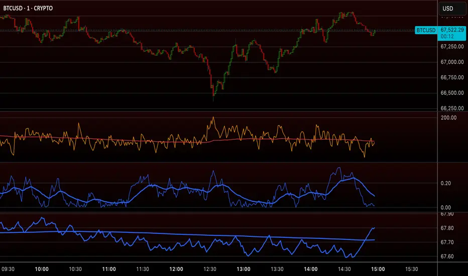
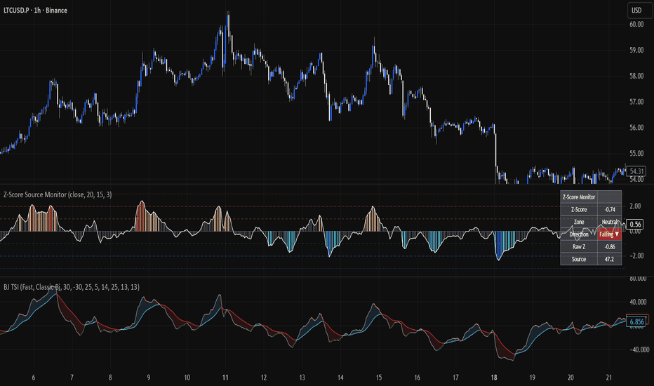
Z-Score Source MonitorZ-Score Source Monitor
What this script does:
Z-Score Source Monitor calculates a rolling Z-Score on any external indicator line connected via the source input. It answers one question: how statistically extreme is the current reading of any oscillating indicator relative to its recent history?
A Z-Score of 0 means the source is exactly at its rolling mean. A reading of ±1 is within normal range. A reading beyond ±2 occurs roughly 5% of the time statistically, and beyond ±3 less than 1% of the time. These are the levels where statistical exhaustion tends to occur.
What makes this script original:
Most Z-Score indicators on TradingView calculate the Z-Score on price. This script is built around a generic input.source — meaning it can calculate the Z-Score on any indicator plot, not just price. This makes it a universal statistical layer that can be placed on top of momentum oscillators, volume indicators, custom signals, or any other plotted line.
The volatility calculation uses EWMA (Exponentially Weighted Moving Average) variance rather than a fixed rolling standard deviation. This means the script adapts faster to changes in the statistical behavior of the source, without waiting for the full lookback window to shift. In fast-moving or regime-changing markets this produces a more responsive and accurate measure of statistical extension.
How to use it:
Connect any external indicator plot to the Source input. The script will calculate and display:
Smoothed Z-Score as histogram and line, color-coded by zone
Raw Z-Score as a reference behind the smoothed line
Reference lines at ±1σ, ±2σ and ±3σ
Dashboard showing current Z-Score, zone classification, direction and raw Z value
The example chart uses the Fast Line from Bjorgum's TSI indicator as the source input, demonstrating how the Z-Score identifies statistical extremes on a momentum oscillator.
Settings
Source: connect any external indicator plot
Lookback: number of bars for the rolling mean (default 20)
EWMA Half-Life: controls how quickly the volatility measure adapts to recent behavior (default 15)
Z-Score Smoothing: EMA smoothing applied to the raw Z-Score to reduce noise (default 3)
How to read the zones :
Gray: neutral, source near its mean
Light blue / light orange: mild extension beyond ±1σ
Blue / red: statistically extended beyond ±2σ — observe closely
Dark blue / dark red: rare extreme beyond ±3σ
Important note:
This script is an observation tool. It identifies statistical extremes but does not generate buy or sell signals. Always use it as additional context alongside your own analysis. Past statistical extremes do not guarantee future reversals. Indicador
Trend Flip Risk MapTrend Flip Risk Map - TradingView Publishing Description
Short description:
Trend Flip Risk Map is a Pine v6 regime-transition study that turns selected compression-release flips into structured risk maps. It combines EMA-spread compression, directional pressure, release scoring, structure-based invalidation, retest tracking, and staged R-multiple targets.
Full description:
Trend Flip Risk Map is built for studying one specific market behaviour: a compressed trend regime beginning to release into a new directional phase. It is not intended to mark every moving-average crossover. The crossover is only the initial trigger. A signal is accepted only when the surrounding compression, candle participation, spread slope, and directional pressure conditions support the idea that the market may be leaving a low-separation regime.
The script’s purpose is to turn a possible trend flip into a complete review map. Instead of showing only a BUY or SELL label, it draws the active transition zone, the signal reference, a structure-aware stop, an early flip-failure line, three R-multiple target references, and a short retest window. This helps users review the full shape of the setup: where the regime changed, where the idea begins to weaken, where it is invalidated, and whether the first pullback into the transition zone holds.
Core idea:
A plain EMA crossover can occur in strong expansion, during compression, or inside meaningless chop. Trend Flip Risk Map tries to separate those situations by measuring the relationship between EMA separation and volatility. The script normalises the distance between the fast EMA and slow EMA by ATR. When that normalised spread remains below the selected threshold, the market is treated as compressed. A later flip is more meaningful when it appears after that compression and begins to expand with directional pressure.
How the regime engine works:
1. The fast EMA and slow EMA define the baseline regime.
2. The absolute distance between those EMAs is divided by ATR to create a volatility-normalised spread reading.
3. If the spread is below the compression threshold, the script treats the market as being in a compressed phase.
4. The script counts how many bars the market has spent in that compressed phase.
5. A flip can qualify only when the fast EMA crosses the slow EMA and the selected compression-release conditions are satisfied.
Directional pressure filter:
The script uses a pressure stack to avoid accepting weak flips by default. For bullish releases, price should be above the fast EMA, the fast EMA should be above the slow EMA, the EMA spread slope should be positive, and the signal candle should close in the upper part of its range. For bearish releases, the same checks are inverted. This makes the marker more selective than a basic crossover label.
Candle participation filter:
The signal candle body is measured relative to ATR. This prevents very small candles from being treated the same as larger transition candles. Users can raise or lower the minimum body-to-ATR input depending on whether they want fewer, stronger releases or more exploratory signals.
Release score:
Each accepted flip receives a release score. The score is a relative context score, not a prediction. It combines:
- How long the market spent in compression
- How much the EMA spread is expanding relative to its baseline
- How large the signal candle body is compared with ATR
- How strongly the EMA spread is sloping in the new direction
The score is useful for comparing different releases on the same symbol and timeframe under the same settings. It should not be read as a win probability or performance forecast.
Structure-aware risk map:
When a qualifying BUY or SELL release appears, the script creates a risk map from the signal candle. The Entry reference is the signal candle close. The stop can be based on recent swing structure with an ATR buffer. For bullish releases, the structure stop references recent lows. For bearish releases, it references recent highs. If that structure stop would not make sense relative to the entry, the script falls back to an ATR-based stop.
The Entry-to-Stop distance defines one unit of risk. TP1, TP2, and TP3 are then projected as configurable R-multiples from that distance. This keeps the ladder tied to the actual invalidation distance rather than drawing arbitrary target lines.
Flip-failure line:
The script also draws a separate FLIP FAIL line around the EMA midline with an ATR band. This is not the same as the full stop. It is an earlier regime-quality warning level. The idea is that a new trend regime can start to lose quality before the full structure stop is reached. This line gives users a visual reference for where the transition thesis begins to weaken.
Retest zone:
After a qualifying release, the script creates a temporary retest zone around the EMA midline. If price returns to that zone and holds in the direction of the active flip within the selected watch window, a RETEST HELD label is printed. This helps users study whether a release continues immediately, fails quickly, or first retests the transition area before continuation.
Dashboard:
The dashboard summarises the current state of the model. It shows whether there is an active bull or bear flip, whether the market is currently in compression or expansion, the current EMA spread relative to ATR, the current candle body relative to ATR, and the latest release score. The dashboard is designed to make the script easier to understand without needing to inspect every input or calculation manually.
Visual elements:
- Fast EMA: short-term regime reference
- Slow EMA: longer regime reference
- EMA midline: centre of the transition zone
- Compression box: recent low-separation area before release
- BUY / SELL release label: accepted directional transition after filters
- Release score: relative strength of the accepted transition
- Entry line: signal candle close
- STRUCT SL line: structure-aware invalidation reference
- FLIP FAIL line: earlier regime-quality warning level
- TP1 / TP2 / TP3 lines: R-multiple target references
- Retest zone: temporary zone used to study the first pullback after release
- RETEST HELD label: retest zone held during the watch window
- Dashboard: live regime and filter context
How to use it:
1. Add the indicator to a clean chart.
2. Use a liquid market and a timeframe where trend transitions are readable.
3. Look for releases that occur after visible compression, not random sideways crossover noise.
4. Review the release score in relation to other signals on the same chart.
5. Check whether the Entry, FLIP FAIL, STRUCT SL, and TP levels make sense against nearby structure.
6. Watch whether price retests the transition zone and holds during the retest window.
7. Adjust the compression threshold, required compression bars, EMA lengths, structure lookback, stop buffer, and R-multiple targets for the market being studied.
8. Forward-test settings before using them in any decision process.
Suggested chart setup:
15-minute and 30-minute charts usually provide cleaner examples because they show compression, release, retest, and continuation without excessive low-timeframe noise. One-hour charts can work well for broader swing review. Very small timeframes may produce more signals but can make the chart harder to interpret.
Important limitations:
Trend Flip Risk Map does not forecast price movement. It does not know whether a release will continue or fail. It can still produce poor signals during rotational, illiquid, or news-driven conditions. The release score is only a relative study metric under the selected settings. It is not a probability model, performance estimate, or recommendation.
Educational-use notice:
This script is for educational, research, and chart-planning purposes only. BUY and SELL labels, release scores, Entry levels, Stop Loss levels, flip-failure levels, retest markers, and target levels are visual study references. They are not financial advice, trade recommendations, or guarantees of future performance. Each user is responsible for testing settings on their own symbol, timeframe, and risk model.
Indicador

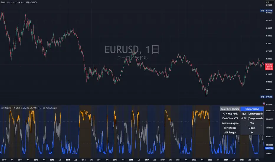
Volatility Regime (Latest) New!This indicator is designed to separate two different market concepts: volatility regime and price displacement.
The main visualization focuses on Volatility Regime, calculated from the standard deviation of log returns over a selected lookback period. The result is ranked against its own historical distribution using a rolling percentile filter, allowing the market to be classified into Low, Mid, or High Volatility regimes without assuming a normal distribution.
A secondary reference metric, Price Displacement, is also included. It measures how far the current price is from its rolling mean using a price z-score. This helps identify whether price is extended from its local average, while keeping it separate from the main volatility regime logic.
Core concept:
* Volatility Regime measures how unstable returns are.
* Price Displacement measures how far price is from its mean.
* Rolling percentile ranking is used to classify regimes empirically.
* The model does not assume that market returns follow a normal distribution.
This tool is intended for regime awareness, risk context, volatility filtering, and market condition analysis. It should not be used as a standalone buy or sell signal.
P-Value
Indicador

IFVG Sniper Entry Engine [trade_w_samet]🎯 IFVG Sniper Entry Engine
IFVG Sniper Entry Engine is a clean, focused, and structured Inversion Fair Value Gap analysis indicator designed to help traders study filtered IFVG conditions directly on the price chart.
This script focuses on one main concept:
IFVG-based entry visualization.
It is not designed to be a complex all-in-one trading system.
It is not designed to show every possible Fair Value Gap.
It is not designed to generate constant chart noise.
Instead, the goal of IFVG Sniper Entry Engine is to detect filtered Inversion Fair Value Gap events, display clean IFVG+ / IFVG- labels, and visualize a simple active trade projection using one entry level, one stop-loss level, and one take-profit level.
The indicator includes:
• Inversion Fair Value Gap detection
• Filtered IFVG selection
• Bullish IFVG+ and bearish IFVG- chart labels
• Thin blue bullish IFVG lines
• Thin red bearish IFVG lines
• Adjustable IFVG label size
• ATR-based stop-loss projection
• Selectable take-profit RR from 1R to 6R
• Active TP / SL visual box
• One-active-trade-at-a-time logic
• Confirmed-candle IFVG processing
• IFVG invalidation handling
• Simple dashboard
• Professional alert conditions
The purpose of this script is to help users visually study where an FVG has inverted and whether that inversion may create a structured review point on the chart.
It should be treated as a chart-analysis and educational decision-support tool.
It is not financial advice.
It is not an automated trading system.
It does not guarantee profitable trades.
It does not execute broker orders.
It does not replace personal analysis, risk management, or trade validation.
━━━━━━━━━━━━━━━━━━━━━━
📌 OVERVIEW
━━━━━━━━━━━━━━━━━━━━━━
At a high level, IFVG Sniper Entry Engine does the following:
• Detects bullish and bearish Fair Value Gaps.
• Stores valid hidden FVG zones in memory.
• Watches for price to invert those zones.
• Confirms bullish IFVG when a bearish FVG is broken upward.
• Confirms bearish IFVG when a bullish FVG is broken downward.
• Applies an optional IFVG quality filter.
• Draws only filtered IFVGs on the chart.
• Displays IFVG+ for bullish IFVG events.
• Displays IFVG- for bearish IFVG events.
• Projects one active entry, stop-loss, and take-profit box.
• Allows only one active trade projection at a time.
• Removes the active TP/SL box after TP or SL is reached.
• Tracks basic visual trade outcome statistics in the dashboard.
• Provides alert conditions for IFVG entries and IFVG formations.
The script is intentionally built to be simple and focused.
It does not include multiple take-profit levels.
It does not include machine-learning optimization.
It does not include hidden performance promises.
It does not attempt to predict the future.
It provides a structured way to visualize filtered IFVG events and their projected trade model.
━━━━━━━━━━━━━━━━━━━━━━
🧠 CORE IDEA
━━━━━━━━━━━━━━━━━━━━━━
The core idea behind IFVG Sniper Entry Engine is based on Inversion Fair Value Gaps.
A Fair Value Gap represents an imbalance area created when price moves aggressively enough to leave a gap-like inefficiency between candles.
An Inversion Fair Value Gap occurs when price later breaks through a previously formed FVG in the opposite direction.
This can be useful for traders who study:
• market imbalance
• failed displacement zones
• price repricing behavior
• continuation after inversion
• possible shift in directional pressure
• clean chart-based trade planning
The script does not treat every FVG as important.
Instead, it stores FVGs and waits for inversion behavior.
Then it filters the IFVG event using quality conditions such as gap size, candle body strength, candle range, and clean break logic.
The goal is not to show more signals.
The goal is to reduce noise and highlight cleaner IFVG conditions.
━━━━━━━━━━━━━━━━━━━━━━
🧩 WHY THIS SCRIPT IS NOT A SIMPLE BUY/SELL INDICATOR
━━━━━━━━━━━━━━━━━━━━━━
IFVG Sniper Entry Engine is not intended to be used as a blind buy/sell system.
The script is structured as a visual review workflow:
Fair Value Gap forms
→ FVG is stored in memory
→ price later breaks through the opposite side
→ inversion is detected
→ IFVG quality filter is checked
→ IFVG+ or IFVG- is displayed
→ active entry / SL / TP projection is drawn
→ trade box extends while active
→ result is tracked visually
→ box is removed after TP or SL
Each part has a specific purpose.
The FVG memory system stores imbalance zones.
The inversion logic checks whether price has broken the opposite side of the stored zone.
The filter system attempts to reduce weaker IFVG events.
The entry model gives a simple visual planning level.
The ATR stop-loss model creates a consistent risk reference.
The RR setting controls the projected target distance.
The dashboard summarizes the current state.
The alert system helps monitor confirmed events.
This makes the script a structured IFVG review tool, not a guaranteed trade signal generator.
━━━━━━━━━━━━━━━━━━━━━━
⚙️ HOW THE SCRIPT WORKS
━━━━━━━━━━━━━━━━━━━━━━
The script first detects normal bullish and bearish Fair Value Gaps.
A bullish FVG is detected when the current candle structure leaves an imbalance above the candle from two bars earlier.
A bearish FVG is detected when the current candle structure leaves an imbalance below the candle from two bars earlier.
Once a raw FVG is detected, the script stores:
• top of the FVG
• bottom of the FVG
• original FVG direction
• age of the FVG
• gap size relative to ATR
• candle body ratio
• candle range relative to ATR
These values are stored internally and are later used when an inversion happens.
The script then waits for price to break through the stored FVG in the opposite direction.
For a bullish IFVG:
A previously bearish FVG must be broken upward.
For a bearish IFVG:
A previously bullish FVG must be broken downward.
When inversion is detected, the script checks whether the IFVG passes the selected filter mode.
Only filtered IFVGs are displayed on the chart.
━━━━━━━━━━━━━━━━━━━━━━
🔵 BULLISH IFVG+ LOGIC
━━━━━━━━━━━━━━━━━━━━━━
A bullish IFVG+ appears when a previously bearish Fair Value Gap is inverted to the upside.
In practical terms, the script looks for a stored bearish FVG and then checks whether price closes above the top boundary of that FVG.
If the selected filter conditions are satisfied, the script draws:
• a thin blue IFVG line
• an IFVG+ label
• a bullish active trade projection if no trade is already active
The bullish trade projection uses:
• entry level
• ATR-based stop-loss below entry
• selected RR-based take-profit above entry
This does not mean price must continue upward.
It only means the script detected a bullish IFVG condition based on its internal rules.
━━━━━━━━━━━━━━━━━━━━━━
🔴 BEARISH IFVG- LOGIC
━━━━━━━━━━━━━━━━━━━━━━
A bearish IFVG- appears when a previously bullish Fair Value Gap is inverted to the downside.
In practical terms, the script looks for a stored bullish FVG and then checks whether price closes below the bottom boundary of that FVG.
If the selected filter conditions are satisfied, the script draws:
• a thin red IFVG line
• an IFVG- label
• a bearish active trade projection if no trade is already active
The bearish trade projection uses:
• entry level
• ATR-based stop-loss above entry
• selected RR-based take-profit below entry
This does not mean price must continue downward.
It only means the script detected a bearish IFVG condition based on its internal rules.
━━━━━━━━━━━━━━━━━━━━━━
💎 IFVG FILTER SYSTEM
━━━━━━━━━━━━━━━━━━━━━━
The script includes an IFVG filter system to reduce chart noise.
This is important because not every inversion is meaningful.
The filter system can be set to:
Off
Loose
Balanced
Strict
Custom
Off mode shows all detected IFVG events.
Loose mode allows more IFVGs and uses lower quality requirements.
Balanced mode is the default middle-ground setting.
Strict mode requires stronger IFVG conditions and will show fewer signals.
Custom mode allows the user to manually control the filter thresholds.
The filter evaluates:
• minimum gap size relative to ATR
• minimum candle body ratio
• minimum candle range relative to ATR
• clean break buffer relative to ATR
This creates a more selective IFVG workflow.
The filter does not guarantee better future outcomes.
It only controls how strict the script is before displaying an IFVG.
━━━━━━━━━━━━━━━━━━━━━━
📏 GAP / ATR FILTER
━━━━━━━━━━━━━━━━━━━━━━
The gap filter measures the original Fair Value Gap size relative to ATR.
This helps avoid very small imbalance zones that may not be meaningful on the selected chart.
A larger minimum gap requirement makes the indicator more selective.
A smaller minimum gap requirement allows more IFVGs.
The default Balanced setting uses a moderate gap requirement.
Users can adjust this in Custom mode.
━━━━━━━━━━━━━━━━━━━━━━
🕯️ BODY RATIO FILTER
━━━━━━━━━━━━━━━━━━━━━━
The body ratio filter measures the candle body compared to the full candle range.
This helps evaluate whether the candle that created the FVG had meaningful directional pressure.
A stronger body ratio requirement can reduce weaker candles.
A lower body ratio requirement allows more setups.
This is not a prediction tool.
It is only a candle-quality filter.
━━━━━━━━━━━━━━━━━━━━━━
📊 RANGE / ATR FILTER
━━━━━━━━━━━━━━━━━━━━━━
The range filter measures the candle’s full range relative to ATR.
This helps the script avoid very small candles that may not represent meaningful displacement.
A higher range/ATR requirement makes the script more selective.
A lower range/ATR requirement increases the number of visible IFVGs.
The value should be adjusted based on symbol volatility and timeframe.
━━━━━━━━━━━━━━━━━━━━━━
🧼 CLEAN BREAK FILTER
━━━━━━━━━━━━━━━━━━━━━━
The clean break filter requires price to break beyond the IFVG boundary by an ATR-based buffer.
This helps avoid very small boundary touches.
For bullish IFVGs, price must close above the stored FVG top plus the clean break buffer.
For bearish IFVGs, price must close below the stored FVG bottom minus the clean break buffer.
The clean break buffer can be controlled in Custom mode.
A higher buffer makes the inversion requirement stricter.
A lower buffer allows more IFVG events.
━━━━━━━━━━━━━━━━━━━━━━
🎯 ENTRY MODEL
━━━━━━━━━━━━━━━━━━━━━━
When a filtered IFVG appears and no active trade is already open, the script creates a visual trade projection.
The entry can be based on:
IFVG Line
Confirmation Close
IFVG Line mode uses the selected IFVG line price as the projected entry reference.
Confirmation Close mode uses the candle close that confirmed the IFVG.
The entry is only a visual reference.
It is not a broker order.
It does not mean the user must enter a trade.
It is designed to help users review how the IFVG setup would look with a structured risk/reward model.
━━━━━━━━━━━━━━━━━━━━━━
🛑 ATR STOP-LOSS MODEL
━━━━━━━━━━━━━━━━━━━━━━
The stop-loss projection is based on ATR.
The main settings are:
ATR Length
SL ATR Multiplier
For bullish IFVG entries, the stop-loss is projected below the entry.
For bearish IFVG entries, the stop-loss is projected above the entry.
ATR is used because market volatility changes across symbols and timeframes.
A higher SL ATR multiplier creates a wider visual risk area.
A lower SL ATR multiplier creates a tighter visual risk area.
This stop-loss level is a visual projection only.
It does not place an order.
It does not guarantee that the level is appropriate for every trader or every market.
━━━━━━━━━━━━━━━━━━━━━━
🎯 TAKE-PROFIT RR MODEL
━━━━━━━━━━━━━━━━━━━━━━
The script uses one take-profit level.
There are no TP1, TP2, or TP3 levels.
The take-profit is calculated from the projected risk distance.
Available RR options:
1R
2R
3R
4R
5R
6R
Default:
3R
For bullish IFVG entries, TP is projected above entry.
For bearish IFVG entries, TP is projected below entry.
The RR setting only controls the visual projected target distance.
It should not be interpreted as a recommendation or guarantee.
Users should decide whether the projected target makes sense based on their own analysis, market structure, liquidity, session, volatility, and risk plan.
━━━━━━━━━━━━━━━━━━━━━━
📦 ACTIVE TP / SL BOX SYSTEM
━━━━━━━━━━━━━━━━━━━━━━
When a new valid IFVG entry appears, the script draws a clean active TP / SL visual model.
The visual model includes:
• TP box
• SL box
• entry line
• stop-loss line
• take-profit line
• ENTRY label
• SL label
• TP label
The TP/SL box remains visible only while the trade projection is active.
While the trade is active, the box extends to the right as new candles form.
When TP or SL is reached, the active trade box is removed from the chart.
This means historical TP/SL boxes are not kept.
The chart remains cleaner and only the active trade projection is visible.
━━━━━━━━━━━━━━━━━━━━━━
🚦 ONE ACTIVE TRADE AT A TIME
━━━━━━━━━━━━━━━━━━━━━━
The script includes one-active-trade-at-a-time logic.
If a trade projection is active, the script will not open another trade projection until the active one reaches TP or SL.
However, new filtered IFVG lines can still appear on the chart.
This design separates:
• IFVG detection
• trade projection permission
An IFVG can appear while a trade is active, but it will not create a new active TP/SL box.
The dashboard tracks blocked IFVG events internally.
This helps keep the chart structured and avoids multiple overlapping trade boxes.
━━━━━━━━━━━━━━━━━━━━━━
⚠️ SAME-CANDLE TP / SL HANDLING
━━━━━━━━━━━━━━━━━━━━━━
If TP and SL are both touched on the same candle, the true intrabar sequence cannot be known from standard OHLC chart data.
This script uses a conservative assumption:
SL is counted first.
This avoids overly optimistic historical visual results when the actual intrabar order is unknown.
Users should understand that this is still a bar-based assumption.
It does not represent broker execution.
It does not include spread, slippage, commissions, order delay, or partial fills.
━━━━━━━━━━━━━━━━━━━━━━
🏷️ IFVG LABELS
━━━━━━━━━━━━━━━━━━━━━━
The script uses simple IFVG labels:
IFVG+
IFVG-
IFVG+ represents a bullish Inversion Fair Value Gap.
IFVG- represents a bearish Inversion Fair Value Gap.
The label size can be adjusted from the settings.
Available label sizes:
Tiny
Small
Normal
Large
Huge
The default label size is Large.
This allows users to adjust visibility depending on chart zoom, monitor size, and visual preference.
━━━━━━━━━━━━━━━━━━━━━━
📍 IFVG LINE PRICE MODES
━━━━━━━━━━━━━━━━━━━━━━
The IFVG line can be drawn using different price references.
Available modes:
Broken Boundary
Confirmation Close
Midpoint
Broken Boundary mode draws the line at the boundary that was broken during inversion.
Confirmation Close mode draws the line at the candle close that confirmed the IFVG.
Midpoint mode draws the line at the midpoint of the original FVG zone.
Each mode gives a different way to visualize the IFVG reference level.
There is no universally best option.
Users should choose the line mode that best matches their own review method.
━━━━━━━━━━━━━━━━━━━━━━
🧹 IFVG INVALIDATION
━━━━━━━━━━━━━━━━━━━━━━
The script can automatically remove invalidated IFVG lines.
For bullish IFVGs, invalidation occurs when price closes back below the lower boundary of the IFVG zone.
For bearish IFVGs, invalidation occurs when price closes back above the upper boundary of the IFVG zone.
This helps keep the chart cleaner by removing IFVG levels that are no longer valid according to the script’s internal logic.
Users can disable this setting if they prefer to keep IFVG lines visible.
━━━━━━━━━━━━━━━━━━━━━━
📟 DASHBOARD
━━━━━━━━━━━━━━━━━━━━━━
The script includes a compact dashboard.
The dashboard displays:
• selected filter mode
• selected label size
• last signal direction
• active trade status
• selected RR
• latest entry level
• latest SL level
• latest TP level
• active box state
• filtered IFVG count
• trades / wins / losses
The dashboard is designed to provide a quick summary of the current script state.
It is not a full performance report.
It is not a replacement for TradingView Strategy Tester.
It is a visual summary based on the script’s internal bar-based projection logic.
━━━━━━━━━━━━━━━━━━━━━━
🚨 ALERT SYSTEM
━━━━━━━━━━━━━━━━━━━━━━
IFVG Sniper Entry Engine includes alert conditions for:
Bullish IFVG Entry
Bearish IFVG Entry
Bullish IFVG+ formed
Bearish IFVG- formed
The entry alerts are triggered when a filtered IFVG creates a new active trade projection.
The IFVG formation alerts are triggered when filtered IFVG+ or IFVG- conditions appear.
Alerts are monitoring tools only.
They do not execute trades.
They do not place broker orders.
Users must confirm all alerts with their own analysis and risk management.
━━━━━━━━━━━━━━━━━━━━━━
🔔 HOW TO USE ALERTS
━━━━━━━━━━━━━━━━━━━━━━
A practical alert workflow:
1. Add IFVG Sniper Entry Engine to your chart.
2. Open TradingView’s alert window.
3. Select the indicator as the alert condition.
4. Choose the desired alert type.
5. Select alert frequency according to your preference.
6. Use alerts for monitoring only.
7. Confirm each alert manually before making any trading decision.
Alerts may behave differently depending on timeframe, symbol, session, and real-time candle updates.
━━━━━━━━━━━━━━━━━━━━━━
🧪 HOW TO USE THE INDICATOR
━━━━━━━━━━━━━━━━━━━━━━
A practical workflow:
1. Add IFVG Sniper Entry Engine to your chart.
2. Start with the default Balanced filter mode.
3. Review the visible IFVG+ and IFVG- labels.
4. Check whether the IFVG appears in a meaningful market context.
5. Review the active TP/SL projection if a trade model appears.
6. Use the selected RR level as a visual planning reference only.
7. Avoid treating every IFVG as a trade.
8. Combine the tool with your own market structure, liquidity, trend, session, and risk-management rules.
9. Use alerts for monitoring, not automatic execution.
10. Test the indicator on the exact markets and timeframes you personally study.
The indicator is best used as a structured IFVG review tool.
It should not be used as a blind execution system.
━━━━━━━━━━━━━━━━━━━━━━
⚙️ SETTINGS REFERENCE
━━━━━━━━━━━━━━━━━━━━━━
⚙️ IFVG Engine
Hidden FVG Memory
Controls how many raw FVGs can be stored internally.
Max Hidden FVG Age
Controls how long a hidden FVG remains eligible for inversion.
Minimum FVG Size / Ticks
Sets the minimum raw FVG size using ticks.
Max Visible IFVG
Controls how many IFVG lines and labels can remain visible.
IFVG Line Length Bars
Controls how far the IFVG line extends to the right.
IFVG Line Price
Controls whether the IFVG line is drawn from Broken Boundary, Confirmation Close, or Midpoint.
Delete Invalidated IFVG
Removes IFVG lines when the script detects invalidation.
━━━━━━━━━━━━━━━━━━━━━━
💎 IFVG Filter
IFVG Filter Mode
Controls how selective the IFVG display logic is.
Available modes:
Off
Loose
Balanced
Strict
Custom
Custom Minimum Gap / ATR
Defines the minimum FVG gap size relative to ATR when Custom mode is selected.
Custom Minimum Body Ratio
Defines the minimum body-to-range ratio when Custom mode is selected.
Custom Minimum Range / ATR
Defines the minimum candle range relative to ATR when Custom mode is selected.
Custom Clean Break Buffer / ATR
Defines the ATR-based clean break buffer when Custom mode is selected.
━━━━━━━━━━━━━━━━━━━━━━
🎯 IFVG Entry Model
Entry Price
Controls whether entry is based on IFVG Line or Confirmation Close.
ATR Length
Defines the ATR length used for risk calculation.
SL ATR Multiplier
Controls the distance of the projected stop-loss.
Take Profit RR
Controls the projected take-profit distance.
Available RR values:
1R
2R
3R
4R
5R
6R
Initial TP / SL Box Length
Controls the initial box length when a new active trade projection appears.
━━━━━━━━━━━━━━━━━━━━━━
🎨 Visual Style
Bullish IFVG Blue
Controls the color of bullish IFVG+ lines and labels.
Bearish IFVG Red
Controls the color of bearish IFVG- lines and labels.
IFVG Label Size
Controls the size of IFVG+ and IFVG- labels.
Entry Line Color
Controls the entry line color.
SL Color
Controls the stop-loss box and line color.
TP Color
Controls the take-profit box and line color.
Dashboard Background
Controls the dashboard background color.
Dashboard Text
Controls the dashboard text color.
━━━━━━━━━━━━━━━━━━━━━━
📟 Dashboard
Show Dashboard
Shows or hides the compact dashboard.
━━━━━━━━━━━━━━━━━━━━━━
🧠 WHAT MAKES THIS SCRIPT ORIGINAL
━━━━━━━━━━━━━━━━━━━━━━
IFVG Sniper Entry Engine uses familiar market concepts such as:
• Fair Value Gaps
• Inversion Fair Value Gaps
• ATR-based risk projection
• risk/reward planning
• label-based visual mapping
• active trade visualization
• alert monitoring
These concepts are not unique by themselves.
The originality of this script lies in how they are organized into a clean IFVG workflow:
Raw FVG detection
→ hidden FVG memory
→ inversion confirmation
→ IFVG quality filter
→ IFVG+ / IFVG- display
→ one-active-trade rule
→ ATR stop-loss projection
→ selectable RR target
→ active-only TP/SL box
→ compact dashboard
→ alerts
This structure is designed to give users a focused way to review filtered IFVG conditions without unnecessary chart clutter.
━━━━━━━━━━━━━━━━━━━━━━
⚠️ IMPORTANT PRACTICAL NOTES
━━━━━━━━━━━━━━━━━━━━━━
The script’s behavior depends heavily on settings.
Signal frequency and visual output may change based on:
• filter mode
• ATR length
• SL multiplier
• RR selection
• IFVG line mode
• minimum gap settings
• candle body settings
• range/ATR settings
• clean break buffer
• timeframe
• symbol volatility
• market session
• available historical bars
A setting that looks clean on one symbol may behave differently on another.
A setting that appears useful on one timeframe may not be useful on another.
Users should test the script on the exact markets and timeframes they personally study.
━━━━━━━━━━━━━━━━━━━━━━
⚠️ LIMITATIONS AND SHORTCOMINGS
━━━━━━━━━━━━━━━━━━━━━━
This script has important limitations:
It does not guarantee profitable trades.
It does not predict future price movement.
It does not replace risk management.
It does not execute trades.
It does not place broker orders.
It does not include broker slippage.
It does not include commissions.
It does not include spreads.
It does not include order delay.
It does not include partial fills.
It uses bar-based chart data.
Same-candle TP/SL order cannot be known from standard OHLC data.
The dashboard is not TradingView Strategy Tester.
The TP/SL boxes are visual projections only.
Alerts are monitoring tools only.
Historical visual behavior does not ensure future behavior.
Filter settings do not guarantee better results.
One-active-trade logic is a visual management rule, not broker execution logic.
For these reasons, IFVG Sniper Entry Engine should be used as an educational decision-support and chart-analysis tool, not as a standalone trading strategy.
━━━━━━━━━━━━━━━━━━━━━━
👤 WHO THIS SCRIPT MAY BE USEFUL FOR
━━━━━━━━━━━━━━━━━━━━━━
This script may be useful for traders who:
• study IFVG concepts
• study Fair Value Gap inversions
• want cleaner IFVG chart visuals
• prefer filtered signals instead of every raw IFVG
• want a simple one-TP projection model
• want ATR-based risk visualization
• want one active trade projection at a time
• want active-only TP/SL boxes
• want IFVG+ and IFVG- labels
• want alert-based monitoring
• want a focused educational analysis tool
It may be less suitable for users who:
• want guaranteed buy/sell signals
• want a fully automated trading bot
• want many take-profit levels
• want every raw FVG displayed
• expect one setting to work on every market
• expect alerts to execute trades
• expect visual projections to match broker execution
• want an indicator that replaces personal decision-making
━━━━━━━━━━━━━━━━━━━━━━
🧭 BEST PRACTICE SUGGESTIONS
━━━━━━━━━━━━━━━━━━━━━━
For cleaner review:
• Start with the default Balanced filter mode.
• Use Strict mode if the chart is too noisy.
• Use Loose mode if the chart shows too few IFVGs.
• Use Custom mode only after understanding how each filter affects signal frequency.
• Review IFVGs together with market structure.
• Check whether the IFVG appears near meaningful liquidity or displacement context.
• Do not treat every IFVG+ or IFVG- as a trade.
• Use the TP/SL box as a visual planning tool only.
• Keep expectations realistic.
• Use alerts for monitoring, not automatic execution.
• Always apply independent analysis and risk management.
━━━━━━━━━━━━━━━━━━━━━━
🔓 PUBLICATION NOTE
━━━━━━━━━━━━━━━━━━━━━━
IFVG Sniper Entry Engine is published as an educational and visual market-analysis tool.
The purpose of this description is to explain:
• what the script does
• how IFVG conditions are detected
• how IFVG filters work
• how IFVG+ and IFVG- labels are created
• how the entry model is projected
• how the ATR stop-loss model works
• how the RR-based take-profit is calculated
• how the active TP/SL box behaves
• how the one-active-trade rule works
• what the dashboard shows
• what the alerts do
• what the limitations are
• how the indicator should and should not be used
The script is designed to support structured analysis.
It does not promise profitable results.
It does not remove market risk.
It does not execute trades.
It should not be used as a blind buy/sell system.
It is best used as a visual framework for reviewing filtered Inversion Fair Value Gap conditions and projected risk/reward behavior.
━━━━━━━━━━━━━━━━━━━━━━
🛡️ DISCLAIMER
━━━━━━━━━━━━━━━━━━━━━━
IFVG Sniper Entry Engine is provided for educational and informational purposes only.
It does not constitute financial, investment, or trading advice.
No indicator can guarantee future results.
Markets are uncertain, conditions change, and historical behavior does not ensure future performance.
Every user is responsible for their own analysis, validation, risk management, position sizing, and trading decisions.
The IFVG+ labels, IFVG- labels, active TP/SL boxes, dashboard values, RR projections, stop-loss projections, and alerts are visual analysis tools only.
Use this script as a structured decision-support and visual review framework, not as a promise of profitability.
Indicador

Adaptive Trend Structure Engine v2Adaptive Market Structure Engine (ATSE) is a technical analysis tool designed to help visualize and interpret evolving market structure in real time. It focuses on detecting shifts in price behavior by constructing a synthetic structure model that reacts dynamically to volatility and directional movement.
Unlike traditional indicators that rely solely on fixed moving averages or standard oscillators, this script builds a behavior-based price structure that adapts to changing market conditions. It does this by generating dynamic upper and lower structure thresholds, which act as reference boundaries for price movement.
📊 How It Works
The core of the indicator is a synthetic price model that simulates structural movement based on a configurable sensitivity parameter. Price action is continuously evaluated against adaptive upper and lower levels, which are recalculated according to selected structure logic (ATR-based, fixed sensitivity, or price fraction methods).
When price breaks beyond these adaptive boundaries, the system interprets this as a potential structural shift in market direction. These shifts are then classified as trend transitions.
🔄 Trend Detection Logic
The indicator tracks directional changes in the synthetic structure and identifies when a transition occurs from upward to downward structure (or vice versa). These transitions are visually marked on the chart to highlight potential changes in market behavior.
To improve readability, only the first bar of each structural shift is marked, reducing noise and repetitive signals.
📐 Fibonacci Structure Visualization
After each confirmed trend shift, the indicator generates a set of Fibonacci-based dynamic zones starting from the current reference price. These levels are not predictive targets but are instead used as visual framework zones, helping to understand possible areas of price interaction during a trend phase.
Each zone is spaced proportionally based on user-defined sensitivity settings, allowing the structure to expand or contract depending on volatility conditions.
📉 Momentum Context (Optional)
The script also includes an internal momentum calculation based on deviation from a dynamic center line. This helps provide additional context to structural movements without acting as a standalone signal generator.
A normalization option is available to smooth momentum behavior across extended trend phases.
⚙️ Customization Options
Users can adjust:
Structure sensitivity (brick size behavior)
Calculation method (ATR / price-based / classic)
Price source model (close-based or OHLC hybrid)
Fibonacci spacing intensity
Momentum normalization and oscillation behavior
This allows the indicator to be adapted across different assets and timeframes.
🎯 Purpose
The main goal of this tool is to:
Visualize market structure transitions
Provide a clearer view of trend shifts
Offer adaptive structural zones for context
Reduce noise from traditional indicator-based signals
It is intended for educational and analytical use to assist in understanding price behavior rather than to generate direct trading signals.
⚠️ Disclaimer
This script does not provide financial advice. All signals and visual elements are based on mathematical transformations of price data and should be used as part of a broader analysis framework. Indicador

Trend Flip Risk MapTrend Flip Risk Map
Short description:
Trend Flip Risk Map is a structured trend-transition and risk-planning overlay that marks EMA regime flips with BUY/SELL planning labels, then projects an ATR-based Entry, Stop Loss, and TP1/TP2/TP3 ladder directly on the chart.
Full description:
Trend Flip Risk Map is a Trade Manager-style research indicator designed to make trend-transition areas easier to study, validate, and publish cleanly on TradingView. The script focuses on the moment when a faster EMA crosses above or below a slower EMA, then converts that trend flip into a clear visual risk map instead of leaving the trader to mentally estimate entry, invalidation, and profit-taking zones.
When the fast EMA flips above the slow EMA, the indicator can print a BUY planning marker. When the fast EMA flips below the slow EMA, it can print a SELL planning marker. Each marker is paired with a fresh trade-planning ladder that includes an Entry reference, an ATR-based Stop Loss, and three configurable R-multiple targets: TP1, TP2, and TP3.
The goal is not to predict every market turn. The goal is to create a cleaner decision map around confirmed trend changes so a trader can quickly see:
- Where the trend-transition signal occurred
- Which side of the market the EMA regime currently favours
- Where the entry reference sits relative to price
- Where the idea is visually invalidated by the Stop Loss level
- Where staged target zones would appear if the move continues
- Whether the available reward profile is worth further review before any trade decision
Core visual elements:
- Fast EMA and slow EMA regime map
- BUY labels on bullish EMA trend flips
- SELL labels on bearish EMA trend flips
- ATR-based Stop Loss projection
- Entry reference line
- TP1, TP2, and TP3 R-multiple target ladder
- Trend-coloured candles to show the active EMA bias
- Right-side price labels for Entry, SL, TP1, TP2, and TP3
- Alert conditions for bullish and bearish planning markers
How it works:
The indicator uses a fast EMA and a slow EMA to define the active trend regime. A bullish flip occurs when the fast EMA crosses above the slow EMA. A bearish flip occurs when the fast EMA crosses below the slow EMA. On each new flip, the prior ladder is cleared and a new risk map is drawn from the latest signal area.
The Stop Loss is calculated using ATR, which allows the risk zone to expand or contract with current market volatility. The take-profit levels are then projected from the distance between Entry and Stop Loss, using configurable R-multiple inputs. This keeps the visual structure consistent across different symbols, price ranges, and volatility conditions.
Suggested use cases:
- Studying clean trend-transition zones after EMA regime changes
- Building publication screenshots with a complete BUY/SELL + TP/SL path
- Reviewing whether a trend flip has enough room before nearby structure
- Comparing signals across intraday futures, indexes, stocks, crypto, or forex charts
- Forward-validating a simple trend-following planning model before developing stricter rules
- Creating a consistent visual framework for entry, invalidation, and staged target discussion
Suggested chart setup:
For publishing, 15-minute or 30-minute charts usually give the cleanest balance between readable trend structure and enough signal detail. For broader swing review, 1-hour charts may be cleaner. Very low timeframes can create more frequent flips and may make screenshots look crowded, so use them only when the purpose is short-term scalping review.
Recommended markets and timeframes:
- NQ / ES: 15m or 30m for intraday trend-transition examples
- Major index ETFs: 30m or 1h for cleaner directional examples
- Liquid large-cap stocks: 30m or 1h
- Crypto majors: 30m, 1h, or 4h depending on volatility
Input controls:
- Fast EMA length
- Slow EMA length
- ATR length
- Stop Loss ATR multiplier
- TP1 R-multiple
- TP2 R-multiple
- TP3 R-multiple
- Confirm on close toggle
- BUY, SELL, TP, SL, and Entry colours
Reading the indicator:
A BUY marker means the fast EMA has flipped above the slow EMA under the selected settings. A SELL marker means the fast EMA has flipped below the slow EMA under the selected settings. The Entry line shows the reference price used when the marker was created. The SL line shows the ATR-based invalidation area. TP1, TP2, and TP3 show staged target references based on the configured R-multiple values.
Because the ladder is redrawn at each new flip, the chart stays focused on the most recent active trend-transition map rather than accumulating old levels across the full chart.
What makes this useful:
Many trend-following tools stop at a signal label or a moving-average crossover. Trend Flip Risk Map adds the missing planning layer: where the idea starts, where it fails, and where staged targets would be located if the move extends. That makes the signal easier to review visually, easier to screenshot for educational publishing, and easier to forward-test with consistent rules.
Best practices:
- Use the indicator as a planning and research overlay, not as a standalone trading system
- Review signal quality in context with market structure, session timing, liquidity, and higher-timeframe trend
- Adjust ATR and R-multiple settings to match the symbol and timeframe being studied
- Avoid using very small stop settings on volatile markets without additional validation
- Forward-test settings before relying on them for any decision-making process
- Use clean screenshots with only a few strong examples visible when publishing
Important disclaimer:
This script is provided for educational, research, and chart-planning purposes only. BUY/SELL markers, Entry levels, Stop Loss levels, and TP levels are visual planning references, not financial advice, trade recommendations, or promises of future performance. The script does not predict market direction, guarantee profitability, or replace independent risk management. Markets involve risk, and all settings should be tested on your own symbol, timeframe, and risk model before relying on any output.
Indicador

SPX Market Pressure & Momentum OutlookSPX Market Pressure is a professional market-reading dashboard designed to help traders understand liquidity pressure, market participation, risk appetite, volatility conditions, and momentum exhaustion probability through a structured intermarket framework.
This indicator is NOT a buy signal, sell signal, strategy, forecasting model, or market prediction tool.
Its purpose is to provide context, market structure awareness, and probability-based decision support by combining multiple market components into a single dashboard.
━━━━━━━━━━━━━━━━━━━━━━━━━━━━━━━━━━━━━━
RECOMMENDED MARKETS
━━━━━━━━━━━━━━━━━━━━━━━━━━━━━━━━━━━━━━
This indicator was primarily designed for:
• SPX
• ES Futures
• NQ Futures
• SPY
• QQQ
• Other major U.S. index-related instruments
The intermarket logic relies on relationships between SPY, QQQ, IWM, and VIX. Therefore, the most accurate results are generally achieved when used on U.S. equity index markets.
━━━━━━━━━━━━━━━━━━━━━━━━━━━━━━━━━━━━━━
WHAT THE INDICATOR MEASURES
━━━━━━━━━━━━━━━━━━━━━━━━━━━━━━━━━━━━━━
The dashboard combines several independent market components:
• Liquidity Pressure
• Market Participation
• Risk Appetite
• Volatility Conditions
• Momentum Condition
• Momentum Exhaustion Probability
Each component contributes information about the current market environment rather than attempting to predict future price direction.
━━━━━━━━━━━━━━━━━━━━━━━━━━━━━━━━━━━━━━
SPY & QQQ LIQUIDITY ENGINE
━━━━━━━━━━━━━━━━━━━━━━━━━━━━━━━━━━━━━━
The foundation of the indicator is a proprietary liquidity pressure model built around SPY and QQQ.
The model evaluates:
• Close Location within the candle range
• Candle Body Pressure
• ATR-normalized Momentum
• Relative Volume Participation
The output is converted into directional liquidity pressure scores representing:
• Demand
• Supply
• Neutral Conditions
This creates a structured view of where institutional participation is currently flowing.
━━━━━━━━━━━━━━━━━━━━━━━━━━━━━━━━━━━━━━
SIGMA (Σ SPY + QQQ)
━━━━━━━━━━━━━━━━━━━━━━━━━━━━━━━━━━━━━━
Sigma combines SPY and QQQ liquidity pressure into a single market participation engine.
Rather than using price alone, Sigma evaluates the combined liquidity behavior of both major index ETFs.
Strong Sigma readings indicate broad participation.
Weak or conflicting Sigma readings may indicate deteriorating market participation.
Sigma serves as the primary market pressure reference inside the dashboard.
━━━━━━━━━━━━━━━━━━━━━━━━━━━━━━━━━━━━━━
IWM RISK APPETITE ENGINE
━━━━━━━━━━━━━━━━━━━━━━━━━━━━━━━━━━━━━━
IWM acts as a risk appetite reference.
Strong IWM participation generally suggests:
• Healthy market participation
• Broader market involvement
• Risk-On conditions
Weak IWM participation may suggest:
• Narrow leadership
• Defensive positioning
• Risk-Off behavior
IWM is used as a confirmation component rather than a directional signal.
━━━━━━━━━━━━━━━━━━━━━━━━━━━━━━━━━━━━━━
VIX VOLATILITY ENGINE
━━━━━━━━━━━━━━━━━━━━━━━━━━━━━━━━━━━━━━
The indicator evaluates volatility conditions using VIX.
Instead of relying only on raw VIX values, the model also evaluates:
• Relative VIX positioning
• Volatility expansion
• Volatility compression
• VIX Bollinger Band location
This helps determine whether market volatility is:
• Normal
• Elevated
• High
• Extreme
Volatility is treated as a market condition measurement, not a directional forecast.
━━━━━━━━━━━━━━━━━━━━━━━━━━━━━━━━━━━━━━
MARKET SUPPORT
━━━━━━━━━━━━━━━━━━━━━━━━━━━━━━━━━━━━━━
Market Support measures whether current liquidity pressure is supported by the broader market environment.
Inputs used:
• Sigma
• IWM
• VIX
Possible states include:
• Strong Bull Support
• Bull Support
• Neutral
• Bear Support
• Strong Bear Support
Market Support measures participation quality, not future price direction.
━━━━━━━━━━━━━━━━━━━━━━━━━━━━━━━━━━━━━━
CURRENT SYMBOL OUTLOOK ENGINE
━━━━━━━━━━━━━━━━━━━━━━━━━━━━━━━━━━━━━━
The Outlook Engine dynamically analyzes the active chart symbol.
The engine automatically adapts to whichever symbol the indicator is attached to.
Examples:
• SPX Outlook
• ES Outlook
• NQ Outlook
• SPY Outlook
• QQQ Outlook
The Outlook Engine is designed to evaluate:
• Momentum Condition
• Momentum Maturity
• Momentum Exhaustion Probability
It does NOT attempt to forecast reversals or predict future trends.
━━━━━━━━━━━━━━━━━━━━━━━━━━━━━━━━━━━━━━
DYNAMIC RSI EXHAUSTION MODEL
━━━━━━━━━━━━━━━━━━━━━━━━━━━━━━━━━━━━━━
A major component of the Outlook Engine is the Dynamic RSI Exhaustion Model.
Unlike traditional RSI systems, RSI alignment is NOT treated as a bullish or bearish signal.
Instead, the engine evaluates:
• Current RSI
• Daily RSI
• Distance between both values
• RSI Rate of Change
As Current RSI approaches Daily RSI, the engine measures momentum maturity and potential exhaustion risk.
Examples:
Daily RSI = 75
Current RSI = 45
→ Significant expansion capacity remains.
Current RSI = 68
→ Momentum becoming mature.
Current RSI = 73
→ Elevated exhaustion probability.
Current RSI = 76
→ Very high exhaustion probability.
The model is designed to identify momentum maturity rather than overbought/oversold trading signals.
━━━━━━━━━━━━━━━━━━━━━━━━━━━━━━━━━━━━━━
ATR EXPANSION ANALYSIS
━━━━━━━━━━━━━━━━━━━━━━━━━━━━━━━━━━━━━━
ATR is used to evaluate movement expansion.
The indicator compares:
• Current ATR
• Long-Term ATR Average
Strong ATR expansion suggests:
• Active participation
• Expanding movement
• Sustained momentum conditions
Weak ATR relative to its historical average may indicate:
• Slowing participation
• Drying liquidity
• Increasing exhaustion probability
ATR is never used as a directional indicator.
━━━━━━━━━━━━━━━━━━━━━━━━━━━━━━━━━━━━━━
VOLATILITY ENGINE
━━━━━━━━━━━━━━━━━━━━━━━━━━━━━━━━━━━━━━
The Volatility Engine combines multiple components:
• Current Symbol ATR Expansion
• Current Symbol Range Expansion
• VIX Environment
• Sigma Stability
This allows volatility conditions to adapt dynamically to the chart currently being analyzed.
Possible outputs:
• Normal Volatility
• Elevated Volatility
• High Volatility
• Extreme Volatility
Volatility measures movement intensity, not direction.
━━━━━━━━━━━━━━━━━━━━━━━━━━━━━━━━━━━━━━
OUTLOOK STATES
━━━━━━━━━━━━━━━━━━━━━━━━━━━━━━━━━━━━━━
The Outlook Engine produces five primary states:
• Momentum Building
• Momentum Active
• Momentum Watch
• Exhaustion Watch
• High Exhaustion Probability
These states represent probability-based market conditions rather than trading signals.
━━━━━━━━━━━━━━━━━━━━━━━━━━━━━━━━━━━━━━
HOW TO USE THE INDICATOR
━━━━━━━━━━━━━━━━━━━━━━━━━━━━━━━━━━━━━━
1. Start with Sigma
Determine whether broad liquidity pressure is favoring Demand or Supply.
2. Review IWM
Evaluate whether broader market participation supports the current environment.
3. Review VIX
Assess volatility conditions and risk environment.
4. Check Market Support
Determine whether the current liquidity environment is supported by broader market participation.
5. Review Outlook
Analyze momentum condition and exhaustion probability for the active chart symbol.
6. Review Volatility
Determine whether the current environment is operating under Normal, Elevated, High, or Extreme volatility conditions.
The strongest environments typically occur when liquidity pressure, market participation, and risk conditions align.
━━━━━━━━━━━━━━━━━━━━━━━━━━━━━━━━━━━━━━
IMPORTANT DISCLAIMER
━━━━━━━━━━━━━━━━━━━━━━━━━━━━━━━━━━━━━━
SPX Market Pressure is a market-reading and decision-support tool.
It is not a trading strategy.
It does not generate buy signals.
It does not generate sell signals.
It does not predict market direction.
It does not forecast future price movement.
All outputs represent market context, participation quality, volatility conditions, momentum condition, and probability-based exhaustion analysis intended to assist traders in making more informed decisions.
هو داشبورد احترافي لقراءة السوق، تم تصميمه لمساعدة المتداول على فهم ضغط السيولة، مشاركة السوق، شهية المخاطرة، حالة التذبذب، واحتمالية إرهاق الزخم من خلال إطار تحليل مترابط يجمع عدة مكونات سوقية في مكان واحد.
هذا المؤشر ليس نظام توصيات، وليس استراتيجية تداول، ولا يقدم إشارات شراء أو بيع، ولا يتنبأ بحركة السوق المستقبلية.
الهدف منه هو توفير مرجع بصري منظم يساعد المتداول على فهم البيئة الحالية للسوق واتخاذ قرارات أكثر وعياً بناءً على السياق العام للسوق.
━━━━━━━━━━━━━━━━━━━━━━━━━━━━━━━━━━━━━━
الأسواق الموصى باستخدام المؤشر عليها
━━━━━━━━━━━━━━━━━━━━━━━━━━━━━━━━━━━━━━
تم تصميم المؤشر أساساً لأسواق المؤشرات الأمريكية، ويعطي أفضل نتائجه عند استخدامه على:
• SPX
• ES Futures
• NQ Futures
• SPY
• QQQ
ويعتمد جزء كبير من منطقه التحليلي على العلاقة بين:
• SPY
• QQQ
• IWM
• VIX
لذلك يوصى باستخدامه على الأسواق الأمريكية والمؤشرات المرتبطة بها.
━━━━━━━━━━━━━━━━━━━━━━━━━━━━━━━━━━━━━━
ماذا يقيس المؤشر؟
━━━━━━━━━━━━━━━━━━━━━━━━━━━━━━━━━━━━━━
يجمع المؤشر عدة عناصر سوقية مختلفة داخل لوحة واحدة:
• ضغط السيولة (Liquidity Pressure)
• مشاركة السوق (Market Participation)
• شهية المخاطرة (Risk Appetite)
• حالة التذبذب (Volatility Conditions)
• حالة الزخم (Momentum Condition)
• احتمالية إرهاق الزخم (Momentum Exhaustion Probability)
المؤشر لا يحاول التنبؤ بالمستقبل، وإنما يقيس حالة السوق الحالية وجودة الحركة القائمة.
━━━━━━━━━━━━━━━━━━━━━━━━━━━━━━━━━━━━━━
محرك السيولة SPY و QQQ
━━━━━━━━━━━━━━━━━━━━━━━━━━━━━━━━━━━━━━
يعتمد أساس المؤشر على نموذج خاص لقياس ضغط السيولة في SPY و QQQ.
يقوم النموذج بتحليل:
• موقع الإغلاق داخل الشمعة
• قوة جسم الشمعة
• الزخم مقارنة بالـ ATR
• الفوليوم النسبي مقارنة بمتوسط الفوليوم
ثم يتم تحويل هذه البيانات إلى درجات تمثل:
• Demand
• Supply
• Neutral
وذلك بهدف قياس اتجاه السيولة الحالية داخل السوق.
━━━━━━━━━━━━━━━━━━━━━━━━━━━━━━━━━━━━━━
سيجما Σ SPY + QQQ
━━━━━━━━━━━━━━━━━━━━━━━━━━━━━━━━━━━━━━
تمثل سيجما الدمج بين قراءات SPY و QQQ داخل مؤشر واحد.
لا تعتمد سيجما على السعر فقط، بل تعتمد على ضغط السيولة الناتج من كلا السوقين.
عندما تكون سيجما قوية فهذا يشير عادة إلى مشاركة واسعة من السوق.
أما ضعف أو تضارب سيجما فقد يدل على تراجع المشاركة أو ضعف البيئة الحالية للحركة.
وتعتبر سيجما المرجع الأساسي لقراءة ضغط السوق داخل المؤشر.
━━━━━━━━━━━━━━━━━━━━━━━━━━━━━━━━━━━━━━
IWM وقياس شهية المخاطرة
━━━━━━━━━━━━━━━━━━━━━━━━━━━━━━━━━━━━━━
يستخدم IWM كمرجع لقياس شهية المخاطرة داخل السوق.
عندما يكون IWM قوياً فقد يدل ذلك على:
• مشاركة أوسع من السوق
• بيئة Risk-On
• استعداد أكبر للمخاطرة
أما عندما يكون ضعيفاً فقد يدل ذلك على:
• ضعف المشاركة
• تركيز السيولة في عدد محدود من الأسهم
• بيئة Risk-Off
ولا يستخدم IWM كإشارة تداول بل كعامل داعم لقراءة البيئة الحالية.
━━━━━━━━━━━━━━━━━━━━━━━━━━━━━━━━━━━━━━
VIX ومحرك التذبذب
━━━━━━━━━━━━━━━━━━━━━━━━━━━━━━━━━━━━━━
يقوم المؤشر بتحليل مؤشر الخوف VIX لتقييم حالة التذبذب في السوق.
ولا يعتمد فقط على قيمة VIX الخام، بل يستخدم أيضاً:
• موقع VIX بالنسبة لبولينجر باند
• توسع التذبذب
• انكماش التذبذب
• البيئة العامة للمخاطرة
ويتم تصنيف حالة التذبذب إلى:
• Normal Volatility
• Elevated Volatility
• High Volatility
• Extreme Volatility
ويجب التنبيه إلى أن التذبذب لا يعني صعوداً أو هبوطاً، وإنما يقيس قوة واتساع الحركة فقط.
━━━━━━━━━━━━━━━━━━━━━━━━━━━━━━━━━━━━━━
Market Support
━━━━━━━━━━━━━━━━━━━━━━━━━━━━━━━━━━━━━━
يقيس Market Support مدى دعم البيئة العامة للحركة الحالية.
ويعتمد على:
• Sigma
• IWM
• VIX
وتظهر النتائج على شكل:
• Strong Bull Support
• Bull Support
• Neutral
• Bear Support
• Strong Bear Support
وهو لا يتنبأ بالاتجاه القادم، بل يقيس مدى توافق البيئة الحالية مع ضغط السوق القائم.
━━━━━━━━━━━━━━━━━━━━━━━━━━━━━━━━━━━━━━
محرك Outlook للرمز الحالي
━━━━━━━━━━━━━━━━━━━━━━━━━━━━━━━━━━━━━━
يقوم Outlook بتحليل الرمز المفتوح حالياً بشكل تلقائي.
فإذا كنت تتابع:
• SPX
• ES
• NQ
• SPY
• QQQ
سيقوم المؤشر بإنشاء Outlook خاص بالرمز الحالي.
هدف Outlook هو تقييم:
• حالة الزخم الحالية
• نضج الزخم
• احتمالية إرهاق الزخم
وليس التنبؤ بالانعكاسات أو الاتجاهات المستقبلية.
━━━━━━━━━━━━━━━━━━━━━━━━━━━━━━━━━━━━━━
نموذج الإرهاق الديناميكي RSI
━━━━━━━━━━━━━━━━━━━━━━━━━━━━━━━━━━━━━━
أحد أهم أجزاء المؤشر هو نموذج الإرهاق الديناميكي المبني على RSI.
على عكس الأنظمة التقليدية، لا يتم التعامل مع تقارب RSI كإشارة صعود أو هبوط.
بدلاً من ذلك يتم قياس:
• RSI الحالي
• RSI اليومي
• المسافة بينهما
• سرعة تغير RSI
كلما اقترب RSI الحالي من RSI اليومي تبدأ احتمالية نضج الحركة وإرهاق الزخم بالارتفاع.
مثال:
إذا كان RSI اليومي = 75
وكان RSI الحالي = 45
فهذا يعني أن الحركة ما زال أمامها مساحة للتوسع.
أما إذا كان RSI الحالي = 73
فهذا يعني أن الزخم أصبح أكثر نضجاً واحتمالية الإرهاق ارتفعت.
أما إذا تجاوز RSI الحالي RSI اليومي
فقد ترتفع احتمالية الإرهاق بشكل أكبر.
هذا النموذج لا يستخدم للتنبؤ بالانعكاس، بل لقياس درجة نضج الحركة الحالية.
━━━━━━━━━━━━━━━━━━━━━━━━━━━━━━━━━━━━━━
تحليل ATR
━━━━━━━━━━━━━━━━━━━━━━━━━━━━━━━━━━━━━━
يقوم المؤشر بمقارنة:
• ATR الحالي
• متوسط ATR طويل المدى
عندما يكون ATR الحالي أعلى من متوسطه التاريخي فهذا يدل غالباً على:
• حركة نشطة
• توسع في الحركة
• استمرار الزخم
أما انخفاض ATR مقارنة بمتوسطه فقد يشير إلى:
• ضعف المشاركة
• تباطؤ الحركة
• ارتفاع احتمالية الإرهاق
ولا يستخدم ATR لتحديد الاتجاه وإنما لقياس جودة الحركة واتساعها.
━━━━━━━━━━━━━━━━━━━━━━━━━━━━━━━━━━━━━━
محرك Volatility
━━━━━━━━━━━━━━━━━━━━━━━━━━━━━━━━━━━━━━
يقيس محرك التذبذب حالة الحركة الحالية من خلال دمج عدة عناصر:
• توسع ATR للرمز الحالي
• توسع مدى الحركة للرمز الحالي
• بيئة VIX
• استقرار أو تذبذب Sigma
وبذلك تصبح قراءة التذبذب مرتبطة بالرمز المفتوح حالياً وليس بالسوق بشكل عام فقط.
وتظهر النتائج على شكل:
• Normal Volatility
• Elevated Volatility
• High Volatility
• Extreme Volatility
التذبذب يقيس قوة الحركة وليس اتجاهها.
━━━━━━━━━━━━━━━━━━━━━━━━━━━━━━━━━━━━━━
حالات Outlook
━━━━━━━━━━━━━━━━━━━━━━━━━━━━━━━━━━━━━━
يعرض Outlook خمس حالات رئيسية:
• Momentum Building
• Momentum Active
• Momentum Watch
• Exhaustion Watch
• High Exhaustion Probability
وتمثل هذه الحالات احتمالات وظروف سوقية حالية وليست إشارات تداول.
━━━━━━━━━━━━━━━━━━━━━━━━━━━━━━━━━━━━━━
طريقة استخدام المؤشر
━━━━━━━━━━━━━━━━━━━━━━━━━━━━━━━━━━━━━━
1. ابدأ بقراءة Sigma
لمعرفة ما إذا كانت السيولة الحالية تميل إلى Demand أو Supply.
2. راقب IWM
لتقييم جودة المشاركة واتساع الحركة داخل السوق.
3. راقب VIX
لفهم بيئة المخاطرة والتذبذب الحالية.
4. راجع Market Support
لمعرفة ما إذا كانت البيئة العامة تدعم الحركة الحالية أم لا.
5. راجع Outlook
لتقييم حالة الزخم واحتمالية الإرهاق على الرمز المفتوح حالياً.
6. راجع Volatility
لمعرفة ما إذا كانت الحركة الحالية طبيعية أو مرتفعة التذبذب أو شديدة التذبذب.
أقوى البيئات عادة تكون عندما تتوافق السيولة ومشاركة السوق وشهية المخاطرة مع بعضها البعض.
━━━━━━━━━━━━━━━━━━━━━━━━━━━━━━━━━━━━━━
إخلاء مسؤولية
━━━━━━━━━━━━━━━━━━━━━━━━━━━━━━━━━━━━━━
SPX Market Pressure هو أداة لقراءة السوق ومساعدة المتداول على فهم البيئة الحالية للسوق.
المؤشر ليس استراتيجية تداول.
لا يقدم إشارات شراء.
لا يقدم إشارات بيع.
لا يتنبأ باتجاه السوق.
لا يتنبأ بالسعر المستقبلي.
جميع القراءات تمثل ظروفاً واحتمالات وسياقاً سوقياً يساعد المتداول على اتخاذ قرارات أكثر وعياً، ولا تمثل أي ضمان أو توصية استثمارية. Indicador

Volatility Regime Dashboard## Overview
Volatility Regime Dashboard is a context and visualization tool that classifies the
current volatility state of any symbol as **Compressed**, **Normal**, or **Expanded**.
Instead of plotting a single raw volatility line, it combines two independent
normalized measures and only changes the displayed state when both of them agree.
A compact table reports the underlying numbers and how many bars the current regime
has lasted.
This script is a visualization and context tool. It does not generate buy or sell
signals. It does not provide financial advice and makes no performance, accuracy,
or future-result claims.
## What it visualizes
- A line in its own pane showing the **percentile rank of price-normalized ATR**
(0-100), with dashed guides at the compressed and expanded thresholds and a
dotted midline.
- A **regime background shade** (optional) coloring the pane by the current state.
- A **context table** with the regime name, the ATR percentile value, the
Fast/Slow ATR compression ratio, whether the two measures currently agree, the
regime persistence in bars, and the ATR length in use.
## How it works
Two measures are computed independently:
1. **Price-normalized ATR percentile.** ATR is divided by price (so the measure is
comparable across symbols and price levels), then ranked as a percentile over a
user-defined lookback (default 252 bars). A high percentile means current ATR is
large relative to its own recent history; a low percentile means it is small.
2. **Fast/Slow ATR compression ratio.** A fast-window ATR is divided by a
slow-window ATR. A ratio above 1 means range is expanding relative to its
baseline; below 1 means it is compressing.
Each measure is classified into Compressed (-1), Normal (0), or Expanded (+1) using
its own thresholds. The displayed regime uses **hysteresis**: it flips to Expanded
or Compressed only when **both** measures agree on that direction, returns to Normal
only when both measures sit in their middle bands, and otherwise **holds** the prior
regime while the two measures disagree. This reduces flicker compared with reacting
to either measure alone. A persistence counter tracks how many consecutive bars the
current regime has held.
## How to use it
- Read the regime as **situational context** about how active the market currently
is relative to its own recent behavior, not as an instruction to act.
- Watch the percentile line approach the dashed thresholds to anticipate when a
regime change may be confirmed by both measures.
- Use the persistence counter to gauge whether a regime is freshly established or
well established.
- Adjust the lookback and thresholds to match the symbol and timeframe you study;
the defaults suit daily charts and are a starting point, not an optimized set.
## What makes it original
Most volatility tools plot a single raw or smoothed value. This dashboard derives a
**single discrete regime from the agreement of two structurally different measures**
- a within-history percentile rank and a fast-versus-slow ratio - and gates state
changes with hysteresis so the regime persists through brief disagreement. It then
surfaces the **persistence duration** of the current regime. The combination of
cross-measure agreement, hysteresis, and persistence reporting is the contribution;
it is not a re-skin of a built-in ATR, Bollinger, or standard-deviation indicator.
## What it does not do
- Does not generate buy/sell signals.
- Does not give entry/exit, target-level, or position-sizing instructions.
- Does not predict price or forecast performance.
- Does not run a strategy or backtest.
- Does not place or manage orders for you.
## Limitations
- Volatility regime is **descriptive context**, not a forecast; an Expanded or
Compressed state can persist or reverse at any time.
- The percentile rank depends on the lookback window; very small lookbacks make the
state noisy and very large ones make it slow to update.
- On symbols or timeframes with sparse history, the percentile may be unstable until
enough bars are available.
- ATR divided by price assumes price is positive and non-zero; exotic data feeds may
behave unexpectedly.
- Default thresholds are reasonable starting values, not values tuned for any
particular market.
## Suggested chart setup
- Use a liquid, recognizable symbol on a daily timeframe so the percentile lookback
has enough history.
- Keep the chart clean: this indicator opens in its own pane, so remove unrelated
indicators and let the percentile line, threshold guides, regime background, and
table be clearly visible.
- Make sure the indicator name, symbol, and timeframe are visible in any published
screenshot.
---
## Japanese notes / 日本語補足
このスクリプトはボラティリティの状態を「Compressed(収縮)」「Normal(通常)」
「Expanded(拡大)」として表示する、コンテキスト把握用の可視化ツールです。価格で
正規化したATRのパーセンタイル順位と、ファスト/スロー期間のATR比率という2つの独立
した指標を用い、両者が一致したときだけ状態を変更するヒステリシス方式を採用していま
す。表には各指標の数値と、現在の状態が何本のバー継続しているかを表示します。
これは相場の状況を把握するための可視化ツールであり、売買の指示は行いません。投資
助言ではなく、将来の値動きや運用成績に関する主張も一切行いません。新規の建玉や手
仕舞い、ポジションサイズの提案も行いません。しきい値やルックバックは銘柄や時間足に
合わせて調整してください(初期値は最適化されたものではありません)。
Indicador

Bipower Jump Detector [forexobroker]🔶 OVERVIEW
Bipower Jump Detector implements the Barndorff-Nielsen jump test: realized variance (RV) captures both diffusion and jump risk, while bipower variation (BV) — built from products of adjacent absolute returns scaled by pi/2 — is jump-robust. Their non-negative difference isolates the jump component J; the standardized Jump-Z statistic tests whether that difference is significant. When Jump-Z exceeds the cutoff (default 1.96, 95% one-sided), the script enters in the direction of the largest absolute return inside the window. The unique angle is using a peer-reviewed jump test rather than ad-hoc bar-size thresholds.
🔶 ALGORITHM
1. Log-returns r_t = log(close / close ) are computed each bar.
2. Realized variance RV = sum of r_t^2 over the window (default 20).
3. Bipower variation BV = (pi/2) * sum of |r_t| * |r_{t-1}| over the window (jump-robust by construction).
4. Jump component J = max(RV - BV, 0) is plotted as a histogram.
5. Jump-Z = sqrt(N) * (RV - BV) / sqrt(theta * BV^2 * 0.5) with theta = pi^2/4 + pi - 5 (Barndorff-Nielsen and Shephard, 2006).
6. Direction is the sign of the largest |r_k| inside the window — the dominant jump bar drives the entry side.
7. Significant jump = Jump-Z > threshold (default 1.96); a 15-bar cooldown and position state flip-prevention stop the same jump cluster from firing multiple entries.
🔶 SIGNAL LOGIC
- Buy: Jump-Z above threshold AND dominant return in the window is positive AND session filter passes AND position is not already long AND cooldown bars elapsed AND barstate.isconfirmed.
- Sell: Jump-Z above threshold AND dominant return in the window is negative AND session filter passes AND position is not already short AND cooldown bars elapsed AND barstate.isconfirmed.
The Z test is the gate, the dominant return is the direction.
🔶 INPUTS
- Jump Calculation group: window length default 20, significance Z default 1.96 (raise to 2.58 for stricter 99%).
- Signal Logic group: cooldown bars default 15.
- Filters group: session restriction (default 0000-2400).
- Visual group: dashboard, 3-layer glow, jump markers, jump component color, Jump-Z color, buy and sell colors.
🔶 ALERTS
BJD Buy, BJD Sell, BJD Any Signal, BJD Significant, BJD Jump Up, BJD Jump Down, BJD Z Rising, BJD J Rising, BJD High Jump Ratio, BJD Quiet Diffusion, BJD Webhook JSON.
🔶 LIMITATIONS
- The Barndorff-Nielsen test was designed for high-frequency intraday returns; on daily timeframes the diffusion-jump decomposition is harder to interpret and BV becomes a less precise diffusion proxy.
- Bipower variation needs at least two adjacent non-zero absolute returns; a window with one or two zero returns inflates Jump-Z artificially.
- The direction comes from the single dominant return in the window — when two large opposite jumps occur back-to-back, the entry side may not reflect the most recent move.
- Defaults are tuned for liquid crypto and intraday futures; thin instruments with frequent zero-volume bars produce noisy BV estimates.
- The Z formula uses a simplified variance approximation (theta * BV^2 * 0.5); under extreme volatility the small-sample distribution deviates from the normal approximation.
Indicador

Allan Variance Stability Index [forexobroker]Allan Variance Stability Index adapts the Allan deviation — the standard tool for measuring atomic clock frequency stability — to financial returns. By computing the standard deviation of block-averaged log-returns across multiple timescales tau in {1, 2, 4, 8, 16, 32}, the script asks whether price drift behaves consistently or fragments across horizons. The single stability index S then collapses that multi-scale picture into one number that an adaptive median-and-sigma floor can monitor. The unique angle is borrowing a frequency-domain stability metric instead of a price-domain volatility one, so the script reads regime change rather than range size.
🔶 ALGORITHM
1. Log-returns r_t = log(close / close ) are computed and the last M (default 128) are used.
2. For each lag tau in {1, 2, 4, 8, 16, 32}: the return window is split into floor(M / tau) contiguous blocks, each block-averaged, and sigma(tau) is the standard deviation of those block averages.
3. The six log-sigmas are averaged and S = -stdev(log sigma(tau)) is computed — higher S means returns scale predictably across tau, lower S means timescales disagree.
4. An adaptive floor is computed each bar as median(S, adaptive median length default 80) minus k (default 1.0) times stdev(S) over the same window.
5. When S falls below the floor the regime is destabilising; the sign of close - close arms a directional bias.
6. When S crosses back above the floor inside that armed bias, the entry fires — the script trades the trend that survived the instability.
🔶 SIGNAL LOGIC
- Buy: S crosses up through the floor AND active bias is bullish (close was above close while S was under the floor) AND session filter passes AND position is not already long AND cooldown bars elapsed AND barstate.isconfirmed.
- Sell: S crosses up through the floor AND active bias is bearish AND session filter passes AND position is not already short AND cooldown bars elapsed AND barstate.isconfirmed.
The cross-back is the trigger; the bias is set during the instability window.
🔶 INPUTS
- Stability Calculation group: return window M default 128, adaptive median length default 80, floor k x sigma default 1.0.
- Signal Logic group: momentum lookback default 3, cooldown bars default 15.
- Filters group: session restriction (default 0000-2400).
- Visual group: dashboard, 3-layer glow, stability line color, floor color, buy and sell colors.
🔶 ALERTS
AVS Buy, AVS Sell, AVS Any Signal, AVS Floor Break, AVS Floor Reclaim, AVS Arm Up, AVS Arm Down, AVS Vol Expanding, AVS Vol Contracting, AVS Bias Flip, AVS Webhook JSON.
🔶 LIMITATIONS
- Needs M plus 32 confirmed returns of history before sigma(32) is reliable, so early-chart bars produce noisy S values.
- The Allan-style estimator was designed for stationary frequency oscillators; under structural market shifts S can stabilise around a new floor for several bars before the adaptive median catches up.
- Block averaging at large tau reduces the number of blocks, so sigma(32) is the noisiest leg of the curve and dominates S in low-history regimes.
- Defaults are tuned for liquid futures and crypto on intraday timeframes; very thin instruments produce zero-return blocks that pin sigma(1) and inflate S.
- The bias is set on the instability bar but only fires on the reclaim, so very short instability episodes can fire a signal with stale momentum context.
Indicador

Indicador

Indicador

Indicador
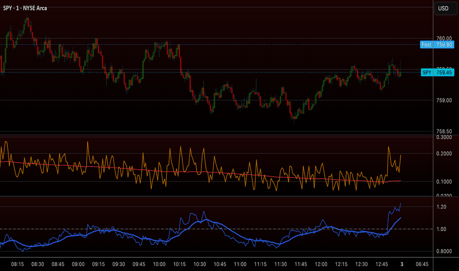
Adaptive Dynamic BB Clouds [PRO] - Auto MA & Double SqueezeWelcome to the Adaptive Dynamic BB Clouds. Traditional Bollinger Bands use a static standard deviation multiplier (usually 2.0) and a fixed moving average (SMA). However, market conditions are constantly shifting between ranging, trending, and highly volatile states.
This indicator introduces an Adaptive Algorithmic Engine that dynamically adjusts both the Basis Line (Moving Average) and the Band Width based on real-time Volume, Trend Strength (ADX), and Momentum (RSI).
🌟 Core Features:
1. Auto-Adaptive Basis Line (Smart MA)
Instead of locking you into one moving average, the script reads the market and automatically selects the best MA:
VWMA (Volume Weighted): Activates automatically when there is a significant volume surge (Relative Volume > 1.3) to track institutional money flow.
EMA (Exponential): Activates when a strong trend is detected (ADX > 25) to reduce lag and stick closer to the price.
SMA (Simple): Defaults to this during flat, ranging, or low-volume markets to avoid false signals and whipsaws.
2. Multi-Factor Dynamic Bands
The width of the bands is no longer static. The script calculates a real-time weight and magnitude based on:
Trend (ADX): Expands bands during strong trends.
Volume (RelVol): Expands bands during high volume breakouts.
Momentum (RSI): Expands bands when approaching overbought/oversold extremes.
If the market is dead, the bands contract tightly, filtering out market noise.
3. MTF Clean Clouds (Macro vs. Micro)
The script automatically detects a logical Lower Timeframe (LTF) based on your current chart. It plots the Macro (Current TF) bands as thick lines and the Micro (LTF) bands as thin lines. The space between them is filled with a clean gradient cloud. This visually represents the "Tension Zone" or dynamic Support/Resistance.
4. Double Squeeze & Squeeze Background
Squeeze Background: When the bands contract inside the Keltner Channels, the chart background turns gray, indicating a volatility compression (Accumulation phase).
Double Squeeze (Purple Diamond 💎): A rare confluence signal. When both the Macro TF and Micro TF enter a squeeze at the exact same time, a purple diamond appears. This indicates an extremely high probability of an imminent, explosive volatility expansion.
5. Real-Time Dashboard
A sleek, customizable panel on the chart displays real-time metrics for ADX, Relative Volume, and the current "Squeeze %" strength, so you always know what is driving the indicator.
⚙️ How to Use:
Accumulation: Look for gray backgrounds (Squeeze) and high Squeeze %. Do not trade breakouts yet; wait for the energy to build up.
Breakout: When the background color disappears and bands expand, trade in the direction of the breakout.
Confluence: A purple diamond 💎 followed by a volume surge (shown in green on the dashboard) is a strong signal for a major move.
Note: 100% Repaint-Free. Built securely with lookahead_off and na() fallbacks.
(Disclaimer: This script is for educational purposes only and does not guarantee financial returns. Always use proper risk management.)
Indicador

Structure & Trend ContextStructure & Trend Context is a clean overlay that visualises market structure and trend direction without cluttering the chart. It is built as a context tool to support your own analysis, not as a signal system.
What it shows
- Trend filter: a fast and a slow EMA define the prevailing direction. The slow EMA is colour-coded by bias (up / down / neutral).
- Volatility band: an ATR band around the fast EMA gives a sense of normal price travel and dynamic over-/under-extension.
- Swing structure: the most recent confirmed swing high and swing low are tracked and drawn as reference levels.
- Structure breaks (BoS): a marker appears only when price closes beyond the prior swing by an ATR buffer while in trend. Each level is locked after it breaks, so markers stay rare and meaningful rather than firing on every minor poke.
- Context panel: a compact top-right table showing current trend bias, last higher high and last lower low.
How to use it
Read the chart first. Use the trend filter and band for context, the swing levels for reference, and treat a structure break as one piece of confluence, not a standalone trigger. Raise "Swing sensitivity" on higher timeframes or noisy assets to keep only the larger structure.
Inputs
Every layer (band, swing levels, structure markers, raw pivots, panel, bar tint) has its own toggle, and the EMA, ATR and pivot lengths are fully adjustable.
Notes
This indicator is a visualisation aid for discretionary analysis. It does not predict price, does not generate buy or sell recommendations, and is not financial advice. Markers are confirmed on bar close and do not repaint. Open-source — adapt it to your own workflow. Indicador

Indicador
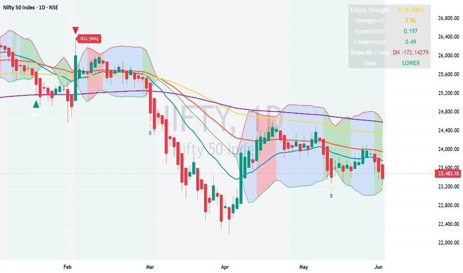
ADR% + ATR/Price %ADR% + ATR/Price % — Dual Volatility Reading
Two complementary volatility measures in one pane, with a live legend showing current readings.
ADR% (Average Daily Range %) — The classic equity trader's volatility filter. Calculates the average ratio of daily high to daily low over N days (default 20), expressed as a percentage. Always uses daily data regardless of your chart timeframe. A stock with ADR% of 5 typically moves ~5% intraday. Popularized by traders like Qullamaggie and Pradeep Bonde as a screening tool — if ADR% is too low, the stock isn't moving enough to be worth trading.
ATR / Price % — Standard ATR (default 14) divided by current close, expressed as a percentage. Unlike ADR%, this adapts to your chart timeframe — on a 4H chart you get 4H ATR%, on daily you get daily ATR%. Also captures gaps via true range, which ADR% misses. Useful for cross-instrument position sizing and risk normalization.
Why both?
ADR% gives you the daily "is this thing moving" read, frozen to daily regardless of chart.
ATR/Price% gives you the timeframe-aware volatility you're actually trading on.
On a daily chart they'll track closely. Drop to lower timeframes and the divergence shows how much of the daily range your timeframe is capturing.
Features
Independent length settings for each indicator
Toggle either line on/off
Customizable colors
On-pane legend with live values and parameters (position configurable: top/bottom × left/right)
Daily security calls use lookahead_off to prevent repainting
Use cases
Stock screening: filter for ADR% above some threshold (e.g. > 4) to ensure tradeable range
Position sizing: use ATR/Price% to normalize risk across instruments at different prices
Timeframe selection: compare the two to gauge whether your execution timeframe captures enough of the daily move
Volatility regime detection: watch for expansion/contraction in both measures
Works on any market — equities, crypto, futures, FX. Built in Pine v5. Indicador