
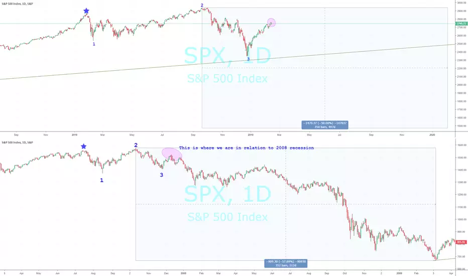
I have marked roughly were I believe today's market is in relation to the 'Great Financial Crisis of 2008'.
Each chart depicts:
A blue star for a top in the market
Followed by a low - marked with the number 1
Followed by the final market top - marked with the number 2
Followed by the first bottom of declines - marked with the number 3
And today's current position is the pinkish circle.
If this is true, the next will occur soon and surpass the prior lows marked with the number 3. In the current case these would be the December 24th lows.
It took about 352 trading days from top to bottom in 2007-2009 in which the market lost 57% of its value.
I only marked a 50% loss on today's chart because it would be much more costly if it occurred and I drew out the highlight for roughly 350 days from the market highs on September 21, 2018.
Mark Twain is rumored to have said, "History doesn't repeat itself but it often rhymes."
Do these charts rhyme? Are they coincidence? Or nothing close?
Let me know what you think!
Each chart depicts:
A blue star for a top in the market
Followed by a low - marked with the number 1
Followed by the final market top - marked with the number 2
Followed by the first bottom of declines - marked with the number 3
And today's current position is the pinkish circle.
If this is true, the next will occur soon and surpass the prior lows marked with the number 3. In the current case these would be the December 24th lows.
It took about 352 trading days from top to bottom in 2007-2009 in which the market lost 57% of its value.
I only marked a 50% loss on today's chart because it would be much more costly if it occurred and I drew out the highlight for roughly 350 days from the market highs on September 21, 2018.
Mark Twain is rumored to have said, "History doesn't repeat itself but it often rhymes."
Do these charts rhyme? Are they coincidence? Or nothing close?
Let me know what you think!

All forecasts are based on analysis of past behavior. Prior movements are not always indicative of future movement. Develop the theory, test the theory. Do your own research. Nothing in this analysis constitutes advice. YouTube For More. Good luck!!
相关出版物
免责声明
这些信息和出版物并非旨在提供,也不构成TradingView提供或认可的任何形式的财务、投资、交易或其他类型的建议或推荐。请阅读使用条款了解更多信息。
All forecasts are based on analysis of past behavior. Prior movements are not always indicative of future movement. Develop the theory, test the theory. Do your own research. Nothing in this analysis constitutes advice. YouTube For More. Good luck!!
相关出版物
免责声明
这些信息和出版物并非旨在提供,也不构成TradingView提供或认可的任何形式的财务、投资、交易或其他类型的建议或推荐。请阅读使用条款了解更多信息。