
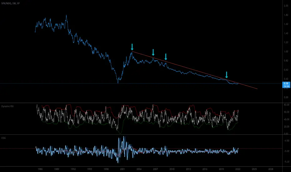
This is a fascinating chart. Since 1985, the NASDAQ 100 Index has been consistently outperforming the S&P 500 except for 2 years following the bursting of the Dot.com Bubble.
Also of note is the well-defined downtrend line that has been tested several times in the past, and is currently being tested again. The ratio is currently near the same level that marked the top of the last tech bubble peak, and is facing pressure from tightening financial conditions.
Watch this chart closely for clues to selecting asset classes that will outperform going forward.
Also of note is the well-defined downtrend line that has been tested several times in the past, and is currently being tested again. The ratio is currently near the same level that marked the top of the last tech bubble peak, and is facing pressure from tightening financial conditions.
Watch this chart closely for clues to selecting asset classes that will outperform going forward.

免责声明
这些信息和出版物并非旨在提供,也不构成TradingView提供或认可的任何形式的财务、投资、交易或其他类型的建议或推荐。请阅读使用条款了解更多信息。
免责声明
这些信息和出版物并非旨在提供,也不构成TradingView提供或认可的任何形式的财务、投资、交易或其他类型的建议或推荐。请阅读使用条款了解更多信息。