
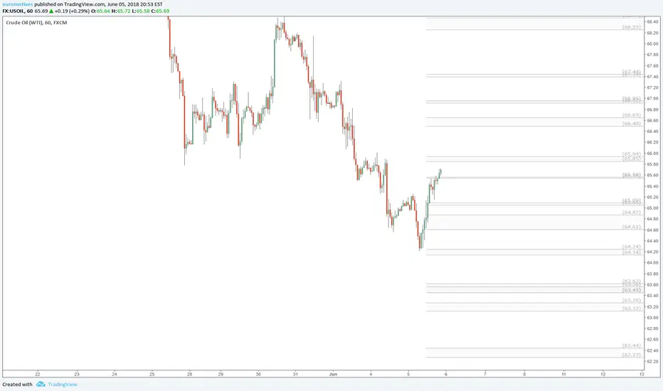
These zones are calculated using Fibonacci Ratios of past price moves.
The chart is stretched Vertically - Drag the Right side axis to change magnification.
There are zones above and below the current window, Drag the Chart up/down to see other zones.
Drag bottom axis to the left to magnify the candle size to view close up.
I will update as new zones are defined by upcoming Fibs.
The chart is stretched Vertically - Drag the Right side axis to change magnification.
There are zones above and below the current window, Drag the Chart up/down to see other zones.
Drag bottom axis to the left to magnify the candle size to view close up.
I will update as new zones are defined by upcoming Fibs.
注释
I don't just make up those zones from simple landmarks, say like previous highs/lows or pivot points, or whatever. I use multiple fibs to precisely measure each move, than look for confluences that identify zones. Here is a big picture of my utter mess of a chart that I boiled down to the above
And here is a bit of a zoomed in view
I hope you can see why I take the time to copy each of those zones into a naked chart to post live....
注释
OIl entering a rather wide zone.It is wide because no Fib harmonics lined up there.
And it shows consolidation activity in the zone previously.
注释
Interesting development in Oil.The zones are holding perfectly.
Some observations/conclusions on chart.
注释
It broke above resistance, with a little gusto (especially for time of day).It might test the zone immediately above on main chart, 66.49 - 66.65 range (ie 66.50).
注释
Oil came back to retest the 65.54.56 zone.Seems to be of GREAT interest.
I think it will break lower this time.
Supports only hold one or at most twice.
注释
Uh oh, important level broke.Down move likely to continue in short term
注释
Looks like 65.25 probable next stop注释
The zones are holding quite nicely, sometimes to the Penny!I am currently adjusting the zones based on price movement since post.
Hopefully I will have a new chart posted later today.
注释
Wow, not sure what caused the spike down today.But it bounced like a super ball off my 65.54/.56 zone.
Waiting to see if there is follow through in either direction now.

the Golden Ratio is my Religion
the Trading View is my Nation
the Moderator Tag is my Flag
the Trading View is my Nation
the Moderator Tag is my Flag
相关出版物
免责声明
这些信息和出版物并非旨在提供,也不构成TradingView提供或认可的任何形式的财务、投资、交易或其他类型的建议或推荐。请阅读使用条款了解更多信息。
the Golden Ratio is my Religion
the Trading View is my Nation
the Moderator Tag is my Flag
the Trading View is my Nation
the Moderator Tag is my Flag
相关出版物
免责声明
这些信息和出版物并非旨在提供,也不构成TradingView提供或认可的任何形式的财务、投资、交易或其他类型的建议或推荐。请阅读使用条款了解更多信息。