Short
Short
The First Grand Impulse or the Beginning of an Extended Fifth WaS&P 500: The First Grand Impulse or the Beginning of an Extended Fifth Wave?
The aggressive Elliott Wave scenario suggests that the S&P 500 continues to develop within the first major impulsive market cycle. Our current wave count places price action in Wave (III) of Wave (V), while the overall structure remains consistent with Elliott Wave rules and guidelines.
This research is supported by several key observations, including alternation between Waves (II) and (IV) across two different degrees, the equality relationship between Waves (I) and (V) at the current stage, valid channeling, and the alignment of Fibonacci relationships in both price and time. In this methodology, time is treated as an equally important validation tool alongside price, providing an additional layer of confidence in the wave count.
If this interpretation remains valid, the current advance may evolve into an Extended Fifth Wave, followed by Wave (IV) and a final Wave (V) of (V), potentially completing the first major impulsive cycle of this long-term structure.
As always, Elliott Wave analysis is based on probabilities, and this scenario will be updated as market structure continues to develop.
— Research by Mr. Nobody
Independent Elliott Wave Principle Researcher
"Patterns whisper. I listen." 🎧📊
S&P 500 Index
May 19
The Fibonacci Sequence and Cycle in the Complete Wave Cycle of t
 Long
Long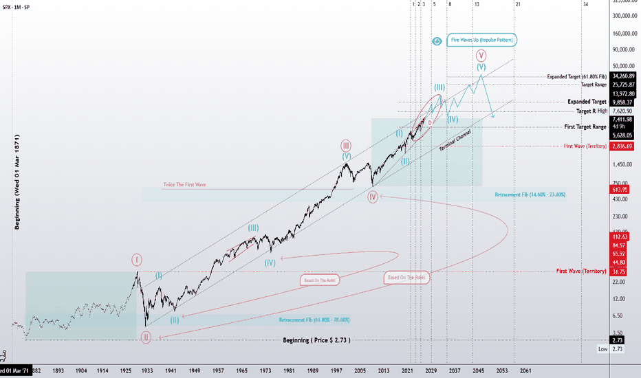
XAU/USD 27 July 2026 Intraday AnalysisH4 Analysis:
-> Swing: Bullish.
-> Internal: Bearish.
Bias and analysis to remain the same as analysis dated 30 June 2026.
Price did not print bullish CHoCH to indicate bullish pullback phase initiation. Price instead printed a new low followed by a bullish CHoCH
Price is currently trading within and established internal range, however, I will continue to monitor price with respect to depth of pullback.
Intraday expectation:
Price to trade up to either premium of internal 50% EQ, or H4 demand zone before targeting weak internal low, currently priced at 3,942.100.
Note:
Gold remains volatile as tensions between the US, Israel, and Iran keep safe‑haven demand elevated.
Markets are reacting quickly to every headline, while uncertainty around the Fed’s easing path and shifting U.S. policy under President Trump, especially tariffs continues to fuel choppy price action.
For newer traders, the key is simple, stay flexible and manage risk carefully, as fast spikes and sudden reversals are a normal part of the current XAU/USD environment.
H4 Chart:
M15 Analysis:
-> Swing: Bearish.
-> Internal: Bearish.
Analysis and bias remains the same as analysis dated 20 July 2026.
Price has printed according to analysis dated 14 July 2026 where I mentioned price to trade up to either premium of internal 50% EQ, or M15 demand zone before targeting weak internal low, priced at 3,983.545. This is how price printed.
Price has subsequently printed a bullish CHoCH to indicate bullish pullback phase initiation. Price has since printed lower. Depth of pullback has been insignificant, therefore, I will not classify the bearish iBOS, however, I have marked this in red for illustration purposes.
Price has since printed a further bullish CHoCH and once again price is trading within an established internal range, however, I shall again monitor price action with regards to depth of pullback.
Intraday expectation:
Price to trade up to either premium of internal 50% EQ, or M15 demand zone before targeting weak internal low, priced at 3,959.800.
Note:
Gold remains highly reactive on M15 as geopolitical risk continues to drive quick, headline‑led moves.
The tension between the US, Israel, and Iran is keeping safe‑haven demand elevated, with markets still sensitive to any sign of escalation.
At the same time, shifting US tariff policy under President Trump is adding extra uncertainty, fuelling sharp intraday swings and increasing the likelihood of sudden sentiment flips. Liquidity pockets and whipsaws remain common, making disciplined risk management essential.
Gold’s geopolitical premium is still firmly in place, and until tensions ease, short‑term volatility is likely to stay front‑loaded.
M15 Chart:

GBPUSD | Fresh Bearish StructureFOREXCOM:GBPUSD has recently transitioned from a bullish market structure into a bearish one, with a clear Change of Character (CHoCH) confirming that sellers have regained control of the higher-timeframe order flow.
Following this structural shift, the market is now in a corrective pullback, retracing into premium pricing before the next potential bearish continuation.
This bearish transition has created three institutional execution zones, each offering a potential opportunity to participate in the continuation move.
The first area of interest is the HTF Flip Zone; the origin of the displacement that shifted market structure from bullish to bearish. A lower-timeframe bearish confirmation here would provide the earliest continuation entry.
Should price trade through the Flip Zone without confirmation, attention shifts to the HTF Supply Zone, where fresh institutional selling interest may be waiting.
If buyers continue to push higher, the final area of interest becomes the Extreme HTF Supply Zone, representing the highest premium area within the current bearish market structure.
Liquidity continues to rest beneath each bearish leg, making those pools the logical downside objectives if sellers successfully defend any of these institutional zones.
The execution plan remains disciplined:
• Sell from the HTF Flip Zone with lower-timeframe confirmation.
• If no confirmation develops, wait for the HTF Supply Zone.
• If price continues higher, allow it to reach the Extreme HTF Supply before reassessing.
The market has already revealed its directional intent through the recent structural shift. Now the focus is simply on allowing price to retrace into value before looking for confirmation.
Structure first. Confirmation second. Execution last. EURUSD | Trading the Structural ShiftFOREXCOM:EURUSD has recently transitioned from a bullish market structure into a bearish one after printing a decisive Change of Character (CHOCH), signalling that buyers have lost control and sellers have begun taking over the order flow.
This structural shift changes the entire market narrative. Rather than looking for buying opportunities, the focus now shifts to identifying the optimal area for sellers to re-enter the market.
Following the bearish CHOCH, the market created a 4H Flip Zone; the origin of the structural shift where previous demand transitioned into supply. This is the first area of interest, as institutions often revisit these zones before continuing in the new trend direction.
If price delivers a valid lower-timeframe bearish confirmation (CHOCH/MSS) from this Flip Zone, it presents the first high-probability continuation opportunity in line with the newly established bearish trend.
However, if the Flip Zone fails to produce confirmation and price trades through it, the bearish bias remains intact. In that case, attention shifts to the major higher-timeframe supply zone positioned above, where a deeper premium retracement may provide the next institutional selling opportunity.
This approach allows the market to dictate execution rather than forcing an entry.
Trading Narrative
• Previous Trend: Bullish
• Structural Shift: Bearish CHOCH confirmed
• Current Bias: Bearish
• First Area of Interest: 4H Flip Zone
• Secondary Area of Interest: Higher-Timeframe Supply
• Execution Plan:
Sell from the Flip Zone only if lower-timeframe confirmation develops.
If no confirmation appears and price trades through the Flip Zone, remain patient and wait for the major HTF Supply before looking for shorts.
The objective is not to predict where price must reverse, but to allow price to reach institutional areas and let market structure confirm the next move.  Short
Short
 Short
Short


Short 
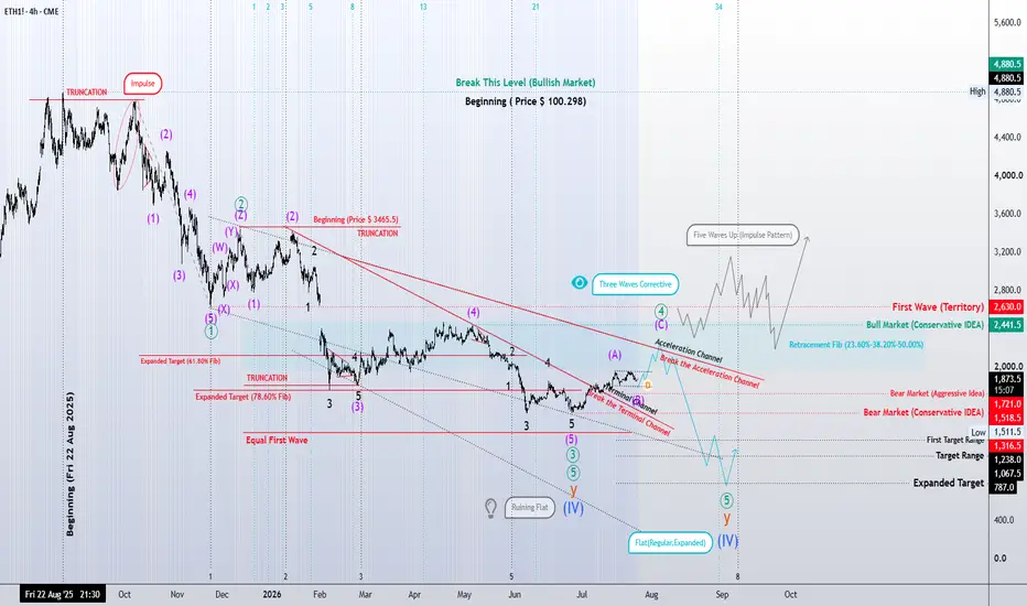
Ethereum | Running Flat or a Larger Corrective Extension?
Our current structural analysis suggests that Ethereum has reached one of the most critical stages of its correction.
In the conservative scenario, the ongoing correction may complete as a Running Flat. If confirmed, this would likely mark the end of the corrective phase and open the door for a five-wave impulsive advance, signaling the beginning of the next bullish cycle.
However, until the bullish structure is fully confirmed, the aggressive scenario remains equally valid. From this perspective, the correction may still extend, allowing Wave Y to evolve into either a Regular Flat or an Expanded Flat. For that reason, declaring the correction complete at this stage would be premature.
At the moment, the most important factor is the quality of the upcoming advance. Will the market develop a clear five-wave impulse, confirming that the correction has ended, or will the current rally become part of a larger corrective structure?
As always, this analysis is not a prediction of the future. It is my structural interpretation of the market based on the rules, guidelines, and relationships of the Elliott Wave Principle. As new waves unfold, the market—not the analyst—will determine which scenario remains valid.
📌 If the logic behind this scenario is not entirely clear, I encourage you to review the previous analyses attached to this idea. They are part of the same research path and provide the broader structural context behind the current wave count.
Price is the result. Structure is the cause.
— Mr. Nobody | Elliott Wave Principle
Ethereum
Jul 12
Is Wave C Complete, or Is the Correction Still Unfolding?
 Short
Short
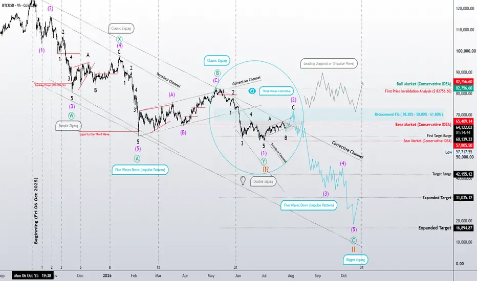
Bitcoin: Wave (V) Begins or a Larger Zigzag Continues? | ElliottBitcoin: Wave (V) Begins or a Larger Zigzag Continues? | Elliott Wave Analysis
In this analysis, both the aggressive and conservative scenarios remain valid. Until the market confirms its structure, neither scenario has gained a decisive advantage.
Under the aggressive scenario, our primary outlook continues to favor the development of a larger Zigzag correction. In this wave count, Wave A and Wave B are considered complete, while the market is now expected to be developing Wave C. If this interpretation is correct, Bitcoin is currently forming Wave (1) and Wave (2) of Wave C, with another impulsive decline expected once the current corrective rally is complete.
At the same time, we cannot rule out the possibility that the current advance evolves into a much larger bullish structure, as discussed in my previous analyses. I always attach earlier publications below each new analysis so the evolution of the wave count can be followed step by step.
On the other hand, the conservative scenario still suggests that the decline from Bitcoin's all-time high may be unfolding as a Double Zigzag with seven swings. If this scenario proves correct, the current correction would complete Wave (2) before the market resumes its next major impulsive advance.
For now, the first price invalidation level remains an important reference. As long as price respects this level, it serves as an early signal that helps determine whether the market is developing a larger corrective structure or preparing for the next bullish phase.
However, price action remains the deciding factor. If the current advance continues to develop only as a three-wave corrective structure, without confirming a strong impulsive move, the aggressive scenario remains the preferred outlook. Conversely, a clear impulsive advance—or even a series of nested 1-2, 1-2, 1-2 formations—would significantly strengthen the conservative scenario.
As with every Elliott Wave study, this is a structural interpretation of the market—not a price prediction. As long as the rules and guidelines of the Elliott Wave Principle continue to support these wave counts, both scenarios remain valid.
Ultimately, the market itself will determine which structure unfolds.
We do not predict price—we follow the structure the market builds.
— Mr. Nobody
Independent Elliott Wave Principle Researcher
"Patterns whisper. I listen." 📊🎧
Bitcoin
Jul 14
Two Valid Scenarios Remain | Elliott Wave Analysis
Short 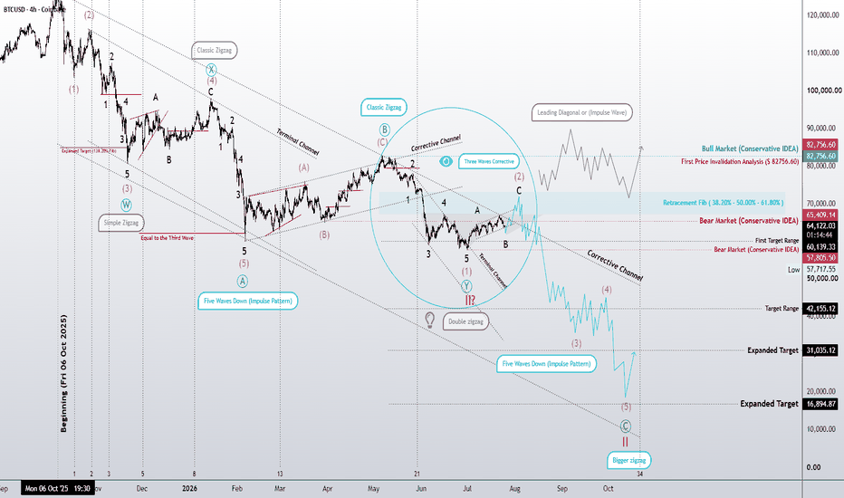
 Short
Short
GBP/USD - Bullish Structure HoldsThe higher-time-frame outlook remains bullish. Market structure continues to hold, with price taking out intermediate highs while preserving the overall bullish framework. No significant lows have been violated, keeping the trend intact and maintaining the objective of reaching higher-time-frame external liquidity.
From an intermediate perspective, price has mitigated key higher-time-frame points of interest, adding confluence to the bullish bias. Along the way, internal liquidity has been taken and new liquidity has been engineered, which is consistent with a healthy bullish structural leg rather than a reversal.
Going into the new week, I’m expecting price to first sweep the current internal liquidity before mitigating lower-time-frame points of interest beneath price. If those areas fail to hold, I’ll anticipate a deeper engineered pullback into a larger liquidity pool before looking for continuation toward the premium objective. Regardless of the depth, my higher-time-frame bias remains unchanged until structure is invalidated.
The lower time frames are also aligned with the higher-time-frame narrative. Rather than chasing price, I’m waiting for sell-side liquidity to be taken and lower-time-frame points of interest to be respected before looking for long opportunities.
One detail worth noting is that the previous higher-time-frame lower high (highlighted by the purple zone) has already been broken. That shift reinforces the expectation that price has reset its objective and is now positioned to seek new external liquidity.
Note: The purple zones represent higher-time-frame confluence areas and are included as additional structural reference points—not standalone entry signals.
For now, patience remains the edge. I’ll continue tracking liquidity, waiting for my confirmations, and allowing price to come into my areas of interest before considering execution.
ETH | Q3 2026 | Day ChartLets just see where this goes.
Higher timeframes show distribution so scalp longs and hold shorts is the plan of attack for lower timeframe entries.
The question I would ask is, If price action wants to go down, where will it go down from?
If price is going up, where will it go up from?
A weekly FrontSide support level at $1,776.12 created Mon 22 Jun.
Below that is a daily frontside level at $1,653.92 created the 25th June and lastly the 4hr support at $1,582.20 which is the last level, final support protecting the local accumulation trend.
If price tests these levels, chances are a breadcrumb trail of resistance will follow. If the weekly support does hold, price would face a daily and monthly resistance level at $2,003 - $2,020. A Yearly distribution level sits quietly at $2,131.22.
The highest price could reach would be $2,268.52. If that level is broken, a breadcrumb trail of support could give price the opportunity to gain the resistance levels as support and break the distribution trend.
-----------------------------------
Multiple Time-Frame Analysis; Color Code | Strength favors the higher timeframe.
Yearly timeframe = black
Monthly timeframe = pink
weekly = grey
daily = red
4hr = orange
1hr = yellow
15min = blue
5min = green if they are shown. (Level visibility on intervals is set to timeframe the level was found on and below to keep chart view organized.)
** Candle Science explained **
A Range = two or more consecutive color candles.
There are two types of ranges - accumulation and distribution. **A single candle is a range on a lower timeframe. *Find the range and define its, creation dates, prices, and risk parameters. A range is broken down into 4 candle, which create 6 levels that define the range and illustrate market structure.
Focus only on the first and last candle of each range. The last candle of each type of range has two levels - see FS & Inv. FS Candles below.
DISTRIBUTION RANGES DEFINED:
When price is above a distribution range, these candles/levels act as support.
(BS) BACKSIDE Candle - First distribution candle in a distribution range. Expectation = strong reaction to price. long wicks reaching to or away from level. high angle accumulation trends, f.v,g's
(FS) FrontSide Candle - Last distribution candle in a distribution range. Expectation = reversal, create a low angle accumulation trend. The top of Distribution candles are used as support. The bottom of the FrontSide candle is the SwingLow of the range. The FS candle wants to protect the SwingLow. When/if Price Action closes below the SwingLow, the level is invalidated. Find another range to trade.
ACCUMULATION RANGES DEFINED: When price is below an accumulation range, these candles/levels act as resistance.
INVERSE BACKSIDE (Inv.BS) - First Accumulation candle in an accumulation range. Expectation. = strong reaction to price. long wicks reaching to or away from level. Creates high angle distribution trends, f.v.g, protects the Inv.FS candle
INVERSE FRONTSIDE (Inv.FS) - Last accumulation candle in an accumulation range. Expectation = reversal, create a low angle distribution trend. The bottom of Accumulation candles are used as resistance.
The top of the Inv.FrontSide candle is the SwingHigh of the range. The Inv.FS candle wants to protect the SwingHigh. When/if Price Action closes above the SwingHigh, the level is invalidated. Find another range to trade.


 Short
Short