"Sell in May and Go Away": What the Data Actually ShowsEvery year around this time, the same advice circulates: sell your stocks in May, come back in November. The idea has a long history. The original saying comes from the London stock market, where traders would leave for the summer months. Academic research has studied it under the name "Halloween Indicator" since at least Bouman and Jacobsen (2002), who found statistically significant seasonal patterns in 36 of 37 countries they examined.
But that was over two decades ago. Markets have changed. Algorithmic trading dominates volume, information travels in milliseconds, and the number of investors aware of this pattern has grown substantially. We tested the hypothesis from scratch, across 28 assets spanning four asset classes, with proper statistical controls.
1. The hypothesis
The claim is specific and testable: returns during the six-month winter period (November through April) are systematically higher than returns during the summer period (May through October). If this is true, an investor could improve risk-adjusted returns by being invested only during winter and holding cash during summer.
We define the null hypothesis as: there is no difference between winter and summer returns. The alternative: winter returns exceed summer returns by a statistically and economically significant margin. We require significance to survive Bonferroni correction for multiple testing, since we test 28 assets simultaneously.
2. The data
We use adjusted close prices from Tiingo for 28 ETFs across four asset classes:
16 equity ETFs: S&P 500 (SPY, 1993-2026), Nasdaq 100 (QQQ), Russell 2000 (IWM), Dow Jones (DIA), plus country ETFs for Germany, UK, France, Switzerland, Japan, Australia, Canada, and emerging markets including Brazil, Taiwan, South Korea.
6 fixed income ETFs: US Aggregate Bond (AGG), 20-year Treasury (TLT), 7-10 year Treasury (IEF), High Yield Corporate (HYG), Investment Grade Corporate (LQD), EM Sovereign Debt (EMB).
4 commodity ETFs: Gold (GLD), Silver (SLV), Crude Oil (USO), Commodity Basket (DBC).
2 real estate ETFs: US REITs (VNQ), International REITs (VNQI).
History ranges from 15 years (VNQI) to 33 years (SPY). All returns are total returns based on adjusted close prices.
Fig. 1: Average monthly returns by asset across all available history. Blue shading indicates positive months, red indicates negative. Dashed lines separate winter (Nov-Apr) from summer (May-Oct) periods.
3. Monthly seasonality
Figure 1 shows the full monthly return matrix. For the S&P 500, the pattern is visible but not dramatic: November (+2.5%) and April (+2.0%) are the strongest months, while September (-0.5%) is the weakest. This is consistent with the literature.
The pattern is more pronounced in European equities. Germany shows July and August returns of -2.3% and -1.3% respectively, with strong November (+2.6%) and December (+2.9%). The UK shows a similar concentration of weakness in summer months.
For fixed income and commodities, no clear seasonal pattern emerges from the monthly data.
Fig. 2: S&P 500 average monthly returns. Blue bars are winter months, red bars are summer months. Asterisks mark months where the mean return is significantly different from zero at p < 0.05.
4. The statistical test
We compute cumulative returns for each winter and summer half-year across the full history of each asset. This gives us paired seasonal observations: 34 winter periods and 34 summer periods for SPY, fewer for more recently launched ETFs.
We apply Welch's t-test (unequal variances) to compare winter and summer means, following our strategy development framework. Since we test 28 assets simultaneously, the risk of finding false positives by chance alone is substantial. At an uncorrected alpha of 0.05, we would expect roughly 1.4 false positives even if the effect did not exist.
We apply Bonferroni correction, setting the significance threshold at 0.05 / 28 = 0.0018.
Fig. 3: Average 6-month returns, winter vs summer, for all 28 assets. Asterisks indicate uncorrected p < 0.05.
Fig. 4: Statistical significance of the seasonal spread for all 28 assets. The dashed yellow line marks p = 0.05 (uncorrected), the dotted red line marks the Bonferroni-corrected threshold.
Result: 4 out of 28 assets show a significant seasonal difference at the uncorrected 0.05 level: Germany (p = 0.025), Switzerland (p = 0.035), UK (p = 0.045), and France (p = 0.046). All four are European equity markets.
No asset survives Bonferroni correction. Zero out of 28.
5. Effect size and confidence intervals
Statistical significance alone does not tell you whether an effect is practically meaningful. Cohen's d measures the standardized difference between winter and summer returns.
Fig. 5: Effect size (Cohen's d) vs p-value for all 28 assets. Points above the dashed line are significant at p < 0.05. Bubble size reflects the number of seasonal periods available.
The largest effect sizes are concentrated in European equities (d = 0.5 to 0.6) and some emerging markets (South Korea, Taiwan). US equities show smaller effects (SPY: d = 0.26). Fixed income is near zero (IEF: d = 0.00).
To go beyond point estimates, we compute 95% bootstrap confidence intervals using 10,000 resamples for key assets.
Fig. 6: Seasonal spread with 95% bootstrap confidence intervals. Only Germany's confidence interval excludes zero.
For the S&P 500, the observed spread is +2.8% with a 95% CI of . The interval includes zero, meaning the data is consistent with no seasonal effect. Germany shows +9.1% with CI , the only asset where the bootstrap interval excludes zero.
6. Return distributions
Fig. 7: Box plots of 6-month return distributions for eight representative assets. Boxes show interquartile range, whiskers show the full range excluding outliers.
The box plots reveal why the seasonal effect is statistically weak despite visible mean differences: the distributions overlap substantially. For SPY, both winter and summer returns range from roughly -30% to +25%. The winter median is about 3 percentage points higher, but the spread within each season is far larger than the spread between them.
7. Does it work as a strategy?
We backtest a simple implementation: invest during November through April, hold 3-month T-Bills during May through October. Transaction costs of 10 basis points per trade are applied at each switch.
This is a methodological improvement over many published analyses of this strategy, which assume cash earns zero during summer. In practice, an investor who exits equities would hold cash or short-term bonds, earning the prevailing risk-free rate.
Fig. 8: Equity curves for the Sell in May strategy (blue) vs Buy & Hold (gray) for six representative assets. Log scale.
Fig. 9: Performance summary for all 28 assets. SIM = Sell in May strategy (invested Nov-Apr, T-Bill May-Oct).
For the S&P 500 over 33 years:
SIM strategy: 8.0% annualized, Sharpe 0.60, max drawdown -35.7%, 49% exposure
Buy & Hold: 10.9% annualized, Sharpe 0.59, max drawdown -55.2%
The SIM strategy achieves a marginally higher Sharpe ratio (0.60 vs 0.59) despite lower absolute returns, because it avoids roughly half the market's volatility. It also cuts the maximum drawdown by 19.5 percentage points. On a risk-adjusted and exposure-adjusted basis, the strategy is roughly neutral for the S&P 500.
The picture changes substantially by asset class and region:
European equities: The strategy adds genuine value. For Germany, the SIM strategy returns 8.9% vs 6.3% buy-and-hold, with a Sharpe of 0.51 vs 0.25. The strategy outperforms in absolute terms while taking half the risk. Similar results hold for France, UK, and Switzerland.
US equities: The strategy underperforms on an absolute basis but provides comparable risk-adjusted returns. For the Nasdaq 100, the strategy returns only 6.0% vs 11.0%, reflecting the strong summer rallies driven by technology stocks in recent years.
Fixed income: The strategy consistently underperforms. Bond returns are more evenly distributed across seasons, and the strategy incurs unnecessary transaction costs while gaining no seasonal advantage.
Commodities: Mixed. Gold shows a slight advantage for the SIM strategy (Sharpe 0.69 vs 0.61), while crude oil is negative in both approaches.
8. Temporal stability
A seasonal effect that existed in one era but has disappeared is not useful for forward-looking decisions.
Fig. 10: Seasonal spread (winter minus summer, annualized) for 12 assets across three uniform sub-periods. Blue indicates winter outperformance, red indicates summer outperformance.
Figure 10 shows the seasonal spread across three common time windows (2006-2012, 2013-2019, 2020-2026) for 12 assets that all have data covering the entire range. The pattern is clear: most assets show positive winter spreads in the first two periods, but the picture shifts noticeably in 2020-2026.
The S&P 500 spread drops from +6.0% in 2006-2012 to -3.5% in the most recent period. The Nasdaq shows an even sharper reversal, from +5.1% to -6.5%, reflecting the strong summer rallies in technology stocks since 2020. This decline is consistent with what the rolling analysis confirms.
Fig. 11: Rolling 10-year seasonal spread for the S&P 500. The spread has declined from roughly 7% in the early 2000s to near zero by 2025.
The rolling 10-year window for SPY shows the same trajectory as the sub-period view: a steady decline from peak spreads above 6% to values near zero by 2025. This is consistent with the efficient markets hypothesis: once a pattern becomes widely known, it gets arbitraged away.
Fig. 12: Rolling 10-year seasonal spread for Germany (DAX). The spread has varied between 7% and 30% but never crossed zero, remaining consistently positive across two decades.
European equities tell a different story. Germany's rolling spread (Fig. 12) peaked near 30% in 2007 and has fluctuated since, but it has never dropped below 7%. Even in the most recent window ending 2025, the spread sits around 16%. The sub-period data confirms this: Germany went from +8.6% to +10.2% in the latest period, the UK from +2.1% to +9.5%. These markets show no sign of the effect weakening, suggesting structural factors (vacation patterns, corporate reporting cycles) that may be more persistent than in the US.
9. Market regimes
Fig. 13: S&P 500 seasonal spread conditional on bull/bear and high/low volatility regimes. None is statistically significant.
The seasonal spread is largest during bear markets (+22.4%) and smallest in bull markets (+4.3%), but neither is statistically significant (p = 0.29 and p = 0.54). This is consistent with the hypothesis that winter outperformance partly reflects crash avoidance: three of the four largest S&P 500 drawdowns (2001, 2002, 2008) had their worst months during the summer period or early autumn.
10. Asset class decomposition
Fig. 14: Average seasonal spread by asset class with standard error bars.
The seasonal effect is concentrated in equities (+6.0% average spread) and commodities (+6.1%), with real estate at +5.7%. Fixed income shows essentially no seasonal pattern (+0.6%). This is what we would expect if the effect is driven by equity risk premia and investor behavior rather than a fundamental economic mechanism. Bond cash flows are contractual and do not respond to seasonal sentiment shifts.
Within equities, the effect is strongest in European and emerging markets, weaker in the US, and essentially absent for the Nasdaq 100. The Nasdaq's non-result likely reflects the dominance of technology stocks, which have delivered strong returns throughout the calendar year over the past two decades.
11. Limitations
ETF histories are short. Most ETFs in this study launched between 1996 and 2010. The analysis covers at most 33 years and as few as 15. Calendar effects observed over short samples can be statistical artifacts.
Survivorship in ETF selection. We test ETFs that exist today. ETFs that failed may have had different seasonal patterns. This is a mild form of selection bias.
No look-ahead in data construction, but in ETF choice. The ETF universe was chosen based on current availability and liquidity, not based on pre-2026 information about which ETFs would show seasonal effects. The broad coverage across asset classes mitigates this concern.
Transaction costs are conservatively estimated at 10 basis points. For large institutional investors, costs would be lower. For retail investors trading options or using leveraged products, costs could be higher.
The T-Bill rate during summer months is approximated using the 3-month T-Bill from FRED (series DTB3). Actual money market returns may differ slightly.
12. Summary
Across 28 assets, four asset classes, and up to 33 years of data:
The seasonal effect exists in the raw data for most equity markets. Winter returns are on average 6 percentage points higher than summer returns for equities.
The effect does not survive multiple testing correction. Zero of 28 assets are significant after Bonferroni correction. Four European equity markets are significant at the uncorrected 0.05 level.
The effect has been declining over time in the US. The rolling 10-year seasonal spread for the S&P 500 has dropped from 7% to near zero.
As a strategy, it is roughly risk-neutral for US equities when cash earns the risk-free rate. The improved Sharpe ratio from reduced volatility is offset by foregone returns.
European equities are the one area where the strategy has generated genuine alpha, both in absolute terms and on a risk-adjusted basis, and this has been relatively stable over time.
Fixed income shows no seasonal effect. Testing it there was a waste of statistical power.
For most investors, the evidence does not support leaving the US equity market in May. The effect is real but too small and too variable to generate reliable outperformance after accounting for the risk-free rate and multiple testing. European equity investors have a somewhat stronger case, but even there, the effect should be viewed as one input among many rather than a standalone strategy.
References
Andrade, S.C., Chhaochharia, V. and Fuerst, M.E. (2013) '"Sell in May and Go Away" Just Won't Go Away', Financial Analysts Journal
Bouman, S. and Jacobsen, B. (2002) 'The Halloween Indicator, "Sell in May and Go Away": Another Puzzle', American Economic Review
Jacobsen, B. and Zhang, C.Y. (2013) 'The Halloween Indicator, "Sell in May and Go Away": Everywhere and All the Time', Available at SSRN: 2154873.
Kamstra, M.J., Kramer, L.A. and Levi, M.D. (2003) 'Winter Blues: A SAD Stock Market Cycle', American Economic Review
Maberly, E.D. and Pierce, R.M. (2004) 'Stock Market Efficiency Withstands another Challenge: Solving the "Sell in May/Buy after Halloween" Puzzle', Econ Journal Watch
Lucey, B.M. and Zhao, S. (2008) 'Halloween or January? Yet another puzzle', International Review of Financial Analysis
 Education
Scared of a Market Crash? Answer: SILVER, $SLV $AGQTVC:SILVER AMEX:AGQ AMEX:SLV Just like Gold exploded higher in late 2025 through early 2026 — delivering one of its strongest performances in decades with massive gains, repeated all-time highs, and prices surging well over $5,000/oz at peaks — TVC:SILVER , AMEX:SLV , AMEX:AGQ is perfectly positioned to follow the same pattern and potentially outperform it significantly.
While gold captured the safe-haven spotlight, silver combines monetary demand with powerful industrial leverage (solar, EVs, AI/electronics). This dual driver often leads to sharper, more explosive moves once momentum kicks in.
Silver Market Fundamentals & Outlook (as of late May 2026):
Current Price: Trading around $74–$77/oz
2025 Performance: Up over 140–160% in one of the strongest years on record
Market Structure: Sixth consecutive annual supply deficit expected in 2026 (~46–67 million ounces)
Heavy Buying from China: Record imports in 2026 — China imported ~836 tons in March alone (highest monthly total ever, 173% above 10-year seasonal average), with Q1 imports exceeding 1,600 tons driven by both industrial and investment demand.
Key Demand Drivers: Surging industrial use (solar panels, EVs, AI/electronics) + rising investment demand (bars, coins, ETFs).
Supply Constraints: Mine production largely flat; recycling unable to keep up with demand
Gold/Silver Ratio: Currently around 55–62:1 (still room for further compression in a bull market)
Analyst Outlook 2026: Many forecasts $90–$120+, with bullish targets as high as $135–$300+ in extreme squeeze scenarios. Michael Oliver, a financial analyst and founder of Momentum Structural Analysis, who predicted Silver going past $100 before the Metals Bull Run, suggests that if gold reaches the $8,000 to $10,000 range, the historical gold-to-silver ratio implies that silver's catch-up move could rapidly push it into the $300-$500/oz range.
AGQ 2x Leveraged Silver: Sitting at around $120/share, these could easily surge past $1,000-$1,200 if Silver breaks $300/oz.
Impact of Rate Cuts Under Kevin Warsh:
Kevin Warsh, who just took over as Fed Chair in mid-May 2026, is generally viewed as more market-friendly and growth-oriented than Powell. Markets are pricing in the possibility of 1–3 rate cuts in the second half of 2026 (especially if inflation cools or economic data softens post-SpaceX IPO volatility).
Lower rates reduce the opportunity cost of holding non-yielding assets like silver.
Weaker USD and lower real yields historically drive strong precious metals rallies.
Silver benefits even more than gold due to its industrial leverage.
Silver could be the perfect safe haven asset in case of a major market correction or profit-taking rotation following the highly anticipated SpaceX IPO (expected mid-June 2026). After the summer hype or toward September–October, any broad market selling could drive strong flows back into silver as investors seek protection — just like we saw with gold during previous periods of volatility.
Why Silver is Primed for More Upside:
Persistent global supply deficits draining inventories for the 6th straight year.
Record heavy buying from China — pulling physical silver from global markets at unprecedented levels.
Explosive industrial demand from green energy and tech sectors
Strong investment flows into physical silver and ETFs.
Potential for further gold/silver ratio compression, following gold’s massive 2025–2026 move
Macro support from Fed policy, geopolitics, and dollar weakness.  Long
Long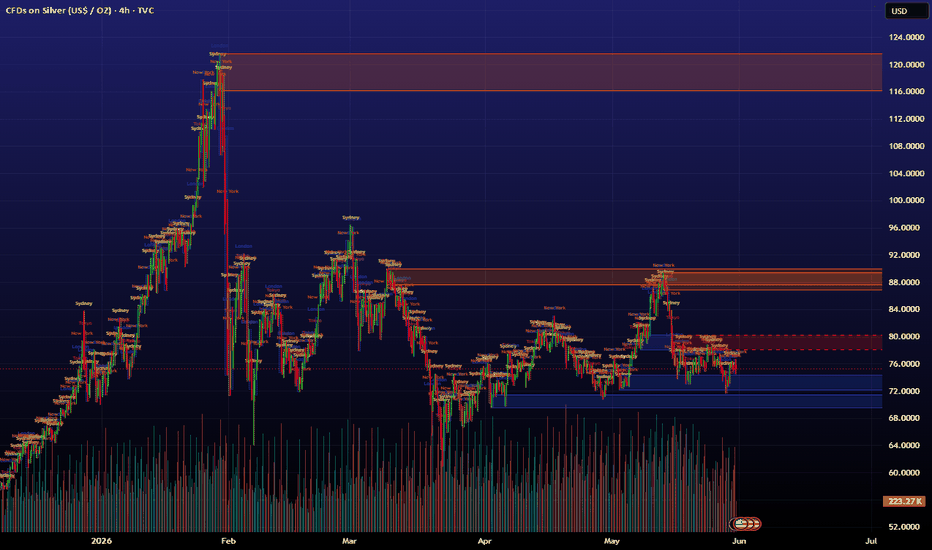
S&P 500 - Sell in May, Return Another Day. The Truth. 2026
SYMBOL: SP:SPX | DIRECTION: Educational / Long-biased | TIMEFRAME: Monthly
Published: April 2026
This idea has been published yearly since 2024. Every year the data is updated. Every year
the conclusion is the same. Every year the crowd ignores it and sells in May anyway. Here we
are again.
No doubt everyone reading this has encountered some version of the phrase "Sell in May
and go away." It appears in newspapers, on financial television, in the comments section of
every S&P 500 idea published in late April. It is stated with authority. It is repeated with
confidence. It is, based on the data, almost entirely wrong.
Almost every publisher on the S&P 500 here on tradingview is bearish.
, except Ww of course.
A quick clarification before the data: the saying refers to the May through October period
historically underperforming the November through April period. That part is broadly true,
November to April has, on balance, delivered stronger returns. What the saying implies is that
May to October loses money and that selling is therefore the rational response. That is where
things fall apart entirely. The record. Unedited. Thirteen years of evidence:
Year Period S&P 500 Return Sell in May verdict
2013 May – Oct +11% WRONG
2014 May – Oct +8% WRONG
2015 May – Oct -15% CORRECT
2016 May – Oct +8% WRONG
2017 May – Oct +11% WRONG
2018 May – Oct +11% WRONG
2019 May – Oct +18% WRONG
2020 May – Oct +55% WRONG
2021 May – Oct +13% WRONG
2022 May – Oct -15% CORRECT
2023 May – Oct +11% WRONG
2024 May – Oct +17% WRONG
2025 May – Oct +23% WRONG
Eleven wrong. Two correct.
That is not a trading strategy. That is a coin flip with worse odds.
The two years it worked, 2015 and 2022, are worth examining. Both involved genuine
macro shocks: the 2015 China currency devaluation scare and the 2022 Federal Reserve rate
hiking cycle. In both cases, the market would have fallen regardless of what month it was.
Selling in May did not cause the decline. Selling in May simply happened to coincide with it. The
distinction matters. In fact, go back far enough and you'll be able to wrap an narrative around any bearish period that followed a red May. The herd are betting on such a scenario right now. But, as usual, they're wrong.
The 2026 context
The S&P 500 begins May 2026 with one of the largest single-session gains in recent history
a 9.32% move on the final trading days of April. The monthly chart shows price confirming
support on the ascending trend line (annotated in blue) as a bullish engulfing candle prints. The yellow arrows mark the double retest of that support and the subsequent recovery. The setup, from a purely technical standpoint, does not resemble the two years in which selling in May was correct. It resembles every other year in which it was wrong.
The crowd will still sell. Crash and recession is all they'll talk about. All will miss the next 11%, 17%, or 23% gain trying to avoid a drawdown that, based on the above table, has a roughly 15% probability of actually arriving when reviewing the last 50 years.
A note on the support line
The ascending support line visible on the chart, in place since the 2022 lows, has been
tested and held. A monthly close below this support would be the first material bearish signal on
the monthly timeframe. Until that occurs, the primary trend remains up, the seasonal data
remains unfavourable to the bears, and the case for staying invested remains statistically
stronger than the case for leaving.
Sell in May if you want to. The table will be updated in November.
Good luck.
Ww
Prior editions:
2025 idea.
2024 idea
===================================================
Disclaimer :
This idea is for educational and informational purposes only. It is not financial advice. Past performance is not indicative of future results. Always do your own research and consult a qualified financial adviser before making any investment decisions. XAU/USD 26 May 2026 Intraday AnalysisH4 Analysis:
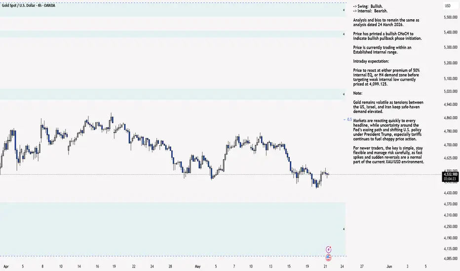
-> Swing: Bullish.
-> Internal: Bearish.
Analysis and bias to remain the same as analysis dated 24 March 2026.
Price has printed a bullish CHoCH to indicate bullish pullback phase initiation.
Price is currently trading within an Established internal range.
Intraday expectation:
Price to react at either premium of 50% internal EQ, or H4 demand zone before targeting weak internal low currently priced at 4,099.125.
Note:
Gold remains volatile as tensions between the US, Israel, and Iran keep safe‑haven demand elevated.
Markets are reacting quickly to every headline, while uncertainty around the Fed’s easing path and shifting U.S. policy under President Trump, especially tariffs continues to fuel choppy price action.
For newer traders, the key is simple, stay flexible and manage risk carefully, as fast spikes and sudden reversals are a normal part of the current XAU/USD environment.
H4 Chart:
M15 Analysis:
-> Swing: Bearish.
-> Internal: Bearish.
Bias and analysis to remain the same analysis dated 21 May 2026.
Price has now printed a bullish CHoCH to indicate bullish pullback phase initiation, with price being contained within an established internal range.
Intraday expectation:
Price to trade up to either premium of 50% internal EQ, or M15 supply zone before targeting weak internal low, currently priced at 4,453.390.
Note:
Gold remains highly reactive on the M15 as geopolitical risk continues to drive quick, headline‑led moves.
The tension between the US, Israel, and Iran is keeping safe‑haven demand elevated, with markets still sensitive to any sign of escalation.
At the same time, shifting US tariff policy under President Trump is adding extra uncertainty, fuelling sharp intraday swings and increasing the likelihood of sudden sentiment flips. Liquidity pockets and whipsaws remain common, making disciplined risk management essential.
Gold’s geopolitical premium is still firmly in place, and until tensions ease, short‑term volatility is likely to stay front‑loaded.
M15 Chart:  Short
Short
 Long
Long
XAU/USD 21 May 2026 Intraday AnalysisH4 Analysis:
-> Swing: Bullish.
-> Internal: Bearish.
Analysis and bias to remain the same as analysis dated 24 March 2026.
Price has printed a bullish CHoCH to indicate bullish pullback phase initiation.
Price is currently trading within an Established internal range.
Intraday expectation:
Price to react at either premium of 50% internal EQ, or H4 demand zone before targeting weak internal low currently priced at 4,099.125.
Note:
Gold remains volatile as tensions between the US, Israel, and Iran keep safe‑haven demand elevated.
Markets are reacting quickly to every headline, while uncertainty around the Fed’s easing path and shifting U.S. policy under President Trump, especially tariffs continues to fuel choppy price action.
For newer traders, the key is simple, stay flexible and manage risk carefully, as fast spikes and sudden reversals are a normal part of the current XAU/USD environment.
H4 Chart:
M15 Analysis:
-> Swing: Bearish.
-> Internal: Bearish.
Price has now printed a bullish CHoCH to indicate bullish pullback phase initiation, with price being contained within an established internal range.
Intraday expectation:
Price to trade up to either premium of 50% internal EQ, or M15 supply zone before targeting weak internal low, currently priced at 4,453.390.
Note:
Gold remains highly reactive on the M15 as geopolitical risk continues to drive quick, headline‑led moves.
The tension between the US, Israel, and Iran is keeping safe‑haven demand elevated, with markets still sensitive to any sign of escalation.
At the same time, shifting US tariff policy under President Trump is adding extra uncertainty, fuelling sharp intraday swings and increasing the likelihood of sudden sentiment flips. Liquidity pockets and whipsaws remain common, making disciplined risk management essential.
Gold’s geopolitical premium is still firmly in place, and until tensions ease, short‑term volatility is likely to stay front‑loaded.
M15 Chart:  Short
Short
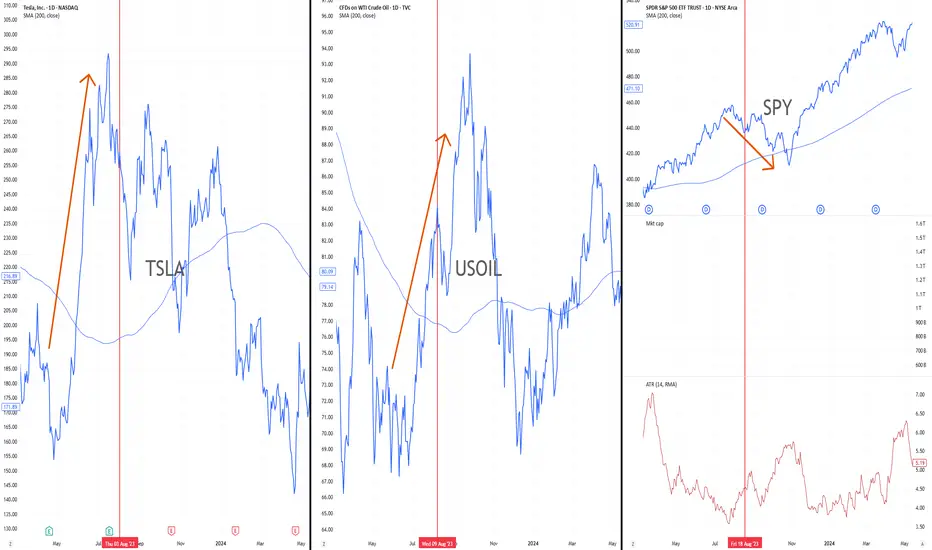
Oil Spike, Market Drop, EV BounceThere is an interesting macro pattern that often gets overlooked:
When oil spikes, the broader market usually comes under pressure.
But electric vehicle stocks can sometimes move in the opposite direction.
The logic is simple. Higher oil prices act like a tax on consumers, pressure inflation expectations, and create stress for equity markets. That is why the S&P 500 often weakens when crude oil moves sharply higher.
But for EV companies, the interpretation can be different.
If gasoline becomes more expensive, the relative appeal of electric vehicles improves. The market starts pricing the idea that higher fuel costs may accelerate the shift away from internal combustion engines and toward EV adoption.
This chart shows the relationship clearly.
In August 2023, crude oil moved sharply higher.
At the same time, the S&P 500 corrected lower.
NIO, however, staged a strong rally into that same period.
That does not mean EV stocks always rise when oil rises. The relationship is not mechanical. EV companies still depend on interest rates, consumer demand, margins, competition, China exposure, and company-specific execution.
But the pattern is important.
Oil strength can create a relative narrative tailwind for EV stocks.
And this is where Tesla becomes the broader, more liquid way to express the same theme.
NIO is a higher-beta example. It can move aggressively when the EV narrative comes back, but it also carries more company-specific and China-related risk.
Tesla is the cleaner market proxy.
It has deeper liquidity, stronger brand recognition, global scale, and remains the stock most investors use when they want exposure to the EV transition.
The setup is not simply “oil up, buy EVs.”
The better framework is:
Oil spike = pressure on consumers and broad equities.
Higher fuel costs = renewed attention on EV adoption.
EV stocks = potential relative outperformers if the market starts rotating into the theme.
That makes this an interesting watchlist idea, not a blind trade.
For NIO, the key is whether price can hold above its base and reclaim the 200-day moving average. Without that, the stock remains a high-risk speculative rebound.
For Tesla, the cleaner question is whether oil strength can support a renewed EV narrative while the stock holds its major technical support levels.
My view:
If crude oil continues higher and the S&P 500 starts pricing inflation and consumer pressure again, EV stocks could become an interesting relative trade. My favourite is NASDAQ:LI currently sitting in the 16$ zone with potential upside move of more than 60%.
Not because their fundamentals instantly improve.
But because the narrative changes.
When oil is cheap, EV adoption looks like a long-term technology story.
When oil spikes, EV adoption starts to look like an economic necessity.
That is when the market can suddenly remember the sector again.  Education
A Fast Way to Tell If a Market Actually Respects Its Seasonal.Most traders glance at a single seasonal curve, see a clean up-then-down shape, and assume the market will do the same again. Sometimes it will. Often it will not. The reason is simple: seasonal patterns drift. Old data carries the weight of decades-old market structure, one-off events, and conditions that no longer exist. So before putting any real conviction behind a seasonal trade, it is worth doing one quick visual check.
The check, in one sentence
If the last five years roughly match the full-history pattern, the market is respecting its seasonal. If the two curves disagree, the seasonal has shifted and should not be the reason you take the trade.
How to do it in under a minute
Open any seasonal indicator that lets you control how many years of history it uses. The example below uses an open source seasonal indicator (True Seasonal Pattern ) .
Add the indicator to the same pane twice .
Set one copy to full history . Set the other to the last 5 years .
Change the plot color on the second copy so the two lines are easy to tell apart.
Compare the shapes: timing of peaks and troughs, direction through the year, where the seasonal turns.
Reading the result
Curves line up - the market has been consistent. The seasonal is a valid piece of evidence and can sit alongside your other tools (structure, trend, volatility, risk).
Curves disagree - the recent behaviour has drifted from the long-term tendency. Treat the seasonal as not reliable right now. It is not "wrong", it is just not in force, and that is reason enough to step aside or rely on other tools.
Markets that respect their seasonal pattern
Lean Hogs is a textbook example. The 5-year trace and the full-history trace climb and fall at almost the same time each year, with the same summer high and the same late-year low. Two different windows of data, the same story. Seasonality here carries weight.
RBOB Gasoline tells the same kind of story. The recent five years and the full history both build into a spring/summer peak and fade into winter. The shapes overlap so closely that the recent cycle could be drawn over the long-term curve and you would barely see two lines.
Markets where the seasonal has drifted
Wheat is the opposite picture. The 5-year curve and the full-history curve disagree on direction for large stretches of the calendar - where one is rising the other is often falling. The historical seasonal narrative is no longer being honoured. Trading the long-term pattern here would mean trading something the market has quietly stopped doing.
Silver shows a similar mismatch. The two windows do not tell the same story, so the seasonal cannot do the heavy lifting in a setup.
Why this matters
A seasonal model is an average of the past. The further back the average reaches, the more it is shaped by conditions that may no longer exist. The 5-year vs full-history comparison is a cheap, visual sanity check that takes under a minute and quietly filters out the markets where the seasonal is no longer in force.
It will not turn a bad setup into a good one. What it will do is stop capital from going into a "seasonal trade" in a market that has stopped honouring its own seasonal. That alone is worth the minute it takes.
Educational content. Not financial advice. Past performance does not guarantee future results.  Education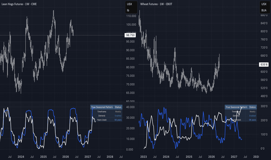
 Short
Short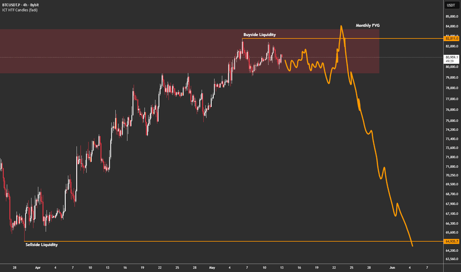
Silver: Seasonal Confluence & Ratio CompressionA) The 2026 Macro Hierarchy: Liquidity & Rates
Silver is currently navigating a pivotal shift in the global liquidity regime as we approach mid-May 2026.
• Liquidity Regime (DXY & Yields):
The U.S. Dollar Index (DXY) has broken local support, testing the 97.70 level. This persistent dollar weakness, combined with 10-year yields stabilizing at 4.38%, has significantly reduced the opportunity cost of holding non-yielding metals.
• Inflation Regime (PCE & CPI):
Markets are pricing in a "Goldilocks" scenario following the cooling of Core PCE (the Fed's preferred gauge). All eyes are now on the May 12 CPI release, which is expected to bolster the case for a dovish transition under new Fed leadership on May 15, 2026.
• M2 Supply:
We are observing a global expansion in M2 money supply, which historically acts as a precursor to explosive breakouts in the silver market as a hedge against currency debasement.
---
B) The Gold/Silver (XAU/XAG) Ratio & Seasonality
• Ratio Cycle:
The Gold/Silver ratio recently dropped from an April 2025 extreme of 105:1 to approximately 61:1 in May 2026. Historically, when the ratio compresses from extreme highs, silver enters a "catch-up" phase where it aggressively outperforms gold. We are currently in a "normal" range (40–60:1), but the trend suggests further compression toward 50:1 as silver's industrial super-cycle accelerates.
• Seasonality:
Historical data over the last 52 years identifies June as a notable seasonal low for silver. However, 2005–2024 data shows May as a month of calibration and mixed results. This suggests we are in a prime accumulation window before the typical July–September recovery and peak.
---
C) Technical Analysis: Structural Defense
Based on chart, the price action is respecting key structural nodes:
• S/R Flip Zone (POC):
The orange line at ~$77.00 marks the Point of Control (POC) where sellers were definitively absorbed during the previous expansion.
• Structural Support:
The blue box at ~$72.50 acts as the first line of defense. The long lower wicks visible on the chart indicate that Passive Buyers are stepping in to absorb supply at this level.
• Physical Deficit:
This technical structure is reinforced by a sixth consecutive year of structural supply deficit, with a projected shortfall of 46.3 million ounces in 2026.
---
Why these factors are critical for Silver:
• DXY / Yields:
Because silver is priced in USD and pays no yield, a weaker dollar and lower real rates make it cheaper for international buyers and more attractive relative to bonds.
• XAU/XAG Ratio:
This acts as a "value gauge." When the ratio is high, silver is historically cheap relative to gold, often leading to outsized percentage gains when the market shifts into liquidity expansion.
• M2 Supply:
Silver is often called "the leveraged play on gold." As global liquidity expands, speculative capital flows into the smaller, more volatile silver market, amplifying moves.
---
Conclusion
The confluence of weakening DXY, expanding liquidity, favorable seasonality, and structural deficit conditions supports a bullish medium-term outlook for silver.
Invalidation:
A daily close below the $72.00 support level would invalidate the immediate bullish structure and expose a potential move toward the $68.00 liquidity floor. Long 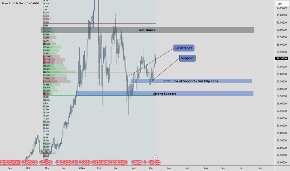
Short 
Bitcoin akan melanjutkan bearish hingga bottomBitcoin is expected to continue its bearish trend until reaching the bottom
Bitcoin( BITSTAMP:BTCUSD ) - Welcome to the bear market phase in the crypto market, especially Bitcoin, which previously reached its peak on October 24, 2025, at a price of $115,000 USD. Currently, Bitcoin is in the middle phase between the peak and the bottom within one market cycle.
Based on our indicator, CRYPTOID, the Bitcoin bottom is predicted to occur around November 14, 2026. Below is an illustration of the projected price movement :
From the chart, we can see a mini bullish movement from around $60,000 USD to $80,000 USD. However, Bitcoin is projected to continue its decline towards the $43,000 USD level in 2026.
So far, our analysis has shown a good level of accuracy. However, each trader has a different risk profile when managing entries and stop losses. Therefore, this analysis should be used as a reference, not as financial advice or an exact trading signal.
Hope this helps and trade wisely. Short 
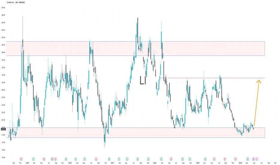
LI Back at Support as Historical Cycles Come Into PlayLi Auto is one of those names where price action alone doesn’t tell the full story—you need to overlay seasonality to really understand what’s going on.
Looking at the broader structure, LI has been trading in a well-defined range for quite some time. The chart clearly shows repeated reactions between a lower demand zone (around current levels) and an upper supply zone near the 30–40 area. Right now, price is once again sitting near that lower boundary, which already makes it technically interesting.
But the real edge here comes from the seasonality data—and it’s honestly brutal (in a good way).
Historically, Li Auto tends to show:
Strong rebounds after weak starts to the year
Noticeable upside periods following consolidation at lows
Explosive months scattered throughout the calendar (especially after drawdowns)
You can clearly see that certain months consistently outperform, while others tend to be weak. This kind of repeatable behavior is exactly what traders look for—it adds a probabilistic layer on top of the technical setup.
So what’s the idea here?
We’re combining two things:
Strong support zone (price has reacted here multiple times)
Seasonal tendency for upside after periods of weakness
That creates a solid case for a potential bounce.
The drawn scenario on your chart reflects a classic range play:
Accumulation at support
Gradual push higher
Move back toward the mid-range / resistance zone (~30 area)
If momentum builds and the sector (EV / China tech) starts catching bids, this move can accelerate quickly.
Why this setup stands out:
Clean range structure → easy to define risk
Multiple historical bounces from this zone
Seasonality aligns with potential upside
Sentiment has been weak → room for reversal
Of course, like any range trade, this only works as long as support holds. A breakdown below this zone would invalidate the idea and likely open the door for further downside.
But as it stands, this is one of those setups where:
You’re not chasing strength—you’re positioning at a level where reactions have historically happened.
Bottom line:
LI is sitting at a key level, and when you combine that with its strong seasonal tendencies, it becomes a high-interest setup for a potential long—especially if price starts confirming with higher lows and momentum.  Long
Long
 Long
Long