OPEN-SOURCE SCRIPT
Resting OrderFlow
Resting OrderFlow — The Complete Guide
See where the buying and selling is still sitting. Then trade the reaction.
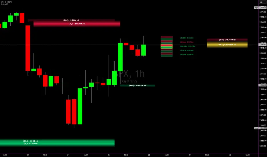
Resting OrderFlow is a TradingView overlay that turns the volume footprint into a map of resting liquidity: the price rows where buyers or sellers dominated and price has not yet traded back through. It draws the strongest of those rows as gradient nodes that reach toward the current bar, merges nearby rows into clusters, tracks the period Point of Control as its own node, and shows the live bar's order flow in a pressure column beside price.
This guide covers what the indicator measures, how every node is built, every setting, how to read the chart, and the honest limits of the data.
1. What It Measures — And What It Doesn't
Start with the one thing every user must know: Pine Script has no access to the order book. There is no DOM, no bid/ask depth, no queue. What TradingView does provide is the volume footprint: for every bar, the buy volume and sell volume that actually traded at each price row.
Resting OrderFlow builds its map from that executed volume:
Every price row accumulates buy volume and sell volume each time price trades there.
A row's resting size is its net delta, buy minus sell. Positive delta means buyers dominated at that price; negative means sellers did.
Orders in a label is the number of bars that printed volume at that row. It is a count of prints, not a count of limit orders.
Value is that resting size expressed in currency: volume × price × point value.
So a BUY node is a price where buyers absorbed selling and price has since moved above it. The thesis is simple: participants who defended a price once tend to be interested there again. The indicator shows you where those prices are. Whether they hold is for you to judge, bar by bar.
Data requirements
The footprint request needs a Premium or Ultimate TradingView plan and a symbol with real volume. Stocks, ETFs, futures, and crypto work. Cash indices report a synthetic volume; see the Value Shown setting.
Footprint data is not available in Bar Replay. The indicator has a proxy mode for that, covered in section 9.
Footprint history is built from intrabar data whose granularity depends on the chart timeframe and how deep into history a bar sits. Recent bars are the most precise.
2. Reading the Chart
BUY nodes (green)
Rows at or below price where buyers dominated. Think of them as absorbed selling, the places buyers stepped in. They sit under price as candidate support.
SELL nodes (red)
Rows at or above price where sellers dominated. Absorbed buying, sitting over price as candidate resistance.
The node shape
Each node is a horizontal band centered on its price row:
Height and opacity scale with size. The strongest node on each side is drawn tallest and most opaque; weaker nodes shrink and fade toward the edge settings. The fill is strongest at the level itself and fades toward the top and bottom edges, so the exact price reads as the brightest line.
The node starts in front of the candle that last touched it. It never sits on top of the bar that created it.
The node ends a few bars short of the current bar while price is far away, and the gap closes as price approaches. Inside the snap distance the gap is zero, so the node and the candle meet at the level.
Fresh nodes extend forward. A node touched on the current bar has no room behind it, so it projects to the right past price instead of collapsing to a sliver.
Nodes are kept out of the pressure column automatically. A node that would run into the column is clipped just short of it, or moved to start after it if too little would remain.
The label
The label is text only, centered inside the node, bold, and formatted by what the node contains:
Single print: + $4.9M for a buy node, - $4.9M for a sell node.
Several prints: (23) + $4.9M. The number is the count of bars that printed volume there.
Cluster: (23,c) + $4.9M. The c means several nearby rows were merged into one node.
POC node: POC · (24) $513M, where the value is the period volume at that row.
Hover the label for the full tooltip: rank, price range, resting size, buy and sell volume, delta, total, orders, strength, when it was last touched, when it was first created, how many breaks it has absorbed, and its distance from price.
Absorption and expiry
When price closes through a node, a share of its size is treated as filled. The default is 50%, so a support that gets closed below keeps half its weight, then a quarter, and so on. The tooltip shows how many breaks a node has absorbed.
Rows untouched for the Level Memory window are forgotten, and the weakest rows are dropped if the tracked set exceeds the cap.
3. Cluster Nodes
Real liquidity rarely sits in a single tick. With clustering on, same-side rows are merged into one node when the whole cluster fits inside the Cluster Range, set as a percentage of price and defaulting to 0.05%.
Rows are walked from lowest to highest. A row joins the current cluster only if the span from the cluster's bottom to that row's top stays within the range; otherwise it starts a new cluster. The span is bounded, so rows never chain into a block far larger than the setting.
The cluster's size is the summed delta, its order count is the summed prints, and its range runs from the lowest row bottom to the highest row top.
A cluster is drawn centered on that range and is never shorter than the range it spans.
Ranking happens after merging, so a band of moderate rows can outrank a single large row. That is intended. A band is what resting interest usually looks like.
The tooltip of a cluster starts with CLUSTER NODE, lists how many rows were merged, and gives the delta-weighted center price.
On a $770 stock the default 0.05% is about 38 cents, or four ten-cent rows. On ES at 7700 it is about 3.85 points. Turn clustering off and every node is a single row.
4. The Period POC Node
The Point of Control is the price row with the most total volume over a period. Resting OrderFlow builds a volume profile from the same footprint rows and draws the POC as a yellow node with the same engine as the buy and sell nodes: touch-anchored start, closing gap, minimum width, column keep-out, gradient fill, label, tooltip, and alert.
Period
Session (default), Weekly, Monthly, or Quarterly. Session resets on the chart's daily boundary, which for futures is the exchange day rather than the cash open.
POC Row Size
The profile uses its own, coarser grid: a multiple of Ticks per Row. A period POC on a ten-cent row is noise; on a dollar row it is a level. Use 5 to 10 on stocks and 50 to 100 on crypto with penny ticks. ES is fine at 1 or 2.
POC Profile Data
By default the profile uses footprint bars only. Bars where the footprint request returned nothing are skipped rather than filled by the proxy, because the proxy can put an entire minute's volume, an opening auction print for instance, into one row and shift the POC in a way that changes with chart timeframe. Choose "All bars" only in Bar Replay, where every bar is proxy.
The tooltip shows the profile's composition: how many bars came from the footprint and how many were proxy, and whether those were skipped or included. If two timeframes disagree on the POC, this line tells you why.
5. The Pressure Column
A single column to the right of price shows the current bar's order flow so you can see, live, who is in control of the bar you are trading.
Rows mode (default)
The bar's footprint rows are merged into at most Max Display Rows so the text stays readable. Each display row is split into a sell cell on top and a buy cell below, sized by their volumes, with the numbers in a label beside the row. Cell shading follows volume. The row containing the bar's POC is outlined in the POC color.
Pressure mode
Two stacked blocks, SELL over BUY, whose heights follow the bar's sell versus buy share. Each block shows its percentage. "SELL volume" sits directly above the sell block and "BUY volume" directly below the buy block. With the summary on, delta, total, and imbalance counts stack on whichever side holds 51% or more.
Guides
POC guide: a line through the bar's highest-volume row. Hover its center for the row range, value, volume with the buy and sell split, and share of the bar.
Value Area guides: dotted lines at the top and bottom of the value area, using the Value Area percentage from the data settings.
Imbalance counts in the summary follow the footprint definition: a buy imbalance when a row's buy volume is at least the Imbalance percentage of the sell volume one row below, and the mirror for sells.
The column starts at Column Offset bars right of price. Move it further right if it collides with other tools; the nodes will keep out of wherever it lands.
6. Settings — Data Source
Data Source. Auto uses the footprint when available and the proxy for bars where it is not. Footprint (Live) never uses the proxy. Proxy (Bar Replay) never calls the footprint request at all, which is required in Replay.
Ticks per Row. Price size of one row. ES: 4 ticks is one point. Stocks: 10 ticks is ten cents. Crypto with penny ticks needs 500 to 1000. Aim for roughly 10 to 40 rows per bar on your working timeframe. Too fine and every node is a single print; too coarse and the column loses its shape.
Value Area %. Used by the column guides. 70 is the industry standard.
Imbalance %. Diagonal imbalance threshold. 300 means one side must be three times the other.
Proxy Intrabar Timeframe. The lower timeframe used to rebuild rows in proxy mode. Auto picks 1 minute for charts up to 4 hours, 5 minutes above that, 15 minutes on daily, and 60 minutes on weekly and higher. Seconds timeframes need a plan that supports them.
Level Memory / Calc Window. Rows untouched for this many bars are forgotten, and nothing at all is calculated further back. This is also the runtime governor: lower it if the script runs heavy.
7. Settings — Resting Nodes
Show BUY Nodes / Show SELL Nodes with the count for each side. Default 3 and 3, up to 10.
Only Nodes Touched in Last N Bars. Limits candidates to rows touched recently. 0 turns it off. 75 is a good match for what fits on a zoomed-in intraday screen.
Max Tracked Rows. Safety cap on the row set. Weakest rows go first.
Break Absorption %. Share of a node's size treated as filled on each close-through. 100 erases a node on its first break; 0 never absorbs.
Cluster Nearby Nodes with the range percentage. See section 3.
Left Offset. Bars between the last touching candle and the node's start.
Min Node Width. A node is never narrower than this; fresh nodes extend forward to reach it.
Forward Node Extra Offset. Nodes that start in front of the current bar are pushed this many more bars to the right, clear of the candle.
Right Gap. The gap between a node's end and the current bar when price is far away.
Proximity Range (ATR ×). The distance, in ATR(14), over which that gap closes to zero.
Snap Distance (rows). Within this many rows of the node the gap is zero and the node touches the candle.
8. Settings — Node Style, Column, and POC
Node Style
Buy / Sell colors.
Strength Scale. Per side gives each side's strongest node full size, so buy nodes stay visible even during a sell-off where sell nodes are thirty times larger. Shared uses one scale so sizes are directly comparable across sides, at the cost of the weaker side fading.
Height Basis. ATR scales node height with volatility. Row fixes it as a multiple of the row size.
Node Height for each basis, given as the half-height of the strongest node.
Min Height Fraction. The weakest displayed node's height as a fraction of the strongest.
Opacity: Strongest, Weakest, Edge. Transparency at the level for the strongest and weakest nodes, and at every node's outer edge.
Gradient Steps. Fills per side between the level and the edge. More is smoother.
Outline Outer Lines. Off by default; on draws the node's top and bottom faintly.
Node Label, Label Size, Label Color.
Value Shown. Notional is volume × price × point value: real dollars on ES, stocks, and ETFs. Volume shows raw volume. Custom multiplies by your own factor. Auto shows volume on index symbols, because an index's "volume" is the summed share volume of its constituents and a dollar figure from it is meaningless.
Pressure Column
Show toggle, mode, offset, width, max display rows, text size, colors, POC guide, Value Area guides, and the summary toggle. See section 5.
POC Node
Show toggle, period, profile data source, row size multiplier, and color. See section 4.
9. Bar Replay and the Proxy
Footprint data does not exist in Bar Replay, and requesting it there is a known cause of memory errors. Set Data Source to Proxy (Bar Replay) before replaying.
The proxy rebuilds each bar's rows from intrabar OHLCV at the Proxy Intrabar Timeframe, classifying each intrabar as buy or sell with the same rule the footprint uses: close above open is buy, below is sell, and a flat intrabar takes the direction of its move from the previous close. Each intrabar's volume is spread across the price rows it covers. If intrabar data has run out, the bar's volume is split by where the close sits in the range.
The proxy is an approximation. Node tooltips say includes proxy whenever any of a node's volume came from it, and the POC profile skips proxy bars by default in live mode.
10. Alerts
Three alert conditions, all evaluated on the live bar:
Price at top BUY node — price is trading into one of the displayed buy nodes.
Price at top SELL node — price is trading into one of the displayed sell nodes.
Price at period POC node — price is trading into the POC node.
Create them from the TradingView alert dialog with the indicator selected. They fire on a touch of the node's range, so a wick counts.
11. Ways to Use It
These are usage frames, not signals. The indicator marks locations; the trade is your read of the reaction.
A. Reaction at a fresh node
Price comes down into a rank 1 buy cluster for the first time since it formed. Watch the pressure column as the bar develops. Buy share rising into the level with the node holding on the close is the reaction you are looking for. A close through the node is the failure, and the node's absorbed size tells you it just gave up half its weight.
B. Retest after a break
A sell node gets closed above, absorbs half its size, and price returns to it from above. It is now a smaller node and it is below price, so it no longer qualifies as resistance and disappears. What often appears instead is a buy node at the breakout candle. That flip is worth watching.
C. POC as the session's anchor
Session POC is where the day did the most business. Price above it with the column showing buy dominance reads differently from price above it while sell share climbs. Weekly POC on the same chart gives you the larger frame without changing timeframes.
D. Node against the column
The most useful single view is a node meeting the current candle with the column beside it. The node says where interest sat before; the column says who is in control now. Agreement is the setup. Disagreement is the warning.
12. Choosing Timeframe and Row Size
Match the row to the instrument. ES: 4 to 10 ticks on 1 to 5 minute charts, 20 to 40 ticks on 15 minutes and above. Stocks: 10 ticks intraday. BTC: 500 to 1000 ticks.
Check rows per bar. Hover the POC guide or watch the column: if you see one row per bar, the row is too coarse for that timeframe; if you see hundreds, it is far too fine and every node will be a single print.
Higher timeframes thin the footprint. Deep history on 60 minute and above is built from coarser intrabars, and some symbols return no footprint on some bars there. The tooltip's "includes proxy" flag and the POC's profile line will tell you when that is happening.
Level Memory is your runtime budget. 1000 bars is comfortable on intraday charts. If the script warns that it is heavy, lower it before anything else.
13. Design Principles & Honest Behavior Notes
Inferred, not observed. Resting size comes from executed footprint volume. The indicator does not see the order book and never claims to.
Fixed price grid. TradingView anchors each bar's footprint rows to that bar's low. The indicator re-bins every row onto a fixed grid so a price means the same row on every bar and every timeframe.
Confirmed bars build the map. Levels and the POC profile update on bar close only, so live ticks are never double counted. Node drawing and the column update live.
Timeframe dependence is real. The footprint's intrabar granularity varies with chart timeframe and history depth. Two timeframes can disagree on a POC when two rows are close in volume. The coarse POC row and the footprint-only profile exist to minimize that.
Repainting by design. Like the footprint itself, recent bars can be recalculated with finer or coarser intrabar data as history loads. Nodes on the latest bars are the most precise and the most likely to adjust.
Resource-safe. All requests and calculations are gated to the calc window, drawings are redrawn from scratch each update, and the POC map prunes itself before hitting Pine's limits.
Everything is configurable. Every default here was chosen to read well on a 5 to 15 minute futures or stock chart. Change them for your instrument.
Nothing here is financial advice. Markets carry risk; past behavior of any level or pattern does not guarantee future results. Trade your own plan.
See where the buying and selling is still sitting. Then trade the reaction.
Resting OrderFlow is a TradingView overlay that turns the volume footprint into a map of resting liquidity: the price rows where buyers or sellers dominated and price has not yet traded back through. It draws the strongest of those rows as gradient nodes that reach toward the current bar, merges nearby rows into clusters, tracks the period Point of Control as its own node, and shows the live bar's order flow in a pressure column beside price.
This guide covers what the indicator measures, how every node is built, every setting, how to read the chart, and the honest limits of the data.
1. What It Measures — And What It Doesn't
Start with the one thing every user must know: Pine Script has no access to the order book. There is no DOM, no bid/ask depth, no queue. What TradingView does provide is the volume footprint: for every bar, the buy volume and sell volume that actually traded at each price row.
Resting OrderFlow builds its map from that executed volume:
Every price row accumulates buy volume and sell volume each time price trades there.
A row's resting size is its net delta, buy minus sell. Positive delta means buyers dominated at that price; negative means sellers did.
Orders in a label is the number of bars that printed volume at that row. It is a count of prints, not a count of limit orders.
Value is that resting size expressed in currency: volume × price × point value.
So a BUY node is a price where buyers absorbed selling and price has since moved above it. The thesis is simple: participants who defended a price once tend to be interested there again. The indicator shows you where those prices are. Whether they hold is for you to judge, bar by bar.
Data requirements
The footprint request needs a Premium or Ultimate TradingView plan and a symbol with real volume. Stocks, ETFs, futures, and crypto work. Cash indices report a synthetic volume; see the Value Shown setting.
Footprint data is not available in Bar Replay. The indicator has a proxy mode for that, covered in section 9.
Footprint history is built from intrabar data whose granularity depends on the chart timeframe and how deep into history a bar sits. Recent bars are the most precise.
2. Reading the Chart
BUY nodes (green)
Rows at or below price where buyers dominated. Think of them as absorbed selling, the places buyers stepped in. They sit under price as candidate support.
SELL nodes (red)
Rows at or above price where sellers dominated. Absorbed buying, sitting over price as candidate resistance.
The node shape
Each node is a horizontal band centered on its price row:
Height and opacity scale with size. The strongest node on each side is drawn tallest and most opaque; weaker nodes shrink and fade toward the edge settings. The fill is strongest at the level itself and fades toward the top and bottom edges, so the exact price reads as the brightest line.
The node starts in front of the candle that last touched it. It never sits on top of the bar that created it.
The node ends a few bars short of the current bar while price is far away, and the gap closes as price approaches. Inside the snap distance the gap is zero, so the node and the candle meet at the level.
Fresh nodes extend forward. A node touched on the current bar has no room behind it, so it projects to the right past price instead of collapsing to a sliver.
Nodes are kept out of the pressure column automatically. A node that would run into the column is clipped just short of it, or moved to start after it if too little would remain.
The label
The label is text only, centered inside the node, bold, and formatted by what the node contains:
Single print: + $4.9M for a buy node, - $4.9M for a sell node.
Several prints: (23) + $4.9M. The number is the count of bars that printed volume there.
Cluster: (23,c) + $4.9M. The c means several nearby rows were merged into one node.
POC node: POC · (24) $513M, where the value is the period volume at that row.
Hover the label for the full tooltip: rank, price range, resting size, buy and sell volume, delta, total, orders, strength, when it was last touched, when it was first created, how many breaks it has absorbed, and its distance from price.
Absorption and expiry
When price closes through a node, a share of its size is treated as filled. The default is 50%, so a support that gets closed below keeps half its weight, then a quarter, and so on. The tooltip shows how many breaks a node has absorbed.
Rows untouched for the Level Memory window are forgotten, and the weakest rows are dropped if the tracked set exceeds the cap.
3. Cluster Nodes
Real liquidity rarely sits in a single tick. With clustering on, same-side rows are merged into one node when the whole cluster fits inside the Cluster Range, set as a percentage of price and defaulting to 0.05%.
Rows are walked from lowest to highest. A row joins the current cluster only if the span from the cluster's bottom to that row's top stays within the range; otherwise it starts a new cluster. The span is bounded, so rows never chain into a block far larger than the setting.
The cluster's size is the summed delta, its order count is the summed prints, and its range runs from the lowest row bottom to the highest row top.
A cluster is drawn centered on that range and is never shorter than the range it spans.
Ranking happens after merging, so a band of moderate rows can outrank a single large row. That is intended. A band is what resting interest usually looks like.
The tooltip of a cluster starts with CLUSTER NODE, lists how many rows were merged, and gives the delta-weighted center price.
On a $770 stock the default 0.05% is about 38 cents, or four ten-cent rows. On ES at 7700 it is about 3.85 points. Turn clustering off and every node is a single row.
4. The Period POC Node
The Point of Control is the price row with the most total volume over a period. Resting OrderFlow builds a volume profile from the same footprint rows and draws the POC as a yellow node with the same engine as the buy and sell nodes: touch-anchored start, closing gap, minimum width, column keep-out, gradient fill, label, tooltip, and alert.
Period
Session (default), Weekly, Monthly, or Quarterly. Session resets on the chart's daily boundary, which for futures is the exchange day rather than the cash open.
POC Row Size
The profile uses its own, coarser grid: a multiple of Ticks per Row. A period POC on a ten-cent row is noise; on a dollar row it is a level. Use 5 to 10 on stocks and 50 to 100 on crypto with penny ticks. ES is fine at 1 or 2.
POC Profile Data
By default the profile uses footprint bars only. Bars where the footprint request returned nothing are skipped rather than filled by the proxy, because the proxy can put an entire minute's volume, an opening auction print for instance, into one row and shift the POC in a way that changes with chart timeframe. Choose "All bars" only in Bar Replay, where every bar is proxy.
The tooltip shows the profile's composition: how many bars came from the footprint and how many were proxy, and whether those were skipped or included. If two timeframes disagree on the POC, this line tells you why.
5. The Pressure Column
A single column to the right of price shows the current bar's order flow so you can see, live, who is in control of the bar you are trading.
Rows mode (default)
The bar's footprint rows are merged into at most Max Display Rows so the text stays readable. Each display row is split into a sell cell on top and a buy cell below, sized by their volumes, with the numbers in a label beside the row. Cell shading follows volume. The row containing the bar's POC is outlined in the POC color.
Pressure mode
Two stacked blocks, SELL over BUY, whose heights follow the bar's sell versus buy share. Each block shows its percentage. "SELL volume" sits directly above the sell block and "BUY volume" directly below the buy block. With the summary on, delta, total, and imbalance counts stack on whichever side holds 51% or more.
Guides
POC guide: a line through the bar's highest-volume row. Hover its center for the row range, value, volume with the buy and sell split, and share of the bar.
Value Area guides: dotted lines at the top and bottom of the value area, using the Value Area percentage from the data settings.
Imbalance counts in the summary follow the footprint definition: a buy imbalance when a row's buy volume is at least the Imbalance percentage of the sell volume one row below, and the mirror for sells.
The column starts at Column Offset bars right of price. Move it further right if it collides with other tools; the nodes will keep out of wherever it lands.
6. Settings — Data Source
Data Source. Auto uses the footprint when available and the proxy for bars where it is not. Footprint (Live) never uses the proxy. Proxy (Bar Replay) never calls the footprint request at all, which is required in Replay.
Ticks per Row. Price size of one row. ES: 4 ticks is one point. Stocks: 10 ticks is ten cents. Crypto with penny ticks needs 500 to 1000. Aim for roughly 10 to 40 rows per bar on your working timeframe. Too fine and every node is a single print; too coarse and the column loses its shape.
Value Area %. Used by the column guides. 70 is the industry standard.
Imbalance %. Diagonal imbalance threshold. 300 means one side must be three times the other.
Proxy Intrabar Timeframe. The lower timeframe used to rebuild rows in proxy mode. Auto picks 1 minute for charts up to 4 hours, 5 minutes above that, 15 minutes on daily, and 60 minutes on weekly and higher. Seconds timeframes need a plan that supports them.
Level Memory / Calc Window. Rows untouched for this many bars are forgotten, and nothing at all is calculated further back. This is also the runtime governor: lower it if the script runs heavy.
7. Settings — Resting Nodes
Show BUY Nodes / Show SELL Nodes with the count for each side. Default 3 and 3, up to 10.
Only Nodes Touched in Last N Bars. Limits candidates to rows touched recently. 0 turns it off. 75 is a good match for what fits on a zoomed-in intraday screen.
Max Tracked Rows. Safety cap on the row set. Weakest rows go first.
Break Absorption %. Share of a node's size treated as filled on each close-through. 100 erases a node on its first break; 0 never absorbs.
Cluster Nearby Nodes with the range percentage. See section 3.
Left Offset. Bars between the last touching candle and the node's start.
Min Node Width. A node is never narrower than this; fresh nodes extend forward to reach it.
Forward Node Extra Offset. Nodes that start in front of the current bar are pushed this many more bars to the right, clear of the candle.
Right Gap. The gap between a node's end and the current bar when price is far away.
Proximity Range (ATR ×). The distance, in ATR(14), over which that gap closes to zero.
Snap Distance (rows). Within this many rows of the node the gap is zero and the node touches the candle.
8. Settings — Node Style, Column, and POC
Node Style
Buy / Sell colors.
Strength Scale. Per side gives each side's strongest node full size, so buy nodes stay visible even during a sell-off where sell nodes are thirty times larger. Shared uses one scale so sizes are directly comparable across sides, at the cost of the weaker side fading.
Height Basis. ATR scales node height with volatility. Row fixes it as a multiple of the row size.
Node Height for each basis, given as the half-height of the strongest node.
Min Height Fraction. The weakest displayed node's height as a fraction of the strongest.
Opacity: Strongest, Weakest, Edge. Transparency at the level for the strongest and weakest nodes, and at every node's outer edge.
Gradient Steps. Fills per side between the level and the edge. More is smoother.
Outline Outer Lines. Off by default; on draws the node's top and bottom faintly.
Node Label, Label Size, Label Color.
Value Shown. Notional is volume × price × point value: real dollars on ES, stocks, and ETFs. Volume shows raw volume. Custom multiplies by your own factor. Auto shows volume on index symbols, because an index's "volume" is the summed share volume of its constituents and a dollar figure from it is meaningless.
Pressure Column
Show toggle, mode, offset, width, max display rows, text size, colors, POC guide, Value Area guides, and the summary toggle. See section 5.
POC Node
Show toggle, period, profile data source, row size multiplier, and color. See section 4.
9. Bar Replay and the Proxy
Footprint data does not exist in Bar Replay, and requesting it there is a known cause of memory errors. Set Data Source to Proxy (Bar Replay) before replaying.
The proxy rebuilds each bar's rows from intrabar OHLCV at the Proxy Intrabar Timeframe, classifying each intrabar as buy or sell with the same rule the footprint uses: close above open is buy, below is sell, and a flat intrabar takes the direction of its move from the previous close. Each intrabar's volume is spread across the price rows it covers. If intrabar data has run out, the bar's volume is split by where the close sits in the range.
The proxy is an approximation. Node tooltips say includes proxy whenever any of a node's volume came from it, and the POC profile skips proxy bars by default in live mode.
10. Alerts
Three alert conditions, all evaluated on the live bar:
Price at top BUY node — price is trading into one of the displayed buy nodes.
Price at top SELL node — price is trading into one of the displayed sell nodes.
Price at period POC node — price is trading into the POC node.
Create them from the TradingView alert dialog with the indicator selected. They fire on a touch of the node's range, so a wick counts.
11. Ways to Use It
These are usage frames, not signals. The indicator marks locations; the trade is your read of the reaction.
A. Reaction at a fresh node
Price comes down into a rank 1 buy cluster for the first time since it formed. Watch the pressure column as the bar develops. Buy share rising into the level with the node holding on the close is the reaction you are looking for. A close through the node is the failure, and the node's absorbed size tells you it just gave up half its weight.
B. Retest after a break
A sell node gets closed above, absorbs half its size, and price returns to it from above. It is now a smaller node and it is below price, so it no longer qualifies as resistance and disappears. What often appears instead is a buy node at the breakout candle. That flip is worth watching.
C. POC as the session's anchor
Session POC is where the day did the most business. Price above it with the column showing buy dominance reads differently from price above it while sell share climbs. Weekly POC on the same chart gives you the larger frame without changing timeframes.
D. Node against the column
The most useful single view is a node meeting the current candle with the column beside it. The node says where interest sat before; the column says who is in control now. Agreement is the setup. Disagreement is the warning.
12. Choosing Timeframe and Row Size
Match the row to the instrument. ES: 4 to 10 ticks on 1 to 5 minute charts, 20 to 40 ticks on 15 minutes and above. Stocks: 10 ticks intraday. BTC: 500 to 1000 ticks.
Check rows per bar. Hover the POC guide or watch the column: if you see one row per bar, the row is too coarse for that timeframe; if you see hundreds, it is far too fine and every node will be a single print.
Higher timeframes thin the footprint. Deep history on 60 minute and above is built from coarser intrabars, and some symbols return no footprint on some bars there. The tooltip's "includes proxy" flag and the POC's profile line will tell you when that is happening.
Level Memory is your runtime budget. 1000 bars is comfortable on intraday charts. If the script warns that it is heavy, lower it before anything else.
13. Design Principles & Honest Behavior Notes
Inferred, not observed. Resting size comes from executed footprint volume. The indicator does not see the order book and never claims to.
Fixed price grid. TradingView anchors each bar's footprint rows to that bar's low. The indicator re-bins every row onto a fixed grid so a price means the same row on every bar and every timeframe.
Confirmed bars build the map. Levels and the POC profile update on bar close only, so live ticks are never double counted. Node drawing and the column update live.
Timeframe dependence is real. The footprint's intrabar granularity varies with chart timeframe and history depth. Two timeframes can disagree on a POC when two rows are close in volume. The coarse POC row and the footprint-only profile exist to minimize that.
Repainting by design. Like the footprint itself, recent bars can be recalculated with finer or coarser intrabar data as history loads. Nodes on the latest bars are the most precise and the most likely to adjust.
Resource-safe. All requests and calculations are gated to the calc window, drawings are redrawn from scratch each update, and the POC map prunes itself before hitting Pine's limits.
Everything is configurable. Every default here was chosen to read well on a 5 to 15 minute futures or stock chart. Change them for your instrument.
Nothing here is financial advice. Markets carry risk; past behavior of any level or pattern does not guarantee future results. Trade your own plan.
开源脚本
秉承TradingView的精神,该脚本的作者将其开源,以便交易者可以查看和验证其功能。向作者致敬!您可以免费使用该脚本,但请记住,重新发布代码须遵守我们的网站规则。

免责声明
这些信息和出版物并非旨在提供,也不构成TradingView提供或认可的任何形式的财务、投资、交易或其他类型的建议或推荐。请阅读使用条款了解更多信息。
开源脚本
秉承TradingView的精神,该脚本的作者将其开源,以便交易者可以查看和验证其功能。向作者致敬!您可以免费使用该脚本,但请记住,重新发布代码须遵守我们的网站规则。
免责声明
这些信息和出版物并非旨在提供,也不构成TradingView提供或认可的任何形式的财务、投资、交易或其他类型的建议或推荐。请阅读使用条款了解更多信息。