OPEN-SOURCE SCRIPT
Day Of Week Price Distribution [LuxAlgo]
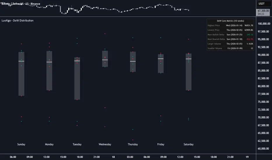
The Day of Week Price Distribution provides a snapshot of the distribution of closing prices for each day of the week over the last few weeks selected by the user. It displays a box plot with the IQR (interquartile range) box, the median, and all the closing prices as dots. Hovering over each dot reveals key information. There is also a dashboard with core metrics of the data for the selected period.
🔶 USAGE

Using the tool is pretty straightforward. Users must select the number of weeks (10 by default) and the box plot spacing (20 by default) to match the desired visual.
This is a unique way to see the data represented on the chart. It allows you to understand the price distribution at a glance.
Each box represents the price for each day of the week and displays the following elements:
Traders can easily detect outliers, which are prices far from their respective boxes.

This chart allows us to compare the price distribution for different window parameters. As we can see, the more data points that are used, the more uniform each day becomes.
The dashboard displays the following core metrics:
🔶 SETTINGS
🔹 Dashboard
🔹 Style
🔶 USAGE
Using the tool is pretty straightforward. Users must select the number of weeks (10 by default) and the box plot spacing (20 by default) to match the desired visual.
This is a unique way to see the data represented on the chart. It allows you to understand the price distribution at a glance.
Each box represents the price for each day of the week and displays the following elements:
- Box: Represents the data's IQR, which is delimited by the 25th and 75th percentiles.
- The line represents the median, or the 50th percentile.
- Dots represent each data point; these are the closing prices for each day. Hovering over the dots displays the closing price, change in price, volume, and date for that day.
Traders can easily detect outliers, which are prices far from their respective boxes.
This chart allows us to compare the price distribution for different window parameters. As we can see, the more data points that are used, the more uniform each day becomes.
The dashboard displays the following core metrics:
- Highest price: Highest price in the dataset
- Lowest price: Lowest price in the dataset
- Most bullish delta: Largest price increase from open to close
- Most bearish delta: Largest price decrease from open to close
- Larger volume: Day with the highest volume
- Smaller volume: Day with the lowest volume
🔶 SETTINGS
- Window: Select the number of weeks from which to gather data.
- Spacing: Select the spacing for the box plot. Larger values will create larger boxes.
🔹 Dashboard
- Dashboard: Enable or disable the dashboard.
- Position: Select the dashboard location.
- Size: Select the dashboard size.
🔹 Style
- Bullish: Select a color for bullish prices.
- Bearish: Select a color for bearish prices.
- IQR Area: Select a color for the IQR area. Enable the "Auto" feature to choose the default color.
- Median: Select the median color. Enable the "Auto" feature to choose the default color.
开源脚本
秉承TradingView的精神,该脚本的作者将其开源,以便交易者可以查看和验证其功能。向作者致敬!您可以免费使用该脚本,但请记住,重新发布代码须遵守我们的网站规则。

All content & scripts provided by LuxAlgo are for educational purposes only and are not financial advice.
免责声明
这些信息和出版物并非旨在提供,也不构成TradingView提供或认可的任何形式的财务、投资、交易或其他类型的建议或推荐。请阅读使用条款了解更多信息。
开源脚本
秉承TradingView的精神,该脚本的作者将其开源,以便交易者可以查看和验证其功能。向作者致敬!您可以免费使用该脚本,但请记住,重新发布代码须遵守我们的网站规则。
免责声明
这些信息和出版物并非旨在提供,也不构成TradingView提供或认可的任何形式的财务、投资、交易或其他类型的建议或推荐。请阅读使用条款了解更多信息。