OPEN-SOURCE SCRIPT
CTP Style Market Temperature + Implied Volatility Overlay
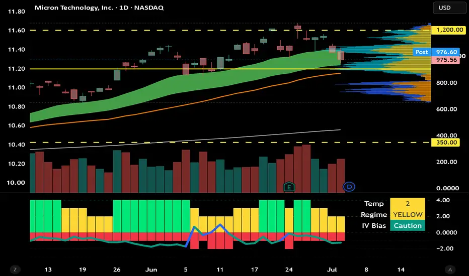
Absolutely. Here’s a stronger **TradingView publish description** written for novice option traders, including how to read the **color transitions**.
---
# CTP Style Market Temperature + IV Overlay
This indicator is designed to help traders quickly understand the current **market temperature**, trend strength, and volatility risk.
It is especially useful for **option traders** because buying calls, puts, or LEAPs is not just about direction. Option prices are also affected by **implied volatility**, time decay, and market conditions.
This indicator tries to answer three simple questions:
1. Is the stock or ETF technically healthy?
2. Is the market environment improving or weakening?
3. Is volatility making options more expensive or risky?
## How the Market Temperature Score Works
The indicator creates a simple score from **0 to 4** using four conditions:
* Price above the 50-day moving average
* Price above the 200-day moving average
* MACD is bullish
* Price is above Parabolic SAR
The higher the score, the stronger the technical environment.
## Bar Colors
The main bars show the market temperature:
* **Green** = strong / bullish environment
* **Yellow** = mixed / neutral environment
* **Red** = weak / defensive environment
This is not meant to be a blind buy or sell signal. It is a **risk filter**.
## How to Read Color Changes
The most important part of this indicator is not just the current color, but how the color is changing.
### Red moving to Yellow
Red moving to yellow means conditions may be starting to improve.
For option traders, this usually means:
> The market may be stabilizing, but it is not fully healthy yet.
This can be a good time to build a watchlist, look for stocks reclaiming key moving averages, and prepare for possible setups. It does **not** mean aggressively buy calls yet.
### Yellow moving to Green
Yellow moving to green means conditions are strengthening.
For option traders, this is usually the best environment to look for higher-quality bullish setups.
This may mean:
* Trend is improving
* Momentum is returning
* Risk conditions are more supportive
* Long calls or LEAPs may have a better probability backdrop
This is the “market wind at your back” zone.
### Green moving to Yellow
Green moving to yellow is an early caution signal.
It does not automatically mean sell, but it means the strong bullish environment is weakening.
For option traders, this may be a time to:
* Stop chasing new call entries
* Tighten risk
* Consider taking partial profits
* Watch for breaks of support
* Be more selective
This is especially important because options can lose value quickly if momentum fades.
### Yellow moving to Red
Yellow moving to red means the environment is becoming defensive.
For option traders, this is usually a warning to be careful with long calls or aggressive bullish trades.
This may mean:
* Trend is breaking down
* Momentum is weakening
* Risk is increasing
* Capital preservation becomes more important
## Implied Volatility / Volatility Overlay
The indicator also includes a volatility line plotted over the bars.
The volatility source can be either:
* An external volatility symbol, such as VIX
* A historical volatility proxy calculated from price movement
The volatility line uses a separate color system:
* **White** = volatility is OK
* **Teal** = caution
* **Blue** = elevated volatility risk
For novice option traders, this matters because higher volatility usually means options are more expensive.
A stock can look bullish, but if volatility is elevated, calls and LEAPs may already be expensive. That creates a headwind.
## Negative Volatility Bias
The red bars below the zero line show the volatility penalty or negative bias.
Simple read:
* **No red bar below zero** = low volatility pressure
* **Small red bar** = caution
* **Deeper red bar** = higher volatility risk
For option traders:
> The deeper the red bar below zero, the more careful you should be about buying expensive option premium.
## Simple Option Trader Guide
### Best environment for bullish option trades
* Bars are green
* Volatility line is white or improving
* Red negative-bias bars are small or absent
* Price is above key moving averages
### Caution environment
* Bars are yellow
* Volatility line is teal
* Red negative-bias bars are present
* Price action is mixed
### Defensive environment
* Bars are red
* Volatility line is blue
* Red negative-bias bars are deep
* Price is below key moving averages
## Important Reminder
This indicator is not a complete trading system. It is designed to help traders understand the environment before making a trade.
Use it with price action, volume, support and resistance, earnings dates, risk management, and your own trading plan.
For educational purposes only. Not financial advice.
---
# CTP Style Market Temperature + IV Overlay
This indicator is designed to help traders quickly understand the current **market temperature**, trend strength, and volatility risk.
It is especially useful for **option traders** because buying calls, puts, or LEAPs is not just about direction. Option prices are also affected by **implied volatility**, time decay, and market conditions.
This indicator tries to answer three simple questions:
1. Is the stock or ETF technically healthy?
2. Is the market environment improving or weakening?
3. Is volatility making options more expensive or risky?
## How the Market Temperature Score Works
The indicator creates a simple score from **0 to 4** using four conditions:
* Price above the 50-day moving average
* Price above the 200-day moving average
* MACD is bullish
* Price is above Parabolic SAR
The higher the score, the stronger the technical environment.
## Bar Colors
The main bars show the market temperature:
* **Green** = strong / bullish environment
* **Yellow** = mixed / neutral environment
* **Red** = weak / defensive environment
This is not meant to be a blind buy or sell signal. It is a **risk filter**.
## How to Read Color Changes
The most important part of this indicator is not just the current color, but how the color is changing.
### Red moving to Yellow
Red moving to yellow means conditions may be starting to improve.
For option traders, this usually means:
> The market may be stabilizing, but it is not fully healthy yet.
This can be a good time to build a watchlist, look for stocks reclaiming key moving averages, and prepare for possible setups. It does **not** mean aggressively buy calls yet.
### Yellow moving to Green
Yellow moving to green means conditions are strengthening.
For option traders, this is usually the best environment to look for higher-quality bullish setups.
This may mean:
* Trend is improving
* Momentum is returning
* Risk conditions are more supportive
* Long calls or LEAPs may have a better probability backdrop
This is the “market wind at your back” zone.
### Green moving to Yellow
Green moving to yellow is an early caution signal.
It does not automatically mean sell, but it means the strong bullish environment is weakening.
For option traders, this may be a time to:
* Stop chasing new call entries
* Tighten risk
* Consider taking partial profits
* Watch for breaks of support
* Be more selective
This is especially important because options can lose value quickly if momentum fades.
### Yellow moving to Red
Yellow moving to red means the environment is becoming defensive.
For option traders, this is usually a warning to be careful with long calls or aggressive bullish trades.
This may mean:
* Trend is breaking down
* Momentum is weakening
* Risk is increasing
* Capital preservation becomes more important
## Implied Volatility / Volatility Overlay
The indicator also includes a volatility line plotted over the bars.
The volatility source can be either:
* An external volatility symbol, such as VIX
* A historical volatility proxy calculated from price movement
The volatility line uses a separate color system:
* **White** = volatility is OK
* **Teal** = caution
* **Blue** = elevated volatility risk
For novice option traders, this matters because higher volatility usually means options are more expensive.
A stock can look bullish, but if volatility is elevated, calls and LEAPs may already be expensive. That creates a headwind.
## Negative Volatility Bias
The red bars below the zero line show the volatility penalty or negative bias.
Simple read:
* **No red bar below zero** = low volatility pressure
* **Small red bar** = caution
* **Deeper red bar** = higher volatility risk
For option traders:
> The deeper the red bar below zero, the more careful you should be about buying expensive option premium.
## Simple Option Trader Guide
### Best environment for bullish option trades
* Bars are green
* Volatility line is white or improving
* Red negative-bias bars are small or absent
* Price is above key moving averages
### Caution environment
* Bars are yellow
* Volatility line is teal
* Red negative-bias bars are present
* Price action is mixed
### Defensive environment
* Bars are red
* Volatility line is blue
* Red negative-bias bars are deep
* Price is below key moving averages
## Important Reminder
This indicator is not a complete trading system. It is designed to help traders understand the environment before making a trade.
Use it with price action, volume, support and resistance, earnings dates, risk management, and your own trading plan.
For educational purposes only. Not financial advice.
开源脚本
秉承TradingView的精神,该脚本的作者将其开源,以便交易者可以查看和验证其功能。向作者致敬!您可以免费使用该脚本,但请记住,重新发布代码须遵守我们的网站规则。

免责声明
这些信息和出版物并非旨在提供,也不构成TradingView提供或认可的任何形式的财务、投资、交易或其他类型的建议或推荐。请阅读使用条款了解更多信息。
开源脚本
秉承TradingView的精神,该脚本的作者将其开源,以便交易者可以查看和验证其功能。向作者致敬!您可以免费使用该脚本,但请记住,重新发布代码须遵守我们的网站规则。
免责声明
这些信息和出版物并非旨在提供,也不构成TradingView提供或认可的任何形式的财务、投资、交易或其他类型的建议或推荐。请阅读使用条款了解更多信息。