OPEN-SOURCE SCRIPT
Pivot Points Mapped [Probalist Essentials]
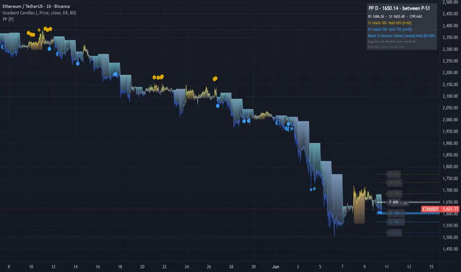
Pivot Points Mapped turns the standard pivot grid into a measured one. Pick your formula (Classic, Fibonacci, Camarilla, Woodie) and the grid timeframe follows your chart (intraday→Daily, daily→Weekly, weekly→Monthly). Every level is labelled with its empirical reach rate on this chart — R1 at 68% is a real target, R3 at 9% is a long shot — and weighted by reach, proximity and higher-TF confluence, so the chart shows a few meaningful zones instead of seven equal lines.
🟡 WHY THIS VERSION
Most pivot tools draw the same lines on every chart without telling you which ones price ever reaches. This one counts it: reach rate per level, hold rate per touch with a Wilson lower bound, first-touch decay, and ✦ when the higher timeframe's grid agrees — all measured on the loaded chart. The CPR band adds the classic narrow-means-trend tell as a percentile of this chart's own history. Alerts have history-backed variants that only fire when the evidence clears the bar. It counts instead of guessing.
🟡 HOW IT WORKS
Levels come from the prior period's confirmed HLC (no lookahead) in the formula you pick; the same formula builds the higher-TF set, so confluence compares like with like. Each live period, per-level booleans track whether price tagged each level; at period close they roll into the reach history. Touch-reactions are judged on the bar after a zone entry — hold or break — and feed per-level hold arrays with Wilson lower bounds. First-touch decay splits the hold rate by 1st/2nd/3rd test of the period. Visual weight (width, brightness, glow) blends reach × proximity × confluence. The CPR band (BC to TC) is washed behind the levels; its width is ranked against this chart's recent periods — narrow percentiles classically precede trending periods. A corner table shows the state, the bull/bear reach-hold stats, a plain-language Read, and an edge clock stamping the last history-backed bounce/rejection.
🟡 KEY FEATURES
🟡 HOW TO USE
🟡 PAIRS WELL WITH
Pair with a trend or momentum read (MA slope, MACD) to know which side of P has the directional edge — pivots are neutral by formula. Volume profile confirms whether a pivot sits at a real high-volume node. For intraday, an opening-range tool tells you the likely direction into the day's levels. Pivots are reference structure, not entries.
Not seven equal lines but a measured terrain: the most-reached levels stand out, confluence is computed instead of eyeballed, and every reaction has a counted history. Evidence from this chart only — description, not prediction.
Open source under MPL-2.0. The probability layer describes past signals on your chart — it is a measurement, not a prediction, and nothing here is financial advice.
🟡 WHY THIS VERSION
Most pivot tools draw the same lines on every chart without telling you which ones price ever reaches. This one counts it: reach rate per level, hold rate per touch with a Wilson lower bound, first-touch decay, and ✦ when the higher timeframe's grid agrees — all measured on the loaded chart. The CPR band adds the classic narrow-means-trend tell as a percentile of this chart's own history. Alerts have history-backed variants that only fire when the evidence clears the bar. It counts instead of guessing.
🟡 HOW IT WORKS
Levels come from the prior period's confirmed HLC (no lookahead) in the formula you pick; the same formula builds the higher-TF set, so confluence compares like with like. Each live period, per-level booleans track whether price tagged each level; at period close they roll into the reach history. Touch-reactions are judged on the bar after a zone entry — hold or break — and feed per-level hold arrays with Wilson lower bounds. First-touch decay splits the hold rate by 1st/2nd/3rd test of the period. Visual weight (width, brightness, glow) blends reach × proximity × confluence. The CPR band (BC to TC) is washed behind the levels; its width is ranked against this chart's recent periods — narrow percentiles classically precede trending periods. A corner table shows the state, the bull/bear reach-hold stats, a plain-language Read, and an edge clock stamping the last history-backed bounce/rejection.
🟡 KEY FEATURES
- Reach Map: every level labelled with its empirical reach rate — e.g. 'R1 68% ✓'
- Four pivot methods (Classic / Fibonacci / Camarilla / Woodie), one selector — the stats work for all
- Auto grid timeframe: intraday→D, daily→W, weekly→M, with manual override; stats count per period
- CPR band with width-percentile read (narrow/mid/wide vs this chart's own history)
- Hold rate per level with Wilson lower bound + first-touch decay (1st/2nd/3rd test) in tooltips
- ✦ confluence: levels aligned with the grid one rung up, same formula, weighted brighter
- Self-decluttering: far/low-reach levels fade, high-evidence levels glow
- Corner stats table + edge clock (last history-backed bounce/rejection)
- Touch-reaction dots with density control (All / Medium+ / Backed)
- Evidence-gated alert variants; everything non-repainting (confirmed prior-period data)
🟡 HOW TO USE
- Read the reach % first: 70%+ is a credible target, <15% a stretch. Set targets by evidence, not formula.
- ✦ levels are where two timeframes agree — treat them as the higher-conviction zones.
- ✓ = already tagged this period; focus shifts to the next untagged level in the direction of travel.
- Hover a level for hold rate, Wilson lower bound and first-touch decay — a level that holds its 1st test but folds on the 3rd is for first-touch fades only.
- CPR narrow (low percentile) classically precedes trending periods — favour breakout targets; wide favours fades. The percentile is measured, the interpretation is theory.
- Use the history-backed alerts for signals worth acting on; standard alerts for awareness.
- Costs honesty: median touch-reactions on low timeframes are small — check hold rate and n against your round-trip costs. This tool filters levels, not entries.
🟡 PAIRS WELL WITH
Pair with a trend or momentum read (MA slope, MACD) to know which side of P has the directional edge — pivots are neutral by formula. Volume profile confirms whether a pivot sits at a real high-volume node. For intraday, an opening-range tool tells you the likely direction into the day's levels. Pivots are reference structure, not entries.
Not seven equal lines but a measured terrain: the most-reached levels stand out, confluence is computed instead of eyeballed, and every reaction has a counted history. Evidence from this chart only — description, not prediction.
Open source under MPL-2.0. The probability layer describes past signals on your chart — it is a measurement, not a prediction, and nothing here is financial advice.
开源脚本
秉承TradingView的精神,该脚本的作者将其开源,以便交易者可以查看和验证其功能。向作者致敬!您可以免费使用该脚本,但请记住,重新发布代码须遵守我们的网站规则。

免责声明
这些信息和出版物并非旨在提供,也不构成TradingView提供或认可的任何形式的财务、投资、交易或其他类型的建议或推荐。请阅读使用条款了解更多信息。
免责声明
这些信息和出版物并非旨在提供,也不构成TradingView提供或认可的任何形式的财务、投资、交易或其他类型的建议或推荐。请阅读使用条款了解更多信息。