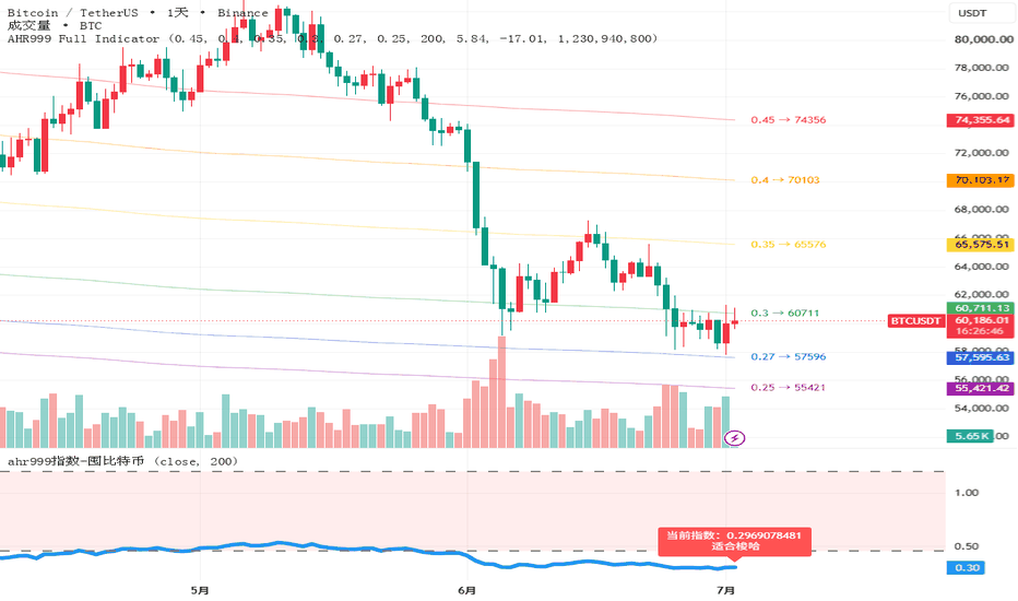
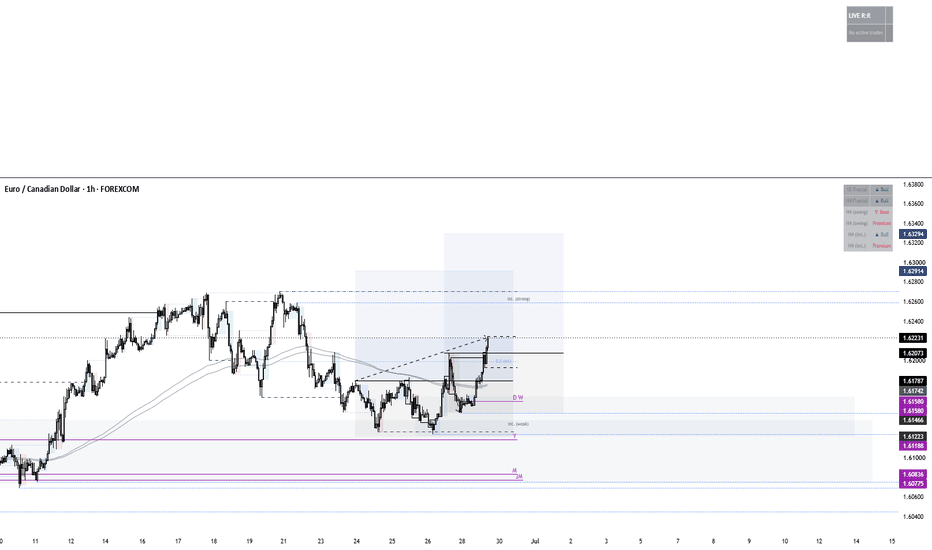
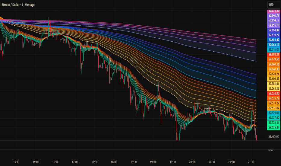
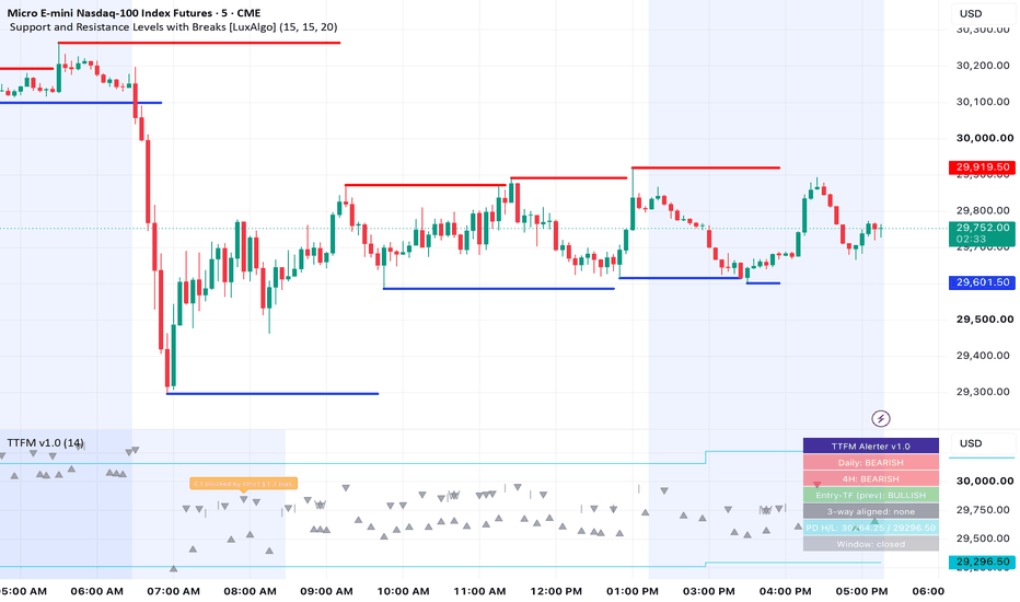
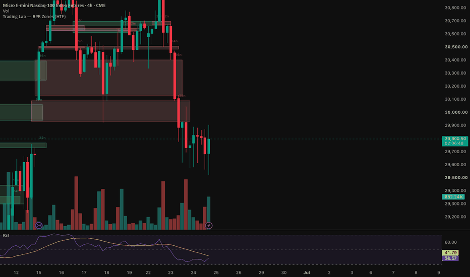
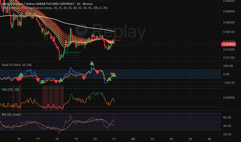
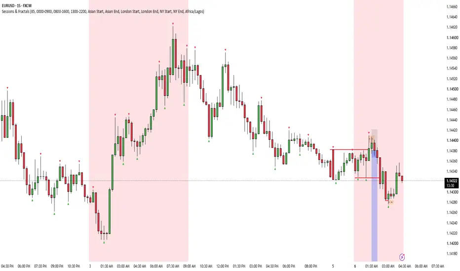
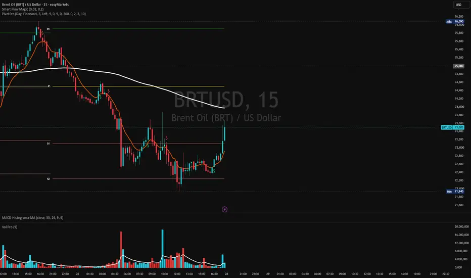
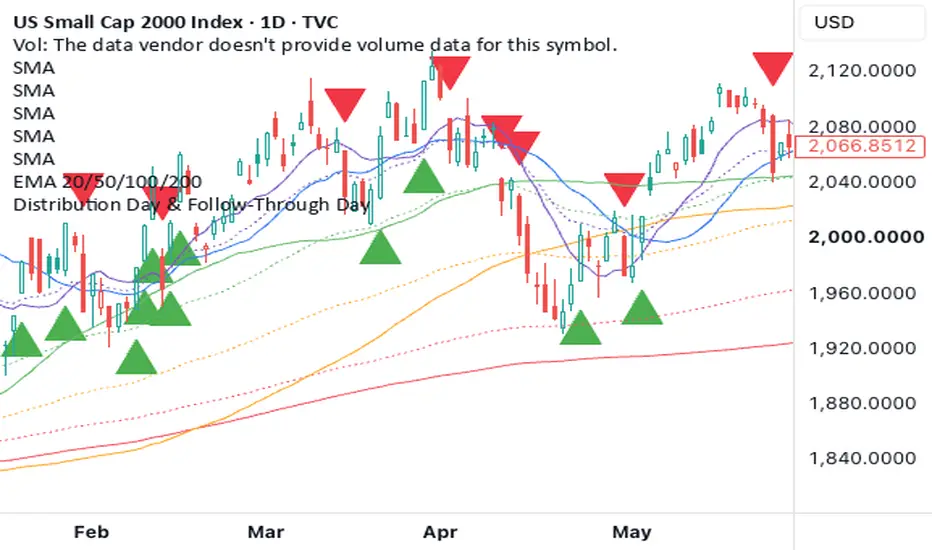
RSI Market Structure Zones ProPlease read how to use it. red before use.
RSI Momentum Zones Pro
Professional RSI Confirmation Indicator for Trend, Reversal & Scalping
Author: Forex_Market_Insights
Overview
RSI Momentum Zones Pro is a professional momentum analysis indicator developed to simplify RSI interpretation by dividing market momentum into four institutional trading zones instead of relying solely on the traditional overbought and oversold approach.
Rather than treating RSI as a simple oscillator, this indicator classifies momentum into Over Bought, Resistance, Support, and Over Sold regions to help traders understand where price is statistically more likely to continue, slow down, reject, or reverse after receiving price action confirmation.
The indicator is designed for discretionary traders who combine momentum analysis with candlestick confirmation instead of using RSI crossovers alone.
It is suitable for scalping, intraday trading, swing trading and multi-timeframe analysis.
Core Concept
Traditional RSI indicators only highlight the 70 and 30 levels, which often generate premature or unreliable signals during strong market trends.
This indicator expands RSI interpretation by introducing four structured momentum zones:
Over Bought (80)
Resistance (68)
Support (35)
Over Sold (20)
These additional zones allow traders to evaluate market strength in greater detail before making trading decisions.
Instead of assuming every overbought or oversold condition will immediately reverse, the indicator encourages confirmation through actual price behavior.
Indicator Structure
The RSI panel contains four clearly defined institutional-style levels:
OVER BOUGHT (80)
Represents an extreme bullish momentum zone.
Price entering this area suggests that buying pressure has become unusually strong.
This does not automatically indicate a sell signal.
Instead, traders should wait for bearish confirmation before considering a short position.
RESISTANCE (68)
Represents an upper momentum resistance area.
Momentum is considered strong, but not yet at an extreme.
This zone is useful for identifying potential exhaustion during bullish trends while still allowing trend continuation if buying pressure remains strong.
SUPPORT (35)
Represents a lower momentum support area.
Momentum has weakened but has not yet reached extreme bearish conditions.
This area frequently serves as an early accumulation zone where buyers may begin regaining control.
OVER SOLD (20)
Represents an extreme bearish momentum condition.
Selling pressure has reached unusually high levels.
Rather than immediately buying, traders should wait for bullish confirmation from price before entering a long position.
Dynamic RSI Visualization
The RSI line changes color according to momentum direction.
Green RSI Line
Indicates that RSI is rising and bullish momentum is strengthening.
Red RSI Line
Indicates that RSI is falling and bearish momentum is increasing.
This dynamic visualization allows traders to recognize momentum shifts without relying solely on numerical RSI values.
Trading Algorithm
The indicator does not generate trading signals simply because RSI reaches a certain level.
Instead, it follows a confirmation-based workflow.
Bullish Setup
A potential Buy opportunity is considered when:
RSI reaches the Support zone (35) or the Over Sold zone (20).
A strong bullish candle closes after momentum stabilizes.
Price confirms that buyers are beginning to regain control.
This confirmation-based approach helps reduce entries during ongoing bearish momentum.
Bearish Setup
A potential Sell opportunity is considered when:
RSI reaches the Resistance zone (68) or the Over Bought zone (80).
A strong bearish candle closes after bullish momentum weakens.
Price confirms increasing selling pressure.
This helps filter out false reversals during strong uptrends.
Momentum Confirmation Philosophy
One of the primary design goals of this indicator is to avoid trading solely based on RSI values.
Instead of assuming:
RSI reached 20 → Buy
or
RSI reached 80 → Sell
the indicator expects traders to combine RSI zones with actual market structure and candlestick confirmation.
This confirmation-first methodology is intended to reduce low-probability entries.
Hidden Momentum Concept
Momentum reversals do not always occur simultaneously on price and RSI.
Occasionally:
Price may create a new swing low while RSI does not.
RSI may create a new swing low while price remains relatively stable.
Likewise, the same behavior can occur near market highs.
These situations often indicate weakening momentum and can provide early evidence that trend strength is fading.
This indicator is designed to help traders visually identify these momentum shifts while combining them with price action confirmation before executing trades.
Multi-Timeframe Usage
Although the indicator performs well on lower timeframes such as the 1-minute chart, its underlying momentum framework is applicable across all TradingView-supported timeframes.
Many traders use:
1 Minute for scalping
5 Minute for intraday trading
15 Minute for short-term trend trading
Higher timeframes for broader market context
Using higher timeframe trend direction together with lower timeframe RSI confirmations may improve trade selection.
Practical Trading Workflow
A typical workflow may include:
Observe which RSI zone the market is approaching.
Wait for price action confirmation.
Confirm momentum direction using the RSI line color.
Enter only after the confirmation candle closes.
Manage risk using appropriate stop-loss placement and position sizing.
The indicator is intended to assist discretionary decision-making rather than automate entries.
Best Market Conditions
The indicator is particularly useful during:
Intraday trading
Scalping
Trending markets
Pullback trading
Momentum continuation setups
Reversal confirmation
Multi-timeframe analysis
Risk Notice
No technical indicator can predict future price movement with certainty.
RSI Momentum Zones Pro is designed as a decision-support tool and should be used alongside sound risk management, price action analysis, and overall market context.
It is not intended to be used as a standalone trading system, and traders should always confirm setups before entering positions.
Original Development
RSI Momentum Zones Pro has been independently designed and implemented by Forex_Market_Insights. The indicator combines structured RSI zoning, dynamic momentum visualization, and confirmation-based trading principles into a single workflow intended to improve momentum interpretation while remaining intuitive for discretionary traders. 指标

Fair Value Gap MarkerFair Value Gap Marker
Overview
Fair Value Gap Marker is a configurable market imbalance visualization tool designed to automatically detect, evaluate, and manage Fair Value Gaps (FVGs) using a three-candle price imbalance model. While the Fair Value Gap concept is widely recognized in technical analysis, this implementation expands the basic detection model by introducing adaptive volatility filtering, quantitative strength scoring, multi-timeframe analysis, and automated zone lifecycle management.
The objective of the indicator is not to display every possible imbalance, but to help traders focus on higher-quality Fair Value Gaps by filtering insignificant gaps and providing additional contextual information about each detected zone.
---
What is a Fair Value Gap?
A Fair Value Gap represents a temporary market inefficiency created when price moves aggressively enough that little or no trading occurs within a specific price range.
Such rapid displacement can leave an imbalance between buyers and sellers. Many traders monitor these areas because price may revisit them later before continuing its trend or establishing a reversal.
Rather than manually inspecting charts for these imbalances, Fair Value Gap Marker continuously scans completed candles and automatically identifies qualifying bullish and bearish Fair Value Gaps.
---
# Detection Algorithm
The indicator evaluates every completed three-candle sequence.
A Bullish Fair Value Gap is identified when the current candle's low remains above the high of the candle two bars earlier.
A Bearish Fair Value Gap is identified when the current candle's high remains below the low of the candle two bars earlier.
Only confirmed candle data is evaluated, ensuring that detected Fair Value Gaps remain stable once created.
---
# Adaptive Minimum Gap Filtering
Not every Fair Value Gap has equal analytical value.
Very small gaps frequently occur during normal market fluctuations and may simply represent insignificant price noise.
To reduce unnecessary chart clutter, this indicator offers two independent filtering methods.
### Percentage Filter
The minimum acceptable gap size can be defined as a percentage of the current market price.
Only Fair Value Gaps exceeding the specified percentage threshold are displayed.
This mode is useful for traders who prefer a fixed proportional filter across different assets.
---
### ATR Adaptive Filter
The second filtering method compares the gap size against the current Average True Range (ATR).
Instead of relying on a fixed gap width, every imbalance must exceed a configurable multiple of current market volatility.
Because ATR expands during volatile conditions and contracts during quieter markets, this approach automatically adapts the minimum acceptable Fair Value Gap size without requiring constant manual adjustment.
This helps maintain more consistent filtering across different symbols, sessions, and market environments.
---
# Fair Value Gap Strength Score
One of the primary enhancements introduced in this implementation is the Fair Value Gap Strength Score.
Rather than assuming all detected imbalances have equal significance, every Fair Value Gap is assigned a numerical score ranging from 0 to 100.
The score combines two independent measurements.
## 1. Gap Size Analysis
The script compares the width of the Fair Value Gap with the current ATR.
Larger displacement moves generally indicate stronger directional momentum and therefore contribute more heavily to the final score.
---
## 2. Relative Volume Analysis
The volume of the candle responsible for creating the Fair Value Gap is compared against its recent moving average.
Higher-than-average participation suggests stronger market commitment and increases the confidence score.
---
## Final Strength Score
The final Strength Score blends volatility expansion and relative participation into a single numerical value.
Higher scores generally represent Fair Value Gaps created by stronger market displacement accompanied by relatively stronger trading activity.
Users may also define a minimum acceptable Strength Score, allowing weaker Fair Value Gaps to be filtered automatically.
This provides an additional quality layer beyond simple price imbalance detection.
---
# Multi-Timeframe Fair Value Gap Detection
The indicator supports optional Higher Timeframe (HTF) analysis.
When enabled, the script independently evaluates completed candles from the selected higher timeframe using the same Fair Value Gap detection algorithm.
Detected higher-timeframe Fair Value Gaps are projected directly onto the active chart using a dedicated color scheme.
This enables traders to monitor institutional imbalance zones from larger market structures while executing analysis on lower timeframes.
The higher-timeframe feature removes the need to switch between multiple charts during analysis.
---
# Automatic Zone Management
Each detected Fair Value Gap becomes an independent price zone.
Once created, every zone is continuously monitored as new market data becomes available.
Users may choose between two operating modes.
### Persistent Mode
Fair Value Gaps remain visible regardless of future price action.
This mode is useful for historical analysis.
---
### Automatic Mitigation Mode
When enabled, the script continuously checks whether price has fully traded back into the imbalance.
Once a Fair Value Gap has been completely mitigated, its corresponding zone is automatically removed from the chart.
This helps reduce clutter while keeping attention focused on active market inefficiencies.
---
# Dynamic Zone Extension
Every active Fair Value Gap extends forward automatically.
As new candles appear, existing zones continue projecting into future price action until mitigation occurs or the configured extension period expires.
This allows traders to monitor future interactions between price and previously identified imbalance zones without manually updating chart objects.
---
# Visualization
The indicator includes multiple visualization options.
Users may display:
• Bullish Fair Value Gaps
• Bearish Fair Value Gaps
• Higher-Timeframe Fair Value Gaps
Zones may use either fixed bullish/bearish colors or rotate through a customizable color palette, making consecutive imbalance zones easier to distinguish during periods of increased market activity.
Strength Scores may also be displayed directly inside each Fair Value Gap box.
---
# Available Settings
The indicator includes configurable options for:
• Bullish Fair Value Gap visibility
• Bearish Fair Value Gap visibility
• Percentage-based minimum gap filtering
• ATR-based adaptive filtering
• ATR Length
• ATR Multiplier
• Strength Score display
• Minimum Strength Score threshold
• Volume Average Length
• Multi-Timeframe detection
• Higher-Timeframe selection
• Automatic mitigation removal
• Zone extension length
• Fixed colors
• Palette cycling
• Complete visual customization
---
# Suggested Workflow
One possible workflow is:
1. Determine the primary market trend using your preferred methodology.
2. Enable Higher-Timeframe Fair Value Gap detection if broader market context is required.
3. Wait for new Fair Value Gaps that satisfy the selected filtering criteria.
4. Evaluate the Strength Score.
5. Monitor future price interaction with active imbalance zones.
6. Combine Fair Value Gap analysis with your own confirmation techniques such as market structure, liquidity sweeps, order blocks, break of structure (BOS), change of character (CHoCH), volume analysis, or personal risk management rules before making trading decisions.
The indicator intentionally does not generate automated buy or sell signals.
Its purpose is to provide an objective framework for identifying and monitoring price imbalance zones.
---
# Original Design Philosophy
This implementation was developed to extend the traditional Fair Value Gap workflow beyond simple imbalance detection.
Instead of displaying every possible gap, the indicator integrates multiple analytical layers—including adaptive ATR-based filtering, quantitative Strength Scoring, configurable minimum quality thresholds, automatic mitigation management, dynamic zone extension, and optional multi-timeframe confluence—to help traders organize Fair Value Gaps according to both market volatility and relative participation.
The design philosophy focuses on improving clarity, reducing low-quality signals, and providing a flexible analytical framework suitable for different trading styles and market conditions.
---
## Disclaimer
This indicator is an analytical charting tool designed to assist technical analysis.
It does not predict future price movement, guarantee profitable trades, or provide financial or investment advice.
Trading decisions should always be based on independent analysis, proper risk management, and the trader's own methodology.
指标

Forex Sessions Trackerwww.tradingview.com
Forex Sessions Tracker is a professional and fully customizable TradingView indicator designed to automatically highlight the most important Forex trading sessions directly on the chart, including the Asia Session, London Session, New York Session, and London Close Session. The indicator draws dynamic boxes that expand in real time as price moves, continuously updating the session high and low so traders can easily visualize volatility, liquidity, and key market reactions during each trading period. A customizable timezone option allows the sessions to match any broker or trading preference, while individual session controls make it possible to show or hide specific sessions according to your strategy. The script also includes optional session labels, adjustable border width, custom colors for each session, and a professional glowing box effect that improves visibility without cluttering the chart. Historical session management keeps only the most recent sessions visible, helping maintain a clean workspace while preserving important market structure. This tool is especially useful for Forex, Gold (XAUUSD), and index traders who rely on session-based analysis, breakout trading, liquidity sweeps, ICT concepts, or intraday price action strategies. By clearly separating the major market sessions, Forex Sessions Tracker helps traders identify when liquidity enters the market, monitor session highs and lows, and focus on the periods where significant price movement is most likely to occur. The indicator is intended as a visual market-session tracking tool and works best when combined with your own trading strategy, risk management, and price action analysis.
For more Expert Signals, Market updates & Analysis 👇👇👇
www.tradingview.com 指标

XI0033 Williams FractalA Williams fractal confirms late by definition: the pattern is complete only after the bars to its right have closed, so the marker always appears in the past. This script keeps the classic fractal template — three- or five-bar — and adds the one thing the classic version cannot show: the bar that is about to become a fractal, before the confirmation arrives.
It draws triangles for confirmed fractal highs and lows, plus one highlighted triangle for the last potential fractal on the live edge. Nothing else: no lines, no levels, no signals.
Confirmed fractals
A fractal high is a bar whose high stands above the highs of its neighbours; a fractal low mirrors that on the lows. The 3-bar mode compares one neighbour on each side, the 5-bar mode two on each side — the original Bill Williams definition. The Periods input sets how many bars back the reference bar sits. Confirmed fractals are painted as muted grey triangles above the highs and below the lows, and once the pattern that produced them is closed, they are history: they do not move and do not disappear.
Confirmed fractal highs and lows in the muted default colour: every triangle marks a bar whose extreme beat its neighbours on both sides, printed only after the pattern completed.
The last potential fractal
This is the addition. One bar to the right of the last confirmable centre there is always a candidate: a bar already higher (or lower) than its closed neighbours, waiting only for the current bar to keep its distance. The script highlights that candidate with an orange triangle — pointing down above a potential high, pointing up below a potential low — so the developing swing is visible before it becomes official.
The highlight exists only on the live bar. It is recalculated tick by tick, disappears the moment price violates the candidate, and is deliberately dropped on the bar's final update, so it never leaves a trace in the chart history. Scroll back and you will find only confirmed fractals.
Left: the orange triangle under the newest low is the last potential fractal. Right, a few bars later: that low now carries a grey confirmed triangle — the preview left no trace — and a new potential fractal already sits above the latest high.
What repaints, and what does not
The potential marker repaints by design — that is its job. It is a live preview that appears, moves and vanishes with the current bar, and it is intentionally not committed to history. Confirmed fractals in the default 3-bar mode are built from closed bars only, so once a triangle prints, it is final. In the 5-bar mode with the default period, the newest confirmation still involves the forming bar's extreme, so it can appear and be withdrawn until that bar closes; after the close it is final. And every confirmed fractal is late by definition — the triangle appears above a bar that is already in the past, because that is what confirmation means.
What is reused, and what is new
The confirmed-fractal logic is the classic Bill Williams fractal template as coded by Mit Nayi, reused open-source with attribution in the source header. What this edit adds: the port to Pine Script v6, and the whole potential-fractal layer — the candidate detection one bar to the right of the confirmable centre, and the barstate mechanism that shows the preview on the live bar only and drops it on the bar's final update, so it never piles up in history.
What it does not do
It gives no signals. A fractal marks a local extreme, and most local extremes get traded through; on their own they are not entries. This is a structural marker — swing logic, liquidity maps and ICT-style analysis use fractals as raw material, and the potential marker only tells you where the next one may appear. The decision stays yours.
The Inputs allow you to set:
Periods: how many bars back the fractal centre sits; the triangles are drawn on that centre bar
3 or 5 Bar Fractal: one or two neighbours compared on each side
Show last potential fractal: the live-edge preview on or off
Potential down and up fractal colours
About the chart
BYBIT:BTCUSDT.P, 5-minute chart. The only script on it is this one, with default settings: muted grey triangles mark confirmed fractal highs and lows across the chart, and the orange triangle at the right edge is the last potential fractal, not yet confirmed. No other indicators, no drawings. 指标

指标

指标

指标

指标

ICT Killzones - High/LowThis indicator highlights the key time-based trading sessions defined by the ICT (Inner Circle Trader) methodology — periods of the day when institutional order flow and liquidity are historically concentrated, making them prime windows for high-probability setups.
Sessions plotted:
Asian Killzone (e.g., 20:00–00:00 EST) — accumulation/range-building phase, often sets up liquidity for later sessions
London Killzone (e.g., 02:00–05:00 EST) — first major volatility expansion, frequently sweeps Asian session highs/lows
New York Killzone (e.g., 07:00–10:00 EST) — overlaps with London close, typically the highest-volume, highest-volatility window of the day
London Close Killzone (e.g., 10:00–12:00 EST) — optional reversal/continuation window as European desks exit positions
Features:
Shaded vertical session boxes drawn directly on the chart for each killzone
Customizable time ranges to match your broker's timezone/session offsets
Optional high/low markers for each session to track liquidity sweeps and raids
Toggle visibility per session and adjust colors/opacity independently
Session labels for quick visual reference
Use case: Combine with ICT concepts like liquidity sweeps, fair value gaps (FVG), and market structure shifts (MSS) to time entries within these windows rather than trading blindly throughout the day.
指标

指标

Fractal Structure Auto FiboFractal Structure Auto Fibo
This tool is designed for price action traders and structural analysts who want to optimize their charting. It automatically identifies valid market swings using fractal logic, draws clear ZigZag lines, and automatically draws Fibonacci retracement levels for the most recent trading range.
Key Features
Dynamic Fractal Detection: Identifies valid swing peaks and troughs based on a user-defined review period (n). It filters out market noise and visually marks confirmed swing points with clear arrows (⮝ / ⮟).
- The difference from other Fractal indicators is that it scans fractal levels; if there are multiple consecutive highs or lows, it selects the highest/lowest as the main fractal level. Eliminate structural doubts.
Draw a live ZigZag map: Connect confirmed structural points to give you a clear, unambiguous view of the current market trend.
Smart automatic Fibonacci: Eliminate the need to manually draw Fibonacci retracement levels!
Automatically identify the nearest swing peaks and troughs.
Automatically reverse based on the current trend (0.0 is at the peak in an uptrend to measure corrections, and vice versa).
Extend dashed Fibonacci levels forward to the current candle to create a clean, uncluttered chart.
Settings & Customization
Fractal Period (n): Determines the sensitivity of the pivot points. Larger numbers filter out small corrections for macro structure, while smaller numbers capture small swings.
Automatic Fibonacci On/Off: Easily turn the Fibonacci display on or off to keep your chart clean. Includes customizable line and text colors.
For Developers (Open Source)
The code is highly optimized using Pine Script v5 array to manage drawing objects (Lines and Labels). It automatically removes old Fibonacci levels and dynamically redraws new ones, ensuring your platform doesn't reach its maximum line limit. Feel free to copy this script to add your own order conditions, alerts, or advanced SMC filters!
Happy using the script and successful trading! 指标

Liquidity Sweep & Golden Zone [StrixEDGE]Overview
Liquidity Sweep & Golden Zone is a multi-timeframe structural analysis tool built for traders who use Smart Money Concepts (SMC) and ICT methodology. It identifies liquidity sweeps at confirmed swing levels, maps the Fibonacci Golden Zone (OTE), and presents a real-time confluence dashboard across 15-minute, 1-hour, 4-hour, and daily timeframes.
The indicator answers three questions at a glance: where is the liquidity?, has it been swept?, and do multiple timeframes agree on direction?
How It Works
Liquidity Sweep Detection
The engine tracks confirmed swing highs and swing lows using pivot detection. These pivots represent resting liquidity pools — areas where stop-loss orders accumulate:
- Buy-Side Liquidity (BSL) sits above swing highs, where short sellers place their stops. When price wicks above a swing high and closes back below, a BSL sweep is triggered — signaling that buy-side stops were hunted. This typically precedes bearish continuation.
- Sell-Side Liquidity (SSL) sits below swing lows, where long traders place their stops. When price wicks below a swing low and closes back above, an SSL sweep is triggered — signaling that sell-side stops were hunted. This typically precedes bullish reversal.
Each sweep event displays the estimated volume in USDT at the moment of the sweep. This is calculated as `volume × close` on the sweep bar and serves as a proxy for the magnitude of liquidations that occurred. Higher volume sweeps tend to produce stronger reversals.
After a sweep, the level is updated to the new extreme — preventing duplicate signals and establishing a fresh liquidity reference.
Support & Resistance (Pivot-Based)
Active (un-swept) pivot levels are drawn on the chart as structural Support and Resistance:
- A line extending from the bar where the pivot formed to the current price area
- A zone band (ATR × 0.15) around the level, representing the area of influence
- Origin labels showing "Buy-Side Liquidity SWEEP" or "Sell-Side Liquidity SWEEP" with the USDT volume
- Price labels on the right edge for quick reference
These levels update dynamically: when a new pivot is confirmed, the line starts from the new origin. When a sweep occurs, the level shifts to the sweep bar.
Golden Zone (Fibonacci OTE: 0.618 – 0.786)
The Golden Zone represents the Optimal Trade Entry area — the 61.8% to 78.6% Fibonacci retracement of the most recent price range. Unlike pivot-based calculations, this indicator uses a **lookback-based approach**: it finds the highest high and lowest low over a configurable number of bars, then derives the zone from that range.
The zone is visualized with:
- A filled box between the 0.618 and 0.786 levels (transparency adjustable)
- Dashed border lines at 0.618 and 0.786
- A dotted midline at the 0.702 level
- Price labels showing exact values
- A centered "GOLDEN ZONE" tag
This approach produces a stable, always-visible zone that doesn't depend on individual pivot detection, making it reliable across all market conditions.
Multi-Timeframe Heatmap
The core of this indicator is a 7-column heatmap table that evaluates market conditions across four timeframes simultaneously:
| Column | What It Shows | Bullish | Bearish |
|--------|--------------|---------|---------|
| SWEEP | Recent liquidity sweep direction | ● BULL (SSL swept) | ● BEAR (BSL swept) |
| GZ | Price position relative to Golden Zone | ▲ ABOVE | ▼ BELOW |
| S/R | Price position vs. pivot S/R midpoint | ▲ BULLISH | ▼ BEARISH |
| BIAS | EMA 21/50 trend direction | ▲ BULL | ▼ BEAR |
| RSI | RSI(14) value with decimal precision | Color-coded by zone | Color-coded by zone |
| SIGNAL | Composite of all conditions | LONG ▲ | SHORT ▼ |
Signal Logic: The SIGNAL column counts four conditions per timeframe — RSI above/below 50, price in/above the Golden Zone, price above/below the S/R midpoint, and EMA bias direction. When 3 or more conditions align bullish, the signal reads LONG. When 3 or more align bearish, it reads SHORT. Otherwise, NEUTRAL.
A confluence bar at the bottom aggregates all timeframes. When the majority of conditions across all four timeframes agree, it displays STRONG BULLISH or STRONG BEARISH CONFLUENCE.
RSI Color Coding
| RSI Range | Color | Meaning |
|-----------|-------|---------|
| > 70 | Orange | Overbought |
| 50 – 70 | Green | Bullish momentum |
| 30 – 50 | Red | Bearish momentum |
| < 30 | Blue | Oversold |
Settings
Structure Settings
| Setting | Default | Description |
|---------|---------|-------------|
| Pivot Lookback Length | 5 | Bars left and right to confirm a swing pivot. Higher values produce fewer but stronger levels |
| Sweep Active Memory | 10 | How many bars a sweep signal remains active on the heatmap after detection |
Golden Zone
| Setting | Default | Description |
|---------|---------|-------------|
| Lookback Period | 20 | Number of bars to find highest high and lowest low for Fibonacci calculation |
| Show Golden Zone | On | Toggle zone visibility on chart |
| Fill Golden Zone | On | Shade the area between 0.618 and 0.786 |
| Fill Transparency | 88 | Opacity of the filled zone (50–98) |
| Golden Zone Color | Gold | Color for all Golden Zone elements |
Support & Resistance
| Setting | Default | Description |
|---------|---------|-------------|
| Show S/R on Chart | On | Toggle S/R lines, zone bands, and labels |
| Support Color | Teal | Color for support level and SSL elements |
| Resistance Color | Red | Color for resistance level and BSL elements |
| Line Width | 2 | Thickness of S/R lines (1–4) |
| Line Style | Solid | Solid, Dashed, or Dotted |
| Show Price Labels | On | Display price values at the right edge of each level |
Sweep Event Labels
| Setting | Default | Description |
|---------|---------|-------------|
| Show Sweep Labels | On | Toggle sweep event markers on chart |
| Bullish Sweep Color | Green | Color for SSL sweep labels (bullish reversal) |
| Bearish Sweep Color | Red | Color for BSL sweep labels (bearish reversal) |
Heatmap Table
| Setting | Default | Description |
|---------|---------|-------------|
| Show Heatmap Table | On | Toggle the entire dashboard |
| Table Position | Top Right | 9 position options across the chart |
| Table Cell Size | Normal | Tiny, Small, Normal, Large, or Auto |
Alerts
Five alert conditions are built in and ready to use:
1. Bullish Liquidity Sweep — SSL swept, potential bullish reversal
2. Bearish Liquidity Sweep — BSL swept, potential bearish reversal
3. Bull Sweep + Golden Zone — SSL swept while price is inside the OTE zone (high-probability long)
4. Bear Sweep + Golden Zone — BSL swept while price is inside the OTE zone (high-probability short)
5. Price in Golden Zone — Price enters the 0.618–0.786 zone on any bar
Disclaimer
This indicator is a technical analysis tool designed to assist in identifying potential areas of interest based on market structure and liquidity concepts. It does not constitute financial advice. The USDT volume figures are approximations, not verified liquidation data. Always use proper risk management and combine this tool with your own analysis. Past performance of any signal or pattern does not guarantee future results. Trade at your own risk. 指标

EMA + Supertrend + OBV [StrixEDGE]Trend Engine EMA + Supertrend + OBV is a multi-timeframe trend scoring system that combines EMA structure, Supertrend direction, and OBV volume flow into a single overlay with a detailed heatmap dashboard. It evaluates four timeframes simultaneously and presents the results in a color-coded, section-organized table directly on the chart.
The indicator answers three questions per timeframe: Is the structure bullish or bearish? Is the directional signal confirmed? Is volume supporting the move? It then aggregates these into a confluence score and cross-timeframe alignment reading.
Components
EMA Stack (21 / 50 / 200)
Three exponential moving averages forming a structural hierarchy. The scoring logic evaluates both the EMA order and price position:
| Condition | Score | Label |
|---|---|---|
| 21 > 50 > 200, price above all | +2 | FULL BULL ▲▲ |
| 21 > 50 > 200 | +1 | BULLISH ▲ |
| Price above 200 but EMAs not ordered | +1 | BULLISH ▲ |
| No clear alignment | 0 | MIXED ◆ |
| Price below 200 but EMAs not ordered | −1 | BEARISH ▼ |
| 21 < 50 < 200 | −1 | BEARISH ▼ |
| 21 < 50 < 200, price below all | −2 | FULL BEAR ▼▼ |
The 200 EMA is separately tracked as "Price/200" in the heatmap, since institutional participants widely use this level as the dividing line between bull and bear regimes.
On the chart, all three EMAs turn green when bull-stacked and red when bear-stacked. A ribbon fill between the fast and mid EMA visualizes alignment strength. Golden Cross (50 above 200) and Death Cross events are marked with "GC" and "DC" labels.
Supertrend (10, 3)
An ATR-based trailing stop that produces a binary directional signal. When the Supertrend line is below price, it scores +1 (BULLISH). When above, it scores −1 (BEARISH). The line also serves as a dynamic stop-loss level. Triangle markers appear at each flip point.
OBV with 20-period SMA
On Balance Volume is calculated cumulatively — adding volume on up-closes, subtracting on down-closes. The heatmap evaluates two dimensions independently: OBV position relative to its SMA (above or below) and the SMA slope direction (rising, falling, or flat). This produces six distinct flow states:
| OBV vs MA | Slope | Label | Meaning |
|---|---|---|---|
| Above | Rising | ACCUM ▲ | Active accumulation — institutional buying |
| Above | Flat | ABOVE MA | Holding above average — neutral positive |
| Above | Falling | WEAKENING | Position eroding despite being above MA |
| Below | Rising | BUILDING | Recovery underway — improving flow |
| Below | Flat | BELOW MA | Holding below average — neutral negative |
| Below | Falling | DISTRIB ▼ | Active distribution — institutional selling |
OBV scores +1 when above MA and rising, −1 when below MA and falling, and 0 for all intermediate states.
The MTF Heatmap
The heatmap table is organized into four color-coded sections:
STRUCTURE (blue header) — EMA Stack alignment and Price vs EMA 200 for each timeframe. Shows whether the market's structural foundation is bullish, bearish, or mixed.
DIRECTION (purple header) — Supertrend signal per timeframe. A clean binary reading of whether the trailing stop is bullish or bearish.
VOLUME FLOW (teal header) — OBV flow state per timeframe. Shows whether volume is confirming the price trend, diverging from it, or transitioning.
CONFLUENCE (gold header) — The aggregated output:
- Score: total from −4 to +4 per timeframe
- Strength: visual dot bar (● ● ● ● ○) representing signal intensity
- Regime: classification label (STRONG BULL BULLISH NEUTRAL BEARISH STRONG BEAR )
At the bottom, an MTF Alignment summary shows how many timeframes agree (e.g., "▲ 3/4 BULLISH — Strong alignment www.tradingview.com or "◆ SPLIT 2/2 — No clear bias www.tradingview.com).
Every cell uses heatmap coloring — bright green for strong bullish, through gray for neutral, to deep red for strong bearish — providing an instant visual scan of market conditions.
| Component | Max bullish | Neutral | Max bearish |
|---|---|---|---|
| EMA Stack | +2 | 0 | −2 |
| Supertrend | +1 | — | −1 |
| OBV Flow | +1 | 0 | −1 |
| **Total** | +4 | 0 | −4 |
Classification per timeframe:
- +3 to +4 → STRONG BULL
- +1 to +2 → BULLISH
- 0 → NEUTRAL
- −1 to −2 → BEARISH
- −3 to −4 → STRONG BEAR
Reading the heatmap
The heatmap's primary value is showing cross-timeframe agreement at a glance:
All columns green — Full alignment across timeframes. This is the highest-probability environment for trend-following trades.
Higher TFs green, lower TFs red — A pullback within a larger uptrend. The structural trend is intact; the short-term weakness may represent an entry opportunity.
Lower TFs green, higher TFs red — A rally within a larger downtrend. Unless the higher timeframes are shifting, this is likely a counter-trend bounce.
Mixed colors — No clear directional edge. Reduce position size or wait for alignment to develop.
Section-level reading — If STRUCTURE and DIRECTION are green but VOLUME FLOW is red, the trend lacks volume confirmation and may be fragile. If VOLUME shows ACCUM but DIRECTION is bearish, smart money may be accumulating before a reversal.
Alerts
Seven alert conditions are available:
- Strong bullish trend detected (current TF)
- Strong bearish trend detected (current TF)
- Golden Cross — EMA 50 crosses above EMA 200
- Death Cross — EMA 50 crosses below EMA 200
- Supertrend flip bullish
- Supertrend flip bearish
- Any trend classification change
Disclaimer: This indicator is a technical analysis tool for educational and informational purposes. It does not constitute financial advice or a recommendation to buy or sell any security. No trading indicator can predict future price movements. Past performance is not indicative of future results. Always conduct your own analysis and consider your risk tolerance before making trading decisions. 指标

指标

Momentum Consensus Heatmap [StrixEDGE]█ MOMENTUM CONSENSUS HEATMAP
A multi-timeframe momentum aggregation system that scans 6 oscillators across 4 customizable timeframes and fires high-conviction BUY/SHORT signals only when a critical mass of indicators reach overbought or oversold consensus simultaneously.
█ CONCEPT
Most momentum-based strategies rely on a single oscillator on a single timeframe — a setup prone to false signals and noise. This indicator solves that by requiring cross-timeframe and cross-indicator agreement before generating a signal.
The core logic works in two layers:
Layer 1 — Timeframe Consensus (per indicator):
Each oscillator is evaluated across 4 timeframes (default: 15m, 1H, 4H, 1D). An indicator only qualifies as "Overbought" or "Oversold" when at least 3 out of 4 timeframes agree (configurable: 2/4, 3/4, or 4/4).
Layer 2 — Indicator Consensus (overall signal):
A chart signal fires only when a user-defined number of indicators (default: 4 out of 6) have all independently reached Layer 1 consensus in the same direction.
This dual-filter architecture dramatically reduces noise and isolates moments of genuine, broad-based momentum exhaustion.
█ OSCILLATORS USED
• RSI (Relative Strength Index) — Classic momentum oscillator measuring speed and magnitude of price changes. Default OB/OS: 70/30.
• Stochastic RSI — Stochastic formula applied to RSI values, more sensitive to short-term momentum shifts than raw RSI. Default OB/OS: 80/20.
• Stochastic Oscillator — Compares closing price to the high-low range over a lookback period. Independent from Stoch RSI. Default OB/OS: 80/20.
• CCI (Commodity Channel Index) — Measures deviation from the statistical mean. Unbounded, making it useful for detecting extreme momentum. Default OB/OS: +100/−100.
• Williams %R — Reflects where the current close sits relative to the highest high. Inverted scale (−100 to 0). Default OB/OS: −20/−80.
• MFI (Money Flow Index) — Volume-weighted RSI. Adds a volume confirmation dimension that pure price-based oscillators lack. Default OB/OS: 80/20.
█ HEATMAP TABLE
The on-chart heatmap table provides a real-time dashboard of all 24 data points (6 indicators × 4 timeframes):
• Each cell shows the live oscillator value with color-coded background:
🔴 Red = Overbought zone
🟢 Green = Oversold zone
⚫ Gray = Neutral
• SCORE column shows how many timeframes agree for each indicator (e.g., "3/4 OB").
• SIGNAL column shows whether that individual indicator has reached consensus ("SHORT ▼" / "BUY ▲" / "—").
• CONSENSUS row at the bottom shows the overall verdict with a percentage score of indicator agreement.
Table position and text size are fully customizable through the settings panel.
█ CHART SIGNALS
When the overall consensus threshold is met:
▲ Green triangle below bar = BUY signal (oversold consensus)
▼ Red triangle above bar = SHORT signal (overbought consensus)
Signals fire only on the first bar of a new consensus event (no repeated signals while conditions persist). A subtle background color flash highlights the signal bar.
█ OPTIONAL TREND FILTER (EMA)
When enabled, signals are filtered by an EMA trend bias:
• BUY signals require price above the EMA (buying in an uptrend)
• SHORT signals require price below the EMA (shorting in a downtrend)
This is disabled by default to keep the indicator pure momentum-based, but can significantly improve signal quality in trending markets.
█ SETTINGS OVERVIEW
⏱ Timeframes — All 4 timeframes are independently configurable.
⚙ Indicator Lengths — Full control over each oscillator's lookback period.
📊 OB/OS Thresholds — Adjust overbought/oversold levels for every oscillator independently.
🎯 Signal Rules:
• Min TF Consensus: How many timeframes must agree per indicator (2-4, default 3).
• Min Indicators: How many indicators must reach consensus for a chart signal (1-6, default 4).
🎨 Table Appearance — Position, size, and full color customization (OB color, OS color, neutral, header, text).
🔔 Alerts — Native TradingView alerts with detailed messages including ticker, timeframe, and consensus count.
█ HOW TO USE
1. Apply the indicator to any chart (works on all instruments and timeframes).
2. The heatmap table updates in real time — use it as a momentum dashboard.
3. Watch for chart signals:
• When 4+ indicators show oversold consensus across 3+ timeframes → BUY signal.
• When 4+ indicators show overbought consensus across 3+ timeframes → SHORT signal.
4. Set up TradingView alerts to get notified when signals fire.
5. For higher conviction:
• Increase "Min Indicators" to 5 or 6 (fewer but stronger signals).
• Require 4/4 timeframe agreement instead of 3/4.
• Enable the EMA trend filter.
█ IMPORTANT NOTES
• This indicator uses request.security() to fetch multi-timeframe data. On the current timeframe, values update in real time. Higher timeframe values reflect the last closed bar of that timeframe.
• Signals are non-repainting once the bar closes. Intrabar, the table values and potential signals update as new ticks arrive (expected behavior for a real-time dashboard).
• This tool is designed for identifying momentum exhaustion zones. It does not predict direction — use it in confluence with price action, support/resistance, and your broader trading plan.
• Past performance is not indicative of future results. Always use proper risk management.
█ CREDITS & LICENSE
Open source under Mozilla Public License 2.0.
Built with Pine Script™ v6. 指标

NIFTY Confirmation-First Option Buying Systempply it to the NIFTY underlying/index 5-minute chart, not directly to a random option premium chart. A BUY CE signal represents bullish confirmation; a BUY PE signal represents bearish confirmation.
The current strategy backtests the underlying movement, so its Strategy Tester P&L will not equal actual option P&L because option premium depends on strike, delta, IV, theta, and expiry.
The next version I would build for you should be more precise and include:
Breakout → mandatory retest → confirmation entry, 1R breakeven, 1.5R swing trailing, daily ₹2,000 loss lock, ₹3,000 daily profit lock, and webhook alerts containing CE/PE strike-selection instructions.
That version would match the personalized rules we created more closely 策略

Supertrend - EMA Cloud - Divergence - ADX [StrixEDGE]Overview
Apex Trend Engine is a 5-layer confluence system that combines trend-following, momentum, and reversal detection into a single overlay indicator. Each layer operates independently and feeds into a unified scoring engine that generates high-conviction BUY and SELL signals only when multiple confirmations align.
Layer 1 — Supertrend (Trend Direction)
An ATR-based adaptive trend filter that hugs price during trends and flips cleanly on reversals. The Supertrend line is plotted directly on the chart with a subtle fill between price and the stop level, making the current trend direction visible at a glance.
Bull & Bear SuperTrend :
Layer 2 — EMA Cloud (Momentum & Entries)
A fast/slow EMA pair (default 9/21) with a filled cloud between them. The cloud color shows momentum direction: green when fast EMA is above slow, red when below. Crossovers serve as entry triggers when confirmed by other layers.
Bull & Bear EMA :
Layer 3 — RSI Divergence Scanner (Reversals)
Automatic detection of regular bullish and bearish divergences between price and RSI using pivot-confirmed swing points. When price makes a lower low but RSI makes a higher low, a bullish divergence line is drawn on the chart. The reverse for bearish.
Bull Div.
Bear Div.
Layer 4 — ADX Trend Strength (Filter)
The Average Directional Index measures whether the market is trending or ranging. ADX above the threshold (default 25) confirms a trending market. The directional indicators (DI+ vs DI-) determine if the trend is bullish or bearish.
Bull & Bear ADX :
Layer 5 — Combined Signal Engine
Each layer contributes one point to a bull score and one to a bear score (5 points maximum each):
Point 1 — Supertrend direction
Point 2 — EMA fast/slow alignment
Point 3 — Price position relative to 200 EMA
Point 4 — Recent RSI divergence (within 20 bars)
Point 5 — ADX trending with directional confirmation
Signal generation requires both a score threshold AND a trigger event:
STRONG BUY — 4 or more bullish points with an EMA crossover or Supertrend flip
BUY — 3 or more bullish points with a trigger
STRONG SELL — 4 or more bearish points with a trigger
SELL — 3 or more bearish points with a trigger
This dual requirement (score plus trigger) prevents signals from firing on every bar during a trend and limits them to actionable moments.
Chart visuals
Supertrend: colored line with transparent fill to price showing the trend zone
EMA Cloud: fast and slow EMA lines with filled cloud between them
EMA 200: gold line for macro trend reference
Divergence lines: green lines connecting bullish divergence pivots, red for bearish
Signal arrows: double arrows for strong signals, single triangles for regular
Background highlight: subtle bar coloring on strong signal bars
Dashboard table
The on-chart dashboard shows each layer's current reading:
Supertrend — stop level and direction
EMA Cross — values and cross status
EMA 200 — value and price position
RSI — value with overbought/oversold warnings
Divergence — type and how many bars ago
ADX — value with trending/ranging status
Score — X/5 BULL and X/5 BEAR
Signal — combined verdict
Settings
Every component is independently configurable with sensible defaults:
Supertrend: ATR length 10, multiplier 3.0
EMA Cloud: fast 9, slow 21, trend 200
RSI Divergence: length 14, pivot lookback 5
ADX: length 14, smoothing 14, trending threshold 25
Signals: buy/sell arrows and background highlights toggleable
Dashboard: position and text size adjustable
Alerts : 10 alert conditions covering every signal type:
Strong Buy, Buy, Strong Sell, Sell
Supertrend flip bullish/bearish
EMA cross up/down
Bullish/Bearish divergence detected
Disclaimer
This indicator is a technical analysis tool for educational and informational purposes. It does not constitute financial advice. Past performance does not guarantee future results. Always use proper risk management and never risk capital you cannot afford to lose. 指标

RM-Zones HeatmapRM. "SOR Zones Heatmap" automatically maps the strongest Support/Resistance zones on any chart by scanning historical price and counting how many times each level was touched. Instead of drawing lines by hand, it highlights the areas where price has reacted the most — colored by strength — so you instantly see where the market respects a level.
Features
Automatic S/R detection: scans a configurable number of candles and clusters nearby touches into zones.
Strength heatmap: each zone is colored green (weak) → yellow (medium) → red (strong) based on how many times price hit it.
Full-width zone bands extended to the right, so levels stay visible as new candles form.
Central line per zone (style, width, and opacity configurable).
Smart labels: price, strength tier (WEAK / MEDIUM / STRONG), score, and touch count.
Fully customizable: colors, opacity, borders, zone size, and max zones to display.
Key Settings
Candles to analyze: lookback depth for building zones.
Minimum touches: filters out weak, noisy levels.
Zone size (pips): tolerance for clustering nearby touches into one zone.
Max zones to draw: caps how many levels appear on the chart.
Band / Line / Label groups: full control over appearance.
How to Use
Read the red zones as the strongest reaction areas — key decision levels.
Use yellow/green zones as secondary levels for scaling out or partial take-profits.
Combine with your trend bias: reactions off strong zones in the trend direction offer the cleanest setups.
Tips
On lower timeframes (e.g. 1min), lower the zone size for finer levels and raise the minimum touches to cut noise.
On higher timeframes, increase zone size so scattered touches merge into meaningful areas.
Created by Raúl (RM) (@your_username) · © 2026
All rights reserved. Educational use only.
Technical analysis tool for educational purposes only. This is not financial advice and does not guarantee results. Trade at your own risk. 指标

RM-Sessions & MTF TrendRM. "Sessions & MTF Trend" is a complete intraday framework that combines trading-session mapping, a triple-EMA system, multi-timeframe trend alignment, and filtered buy/sell signals with automatic SL/TP — all on one overlay. Built to keep you trading with the higher-timeframe trend and only during the sessions that matter.
🕐 Trading Sessions
London, New York, and Day Change sessions highlighted on the chart.
Two modes: session background color or High/Low range fill (toggle "Activate High/Low View").
Fully configurable session times and resolution (D/W/M).
📈 Triple EMA System
EMA 20 / 50 / 200 with independent source, offset, and optional smoothing (SMA, EMA, RMA, WMA, VWMA).
🧭 Multi-Timeframe Trend Alignment
Tracks trend (price vs EMA 200) across 1m, 5m, 15m, 1H, 4H, 1D.
Live alignment counter (e.g. 6▲ / 0▼) and a heat-colored table that turns fully green/red only when all timeframes agree.
✅ Filtered Signals (SL/TP included)
Buy: EMA 20/50 bullish cross + all 6 timeframes bullish.
Sell: EMA 20/50 bearish cross + all 6 timeframes bearish.
Optional session filter (London / New York) so signals only fire in high-liquidity windows.
Each signal prints a label with calculated Stop Loss and 2R Take Profit.
🔔 Alerts
6/6 Buy and Sell alerts.
Progressive 5/6 warning — get notified one timeframe before full alignment.
Per-side toggles.
☁️ Ichimoku Cloud
Standard Ichimoku cloud for extra trend and support/resistance context.
How to Use
Trade in the direction of the alignment table — wait for the header to go full green or red.
Take signals only inside London/NY with the session filter on.
Use the printed SL/TP as a baseline and manage risk to your plan.
Recommendations
Best on 1m–15m for entries, with the table confirming higher-TF bias.
Combine with your own risk management.
Created by Raúl (RM) (@your_username) · © 2026
All rights reserved. Educational use only.
Technical analysis tool for educational purposes only. This is not financial advice and does not guarantee results. Trade at your own risk. 指标

Dashboard Pro | RSI - Fib - S/R - VolumeOverview
MTF Dashboard Pro is a multi-timeframe confluence engine that scans four timeframes simultaneously — 15-minute, 1-hour, 4-hour, and daily — and evaluates four independent technical conditions on each one. When all conditions align in the same direction, the dashboard issues a high-conviction LONG or SHORT signal. Everything is displayed inside a professional color-coded table directly on your chart, with optional S/R lines and a projected Golden Zone overlay.
What makes this different
Most multi-timeframe dashboards simply display RSI or MACD values across timeframes and leave interpretation to you. This indicator goes further: it defines explicit bullish and bearish conditions for each metric, scores them per timeframe, and only triggers a signal when a configurable number of conditions agree. The result is a systematic, rules-based directional bias — not a subjective reading of scattered numbers.
The four conditions
Each timeframe is scored on these four independent tests:
1 — RSI Momentum (Default: 14-period)
RSI above 50 registers as bullish. RSI below 50 registers as bearish. This captures the underlying momentum direction without relying on overbought/oversold extremes, which lag in trending markets.
🟢 Bullish: RSI > 50
🔴 Bearish: RSI < 50
2 — Fibonacci Golden Zone (0.618 – 0.786)
Calculated from the highest high and lowest low of the last N candles (default: 20 bars). The Golden Zone sits between the 0.618 and 0.786 Fibonacci retracement levels of that range. Price position relative to this zone determines the condition:
🟢 Bullish: Price at or above the 0.618 level (inside or above the Golden Zone)
🔴 Bearish: Price below the 0.618 level (rejected from the zone)
The Golden Zone is drawn on the chart as a projected box extending 20 bars to the right of the current candle, with dashed borders at 0.618 and 0.786, and a dotted midline at 0.702.
3 — Support / Resistance Positioning
Strong Support is the lowest low of the lookback period. Strong Resistance is the highest high. The midpoint between them defines the range center.
🟢 Bullish: Price above the midpoint (upper half of range — strength)
🔴 Bearish: Price below the midpoint (lower half of range — weakness)
Support and Resistance lines are drawn on the chart starting from the exact candle where the high or low occurred, extending to the right of the current bar. A subtle zone band (ATR-based) highlights each level as a zone rather than a single line.
4 — Volume Confirmation (USDT-denominated)
Volume is calculated as volume × close to approximate USDT-denominated volume. This is compared against a simple moving average (default: 20 periods).
🟢 Confirmed: Current volume above the average
🔴 Not confirmed: Current volume below the average
Volume confirmation applies equally to both LONG and SHORT signals — high volume validates the move regardless of direction.
Signal logic
For each timeframe, the indicator counts how many of the four conditions are bullish and how many are bearish.
LONG ▲ — Triggered when the bullish count reaches the minimum threshold (default: 4 out of 4)
SHORT ▼ — Triggered when the bearish count reaches the minimum threshold
NEUTRAL — Mixed conditions, no clear directional consensus
You can lower the threshold to 3 for more frequent signals with slightly less conviction, or keep it at 4 for maximum confluence.
Dashboard table
The on-chart table displays 13 rows across 5 columns (one label column + four timeframe columns):
Row 1 — RSI value with color-coded background (green > 50, red < 50)
Row 2 — Golden Zone status: ABOVE, IN ZONE, or BELOW
Row 3 — Golden Zone price range (0.618 and 0.786 levels)
Row 4 — Strong Support price (green text)
Row 5 — Strong Resistance price (red text)
Row 6 — S/R Position: BULLISH or BEARISH
Row 7 — Volume USDT with formatted K/M/B suffix
Row 8 — Individual condition checklist (✓ or ✗ for each of the 4 conditions)
Row 9 — Score (e.g. "4/4 BULL" or "3/4 BEAR")
Row 10 — Final signal: LONG ▲ / SHORT ▼ / NEUTRAL
Every data cell is background-colored to show its directional bias at a glance. Hover over any label cell to see a tooltip explaining the logic.
Chart overlay
Strong Support and Strong Resistance are drawn as horizontal lines originating from the exact candle where the extreme price occurred within the lookback period. Each line includes a subtle zone band for visual clarity and price labels at the right edge.
The Golden Zone is projected as a filled box extending 20 bars to the right of the current candle. The box includes dashed borders at 0.618 and 0.786, a dotted midline at 0.702, and a centered "GOLDEN ZONE" label.
You can choose which timeframe's levels to display on the chart — Current, 15M, 1H, 4H, or Daily. When plotting a higher timeframe on a lower timeframe chart, bar offsets are automatically scaled to the correct chart positions.
Settings
Table Display
— Position: 9 options (Top/Middle/Bottom × Left/Center/Right)
— Text Size: Tiny, Small, Normal, Large
Indicator Settings
— RSI Period: Default 14 (range 2–100)
— S/R and Golden Zone Lookback: Default 20 bars (range 5–500)
— Volume SMA Period: Default 20 (range 2–200)
Signal Logic
— Minimum Conditions: Default 4 (range 1–4). Controls how many conditions must agree for a signal.
Chart Lines
— Show/Hide toggle for all chart drawings
— Timeframe selection for plotted levels
— Individual color pickers for Support, Resistance, and Golden Zone
— Line width and style (Solid, Dashed, Dotted)
— Show/Hide price labels
— Golden Zone fill toggle and transparency control
Alerts
10 pre-configured alert conditions:
— LONG and SHORT alerts for each individual timeframe (8 alerts)
— "Any TF LONG" — fires when at least one timeframe triggers LONG
— "Any TF SHORT" — fires when at least one timeframe triggers SHORT
Set these up in TradingView's alert dialog to receive notifications when signals change.
Best practices
— Use this as a confluence filter alongside your own price action analysis, not as a standalone entry signal.
— When multiple timeframes show the same signal simultaneously, conviction is significantly higher than a single-timeframe signal.
— For crypto pairs, the Volume USDT calculation is most accurate. For forex and equities, the volume column still shows relative volume strength but does not represent actual USDT value.
— The 20-bar lookback on a 15-minute chart covers roughly 5 hours. On a daily chart, it covers 20 trading days. Keep this asymmetry in mind when comparing timeframe signals.
— Start with the default threshold of 4/4 to learn the indicator's behavior before experimenting with lower thresholds.
Disclaimer
This indicator is a technical analysis tool for educational and informational purposes. It does not constitute financial advice, and past performance does not guarantee future results. Always use proper risk management. Never risk capital you cannot afford to lose. The signals generated are mathematical calculations based on historical price and volume data and should be used as one component of a broader, well-tested trading strategy. 指标

指标

Williams %Rwilliams %r god mode
williams %r god mode is a modern momentum oscillator designed for clean reversal detection, trend continuation timing, multi-timeframe reading, higher-timeframe confirmation, and filtered buy/sell signals.
the tool is built around williams %r, but it does not behave like a basic overbought/oversold oscillator. it adds smoothing, signal logic, mtf mode, score filtering, trend confirmation, htf confirmation, anti-spam protection, visual zones, glow effects, labels, and a compact dashboard.
main idea
williams %r is often used to detect when price is overbought or oversold.
the problem with a basic williams %r is that it can give too many early signals, especially during strong trends.
this indicator is designed to reduce that noise by combining:
williams %r flow
signal line confirmation
overbought and oversold exits
midline reclaim
trend filter
mtf mode
htf confirmation
impulse candle filter
precision score
signal cooldown
clean visual dashboard
how the oscillator works
the oscillator is displayed from 0 to 100.
low values show bearish pressure or oversold conditions.
high values show bullish pressure or overbought conditions.
important zones:
0 to 20 = oversold area
20 to 50 = lower momentum zone
50 = midline
50 to 80 = upper momentum zone
80 to 100 = overbought area
a bullish setup usually becomes stronger when the flow exits oversold, crosses above the signal line, and starts reclaiming higher zones.
a bearish setup usually becomes stronger when the flow exits overbought, crosses below the signal line, and starts losing higher zones.
mtf mode
the indicator includes a real multi-timeframe mode.
you can choose the timeframe used by the oscillator.
available display modes:
chart tf
true mtf
smooth mtf
chart tf
uses the current chart timeframe.
this is the fastest and most responsive mode.
true mtf
uses the selected higher timeframe directly.
this is the most exact mtf reading, but it can look stepped because higher-timeframe values update only when the higher-timeframe candle updates.
smooth mtf
uses the selected mtf source and applies fixed smoothing to make the line cleaner.
this mode is useful when you want a higher-timeframe oscillator view without a harsh stair-step appearance.
buy/sell signal source
the signal source can be selected separately.
you can choose:
display mode
chart tf
true mtf
smooth mtf
when set to display mode, the signals follow the same source used by the visible oscillator.
beginner recommendation:
use mtf mode on
use smooth mtf display
use display mode as signal source
use confirmed mtf candle on
htf confirmator
the htf confirmator is an additional higher-timeframe filter.
it helps block lower-quality buy and sell signals when the larger trend does not agree.
available htf modes:
ema
williams
ema + williams
ema mode
uses price and ema direction.
williams mode
uses higher-timeframe oscillator direction.
ema + williams mode
requires both the higher-timeframe ema direction and higher-timeframe williams direction to agree.
this is the strictest and cleanest option.
signal modes
aggressive
more signals, faster reaction, more noise.
best for experienced scalpers who want early entries.
balanced
medium filtering.
good for traders who want a mix between frequency and quality.
sniper
strictest mode.
fewer signals, cleaner confirmation, better for beginners and trend-following setups.
entry logic
reversal
focuses on exits from overbought and oversold zones.
example: flow leaves oversold and begins to turn up.
continuation
focuses on midline continuation and momentum reclaim.
example: flow crosses back above the midline during a bullish continuation.
hybrid
uses both reversal and continuation logic.
this is the most flexible mode.
precision score
every signal receives a score from 0 to 100.
the score is based on multiple conditions:
extreme reclaim
trend alignment
flow slope
adx regime
candle impulse
flow/signal cross
higher scores mean stronger confirmation.
beginner recommendation:
minimum precision score: 75 to 85
lower score = more signals
higher score = fewer but cleaner signals
how to use the indicator
step 1: choose the timeframe mode
for normal trading, start with smooth mtf.
example:
chart: 5m
mtf timeframe: 15m or 1h
htf confirmator: 4h
this gives a cleaner view than using the 5m alone.
step 2: read the oscillator zone
if the flow is below 20, the market is oversold.
if the flow is above 80, the market is overbought.
if the flow is above 50, momentum is stronger on the bullish side.
if the flow is below 50, momentum is stronger on the bearish side.
step 3: wait for confirmation
for a buy setup, look for:
flow leaving oversold
flow crossing above the signal line
bullish score above the minimum threshold
htf confirmator bullish
bullish impulse candle if enabled
for a sell setup, look for:
flow leaving overbought
flow crossing below the signal line
bearish score above the minimum threshold
htf confirmator bearish
bearish impulse candle if enabled
step 4: use the dashboard
the dashboard shows:
current flow value
oscillator state
display mode
mtf timeframe
signal source
htf direction
buy score
sell score
last signal
this helps you understand why a signal is accepted or blocked.
step 5: manage risk
do not enter only because a label appears.
before taking a trade, define:
entry
stop loss
target
risk per trade
invalidation level
a clean oscillator signal is not a complete trading plan by itself.
beginner buy example
1. chart is on 5m
2. mtf mode is enabled
3. mtf timeframe is 15m
4. display mode is smooth mtf
5. htf confirmator is set to 4h
6. flow exits oversold
7. flow crosses above the signal line
8. buy score is above 75
9. htf direction is bullish
10. a buy label appears
this is a cleaner long condition than buying only because the oscillator touched oversold.
beginner sell example
1. chart is on 5m
2. mtf mode is enabled
3. mtf timeframe is 15m or 1h
4. display mode is smooth mtf
5. htf confirmator is enabled
6. flow exits overbought
7. flow crosses below the signal line
8. sell score is above 75
9. htf direction is bearish
10. a sell label appears
this helps avoid shorting too early while momentum is still strong.
best settings for scalping
mtf mode: on
mtf timeframe: 15m
display mode: smooth mtf
signal source: display mode
use confirmed mtf candle: on
htf confirmator: on
htf timeframe: 1h or 4h
htf mode: ema + williams
signal mode: balanced or sniper
minimum precision score: 70 to 80
cooldown: 8 to 15 bars
best settings for cleaner trend trades
mtf mode: on
mtf timeframe: 1h
display mode: smooth mtf
signal source: display mode
use confirmed mtf candle: on
htf confirmator: on
htf timeframe: 4h or daily
htf mode: ema + williams
signal mode: sniper
minimum precision score: 80 to 90
require flow / signal cross: on
signals on confirmed candle only: on
tips
use smooth mtf when you want a clean higher-timeframe oscillator view.
use true mtf only when you want the exact higher-timeframe value, even if the line looks stepped.
use sniper mode when the market is choppy.
use balanced mode when the market is moving cleanly.
raise the precision score when there are too many signals.
lower the precision score when signals are too rare.
keep htf confirmation enabled for safer entries.
avoid buying directly into strong resistance.
avoid selling directly into strong support.
the best signals usually happen when oscillator direction, trend direction, and htf confirmation all agree.
alerts
available alerts:
williams %r buy
williams %r sell
for cleaner alert behavior, use once per bar close.
risk warning
this indicator is designed to improve momentum reading and signal filtering, but no indicator can predict every market move.
always use risk management, position sizing, and confirmation from price structure.
指标

Smart Structure Mapper [StrixEDGE]Overview
AetherZone is a market structure analysis toolkit that maps the internal architecture of price action in real time. It identifies swing points, tracks structural shifts (BOS & CHoCH), detects order blocks (supply and demand zones), and highlights fair value gaps — consolidating the core framework of institutional price analysis into a single, self-managing overlay.
What This Indicator Does
AetherZone operates through five interconnected analytical layers:
Swing Detection Engine
Identifies confirmed pivot highs and pivot lows using a configurable lookback window. Each swing point is labeled directly on the chart as "Swing High" or "Swing Low" in clean, neutral text. Pivots are confirmed after the required bars have closed on both sides, ensuring the indicator does not repaint or revise historical swing points. Each swing is classified relative to its predecessor as a Higher High (HH), Lower High (LH), Higher Low (HL), or Lower Low (LL).
Market Structure Tracker
Continuously evaluates the relationship between consecutive swing highs and swing lows to determine the prevailing market structure:
- Bullish Structure — Higher Highs + Higher Lows (HH/HL)
- Bearish Structure — Lower Highs + Lower Lows (LH/LL)
- Ranging — Mixed signals or insufficient structural data
BOS & CHoCH Detection
AetherZone uses a flag-based detection system to identify structural breaks. When a new swing point is confirmed, its level becomes active. The first bar where price closes beyond that level triggers the event:
- BOS ↑ / BOS ↓ (Break of Structure) — Price breaks a swing level in the direction of the prevailing trend, confirming continuation. Labeled with directional arrows on the chart.
- CHoCH ↑ / CHoCH ↓ (Change of Character) — Price breaks a swing level against the prevailing trend, signaling a potential reversal. Displayed with a more prominent label and color to draw attention to the structural shift.
A dashed level line is drawn at the broken swing point for visual reference.
Order Block Detection
AetherZone identifies potential institutional interest zones through two configurable modes:
"All Swings" mode (default): An Order Block is created at every confirmed swing point, providing comprehensive zone coverage. On each confirmed pivot low, the last bearish candle near that swing becomes a Demand zone. On each confirmed pivot high, the last bullish candle near that swing becomes a Supply zone.
Bullish OB
"BOS/CHoCH Only" mode: Order Blocks are created only when a structural break occurs, providing fewer but potentially higher-conviction zones.
Fair Value Gap (FVG) Detection
- BULL FVG — Current candle's low is above the candle-two-bars-ago's high (gap up)
- BEAR FVG — Current candle's high is below the candle-two-bars-ago's low (gap down)
FVGs are filtered by a minimum size threshold (percentage of ATR) to eliminate insignificant gaps, and are automatically removed when filled by subsequent price action or when they exceed their maximum age.
Inputs & Customization
Structure
- Show BOS / Show CHoCH — Independent visibility toggles for each structural event type.
Order Blocks
- OB Source — "All Swings" (OB at every pivot, more zones) or "BOS/CHoCH Only" (fewer, higher-conviction zones). Default: All Swings.
- Max OB Age — Bars before an OB is removed due to aging. Default: 120.
- Mitigation Grace — Bars after creation during which an OB cannot be mitigated. Default: 10.
- Max Active OBs — Limits simultaneously displayed OBs per side. Default: 6.
Fair Value Gaps
- Max FVG Age — Bars before an unfilled FVG is removed. Default: 50.
- Min FVG Size (% of ATR) — Minimum gap size to qualify. Default: 10%.
- Max Active FVGs — Limits simultaneously displayed FVGs per side. Default: 5. 指标