Advanced Support Resistance ZonesAdvanced Support Resistance Zone
www.tradingview.com
What This Indicator Is
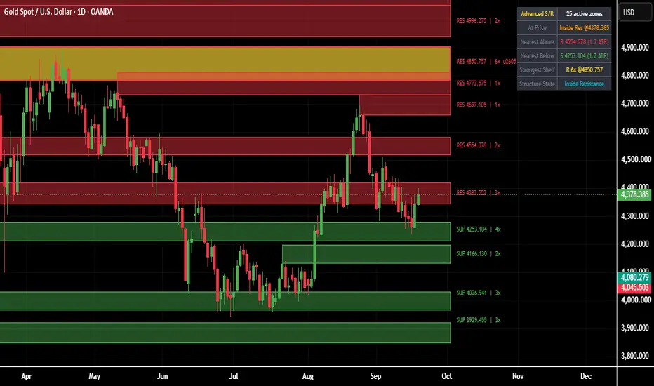
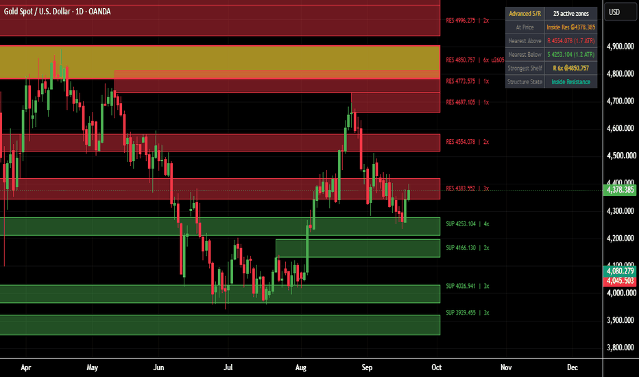
Advanced Support Resistance Zones is an automatic support and resistance tool that finds the real swing highs and lows on any chart and turns them into live, self-updating price zones instead of plain single-price lines. Each zone is a shaded band with a clear label showing whether it is resistance or support, the exact price level, and how many times price has reacted to it. The single most significant zone on the chart is highlighted separately so the strongest level always stands out. A live dashboard in the corner of the chart summarizes the current structure at a glance, so a trader does not need to manually count zones or measure distances.
Why It Was Built
Manually drawing support and resistance is slow, inconsistent, and different from one trader to the next. Two traders looking at the same chart often mark completely different levels depending on mood and experience. This indicator removes that inconsistency by using a fixed, repeatable method every single time: it looks only at confirmed swing highs and lows, groups nearby ones together into a single zone instead of drawing dozens of overlapping lines, and keeps a running count of how many times each zone has actually mattered to price. The goal is a clean, objective map of the levels that price itself has already proven are important, updated automatically as new data comes in.
How It Works
The engine watches for confirmed swing highs and swing lows using a standard pivot detection method. Every time a new swing high forms, it is treated as a resistance candidate; every new swing low is treated as a support candidate. Instead of creating a brand new zone for every single pivot, the script first checks whether the new pivot is close enough in price to an existing zone of the same type. If it is close enough, the two are merged together using a running weighted average, so the zone's price slowly centers itself on the true average of every touch, and its touch counter goes up by one. If nothing close enough exists yet, a brand new zone is created. Each zone is drawn as a shaded rectangle so its thickness reflects normal market noise around that level rather than being an impossibly thin, unrealistic line.
Every zone also tracks whether price is currently sitting inside it. A touch is only counted the moment price freshly enters the zone after having been outside it, which stops a slow, grinding move through a zone from being counted as dozens of touches. When price fully closes beyond a zone in the opposite direction, the zone is understood to be broken, and because a broken resistance level frequently goes on to act as support afterwards (and the same in reverse for a broken support level), the zone flips its role, resets its touch count, and continues tracking from there rather than disappearing outright. To keep the chart readable, only a limited number of zones are kept active at once; if that limit is ever exceeded, the zone that currently sits farthest away from the live price is removed first, since it is the least relevant to what is happening right now.
How To Read The Chart
Every zone is labeled directly on its own band. A red label reading RES followed by a price and a touch count is a resistance zone; a green label reading SUP followed by a price and a touch count is a support zone. The number before the small x is simply how many separate times price has reacted to that exact level since the zone was formed, so a zone showing a higher number has been tested and respected more often than one showing a low number. Exactly one zone at a time, the one with the highest touch count among everything currently active, is drawn in a distinct highlight color and marked with a star symbol next to its label, making the single most important level on the chart impossible to miss.
How To Use It For Analysis
Start by identifying where price currently sits relative to the nearest zones above and below it; this alone tells you whether the market has room to move or is already pressing against a meaningful level. When price approaches a zone with a high touch count, treat it with more respect than a fresh, barely-tested one, since it represents a level the market has already agreed on multiple times. Watch for a reaction at the zone, a stall, a wick rejection, or a reversal, as confirmation that the level is holding; a clean close through the zone instead signals that it has broken, at which point the same level flips role and becomes worth watching in the opposite direction going forward. The starred strongest zone deserves the closest attention of all, since it represents the single level the market has interacted with the most. Used this way, the indicator is not a standalone buy or sell signal generator, but a structural map that should be combined with your own entry timing, trend reading, and risk management.
What The Dashboard Shows
The dashboard sits in the corner of the chart and updates on every new bar. The first row shows how many zones are currently active on the chart. The row labeled At Price tells you immediately whether the current price is sitting inside a resistance zone, inside a support zone, or simply between zones with open space on both sides. The Nearest Above row shows the closest resistance zone sitting above the current price, along with how far away it is measured in multiples of average recent volatility, so the same reading means roughly the same thing on a calm day as on a wild one. The Nearest Below row shows the same information for the closest support zone underneath price. The Strongest Shelf row always reports whichever single zone currently has the highest touch count anywhere on the chart, together with its price, so you never have to hunt for it visually. The final row, Structure State, gives a one line plain English summary of the current situation, such as sitting inside resistance, sitting inside support, or ranging between zones.
Settings Worth Knowing Before Use
The pivot detection sensitivity, the average volatility length used to size and measure zones, how thick each zone band is drawn, how close a new pivot needs to be to merge into an existing zone, how many zones are kept active at once, and every color used can all be adjusted from the indicator's settings panel to suit different instruments, timeframes, and personal preferences.
Disclaimer
This indicator is a technical analysis tool and does not constitute financial advice. Touch counts describe how many times price has historically reacted to a level, not a guarantee that it will do so again. All trading involves risk, and past reactions to a level do not guarantee future results. Always use proper risk management and combine this tool with your own analysis before entering any trade.
Original Script Declaration
Script Name: Advanced Support Resistance Zones
Author: Michael_Fx_Trader
Publisher: Michael_Fx_Trader
Rights: Copyright Michael_Fx_Trader. All rights reserved.
Originality Statement: This is an original work, designed and coded from scratch by Michael_Fx_Trader. The pivot clustering zone detection engine, which converges each zone's center using a running weighted average rather than ever expanding boundaries, the touch count based strength tracking, the automatic role reversal logic that flips a broken resistance zone into a support zone and a broken support zone into a resistance zone, the strongest zone highlighting system, and the live information dashboard were all independently conceived and implemented for this publication. No proprietary source code, private scripts, or copyrighted material belonging to any other author has been copied, mashed up, or reused in any part of this script.
Author Verification and Declaration: I, Michael_Fx_Trader, am the sole author and publisher of this script. I hold full authorship rights over its source code, its underlying logic, and its visual presentation. Support and resistance analysis using swing pivots is a well known, generic technical analysis concept not owned by any individual author; only the specific detection, clustering, scoring, and dashboard logic built around it here is original to this script.
www.tradingview.com 指标
EMA200 REGIME + BOS/CHoCH + 2x FVG StrategyEMA200 Regime + BOS/CHoCH + 2x FVG Strategy
Overview
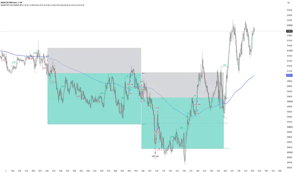
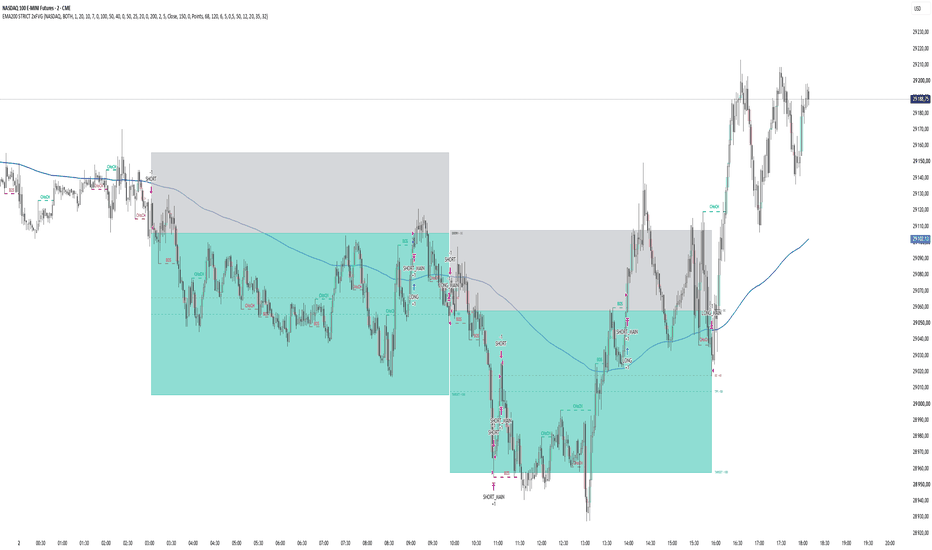
EMA200 Regime + BOS/CHoCH + 2x FVG Strategy is a rule-based TradingView strategy designed primarily for 2-minute intraday trading.
The strategy combines four core concepts:
EMA200 directional regime
Market Structure: BOS and CHoCH
Two-FVG confirmation logic
Limit entry at 50% of the body of the signal candle
The main objective is to identify continuation or reversal setups that develop while price remains on the correct side of the EMA200.
Unlike a simple EMA crossover strategy, the EMA200 is used mainly as a directional regime filter. A crossover activates either LONG or SHORT mode, but the strategy still requires market structure and Fair Value Gap confirmation before an entry can be created.
This script is a full strategy() implementation and is intended for use with TradingView's Strategy Tester.
1. EMA200 Regime Logic
The EMA200 determines the allowed trading direction.
SHORT regime
A SHORT regime begins when price crosses the EMA200 from above to below.
The regime remains active as long as price continues to close below the EMA200.
A SHORT regime is cancelled when:
Close > EMA200
A wick above the EMA200 alone does not necessarily invalidate the regime when structure confirmation is based on candle close.
During an active SHORT regime, the strategy searches for:
bearish BOS or bearish CHoCH
bearish 2x FVG
a valid signal candle
a retracement to the calculated limit-entry price
LONG regime
A LONG regime begins when price crosses the EMA200 from below to above.
The regime remains active while price closes above the EMA200.
The LONG regime is cancelled when:
Close < EMA200
During the active LONG regime, the strategy searches for:
bullish BOS or bullish CHoCH
bullish 2x FVG
a valid signal candle
a retracement to the limit-entry price
Important
The EMA regime does not expire after a fixed number of candles.
For example, if price remains below the EMA200 for 40 candles on the 2-minute chart, the SHORT regime may remain active for the entire period.
This is intentional.
The time limit applies to the relationship between the market-structure event and the 2x FVG confirmation, not to the EMA regime itself.
2. Market Structure
The strategy uses confirmed swing highs and swing lows to detect market-structure breaks.
Swing sensitivity is controlled by:
Swing Length
The default value is:
5
The script uses confirmed pivots and therefore does not require future data beyond the normal pivot-confirmation process.
3. BOS — Break of Structure
A bullish structure break occurs when price breaks above the most recent valid swing high.
A bearish structure break occurs when price breaks below the most recent valid swing low.
The user can select whether a structure break is confirmed using:
Close
Wick
The default setting is:
Close
This means that by default a wick through a swing level is not enough. The selected confirmation source must actually break the swing level.
Bullish BOS
If the current market structure is already bullish and another swing high is broken, the event is classified as:
Bullish BOS
Bearish BOS
If the current market structure is already bearish and another swing low is broken, the event is classified as:
Bearish BOS
4. CHoCH — Change of Character
CHoCH represents a break against the previously established market-structure direction.
Bullish CHoCH
If the previous structure was bearish and price breaks a valid swing high, the strategy classifies the event as:
Bullish CHoCH
Bearish CHoCH
If the previous structure was bullish and price breaks a valid swing low, the event is classified as:
Bearish CHoCH
The structure engine also handles newly confirmed pivots that may already have been broken by the time the pivot becomes confirmed.
This helps keep the strategy's BOS/CHoCH logic consistent with the structure displayed on the chart.
5. Fair Value Gap Definition
The strategy uses a classic three-candle FVG definition.
Bullish FVG
A bullish FVG exists when:
low > high
This means that the current candle's low is above the high from two candles earlier.
The gap is located between:
high and low
Bearish FVG
A bearish FVG exists when:
high < low
The gap is located between:
high and low
An optional minimum FVG-size filter can also be enabled.
The minimum size can be expressed in:
points
ticks
6. 2x FVG Logic
The strategy does not simply count every two consecutive FVG labels as a valid 2x FVG.
Instead, same-direction FVGs are grouped into clusters.
For example, several bullish FVGs that overlap each other can be treated as part of the same imbalance cluster.
A new same-direction FVG that does not overlap the existing cluster, while still occurring within the allowed number of bars, creates the second imbalance required for the:
2x FVG condition
The maximum allowed distance is controlled by:
Max bars between FVG
Default:
5
This approach is intended to prevent several overlapping gaps from being incorrectly counted as multiple independent imbalances.
7. Matching BOS/CHoCH With 2x FVG
During an active EMA regime, the strategy remembers the most recent valid structure event and 2x FVG event in the same direction.
For SHORT:
bearish BOS or bearish CHoCH
bearish 2x FVG
For LONG:
bullish BOS or bullish CHoCH
bullish 2x FVG
The two events must occur within the user-defined setup window.
Default:
Max bars: BOS/CHoCH ↔ 2x FVG = 15
On a 2-minute chart this represents a maximum separation of approximately:
30 minutes
Importantly, the two conditions do not have to occur in one fixed order.
Both sequences may qualify:
BOS/CHoCH → 2x FVG
or:
2x FVG → BOS/CHoCH
The script compares the distance between the two events.
If they are sufficiently close, the setup becomes:
SETUP READY
8. Signal Candle
Once the structure condition and 2x FVG condition have both been completed, the strategy waits for the next candle to close.
That candle becomes the:
Signal Candle
The strategy does not enter during an unfinished signal candle.
This avoids using information that would not have been known at the time.
9. Entry Price
The entry is calculated from the body of the signal candle.
The formula is:
Entry = (Open + Close) / 2
This is the midpoint of the candle body.
It is not:
(High + Low) / 2
After the signal candle closes, the strategy submits a LIMIT order at this body midpoint.
Example:
Open:
25,020
Close:
25,000
Entry:
25,010
The entry price is fixed after the signal candle closes and is not moved afterward.
10. Limit Order Validity
The market must retrace back to the calculated 50% body level.
The pending order remains valid for:
LIMIT Entry Validity Bars
Default:
5
If price does not reach the entry level during this period, the pending setup expires.
Importantly, expiration of the individual setup does not cancel the entire EMA regime.
For example:
price remains below EMA200
SHORT mode remains active
one limit entry expires
the strategy can continue searching for a new bearish BOS/CHoCH + 2x FVG setup
11. Multiple Setups Inside One EMA Regime
The strategy can detect more than one trade during the same directional EMA regime.
Example:
Price crosses below EMA200
↓
SHORT MODE
↓
Bearish BOS + bearish 2x FVG
↓
Trade #1
↓
Trade closes
↓
SHORT MODE remains active
↓
New bearish BOS/CHoCH + bearish 2x FVG
↓
Trade #2
This continues until the directional regime is invalidated.
For SHORT:
Close > EMA200
For LONG:
Close < EMA200
12. GOLD Preset
When the selected market is:
GOLD
the default values are:
Take Profit: 20 points
Stop Loss: 10 points
Break-Even Trigger: +15 points
Break-Even Offset: 0
Example SHORT:
Entry:
3800
Stop:
3810
Target:
3780
Break-even activates when price reaches:
3785
The stop is then moved to the entry price when the default BE Offset is zero.
13. NASDAQ Preset
When the selected market is:
NASDAQ
the default values are:
Take Profit: 100 points
Stop Loss: 50 points
Break-Even Trigger: +50 points
Break-Even Offset: 0
Example SHORT:
Entry:
25,000
Stop:
25,050
Target:
24,900
Break-even trigger:
24,950
These values represent actual price points, not ticks.
14. CUSTOM Market Mode
The CUSTOM preset allows manual configuration of:
Take Profit
Stop Loss
Break-Even Trigger
Break-Even Offset
This allows the strategy to be tested on other instruments or with different risk parameters.
15. Break-Even Logic
Break-even is handled automatically.
SHORT
If price reaches:
Entry - BE Trigger
the stop is moved to:
Entry + BE Offset
With:
BE Offset = 0
the stop moves exactly to the entry price.
LONG
If price reaches:
Entry + BE Trigger
the stop is moved to:
Entry - BE Offset
Once break-even has been activated, the stop is not intentionally moved back to the original stop-loss level.
16. TP1
The strategy also calculates an intermediate TP1 level.
Default:
50% of the distance between Entry and final Target
Example NASDAQ:
Main Target:
100 points
TP1:
50 points
Example GOLD:
Main Target:
20 points
TP1:
10 points
By default TP1 can be used as a visual reference.
The optional:
Enable Partial TP1
setting allows part of the position to be closed at TP1.
The percentage is controlled by:
TP1 Quantity %
17. Position Visualization
Active trades can be displayed using a risk/reward style box.
The visual structure includes:
Stop area
Entry line
TP1 line
Break-even trigger line
Main target
Trade labels
The STOP area is displayed above a SHORT entry and below a LONG entry.
The TARGET area is displayed below a SHORT entry and above a LONG entry.
The visualization is intended to resemble the logic of TradingView's Long/Short Position drawing tool.
18. Trade Direction
The strategy supports three directional modes:
SHORT ONLY
Only bearish setups are traded.
LONG ONLY
Only bullish setups are traded.
BOTH
Both bullish and bearish setups are allowed.
Default:
BOTH
19. Recommended Timeframe
The strategy is designed primarily around the:
2-minute timeframe
A visual warning can appear if another timeframe is selected.
The script is not technically locked to 2 minutes, but changing the timeframe changes the meaning of parameters expressed in bars.
For example:
15 bars
represents:
30 minutes on 2M
75 minutes on 5M
225 minutes on 15M
Users should therefore retest all parameters when changing timeframe.
20. Debug Mode
Debug Mode can be enabled to inspect the internal setup process.
It can show events such as:
SHORT MODE
LONG MODE
SETUP READY
LIMIT CREATED
The debug table can also display the current state of:
timeframe
EMA regime
BOS/CHoCH confirmation
2x FVG confirmation
setup readiness
pending limit
active position
This is particularly useful when reviewing historical setups that appear visually valid but did not produce a trade.
21. Backtesting
This script uses:
strategy()
rather than:
indicator()
and is therefore designed for TradingView's Strategy Tester.
It includes:
fixed contract quantity
configurable date range
stop loss
take profit
break-even
optional partial TP1
limit entries
Strategy Tester trade statistics
The strategy also uses:
calc_on_order_fills = true
calc_on_every_tick = true
use_bar_magnifier = true
Bar Magnifier can improve the realism of historical order execution when lower-timeframe data is available.
However, historical backtests can never perfectly reproduce live execution.
22. Futures Margin Configuration
The strategy includes:
margin_long = 10
and:
margin_short = 10
This represents a 10% simulated margin requirement in TradingView's broker emulator.
This setting is included primarily so that futures contracts with a high notional value are not automatically rejected simply because the simulated account does not contain 100% of the contract's notional value.
This is a backtesting configuration only.
It does not represent a specific broker's real margin requirement.
23. Non-Repainting Principles
The strategy is designed to avoid using future information for its trading decisions.
Important rules include:
structure breaks are evaluated only using available information
pivots are used only after confirmation
the signal candle must close before its midpoint can be calculated
the limit order is created only after the signal candle has closed
historical entry prices are not moved backward to make the backtest look better
the script does not intentionally use lookahead data
A confirmed pivot naturally requires candles to form after the actual swing point. This is standard pivot confirmation and should not be confused with repainting.
24. Entry Sequence Summary
SHORT
Price crosses below EMA200
↓
SHORT regime becomes active
↓
Bearish BOS or bearish CHoCH
↓
Bearish 2x FVG
↓
Conditions must be within allowed setup distance
↓
Next candle closes
↓
Entry = 50% of signal candle body
↓
SHORT limit order
↓
Price retraces to entry
↓
Position opened
↓
SL / BE / TP management
LONG
Price crosses above EMA200
↓
LONG regime becomes active
↓
Bullish BOS or bullish CHoCH
↓
Bullish 2x FVG
↓
Conditions must be within allowed setup distance
↓
Next candle closes
↓
Entry = 50% of signal candle body
↓
LONG limit order
↓
Price retraces to entry
↓
Position opened
↓
SL / BE / TP management
25. Main Inputs
Market Settings
Market
Trade Direction
Contracts
GOLD TP / SL / BE
NASDAQ TP / SL / BE
CUSTOM parameters
EMA Settings
Show EMA200
EMA Length
EMA Color
EMA Width
Structure Settings
Enable BOS
Enable CHoCH
Swing Length
Structure Break Confirmation
Structure labels
Structure lines
FVG Settings
Enable FVG
Show FVG
Maximum bars between FVGs
Minimum FVG filter
FVG size
FVG units
FVG colors
2x FVG markers
Setup Settings
Max bars between BOS/CHoCH and 2x FVG
Pre-cross event lookback
Entry Settings
LIMIT Entry Validity Bars
Risk Management
TP1 position
Partial TP1
TP1 quantity
Same-bar historical BE behavior
Visual Settings
Position box
Trade labels
EMA regime background
timeframe warning
26. Intended Use
This strategy is intended as a structured framework for researching a specific intraday trading model based on:
trend regime + market structure + imbalance + retracement entry
It is particularly useful for studying whether BOS/CHoCH and multiple Fair Value Gaps provide meaningful confirmation after price establishes direction relative to the EMA200.
The purpose of the script is not to predict every market move.
It is designed to convert a discretionary chart-reading process into explicit and testable rules. 策略
指标
Session High / Low Strength **Session High / Low Strength PRO** is a session-based market structure indicator designed to automatically track the High and Low of multiple trading sessions while also calculating how strong each level is.
The indicator can be fully customized for different markets, time zones, and trading styles. Each session can have its own name, trading hours, and color.
### Main Features
• Tracks the **Session High and Session Low** automatically
• Supports up to **4 fully customizable sessions**
• Custom **From / To session times**
• Adjustable **UTC / GMT timezone**
• Works with Asia, London, New York, custom sessions, or any other time window
• Automatically extends completed session levels
• Optional strength labels
• Live dashboard displaying session levels and strength
• Customizable line styles, colors, and widths
### High / Low Strength Score
Each Session High and Session Low receives a **Strength Score from 0 to 100**.
The score combines several different factors instead of relying on only one measurement.
**Level Touches**
The indicator tracks how often price interacts with the Session High or Low. Multiple reactions around the same price can indicate that the level is being respected by the market.
**Wick Rejection**
Long rejection wicks around the Session High or Low can indicate aggressive rejection of that price area.
**Relative Volume**
Volume around each level is compared with average market volume. Higher relative volume during a test can indicate stronger participation around the level.
**Close Away Strength**
The indicator measures how strongly price closes away from the Session High or Low after interacting with it. A stronger move away from the level can indicate stronger rejection.
### Strength Classification
The final score is classified as:
**0–24:** VERY WEAK
**25–39:** WEAK
**40–54:** MODERATE
**55–69:** STRONG
**70–84:** VERY STRONG
**85–100:** EXTREME
The weight of each strength component can be adjusted individually in the settings.
### Session Configuration
Every session can be configured independently.
Example:
**Asia Session**
00:00 – 08:00
**London Session**
07:00 – 16:00
**New York Session**
13:30 – 20:00
**Custom Session**
Any user-defined trading period
These are only example times. All session times can be changed directly in the indicator settings.
### Time Zone Support
The indicator supports customizable time zones, allowing the same session logic to be used regardless of the chart's exchange timezone.
Examples:
GMT+0
GMT+1
GMT+2
GMT-4
GMT-5
You can also use supported timezone names such as:
Europe/London
America/New_York
This makes the indicator useful for traders who work with specific session windows across different global markets.
### Extended Session Levels
When a session finishes, its High and Low can automatically extend to the right side of the chart.
This allows previous session levels to act as potential:
• Support
• Resistance
• Liquidity targets
• Breakout levels
• Reversal areas
• BOS / CHoCH confirmation zones
When the same session starts again, the previous session levels stop extending and the new session begins calculating its own High and Low.
### Dashboard
The built-in dashboard shows:
• Session name
• Session High
• High Strength Score
• Session Low
• Low Strength Score
• Strength classification
This makes it possible to quickly compare the most important session levels without manually checking every line on the chart.
### Trading Applications
The indicator can be used together with:
• BOS / CHoCH
• Market Structure Shift
• Liquidity Sweeps
• Breakout & Retest strategies
• Support and Resistance
• Volume Profile
• Session trading
• Reversal setups
• Trend continuation setups
For example, a Session High with a high strength score may represent a more significant liquidity or resistance area than a Session High that formed with very little volume and no meaningful rejection.
### Important
The Strength Score should not be interpreted as a prediction that a level will definitely hold.
A strong level can still break.
The score is designed to provide additional context about how the level was formed and how strongly the market previously reacted around that area.
It is best used together with price action, market structure, volume, and proper risk management.
指标

Sector Breadth Balance [Pineify]Sector Breadth Balance
Overview
Sector Breadth Balance compares eleven editable sector proxies. It separates direction, participation, dispersion, leaders, and coverage to show whether a basket move is broad or narrow. It is context, not a forecast or signal.
Problem Definition
A weighted index can rise while most sectors are weak because large components dominate. An advance/decline count treats marginal and large volatility-adjusted moves equally, ignores return separation, and can appear complete when symbols lack matching bars. The same direction may mean broad participation, narrow leadership, or missing data. It measures the chosen basket directly.
Design Rationale
Close-to-EMA distance is divided by each symbol's ATR to compare scales. Saturation limits an extreme member; a separate vote preserves participation. Horizon returns are centered on the basket mean, making dispersion an internal separation measure. Equal membership favors breadth over index replication, so symbol choice matters. Dispersion penalizes disagreement, while square-root coverage lowers confidence without discarding partial data.
Key Features
Eleven symbols with matching-bar checks.
ATR-normalized trend and direction votes.
Return dispersion and leader/lagger counts.
Confirmed broad, narrow, mixed, and insufficient states.
Optional explanatory layers.
How It Works
Each request returns close-to-EMA distance divided by ATR and log return over the selected horizon. Both values must exist on the matching bar; gaps are not filled.
Trend x becomes x divided by the saturation scale plus absolute x, and bounded values are averaged. Members outside neutral distance cast positive or negative votes. Net votes divided by valid membership form vote balance. Returns are centered on the basket mean and dispersion is calculated. Dispersion share is dispersion divided by dispersion plus absolute mean return, rising when internal separation dominates.
With enough symbols, the score combines 62% mean trend and 38% vote balance, applies dispersion penalty and square-root coverage, then scales to -100 through +100. Broad candidates also need minimum participation. High dispersion with a signed mean is narrow; otherwise it is mixed. States change only at bar close and use a lower release threshold. Leaders and laggers exceed a configurable fraction of dispersion.
How Multiple Indicators Work Together
EMA distance supplies direction; ATR and saturation make influence comparable and bounded. Votes reveal participation hidden by an average. Centered returns and dispersion reveal concentration hidden by counts. Coverage prevents incomplete baskets from appearing reliable, while confirmed states make transitions auditable. Each layer changes the analytical question.
Trading Ideas and Insights
Use broad state to check whether a directional thesis has basket participation. Narrow highlights leaders and laggers without implying reversal. Mixed supports neither broad agreement nor a concentrated signed move. Compare breakouts with breadth diffusion, or leader growth with a score that fails to confirm. These observations do not estimate returns or define execution.
Unique Aspects
The contribution is a four-part decomposition: bounded normalized trend, vote balance, dispersion share, and synchronized coverage. Dispersion changes the score, selects narrow states, and defines leader bands; coverage changes readiness and visual confidence. This independent implementation uses no imported or reverse-engineered source.
How to Use
Use a standard chart; target 4H through 1W.
Select comparable symbols and sessions; defaults are US sector SPDR proxies.
Read the track first: cyan is broad upside, coral downside, gold narrow, violet mixed, and gray insufficient.
Use secondary layers to explain roles and missing data.
Apply separate execution and risk rules.
Customization
EMA and ATR lengths set direction and normalization. Return length changes the cross-section. Neutral distance changes voting; saturation changes extreme influence. Entry score, participation, dispersion share, and release ratio define states and hysteresis. Leader band affects roles, not the score. Minimum valid symbols controls coverage. Display switches do not change calculations.
Assumptions and Limitations
The basket must be comparable, and equal membership must fit the question. The model ignores weights, currencies, distributions, survivorship, and causes of dispersion. EMA and ATR lag. Asynchronous sessions are missing rather than stale; mismatched calendars reduce coverage. Each member needs enough history.
Live score, columns, roles, and table can change; states and alerts wait for bar close. Data or setting changes can recalculate results. No future lookahead or negative offset is used, but no universal non-repainting claim is made. It is not constituent breadth, order flow, cost, or performance analysis.
Conclusion
Sector Breadth Balance creates an inspectable direction-participation-concentration map. Strong readings require comparable trends, agreement, acceptable dispersion, and matching coverage. It qualifies market internals; it does not replace risk analysis.
指标

ICT & FVG [UgurTash]ICT & FVG
The level that stopped you was never on your chart
You are on the 15m. The setup is clean, the structure agrees, you take it, and price stalls twelve ticks later at nothing. There is no level there. Not on the 15m.
Open the daily and there it is: a gap left three weeks ago, or the block that started the leg you are currently trading against. It was always there. You just could not see it from where you were standing.
That is the problem this script is built around. Everything else it does is support.
What it actually draws
Five higher timeframes at once, projected onto whatever chart you are on. Monthly, weekly, daily, 4H and 1H by default, each with its own colour and its own switch. Every zone is tagged with the timeframe that produced it, so a box reading OB+ is unambiguous: that is a daily bullish order block, seen from the 15m, drawn at its real daily price and its real daily origin bar.
Two kinds of zone come from each timeframe:
Fair Value Gaps. A three candle gap in that timeframe's own bars. A daily FVG is built from daily candles, not from an average of 15m ones.
Order Blocks. The candle a move actually came from, found by structure rather than by colour. More on the method below, because the method is the part that matters.
And because a higher timeframe zone is only interesting while it is still unfilled, each one carries a state you can see at a glance: untouched, tested, or filled.
How an Order Block is found
Most order block scripts take the last opposite coloured candle before a strong move. That sounds right and often is not. In a real displacement leg there is usually a small pause bar somewhere in the middle, and the nearest opposite candle rule will happily mark that pause bar instead of the place the move came from.
This one works differently, in two steps.
Step one, structure. A swing high or low is confirmed only after a set number of bars have failed to exceed it. Nothing happens until price closes beyond that confirmed swing. No break of structure, no block.
Step two, the origin. When the break happens, the leg between the swing point and the breakout bar is scanned, and the block is anchored to the extreme candle of that leg: the lowest low for a bullish block, the highest high for a bearish one. That is the candle the move actually left from, whatever colour it happened to close.
Each swing point can only produce one block. Once it has been broken it is spent, so the same level does not keep re-arming as price chops around it.
The same function runs on the chart timeframe and inside each of the five higher timeframes, so a 1H block and a 1D block are built by an identical definition. They are comparable because they are the same measurement at different scales.
Optional on top of that: Use Candle Body to measure the block from the body instead of the full range, and Break Confirmation, which demands the breakout close clear the swing by a fraction of the swing range before anything is created. Both are off by default.
Higher timeframe blocks do not repaint
This is worth its own paragraph because it is the easiest thing in a multi timeframe script to get quietly wrong.
Confirm MTF Order Blocks On HTF Close is on by default. A higher timeframe block is only published once its own bar has closed. A daily block appears at the daily close and then never moves, never shifts edge, never vanishes on a later reload.
Turn it off and blocks appear as soon as the condition is met inside the forming higher timeframe bar. Earlier, and able to change its mind. The switch is there because some people want that trade off. The default is the honest one.
Breaker Blocks
A block that price closes through does not have to die.
Turn on Show Breaker Blocks and it flips polarity instead. A bullish block that fails becomes resistance, keeps its box, and is relabelled BB- . It stays until price closes back through its far edge, at which point it is genuinely spent and removed.
This is the same idea the script already applies to gaps through Inverse FVG, now applied to blocks, on the chart timeframe and on every higher timeframe alike. Off by default.
Zone states, and what happens when a zone is used up
Three states, and all three are configurable.
Untouched . Full colour. Nobody has been there yet.
Tested . Price has wicked into the zone without closing through it. The fill fades by an amount you set and the border changes to dashed, dotted, solid or nothing. Turn the whole thing off if you would rather not see it.
Filled . Price closed through. This is where the script stops deciding for you: pick Gray Out to keep it greyed and frozen as a record, Delete to clear it off the chart entirely, or Keep to leave it in its original colour. Fair Value Gaps and Order Blocks get that choice separately, because most people want different behaviour from each.
If you trade a clean chart, set filled gaps to Delete and filled blocks to Gray Out. The chart cleans itself and you still keep the history where it matters.
The chart timeframe layer
The higher timeframe module sits on top of a full imbalance engine running on your own chart, and the two are controlled independently. Switching the MTF panel off does not touch your local zones, and vice versa.
Fair Value Gaps with three mitigation definitions (Engulf, Mitigate, Rebalance), a consequent encroachment line, and Liquidity Void mode which merges consecutive gaps into one region.
Inverse FVG . A filled gap flips and starts working from the other side.
Implied FVG . The wick based variant, for the gaps that do not show up as a clean three candle structure.
Volume Imbalance in classic and advanced form, the body to body gaps between consecutive candles.
True GAP and GAP plus inefficiency, for instruments that actually gap.
Order Blocks and Breaker Blocks , by the method described above.
Each family has its own box limit and its own mitigation rule. Nothing is forced on you.
About the way the boxes look
The fills use a rule worth explaining, because it is the reason the chart stays readable with eight families of zone drawn at once.
The colour picker shows what you chose. What gets drawn is a fixed fraction of that opacity, so the default 50 in the settings lands on screen at a density that layers cleanly instead of burying the candles. Move the slider and the chart moves with it. You get an honest number in the settings and a usable chart at the same time, which the usual approaches give you one of but not both.
Borders are off by default, because a fill and a frame competing for the same edge is noise. Set Box Border Width to 1 if you disagree. Tested and filled zones can still draw their own border regardless.
Where to start
Turn off what you are not using. Seriously. With five higher timeframes and eight local zone families all enabled at once the chart is unreadable, and that is a setting problem, not a script problem.
A reasonable starting point for an intraday chart: monthly and weekly off, daily and 4H on, FVG and Order Blocks on, everything else off. Add one thing at a time from there.
Then set the Swing Lookback for each layer. It is the single control that decides how many blocks you get. Low means many, early and noisy. High means few, late and significant. The MTF layer has its own value because higher timeframe bars are scarce and usually want a smaller number than your chart does.
Limitations, honestly
Chart timeframe order blocks move on the live bar. A block is created the moment price closes beyond a swing, and on the forming bar that close is still changing. It can appear and disappear until the bar closes. Higher timeframe blocks do not have this problem when Confirm On HTF Close is on, which is why it is on.
The block scan is bounded. Max Scan Bars defaults to 50. In an unusually long leg the block anchors to the extreme within the last 50 bars rather than the true origin of the move. Raise it if your instrument runs long legs, but it is a real ceiling and you should know it is there.
Zone state is judged on the chart timeframe's closes. A daily zone is marked filled when the chart you are looking at closes through it, not when the daily candle does. On a 5m chart that is a faster verdict than a daily trader would give.
Five higher timeframes means ten data requests. On a slow connection or a thin symbol the script takes a moment to draw. Disable the slots you are not using.
None of this is a signal. There is no entry, no stop, no target, no win rate, nothing backtested and nothing claimed. It draws where price left work undone. What you do about that is the actual trade, and it is yours.
Feedback welcome, particularly the kind that finds something broken.
Nothing here is financial advice.
指标

Index Lead Lag [BMT]Index Lead Lag
Which of NQ, ES, YM and RTY is leading, and specifically whether NQ is. All four are measured from one shared anchor so the differences between them are relative strength, not four unrelated returns; vertical order in the pane is the ranking and a crossover is a change of leadership. Beta-adjust vs ES answers the harder question: is NQ leading by more than its beta to ES already implies?
What it draws
One line per index: its percent change from the anchor bar, on the chart's own timeframe. The gap between NQ and ES is filled, cyan while NQ is ahead and neutral while it is not, so the pane lights up on the state you are watching for. A dashed zero line, a vertical line at the anchor bar, and faint bands on the bars that were earlier anchors, so a reset is visible as it happens.
The anchor
Measure picks the bar every index is measured from. All four always share it.
Auto (default) chooses from the chart timeframe: session open under an hour, week open intraday above that, month open on a daily chart, quarter open above. The table's Ref cell shows what it resolved to.
Session open , Prior close , Week open , Month open , Quarter open . Each resets on its boundary, so the pane reads as leadership within the period to date. The gap between Prior close and Session open is the overnight move.
N sessions : the close N daily sessions ago. Rolling, and the same thing on every chart timeframe.
ES swing low / ES swing high : the lowest low or highest high ES has printed in the range on screen, so it reads as "since the market turned, who led?". Pan or zoom and it re-resolves to the new view.
Fixed date : by default the current session's open, rolling forward each day; turn that off to pin a date with the date picker.
The period anchors are read as prices (the open of the current day, week, month or quarter, from a higher-timeframe request) rather than counted back as bars, so there is no history-buffer limit on how far back an anchor can sit.
Beta-adjust vs ES
NQ's beta to ES has run about 1.67, so NQ beats ES on nearly every up day whether or not it is leading, and zero is the wrong threshold on a plain difference. With Beta-adjust on, each index has beta times the ES move subtracted, leaving a residual: zero means it moved exactly as its beta implies, above zero is genuine leadership, below zero is a quiet failure even on a green day. ES sits flat on zero by construction, and the NQ-ES fill becomes the residual itself.
Beta is the ordinary least squares slope of each index against ES over a settable window (90 bars by default) of the chart's own timeframe, fitted on the bars before the one being scored so a bar cannot explain itself away. The window applies with Beta-adjust off as well, because the markers, ribbon and chart tint are built from the residual either way.
Divergence markers
A small triangle at the top of the pane on any bar where NQ sits beyond a threshold above (green, leading) or below (red, lagging) the path its beta implies. Hover one for its sigma and a one-line reading. The threshold is in standard deviations of where the residual could have drifted by now under chance, per-bar noise times the square root of bars since the anchor, so early in a period it takes less and late in a period it takes more, rather than one yardstick set by the period's average. The sigma value is also in the data window.
Ribbon
With the index lines off, the pane collapses to a strip of dots and the table: green while NQ beats its beta, red while it misses it, grey between, or coloured by the current leader instead, which is gated on the leader-to-laggard spread being wider than its recent average so it does not flicker while the four are bunched. The same message at a fraction of the weight, in a pane you can shrink to a strip.
The chart symbol
Whatever symbol the chart is on gets its own column, run through the same machinery but against NQ rather than ES, so it reads as "is this name adding something of its own beyond how much more it moves than the Nasdaq". Its lead is marked confirmed only when the name is also at a period high NQ has not made: beating a beta while quiet is a read that inverts by regime, and the upside leg is the half that holds. A conditional profile shows what the name has averaged while NQ was leading its own beta versus while NQ was lagging, so a wide gap says it rides megacap leadership and two similar numbers say the index regime tells you nothing about it. An optional tint paints the price chart green or red by the symbol's state. Turn the column off on an index chart, where it restates one you already have.
Status table
Columns sort strongest first, so the table reads left to right as a ranking and a change of column order is the signal. Each column shows the value and, under Beta-adjust, the beta it was measured against. Held counts bars since the leader last changed; Ref names the anchor in force. The leader-to-laggard spread is on the status line. Location and font size are inputs. RTY can be excluded, since its correlation to ES is lower and it reaches the extremes on idiosyncratic moves rather than leadership.
Colors
Red and green are avoided for the lines on purpose, since on a chart they already mean down and up and a red leader reads as a falling index. The four hues are held close in brightness so no index visually outweighs another, ES the neutral one because it is the benchmark, and the set flips with the chart background.
Notes
Each index is a handful of requests: its close on the chart timeframe; its session open, prior close and N-sessions-ago close in one daily request; and the week, month and quarter opens. The higher-timeframe requests use lookahead on, which is safe for an open or for the close of a session that has already ended. Everything else, beta included, is computed on the chart's own bars. 指标

GEX Levels v3 [Barrett]GEX Levels v3 draws options gamma exposure (GEX) levels for SPY and QQQ as labeled horizontal lines, across three time horizons from a single input.
WHAT IT SHOWS
- Flip: the price where dealer gamma changes sign. Above it, moves tend to be dampened; below it, moves tend to be amplified.
- CW / PW: call wall (heaviest call strike, overhead ceiling) and put wall (heaviest put strike, floor).
- P1 / P2: positive-gamma resistance strikes above price. PS1 / PS2: support strikes below price.
- N1 / N2: negative-gamma strikes where moves tend to accelerate.
- AG1 / AG2: high absolute-gamma strikes that price tends to stick to.
- MP: max pain. EM+ / EM-: the expected-move band.
- HVL: highest-volume strike. FC: full-chain gamma flip.
HOW IT WORKS
The levels are calculated outside TradingView from the full options chain and entered as one comma-separated string. The indicator parses that string and draws each level with its label. A 0 in any slot means that level is not present and is skipped.
String format: 0DTE (16 values) | WEEKLY (10 values) | MONTHLY (10 values)
0DTE order: P1,P2,PS1,PS2,N1,N2,AG1,AG2,Flip,MP,EM+,EM-,CW,PW,HVL,FC
WEEKLY / MONTHLY order: P1,P2,N1,N2,AG1,AG2,Flip,MP,EM+,EM-
HOW TO USE
1. Add the indicator to a SPY or QQQ chart.
2. Open settings (gear) and paste the level string into "All Levels (String)".
3. Use "Active View" to show 0DTE, WEEKLY, MONTHLY, or ALL.
4. Use the SPY string on SPY and the QQQ string on QQQ. The levels change daily.
WHY IT IS DIFFERENT
One input loads three expiry horizons at once. A level that appears on 0DTE, weekly, and monthly together is being defended across expirations, and those stacked levels are usually the most significant of the day.
These levels are for reference only and are not trade signals. 指标

Comparative Relative Strength Multi-Mode [MDT]===============================================================
SUGGESTED TITLE (English only, as required)
===============================================================
Comparative Relative Strength Multi-Mode
===============================================================
SHORT TITLE (chart label)
===============================================================
CRS
===============================================================
DESCRIPTION - ENGLISH (must appear first)
===============================================================
OVERVIEW
Comparative Relative Strength measures how one instrument is performing
against another instrument, rather than against its own past. It answers a
different question from Wilder's RSI. RSI is internal: it compares a stock to
its own recent closes. This indicator is external: it compares the chart
symbol to a benchmark you choose, such as an index, a sector index, or a
second stock.
The core relationship is simply the price of the chart symbol divided by the
price of the benchmark. When that ratio rises, the chart symbol is gaining
ground on the benchmark. When it falls, the chart symbol is losing ground.
The absolute level of the ratio carries no meaning, because it depends
entirely on the two price scales involved. Only the direction of the line
matters.
An important reading point: a rising line does not mean price is going up. In
a falling market a rising line means the symbol is falling less than the
benchmark. Relative strength is relative, not directional.
WHAT THIS VERSION ADDS
The raw price relative is a well known idea and is available through the
built-in compare function. This script exists because the raw ratio alone is
hard to work with in practice, for three reasons: its level is arbitrary, it
cannot be compared across two different symbols, and it gives no structure to
read. This version addresses all three in one pane.
1. Four normalizations of the same relationship, switchable from one input,
so you can move between an absolute view and a comparable view without
changing indicators.
2. A Mansfield style normalization, which rebases the ratio around a zero
line and therefore makes readings comparable across different symbols.
3. Relative strength structure detection. The script tracks new highs and
new lows of the relative strength line itself over a lookback window, and
marks them on the pane. This is what lets you see relative strength break
out while price is still inside a base.
4. A moving average applied to the relative strength line, with the line
colour and a shaded band both driven by the line's position against that
average, so a change in relative leadership is visible at a glance.
5. A reading table that states the current benchmark, the current relative
strength value, whether the symbol is currently outperforming or
underperforming, and the raw percentage gap over the chosen lookback.
CALCULATION
Let BASE be the selected price source of the chart symbol and COMP be the
same source requested from the benchmark symbol on the same timeframe, with
lookahead off and gaps off.
Mode 1, Ratio:
CRS = BASE / COMP
Mode 2, Ratio x100:
CRS = (BASE / COMP) * 100
Identical to mode 1 but scaled so the numbers read comfortably on most
instruments.
Mode 3, Percent out or under-performance:
symbol return = (BASE / BASE - 1) * 100
benchmark return= (COMP / COMP - 1) * 100
CRS = symbol return - benchmark return
This is a rate rather than a level. It expresses, in percentage points,
how much the symbol has gained on or lost to the benchmark over the last
n bars. It oscillates around zero.
Mode 4, Mansfield relative strength:
ratio = BASE / COMP
CRS = ((ratio / SMA(ratio, m)) - 1) * 100
This rebases the ratio against its own longer average. A positive value
means the symbol is stronger against the benchmark than it has been on
average over the base period, and a negative value means the opposite.
Because the output is a deviation from a self-referencing average rather
than an absolute ratio, readings from two different symbols can be
compared to each other. Stan Weinstein used a 52 period base on weekly
charts.
A moving average of the selected output is then computed. All three moving
average types are calculated on every bar and only then selected, so
switching type does not create a broken calculation history.
Note that mode 3 and mode 4 can disagree with mode 1 and 2 over short
windows. That is expected, not an error. Mode 3 measures a rate of change
over a fixed window while modes 1 and 2 measure a level.
HOW TO READ THE PANE
Main line
Rising means the chart symbol is outperforming the benchmark. Falling
means it is underperforming. Flat means it is tracking the benchmark.
Line colour and shaded band
By default the colour is set by whether the line sits above or below its
own moving average. The colour flip is the moment relative leadership is
changing, which usually precedes the visual change in slope.
Grey moving average line
A smoothed reference for the relative strength line, used for the colour
logic and for the crossover alerts.
Zero line
Drawn automatically in the percentage and Mansfield modes only, because
those two modes are centred on zero and the ratio modes are not.
Triangles
An up triangle at the bottom of the pane marks a new high in relative
strength over the lookback window. A down triangle at the top marks a new
low. These fire on the relative strength line, not on price.
Table
Top right. Shows the active benchmark, the current reading, the current
outperforming or underperforming state, and the percentage gap over the
chosen lookback.
HOW TO USE IT
Selecting candidates against a broad index
Set the benchmark to a broad index and use Ratio x100. Names whose
relative strength line is making higher highs are your long side
candidates. Names making lower lows are your short side candidates. You
are filtering for where money is actually rotating, before deciding
anything about entry.
Two stage top down filter
First put a sector index on the chart with the broad index as benchmark,
to see whether the sector is leading. Then put an individual stock on the
chart with that sector index as the benchmark, to see whether the stock
is leading inside its own sector. A stock that is strong inside a strong
sector is a higher quality candidate than a stock that is merely strong
in isolation.
Relative strength leading price
Watch for an up triangle, that is a new relative strength high, while
price itself is still inside a range or base. This often appears before
the price breakout. The inverse is a warning: price makes a new high but
the relative strength line does not, which suggests the move is being
carried by the whole market rather than by demand specific to that name.
Longer term positional filter
Switch to Mansfield relative strength with a 52 period base on a weekly
chart. Treat the zero line as a regime filter and only consider long side
setups while the reading is above zero.
Comparing two indices intraday
Put one index on the chart with a second index as the benchmark and use
the percentage mode with a short lookback. This tells you which of the
two is leading on the day, which is useful when deciding which instrument
to express a directional view in.
Spread work
Because the ratio is literally the spread between two instruments, mode 1
can be used directly as the input for pair or spread analysis between two
correlated symbols.
INPUTS
Benchmark symbol
The instrument you are comparing against. Default is a broad index.
Price source
Which price of each bar is used, for both the chart symbol and the
benchmark. Close is the usual choice.
Display mode
Selects between the four calculations described above.
RS moving average type and length
The smoothing applied to the relative strength line, used for colour and
for the crossover alerts.
Mansfield base length
The base period for the Mansfield normalization. 52 on weekly charts
follows the original use. On daily charts a longer base, around 200, is
the closer equivalent.
Percent performance lookback
The window used by mode 3 and by the percentage figure in the table.
New RS high and low lookback
The window used to decide whether the relative strength line has made a
new extreme.
Visual settings
Toggles for the moving average, the shading, the triangles and the table,
plus the two colours used for the outperforming and underperforming
states.
ALERTS
Four alert conditions are available:
Relative strength crossing above its moving average.
Relative strength crossing below its moving average.
A new relative strength high over the lookback.
A new relative strength low over the lookback.
LIMITATIONS AND WHAT THIS IS NOT
This is a selection and context tool. It tells you where relative leadership
sits. It does not tell you when to enter or exit, and it is not designed to
be used as a standalone signal.
The output has no fixed bounds, so there are no overbought or oversold levels
to read. Attempting to use it that way will produce poor results.
Raw ratio values from two different symbols are not comparable to each other,
because each pair of price scales produces its own arbitrary level. Use the
Mansfield or percentage mode if you need to rank several symbols.
Unadjusted data will distort the line. If the chart symbol has had a split,
bonus or similar corporate action and the data series is not adjusted, the
ratio will show a break that has nothing to do with relative strength.
If the benchmark does not trade during the same session as the chart symbol,
readings near session edges can be unreliable.
DISCLAIMER
This script is published as an educational technical analysis tool. It is not
investment advice and it is not a recommendation to buy or sell any security.
No claim is made or implied regarding past or future performance. Trading and
investing in securities and derivatives carries a substantial risk of loss.
Please consult a SEBI registered investment adviser before making any
investment decision, and take responsibility for your own risk management.
===============================================================
DESCRIPTION - TELUGU (place immediately below the English block)
===============================================================
పరిచయం
Comparative Relative Strength అంటే ఒక స్క్రిప్ట్ (షేరు లేదా ఇండెక్స్) పనితీరును
దాని స్వంత గతంతో కాకుండా, మరొక ఇన్స్ట్రుమెంట్తో పోల్చి కొలవడం. ఇది RSI కాదు.
RSI అనేది అంతర్గతమైనది, అది షేరును దాని సొంత గత ధరలతో పోలుస్తుంది. ఈ ఇండికేటర్
బాహ్యమైనది, ఇది చార్ట్లో ఉన్న స్క్రిప్ట్ను మీరు ఎంచుకున్న బెంచ్మార్క్తో
పోలుస్తుంది. బెంచ్మార్క్ అనేది ఒక బ్రాడ్ ఇండెక్స్ కావచ్చు, సెక్టార్ ఇండెక్స్
కావచ్చు, లేదా మరొక షేరు కూడా కావచ్చు.
లెక్క చాలా సరళం. చార్ట్ స్క్రిప్ట్ ధరను బెంచ్మార్క్ ధరతో భాగిస్తే వచ్చే
నిష్పత్తి (ratio) ఇక్కడ ప్రధానం. ఆ లైన్ పైకి వెళ్తుంటే చార్ట్ స్క్రిప్ట్
బెంచ్మార్క్ కంటే మెరుగ్గా పని చేస్తోంది (outperforming). కిందికి వెళ్తుంటే
వెనుకబడుతోంది (underperforming). ఆ నిష్పత్తి యొక్క సంఖ్యా విలువకు అర్థం లేదు,
ఎందుకంటే అది రెండు ధరల స్థాయిలపై ఆధారపడి ఉంటుంది. లైన్ దిశ (direction) మాత్రమే
ముఖ్యం.
ఇక్కడ ఒక కీలకమైన విషయం గుర్తుంచుకోవాలి. లైన్ పైకి వెళ్తోంది అంటే ధర పైకి
వెళ్తోందని అర్థం కాదు. మార్కెట్ పడుతున్నప్పుడు లైన్ పైకి వెళ్తోందంటే, ఆ స్క్రిప్ట్
బెంచ్మార్క్ కంటే తక్కువగా పడుతోందని అర్థం. రిలేటివ్ స్ట్రెంత్ అనేది సాపేక్షమైనది,
దిశను సూచించేది కాదు.
ఈ వెర్షన్లో అదనంగా ఏముంది
ప్రైస్ రిలేటివ్ అనే భావన కొత్తది కాదు. కానీ ముడి నిష్పత్తిని ఆచరణలో వాడటం కష్టం.
దానికి మూడు కారణాలు: దాని స్థాయికి అర్థం ఉండదు, రెండు వేర్వేరు స్క్రిప్ట్ల
విలువలను పోల్చలేము, మరియు చదవడానికి ఎలాంటి స్ట్రక్చర్ ఉండదు. ఈ స్క్రిప్ట్ ఆ
మూడింటినీ ఒకే పేన్లో పరిష్కరిస్తుంది.
1. ఒకే రిలేషన్షిప్ను నాలుగు వేర్వేరు రూపాల్లో చూపిస్తుంది, ఒకే ఇన్పుట్ నుంచి
మార్చుకోవచ్చు. ఇండికేటర్ మార్చకుండానే absolute view నుంచి comparable view కు
వెళ్ళవచ్చు.
2. Mansfield తరహా నార్మలైజేషన్ ఉంది. ఇది నిష్పత్తిని జీరో లైన్ చుట్టూ
అమరుస్తుంది, అందువల్ల వేర్వేరు స్క్రిప్ట్ల రీడింగ్లను ఒకదానితో ఒకటి
పోల్చవచ్చు.
3. రిలేటివ్ స్ట్రెంత్ స్ట్రక్చర్ను గుర్తిస్తుంది. ఎంచుకున్న లుక్బ్యాక్లో
రిలేటివ్ స్ట్రెంత్ లైన్ కొత్త హై లేదా కొత్త లో చేసిందా అన్నది గుర్తు
పెడుతుంది. ధర ఇంకా బేస్లోనే ఉండగా రిలేటివ్ స్ట్రెంత్ బ్రేక్ అవడాన్ని
చూడటానికి ఇది ఉపయోగపడుతుంది.
4. రిలేటివ్ స్ట్రెంత్ లైన్పై ఒక మూవింగ్ యావరేజ్ వేయబడుతుంది. లైన్ రంగు మరియు
షేడెడ్ బ్యాండ్ రెండూ ఆ యావరేజ్తో పోలిస్తే లైన్ ఎక్కడ ఉందో దాన్ని బట్టి
మారతాయి. దీనివల్ల లీడర్షిప్ మార్పు ఒక్క చూపులో కనిపిస్తుంది.
5. ఒక రీడింగ్ టేబుల్ ఉంది. ప్రస్తుత బెంచ్మార్క్, ప్రస్తుత విలువ, outperforming
లేదా underperforming స్థితి, మరియు ఎంచుకున్న లుక్బ్యాక్లో శాతం తేడా
చూపిస్తుంది.
లెక్కింపు విధానం
BASE అంటే చార్ట్ స్క్రిప్ట్ యొక్క ఎంచుకున్న ప్రైస్ సోర్స్. COMP అంటే అదే
టైమ్ఫ్రేమ్లో బెంచ్మార్క్ నుంచి తీసుకున్న అదే సోర్స్ (lookahead ఆఫ్, gaps ఆఫ్).
మోడ్ 1, Ratio:
CRS = BASE / COMP
మోడ్ 2, Ratio x100:
CRS = (BASE / COMP) * 100
మోడ్ 1 లాంటిదే, కానీ సంఖ్యలు చదవడానికి సౌకర్యంగా ఉండేలా స్కేల్ చేయబడింది.
మోడ్ 3, శాతం అవుట్ లేదా అండర్ పెర్ఫార్మెన్స్:
స్క్రిప్ట్ రిటర్న్ = (BASE / BASE - 1) * 100
బెంచ్మార్క్ రిటర్న్ = (COMP / COMP - 1) * 100
CRS = స్క్రిప్ట్ రిటర్న్ - బెంచ్మార్క్ రిటర్న్
ఇది స్థాయి కాదు, రేటు. గత n బార్లలో స్క్రిప్ట్ బెంచ్మార్క్పై ఎన్ని శాతం
పాయింట్లు సంపాదించిందో లేదా కోల్పోయిందో చెబుతుంది. ఇది సున్నా చుట్టూ
కదులుతుంది.
మోడ్ 4, Mansfield రిలేటివ్ స్ట్రెంత్:
ratio = BASE / COMP
CRS = ((ratio / SMA(ratio, m)) - 1) * 100
ఇది నిష్పత్తిని దాని సొంత దీర్ఘకాలిక సగటుతో పోల్చి రీబేస్ చేస్తుంది. విలువ
ధనాత్మకంగా ఉంటే, ఆ స్క్రిప్ట్ బెంచ్మార్క్పై తన సగటు కంటే బలంగా ఉందని అర్థం.
రుణాత్మకంగా ఉంటే దానికి వ్యతిరేకం. అవుట్పుట్ ఒక absolute ratio కాకుండా తన
సొంత సగటు నుంచి విచలనం (deviation) కాబట్టి, రెండు వేర్వేరు స్క్రిప్ట్ల
రీడింగ్లను పోల్చవచ్చు. Stan Weinstein వీక్లీ చార్ట్లపై 52 బేస్ వాడేవారు.
తరువాత ఎంచుకున్న అవుట్పుట్పై మూవింగ్ యావరేజ్ లెక్కించబడుతుంది. మూడు రకాల
మూవింగ్ యావరేజ్లూ ప్రతి బార్పై లెక్కించి, ఆ తర్వాతే ఎంపిక జరుగుతుంది. అందువల్ల
టైప్ మార్చినప్పుడు లెక్కింపు చరిత్ర దెబ్బతినదు.
గమనిక: తక్కువ వ్యవధిలో మోడ్ 3 మరియు మోడ్ 4, మోడ్ 1 మరియు 2 తో విభేదించవచ్చు. అది
తప్పు కాదు, సహజం. మోడ్ 3 ఒక నిర్ణీత విండోలో మార్పు రేటును కొలుస్తుంది, మోడ్ 1
మరియు 2 స్థాయిని కొలుస్తాయి.
పేన్ను ఎలా చదవాలి
ప్రధాన లైన్
పైకి వెళ్తుంటే చార్ట్ స్క్రిప్ట్ బెంచ్మార్క్ కంటే మెరుగ్గా ఉంది. కిందికి
వెళ్తుంటే వెనుకబడి ఉంది. ఫ్లాట్గా ఉంటే బెంచ్మార్క్తో పాటే కదులుతోంది.
లైన్ రంగు మరియు షేడెడ్ బ్యాండ్
డిఫాల్ట్గా లైన్ తన మూవింగ్ యావరేజ్ పైన ఉందా కిందా అన్నదాన్ని బట్టి రంగు
మారుతుంది. రంగు మారిన క్షణమే లీడర్షిప్ మారుతున్న క్షణం, ఇది సాధారణంగా
లైన్ వాలు (slope) కంటితో కనిపించే ముందే వస్తుంది.
బూడిద రంగు మూవింగ్ యావరేజ్ లైన్
రిలేటివ్ స్ట్రెంత్ లైన్కు స్మూత్ చేసిన రిఫరెన్స్. రంగు లాజిక్కు మరియు
క్రాస్ఓవర్ అలర్ట్లకు ఇదే ఆధారం.
జీరో లైన్
శాతం మోడ్లో మరియు Mansfield మోడ్లో మాత్రమే ఆటోమేటిక్గా వస్తుంది.
ఎందుకంటే ఆ రెండు మోడ్లే సున్నా చుట్టూ కేంద్రీకృతమై ఉంటాయి.
త్రిభుజాలు (Triangles)
పేన్ కింద పైకి చూపే త్రిభుజం అంటే లుక్బ్యాక్లో రిలేటివ్ స్ట్రెంత్ కొత్త హై
చేసింది. పైన కిందికి చూపే త్రిభుజం అంటే కొత్త లో చేసింది. ఇవి ధరపై కాదు,
రిలేటివ్ స్ట్రెంత్ లైన్పై పని చేస్తాయి.
టేబుల్
కుడి పైన ఉంటుంది. ప్రస్తుత బెంచ్మార్క్, ప్రస్తుత రీడింగ్, outperforming
లేదా underperforming స్థితి, మరియు లుక్బ్యాక్లో శాతం తేడా చూపిస్తుంది.
ఎలా ఉపయోగించాలి
బ్రాడ్ ఇండెక్స్తో పోల్చి స్క్రిప్ట్లను ఎంచుకోవడం
బెంచ్మార్క్గా బ్రాడ్ ఇండెక్స్ పెట్టి Ratio x100 వాడండి. ఏ స్క్రిప్ట్ల
రిలేటివ్ స్ట్రెంత్ లైన్ హయ్యర్ హైస్ చేస్తోందో అవి లాంగ్ వైపు అభ్యర్థులు.
లోయర్ లోస్ చేస్తున్నవి షార్ట్ వైపు అభ్యర్థులు. డబ్బు ఎక్కడికి
తిరుగుతోందో ఫిల్టర్ చేయడమే ఇక్కడ పని, ఎంట్రీ నిర్ణయం ఇంకా కాదు.
రెండు దశల టాప్ డౌన్ ఫిల్టర్
ముందు సెక్టార్ ఇండెక్స్ను చార్ట్లో పెట్టి, బ్రాడ్ ఇండెక్స్ను
బెంచ్మార్క్గా పెట్టండి. సెక్టార్ లీడ్ చేస్తోందా అన్నది తెలుస్తుంది.
తర్వాత ఒక్కో స్క్రిప్ట్ను చార్ట్లో పెట్టి, ఆ సెక్టార్ ఇండెక్స్ను
బెంచ్మార్క్గా పెట్టండి. బలమైన సెక్టార్ లోపల బలంగా ఉన్న స్క్రిప్ట్,
ఒంటరిగా బలంగా ఉన్న స్క్రిప్ట్ కంటే మెరుగైన అభ్యర్థి.
ధర కంటే ముందు రిలేటివ్ స్ట్రెంత్
ధర ఇంకా రేంజ్లో లేదా బేస్లో ఉండగానే పైకి చూపే త్రిభుజం వస్తే గమనించండి.
ఇది తరచుగా ప్రైస్ బ్రేక్అవుట్ కంటే ముందే కనిపిస్తుంది. దీనికి వ్యతిరేకం
ఒక హెచ్చరిక: ధర కొత్త హై చేస్తోంది కానీ రిలేటివ్ స్ట్రెంత్ లైన్ చేయడం
లేదు. అంటే ఆ కదలికను మొత్తం మార్కెట్ మోస్తోంది, ఆ స్క్రిప్ట్కు ప్రత్యేకమైన
డిమాండ్ కాదు.
దీర్ఘకాలిక పొజిషనల్ ఫిల్టర్
వీక్లీ చార్ట్పై Mansfield మోడ్కు మారి, బేస్ 52 పెట్టండి. జీరో లైన్ను ఒక
రెజీమ్ ఫిల్టర్గా వాడండి. రీడింగ్ సున్నా పైన ఉన్నప్పుడు మాత్రమే లాంగ్ వైపు
సెటప్లను పరిశీలించండి.
ఇంట్రాడేలో రెండు ఇండెక్స్లను పోల్చడం
ఒక ఇండెక్స్ను చార్ట్లో పెట్టి, రెండో ఇండెక్స్ను బెంచ్మార్క్గా పెట్టి,
తక్కువ లుక్బ్యాక్తో శాతం మోడ్ వాడండి. ఆ రోజు ఏ ఇండెక్స్ లీడ్ చేస్తోందో
తెలుస్తుంది. దిశాత్మక అభిప్రాయాన్ని ఏ ఇన్స్ట్రుమెంట్లో వ్యక్తపరచాలో
నిర్ణయించుకోవడానికి ఇది ఉపయోగపడుతుంది.
స్ప్రెడ్ విశ్లేషణ
నిష్పత్తి అంటే రెండు ఇన్స్ట్రుమెంట్ల మధ్య స్ప్రెడ్ కాబట్టి, రెండు
కోరిలేటెడ్ స్క్రిప్ట్ల పెయిర్ విశ్లేషణకు మోడ్ 1 నేరుగా వాడుకోవచ్చు.
ఇన్పుట్లు
Benchmark symbol
దేనితో పోల్చాలో ఆ ఇన్స్ట్రుమెంట్. డిఫాల్ట్గా ఒక బ్రాడ్ ఇండెక్స్.
Price source
ప్రతి బార్లో ఏ ధరను వాడాలి అన్నది. చార్ట్ స్క్రిప్ట్కు మరియు
బెంచ్మార్క్కు ఇదే వర్తిస్తుంది. సాధారణంగా close వాడతారు.
Display mode
పైన చెప్పిన నాలుగు లెక్కల్లో ఒకదాన్ని ఎంచుకుంటుంది.
RS moving average type and length
రిలేటివ్ స్ట్రెంత్ లైన్పై వేసే స్మూతింగ్. రంగు మరియు క్రాస్ఓవర్
అలర్ట్లకు ఇది ఆధారం.
Mansfield base length
Mansfield నార్మలైజేషన్కు బేస్ పీరియడ్. వీక్లీ చార్ట్లపై 52 అనేది అసలు
పద్ధతి. డైలీ చార్ట్లపై 200 దగ్గర ఉండే విలువ దానికి దగ్గరి సమానం.
Percent performance lookback
మోడ్ 3 వాడే విండో, టేబుల్లో చూపే శాతానికి కూడా ఇదే విండో.
New RS high and low lookback
రిలేటివ్ స్ట్రెంత్ లైన్ కొత్త ఎక్స్ట్రీమ్ చేసిందా అని నిర్ణయించే విండో.
Visual settings
మూవింగ్ యావరేజ్, షేడింగ్, త్రిభుజాలు, టేబుల్ ఆన్ ఆఫ్ చేసే టోగుల్లు,
మరియు outperforming, underperforming స్థితులకు రెండు రంగులు.
అలర్ట్లు
నాలుగు అలర్ట్ కండిషన్లు ఉన్నాయి:
రిలేటివ్ స్ట్రెంత్ తన మూవింగ్ యావరేజ్ను పైకి దాటడం.
రిలేటివ్ స్ట్రెంత్ తన మూవింగ్ యావరేజ్ను కిందికి దాటడం.
లుక్బ్యాక్లో కొత్త రిలేటివ్ స్ట్రెంత్ హై.
లుక్బ్యాక్లో కొత్త రిలేటివ్ స్ట్రెంత్ లో.
పరిమితులు, మరియు ఇది ఏమి కాదు
ఇది ఒక సెలక్షన్ మరియు కాంటెక్స్ట్ టూల్. లీడర్షిప్ ఎక్కడ ఉందో చెబుతుంది.
ఎప్పుడు ఎంటర్ కావాలో, ఎప్పుడు ఎగ్జిట్ కావాలో చెప్పదు. దీన్ని ఒంటరిగా సిగ్నల్గా
వాడేలా రూపొందించలేదు.
దీని అవుట్పుట్కు నిర్దిష్ట పరిమితులు (bounds) లేవు. కాబట్టి ఓవర్బాట్,
ఓవర్సోల్డ్ స్థాయిలు అంటూ ఏమీ ఉండవు. అలా వాడితే ఫలితాలు సరిగా ఉండవు.
రెండు వేర్వేరు స్క్రిప్ట్ల ముడి నిష్పత్తి విలువలను ఒకదానితో ఒకటి పోల్చలేము,
ఎందుకంటే ప్రతి జతకు దాని సొంత ఏకపక్ష స్థాయి ఉంటుంది. చాలా స్క్రిప్ట్లను
ర్యాంక్ చేయాలంటే Mansfield లేదా శాతం మోడ్ వాడండి.
అడ్జస్ట్ చేయని డేటా లైన్ను వక్రీకరిస్తుంది. స్ప్లిట్, బోనస్ వంటి కార్పొరేట్
యాక్షన్ జరిగి డేటా సిరీస్ అడ్జస్ట్ కాకపోతే, రిలేటివ్ స్ట్రెంత్తో సంబంధం లేని
ఒక బ్రేక్ లైన్లో కనిపిస్తుంది.
బెంచ్మార్క్ మరియు చార్ట్ స్క్రిప్ట్ ఒకే సెషన్లో ట్రేడ్ కాకపోతే, సెషన్ అంచుల
దగ్గర రీడింగ్లు నమ్మదగినవి కాకపోవచ్చు.
నిరాకరణ (Disclaimer)
ఈ స్క్రిప్ట్ విద్యాపరమైన సాంకేతిక విశ్లేషణ సాధనంగా మాత్రమే ప్రచురించబడింది. ఇది
పెట్టుబడి సలహా కాదు, ఏ సెక్యూరిటీని కొనమని లేదా అమ్మమని ఇచ్చే సిఫారసు కాదు. గత
లేదా భవిష్యత్ పనితీరు గురించి ఎటువంటి వాదన చేయడం లేదు. సెక్యూరిటీలు మరియు
డెరివేటివ్లలో ట్రేడింగ్, పెట్టుబడులకు గణనీయమైన నష్ట ప్రమాదం ఉంటుంది. ఏదైనా
పెట్టుబడి నిర్ణయం తీసుకునే ముందు SEBI రిజిస్టర్డ్ ఇన్వెస్ట్మెంట్ అడ్వైజర్ను
సంప్రదించండి, మరియు మీ సొంత రిస్క్ మేనేజ్మెంట్కు మీరే బాధ్యత వహించండి. 指标

指标

QQQ Momentum Complete 4.31# QQQ Momentum Complete — Trend Structure & Momentum
QQQ Momentum Complete combines automatic trend lines, market structure, Fair Value Gaps and a MACD-style momentum panel. It is designed to help traders read price direction, recognize weakening momentum and compare several timeframes without switching charts.
### Automatic Trend Lines
Trend lines connect two confirmed candle-body pivots. Resistance prioritizes the highest eligible body pivot, while support prioritizes the lowest eligible body pivot and slopes upward.
Small historical price crossings can be tolerated through adjustable settings. Active lines remain fixed until a candle closes beyond the configured break threshold or their anchors expire. Previous lines remain visible as historical context.
### Market Structure
**BOS — Break of Structure** marks a confirmed close beyond a tracked swing level in the established direction. The first qualifying break initializes the direction.
**CHoCH — Change of Character** marks a confirmed break against that direction.
Labels appear below the connecting lines for a cleaner chart.
### Equal Highs and Equal Lows
**EQH** and **EQL** connect consecutive confirmed wick pivots that fall within an adjustable price tolerance.
These are historical formations. Their presence does not mean that the level remains unbroken or that a reversal will follow.
### Support, Resistance and Fair Value Gaps
Support and resistance zones form around confirmed swing extremes.
FVG shading identifies three-candle wick imbalances. The shading stays attached to the formation and contracts as subsequent confirmed candles fill the gap.
### Multi-Timeframe Dashboard
The compact dashboard displays **5m, 15m, 30m and 1h** by default:
- **Structure:** green for bullish structure, red for bearish structure and yellow for mixed structure.
- **Impuls:** green for building upward momentum, red for building downward momentum, yellow for fading momentum and gray for neutral or unavailable data.
- **Reversal:** “Wait” indicates weakening, “Up?” or “Down?” indicates a potential change, and “Up” or “Down” indicates confirmation under the script’s structural rules.
Dashboard values use completed candles from each source timeframe. Tooltips provide additional detail.
### Momentum Panel
The lower panel displays MACD and its signal line, normalized by the previous candle’s ATR. Histogram colors distinguish strengthening and weakening momentum in either direction.
Default MACD settings are **8 / 21 / 5**. The lower panel updates during the live candle, so its developing values may change before the candle closes.
### Additional Features
- Optional EMA 9, 21, 50 and 100 overlays.
- VWAP and previous-session high/low levels.
- Daily opening-candle background highlight, defaulting to **09:30 New York time**.
- Adjustable colors, line widths and dashboard size.
- Optional live candle-body split based on the closing price’s position within the candle’s range.
The candle split is a price-based estimate. It does not measure actual buying/selling volume or opened and closed long/short positions.
### Important Notes
Pivot-based drawings become available only after the required confirmation candles have closed. Although drawings connect earlier pivot candles, they were not known at those earlier moments.
This indicator describes price structure and momentum; it does not predict the next candle or guarantee a reversal. It uses chart data rather than option-chain data, and its default settings are not a validated trading strategy. 指标

2x FVG + BOS/CHoCH + EMA + RSI Gradient + PVSRAOVERVIEW
2x FVG Structure and PVSRA Footprint Toolkit is an intraday market-analysis indicator designed to combine several different layers of market information into one structured workflow:
1. Trend and directional context using EMA 50 and EMA 200
2. Market structure using BOS and CHoCH
3. Price imbalance using Fair Value Gaps
4. Detection of two distinct same-direction FVG structures
5. Volume-based PVSRA / Vector Candle classification
6. Volume Footprint Buy/Sell dominance
7. Optional RSI-based candle coloring
8. Alerts for selected structural, EMA, FVG and PVSRA events
The purpose of combining these modules is not to produce a standalone automatic buy or sell signal.
Instead, the indicator is intended to help traders evaluate several independent pieces of market information on the same chart and determine whether price structure, imbalance, volume activity and directional participation are supporting the same market scenario.
The indicator does not place trades, calculate position size, define risk, or guarantee future price direction.
WHY THESE MODULES ARE COMBINED
This indicator is not intended to be a collection of unrelated indicators.
Each module has a specific role in the analysis process.
EMA 50 and EMA 200 provide broader directional context.
BOS and CHoCH identify changes or continuation in confirmed market structure.
Fair Value Gaps identify three-candle price inefficiencies.
The 2x FVG module identifies situations where two separate same-direction imbalance structures occur within a configurable number of bars.
PVSRA highlights candles with abnormal volume or volume-spread activity.
Volume Footprint statistics provide additional information about the distribution of classified Buy and Sell volume inside selected candles.
The intended workflow is therefore:
CONTEXT
→ STRUCTURE
→ IMBALANCE
→ VOLUME
→ FOOTPRINT CONFIRMATION
A trader can use each layer independently, but the main purpose of the indicator is to provide contextual confirmation between different types of market information.
EMA 50 AND EMA 200
The indicator calculates two Exponential Moving Averages:
Fast EMA:
Default length = 50
Slow EMA:
Default length = 200
Both lengths, colors and line widths can be changed in the settings.
The EMA module provides a simple representation of medium-term and longer-term price direction.
A bullish EMA cross occurs when the Fast EMA crosses above the Slow EMA.
A bearish EMA cross occurs when the Fast EMA crosses below the Slow EMA.
The script can display small visual markers when these crosses occur and can generate corresponding alert conditions.
The EMA module should be treated as market context rather than as an independent entry system.
For example, a trader may choose to give more weight to bullish structural setups while the Fast EMA is above the Slow EMA and more weight to bearish setups while the opposite condition exists.
This is only one possible interpretation and is not enforced by the indicator.
MARKET STRUCTURE: SWING HIGH AND SWING LOW
Market structure is calculated using confirmed pivot highs and pivot lows.
The Swing Length setting determines how many bars are required on each side of a potential swing.
With the default Swing Length of 5, a pivot requires five bars to the left and five bars to the right before it can be confirmed.
This has an important consequence:
A swing point cannot be known at the moment the original high or low occurs.
It becomes confirmed only after the required number of right-side bars exists.
Therefore, historical swing locations must not be interpreted as signals that were available at the original swing bar.
The indicator uses these confirmed swings as reference levels for BOS and CHoCH detection.
BOS — BREAK OF STRUCTURE
A Break of Structure identifies a break of a previously confirmed swing level in the current structural direction.
Depending on the Structure Break Confirmation setting, a break can be confirmed using:
Close
or
Wick
When Close is selected, price must close beyond the swing level.
When Wick is selected, the high or low of the candle can confirm the break.
A bullish BOS represents a confirmed break above a relevant swing high while the internal structural direction is already bullish or has not previously established a bearish reversal condition.
A bearish BOS represents the corresponding break below a relevant swing low.
BOS should generally be interpreted as a structural continuation event rather than an automatic trade signal.
CHOCH — CHANGE OF CHARACTER
CHoCH is used to identify a possible change in structural direction.
A bullish CHoCH occurs when price breaks a confirmed swing high while the previously tracked structure was bearish.
A bearish CHoCH occurs when price breaks a confirmed swing low while the previously tracked structure was bullish.
This can help identify potential transitions between bearish and bullish structure.
A CHoCH does not guarantee a reversal.
Markets frequently produce temporary structural breaks before continuing in the previous direction.
For this reason, CHoCH is intended to be evaluated together with other information such as FVGs, EMA context, PVSRA activity and Footprint dominance.
IMPORTANT STRUCTURE DISPLAY BEHAVIOR
When a BOS or CHoCH occurs, the horizontal structure line begins at the historical swing that was broken and ends at the bar that confirmed the break.
The visual line therefore extends backward to the location of the swing.
This does NOT mean the BOS or CHoCH signal was known at the swing bar.
The actual structural event is confirmed only when the later candle breaks the swing according to the selected Close or Wick confirmation method.
This distinction is important when visually reviewing historical charts.
FAIR VALUE GAP — FVG
The indicator detects traditional three-candle Fair Value Gaps.
A Bullish FVG is detected when:
Current Low > High from two bars earlier
A Bearish FVG is detected when:
Current High < Low from two bars earlier
This represents a price range that was not overlapped by the first and third candles of the three-candle sequence.
The FVG is created only on a confirmed bar.
Users can optionally apply a minimum FVG size filter.
The minimum size can be expressed in:
Points
or
Ticks
This can be useful for reducing very small imbalances that may have limited analytical value on a particular instrument.
The appropriate minimum FVG size depends on the instrument, volatility and timeframe.
There is no universal value that works for every market.
FVG VISIBILITY
The indicator allows users to display:
All available FVGs
or
Only FVGs from the most recent configured number of hours.
The default historical window is 24 hours.
A maximum number of FVG objects is also enforced to protect chart performance and TradingView object limits.
IMPORTANT:
The current implementation does not automatically remove an FVG simply because price later trades through or mitigates the zone.
The displayed FVG therefore represents the historical detection of the imbalance, not necessarily an active or unmitigated trading zone.
2x FVG LOGIC
The 2x FVG module is more selective than simply counting any two Fair Value Gaps.
The script tracks FVGs of the same direction occurring within the configurable Max Bars Between FVG setting.
The default value is 5 bars.
If a new same-direction FVG overlaps the currently tracked FVG cluster, the indicator treats the gaps as part of the same broader imbalance structure.
The cluster boundaries are expanded when necessary.
A 2x FVG event is generated when another same-direction FVG appears within the allowed bar window but forms a separate, non-overlapping imbalance rather than simply extending the existing cluster.
Therefore:
Two overlapping bullish FVGs are not necessarily treated as a completed 2x Bullish FVG signal.
Two distinct bullish FVG structures occurring close together can generate the bullish 2x marker.
The same logic applies in the bearish direction.
When an opposite-direction FVG occurs, the previous same-direction cluster is reset.
This design attempts to distinguish between one extended imbalance and two separate displacement events.
HOW TO INTERPRET 2x FVG
A 2x FVG should not automatically be interpreted as an entry.
It indicates that price has created multiple distinct inefficiencies in the same direction over a relatively short sequence of candles.
For example:
Bullish market structure
+
price above the broader EMA context
+
bullish BOS
+
two separate bullish FVGs
+
strong bullish PVSRA activity
provides more contextual information than a single FVG alone.
However, the indicator does not assign a statistical probability of success to such a configuration.
Users should test the behavior on the specific instrument and timeframe they trade.
PVSRA / VECTOR CANDLES
The PVSRA module classifies candles according to volume and candle spread.
The default volume lookback period is 10 bars.
The script calculates the average volume over this lookback period.
The default Above Average threshold is:
150% of average volume
The default Climax threshold is:
200% of average volume
A candle can also qualify as a Climax candle through the Volume x Spread calculation.
Volume x Spread is calculated as:
Volume × (High - Low)
The script compares this value with the highest Volume x Spread value over the configured PVSRA lookback.
This allows unusually large volume combined with a wide candle range to be identified even when the simple volume threshold alone may not fully describe the event.
PVSRA CANDLE COLORS
By default, the PVSRA candle categories are displayed as:
Green:
Bullish 200% / Climax candle
Red:
Bearish 200% / Climax candle
Blue:
Bullish 150% Above Average candle
Purple:
Bearish 150% Above Average candle
Light Gray:
Regular bullish candle
Dark Gray:
Regular bearish candle
All colors can be modified by the user.
The bullish or bearish classification of the candle itself is determined by comparing its Open and Close.
A bullish candle has:
Close > Open
A bearish candle has:
Close <= Open
PVSRA SOURCE SYMBOL
By default, PVSRA calculations use the current chart symbol.
An optional Override PVSRA Source Symbol setting is available.
This allows the volume calculations to use another symbol or data feed.
This feature should be used carefully.
If the PVSRA source symbol is different from the chart symbol, the volume information no longer represents exactly the same instrument displayed on the chart.
The user is responsible for selecting a logically appropriate source.
WHAT A PVSRA CLIMAX MEANS
A Climax candle indicates unusually high activity relative to recent bars.
It does NOT automatically indicate reversal.
For example, a bullish Climax candle can represent:
Strong continuation buying
Aggressive participation during a breakout
Buying absorption
Late participation near the end of a move
or increased activity around an important level.
Context is therefore essential.
A high-volume candle is evidence of increased activity, not proof of the next market direction.
VOLUME FOOTPRINT BUY/SELL DOMINANCE
The Footprint module uses TradingView's volume footprint data.
For selected candles, the script retrieves:
Total Volume
Buy Volume
Sell Volume
Volume Delta
The script then calculates:
Buy % = Buy Volume / Total Volume × 100
Sell % = Sell Volume / Total Volume × 100
Delta % = Volume Delta / Total Volume × 100
where:
Volume Delta = Buy Volume - Sell Volume
IMPORTANT INFORMATION ABOUT BUY AND SELL VOLUME
The words BUY and SELL in the Footprint module refer to TradingView's volume footprint classification.
TradingView classifies lower-timeframe volume according to the direction of intrabar price movement.
This should not be interpreted as direct access to every participant's intentions, resting limit orders, or the complete exchange order book.
The indicator does NOT display DOM resting liquidity.
It does NOT show pending limit orders.
It does NOT identify how many individual traders are buying or selling.
It displays TradingView's calculated Buy and Sell footprint volume categories.
This distinction is important when interpreting the values.
FOOTPRINT DOMINANCE
The indicator compares Buy % and Sell %.
If the difference between the two sides is smaller than or equal to the Neutral Threshold, the candle is classified as NEUTRAL.
The default Neutral Threshold is 5 percentage points.
For example:
BUY = 52%
SELL = 48%
Difference = 4 percentage points
With a 5% Neutral Threshold, this candle is considered neutral.
Another example:
BUY = 67%
SELL = 33%
Difference = 34 percentage points
This candle is classified as BUY dominance.
The same logic applies to SELL dominance.
FOOTPRINT BUBBLES
Footprint information is displayed using bubbles near selected candles.
BUY dominance is displayed below the candle.
SELL dominance is displayed above the candle.
Neutral conditions are also displayed above the candle.
The bubble can contain:
BUY or SELL classification
Buy or Sell percentage
Volume Delta percentage
A detailed tooltip can additionally display:
Buy Volume
Sell Volume
Total Volume
Buy %
Sell %
Absolute Delta
Delta %
Dominance classification
Difference between Buy and Sell percentages
DYNAMIC BUBBLE SIZE
When Dynamic Bubble Size is enabled, stronger Buy/Sell differences can produce larger bubbles.
The bubble size is therefore a visual representation of the magnitude of the Buy/Sell dominance difference.
It should not be interpreted as a prediction of future price movement.
The script also uses a simple anti-collision system that assigns nearby bubbles to different visual lanes to reduce overlap.
FOOTPRINT VISIBILITY FILTER
Users can choose which candles receive Footprint bubbles.
Available modes are:
200% Climax only
150% + 200%
All candles
The default mode is 200% Climax only.
This is intentional.
Displaying Footprint statistics only around unusually active PVSRA candles can reduce visual noise and focuses the Footprint module on bars where volume participation is already elevated.
FOOTPRINT HISTORY
The indicator includes an option to limit Footprint bubble history to approximately the most recent hour.
This reduces chart clutter and helps manage the amount of footprint data used by the script.
The current implementation also restricts footprint calculations to a limited number of recent bars for memory efficiency.
As a result, the Footprint component is primarily intended as a recent intraday analysis tool rather than a long-term historical footprint database.
The availability and precision of Footprint data can also depend on the symbol, timeframe, available market data and TradingView account/data access.
FOOTPRINT ROW SIZE
Ticks Per Footprint Row controls the aggregation size used in the footprint request.
However, this indicator currently uses the overall Buy Volume, Sell Volume, Total Volume and Delta of each requested footprint.
It does not display every individual footprint price row.
It therefore should not be confused with a complete Footprint chart showing bid/ask-style information at every individual price level.
RSI CANDLE GRADIENT
The indicator also includes an optional RSI candle-coloring mode.
The default RSI length is 14.
The gradient transitions through several ranges:
Very low RSI
→ green
Lower RSI
→ green/yellow
Mid-range RSI
→ yellow/orange
Higher RSI
→ red
Extreme high RSI
→ dark red
The default Oversold and Overbought reference values are 30 and 70.
This module is designed primarily as an alternative momentum visualization.
IMPORTANT:
PVSRA candle coloring has priority over RSI candle coloring.
If PVSRA and RSI Gradient are both enabled, PVSRA colors are displayed.
To view the RSI candle gradient directly, disable PVSRA candle coloring.
ALERTS
The indicator provides alert conditions for:
2x Bullish FVG
2x Bearish FVG
Any 2x FVG
Bullish BOS
Bearish BOS
Any BOS
Bullish CHoCH
Bearish CHoCH
Any CHoCH
Any Structure Break
Bullish EMA Cross
Bearish EMA Cross
Any EMA Cross
Bullish PVSRA Climax candle
Bearish PVSRA Climax candle
Any PVSRA Climax candle
Master "Any Signal" condition
The script also includes a repeating alert engine using alert() calls.
Signals are evaluated using confirmed bars.
This means alerts are intended to trigger after the relevant candle has closed rather than continuously changing during the still-forming candle.
The current Footprint bubble itself is not included as a separate alert condition.
PRACTICAL WORKFLOW
One possible way to use the indicator is to begin with directional context.
First evaluate the position and relationship of EMA 50 and EMA 200.
Then evaluate the most recent confirmed BOS or CHoCH.
Next examine whether the displacement created one or more Fair Value Gaps.
A 2x FVG can indicate that multiple separate price inefficiencies have formed in the same direction.
PVSRA can then be used to determine whether the move occurred with unusually high volume or Volume x Spread activity.
Finally, the Footprint bubble can provide additional information about TradingView-classified Buy/Sell volume dominance inside the selected high-activity candle.
This creates a multi-layer confirmation process rather than relying on one isolated indicator.
EXAMPLE OF BULLISH CONFLUENCE
A trader may observe:
EMA context favoring the upside
Bullish BOS or bullish CHoCH
Bullish FVG structure
Bullish 2x FVG
Bullish PVSRA Climax candle
BUY-dominant Footprint statistics
This combination may justify further investigation of a bullish scenario.
It does NOT mean a long trade must be taken.
The same concept can be mirrored for bearish conditions.
DIVERGENCE BETWEEN PRICE AND FOOTPRINT
The Footprint module may also be useful when its information disagrees with the candle direction.
For example, price may close bullish while the Footprint statistics show stronger Sell classification.
Likewise, a bearish candle may contain strong classified Buy volume.
Such situations can indicate more complex interaction between price movement and volume participation.
They can be worth observing around:
previous highs or lows
liquidity areas
major support or resistance
BOS or CHoCH levels
FVG boundaries
session extremes
However, these relationships are contextual observations and are not automatically classified by this version of the indicator as absorption or reversal signals.
TIMEFRAMES AND MARKETS
The indicator is primarily designed for intraday use.
It can technically operate on multiple standard chart timeframes, but the meaning of each component changes with timeframe and market structure.
Short timeframes generate more structural events and more FVGs, but also more noise.
Higher timeframes produce fewer signals and generally larger structural zones.
Users should adjust:
Swing Length
Minimum FVG Size
Maximum Bars Between FVGs
PVSRA thresholds
Footprint settings
according to the volatility and tick size of the instrument being analyzed.
The default settings should be treated as starting values rather than universally optimized parameters.
Volume-dependent modules are most meaningful on markets where reliable volume data is available.
STANDARD CANDLESTICK CHARTS RECOMMENDED
The indicator is designed for use with standard time-based candlestick charts.
Using synthetic chart types such as:
Heikin Ashi
Renko
Kagi
Point & Figure
Range
or Line Break
can change the relationship between displayed OHLC values and actual market prices.
For structural or signal-based analysis, standard candlestick charts are recommended.
REPAINTING, CONFIRMATION AND HISTORICAL DISPLAY
The script intentionally uses confirmed candles for FVG, structure, EMA-cross and PVSRA signal events.
The PVSRA security request uses lookahead disabled.
However, users should understand the behavior of confirmed pivots.
A pivot high or pivot low requires future right-side bars before it becomes confirmed.
The structure line is then drawn starting from the historical pivot.
Therefore, the historical location of a swing does not mean the swing was known in real time at that original candle.
Likewise, a BOS/CHoCH line visually beginning at a previous swing does not mean the structure break occurred there.
The actual BOS or CHoCH event occurs only on the later bar that confirms the break.
This is normal pivot-based structure behavior and should be considered when reviewing historical charts.
LIMITATIONS
This indicator does not predict future market direction.
It does not provide guaranteed entries or exits.
It does not calculate Stop Loss or Take Profit levels.
It does not calculate risk or position size.
It does not execute trades.
FVG zones are not automatically removed after mitigation.
BOS and CHoCH depend on confirmed swing pivots and therefore include structural confirmation delay.
PVSRA identifies unusual volume activity but cannot determine the intention of market participants.
Footprint BUY and SELL statistics are based on TradingView's footprint volume classification and should not be confused with direct DOM order-book liquidity.
The Footprint module currently uses bar-level total Buy/Sell statistics rather than displaying the complete footprint ladder at every price level.
The availability and granularity of Footprint data depend on TradingView's available lower-timeframe data and market-data access.
Historical results should not be interpreted as evidence of future performance.
INTENDED USE
This indicator is intended as a discretionary market-analysis toolkit.
It is most useful when the trader evaluates the relationship between:
market direction
confirmed structure
price imbalance
volume expansion
and Buy/Sell volume distribution
rather than interpreting any single visual element as an automatic trading signal.
Users are encouraged to test the indicator on historical and real-time data, understand each component independently, and build their own risk-management rules before using the information in live trading. 指标

指标

TrendCloud (Tradencia Traders)TCloud — Tilson T3 Cloud with ATR Trend Line
TCloud implements the Tradencia Traders trading methodology, combining two Tilson T3 moving averages with an ATR-based Supertrend line. It overlays the price chart to help identify trend direction and show how price is positioned relative to the cloud.
This trading methodology belongs to Tradencia Traders. Indicator credits: EduWarlock — Tradencia Traders.
HOW IT WORKS
The cloud is formed by a short Tilson T3 and a long Tilson T3:
• Blue cloud: the short Tilson is above the long Tilson.
• Red cloud: the short Tilson is below or equal to the long Tilson.
Cloud colors can be customized in the settings.
CANDLE COLORS
Each candle is colored according to its closing price relative to both moving averages:
• Blue: the close is above both Tilson averages.
• Red: the close is below both Tilson averages.
• White: the close is inside the cloud or exactly on either boundary.
Candle colors are calculated independently of the cloud and ATR line colors.
ATR LINE — SUPERTREND
The line uses ATR and a multiplier to track trend direction while adapting to volatility:
• Blue line below price: an upward Supertrend state.
• Red line above price: a downward Supertrend state.
This is a price level derived from ATR, rather than the raw ATR value.
HOW TO USE IT
For a bullish reading, look for alignment between a blue cloud, blue candles, and a blue ATR line below price.
For a bearish reading, look for alignment between a red cloud, red candles, and a red ATR line above price.
White candles indicate that the closing price is within the cloud or on its boundaries. Disagreement between the cloud, candles, and ATR line may indicate a transition or a lack of directional alignment.
The ATR line can also serve as a visual reference for tracking a move and planning exits. Using it as a stop requires your own risk management rules.
SETTINGS
• Tilson Long Period: long moving average period. Default: 15.
• Tilson Short Period: short moving average period. Default: 4.
• Tilson Long Factor: long Tilson smoothing factor. Default: 0.55.
• Tilson Short Factor: short Tilson smoothing factor. Default: 0.38.
• ATR Length: ATR period used by the Supertrend. Default: 10.
• Factor: ATR multiplier. Default: 3.0.
• Mostrar Nuvem Tilson: shows or hides the cloud.
• Mostrar Linha ATR: shows or hides the Supertrend line.
Shorter moving average periods generally increase sensitivity to price changes. A larger ATR multiplier generally places the line farther from price and reduces the frequency of trend reversals.
NOTES
Values and colors can change while the current candle is forming. Wait for the candle to close when evaluating confirmed conditions.
TCloud is a visual indicator. It does not execute trades, provide backtest results, or include programmed alerts. Its components can lag behind price and change direction frequently in sideways markets. Color alignment does not guarantee trend continuation or profitable results.
Trading methodology: Tradencia Traders.
Indicator author: EduWarlock — Tradencia Traders.
Code released under the Mozilla Public License 2.0. 指标

Edge Sweep | Ismael BorgesMy strategy is called Edge Sweep. It is based on the high and low of a configurable session range.
First, the system creates a box using the selected session time. After the box is completed, Trade 1 looks for a liquidity sweep outside either side of the box. If price sweeps above the box, the strategy enters a short position. If price sweeps below the box, it enters a long position.
If Trade 1 reaches take profit, the strategy activates Trade 2, which is another liquidity sweep at the opposite side of the box. The entry can be placed slightly inside or outside the box using a configurable tick offset.
If Trade 2 also reaches take profit, Trade 3 becomes available. Trade 3 is another sweep at the opposite side of Trade 2. Therefore, a possible sequence would be: Trade 1 short, Trade 2 long, and Trade 3 short.
The stop-loss sequence is different. If Trade 1 hits stop loss or is force-closed with a negative result, the next trade is a retest setup instead of another sweep. After that retest trade closes, the trading cycle is complete. Trade 3 is only released after two consecutive profitable sweep trades.
If no trade occurs during the regular Trade 1 window, the strategy can carry the original box into an extended trading window. During that extended window, it is allowed to execute only one trade. After that trade closes—whether by take profit, stop loss, or force close—the strategy waits for the next session and a new box.
Every trade has independent settings for entry window, entry type, contracts, tick offset, stop loss, take profit, trailing stop, buy/sell permission, and force close.
The strategy also includes an optional martingale contract progression. A stop loss or negative force close increases the number of contracts for the next trade, up to a configurable maximum. A take profit resets the progression.
It supports Sweep, Retest, and Breakout entry modes, works with different assets by using the instrument’s minimum tick size, and includes webhook compatibility for automated execution.
指标

指标

RSI + S/R + FVG + BOS + CHoCH SetupRSI + Support/Resistance + FVG + BOS + CHoCH
This indicator combines five popular technical analysis concepts into one structured market setup: RSI, Support & Resistance, Fair Value Gaps (FVG), Break of Structure (BOS), and Change of Character (CHoCH).
The goal is to identify higher-quality potential long and short setups by requiring multiple confirmations instead of relying on a single indicator.
How the Indicator Works
🟢 Long / BUY Setup
A bullish setup is generated when the following conditions align:
Support: Price is trading near a recent swing-low support area.
BOS / CHoCH: The market confirms bullish structural strength by breaking a previous swing high.
Bullish FVG: A bullish Fair Value Gap is detected or price returns into the latest bullish FVG.
RSI: RSI is above the configured bullish level, confirming bullish momentum.
When the required conditions are satisfied, the indicator displays a BUY signal.
Basic flow:
Support → Bullish BOS/CHoCH → Bullish FVG → RSI Confirmation → BUY
🔴 Short / SELL Setup
A bearish setup is generated when:
Resistance: Price is trading near a recent swing-high resistance area.
BOS / CHoCH: The market confirms bearish structural weakness by breaking a previous swing low.
Bearish FVG: A bearish Fair Value Gap is detected or price returns into the latest bearish FVG.
RSI: RSI is below the configured bearish level, confirming bearish momentum.
When the required conditions are satisfied, the indicator displays a SELL signal.
Basic flow:
Resistance → Bearish BOS/CHoCH → Bearish FVG → RSI Confirmation → SELL
Main Features
RSI Confirmation
Uses RSI to help determine whether bullish or bearish momentum is present. The RSI levels can be customized according to your trading style.
Support & Resistance
Recent swing highs and swing lows are used to identify potential resistance and support areas.
BOS — Break of Structure
Detects when price breaks an important recent swing high or swing low, helping identify continuation or structural changes.
CHoCH — Change of Character
Helps identify potential changes in market direction when price breaks structure against the previously established trend.
FVG — Fair Value Gap
Identifies three-candle price imbalances and displays bullish and bearish FVG zones directly on the chart.
Signal Window
The structure confirmation can remain valid for a configurable number of bars, allowing price time to return toward an FVG or key level.
Alerts
BUY and SELL alert conditions are included so you can create TradingView alerts when a setup is confirmed.
Recommended Usage
The indicator is designed to be used as a confluence-based confirmation tool, rather than as a standalone automatic trading system.
For example, a trader could wait for:
1. Price to approach support.
2. A liquidity reaction or market-structure shift.
3. Bullish BOS/CHoCH confirmation.
4. A bullish FVG to form or become available for a retracement.
5. RSI to confirm bullish momentum.
6. BUY signal to appear.
7. Stop-loss to be placed below the relevant swing/support.
8. Take-profit to be based on a predefined risk/reward ratio or the next major resistance/liquidity area.
The opposite process can be used for short trades.
Important Note
This indicator does not guarantee profitable trades. Market conditions, volatility, timeframe, spread, liquidity and execution can significantly affect results.
BOS, CHoCH, FVG, support/resistance and RSI are interpreted using predefined mathematical rules in the script. These definitions may differ from how individual traders manually identify them.
Always test the indicator on your preferred market and timeframe before using it with real money, and use appropriate risk management.
Best practice: combine the signals with higher-timeframe market structure, liquidity levels and disciplined risk management rather than taking every BUY or SELL signal automatically. 指标

B8 UltimateB8 Ultimate
An Open Price Range indicator that automatically identifies the High/Low of a reference hour and extends this range over a configurable duration.
Features:
Up to 5 configurable symbols.
Zones are displayed only on their corresponding symbol.
Independent reference time for each symbol, in 30-minute increments.
Independent time zone for each symbol, with automatic Daylight Saving Time (DST) handling.
Rectangle duration and color configurable for each symbol.
Optional first-hour marker.
Configurable number of historical zones.
IG DAX and CAC preconfigured, with 3 additional free slots.
Behatsla’ha
Notes:
Uses 1H data for XX:00 reference times and aggregates 2 × 30-minute candles for XX:30.
Rectangle border width and transparency are configurable globally.
Rectangle fill can be enabled or disabled.
The optional first-hour marker automatically adapts to the chart timeframe.
The first-hour marker is displayed only on timeframes below 1H.
For XX:30 reference times on a 1H chart, the rectangle starts at the opening of the 1H candle containing XX:30. Example: 14:30 → displayed from 14:00.
The rectangle end is recalculated from this visual starting point. With a 24-hour duration: 14:00 → 14:00 the following day, preventing overlapping zones.
The High/Low is always calculated from the actual reference hour.
Short legend name: B8.
==========================================================================
Français :
B8 Ultimate
Indicateur de type "open price range" permettant de matérialiser automatiquement le High/Low d’une heure de référence et de prolonger cette zone sur une durée configurable.
Fonctionnalités :
Jusqu’à 5 actifs configurables.
Affichage uniquement sur l’actif correspondant.
Heure de référence configurable par actif, par pas de 30 minutes.
Fuseau horaire indépendant par actif, avec gestion automatique des changements d’heure.
Durée et couleur du rectangle configurables par actif.
Marqueur optionnel de la première heure
Nombre de zones historiques configurable.
DAX et CAC IG préconfigurés, avec 3 emplacements supplémentaires libres.
Behatsla’ha
Notes :
Calcul en 1H pour XX:00 et agrégation de 2 × 30 min pour XX:30.
Épaisseur et transparence du rectangle configurables globalement.
Option pour afficher ou masquer le remplissage du rectangle.
Marqueur optionnel de la première heure, adapté automatiquement à l’unité de temps affichée.
Le marqueur est affiché uniquement sur les timeframes inférieurs à 1H.
Pour XX:30 sur un graphique 1H, le rectangle commence à l’ouverture de la bougie 1H contenant XX:30. Exemple : 14:30 → affichage à partir de 14:00.
La fin est recalculée depuis ce début visuel. Avec une durée de 24 h : 14:00 → 14:00 le lendemain, afin d’éviter le chevauchement des rectangles.
Le High/Low est calculé sur l’heure réelle de référence.
Nom court dans la légende : B8. 指标

Tidemarks - Session Levels & VWAPTidemarks — Session Levels & VWAP
Tidemarks brings session levels, daily and weekly reference prices, confirmed higher-timeframe swings, and VWAP into one customizable chart overlay. It keeps key prices visible as the session develops, with individual level controls and automatic label staggering to help keep crowded areas readable.
Available levels include:
Session: Pre-market and after-hours highs and lows.
Daily: Prior-day open, high, low, and close; current-day open, high, low, and range midpoint.
Weekly: Prior-week high, low, and close; current-week open, high, and low.
Swings: Latest confirmed 1-hour and 4-hour swing highs and lows, with adjustable pivot strength.
All-time high: Highest price found in the available monthly history.
VWAP uses typical price, (high + low + close) / 3, with session, weekly, or monthly resets. Optional ±1 and ±2 standard-deviation bands show price’s distance from VWAP.
Choose between historical level segments, the latest levels extending right, or the latest levels spanning the full chart. Customize individual colors, separate line styles and widths for daily, weekly, and swing levels, label size and spacing, and optional prices on labels and the price scale. Nearby labels automatically stagger horizontally.
Built-in alert conditions cover regular-session crosses above the pre-market high or below the pre-market low, plus crosses above and below VWAP.
Tidemarks is designed primarily for intraday charts. Pre-market and after-hours levels require extended-session bars to be available and enabled. VWAP requires volume data. The 1-hour swing levels appear on chart timeframes of 1 hour or lower; 4-hour swings appear on timeframes of 4 hours or lower. Swing levels become available after confirmation, with a delay determined by the selected swing strength.
Current daily and weekly ranges develop during their periods. Historical daily, weekly, and all-time-high displays can reflect completed higher-timeframe values before those values were known live, so historical charts should not be interpreted as a record of real-time signals. The all-time-high level also depends on available history.
Rebuilt and streamlined from “Price levels” by nkwdesmond, with attribution retained under the Mozilla Public License 2.0. 指标

PPT First 5-Minute Candle High/LowMarks the high and low of the very first 5-minute candle of the trading session — the "opening range" that opening-range-breakout (ORB) traders use as their first reference level of the day.
WHAT IT DOES
At the session open (9:30-9:35 AM ET by default), the indicator watches that opening 5-minute candle form in real time. The instant that candle closes, its high and low are locked in and drawn as two horizontal lines extending forward across the rest of the chart, optionally tagged with price labels ("5M High = ..." / "5M Low = ..."). Those two lines become your reference: a break above the high or below the low is the classic opening-range-breakout signal, while price holding between them marks the range traders can fade.
The lines are drawn fresh every session. By default only today's lines are kept (each new day's lines replace yesterday's); turn off "Show Only Today's Lines" to instead build up a running history of every session's opening range on the chart.
WORKS ON ANY CHART TIMEFRAME
You do not need to be viewing the 5-minute chart. When you are, the indicator reads the high/low directly off your own chart bars; on any other timeframe (1m, 15m, 1H, daily, etc.) it pulls the 5-minute data for you in the background, so the same opening-range lines show up no matter what timeframe you actually trade from.
MULTI-EXCHANGE SESSION SUPPORT
Choose which exchange's regular session open to mark — New York, London, Tokyo, Sydney or Hong Kong — or define your own session time and IANA timezone with the "Custom" option. This makes it useful for opening-range setups on US equities/futures, FX session opens, or other global markets without changing your chart's own timezone.
INPUTS
High/Low Line Color — colors for the two opening-range lines
Line Style / Width — solid, dashed or dotted, and line thickness
Exchange Timezone — which session's open to track (or Custom)
Custom Session/Timezone — session time (HHMM-HHMM) and IANA timezone, used only when Exchange = Custom
Show Only Today's Lines — keep just the current session's lines, or accumulate every past session's lines too
Show High/Low Labels — toggle the price-value text labels
Label Text Size — size of those labels
Label Gap — how far the labels sit from their line, as a percentage of price
This is a pure charting/visualization tool — it draws the opening-range levels for you to trade around manually; it does not place trades, plot buy/sell signals, or generate alerts on its own. 指标

Coinbase Premium Barometer by tf1803 COINBASE PREMIUM — BAROMETER
WHAT IT DOES
This indicator measures the price difference between Coinbase — the regulated
US exchange where buyers pay in actual dollars — and an offshore reference
exchange quoted in USDT (Binance by default). That spread is a proxy for where
demand is coming from.
Above zero → Coinbase is more expensive. US buyers are paying up.
Below zero → Coinbase is cheaper. Selling pressure sits on the US side.
It is a context tool, not an entry signal. Its value lies in whether the spread
confirms or contradicts what price is doing.
HOW IT IS CALCULATED
Premium (USD) = Coinbase price − reference price
Premium (percent) = (Coinbase price − reference price) / reference price × 100
Both exchanges are requested on the timeframe of your chart, with no lookahead.
An optional USDT depeg adjustment converts the reference price into real dollars
via USDT/USD before comparing. This removes the portion of the spread that only
exists because the stablecoin itself is trading off its peg — useful during
periods of stablecoin stress, when a raw spread overstates the actual demand
imbalance.
FEATURES
- Absolute USD or percentage display
- Any symbol pair — works for ETH, SOL or anything listed on both venues
- Optional USDT depeg correction
- Signal moving average (EMA or SMA) to read the trend rather than the noise
- Extreme detection, either adaptive (standard deviation bands) or fixed
thresholds, with background shading
- Automatic trendlines connecting the last two pivot highs and pivot lows of
the premium itself, extended right — shows when a premium regime is losing
momentum before the zero line is crossed
- Markers at every zero crossing
- Info box with the current value, the signal MA and a Z-score
- Six alert conditions: zero crossings in both directions, signal MA crossings,
and entries into either extreme
HOW TO USE IT
Add it to a daily chart first. The daily is where the reading is cleanest; on
low timeframes the spread becomes noisy and the EMA smoothing input (try 5)
becomes necessary.
Then watch the relationship, not the number:
- Price rising while the premium stays negative — the move is not carried by US
spot demand. Weaker than it looks.
- Price rising with the premium turning positive — demand and price agree.
- Premium making higher lows while price chops sideways — accumulation building
under the surface. The automatic trendlines are there to make exactly this
visible.
- Extremes in either direction tend to mean-revert. They mark exhaustion more
often than continuation.
NOTES AND LIMITATIONS
Single spikes are noise. The signal is in the trend over days and weeks.
Part of any spread is structural rather than informational: USDT can trade off
its dollar peg, and the two venues differ in fees, liquidity and depth. The
depeg option addresses the first of these; the others remain.
The indicator reads the same on every chart it is applied to, because it pulls
both legs from the symbols set in the inputs rather than from the chart symbol.
This is a market-structure tool for context. It is not financial advice and
makes no claim about future prices.
COINBASE PREMIUM — BAROMETER
WAS ER MACHT
Der Indikator misst die Preisdifferenz zwischen Coinbase — der regulierten
US-Börse, an der in echten Dollar gekauft wird — und einer Offshore-Referenzbörse
in USDT (voreingestellt Binance). Diese Differenz ist ein Näherungsmaß dafür,
woher die Nachfrage gerade kommt.
Über null → Coinbase ist teurer. US-Käufer zahlen auf.
Unter null → Coinbase ist günstiger. Der Verkaufsdruck sitzt in den USA.
Es ist ein Kontextwerkzeug, kein Einstiegssignal. Der Wert liegt darin, ob die
Differenz bestätigt oder widerspricht, was der Preis tut.
BERECHNUNG
Premium (USD) = Coinbase-Preis − Referenzpreis
Premium (Prozent) = (Coinbase-Preis − Referenzpreis) / Referenzpreis × 100
Beide Börsen werden auf der Zeiteinheit des Charts abgefragt, ohne Lookahead.
Optional lässt sich der USDT-Depeg herausrechnen: Der Referenzpreis wird über
USDT/USD in echte Dollar umgerechnet, bevor verglichen wird. Das entfernt den
Anteil der Differenz, der nur daher kommt, dass der Stablecoin selbst von seiner
Bindung abweicht.
FUNKTIONEN
- Anzeige in absoluten USD oder in Prozent
- Beliebiges Symbolpaar — funktioniert für ETH, SOL und alles, was an beiden
Börsen gelistet ist
- Optionale USDT-Depeg-Korrektur
- Signal-MA (EMA oder SMA), um den Trend statt des Rauschens zu lesen
- Extremerkennung wahlweise adaptiv (Standardabweichungsbänder) oder über feste
Schwellen, mit Hintergrundfärbung
- Automatische Trendlinien auf dem Premium selbst, gezogen zwischen den letzten
beiden Pivot-Hochs bzw. -Tiefs und nach rechts verlängert — macht sichtbar,
wenn eine Phase ausläuft, bevor die Nulllinie gekreuzt wird
- Markierungen an jedem Nulldurchgang
- Info-Box mit aktuellem Wert, Signal-MA und Z-Score
- Sechs Alarmbedingungen: Nulldurchgänge in beide Richtungen, MA-Kreuzungen und
das Erreichen beider Extrembereiche
ANWENDUNG
Zuerst auf dem Tageschart. Dort ist die Ablesung am saubersten; auf kleinen
Zeiteinheiten wird die Differenz verrauscht, dann ist die EMA-Glättung nötig
(Startwert 5).
Dann auf das Verhältnis achten, nicht auf die Zahl:
- Preis steigt, Premium bleibt negativ — die Bewegung wird nicht von US-Spot-
Nachfrage getragen. Schwächer, als sie aussieht.
- Preis steigt und das Premium dreht ins Positive — Nachfrage und Preis stimmen
überein.
- Premium bildet höhere Tiefs, während der Preis seitwärts läuft — darunter baut
sich etwas auf. Genau dafür sind die automatischen Trendlinien da.
- Extreme in beide Richtungen neigen zur Rückkehr zum Mittel. Sie markieren
häufiger Erschöpfung als Fortsetzung.
HINWEISE UND GRENZEN
Einzelne Ausschläge sind Rauschen. Die Aussage liegt im Verlauf über Tage bis
Wochen.
Ein Teil jeder Differenz ist strukturell und nicht informativ: USDT kann von der
Dollarbindung abweichen, und die beiden Börsen unterscheiden sich in Gebühren,
Liquidität und Markttiefe. Die Depeg-Option adressiert den ersten Punkt, die
übrigen bleiben.
Der Indikator zeigt auf jedem Chart dasselbe, weil er beide Seiten aus den in
den Einstellungen gesetzten Symbolen zieht und nicht aus dem Chartsymbol.
Ein Werkzeug zur Marktstruktur-Einordnung. Keine Anlageberatung und keine
Aussage über künftige Kurse.
指标

指标

Stock vs. Sector Relative Strength**Stock vs. Sector Relative Strength**
**What it does**
Plots how the stock on the chart has performed relative to *its own sector ETF* over a lookback window (default 20 bars), and how unusual that relative performance is compared to the stock's own recent history (z-score over 60 bars). The sector ETF is detected automatically from TradingView's sector classification and mapped to the matching SPDR sector fund (XLK, XLF, XLV, …). If the sector is unknown — non-US listings, ETFs, crypto — the script falls back to a benchmark you choose (default SPY). You can also set the benchmark manually.
**What you see**
- Z-score line with ±1 bands (default view), or the raw relative return in % as columns.
- Background shading when the z-score is beyond the band: teal = outperforming the sector by more than usual, red = underperforming.
- A small table with the detected sector, the benchmark actually used, the relative return, the z-score and the current state.
- Alerts on state changes: relative return crossing zero, z-score entering the upper or lower band.
**How it works**
`relative return = (close / close − 1) − (benchmark / benchmark − 1)`. The z-score is the relative return minus its 60-bar mean, divided by its 60-bar standard deviation. The benchmark is requested on the chart's timeframe without lookahead, so the value on any bar only uses that bar's closes.
**Why it is different from existing sector-strength scripts**
Most published sector tools compare a *sector ETF against SPY*. This one compares the *stock against its sector*, which answers a different question: is this stock doing better than the peers it is normally traded with?
**Why I built it — the measurement behind it**
This is a state, not a signal. The reason it exists is a filter test. I took 47,013 daily bullish moving-average crossover events (EMA 9 crossing above DEMA 200) on 1,758 US stocks from 2014 to 2026, including names that were later delisted, and asked which conditions at the crossover bar separated better outcomes from worse ones. For the 18,280 events where a sector ETF could be assigned:
| Condition at the crossover bar | Share of events kept | Share positive after 20 bars | after 60 bars |
|---|---:|---:|---:|
| all events with a sector ETF | 100 % | 56.9 % | 59.7 % |
| relative return vs. sector > 0 | 28 % | 57.5 % (vs. 53.7 % for the rest) | 60.2 % (vs. 56.2 %) |
| z-score vs. sector > +1 | 17 % | 57.3 % (vs. 54.2 %) | 59.8 % (vs. 56.8 %) |
Both versions held in the second half of the sample (from September 2020) and were the only conditions in that test that improved *every* measure I looked at, including the outcome of the trades themselves under a trailing exit (+3.2 percentage points). Comparing against SPY instead of the sector gave almost the same 20-bar effect but nothing at 60 bars — the sector benchmark is where the longer-horizon difference comes from.
**Limitations — please read**
- The measurement is conditional: it says that crossovers with positive relative strength were followed by positive returns more often than crossovers without it. It is not a strategy return and says nothing about future performance.
- The sector-mapped subset consisted of today's ~1,000 largest US stocks, so it carries survivorship bias. The comparison *within* that subset (kept vs. removed) is what the numbers above show; the absolute levels are flattered.
- TradingView's sector taxonomy is not GICS. The mapping to SPDR ETFs is approximate (retail, media and REITs are the usual edge cases). Check the table and switch to a manual benchmark if it looks wrong.
- Tested on daily bars only. On intraday timeframes the lookback of 20 bars means something else.
- `syminfo.sector` is only populated for stocks. Everything else uses the fallback benchmark.
No buy or sell signals are generated, and none are implied.
指标