指标
广量指标

Crisis indicatorWhat This Indicator Does
This indicator acts as an early warning system for potential market crises by tracking 5 of the most reliable financial danger signals that have predicted major market declines throughout history.
The 5 Crisis Signals Monitored
1. Yield Curve Inversion
- What it measures: When short-term interest rates become higher than long-term rates
- Why it matters: This has predicted every US recession since 1955
- Trigger: Yield curve drops below your set threshold (default: 0.0)
2. Shiller CAPE Ratio
- What it measures: Stock market valuation adjusted for economic cycles
- Why it matters: Only exceeded 30 during major bubbles (1929, 2000, 2021) - all followed by crashes
- Trigger: CAPE ratio rises above your threshold (default: 30.0)
3. Buffett Indicator
- What it measures: Total stock market value compared to GDP
- Why it matters: Warren Buffett's favorite market valuation gauge
- Trigger: Ratio exceeds your threshold (default: 180%)
4. VIX Complacency
- What it measures: Market fear gauge (Volatility Index)
- Why it matters: Extremely low VIX indicates investor complacency before storms
- Trigger: VIX falls below your threshold (default: 15.0)
5. SPX Extreme Deviation
- What it measures: How far S&P 500 is above its 200-week moving average
- Why it matters: Major tops in 1929, 2000, 2021 all showed extreme deviations
- Trigger: Deviation exceeds your threshold (default: 2.8 standard deviations)
How to Read the Results
The Yellow Line (0-5 Scale)
- Shows how many of the 5 danger signals are currently active
- 0-1: Normal market conditions
- 2: High Risk - Caution advised
- 3+: Crisis Cluster - High probability of market decline
The Information Table
- Shows exactly which signals are triggering
- Displays current values for each indicator
- Color-coded status (Green = Safe, Red = Danger)
Historical Performance
When 3+ indicators flash simultaneously:
- 1999-2000: Preceded Dot-com crash (-49% SPX)
- 2007: Preceded Financial Crisis (-57% SPX)
- 2021: Preceded 2022 bear market (-25% SPX)
指标

Trend / Range / Down Days Counter v6
Trend Duration Tracker v6
A trend-state indicator that automatically detects whether the market is currently in an:
UPTREND
DOWNTREND
RANGE
and displays how long the current condition has been active directly on the chart.
Features
• Automatic Market State Detection
The indicator continuously analyzes price action and trend direction using:
EMA slope
Price position relative to EMA
ATR-based noise filtering
to classify the market environment in real time.
• Trend Duration Display
Shows how long the current trend or range has lasted.
Example:
UPTREND
Duration: 12 Days
This helps traders understand whether a move is still developing or potentially becoming exhausted.
• Visual Background Coloring
The chart background changes automatically depending on market condition:
Green → Uptrend
Red → Downtrend
Aqua → Range
Making trend recognition instant and intuitive.
• Trend Change Markers
The indicator highlights transitions between market phases with labels such as:
UP START
DOWN START
RANGE
allowing traders to quickly identify possible regime shifts.
What It’s Useful For
✔ Trend Analysis
Track how long trends remain active and identify extended market conditions.
✔ Market Environment Recognition
Quickly determine whether the market is trending or ranging before entering trades.
✔ Multi-Market Compatibility
Works well across:
Cryptocurrency
Forex
Stocks
Indices
Commodities
and multiple timeframes.
Core Logic
The indicator combines:
EMA direction
EMA slope analysis
ATR volatility filtering
Price location relative to trend
to create a cleaner and more reliable trend-state model.
Best For
Trend-following traders
Swing traders
Crypto traders
Traders who want cleaner market structure analysis
In One Sentence
👉 “A visual market-state tracker that shows what trend the market is in — and how long it has lasted.”
Trend Duration Tracker v6
現在の相場が
上昇トレンド・下降トレンド・レンジ のどの状態にあるのかを自動判定し、
その継続期間を「日数」で表示するトレンド分析インジケーターです。
■ 特徴
● トレンド状態を自動判定
UPTREND
DOWNTREND
RANGE
をリアルタイムで表示。
EMAの傾きと価格位置を組み合わせ、
相場の方向性をシンプルかつ視覚的に把握できます。
● 継続日数を表示
現在の状態が
何日続いているか
どれくらい継続しているか
をチャート上へ表示。
例:
UPTREND
Duration: 12 Days
● 背景色で視認性アップ
緑 → 上昇トレンド
赤 → 下降トレンド
水色 → レンジ
チャートを開いた瞬間に相場環境を判断できます。
● トレンド転換ポイントも表示
状態が変わったタイミングで
UP START
DOWN START
RANGE
を自動表示。
■ 何に使えるか
✔ トレンドの継続分析
「今の上昇は伸びすぎか?」
「レンジが長すぎないか?」
を日数ベースで確認できます。
✔ 環境認識
エントリー前に
トレンド相場なのか
レンジ相場なのか
を一目で判断可能。
✔ 仮想通貨・FX・株に対応
BTC
ETH
アルトコイン
FX
株価指数
など、あらゆる市場で利用可能。
■ 判定ロジック
EMAの方向
EMAの傾き
現在価格との位置関係
ATRベースのノイズ除去
を組み合わせて相場状態を分類。
■ 向いている人
トレンドフォローをする人
レンジ回避したい人
環境認識を重視する人
仮想通貨トレーダー
■ 一言でいうと
👉 「今の相場が“どの状態で、どれだけ続いているか”を見える化するインジケーター」
指标

Calculador de Lotajes - copyCalculador de Lotajes - copyCalculador de Lotajes - copyCalculador de Lotajes - copyCalculador de Lotajes - copyCalculador de Lotajes - copyCalculador de Lotajes - copyCalculador de Lotajes - copyCalculador de Lotajes - copyCalculador de Lotajes - copyCalculador de Lotajes - copyCalculador de Lotajes - copyCalculador de Lotajes - copyCalculador de Lotajes - copyCalculador de Lotajes - copy
指标

ORB Breakout - 30min (MNQ/GC)**ORB Breakout — 30min (MNQ/GC)**
Identifies high-probability breakout setups during the first 2 hours of the regular NYSE session, optimized for futures traders (MNQ, GC).
**Triggers when ALL 4 conditions are met simultaneously:**
- ✅ Price closes above the 30-minute Opening Range High (9:30–10:00 AM EST)
- ✅ Current bar volume is ≥ 1.5× the average volume of the opening range bars
- ✅ Price is above VWAP
- ✅ Time is before 11:30 AM EST (within the first 2 hours of session)
**Visuals:**
- Dashed orange horizontal line marking the ORB High
- Green triangle marker on the breakout bar
- Light green background highlight while all conditions are active
- VWAP plotted for reference
- Live debug table (top-right) showing the status of each condition in real time
**Alerts:**
- Built-in alert condition fires once on the first bar where all conditions are met — set to *Once Per Bar Close* for confirmation entries.
**Settings are fully adjustable:** ORB window times, session end time, volume multiplier, and all visual colors can be customized via the indicator settings panel.
指标

Orange FlagHow it works
The indicator pulls daily data from four market internals and assigns points based on whether each one is at an extreme reading:
YRHI-YRLO spread (52-week new highs minus new lows on NASDAQ): +3 points if ≥ 75
MMTW (Russell 2000 stocks above 50-day MA): +2 points if ≥ 55
S5FI (S&P 500 stocks above 50-day MA): +2 points if ≥ 65
VIX: +1 point if < 15
Maximum score is 8 points. When the total reaches 5 or higher, the chart background paints orange to flag a risk-on extreme.
How to use it
The orange flag identifies conditions historically associated with frothy market tops — broad participation, lots of new highs, and complacent volatility all aligned. It is a context filter, not a trade signal. When the flag is on, consider tightening risk controls, fading new long entries on extension, or being more selective about chasing strength.
The flag should be relatively rare. If it fires often, the thresholds are too loose for current market structure.
Display
A status table in the top-right corner shows each component's current value, threshold, and points contributed, plus the total risk score and flag state.
Settings
All thresholds, the flag trigger level, and the underlying ticker symbols are configurable. Defaults use TVC, USI, and INDEX prefixes that resolve cleanly on TradingView.
Alerts
Two alert conditions are available: orange flag triggered (score crosses up through threshold) and orange flag cleared (score drops back below threshold).
Notes
Data is pulled at the daily timeframe regardless of chart timeframe, with lookahead_off to prevent intrabar repaint. The score updates only when the daily close prints. Built in Pine Script v6.
指标

Chart Club - Laser Storm Deluxe# Chart Club — Laser Storm Deluxe
Turn your chart into a full-blown nightclub.
**Chart Club — Laser Storm Deluxe** is a visual overlay indicator built for traders who want their chart to feel less like a spreadsheet and more like a Saturday night laser rave. It adds a black club-style background, aggressive laser storms, fan cannons, horizontal laser grids, smoke machines, foam effects, a DJ booth, video screens, dancers, a disco ball, bassline glow, and bass drop markers.
This is not a traditional trading system. It is a chart atmosphere indicator designed for fun, visual flair, livestreams, screenshots, and pure chaotic energy.
## Features
* Black club background by default
* Dense crisscrossing laser storm
* Laser fan cannons
* Horizontal laser grid
* DJ booth featuring **DJ Bearly Invested**
* Smoke machines
* Foam cannon
* LED dancefloor
* Video screens
* Equalizer towers
* Disco ball and prism rays
* Bassline EMA tunnel
* Bass drop and mega drop visual markers
* Optional strobe background
* Optional neon candle coloring
## How it works
The indicator uses Pine Script visual objects such as lines, labels, boxes, tables, fills, and bar coloring to create a nightclub-style overlay on your chart. The laser effects update dynamically as new bars print, giving the chart a chaotic animated feel.
The “bass drop” markers are based on larger-than-normal price movement relative to ATR. These are mainly used to trigger visual effects and are not intended as buy or sell signals.
## Recommended Settings
For the wildest look:
* Laser Storm Beam Count: 200–300
* Laser Fan Beam Count: 80–120
* Horizontal Laser Grid Lines: 40–80
* Laser Opacity: 0–12
* Laser Width: 1 or 2
* Black Club Background: On
* Background Strobe: Off or On, depending on how intense you want the chart to feel
For better performance on slower devices, reduce the Laser Storm Beam Count first.
## Disclaimer
This indicator is for entertainment, aesthetics, chart customization, and visual hype. It is not financial advice, not a trading strategy, and not intended to generate buy or sell signals. Trade responsibly.
Welcome to the club. 🪩
指标

指标

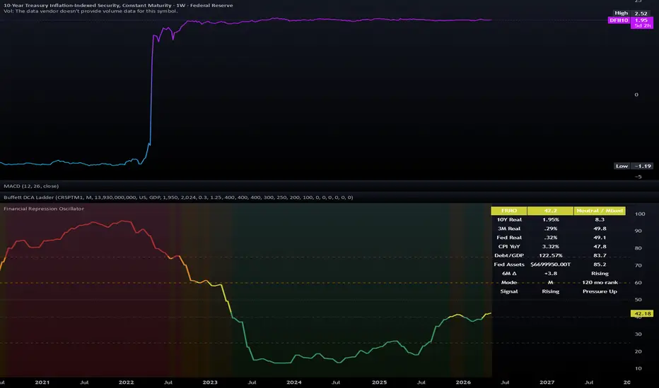
Financial Repression OscillatorThe Financial Repression Oscillator is a macro-regime indicator designed to help visualize whether current conditions are more consistent with a restrictive real-rate environment or a financial-repression-like environment.
It combines several public FRED macroeconomic series into a single bounded oscillator from 0 to 100. The goal is not to generate trade signals, but to provide a compact way to monitor real rates, inflation pressure, debt burden, and Federal Reserve balance-sheet conditions together.
Why this can be useful
Macro conditions can change the meaning of “safe” assets.
When real rates are positive, cash-like instruments and short-duration fixed income may offer meaningful real returns. When real rates are negative or falling while inflation and debt pressure remain elevated, cash and nominal fixed-income assets may lose purchasing power in real terms.
This indicator is intended to make those regime conditions easier to monitor in one place.
General interpretation
0-25 Restrictive / not repressive
25-40 Mildly restrictive
40-60 Neutral / mixed
60-75 Repression-like
75-100 Strongly repression-like
These zones are intended as a framework for macro context, not as automatic buy or sell signals.
What the indicator tracks
The oscillator uses six components:
1. 10-Year Real Yield
Series: FRED:DFII10
This is the 10-year Treasury Inflation-Protected Securities real yield. It is used as a market-based measure of long-term real interest rates.
Higher positive real yields generally suggest a more restrictive real-rate environment. Lower or negative real yields are more consistent with financial-repression-like conditions.
2. 3-Month Real Rate
Series: FRED:DTB3 minus CPI YoY
This compares the 3-month Treasury bill yield to year-over-year CPI inflation.
It helps show whether short-term cash-like instruments are providing a positive or negative real return relative to inflation.
3. Real Fed Funds Rate
Series: FRED:FEDFUNDS minus CPI YoY
This compares the effective federal funds rate to year-over-year CPI inflation.
It provides a simple estimate of whether short-term monetary policy is restrictive or accommodative after inflation.
4. CPI Inflation
Series: FRED:CPIAUCSL
Inflation is included because financial repression is usually most relevant when inflation is elevated relative to interest rates.
The script calculates CPI year-over-year inside the monthly data request so that the calculation remains consistent when the indicator is viewed on daily, weekly, or monthly charts.
5. Federal Debt to GDP
Series: FRED:GFDEGDQ188S
Debt to GDP is included as a structural pressure variable.
High debt levels do not prove that financial repression is occurring, but they may increase the policy incentive to maintain lower real borrowing costs over time.
6. Federal Reserve Total Assets
Series: FRED:WALCL
Federal Reserve total assets are used as a broad proxy for the size of the central bank’s balance sheet.
A larger balance sheet may indicate a greater central-bank footprint in financial markets, though it should not be interpreted by itself as proof of financial repression.
How the scoring works
The indicator uses a hybrid scoring model.
Each component is scored using two methods:
Absolute threshold scoring
Absolute thresholds are used so that the oscillator does not label an environment as strongly repressive simply because a value is low relative to recent history.
For example, a positive real rate should not automatically score as maximum financial repression just because it has declined from a recent high.
Percentile pressure scoring
A smaller percentile component compares each series to its own recent history over a 120-month window.
This helps the oscillator respond when conditions are deteriorating or improving relative to the recent macro regime.
Weighted blend
The real-rate components receive the largest weights because suppressed real yields are central to the concept of financial repression.
The debt and Federal Reserve asset components are included as structural context, but they are not intended to dominate the reading by themselves.
How to use it
This indicator is best used as a macro context tool on weekly or monthly charts.
Possible uses include:
Monitoring whether real-rate conditions are becoming more or less restrictive
Comparing current macro conditions to prior regimes
Adding context to cash, bond, equity, commodity, gold, or Bitcoin allocation decisions
Watching for transitions between cash-friendly and negative-real-rate environments
Supplementing other macro tools such as yield curves, credit spreads, liquidity indicators, valuation metrics, and market breadth
Important limitations
This indicator is not a trading system.
It does not issue buy or sell signals, and it does not attempt to predict short-term market direction. The underlying data comes from FRED and updates at different frequencies. Some components update daily, while others update monthly or quarterly, and macroeconomic data may be revised.
The oscillator should be interpreted as a broad macro-regime estimate, not as a precise timing model.
A high debt score or a large Federal Reserve balance sheet score does not, by itself, mean financial repression is occurring. The most important readings come from the combination of real yields, inflation, short real rates, and structural debt pressure.
Practical reading
When the oscillator is low, real-rate conditions are generally more restrictive and cash-like assets may be more competitive in real terms.
When the oscillator rises, conditions may be shifting toward a more inflationary or repression-like environment, especially if real yields are falling while inflation and debt pressure remain elevated.
The most meaningful signals are usually changes in regime over time rather than any single daily reading.
指标
Lomo Timeframes & Delta VolumePodrás visualizar el sesgo del activo en diferentes temporalidades y el delta volume en tiempo real. Muy funcional y visual para saber dirección del activo.
指标

IS Ghostbusters - Visual Session Levels & Auto-Hedge LogicGhostbusters is a visual execution tool designed for traders who operate based on fixed intraday levels and seek disciplined risk management. The script does more than just project entry, stop loss, and take profit levels; it acts as a real-time session monitor, validating executions and automatically managing hedge operations.
+1
Key Features:
Precision "Touch" Detection: Unlike standard indicators that wait for a candle to close, Ghostbusters uses intrabar prices (High/Low) to detect the exact moment price touches a level, ensuring surgical precision for entries and exits.
"One-Shot" Logic: To prevent overtrading, the script validates only the first outcome of the day. Once a TP or SL is hit, the indicator locks until the next configured session.
+1
Automatic Hedge System: If the initial trade hits the Stop Loss, the script automatically activates a violet-colored hedge radar. It calculates a new entry at the failure point, sets the Stop Loss at the original entry price, and calculates a reduced Take Profit (50% of the original range) to seek a quick technical recovery.
+1
Adaptable Professional UI:
Smart Contrast: Labels automatically change color based on your chart background (light or dark) to ensure total readability.
Level Table: Includes a dynamic table in the bottom corner that organizes SELL, BUY, and Hedge values.
Synchronized Infinite Lines: Uses line objects that span the entire chart, maintaining perfect synchronization with the price scale when zooming or scrolling.
How to Use It:
Configure Levels: Manually enter your Entry, SL, and TP levels for both BUY and SELL scenarios.
Session Control: Define your session start time. The script will ignore any prior movement and place a yellow "START" circle on the starting candle.
+1
Execution: Monitor the visual signals:
▲/▼ OPEN: Confirmed Entry.
✔️ TP: Target Reached.
X SL: Stop Loss Hit.
🟣 OPEN HEDGE: Hedge activation after an initial SL.
Technical Notes:
Written in Pine Script v6.
Optimized to keep the chart clean by avoiding unnecessary data points, maintaining a professional aesthetic.
Disclaimer: This script is a visualization and manual trading aid. It does not constitute financial advice or guarantee profits. Use at your own risk.
指标

Fibonacci Retracement Low
Fibonacci Retracement Low for bitcoin and other coins.
# Fibonacci Retracement Low — Bitcoin & Altcoins
## 📐 What is Fibonacci Retracement?
Fibonacci Retracement is a technical analysis tool derived from the **Fibonacci sequence**, a mathematical series discovered by Leonardo Fibonacci in the 13th century. The sequence — 0, 1, 1, 2, 3, 5, 8, 13, 21... — produces a ratio (~1.618) known as the **Golden Ratio (φ)**, which appears repeatedly in nature, art, and financial markets.
In trading, key retracement levels are calculated as:
- **23.6%** — shallow pullback zone
- **38.2%** — moderate support/resistance
- **50.0%** — psychological midpoint (not a Fibonacci number, but widely respected)
- **61.8%** — the "Golden Pocket," most critical level
- **78.6%** — deep retracement, often a last line of defense before trend invalidation
---
## 🔍 Theoretical Background
### Why Does It Work in Markets?
Markets are driven by **human psychology**, and crowd behavior tends to cluster around mathematically significant levels. Traders worldwide watch the same Fibonacci levels, creating **self-fulfilling prophecies** — the more traders act on a level, the more significant that level becomes.
### Retracement vs. Reversal
A retracement is a **temporary price pullback** within a larger trend. The core thesis of Fibonacci Retracement analysis is:
> *"A strong trending asset will not give back all its gains — it will retrace to a predictable mathematical level and resume its primary trend."*
The chart identifies the **Retracement Low**, meaning the deepest point of a corrective wave before the next major upward impulse.
---
## ₿ Bitcoin & Altcoin Context
### Bitcoin as the Anchor
Bitcoin dominates the crypto market, and its Fibonacci structure sets the **macro framework** for the entire cycle. Historically:
| Cycle | Retracement Level | Outcome |
|---|---|---|
| 2018–2019 Bear | ~84% drawdown | Bounced at 0.786 |
| 2020 COVID Crash | ~50% level | V-shape recovery |
| 2021–2022 Bear | ~77% drawdown | Major accumulation zone |
### Altcoin Behavior
Altcoins tend to **amplify** Bitcoin's Fibonacci structure:
- They retrace **deeper** (often 85–95%)
- But they also **bounce harder** from key levels
- The 61.8% and 78.6% zones act as **high-probability accumulation targets** for risk-on capital rotation
---
## 📊 Practical Application
When the chart marks the **Fibonacci Retracement Low**, it signals:
1. **Price has reached a historically significant mathematical support**
2. **Risk/reward is favorable** — downside is limited relative to potential upside
3. **Confluence with other indicators** (volume, RSI divergence, on-chain data) strengthens the signal
4. **Macro cycle positioning** — these lows often coincide with the final capitulation phase before a new bull run
---
## ⚠️ Key Caveats
- Fibonacci levels are **not guarantees** — they are probability zones
- In extreme bear markets, price can **overshoot** below the 78.6% level temporarily
- Always combine with **volume analysis**, **market structure**, and **macro conditions**
- Bitcoin halving cycles historically influence which Fibonacci level acts as the ultimate bottom
---
The identification of a Fibonacci Retracement Low, particularly across both Bitcoin and altcoins simultaneously, is often interpreted as a **generational buying opportunity** — a zone where patient, thesis-driven investors accumulate positions before the next major market expansion phase.
指标

ADDQ Breadth Oscillator [Signal Vision]
ADDQ Breadth Oscillator
📊 ADDQ Breadth Oscillator (Advanced Market Internal)
The ADDQ Breadth Oscillator is a momentum-based tool designed to visualize the internal health of the NASDAQ by tracking Net Advancing Issues (ADDQ).
Unlike standard price indicators, this oscillator looks "under the hood" of the market to see if price movement is supported by broad participation or if it’s being driven by just a few heavyweights.
🔍 How it Works
This indicator pulls the NASDAQ Advance-Decline Line (ADDQ) and processes it through a dual-EMA system to create a smoothed oscillator and a signal line. It measures the spread between the current breadth and its moving average, resulting in a responsive histogram that highlights shifts in market momentum.
🛡️ Smart Data Selection (Fail-safe)
One of the unique features of this script is its triple-source logic. Different TradingView data plans and brokers handle Breadth symbols differently. This script automatically checks:
NASDAQ:ADDQ
ADDQ (Generic)
ADVQ - DECLQ (Calculated manually from Advancing vs. Declining issues)
It will automatically use the best available source based on your data subscription, ensuring the indicator never returns a "blank" screen. A Debug Table in the top right confirms which source is currently active.
📈 Key Features
Momentum Histogram: A scaled histogram that shows the acceleration or deceleration of market breadth.
Trend Ribbon: The area between the ADDQ line and the Signal line changes color (Teal/Red) to indicate the short-term internal trend.
Extreme Levels: Horizontal dashed lines at +/- 1500 (customizable) highlight overbought or oversold breadth conditions.
Crossover Signals: Visual shapes appear on the chart when the breadth line crosses its signal line, marking potential entry or exit points.
🛠️ How to Use
Bullish Confirmation: Look for the ADDQ line to cross above the Signal line while the histogram turns bright teal.
Overextended Markets: When the background turns teal or red, the NASDAQ is reaching extreme breadth levels (+/- 1500). These are often areas where the market is prone to mean reversion or a temporary pause.
Divergence: If price is making new highs but the ADDQ Oscillator is making lower highs, it suggests the rally is losing participation.
⚙️ Settings
Signal Length: Adjust the smoothness of the yellow signal line.
Histogram Scale: Since ADDQ values are large, use this to make the histogram bars more or less prominent.
Extreme Level: Customize the threshold for "Extreme" market conditions based on current volatility.
Note: This indicator requires access to NASDAQ Market Internals data. If the debug table shows "no data," ensure you have the appropriate NASDAQ data package or are using a broker feed that supports breadth symbols.
指标

指标

900 S/R Scanner v4support and resistance tool , that i made for myself , its show the 900 moving average on different time frames live.
just first tool that made if you have update suggestions write a comment
指标

指标

Auto-Logger MTF + Calendar Backtestkalender backtest ini membuat kita tidak perlu ribet cek backtesting dan tidak perlu harus forward testing sehingga akan sangat memudahkan para trader
策略

BankNifty 15m Clear TP/SL StrategyBanknifty 5/10min TP/SL- trade on banknifty NSE with 5/10 min chart and get TP and SL marked on chart itself
策略

Auto-Logger Multi-Timeframe Analyzer by mucismulti time frame untuk cek history backtest bahkan winrate dari tiap indikator agar kita bisa tau win dan lose tanpa perlu forward test yang lama
指标

Gann Fan v15 [Phases + Signals]Gann Fan v15 is a strategy inspired by the classic Gann Fan and Gann Angles methodology attributed to W.D. Gann. Gann’s original approach studied the relationship between price, time, geometry, and market angles to identify trend strength, diagonal support and resistance, and potential changes in market behavior.
Credit:
The base concept of the fan angles comes from the Gann Fan / Gann Angles method attributed to W.D. Gann. This script does not claim to reproduce Gann’s original work exactly. It is an independent strategy built around that historical concept, with additional logic for phase detection, signal confirmation, visual analysis, and risk management.
What makes this strategy different:
This script is not only a traditional Gann Fan drawing tool. A classic Gann Fan usually plots diagonal angle levels from a selected high or low. This strategy adds a complete decision framework on top of the Gann Fan concept.
The main differences are:
1. Automatic pivot detection
The script automatically detects recent pivot highs and pivot lows instead of requiring the user to manually anchor the fan.
2. ATR-normalized angle calculation
Instead of using only fixed visual chart angles, the script calculates movement angles using ATR normalization. This helps adapt the angle reading to the volatility of the current symbol.
3. Market phase classification
The script classifies the market into four phases based on the calculated angle:
ACCUM: weak angle or low momentum.
MODER: moderate directional movement.
EXPAN: stronger directional expansion.
ACCEL: extreme acceleration.
4. Visual phase background
The chart background changes according to the detected phase and direction. This helps the user quickly identify whether the market is in accumulation, moderate movement, expansion, or acceleration.
5. LONG and SHORT signal logic
The strategy generates LONG and SHORT signals using Gann-inspired angle behavior, swing direction, EMA confirmation, and candle confirmation depending on the selected entry mode.
6. Multiple entry modes
The user can choose between three signal modes:
Strict, Medium, and Easy.
Each mode changes how much confirmation is required before a signal appears.
7. Built-in risk management
The strategy includes configurable Stop Loss, Take Profit, optional Trailing Stop, and visual TP/SL guide lines.
8. Dashboard
A table shows the current swing direction, live angle, current phase, bullish fan angle, bearish fan angle, active mode, and phase thresholds.
How the strategy enters LONG:
A LONG signal appears when the market structure is bullish and the selected entry mode confirms that the bullish movement has enough strength.
Mode 1 - Strict:
A LONG entry requires the market phase to transition from ACCUM or MODER into EXPAN or ACCEL. The swing must be bullish, EMA 8 must be above EMA 21, and the candle must close bullish.
Mode 2 - Medium:
A LONG entry can appear when the current phase is MODER, EXPAN, or ACCEL. The swing must be bullish, EMA 8 must be above EMA 21, and the candle must close bullish.
Mode 3 - Easy:
A LONG entry can appear when the current angle is above the weak angle threshold, the swing is bullish, price closes above EMA 8, and the candle is bullish.
How the strategy enters SHORT:
A SHORT signal appears when the market structure is bearish and the selected entry mode confirms that the bearish movement has enough strength.
Mode 1 - Strict:
A SHORT entry requires the market phase to transition from ACCUM or MODER into EXPAN or ACCEL. The swing must be bearish, EMA 8 must be below EMA 21, and the candle must close bearish.
Mode 2 - Medium:
A SHORT entry can appear when the current phase is MODER, EXPAN, or ACCEL. The swing must be bearish, EMA 8 must be below EMA 21, and the candle must close bearish.
Mode 3 - Easy:
A SHORT entry can appear when the current angle is above the weak angle threshold, the swing is bearish, price closes below EMA 8, and the candle is bearish.
Risk management:
The strategy includes a configurable Stop Loss percentage and Take Profit percentage.
When Trailing Stop is enabled, the Take Profit level is used as the trail activation price.
The strategy also includes an optional open-profit protection feature that can close the position after a minimum open profit condition is reached.
TP and SL levels are displayed on the chart while a position is active.
Visual elements:
Dynamic bullish and bearish Gann Fan levels.
Phase-colored background.
EMA 8 and EMA 21.
LONG and SHORT labels.
Live angle label.
Dashboard with current market state.
TP and SL lines.
Important usage notes:
Gann Fan and angle-based analysis can be sensitive to chart scaling, timeframe, volatility, and market conditions.
This strategy should be tested on each symbol and timeframe before use.
The default parameters are only a starting point.
Users should adjust the angle thresholds, pivot periods, Stop Loss, Take Profit, and Trailing Stop according to their own testing.
Disclaimer:
This script is for educational and analytical purposes only.
It does not provide financial advice.
It does not guarantee profits.
Past performance does not guarantee future results.
Always use proper risk management.
策略

SPX/SPY Weighted Sector Tape Quality DashboardSPY/SPX Weighted Sector Tape Quality Dashboard
- Purpose:
Provides a real-time view of SPY/SPX sector participation using sector ETF movement and approximate S&P 500 sector weights.
- Weighted Sector Impact:
Calculates each sector’s contribution by multiplying the sector’s percent move by its market weight.
- Real-Time Sector Table:
Displays each sector in a TradingView table with sector name, weight, percent move, weighted impact, and quick read.
- Color-Coded Heatmap:
Uses green/red shading to show positive or negative contribution. Brighter colors indicate stronger impact.
- Sortable Sector View:
Allows sorting by SPX weight, absolute contribution, or directional contribution.
- Editable Sector Weights:
Sector weights can be adjusted in settings as S&P 500 sector weights change over time.
- Move Calculation Options:
Supports Today From Open, Bar-to-Bar, and custom Lookback calculations.
- Weighted Positive Participation:
Shows how much of the S&P 500 by sector weight is participating positively.
- Positive Sector Count:
Tracks how many of the 11 major sectors are positive.
- Cyclical vs Defensive Score:
Compares risk-on sectors against defensive sectors to identify market tone.
- Mega-Cap Concentration:
Measures whether the move is being driven mainly by Technology, Communication Services, and Consumer Discretionary.
- VIX Confirmation:
Uses VIX movement as a confirmation or warning signal for tape quality.
- Tape Quality Score:
Combines weighted participation, breadth, cyclicals vs defensives, and VIX behavior into one quick score.
- Tape Classification:
Labels the tape as Broad Risk-On, Narrow Mega-Cap Bid, Defensive Rotation, Fake Breakout Risk, Broad Liquidation, Risk-Off, or Mixed/Chop.
- Compact Mode:
Offers a smaller, faster-read table layout for active trading screens.
- Adjustable Table Size:
Allows changing table text size from Tiny to Huge.
- Moveable Table Location:
Supports nine table positions across the chart: top, middle, bottom, and left, center, or right.
- Top 6 Mode:
Optionally shows only the six highest-ranked sectors to reduce screen clutter.
- Mini Plot:
Optional plot of net weighted sector contribution and tape quality score.
- Best Use Case:
Designed for intraday ES, SPX, and SPY traders who want to quickly see whether price action is broadly supported or narrowly driven.
- Important Note:
This tool estimates sector participation using SPDR sector ETFs and editable S&P 500 sector weights. It is intended as a market internals and participation read, not a buy or sell signal by itself.
指标

Universal Session Open V.3 - TF 1/15DESCRIZIONE DELLO SCRIPT:
Cos'è Universal Session Open V3?
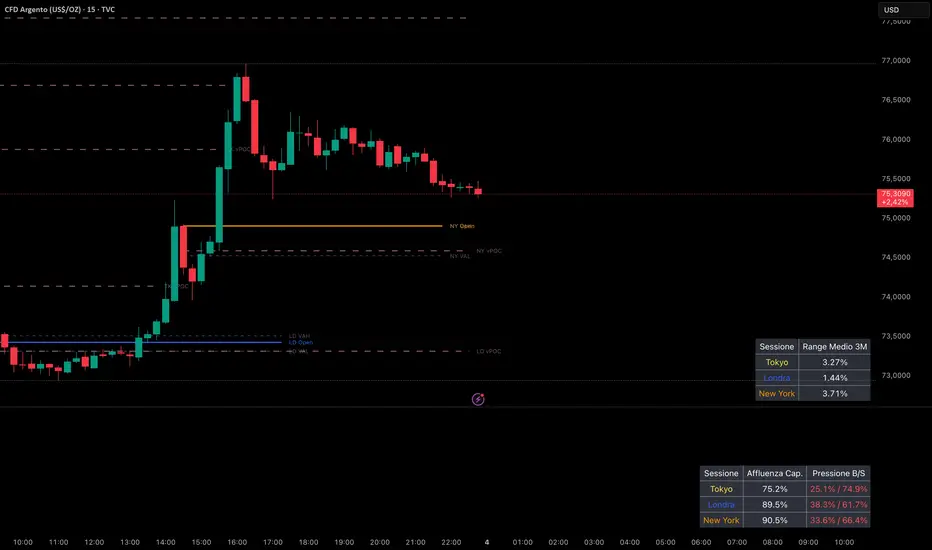
L’Universal Session Open V3 è un indicatore avanzato studiato per lavorare sui timeframe a 1 e 15 minuti. È progettato per i trader che vogliono unire la ciclicità del tempo (le sessioni di borsa) con la precisione millimetrica dei volumi (Volume Profile e vPOC).
Lo scopo di questo strumento è mappare con esattezza l'attività delle tre sessioni principali (Tokyo, Londra e New York) per individuare i livelli in cui le istituzioni hanno accumulato i massimi volumi.
Caratteristiche Principali
Tracciamento Sessioni Intraday: Evidenzia l'apertura esatta di Tokyo, Londra e New York con linee e label dedicate.
Volume Profile Integrato: Calcola e traccia in tempo reale il POC (Point of Control), il VAH (Value Area High) e il VAL (Value Area Low) di ciascuna sessione.
Virgin POC (vPOC) Dinamici: Alla chiusura di ogni sessione, se il POC non è stato toccato, l'indicatore lo trasforma in un vPOC tratteggiato e semi-trasparente, estendendolo verso destra. La linea si interrompe automaticamente nel momento esatto in cui il prezzo la tocca nel futuro.
Grafica Ottimizzata per SMC: I colori e i livelli sono studiati per essere puliti e riposanti, perfetti per essere usati insieme ad altri indicatori (es. FVG e SMC).
Come Imposto la Mia Operatività (La Strategia di Confluenza)
Per ottenere il massimo da questo indicatore, vi spiego la mia regola di trading ferrea che unisce struttura, tempo e volume:
Identifico la Fascia SMC: Aspetto che il prezzo entri in una zona di interesse istituzionale. Uso i rettangoli Rosa (Premium/Supply) per cercare vendite e i rettangoli Blu (Discount/Demand) per cercare acquisti.
Cerco la Confluenza con il vPOC: Guardo se all'interno di quella fascia è presente un vPOC non mitigato (linea rosa tratteggiata generata dall'indicatore).
Controllo le Conferme nella Dashboard: Verifico sulla dashboard che la borsa attuale mostri un'estensione del volume significativa e che la pressione Buy/Sell (Delta) confermi l'inversione.
Il Trigger d'Ingresso: Se il vPOC è dentro la fascia e i volumi confermano, quello è il mio livello esatto per piazzare l'ordine.
Gestione dello Stop Loss e del Rischio
Lo Stop Loss va posizionato sempre appena fuori dalla fascia SMC (sotto la fascia blu per i Long, sopra la fascia rosa per gli Short). Questo permette di rischiare pochissimi pip a fronte di guadagni molto più grandi, mantenendo un Risk/Reward medio di 1:3 o superiore. Se il prezzo tocca un vPOC che si trova nel "vuoto" (fuori dalle fasce di ordine SMC), lo ignoro.
NOTE PER LA COMMUNITY:
Questo indicatore viene rilasciato gratuitamente per tutti i trader che vogliono fare un salto di qualità nella lettura dei volumi e delle sessioni. Se lo trovi utile per il tuo trading, lascia un "Boost" e aggiungilo ai preferiti!
________
What is Universal Session Open V3?
Universal Session Open V3 is an advanced indicator specifically designed for 1-minute and 15-minute timeframes. It is tailored for traders who want to combine time cycles (market sessions) with precise volume data (Volume Profile and vPOCs).
This tool accurately maps the activity of the three major trading sessions (Tokyo, London, and New York) to identify the exact levels where institutions have accumulated the highest trading volume.
Key Features
Intraday Session Tracking: Highlights the exact opening prices for Tokyo, London, and New York with dedicated lines and labels.
Integrated Volume Profile: Calculates and plots the POC (Point of Control), VAH (Value Area High), and VAL (Value Area Low) for each session in real-time.
Dynamic Virgin POCs (vPOC): At the end of each session, if the POC remains untouched, the indicator converts it into a dashed, semi-transparent vPOC line and extends it to the right. The line automatically stops plotting the exact moment price mitigates it in the future.
Optimized for SMC: Colors and levels are clean and non-intrusive, making it the perfect companion for other indicators like FVG and SMC setups.
Trading Strategy & Confluence Rules
To get the most out of this indicator, here is my strict trading plan combining structure, time, and volume:
Identify the SMC Zone: Wait for the price to enter an institutional area of interest. Use Pink rectangles (Premium/Supply) for shorts and Blue rectangles (Discount/Demand) for longs.
Find the vPOC Confluence: Check if there is an unmitigated vPOC (dashed pink line created by the indicator) lying inside that specific SMC zone.
Check the Dashboard Confirmations: Look at your volume dashboard to verify that the current session shows significant volume extension and that the Buy/Sell pressure (Delta) confirms the reversal.
The Entry Trigger: If the vPOC is inside the zone and volume confirms it, that is the exact level to place the order.
Risk Management & Stop Loss
Always place the Stop Loss just outside the SMC zone (below the blue zone for Longs, above the pink zone for Shorts). This allows for a very tight Stop Loss and much larger targets, maintaining a Risk/Reward ratio of 1:3 or higher. If the price touches a vPOC that sits in "no man's land" (outside of valid SMC zones), ignore it.
NOTES FOR THE COMMUNITY:
This indicator is released for free to help traders level up their volume and session analysis. If you find it useful, please leave a Boost and add it to your favorites!
指标
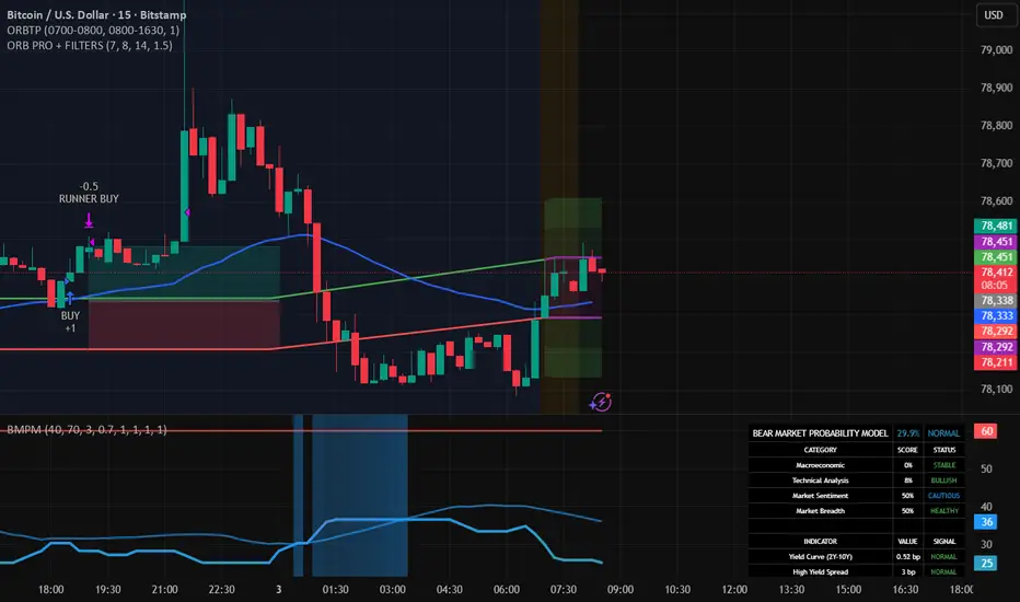
ORB PRO + FILTERS (elwinpoedeklapopsnoede)Short and simple:
👉 This Pine script trades an Opening Range Breakout with filters.
What it does:
Determines the range between 07:00–08:00 (highest and lowest price)
Waits until the US session (14:00–23:00 NL time) begins
Goes long if price breaks above the range
Goes short if price breaks below the range
Only trades in the direction of the trend (EMA 50)
Risk management:
Stop loss = opposite side of the range
Take profit = 1:1 risk/reward (close 50%)
It lets the rest run with a trailing stop (ATR + range based)
👉 Briefly summarized:
You only trade strong breakouts of the morning range, with a trend filter and smart risk management.
策略