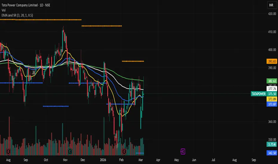
Quadruple EMA with Support and Resistance# EMA Trend + Support & Resistance Strategy
## Overview
A clean, rule-based trading strategy designed for the **Daily timeframe**. It uses four Exponential Moving Averages (EMA 20, 50, 100, 200) as a trend filter combined with dynamic Support & Resistance levels to identify high-probability breakout and breakdown setups.
The logic is intentionally simple — no indicators stacked on indicators, no complex filters. Just price, trend direction, and key levels.
---
## How It Works
### Entry — Long (CE / Buy)
A long entry is triggered when:
- Price closes **above all four EMAs** (20, 50, 100, 200) — confirming strong bullish trend alignment
- Price **breaks above the previous bar's high** — confirming momentum and breakout
### Entry — Short (PE / Sell)
A short entry is triggered when:
- Price closes **below all four EMAs** (20, 50, 100, 200) — confirming strong bearish trend alignment
- Price **breaks below the previous bar's low** — confirming momentum and breakdown
### Exit Logic
- **Stop Loss** — set at the previous bar's low (for longs) or previous bar's high (for shorts)
- **Target** — calculated using the configurable Risk:Reward Ratio (default 3:1)
- **EMA-based dynamic exit** — if price closes below EMA 20 or EMA 50 (for longs), or above EMA 20 or EMA 50 (for shorts), the stop is tightened to force an exit on the next bar, protecting open profit
- **Optional Trailing Stop Loss** — activates after a defined profit % is reached, then trails at a set % distance from the peak
---
## Indicators on Chart
| Line | Color | Meaning |
|------|-------|---------|
| EMA 20 | Yellow | Fast trend / momentum |
| EMA 50 | Blue | Mid-term trend |
| EMA 100 | White | Medium-long trend support |
| EMA 200 | Green | Long-term trend direction |
| Resistance | Orange dots | Swing high levels |
| Support | Blue dots | Swing low levels |
| ▲ Green arrow | Below bar | Long (CE) entry signal |
| ▼ Red arrow | Above bar | Short (PE) entry signal |
---
## Settings
| Input | Default | Description |
|-------|---------|-------------|
| Risk Reward Ratio | 3.0 | Target = Entry + (RR × Risk) |
| Show Support/Resistance | On | Toggle S/R level plots |
| Swing Detection Bars | 20 | Lookback bars for pivot detection |
| One Trade Per Day | On | Limits to one CE and one PE per day |
| Use Trailing Stop Loss | Off | Enable trailing SL after activation |
| Trailing Activation % | 1.0% | Profit % before trailing SL kicks in |
| Trailing Distance % | 0.5% | Distance the trailing SL follows from peak |
---
## Best Used On
- **Timeframe:** Daily (recommended), Weekly
- **Instruments:** Stocks, Indices, ETFs
- Works well on trending instruments where EMA stacking is meaningful
---
## Notes
- This strategy does **not** use candle body filters, volume filters, or session time windows — keeping it universally applicable across timeframes and instruments
- One trade per direction per day is enforced by default to avoid overtrading
- Both CE (long) and PE (short) trades cannot be open simultaneously
---
⚠️ **Disclaimer:** This strategy is for educational and backtesting purposes only. Past performance does not guarantee future results. This is not financial advice. Always do your own research and consult a qualified financial advisor before making any trading decisions. 策略

指标

指标

指标

指标

指标

指标

指标

BK AK-Blackbird🐦⬛ BK AK-Blackbird 🐦⬛
All glory to G-d — source of wisdom, restraint, and right timing.
Respect to AK — discipline, patience, and clean execution.
Blackbird is a non-overlay oscillator built for one job:
mark momentum turns at extremes, then grade whether the turn has real participation behind it.
It does that by stacking three layers into one pane:
Falcon oscillator (momentum + regime)
Footprint order flow (delta / absorption / divergence / POC context) — optional, requires eligible plan/data
Time block intelligence (New York session weighting)
This is not a “predict direction” script.
It’s a confirmation + context engine: where is momentum inside its dynamic range, is it accelerating or stalling, is the market trending or ranging, and does order flow agree?
What you see on the chart
Core oscillator
“Zenith” line (Falcon oscillator), normalized into a fixed 0–100 pane so it’s readable across instruments.
Signal line (EMA of Zenith) for clean cross-based turns.
Overbought / oversold zones with shading so extremes are obvious.
Context
Optional time-block background (New York time blocks).
Optional RTH open (9:30 ET) and ETH open (18:00 ET) vertical lines (auto-hidden on higher timeframes to prevent clutter).
Decision layer
Peak / valley signals at extremes (with cooldown).
Optional footprint-enhanced grading (Quality score).
Dashboard panel that summarizes the live state (momentum, velocity, ADX regime, time block, volume, and—if available—footprint metrics).
1) Falcon oscillator (how it works)
Blackbird’s oscillator is built from the Directional Movement (DI) spread, then normalized:
It computes DI+ and DI− using standard directional movement math.
It derives a signed strength value (“Zenith”) from the DI spread relative to total DI:
Think of it as: directional dominance / total directional activity, expressed as a signed percentage.
A signal line smooths Zenith (EMA), so crosses are clean.
Velocity is simply the 1-bar change in Zenith (rate-of-change).
Dynamic bands (adaptive extremes)
Instead of fixed oscillator levels, Blackbird uses dynamic bands derived from the oscillator’s rolling volatility (standard deviation window). This makes “extreme” mean extreme for current conditions, not an arbitrary number.
You control how deep into the band counts as “extreme” using Extreme Zone %.
2) Regime filter (trend vs range)
Blackbird uses ADX to classify regime:
If ADX is above your threshold, the script flags a trending regime
If not, it’s treated as ranging / mean-reverting conditions
This matters because the same oscillator extreme can mean two different things:
In a strong trend: extremes can “stick” (continuation risk).
In a range: extremes are more likely to mean-revert (reversal opportunity).
3) Footprint order flow layer (optional, premium-dependent)
If enabled and data is available, Blackbird pulls footprint metrics via request.footprint() and derives:
Delta and delta ratio
Delta = buy volume − sell volume
Delta ratio = delta / total volume (how one-sided the flow is)
Absorption detection
Absorption = high volume but low net delta
(two-sided institutional activity: heavy trading but not much net progress)
Delta divergence
Bearish divergence concept: momentum improving while delta pressure is negative over a lookback window (stealth distribution)
Bullish divergence concept: momentum weakening while delta pressure is positive (stealth accumulation)
POC context
Uses footprint POC location inside the candle range:
POC high in bar can suggest acceptance/distribution
POC low can suggest acceptance/accumulation
Footprint bias score (−2 to +2)
A compact “who is winning” readout built from delta ratio, absorption at extremes, and delta divergence.
If footprint data is unavailable, this entire layer degrades gracefully (no broken logic, no fake values).
4) Signals: Peak and valley turns (the execution events)
Blackbird fires signals when a turn is earned, not guessed:
Peak signal
Zenith crosses down through its signal line
Price/momentum is in or near the upper extreme zone
Velocity confirms the turn (deceleration)
Cooldown must be satisfied (prevents spam)
Valley signal
Zenith crosses up through its signal line
In or near lower extreme zone
Velocity confirms reversal energy
Cooldown satisfied
Time block gate (New York normalization)
If time blocks are enabled, the script can require a minimum time-block weight (default logic: avoid low-quality periods). This is designed to stop you from treating lunch chop the same as the afternoon window.
5) Signal quality score (0–100)
Blackbird grades every eligible signal with a score designed to answer:
“Is this just oscillator movement, or is it backed by participation and context?”
Baseline:
40 points = momentum-only turn signal
Additive boosts (when available):
Delta confirms direction
Absorption at the extreme (ceiling/floor defense)
Delta divergence (stealth reversal pressure)
POC position confirms
Time block premium window bonus
Trending regime bonus
Then you can filter signals using Min Quality to Show Signal:
0 = show everything
50+ = requires meaningful confirmation
70+ = strong confirmation only
85+ = rare “full confluence” events
Important: if footprint data is not available, quality naturally caps much lower because the order-flow boosts can’t be applied.
6) How to use it (simple, executable rules)
A) First decide the regime
Trending (ADX above threshold): treat signals as timing tools, be careful fading strength.
Ranging: peaks/valleys are more valid as mean-reversion setups.
B) Use extremes as location, not as entries
The zone tells you “stretched.”
The signal-line cross + velocity shift is what turns “stretched” into “turning.”
C) Trade the best time blocks, not the most bars
If time blocks are enabled, use them as a permission system:
Open drive can be trap-heavy
Lunch is often noise
Afternoon window is often cleaner
D) Size by quality, not emotion
Higher quality = more layers aligned
Low quality = information only (or reduced size)
E) Use footprint as the lie detector (when available)
Momentum and delta agree: continuation risk / real participation
Momentum and delta diverge: exhaustion / stealth reversal risk
Absorption at extremes: ceiling/floor behavior (watch for rejection)
Alerts included
Blackbird includes alertconditions for:
Peak / valley
Strong tiers (Quality 70+)
Elite tiers (Quality 85+)
Afternoon-weighted peak / valley
Absorption at highs / absorption at lows
Tip: For clean execution, most traders should run alerts once per bar close so you’re acting on confirmed conditions, not mid-bar fluctuations.
Non-repainting note (important)
This script updates on the live bar. That means conditions can change until the bar closes (normal Pine behavior). If you want “confirmed-only” behavior:
Set TradingView alerts to Once per bar close
(Code-side improvement suggestion) gate signal label printing and alerts behind barstate.isconfirmed or provide a “realtime preview” toggle that deletes unconfirmed labels.
Right now your tooltip labels are already careful about confirmation (barstate.isconfirmed), but signal label printing is not gated, so on some markets/timeframes you can get “phantom” signal labels if a cross appears intrabar and disappears by close.
Limitations / requirements
The footprint module requires an eligible TradingView plan and supported symbols. If unavailable, Blackbird runs in “Falcon-only” mode without breaking.
Time blocks are designed around America/New_York (RTH behavior). They still function on other markets, but the weighting assumptions are New York session-specific.
This is a decision-support tool. Always apply your own risk management.
🐦⬛ BK AK-Blackbird 🐦⬛ 指标

GM RubenIndicator: Gran Maestro Ruben (I-AVBS)
Gran Maestro Ruben (I-AVBS) is an indicator designed to detect institutional movements before a 5-minute candle closes, using a combination of:
Volume projection
Price momentum
Delta proxy
Breakout context
Manual GEX level filter
The objective is to identify early expansions in volume and market participation, which often anticipate directional breakouts with a high probability of continuation.
How the Indicator Works
The indicator analyzes market behavior while the candle is forming, without waiting for it to close.
To generate a signal, it evaluates several factors simultaneously.
1️⃣ Volume Projection (Projected Volume)
The system estimates how much volume the candle will likely have at close by comparing:
Current candle volume
Elapsed candle time
Average volume of previous candles
If the projected volume is significantly higher than the recent average, it suggests early institutional participation.
Example:
Average 5-minute volume = 10,000
At the midpoint of the candle there are already 8,000 contracts traded.
This suggests the candle will likely close with abnormally high volume.
2️⃣ Early Candle Window
The indicator only looks for signals during the first minutes of the candle.
This is important because the goal is to anticipate the move, not confirm it afterward.
By default, the indicator analyzes the first:
3 minutes of the 5-minute candle
3️⃣ Structure Breakout
The system also checks whether price is breaking recent structure.
Bullish breakout:
Current close > previous candle high
Bearish breakout:
Current close < previous candle low
This helps avoid signals during sideways market conditions.
4️⃣ Candle Body Strength
The indicator analyzes the structure of the candle.
To confirm momentum:
The candle body must represent at least 60% of the total range.
This indicates the move is directional rather than random volatility.
5️⃣ Delta Proxy
Because TradingView does not provide real bid/ask delta for many instruments, the indicator uses an approximation based on:
Up-candle volume
Down-candle volume
This helps estimate whether the dominant pressure comes from:
Buyers
Sellers
If the estimated delta confirms the breakout direction, the signal is validated.
6️⃣ GEX Level Filter
The indicator allows traders to manually input Gamma Exposure (GEX) levels.
Rules:
LONG signals only if:
Price > Positive GEX level
SHORT signals only if:
Price < Negative GEX level
This helps align signals with typical market maker hedging behavior.
Visual Signals
The indicator displays the following signals on the chart:
🔺 Green triangle
Anticipated bullish breakout signal
🔻 Red triangle
Anticipated bearish breakout signal
It also displays a label showing:
Projected volume vs average volume
Estimated delta
Markets Where It Works Best
The indicator is optimized for markets with strong institutional order flow such as:
SPX
SPY
QQQ
ES futures
NQ futures
It performs particularly well during:
Market open
Range breakouts
Liquidity zones
Gamma levels
Recommended Trading Horizon
Ideal timeframe:
5-minute chart
Most effective trading windows:
9:30 – 10:30 New York session
14:30 – 16:00 New York session
Indicator Objective
The purpose of the Gran Maestro Ruben (I-AVBS) indicator is to help traders detect:
Early institutional entry
Volume acceleration
Structural breakout with momentum
This allows traders to enter positions before the move becomes obvious to the broader market. 指标

指标

指标

指标

指标

RaVen V2.3.17🦅 RaVen V2.3.17 更新说明
═══ 信号准确率增强 ═══
▶ 多时间框架共识系统 (MTF)
新增1分钟、3分钟、5分钟多周期趋势确认,利用TradingView Premium的
request.security()能力实现跨周期信号校验,当多周期方向一致时信号可信度显著提升。
▶ 7项新增技术指标
• MFI (资金流量指数) — 量价结合的超买超卖判断
• Heikin Ashi (平均K线) — 过滤噪音的趋势连续性确认
• Ichimoku Cloud (一目均衡表) — 多维度趋势方向与支撑阻力
• Linear Regression (线性回归) — 统计学趋势方向与拟合度
• Parabolic SAR (抛物线转向) — 趋势反转早期预警
• CCI (商品通道指数) — 极端区域惩罚机制
• CMF (蔡金资金流) — 买卖压力量化
▶ 市场状态分类
基于ADX、趋势一致度、布林带状态自动识别"强趋势/弱趋势/震荡"三种市场环境,
动态调整质量阈值——强趋势时放宽覆盖率,震荡时提高准确率门槛。
▶ 高级反转预警
反转检测从原先维度扩展至9维,新增RSI背离、MACD背离、成交量高潮、
PSAR翻转等检测,提前预警趋势疲软。
▶ 评分体系重平衡
趋势维度扩展至9维(满分25),动量维度扩展至7维(满分20),
MTF共识加分(满分20)替代原HTF加分,新增HA连续性、
一目均衡表云层、R²拟合度等加分项。
═══ 视觉优化 ═══
▶ 三档显示模式
• 精简 — 仅主信号面板,手机竖屏友好
• 标准(默认) — 主信号 + 价值预测,日常实盘推荐
• 完整 — 全部面板 + 详情面板,深度分析
▶ 详情面板区域选择
完整模式下可选择只显示"趋势/评分/回测/全部"中的某个区域,
避免40行面板遮挡K线图表。
▶ 价值预测面板整合
完整模式下自动展示预测统计(准确率、高置信度命中、一致/矛盾胜率),
无需单独开启记录面板。
▶ 统一色彩体系
全面板统一深蓝黑底色(#0a1628)、暗蓝边框(#2a4a6b)、亮青强调(#4fc3f7),
视觉层次更清晰,长时间盯盘不刺眼。
═══════════════════════════════════════
⚠️ 免责声明
本脚本("RaVen V2.3.17")仅供教育和研究目的使用,不构成任何形式的
投资建议、交易建议或财务建议。
1. 风险警告:二元期权及加密货币交易涉及高风险,可能导致全部本金损失。
过往表现不代表未来收益。脚本中显示的胜率、回测数据仅为历史统计,
不保证未来交易结果。
2. 无担保:本脚本按"现状"提供,作者不对其准确性、完整性、可靠性或
适用性作任何明示或暗示的保证。使用本脚本产生的任何损失,作者概不负责。
3. 自主决策:用户应根据自身财务状况、风险承受能力和投资经验独立做出
交易决策。强烈建议在实盘交易前充分了解相关市场规则和风险。
4. 第三方平台:本脚本涉及的第三方平台(如Polymarket、TradingView等)
均为独立运营,作者与这些平台无任何关联或合作关系。
使用本脚本即表示您已阅读、理解并同意以上免责条款。
🦅 RaVen V2.3.17 Release Notes
═══ Signal Accuracy Enhancement ═══
▶ Multi-Timeframe Consensus (MTF)
Added 1-min, 3-min, and 5-min cross-timeframe trend confirmation
leveraging TradingView Premium request.security() calls.
Signals are significantly more reliable when multiple timeframes agree.
▶ 7 New Technical Indicators
• MFI (Money Flow Index) — Volume-weighted overbought/oversold detection
• Heikin Ashi — Noise-filtered trend continuity confirmation
• Ichimoku Cloud — Multi-dimensional trend direction & support/resistance
• Linear Regression — Statistical trend direction with R² goodness-of-fit
• Parabolic SAR — Early trend reversal warning
• CCI (Commodity Channel Index) — Extreme zone penalty mechanism
• CMF (Chaikin Money Flow) — Quantified buying/selling pressure
▶ Market Regime Classification
Automatically identifies Strong Trend / Weak Trend / Ranging conditions
based on ADX, trend agreement, and Bollinger Band state. Dynamically
adjusts quality threshold — relaxed in strong trends for coverage,
tightened in ranging markets for accuracy.
▶ Advanced Reversal Warning
Reversal detection expanded to 9 dimensions including RSI divergence,
MACD divergence, volume climax, and PSAR flip detection.
▶ Scoring System Rebalance
Trend dimensions expanded to 9 (max 25pts), momentum to 7 (max 20pts).
New MTF consensus bonus (max 20pts) replaces legacy HTF bonus.
Added HA continuity, Ichimoku cloud, and R² fit bonuses.
═══ Visual Optimization ═══
▶ Three-Tier Display Mode
• Compact — Signal panel only, mobile-friendly
• Standard (default) — Signal + Value Prediction, recommended for live trading
• Full — All panels + Detail panel for deep analysis
▶ Detail Panel Section Selector
In Full mode, choose to display only Trend / Score / Backtest / All
sections to avoid chart obstruction.
▶ Value Prediction Panel Integration
Full mode auto-expands to show prediction statistics (accuracy rate,
high-confidence hit rate, agree/conflict win rates) without a separate panel.
▶ Unified Color Scheme
All panels unified with deep navy background (#0a1628), muted blue
borders (#2a4a6b), and bright cyan accents (#4fc3f7) for a clean,
eye-friendly visual hierarchy during extended sessions.
═══════════════════════════════════════
⚠️ Disclaimer
This script ("RaVen V2.3.17") is provided for educational and research
purposes only and does not constitute investment advice, trading
recommendations, or financial guidance of any kind.
1. Risk Warning: Binary options and cryptocurrency trading involve
substantial risk and may result in the complete loss of your capital.
Past performance is not indicative of future results. Win rates and
backtesting data displayed by this script are historical statistics
only and do not guarantee future trading outcomes.
2. No Warranty: This script is provided "as is" without any express or
implied warranties of accuracy, completeness, reliability, or fitness
for a particular purpose. The author assumes no liability for any
losses arising from the use of this script.
3. Independent Decision-Making: Users should make trading decisions
independently based on their own financial situation, risk tolerance,
and investment experience. It is strongly recommended to fully
understand the relevant market rules and risks before live trading.
4. Third-Party Platforms: Third-party platforms referenced by this script
(such as Polymarket, TradingView, etc.) are independently operated.
The author has no affiliation or partnership with these platforms.
By using this script, you acknowledge that you have read, understood,
and agreed to the above disclaimer. 指标

指标