Kamote v1.0Kamote v1.0 gives traders a clear, color-coded decision system that tells them the current market regime and the single highest-probability strategy to use—or when to stay out—across Intraday, Day, and Swing horizons.
It does this by combining five independent, hysteresis-protected filters into one coherent recommendation engine, displayed in a clean status matrix with fully configurable alerts. The result is fewer forced trades in dead or chaotic conditions and higher-confidence entries when the conditions actually align.
### Core Value: One Dashboard That Replaces Guesswork ###
Most indicators show isolated signals. Kamote synthesizes volatility regime, higher-timeframe trend direction, trend efficiency, volume behavior, and horizon-specific strategy scoring into a single, actionable output. Traders see at a glance:
Whether volatility is Dead, Healthy, or Extreme
Whether the higher-timeframe linear-regression slope is Bullish, Bearish, or Flat
Whether multi-timeframe Kaufman Efficiency Ratio confirms real trend strength
Whether volume is Expanding, Contracting, or Flat
The optimal strategy (Trend Long/Short, Pullback Long/Short, Momentum Long/Short, Breakout, Mean Reversion) or “Stay Out / None”
Color coding makes the matrix instantly readable. Green supports action, red signals caution or exit, yellow flags transitional states.
### How the Engine Works ###
Kamote runs a single higher-timeframe data request (automatically set by the chosen trading mode) and blends it with chart-timeframe calculations. All regime classifications use percentile ranks plus hysteresis bands so the status does not flicker on every minor bar.
Volatility Regime (ATR Percentile + Hysteresis)
ATR is ranked over a lookback window. Dead (< low percentile), Extreme (> high percentile), or Healthy. Hysteresis prevents rapid oscillation between states. Extreme + contracting volume + weak efficiency is treated as structural noise and forces a “Stay Out” recommendation.
Higher-Timeframe Trend Filter (ATR-Scaled Linear Regression Slope)
Slope is calculated on the higher timeframe, normalized by ATR, and classified Bullish / Bearish / Flat. The threshold itself scales with volatility so the filter stays relevant in both quiet and explosive markets.
Multi-Timeframe Efficiency Ratio
Kaufman’s Efficiency Ratio is computed on both chart and higher timeframes, then blended with user-adjustable weights. A minimum threshold gates whether the move is efficient enough to support trend or momentum strategies.
Volume Regime (Percentile + Hysteresis)
Volume is ranked and classified Expanding / Contracting / Flat. Expanding volume supports breakouts and trend continuation; contracting volume favors mean-reversion or short-side setups depending on direction.
Horizon-Aware Strategy Scoring
The script first checks for hard invalid states (extreme volatility + contracting volume + weak efficiency, flat slope + weak efficiency + flat volume, or swing-mode + flat slope + extreme ATR). If any invalid condition is true, the recommendation is “Stay Out.”
Otherwise it scores eight strategy candidates using eligibility gates and horizon-specific weights:
Trend and Pullback strategies are favored on Day and especially Swing horizons.
Momentum strategies are favored on Intraday.
Breakout receives a boost on Intraday and a discount on Swing.
Mean Reversion is favored on Swing and discounted on Intraday.
The highest-scoring eligible strategy is displayed. Confidence modifiers (healthy ATR, volume alignment, weak prior efficiency, etc.) further refine the score so the recommendation is not binary.
### Designed for Real Trading Workflows ###
Three preset modes (Intra / Day / Swing) automatically adjust higher-timeframe, efficiency length, volume lookback, slope threshold, ATR window, and hysteresis. Users can still fine-tune every parameter. Layout can be horizontal or vertical and placed in any corner. Alerts fire only on confirmed state changes for ATR regime, slope direction, efficiency cross, volume regime, and strategy recommendation—keeping notification noise low.
### Why Traders Adopt It ###
Kamote does not claim to predict the future. It enforces discipline by making regime and edge explicit. When the matrix is green and a strategy is named, the conditions that historically support that style of trade are present. When it says “Stay Out,” the market is offering no edge. That single piece of information—knowing when not to trade—is often more valuable than any entry signal.
The script is pure Pine Script v6, overlay=false, and designed to sit alongside price action or other tools without cluttering the chart. It is built for discretionary traders who want a systematic regime filter and for systematic traders who need a clean, multi-factor permission layer.
Install Kamote v1.0, select your trading horizon, and let the status matrix tell you what the market is actually offering right now. 指标

STOC - EMA + RSI Pullback TraderThe STOC – EMA RSI Pullback Trader is a long-only trend-following indicator designed to identify potential entries during bullish trends and controlled pullbacks.
Instead of chasing price after a large upward move, the indicator looks for opportunities when price returns toward the faster trend average while the broader trend remains positive.
How it works
The indicator combines:
* 20 EMA for identifying short-term momentum and pullback areas.
* 50 EMA for determining the broader trend.
* RSI for confirming that momentum remains bullish.
An initial Buy signal can appear when the 20 EMA crosses above the 50 EMA and RSI confirms positive momentum.
After the bullish trend is established, a Pullback Buy signal can appear when price revisits the 20 EMA and subsequently confirms strength above it while RSI remains above the selected bullish threshold.
Exit methods
The indicator provides three selectable exit methods:
* 20 EMA crossing below the 50 EMA.
* Price closing below the 50 EMA.
* Either condition, whichever occurs first.
The “Either Condition” setting offers more defensive trade management, while the EMA crossover exit generally gives the trend more room to develop.
Key features
* Initial EMA crossover entries.
* Trend-continuation pullback entries.
* RSI momentum confirmation.
* Adjustable EMA and RSI settings.
* Optional requirement for rising RSI.
* Multiple pullback-confirmation methods.
* Selectable exit logic.
* Buy, Pullback Buy and Exit labels.
* Active-trade background highlighting.
* Trend and trade-status dashboard.
* TradingView alert conditions.
* Dynamic JSON messages for webhook integration.
* Works across equities, indices, futures, forex and cryptocurrencies.
How to use
The indicator is best used on instruments displaying a clear directional trend.
A valid bullish environment generally exists when:
* The 20 EMA is above the 50 EMA.
* Price is trading above the 50 EMA.
* RSI is above 50.
The initial Buy signal identifies a possible new bullish trend. Pullback Buy signals identify potential re-entry opportunities after price returns toward the 20 EMA without invalidating the broader trend.
Avoid treating every signal as an automatic trade. Consider confirming the setup using:
* Higher-timeframe trend direction.
* Support and resistance.
* Breakout structure.
* Volume expansion.
* Relative strength.
* Overall market and sector conditions.
Suggested timeframes
* Daily and weekly charts: positional and swing trading.
* 1-hour and 4-hour charts: shorter-term swing trading.
* 5-minute and 15-minute charts: intraday trading with additional market and volume confirmation.
Alerts
Create a TradingView alert using “Any alert() function call” to receive the indicator’s dynamic Buy and Exit messages. Standard Buy and Exit alert conditions are also available.
Disclaimer
This indicator is provided solely for educational and informational purposes. It does not constitute investment advice, financial advice, trading advice or a recommendation to buy or sell any security or financial instrument.
Trading and investing involve substantial risk, including the possible loss of capital. Historical signals and past performance do not guarantee future results. Always perform your own analysis, apply appropriate position sizing and risk management, and consult a qualified financial professional when necessary. 指标

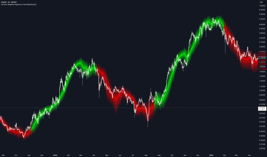
Variance-Weighted Regression Trend [BackQuant]Variance-Weighted Regression Trend
Overview
Variance-Weighted Regression Trend is a rolling linear-regression trend indicator that adjusts the influence of observations according to the estimated variance of their regression residuals.
The script first calculates a standard ordinary least-squares regression across the selected window. It then measures the squared residuals around that fit and uses those residuals to estimate how variable the regression error has been through the sample.
Those variance estimates are converted into relative weights. Lower estimated residual variance can receive more influence, while higher estimated residual variance can receive less. A second weighted regression is then calculated using those weights.
The indicator also includes:
EMA, RMA or rolling-average residual variance.
Configurable inverse-variance weighting strength.
Weight regularization and upper/lower weight limits.
Weighted R² and slope-quality diagnostics.
Two regression-channel methods.
Optional trend-flip quality confirmation.
OLS comparison.
Linear regression projection.
Trend colouring and alerts.
Calculation
The basic process is:
Fit an ordinary least-squares regression over the Regression Length.
Calculate the squared residual of every observation around that fit.
Smooth those squared residuals to estimate local residual variance.
Add a regularization floor to reduce unstable extreme weights.
Convert variance into relative observation weights.
Clamp weights between the selected minimum and maximum.
Calculate a second weighted regression.
The weighted line is therefore influenced more by observations receiving larger relative weights and less by those receiving smaller ones.
Variance Weighting
The weighting is based on regression residual variance , not ATR, trading volume or raw price volatility.
For each point:
Residual = Source - OLS fitted value
Squared Residual = Residual²
The squared residuals are then processed using the selected Variance Model.
EMA
Uses exponential smoothing and responds more quickly to recent residual changes.
RMA
Uses a slower recursive smoothing process.
Rolling Mean
Uses a finite moving average of squared residuals.
Weight Power
Weight Power controls how strongly estimated variance affects the regression.
The raw weighting relationship is:
Weight ∝ 1 / Variance^Weight Power
0 gives equal weighting, making the final fit behave like the OLS regression.
1 applies standard inverse-variance-style weighting.
Values above 1 increase the difference between low- and high-variance observations.
Higher settings can make the regression more selective, but can also concentrate too much influence in a small part of the sample.
Variance Regularization
Very small variance estimates can otherwise create extremely large inverse weights.
The script therefore adds a fraction of the window's mean squared residual to each local variance estimate.
Higher regularization makes the weights more uniform.
Lower regularization allows stronger differences between observations.
Minimum and Maximum Relative Weight
Raw weights are normalized relative to their average before being clamped.
A relative weight above 1 means the observation has greater-than-average influence.
A value below 1 means it has less.
The Minimum Relative Weight prevents high-variance observations from effectively disappearing from the regression.
The Maximum Relative Weight prevents very low-variance observations from dominating the entire fit.
Weighted Regression
Once the final weights are calculated, the script solves a weighted linear regression:
Y = Intercept + Slope × X
The displayed line is the current endpoint of that rolling weighted regression.
Each new bar shifts the regression window and recalculates:
OLS.
Residuals.
Variance estimates.
Weights.
Weighted slope and intercept.
OLS Comparison
The optional OLS line shows the endpoint of the initial equal-weight regression.
This makes it easy to see how much the variance weighting is actually changing the result.
If Weight Power is set to 0, the weighted regression and OLS should be effectively aligned.
As the weighting becomes more aggressive, the lines may separate depending on the residual structure inside the window.
Trend State
Trend direction comes from the sign of the weighted regression slope.
Positive slope = bullish.
Negative slope = bearish.
A bullish flip occurs when the stored trend changes from bearish to bullish.
A bearish flip occurs when it changes from bullish to bearish.
Quality Confirmation
Quality Confirmation can be enabled to prevent weak slope changes from immediately flipping the trend state.
When enabled, an opposite slope must also satisfy:
Minimum Weighted R².
Minimum Slope / Standard Error.
If those conditions are not met, the existing trend state remains active even if the current slope temporarily changes sign.
Weighted R²
Weighted R² measures how well the weighted straight-line regression describes the current sample.
Higher values indicate that the weighted observations are more closely aligned with a linear fit.
Lower values indicate a less orderly linear relationship.
R² does not determine trend direction and should not be interpreted as a forecast of future performance.
Slope / Standard Error
The script calculates the absolute weighted slope relative to its estimated standard error:
|Slope| / Slope Standard Error
This is used as a practical slope-quality measure.
Higher values indicate that the fitted slope is larger relative to the estimated regression error.
It is used by the optional Quality Confirmation setting and is not presented as a formal significance test.
Regression Channels
Two channel-width methods are available.
Weighted Residual RMS
Uses the weighted root-mean-square distance of observations from the fitted regression.
This reflects the general amount of scatter around the line.
Regression Standard Error
Uses the calculated standard error of the fitted current regression value.
This normally represents a different and often narrower measure than residual RMS.
The Channel Multiplier scales whichever method is selected.
Expand During Poor Fit
When enabled, the channel becomes wider as Weighted R² decreases.
This is intended to visually reflect greater uncertainty when the current window is poorly described by a straight line.
The expansion affects only the channel width.
It does not alter the regression or trend calculation.
Projection
The Projection extends the current regression slope forward by the selected number of bars.
It is simply:
Current fitted line extended using the current slope.
It is not a separate forecasting model.
As the regression changes on new bars, the projection also changes.
Current Relative Weight
The Data Window shows the final relative weight assigned to the newest observation.
A value:
Above 1 = greater-than-average influence.
Below 1 = less-than-average influence.
This can help show how the current observation is being treated by the variance-weighting model.
Effective Sample Size
The indicator also reports:
Effective N = (Sum of Weights)² / Sum of Squared Weights
This provides a simple measure of weight concentration.
If weights are similar, Effective N remains close to the full Regression Length.
If a smaller group of observations receives most of the weight, Effective N falls.
This is useful when experimenting with aggressive Weight Power or wide weight limits.
Trend Strength
Trend Strength is used only for the regression glow.
It combines:
60% Weighted R².
40% normalized Slope / Standard Error.
It does not affect the regression or signals.
ATR(14) is used only to scale the visual width of the glow and flip bloom to the instrument.
Input Guide
Regression Length
Controls the size of the rolling regression sample.
Projection Bars
Controls how far the current fitted slope is extended visually.
Variance Length
Controls how quickly the residual-variance estimate changes.
Variance Model
Selects EMA, RMA or Rolling Mean smoothing of squared residuals.
Weight Power
Controls the strength of inverse-variance weighting.
Variance Regularization
Reduces extreme differences between weights.
Minimum / Maximum Relative Weight
Limits how little or how much influence any one observation can receive.
Channel Width
Selects Weighted Residual RMS or Regression Standard Error.
Channel Multiplier
Scales the regression channel.
Poor Fit Expansion
Optionally widens the channel as R² deteriorates.
Quality Confirmation
Requires minimum regression fit and slope quality before allowing trend flips.
How to use it
The indicator can be used as:
A regression-based trend filter.
A comparison between ordinary and variance-weighted regression.
A way to study how residual-based weighting changes a rolling trend estimate.
A trend-quality filter using R² and slope strength.
A regression channel for visualizing fit dispersion.
The OLS Comparison and Data Window values are particularly useful when testing the weighting settings, because they show whether the extra weighting is materially changing the regression or simply producing a result close to ordinary least squares.
Limitations
The variance estimates are derived from OLS residuals inside the same rolling window.
The model is a custom two-stage weighted regression rather than a full generalized least-squares procedure.
Higher Weight Power can concentrate the fit in a relatively small part of the sample.
Linear regression cannot represent every type of market structure.
High R² does not imply future trend continuation.
The forward projection is only a linear extrapolation of the current fit.
Quality Confirmation can reduce weak flips but can also delay genuine changes in direction.
Data Window
The script exposes:
Weighted Slope.
Weighted R².
Slope / Standard Error.
Weighted Residual RMS.
Regression Standard Error.
Current Relative Weight.
Effective Sample Size.
Trend Strength.
Alerts
The indicator includes:
Variance-Weighted Regression Bullish: trend changes from bearish to bullish.
Variance-Weighted Regression Bearish: trend changes from bullish to bearish.
Variance-Weighted Regression Flip: either transition occurs.
Summary
Variance-Weighted Regression Trend starts with a normal rolling OLS regression, measures the residual variance around that fit, and uses those estimates to assign relative weights to the observations in a second regression.
The weighting strength, variance smoothing, regularization and weight limits are all configurable, making it possible to move from essentially equal-weight OLS to a much more selective fit.
The final weighted slope controls the trend state, while Weighted R² and the Slope / Standard Error score can optionally be used to filter weak reversals.
Regression channels, OLS comparison, forward projection and the visual strength system provide additional context around the core weighted regression without changing the underlying trend logic.
指标
Mann-Kendall Trend Significance [RC Tools]RC Tools — Mann-Kendall Trend Significance
────────────────────────────────────────────────────────────────────
█ OVERVIEW
Most trend tools answer "which way is price going." This one answers a different question: "how statistically unlikely is it that this trend is just noise." It applies the Mann-Kendall test — a nonparametric hypothesis test from statistics, most commonly used in hydrology and climate-science time-series analysis — to price, turning "trend" into a proper standardised test statistic rather than a slope or a moving-average read.
█ WHAT IT DOES
Computes a standardised Z-statistic for monotonic trend over a rolling window and classifies each confirmed bar as a Significant Uptrend or Significant Downtrend once that statistic crosses a configurable significance threshold. Colours the chart background accordingly, plots both the smoothed and raw Z line in a dedicated pane against static threshold lines, and shows a table with the current state, how long price has been in it, and historical base rates (average forward return and win rate) for each state.
█ THE THEORY BEHIND IT
The Mann-Kendall test was developed to detect a monotonic trend in a time series without assuming any particular distribution or that the trend is linear — it only asks whether values tend to rise (or fall) more often than chance would predict. It does this by comparing every pair of points in a window and tallying how often the later point is higher versus lower than the earlier one. Under the null hypothesis of no trend, that tally has a known variance, which lets the raw count be converted into a Z-score — the same logic behind any standard statistical significance test. A Z-score of 1.645, for example, corresponds to the classic 90% one-tailed critical value: at that level, the observed pattern would be expected by pure chance less than 10% of the time.
This is a meaningfully different question from "has price been going up." A choppy market can have more up-days than down-days without ever producing a statistically significant Z-score; a genuinely persistent trend will.
█ HOW IT IS CALCULATED
1. Over a rolling window, compute S — the sum, across every pair of points in the window, of the sign of (later value − earlier value). A persistent uptrend pushes S strongly positive; a persistent downtrend pushes it strongly negative; a directionless window keeps it near zero.
2. Under the null hypothesis of no trend, S has a known variance: Var(S) = n(n−1)(2n+5) / 18, where n is the window length (this assumes no tied values, a reasonable approximation for continuous price data).
3. Standardise S into a Z-score, with the standard continuity correction applied.
4. Optionally smooth the Z-statistic (it is naturally "steppy," since individual pairs enter and exit the window discretely as new bars form).
5. When smoothed Z rises above the long threshold, the state flips to Significant Uptrend. When it falls below the (negative) short threshold, it flips to Significant Downtrend. Otherwise the state holds — this is hysteresis, not noise.
Classification occurs ONLY on confirmed bar close — the plotted Z, the background colour and the table all update together, so nothing here can disagree mid-bar or flip back and forth as the current bar forms.
█ SETTINGS & CONFIGURATION
• Source (default close)
• Window Length (default 20, capped at 50 to keep the pairwise comparison fast)
• Long / Short Significance Thresholds (default 1.645 each, the classic 90% one-tailed critical value) — set independently so long and short conviction can be tuned separately rather than assuming symmetric behaviour
• Smoothing Length and Type (default 3-period EMA) — reduces the raw statistic's step-like behaviour
• Forward Return Window (default 20 bars) — the horizon used for the base-rate table
• Table visibility, position and colours are fully configurable; the main-chart background painting can be toggled off if you only want the statistics pane
█ HOW TO USE IT
Use it as a trend-confirmation filter, not a standalone entry trigger. Because it requires the statistic to clear a significance threshold rather than simply cross zero, it tends to flag fewer, more deliberate trend changes than a typical oscillator — useful for filtering out other tools' false starts in choppy conditions. Check the base-rate table's sample count before treating any single state as meaningfully predictive.
Works on any asset and timeframe with sufficient history for the Window Length.
█ LIMITATIONS
• Mann-Kendall tests for a MONOTONIC trend within the window. It says nothing about the trend's magnitude, and any use of it as a precision entry/exit signal is a misuse.
• The variance formula assumes no tied values, which is reasonable for continuous price data but can be mildly optimistic on assets with heavy price discretisation (e.g. very low-priced or thinly-traded instruments).
• The window length is capped at 50 to keep the pairwise comparison fast — larger structural trends spanning more bars are not captured directly.
• The raw Z statistic is discrete and "steppy" by construction; smoothing trades responsiveness for a cleaner state transition.
• Historical base-rate stats need a meaningful sample count (check N) before being trusted, especially in a low-frequency-flip regime or on a short history.
• This script does NOT repaint. All classification updates on confirmed bar close only.
█ DISCLAIMER
For educational and informational purposes only. Nothing here is financial advice. Past behaviour of any trend-significance state does not indicate future results. Trade at your own risk.
指标

Market Path Forecast [BOSWaves]Market Path Forecast - Swing-Calibrated Directional Forecast with Confidence Cone, Structure-Snapped Levels, and Adaptive Horizon
Overview
Market Path Forecast is a swing-calibrated probabilistic directional forecast system that derives its target price, forecast duration, and cone width entirely from the statistical properties of the instrument's own historical swing behavior, where the path cone, level placement, and forecast horizon all adapt continuously to the accumulated record of completed swings rather than applying fixed ATR multiples or arbitrary projection distances.
Instead of projecting fixed percentage moves or static ATR extensions, the system accumulates the percentage size and bar duration of each completed directional swing into weighted sample arrays, computes the weighted average and standard deviation of those samples, and uses these statistics to estimate where the current swing is likely to travel and how long it is likely to take. The resulting forecast is not a generic technical projection but a statistically calibrated estimate derived from the instrument's actual measured movement history.
This creates a forecast framework that is self-calibrating to each instrument and timeframe. Instruments with large consistent swings produce wide confident cones pointing to distant targets. Instruments with small erratic swings produce narrower cones with closer targets. The confidence interval setting scales the cone width relative to the measured historical variance, allowing the trader to choose whether to view the tight central tendency or the broader probable range. Structure snap alignment pulls forecast levels toward nearby historical pivot prices, anchoring statistically derived targets to structurally significant levels. And the adaptive horizon dynamically adjusts the projection duration as the current swing develops, so the cone length reflects how much time is estimated to remain rather than a fixed number of bars.
Price is therefore evaluated against a forecast that reflects the instrument's own statistical swing personality rather than a generic overlay applied identically regardless of how the instrument actually moves.
Conceptual Framework
Market Path Forecast is founded on the principle that the most reliable basis for a directional price forecast is the statistical distribution of the instrument's own completed swing history, and that both the target level and the confidence around that target should derive from measured historical variance rather than from fixed indicator parameters.
Traditional forecast tools apply static extensions, fixed ATR projections, or Fibonacci ratios that carry no relationship to how the specific instrument actually moves. This framework replaces static projection with statistical estimation, accumulating a rolling weighted sample of historical swing sizes and durations and deriving forecast parameters from that sample on every bar. Recent swings receive greater weight than older ones, ensuring the forecast adapts dynamically to evolving market behavior while maintaining the stability that comes from a sufficient sample of historical evidence.
Three core principles guide the design:
Forecast targets, durations, and cone widths should derive from the statistical properties of the instrument's own swing history rather than from fixed parameters, ensuring every element of the projection reflects actual measured behavior rather than generic assumptions.
The confidence cone should scale with historical swing variance through a statistically meaningful confidence interval parameter, so traders understand they are viewing a fraction of the measured probability distribution rather than an arbitrary visual band.
Forecast levels should be snapped toward nearby historical structure prices where they exist within the configurable snap range, anchoring statistically derived targets to the structural price levels that may have influenced prior swing reversals.
This shifts directional forecasting from fixed-parameter projection into instrument-specific statistical estimation where all visual elements adapt to the instrument's own historical behavior.
Theoretical Foundation
The indicator combines swing detection through highest and lowest lookback comparison, recent-weighted average and standard deviation calculation across historical swing percentage moves and bar durations, directional forecast derivation from the appropriate bull or bear sample arrays, momentum-adjusted path curvature using EMA difference normalization, structure-snap level alignment using nearest historical pivot within the configurable ATR search radius, and historical support and resistance zone construction from separate pivot detection with age-based expiry and break detection.
Swing direction is tracked by monitoring whether the current highest or lowest lookback value is being set by the current high or low, with confirmed swing points registered when price rotates away from a prior extreme. Each completed directional leg contributes its percentage move and bar duration to separate bull and bear sample arrays using a weighted push that replaces oldest samples beyond the configured maximum. The weighted average applies linearly increasing weights from oldest to most recent, giving recent swings proportionally greater influence. Standard deviation is computed from the same weighted scheme, producing a variance measure that reflects recent behavior more than distant history. The forecast target is calculated as a percentage move from the swing origin, with the extension factor derived from the deviation ratio to scale the extension level beyond the primary target.
Four internal systems operate in tandem:
Swing History Engine : Detects confirmed swing direction changes, measures the percentage move and bar duration of each completed leg, and accumulates these into directional and combined weighted sample arrays that feed all downstream forecast calculations.
Statistical Forecast Engine : Derives weighted average target percentage and duration from the directional sample arrays, falls back to combined samples when directional sample count is insufficient, calculates the standard deviation for cone width scaling, and applies minimum spacing enforcement to prevent levels from overlapping.
Path and Level Rendering System : Constructs the three-layer confidence cone using eased smooth interpolation with momentum-derived curvature, and renders up to six forecast levels as three-layer box zones with structure-snapped prices, directional coloring, and configurable label display.
Historical Structure System : Independently detects pivot highs and lows at the configured structure pivot length, maintains active zone boxes with age-based fading and break detection, stores pivot prices in a rolling array that feeds the structure snap function for all forecast levels, and enforces maximum zone count and age limits.
This design ensures the forecast derives entirely from measured historical behavior while the structure snap layer connects statistically derived levels to structurally significant prices where they exist in proximity.
How It Works
Market Path Forecast evaluates price through a sequence of swing-calibrated and statistically derived processes:
Swing Direction Tracking : On each bar, the highest high and lowest low over the configured swing length are compared to the current bar. When the current high sets the lookback high, direction tracks bullish. When the current low sets the lookback low, direction tracks bearish. Confirmed swing points are registered when price rotates away from the prior extreme.
Swing Sample Accumulation : On each confirmed swing direction change, the completed leg's percentage move and bar duration are calculated and pushed into the appropriate directional and combined sample arrays with size capping at the configured maximum. Bull legs accumulate into the bull arrays and bear legs into the bear arrays.
Weighted Forecast Derivation : The weighted average of the directional sample array provides the forecast percentage move. The weighted average of the duration array provides the forecast bar count. The weighted standard deviation of the directional array provides the variance measure for cone scaling. When fewer than three directional samples exist, the combined arrays are used as fallback.
Adaptive Horizon Calculation : The estimated remaining bars for the current swing are calculated by subtracting elapsed bars from the estimated total duration and clamping to the configured minimum and maximum. When adaptive horizon is disabled, the fixed bar count is used instead.
Target Calculation : The primary target is derived from the swing origin price adjusted by the forecast percentage in the forecast direction, with a minimum distance floor enforced as an ATR multiple to prevent targets from forming too close to current price.
Level Derivation : Target 1, 2, and 3 are placed at 40, 70, and 100 percent of the base distance. The extension level is placed beyond Target 3 using a factor derived from the deviation-to-mean ratio. The opposite structure reference and invalidation level are placed on the opposing side of price.
Structure Snap Application : Each raw level price is tested against the rolling historical structure price array. If a matching structural high or low exists within the ATR snap range on the correct side of price, the level is blended toward that structural price by the configured snap strength.
Minimum Spacing Enforcement : After snapping, all levels are adjusted to maintain a minimum separation equal to twice the zone ATR width, preventing levels from overlapping regardless of snap results.
Cone Construction : The base band half-width is derived from the greater of the ATR floor and the price-converted standard deviation, clamped to a maximum fraction of the distance to Target 3, then multiplied by the confidence interval setting. Smooth eased interpolation builds the outer, inner, and center polyline paths between current price and the Target 3 level with momentum-derived curvature applied.
Historical Structure Zone Management : Pivot highs and lows detected at the structure pivot length receive dual-layer zone boxes that extend rightward each bar, fade with cubic age scaling, convert to dotted broken style when price closes through them, and expire after the configured maximum age or break age.
Together, these elements form a continuously updating forecast system where every visual element adapts to the instrument's measured swing history and structural price environment.
Interpretation
Market Path Forecast should be interpreted as a statistically calibrated swing forecast with a probabilistic confidence cone and structure-aligned target levels:
Forecast Path Cone : The three-layer cone extending from current price represents the probable range of price paths based on historical swing behavior. The outer layer covers the full confidence interval width. The inner layer covers approximately 55 percent of the cone width. The center line represents the weighted average expected path.
Cone Width : A wide cone indicates high historical swing variance where completed swings varied significantly in size. A narrow cone indicates consistent swing behavior with low variance. The confidence interval setting controls how many standard deviations of historical variance the cone spans.
Cone Curvature : The cone bends in the direction of current EMA momentum, reflecting whether the trend currently has upside or downside momentum bias that may influence the directional path of the developing swing.
Target 1, 2, 3 Levels : Three-layer zone boxes at progressively greater distances represent the expected first, intermediate, and primary swing completion levels derived from the weighted average of historical swings at 40, 70, and 100 percent of the base distance.
Extension Level : Beyond Target 3, the extension level marks where larger-than-average swings have historically reached, scaled by the ratio of standard deviation to mean swing size. A larger extension factor indicates that historical swings have been more variable and have occasionally traveled significantly beyond average.
Support / Resistance Level : The opposing-direction level on the near side of price identifies the closest structural reference in the opposing direction, representing the level where a counter-swing could develop before the forecast target is reached.
Invalidation Level : The furthest opposing level marks the price beyond which the current swing forecast would be statistically invalidated, representing the distance at which counter-directional movement exceeds what is consistent with the current swing remaining intact.
Historical Structure Zones : Green support zones and red resistance zones from historical pivot detection provide the structural price environment that both informs the forecast level snap function and serves as ongoing structural reference for price interaction monitoring.
Broken Structure Zones : Zones that have been closed through convert to dotted style with faded coloring, indicating the former level has been breached and may now function in the opposing structural role.
Cone width, target level placement, snap alignment to structure, and invalidation level distance collectively provide more forecast context than any element in isolation.
Signal Logic & Visual Cues
Market Path Forecast generates two directional signals tied to swing direction changes:
Bullish Forecast : Triggered when swing direction flips from bearish to bullish, resetting the forecast origin to the confirmed swing low and projecting the cone and levels upward toward the statistically estimated bull swing targets.
Bearish Forecast : Triggered when swing direction flips from bullish to bearish, resetting the forecast origin to the confirmed swing high and projecting the cone and levels downward toward the statistically estimated bear swing targets.
Each forecast reset incorporates the newly completed swing into the weighted sample arrays before generating the next projection, ensuring every forecast benefits from the most recent available behavioral evidence.
Alert generation covers bullish and bearish forecast direction changes for systematic swing-based monitoring workflows.
Strategy Integration
Market Path Forecast fits within swing-calibrated directional and statistical target-based trading approaches:
Target-Based Exit Planning : Use the three forecast target levels as a staged exit framework, planning partial position reductions at T1, T2, and T3 rather than targeting a single fixed level, allowing structured progression through the statistically estimated swing completion zone.
Cone Containment Monitoring : Monitor whether price is staying within the inner confidence cone or pressing against the outer boundaries as a real-time swing health indicator. Price persistently hugging the outer cone boundary in the forecast direction suggests above-average momentum. Price compressing toward the center early in the forecast suggests weakening follow-through.
Extension Level Context : Use the extension level as a target for high-momentum setups where the deviation-to-mean ratio is elevated, indicating that historical swings have occasionally extended significantly beyond the average. A larger gap between T3 and the extension level reflects greater historical variability.
Invalidation Level Risk Management : Use the invalidation level as the maximum tolerable counter-directional excursion, beyond which the current swing forecast is no longer statistically consistent with historical behavior and the position rationale is undermined.
Structure Snap Confluence : Prioritize levels that have been snapped to nearby structural pivot prices over purely statistically derived levels, as these represent locations where both the measured swing expectation and historical price structure align simultaneously.
Confidence Interval Calibration : Use a lower confidence interval such as 0.5 for tight conviction analysis where you want to see only the central tendency of the forecast. Use 1.5 or 2.0 to visualize the broader probability range that captures less typical swing outcomes.
Technical Implementation Details
Swing Detection : Highest and lowest lookback comparison with direction tracking and confirmed point registration on price rotation
Sample Arrays : Weighted push accumulation for bull, bear, and combined percentage and duration arrays with configurable maximum size
Forecast Statistics : Linearly increasing weight scheme for weighted average and standard deviation with directional to combined fallback below minimum sample threshold
Cone Construction : Eased smooth interpolation with momentum-normalized EMA curvature across configurable step count for outer, inner, and center polyline paths
Level System : Six forecast levels with percentage-of-base-distance placement, deviation-ratio extension scaling, structure snap blending, minimum spacing enforcement, and three-layer zone box rendering
Structure System : Pivot-based zone detection with dual-layer boxes, rolling structure price array for snap function, cubic age fading, break detection with style conversion, and configurable zone count and age limits
Performance Profile : Last-bar rendering with full polyline and object rebuild each update, configurable level count for object management
Optimal Application Parameters
Timeframe Guidance:
1 - 5 min : Intraday swing forecasting with shorter swing length and fewer historical swings for fast adaptation to intraday directional changes
15 - 60 min : Session-level swing projection with balanced swing length and moderate sample count for meaningful statistical accumulation across typical session swings
4H - Daily : Swing-level directional forecasting with longer swing detection and larger sample count for statistically robust estimates derived from significant structural moves
Suggested Baseline Configuration:
Swing Length : 16
Historical Swings : 20
Volatility Length : 200
Adaptive Forecast Horizon : Enabled
Confidence Interval (SD) : 1.0
Path Curvature : 0.45
Number of Levels : 6
Structure Snap Strength : 0.65
Show Historical Structure : Enabled
Show Forecast Path : Enabled
Show Forecast Levels : Enabled
These suggested parameters should be used as a baseline; their effectiveness depends on the instrument's swing frequency, historical swing consistency, and preferred forecast horizon, so fine-tuning is expected for optimal performance.
Parameter Calibration Notes
Use the following adjustments to refine behavior without altering the core logic:
Forecast targets too close to price : Decrease Minimum Target Distance toward 1.0 to allow targets to form closer to price, or increase Historical Swings to accumulate more samples that may include larger average moves.
Forecast targets too far from price : Increase Minimum Target Distance to enforce greater separation, or decrease Historical Swings to weight more recent and potentially smaller swing samples more heavily.
Cone too wide or too narrow : Adjust Confidence Interval to expand or contract the cone relative to the measured standard deviation of historical swings, using 0.5 for a tight central tendency view or 2.0 for a broad probability range.
Forecast flipping too frequently : Increase Swing Length to require more bars on each side of a confirmed swing extreme, filtering shorter-term oscillations from the swing detection.
Forecast too slow to update : Decrease Swing Length toward 6 for faster swing confirmation, or decrease Historical Swings to allow the weighted average to adapt more quickly to recent behavior changes.
Levels not snapping to structure : Increase Structure Snap Range to widen the ATR distance within which structural pivot prices attract forecast levels, or increase Structure Snap Strength toward 1.0 for stronger magnetic pull toward nearby structure.
Too many historical structure zones : Reduce Maximum Zones to limit visible structural zones, or decrease Maximum Zone Age to expire older zones sooner and keep the chart focused on more recent structural history.
Adjustments should be incremental and evaluated across multiple session types rather than isolated market conditions.
Performance Characteristics
High Effectiveness:
Instruments with consistent swing behavior where historical percentage moves and durations cluster tightly, producing low variance forecasts with narrow confident cones that accurately reflect the instrument's typical directional tendency
Trending markets where completed swings accumulate rapidly and the weighted sample arrays update frequently, keeping the forecast calibrated to current momentum characteristics
Swing-based trading approaches where statistically derived target levels replace arbitrary Fibonacci or ATR projections with instrument-specific measurements of where swings have historically terminated
Structure-rich instruments where the snap function can align statistically derived levels with meaningful historical pivot prices, creating confluence between statistical expectation and structural significance
Reduced Effectiveness:
Instruments with highly erratic swing behavior where percentage moves vary widely between legs, producing large standard deviations and wide uncertain cones that reduce the specificity of target level placement
Range-bound or choppy markets where swing detection fires frequently on minor oscillations, populating the sample arrays with small inconsistent measurements that undermine forecast reliability
Instruments with insufficient completed swings within the sample window where the fallback to combined arrays may produce forecasts that blend bull and bear statistical properties inappropriately
Very short timeframes where completed swings are so numerous and small that the weighted average converges on noise-level movements without statistical significance
Markets undergoing structural regime changes where historical swing statistics are no longer representative of current behavior, making the weighted average a poor estimate of future swing potential until sufficient new samples accumulate
Integration Guidelines
Confluence : Combine with BOSWaves structural tools, volume analysis, or momentum indicators to validate forecast direction and target level interactions with broader analytical context before committing to swing-based trade plans
Sample Count Awareness : Monitor whether the forecast is drawing on directional or combined samples by assessing how many completed swings in the current direction exist within the historical window. Fewer than three directional samples means the forecast is using combined statistics that blend both directions.
Cone Evolution Monitoring : Track cone width changes across successive forecast resets as a volatility regime indicator. Progressively widening cones across multiple swings suggest increasing swing size variability. Narrowing cones suggest the instrument is entering a more consistent swing rhythm.
Structure Snap Validation : When a level snaps significantly from its raw statistical position to a nearby structural pivot, treat the snapped level with elevated confidence as it represents simultaneous statistical expectation and structural significance.
Invalidation Discipline : Respect the invalidation level as a hard position management boundary. A close beyond the invalidation level indicates counter-directional movement that exceeds the statistical parameters of the current forecast, warranting position reassessment regardless of other analytical factors.
Disclaimer
Market Path Forecast is a professional-grade swing-calibrated statistical forecast and structural analysis tool. It uses weighted historical swing statistics with confidence interval scaling and structure snap alignment but does not predict future price movements with certainty. All forecasts represent statistical estimates based on historical behavior and carry inherent uncertainty that increases with forecast horizon. Results depend on market conditions, instrument swing consistency, parameter selection, and disciplined execution. BOSWaves recommends deploying this indicator within a broader analytical framework that incorporates order flow context, structural analysis, and comprehensive risk management. 指标

HTF FVG Tracker (M1D)HTF FVG Tracker
Keeps a running ledger of the hourly, four-hour and eight-hour fair value gaps on any intraday chart. Each gap is drawn the moment its candle set completes on its own timeframe, and each zone runs its own timeframe's length forward and then stops — so the day reads left to right as a clean staircase of imbalances, hour by hour, instead of a pile of boxes all stretching to the live candle at once.
It is a marking tool, not a signal tool. It draws where higher-timeframe imbalances printed and what has happened to them since, and leaves the read to you.
The zones
A bullish gap (BISI) is a candle whose low sits above the high two candles back; a bearish gap (SIBI) is a candle whose high sits under the low two candles back. Each is measured on the tracked timeframe's own candles — H1, H4 and H8, each with its own switch — and drawn from its displacement candle forward.
Every zone carries its name inside the box at the right edge, centred on the zone's midline: H1+ for a bullish hourly gap, H4- for a bearish four-hour one. A setting adds the displacement candle's New York hour, so a four-hour gap reads H4+ 2PM. The fill colour states direction; the border is a solid line on every zone so the edges stay readable where timeframes overlap.
The window
By default a zone extends exactly its own timeframe past its formation: an hourly gap gets one more hour, a four-hour gap four hours, an eight-hour gap eight — then its right edge is fixed. How many of its own candles it runs is a setting, and a second mode keeps the newest zone per timeframe extending until the next zone on that timeframe prints instead.
Either way, if a new gap prints while an earlier zone on the same timeframe is still open, the earlier zone is cut at the new zone's left edge. Nothing overlaps raggedly, and every box's width tells you how long it was the live imbalance.
Volume imbalance and suspension blocks
A fair value gap measured wick to wick understates a fast leg. Where the candle bodies also gap on either seam of the displacement candle while the wicks still bridge it, that volume imbalance is part of the same region, and the zone absorbs it — the edge extends from the wick to the body it should have reached. Each seam is tested on its own.
A suspension block is three same-direction candles whose bodies gap at both seams with no wick gap anywhere — a span price never traded back through. It is drawn as its own zone, from the first candle's close to the last candle's open, tagged SB.
A body gap across a session or weekend break is a calendar artefact, not an imbalance, so any seam spanning more than one candle's worth of time is excluded from both rules. Absorption and suspension blocks each have their own switch.
Fills
A fill is a candle body closing through the far edge of the zone. A wick into the zone is a touch, and a touch never counts. By default a fill inside the zone's window shortens the box to the fill bar but keeps it on the chart — the ledger is the point, and a filled gap is still part of the day's record. You can instead leave a fill unmarked, or delete the zone outright. Zones older than a set number of days are removed either way.
Consequent encroachment
Each zone can carry its midpoint — the consequent encroachment of that gap — as a dotted line through the box. One switch.
Method & repainting
Each timeframe is read with a single higher-timeframe request using confirmed candles only — offset by one bar with lookahead, the standard non-repainting form. Detection is gated to the chart bar's close, so a zone appears on the first closed chart bar after its higher-timeframe candle completes, and nothing appears mid-bar and then withdraws.
In the default mode a zone's full window is drawn as soon as the zone prints, so its right edge can sit a little ahead of the live candle until the window closes. In the until-the-next-FVG mode the newest zone per timeframe extends rightward as bars print — that is the box tracking the present, not its history changing.
The chart timeframe has to be at or below the timeframe being tracked. On a 4-hour chart you get the H4 and H8 ledgers only, and above H8 the script says so on the chart rather than drawing nothing.
Alerts
Three, one per timeframe, firing on bar close when a new zone prints on that timeframe — gap or suspension block.
What it will not do
It places no entries, exits, stops or targets, draws no bias and grades no gap. It does not decide which imbalance matters — that is a judgement about context this script does not have. A quiet day showing only a handful of zones is the tool working, not failing.
Settings
The three timeframe switches and days of history; the zone extension mode and its candle count; volume imbalance absorption, suspension blocks, and the fill behaviour; bullish, bearish and border colours with the zone fill transparency; the consequent encroachment line, the New York hour tag, and label text size.
Disclaimer
This is a decision-support tool for discretionary ICT trading. It is not financial advice, and no market's past behaviour is indicative of future results. 指标

EMA Pullback Trend Continuation Strategy with Volume and Momentu
Description:
Most trend-following strategies share the same flaw: they enter on breakouts. A stock breaks above resistance, the moving average crosses over, the indicator fires — and the entry price is at the top of the move that just happened. The trader is buying strength into a market that has already moved. When the move pauses or retraces, as nearly every trending move does, the position immediately goes underwater. The trader who waited for the breakout is now holding a losing position at precisely the moment when the chart looks its worst.
Pullback strategies solve this structurally. Instead of entering on the breakout, they wait for the trend to establish itself, then enter on the first meaningful retracement back toward a key dynamic level. The entry is at a better price, the stop can be placed tighter, and the risk-to-reward ratio is fundamentally more favorable. The trade-off is patience, pullbacks require waiting and watching while the initial breakout move plays out without you. For systematic traders, that patience is enforced by rule rather than willpower.
This strategy builds a pullback entry system around the 50 and 200 EMA combination, arguably the most widely watched moving average pair in retail trading, with volume confirmation and a momentum filter to ensure the pullback is a genuine pause in a healthy trend rather than the beginning of a reversal.
Why the 50 EMA Specifically
The 50 EMA is not arbitrary. It represents approximately 10 weeks of price action on the daily chart, two and a half months. In an uptrending market, the 50 EMA tends to act as the level where the dominant trend reasserts itself after a normal consolidation or retracement.
Institutional traders who missed the initial move use pullbacks to the 50 EMA as value entries in a trend they believe is still intact. That institutional behavior is what creates the bounce, not because the 50 EMA is a magic line, but because enough participants are watching it and acting around it that reactions become self-reinforcing.
The 200 EMA defines the broader regime. When price is above the 200 EMA, the instrument is in a long-term uptrend. Below it, a long-term downtrend. The 50 and 200 EMA together create a two-timeframe framework: the 200 defines which direction to trade, and the 50 defines where to enter in that direction.
The Pullback Condition
An uptrend pullback entry requires three conditions to be met simultaneously. First, the 50 EMA must be above the 200 EMA, the shorter-term trend is aligned with the longer-term trend. Second, price must have retraced to touch or close below the 50 EMA after having been above it, a genuine pullback has occurred, not just a pause near the high. Third, price must close back above the 50 EMA on the entry bar, the pullback is over and the trend is resuming. This third condition is the entry trigger. It requires confirmation that the 50 EMA has acted as support, not just that price reached it.
The mirror condition applies for downtrend entries: 50 EMA below 200 EMA, price rallies to touch the 50 EMA from below, then closes back below it.
Volume Confirmation
Volume is added as a quality filter for one specific reason: genuine trend continuation moves tend to show increased volume on the bar that confirms the resumption. A close back above the 50 EMA on declining volume suggests the bounce has limited conviction, institutional participation is not behind it. A close back above the 50 EMA on above-average volume suggests real buying is supporting the resumption. The volume filter checks whether volume on the confirmation bar exceeds its 20-period average. This eliminates a significant portion of false pullback signals that occur during low-liquidity periods.
Momentum Confirmation with RSI
RSI is added not as an overbought/oversold indicator, using RSI that way in a trend-following strategy is counterproductive, but as a momentum health check. A healthy uptrend pullback should show RSI holding above 40 when the confirmation bar fires. If RSI has dropped below 40 during the pullback, momentum deterioration is significant enough that the trend may be genuinely weakening rather than pausing. Similarly, for downtrend entries, RSI should be below 60. This filter does not reduce win rate significantly in most backtests, but it meaningfully reduces the depth of losing trades by avoiding entries into pullbacks that are actually early-stage reversals.
Exit Structure
The take-profit is set at 2.5x ATR from entry. The stop-loss is placed below the swing low of the pullback for longs, the lowest point price reached during the retracement, with an ATR buffer. This placement is intentional: if price breaks below the swing low that formed during the pullback, the pullback structure is broken and the trade thesis is invalidated regardless of where the EMAs are. Using the structural swing low rather than a fixed ATR stop keeps the stop level meaningful rather than arbitrary.
Timeframes and Instruments
The 50/200 EMA pullback framework works across all major timeframes, but performs most consistently on the daily and 4-hour charts where the EMAs have enough historical context to be genuinely meaningful. On very low timeframes, the 50 EMA responds too quickly to noise and pullback signals become indistinguishable from choppy ranging behavior. Strong trending instruments, equity indices, large-cap tech stocks, major forex pairs, and trending crypto assets, produce the cleanest setups because the 200 EMA slope is clearly defined and the 50 EMA acts with more consistency as a support level.
Common Failure Modes to Watch in Backtesting
The most consistent failure mode for this strategy is trading it in a ranging market where the 50 and 200 EMAs are flat and intertwined. When the EMAs are not clearly separated and sloping, pullbacks to the 50 EMA are not meaningful, they are just random touches of a flat average in a directionless market. Check the slope of both EMAs in your backtest and consider adding a minimum slope threshold. The second failure mode is entering pullbacks that are actually the early stages of a trend reversal, the RSI filter addresses this partially, but no filter eliminates it entirely. Always check maximum adverse excursion in backtesting to understand how far against the position typical losing trades move before closing.
Shared for educational purposes. This is not investment advice. Always backtest on your own instruments and timeframes with realistic commission and slippage before evaluating performance.
策略

Buy Signal Ema Macd CrossBuy Signal Ema Macd Cross — Xcelerate Trade
All-in-one indicator for TradingView: multi-factor BUY confluence on the price chart + classic MACD (12, 26, 9) in a separate pane below.
WHAT YOU GET
• Price chart: MA14 (purple) and MA200 (red) — MA25/50/99 optional
• BUY labels when all confluence rules align (not on a single isolated MACD cross)
• Live Confluence table — MACD, Signal, Histogram, condition checks, active window
• Movable table — 9 screen positions (corners & centers)
• MACD pane: official TradingView-style histogram (4-tone momentum colors), MACD line, Signal line (orange), zero line
BUY SIGNAL LOGIC
A BUY fires only when these align within the Confluence window (default: 8 bars):
1. MACD crosses above Signal (bullish cross)
2. Close above MA14 and MA200
3. Price recently crossed above MA200 (within window)
4. MA14 recently crossed above MA200 (within window)
5. Cooldown: minimum 12 bars between BUY labels (anti-spam)
Optional (default OFF): BUY only when MACD is below zero — cross and signal must occur under the zero line (classic recovery-from-oversold setup).
Analysis limited to the last 500 bars on chart load.
KEY SETTINGS
• Moving averages: show/hide MA14, MA25, MA50, MA99, MA200
• MACD: 12 / 26 / 9, EMA oscillator & signal
• Confluence window & cooldown — tune for your timeframe and volatility
• Display: BUY label color, confluence table on/off, table position
ALERTS
• BUY confluence (all conditions met)
• MACD crosses above / below Signal
• MACD histogram rising→falling / falling→rising
WHO IT'S FOR
Traders who want filtered BUY entries combining trend (MA200), short-term momentum (MA14), and MACD confirmation — intraday and swing on forex, gold, crypto, indices. Always validate on demo and adjust window/cooldown for your market.
DISCLAIMER
Technical analysis tool only — not financial advice. Past signals do not guarantee future results. Trade at your own risk. 指标

Session Open LineA price overlay for TradingView (Pine Script v6). A horizontal line at the session's reference level - the previous session's close by default, or the session open - drawn from the first to the last bar of that session, with a label carrying the price change during the session (close vs the reference) - as a percent, as a difference in the instrument currency, or both. Alerts fire when the price crosses the line, and the reference level plus the session change are exposed as hidden series for other scripts.
█ 🧠 WHAT IT SHOWS
For every trading session the script anchors a line at the session's reference level and stretches it to the right as the session progresses:
price
│ ╭─╮
│ reference level │ │ ╭╮ ← price above the reference
│ ╭╮ ╭╮ ╰─╯ ││
│ ══╪╪═══════════════════╪╪═══════╪╪══ ─►
│ ╰╯ ╭╮ ╭╮ ╰╯ ╰╯
│ ╰╯ ╰╯ ← price below the reference
│
│ ├──────── one session ────────┤├── next session ──
└────────────────────────────────────────────── time
The line sits at the reference level - the previous session's close (default) or the session open - and never moves vertically.
Its right end follows the current bar until the session ends.
The color of the line depends on the sign of the change : up color when close >= reference level , down color otherwise. It is re-evaluated on every bar, so a session that flips from green to red repaints the whole line.
The whole session is shaded in the same up/down color (on by default, can be turned off).
Reference level
Previous session close (default) - the close of the last bar of the prior session. The change matches the day change quoted against the previous close (the way most quote screens report it), and an opening gap shows up as the distance between the line and the session's first candle.
Session open - the open of the first bar of the session. The change measures only what happened inside the session; there is never a gap between the line and the first candle.
Session detection
A new session is detected with timeframe.change('D') - the trading day boundary as TradingView defines it for the symbol. That is deliberately not "midnight": it follows the instrument's own session definition, so futures sessions that cross midnight are handled correctly (the line starts at the session boundary, not at 00:00).
Why a box, not bgcolor()
The session highlight is drawn as one box per session rather than bgcolor() . bgcolor() paints a single bar and cannot be repainted afterwards, so a session that flips sign would end up striped. A box spans the whole session and keeps a single color that is corrected on every bar. Box extend only works on the time axis, so the vertical coverage comes from the box bounds: the highest high and lowest low of the loaded data, padded by 100x that range above and below. On the last bar every box is brought to the final bounds, so sessions drawn while less data was loaded get the same coverage.
Why not simply 1e17 / -1e17 : TradingView silently skips boxes whose bounds lie extremely far from the price scale (on an instrument near 85, bounds of +-1e8 still draw while +-1e9 do not). Such boxes exist - they show up in the object tree - but never render, so the highlight looks like it is not working at all.
█ 🏷️ THE CHANGE LABEL
The label is colored by the sign of the change and sits on a fully transparent background. Two checkboxes decide what it carries:
Show percent change (default on) - the change as a percent of the reference level, formatted as +0.84% / -1.12% (always signed, two decimals).
Show change in instrument currency (default off) - the change as a price difference ( close - reference level ), formatted with the symbol's tick precision ( format.mintick ) and suffixed with syminfo.currency , e.g. +12.50 USD . For symbols without a quote currency the suffix is omitted.
With both on the label reads +0.84% (+12.50 USD) ; with both off no label is drawn at all - only the line (and the optional highlight) remains. For a reference level at or below zero (possible on futures spreads) the percent is undefined - the label falls back to the price difference, and the up/down color always follows the sign of the difference, which stays meaningful at any price.
Percent position decides where it sits, and the choice applies the same way to completed sessions and to the ongoing one:
Behind the line (default) - anchored on its left edge ( label.style_label_left ), at the reference level, right of the line end, as if continuing the line.
Above the line - anchored at its bottom-right corner ( label.style_label_lower_right ), so the text sits over the end of the line and does not stick out past the session end.
Below the line - anchored at its top-right corner ( label.style_label_upper_right ), so the text hangs under the end of the line, again inside the session.
During the ongoing session the label follows the end of the line and updates on every bar; once the session ends it stays at the last bar with the final value.
█ 🛠️ KEY PARAMETERS
General
Reference level (default Previous session close) - Previous session close / Session open, described above.
Show percent change (default on) - percent of the reference level in the label.
Show change in instrument currency (default off) - price difference in the instrument currency in the label.
Appearance
Up color (default #26A69A ) - line and label color when the session is up.
Down color (default #EF5350 ) - line and label color when the session is down.
Line style (default Solid) - Solid / Dashed / Dotted.
Line width (default 1) - range 1 - 4 .
Text size (default Small) - Auto / Tiny / Small / Normal / Large.
Percent position (default Behind the line) - Above the line / Below the line / Behind the line, described above.
Session highlight
Highlight the whole session (default on) - fills the entire session with a single color, decided by where the price stands against the reference level.
Highlight up color (default #26A69A at 90% transparency) .
Highlight down color (default #EF5350 at 90% transparency) .
█ 📈 HOW TO READ IT
The line is a reference level, not a signal. Trading above it means buyers have controlled the day so far; below it, sellers have.
Reclaims and rejections at the line are the interesting part - price returning to the level and being pushed away often marks who is defending the day.
With the previous-session-close reference (default) the line doubles as the gap-fill level : a session that opens with a gap and later crosses the line has closed that gap.
The label value gives an instant sense of the session's magnitude without measuring anything by hand, and the sign color makes a flip visible at a glance. The percent is comparable across instruments; the currency difference maps directly to points or ticks on the symbol you trade.
With the session highlight on , a screen full of alternating green and red blocks makes runs of consecutive up or down sessions obvious.
█ 🔔 ALERTS
Cross above the reference level - the price crossed the current session's line from below.
Cross below the reference level - the price crossed the current session's line from above.
Those are exactly the reclaim/rejection moments described above (with the default reference: the gap-fill / day-flip moments). The first bar of a session - where the line jumps to the new reference - never fires either alert. Crosses are evaluated on close , so on the live candle a cross can appear and un-cross before the candle closes; set the alert trigger to Once Per Bar Close if you only want confirmed crosses.
█ 📤 HIDDEN SERIES
The script exposes two hidden series, visible in the Data Window and usable as an external source in other indicators and strategies (any input.source field):
Reference level - the level the line sits at: the previous session's close (default) or the session open.
Session change % - the session change as a percent of the reference level.
█ ⛔ LIMITATIONS
Intraday timeframes only. On D and above every bar is its own session, so the script draws nothing and instead shows a hint table in the top-right corner: Session Open Line: the indicator works on intraday timeframes .
Drawing objects are capped at 500 lines, 500 labels, and 500 boxes - older sessions drop off the left side of the chart.
Both values are computed from close against the reference level, so during the ongoing session they move with every tick and only become final at the session close.
The first session in the loaded history starts at the first loaded bar, which is not necessarily the true session start. With the default reference (previous session close) it has no prior close at all, so it draws nothing; with the session-open reference its "open" (and therefore its change) can be off. Every later session is exact.
© Piotr Kowalski "piecioshka". License: Mozilla Public License 2.0. 指标

VWAP AI - Statistical Bands & Touch Stats [Dots3Red]⚓ VWAP AI - STATISTICAL BANDS & TOUCH STATS
VWAP's standard deviation bands are treated more or less as reliable support and resistance — on faith. This script checks that faith against the actual chart in front of you: every band touch is graded, every break beyond a band is graded, and the results accumulate into a running, honest record.
✨ WHY THIS MATTERS
VWAP tells you the volume-weighted average price — where the "center of gravity" of trading has actually been. The bands around it are meant to show how far price typically wanders from that center before snapping back. But "typically" varies enormously by instrument, session, and market condition, and no plain VWAP tool tells you what's actually been happening on your chart.
This script tracks it directly:
📊 +1σ | 62% rejected (n=41)
That means 41 touches of the +1σ band have been recorded on this chart, and 62% of them resulted in price genuinely rejecting back toward VWAP. Measured history, not an assumption baked into the tool.
⚙️ HOW IT WORKS
⚓ Anchoring — VWAP resets at the start of each new period. Session is the classic intraday default; Week and Month extend the same logic to longer views. Custom Bar anchors once, permanently, to a specific historical point you choose — useful for anchoring to an earnings date, a gap, or any event you want to measure from, rather than the calendar.
📏 Two-tier statistical bands — Band 1 and Band 2 are both standard-deviation multiples of VWAP, computed from a proper running variance (not an ATR approximation). Defaults are ±1σ and ±2σ, both fully adjustable.
🎯 Touch grading — when price wicks into a band without closing beyond it, that's logged as a touch. Within a configurable window, it resolves as:
• Rejection — price moved back toward VWAP by a meaningful distance
• Break — price closed convincingly through the band
• Timeout — neither happened clearly enough to call
🔄 Break-to-reversion tracking — separately, when price actually closes beyond Band 1, the script watches whether that move reverts back toward VWAP or continues away from it. This answers a different question than touch grading: not "did the band hold," but "once it didn't, did price come back anyway?"
🔒 Non-repainting — all grading happens strictly on confirmed bars.
🧭 HOW TO USE
1️⃣ Check the band stats before treating a level as reliable. "+1σ: 71% rejected (n=38)" and "+1σ: 44% rejected (n=12)" look like the same line on the chart but mean very different things about how much to lean on it.
2️⃣ Use break-reversion stats to judge a breakout beyond VWAP's range. If breaks above Band 1 have reverted back 65% of the time on this chart, that's useful context before assuming a fresh breakout will keep running.
3️⃣ Read Price vs VWAP as the simplest possible bias check. Above VWAP means the average buyer today is in profit; below means the average buyer is underwater. It's a blunt but genuinely useful read on crowd positioning.
4️⃣ Let sample sizes build before trusting the percentages. Every stat shows its N= specifically so you can judge reliability yourself — a handful of touches is not yet a pattern.
5️⃣ Match the anchor mode to what you're actually measuring. Session for pure intraday structure, Week or Month for a longer view, Custom Bar when you want to measure from one specific moment forward.
⏱️ WHICH TIMEFRAMES WORK BEST
Session-anchored VWAP is fundamentally an intraday tool — it was built for, and is most meaningful on, timeframes where a full session contains enough bars to form a real distribution: 1-minute through 1-hour is the classic and most effective range, which is exactly where VWAP sees the heaviest institutional and day-trading use.
On daily or weekly charts, a Session anchor resets so frequently relative to the bar size that it stops being meaningful — you'd see very few bars per session. For higher-timeframe or swing-style use, switch the anchor to Week, Month, or Custom Bar instead, so the accumulation window actually spans enough bars to produce a meaningful VWAP and band structure.
The touch and break statistics also need enough occurrences to mean anything — a fast-moving intraday chart will accumulate a useful sample size in days; a slow higher-timeframe anchor will take considerably longer.
🛠️ SETTINGS
⚓ Anchoring — Session / Week / Month / Custom Bar, source price
📏 Bands — Band 1 and Band 2 standard-deviation multipliers, Band 2 visibility toggle
🎯 Touch Statistics — Touch Tolerance, Rejection Distance, Reversion Distance, Outcome Window
🎨 Visualization — independent Band 1 / Band 2 touch marker toggles, Dot or Triangle marker style, marker size, VWAP and band line widths, independent fill transparency per band tier
🎨 Colors — VWAP line, Band 1 lines, Band 2 lines, upper/lower touch markers, Price Above/Below VWAP indicator, and full dashboard color control (background, border, header, row styling)
🖥️ Dashboard — show/hide, position — current VWAP value, price position, all four band stats, and both break-reversion stats in one place
📝 NOTES
Statistics accumulate from when the indicator is added to the chart and reset only when explicitly cleared by reloading. A Custom Bar anchor never resets on its own, it measures continuously from the point you chose. Band 2 statistics take meaningfully longer to build a useful sample than Band 1, simply because price reaches ±2σ far less often than ±1σ.
⚠️ DISCLAIMER
This is an analytical and visualization tool. It does not generate trade signals and does not constitute financial advice. Historical rejection and reversion rates do not guarantee future performance. 指标

Fibonacci Gravity Clusters [GBB]Fib Gravity Clusters — Fibonacci confluence as a heatmap
The problem with Fibonacci retracements was never the ratios but the correct swing selection. Two traders, same chart, different anchor points, completely different levels and both will find "confirmation" for theirs. I wanted to take that choice away from myself.
So this script runs six ZigZag lines in parallel (pivot lengths 3, 8, 21, 55, 144, 377 by default, but they're configurable), keeps the last 13 legs of each, projects the usual retracement ratios from every single confirmed leg, and adds it all up into a density field on the price axis. Where lots of independent swings project into the same area, the chart glows. Where they don't, nothing.
THE BOOKKEEPING
Legs smaller than 0.5 ATR get thrown out because they're noise. Every surviving leg projects the enabled ratios (0.236 / 0.382 / 0.5 / 0.618 / 0.786, plus 0.886 if you want it). Each projected level drops heat into fine price bins, a quarter ATR tall, smeared with a small Gaussian kernel so neighboring projections merge into zones instead of producing a picket fence.
Not every projection counts the same:
- bigger swings contribute more (leg size in ATR, raised to a configurable exponent, capped at 8 so one monster leg can't drown everything else)
- old legs fade out with a half-life, default 144 bars. This matters more than it sounds — without decay the chart slowly fills up with structure the market stopped caring about weeks ago
- optional golden pocket mode adds 0.65 and gives the 0.618–0.65 area a 1.618x weight, if that's your thing
The field gets normalized, gamma-corrected and painted. Four palettes (Thermal, Ember, Ice, Mono) are selectable. The top 5 local peaks get a line and a label with the exact price and a hit count, so you can see how many raw projections actually built that zone. A ×14 zone and a ×3 zone are not the same thing even if they look similar in color.
There's also an optional HTF layer: the same field computed on Daily/Weekly/Monthly (auto-mapped from your chart TF, or fixed) and rendered behind the intraday one, dimmed, in its own palette. Built from closed HTF bars only. When an intraday hot band sits inside an HTF hot band, that's the most interesting picture this tool produces.
NON-REPAINTING
Everything is built from confirmed pivots. A level shows up once its pivot confirms which is N bars after the extreme, that's the nature of pivots and after that it doesn't move and doesn't disappear. HTF layer is lookahead_off, closed bars only. Alerts fire on bar close.
One exception: the Live Leg overlay. It projects ratios from the swing that's still forming. Dashed, labeled "forming", off by default, and it repaints by definition because the leg isn't finished. I left it in because it's occasionally useful context on fast timeframes. It is not a signal. If you turn it on and then complain about repainting, that one's on you.
ALERTS
Three of them: close enters a hot band, close enters an HTF hot band, and a new core zone forming in the top 5. Plus an optional visual flash on the touched band.
指标

Coppock Curve Multi-Filter [MarkitTick]💡 A dual-momentum oscillator built on the classic Coppock Curve, extended with an optional adaptive source pre-filter, an ADX strength gate, and a full ATR-based trade-management layer with staged take-profits, on-chart price levels, and a live dashboard. The core wave is a weighted moving average of two rate-of-change readings, but everything measured downstream of that wave — signal timing, trend bias, and risk levels — can be reshaped by up to eight independent, toggleable filters, giving traders a single oscillator that can behave anywhere from "classic long-term Coppock" to a tightly gated, multi-condition entry engine.
✨ Originality and Utility
The stock Coppock Curve is a single-purpose, long-only momentum tool: sum two rate-of-change readings, smooth with a weighted moving average, and watch for crosses above zero. This script keeps that foundation intact but restructures it into a bidirectional signal engine with a stack of independent confirmation layers that the original concept never included.
The key structural change is the adaptive source stage. Rather than feeding raw closing price directly into the rate-of-change calculations, the script offers a choice of eight different smoothing methods — including a custom Kalman Filter estimator and a custom LLAMA (Linear-Lag Adaptive Moving Average) function — that first condition the price series before Coppock's ROC math is applied. This means the character of the entire curve can be tuned from responsive to heavily smoothed without altering the underlying two-ROC-plus-WMA structure that defines the Coppock method.
Layered on top of that are seven optional gating and confirmation mechanisms (ADX strength, divergence, slope acceleration, volume, higher-timeframe alignment, volatility-adjusted zero line, and signal persistence) that traders can combine in any subset. Because each filter operates independently and can be switched on or off, the same core wave can be configured for a slow trend-confirmation approach or a fast, tightly-filtered signal generator, giving the tool a much broader utility range than a standard Coppock plot.
Beyond signal generation, the script converts each qualifying cross into a full trade plan: an ATR-derived stop-loss, three R-multiple take-profit tiers, live price levels drawn on the chart, and a real-time dashboard summarizing bias, filter states, and trade levels — none of which exist in the original Coppock Curve concept or in standard TradingView implementations of it.
🔬 Methodology and Concepts
● Core Wave Construction
The engine begins with an adaptive source stage. If no adaptive filter is selected, the raw chosen source (default: close) feeds directly into the calculation. If a filter is selected, the source is pre-smoothed using one of the following:
Simple, Exponential, or RMA-based moving averages
A Double WMA (a weighted moving average applied twice in succession, producing extra lag reduction)
A Triple VWMA (three successive volume-weighted moving average passes)
A Hull Moving Average
A custom LLAMA function, which computes a simple moving average over the lookback window, then adds a linear slope term (calculated from the change in price across the window divided by the window length) scaled by half the window length — effectively projecting the average forward along its own recent trajectory
A custom Kalman Filter estimator, which maintains a running estimate and error variance, calculates a Kalman gain each bar from the ratio of predicted error to total error, and blends the new price into the estimate proportionally to that gain — placing more weight on new data when the filter's own uncertainty is high, and more weight on the existing estimate when it is low
Once the (optionally smoothed) source is established, two Rate of Change values are calculated against it — a long lookback and a short lookback, independently configurable. These two ROC values are summed and passed through a weighted moving average, producing the final Coppock Curve value. This is structurally identical to the classic Coppock formula, but with the adaptive pre-filter as an optional intermediate step.
• ADX Strength Filter
When enabled, the script calculates the Directional Movement Index (+DI, -DI, ADX) over a configurable length. A signal — whether a slope change, a cross, or a zero-line cross — is only considered valid if the ADX reading is at or above the user-defined threshold. This filters out Coppock movements that occur during weak or directionless conditions.
• Slope and Cross Detection
The script tracks whether the curve is rising or falling bar-to-bar, and separately detects two types of crosses: a cross of the curve against its own prior value (used as the primary bull/bear signal) and a cross of the curve against the zero line (used as a secondary trend-state signal). Both cross types respect the ADX filter when it is active.
• Signal Locking
A "Lock Signal" input freezes the active signal and trade levels on the most recent bar, preventing new signals from overwriting the currently displayed trade plan — useful for holding a specific setup visible while monitoring live price action.
● Trade-Level Automation
Every new bullish or bearish cross (confirmed and unlocked) triggers a full trade-plan calculation:
Entry is set to the prior bar's close
Stop-loss is placed at a configurable multiple of ATR away from entry, in the direction opposing the trade
Three take-profit levels are calculated as configurable R-multiples of the initial risk distance (the entry-to-stop distance), projected in the trade's favor
Each level's distance from entry is also expressed as a percentage for quick reference
These levels persist on the chart until a new opposing signal fires (or, if Lock Signal is active, until manually released), and are dynamically extended to the current bar so the trade plan remains visible in real time. Take-profit and stop labels update their text once price actually touches each respective level, marking it as hit along with the realized percentage move.
● Optional Confirmation Filters
Seven additional filters exist as inputs in the script but should be understood as configuration flags a trader can layer onto the core signal logic depending on their own methodology:
Divergence Filter — intended to suppress cross signals that run counter to a detected price/Coppock divergence
Slope Acceleration Filter — intended to require the curve's slope itself to be increasing, not merely positive, before validating a signal
Volume Confirmation Filter — intended to require current volume to exceed its moving average before a signal is accepted
HTF Alignment Filter — intended to require a higher-timeframe Coppock reading to agree with the signal's direction
Volatility-Adjusted Zero Line — intended to require zero-line crosses to clear a noise band derived from the indicator's own recent volatility, reducing whipsaw signals near the zero line
Signal Persistence Filter — intended to require the curve's direction to hold for a minimum number of bars before a signal is treated as valid
Traders should treat these as intended-purpose toggles per their input tooltips and confirm behavior against the ADX filter and core cross logic, which are the two filters fully wired into the signal path in this build.
🎨 Visual Guide
● Main Panel (Separate Pane)
The primary line plot shows the Coppock Curve itself. It is colored using the Bull Color when the curve is rising and the ADX filter (if active) passes, the Bear Color when falling under the same condition, and the Neutral Color otherwise.
A histogram of the same Coppock value is plotted in columns beneath the line, using a four-tier color scheme: strong bull shading when the curve is above zero and rising, weak bull shading when above zero but not rising, weak bear shading when below zero but rising, and strong bear shading when below zero and falling.
A dashed horizontal zero line marks the neutral threshold that separates bullish and bearish curve territory.
Small triangle markers appear directly on the curve at the exact bar where it crosses zero — an upward triangle in Bull Color for an upward zero-cross, and a downward triangle in Bear Color for a downward zero-cross.
● Price Chart Overlay
When candle coloring is enabled, the price candles themselves are recolored using the same four-tier histogram coloring described above, turning the price chart into a visual heatmap of underlying Coppock strength and direction.
When a new signal fires and trade levels are enabled, five horizontal lines are drawn directly on price: a solid stop-loss line, a dashed entry line, and three dashed take-profit lines with progressively increasing opacity from TP1 to TP3. Each line carries a right-aligned label showing its role and exact price.
A shaded "risk zone" fills the area between the stop-loss and entry lines, and a "reward zone" fills the area between the entry and TP3 lines, giving an immediate visual sense of the risk-to-reward geometry of the active trade plan.
Once a take-profit or stop level is touched by price, its label updates in place to show a hit confirmation along with the realized percentage gain or loss.
● Dashboard Table
A compact table (position configurable) displays, in real time: the current symbol and timeframe, the Lock Signal state, the raw Coppock value, the current bias (Bullish / Bearish / Neutral, color-coded), the individual long and short ROC readings, whether the curve is currently above or below zero, and — when trade levels are enabled — the live Entry, SL, TP1, TP2, and TP3 prices. If the ADX filter is active, its current reading is shown alongside a pass/fail color cue. If an adaptive filter is selected, its name is displayed for quick reference.
📖 How to Use
Treat a bullish cross (curve turning up) as a potential long-side signal, and a bearish cross (curve turning down) as a potential short-side signal, especially when it aligns with a zero-line cross in the same direction.
Use the zero line as a broader trend-state filter: readings above zero generally reflect positive intermediate-term momentum, while readings below zero reflect negative momentum, independent of the immediate slope.
Enable the ADX filter to restrict signals to periods of measurable trend strength, reducing signals generated during flat or choppy conditions.
Select an adaptive filter method to change the responsiveness of the underlying source feeding the Coppock calculation — faster methods like EMA or the Kalman Filter increase sensitivity, while methods like the Triple VWMA or SMA produce a smoother, slower curve.
When a signal fires, use the automatically plotted Entry, SL, and TP1–TP3 lines as a starting reference for trade structure, and adjust position sizing according to the displayed stop distance and your own risk tolerances.
Use candle heatmap coloring as a quick visual scan across the chart to spot where momentum has historically been strongest or weakest, independent of reading the oscillator pane directly.
Configure the webhook alert action strings in the Alerts group to match the payload keys expected by your automation or webhook receiver before relying on the JSON-formatted alerts for execution.
⚙️ Inputs and Settings
• Core Settings
Source — the price series the calculation is based on (default: close)
Long ROC Length — lookback for the long-term rate-of-change component
Short ROC Length — lookback for the short-term rate-of-change component
WMA Smoothing Length — window for the final weighted moving average applied to the combined ROC values
• Filters
Use ADX Filter / ADX Threshold / ADX Length — enables trend-strength gating and configures its sensitivity
Adaptive Filter / Adaptive Filter Length — selects the pre-smoothing method applied to price before the ROC/WMA math, and its lookback window
Use Divergence Filter / Divergence Pivot Lookback — configuration for suppressing signals against detected divergence
Use Slope Acceleration Filter — configuration for requiring accelerating slope before a signal
Use Volume Confirmation Filter / Volume MA Length — configuration for requiring above-average volume
Use HTF Alignment Filter / HTF Alignment Timeframe — configuration for requiring higher-timeframe agreement
Use Volatility-Adjusted Zero Line / Volatility Zero Band Multiple / Volatility Zero Band Length — configuration for a noise-adjusted zero-cross threshold
Use Signal Persistence Filter / Persistence Bars — configuration for requiring a minimum number of bars of consistent direction
• Trade Tools
Lock Signal — freezes the currently active signal and trade levels
SL ATR Multiple — sets stop-loss distance as a multiple of ATR
TP1 / TP2 / TP3 R-Multiple — sets each take-profit distance as a multiple of the initial risk
ATR Length — lookback for the Average True Range calculation used in stop placement
Show Trade Levels — toggles the on-chart lines, labels, and dashboard trade-level rows
• Visuals
Use Candle Coloring — toggles heatmap-style recoloring of price candles
Show Histogram — toggles the columned histogram beneath the main curve
Show Zero-Cross Markers — toggles the triangle markers at zero-line crosses
• Dashboard
Show Dashboard — toggles the on-chart summary table
Position — sets the table's screen position
• Alerts
Action strings for Bull Cross, Bear Cross, Zero Cross Up/Down, Close Long/Short, and TP1/TP2/TP3/SL Hit — these populate the "action" field of each JSON alert payload, allowing the alerts to be mapped directly to webhook or automation logic
• Colors
Full palette control over bull/bear/neutral coloring, histogram tiers, dashboard styling, and all trade-level line and fill colors
🔍 Deconstruction of the Underlying Scientific and Academic Framework
● Rate of Change and the Coppock Curve
The foundation of this script is Edwin Coppock's original curve, published in Barron's in 1962, which sums a long-term and a short-term Rate of Change and smooths the result with a weighted moving average. Rate of Change itself is a first-order momentum measure — the percentage difference between the current value and its value N bars ago — rooted in the broader technical-analysis principle that the velocity of price change often leads price direction itself. Coppock's original design used a WMA specifically because it weights recent data more heavily than a simple average while remaining less reactive to single-bar noise than an exponential average.
● Weighted and Hull Moving Averages
The Weighted Moving Average used both in the final smoothing stage and optionally in the adaptive pre-filter assigns linearly decreasing weights to older data points, a technique long used to balance responsiveness against noise rejection. The Hull Moving Average, developed by Alan Hull, extends this idea by combining WMAs of different lengths in a way designed to reduce lag while preserving smoothness — a documented refinement of the general weighted-average family.
● Kalman Filtering
The Kalman Filter, originally developed by Rudolf Kálmán in the context of control and estimation theory, is a recursive algorithm for estimating an unknown value from a series of noisy observations. In this implementation, the filter maintains a running estimate and an error term, computes a Kalman gain from the ratio of predicted error to total error each bar, and updates the estimate by blending new price data in proportion to that gain. This gives the estimate more responsiveness when its own uncertainty is high and more smoothness when uncertainty is low — the same estimation principle underlying Kalman's original work, applied here to a single noisy input series rather than a multi-variable state system.
● Directional Movement and Trend Strength (Wilder)
The optional ADX filter is built on J. Welles Wilder's Directional Movement System, which derives +DI and -DI from directional price movement smoothed with Wilder's own moving average technique, then compresses their divergence into the Average Directional Index (ADX) as a bounded measure of trend strength independent of direction. Using ADX as a gating condition reflects the broader academic distinction between trend-following and mean-reverting market regimes — Wilder's system was explicitly designed to help separate the two.
● Average True Range and Volatility-Based Risk Sizing
Stop-loss and take-profit distances in this script are derived from Average True Range, also introduced by Wilder, which measures volatility by accounting for gaps as well as intraperiod range. Sizing risk as a multiple of ATR — rather than a fixed point or percentage value — is a widely documented approach in position-sizing literature because it scales stop distance to the instrument's actual recent volatility rather than an arbitrary constant.
● R-Multiples and Risk-Reward Structuring
The three-tiered take-profit structure expresses reward as a multiple of initial risk (an "R-multiple"), a framework popularized in trading risk-management literature to normalize outcomes across trades of different sizes and volatility regimes, allowing performance to be evaluated in terms of risk-adjusted return rather than raw price movement.
⚠️ Disclaimer
All provided scripts and indicators are strictly for educational exploration and must not be interpreted as financial advice or a recommendation to execute trades. We expressly disclaim all liability for any financial losses or damages that may result, directly or indirectly, from the reliance on or application of these tools. Market participation carries inherent risk where past performance never guarantees future returns, leaving all investment decisions and due diligence solely at your own discretion. 指标

Risk-Sizing CalculatorA simple, visual position-sizing tool for any market or timeframe.
Enter your account size and risk percentage, choose a stop-distance
method (ATR-based, manual stop price, or fixed % of entry), and the
indicator calculates your position size, stop distance, dollar risk,
notional exposure, and an optional reward-to-risk target — displayed
in a clean live table with entry and stop lines on your chart.
Also includes a 3-scenario Size Ladder (0.5% / 1% / 2% account risk
side-by-side) so you can see the sizing range at a glance, plus an
optional Market Context panel showing ATR %, RSI, ADX, volatility
class, and session state.
FEATURES
- Three stop-distance methods: ATR-based, Manual Stop Price, Fixed %
- Position size in units, notional dollars, and % of account
- Size Ladder table showing what 0.5% / 1% / 2% risk each produce
- Reward-to-risk target row (optional · pairs with an R multiple)
- Market Context panel: ATR %, RSI(14), ADX(14), volatility class,
session flag
- Live entry + stop + target lines drawn on the chart
- Adjustable table position (top-right, middle-right, etc.)
- Clean numeric output for quick pre-trade sanity check
HOW TO USE
1. Set Direction (Long / Short) and optionally a Manual Entry Price
2. Choose your Stop Distance method — ATR, manual price, or fixed %
3. Enter Account Size and Risk per trade % (1% is a common default)
4. Optional: enable target row and set R multiple
Pairs naturally with any ATR-based visualizer or manual entry planning.
Educational only · not financial advice · does not generate buy/sell signals. 指标

ATR Stop & Target VisualizerA simple, visual risk-planning tool for any market or timeframe.
Choose a direction (Long/Short) and the indicator plots an ATR-based
stop-loss, three reward-to-risk targets (TP1, TP2, TP3), shaded
risk / reward zones, and a live trade-plan table summarizing entry,
stop, targets, R:R math, ATR value, dollar risk, and a simplified
position-size estimate.
Also includes an optional Market Context panel showing ATR %, RSI,
ADX, volatility class, and session state — so the risk plan sits
alongside the environment reading you're planning against.
FEATURES
- ATR-based stop distance with selectable smoothing (RMA/SMA/EMA/WMA)
- Three reward-to-risk targets (TP1/TP2/TP3) with independent R
multiples · defaults 1R / 2R / 3R
- Layered shaded reward zones (densest at TP1, lightest at TP3)
- Auto or manual entry price
- Trade-plan table with all key numbers at a glance
- Simplified position-size estimate (account × risk %)
- Market Context panel: ATR %, RSI(14), ADX(14), volatility class,
session flag
- Clean single-bar drawing to keep charts readable
HOW TO USE
1. Set Direction (Long / Short) and optionally a Manual Entry Price
2. Tune the ATR length and stop multiple to fit the instrument's
volatility
3. Set each target as an R multiple (defaults 1R / 2R / 3R)
4. Enter account size and risk % to see a suggested position size
This is a visual risk-planning tool built to help traders think in
terms of risk first. Educational only · not financial advice · does
not generate buy/sell signals. 指标

Crypto Correlation Dashboard [StrixEDGE]Overview
A real-time Pearson correlation matrix built for crypto portfolio analysis. Tracks the statistical co-movement between up to 6 assets across selectable timeframes, using log-return correlation — not raw price correlation — to avoid the inflated readings that plague most correlation tools.
Whether you're managing a multi-asset portfolio, hunting pairs trades, or monitoring regime shifts, this dashboard tells you exactly when diversification is real and when it's an illusion.
🔍 What Makes This Different
Most correlation indicators on TradingView calculate Pearson r on raw closing prices. That's a statistical mistake: two assets trending upward will always show near-perfect correlation on price, even if their returns are completely independent. This indicator correlates **logarithmic returns**, which isolates actual co-movement from shared trend bias.
The multi-timeframe engine uses a period-scaling method through `request.security` that preserves mathematical accuracy when projecting higher-timeframe correlations onto lower-timeframe charts — consuming only 6 security calls total, leaving headroom for other indicators on your layout.
⚡ Key Features
6×6 Correlation Matrix
Full heatmap-style matrix covering all 15 unique pair combinations (C(6,2)). Color intensity maps directly to correlation strength: teal for strong positive, red for strong negative, neutral gray for uncorrelated pairs. Diagonal cells are blanked — no wasted space showing you that BTC correlates with BTC.
Multi-Timeframe Support
Select from Chart / 1H / 4H / 1D / 1W directly in settings. The lookback period auto-scales to the target timeframe resolution, so "20 periods on Daily" means 20 trading days regardless of your chart timeframe.
Rolling Correlation Chart
Select any pair (Leg A / Leg B) and track its correlation coefficient over time as a continuous line. Shaded fill between the line and zero gives an instant visual read of direction and magnitude. A dynamic label on the last bar displays the current ρ value.
Aggregate Statistics Bar
Footer row shows AVG / MIN / MAX across all 15 pairs at a glance. When the minimum correlation drops to or below your threshold, a ⚠ BREAKDOWN tag appears.
Three Independent Alert Conditions
- Pair Breakdown — fires when any single pair falls to or below your threshold
- Average Breakdown — fires when the market-wide average correlation collapses
- Rolling Crossunder — fires when your selected pair crosses under the threshold
📐 How to Use
Portfolio Diversification Check
Add your held assets as Symbols 1–6. If the matrix is mostly dark teal (all pairs > 0.7), your portfolio moves as a single block — you're concentrated, not diversified. Look for pairs with low or negative correlation to add genuine hedging value.
Regime Change Detection
Monitor the AVG stat in the footer. A sudden drop in average correlation often precedes volatility expansion, sector rotation, or flight-to-quality moves. The average breakdown alert automates this surveillance.
Pairs Trading
Identify pairs with historically high correlation (> 0.8). When their rolling correlation temporarily collapses, it may signal a mean-reversion opportunity. Use the rolling chart to time entries and the crossunder alert for notifications.
Risk Management
During market stress, correlations tend to spike toward 1.0 across the board ("correlation breakdown to the upside"). When the matrix turns uniformly teal, portfolio risk is higher than position sizing alone suggests.
⚙️ Settings
| Parameter | Default | Description |
|---|---|---|
| Symbols 1–6 | BTC, ETH, SOL, BNB, XRP, ADA | Any tradable asset — crypto, forex, equities, commodities |
| Lookback Period | 20 | Number of target-TF bars for Pearson calculation |
| Timeframe | Chart | Correlation resolution: Chart / 1H / 4H / 1D / 1W |
| Breakdown Alert ≤ | 0.30 | Threshold for all three alert conditions |
| Rolling Pair | 1 × 2 | Which pair (by index) to plot on the rolling chart |
| Matrix Position | Top Right | Table placement on the pane |
| Colors | Brand defaults | Full control over positive, negative, neutral, header, and accent colors |
🧠 Technical Notes
- Log returns `ln(close / close )` are used instead of simple returns for better statistical properties (additivity, normality approximation).
- TF scaling: When the selected timeframe exceeds the chart timeframe, the lookback is multiplied by the bar ratio. Pearson r is invariant under uniform observation duplication, so accuracy is preserved.
- Security calls: 6 total (one per symbol), well within Pine's 40-call limit.
- Symbol parsing: Automatically strips exchange prefixes (Binance, Bybit, Coinbase, OKX, etc.) and quote currencies (USDT, USD, BUSD, USDC) for clean matrix labels.
- Works on any asset class — not limited to crypto despite the default symbols.
⚠️ Limitations
- Selecting a timeframe **lower** than your chart TF (e.g., "1H" on a Daily chart) will not produce hourly-resolution correlation. The multiplier floors at 1 and you get chart-TF correlation. For true 1H correlation, view on a 1H chart.
- Pearson correlation measures **linear** relationships. Non-linear dependencies (tail risk, asymmetric co-movement during crashes) require different tools.
- Past correlation does not guarantee future correlation. Regime shifts can invalidate historical readings without warning — which is exactly why the breakdown alerts exist. 指标

STP Top 10 Trade Opportunity Scanner / ScreenerSTP Top 10 Trade Opportunity Scanner / Screener
The STP Top 10 Large Move Radar is a multi-symbol market scanner designed to help traders quickly identify stocks showing conditions that may support a larger-than-normal price move.
Instead of reviewing charts individually, the Radar continuously analyzes up to 20 user-selected symbols and ranks the strongest opportunities based on a proprietary scoring system. The highest-ranked symbols are displayed in an easy-to-read Top 10 table.
The system evaluates multiple technical factors, including price trend, EMA alignment, VWAP positioning, RSI, DMI/ADX, buying and selling pressure, Range Oscillator conditions, relative volume, ATR, volatility expansion, squeeze and compression conditions, breakouts and breakdowns, supply and demand proximity, Fair Value Gaps, price movement speed, and overall trend strength.
Radar Table Information
Each ranked symbol includes:
Score: Overall opportunity score from 0–100 based on the combined technical conditions evaluated by the Radar.
Direction: Identifies the current directional bias as BULL, BEAR, or NEUTRAL.
Setup: Identifies conditions such as BREAKOUT, BREAKDOWN, SQZ RELEASE, COMPRESSED, AT S/D, AT FVG, NEAR BREAK, or BUILDING.
RVOL: Measures current volume relative to average volume to identify unusually active symbols.
ATR: Displays the previous completed daily 10-period ATR in dollars to provide context for the symbol's typical daily movement.
ATR Used: During regular market hours, estimates how much of the symbol's daily ATR has been used so far. Before and after the regular session, the Radar identifies the applicable market session instead.
Speed: Measures the magnitude of short-term EMA movement relative to ATR.
T-Strength: Classifies directional trend conditions as Strong, Moderate, Weak, or None.
Evidence: Highlights supporting technical conditions including squeeze activity, breakouts, supply/demand proximity, and Fair Value Gaps.
How Traders Can Use the Radar:
The Radar is designed primarily as an opportunity-discovery tool. A high ranking does not automatically represent a trade entry. Instead, traders can use the Top 10 list to identify which symbols deserve further chart analysis.
For example, a high-scoring bullish symbol showing elevated relative volume, a breakout or squeeze release, increasing speed, and strong trend conditions may warrant closer review for a potential bullish setup. The opposite conditions may identify potential bearish opportunities.
The Radar can be used alongside the STP Elite Prediction System or a trader's existing technical analysis process to confirm chart structure, support and resistance, risk, entry timing, and trade direction before entering a position.
Customizable Symbol List:
Users can configure up to 20 symbols, allowing the Radar to monitor a personal watchlist of stocks, ETFs, or other supported TradingView symbols. The scan timeframe is also configurable, with the default set to 5 minutes.
Dynamic Alerts:
The Radar includes a dynamic alert system for the highest-ranked opportunity. Users can set a minimum score threshold and optionally receive alerts when the leading symbol changes, its direction changes, or it crosses the configured threshold. Alerts include the symbol, direction, opportunity score, relative volume, ATR Used status, and scan timeframe.
Important:
The STP Top 10 Large Move Radar is intended to identify and rank developing technical conditions. Rankings and scores can change as new market data becomes available. A high score does not guarantee a large move and should not be considered a standalone buy or sell signal.
This indicator is intended for educational and informational purposes only and does not constitute financial advice. 指标

Equal Highs & Lows [ITA]🟠 OVERVIEW
Equal Highs & Lows marks the places where liquidity pools build, and then
tracks what happens to them.
When two swing highs form at almost the same price, the stops of everyone who
sold that level sit just above it. The same is true in reverse below two equal
lows. Those clusters are what price often reaches for before it turns, and they
are visible on the chart long before anything happens to them.
Most tools that find these draw the two swings and stop there. This one keeps
the level alive until price actually takes it, then marks it as swept rather
than deleting it, so you can look back and see whether a symbol respects its
pools at all before you trade one.
🟠 CONCEPTS
* Equal Highs (EQH) - Two swing highs within a set tolerance of each other.
Stop orders rest above them.
* Equal Lows (EQL) - Two swing lows within tolerance. Stops rest below.
* Liquidity Pool - The cluster of resting orders those stops form. It is a
reason for price to travel somewhere, not a reason for it to reverse there.
* Sweep - Price trading through the level and taking the orders. What happens
immediately after the sweep is the part that matters.
🟠 FEATURES
🔹 Equality tolerance is set as a percentage of price rather than in points, so
the same setting behaves consistently on a five dollar stock and a seven hundred
dollar index
🔹 The level is drawn at the higher of the two equal highs, and the lower of the
two equal lows, because that is where the stops actually sit. Averaging the two
puts the line underneath the liquidity it is meant to mark
🔹 Levels extend forward on every bar until they are taken, so an untouched pool
stays visible for as long as it survives
🔹 Swept pools are greyed out and labelled instead of being removed, which
leaves a record of how the symbol has treated its pools historically
🔹 A cap on active pools, so old levels retire instead of filling the chart
🔹 Separate alerts for equal highs taken and equal lows taken
🟠 HOW TO USE
Start with the tolerance. It is the setting that decides everything else. On a
daily chart 0.1 to 0.3 percent is usually right. Intraday, drop it to 0.05 to
0.15. If you are seeing almost no pools, raise it. If everything is a pool,
lower it.
Read an unswept level as a destination, not a wall. Liquidity sitting above the
current price is a reason to expect price to reach up there at some point. It is
not a reason to short it.
The information is in what follows the sweep. Price taking equal highs and then
continuing up means the pool was simply passed through. Price taking them and
immediately failing back below is the sequence that traders are usually looking
for, and the sweep alert is there so you do not have to watch for it.
Swing Lookback controls how significant a swing has to be before it counts.
Raise it for fewer and more meaningful pools.
🟠 CONCLUSION
Equal highs and lows are easy to see once someone points at them and easy to
miss while a chart is moving. This marks them as they form, keeps them until
they are taken, and leaves the record behind. 指标

Precision PushBack [MohaveTrader]WHAT PUSHBACK IS
PushBack is a support-and-resistance overlay whose levels are built from a dual Williams %R engine, paired with a rail-based trend layer that runs on its own detection. Where the source oscillator treats a %R extreme as exhaustion — a spent move likely to reverse — PushBack reads that same condition as sustained directional pressure: the side in control pushing price to an extreme.
Two terms carry the whole design. Every completed pressure run is an EVENT. An event that clears qualification earns a LEVEL. Events that do not qualify are marked, but no level is built. When an event does qualify, PushBack takes the price extreme reached by that push and stamps it as a structural zone, then carries that zone through its own lifecycle of resistance, support, reclaim and testing. The panel counts both, so how selective the current settings are running on this instrument is readable at a glance.
It is intended for traders who want structure that emerges from qualifying pressure events rather than levels drawn on a fixed schedule, with a separate trend read layered on the same chart.
WHAT'S ORIGINAL
PushBack retains the dual fast and slow %R detection from upslidedown's open-source "%R Trend Exhaustion" (credited below and in the source code) and uses it only as the raw event source. Everything built on top is original: the reinterpretation of the extreme as directional pressure; event qualification by price range and, when enabled, sustained duration; the Event Mode presets that set how selective that qualification is; event-derived zone geometry, where a zone's depth is taken from the run's own candles; the support and resistance lifecycle with reclaim and testing states; role-flip management and retirement; ATR relevance hiding; optional same-state merging; the live run ribbon; the candle coloring modes; the trend layer with its fast and structure rails, defended-level state machine and rail-assisted transitions; and the information panel. The following image illustrates upslidedown's "%R Trend Exhaustion," the open-source indicator PushBack's detection comes from. Each filled box is one %R run — red where both fast and slow %R are overbought, blue where both are oversold — with a triangle where the run ended. PushBack reads these same runs as pressure rather than exhaustion, and keeps the price extreme each one reached as a structural level. For comparison the second image renders PushBack and %R Trend Exhaustion on the same chart.
WHAT MAKES IT DIFFERENT
The structure is emergent, not scheduled. No structural zone is created without a completed qualifying pressure run, so the absence of nearby zones is itself information rather than a missing calculation.
Structure and events are kept separate. The zones are the structural layer and carry the role-based color set. The pressure marks and run ribbon are a distinct event layer in a single neutral color, held off the price and clear of the zones, so a mark is never mistaken for a directional signal.
The run ribbon reads live. It sketches in real time across the pressure run and settles into the completion triangle, so a developing run is visible on price as it happens rather than only after it ends.
The trend line is the rail, not a separate object. The plotted line is the fast adaptive rail itself rather than an average derived from it, so the drawn line and the value the engine reads are the same series and cannot disagree.
%R PRESSURE
Pressure is read from a dual fast and slow Williams %R with independent smoothing. Both periods and the threshold are fixed internally at settled values rather than exposed as inputs. A shared threshold defines the overbought condition (bullish pressure) and the oversold condition (bearish pressure), and a run is the span in which that condition holds. The single event PushBack acts on is the run's completion — the bar the condition is lost.
Not every run qualifies. A completed run must clear a size test — its price range as a multiple of ATR — and, when duration filtering is on, a duration test as well: it must have persisted for the required number of bars. Both conditions must be met, and a larger or faster move does not waive the duration requirement. An Event Mode control — Responsive, Balanced, Strict, or Manual — sets how demanding that qualification is; in Manual, the Advanced values are read instead and the duration test can be turned off to gate on range alone. The duration test is not scaled by timeframe.
ZONES
When a qualifying run completes, its price extreme seeds a zone: a bullish pressure run's high becomes resistance, a bearish pressure run's low becomes support — the rail where the push stalled. Zone depth is set at birth from the run's own candles: the mean or the median of the run's bar ranges, median by default so a single outlier bar does not distort the level. Neither method applies a multiplier, so depth comes from the same bars that produced the level and there is no width setting to tune. Depth is frozen at birth. An optional merge step, off by default, can consolidate same-state zones that overlap or fall within a configurable price gap; with it off, distinct qualified levels stay separate.
A level holds until price closes through it. A close through flips it to a reclaim, which can firm back into support or resistance as price tests and holds. Red is resistance, green is support, cyan is reclaim, yellow is testing. A level keeps flipping between roles until it reaches its Max Role Flips limit — three by default — after which it is retired rather than reclaimed again; fresh pressure re-seeds it if it matters again.
Zones persist as structural objects and can change role as price interacts with them. A zone originally created as support or resistance may later become reclaim, enter testing, and resolve back into support or resistance. Its displayed color and label represent its current state, not necessarily the state in which it originated.
Previously established zones can remain stored after the pressure event that created them has passed. A zone outside the configured ATR relevance distance is hidden rather than deleted and can reappear when price returns. Because a zone can persist through multiple state changes, a currently visible zone may have originated much earlier, in a different role, and its original completion mark may no longer be visible on the chart. A fresh reclaim is held visible for a short grace period regardless of distance. A per-side cap limits the number of native support and resistance zones retained; reclaim zones are exempt from that cap.
PRESSURE MARKS AND RUN RIBBON
A triangle marks where each run completed — a down triangle where a bullish run ended, an up triangle where a bearish run ended. The run ribbon traces the run into that completion, one bar short of the triangle. Both use a single neutral color and float off the price in ATR-scaled offset space, so side is read from triangle direction and ribbon position rather than color. They show the duration and completion of a pressure run and are not buy or sell signals. By default every completed run is marked with a triangle. A qualified event also carries a ribbon into its triangle and seeds a zone; a filtered turn — one that did not clear qualification — is marked identically but with no ribbon and no zone, so the triangle shows that an event occurred while the ribbon and zone show whether it earned a level. Show All Event Marks turns the filtered triangles on or off.
TREND LAYER
A second engine runs alongside the zones, with its own dual %R detection independent of the one above. Its pressure runs do not create zones; they set rails. A completed bullish run leaves a lower rail at its low, a completed bearish run leaves an upper rail at its high, and one of those rails is held as the defended level that owns the current trend state. A close beyond the defended level flips the campaign, but only when an opposing rail exists and price has cleared it; otherwise the campaign continues.
Two adaptive followers of the body-weighted midpoint support that state machine. The fast rail shortens its own averaging length as a bar's body sits further from it, so a displaced bar moves it most of the way in one bar. The structure rail uses the same formula with a longer base and sits inside a hysteresis channel scaled to a long-period ATR, so its direction holds through ordinary pullbacks and only turns when price crosses the far edge of that channel.
Between them these supply two transitions the defended level alone cannot make. Once a bullish event has set a campaign ceiling, a failure of the fast rail can end the campaign early at that ceiling. In the other direction, both rails turning up together can start a bullish campaign with no completed %R event at all. These rail-assisted transitions print a diamond alongside the flip triangle so they are distinguishable from a defended-level flip. A campaign entered by the rails alone carries no defended level and exits late by construction.
The plotted trend line is the fast rail, drawn in the campaign color rather than the rail's own direction, so the line's shape comes from the follower and its color from the campaign. An optional two-tier fill runs from price to the fast rail and from the fast rail out to the structure rail, each tier colored by its own source, so a disagreement between the two renders as a two-tone band. Optional sequence marks compare each completed rail event's extreme to the previous event on the same side and print HH, LH, HL or LL; these are instrumentation only and drive nothing.
CANDLE COLORS
Candles can optionally be recolored, in one of two modes.
Pressure mode carries the bar's own direction as hue and whether a %R pressure run is active as brightness, so a bearish bar inside a buying-pressure run stays a bright bearish candle and a developing push is visible on the candles themselves.
Wave mode drops bar direction and paints the campaign instead, reusing the trend line's own two colors so the candles and the line always agree. Three independent sources are then readable at once on the same bars: campaign state sets the candle's hue, an active %R pressure run sets its brightness, and the inner fill follows the fast rail's own direction. Because the fill is the only one of the three tied to the fast rail, a pullback inside a campaign renders as candle color standing against fill color, while an actual campaign flip changes the candles themselves. That is the distinction Wave exists to make. Wave draws nothing before the first campaign is established, since no trend state exists yet to color.
Both modes dim between pressure runs and brighten during them. This uses plotcandle, so native candles should be hidden in chart settings to avoid overlap. Turned off, it draws nothing and leaves the native candles untouched.
INFO PANEL
An optional corner panel reports three rows. RSI is colored relative to the current campaign rather than against fixed bands, since RSI ranges differently in an advance than in a decline; the color meaning is constant — one color when buyers hold RSI control, another when sellers do, and a neutral shade in between — while the bands themselves shift with the campaign. EVENTS counts every completed pressure run for the session. LEVELS counts how many of those earned structure, with the percentage being that earned share. That percentage largely reflects how demanding the current Event Mode is rather than a property of the instrument, so it reads as feedback on whether the mode suits what is being traded: a very low share suggests qualification is tighter than the instrument supports, and a very high one suggests it is filtering little. The panel frame carries the RSI color so the state reads from across the screen. The session count can include extended hours or regular hours only.
ALERTS
Two alert conditions are provided, one for a qualified bullish pressure event and one for a qualified bearish pressure event. Alerts fire only when a completed run clears PushBack's active qualification requirements and earns structure; filtered event marks do not alert. The trend layer does not carry its own alerts.
HOW TO READ IT
Read the zones as structure and the marks as events: every triangle is an event, and only the ones carrying a ribbon and a zone earned a level. PushBack keeps four things distinct: the pressure event is where a zone came from; price interaction is what has since happened to it; the current color and label are what the level means now; and ATR relevance decides whether it is shown at all. A currently visible zone may have originated much earlier, in a different role, than the state now displayed. Treat a blank area as the absence of currently relevant qualifying pressure structure, not a missing calculation. Use the live ribbon to watch a qualifying run develop. The completion triangle identifies where a pressure run ended; when that completion also qualifies, its ribbon remains, a structural zone is established, and the corresponding alert can fire.
The two layers are independent and can disagree. The zones and the trend campaign are computed from separate detections and neither gates the other, so a level forming against the prevailing campaign is a normal reading rather than a conflict to resolve.
LIMITATIONS
A zone is not created until its run completes, so the level is confirmed after the move that produced it, not during. The %R condition can persist for a long time in a strong trend, so a run's duration is not itself a timing signal. PushBack is most expressive on instruments that produce qualifying pressure events and is quiet on orderly price.
The trend layer's rail events carry no qualification of their own, so a very short pressure run can set a rail. Because two of its transitions are driven by the rails rather than by a completed event, the campaign can change direction with no %R event involved, and a campaign entered that way holds no defended level. Zone role changes are driven by subsequent price interaction, so a zone's displayed state reflects the bar being evaluated and changes as price develops. On very low-priced instruments a run whose bar ranges are near the minimum tick can produce a zone thin enough to render as a line rather than a band.
PushBack does not predict future prices, does not manage risk, and does not guarantee any outcome.
ATTRIBUTION AND LICENSE
PushBack's dual-period Williams %R detection is derived from the open-source "%R Trend Exhaustion" indicator by upslidedown, who is credited here and in the source code. That indicator reads the %R extreme as exhaustion; PushBack uses the same detection only as a raw event source and reinterprets the extreme as sustained directional pressure. The pressure-event qualification, the persistent zone construction and event-derived geometry, the support and resistance interpretation, the reclaim and testing lifecycle, flip management and retirement, relevance behavior, merging, the run ribbon, the candle coloring modes, the trend layer and its rails and transitions, and the price-overlay presentation are original to PushBack. PushBack is published open-source under the Mozilla Public License 2.0.
DISCLAIMER
PushBack's zones, marks and trend state are analytical structures derived from the rules described above, not recommendations to buy or sell any instrument. You remain solely responsible for every trading decision. 指标

Altcoin Strength Ranker - BTC DominanceALTCOIN STRENGTH RANKER - BTC DOMINANCE
This indicator ranks a list of cryptocurrencies by how strongly each one is moving
relative to Bitcoin, and uses BTC.D (Bitcoin Dominance) as a regime filter to indicate when that
ranking is actually worth acting on.
Instead of checking one chart at a time, it reads up to 18 symbols (divided into groups) in a single pass and presents them as a sorted table: strongest against Bitcoin at the top, weakest
at the bottom.
HOW IT WORKS
1) Normalized momentum
For every coin, the script takes the logarithmic return over N bars and divides it by the standard deviation of one-bar log returns over the same window, scaled by the square root of N.
In plain words: rather than asking "how much did it move?", it asks "how big was the move compared with this coin's own everyday noise?" The result is a t-statistic — a number expressing the move in units of typical volatility. Around +2 means an unusually strong advance; around -2 is the mirror image; near 0 means the move is indistinguishable from ordinary fluctuation.
The point of normalizing is comparability. A raw 15% weekly move means something very different for a large cap than for a low-liquidity newcomer. After normalization, every coin sits on the same scale and the ranking is meaningful.
2) Two readings per coin
z/BTC — momentum of the synthetic ratio ALT/BTC, built as ALTUSDT / BTCUSDT. This is relative strength: the coin measured against Bitcoin. Building it as a spread means the indicator works for any coin that has a USDT pair, even when no direct BTC pair is listed on the exchange.
z/USD — momentum of the coin against the quote currency (USDT by default). This is absolute direction: whether the coin is going up or down in dollar terms.
The distinction matters because the two frequently disagree, and the disagreement is the interesting part. A coin can be rising in dollars while still losing ground to Bitcoin — capital is flowing in, but less than it is flowing into BTC.
3) Composite score
score = w × (z/BTC) + (1 − w) × (z/USD)
The weight w (0.6 by default) sets how much the ranking cares about beating Bitcoin versus simply going up. Set w = 1 for pure relative strength; set w = 0 to rank by absolute momentum alone.
4) Dominance regime filter
The same normalization is applied to BTC.D and shown as the histogram in the lower
panel, with the background shaded accordingly:
- z_D above the threshold: dominance is rising, capital is rotating toward Bitcoin, altcoins tend to underperform.
- z_D below the negative threshold: dominance is falling, altcoins tend to outperform.
- In between: neutral, no directional signal is issued.
This is what keeps the ranking from being read out of context. The same table means something different depending on where the whole market's capital is heading.
READING THE COLORS
In the dominance plot, teal means Bitcoin is gaining ground on the rest of the market, red means it is losing ground:
- Dominance rising -> teal histogram bar, teal background -> capital concentrating
in Bitcoin -> Bitcoin strong, altcoins weak.
- Dominance falling -> red histogram bar, red background -> capital dispersing into
the rest of the market -> Bitcoin weak, altcoins strong.
The table uses the opposite convention, because it describes altcoins rather than Bitcoin: a negative z-score is red, a positive one is teal, and the score column runs on a gradient between them.
One qualification is important here. Dominance is a ratio, not a price. Rising dominance tells you Bitcoin is outperforming the market — it does not tell you Bitcoin is going up in dollar terms, and the two frequently part ways. In a market-wide sell-off, altcoins normally fall harder than Bitcoin, so dominance rises while Bitcoin itself declines. The reverse also happens: in the later stage of an advance, capital rotates outward and dominance falls while Bitcoin keeps making new highs. So read the panel as a statement about relative flow between Bitcoin and the rest of the market, and pair it with the Bitcoin chart itself before drawing any conclusion about direction.
READING THE TABLE
Coin — the ticker, without the quote currency
z/BTC — normalized momentum of the ALT/BTC ratio (relative strength)
z/USD — normalized momentum against the quote currency (absolute direction)
RSI/B — RSI (Relative Strength Index, a 0–100 oscillator measuring a series against its own recent history) computed on the ALT/BTC ratio
RSI/U — RSI computed on the coin against the quote currency
Score — the composite above, colored on a gradient from weak to strong
Signal — see below
The top line reports the group being evaluated, the current dominance regime, and
the value of z_D.
THE SIGNAL COLUMN
No signal: either the regime is neutral or z/BTC has not cleared the significance threshold.
▼ or ▲ direction consistent with the regime, and relative strength beyond the
threshold. ▼ = weak against Bitcoin during rising dominance; ▲ = strong against
Bitcoin during falling dominance.
★ divergence between the two readings: the coin is still moving up in dollar
terms while losing ground against Bitcoin (or the reverse). This is the
configuration where relative-strength setups typically live, because the crowd
watching the dollar chart sees strength while the capital flow says otherwise.
★★ the same divergence, plus timing from the RSI of the ratio: above 55 on the
weak side, below 45 on the strong side — meaning the ratio is stretched in the
direction that is about to be given up.
An alert fires on bar close listing every coin currently showing ★ or ★★.
SETTINGS
Analysis timeframe — leave empty to follow the chart, or fix it (e.g. 1D) to keep one reading regardless of the chart you are on
Momentum length — lookback window for the normalized momentum
RSI length — lookback for both RSI columns
Exchange / Quote — how symbols are assembled (BINANCE + USDT by default)
Display — strongest, weakest, or both lists
Top N per list — how many rows per list
Weight w — relative strength versus absolute direction in the score
Significance |z| — how large z/BTC must be before a signal is issued
BTC.D momentum — lookback for the dominance regime
Regime |z_D| — how decisive dominance must be before the regime is called
Groups 1–4 — four editable comma-separated symbol lists (large caps, mid caps and DeFi, memes and new listings, plus a free slot)
⚠️ NOTES AND LIMITATIONS
- The table is drawn on the last bar only; it is a live cross-section, not a
historical record.
- Symbols that do not resolve on the chosen exchange are silently skipped, which is
why a group may show fewer rows than it lists.
- The ranking is relative and descriptive, not a forecast. In a broad market decline
the "strongest" coin can still be falling — it is simply falling less.
- The dominance regime is a context filter, not an entry trigger. Position sizing,
invalidation levels and exits are outside the scope of this tool.
For research and educational purposes. Nothing here is financial advice. 指标

Filter Reality Check# Filter Reality Check — does your condition actually select anything?
My last script measured what entering at random would have produced on a
chart at a given reward-to-risk. The question everybody asked next was the
obvious one: *fine — does my filter beat that?*
Almost nobody measures it. This does.
It resolves every bar in the sample exactly once, then counts the outcome
twice: into the baseline, and into the filtered set if your condition was
true on that bar. Same bars, same distances, same resolutions — so the
difference between the two rates is the filter and nothing else.
## What the table shows
**All bars.** The baseline. What entering at random would have produced
here at your reward-to-risk.
**When condition true.** The same measurement, restricted to bars where
your filter passed.
**The filter is worth.** The difference, in percentage points of hit rate.
This is the number you came for.
**Bars it kept.** What share of the sample survived the condition. This
matters more than it looks: a filter true on 97% of bars is not selecting
anything, and its hit rate will match the baseline for that reason alone.
If this figure is near 100%, the filter is decoration.
**Filtered vs break-even.** Whether the filtered rate clears what your
reward-to-risk actually demands, after costs.
## Conditions you can test
Price above or below a moving average (EMA or SMA, any length), ADX above
a level, RSI above or below a level, volatility rising (ATR above its own
average), volume above a multiple of average, inside a session window, or
**any custom source above a level** — which lets you point it at another
indicator on your chart and test that.
## What you should expect to find
Most filters are worth nothing.
That is the finding, not a failure of the tool. A condition that moves the
hit rate by half a point is a condition you can delete, and knowing which
of yours those are is worth more than adding another indicator. The script
says so plainly when it happens.
Occasionally you will find one that costs you points — where you would
genuinely do better entering at random. Those are worth knowing about
before they are load-bearing in a strategy.
## Method, and its limits
**The condition is read on the entry bar itself**, using only data that
existed then. A filter evaluated with information that arrived later would
flatter itself and the result would be worthless.
**A bar spanning both stop and target counts as a loss.** There is no way
to know which came first from bar data, and being wrong pessimistically is
the only honest way to resolve it.
**Samples that reach neither level within the holding window are reported
as timed out**, not quietly dropped.
**Distances can scale with each historical bar's own ATR**, so the test
uses the volatility of the time rather than today's.
**The table states the period covered.** Six hundred bars is two days on a
5m chart and two years on a daily one, and a percentage with no period
attached invites more confidence than it has earned.
**Thirty resolved samples is the floor.** Below that the script refuses to
draw a conclusion, and it will tell you when your condition was true too
rarely to judge — which happens often with tight filters on short samples.
## What it is not
It places no trades, gives no signals and predicts nothing. It measures
what a condition would have selected on the history in front of you, on
this instrument, over this window. Run it across several windows before
you believe any single number, and check whether the direction you are
testing happened to be the way the market was going.
A filter that improves the hit rate may still be worthless for other
reasons — overfitting, costs, or a sample too small to mean anything.
This measures one thing and only claims that one thing.
Open source. Companion to *Edge Reality Check*, which measures the
baseline this compares against. 指标

Accumulation / Distribution Density (VD)A volume indicator for TradingView (Pine Script v6), modeled after Mieczyslaw Siudek's "Accumulation / Distribution Density" (VD) from xStation (XTB). It hunts for candles where a disproportionately large volume produced a disproportionately small price move at a fresh local extreme - a classic footprint of a big player building (accumulation) or unloading (distribution) a position.
█ 🧠 THE IDEA: DENSITY
Density = volume / candle range (high - low) - "how much turnover per unit of movement".
🚚 A lot of volume + a small candle = high density. Someone big is absorbing everything the market throws at them, so price cannot move.
🪶 A lot of volume + a big candle = normal. The volume simply traveled with the price.
normal candle density candle
volume: ██ 2K volume: ████████ 8K
range: │ (big) range: ▮ (small)
│
│ ▮ ← 8K went in, price barely moved:
│ ▲ someone ABSORBED it (marker)
When such a candle also sets a new local low , buyers were absorbing the sell-off → accumulation (marker below the candle). At a new local high , sellers were absorbing the buying → distribution (marker above the candle).
price
│ ▼ ← distribution: new high, huge volume, small candle
│ ┌──┸──┐
│ ─┘ └─┐
│ └──┐ ┌───
│ └─┐ ┌──┘
│ └─┰─┘
│ ▲ ← accumulation: new low, huge volume, small candle
└────────────────────────── time
█ ⚙️ SIGNAL CONDITIONS
A marker appears on a candle only when all of these hold:
📉 New extreme - the candle's low is at or below the lowest low of the previous Max/Min of candles (accumulation), or its high is at or above the highest high of those candles (distribution).
🚚 High density - volume / range >= Density Factor x average density .
🤏 Small candle (optional, Spread condition ) - range <= Spread Factor x average range .
🎯 Close position (optional, Bar close % ) - for accumulation the close must sit at least X% above the low; for distribution at least X% below the high. 0 disables the filter.
🔊 volume > 0 - instruments without volume data never signal.
Both averages (range and density) use a window ending at the previous candle - the signal candle does not inflate its own threshold.
By default the conditions are checked only once the candle closes ( Signal on closed candle only ) - a marker never appears and then disappears on the live candle.
█ 🛠️ PARAMETERS
Parameters (as in xStation)
Max/Min of (bars) (default 5) - how many previous candles the signal candle must out-low / out-high.
Average Spread of (bars) (default 5) - window for the average range.
Average Density of (bars) (default 5) - window for the average density.
Spread condition (default on) - toggle for the "candle must not be too big" filter.
Spread Factor (default 1.4) - how much larger than the average range the signal candle may be.
Density Factor (default 2) - how many times the average density the candle must reach.
Bar close (%) (default 0) - the close-position filter described above.
Signal on closed candle only (default on) - evaluate signals only when a candle closes (no repainting). Turn off to watch signals form in real time on the unclosed candle - such a signal may vanish before the close.
Appearance (Style tab)
Markers are plotshapes, so each signal gets its own row in the Style tab of the indicator settings - with a visibility checkbox, a marker-shape picker, a position dropdown ( Above bar / Below bar ), and a color:
Accumulation (default: triangle below the bar) ,
Distribution (default: triangle above the bar) .
█ 🔔 ALERTS
Accumulation density - potential bullish signal (heavy volume, little movement, new low).
Distribution density - potential bearish signal (heavy volume, little movement, new high).
With Signal on closed candle only on (default) alerts fire at the candle close. If you turn that option off, set the alert trigger to Once Per Bar Close - otherwise an alert can fire on a live-candle signal that later vanishes.
█ 📤 SIGNAL OUTPUT
The script exposes a hidden Signal series: +1 (accumulation), -1 (distribution), 0 (none). It is visible in the Data Window and can be used as an external source in other indicators and strategies (any input.source field) - e.g. to build your own strategy on top of these signals.
█ ✅ CORRECTNESS - VERIFIED
The implementation was verified empirically (2026-08-18): signals recomputed independently (Node.js, same formulas) from OHLCV bars pulled off a live TradingView chart (COMEX:GC1!, 60m, 300 bars) and compared with the markers the Pine script actually drew:
default parameters → 1 signal, exact match (and 299 bars correctly without a marker),
relaxed parameters (Max/Min 3, Spread Factor 2.5, Density Factor 1.2) → 63 signals, exact match , zero missing, zero extra.
The script does exactly what this note describes.
█ ⚠️ WHY MARKERS DIFFER FROM XSTATION
Even with identical parameter values, markers will not land 1:1 on xStation's. This is expected, not a bug:
📊 Different data. xStation runs on XTB's own CFD feed; its volume is XTB tick volume (count of price updates in XTB's book). TradingView shows real exchange volume (futures/stocks) or another provider's feed. Density = volume / range is extremely sensitive to both - different volume and different OHLC (session hours, timezone, weekend CFD candles) shift every threshold in the formula.
🔒 The original algorithm is closed source. XTB only published parameter descriptions, not formulas. Ambiguities the port had to decide (each can move single markers):
averages computed over the window ending at the previous candle (the original may include the signal candle),
new-extreme check uses <= / >= (the original may require a strict break),
a zero-range candle (doji) divides by one tick instead of being skipped,
"Bar close %" measured from the low (accumulation) / from the high (distribution).
⏳ Live-candle behavior. With Signal on closed candle only turned off, conditions are evaluated on live values, so a marker on an unclosed candle can disappear before the close. The default (on) evaluates only closed candles; xStation's behavior here is unknown.
Practical takeaway: compare the two on the same market data type (e.g. gold futures on both), expect agreement in character (markers cluster in the same spots), not in identical candles.
█ ⛔ LIMITATIONS
Requires an instrument with volume data - many TVC CFDs (TVC:GOLD, TVC:USOIL) have zero volume and never signal; the script then shows a warning in the top-right corner of the chart. Check per symbol (e.g. TVC:UKOIL does have volume) or use futures (e.g. COMEX:GC1!).
A signal on an unclosed candle may vanish before the close - only with Signal on closed candle only turned off (see above).
© Piotr Kowalski "piecioshka". License: Mozilla Public License 2.0.
指标

Multi Timeframe State Dashboard [Pineify]Multi Timeframe State Dashboard
Overview
This confirmation-aware TradingView dashboard condenses six reference timeframes into one matrix. Each row pairs the last closed state with the forming state and shows its trend, RSI, and ATR-percentile evidence.
Problem Definition
A basic multi-timeframe table colors each timeframe from its latest value. It hides whether a higher-timeframe bar has closed, so apparent agreement can disappear before confirmation. It also treats quiet drift and high-volatility impulse alike. Duplicate inputs overweight one horizon, while a reference below the chart requires a different sampling method. The script separates these cases.
Design Rationale
EMA slope is normalized by ATR so direction is comparable across price and volatility scales. RSI adds bounded momentum around 50; ATR percentile labels energy without choosing direction. A weighted score replaces unrelated votes, while strong trend/RSI opposition becomes CONFLICT rather than false neutrality. The matrix sacrifices each component's full path for scan speed. Pairing confirmed and live states preserves the compact view while making temporal uncertainty observable.
Key Features
Six slots with duplicate and lower-timeframe diagnostics.
CONFIRMED and LIVE states with visible drift.
Impulse, directional, bias, quiet, neutral, and conflict classes.
Closed-bar consensus, optional background, and alignment alerts.
How It Works
Each slot makes a live request with lookahead disabled and a prior-bar request for confirmed higher-timeframe data. When a slot equals the chart timeframe, its current value is confirmed only after that chart bar closes.
EMA change over the slope lookback is divided by ATR and a scale, then clipped to -1 through +1. RSI is centered at 50, divided by 25, and clipped likewise. ATR receives a 0-100 percentile rank. Direction is 55% trend and 45% momentum. Strong opposite components produce CONFLICT. Thresholds create bias or direction. Hot direction becomes IMPULSE; a small quiet score becomes QUIET.
Consensus counts only enabled, unique references equal to or higher than the chart. ALL BULLISH or ALL BEARISH requires every valid confirmed state to share direction. DRIFT counts live states that differ from confirmed partners. WARM-UP remains visible until all rolling histories exist; missing values are not replaced with zero.
How Multiple Indicators Work Together
EMA slope supplies persistent direction, RSI tests momentum support, and ATR percentile separates low-energy drift from expansion. Without slope, brief momentum could define trend; without RSI, a slow average could ignore opposition; without volatility, quiet and impulse states would share a label. The sequence is direction, agreement, then energy. Confirmed/live pairing adds time status, not another signal.
Trading Ideas and Insights
Use confirmed consensus as context for a separate setup. A lower-chart process can ask whether higher horizons are bullish, bearish, or mixed. More DRIFT rows show forming bars challenging closed evidence, not a confirmed reversal. QUIET describes low-energy alignment; IMPULSE describes high ATR rank. Price structure, execution, and risk still need independent rules.
Unique Aspects
The contribution is a confirmation-aware state lattice, not adjacent indicator readings. Every row preserves closed and forming versions of one state, flags their difference, and removes duplicate or lower references from consensus. Volatility changes the class but cannot select bullish or bearish direction. Agreement is therefore auditable as confirmed evidence, developing drift, warm-up, or invalid configuration. The implementation is independent.
How to Use
Set enabled references equal to or higher than the chart timeframe.
Read CONFIRMED for stable context and LIVE for the forming bar.
Check TREND, RSI, and ATR % before interpreting color.
Treat LOWER TF, DUPLICATE, and WARM-UP as diagnostics.
Combine alerts with separate entry, exit, sizing, and invalidation rules.
Disable unused rows so the consensus denominator stays intentional.
Customization
EMA length and slope lookback control directional memory; ATR slope scale controls normalization. RSI length changes momentum response. ATR length and percentile lookback define volatility context. Direction and conflict thresholds set classification strictness. Quiet percentile must remain below hot percentile. Timeframe inputs set horizon coverage. Display controls cover numeric suffixes, table corner, dashboard, and chart background.
Assumptions and Limitations
EMA, RSI, and ATR lag and are parameter-sensitive. ATR percentile is relative, not an absolute risk forecast. LIVE can change on every update; CONFIRMED waits for completed reference bars and adds delay. A newly closed higher-timeframe value appears when the next chart bar exposes it. Data gaps or limited history can distort ranks. Lower references are rejected. It does not model execution, risk, performance, or future prices. Alerts report alignment only.
Conclusion
Only valid, unique, closed-bar states determine consensus; live states explain drift. This invariant keeps six horizons readable while exposing calculations, confirmation status, and failure conditions instead of hiding them behind one color.
指标

XauLabs BOS / CHoCHENGLISH
What it does
A market either keeps doing what it was doing, or it stops. This indicator marks the exact bar where that question gets answered: a BOS when structure continues in the same direction, a CHoCH when it breaks against it. Two scales are read in parallel — a swing structure for the major turns, an internal structure for the detail inside them — so the chart shows both the shape of the move and its texture.
Where this one differs
Most tools flip the bias to the opposite direction the moment a CHoCH prints. This one does not. A bullish CHoCH inside a downtrend cancels the downtrend and returns the state to RANGE — nothing more. The upside then has to prove its own sequence with a first BOS in its direction before an uptrend is declared. That is a deliberate choice: a change of character is evidence that the previous story ended, not evidence that the opposite story has begun. It is less flattering to read and closer to what actually happens.
How it works (full method)
Confirmed pivots, two widths. Swing pivots use 20 bars on each side by default, internal pivots use 5. A pivot is only registered once the right-hand bars have closed, which is what makes the tool non-repainting — and what makes a level appear with a delay rather than being revised later.
Breaks are judged on the close. A wick beyond a pivot changes nothing. The candle has to close beyond the level for the structure to be considered broken. This is the same rule used across the whole XauLabs set, and it is what separates a break from a sweep.
One level, one break. Each pivot carries a flag. Once it has produced a break it is retired, so a single level cannot trigger a cascade of marks as price oscillates around it.
State machine. Three states per scale: bullish, bearish, range. A break with the trend increments the BOS counter. A break against it sets the state to range and resets the counter to zero. From range, the first break in either direction establishes that direction with one BOS.
Optional shape filter. On the internal scale, breaks can be filtered by candle shape — a bullish break is kept only when the upper wick is shorter than the lower one, and conversely. Off by default.
Dashboard. Two columns, swing and internal, each showing the current state and the number of BOS in the running sequence, plus the exact level whose close would trigger the next CHoCH. When both columns agree, the move is aligned; when the internal scale drops to range while the swing scale still reads bullish, that divergence is the first sign of tiring.
No repainting
Pivots are confirmed by the right-hand bars and never revised. Breaks are evaluated on confirmed bars only. A mark printed in history is exactly what would have been printed live, with the same delay.
Settings
Swing and internal pivot width, either structure on or off, shape filter, which marks to display (all, BOS only, CHoCH only), number of marks kept on screen, level lines, colours, theme, dashboard and text size. Eight alert conditions, four per scale.
Educational structural tool. It gives no buy or sell signals and makes no performance claim. Trading involves substantial risk of loss.
FRANÇAIS
Ce que fait l'indicateur
Un marché continue ce qu'il faisait, ou il s'arrête. Cet indicateur marque la bougie exacte où la question est tranchée : un BOS quand la structure continue dans le même sens, un CHoCH quand elle casse à contresens. Deux échelles sont lues en parallèle — une structure swing pour les tournants majeurs, une structure interne pour le détail à l'intérieur — de sorte que le graphique montre à la fois la forme du mouvement et sa texture.
Ce qui distingue celui-ci
La plupart des outils basculent le biais dans la direction opposée dès qu'un CHoCH apparaît. Pas celui-ci. Un CHoCH haussier dans une tendance baissière annule la tendance baissière et ramène l'état à RANGE — rien de plus. La hausse devra ensuite prouver sa propre séquence par un premier BOS dans son sens avant qu'une tendance haussière soit déclarée. C'est un choix délibéré : un changement de caractère prouve que l'histoire précédente est terminée, pas que l'histoire inverse a commencé. C'est moins flatteur à lire, et plus proche de ce qui se passe réellement.
Comment il fonctionne (méthode complète)
Pivots confirmés, deux largeurs. Les pivots swing utilisent 20 bougies de chaque côté par défaut, les pivots internes 5. Un pivot n'est enregistré qu'une fois les bougies de droite clôturées : c'est ce qui rend l'outil non-repainting, et ce qui fait qu'un niveau apparaît avec un délai plutôt que d'être révisé après coup.
Les cassures se jugent en clôture. Une mèche au-delà d'un pivot ne change rien. La bougie doit clôturer au-delà du niveau pour que la structure soit considérée comme cassée. C'est la règle appliquée dans toute la série XauLabs, et c'est elle qui sépare une cassure d'un balayage.
Un niveau, une cassure. Chaque pivot porte un drapeau. Une fois qu'il a produit une cassure, il est retiré : un même niveau ne peut donc pas déclencher une cascade de marquages pendant que le prix oscille autour.
Machine à états. Trois états par échelle : haussière, baissière, range. Une cassure dans le sens de la tendance incrémente le compteur de BOS. Une cassure à contresens ramène l'état à range et remet le compteur à zéro. Depuis le range, la première cassure dans un sens établit ce sens avec un BOS.
Filtre de forme, optionnel. Sur l'échelle interne, les cassures peuvent être filtrées selon la forme de la bougie : une cassure haussière n'est retenue que si la mèche haute est plus courte que la basse, et inversement. Désactivé par défaut.
Tableau de bord. Deux colonnes, swing et interne, chacune affichant l'état courant et le nombre de BOS de la séquence en cours, plus le niveau exact dont la clôture au-delà déclencherait le prochain CHoCH. Quand les deux colonnes concordent, le mouvement est aligné ; quand l'échelle interne repasse en range alors que le swing reste haussier, cette divergence est le premier signe d'essoufflement.
Aucun repaint
Les pivots sont confirmés par les bougies de droite et ne sont jamais révisés. Les cassures ne sont évaluées que sur bougies confirmées. Un marquage visible dans l'historique est exactement celui qui serait apparu en direct, avec le même délai.
Réglages
Largeur des pivots swing et internes, activation de chaque structure, filtre de forme, marquages affichés (tout, BOS seulement, CHoCH seulement), nombre de marquages conservés, lignes de niveau, couleurs, thème, tableau de bord et taille du texte. Huit conditions d'alerte, quatre par échelle.
Outil structurel à but éducatif. Il ne donne aucun signal d'achat ou de vente et ne formule aucune promesse de performance. Le trading comporte un risque de perte important. 指标


