Profitable SuperTrend Hello friends,
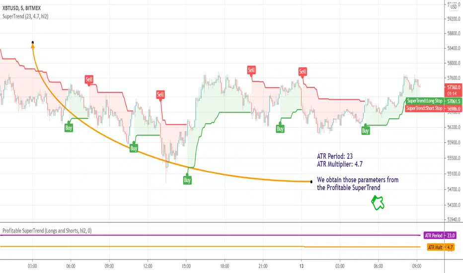
This script is a powerful, non-repainting optimizer for the classic SuperTrend indicator — one of the most popular tools for trend-following and volatility-based trading. It automatically finds and applies the most profitable SuperTrend settings for each instrument and timeframe, removing the need for manual parameter tuning or guesswork.
🛠 How It Works
The indicator evaluates over 1,400 combinations of ATR Periods and Multipliers using a decision tree–based optimization algorithm .
Each configuration is backtested across the instrument's full history, and when a more profitable setup is identified, the indicator automatically switches to those values in real time — while preserving the standard SuperTrend logic.
It also supports commission customization for more realistic backtesting and includes an alert system that notifies you whenever a better parameter set is found.
This adaptive approach keeps the SuperTrend continuously tuned to evolving market conditions without repainting or distorting past data.
💡 Integrated Versions Explained
This all-in-one tool merges 3 complementary indicators:
• Profitable SuperTrend — A dedicated optimizer that runs in a separate window below your chart. It doesn’t produce buy/sell signals directly but analyzes your asset and timeframe to find optimal ATR settings. Results are visualized as two lines (purple and orange), with optional labels displaying the best parameter values. You can then manually apply these values to your standard SuperTrend.
• Self-Adjusting SuperTrend — A real-time overlay version that behaves like the standard SuperTrend but dynamically adjusts its parameters on the fly. It requires no manual setup and can be paired with the Profitable SuperTrend for full transparency over which values are currently active.
• Compact Self-Adjusting SuperTrend — A minimalist oscillator version that uses simple binary outputs: -1 for Sell and 1 for Buy. This format is ideal for filtering or integrating the adaptive logic into other trading systems.
Together, they form a complete adaptive suite that combines automation, flexibility, and precision — suitable for both discretionary and systematic traders.
🔥 Key Features
Adaptive optimization powered by a decision tree–based algorithm
Real-time switching to the most profitable SuperTrend parameters
Commission customization for realistic backtesting
Direction filter (Longs | Shorts | Longs & Shorts)
Optional analysis start date for focused historical testing
Smart alert when better settings are detected
Optional buy/sell labels and compact trend output
Clean and organized UI with improved workflow
If you'd like access or have any questions, feel free to reach out to me directly via DM.
👋 Good luck and happy trading! [STRATEGY] Moving Average Crossover Hello friends,
This is a comprehensive backtesting engine for Moving Average crossover strategies, supporting over 63 types of moving averages and filters. It allows you to test, compare, and optimize crossover behaviors between any two moving averages with flexible profit and risk management tools.
Built upon the Moving Average Crossover foundation, this advanced version lets you manually backtest more than 4096 combinations of moving average types. When combined with customizable periods, take-profits, and stop-loss levels, the total number of possible configurations becomes virtually unlimited.
🛠 How It Works
The system tests crossovers between two selected moving averages, with full control over their types, lengths, and trading direction. Integrated bracket settings enable dynamic take-profit, stop-loss, and trailing-stop management using units such as % , ATR , points , pips , or ticks .
You can restrict backtesting to a custom date range for focused performance evaluation or run it across the instrument’s full history.
🔥 Key Features
Supports 63+ moving average and filter types — including algorithms by Ehlers , Jurik , Kaufman , Apirine , Tillson , and Dürschner
Customizable MA types, periods, and strategy direction
Full-featured bracket control: TP, SL, and TSL in ATR, %, points, pips, or ticks
Backtest window customization (start, end, or range)
Direction filter: Longs only, Shorts only, or Both
Dynamic trade labeling and color-coded visualization
Option to exit only at TP, SL, or TSL
If you'd like access or have any questions, feel free to reach out to me directly via DM.
👋 Good luck and happy trading! Double Bottom Pattern Identifier Hello friends,
This script is a powerful, non-repainting detector for the classic Double Bottom pattern — one of the most widely recognized bullish reversal setups. The indicator automatically identifies and tracks developing 'W'-shaped formations in real time, confirming valid entries once the neckline is broken and providing complete trade management features. No manual configuration is needed — it works right out of the box.
🛠 How It Works
It uses advanced techniques involving pivot point analysis and does not rely on other indicators, ensuring robustness and adaptability across different market conditions. When a potential Double Bottom is detected, the indicator marks the pattern points, draws the neckline, and waits for confirmation.
Once confirmed, it generates a 'Long' signal with calculated Take Profit (TP) and Stop Loss (SL) levels.
The script also includes a statistics table summarizing performance metrics — such as the number of patterns, trade results, bar distances, and bottom differences — all dynamically updated on your chart.
🔥 Key Features
Pine Script V6 — optimized logic and performance
Works right out of the box — no setup required
Non-repainting detection
Fully visualized structure — points, neckline, TP, and SL plotted automatically
Multiple TP/SL modes: R/R ratio, ATR-based, percent, points, pips, ticks, or bottom-to-neckline distance
Trailing Stop Loss support
Interactive statistics table with pattern count, trade outcomes, profit ratio, and structural measurements
Smart alert system
Customizable alert messages with placeholders (price, ticker, timeframe, etc.)
Clean, updated UI with improved layout and organization
If you'd like access or have any questions, feel free to reach out to me directly via DM.
👋 Good luck and happy trading! Minicharts Hello friends,
I'm happy to introduce this compact visualization tool that lets you display multiple mini candlestick charts directly on your main chart. It’s ideal for tracking several instruments at once, helping you compare assets, monitor relative performance, or build your own visual screener — all without leaving your chart.
🛠 How It Works
Each minichart represents a scaled-down candlestick chart of any ticker and timeframe you select. You can display up to 12 charts in a single instance and choose from multiple grid layouts — ranging from 1×1 to 6×2 . Each chart can show up to 20 candles, providing a concise yet information-rich view of price behavior. You can also overlay custom moving averages (SMA, EMA, WMA, or HMA) and display last price lines for better visual context.
🔥 Key Features
Pine Script V6 — optimized for performance and compatibility
Up to 12 charts per instance
16 layout options : 1×1, 1×2, 1×3, 1×4, 1×5, 1×6, 1×7, 1×8, 1×9, 1×10, 1×11, 1×12, 2×6, 3×4, 4×3, 6×2
Display up to 20 candles per chart
Supports 48 tickers through multiple instances
Choose between SMA, EMA, WMA, and HMA for overlayed moving averages
Optional last price line for each chart
Customizable chart labels
📸 Visual Examples
Merge of two instances (1×4 layout):
Example with three instances (3×4 layout):
If you'd like access or have any questions, feel free to reach out to me directly via DM.
👋 Good luck and happy trading! Intraday Volume Spikes Heatmap Hello friends,
Here's something truly special for intraday traders: this script identifies and visualizes abnormal volume activity clusters throughout the trading day, giving you an instant overview of when the market gets unusually active. It's designed specifically for intraday charts with volume data available.
No setups, no guesswork — just plug it in and see where volume truly spikes.
🛠 How It Works
The indicator divides the trading session into a 60×24 grid — minutes across the horizontal axis and hours down the vertical one.
It tracks each bar's volume (or price spread, or relative change — depending on your selected metric) and highlights the frequency of abnormal activity using a smooth color heatmap.
You can analyze the full chart history or focus on a specific date range.
All the data is neatly displayed in a customizable on-chart table, allowing you to instantly spot intraday periods with heightened trading activity.
🔥 Key Features
Pine Script V6 — optimized and refactored for performance and maintainability
Detects abnormal volume activity — instantly see where volume spikes most often within the day
4 analytical modes — Volume Amount, Volume % Change, High/Low Spread, and Price % Change
Configurable analysis window — use entire chart history or a specific date range
Overlay Mode — display the heatmap directly on your chart or in a separate panel
Customizable appearance — fine-tune colors, borders, text, and layout
17 professional color palettes — including Viridis, Inferno, Magma, and Plasma
Time zone offset support — align analysis with your local time if needed
📸 Visual Examples
Viridis palette
Inferno palette
If you'd like access or have any questions, feel free to reach out to me directly via DM.
👋 Good luck and happy trading! Double Top Pattern Identifier Hello friends,
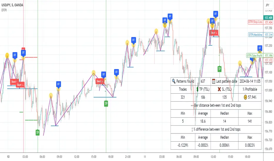
This script is a powerful, non-repainting detector for the classic Double Top pattern — one of the most widely recognized bearish reversal setups. The indicator automatically identifies and tracks developing 'M'-shaped formations in real-time, confirming valid entries once the neckline is broken and providing complete trade management features. No manual configuration for detection is needed — it works out of the box.
🛠 How It Works
It uses advanced techniques that involve pivot points analysis and do not rely on other indicators, ensuring robustness and adaptability across different market conditions. When a potential Double Top is detected, the indicator marks the pattern points, draws the neckline, and waits for confirmation.
Once confirmed, it generates a 'Short' signal with calculated Take Profit (TP) and Stop Loss (SL) levels.
The script includes a statistics table summarizing performance metrics — such as number of patterns, trade results, bar distances, and top differences — all dynamically updated on your chart.
🔥 Key Features
Pine Script V6 — optimized logic and performance
Works out of the box — no manual configuration required
Non-repainting detection
Fully visualized structure — points, neckline, TP, and SL plotted automatically
Multiple TP/SL modes: R/R ratio, ATR-based, percent, points, pips, ticks, or top-to-neckline distance
Trailing Stop Loss support
Interactive statistics table with pattern count, trade outcomes, profit ratio, and structural measurements
Smart alert system
Customizable alert messages with placeholders (price, ticker, timeframe, etc.)
Clean, updated UI with improved layout and organization
If you'd like access or have any questions, feel free to reach out to me directly via DM.
👋 Good luck and happy trading! Range & Consolidation Detector Hello friends,
I’m excited to share my latest discovery with you — the Range & Consolidation Detector. This script is built on a unique methodology I’m truly proud of. It uses no traditional indicators like ADX, RSI, or ATR — just pure statistics and mathematics under the hood. No parameters to tweak, no settings to guess — it just works, right out of the box.
🛠️ How It Works
At its core is a proprietary formula that reliably identifies ranging conditions across all tickers and timeframes. It’s simple, robust, and consistent — exactly what traders need to spot sideways markets without noise or lag.
🔥 Key Features
Pine Script v6 – Uses the latest version for maximum performance
Zero configuration – No inputs to adjust, no hidden settings — the algorithm works automatically
Optimized performance – Runs efficiently for smooth charting
Universal compatibility – Works flawlessly on any asset and timeframe, in every market condition — from euphoric peaks to choppy ranges
📸 Visual Examples
If you’d like access or have any questions, feel free to reach out to me directly via DM.
👋 Good luck and happy trading! MTF Minicharts Hello friends,
I'm excited to share another unique tool with you — the MTF Minicharts indicator. This script lets you display multiple mini candlestick charts directly on your main chart, using data from different tickers and timeframes at the same time. It's designed to give you a clear multi-timeframe, multi-asset perspective — all in one place.
There are no complicated setups: just select your tickers, pick your timeframes, and the minicharts are ready to go. You can even apply one timeframe to all tickers with a single switch — making your workflow simple and efficient.
🛠️ How It Works
The script pulls price data for up to six different tickers and timeframes and displays them as compact candle charts inside your main chart window. You can choose to set each minichart's timeframe individually, or apply one timeframe to all tickers instantly. Fully customizable layout options let you arrange your minicharts in flexible grids — from 1×1 up to 3×2 and beyond. A total of 13 grid layouts are available, so you can adapt the view exactly to your screen and style. Each minichart can display 2 to 21 candles , giving you just the right balance between detail and space. Candlestick styling, spacing, last price lines, and ticker labels are all adjustable, so you can fine-tune your view to your exact needs.
🔥 Key Features
Pine Script v6 — Uses the latest version for maximum performance
Multi-Timeframe, Multi-Ticker — Combine up to six charts, mixing tickers and timeframes as you wish
Single-Timeframe Mode — Apply one timeframe to all tickers with a single click
13 Grid Layouts — Choose from multiple layout options for clean positioning on your main chart
Custom Candles per Chart — Display anywhere from 2 to 21 candles in each minichart
Overlay or Subpanel Mode — Choose whether your minicharts overlay the price or sit in a subpanel
Custom Candles Styling — Adjust body width, wick width, and colors to match your style
Last Price Lines — Optional last price marker for each minichart, with style and width controls
Clear Ticker Labels — Show performance metrics in various formats
Optimized Performance — Efficient rendering for smooth operation, even with multiple charts
Universal Compatibility — Works flawlessly across all assets, timeframes, and market conditions
📸 Visual Examples
Subpanel mode with 1x6 layout
Combination of two instances gives you a mini screener
If you'd like access or have any questions, feel free to reach out to me directly via DM.
👋 Good luck and happy trading! Sparklines Hello friends,
This script lets you monitor up to 12 different instruments simultaneously using compact mini price charts called sparklines. Instead of switching between multiple charts or cluttering your workspace, you can keep a real-time overview of your watchlist directly on a single chart pane.
Each sparkline displays the recent price action of an individual symbol, making it easy to compare trend direction, momentum, and relative performance across multiple markets at a glance.
🛠️ How It Works
The script retrieves market data for each selected symbol and renders a miniature price chart containing up to 20 recent points . Every sparkline is automatically scaled to its own price range, allowing instruments with vastly different prices to be compared visually.
You can organize the charts using multiple grid layouts, customize their appearance, display the latest price as a reference line, and choose how performance statistics are shown below each symbol. Since everything is drawn inside a single indicator pane, multiple instances can also be combined to monitor larger watchlists or mixed with other indicators.
🔥 Key Features
Monitor up to 12 symbols simultaneously
Multiple grid layouts from 1×1 to 6×2
Up to 20 price points per sparkline
Automatic per-chart scaling for clear visualization
Optional last price reference line
Flexible performance labels showing price, change, percentage, or combinations of them
Optional exchange prefixes and sparkline numbering
Adjustable spacing, positioning, sizing, colors, and line width
Multiple indicator instances can be combined on the same pane
📸 Visual Examples
Merge of three instances on the same pane: Merge with another indicator on the same pane:
👋 Good luck and happy trading! Jurik RSX+ Hello friends,
Meet Jurik RSX+, a powerful standalone oscillator that also integrates perfectly with Profitable Jurik RSX optimizer.
It enhances Jurik's original RSX by introducing a Values Distribution Profile , Point of Control (POC) , and Value Area visualization — transforming a traditional oscillator into a statistically guided market sentiment tool.
These additions help identify where true equilibrium, overbought, and oversold zones occur based on the actual behavior of RSX values rather than fixed numeric levels.
🛠 How It Works
Jurik RSX+ applies advanced smoothing and statistical profiling to analyze how RSX values are distributed over time.
The Values Distribution Profile builds a frequency map of RSX activity, allowing traders to see:
The Point of Control (POC) — the statistically dominant RSX level.
The Value Area — the range where RSX values cluster most frequently.
By studying this distribution, the indicator reveals true overbought, oversold, and midline zones , adapting dynamically to different instruments and market conditions.
On top of that, traders can construct fully customized Buy/Sell signals using crossover conditions between RSX, Signal Line, Midline, or POC — creating a flexible signal generation framework.
🔥 Key Features
Jurik RSX foundation with enhanced smoothing and adaptive distribution modeling
Values Distribution Profile identifying statistically balanced and extreme zones
Point of Control (POC) and Value Area visualization for precision analysis
Customizable Buy/Sell logic — up to 4 Buy and 4 Sell slots using flexible crossover conditions
Strategy Mode preventing overlapping Buy/Sell signals
Multiple visualization styles — Labels , Dots , Stripes , or combined modes
Integrated alerts for RSX, POC, and OB/OS conditions
If you'd like access or have any questions, feel free to reach out to me directly via DM.
👋 Good luck and happy trading! Price Levels Constructor Hello friends,
This is a multi-period OHLC level mapping tool that lets you build your own higher-timeframe levels directly on the chart - across up to 20 customizable period slots.
You choose which periods matter (Year, Half-Year, Quarter, Month, Week, Day, weekdays, etc.), how recent they should be, and which levels to show (Open/High/Mid/Low/Close).
The script then renders those levels with automatic stacking and clear label formatting, giving you a compact higher-timeframe map for intraday and swing trading.
🛠️ How It Works
Each selected period slot creates a period model with its own OHLC+Mid data.
For each active level type, the script draws the price level, tracks the correct H/L/C timestamps when needed, and generates a label consisting of:
The selected recency (Current, Previous, 2nd Previous, …)
The period name (e.g., Month, Q1, Monday)
The level type (O/H/Mid/L/C)
All levels are fed into a registry that merges levels at identical prices, stacks their labels vertically or horizontally, and displays only one rendered line per price with combined label text.
This produces clean clusters when multiple periods share the same level.
Global settings control left/right extensions, label compactness, label content (name, price, % distance), and stacking direction.
🔥 Key Features
20 period slots
Ability to specify period (31 options, from Year to various weekdays)
Ability to specify recency for each selected period (13 options)
5 levels (Open, High, Mid, Low, Close) for each selected period
Stacking of labels of matching levels
% from All-Time High (ATH)
% from All-Time Low (ATL)
Alerts
📸 Visual Examples
The percentages in the level labels make it easy to see the current performance relative to that level
Labels with full level names
Compact labels with vertical stacking
Compact labels with horizontal stacking
👋 Good luck and happy trading! Financial Statement (Annual) Hello friends,
I'm glad to share this professional-grade visualization tool designed to analyze a company's fundamental data in a clear and structured way. It uses the same official financial metrics available on TradingView, but with a much deeper and more flexible presentation.
🛠 How It Works
The script retrieves annual financial data for the selected company and metric, then transforms it into a series of intuitive visual bars. You can instantly see how a company’s key financial indicators evolve over time. Built-in statistical lines — including maximum , minimum , mean , median , standard deviation , and linear regression — provide a quick snapshot of long-term stability, volatility, and growth.
🔥 Key Features
Access to all 222 built-in annual financial metrics
Advanced statistical overlays: Max, Min, Mean, Median, Std. Dev., and Linear Regression
Sortable data visualization — view trends in ascending or descending order
Adjustable column width, spacing, and color themes
Supports both colored and neutral schemes for growth/decline visualization
Performance-optimized for large datasets
Clean, presentation-friendly visual design
If you'd like access or have any questions, feel free to reach out to me directly via DM.
👋 Good luck and happy trading! Financial Statement (Quarterly) Hello friends,
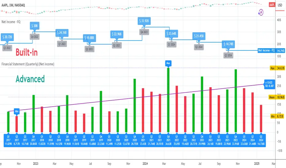
I'm excited to present this advanced visualization tool, designed to help you analyze a company's financial health with precision and clarity. Built on TradingView’s official quarterly financial metrics, this indicator transforms raw data into an intuitive, easy-to-read chart that brings your fundamental analysis to life.
🛠 How It Works
The script retrieves quarterly financial data for the selected company and displays it as visual bars directly on your chart. You can track how each metric evolves over time, quickly identify turning points, and compare performance between quarters. To make interpretation effortless, the script automatically calculates and displays statistical overlays such as maximum , minimum , mean , median , standard deviation , and linear regression — revealing patterns and trends that might otherwise stay hidden.
🔥 Key Features
Access to 214 built-in quarterly financial metrics
Advanced statistical overlays: Max, Min, Mean, Median, Std. Dev., and Linear Regression
Data sorting for ascending or descending trend visualization
Independent visibility toggles for Q1, Q2, Q3, and Q4
Optimized performance even with large datasets
Customizable bar width, spacing, and color schemes
Clean, professional-grade visualization suited for both traders and analysts
If you'd like access or have any questions, feel free to reach out to me directly via DM.
👋 Good luck and happy trading! Trading Sessions Constructor Hello friends,
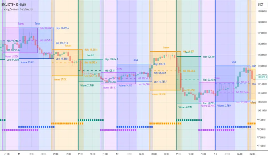
This tool is designed for traders who want a clean, flexible way to visualize trading sessions directly on the chart. It lets you highlight key market sessions (London, New York, Tokyo, Sydney, custom specifications, etc.), add rich visual structure around them, and optionally track basic statistics - all in a highly customizable and timezone-aware format.
🛠️ How It Works
The indicator lets you define up to 8 separate sessions , each with its own name, timezone, and active days of the week. Sessions can share one common timezone or use individual timezones, depending on how you prefer to track global markets.
For each session, the script builds a visual "frame" around price action:
it can draw a box around the full range, plot high/mid/low lines, show a title label above price, and optionally display a box stats label with session metrics (such as volume or pips range).
A progress indicator at the bottom of the chart helps you see how much of the current session has already passed, while an optional summary table aggregates statistics across all visible sessions for quick comparison.
🔥 Key Features
Up to 8 configurable sessions with their own names, timezones, and weekdays
Option to use one common timezone for all sessions or separate timezones per session
Custom session titles with flexible label positioning and size
Customizable vertical start-line
Customizable session box
Per-session box stats label with selectable metrics
Independent high, mid, and low lines with full style and width control
Optional background shading to highlight active trading hours
Bottom progress indicator (◼) showing how much of the session has elapsed
Optional statistics table summarizing all visible sessions
📸 Visual Examples
1. Background + High/Mid/Low lines + Session names above high
2. Background + Boxes + Session names above high
3. Background + Vertical start-line + Session names at the bottom
4. Background + Vertical start-line + Session names at the top + Bottom progress indicator
5. Background + Session names at the bottom + Bottom progress indicator 👋 Good luck and happy trading! Multi-Period Performance Table Hello friends,
I'm returning to the fascinating world of TradingView publications. Over time, I've accumulated many unpublished ideas — both open- and closed-source — that I now plan to share, alternating between the two. It felt like a shame to let so much valuable work remain unseen. The story isn't over yet — so today, we kick off a new series of invite-only scripts, starting with this indicator.
🛠️ How It Works
The script analyzes your selected number of years of price data, calculating returns for each month, quarter, and season
Advanced algorithms compute comprehensive statistics, including the mean, median, standard deviation, and extremes for each period
Data is presented in an intuitive table with optional heatmap coloring that makes patterns immediately stand out
Sorting of any column allows you to quickly identify the best and worst performing periods
🔥 Key Features
Pine Script V6 – leverages the latest version for better performance
Custom number of years to aggregate statistics
Complete breakdown for all 12 months (Jan-Dec)
Quarter (Q1, Q2, Q3, Q4) statistics
Season (Winter, Spring, Summer, Fall) statistics
Year/Year-to-Date (YTD) statistics
Enable/disable Right-side statistics for each row
Enable/disable Bottom statistics for each column
Heatmap mode with 10 palettes
Sortable columns
Customizable table
Optimized performance - efficient calculations for smooth operation
Universal compatibility – runs smoothly across all assets, timeframes, and market conditions — from euphoric peaks to capitulation lows
📸 Visual Examples
Monthly view
Quarterly view
Seasonal view
Clean table mode - without heatmaps
Default heatmap palette
June column sorted in descending order to quickly identify best/worst years
Turbo palette - high contrast
Spectral palette - professional look
Red/Yellow/Blue palette - classic style
My similar indicators that are also worth paying attention to
Still here? Unlock the full potential of multi-period market analysis — and take your trading to the next level today! 🚀
👋Good luck! Profitable Moving Average Crossover Hello friends,
I'm glad to introduce a powerful research and optimization tool that takes the classic moving average crossover concept to a new level. Instead of relying on guesswork or fixed MA types, it lets you objectively discover the most profitable moving average pair for any instrument and timeframe.
🛠 How It Works
Moving average crossovers are among the most popular trading systems. A buy signal occurs when a shorter (faster) moving average crosses above a longer (slower) one, and a sell signal when it crosses below. The system's responsiveness — and the number of generated signals — depend on the chosen MA lengths and types.
This script evaluates 61 moving average types (including Jurik, Kaufman, Ehlers, Apirine, and others) and backtests all possible crossover combinations either across the entire chart history or within a custom backtest window . It then plots continuous profit metric lines for each crossover type and displays the top 5 performers in a results table. Each MA type is color-coded, allowing quick visual identification of which systems have historically delivered the strongest results.
🔥 Key Features
Pine Script V6 — optimized for performance and stability
Tests 61 moving average types , from classic to adaptive designs
Custom Backtest Window — analyze the entire history or a specific date range
Continuous profit curves for every crossover type plotted on chart
Top 5 crossover systems displayed in a compact summary table
Color-coded MA identifiers for fast visual comparison
Supports custom parameters for advanced MAs (JMA, ALMA, McGinley Dynamic, Adaptive Laguerre Filter, etc.)
Works seamlessly across all assets and timeframes
NOTE: Results will vary across different tickers and timeframes. Seeing strong performance in one preview does not imply similar profitability elsewhere — this variability is normal due to differing market structures.
NOTE 2: You can experiment with the tool independently or request a full study, in which case I'll share a spreadsheet of all backtest results with you.
👋 Good luck and happy trading! Ultimate ZigZag Hello friends,
Ultimate ZigZag is a market structure toolkit that combines ZigZag, swing points, market structure, fractals, trendlines, Fibonacci retracements, and swing analytics into a single indicator.
Each of these tools analyzes the same underlying concept: significant price swings. Instead of calculating those swings independently, every module in this script shares one confirmed pivot engine. This keeps every visual element and calculation synchronized, and avoids the contradictions that come from running several separate indicators that each detect swings slightly differently.
The result is a compact environment where market structure, trendlines, Fibonacci retracements, fractals, and swing statistics are all built from the same sequence of confirmed pivots. That means one consistent read on price action, instead of stacking four or five indicators that quietly disagree with each other.
🛠️ How It Works
The indicator first identifies confirmed swing highs and lows using configurable left/right pivot lookbacks. A pivot needs a set number of bars sloping away from it on both sides before it's accepted. Once a pivot is confirmed, it becomes the shared data source every other module in the script reads from.
This means every module (ZigZag, market structure, fractals, trendlines, Fibonacci retracements, and swing metrics) references that same sequence of confirmed pivots, so everything stays synchronized no matter which combination you enable.
ZigZag - A ZigZag line connects confirmed swing highs and lows, filtering out minor fluctuations so the larger directional moves in price are easy to see. It provides the structural backbone every other module in this indicator builds on.
Market Structure - Market structure classifies successive swings as higher highs, higher lows, lower highs, or lower lows, so the current trend can be described objectively. The script tracks the most recent unresolved swing high and low and distinguishes three events by how price interacts with them: a wick that breaks a level and is confirmed by a close continues the prevailing bias (Break of Structure) or reverses it (Change of Character / MSS); a wick that breaks a level but closes back on the original side is tagged a Swing Failure Pattern, and the bias stays unchanged.
Fractals - A fractal is a local turning point where a set number of bars slope toward a central peak or trough on both sides. Every candle is the trivial depth-1 case, and each additional depth requires one more consecutive bar sloping toward the peak on both sides. A depth-2 fractal is therefore the classic 3-bar pattern (the peak with one sloping bar on each side), and each higher depth extends that by one more bar per side. The script plots fractals from any minimum depth you configure (2 or higher), with optional display of non-pivot fractals alongside the confirmed ones.
Trendlines - A trendline connects two price points to visualize a move's slope and flag when it breaks. You choose a Start and an End pivot type for each trendline, and the End must chronologically follow the Start rather than simply reconnecting whichever two pivots are most recent. Trendlines can project forward and optionally stop once broken.
Fibonacci Retracements - Fibonacci retracements mark horizontal levels (ratios such as 38.2% or 61.8% derived from a prior price swing) commonly referenced when gauging potential pullback areas. This script anchors each retracement to the current swing's own price range and only rebuilds it once price closes beyond that range, not on every minor pivot in between, so the levels stay stable through normal noise.
Swing Metrics - Statistics calculated for every completed swing, including price change, percentage, retracement, bars, volume, and ATR, quantifying each move instead of relying on visual estimation.
⚙️ How to Use
The indicator is modular, so you can enable only the components relevant to your workflow:
Use ZigZag on its own for a clean view of confirmed swings.
Add Market Structure to see HH/HL/LH/LL classification and BoS/CHoCH/SFP events.
Add Trendlines to connect specific pivot types you select, with optional forward projection.
Add Fibonacci Retracements to see levels drawn automatically from the current swing.
Add Fractals or Swing Metrics for additional confirmation and context.
🔥 Key Features
Advanced ZigZag with configurable pivot detection
Automatic classification of HH, HL, LH, and LL market structure
Break of Structure (BoS), CHoCH/MSS, and Swing Failure Pattern (SFP) detection
Configurable fractal detection with adjustable minimum depth (2 and up) and optional non-pivot fractals
Up to 6 independently configurable trendlines connecting selected pivot types, with optional projection, break detection, and a limit on how many recent segments stay visible
Automatic Fibonacci retracements with customizable retracement and extension levels, labels, and backgrounds
Swing metrics including price change, percentage, ticks, retracement, bars, volume, and ATR
Alerts for pivots, fractals, structure events, trendlines, trendline breaks, and Fibonacci level crossings
I hope this toolkit becomes a valuable part of your trading workflow. If you have any feedback, ideas, or suggestions for future improvements, I'd be happy to hear them.
👋 Good luck and happy trading! Jurik Velocity Hello friends,
Meet Velocity, Jurik's ultra-smooth alternative to the traditional momentum indicator. Designed to reveal the true pace of market movement without the typical noise and lag, it offers a more accurate view of acceleration and deceleration in price. Includes an optional normalization mode to ensure the scale remains consistent across all markets.
🛠 How It Works
What's wrong with classical momentum? The standard momentum indicator is often too noisy to be useful. Traders try to fix this by applying moving averages — which smooths it, but at the cost of responsiveness.
Velocity solves this by using Jurik's non-lagging smoothing method that removes noise without delay , maintaining the sharpness of turning points while filtering out irrelevant fluctuations.
Like the classical momentum, Velocity compares the current price with that from N periods ago, but with vastly improved clarity. It helps traders detect early shifts in trend strength, exhaustion points, and potential reversals — all while keeping a steady, normalized scale for cross-market consistency.
🔥 Key Features
Non-lagging Jurik smoothing — clarity and responsiveness without delay
Highlights bullish and bearish velocity peaks for precise timing
Integrated alert conditions for velocity peak events
📸 Visual Examples
Velocity with peaks highlighting
If you'd like access or have any questions, feel free to reach out to me directly via DM.
👋 Good luck and happy trading! Jurik RSX on JMA Hello friends,
Meet Jurik RSX on JMA — a refined version of Jurik's classic RSX that applies advanced pre-smoothing using the best
original JMA clone available on TradingView. By filtering the input price through JMA, it delivers a cleaner, faster, and more efficient representation of market momentum — maintaining exceptional smoothness with almost no lag.
🛠 How It Works
RSX is Jurik's noise-free alternative to the traditional RSI, designed to measure trend direction and efficiency with minimal distortion. However, when the input price is noisy, even RSX can lose precision.
To solve this, the input price is first smoothed with JMA — Jurik's most advanced low-lag filter. As Jurik Research noted:
“A smooth (low noise) trend is more efficient than a noisy trend... RSX would respond better when fed pre-smoothed price data. And there's no better way to pre-smooth than by using JMA.”
This approach allows RSX to reverse with the market almost instantly , reacting sharply to genuine turning points while ignoring random fluctuations — providing traders with a clear, stable view of trend dynamics.
🔥 Key Features
JMA pre-smoothing integrated with Jurik RSX
Near-zero lag response with reduced noise
Optional overbought/oversold breakout highlighting
If you have any questions or would like to explore related Jurik-based tools, feel free to contact me directly via DM.
👋 Good luck and happy trading! Compact Profitable Moving Average Crossover Hello friends,
I'm pleased to introduce this advanced evolution of the original Profitable Moving Average Crossover tool. This version offers complete control over the analysis range and delivers detailed real-time profitability metrics for every moving average crossover type directly on your chart.
🛠 How It Works
The script evaluates 61 moving average crossover systems across a customizable date range , allowing you to focus on specific historical windows for optimization or validation. It calculates each crossover's net profit performance and automatically ranks all results, displaying the top 5 performers in a summary table. Results are visualized through a color-coded column chart, making it easy to identify which crossover types have historically delivered the strongest outcomes.
🔥 Key Features
Pine Script V6 — built on the latest and most efficient version
Tests 61 moving average types , including those developed by Jurik, Kaufman, Ehlers, Apirine, and others
Custom Backtest Window — analyze any date range with start and end parameters
Automatic Results Table — displays the top 5 crossovers ranked by profit
Color-Coded Chart — quick visual identification of performance by crossover type
Sorted column chart for clear visual comparison of profit metrics
Fully compatible with all symbols, timeframes, and market types
NOTE: Results will vary across different tickers and timeframes. Seeing strong performance in one preview does not imply similar profitability elsewhere — this variability is normal due to differing market structures.
NOTE 2: You can experiment with the tool independently or request a full study, in which case I'll share a spreadsheet of all backtest results with you.
👋 Good luck and happy trading! Stock Market Indices Correlations Heatmap Hello friends,
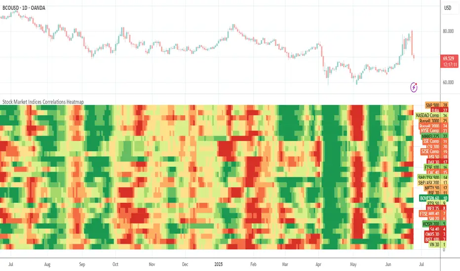
I'm excited to share one of my insightful tools. This indicator visualizes how major global stock indices move relative to your selected instrument, helping you instantly spot market-wide strength, weakness, or divergence.
🛠 How It Works
The indicator calculates Pearson correlation coefficients between your selected symbol and 28 major stock indices , including S&P 500, NASDAQ, DAX, NIKKEI, and many more. Each color is selected according to the correlation value:
Green hues show positive correlations (instruments moving together).
Red hues show negative correlations (instruments moving in opposite directions).
Lighter or transparent colors indicate weak or no correlation.
You can customize the correlation lookback period (default 14 bars ), select your preferred data source (close, open, etc.), and choose from multiple professional color palettes to best match your charting style.
🔥 Key Features
Comprehensive Global Coverage — Correlations across 28 major indices from North America, Europe, and Asia.
Multiple Palettes — Choose from 8 professional color palettes (Blue/Red, Spectral, Viridis, etc.) for better visual clarity.
Adjustable Lookback — Set correlation calculation period from 1 to any number of bars.
Dynamic Data Requests — Real-time updates for all tracked indices using TradingView's request.security.
Smart Alerts — Receive alerts when all indices align positively or negatively — a sign of broad market sentiment extremes.
Performance Optimized — Efficient data handling ensures smooth operation even with multiple requests per bar.
Enhanced UI — Streamlined settings panel for fast palette and source adjustments.
Non-Repainting — Uses only historical data, ensuring stable readings.
If you'd like access or have any questions, feel free to reach out to me directly via DM.
👋 Good luck and happy trading! Crypto Correlations Heatmap Hello friends,
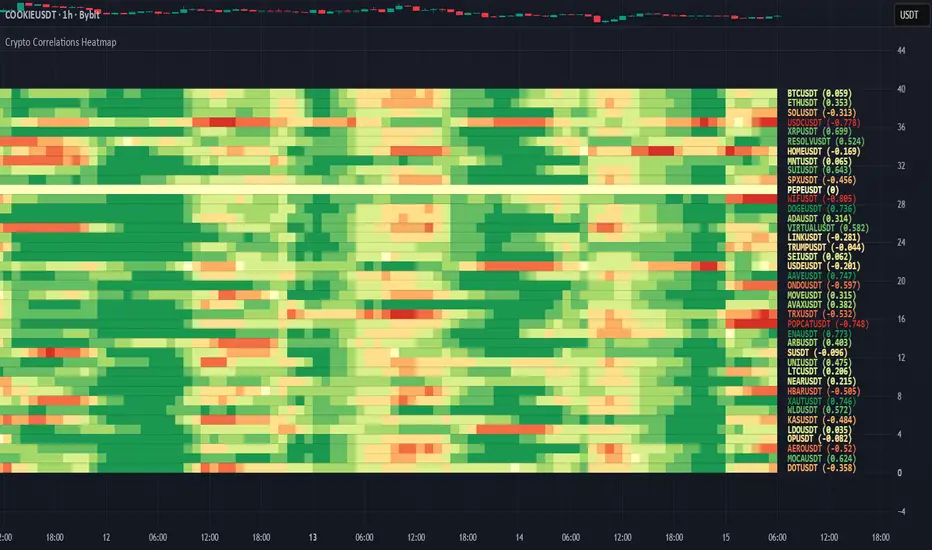
This tool is designed for crypto traders who want a fast, visual way to understand how different coins move relative to each other. It builds a correlation heatmap between your current chart symbol and a customizable list of crypto pairs, helping you immediately see which assets tend to move together, move opposite, or behave independently.
🛠️ How It Works
You provide a comma-separated watchlist of cryptocurrency tickers (for example, a list of USDT or USD-margined pairs). The script then:
Filters this list using your chosen Display Mode - All pairs, or only BTC, ETH, USDT, or USDC-related pairs.
Splits long watchlists into pages of up to 40 tickers , so you can smoothly navigate large universes of coins using the page selector.
For each symbol on the active page, it calculates the Pearson correlation over a user-defined lookback period, based on your selected Correlation Source (close, alternative price averages, or other supported inputs via the custom source module).
The results are rendered as a color-coded heatmap: color and intensity reflect both the strength and direction of correlation with your chart symbol.
You can switch between multiple professional color palettes to fine-tune how positive, negative, and neutral correlations are visually separated on the chart.
🔥 Key Features
Custom watchlist input via a simple text area (paste long lists directly from your exchange or screener)
Pagination support - view up to 40 tickers per page for stable performance
Flexible Display Modes : All pairs, BTC pairs, ETH pairs, USDT pairs, USDC pairs
Adjustable correlation lookback length
Advanced correlation source selector via the custom source module
Multiple color palettes : Blue/Red, Blue/White/Red, Green/Pink, Green/Red, Green/Yellow/Red, Purple/Orange, Spectral, Viridis
Clear visual mapping of correlation strength and sign using color intensity and hue
👋 Good luck and happy trading! Forex Correlations Heatmap Hello friends,
This tool is built for forex traders who want a clean, visual way to understand how currency pairs move together. It builds a color-coded correlation matrix between your current chart symbol and a customizable list of forex pairs, helping you quickly spot strong positive or negative relationships across majors, crosses, and extended FX watchlists.
🛠️ How It Works
You provide a comma-separated watchlist of forex tickers (e.g., EURUSD,USDJPY,GBPUSD,...). The script then:
Filters this list based on your selected Display Mode (All pairs, or only AUD, CAD, CHF, EUR, GBP, JPY, NZD, or USD-related pairs).
Paginates long watchlists into pages of up to 40 tickers , so you can scroll through large FX universes without overloading the chart.
For each pair on the current page, it calculates the Pearson correlation over a user-defined lookback window, using your chosen price source (close, HL2, HLC3, etc. via the custom source selector).
The resulting correlations are plotted as a heatmap: each cell's color and intensity reflect the strength and direction of the relationship.
You can switch between multiple professional color palettes to better match your visual preferences and quickly distinguish strong positive, strong negative, and neutral correlations.
🔥 Key Features
Custom watchlist input via a simple text area (paste or type your pairs)
Pagination support - view up to 40 symbols per page for smoother performance
Flexible Display Modes : All pairs, or focused views like AUD pairs, EUR pairs, USD pairs, etc.
Configurable correlation lookback period
Customizable correlation source via an advanced source selector module
Multiple professional color palettes : Blue/Red, Blue/White/Red, Green/Pink, Green/Red, Green/Yellow/Red, Purple/Orange, Spectral, Viridis
Clear visual mapping of correlation strength and sign through color intensity
👋 Good luck and happy trading!