
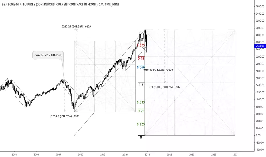
This is a monthly chart that shows important relationships in terms of price and time. As we can see, through the 2008 crisis the market plunged almost 60% and saw around 350% increase thereafter, painting an all-time high in September 2018. Currently, the 10-year-cycle is seemingly done and another big selloff in the equity market appears to be zooming. The 25%, 33.33% and 50% areas from the all-time high are potential targets and reversal zones. Selling into strength seems reasonable here.

Haftungsausschluss
Die Informationen und Veröffentlichungen sind nicht als Finanz-, Anlage-, Handels- oder andere Arten von Ratschlägen oder Empfehlungen gedacht, die von TradingView bereitgestellt oder gebilligt werden, und stellen diese nicht dar. Lesen Sie mehr in den Nutzungsbedingungen.
Haftungsausschluss
Die Informationen und Veröffentlichungen sind nicht als Finanz-, Anlage-, Handels- oder andere Arten von Ratschlägen oder Empfehlungen gedacht, die von TradingView bereitgestellt oder gebilligt werden, und stellen diese nicht dar. Lesen Sie mehr in den Nutzungsbedingungen.