OPEN-SOURCE SCRIPT
Pivot Points Mapped [Probalist Essentials]
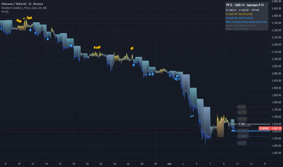
Pivot Points Mapped turns the standard pivot grid into a measured one. Pick your formula (Classic, Fibonacci, Camarilla, Woodie) and the grid timeframe follows your chart (intraday→Daily, daily→Weekly, weekly→Monthly). Every level is labelled with its empirical reach rate on this chart — R1 at 68% is a real target, R3 at 9% is a long shot — and weighted by reach, proximity and higher-TF confluence, so the chart shows a few meaningful zones instead of seven equal lines.
🟡 WHY THIS VERSION
Most pivot tools draw the same lines on every chart without telling you which ones price ever reaches. This one counts it: reach rate per level, hold rate per touch with a Wilson lower bound, first-touch decay, and ✦ when the higher timeframe's grid agrees — all measured on the loaded chart. The CPR band adds the classic narrow-means-trend tell as a percentile of this chart's own history. Alerts have history-backed variants that only fire when the evidence clears the bar. It counts instead of guessing.
🟡 HOW IT WORKS
Levels come from the prior period's confirmed HLC (no lookahead) in the formula you pick; the same formula builds the higher-TF set, so confluence compares like with like. Each live period, per-level booleans track whether price tagged each level; at period close they roll into the reach history. Touch-reactions are judged on the bar after a zone entry — hold or break — and feed per-level hold arrays with Wilson lower bounds. First-touch decay splits the hold rate by 1st/2nd/3rd test of the period. Visual weight (width, brightness, glow) blends reach × proximity × confluence. The CPR band (BC to TC) is washed behind the levels; its width is ranked against this chart's recent periods — narrow percentiles classically precede trending periods. A corner table shows the state, the bull/bear reach-hold stats, a plain-language Read, and an edge clock stamping the last history-backed bounce/rejection.
🟡 KEY FEATURES
🟡 HOW TO USE
🟡 PAIRS WELL WITH
Pair with a trend or momentum read (MA slope, MACD) to know which side of P has the directional edge — pivots are neutral by formula. Volume profile confirms whether a pivot sits at a real high-volume node. For intraday, an opening-range tool tells you the likely direction into the day's levels. Pivots are reference structure, not entries.
Not seven equal lines but a measured terrain: the most-reached levels stand out, confluence is computed instead of eyeballed, and every reaction has a counted history. Evidence from this chart only — description, not prediction.
Open source under MPL-2.0. The probability layer describes past signals on your chart — it is a measurement, not a prediction, and nothing here is financial advice.
🟡 WHY THIS VERSION
Most pivot tools draw the same lines on every chart without telling you which ones price ever reaches. This one counts it: reach rate per level, hold rate per touch with a Wilson lower bound, first-touch decay, and ✦ when the higher timeframe's grid agrees — all measured on the loaded chart. The CPR band adds the classic narrow-means-trend tell as a percentile of this chart's own history. Alerts have history-backed variants that only fire when the evidence clears the bar. It counts instead of guessing.
🟡 HOW IT WORKS
Levels come from the prior period's confirmed HLC (no lookahead) in the formula you pick; the same formula builds the higher-TF set, so confluence compares like with like. Each live period, per-level booleans track whether price tagged each level; at period close they roll into the reach history. Touch-reactions are judged on the bar after a zone entry — hold or break — and feed per-level hold arrays with Wilson lower bounds. First-touch decay splits the hold rate by 1st/2nd/3rd test of the period. Visual weight (width, brightness, glow) blends reach × proximity × confluence. The CPR band (BC to TC) is washed behind the levels; its width is ranked against this chart's recent periods — narrow percentiles classically precede trending periods. A corner table shows the state, the bull/bear reach-hold stats, a plain-language Read, and an edge clock stamping the last history-backed bounce/rejection.
🟡 KEY FEATURES
- Reach Map: every level labelled with its empirical reach rate — e.g. 'R1 68% ✓'
- Four pivot methods (Classic / Fibonacci / Camarilla / Woodie), one selector — the stats work for all
- Auto grid timeframe: intraday→D, daily→W, weekly→M, with manual override; stats count per period
- CPR band with width-percentile read (narrow/mid/wide vs this chart's own history)
- Hold rate per level with Wilson lower bound + first-touch decay (1st/2nd/3rd test) in tooltips
- ✦ confluence: levels aligned with the grid one rung up, same formula, weighted brighter
- Self-decluttering: far/low-reach levels fade, high-evidence levels glow
- Corner stats table + edge clock (last history-backed bounce/rejection)
- Touch-reaction dots with density control (All / Medium+ / Backed)
- Evidence-gated alert variants; everything non-repainting (confirmed prior-period data)
🟡 HOW TO USE
- Read the reach % first: 70%+ is a credible target, <15% a stretch. Set targets by evidence, not formula.
- ✦ levels are where two timeframes agree — treat them as the higher-conviction zones.
- ✓ = already tagged this period; focus shifts to the next untagged level in the direction of travel.
- Hover a level for hold rate, Wilson lower bound and first-touch decay — a level that holds its 1st test but folds on the 3rd is for first-touch fades only.
- CPR narrow (low percentile) classically precedes trending periods — favour breakout targets; wide favours fades. The percentile is measured, the interpretation is theory.
- Use the history-backed alerts for signals worth acting on; standard alerts for awareness.
- Costs honesty: median touch-reactions on low timeframes are small — check hold rate and n against your round-trip costs. This tool filters levels, not entries.
🟡 PAIRS WELL WITH
Pair with a trend or momentum read (MA slope, MACD) to know which side of P has the directional edge — pivots are neutral by formula. Volume profile confirms whether a pivot sits at a real high-volume node. For intraday, an opening-range tool tells you the likely direction into the day's levels. Pivots are reference structure, not entries.
Not seven equal lines but a measured terrain: the most-reached levels stand out, confluence is computed instead of eyeballed, and every reaction has a counted history. Evidence from this chart only — description, not prediction.
Open source under MPL-2.0. The probability layer describes past signals on your chart — it is a measurement, not a prediction, and nothing here is financial advice.
Open-source Skript
Ganz im Sinne von TradingView hat dieser Autor sein/ihr Script als Open-Source veröffentlicht. Auf diese Weise können nun auch andere Trader das Script rezensieren und die Funktionalität überprüfen. Vielen Dank an den Autor! Sie können das Script kostenlos verwenden, aber eine Wiederveröffentlichung des Codes unterliegt unseren Hausregeln.

Haftungsausschluss
Die Informationen und Veröffentlichungen sind nicht als Finanz-, Anlage-, Handels- oder andere Arten von Ratschlägen oder Empfehlungen gedacht, die von TradingView bereitgestellt oder gebilligt werden, und stellen diese nicht dar. Lesen Sie mehr in den Nutzungsbedingungen.
Open-source Skript
Ganz im Sinne von TradingView hat dieser Autor sein/ihr Script als Open-Source veröffentlicht. Auf diese Weise können nun auch andere Trader das Script rezensieren und die Funktionalität überprüfen. Vielen Dank an den Autor! Sie können das Script kostenlos verwenden, aber eine Wiederveröffentlichung des Codes unterliegt unseren Hausregeln.
Haftungsausschluss
Die Informationen und Veröffentlichungen sind nicht als Finanz-, Anlage-, Handels- oder andere Arten von Ratschlägen oder Empfehlungen gedacht, die von TradingView bereitgestellt oder gebilligt werden, und stellen diese nicht dar. Lesen Sie mehr in den Nutzungsbedingungen.