Indikator

Linear Regression Channel Fit AuditLinear Regression Channel Fit Audit
Overview
Linear Regression Channel Fit Audit is a price-chart overlay for studying statistical slope and the behavior of a rolling regression channel. It separates three questions: how well a line fits its own historical window, how the next observation compares with the model available before it arrived, and what happens when an earlier model is kept unchanged through several later observations.
The practical question is simple: did price fit the channel that was available beforehand, or did updating the channel make it appear to fit?
The script combines a current ordinary least-squares channel, a previous-model reference, refit attribution, historical as-of inspection, and scheduled frozen-channel studies. It is a descriptive model-diagnostics indicator, not a trading strategy, probability forecast, or source of entry and exit instructions.
What distinguishes the approach
Regression lines, residual bands, R-squared and historical channels are established tools. The contribution here is their use in a connected comparison of model updates and subsequent observations.
The same observation is evaluated before and after refitting. Movement of the fitted center is separated into removal of the oldest observation and addition of the newest. Changes in containment are examined separately through center movement and width changes. Earlier models are also retained on a predetermined schedule, allowing endpoint containment to be distinguished from containment throughout the observed path. Matched comparisons then show how a fixed model differs from an updating model and how shifting the starting level affects extrapolation errors.
These components address one problem: a rolling channel can change its apparent relationship with price because the model itself has moved or widened. They do not vote on a combined trade score or choose a supposedly best model.
Getting started
Use standard time-based candles and a price-valued Source. The default Source is close, the regression length is 120 bars, and the width is twice the residual standard error. Snapshot updates default to Confirmed close.
Start with the Model panel. Read the slope and in-window fit, then compare Prior/Now. Use Refit research to examine the effect of updating the model, Horizon research for one-step and H-step endpoint checks, and Frozen paths for complete fixed-model observation sequences.
Historical frozen paths are enabled by default. Four recent paths are retained for display. Each evaluates 24 later Source values, followed by a 24-bar gap, so scheduled origins are 48 bars apart. Drawing retention and numerical sample retention are separate controls.
Chart guide
The solid upper and lower boundaries are cyan and pink by default. The solid center is colored according to rising, falling or approximately flat normalized slope. Optional dotted inner guides and transparent shading help locate price within the selected width. These colors describe geometry, not trade direction.
OLS identifies the fitted center. +1w and -1w identify the selected upper and lower boundaries, where w means one channel half-width, not necessarily one standard deviation. The dashed EXT segment continues the current slope and width geometrically. It is not an uncertainty interval and is not used in any audit statistic.
The short amber reference uses the preceding model and its preceding width. Its endpoint at the displayed observation is the one-step reference. Optional historical reference traces connect those successive one-step centers and boundaries; they are not one permanently fixed channel.
Thin dashed channels identified by F1, F2 and similar labels are scheduled frozen paths. They retain their origin model rather than being refitted with later prices. A dotted vertical line marks the origin. Optional amber connectors show the first observed exit and the distance from the fixed center at the latest evaluated observation.
The Forward only setting shows the observed forward portion. Fit + forward additionally restores the original fitted training segment as faint dotted lines. That training segment became available at its origin, not at each older bar through which it is drawn.
Small event symbols have no filled background:
! means a transition outside the respective previous-model envelope, including a direct switch from one outside side to the other.
↺ means refit inclusion has appeared: outside the previous envelope but inside after refitting.
= means a transition inside the respective previous-model envelope again.
An optional letter mode uses O, R and I. These are state transitions, not buy/sell signals. Each observation uses its own preceding model; an inside-again event does not prove that price crossed back through one unchanged boundary.
Symbols are offset outside nearby candle wicks for readability. Their vertical placement is not an event or execution price. When conditions coincide, refit inclusion takes drawing priority. Marker spacing, count and display-window filters can hide glyphs without removing observations or suppressing the corresponding alert conditions.
Regression and residual width
The script fits a straight line to N consecutive Source observations using equally spaced bar positions. It works in source-price units, not log price or elapsed calendar time. For each observation, its residual is its Source value minus the fitted value at the same position in that window.
Three half-width methods are available:
Residual standard error: multiplier * sqrt(SSE / (N - 2)).
Mean absolute residual: multiplier * mean(abs(residual)).
Residual percentile: the nearest-rank percentile of absolute residuals from the fitted window.
SSE is the sum of squared fitted residuals. The percentile method does not use the multiplier. Mean absolute residual is not median absolute deviation. A configurable minimum width in symbol ticks, together with a small numerical floor, prevents a zero denominator on flat or nearly exact-line data. The floor can dominate such samples.
These are descriptive residual envelopes. A selected percentile measures the fitting sample; it does not specify a future coverage probability. None of the methods constructs a confidence interval or prediction interval.
Model panel
Slope is the fitted price change over the selected measurement span divided by the current half-width. The default span is 20 bars. Arrows and the flat threshold use this normalized value. Changing the width method or multiplier can therefore change the normalized slope and its flat classification. It is not an on-screen angle or annualized return.
R-squared measures in-window fit relative to variation around the sample mean. The five-segment meter is a coarse visual representation of that number. Constant data display n/a. High R-squared does not establish useful future prediction.
In/Next compares current fitted-window containment with realized one-step containment over the audit sample. These are different samples. Amber highlights the configured coverage gap after enough valid observations are available; it is not a significance test.
Prior/Now shows the signed Source distance before and after refitting. Prior uses the old half-width; Now uses the new half-width. Values beyond +1 or -1 are outside the respective envelope. Do not subtract these readings as raw price distances because their denominators differ.
Add/Drop reports the center-update components explained below. State refers to the previous envelope, except REFIT IN, which explicitly identifies inclusion after updating. Audit shows the valid observation count. A check mark means the sample is full, not that the model passed a performance test.
Detailed mode also shows one-step error skill, residual persistence, older/recent half-window slopes, width change and the number of refit-included observations. Residual persistence is the sum of adjacent residual products divided by SSE, not a significance test. The two half-window slopes use a common full-channel width; with odd lengths the older half contains one extra observation.
Add/Drop: why the center changed
The previous and current N-observation windows share N - 1 observations. All three models below are evaluated at the current observation's time coordinate:
Previous center: the preceding N-observation model extended by one bar.
Common center: the model fitted to the N - 1 shared observations.
Current center: the newly fitted N-observation model.
Drop = Common center - Previous center.
Add = Current center - Common center.
Add + Drop = Current center - Previous center.
The defined update order removes the oldest observation first and then adds the newest. The calculation uses the least-squares endpoint leverage identity to obtain the addition term without fitting another model on every bar.
Both displayed components are signed shifts in prior half-widths, not percentages. Opposite signs indicate offsetting effects. This is an attribution of a model update, not an explanation of the economic cause of a price movement.
Refit research: center versus width
Before/After compares exactly the same confirmed observations against their respective prior and refitted envelopes. In/Out n counts outside-to-inside and inside-to-outside observations. Their difference accounts for the change in matched containment:
After coverage - Before coverage = (Included observations - Excluded observations) / Paired observations.
The After result includes each observation in its own fit and is not an out-of-sample forecast.
Containment margin is half-width minus the absolute distance from the center. Its change is split into:
Center contribution = abs(old residual) - abs(new residual).
Width contribution = new half-width - old half-width.
Both displayed contributions are divided by the prior half-width, and their sum equals the normalized margin change.
For outside-to-inside observations, the Cause field tests two alternative geometries: new center with old width, and old center with new width.
CENTER: only the center change alone is sufficient.
WIDTH: only the width change alone is sufficient.
JOINT: neither change alone is sufficient; both are needed.
EITHER: either change alone is sufficient.
The four classification counts sum to the included count. These are geometric comparisons, not evidence of price reversal or economic causality. For example, WIDTH can identify a point accommodated by a wider envelope without needing the center to move.
One-step and H-step endpoint research
At observation t, the one-step reference is the center fitted at t-1 plus that model's slope. Its width is the width fitted at t-1. The observation at t is not included in that reference.
The second reference uses the model fitted H bars earlier, extended by H bars while keeping its origin width. H defaults to 5 and is selectable from 2 to 50. Results enter the statistics only when their endpoint has been reached and confirmed. This endpoint test does not require all intermediate observations to remain inside; the Frozen paths study addresses that separate question.
Each horizon reports realized containment and an error-skill comparison with holding its origin Source value unchanged:
Skill (%) = 100 * (1 - Model squared-error sum / Unchanged-source squared-error sum).
Model and baseline use identical eligible observations at that horizon. Positive values mean lower squared error than that baseline; negative values mean higher squared error. A zero baseline error produces n/a. Scores are not returns, win rates or significance levels. The two horizons can have different valid counts and are not necessarily identical samples across horizons.
The page also reports H-step mean absolute error in source-price units, the matching baseline error, mean absolute error normalized by origin width, and upper/lower endpoint misses. Successive horizon tests can overlap and are dependent.
Scheduled frozen paths
A path saves the fitted center, slope, width and Source value at its origin. It then evaluates the next L confirmed Source values without changing those saved parameters:
Fixed center at age k = Origin fitted center + Origin slope * k.
Fixed boundaries = Fixed center at age k +/- Origin half-width.
The origin observation itself is not one of the L tested outcomes. A path is extended only through observations already reached. It is not reset or discarded when price exits. Historical line colors do not change retrospectively to label the whole path as successful or unsuccessful.
Origins follow a bar-count schedule beginning at the first loaded confirmed close at or after Path schedule anchor. They recur every L plus Gap bars. Price behavior does not choose the scheduled times. An invalid origin fit is skipped, not moved to a more favorable observation. Skipped origins are reported in the sample tooltip.
With a zero gap, a path finishes before the next starts on the same close. Tested outcome segments do not overlap, although training windows can overlap and market observations remain dependent.
At maturity, the result label is:
ALL: all L sampled Source values were inside.
BACK: the final Source value was inside after at least one earlier sampled exit.
OUT: the final Source value was outside.
DATA: the path contained missing Source observations and is excluded from valid-result denominators.
A fraction such as 8/24 indicates an unfinished path. It is not counted as success or failure. ALL is about sampled Source values at confirmed bars, not an intrabar high/low test. With close as Source, a wick can exceed a boundary while the sampled close remains inside.
The first-exit connector marks the first observed outside Source value, not an intrabar crossing or order fill. Maximum distance is the largest sampled absolute distance from the fixed center divided by origin width.
For a simple example, a path that exits at age 6 and finishes inside at age 24 is BACK, not ALL. Looking only at the final observation would miss that distinction.
Frozen paths panel and matched comparisons
End/All reports final-observation containment and every-observation containment over the same valid completed paths. Back/Exit reports paths ending inside after an exit and paths with any sampled exit. End count equals All count plus Back count.
First exit is the average first-exit age among exited, valid, completed paths only. Paths without an exit and unfinished paths are not assigned zero-time exits. This conditional average is not a survival estimate.
F/A skill compares two centers against one common unchanged-origin-Source baseline over the same complete paths:
F: origin fitted center + origin slope * k.
A: origin Source + the same origin slope * k.
A changes the starting level, not the slope. The comparison helps inspect the effect of initial fitted-center displacement. It does not prove that the slope is useful or select a winning model. Scores use pooled squared errors across all included observations, not an average of individual path percentages.
Roll/Fix compares updating one-step envelopes with the saved fixed envelope on the same eligible observations within valid completed paths. It reports the percentage inside only the updating envelope and the percentage inside only the fixed envelope. Both-inside and both-outside counts are also available in the tooltip, along with matched error comparisons.
Both references exclude the observation being tested, but the updating model has intermediate information that the fixed model does not. Their widths may also differ. This comparison measures the effect of updating; it is not a contest between models with equal information.
Paired gives the number of matched observations. Done/Open gives the valid completed-path count and current unfinished age. Missing-data slots are separately disclosed and remain part of slot retention. The drawing cap never changes the numerical sample.
As-of research and sample scope
Set View to As-of research, choose Research start and As-of cutoff, and select the relevant panel page. The main channel and snapshot represent the last available confirmed bar whose close time is inside that interval. The header or its tooltip identifies the actual selected close in the exchange timezone.
Training can use earlier observations, but test origins must be calculated inside the admitted interval. One-step and H-step results therefore need their respective earlier origin models. The script does not invent those initial tests. A frozen path still unfinished at the cutoff remains unfinished.
Rolling audit uses the last K chart bars for the ordinary audit metrics. Selected interval aggregates valid tests admitted throughout the interval. Frozen-path statistics have a separate completed-slot sample: Latest and Rolling research retain up to the configured number of completed slots; Selected interval uses all completed slots. Actual counts, not requested maxima, determine the denominators.
As-of mode does not scroll the chart or hide later candles. It reconstructs the model at the selected time, but it is not a blind replay environment. Alerts are disabled in this mode. Later loaded timestamps can place optional annotations; later Source prices do not enter the selected model or its statistics. Without those timestamps, annotation spacing beyond loaded data uses a nominal bar duration and can differ around session gaps or irregular periods.
Schedule reproducibility and workload
If the path anchor is at or before the beginning of loaded history, the Frozen paths header displays PHASE*. The schedule may then change when additional earlier bars load. For reproducible comparisons, place the anchor within loaded history with earlier bars available, and retain the same symbol, timeframe, settings and research interval.
The default calculation budget is 600 bars, configurable from 100 to 4,000. Latest view adds audit/horizon warm-up to the recent fitted range. Frozen-path origins and retained results are bounded by the recent path range; chronological path IDs are local identifiers, not permanent IDs across recalculations.
In research, the budget is a hard limit on admitted interval bars. RANGE > CAP blocks the main research display rather than silently presenting an earlier endpoint as the selected result. Earlier traces or numeric records can remain partial and must not be read as complete interval results. Narrow the dates or raise the budget. START > END, NO ELIGIBLE BAR and WARM-UP / DATA identify other unavailable states.
Larger windows and percentile sorting increase processing cost. Drawing caps are independent of statistical caps. Up to 12 paths can be retained visually. Defaults are starting points, not optimized parameters.
Numeric history and alerts
Numeric history page selects Model, Refit research, Horizon research or Frozen paths independently of the visible panel; Match panel follows that panel. Outputs are paged rather than exposing every metric simultaneously. Titles use M, R, H and F to identify page-specific meanings, and a numeric page ID accompanies the values. Record that page and the settings when comparing exports. The settings tooltip lists the field mapping.
Common fields include Source, the inclusion-cause code and additive event flags. Cause codes are 0 for none, 1 CENTER, 2 WIDTH, 3 JOINT and 4 EITHER. Event bits are 1 outside, 2 inside again, 4 refit inclusion, 8 refit exclusion, 16 coverage gap, 32 half-window disagreement, 64 path start, 128 path completion and 256 first path exit. Coexisting bits are added. Numeric events are not thinned by marker spacing.
Historical records describe the observation where they were calculated; they do not repeat the frozen as-of panel into later bars. On a zero-gap finish/start close, path step fields describe the finishing path while event flags can identify both events.
Six confirmed-close alert conditions are available in Latest view: Outside prior channel; Inside prior channel again; Refit inclusion appeared; Refit exclusion appeared; Coverage gap appeared; and Half-window slopes disagree. Path start/completion/exit flags are research records, not additional standalone alert conditions. Configure alerts through the chart interface; the indicator does not create them automatically.
Updates and limitations
Confirmed close holds the main snapshot on the last confirmed bar during an open bar. Live preview permits that snapshot to change intrabar. Audit totals, path evaluation, event records and alerts still use confirmed closes.
The current fitted historical segment redraws as its window changes. Restored training segments also use information available at their origin, not at every earlier point. Do not treat those lines as contemporaneous historical signals or describe the entire indicator as non-repainting. Frozen parameters remain fixed within a path for unchanged inputs and data, but changing settings, loaded history, the schedule phase or the data feed can change the reconstructed study. An external Source can introduce its own repainting or revisions.
No volume data, imported libraries, external requests or higher-timeframe series are required. ATR is used only to separate labels from candle wicks. Bar counts are not elapsed calendar time. Non-standard or synthetic charts can change the meaning of prices and time; use standard time-based charts for the described interpretation.
Wide envelopes can achieve high containment without useful directional information. High in-window fit can coexist with weak future error scores. Retained samples can be small, and missing-data exclusions can affect representativeness. No confidence level, calibrated future probability, statistical significance, economic causality or trading profitability is established by these readings.
The script is free and open-source under the Mozilla Public License 2.0. Users can inspect the calculations and modify the research settings. It does not place orders, simulate a trading strategy or guarantee outcomes. Indikator

Quarterly Range Breakout with TargetsQuarterly Range Breakout with Targets
Quarterly Range Breakout with Targets is a higher-timeframe market-structure indicator designed to show how price interacts with the previous quarter’s range and how far price may expand once that range begins to break.
At the start of each new calendar quarter, the indicator automatically identifies the completed previous quarter’s:
High
Low
50% midpoint
Those levels are then projected across the current quarter.
The indicator also calculates customizable Fibonacci-based expansion targets above and below the previous quarter’s range.
Each quarter remains visually independent, with its own range levels, targets, labels, and quarter divider.
The Idea Behind the Indicator
The concept is based on a simple market-structure question:
How does the current quarter behave relative to the range established during the previous quarter?
Intraday traders often use opening ranges, previous-day highs and lows, session ranges, and similar reference levels.
Quarterly Range Breakout applies that same idea to a much larger timeframe.
Instead of asking:
“Where is price relative to today’s opening range?”
the indicator asks:
“Where is price relative to the previous three months of price discovery?”
The completed quarter becomes the reference range.
The new quarter then shows whether price:
remains inside that range
rejects the boundaries
rotates around the midpoint
breaks above the high
breaks below the low
expands beyond the range
The goal is not to predict price direction.
The goal is to create a clean structural map and then observe what price actually does around those levels.
Previous Quarter Range
The indicator automatically calculates three core levels.
Previous Quarter High
This is the highest price reached during the completed quarter.
It may act as:
resistance
breakout level
retest level
support after a successful breakout
Previous Quarter Midpoint
The midpoint is calculated as:
(Previous Quarter High + Previous Quarter Low) ÷ 2
This represents the 50% point of the previous quarter’s range.
It can help identify whether price is operating in the upper or lower half of that range.
Above the midpoint, price is trading in the upper half.
Below the midpoint, price is trading in the lower half.
The midpoint may also act as an area of balance, support, resistance, or transition.
Previous Quarter Low
This is the lowest price reached during the completed quarter.
It may act as:
support
breakdown level
retest level
resistance after a successful breakdown
Quarterly Expansion Targets
The target system is based on the size of the completed previous quarter.
First, the indicator calculates:
Quarterly Range = Previous Quarter High − Previous Quarter Low
That range is then used to project expansion targets above and below the original range.
For example, a 1.618 target above the range is calculated using:
Previous Quarter Low + (Quarterly Range × 1.618)
The equivalent downside target is mirrored below the range:
Previous Quarter High − (Quarterly Range × 1.618)
This creates symmetrical expansion levels above and below the previous quarter.
The default target levels include:
1.618
2.618
3.618
4.236
Additional customizable target slots are also included.
The Fib numbers can be changed manually, allowing traders to test other expansion ratios.
Why Use Range-Based Targets?
The purpose of the target system is not to suggest that price must stop exactly at a Fibonacci number.
Instead, the targets provide a structured way to measure how far price expands relative to the range that existed before the move.
A completed quarter represents roughly three months of price discovery.
If price breaks outside that range, the previous quarter provides an objective measurement unit for evaluating the size of the expansion.
For example:
Previous quarter range = 100 points.
A move to the 1.618 level means price has traveled approximately 1.618 times the size of that previous quarterly range from the opposite side of the range.
This creates a consistent framework that can be compared across different assets and different price levels.
How to Use the Indicator
The indicator can be used as a market-structure framework rather than a standalone entry signal.
A trader might first ask:
Where is price relative to the previous quarter?
Above the high
Inside the range
Below the low
Then:
How is price behaving around the boundary?
Rejecting
Breaking
Retesting
Consolidating
Accepting outside the range
If price breaks above the previous-quarter high, the upside Fib levels can provide objective expansion areas to monitor.
If price breaks below the previous-quarter low, the downside Fib levels can provide the same type of structure.
Example Bullish Sequence
A possible bullish progression might look like:
Previous-quarter high is tested
→ Price closes above the high
→ Price holds above the range
→ Previous-quarter high is retested
→ Buyers continue higher
→ Price begins moving toward the next expansion target
The Fib targets can then act as areas where traders monitor:
slowing momentum
rejection
consolidation
profit taking
continuation through the level
Example Bearish Sequence
A bearish sequence may look like:
Previous-quarter midpoint fails
→ Price enters the lower half of the range
→ Previous-quarter low breaks
→ Price remains below the range
→ The low is retested from underneath
→ Selling continues toward lower expansion targets
Again, the targets are reference levels rather than guaranteed turning points.
Quarter-by-Quarter Structure
Each quarter is visually separated by a vertical divider.
All range levels and targets:
begin with the current quarter
remain inside that quarter
stop at the end of the quarter
When the next quarter begins, the indicator automatically calculates a completely new range based on the quarter that just finished.
This keeps historical structure clean and makes it easy to study how each quarter behaved relative to the one before it.
Customization
The indicator includes extensive visual customization.
Users can change:
Previous Quarter High color
Previous Quarter High thickness
Previous Quarter High line style
Previous Quarter Midpoint color
Previous Quarter Midpoint thickness
Previous Quarter Midpoint line style
Previous Quarter Low color
Previous Quarter Low thickness
Previous Quarter Low line style
Quarter divider color
Quarter divider thickness
Quarter divider style
Fib target colors
Fib target thickness
Fib target line style
Individual Fib numbers
Which Fib targets are displayed
Upside targets
Downside targets
Fib label visibility
Fib label size
Fib label placement
Fib label spacing
Fib labels remain inside the quarter they belong to so the chart remains visually organized.
Best Use
The indicator is designed primarily for higher-timeframe analysis, especially the Daily chart.
It can be applied to many different markets, including:
Stocks
ETFs
Futures
Forex
Indices
Cryptocurrencies
Different markets have different volatility characteristics, so traders should test the concept independently on the instruments they trade.
The Thought Process Behind Quarterly Range Breakout
The indicator is intentionally simple.
It is built around one core principle:
The previous quarter defines the range.
The current quarter reveals the reaction.
The targets measure the expansion.
Rather than filling the chart with many indicators, Quarterly Range Breakout focuses on a small number of objective price levels.
Those levels provide the structure.
Price action provides the information.
The trader decides what to do with it. Indikator

Taught to Trade - Cost Hurdle🔵 OVERVIEW
Costs are usually treated as a fee subtracted at the end. They are better understood as a hurdle: a distance price must travel before a trade is worth anything at all, in either direction.
This measures how tall that hurdle is on the chart you are looking at — as a percentage, in price, and in ATR — and then reports how often this instrument has actually produced a move that size over the sample window, for four different holding periods.
Everything is computed from closed bars, looking backward only. Nothing repaints.
🔵 HOW THE HURDLE IS BUILT
Commission per side and slippage per side are both doubled, because a round trip pays each of them twice. An optional spread is added once. That total is the hurdle.
It is then expressed three ways. As a percentage, which is comparable across instruments. In price, which is what you actually see on the chart. And in ATR(14), which is the one worth paying attention to — it tells you what fraction of a typical bar's movement is consumed before you are level.
🔵 HOW TO READ THE TABLE
Each row is a holding period measured in bars. Bars is how many observations the window produced for that period.
Cleared is the share of those observations where price moved further than the hurdle, in absolute terms. It turns red below 50 percent, because at that point most of the moves this instrument produces over that holding period are smaller than what it costs you to participate in them.
Median move is the middle-sized absolute move over that period. Compare it directly with the hurdle. If the hurdle is close to the median, the typical trade is a coin flip against a fee.
🔵 WHAT THIS DOES NOT MEAN
Clearing the hurdle is not profit. It only means the move was big enough to have been worth trading — the direction still has to be right, and this measures absolute distance, so a move that cleared the hurdle downward counts exactly the same as one that cleared it upward.
A table that is entirely green does not mean a strategy will work here. It means costs are not the thing stopping it. That is a much smaller claim, and it is the only one this tool is entitled to make.
🔵 SETTINGS
Commission and slippage per side, plus an optional spread. Four holding periods, defaulting to 1, 5, 10 and 20 bars. Sample window length. Table position and text size.
Two alert conditions fire when a round trip costs more than half an ATR, and more than a full ATR. Neither fires on its own; you arm them in the alerts dialog. This script does not send buy or sell signals and never will.
🔵 WHERE IT FAILS
The cost inputs are yours, and the tool cannot verify them. Enter zero slippage and you will get a flattering table that means nothing. Zero slippage is the most common dishonest backtest setting there is, and this will not catch it for you.
It uses a single fixed cost figure. Real slippage is worse in fast markets and worse on larger size, which is exactly when it matters most. A constant understates the tail.
Absolute moves ignore direction entirely. Half of every number in the Cleared column came from moves that would have gone against you.
Close-to-close movement is not the path. A move that ends 1% away may have travelled 3% getting there and taken out a stop on the way. This says nothing about the route.
The median is a poor summary of a fat-tailed distribution. A large share of real trading outcomes live in the tails this column deliberately ignores.
The holding periods are fixed bar counts, not your actual holding times, and a strategy that exits on a condition rather than a bar count will not match any row here.
Percentage-based costs suit crypto and equities. Futures and forex price commissions per contract or per lot, and converting those into a percentage of notional is an approximation that gets worse at small position sizes.
Open source, so you can read every calculation instead of taking any of this on trust.
Educational tool only, not investment advice. It does not predict anything and does not generate signals. Trading involves substantial risk of loss. Indikator

Indikator

Fib Grid Bias & BreakoutBuilds a supply/demand grid from the overnight session rather than from swing structure. The idea is that the 18:00–00:00 ET window is where the market sets its reference range for the next day — the levels that matter are the ones institutions established overnight, not the ones a swing detector happens to pick up.
The three phases.
Building — from 18:00 ET, the indicator tracks the running high and low of every bar in the window. The range expands as the night goes.
Freeze — at midnight ET the range locks. Those two prices become the anchor for the whole next session.
Hold — through the following day, the frozen range is projected forward as a level grid.
Weekends. Friday 18:00 through Sunday 18:00 the grid stays blank. Carrying Friday's levels into a Sunday open is worse than having none — the gap invalidates them.
Thin-range padding. If the overnight range is too narrow to be useful (a quiet holiday session, say), the indicator pads it symmetrically to a minimum span around the midpoint. This keeps the grid from collapsing into a single line.
Reload robustness. If you load the chart mid-session — after the freeze has already happened — the indicator scans back through history to recover the overnight range instead of falling back to swing levels. Without this, a reload during the day would silently give you a different grid than the one you had open overnight.
Reading the row. The status line tells you which state you're in: Building, Frozen, or blank (weekend). If it says Frozen and the levels sit near the overnight range, it's working.
Example for students
Scenario. It's 18:00 ET on a Tuesday. ES is trading at some price P.
18:00–00:00 — Building. Price drifts between P − 8 and P + 11. The indicator's running high is P + 11, running low is P − 8. The row reads Building.
00:00 — Freeze. The range locks at P − 8 / P + 11. A 19-point range. The row flips to Frozen.
Wednesday session — Hold. The grid projects P − 8 and P + 11 forward. Price opens at P − 2, rallies to P + 9 — stalls just under the frozen high. That stall is the tradeable information: the overnight high is acting as resistance.
Why this beats a swing detector. A swing-based indicator would have drawn resistance at whatever the last local peak happened to be — maybe P + 6, maybe P + 14, depending on the lookback. The overnight anchor gives you one specific, non-arbitrary number that every participant watching the same session can see. That's what makes it a level rather than a line.
The teaching point. Levels aren't magic prices — they're places where a shared reference exists. The overnight range is shared because everyone watched the same window. That's the whole thesis. Indikator

TBR Stats+ (M1D)TBR Stats+
Measures how far price has historically travelled once a fixed New York morning window breaks from its opening price, and draws that history as percentile boxes on today's window. It is built for one-minute to one-hour charts. It is not a signal generator, and the entry is left to you.
What it does
1 · The window. One window is read each weekday, 8:00 to 12:00 New York time by default. The open of its first bar is the TBR Open, drawn as a solid line with a dotted trigger line either side of it.
2 · The break. The trigger sits 0.25 standard deviations either side of the TBR Open, where the standard deviation is taken from the open-to-close change of the last 20 windows. A break is the first bar that CLOSES beyond a trigger line. A wick through it is not a break.
3 · The boxes. Every past window that broke the same way is measured twice. Ext is how far price travelled past the TBR Open in the break direction before the window closed. Rev is how far it came back through the TBR Open after the break, and a window that never came back measures zero. Each box is drawn from the median to the 90th percentile of its distance: the heavier part runs median to 75th, the lighter part 75th to 90th. Until the window breaks, both sides' Ext boxes are drawn faintly. On the break they are replaced by the break side's Ext box and the opposite Rev box.
4 · The sample. On NQ and MNQ with the default window, trigger and lookback, the boxes and held rates come from five years of MNQ one-minute sessions, October 2021 to September 2026: 1,269 windows, 614 that broke up and 643 that broke down. Those distances are stored in standard deviation units and multiplied by the live standard deviation, so a box sizes itself to current volatility rather than to price levels from years ago. On any other symbol or setting, the sample is built from the chart's own history on a five-minute request, and the boxes stay hidden until at least 15 windows have broken the same way. The archive is fixed; it does not update itself.
5 · The table. It reports whether this window has broken up, down or not yet; how many windows broke each way and how many of those held; how many never broke; the trigger distance in points; and where the sample comes from. A break held when the window closed on the break side of the TBR Open, or, in the stricter setting, beyond the trigger line.
Visual grammar
The up side is purple and the down side is magenta. The Ext and Rev names sit to the left of the window, each listing its median, 75th and 90th percentile prices in one block, or on every edge as a setting. The TBR Open name sits at the right, beside the line it names. Only the last five windows stay on the chart by default.
Method & repainting
Breaks are evaluated on confirmed bars only. A window only enters the sample once it has closed, so today's window never feeds its own boxes. The sample request runs without lookahead; its figures change only when a window closes.
Settings
The window; whether to use the archive on NQ and MNQ, the sample timeframe, the trigger in standard deviations, the standard deviation lookback, the sample cap and the minimum sample before boxes draw; the held definition; label layout and side, windows kept on the chart, the before-break boxes, right offset and text size; the table and its position. Two alerts: break up, and break down.
Disclaimer
This is a decision-support tool for discretionary trading. It is not financial advice, and no market's past behaviour is indicative of future results. Indikator

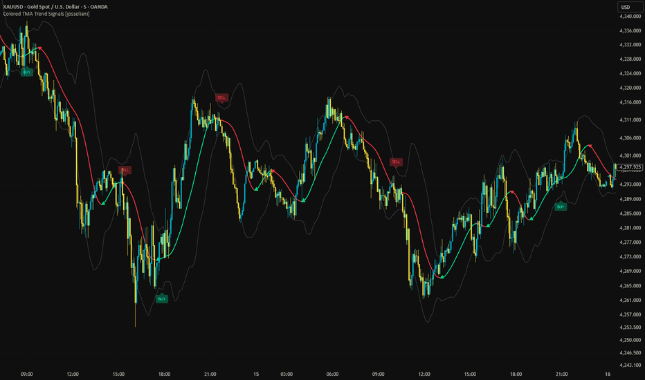
Colored TMA Trend Signals [josseliani]This is a very simple indicator for beginners in trading, based on the popular Triangular Moving Average.
I wanted to keep it simple: minimal settings, clear visuals, and easy-to-understand trade logic.
TMA color-change signals are popular, but there is one thing I wanted to improve. Sometimes, by the time TMA changes direction, price has already moved quite far away from the average. The turn is there, but entering is already uncomfortable: price is stretched, and the potential stop becomes too large.
So I added a simple candle-close confirmation engine instead of using every color change as an entry.
→ THE TMA
TMA is a Triangular Moving Average, calculated here using two consecutive simple moving averages of the same length.
Green → TMA is rising.
Red → TMA is falling.
A basic standard-deviation channel surrounds it. Optional EMA smoothing can be applied to the price source.
Small triangles mark confirmed changes between rising and falling TMA direction. They show the turn itself; BUY/SELL uses a separate confirmation.
→ BUY/SELL CONFIRMATION
For BUY, the indicator counts consecutive candle closes above the selected level. For SELL, it counts consecutive closes below it.
The default is three candles, with TMA as the confirmation level.
You can also select Bands:
• BUY → closes above the upper band.
• SELL → closes below the lower band.
Each close is compared with the level calculated on that candle.
The important detail is that the candle counters run independently of the TMA color change.
Confirmation is checked exactly on the selected Nth close — the third close by default. If the direction and signal-limit conditions do not allow a signal then, that confirmation is not reused on later candles.
The sequence must reset and form again.
For example, if price has already closed above TMA for more than three consecutive candles before TMA turns green, the earlier confirmation is not reused. Price must first close at or below TMA, then form three consecutive closes above it again.
If TMA turns green on the third close, BUY can appear together with the triangle. SELL follows the same logic in the opposite direction.
This was my simple way of skipping some entries where the move had already started before TMA turned. The script does not measure the distance from price to TMA, so a fresh confirmation can still appear far from the average.
→ ONE SIGNAL PER COLOR
With the default settings:
• A confirmed turn to green unlocks one BUY and blocks SELL.
• A confirmed turn to red unlocks one SELL and blocks BUY.
The first eligible confirmation produces the signal.
After BUY, another BUY is blocked until TMA turns red and then green again. After SELL, another SELL is blocked until it turns green and then red again.
A color section can also have no signal if the conditions are not met.
Disabling One Trade Per Color allows further signals after new confirmation sequences form. Its directional restrictions remain active while it is enabled, even if Only With TMA Trend is disabled.
→ HOW I USE IT
For me, the small triangle is simply information: TMA has changed direction.
BUY/SELL is a separate trade signal.
I made this mainly for people who are just starting to work with the market and do not want to immediately dive into complicated strategies and lots of settings.
It is basically ordinary trading with a moving average, just visualized a little more conveniently.
You can leave the default settings and watch the TMA direction and the confirmed BUY/SELL signals.
This is not a complete trading system. The trader still decides whether an entry makes sense at the current price and determines the stop, target, position size and risk management.
→ INPUTS
• Half Length → TMA smoothing length. Default: 12. The double-SMA calculation has an effective length of 2 × Half Length − 1, or 23 by default.
• Price Source → selects the calculation price. The default Weighted Price is (High + Low + 2 × Close) / 4.
• Band Deviation → standard-deviation multiplier controlling channel width. Default: 2.0. Standard deviation uses the selected source and the effective TMA length.
• Use Source Smoothing → optional EMA smoothing before calculating TMA and the channel. Disabled by default.
• Smoothing Period → optional EMA length. Default: 12.
• Show Bands → shows or hides the channel.
• Show TMA Color-Change Signals → shows or hides the triangles without disabling their alerts.
• TMA Line Width → adjusts line thickness.
• Show BUY/SELL Labels → shows or hides trade labels without disabling trade calculations or alerts.
• Break Level → selects TMA or Bands for confirmation.
• Confirm Bars → required consecutive closes, from 1 to 10. Default: 3. Confirmation is checked exactly on the selected Nth close.
• Only With TMA Trend → allows BUY only while TMA is rising and SELL only while it is falling. Enabled by default.
• One Trade Per Color → applies the directional signal limits explained above. Enabled by default.
Label spacing uses ATR and the candle range. It is only visual and does not change the signal candle or trading logic.
→ WHAT I ADDED AND WHY
TMA and standard-deviation bands are established calculations. My addition is the confirmation and signal-handling logic around them:
• Separate markers for TMA turns and BUY/SELL confirmations.
• Candle-close counters independent of color changes.
• Confirmation checked on the exact Nth close, without reusing a blocked confirmation later.
• One eligible signal per matching color turn.
• A choice of TMA or bands as confirmation levels.
• Separate alerts independent of marker visibility.
The purpose is to distinguish a moving-average turn from a confirmed price sequence while keeping the visual presentation and trading logic simple.
→ ALERTS
• TMA Bullish Color Change
• TMA Bearish Color Change
• Any TMA Color Change
• Trade Long
• Trade Short
• Any Trade Signal
All signal conditions require a closed candle. Select Once Per Bar Close when creating alerts.
→ CONFIRMATION AND LIMITATIONS
Triangles and BUY/SELL signals appear on the confirmation candle after it closes. They are not shifted into the past. The first established TMA direction does not produce a turn triangle, and unchanged TMA values preserve the last direction for turn detection.
The line, its color and the channel can change while the current candle is open. The calculation uses no future bars or higher-timeframe requests.
TMA and candle confirmation introduce delay. Signals can arrive late, sideways markets can produce unsuccessful signals, and a sequence reset does not guarantee an entry close to TMA.
Use standard time-based candles. This is an indicator, not a backtested strategy; it does not calculate trade results or a verified win rate.
Indikator
QRB - Quarterly Break RangeQRB — Quarterly Break Range is a market-structure indicator designed to help traders visualize how price interacts with the previous quarter’s range.
At the beginning of each new calendar quarter, QRB automatically identifies the completed previous quarter’s:
High
Low
50% midpoint
Those three levels are then projected across the current quarter, creating a simple structural map for price.
The indicator automatically updates when a new quarter begins, so there is no need to manually redraw the levels.
The Idea Behind QRB
The concept behind QRB comes from a simple observation:
Markets often react to important historical ranges.
Intraday traders commonly use concepts such as the Opening Range, previous-day high and low, session ranges, and other reference levels to understand where price is accepting, rejecting, or breaking away from prior value.
QRB applies that same thought process to a much larger timeframe.
Instead of asking:
“Where is price relative to today's opening range?”
QRB asks:
“Where is price relative to the previous quarter?”
The previous quarter becomes the reference range, while the current quarter shows how the market responds to that range.
This allows traders to study quarterly price behavior using only three objective levels.
Understanding the Three Levels
Previous Quarter High
The previous-quarter high represents the upper boundary of the completed quarterly range.
When price approaches this level, traders may watch for:
Rejection
Consolidation
Breakout attempts
Acceptance above the range
Retests after a breakout
A sustained move above the previous-quarter high may indicate that the market is beginning to expand beyond the prior quarter's range.
Previous Quarter Midpoint
The midpoint is calculated as:
(Previous Quarter High + Previous Quarter Low) ÷ 2
This represents the 50% level of the previous quarter's range.
The midpoint can be useful as a simple measure of where price is trading relative to the prior quarter.
Price holding above the midpoint places it in the upper half of the previous quarter's range.
Price holding below the midpoint places it in the lower half.
The midpoint may also act as an important area of balance, support, resistance, or transition.
Previous Quarter Low
The previous-quarter low represents the lower boundary of the completed quarterly range.
When price approaches this area, traders may watch for:
Support
Rejection
Consolidation
Breakdown attempts
Acceptance below the range
Retests following a breakdown
A sustained move below the previous-quarter low may indicate that the market is expanding beneath the previous quarter's range.
How to Use QRB
QRB is primarily designed as a market-structure framework, not a standalone buy or sell signal.
The three quarterly levels can help answer a few simple questions:
Where is price?
Above the previous quarter
Inside the previous quarter
Below the previous quarter
Which half of the prior range is price occupying?
Above the midpoint
Below the midpoint
How is price reacting to the boundaries?
Breaking
Rejecting
Retesting
Consolidating
Accepting beyond the range
That information can then be combined with a trader's existing approach to trend, momentum, price action, support and resistance, volume, or other forms of confirmation.
Example Market Behaviors
One possible bullish sequence could look like:
Previous-quarter high is tested
→ Price breaks above it
→ Price remains above the level
→ The level is retested
→ Buyers continue pushing price higher
A possible bearish sequence could look like:
Previous-quarter midpoint fails
→ Price moves into the lower half of the range
→ Previous-quarter low breaks
→ Price remains below the range
→ Selling pressure continues
Another possible scenario is simple rejection:
Price reaches the previous-quarter high
→ Fails to gain acceptance above it
→ Moves back inside the range
→ Rotates toward the midpoint
QRB does not attempt to predict which scenario will occur.
It simply provides the structural levels needed to observe what price actually does.
Why Quarterly Ranges?
Calendar quarters are natural market periods.
Each quarter contains roughly three months of price discovery and can represent a significant amount of accumulated positioning and market activity.
Rather than treating each daily candle independently, QRB allows traders to step back and see price within a broader structural framework.
The previous quarter essentially becomes a large reference range.
The current quarter then answers the question:
Will price remain inside that range, reject its boundaries, or expand beyond it?
That is the central idea behind QRB.
Best Use
QRB was designed primarily for higher-timeframe analysis, especially the Daily chart.
It may be useful across different markets, including:
Stocks
Forex
Futures
Indices
Cryptocurrencies
Because different markets behave differently, traders should evaluate the concept independently on the instruments they trade.
Customization
QRB allows users to customize the appearance of each level, including:
Previous Quarter High color
Previous Quarter High thickness
Midpoint color
Midpoint thickness
Previous Quarter Low color
Previous Quarter Low thickness
This allows the quarterly structure to remain visible without overwhelming the chart.
The Philosophy Behind QRB
QRB is intentionally simple.
There are no complicated calculations, predictive algorithms, or large collections of indicators.
The purpose is to create a clean structural map and allow price action to provide the information.
The core idea is:
Previous quarter = reference range
Current quarter = reaction to that range
From there, the trader observes whether price accepts, rejects, breaks, retests, or rotates around those levels.
Sometimes three well-defined levels can tell you more about market structure than twenty indicators ever could. Indikator

Gold M15 Signal Engine with H4 Trend FilterWHAT THIS SCRIPT DOES
This indicator detects intraday entry setups on the 15-minute chart and attaches a complete, pre-calculated trade frame to each one: an entry, a stop-loss, and three targets. It then tracks that setup bar by bar and reports what actually happened to it — which target was reached, whether the stop was hit, and when the setup has gone stale.
It was built and tuned for gold (XAU/USD) on the 15-minute timeframe. The script deliberately refuses to run on any other timeframe.
WHY IT IS DIFFERENT FROM A STANDARD SIGNAL SCRIPT
Most published signal scripts stop at the arrow. They mark an entry and leave the trader to guess the rest. Three design choices separate this one:
1. Every signal ships with its own risk frame.
The stop-loss is derived from the structural level that produced the signal, not from a fixed pip distance, and it is then capped by a percentage-of-price ceiling so a single wide candle cannot create an unreasonable stop. The first target is ATR-based. The second target prefers a real support or resistance level detected on the chart, and only falls back to an ATR multiple when no suitable level exists. This means targets sit where price is actually likely to react, not at arbitrary distances.
2. The higher timeframe has a veto.
A 4-hour EMA200 trend filter gates every signal. A long is only permitted when the 4-hour close is above its own EMA200, and a short only when it is below. This removes the most common failure mode of intraday signal scripts — firing counter-trend entries during a strong higher-timeframe move. The filter can be switched off in the settings.
3. Signals report their own outcome.
Once a signal is active the script follows it: it marks the bar where each target was reached, automatically moves the displayed stop to breakeven after the first target and to the first target after the second, and hides the setup once the stop is hit. Setups that neither complete nor fail within a configurable number of bars are marked as expired rather than being left on the chart indefinitely.
HOW THE SIGNAL ENGINE WORKS
Three independent detection paths can produce a signal. All of them must additionally pass the RSI gate, the higher-timeframe filter, and a cooldown period.
EMA pullback. In an aligned trend (EMA20 above EMA50 and price above EMA200 for longs, inverted for shorts), price wicks into the EMA20 and closes back on the trend side of it. The candle must close in the outer 55% of its own range, which filters out indecisive bars.
Support and resistance reaction. Price tests a detected level within a 0.15% tolerance and closes back on the correct side of it with the same candle-strength requirement.
N-bar breakout. Price closes beyond the highest high or lowest low of the previous N bars with a directional close.
Support and resistance levels are built from confirmed pivot highs and lows. A minimum-gap rule prevents clustered levels from stacking on top of each other, and the number of active levels on each side is capped.
RSI gate. The pullback path requires RSI between 35 and 65 — it avoids entries that are already stretched. The reaction and breakout paths use wider one-sided bounds appropriate to their context.
Cooldown. A minimum number of bars must pass between signals, and a new signal in the same direction is blocked while an earlier one is still running.
READING THE PANEL
The panel in the top-right corner shows the direction of the active signal, its entry, the current stop, all three targets, the bar the signal was created on, its live status, and the current 4-hour trend state.
The status line progresses through: active, then first target reached with the stop moved to entry, then second target reached with the stop moved to the first target, then complete. If the stop is hit the panel is removed and the bar is marked on the chart.
SETTINGS
Moving averages — lengths for the three EMAs.
Support / resistance — pivot lookback, how many levels to keep on each side, and the minimum percentage gap between them.
Signal engine — RSI length, cooldown bars, breakout lookback, and how many bars before a setup is marked expired.
Targets and stop — ATR length, the three ATR multipliers, and the maximum stop size as a percentage of price.
Higher-timeframe filter — enable or disable the 4-hour trend veto.
LIMITATIONS - PLEASE READ
It runs on the 15-minute timeframe only. On any other timeframe the script draws a warning and produces nothing. The thresholds were tuned for 15-minute gold behaviour and do not transfer.
It was tuned on gold. The tolerance values, ATR multipliers and RSI bounds reflect how XAU/USD moves. On other instruments the defaults will need adjustment and the results may differ substantially.
Signals are evaluated on confirmed bars only. Nothing is drawn or evaluated from an unclosed bar, so the script does not repaint — but this also means a signal appears at the close of its bar, not during it.
The 4-hour filter uses the last closed 4-hour bar. The higher-timeframe request uses lookahead_off, so no future data is used. The consequence is that within a forming 4-hour bar the filter reflects the previous one.
Target and stop levels are calculated at the moment the signal fires and are not recalculated afterwards. If volatility changes materially after entry, the levels do not adapt.
The stop and target tracking uses bar high and low values. When both the stop and a target fall inside the same bar's range, the script resolves the stop first. Real intrabar sequence may have differed.
It does not know about scheduled news. Economic releases routinely produce moves that invalidate technical setups. The script has no awareness of the economic calendar.
This is an analysis tool, not a trading system. It does not account for spread, commission, slippage or position sizing, and no historical behaviour implies future results.
ON PERFORMANCE CLAIMS
This publication makes no claim about win rate, accuracy or profitability, because no such claim can be substantiated for future market conditions. What the script does is make each setup's assumptions explicit and visible so you can evaluate them yourself.
ORIGINALITY
The three detection paths use well-known building blocks — EMAs, RSI, ATR, pivot-based levels. The original work is in how they are combined: a structural stop bounded by a percentage ceiling, a second target that prefers real chart levels over a fixed multiple, a higher-timeframe veto applied uniformly across all three detection paths, and a per-signal outcome tracker with automatic stop progression and expiry. The code is entirely original and is published open-source so every one of these mechanics can be inspected and modified. Indikator

QuantumForexTrader_SniperFusion_Strategy_v2What is the QuantumForexTrader (SniperFusion v2)?
This is an advanced, automated trading strategy written for TradingView (using Pine Script v6). It is currently calibrated specifically for ZCash (ZEC) on the 5-minute chart, but its flexible architecture allows it to run on any trading pair or timeframe.
Instead of relying on simple moving average crossovers, it acts like a digital sniper—waiting for multiple layers of market confirmation before executing a trade.
Key Features Broken Down
🧠 Quantum Core (Market Memory):
It looks back across thousands of historical bars to calculate a weighted "memory" score of recent price momentum. It determines whether bulls or bears currently dominate the market structure.
🎯 Sniper Fusion & Multi-Indicator Filters:
A trade is only triggered when a strict checklist is met. It checks the VWAP, Relative Strength Index (RSI), MACD, EMA trends, ADX (trend strength), and volume spikes simultaneously. It also cross-references a 5-minute higher-timeframe filter to ensure you are trading with the overarching trend.
🛡️ Advanced Risk Management:
Dynamic Stop-Loss: Automatically calculates risk based on market volatility (ATR).
5-Tier Take-Profits: Instead of closing the whole trade at once, it takes profits off the table in 20% chunks across five consecutive target levels.
Trailing Stop-Loss: Once the trade moves into profit by a certain amount, a trailing stop locks in gains and follows the price.
⚡ Automated Execution Ready:
It is built with webhook capabilities (compatible with platforms like Pionex). A single alert template in TradingView sends fully formatted JSON buy, sell, and close signals directly to your bot.
📊 Live On-Chart Dashboard:
It draws a clean HUD table directly on your chart, showing real-time metrics like Bull/Score percentages, market bias (STRONG BULL, MILD BEAR, etc.), active positions, net PnL, and win rate.
🔒 Zero-Repaint Protection:
All higher-timeframe and indicator calculations strictly look at confirmed completed bars ( offset), preventing false backtest results that vanish in live trading.
Strategie

Reaction Path [BullByte]Reaction Path is a price-action, pressure, volatility, and trade-geometry indicator designed to organize two different market behaviours into one integrated framework:
1. Reaction: price has displaced away from its current Fair Price area and the recent candle behaviour shows conditions consistent with a possible response back toward the opposing side.
2. Continuation: price is positioned beyond the Fair Price area while pressure is migrating in the same direction, recent movement is efficient enough to qualify as directional, and the current bar shows sufficient expansion and participation.
The purpose of Reaction Path is not to predict the future or guarantee a reversal or continuation. It is designed to help traders distinguish between changing pressure, developing movement, established directional travel, exhaustion, and neutral conditions.
The indicator combines several complementary measurements rather than relying on a conventional overbought/oversold oscillator.
The main components are:
A wick-weighted Fair Price calculation.
An adaptive Reaction Band around Fair Price.
A Pressure Centre based on where price closes within its recent ranges.
Pressure Migration to measure how that pressure balance is changing.
Market-state classification including EXHAUSTION , SHIFT , BUILDING , TRAVEL , MOVING UP , MOVING DOWN , and NEUTRAL .
Reaction and Continuation signal qualification.
Trend Efficiency as a directional regime filter for continuation conditions.
Candle-character analysis using body efficiency, wick relationships, range speed, directional dominance, depth, and volume behaviour.
Spike and immediate post- spike filtering .
Adaptive Failure Memory that becomes more selective after setup invalidations.
ATR-based Path Level 1, Path Level 2, and invalidation geometry.
A Projected Path corridor for visualizing the current route from entry toward Path Level 2.
A compact dashboard showing market state, path direction, Fair Price location, and active setup levels.
Historical setup visualization for reviewing completed setups.
Bar-close alert events for new signals, target completion, and invalidation.
Reaction Path is intended as an analytical framework. The signals and plotted levels are references for decision-making and should be evaluated together with the actual market context, instrument behaviour, liquidity, execution conditions, and the trader's own risk process.
---
ORIGINALITY - WHY THIS IS NOT A MASHUP
Reaction Path is built as a single integrated behavioural engine rather than a collection of unrelated indicators placed together.
The individual measurements are not displayed as independent conventional indicators which are combined with arbitrary voting rules.
Instead, the engine builds a connected chain:
Fair Price
Price displacement from Fair Price
Pressure Centre
Pressure Migration
Market state
Candle character
Trend efficiency
Signal qualification
Trade geometry
Setup lifecycle
Failure Memory
Each stage contributes information to the stages that follow it.
Fair Price establishes the current reference area.
Pressure Centre measures where recent closes are occurring within their candle ranges.
Migration measures whether that pressure balance is moving.
Market-state logic classifies the behaviour of that migration.
Reaction and Continuation conditions then use several independent characteristics of price behaviour before a setup is created.
Failure Memory adds another layer by recording the characteristics surrounding an invalidated setup and making subsequent qualification more selective when sufficiently similar conditions reappear.
This structure is what makes the indicator an integrated system rather than a simple mashup of unrelated calculations.
---
PURPOSE OF THE INDICATOR
Markets do not move in only one way.
Sometimes price stretches away from its current area of accepted value and begins to show rejection.
Sometimes price moves away from that area and continues because pressure remains aligned with the direction of travel.
Sometimes a large candle creates apparent momentum but is primarily wick and produces little decisive progress.
Sometimes pressure begins changing before a visible directional move becomes established.
Reaction Path is designed to separate these situations.
The central question is not simply:
"Is price going up or down?"
Instead, the framework asks:
Where is price relative to its current Fair Price area?
Is recent closing pressure migrating?
Is that migration strengthening, weakening, shifting, or reaching an extreme?
Is the recent movement efficient or highly rotational?
Is the current bar expanding relative to recent activity?
Are wicks and candle bodies supporting the intended behaviour?
Is volume informative on the current symbol?
Has a similar setup recently failed?
Has the current setup reached Path Level 1, Path Level 2, or its invalidation reference?
---
WHY THESE SPECIFIC MECHANICS
FAIR PRICE
Fair Price is calculated from a custom typical-price measure:
(high + low + 2 x close) / 4
The calculation is weighted according to candle body efficiency.
Candles with a smaller body relative to their total range receive greater weight. This gives more influence to candles that spent more of their range away from their decisive body.
The result is a rolling reference value intended to represent the recent area around which price has been behaving.
An adaptive deviation value is calculated from the same weighted observations.
Together they create:
Fair Price
Fair Price Upper
Fair Price Lower
This gives the indicator a dynamic reference zone rather than relying on a fixed percentage distance.
REACTION BAND
The Reaction Band visualizes the Fair Price area as three nested bands.
The inner and outer areas represent progressively wider deviations around the current Fair Price.
The band therefore provides context for whether price is:
Inside the current fair area.
Moving toward an edge.
Beyond the upper region.
Beyond the lower region.
The band color also reflects the current pressure/state classification.
PRESSURE CENTRE
The Pressure Centre does not ask whether a candle is simply green or red.
Instead, it examines where the close occurred inside the candle's own high-low range.
A close near the high represents stronger upward closing pressure for that candle.
A close near the low represents stronger downward closing pressure.
The measurement is averaged over a rolling window and weighted using the same candle-character concept used by Fair Price.
This produces a smoother representation of recent closing-pressure behaviour.
PRESSURE MIGRATION
Pressure Migration measures how much the Pressure Centre has changed between two points in time.
A positive migration indicates that the recent closing-pressure balance has shifted upward.
A negative migration indicates that it has shifted downward.
The engine then evaluates the magnitude and context of this migration instead of treating every zero crossing as a signal.
This is important because very small changes around an inflection point can alternate direction without representing meaningful behavioural change.
---
MARKET STATES
REACTION PATH classifies the current market into several behavioural states.
EXHAUSTION
Pressure has reached an extreme zone.
This does not automatically mean that price must reverse.
It means the Pressure Centre has reached one of the defined extreme regions used by the engine.
SHIFT
A meaningful migration transition has occurred across the configured stall threshold.
The purpose is to identify a stronger change in pressure rather than reacting to a minor zero-line fluctuation.
BUILDING
Pressure is moving in the upward direction and is approaching or has reached the internal building region.
MOVING UP
Upward pressure migration has become sufficiently strong to qualify as upward movement outside the building state.
MOVING DOWN
Downward pressure migration has become sufficiently strong to qualify as downward movement.
TRAVEL
Directional continuation conditions are active while price is positioned on the corresponding side of Fair Price.
NEUTRAL
None of the above behavioural classifications currently has priority.
---
WHAT MAKES A REACTION SIGNAL
A Reaction signal is not generated simply because price is above or below Fair Price.
For a long Reaction setup, the engine looks for a combination of conditions including:
Price displacement sufficiently below Fair Price.
Recent directional efficiency supporting the intended reaction.
Sufficient directional dominance.
A stronger lower-wick response than the opposing wick.
Adequate recent range speed.
Sufficient volume participation when volume is informative.
Sufficient recent depth below Fair Price.
Absence of a qualifying spike or immediate post-spike retracement condition.
The short Reaction condition is the mirrored structure.
The important concept is that displacement alone is not enough.
The engine looks for displacement together with evidence that recent candle behaviour is producing a meaningful response.
---
WHAT MAKES A CONTINUATION SIGNAL
Continuation setups use a different logic.
A long Continuation setup requires price to be positioned above the Fair Price region together with:
A qualifying expansion bar.
Limited opposing wick behaviour.
Sufficient candle efficiency.
Adequate range speed.
Sufficient volume participation when volume is informative.
Positive trend direction.
Adequate trend efficiency.
A normal bar rather than a qualifying spike condition.
Short Continuation setups use the corresponding bearish structure.
Two consecutive closes outside the Fair Price band are recognized as acceptance by the state engine. A Continuation signal itself does not universally require two consecutive closes; the current bar can qualify when the other continuation conditions are satisfied.
---
EXPANSION LOGIC
A continuation setup requires more than simply producing the largest candle of a recent window.
The current range must satisfy both:
1. It must be at least as large as the previous recent maximum range.
2. It must also exceed an ATR-based expansion floor.
This prevents a relatively large candle inside a very quiet environment from being treated as meaningful expansion solely because it happens to be the largest recent candle.
ATR is therefore used as a volatility scale and also as part of the expansion qualification.ATR is not used as a standalone directional signal.
---
CANDLE CHARACTER AND QUALITY FILTERS
Reaction Path evaluates several aspects of recent candle behaviour.
BODY EFFICIENCY
Measures the body relative to the full candle range.
Higher efficiency means more of the candle's movement occurred through the body rather than through wicks.
WICK BALANCE
Compares upper and lower wick behaviour to determine whether the candle is showing rejection characteristics or cleaner directional movement.
RANGE SPEED
Compares the current range with recent average range behaviour.
VOLUME RATIO
Compares current volume with its recent baseline when the symbol provides meaningful volume information.
On symbols where volume is flat, missing, or otherwise uninformative, the engine avoids pretending that volume provides meaningful confirmation and uses a neutral treatment instead.
DEPTH
Measures how far recent price movement has extended beyond the Fair Price reference.
DIRECTIONAL DOMINANCE
Measures how much of the recent short window has been directionally aligned with the candidate setup.These dimensions are evaluated together rather than allowing one measurement to create a setup by itself.
---
SPIKE FILTER
Large candles are not automatically treated as strong momentum.
Reaction Path identifies oversized, low-efficiency bars where a substantial portion of the range is wick rather than decisive body movement.
Signal generation is withheld during such qualifying spike conditions.
The engine also checks the bar immediately following a qualifying spike. If that next bar is simply retracing inside the previous spike's range, it is also treated as a lower-quality setup environment.
The goal is to avoid treating every unusually large candle as meaningful directional expansion.
---
FAILURE MEMORY
Reaction Path includes an adaptive Failure Memory system.
When an active setup reaches its invalidation boundary before reaching Path Level 2, the engine records characteristics of the failed environment, including elements such as:
Direction.
Signal family.
Displacement.
Pressure Migration.
Directional efficiency.
Speed.
Depth.
Volume behaviour.
Pressure state.
Range relative to ATR.
The system then uses two related forms of adaptation.
GLOBAL FAILURE TIGHTENING
After consecutive invalidations, the qualification requirements become progressively more selective, with the escalation capped by the internal maximum failure count.
This means repeated failed conditions do not simply produce an unlimited stream of identical setups.
SIMILARITY-BASED MEMORY
The current environment can also be compared with the recorded failed environment.
A sufficiently similar setup can be blocked when it belongs to the same relevant signal family and direction.
A failed Reaction therefore weighs most strongly against a highly similar subsequent Reaction attempt, while the global failure tightening can still affect other qualifying setups.
Failure Memory uses two independent lifecycles. The direction and similarity block can clear when the market behaviour resets or the memory window expires, allowing a genuinely changed market environment to qualify again. The consecutive-failure count follows a separate lifecycle and is cleared when Path Level 2 is reached or when its own time-based expiry occurs. This allows the system to remember a losing sequence without permanently blocking a direction.
This is a behavioural filter, not a guarantee that future similar setups will fail.
---
SETUP SENSITIVITY
The Setup Sensitivity input provides a single control for the overall selectivity of the engine.
Adjusts the overall qualification balance. Lower values tighten distance and expansion requirements while relaxing several quality thresholds; higher values do the opposite. Use this control to adapt overall setup selectivity.
The thresholds are coupled rather than exposing every individual internal gate.
This is intentional.
Changing one isolated component independently could create an internal imbalance between distance, efficiency, speed, depth, volume, expansion, and trend requirements.The sensitivity control therefore moves these requirements together.
---
TRADE GEOMETRY
When a setup is created, Reaction Path establishes four primary reference levels:
ENTRY
The setup's entry reference is the signal-bar closing price.
PATH LEVEL 1
Path Level 1 is calculated from the setup entry using the configured ATR distance.
PATH LEVEL 2
Path Level 2 is the primary larger projected objective used by the setup geometry and is also calculated from the setup entry using ATR.
INVALIDATION
For Reaction setups, the invalidation boundary is derived beyond the relevant reaction extreme using the configured ATR distance.
For Continuation setups, the invalidation reference is the Fair Price value captured when the setup is created.
These are analytical reference levels.
They do not guarantee execution, fill price, stop execution, or trading outcomes.
---
PROJECTED PATH
The Projected Path is a visual corridor extending from the setup entry toward Path Level 2.
It is not a forecast.
It does not use future prices to calculate where the path should go.
Instead, the corridor is shaped using the confirmed setup and the current market-state information available after the setup has been created.
Its curvature responds to pressure migration and displacement.
Its width responds to the current state and field energy, allowing the visual route to become wider when the market environment is more uncertain and narrower when conditions are calmer.
Because the path can respond to subsequent confirmed market conditions, it should be read as a dynamic visual reference rather than a promised route taken by price.
---
PATH LEVEL EXTENSIONS
When a continuation setup remains active and another qualifying continuation condition appears in the same direction, Path Level 2 can be extended.
Extensions are limited by an internal maximum so that one continuously trending environment cannot expand the objective indefinitely.
The extension uses the configured Path Level 1 ATR distance as the incremental extension amount.
WHY THE REACTION FIELD EXISTS
The Reaction Field was created to solve a specific problem:
Price candles show what happened, but they do not always make the change in underlying closing pressure easy to read.
A market can move higher while its internal pressure is weakening.
A market can move lower while selling pressure is beginning to lose control.
A reversal can develop through several candles before the change becomes obvious from price alone.
Likewise, a strong-looking candle does not automatically mean that directional pressure is continuing. The candle may contain a large amount of wick, may occur inside a rotational market, or may simply be an isolated expansion.
Reaction Path therefore separates two ideas:
PRICE LOCATION : Where price is relative to the current Fair Price area.
PRESSURE MIGRATION : How the recent balance of closing pressure is changing.
The Reaction Field is the visual representation of that second component.
For every candle, the engine examines where the close occurred inside the candle's own high-low range.
A close near the high contributes stronger upward closing pressure.
A close near the low contributes stronger downward closing pressure.
Those observations are averaged over a rolling window using the same wick-weighting concept used by the Fair Price calculation.
The engine then compares the current Pressure Centre with an earlier Pressure Centre.
That difference is called Migration .
In simplified form:
Pressure Centre = weighted average of close location within recent candle ranges
Migration = Current Pressure Centre - Prior Pressure Centre
The Reaction Field plots this migration as a behavioural field.
This creates a visual layer that answers a different question from the price chart:
"Is control shifting, and in which direction?"
That is why the oscillator is not intended to behave like RSI, MACD, Stochastic, or a traditional overbought/oversold oscillator.
It is also not intended to be used as a standalone buy/sell trigger.
Its purpose is to provide continuous context around the discrete events identified by the main engine.
For example:
Price can be below Fair Price while pressure begins migrating upward.
Pressure can continue building before a full Reaction setup qualifies.
Migration can reverse direction across the configured stall threshold, creating a SHIFT condition.
Pressure can reach an extreme zone, producing an EXHAUSTION state.
Pressure can remain directionally aligned while price travels beyond Fair Price, supporting continuation context.
The oscillator therefore acts as the behavioural " state layer " between raw candles and the final setup qualification.
The candle chart shows the movement.
The Fair Price Band shows location.
The Reaction Field shows pressure migration.
The signal engine combines these and additional price, volume, speed, depth, efficiency, expansion, and trend conditions before creating a Reaction or Continuation setup.
This separation is intentional.
The Reaction Field is there to help the trader understand the condition that surrounds a signal, rather than simply displaying another indicator that generates an independent signal.
---
REACTION FIELD - HOW TO READ THE PANE
The lower Reaction Field is the indicator's dedicated analytical pane.
It is intentionally not designed as a conventional overbought/oversold oscillator.
The field visualizes the direction and magnitude of Pressure Migration.
REACTION SPINE
The main line represents the scaled migration value.
Positive territory indicates upward pressure migration.
Negative territory indicates downward pressure migration.
The distance from the centre gives additional visual context about migration magnitude.
REACTION FLOW
Reaction Flow is a scaled companion to the Reaction Spine.
It provides a secondary visual representation of the same migration field so smaller movements can be compared more easily.
REACTION CENTRE
The centre line provides the zero reference.
REACTION FIELD
The shaded field surrounds the Reaction Spine.
Its width responds to field energy, which reflects migration magnitude and range-speed behaviour.
REACTION TRANSITION
A small transition marker can appear when the engine identifies a SHIFT or EXHAUSTION condition.
The Reaction Field should therefore be interpreted as a pressure-behaviour visualization, not as an independent buy/sell oscillator.
---
DASHBOARD - WHAT EACH ROW MEANS
The on-chart dashboard summarizes the current state without requiring the trader to interpret every calculation separately.
MARKET STATE
Displays the current behavioural classification such as:
EXHAUSTION
SHIFT
BUILDING
TRAVEL
MOVING UP
MOVING DOWN
NEUTRAL
PATH
Shows whether the current pressure/path condition is:
UP OPEN
DOWN OPEN
WAIT
LOCATION
Shows where the current close sits relative to the Fair Price region:
ABOVE FAIR
BELOW FAIR
AT FAIR
ACTIVE SETUP
When a setup is active, the dashboard provides:
ENTRY
PATH LEVEL 1
PATH LEVEL 2
INVALIDATION
When no setup is active, the dashboard displays that no active setup is currently present.
The dashboard also displays the current symbol and chart timeframe.
---
VISUAL SETTINGS
SHOW HISTORICAL SETUPS
When enabled, completed setups remain visible so historical behaviour can be reviewed.
The number of retained completed setups is capped by the Maximum Historical Setups setting.
The current implementation allows up to 25 retained historical setups.
SHOW REACTION BAND
Displays the three nested Fair Price bands directly on the price chart.
SHOW PROJECTED PATH
Displays the dynamic corridor between the setup entry and Path Level 2.
This can be disabled when a cleaner chart is preferred.
SHOW DASHBOARD
Displays the current market-state and setup summary.
DASHBOARD SIZE
Available sizes:
Small
Medium
Large
DASHBOARD POSITION
Available positions:
Top Left
Top Right
Bottom Left
Bottom Right
---
INPUTS - GROUPED BY SETTINGS PANEL
ENGINE SENSITIVITY
Signal Mode
Reaction Only
Continuation Only
Both
This determines which signal family the engine is allowed to generate.
Setup Sensitivity
Controls overall selectivity.
Lower values allow more setups.
Higher values require stronger market behaviour.
TRADE GEOMETRY
Path Level 1
Defines the distance from the setup entry to Path Level 1 in ATR units.
Path Level 2
Defines the distance from the setup entry to Path Level 2 in ATR units.
Invalidation
Defines the invalidation distance used for Reaction setup geometry.
VISUAL SYSTEM
Show Historical Setups
Keeps completed setups visible for historical review.
Maximum Historical Setups
Controls the maximum number of completed setup drawings retained at once.
Show Reaction Band
Controls visibility of the Fair Price bands.
Show Projected Path
Controls visibility of the dynamic path corridor.
DASHBOARD
Show Dashboard
Controls dashboard visibility.
Dashboard Size
Controls dashboard text size.
Dashboard Position
Controls dashboard placement.
---
HOW TO USE REACTION PATH
A practical workflow is to begin with the market state rather than immediately reacting to an individual signal.
STEP 1 - CHECK LOCATION
Determine whether price is:
ABOVE FAIR
BELOW FAIR
AT FAIR
This establishes the current relationship between price and the Fair Price area.
STEP 2 - CHECK PRESSURE
Read the Reaction Field and Pressure Migration.
Look for whether pressure is:
Building.
Moving.
Shifting.
Reaching exhaustion.
Remaining neutral.
STEP 3 - IDENTIFY THE BEHAVIOUR
A Reaction condition and a Continuation condition represent different market behaviours.
Do not interpret every long condition as interchangeable with every other long condition.
Reaction setups are based on displacement and response characteristics.
Continuation setups are based on directional persistence, expansion, efficiency, and trend alignment.
STEP 4 - CHECK THE SETUP GEOMETRY
When a signal appears, review:
ENTRY
PATH LEVEL 1
PATH LEVEL 2
INVALIDATION
These levels provide the framework for evaluating the setup rather than requiring the trader to estimate distances visually.
STEP 5 - OBSERVE THE PROJECTED PATH
When enabled, use the Projected Path as a visual representation of the current route and uncertainty.
It is not a prediction.
STEP 6 - REVIEW FAILURE MEMORY
When the engine has recently experienced an invalidation, subsequent qualification may become more selective.
This can result in fewer signals during repeated similar conditions.
STEP 7 - APPLY YOUR OWN RISK PROCESS
The indicator provides analytical references.
Position size, leverage, execution, risk per trade, market selection, trading hours, and final trade decisions remain the responsibility of the trader.
---
RECOMMENDED TIMEFRAMES
Reaction Path can be applied to different chart timeframes, but it is particularly suited to intraday analysis where changes in candle behaviour, pressure migration, and directional expansion can be observed clearly.
As a practical starting point, traders may evaluate it on:
1 minute
3 minute
5 minute
15 minute
The appropriate timeframe depends on the instrument, liquidity, trading style, and desired holding period.
The same settings should not automatically be assumed to behave identically across every market or timeframe.
The indicator does not use multi-timeframe security requests, so its calculations are based on the selected chart's own data.
---
REAL-LIFE EXAMPLE - CONSOLIDATED
Consider a market trading below its current Fair Price area.
Price has recently displaced downward, but the recent candles begin showing stronger lower-wick response while upward closing pressure starts migrating.
The engine may classify the environment as BUILDING or SHIFT depending on the measured pressure transition.
If the remaining Reaction requirements are also satisfied, a REACTION LONG setup can be created.
The chart then provides:
ENTRY
PATH LEVEL 1
PATH LEVEL 2
INVALIDATION
The trader can now evaluate the situation using a defined reference structure rather than treating every tick as a new decision.
A different scenario can occur when price is already above Fair Price.
Suppose the market maintains positive pressure migration, the recent trend is efficient rather than highly rotational, the current range expands beyond its recent range window and the ATR expansion floor, opposing wick behaviour remains limited, and the other continuation requirements are satisfied.
The engine can then produce a CONTINUATION LONG setup.
If the market instead produces an oversized low-efficiency spike, the signal can be withheld.
If an existing setup becomes invalidated, Failure Memory records the characteristics of the environment and can make highly similar subsequent attempts more selective.
LIVE CHART EXAMPLE: REACTION LONG ON QQQ (15m)
Price spent an extended stretch below the lower edge of the wick-weighted Fair Price band, with the Reaction Field spine sitting in negative territory, a sign that recent candles had been closing nearer their lows than their highs, reflecting sustained downward closing pressure.
As price pushed further beneath Fair Price, the depth of that penetration cleared the engine's minimum requirement, and the bars driving it stayed clean of spike behaviour, sufficient range, volume, and body efficiency, without any oversized, low-quality wick bar in the mix.
On the signal candle itself, the lower wick grew clearly longer than the upper wick: a decisive rejection of the downside rather than an indecisive drift. At the same moment, the Pressure Centre had already begun migrating upward, flipping the Reaction Field spine from negative to positive on that identical bar.
It was this convergence, sufficient displacement and depth below Fair Price, a wick-confirmed rejection, and a same-bar pressure flip - that opened the gate for a Reaction Long setup, rather than any single condition acting alone.
LIVE CHART EXAMPLE - CONTINUATION LONG ON BTC/USDT (5m)
Price had already pushed above the fair-price band and, over the signal bar and the one immediately before it, closed above it both times- the engine's threshold for acceptance rather than a single overshoot. Over the same stretch, the broader move up from the earlier local low remained efficient enough to qualify as a genuine trend rather than rotational chop, and the Reaction Field spine was already migrating upward, meaning closing pressure was actively supporting the direction of the setup.
On the signal candle, range expanded beyond the recent local maximum and cleared the ATR-based expansion floor, while the upper wick stayed minimal and the body dominated the bar, a decisive, clean directional bar regardless of its color. It was these conditions holding together on that one bar- acceptance above fair, a qualifying expansion bar, clean wick geometry, and trend efficiency- that opened the gate for a Continuation Long setup, rather than any single measurement acting alone.
These examples describe how the engine behaves conceptually. They are not historical performance claims or guarantees of what price will do next.
---
ALERTS
Reaction Path provides alert events for the setup lifecycle.
NEW SIGNAL
Triggered when a new Reaction or Continuation setup is created.
TARGET REACHED
Triggered when the active setup reaches its Path Level 2 completion condition.
INVALIDATED
Triggered when the active setup reaches its invalidation condition.
Signal, target, and invalidation alerts are generated on confirmed bar events using once-per-bar-close alert frequency.
The alert message includes the chart symbol, timeframe, event type, signal type, and relevant price level.
Use TradingView's alert system to create the desired alert from the indicator.
---
CONFIRMATION, REPAINTING, AND DATA BEHAVIOUR
Current-bar signal decisions are restricted to confirmed bar data.
The indicator does not use request.security().
It does not use lookahead.
The signal lifecycle is therefore based on closed-bar confirmation rather than intrabar creation of a setup followed by later modification of that signal.
Some visual elements, such as live setup labels and dashboard presentation, may update while the current chart bar is forming.
Those visual updates do not create, close, or modify the confirmed signal decision.
The indicator is also intentionally disabled on non-standard chart types such as Heikin Ashi, Renko, Kagi, Point & Figure, and Range charts.
Use a standard chart type when evaluating the indicator.
---
LIMITATIONS
Reaction Path is an analytical indicator, not an automatic trading system.
No indicator can determine with certainty whether a market will reverse, continue, reach a target, or respect an invalidation level.
The calculations are sensitive to the characteristics of the selected instrument and timeframe.
Low-liquidity markets, unusual spreads, sudden news events, market gaps, abnormal volatility, and unreliable volume data can affect the behaviour of any price-based analytical model.
Volume-dependent qualification also depends on the quality of volume supplied by the symbol.
The Projected Path is a visual representation of the current confirmed setup and market state. It is not a future-price forecast.
Path Level 1, Path Level 2, and Invalidation are reference levels derived from the configured geometry and current market information. They do not represent guaranteed execution levels or guaranteed outcomes.
Historical setup drawings are provided for visual review and should not be interpreted as a verified backtest or performance record.
If Path Level 2 and Invalidation are both touched during the same bar, the script cannot determine the true intrabar sequence from OHLC data alone. It resolves this ambiguity conservatively by treating the setup as invalidated when both levels are touched on the same bar.
The indicator does not replace independent analysis, risk management, or execution planning.
---
IMPORTANT NOTES
For consistent interpretation:
Use standard chart types.
Evaluate signals on closed bars.
Understand the difference between Reaction and Continuation signals.
Treat the Fair Price area as a dynamic reference, not an absolute support or resistance level.
Read the Reaction Field as pressure migration rather than a traditional overbought/oversold oscillator.
Consider the dashboard as a summary of the engine state, not an independent signal source.
Treat Failure Memory as an adaptive qualification filter, not as a prediction of future failure.
Review Path Level 1, Path Level 2, and Invalidation together.
Do not assume identical behaviour across different symbols and timeframes.
Use your own risk and execution rules before acting on any setup.
---
DISCLAIMER
This indicator is provided for informational and educational purposes only and does not constitute financial, investment, trading, or other professional advice.
Trading financial markets involves substantial risk, including the possible loss of capital.
The signals, states, levels, visualizations, and alerts generated by Reaction Path are analytical references only. They do not guarantee market direction, execution, profitability, target achievement, or avoidance of losses.
Past market behaviour and historical setup visualization do not guarantee future results.
Users are responsible for their own trading decisions, risk management, position sizing, and execution. Indikator

Delta Run ConfluenceDelta Run Confluence
Any bar can show net buying or net selling in its volume delta. This looks for the runs: several bars of the same flow that moved price the way flow should, with nothing pushing back.
That's what this indicator finds. It watches every bar for a run of one-sided delta, checks whether price responded to it, checks that the other side has gone quiet, and marks the bar where all three line up.
It's a confluence tool, not a standalone indicator. Here's the approach. Put it on your chart and keep trading your own setup. When a marked run shows up at a level you're already watching, you can start asking a real question: do reversals happen more often when a run lands there? Or do continuations? The chart shows you the runs and the table gives you the numbers, so you can work that out on your own symbol and timeframe.
🔸 Three checks, one bar
It runs three checks on estimated volume delta and only marks a bar when all three pass:
▪ 3-Bar Delta Run. Delta is estimated from lower-timeframe candles (1-second candles on a 1-minute chart, 1-minute candles up to 15 minutes), each one's volume signed by its direction. A run is three bars in a row with net delta on the same side, buying or selling. Three is the default and you can change it. It means one side kept pressing.
▪ Delta Efficiency. Take the run's price range and divide it by the delta behind it. Compare that with the last 100 bars. Above average, price moved more than it normally does for that much delta. Below average, price barely moved for it, which is what absorption looks like. You can look for either, or both.
▪ Isolation Test. No run the other way in the last 45 minutes. One-sided flow, not a tug-of-war.
Persistent, effective and uncontested, all on the same bar. When that happens the run is marked, green for buy-flow, red for sell-flow. That's the confluence.
Every threshold is a plain number you can turn up or down. Want only the cleanest runs? Widen the isolation window. Curious about absorption near session highs and lows? Set the efficiency filter to Absorbed.
🔶 WHAT YOU'LL SEE
▪ Marked runs take the flow colour. The rest of your chart stays as it is.
▪ A soft glow around the marked candles, so you spot them zoomed right out.
▪ A triangle under a buy-flow run, or over a sell-flow run, on the bar that completed it.
▪ Dots along the bottom count runs as they build. A faded stack is a run that didn't pass. A bright one-two-three staircase is one that did.
▪ Alerts for buy-flow and sell-flow runs.
🔶 THE TABLE
It tells you what marked runs did on the chart you have open right now:
▪ Marked runs ▲ / ▼ and how many per session.
▪ Avg run size · flow strength. How big the runs were in ticks, and how heavy their delta was compared with normal. Above one means heavier than usual.
▪ Next candle continued / reversed. What the very next candle did.
▪ Follow-through / pullback. Over the next five bars (adjustable), how far price ran with the flow and how far against it, in ticks.
▪ Delta source. Where the delta came from and how much of the chart had real lower-timeframe data.
▪ Last bar. So you know it's live.
Load it on the timeframe you actually trade. Look at the numbers. Then decide whether run confluence adds anything to your entries, long or short.
🔶 HOW IT'S BUILT
▪ Each lower-timeframe candle's volume takes the sign of that candle. If open equals close, the sign comes from the previous candle's close.
▪ Signed volumes are added up for each chart bar.
▪ 1-minute charts use 1-second data. Up to 15 minutes, 1-minute data. Above that, 5-minute data. Or pick a source manually.
▪ Bars with no lower-timeframe data fall back to candle direction times volume. The table tells you how much of the chart that applies to.
All three checks run on that one delta series. No second data source, no third-party code. Everything is evaluated on closed bars.
🔶 SETTINGS
▪ Run length. Default 3.
▪ Delta source timeframe. Auto, or fixed.
▪ Efficiency filter and baseline. Any, Efficient or Absorbed. Baseline default 100 bars.
▪ Require isolation and window. Default on, 45 minutes.
▪ Follow-through window. Default 5 bars.
▪ Palette. Green / Red by default. Already on green and red candles? Aurora (cyan and magenta) stands out more. Heat (yellow and orange) if you want something else.
▪ Dim all other candles. Off by default. Turn it on and the marked runs become the only colour on the chart.
▪ Glow and glow size. Sized in ATR multiples so it scales with volatility.
▪ Run dots. Marked runs only, completed runs, all run bars, or off.
▪ Table. On or off, corner, text size.
🔶 LIMITATIONS
▪ Delta comes from lower-timeframe candles, not bid and ask ticks. It won't match a footprint.
▪ Lower-timeframe history is limited. Older bars use the fallback, and that boundary moves
forward over time. Check the Delta source row before trusting long histories.
▪ Real-time intrabars can differ slightly from historical ones specifically after a refresh.
▪ No volume, no runs. Minute-based intraday charts only.
▪ The glow draws on recent runs only. Older runs keep their colours, markers and dots.
▪ The table is descriptive and in-sample. No costs, no backtest, and the numbers change with every symbol and timeframe.
🔶 SUMMARY
Three checks on estimated volume delta, marked on the chart at the bar where all three pass, with a live table showing what those runs did on your chart. Built as confluence for traders who want to know whether one-sided flow, buying or selling, is behind the setups they already take.
Indikator

SATTAM | MarketMindSATTAM | MarketMind — a complete trading workspace in one overlay: a Heikin-Ashi trend engine, automatic targets and trailing stop, volume-weighted support and resistance, a multi-timeframe dashboard and a live economic calendar. Open source, with every key parameter exposed as an input.
HOW IT WORKS
MarketMind builds Heikin-Ashi candles internally and uses them to read the trend, then places every level on real price. The trend decision comes from a smoothed candle, so market noise flips it less often. Entries, targets and stops are measured on the price you actually trade.
Keep your chart on regular candles. The script calculates Heikin-Ashi itself, so switching the chart to Heikin-Ashi would smooth the data twice and distort the signals.
THE ENGINE
A SuperTrend calculated on Heikin-Ashi values with ATR(14), in three modes:
• MarketMind: uses the fast multiplier (default 3.0). The most responsive mode, with more signals and earlier flips.
• MarketMind + (default mode): uses the slow multiplier (default 4.0). Balanced, with one signal per trend leg.
• MarketMind + FILTER: the most selective mode. It signals only when price breaks the high or low of the last 120 bars in the trend direction, and never gives two signals in a row in the same direction.
Both multipliers and the breakout window can be changed in the settings.
FEATURES
① Signals : buy and sell triangles at trend flips, with optional price text.
② Confirmation signals ◆: continuation entries inside a running trend. They require a Heikin-Ashi candle with a strong body (at least 0.70 × ATR and 30% of its range) and a short tail against the move (no more than 25% of its range). The candle must be early in its colour run, and at least 6 bars must have passed since the previous confirmation.
③ Targets and stops : TP1, TP2 and TP3 default to 2, 4 and 6 × ATR, and the stop loss to 4 × ATR. A Golden Entry (GE) pullback level sits at 1 × ATR, and a trailing stop (TSL) follows the slow SuperTrend line. All multipliers are adjustable. Targets that get hit are marked ✓1, ✓2 and ✓3, and an optional box shows risk against reward.
④ Support and resistance with volume : pivot zones (10/10) with a height of 0.40 × ATR(50), up to 12 live zones at once. Each zone has a volume bar and a label. On resistance zones the label shows the selling share (for example "167.72K · 39% Sell"), and on support zones the buying share ("79.64K · 61% Buy"). The bar's length follows that share. Optional "$" markers show breaks.
⑤ Drawing tools : a MarketMind moving average (EMA 34), a linear-regression price channel (100 bars), Fibonacci levels (internal, external or both), and CHoCH and BoS structure breaks with internal (3) or external (15) pivots.
⑥ Trend candles : the whole candle (body, border and wick) is painted in your chosen trend colours.
⑦ Daily and weekly levels : previous day and previous week high and low, with optional daily and weekly dividers.
⑧ Next-candle probability : shows the expected range of the next candle.
⑨ Higher-timeframe candles : up to ten candles from any higher timeframe beside price, with an optional volume profile.
⑩ MarketMind dashboard : a table with the columns Frame, HTF, Gauge, Reading and Session. It shows trend direction on six timeframes (3m, 5m, 15m, 1h, 4h and D) plus short- and long-term averages, and FIB, VOL, RSI and $$$ readings. The four trading sessions (New York, London, Tokyo and Sydney) light up while they are open. An 8-point BULL / BEAR score with ▰▱ bars leads to a JUDGE verdict (SLIGHT, MODERATE or STRONG). There are two themes (Classic, and Dark for black backgrounds), five sizes and nine positions.
⑪ Live economic calendar : real Forex Factory events on the chart, for today or the whole week. It filters by impact (red and orange by default), supports a timezone offset, and can optionally show only the events for the symbol's currencies.
⑫ External data : blocks signals around high-impact news, adds a macro filter (DXY / US10Y), and can show a COT net-position row and a company fundamentals row (revenue, EPS, net income, debt/equity). All of these are off by default.
ALERTS
MarketMind Buy · MarketMind Sell · Confirm Buy · Confirm Sell. Each message includes the ticker and timeframe.
CREDITS
The economic calendar uses the open-source toodegrees Forex Factory libraries (MPL-2.0), with data from Pine Seeds.
This indicator is an analysis tool, not financial advice. Test any setting on your own market and timeframe before trading with it.
==============================================
SATTAM | MarketMind — أدوات تحليل كاملة في مؤشر واحد: محرّك اتجاه مبني على هايكن آشي، أهداف ووقف متحرّك يُحسبان تلقائياً، دعوم ومقاومات مع قراءة الفوليوم، لوحة لعدة أطر زمنية، وتقويم اقتصادي حيّ. مفتوح المصدر، وكل إعداداته الأساسية قابلة للتعديل.
كيف يعمل
يحسب ماركت مايند شموع هايكن آشي بنفسه ويقرأ منها الاتجاه، ثم يضع كل المستويات على السعر الحقيقي. قرار الاتجاه يأتي من شمعة مُنعَّمة، فلا يتقلّب مع كل حركة صغيرة في السوق. أما الدخول والأهداف والوقف فتُقاس على السعر الذي تتداول به فعلاً.
خلِّ الشارت على الشموع العادية. المؤشر يحسب هايكن آشي داخلياً، فلو غيّرت الشارت إلى هايكن آشي ستُنعَّم البيانات مرتين وتتشوّه الإشارات.
المحرّك
سوبرترند محسوب على قيم هايكن آشي مع ATR(14)، وله ثلاثة أوضاع:
• MarketMind: يستخدم المضاعف السريع (الافتراضي 3.0). أسرع الأوضاع، إشاراته أكثر وانقلاباته أبكر.
• MarketMind + (الوضع الافتراضي): يستخدم المضاعف البطيء (الافتراضي 4.0). متوازن، وفيه إشارة واحدة لكل موجة اتجاه.
• MarketMind + FILTER: أكثرها انتقائية. لا يعطي إشارة إلا إذا كسر السعر أعلى أو أدنى آخر 120 شمعة في اتجاه الترند، ولا يعطي إشارتين متتاليتين في نفس الاتجاه.
تقدر تغيّر المضاعفين وعدد شموع الكسر من الإعدادات.
المميّزات
① الإشارات: مثلثات شراء وبيع عند انقلاب الاتجاه، ويمكن إظهار السعر معها.
② إشارات التأكيد ◆: فرص دخول مع الاتجاه وهو مستمر. تحتاج شمعة هايكن آشي جسمها قوي (0.70 × ATR على الأقل، و30% من طولها على الأقل)، وذيلها عكس الحركة قصير (25% من طولها كحد أقصى). ولازم تكون الشمعة من أوائل سلسلة لونها، وأن تمرّ 6 شموع على الأقل منذ آخر تأكيد.
③ الأهداف والوقف: TP1 وTP2 وTP3 افتراضياً عند 2 و4 و6 × ATR، ووقف الخسارة عند 4 × ATR. مستوى الدخول الذهبي (GE) للارتداد عند 1 × ATR، والوقف المتحرّك (TSL) يلحق خط السوبرترند البطيء. كل هذه القيم قابلة للتعديل. الأهداف المتحقّقة تُعلَّم بـ ✓1 و✓2 و✓3، ويمكن إظهار صندوق يوضّح المخاطرة مقابل العائد.
④ الدعوم والمقاومات مع الفوليوم: مناطق من القمم والقيعان (10/10) ارتفاعها 0.40 × ATR(50)، وتظهر حتى 12 منطقة في نفس الوقت. لكل منطقة عمود فوليوم وليبل. في مناطق المقاومة يعرض الليبل نسبة البيع (مثل «167.72K · 39% Sell»)، وفي مناطق الدعم نسبة الشراء («79.64K · 61% Buy»). طول العمود يتبع هذه النسبة. ويمكن إظهار علامة «$» عند كسر المنطقة.
⑤ أدوات الرسم: متوسط ماركت مايند (EMA 34)، وقناة سعرية بالانحدار الخطي (100 شمعة)، ومستويات فيبوناتشي (داخلي أو خارجي أو كلاهما)، وكسر الهيكل CHoCH وBoS بقمم وقيعان داخلية (3) أو خارجية (15).
⑥ تلوين الشموع: الشمعة كاملة (الجسم والإطار والفتيل) تتلوّن بألوان الاتجاه اللي تختارها.
⑦ المستويات اليومية والأسبوعية: أعلى وأدنى سعر لليوم السابق والأسبوع السابق، مع فواصل يومية وأسبوعية اختيارية.
⑧ احتمالية الشمعة القادمة: يعرض النطاق المتوقّع للشمعة الجاية.
⑨ شموع الإطار الأعلى: حتى عشر شموع من أي إطار أكبر بجانب السعر، مع بروفايل فوليوم اختياري.
⑩ لوحة ماركت مايند: جدول بأعمدة Frame وHTF وGauge وReading وSession. يعرض اتجاه ستة أطر زمنية (3د، 5د، 15د، 1س، 4س، يومي) ومتوسطَي المدى القصير والطويل، مع قراءات FIB وVOL وRSI و$$$. الجلسات الأربع (نيويورك، لندن، طوكيو، سيدني) تضيء وقت فتحها. ومقياس BULL / BEAR من 8 نقاط بأشرطة ▰▱ يعطي حكم JUDGE (SLIGHT أو MODERATE أو STRONG). فيه ثيمان للألوان (كلاسيكي، وداكن للخلفيات السوداء)، وخمسة أحجام وتسعة مواضع.
⑪ التقويم الاقتصادي الحيّ: أحداث Forex Factory الحقيقية على الشارت، لليوم أو للأسبوع كله. تقدر تفلترها حسب الأهمية (الأحمر والبرتقالي افتراضياً)، وتضبط فرق التوقيت، وتختار عرض أخبار عملتَي الرمز فقط.
⑫ بيانات خارجية: إيقاف الإشارات وقت الأخبار القوية، وفلتر ماكرو (DXY وUS10Y)، وصف COT لصافي مراكز المضاربين، وصف لأساسيات الشركة (الإيرادات، ربحية السهم، صافي الدخل، الدين إلى حقوق الملكية). كلها مطفأة افتراضياً.
التنبيهات
MarketMind Buy · MarketMind Sell · Confirm Buy · Confirm Sell. كل تنبيه يذكر الرمز والإطار الزمني.
التقويم الاقتصادي يستخدم مكتبات toodegrees مفتوحة المصدر لأخبار Forex Factory (رخصة MPL-2.0)، وبياناتها من Pine Seeds.
هذا المؤشر أداة تحليل وليس نصيحة مالية. جرّب أي إعداد على سوقك وإطارك الزمني قبل ما تتداول به. Indikator

Indikator

Strong GEX Liquidations | ProjectSyndicateStrong GEX Liquidations maps the one thing a liquidity trader actually wants to see — where over-leveraged positions get force-closed — and prints it as heat. Every meaningful burst of positioning projects a ladder of liquidation prices; wherever those projections stack, a wall forms, and the indicator paints a hot beam there. A thin build prints a faint magenta thread. A heavy, stacked cluster prints a bright, teal-hot beam that says a cascade is loaded at that level. Your chart stays clean — ranked liquidation beams and nothing else — while the engine measures the leverage build-up underneath, across your entire lookback.
Most volatility and support/resistance tools draw a level and leave you to guess which one matters. This one grades the wall, ranks it, and tells you which side is trapped.
XAUUSD
💥 The Liquidation Engine — the core. On every bar, the tool reads a size proxy — volume, or volume × range as an open-interest stand-in — and flags the bars where leverage genuinely piled in (a volume spike over its adaptive baseline, optionally weighted by how fast the proxy is accelerating, the way real ∆OI behaves). Each flagged bar becomes a trigger: a place where a crowd took a position that now has a stop the market can hunt. Quiet bars print nothing. Only real build-up feeds the map.
⚡ Leverage-Tier Projection — where the levels come from. From every trigger price the engine projects the exact prices at which that crowd blows out, tier by tier: longs are force-closed BELOW at price × (1 − mm / L), shorts ABOVE at price × (1 + mm / L), for 5× / 10× / 25× / 50× / 100× leverage. 100× liquidations hug price; 5× sit far away. A realistic maintenance factor fires each one slightly before the naive 1/L move. Toggle any tier on or off, and restrict the map to longs-below, shorts-above, or both.
🌡️ Power Heatmap — the signature read. Every projection is binned to a price row, and overlapping projections STACK — that is precisely how a wall forms: many liquidations at one level equals high power. Power is then double-encoded so you can read it from across the room. Colour: a magenta → blue → teal gradient (magenta is a light poke, teal is a loaded wall). Label: a ranked strength score on the strongest levels. A faint magenta thread is a shrug; a bright teal beam is a level the whole market can feel. Hotter equals more stacked, no interpretation required.
🏷️ Strength Ranking — labels on both ends. The heavy walls carry a full read-out at the price axis — ★ stars, an X/10 score, a tier (WIPEOUT / HEAVY / STRONG / MEDIUM / LIGHT), the side that is trapped (▲ SHORT-LIQ above price, ▼ LONG-LIQ below), the dominant leverage tier that built the wall, and its distance from spot. A compact tag on the left end marks where the wall first formed. Labels are placed strongest-first with enforced vertical spacing, so the heavy levels always win the real estate and text never stacks into a blur.
📍 Wall Stacking & Anchoring — one clean beam per level. A cluster of projections at nearly the same price is collapsed to a single crest and drawn as one beam, not a smear of overlapping lines. Each beam is anchored where its build-up first formed and extends right to the live bar, so you can see when the wall was laid down. Levels price has already traded through are dimmed — their liquidations were taken — while untouched walls stay bright.
🧼 Clean-Chart Discipline — heat and nothing else. No moving-average spaghetti, no band lines across price, no dashboard, no stat panel. Just the ranked liquidation beams, their strength labels, and a faint current-price guide. A tight set of declutter controls — max beams, minimum power, beam separation and label spacing — keeps only the levels that matter on screen. Everything else lives in the alerts.
🎨 Fully Themed & Configurable. Custom low / mid / high power colours; beam thickness, glow layers, core and weak opacity, and power contrast; scan resolution and range padding (how far out-of-range to project far-leverage walls); the volume baseline, trigger-spike multiplier, OI-acceleration weighting and recency emphasis; the maintenance factor and per-tier leverage toggles; max beams, minimum-power cutoff and beam separation; beam anchoring (where it formed vs full lookback) and right-extension; consumed-level dimming; and the full label controls — count, spacing, minimum strength, dominant-leverage tag and size.
🔒 Honest, Synthetic Core. This is a behavioural reconstruction, not a live exchange feed: it infers where leverage sits from price and volume, so it runs on any market, but it does not read real order books or open interest. The map is a live snapshot — it recomputes on the last bar as fresh build-up arrives. A level's price is fixed by the leverage maths the moment its trigger closes, but its relative power and heat can re-rank as new, larger walls appear and the strongest-wall scale shifts. It is a risk-awareness and attention tool for ranking where the market is trapped — not a backtested edge and not a promise that price will react at any level.
BTCUSD
🔔 Native Alerts. Approaching Short-Liq Wall and Approaching Long-Liq Wall fire as price closes in on a strong wall above or below; Short-Liq Cascade and Long-Liq Cascade fire the moment price actually reaches one — the point where a squeeze or a flush can ignite. Set the wall-strength threshold once and let the chart stay silent until price is near real trapped size.
🎯 Why this is different. A raw support/resistance line is static and un-graded — you eyeball a touch and guess. A liquidation feed is powerful but costs money and only exists for a handful of crypto pairs. Strong GEX Liquidations reconstructs the same idea from price and volume: it projects the actual leverage-liquidation prices, stacks them into walls, ranks each wall by power, and tells you which side is trapped and at what leverage — on any symbol, at any timeframe.
🚀 Apply to Gold (XAUUSD), Silver, Forex, Crypto, Indices and Futures on any timeframe. Because levels are projected from leverage maths and stacked by a volatility-normalised power score, the read travels across symbols without re-tuning; volume-weighted markets sharpen it where the tape carries clean volume.
💡 Cleanest setup: raise Min Power and lower Max Beams so only the heavy walls survive; widen Beam Separation and Label Spacing for a de-cluttered map; keep the near tiers (50× / 100×) on to see the walls price is most likely to reach soon, and the far tiers (5× / 10×) on to see the deeper magnets; raise the Trigger Spike to build walls only from genuine leverage bursts.
USDJPY
🎯 How To Trade It — Two Approaches
Everything hinges on one read: where is the trapped size, and is price being pulled into it or repelled by it?
🧲 1) Trade toward the wall — the liquidity magnet
Use when a strong, untested wall sits above or below and price has room to run at it.
Mark the heavy walls — teal, WIPEOUT / HEAVY beams are where the most leverage is stacked; price is frequently drawn toward that liquidity.
Read the side — a strong ▲ SHORT-LIQ wall above is fuel for a squeeze up; a strong ▼ LONG-LIQ wall below is fuel for a flush down.
Trigger: position in the direction of the nearest untested heavy wall, with structure or momentum agreeing; the Approaching alert flags the run-in.
Target: the wall itself, then the next unstretched level beyond it. A cascade often over-runs the wall before settling.
Stop: on the far side of the setup that argued for the move, not inside the wall.
🧱 2) Fade the wall — the barrier that repels
Use on first contact with a dense, untested wall while price arrives tired.
A large, tightly stacked cluster can act as a temporary barrier that repels price on the first tap — the classic "wall" behaviour.
Trigger: fade the first touch back toward the mean, ideally when price arrives over-extended and the wall is WIPEOUT-tier.
Invalidation: acceptance through the wall. Once price closes decisively beyond a heavy level, the trapped side is being taken — that is a cascade, not a rejection, so stand aside or flip with it.
✋ Stand down — the map says wait
Thin, magenta beams are minor build-up, not walls. Nothing to lean on.
Already-consumed (dimmed) levels have had their liquidations taken — they carry far less fuel.
No strong wall near price, or price mid-range between clusters — wait for contact with a ranked wall and let the alert bring you in.
Rule of thumb: 🔥 Strong untested wall + price running at it → trade toward the magnet, target the wall. 🧱 Dense wall + tired arrival on first touch → fade back to the mean until acceptance proves otherwise. ❄️ Thin or consumed levels, or no wall near price → stand down until the heat lines up. Indikator

EWMAC Trend Signals [QuantAlgo]🟢 Overview
The EWMAC Trend Signals is a trend-following indicator built on exponentially weighted moving average crossovers (EWMAC), a staple trend rule in systematic futures trading. In that setting, the rule typically runs across many markets at several speeds at once. Each reading is divided by volatility, so a trend's strength, not just its direction, sets how much exposure to take. That design is why it anchors this indicator: fast speeds respond to new trends sooner, slow speeds stay with longer ones, and volatility scaling keeps readings comparable from quiet stock indices to volatile crypto. Up to six EWMAC speeds blend into one trend score that drives bullish, bearish, and neutral signals through a hysteresis band, so traders can follow established trends through shallow pullbacks on any asset and any interval.
🟢 How It Works
Each EWMAC rule compares a fast EMA with a slow EMA spanning four times as many bars, so the gap between them widens as a trend develops and narrows as it fades. To give that gap the same meaning on any market, it is divided by a volatility unit built from the standard deviation of log returns, blended with a share of its long-run average. The result is rescaled to target an average absolute score of 10, either adaptively from the rule's own recent history or from a fixed factor based on its span. It is then capped to limit how far any single speed can pull the blend:
ewmacRule(float src, simple int fastLen, float riskUnit, simple int scaleLen, bool adaptive, float cap) =>
float fastMa = ta.ema(src, fastLen)
float slowMa = ta.ema(src, fastLen * 4)
float raw = (fastMa - slowMa) / math.max(riskUnit, 0.0000000001)
float avgAbs = ta.sma(math.abs(raw), scaleLen)
float fixedScale = 15.0 / math.sqrt(fastLen)
float scaleFactor = adaptive and not na(avgAbs) ? 10.0 / math.max(avgAbs, 0.0000000001) : fixedScale
float score = math.max(math.min(raw * scaleFactor, cap), -cap)
float midpoint = (fastMa + slowMa) / 2.0
Up to six rules run at geometrically spaced speeds, from 2/8 through 64/256 bars by default, and their scores are combined by weight into a single trend score. Averaging partially correlated rules shrinks the result, so a diversification multiplier restores the scale based on how many rules are active, or a manual value. The same weights average each rule's EMA midpoint into the trend line plotted on price:
float divMultiplier = multiplierIn > 0.0 ? multiplierIn : multiplierTable
float trendScoreRaw = weightSum > 0.0 ? scoreSum / weightSum * divMultiplier : 0.0
float trendScore = math.max(math.min(trendScoreRaw, scoreCap), -scoreCap)
float trendLine = weightSum > 0.0 ? lineSum / weightSum : srcSafe
The trend score then drives the signals. A bullish signal confirms when the score rises above the entry threshold, and a bearish signal confirms when it falls below the negative threshold. The exit level sits at a fraction of the entry threshold, forming a hysteresis band. With the neutral state enabled, a signal holds while trend strength eases and releases to neutral only once the score fades back through that level:
float exitTh = entryTh * exitFrac
var int signalState = 0
if barstate.isconfirmed
if trendScore > entryTh and signalState != 1
signalState := 1
else if trendScore < -entryTh and signalState != -1
signalState := -1
else if useNeutral and signalState == 1 and trendScore < exitTh
signalState := 0
else if useNeutral and signalState == -1 and trendScore > -exitTh
signalState := 0
🟢 Signal Interpretation
▶ Bullish Trend (Green/Bullish palette): When the trend score rises above the entry threshold on a confirmed bar, the indicator enters bullish mode. Bullish coloring applies across the trend line, neon glow, signal readout, price bars, and optional background. The signal holds while the score stays above the exit level, so pullbacks that only ease trend strength pass without releasing it. With the neutral state disabled, it holds until a bearish signal confirms. Trend traders can read the turn into bullish as a long bias or continuation cue, with the trend line as a dynamic reference for the prevailing trend.
▶ Bearish Trend (Red/Bearish palette): When the trend score falls below the negative entry threshold on a confirmed bar, the indicator enters bearish mode with bearish coloring across all visual elements. The signal holds while the score stays below the negative exit level. With the neutral state disabled, it holds until a bullish signal confirms. Trend traders can read the turn into bearish as a short bias or a cue to exit long exposure.
▶ Neutral (Gray/Neutral palette): With Use Neutral State enabled, a bullish or bearish signal releases to neutral once the trend score fades back through the exit level. This marks a trend that has lost strength without a confirmed reversal. Neutral also covers the warm-up period before the first signal confirms. Trend traders can use neutral phases to stand aside or manage open positions until the score commits to a direction again.
🟢 Features
▶ Preconfigured Presets: Three parameter sets cover different trading approaches. "Default" uses the manual settings, starting with Rules 2 to 5 active and a moderate entry threshold for swing trading on 4-hour and daily charts. "Fast Response" activates Rules 1 to 4, shortens the volatility and scaling windows, lowers the entry threshold, and narrows the hysteresis band. It suits intraday charts from 5-minute to 1-hour, where earlier signals matter more than fewer flips. "Smooth Trend" activates Rules 4 to 6, lengthens the volatility and scaling windows, raises the entry threshold, and widens the hysteresis band. It suits position trading on daily and weekly timeframes, where false signals are more costly than delayed ones. Selecting a preset overrides the active rules along with the corresponding volatility, scaling, and signal inputs.
▶ Built-in Alerts: Four alert conditions cover every signal change. "Bullish Trend Signal" fires on the confirmed bar where the signal turns bullish. "Bearish Trend Signal" fires on the confirmed bar where it turns bearish. "Neutral Trend Signal" fires when a bullish or bearish signal releases to neutral. "Trend Signal Changed" combines all three into a single condition for traders who want one notification for any change. Alerts continue to work even when the signal readout is hidden.
▶ Visual Customization: Six color presets (Classic, Aqua, Cosmic, Cyber, Neon, and Custom) apply coordinated bullish and bearish color schemes across the trend line, neon glow, signal readout, and bar and background coloring. Custom also lets you set the neutral color. The trend line offers an adjustable width and an optional neon glow effect. The signal readout labels the active signal as Bullish, Bearish, or Neutral at the end of the trend line in a selectable text size. Bar coloring tints price candles with the active signal color at a configurable transparency level, and background coloring extends that tint across the full chart pane.
Indikator

PVT Cross Tracker**PVT Cross Tracker**
Introducing the PVT Cross Tracker, designed to optimize your trading experience by monitoring time entries at the crucial intersection of the 3 AM anchored VWAP and the 47 SMA. Each cross not only establishes a new VWAP on the respective candle but also sets the stage for a powerful trade setup. This setup triggers when a candle closes decisively beyond both the 47 SMA and the cross VWAP in the same direction, with entry executed at the next candle's open, based on the breakout direction. A new cross refreshes and strengthens this setup.
Engage in one trade at a time, enhancing focus and precision. The take profit is set at a predetermined, fixed-point distance, while the stop is anchored to the high or low of the cross candle—thus defining your risk by the invalidation level of the setup. Both levels are drawn as clearly defined zones, with confirmation of hits by wick touches. Should a stop-out occur, the same cross is re-armed in the opposite direction, offering you one flip per cross—a strategic approach that resets at 3:00 AM.
All three indicators are calculated using 1-minute data, ensuring consistency across 30-second, 1-minute, and 3-minute charts, delivering identical levels and signals. All actions are executed based on closed candles, providing reliability.
Additionally, the tracker highlights the 9 EMA alongside its 9/47 and 9/3 AM crosses on 1-minute, 5-minute, and 15-minute charts, while also identifying liquidity sweeps where a candle breaks through the prior N-bar extreme and then closes back inside.
Stay ahead with configurable alerts for crosses, entries, and sweeps, and tailor the experience to your preferences with options for timezone, colors, and markers. Elevate your trading with the PVT Cross Tracker today! Indikator

Multi-ORB [4 Sessions]The Multi-ORB indicator is a highly customizable tool designed for day traders who rely on Opening Range Breakout strategies to capture early momentum. This script allows you to plot up to four distinct Opening Range sessions on a single chart, making it easy to monitor multiple timeframes (such as the 5-minute, 15-minute, 30-minute, and 60-minute ORBs) simultaneously without cluttering your workspace.
Perfect for trading the New York open in equity indices and futures markets (like the Nasdaq or S&P 500), this indicator locks to "America/New_York" time, ensuring your opening ranges are always accurate regardless of your local timezone.
Key Features:
4 Independent ORBs: Toggle up to four separate opening ranges on or off. Fully customize the start and end times for each session.
Midline Tracking: Automatically calculates and plots the exact midline (50% level) for every active ORB, providing an essential pivot point for intraday price action.
Two-Tone Gradient Fills: Features a visually clean, dual-gradient background fill. The upper zone (High to Midline) and lower zone (Midline to Low) can be colored independently to help you instantly visualize bullish versus bearish positioning within the range.
Full Aesthetic Control: Easily adjust the colors, transparency, line styles (solid, dashed, dotted), and line thickness directly from the indicator settings to fit your personal charting theme.
Clean Overlaps: Gradient transparencies are optimized so that multiple ORB zones can overlap seamlessly, highlighting confluence areas where multiple timeframes align.
Whether you use the opening range for breakout entries, stop-loss placement, or identifying key intraday support and resistance, this indicator provides a clean, all-in-one visual solution. Indikator

Market Seasonality CalendarMarket Seasonality Calendar adds a recurring calendar framework to the price chart. It highlights nine predefined seasonal periods, explains their assigned market context, displays the next three upcoming periods, and summarizes how the selected instrument moved during previous occurrences.
The indicator is designed for traders who want to include seasonal context in market preparation and chart analysis. It combines calendar shading, a timeline, explanatory text, instrument-specific historical statistics, and advance alerts in one overlay.
It provides context for an existing trading process. It does not generate trade entries, exits, stop-loss levels, or price targets.
**How the calendar works**
The model uses fixed date ranges that repeat every year. Each range has an assigned interpretation: a positive seasonal bias, a downside-risk context, or potential support from share buybacks.
These are predefined seasonal hypotheses. The script does not discover the dates by searching for the most profitable historical periods. The assigned color remains the same even when historical results disagree with the expected direction.
Event names describe the themes associated with the calendar model. The indicator does not retrieve actual earnings dates, GDP release schedules, contract expiration calendars, or executed buyback activity. An event label does not mean that the named event occurs within that exact date range every year or for every company.
**Included seasonal periods**
- January 3–12 — Green: positive seasonal context; Q4 earnings/GDP theme and beginning-of-year expectations.
- March 15–22 — Red: downside-risk context; futures and options expiration theme and profit-taking.
- April 5–10 — Green: positive seasonal context; Q1 earnings/GDP theme and the beginning of the second quarter.
- June 17–21 — Red: downside-risk context; contract expiration and portfolio rebalancing themes.
- July 4–11 — Green: positive seasonal context; Q2 earnings/GDP theme.
- September 16–20 — Red: downside-risk context; contract expiration and end-of-summer profit-taking themes.
- October 5–10 — Green: positive seasonal context; Q3 earnings/GDP theme and buyback expectations.
- November 1–7 — Gold: potential demand support associated with the share buyback theme.
- December 16–23 — Red: downside-risk context; contract expiration and year-end position unwinding themes.
Dates are inclusive and refer to calendar days. The schedule is not shifted to match holidays or actual event dates. Price zones and statistics use the available chart bars within those ranges.
**Reading the colors**
Green identifies periods assigned a positive or upward seasonal bias. Price can still fall during a green period.
Red identifies periods assigned a downside-risk and volatility theme. Price can still rise during a red period. The indicator does not test whether volatility actually increased; its historical match calculation measures price direction.
Gold identifies the model’s buyback-support period. It does not confirm that a company is buying shares, and it does not mark a technical support level.
Outside the listed periods, the panel reports no active window. This means that the calendar has no active classification; it does not mean that market risk is low.
**Suitable instruments**
The intended starting point is U.S. equity-market analysis. Broad U.S. equity benchmarks and related ETFs, such as the S&P 500/SPY and Nasdaq-100/QQQ, are sensible instruments for exploring the model because its themes concern corporate earnings, equity derivatives, and share buybacks.
This is a recommendation based on the model’s intended context, not evidence of superior predictive performance on those instruments.
Individual U.S. stocks can also be examined. However, company-specific news and earnings announcements may outweigh broad calendar effects. Verify those events separately.
For other equity markets, index futures, or CFDs, assess the relevance of the calendar model and the selected data feed, trading sessions, and timezone. Continuous futures can also be affected by contract rolls and historical adjustments. The script does not adapt its calendar to each local market.
The model was not specifically calibrated for cryptocurrency, foreign exchange, or commodities. Being able to display the overlay on an instrument does not establish that its seasonal assumptions apply there.
**Recommended timeframes**
Start with the daily chart, 1D, to review the multi-day periods and historical statistics.
Intraday charts, such as 4H, 1H, or 15 minutes, can provide a more detailed view of price behavior within a seasonal period. The calendar dates remain the same on every supported timeframe.
The supported calculation timeframes are 1D and intraday. Multi-day, weekly, and monthly charts are not supported for active-window tracking and statistics. Switch to 1D or lower when the panel requests it.
Standard time-based candlesticks or bars are recommended so that the statistics use ordinary market prices.
**What appears on the chart**
The information panel focuses on the active period, or the next period when none is active. It displays:
- The period’s dates and assigned market context.
- Its associated event theme.
- An explanation of the expected effect and underlying theme.
- Guidance on interpreting the seasonal context.
- A color guide.
- The next three upcoming periods with calendar-day countdowns.
- Historical statistics for the period currently in focus.
For example, when November 1–7 is in focus, the statistics summarize eligible past November 1–7 occurrences. They do not combine all green or gold periods.
The panel follows the latest chart bar rather than the bar under the cursor.
Colored boxes surround the observed price range during tracked periods. Their vertical padding uses ATR(14), and an active box can expand as new bars arrive. These boundaries are visual aids, not forecast ranges, stops, or targets.
The timeline places calendar segments above price. Future segments represent scheduled date ranges only. Its vertical position adjusts to the visible chart area.
In this version, the timeline depends on recorded colored windows. Keep “Show colored windows” enabled when using the timeline and allow enough chart history for at least one window to be tracked.
**Understanding the historical statistics**
SAMPLES is the number of completed, tracked occurrences available in the chart history for the selected period. An unfinished occurrence is not included. A period already in progress at the first loaded bar may also be excluded.
AVG MOVE is the arithmetic mean of each occurrence’s percentage price change:
100 × (last in-window bar close / first tracked in-window bar close − 1).
On a daily chart, this measures from the first included daily close to the last included daily close. It does not include the move from the previous day’s close into the first day.
On an intraday chart, the first and last included bar closes differ from those on the daily chart. Results can therefore change with timeframe and session settings. A completed observation is recorded when the first subsequent out-of-window bar arrives.
MATCH RATE is the percentage of completed occurrences whose price direction agrees with the assigned bias:
- Positive moves count as matches for green and gold periods.
- Negative moves count as matches for red periods.
- An unchanged close-to-close result is not a match.
A small move and a large move each count as one occurrence.
The accompanying labels use simple thresholds:
- LOW DATA: fewer than three observations.
- STRONG: at least three observations and a match rate of 70% or higher.
- MODERATE: at least three observations and a match rate from 55% to below 70%.
- WEAK: at least three observations and a match rate below 55%.
These labels summarize historical directional agreement. They are not confidence levels, statistical significance tests, or probability forecasts.
Match rate is not a trade win rate. Average move is not a strategy return. The calculations do not simulate orders, transaction costs, slippage, stops, or position sizing.
Available history, symbol, timeframe, session, timezone, and chart price adjustments can affect the results. The “Historical windows” setting limits the number of displayed boxes, not the number of observations used in the statistics.
**A practical workflow**
1. Open a standard daily chart, for example SPY, and add the indicator.
2. Keep “Use exchange timezone” enabled initially and load sufficient historical data.
3. Read the active or next period, its explanation, and the sample count before interpreting the percentages.
4. Compare the calendar context with your own trend, price-level, volume, and risk analysis. Check actual company and economic event dates separately.
5. If useful, switch to an intraday chart to inspect price behavior inside the period. Remember that statistics will be recalculated using that chart’s bars.
6. Use upcoming-period alerts as preparation reminders, then review completed outcomes without assuming that the seasonal bias must repeat.
For example, a red period approaching during an uptrend is a reason to review the risk context within your own process. The calendar alone does not confirm a reversal or specify a short entry.
**Settings and languages**
The panel supports English, Russian, German, Spanish, Arabic, and Simplified Chinese. Input titles remain in English.
Panel position offers four chart corners. Panel size offers Compact, Standard, and Large.
The display settings include:
- Show information panel — displays the dashboard.
- Show colored windows — displays the tracked seasonal price zones.
- Show timeline above chart — displays calendar segments above price.
- Window transparency — adjusts zone shading.
- Window padding (ATR) — adjusts spacing around the observed price range.
- Historical windows — controls the number of retained boxes.
- Timeline distance (ATR) — adjusts the timeline’s vertical distance from price.
The calendar uses the symbol’s exchange timezone by default. Disable “Use exchange timezone” to apply the “Custom timezone (IANA)” setting.
Date classification uses each bar’s opening timestamp in the selected timezone. Changing only the chart’s displayed timezone does not change the indicator’s timezone setting.
**Alerts**
The indicator supports a window-start alert and an advance warning.
“Warn N calendar days before” sets the warning range, with a default of three calendar days. The warning occurs when the chart first enters that range; it is not intended as a daily reminder.
Enable the desired alert types in the indicator settings, then create a TradingView alert for this indicator.
Choose “Any alert() function call” for detailed messages localized to the selected language. Alternatively, select an individual “Calendar window started” or “Calendar window approaching” condition for its fixed English message.
Alerts run on live chart updates. They are not independent weekend or holiday calendar notifications. Adding the indicator does not automatically create a running alert.
If a boundary passes while no bars arrive, delivery can be delayed or the warning can be missed. Recreate alerts after changing the settings or language that they should use.
**Scope and limitations**
This indicator provides a fixed-calendar overlay with descriptive historical statistics. Future dates are known because the calendar is predefined, not because future price information is available.
Active price boxes evolve with incoming bars. Completed-window statistics become available after the window ends and a subsequent bar arrives.
The script does not validate the economic explanation behind each period, establish causation, or guarantee that historical effects will persist.
Use it as an educational and analytical aid alongside independent analysis and risk management.
**English**
Highlights nine fixed seasonal periods, shows upcoming windows, and summarizes historical price changes and directional agreement for the selected instrument. Start with U.S. equity indices or ETFs on 1D; intraday charts are also supported. Provides calendar context, not trade signals or a live economic calendar.
**Русский**
Отмечает девять фиксированных сезонных периодов, показывает ближайшие окна и историческую статистику изменения цены и совпадения направления. Начните с фондовых индексов США или ETF на 1D; внутридневные графики также поддерживаются. Это календарный контекст, а не торговые сигналы или актуальное расписание экономических событий.
**Deutsch**
Markiert neun feste saisonale Zeitfenster und zeigt kommende Zeiträume sowie historische Kursveränderungen und die Übereinstimmung mit der erwarteten Richtung. Als Einstieg eignen sich US-Aktienindizes oder ETFs im Tageschart; Intraday-Charts werden ebenfalls unterstützt. Liefert saisonalen Kontext, keine Handelssignale und keinen aktuellen Wirtschaftskalender.
**Español**
Señala nueve períodos estacionales fijos y muestra los próximos períodos, la variación histórica del precio y la coincidencia con el sesgo previsto. Para empezar, utilice índices bursátiles estadounidenses o ETF en 1D; también admite gráficos intradía. Aporta contexto estacional, no señales de operativa ni un calendario económico actualizado.
**العربية**
يحدد تسع فترات موسمية ثابتة، ويعرض الفترات القادمة والتغيرات التاريخية للأسعار ومدى توافق اتجاهها مع الميل الموسمي المفترض. يُنصح بالبدء بمؤشرات الأسهم الأمريكية أو صناديق المؤشرات المتداولة على الإطار اليومي؛ كما يدعم الأطر الزمنية خلال اليوم. يقدم سياقًا موسميًا، وليس إشارات تداول أو تقويمًا اقتصاديًا محدثًا.
**中文(简体)**
标示九个固定的季节性时段,展示即将到来的时段、历史价格变动及其与预设方向的一致率。建议从美国股票指数或相关ETF的日线图开始,也支持日内周期。提供季节性背景参考,不提供交易信号,也不是实时经济日历。 Indikator

Indikator

Valid Highs & Lows (Structure Break)# Valid Highs & Lows (Structure Break)
Most swing-detection tools mark a high the moment price turns down from it. That is a guess: at the time it is drawn, nothing has confirmed that the turn matters. This indicator uses a stricter rule — the one discretionary traders apply by eye but rarely write down.
**A swing high is only valid once price breaks the last swing low. A swing low is only valid once price breaks the last swing high.**
In other words, a turning point earns the label by producing a structure break. Until that happens, it is a candidate, not a point.
## What it draws
- **H** — a confirmed valid high, placed at the exact bar of the highest high reached since the previous valid low.
- **L** — a confirmed valid low, placed at the lowest low reached since the previous valid high.
- **Red / green lines** — the current valid high and valid low, extended to the right. These are the levels the structure is built on.
- **h? / l? (gray, dashed)** — the pending candidate: the extreme reached so far that has not yet been confirmed by a break. It updates live and disappears the moment it is either confirmed or replaced.
Points strictly alternate: high, low, high, low.
## How it works
The indicator tracks local pivots to define the break reference, and separately tracks the running extreme since the last confirmed point.
When price breaks the reference in the opposite direction, the running extreme becomes the new valid point. The break reference moves with price, so in a trend it is the most recent higher low (or lower high) that has to give way — not an old level from months back.
## Inputs
**Bars on each side** — how significant a local swing must be to serve as the break reference. Lower values produce more points, marked sooner, including minor structure. Higher values produce fewer, larger points, confirmed later. This is the only parameter that changes the character of the output; start at 5 and adjust to the scale you actually trade.
**Confirm break on close** — when enabled, the break only counts if a candle closes beyond the reference. Disabled, a wick is enough. Close-based is more conservative and produces fewer false structure breaks.
**Show pending candidate** — toggles the gray h? / l? marker.
## What to expect
**Confirmation is late by design.** By the time a high is validated, price has already broken the previous low, so it is well below that high. This is inherent to the definition, not a flaw. If you need a signal at the extreme itself, this is the wrong tool.
**The most recent swing is almost always pending.** The right edge of the chart will typically show a gray candidate rather than a confirmed point. That is the honest state of the market — the turn has not yet proven itself.
**Confirmed points do not repaint.** Once an H or L is printed it stays where it is. The gray candidate does move, which is the whole point of showing it in a different colour.
## Using it
The valid high and valid low define the active structure. A sequence of rising valid lows and rising valid highs is an uptrend; falling ones are a downtrend. A break of the current valid low in an uptrend is the first objective evidence that the trend has changed.
The indicator also publishes a hidden plot, **Structure bias**, returning 1 when the last confirmed point was a low (structure up) and -1 when it was a high (structure down). You can feed it into another script with `input.source` to use the structure state as a filter.
Alerts are available for both confirmations.
## Notes
This is an indicator, not a strategy. It marks structure — it does not generate entries, place stops, or size positions. Indikator

Liquidity Sweep + CISD + FVG ReversalLiquidity Sweep + CISD + FVG Reversal
What this is — and is not. This is one sequence machine, not three ICT tools stacked on a chart. A liquidity-pool tracker, a change-in-state-of-delivery confirmation, a fair value gap entry zone and a quality-scoring engine are chained so that each stage only exists because the previous one fired. It is not a sweep indicator with gaps drawn next to it, and it is not an FVG tool with sweep markers bolted on. No stage is a signal on its own; only the completed sequence fires.
Why the parts are inseparable. The CISD is measured against the delivery run that produced the sweep — remove the sweep and there is no run whose state can change. The gap is hunted only inside the displacement that follows the CISD — remove the CISD and there is no displacement to scan. The entry is a retrace into that specific gap with a confirmed rejection — remove the gap and there is nothing to retrace into. And the quality engine scores properties of the completed sequence itself — how many highs or lows stack at the swept level, how much force the CISD candle carried, where the setup sits in the dealing range, how deep the sweep penetrated, and how efficiently price approached the pool. None of those measurements exist until the sequence exists. Take any stage away and the remaining logic has nothing to act on.
━━━━━━━━━━━━━━━━━━━━━━━━━━━━━━━━
THE SEQUENCE
━━━━━━━━━━━━━━━━━━━━━━━━━━━━━━━━
1 — POOLS. Swing pivots are confirmed with a configurable length, and the most recent unswept swing high and swing low are tracked as the resting liquidity pools — buy-side above, sell-side below. Levels expire after a maximum age so a stale pivot from hundreds of bars ago cannot anchor a setup.
2 — SWEEP. A pool is swept when price wicks through it and closes back inside. Resting orders were taken, not genuinely broken. The sweep opens a candidate setup, marks the raid with a zone, and starts a strict countdown.
3 — CISD. Within a configurable window, price must close through the opening price of the delivery run that swept the pool — the change in state of delivery. No CISD inside the window and the setup dies quietly, because a sweep that produces no state change was absorption, not a raid. The CISD candle's body is also measured against ATR: a state change is supposed to arrive with force, so a doji drifting through the level is recorded but scores nothing for displacement.
4 — FAIR VALUE GAP. The displacement that delivered the CISD is scanned for a gap of at least a configurable ATR fraction. When one qualifies, the zone is drawn with its consequent-encroachment midline, the dashboard flips to FVG SET, and the machine waits.
5 — ENTRY. Price must retrace into the gap within a configurable window and reject on a confirmed bar. That rejection is the signal — not the sweep, not the CISD, not the gap forming. A retrace that never comes, or a close that blows through the gap, retires the setup without a trade.
6 — GRADE. Every completed setup is scored 0–100 across five independent measures and stamped A, B or C, printed on the entry label and in the dashboard. Pool quality counts how many equal highs or lows stack at the swept level — two or more touches is where stops actually accumulate, and a three-touch pool outranks a lone pivot. Displacement scores the CISD body against ATR. Array context scores position in the dealing range — shorts want premium, longs want discount. Sweep cleanliness caps penetration depth, because a spear far beyond the pool is a failed breakout, not a raid. And approach efficiency measures the path into the sweep with an efficiency ratio: price that drifted sideways and then wicked through a pool was raided, while a clean one-way leg into the level is a trend arriving — the engine can downgrade those setups, skip them, or take the other side, at your choice. By default everything is measured and nothing is filtered: raise the minimum grade when you want the engine to be selective, and watch what you would be filtering before you filter it.
━━━━━━━━━━━━━━━━━━━━━━━━━━━━━━━━
READING THE DASHBOARD
━━━━━━━━━━━━━━━━━━━━━━━━━━━━━━━━
The bottom-center panel is the machine's cockpit, one cell per subsystem, updating on confirmed bars:
STAGE — where the sequence stands right now: SCANNING, SWEPT, CISD, or FVG SET. This cell alone tells you whether the machine is hunting or waiting.
HUNT — the direction being stalked once a sweep registers: SHORT HUNT after a buy-side raid, LONG HUNT after a sell-side raid.
BSL / SSL — the tracked buy-side and sell-side pool prices currently on watch.
GRADE — the live quality score with its letter, plus a compact readout of the raw measures behind it (pool touches, displacement, penetration, range position, approach efficiency), so you can see why a setup earned its grade, not just what it earned.
CISD — the delivery-run open being watched, a checkmark when the close-through confirms, and the countdown window.
FVG — the qualified gap's boundaries and the remaining retrace window.
POSITION / TP·SL — flat or in a trade, with the working exit levels and the configured exit percentages.
RECORD — a running tally of how past signals on the chart resolved, maintained as a study aid so you can review the machine's behavior on your instrument and settings.
STATUS — READY, in-trade, or cooldown with bars remaining.
━━━━━━━━━━━━━━━━━━━━━━━━━━━━━━━━
CHART WALKTHROUGH — MNQ 5-MINUTE, TWO MOMENTS OF ONE SETUP
━━━━━━━━━━━━━━━━━━━━━━━━━━━━━━━━
SCREENSHOT 1 — THE TRAP BUILDS. Price rallies through the morning and spears the buy-side pool near 29,480 — the purple zone with the SWEEP marker. The wick trades through the tracked high and the candle closes back inside: buy stops above the pool were collected, and the machine opens a candidate. Within its window, price then closes down through the opening price of the run that made the raid — the gold CISD line at 29,420.75, checkmarked in the dashboard. The displacement leg that delivered that close left an imbalance at 29,425.50–29,426.50, drawn as the FVG zone extending right. At this moment the dashboard reads the whole story in one row: STAGE — FVG SET, HUNT — SHORT ▼, the sell-side pool tracked at 29,398.50 below, GRADE — B with its measures broken out beside it, and POSITION — FLAT. Nothing has fired. The machine has identified the raid, confirmed the state change, framed the entry zone, and is now doing the one thing most tools cannot: waiting.
SCREENSHOT 2 — THE RESOLUTION. Price retraces upward into the gap and rejects on a confirmed bar — and only now does the entry print: SHORT at 29,386.50, grade stamped on the label, with the full trade frame drawn the moment it fires. The red zone above spans entry to the protective stop at 29,477.50 — placed beyond the swept pool itself, because if price reclaims the raided high the entire thesis is invalid. The teal zone below spans entry to the target at 29,319.00, this example running the fixed-percentage exit mode shown in the TP/SL cell. Price breaks away from the gap, cascades through the profit zone, and tags the target — the exit label printing the realized result on the bar where it happened. Behind it, the dashboard has already moved on: STAGE back to SCANNING, STATUS in cooldown, the completed setup's graphics faded in place as a permanent record of what fired and why. One raid, one state change, one gap, one rejection, one trade — start to finish on the chart with nothing repainted and nothing hidden.
━━━━━━━━━━━━━━━━━━━━━━━━━━━━━━━━
SETTINGS
━━━━━━━━━━━━━━━━━━━━━━━━━━━━━━━━
Structure — pivot length, level age, sweep-to-CISD window. CISD + FVG — minimum gap size (ATR fraction), retrace window, midline toggle. Quality engine — equal-level tolerance and lookback, displacement threshold, premium/discount requirement, penetration cap, approach-efficiency threshold and its response mode (downgrade, skip, or flip), minimum grade to signal, grade-on-label toggle. Trade management — structural or fixed-percent exits, risk multiple, stop buffer past the wick, cooldown, max bars in trade, optional end-of-day flatten window. Webhook — optional JSON payload on entry and exit with a strategy identifier.
━━━━━━━━━━━━━━━━━━━━━━━━━━━━━━━━
HOW TO USE
━━━━━━━━━━━━━━━━━━━━━━━━━━━━━━━━
Apply to a liquid instrument on a timeframe you know, leave the grade filter open, and watch several sessions of the dashboard walking through SCANNING → SWEPT → CISD → FVG SET before judging anything. The grade cell teaches faster than any manual: you will see which measures your market keeps failing. Once the letter grades map to outcomes you have personally watched, raise the minimum grade to match. The defaults are a starting point, not an optimized or recommended configuration, and they are not intended to suggest any particular outcome — different instruments, timeframes and volatility conditions will call for different values.
━━━━━━━━━━━━━━━━━━━━━━━━━━━━━━━━
NON-REPAINTING
━━━━━━━━━━━━━━━━━━━━━━━━━━━━━━━━
The entire state machine advances on confirmed bars only. Pivot detection uses right-side confirmation, so tracked levels are locked once drawn. The sweep, the CISD close, the gap qualification and the rejection entry all evaluate on closed bars, and a signal that prints does not move or disappear. No higher-timeframe requests are used anywhere in the script. What you see on historical bars is what the machine would have shown live.
Indikator


