FCPO KDJ Tower HA EMA StrategyFCPO 5-Min Strategy Backtest v1 — A day-trading strategy for FCPO (Malaysia Crude Palm Oil Futures, BMD:FCPO1!) built on a 5-layer confluence system: KDJ + Tower (Baota) + Heikin Ashi + EMA20 + MACD. It uses the exact same entry logic as the companion "FCPO 5min Signal System v2" indicator, converted to the Strategy Tester to validate signal quality.
Entry Conditions (all 5 layers must align) :
- Layer 1 — Trend filter: price above EMA20 = long only; below EMA20 = short only
- Layer 2 — Momentum: MACD histogram direction (5,20,5)
- Layer 3 — Extreme signal: KDJ J value < 20 (oversold) or > 80 (overbought)
- Layer 4 — Candle confirmation: Heikin Ashi direction matches raw candle close direction
- Layer 5 — Final filter: Tower (Baota) line flips red (bullish) / green (bearish)
- Entries only when flat; each signal fires once, on the first bar all conditions align
Exit Rules (intraday discipline) :
- Fixed stop-loss / take-profit: 8 points each by default (1 lot = RM25 per point, i.e. RM200 / RM200)
- Max holding time: 60 bars by default (can be disabled)
- End-of-day liquidation at 17:45 — no overnight positions
- No new entries after 17:15 (MYT)
Backtest Settings : commission RM12.5/lot and 1-tick slippage included; initial capital 10,000, fixed 1 lot.
How to Use : Open FCPO1! (or BMD:FCPO1!) on a 5-minute chart — keep regular candlesticks (do NOT enable Heikin Ashi candles, as fill prices would be distorted) — add the strategy, then open the Strategy Tester. All parameters (EMA / KDJ / MACD / stop-take points / time windows) are adjustable in the settings panel.
Disclaimer: This script is a technical-analysis tool for validation only. Backtest results do not guarantee future performance, and this is not financial advice. Futures trading involves high risk; always use proper risk management and stop-loss discipline.
FCPO 5分钟 策略回测 v1 —— 基于 KDJ + 宝塔线 + Heikin Ashi + EMA20 + MACD 五层共振入场系统的 FCPO(马来西亚棕榈油期货,BMD:FCPO1!)日内交易策略,与「FCPO 系统警报 v2」指标使用同一套入场逻辑,用于在策略回测器中验证信号质量。
入场条件(五层全部满足才开仓) :
- 第1层 大方向:价格在 EMA20 上方只做多,下方只做空
- 第2层 动量背景:MACD 柱状线方向(5,20,5)
- 第3层 极端信号:KDJ J 值 < 20(KDJL)或 > 80(KDJH)
- 第4层 K线确认:Heikin Ashi 同向 + 普通K线收盘同向
- 第5层 最终过滤:宝塔线翻红 / 翻绿
- 只在空仓时进场,信号首次满足时只触发一次
出场规则(按日内交易纪律) :
- 固定止损 / 止盈:默认各 8 点(1手合约每点 = RM25,即 RM200 / RM200)
- 最长持仓超时:默认 60 根K线(可关闭)
- 日内强平:17:45 触发清仓,不留隔夜仓
- 17:15 后不开新仓
回测设置 :已含手续费(RM12.5/手)与滑点(1 tick);初始资金 10,000,固定 1 手。
使用方法 :FCPO1!(或 BMD:FCPO1!)5 分钟图 → 保持普通K线蜡烛模式(不要开 Heikin Ashi 蜡烛,否则成交价失真)→ 添加策略 → 打开策略回测器查看结果。EMA / KDJ / MACD / 止损止盈点数 / 时间窗口等参数均可在设置面板调整。
提醒:本策略仅为技术分析验证工具,回测结果不代表未来表现,不构成任何投资建议。期货交易风险高,请务必配合资金管理与止损纪律。 Strategie

SHM - RSI Momentum MatrixSHM - RSI Momentum Matrix (Pine Script v6)
Executive Overview
The SHM - RSI Momentum Matrix is a quantitative, sub-pane momentum filter engineered for high-probability trend-following strategies. Acting as the dedicated momentum gate for the Sovereign Horizon Matrix (SHM) v8.0 ecosystem, this indicator isolates high-velocity structural breaks while strictly filtering out late, momentum-exhausted entries.
Rather than using standard, single-timeframe momentum oscillators that chop during consolidation, the Matrix utilizes a Timeframe-Locked RSI Engine paired with dual Weighted Moving Averages (WMAs) and a macro structural trend filter.
Core Architectural Pillars: How It Works
1. Timeframe-Locked RSI Momentum Engine
* Non-Repainting Security Calculations: Uses request.security() with offset closed bars (rsi_raw ) to eliminate repainting.
* Higher-Timeframe Alignment: By default, the RSI calculation is locked to a 24-hour (1440) rolling evaluation window regardless of the chart timeframe you are viewing.
* Narrow Velocity Gates & Exhaustion Caps:
* Long Entry Gate (42.0 – 48.0 RSI): Captures bullish acceleration before price becomes overbought. If RSI exceeds 48.0, the system flags the move as overextended and blocks the signal.
* Short Entry Gate (46.0 – 52.0 RSI): Captures bearish distribution before price reaches oversold levels.
2. Dual WMA Structural Framework
* Fast Institutional WMA (63): Tracks immediate directional momentum shifts.
* Macro Baseline WMA (480): Acts as the primary macro structural trend floor/ceiling.
* Sensitivity Filter (41 SMA): Ensures price is trading on the correct side of short-term structure before validating a setup.
3. Macro Tide Filter
Requires price action to align with the macro 480 WMA trend direction (Price > 480 WMA for Longs; Price < 480 WMA for Shorts), ensuring you never trade against primary market tide.
4. Experimental Baseline Price Action Module
Offers customizable baseline geometry execution mode:
* Candle Body Trigger: Requires a confirmed candle Close cross over the 63 or 480 WMAs.
* Candle Wick Trigger: Captures intraday High/Low wick breaches across WMA lines for faster sensitivity.
Joint Visual Connection with SHM 8.0
When paired with the main SHM 8.0 Overlay Strategy, this indicator pane serves as the visual "truth engine" that explains why a trade signal is allowed or rejected on the main price chart.
+-------------------------------------------------------------------------+
| MAIN CHART (SHM 8.0 Strategy Overlay) |
| - Price crosses 63/480 WMA baseline |
| - Displays BUY/SELL strategy execution labels |
+-------------------------------------------------------------------------+
|
v (Synchronized Confirmation)
+-------------------------------------------------------------------------+
| SUB-PANE (SHM - RSI Momentum Matrix) |
| - RSI Wave enters shaded Velocity Zone (Teal = Long / Red = Short) |
| - Prints matching BUY/SELL label directly on the Locked RSI Line |
+-------------------------------------------------------------------------+
1. Synchronized Signal Labels: When a valid entry condition triggers on the main chart, an identical BUY or SELL label prints at the exact same candle inside the RSI Momentum Matrix sub-pane.
2. Shaded Entry Threshold Zones:
* Teal Zone: Visualizes the 42.0 – 48.0 Long momentum window.
* Red Zone: Visualizes the 46.0 – 52.0 Short momentum window.
Note- Make sure that both scripts have the same numbers to receive proper signal.
3. Instant Rejection Audit: If you see a WMA line cross on the main price chart without a corresponding BUY/SELL label in the RSI sub-pane, the sub-pane visually demonstrates that RSI was outside the shaded velocity zone—protecting capital from false breakouts.
Key Parameter Settings Guide
Input Group Parameter Recommended Default Description
1. Core Framework Fast WMA / Slow WMA 63 / 480 Structural trend baselines.
Structural Sensitivity 41 Short-term trend confirmation filter.
2. Macro Tide Enable Macro Tide True Forces alignment with the 480 WMA trend.
3. RSI Matrix Locked Timeframe 1440 (Daily) Locks RSI to HTF calculation.
Lookback Period 33 RSI calculation length.
Long Min / Max 42.0 / 48.0 Bullish momentum velocity window.
Short Max / Min 52.0 / 46.0 Bearish momentum velocity window.
Best Practices for Trading
* Timeframe Flexibility: Best utilized on Daily (24h) or 4H charts for crypto, index futures (SPY/NQ), and FX macro trend trading.
* Bar Close Confirmation: Always wait for the active candle to close to ensure full RSI higher-timeframe data synchronization.
Indikator

Trend EMA (MTF) + 4H 200 EMAfWHAT THIS DOES
Plots a higher-timeframe trend EMA on any chart (default: 60-period EMA of daily closes), colored by its slope: green while rising, red while falling. A second reference line plots the 200 EMA computed on 4-hour bars regardless of your chart timeframe. Floating chips at the end of each line identify them at a glance ("Daily trend EMA" / "4H 200 EMA"), with the trend chip showing a live direction arrow.
KEY FEATURES
- Trend EMA timeframe is selectable: Hourly, 4-Hour, or Daily (length configurable, default 60)
- Slope coloring: the line turns green when rising and red when falling, so trend state is readable without any oscillator
- Hover-to-peek bar coloring: hover over or select the indicator and the price bars instantly color green/red based on whether price is above or below the trend EMA. Click empty chart space and the coloring disappears. No settings required.
- Permanent bar coloring: if you prefer always-on painting, enable it in the Style tab ("Price bar coloring (permanent)")
- Session pinning: EMAs are computed on a fixed data session (Extended 24H by default), so the 4H 200 EMA shows the SAME value whether you view it from a 15-minute, 4-hour, or 3-day chart
- Smart labels: the two chips automatically split apart vertically when the lines converge, so they never overlap
HOW IT WORKS
- The higher-timeframe EMA is requested with gaps enabled, so it prints once per HTF bar and draws as a smooth connected line on intraday charts instead of a stair-step
- Slope state is persisted across the in-between bars, driving the line color, the label color, and the direction arrow
- The data session is pinned via ticker.modify(). Extended-hours data only exists on intraday charts, so an intraday EMA inherited from chart data changes value when you switch to daily+ timeframes. Pinning the session removes that inconsistency, which is a subtle but real problem with most MTF EMA scripts.
- The peek feature works by plotting exact candle copies behind the main price bars, colored by position vs the EMA. TradingView raises a hovered or selected indicator above the main series, which reveals them; deselecting drops them behind the bars again.
HOW TO USE IT
- Trend filter: take longs while the trend EMA is green and price holds above it, shorts while red and below. The bar-peek gives an instant read on how price has interacted with the EMA historically.
- Pullback reference: on intraday charts, the daily trend EMA often acts as a dynamic pullback zone within trends.
- The 4H 200 EMA is a slower structural reference; confluence of the two lines tends to mark meaningful support/resistance zones.
SETTINGS
- Trend EMA: timeframe, length, width, rising/falling colors
- Bar coloring: above/below colors (used by both peek and permanent modes)
- 4H 200 EMA: show/hide, color, width
- Labels: show/hide, offset from last bar
- Data: session used for intraday EMAs (Extended 24H / Regular hours / Chart)
NOTES
- Designed for chart timeframes at or below the selected EMA timeframe. On higher timeframes the intraday EMAs are sampled once per chart bar (coarser but consistent thanks to session pinning).
- The peek feature relies on solid candle/bar styles. With hollow candles, disable the "Bars above/below EMA" plots in the Style tab.
- If bars appear permanently colored after adding the indicator, right-click it and choose Visual order > Send to back.
This is a technical analysis tool for educational purposes, not financial advice. Indikator

TF: Efficiency & Absorption Index (EAI)TradingFlow: Efficiency & Absorption Index (EAI)
EAI studies the relationship between market participation and price progress. It helps answer two connected questions:
1. Is trading activity moving price efficiently in one direction?
2. Is participation high while price makes limited progress near an important area?
The first condition can support continuation. The second may indicate absorption: buying or selling is active, but opposing interest is preventing price from advancing easily.
What “Efficiency” Means
Efficiency measures close-to-close price progress relative to participation, with price movement adjusted for the instrument’s normal volatility. In practical terms, it asks how much directional progress the market produced for the amount of activity involved.
Strong positive efficiency means price is advancing upward effectively. Strong negative efficiency means price is advancing downward effectively. Low efficiency means participation is producing relatively little net movement; this alone does not imply a reversal.
How to Read the Main Plot
• Cyan columns above zero: upward price efficiency.
• Pink columns below zero: downward price efficiency.
• Taller columns: greater directional progress relative to participation.
• Orange line: a smoothed view of efficiency, useful for seeing the broader change rather than every bar-to-bar fluctuation.
The teal upper line and red lower line are adaptive boundaries based on recent readings. A column extending beyond a boundary means movement in that direction is unusually efficient compared with the recent market. It can confirm directional expansion, but it is not an automatic entry signal.
Potential Absorption
EAI also looks for bars where participation is unusually high but close-to-close progress is limited. To reduce noise, potential bullish or bearish absorption additionally requires a meaningful bar range, a prior directional approach, a test near a recent range edge, and a recovery away from that edge.
• Green: price approached a recent lower area, tested it, and recovered from the low. This indicates potential bullish absorption.
• Red: price approached a recent upper area, tested it, and pulled back from the high. This indicates potential bearish absorption.
The colored column and matching background show the same potential absorption state. Matching triangles make these locations easier to find on the chart. Because absorption can develop before price visibly turns, a triangle can sometimes serve as an early hint of a potential reversal.
This is an early warning, not reversal confirmation. Look for subsequent price movement away from the tested area before acting.
High-Participation, Limited-Progress Events
A light gray band means participation was high, but the close made limited net progress from the previous close. The bar can still have a wide intrabar range.
This is context only. It does not predict direction or imply that the next bar will move sharply. It may occur during consolidation, a reversal attempt, or a pause within a clean trend. Its meaning comes from the price response that follows.
Practical Reading Process
1. Read the columns and orange line to identify direction and whether efficiency is strengthening or fading.
2. Use the adaptive boundaries to recognize unusually efficient expansion.
3. Give potential absorption more weight near support, resistance, range edges, or failed breakouts.
4. Wait for subsequent price confirmation rather than trading a marker by itself.
The optional dashboard summarizes the current state, relative volume, close-to-close progress in ATR units, and location within the recent range.
Important
EAI uses chart OHLCV data. It cannot see the order book, aggressor-side trades, or institutional positions. The markers indicate potential absorption based on filtered conditions; they do not prove actual order-flow absorption. Results are less meaningful on symbols without reliable traded volume.
---
TradingFlow: Efficiency & Absorption Index (EAI)
EAI 研究市場參與程度與價格淨進展之間的關係,主要協助交易者回答兩個相互關聯的問題:
1. 當前的成交活動,是否正在有效推動價格向某個方向前進?
2. 市場參與度很高,但價格在重要位置是否仍然只能取得有限進展?
第一種情況可用於判斷走勢是否具備延續動力;第二種情況則可能反映吸收現象:買盤或賣盤相當活躍,但對手方力量令價格難以繼續推進。
这里的「效率」是什么?
效率衡量的是:相對於市場參與程度,價格從前一收盤價到當前收盤價走出了多少淨距離;價格變化同時會按標的本身的正常波動幅度調整。簡單來說,就是觀察市場付出了多少成交活動,最終換來了多少方向性進展。
正值較強,表示價格正在有效向上推進;負值較強,表示價格正在有效向下推進。效率偏低只代表成交活動帶來的淨進展較少,本身並不等於即將反轉。
如何阅读主要图形
• 零軸上方的青色柱: 向上價格效率。
• 零軸下方的粉紅色柱: 向下價格效率。
• 柱體越高: 相對於市場參與程度,方向性淨進展越大。
• 橙色線: 效率的平滑走勢,用來觀察整體變化,減少單根 K 線波動造成的干擾。
青綠色上邊界與紅色下邊界會根據近期讀數自動調整。柱體超越邊界,表示該方向的價格推進效率相對於近期市場異常強,可用於確認方向性擴張,但不是自動進場訊號。
潛在吸收
EAI 也會尋找市場參與度異常高,但收盤價淨進展有限的 K 線。為減少雜訊,潛在多頭或空頭吸收還需要同時具備足夠的 K 線波幅、此前的方向性靠近、對近期區間邊緣的測試,以及價格從該邊緣收回。
• 綠色: 價格先靠近並測試近期低位,之後從低位回升,表示潛在多頭吸收。
• 紅色: 價格先靠近並測試近期高位,之後從高位回落,表示潛在空頭吸收。
彩色柱與同色背景表達同一個潛在吸收狀態;同色三角形可協助在圖表中找到這些位置。由於吸收現象可能早於價格明顯轉向,三角形有時也可視為潛在反轉的早期提示。
這只是早期預警,並不代表反轉已經確認。實際操作前,應觀察價格之後是否進一步離開測試區域。
高參與、有限進展事件
淺灰色事件帶表示市場參與度高,但當前收盤價相對前一收盤價的淨進展有限;該根 K 線的盤中高低波幅仍可能很大。
這項顯示只提供背景資訊,不預測方向,也不表示下一根 K 線必然大幅波動。它可能發生在盤整、轉折嘗試,或乾淨趨勢中的短暫停頓。其意義應由之後的價格反應判斷。
實用判讀流程
1. 用柱狀圖與橙色線判斷方向,以及效率正在增強還是減弱。
2. 用自適應邊界辨認異常有效的方向性擴張。
3. 潛在吸收若出現在支撐、阻力、區間邊緣或假突破附近,通常更值得留意。
4. 等待後續價格確認,不要只憑單一標記交易。
選用的資訊面板會摘要目前狀態、相對成交量、以 ATR 計算的收盤價淨進展,以及價格在近期區間內的位置。
重要說明
EAI 使用圖表上的 OHLCV 資料,無法看到訂單簿、主動買賣方向或機構持倉。這些標記只表示經過條件過濾後的潛在吸收,並非真實訂單流吸收的直接證明。缺乏可靠實際成交量的標的,結果會較缺乏意義。
---
TradingFlow: Efficiency & Absorption Index (EAI)
EAIは、市場参加の大きさと価格の進み方との関係を分析し、次の2つの問いに答えるための指標です。
1. 現在の取引活動は、価格を一方向へ効率よく動かしているか?
2. 市場参加が活発であるにもかかわらず、重要な価格帯で値動きが伸び悩んでいないか?
前者はトレンド継続の判断材料になります。後者は、買いや売りが活発でも反対側の注文に受け止められ、価格が進みにくくなる「吸収」の可能性を示します。
ここでいう「効率」とは
効率は、市場参加の大きさに対して、終値が前の足の終値からどれだけ動いたかを測ります。値動きは銘柄本来のボラティリティに合わせて調整されるため、取引活動の大きさに対して、どれだけ明確な方向性が生まれたかを確認できます。
強いプラス値は、価格が上方向へ効率よく進んでいる状態です。強いマイナス値は、下方向へ効率よく進んでいる状態です。効率が低いことは、活発な取引の割に価格の純変化が小さいことを意味しますが、それだけで反転を示すものではありません。
メイン表示の見方
• ゼロラインより上のシアンの柱: 上方向の価格効率。
• ゼロラインより下のピンクの柱: 下方向の価格効率。
• 柱が高いほど: 市場参加に対する方向性のある価格変化が大きい状態。
• オレンジのライン: 効率を平滑化したもので、各足の細かな変動を抑えながら全体の変化を確認できます。
上側のティールラインと下側の赤いラインは、直近の値に応じて変化する適応型の境界線です。柱が境界線を超えると、その方向への価格推移が最近と比べて特に効率的であることを示します。方向性のある拡大を確認する材料にはなりますが、それ自体がエントリーシグナルではありません。
潜在的な吸収
EAIは、市場参加が通常より活発である一方、終値ベースの価格変化が限られている足も検出します。ノイズを抑えるため、潜在的な強気または弱気の吸収には、十分な値幅、直前までの方向性、直近レンジ端のテスト、そしてその水準から押し戻された動きも必要です。
• 緑: 価格が直近の安値圏へ接近して試した後、安値から持ち直した状態。強気の吸収が起きている可能性を示します。
• 赤: 価格が直近の高値圏へ接近して試した後、高値から押し戻された状態。弱気の吸収が起きている可能性を示します。
色付きの柱と同色の背景は、同じ潜在的な吸収状態を表します。同色の三角形は、チャート上でその位置を見つけやすくするための補助マーカーです。吸収は価格が明確に転換する前から進むことがあるため、三角形が反転の可能性を早期に示す場合もあります。
ただし、これは早期の注意喚起であり、反転の確定を意味しません。判断する際は、その後に価格がテストした水準から離れていく動きを確認してください。
高い市場参加・限定的な価格進展
薄いグレーの帯は、市場参加が活発だった一方、現在の終値が前の足の終値からあまり進まなかったことを示します。ただし、その足の高値と安値の値幅が小さいとは限りません。
これは相場状況を把握するための補助情報であり、方向を予測するものでも、次の足で大きく動くことを示すものでもありません。持ち合い、反転の試み、または明確なトレンド途中の一時的な停滞でも発生します。意味を判断するには、その後の値動きを確認してください。
実践的な読み方
1. 柱とオレンジのラインから方向を読み、効率が強まっているか弱まっているかを確認します。
2. 適応型の境界線を使い、通常より効率的な方向性の拡大を見つけます。
3. サポート、レジスタンス、レンジ端、またはダマシのブレイク付近に現れる潜在的な吸収を重視します。
4. マーカーだけで判断せず、その後の値動きによる確認を待ちます。
オプションのダッシュボードでは、現在の状態、相対出来高、ATR単位で表した終値間の価格変化、直近レンジ内での位置を確認できます。
重要事項
EAIはチャート上のOHLCVデータを使用します。板情報、買い手・売り手のどちらが主導した約定か、機関投資家のポジションを直接確認することはできません。マーカーは複数の条件から潜在的な吸収を示すものであり、実際の注文フローにおける吸収を証明するものではありません。信頼できる実出来高が提供されていない銘柄では、指標の有効性が低下します。
Indikator

Breaking Ray [vganesh]Breaking Ray — Anchor a Level, Watch It Break
## Overview
Breaking Ray anchors a horizontal ray to a single candle you click on — its top, bottom, or both. The ray extends forward indefinitely, exactly like TradingView's built-in Ray drawing tool, until price actually breaks it. At that moment it freezes into a fixed line segment running from the anchor candle to the candle that broke it, so your chart keeps a permanent, uncluttered record of exactly when and where a level gave way.
It works the same way the built-in Anchored VWAP does: add the indicator, click the candle you want to anchor to, and you're done. Want to track several candles at once? Add another instance of the indicator for each one — every instance is independent.
## How It Works
- **Anchoring**: click any candle (or reposition later via the target icon in Settings) to set the ray's origin. You choose whether it originates from that candle's high, low, or both.
- **Breaking**: each bar, the script checks whether price has broken the level (wick or close, your choice). The instant it does, the ray stops extending and locks into a plain line segment — a visual record of exactly how long that level held.
- **Multi-timeframe aware**: set "Anchor Candle's Timeframe" to the timeframe you clicked on (e.g. "D" for a Daily candle), and the ray will show the correct level and starting point no matter what timeframe you switch the chart to afterward.
## Key Features
- Click-to-anchor UX — no manual price/time entry required
- Draw from the candle's Top, Bottom, or Both
- Break detection by wick touch or candle close
- Optional halo line and a price label (Left / Center / Right anchored) so the ray stays legible even on busy, lower-timeframe charts
- Broken rays can be kept as a permanent segment or discarded entirely
- Built-in alerts, including a dynamic message with the ticker, which side broke, and the exact price
- On-chart diagnostics (an optional debug label) if a ray isn't behaving as expected
## How To Use
1. Add the indicator to your chart.
2. Click the candle you want to anchor to when prompted.
3. If you plan to view the ray on a timeframe other than the one you clicked on, set "Anchor Candle's Timeframe" to match (e.g. "D", "4H").
4. Choose Top, Bottom, or Both under "Draw Ray From".
5. Adjust style, break sensitivity, and label settings to taste.
6. Repeat with a new indicator instance for each additional candle you want to track.
## Alerts
Create an alert on this indicator with the condition **"Any alert() function call"** and set the alert's Message field to `{{alert_message}}` to receive the dynamic message: `{{ticker}} Top ray broken at ` (or Bottom). A generic "Ray Broken" condition is also available for a simple yes/no trigger.
## Notes
- One indicator instance tracks one anchor candle by design — this keeps each ray independently configurable (its own color, break rule, timeframe, etc.).
- The ray's exact starting bar is timeframe-dependent: it points to the specific candle where the high/low actually printed, so the same anchor can look slightly different in position (never in price) depending on what timeframe you're viewing.
## Disclaimer
This script is provided for informational and educational purposes only. It does not constitute financial advice, and past levels holding or breaking are not indicative of future price behavior. Always do your own research and manage risk appropriately.
Indikator

ICT MacrosThe ICT macro windows as first-class chart objects: each window bracketed by
a vertical line at its start and one at its end, the pair joined by a
captioned rectangle on a strip at the chart's edge. The caption carries the
window's name with a countdown under it -- to the open while the window is
ahead, of what is left once inside. Split out of Time-Based Vertical Lines
the way the NinjaTrader pair is: that tool keeps the plain time lines, this
one owns the windows, and the two share a chart without double-booking an
edge -- the band strip defaults to the bottom and the line captions to the
top.
The slots are the full standard macro map, in New York time. The rule is
:50 to :10 around every top of the hour -- twenty minutes straddling it --
except the final trading hour, which replaces its window with the Final
Hour (15:15 - 15:45) and Market On Close (15:45 - 16:00) specials; the
settlement portion (15:50 - 16:00) rides inside MOC as its own optional
slot. That gives one row per window from the 18:50 Asia macro around the
clock to the close, grouped by the session each falls in. The playbook
trades the six regular-hours windows plus the Final Hour and MOC, so
exactly that set starts enabled; every other session's windows are carried
but off. The 08:30 news release and the opening ranges are separate
events, not macros -- the 08:30 line lives in Time-Based Vertical Lines.
Features:
- 24 macro slots, one row each: on/off, start and end as HH:MM, label
- Empty label captions the band with the window's times; the Final Hour,
MOC and Settlement windows come pre-labeled
- Countdown on its own line under the window's name
- A window may cross midnight (23:50 - 00:10 does); it stays keyed to the
day it starts on
- Bands and captions ride a strip at the bottom (or top) edge, set clear
of the bars by an adjustable gap
- Bracket lines can switch off, leaving only the bands on the strip
- Every window drawn for the whole day, future ones included
- Time zone support and historical-days control
Notes:
- Times are read as HH:MM in the selected zone. An entry that is not a
valid time is skipped, with a note in the Pine Logs pane; an end at or
before the start means the window runs into the next day.
- The strip hangs off the visible bars, not the panel edge: a script only
knows prices, never pixels, so it makes room by having the chart's
auto-scale give up range under (or over) the candles. Pine has no way to
read the viewport's own bounds, so the strip cannot be pinned to the
panel edge the way a platform-native tool could pin it.
- A window later today sits past the last bar. TradingView draws at most
500 bars past the last one, and the chart only reveals as much of that
as the right margin allows (Chart settings > Appearance).
Indikator

52 Week Quarterly Previous Day High Low Mid52-Week High/Low, Quarterly High/Low (13-Week) & Previous Day High / Low / Mid
**A clean, all-in-one context indicator combining intraday reference levels and long-term high/low structure — built for traders who want key levels without cluttering the chart.**
---
🔹 What It Plots
1. Previous Day High / Low / Mid
Draws live, auto-updating horizontal lines at the prior trading day's high, low, and midpoint. These lines extend in real time as the current session develops, giving you an instant read on where price stands relative to yesterday's range — a level watched closely by intraday and swing traders alike for breakout, reversal, and mean-reversion setups.
2. 52-Week High / Low
Calculated from weekly data, this plots the true 52-week high and low (1-year lookback) — a level closely followed for breakout confirmation, momentum screens, and macro trend context. Choose whether the calculation uses candle highs/lows or closing prices to match your preferred definition of "range."
3. Quarterly High / Low (13-Week)
The same logic applied to a 13-week (one quarter) lookback, useful for spotting intermediate-term range breaks and consolidation zones that longer 52-week levels can miss.
4. Smart Merged Labels
Instead of stacking overlapping "YH," "QH," "YL," "QL" tags on top of each other when the yearly and quarterly levels converge, the indicator automatically merges them into a single clean "YH/QH" or "YL/QL" label — keeping your chart readable even when the two timeframes align.
---
🔹 Why Use It
Most traders juggle several separate indicators to track daily levels and long-term range context. This script consolidates all three into one lightweight overlay:
- ✅ Spot intraday breakouts against yesterday's range
- ✅ Identify major support/resistance from Yearly High/Low (52-week) and Quarterly High/Low (13-week) extremes
- ✅ Keep the chart clean with automatic label merging and full visibility toggles
---
🔹 Customization
Every component can be shown, hidden, or recolored independently:
- Toggle previous day High/Low/Mid colors
- Toggle Yearly and Quarterly High/Low visibility
- Choose High/Low vs. Close basis for the range calculations
---
🔹 How to Use It
- Intraday traders: Watch for reactions and breakouts at the previous day's high/low/mid, especially during the first hour of the session.
- Swing traders/Position/breakout traders: Treat the 52-week and 13-week highs/lows as major structural levels; a decisive close beyond them often signals a shift in the dominant range.
---
*As with any tool, this indicator is designed to provide context, not standalone signals. Combine it with your own risk management and trade plan.* Indikator

Precedent [ThrowMaster]===============================================================
WHAT IT IS
===============================================================
Precedent does not predict. It measures.
Every time a defined market event confirms on your chart, Precedent
records what price actually did over the following N bars. Once enough
comparable records have accumulated, it displays the empirical
distribution of those recorded outcomes: how far price travelled, how
often it reached a given distance, and how many bars that took.
The question it answers is narrow and deliberately so:
"On this symbol, on this timeframe, when this kind of event happened
at this kind of price level in this kind of market condition, what
followed afterwards, and across how many cases?"
Every number shown is measured from the visible history of the chart you
are looking at. Nothing is imported from another market, no outcome
percentages are hard-coded, and no distribution shape is assumed. If the
chart has not yet produced enough comparable cases, the indicator stays
silent and tells you how many it has.
This is a context tool. It produces no buy or sell signals, no entry
prices, and no stop levels, and it is not designed to be used as one.
Please read the section titled THE MOST IMPORTANT WARNING before using
it on a live chart.
===============================================================
HOW IT WORKS
===============================================================
1. LEVEL MAP
A running inventory of prices that carry structural meaning is
maintained bar by bar:
- Swing pivots confirmed with a symmetrical left/right lookback
(default 21 bars each side for external structure, 5 for internal).
- Equal highs and equal lows: when a new pivot lands within the merge
tolerance of an existing level, that level's touch count increases
rather than a second level being created.
- Unfilled fair value gaps: a three-bar imbalance where the current
bar's low is above the high from two bars ago (or the mirror for
the bearish case). Each additional gap overlapping the same price
adds to that level's weight, so three gaps stacked at one price
are recorded as one level carrying three factors.
- Order blocks: the extreme of the last opposite-coloured candle
immediately before a displacement bar, where displacement means a
body in the top 15 percent of the last 100 bodies AND the move
takes out the most recent internal pivot. Displacement alone is not
enough; it must be tied to a structural break.
- Previous day and previous week high and low, requested with a
one-bar offset so no unclosed higher-timeframe data is used.
Each level accumulates a WEIGHT equal to the number of independent
factors coinciding there, plus a bonus for repeated touches and for age
beyond 200 bars. Two factors closer together than the merge tolerance
(default 0.25 x ATR) are treated as one level with two factors, never as
two levels. This prevents an order block that naturally sits inside a
fair value gap from being counted twice.
A level whose weight reaches the MAJOR threshold (default 4) is
classified MAJOR; weight 1 to 3 is MINOR; anything else is NONE.
Note on interpretation: a heavily touched level is treated as more
SIGNIFICANT, not as stronger. Repeatedly tested highs and lows are
exactly the prices that attract sweeps. The indicator does not assume
which way that resolves; it measures what actually followed.
2. EVENT CLASSES
Six event types are detected. Every one of them locks its state at bar
close.
SWP Sweep Price trades beyond a mapped level and closes back
inside it, with a wick in the top quartile of the
last 100 wicks on that side.
SHF Shift A close beyond the most recent confirmed external
swing, in either direction (break of structure or
change of character).
SQZ Squeeze Bollinger Bands (20, 2.0) contract entirely inside
Keltner Channels (20, 1.5 x ATR) for at least five
consecutive bars, then expand back out.
CLX Climax Volume in the top 5 percent of the last 200 bars
combined with a bar range in the top 10 percent.
Where volume is unavailable, range plus body size is
used instead and the dashboard states which.
REJ Reject A bullish or bearish engulfing bar, or a pin bar with
a wick in the top quartile of the last 100, but only
when it occurs at a mapped level. A rejection candle
floating in empty space is not recorded at all.
DIV Divergence Price makes a lower low while cumulative flow makes a
higher low, or the mirror case, measured at confirmed
pivots. Flow is signed by body position within the
bar range and scaled by volume where volume exists.
Divergence is measured against volume-weighted flow, not against an
oscillator. An oscillator derived from price and then compared back to
price adds no independent information; volume is a separate data source.
Two events of the same class are never recorded closer together than the
full horizon. This is a deliberate statistical constraint: it costs
sample size, and it buys the guarantee that no two stored outcomes share
an overlapping future.
3. CONTEXT SCORE
Three voices contribute to an additive score from 0 to 100. Nothing
gates. No voice can block a signal; each only adds weight.
STRUCTURE 35 Whether the recent sequence of confirmed swing highs
and lows agrees with the event's direction.
FLOW 30 The percentile rank of the bar's signed flow over the
last 200 bars, cut to one fifth when its sign
disagrees with the event direction.
HTF 35 Whether the higher timeframe close sits above or below
its own 50-period EMA, in agreement with the event.
The score is then discounted by regime and renormalised back to a 0-100
scale, so scores remain comparable across regimes:
RANGE structure x 0.70 (structure breaks constantly and means
little inside a range)
TRANSITION higher tf x 0.80 (higher timeframe bias is least
reliable while it is turning)
TREND flow x 0.85 (large volume is ordinary in a trend
and therefore less informative)
One correction is applied automatically: Climax and Divergence are
themselves defined from flow, so for those two classes the flow weight
is halved and the freed weight is split evenly between structure and
higher timeframe. Without this, the flow voice would confirm an event
that flow itself created.
The score is converted into a two-level tier by comparing it to the 60th
percentile of past scores for the same event class on this chart. There
is no fixed cut-off number.
4. SIGNATURE AND BACKOFF
Each recorded event is filed under a discrete key:
event class x location class x regime x direction x score tier
Direction is never merged at any level, because upward and downward
outcomes are not symmetrical.
When a new event confirms, the engine looks for stored outcomes sharing
that key. If fewer than the minimum sample (default 20) exist, it drops
the finest component and looks again:
L3 event + location + regime + direction + tier
L2 event + location + regime + direction
L1 event + regime + direction
L0 event + direction
The first level with a sufficient sample is used, and the dashboard
always states which level was used and how many records it contained.
If even L0 is short, nothing is drawn and the dashboard shows
CALIBRATING with the current count.
Seeing L1 or L0 rather than L3 is normal, not a fault. Non-overlapping
sampling produces a limited number of independent cases per chart, and
the backoff exists precisely to handle that honestly rather than
displaying a percentage built on four observations.
5. OUTCOME STORE
For each recorded event the engine tracks, for the following H bars
(default 24):
- excursion at H/4, H/2, 3H/4 and H, expressed in R where R is the
ATR(14) value at the event bar
- maximum favourable and maximum adverse excursion
- the bar number at which the move first reached +1R, +2R and +3R,
or zero if it never did
The record is written to the store only after H bars have fully elapsed.
A projection displayed today is therefore built exclusively from events
that had already finished before it was issued. This is a structural
property of the design, not a discipline that has to be maintained.
6. WHAT IS DRAWN
- An empirical quantile fan. The outer envelope traces the 5th and
95th percentiles of the matched outcomes at each of the four
checkpoints; the inner envelope traces the 25th and 75th; the
dashed centre line traces the 50th. The shape is asymmetric and
heavy-tailed whenever the underlying data is, because the values
are measured percentiles rather than a fitted curve.
- A target line. The median maximum favourable excursion of the
matched set is converted to a price, then snapped to a mapped
structural level if one lies within half an ATR. Statistics choose
the zone; structure chooses the exact price. The label states
"level" when a snap occurred and "stat" when it did not.
- Hit rate and expected bars. Both are read at the nearest whole R
ring (+1R, +2R or +3R) to the target distance, and the ring is
named on the label. Hit rate is the share of matched records that
reached that ring within H bars. The bar count is the median
first-passage time among those records that reached it.
7. RUN TRACKER
A run begins at a confirmed structure shift and ends at the next
confirmed shift in the opposite direction. Within a run, occurrences of
each event class and direction are counted. When the run closes, one
record per class is stored: how many had occurred before the reversal.
The observation unit is therefore the run, not the event. This matters:
counting events directly would produce heavily overlapping samples,
since several events inside one run share the same future. Counting runs
does not.
The panel answers a question most tools ignore entirely: given that a
third bearish divergence has now printed in this uptrend, in what
fraction of past runs on this chart did the reversal arrive by the
third, and in what fraction did the run extend to a fourth or beyond.
8. SELF-AUDIT
Every displayed projection resolves into exactly one of four states, and
these are never merged:
HIT the target was reached first
ADV the -1R reference was reached first
AMB both were touched inside the same bar, so the order is
unknowable from bar data and the case is discarded rather
than claimed
EXP H bars elapsed with neither touched
The dashboard reports the running counts, and separately compares the
average hit rate the tool projected against the hit rate it actually
realised. If those two numbers diverge, the tool is telling you its own
estimates are miscalibrated on this chart.
Two further panels report whether the classification axes carry any
information at all: median outcome for tier A versus tier B, and median
outcome for MAJOR versus MINOR versus NONE locations. If a pair does not
separate, that axis is not contributing, and you are meant to see that.
===============================================================
WHAT MAKES IT ORIGINAL
===============================================================
- Outcome statistics are conditioned on a discrete event signature
and computed from the chart's own history, rather than assumed from
a parametric distribution or imported as fixed percentages.
- Projection targets are snapped onto mapped structural levels, so
the displayed price is a real level rather than a quantile value
floating in empty space.
- The hierarchical backoff makes sparse conditioning explicit: the
display always names the level of specificity that was achievable
and the sample size behind it.
- Sequence statistics use the completed run as the observation unit,
which removes the sample overlap that direct event counting creates.
- The indicator scores its own past projections against outcomes and
displays projected versus realised hit rate on the chart.
===============================================================
HOW TO READ THE CHART
===============================================================
HORIZONTAL LINES
The image below shows the level map alone, with the projection layer
switched off, so the two grades of level can be compared directly: gold
solid lines mark MAJOR levels, thin dotted lines mark MINOR ones.
Two families of horizontal line exist, and they are drawn so that they
can never be confused with each other.
THE LEVEL MAP owns thin dotted lines and gold:
Gold, solid, width 2 A MAJOR level: four or more independent
structural factors coincide at this price.
Washed white, DOTTED, A MINOR level: one to three factors.
width 1
THE TARGET FAMILY owns solid width-2 lines in mint, coral and slate.
No target line is ever drawn dotted or at width 1.
Mint, solid, width 2, The target of the live projection.
full opacity Extends to the right. Only one is live at
a time.
Coral, dotted, width 1 The -1R adverse reference of the live
projection. Removed the moment the
projection resolves. This is a measurement
boundary used to classify the outcome. It
is NOT a stop loss and must not be used as
one.
Once a projection resolves, its target line keeps its full width and
stays solid. Only its colour and opacity change:
Mint, faded HIT: price reached it within the horizon.
Coral, faded ADV: price reached the -1R reference
first.
Slate blue-grey, faded EXP or AMB: the horizon elapsed with
neither touched, or both were touched in
the same bar and the case was discarded.
Resolved lines are retained deliberately. A price that the statistics
selected, and that was then snapped onto a structural level, often
remains structurally relevant afterwards, and it is useful to see where
those prices were. The number retained is configurable and defaults to
six.
Read the fade as expiry of a claim, not as expiry of the price. The
faded line is a record that this price was once selected as a target and
of what happened next. It is not a live target and carries no ongoing
claim about the future.
The image below shows several resolved projections on one chart, so the
three outcome colours can be compared side by side: a faded mint line
where price reached the target, a faded coral line where it reached the
adverse reference first, and a faded slate line where the horizon
elapsed without either being touched. The markers carry the matching
three-letter outcome. Projections that did not work out are shown here
deliberately; the indicator records its own failures and so should its
description.
Level lines are redrawn on each new bar and only levels within six ATR
of current price are displayed, up to fourteen at a time.
THE FAN
Outer shaded band 5th to 95th percentile of matched
historical outcomes.
Inner shaded band 25th to 75th percentile.
Dashed centre line 50th percentile, the median path.
Teal the event pointed upward.
Coral the event pointed downward.
The fan is frozen at the moment the projection is issued and is never
recalculated. It reaches forward exactly H bars.
The next image shows a single live projection close up: the two shaded
bands, the dashed median path, the mint target line, and the label
carrying hit rate, sample size and remaining bars. Note that the bands
are not symmetrical around the median, because they are measured
percentiles rather than a fitted curve.
EVENT MARKERS
A small label prints at each recorded event, below the bar for upward
events and above for downward ones. It contains a three-letter code and
a number:
SWP sweep SHF shift SQZ squeeze
CLX climax REJ rejection DIV divergence
The number is the count of that event class and direction so far inside
the current run. "DIV 3" means this is the third divergence of that
direction since the last structure shift.
When a projection resolves, its marker gains a suffix and changes
colour:
HIT green target reached first
ADV red the -1R reference reached first
AMB amber both touched in the same bar; discarded
EXP amber the horizon elapsed with neither touched
THE TARGET LABEL
Three lines at the right end of the projection:
line 1 the target price, followed by "level" if it was snapped onto
a mapped structural level or "stat" if no level was near
line 2 hit rate and sample size, for example: hit 61% n=38
line 3 while the projection is live: bars remaining and the R ring
the hit rate refers to. Once it resolves, this line is
replaced by "RESOLVED" followed by HIT, ADV, AMB or EXP, and
the whole label takes the matching colour.
The bar count was frozen when the projection was issued and only counts
down. Nothing behind it is recalculated.
THE DASHBOARD
EVENT class, direction, and sequence number in this run
LOCATION MAJOR / MINOR / NONE and the level weight
REGIME RANGE / TRANS / TREND, the context score, tier
SIGNATURE backoff level used and sample size
WITH q50 q75 q95 terminal excursion quantiles measured ALONG the
event's own direction, in R
AGAINST q25 q05 the same distribution's tail measured AGAINST the
event's direction, in R
TARGET price and hit rate
ETA bars remaining and the R ring, or "no open
projection"
RUN EXT how far the current run has extended, in R
FLOW SOURCE "volume" or "proxy"
SEQ 1 / 2 / 3 / 4+ share of past completed runs that reversed after
that many events of this class
RUNS median median count before reversal, and number of runs
TIER A / B median outcome in R for each tier, with counts
LOC MAJ/MIN/NONE median outcome in R for each location class
LEDGER running totals of hit, adv, amb and exp
CALIBRATION average projected hit rate against realised
The dashboard is reproduced below at readable size, since every claim
made in the HOW IT WORKS section is meant to be verifiable there: the
backoff level actually used, the sample size behind it, the quantiles,
the sequence distribution, the two axis-health rows, and the running
comparison of projected against realised hit rate.
WITH and AGAINST are measured relative to the event's own direction, not
relative to the chart. For a downward event, a WITH value of +1.4R means
price fell by 1.4 ATR, and an AGAINST value of -1.8R means price rose by
1.8 ATR before the horizon closed. AGAINST is the row that tells you how
violent the route can be, and it is the row most worth reading before
deciding on any position size.
===============================================================
THE MOST IMPORTANT WARNING
===============================================================
DO NOT TREAT THE GREEN LINE AS A TARGET TO TRADE TOWARD, AND DO NOT
TREAT ANY MARKER AS AN ENTRY SIGNAL.
You will observe the following, and it is the single most dangerous
thing about this indicator:
The projection expires. The bars run out. The label reads "closed". And
then, twenty or fifty bars later, price finally reaches the green line.
It is tempting to read that as the tool having been right after all. It
was not, and here is why that reading destroys accounts:
1. The green line is snapped to a structural level. Structural levels
get revisited eventually, because that is what they are. Price
arriving there after the horizon has expired is not evidence of
anything. It is what levels do.
2. The expected bar count is a median of the cases that reached the
ring. By definition, roughly half of the successful cases took
longer than that. "The estimate elapsed and it is not there yet"
is an ordinary outcome, not a malfunction.
3. Route is not measured. The indicator records where price ended up
and how far it travelled. It does not promise that the path there
was survivable. Price can travel far against you first, and still
arrive. The AGAINST row is the only place the route appears at all,
and even there it is a summary, not a guarantee.
A faded line is a closed case. It has no ETA, no live claim and no
implication that price is still heading there. If price later reaches a
faded line, that is not a delayed hit. It is a structural level being
revisited, which is what structural levels do.
That third point is what actually costs money. A leveraged position
opened on the strength of a hit rate can be liquidated by an adverse
excursion long before the target is reached. The account is closed; the
target being reached afterwards is irrelevant to it. This is not a
remote scenario. It is the ordinary case whenever leverage is applied to
a statistic that describes destinations rather than routes.
The -1R red line does not protect you either. It is a measurement
boundary chosen so outcomes can be classified consistently. It is not a
risk parameter and was never sized to be one.
Precedent is a context tool. It tells you what has typically followed
this kind of moment on this chart, with the sample size attached. Entry
timing, position size, stop placement, leverage and the decision to
trade at all remain entirely yours and must come from a method this
indicator does not contain and does not attempt to contain.
If the only thing you take from a projection is "hit 61 percent, so buy"
you have misread it. The intended reading is closer to: "in 38
comparable cases on this chart, price reached this level within 24 bars
in 61 percent of them, taking a median of 9 bars, and the adverse tail
of that distribution ran to -1.8R."
===============================================================
LIMITATIONS AND REPAINT POLICY
===============================================================
REPAINT BEHAVIOUR, ELEMENT BY ELEMENT
- Event detection, tier assignment and score sampling are locked at
bar close. They do not change afterwards.
- Swing pivots confirm with a delay equal to the pivot length in bars
(default 21). A level cannot appear before its pivot is confirmed.
That delay is the cost of not looking ahead, and it is not avoided
anywhere in this script.
- Higher timeframe values are requested with a one-bar offset, so
only completed higher timeframe bars are used. On the chart
timeframe this means the higher timeframe bias lags by one higher
timeframe bar.
- The fan, the target line and the adverse line are computed once, at
the confirmed bar that issued them, and are never recalculated.
- The dashboard and the countdown update live within the forming bar
by design. The countdown only subtracts from a number that was
frozen at issue; no statistic behind it is recomputed.
KNOWN LIMITATIONS
- The statistics are descriptive, not predictive. They summarise what
has already happened on the chart in front of you. They are not a
forecast and are not out-of-sample.
- Sample sizes are small by construction. Requiring non-overlapping
outcomes limits the number of independent cases available, which is
why the backoff and the visible sample counts exist.
- Until enough completed outcomes exist, nothing is drawn at all. The
image below shows that state: the dashboard reports CALIBRATING and
the current count against the required minimum, and no fan, target
or hit rate appears anywhere on the chart.
- Chart history is finite. On low timeframes the available bars may
cover only a matter of weeks, and possibly only one market regime.
Treat a large sample drawn from a single regime with caution.
- Outcomes are measured at bar resolution. When a bar touches both
the target and the adverse reference, the order is unknowable and
the case is marked ambiguous and discarded rather than assumed.
- Statistics apply only to events this indicator itself defined. If
you identify a setup it did not mark, no displayed percentage
describes it. Borrowing a number from a different occasion is a
misuse.
- Where a symbol provides no usable volume, flow falls back to a
body-position proxy on the same percentile scale. The dashboard
states which is in use. Mixing the two would corrupt the store, so
the fallback applies to the whole session or not at all.
- Changing the higher timeframe from Auto to Manual changes what the
signature key means. The stored outcomes are therefore cleared and
rebuilt from zero when you do it. This is intentional.
- Nothing here is tuned. There is no optimiser and no fitted weight.
Thresholds are percentiles over disclosed rolling windows. If a
parameter is changed, the level map and the statistics change with
it, and the sample must accumulate again.
===============================================================
DISCLAIMER
===============================================================
This script is published for educational and analytical purposes. It is
not financial advice, not a recommendation to buy or sell any
instrument, and not a trading system. It produces no entry signals, no
stop levels and no position sizing.
Historical measurement does not indicate future results. Markets change
regime, and a distribution measured on past bars may not describe the
next ones. Trading carries risk of loss, and leveraged trading carries
risk of total loss. Any decision taken while this indicator is on the
chart remains entirely the responsibility of the person taking it.
Indikator

Thermometer OscillatorThermometer Oscillator
This one comes from David Bowden's Gann trading material — a quick way to check whether a trend still has gas in the tank or is about to stall. I built it as a simple momentum readout, nothing fancy.
Each bar gets scored on three things, added up into one number from -5 to +5:
1. Today's close vs. yesterday's close — +2 if higher, -2 if lower, 0 if it didn't move.
2. Today's close vs. today's open — same idea, +2/-2/0.
3. Today's range vs. yesterday's close — +1 if the whole bar sat above yesterday's close, -1 if it sat entirely below, 0 if yesterday's close landed inside the bar.
Add the three up and you get a number between -5 and +5. It plots like an RSI, with lines at +5, +3, 0, -3 and -5 so you can see where things stand at a glance. There's also a moving average on top (EMA by default, 9-period, but you can switch to SMA/WMA/RMA and change the length) to smooth out the noise.
Don't trade off this thing alone. It's an early-warning tool, not a signal. The way it's meant to be used: watch for it disagreeing with price. If a market's been sitting at +5 for a few days and then drops to +1 while price is still grinding out higher highs, that's momentum leaking out before the chart shows it.
Bowden's original write-up covers the daily version — previous day vs. current day. He does the same thing for the weekly trend, but you don't need a second calculation for that, just flip the chart to a weekly timeframe and read it the same way.
Educational tool only, not trading advice. Do your own homework before putting money behind it. Indikator

TF: Torque Flow Oscillator (TFO)TradingFlow: Torque Flow Oscillator (TFO)
TFO shows whether recent candles are producing persistent upward or downward pressure. It combines candle bodies, upper and lower wick behavior, relative volume, and fading memory into one directional oscillator.
Its main value is simple: instead of judging one candle in isolation, TFO shows whether similar pressure has continued across several bars and whether that pressure is unusually strong compared with its own recent history.
Quick Chart Guide
• Teal columns above zero: Net upward pressure.
• Red columns below zero: Net downward pressure.
• Orange line: Smoothed TFO signal.
• Upper extreme line: Threshold for unusually strong positive pressure.
• Lower extreme line: Threshold for unusually strong negative pressure.
• Light background: TFO has moved beyond a directional extreme line.
How TFO Is Built
Each candle contributes three pieces of information:
• Body direction: a bullish body adds positive pressure; a bearish body adds negative pressure.
• Wick behavior: a lower wick means price traded lower and then recovered, so the model adds a positive contribution. An upper wick means price traded higher and then pulled back, so the model adds a negative contribution.
• Relative volume: active candles receive more weight, while extreme volume is compressed so one bar cannot dominate the oscillator for too long.
Price geometry is normalized by the instrument's prior ATR, so readings are less dependent on price level or timeframe. Recent pressure is then accumulated with a gradually fading memory.
How to Read the Columns
• TFO holding above zero means recent candle pressure is net positive.
• TFO holding below zero means recent candle pressure is net negative.
• Moving farther from zero means directional pressure is becoming larger in magnitude.
• Moving back toward zero means pressure is fading or becoming more balanced.
Column shade compares TFO with the previous bar. Dark teal means a rising positive reading; light teal means a falling positive reading. Dark red means a more negative reading; light red means a less negative reading.
The columns describe pressure within the observed candles. They do not guarantee the next price direction.
Signal Line
The orange line is a smoother baseline for TFO:
• TFO moving above the signal means pressure has shifted upward relative to its smoothed baseline.
• TFO moving below the signal means pressure has shifted downward relative to its smoothed baseline.
Read signal-line changes together with the zero axis. A crossover is a change in pressure state, not an automatic trade signal.
Directional Extreme Lines
The upper and lower lines are based on the recent percentile of absolute TFO readings. By default, they represent pressure magnitudes reached by only the strongest part of recent observations.
• Above the upper line means unusually strong positive pressure.
• Below the lower line means unusually strong negative pressure.
An extreme can indicate continuation, acceleration, panic, or exhaustion. It does not automatically mean overbought, oversold, or reversal.
Practical Use
1. Use the zero axis to identify the current pressure direction.
2. Use the signal line to observe short-term changes in that pressure.
3. Use the extreme lines to recognize when pressure is unusually large.
4. Confirm all readings with price structure, support and resistance, and your own risk rules.
For realtime bars, TFO changes as the candle and volume develop. Use closed bars when confirmation matters.
Important
TFO is an OHLCV-based candle-pressure model. It is not order flow, volume delta, or proof of institutional activity. It measures the current candle from open to close, so overnight gaps are not directly included in body direction. On symbols without volume data, TFO falls back to price geometry only. Standard candles and reliable traded volume provide the clearest interpretation.
---
TradingFlow: Torque Flow Oscillator (TFO)
TFO 用來觀察近期 K 線是否持續產生向上或向下壓力。它把 K 線實體、上影線與下影線的形態、相對成交量,以及會逐漸消退的歷史影響,整合成一個方向性震盪指標。
它的主要價值很直接:不只判斷單獨一根 K 線,而是顯示相似方向的壓力是否持續了數根 K 線,以及目前壓力相對於近期是否異常強烈。
快速讀圖
• 零軸上方的青綠色柱: 整體壓力偏多。
• 零軸下方的紅色柱: 整體壓力偏空。
• 橙色線: TFO 的平滑訊號線。
• 上方極值線: 判斷正向壓力是否異常強烈的門檻。
• 下方極值線: 判斷負向壓力是否異常強烈的門檻。
• 淡色背景: TFO 已超越其中一條方向極值線。
TFO 如何形成
每根 K 線提供三部分資料:
• 實體方向: 陽線增加正向壓力,陰線增加負向壓力。
• 影線形態: 下影線表示價格曾經跌至較低位置,其後有所回升,因此模型計入正值;上影線表示價格曾經升至較高位置,其後有所回落,因此模型計入負值。
• 相對成交量: 成交較活躍的 K 線獲得較高權重;極端成交量會被壓縮,避免單根 K 線長時間主導指標。
K 線幾何會使用該標的此前的 ATR 作標準化,降低股價水平與時間週期對讀數的影響。其後,近期壓力會透過逐漸衰減的記憶累積起來。
如何閱讀柱狀圖
• TFO 持續位於零軸上方,表示近期 K 線的淨壓力偏多。
• TFO 持續位於零軸下方,表示近期 K 線的淨壓力偏空。
• 柱狀圖離零軸愈遠,代表方向壓力幅度愈大。
• 柱狀圖返回零軸,代表壓力正在減弱,或買賣力量變得較平衡。
柱色會把 TFO 與前一根 K 線比較:深青綠表示正值上升,淺青綠表示正值下降;深紅表示讀數變得更負,淺紅表示負值正在回升。
柱狀圖描述的是 K 線所反映的壓力,不保證價格下一步的方向。
訊號線
橙色線是 TFO 的平滑比較基準:
• TFO 移至訊號線上方,表示壓力相對於平滑基準向上轉移。
• TFO 移至訊號線下方,表示壓力相對於平滑基準向下轉移。
訊號線應與零軸一起閱讀。交叉代表壓力狀態正在轉變,不是自動買賣訊號。
方向極值線
上下兩條線根據近期 TFO 絕對值的百分位數計算。預設情況下,它們代表近期只有最強一部分讀數才會到達的壓力幅度。
• 超越上線,表示正向壓力異常強烈。
• 跌破下線,表示負向壓力異常強烈。
極值可能代表延續、加速、恐慌或衰竭,不等於超買、超賣或必然反轉。
實際使用方法
1. 使用零軸判斷目前的壓力方向。
2. 使用訊號線觀察壓力的短期變化。
3. 使用極值線判斷壓力是否異常強烈。
4. 配合價格結構、支撐阻力及自己的風險規則作最終判斷。
實時 K 線尚未收盤時,TFO 會隨價格與成交量變化。需要確認時,應以已收盤 K 線為準。
重要說明
TFO 是基於 OHLCV 的 K 線壓力模型,不是訂單流、Volume Delta 或機構活動證明。它以當前 K 線的開盤至收盤計算實體方向,因此不會直接把隔夜跳空計入實體方向。若標的沒有成交量資料,TFO 會只使用價格幾何。使用標準 K 線及具可靠實際成交量的標的,解讀會最清晰。
---
TradingFlow: Torque Flow Oscillator (TFO)
TFOは、直近のローソク足に上方向または下方向への圧力が継続して表れているかを可視化する方向性オシレーターです。ローソク足の実体、上ヒゲ・下ヒゲの形状、相対出来高、そして時間とともに減衰する過去の影響を一つの指標にまとめています。
一つのローソク足だけを個別に評価するのではなく、同じ方向の圧力が複数の足にわたって続いているか、また現在の圧力が直近の推移と比べてどの程度強いかを確認できる点が、TFOの主な特徴です。
チャートの見方
• ゼロラインより上の青緑色の柱: 上方向への圧力が優勢。
• ゼロラインより下の赤色の柱: 下方向への圧力が優勢。
• オレンジ色のライン: TFOを平滑化したシグナルライン。
• 上側の極値ライン: 上方向の圧力が異常に強いかを判断する基準。
• 下側の極値ライン: 下方向の圧力が異常に強いかを判断する基準。
• 薄い背景色: TFOがいずれかの方向の極値ラインを超えた状態。
TFOの仕組み
各ローソク足から、次の三つの要素を評価します。
• 実体の方向: 陽線の実体はプラス方向、陰線の実体はマイナス方向に加算されます。
• ヒゲの形状: 下ヒゲは、いったん安値を付けた後に価格が戻した動きを示すため、モデルではプラス方向に加算されます。上ヒゲは、いったん高値を付けた後に価格が押し戻された動きを示すため、マイナス方向に加算されます。
• 相対出来高: 出来高が通常より多いローソク足ほど重みが大きくなります。一方、極端な出来高は圧縮されるため、一つの足が長期間にわたって指標を支配しにくい設計です。
ローソク足の値幅は、その銘柄の直前までのATRで正規化されます。これにより、価格水準や時間軸の違いによる影響を抑えています。その後、直近の方向性圧力を、過去の影響が徐々に小さくなる形で蓄積します。
柱状表示の読み方
• TFOがゼロラインより上で推移している場合、直近のローソク足に表れた圧力は全体として上向きです。
• TFOがゼロラインより下で推移している場合、直近のローソク足に表れた圧力は全体として下向きです。
• ゼロラインから離れるほど、方向性圧力の大きさが増しています。
• ゼロラインへ戻る動きは、圧力の弱まり、または買いと売りの力が均衡に近づいていることを示します。
柱の色の濃淡は、現在のTFOを一つ前の足と比較したものです。濃い青緑色はプラス値の上昇、薄い青緑色はプラス値の低下、濃い赤色はマイナス幅の拡大、薄い赤色はマイナス値がゼロへ戻る動きを示します。
柱状表示はローソク足から推定した圧力を表すものであり、次の価格方向を保証するものではありません。
シグナルライン
オレンジ色のラインは、TFOを平滑化した比較基準です。
• TFOがシグナルラインを上回ると、圧力が平滑化された基準に対して上方向へ変化したことを示します。
• TFOがシグナルラインを下回ると、圧力が平滑化された基準に対して下方向へ変化したことを示します。
シグナルラインはゼロラインと併せて確認してください。交差は圧力状態の変化を示しますが、それ自体が自動的な売買シグナルになるわけではありません。
方向性の極値ライン
上下の極値ラインは、直近のTFOの絶対値をパーセンタイルで評価して算出します。初期設定では、直近の観測値の中でも特に強い圧力だけが到達する水準を示します。
• TFOが上側のラインを超えると、上方向の圧力が通常より著しく強い状態です。
• TFOが下側のラインを下回ると、下方向の圧力が通常より著しく強い状態です。
極端な圧力は、トレンドの継続、加速、パニック的な値動き、または勢いの限界を示す可能性があります。極値への到達だけで、買われ過ぎ、売られ過ぎ、あるいは反転を意味するものではありません。
実践的な使い方
1. ゼロラインで現在の圧力方向を確認します。
2. シグナルラインで圧力の短期的な変化を確認します。
3. 極値ラインで圧力が通常より大きいかを判断します。
4. 最終的な判断には、価格構造、サポート・レジスタンス、ご自身のリスク管理ルールを組み合わせてください。
リアルタイムのローソク足では、価格と出来高の変化に伴ってTFOも変動します。確認を重視する場合は、確定したローソク足の値を使用してください。
重要事項
TFOはOHLCVデータに基づくローソク足圧力モデルです。オーダーフローや出来高デルタではなく、機関投資家の活動を直接示すものでもありません。実体の方向は当該ローソク足の始値から終値までで計算するため、前の足の終値からのギャップは直接反映されません。出来高データがない銘柄では、ローソク足の価格形状のみを使用します。通常のローソク足と信頼できる出来高データを持つ銘柄で、最も明確に解釈できます。
Indikator

MYND Distribution/Capitulation Exit Engine v1.0MYND Distribution/Capitulation Exit Engine
A dedicated exit tool built on one core idea: the way an uptrend tops out and the way a downtrend bottoms out are not mirror images of each other, so this indicator scores them with two genuinely different engines instead of one exit score flipped in sign.
WHAT IT DOES
This tool watches for two separate exit conditions. Distribution (long exit) is a slow, multi-bar process - the kind of quiet, high-volume selling that shows up while price still looks fine on the surface. Capitulation (short exit) is a fast, single-bar process - a violent, high-volume flush that can resolve in a bar or two. Each gets its own 0-100 score, its own Warning and Exit thresholds, and its own markers and alerts.
HOW IT WORKS
The Distribution score blends three classic distribution signatures: Distribution Day counting (a down day on rising volume, the technique long used by institutional trend-followers to spot quiet institutional selling), down-day volume dominance over a shorter window, and a gradual RSI roll-over from an elevated reading. A "still near recent highs" check keeps the score meaningful while price looks healthy, and dampens it once price has already broken down - by then you likely don't need this tool to tell you something changed.
The Capitulation score blends three climax signatures: a volume z-score spike relative to its own recent history, a rejection-candle score that continuously blends range expansion and close position off the low (no hard cutoff, so the score moves smoothly rather than jumping), and an RSI extreme-and-uptick check that only rewards being oversold once RSI has actually started turning back up - not just for being oversold and still falling. All three are scored live, every bar, with no multi-bar confirmation delay - because by the time a slow confirmation window closes on a capitulation move, the opportunity to act on it is often already gone.
KEY FEATURES
Four distinct signals - Long Exit Warning, Long Exit Signal, Short Exit Warning, Short Exit Signal - each independently plotted and alertable. A live dashboard table showing both scores, their zones, the raw Distribution Day count, the down-volume ratio, and whether price is still near its recent high. Full color, table position, and text-size customization. Eight alerts total, including four combo bundles (all signals, long-side only, short-side only, actionable-only) so you can set up exactly the notification footprint you want.
HOW TO USE IT
Pair this with any entry method - it is not an entry tool. Once in a position, watch the relevant score: a Warning is an early heads-up to tighten stops or begin scaling out, an Exit signal is the higher-conviction, actionable read. Treat the Distribution and Capitulation scores independently; they are not designed to be compared against each other, only against their own thresholds.
SETTINGS WORTH TUNING FIRST
Long/Short Exit Warning and Signal Thresholds - the fastest way to make signals earlier/more frequent or later/higher-conviction. Distribution Day Lookback and Critical Distribution Day Count - calibrates how much selling pressure counts as meaningful distribution for your symbol and timeframe. Minimum Bar Range (x ATR) and Minimum Close Position - the reference levels the capitulation rejection-candle score scales against; raise either to require a stronger candle to reach a high score.
ALERTS
All eight alerts use TradingView's standard alertcondition() system - no special setup required. Add Alert, choose this indicator, and pick the named condition from the dropdown.
This tool does not know your actual position or entry price - it scores exit conditions on the underlying symbol only, and a signal is only actionable if you hold a matching position. This tool is provided for informational and educational purposes and does not constitute financial advice. Trading involves risk; past performance and historical patterns do not guarantee future results. Indikator

Wavelet Transform Trend [QuantAlgo]🟢 Overview
The Wavelet Transform Trend is a trend-following indicator built on multi-level undecimated Haar wavelet decomposition rather than moving averages or fixed volatility bands. It separates the price series into approximation components that carry structural trend and detail components that carry short-term noise, discards or shrinks the noise, then reconstructs a denoised wavelet path from what remains. That path is wrapped in an ATR confirmation band that price must close beyond before the trend state flips, helping traders separate genuine directional structure from local oscillation across every timeframe and market.
🟢 How It Works
The core engine is a dilated à trous cascade. Each stage widens the Haar filter by a factor of two and splits the series into a coarser approximation and the detail band at that scale, with no downsampling, so the decomposition stays shift invariant and every bar receives a coefficient at every level:
float a1 = (a0 + a0 ) * 0.5
float d1 = a0 - a1
float a2 = wavelet_levels >= 2 ? (a1 + a1 ) * 0.5 : a1
float d2 = a1 - a2
Wavelet Period sets how much history the trend component draws on, and Wavelet Levels determines how that span is divided across scales. The dilation schedule is derived from both, so the deepest approximation always spans the requested period. Reconstruction is exact by construction, meaning the deepest approximation plus every detail band returns the original source, so removing or shrinking detail is the only thing that changes the output. With Wavelet Approximation Only enabled the details are discarded outright. With it disabled, each band is soft thresholded against its own estimated noise magnitude, so the same setting behaves consistently on any instrument.
The resulting path is smooth but continuous, so direction comes from wrapping it in an ATR band and requiring a close through it. Each band only trails in the favorable direction and freezes otherwise:
lower_band := lower_raw > prev_lower or prev_close < prev_lower ? lower_raw : prev_lower
upper_band := upper_raw < prev_upper or prev_close > prev_upper ? upper_raw : prev_upper
The result is a binary state that holds through pullbacks inside the band and flips only on a confirmed close beyond it. The entire engine runs on confirmed bar data, so the wavelet path, the bands, the trailing level, the trend state, and the alerts all hold their last closed-bar values and the indicator does not repaint.
🟢 Signal Interpretation
▶ Bullish Trend (Green): When price closes above the upper confirmation band, the indicator enters bullish mode with green coloring applied across the trend line, glow, radial layering, wave trail, and optional bar and background coloring. The trailing level switches to the lower band and ratchets upward with the wavelet path, holding through pullbacks that fail to close beneath it.
▶ Bearish Trend (Red): When price closes below the lower confirmation band, the indicator enters bearish mode with red coloring across all visual elements. The trailing level switches to the upper band and only tracks lower from that point, requiring a close above it before the state can flip back.
🟢 Features
▶ Preconfigured Presets: Three parameter sets cover different trading approaches. "Default" targets swing trading on 1-hour and daily charts. "Fast Response" shortens the span, reduces decomposition depth, and narrows the band for intraday charts where the indicator needs to adapt to shorter-duration moves. "Smooth Trend" extends the span, deepens the decomposition, and widens the band for position trading on daily and weekly timeframes, where the cost of a false flip is higher than the cost of a delayed one. Selecting a preset overrides the individual wavelet and ATR inputs.
▶ Built-in Alerts: Three alert conditions cover all directional states. "Bullish Wavelet Trend" fires on the bar where the trend direction flips from bearish to bullish. "Bearish Wavelet Trend" fires on the bar where it flips from bullish to bearish. "Any Wavelet Trend Flip" combines both into a single condition for traders who want a unified notification regardless of direction.
▶ Visual Customisation: Two display modes cover different reading styles. Line plots the confirmed trailing level with glow and optional radial layering, Wave instead builds a smoke-trail from copies of the wavelet path with configurable layers, span, and brightness. Six colour presets (Classic, Aqua, Cosmic, Cyber, Neon, and Custom) apply coordinated bullish and bearish schemes across the trend line, glow, radial layering, wave shades, and optional bar and background colouring. Bar colouring tints price candles with the active trend colour at a configurable transparency level, and background colouring extends the directional tint across the full chart pane.
Indikator

VWAP Trend Momentum [Artillery]VWAP Trend Momentum is a session-VWAP pullback strategy: it waits for price to establish a trend on one side of the session VWAP, lets price pull back into the VWAP, and enters when the pullback resolves back in the trend direction. This publication consolidates three earlier scripts - "VWAP Trend Momentum", "VWAP Trend Momentum v2" and the market-specific "MNQ VWAP Trend" - into one canonical open-source strategy. The oldest version incorporated a third-party open-source trailing-stop component; that code has been removed entirely, so everything in this script is original and written with Pine built-ins only.
WHAT IT DOES
1) Trend side - the session-anchored VWAP (reset daily, volume-weighted) splits the day. A trend qualifies only when price is on one side of VWAP, a 34-period EMA has a meaningful slope in the same direction (slope is measured against ATR so "meaningful" scales with volatility), and optionally price is also beyond the EMA50.
2) Pullback - the entry setup requires price to have traded within a configurable distance of VWAP inside the last few bars: the strategy buys strength only after a genuine test of the mean, not at extension.
3) Trigger - after the VWAP test, a close back on the trend side that also takes out the prior bar's high (for longs; mirror for shorts) fires the entry.
4) Exits - fixed ATR-based stop and target (defaults 1.5 ATR stop, 4.5 ATR target = 3:1), an optional breakeven move after a configurable ATR gain, and a forced flatten at session end.
5) Guard rails - a trades-per-day cap, one position at a time, and a session window (all times New York).
OPTIONAL CONFIRMATION FILTERS
Two stricter entry filters from the retired MNQ variant are included, off by default: a rejection-candle requirement (the trigger bar must show a wick of at least N% of its range toward VWAP with a real body) and an ADX floor (skip signals in flat tape). Turn them on if you want fewer, more selective entries.
WHY ONE SCRIPT INSTEAD OF THREE
The three earlier publications were variations of the same idea - session VWAP plus trend filter plus pullback entry - separated only by tuning and by one market-specific configuration. That is versioning, not new logic, so they now live in one script where the differences are inputs. The trades-per-day cap in the previous version was documented but not actually enforced in code; that is fixed here.
BACKTEST PROPERTIES (documented so you can judge the report)
The report uses realistic properties for one micro futures contract: 50,000 initial capital, fixed 1 contract, commission of 4.00 per contract per side, 2 ticks of slippage, 10% margin, orders on confirmed bars only. Risk per trade is the ATR stop - a small fraction of capital on a micro contract. Defaults are deliberately neutral rather than optimized: full New York cash session (9:45-15:30 ET), both directions enabled, up to 3 trades per day. They were run on MNQ 5-minute bars; other symbols and timeframes need their own settings. Backtest results are historical, vary with the tested window, and do not predict future performance.
WHAT YOU SEE ON THE CHART
- The session VWAP (gold), the trend EMA (blue) and optional EMA50 (purple)
- BUY/SELL labels at entries plus the strategy's own trade markers
- A subtle session shading and a compact dashboard with VWAP bias, trend state, position, configured R:R and session status
BEHAVIOUR NOTES
Everything is computed on closed bars: no intrabar order generation, no higher-timeframe requests, no lookahead. The session VWAP accumulates during the day and does not repaint once its bar closes. Strategies in Pine v6 alert through order-fill events - create an alert on the strategy and select order fills.
This is an educational and analytical tool for studying VWAP-anchored trend behaviour. It is not financial advice. Strategie

TRADION Adaptive Momentum MatrixA normalized multi-factor momentum framework combining RSI structure, ROC velocity, MACD impulse and stochastic pressure into a unified -100 to +100 momentum regime model.
────────────────────────────
OVERVIEW
────────────────────────────
TRADION Adaptive Momentum Matrix (AMM) is a composite momentum oscillator designed to evaluate not only the direction of momentum, but also its intensity, acceleration and regime.
Rather than displaying several conventional oscillators independently, AMM transforms four different momentum dimensions into normalized components and combines them into a single bounded Momentum Score ranging from -100 to +100.
The engine integrates:
• RSI Momentum Structure
• Rate of Change (ROC) Velocity
• ATR-Normalized MACD Impulse
• Stochastic Pressure
• Weighted Composite Momentum Scoring
• Multi-Level Momentum Regimes
• Momentum Signal Line
• Compression Detection
• Confirmed-Bar Momentum Transitions
• Six Dedicated Alert Conditions
The objective is to provide a unified interpretation of momentum conditions while preserving the information contributed by different momentum methodologies.
────────────────────────────
COMPOSITE MOMENTUM ARCHITECTURE
────────────────────────────
The core of TRADION AMM is a weighted composite model.
Each momentum component measures a different characteristic of price behavior and is transformed into a normalized range before entering the final calculation.
The four default components are:
RSI Momentum — 30%
ROC Velocity — 25%
MACD Impulse — 25%
Stochastic Pressure — 20%
The component weights are user-adjustable.
The engine automatically normalizes the total weighting, allowing users to modify the relative importance of individual components without requiring the weights to manually sum to 100.
────────────────────────────
1. RSI MOMENTUM STRUCTURE
────────────────────────────
RSI is transformed around its 50 equilibrium level.
Values above 50 contribute positively to the composite momentum model, while values below 50 contribute negatively.
The distance from the 50 level represents the relative intensity of the RSI component.
This allows RSI to function as a normalized directional momentum input rather than simply as an overbought/oversold condition.
────────────────────────────
2. ROC VELOCITY
────────────────────────────
Rate of Change measures the velocity of price movement over the selected lookback period.
Positive ROC contributes to bullish momentum.
Negative ROC contributes to bearish momentum.
Because raw ROC magnitude can vary considerably between instruments and market regimes, the component is normalized using a configurable ROC scale before entering the composite calculation.
────────────────────────────
3. ATR-NORMALIZED MACD IMPULSE
────────────────────────────
The MACD component focuses on impulse rather than the absolute MACD level.
The engine calculates the difference between the MACD line and its signal line and then normalizes this histogram relative to ATR.
This is an important part of the architecture.
A raw MACD histogram value cannot be directly compared across instruments with different price scales and volatility characteristics.
ATR normalization expresses MACD impulse relative to the instrument's current volatility environment before it contributes to the composite score.
────────────────────────────
4. STOCHASTIC PRESSURE
────────────────────────────
The Stochastic component evaluates the position of price within its recent high-low range.
The result is smoothed and transformed around the neutral 50 level.
Values above the midpoint contribute positive pressure, while values below the midpoint contribute negative pressure.
This component adds a shorter-term measure of directional price pressure to the broader momentum framework.
────────────────────────────
THE -100 TO +100 MOMENTUM SCORE
────────────────────────────
After normalization and weighting, the four components are combined into the Adaptive Momentum Score.
The final oscillator is bounded between:
-100 = Maximum bearish momentum classification
0 = Momentum equilibrium
+100 = Maximum bullish momentum classification
The score is not intended to predict a specific future return.
Instead, it measures the degree of directional agreement between the underlying momentum components at the current point in time.
────────────────────────────
MOMENTUM REGIME MODEL
────────────────────────────
Instead of treating momentum as simply positive or negative, TRADION AMM separates the oscillator into multiple regimes.
Default bullish regimes:
+15 to +40
BULLISH
+40 to +70
STRONG BULLISH
+70 to +100
EXTREME BULLISH
Default bearish regimes:
-15 to -40
BEARISH
-40 to -70
STRONG BEARISH
-70 to -100
EXTREME BEARISH
The area between -15 and +15 represents the neutral momentum region.
All major regime thresholds are configurable.
────────────────────────────
ADAPTIVE HISTOGRAM
────────────────────────────
The histogram provides the primary visual representation of the composite Momentum Score.
Its color changes according to the active momentum regime.
Bullish momentum progresses through increasingly stronger green / turquoise classifications as the score rises.
Bearish momentum progresses through increasingly stronger red classifications as the score falls.
The histogram therefore communicates two variables simultaneously:
• Momentum direction
• Momentum intensity
This makes transitions between neutral, directional, strong and extreme momentum regimes immediately visible.
────────────────────────────
MOMENTUM SIGNAL LINE
────────────────────────────
A configurable EMA of the Momentum Score is plotted as a secondary signal line.
This provides a smoothed reference for interpreting changes in the composite oscillator.
The relationship between the Momentum Score and its signal line can help identify:
• Momentum acceleration
• Momentum deceleration
• Changes in short-term impulse
• Potential regime transitions
The signal line can be enabled or disabled from the settings.
────────────────────────────
MOMENTUM ACCELERATION
────────────────────────────
The engine also calculates the bar-to-bar change in the composite Momentum Score.
Positive momentum that continues to increase represents bullish momentum acceleration.
Negative momentum that continues to decrease represents bearish momentum acceleration.
This internal measurement allows the framework to distinguish momentum level from changes in momentum intensity.
────────────────────────────
COMPRESSION ENGINE
────────────────────────────
Markets do not remain in directional momentum regimes continuously.
TRADION AMM therefore includes a Momentum Compression model.
The engine evaluates the standard deviation of the composite Momentum Score over a configurable lookback period.
Compression is identified when:
• Momentum variability falls below the selected threshold
• The composite score remains inside the neutral momentum region
These conditions identify periods where directional momentum has contracted.
Compression does NOT predict the direction of a future breakout.
It simply identifies a low-dispersion momentum environment that may deserve additional attention.
────────────────────────────
CONFIRMED MOMENTUM TRANSITIONS
────────────────────────────
TRADION AMM includes six momentum transition classifications:
BULLISH SHIFT
STRONG BULLISH
EXTREME BULLISH
BEARISH SHIFT
STRONG BEARISH
EXTREME BEARISH
These events are generated when the composite Momentum Score crosses the corresponding regime threshold.
When Confirm Signals At Bar Close is enabled, a transition is accepted only after the current chart bar has been confirmed.
This helps prevent temporary intrabar threshold crossings from being treated as completed momentum transitions.
────────────────────────────
VISUAL REGIME MAP
────────────────────────────
The oscillator panel is divided into visually distinct momentum zones.
This provides a structured map of the current momentum environment:
EXTREME BULLISH
↑
STRONG BULLISH
↑
BULLISH
↑
NEUTRAL / COMPRESSION
↓
BEARISH
↓
STRONG BEARISH
↓
EXTREME BEARISH
The visual design is intended to make changes in momentum regime readable without requiring constant interpretation of individual indicator values.
────────────────────────────
USER CONTROLS
────────────────────────────
Momentum Engine:
• Source
• RSI Period
• ROC Period
• MACD Fast Length
• MACD Slow Length
• MACD Signal Length
• Stochastic Period
• Stochastic Smoothing
Component Weights:
• RSI Weight
• ROC Weight
• MACD Weight
• Stochastic Weight
Normalization:
• ROC Normalization Scale
• MACD ATR Normalization Period
• MACD Normalization Sensitivity
Momentum Regimes:
• Bullish Threshold
• Strong Threshold
• Extreme Threshold
Signal Engine:
• Momentum Signal Length
• Show Momentum Shift Signals
• Confirm Signals At Bar Close
Compression:
• Compression Lookback
• Compression Threshold
• Highlight Compression
Visual Settings:
• Show Momentum Histogram
• Show Signal Line
• Show Regime Zones
────────────────────────────
ALERT SYSTEM
────────────────────────────
Six dedicated TradingView alert conditions are included:
• TRADION BULLISH SHIFT
• TRADION STRONG BULLISH
• TRADION EXTREME BULLISH
• TRADION BEARISH SHIFT
• TRADION STRONG BEARISH
• TRADION EXTREME BEARISH
Each momentum classification can therefore be monitored independently.
────────────────────────────
PRACTICAL INTERPRETATION
────────────────────────────
TRADION Adaptive Momentum Matrix can be used as:
• A composite momentum oscillator
• A momentum regime classifier
• A momentum-strength confirmation layer
• A momentum acceleration/deceleration reference
• A compression detection framework
• A confirmation tool alongside independent trend analysis
• An alert-based momentum monitoring system
For example, a positive Momentum Score does not automatically imply that momentum is strong.
The regime model distinguishes between ordinary bullish momentum, strong bullish momentum and extreme bullish momentum.
The same principle applies to bearish conditions.
This distinction is central to the design of the indicator.
────────────────────────────
DESIGN PHILOSOPHY
────────────────────────────
Momentum is multidimensional.
RSI measures momentum differently from ROC.
ROC measures velocity differently from MACD impulse.
Stochastic positioning provides different information from all three.
TRADION Adaptive Momentum Matrix does not attempt to replace these concepts with a single conventional oscillator.
Instead, it asks a broader question:
How strongly do multiple independent momentum measurements agree on the current directional state?
The individual components are normalized, weighted and aggregated into a common -100 to +100 framework.
The resulting Momentum Score is then classified into structured regimes, allowing direction and intensity to be interpreted within the same analytical model.
────────────────────────────
IMPORTANT NOTES
────────────────────────────
TRADION Adaptive Momentum Matrix is an analytical oscillator, not a trading strategy or prediction system.
BULLISH, STRONG BULLISH, EXTREME BULLISH, BEARISH, STRONG BEARISH and EXTREME BEARISH classifications describe conditions calculated by the indicator.
They do not guarantee future price direction, profitability or trade outcomes.
EXTREME momentum should not automatically be interpreted as a reversal condition.
Strong momentum can remain elevated or depressed for extended periods during directional markets.
Similarly, Momentum Compression does not predict the direction or timing of a future breakout.
Confirmed-bar processing can reduce temporary intrabar signals, but it does not eliminate market risk, signal lag or false transitions.
Users should evaluate the indicator within their own analytical framework and apply appropriate risk management.
For research and educational purposes. Indikator

StackLight MTF | MTF Momentum Stack + Stochastic ConfluenceThe strategy only fires a signal when three timeframes of your choosing — fast, medium, and slow — all agree on direction. Each timeframe is scored bullish, bearish, or neutral using either RSI or EMA slope, and displayed as a live 3-light traffic signal in the corner of your chart. Green means go, red means no — and when all three lights match, the strategy arms itself for entry.
Once the stack is aligned, entries are triggered by a stochastic %K/%D crossover on your chart timeframe, confirmed by a linreg-smoothed stochastic on your slowest timeframe — so you're not just trading a momentum cross in isolation, you're trading one that's backed by higher-timeframe agreement.
Risk is handled with ATR-based stops and targets, and position size adjusts automatically so every trade risks a fixed percentage of your account — no more, no less — regardless of how wide or tight the current stop distance is. An optional "stack flip" exit closes trades early if the multi-timeframe alignment breaks down before your stop is hit, cutting losers faster than a static stop alone.
Features
3-light traffic signal table — instant visual read of alignment across your fast/medium/slow timeframes
Dual momentum modes — RSI (with adjustable neutral band to reduce flip-flopping) or EMA slope
Linreg-smoothed MTF stochastic — filters out the staircase artifact from pulling higher-timeframe data
Bias label — STRONG BULL / BULL LEAN / NEUTRAL / BEAR LEAN / STRONG BEAR at a glance
Background tint + bar coloring — full-chart visual confirmation, not just the indicator pane
Risk-based position sizing — fixed % equity risk per trade, auto-scaled to current ATR
ATR stop/target + stack-flip early exit — two independent exit mechanisms
Built-in alert conditions for long/short signals — ready for automation
Long-only, short-only, or both — directional bias control in one input
Strategie

Indikator

Break quality: level breaks read against candle structureTwo bars can close in exactly the same place after taking out a recent high. One is buyers absorbing supply. The other is a trap. This reads the bar that did the breaking to tell them apart.
What it does
It watches the highest high and lowest low of the last few bars. When price closes beyond one of them, that is a break, and the script then asks two questions about the bar that produced it: did enough volume show up, and did the bar's own shape agree with the direction it just moved.
A break on strong volume with nothing contradicting it is marked as supported. A break on thin volume is marked as unconfirmed. A break where the same bar printed a reversal pattern pointing the other way is marked as contradicted, in its own colour, because that is the case worth stopping on.
Why these things are in one script
This is not a breakout tool and a pattern scanner merged for convenience. They were two separate scripts and the reason for combining them is that neither answers the question on its own.
A break is a liquidity event. Price trades through a level where resting orders sat, those orders get filled, and the close tells you the level was crossed. It does not tell you who did the crossing or whether they intend to stay. Continuation and a stop run produce the same closing price.
What separates them is visible on the breaking bar itself. Continuation looks like a decisive body with participation behind it. A trap looks like a long rejection wick, or an engulfing bar in the opposite direction, printed on volume that never arrived. That evidence exists for exactly one bar, at exactly one location, and scanning for it independently across the whole chart produces hundreds of marks that have nothing to do with any level.
So the candle structure here is subordinate to the break. It is not reported unless a level was taken. That subordination is the entire design, and it is why this is one script and not two.
There is also a plain engineering reason. Both halves needed relative volume against the same average, and as separate indicators that average was computed twice from identical data on every bar. Here it is computed once and both readings share it.
How it works
The level is the highest high or lowest low of the prior bars, deliberately excluding the current one. Including it would let the level move with the bar trying to break it, and nothing could ever exceed it.
A break is a close beyond that level. In a trending market a new high is set on almost every bar, so only the first break of a run is treated as an event, and a spacing setting stops a strong trend from covering the chart in labels. Bar colouring stays continuous through the run, so you still see the whole move.
Volume is compared to its own moving average. At or above the strong threshold the break is treated as participated; below one times average it is treated as thin.
The candle structure read covers engulfing, hammer and shooting star, piercing and dark cloud, harami, and harami cross. Each family has its own toggle. A shape pointing against the break direction is what triggers the contradicted reading. The doji used by the harami cross is defined by a body no larger than a set fraction of the bar's range, and that fraction is a setting rather than a hidden constant.
The broken level is drawn forward as a dashed line and removed when price trades back to it, because a level that has been revisited has stopped being a reference.
Everything confirms on bar close by default.
How to use it
Works on any symbol and timeframe that reports volume.
The reading to act on is not the break itself but the label under it. Supported, unconfirmed and contradicted are three different situations that look identical if you only watch price close beyond a line.
Contradicted breaks are the reason the script exists. A break that prints a reversal shape on its own bar is not automatically a fade, but it is a break that has not yet proven anything, and treating it identically to a supported one is how breakout traders get taken apart.
Raise the lookback for fewer and more significant levels. Raise the spacing setting if a trending instrument is still producing too many marks. Turn the structure read off entirely and it becomes a plain break-and-volume tool with nothing else changed.
What it cannot do
A contradicted break is a description of one bar, not a forecast. Some traps reverse immediately and some run for days before they do. The label says the evidence on that bar conflicts, and nothing more.
Candlestick patterns are shape definitions with no universally agreed thresholds. The definitions used here are listed above so you can check them against your own rather than trust mine. Piercing and dark cloud are implemented in the strict form requiring a genuine gap beyond the prior bar's extreme, which means they fire rarely on intraday charts where gaps are uncommon.
The level is a recent high or low and nothing more. It carries no weight from prior sessions, no volume profile, no higher timeframe context. A five-bar high on a quiet afternoon and a five-bar high at a weekly extreme are treated identically.
There are no entries, exits, targets or stops in this script, and no performance of any kind is claimed, measured or implied.
On authorship
Swing breakouts, relative volume and the classic candlestick reversal patterns are all public methodology and I have said so plainly. The implementation is not borrowed. Every line is written from scratch and no code in it is copied or adapted from another author's script, on this platform or anywhere else.
Settings
Lookback for the level, confirm-on-close and minimum spacing between marked breaks; volume average length and the strong-participation multiple; a master switch for the structure read plus a toggle per pattern family and the doji body fraction; and display options for the level lines, labels, plotted levels, bar colouring, label size and colours.
Indikator

Elite CVD: volume delta with directional wick attributionA cumulative volume delta that attributes wick volume directionally instead of splitting every bar down the middle, with all three proxy models exposed so you can compare them yourself.
What it does
Volume delta estimates how much of a bar's volume was buyer-initiated versus seller-initiated, then accumulates the difference into a running total. When that total rises while price stalls, buyers are absorbing supply. When it falls while price grinds higher, the advance is not being paid for. This plots that total, colours each bar's contribution by whether the pressure is building or fading, marks unusually heavy volume, and flags divergences between the total and price.
What is different here
Cumulative volume delta is a public idea with many open-source implementations on this platform, and I claim no ownership of it. What differs is how the volume gets attributed.
Almost every delta proxy splits a bar by where the close sits within the range. That treats both wicks as neutral, which is a choice, and usually an unexamined one. It says the volume in a long lower wick carries the same meaning as volume in a long upper wick.
This one reads wicks directionally. On an up bar, the lower wick is treated as selling that buyers absorbed and overcame, so most of that volume is credited to buyers, while the upper wick is treated as rejection and mostly credited to sellers. On a down bar the reading inverts. The split is 75/25 rather than 50/50, and the body always goes to the direction the bar closed.
Whether that assumption is better than the neutral one is something you should decide rather than take on faith, so the classic model, the directional model, and an average of the two are all selectable from one dropdown. Switch between them on your own instrument and see whether the difference matters. If it does not, use the classic one.
How the parts work together
Four components share one job, which is why they sit in one script rather than four.
The delta engine produces the per-bar reading. The relative-volume layer scales that reading by how heavy the bar was against its own recent average, using a square root so a four-times-volume bar counts double rather than quadruple. That matters because a large delta on thin volume is noise and a moderate delta on heavy volume is participation, and an unweighted total treats them as equal.
The acceleration colouring compares each bar's delta to its own reading a few bars back and dims the histogram when pressure is fading. Pressure that is still positive but decelerating is the condition that precedes most reversals in this kind of data, and a plain two-colour histogram hides it entirely.
The divergence layer compares confirmed price pivots against the delta total at those same bars. Divergences are confirmed rather than live: they appear only once the pivot's right-hand bars have elapsed, so they will always print a few bars after the turn.
How to use it
Built for intraday work on futures, and it functions on any symbol that reports volume.
Start with the reset mode. Session reset gives you the day's accumulated pressure and is the right default for intraday trading. Fixed length gives a rolling window. Running never resets and is only useful over short chart histories.
Read the relationship rather than the level. The absolute number means little on its own, since it depends on how long the total has been accumulating. What carries information is the direction of the total relative to price, whether it sits above or below its signal line, and whether the per-bar contribution is brightening or dimming.
The table reports the current bar's buy and sell split, the bar delta with an acceleration marker, the running total and which reset mode produced it, the signal-line relationship, relative volume, and raw volume.
What it cannot do
This is a proxy and not real order flow. It infers the aggressor side from the shape of the bar. It has no access to bid and ask data, no tick data, and no exchange-reported delta. On any instrument where true delta is available to you, the true delta is better and you should use that instead.
The directional wick reading is an assumption about intent, not a measurement. It is defensible and it is still an assumption, which is why the neutral model remains available.
With relative-volume weighting switched on, the running total is no longer in contracts or shares, because each bar is scaled before being added. The shape of the line stays comparable across time; the units do not. Turn the weighting off if you need the axis to be literal.
The session reset follows the exchange's own daily session, so on futures it resets at the futures open rather than the equity open. That is correct for a futures instrument and worth knowing if you apply the script elsewhere.
Divergences are confirmed, which means late by design. They describe a turn that has already formed. They are not predictions and no claim is made about how often they resolve favourably.
On authorship
Cumulative volume delta, relative volume and pivot divergence are all public methodology and I have said so plainly. The implementation is not borrowed. Every line is written from scratch and no code in it is copied or adapted from another author's script, on this platform or anywhere else.
Settings
Proxy model selection; reset mode with a fixed-length option, signal line length and type; display mode for line, histogram or both, acceleration colouring and its lookback, and the zero fill; relative-volume weighting with its average length, type and spike threshold; divergence toggle with pivot left and right bars; and table position, size and colours.
Indikator

Daily Sweep Pro: liquidity raid and fair value gap entriesA liquidity-sweep model that refuses to print an entry unless four things happen in the right order, and abandons the setup when any of them breaks.
What it does
It reads daily market structure to decide which direction it is allowed to trade, then waits inside the New York session for price to run a pool of resting orders in the wrong direction, then requires a fair value gap back in the direction of structure, and only then arms an entry on the pullback into that gap. The target is the opposite prior-day level. The stop is the extreme of the sweep.
If any step is missing, nothing prints. If a step happens out of order, nothing prints.
What is original here
The individual ideas are public and widely taught, and I will not pretend otherwise: daily structure, the accumulation and manipulation and distribution session model, sweeps of prior highs and lows, fair value gaps, opening gaps. You can find every one of them explained openly in a hundred places. Nothing here claims to have invented them.
What is not standard is the wiring.
The usual way these ideas get implemented is as separate indicators drawing separate levels, leaving the trader to spot the sequence by eye. This is one state machine with four states, and it enforces causal order. A gap that forms before the sweep is not a signal. A sweep with no gap after it is not a signal. A gap that appears once the session has ended, or once the daily bias has flipped, is not a signal, and the machine drops the setup rather than carrying it forward.
Three specific consequences of that design:
1. The manipulation filter is a directional test against the weekly open, not a location test. In a bearish read the sweep only counts if price is above the weekly open when it happens, and in a bullish read only if price is below it. The trap has to occur on the side of the week's opening price where trapped traders would be, which is the part of the session model that usually gets drawn as a line and then ignored.
2. Every setup is priced before it is allowed to arm. Stop at the sweep extreme, target at the opposite prior-day level, and the reward-to-risk computed from those two. Below your floor, the setup is discarded silently rather than printed with a warning. That means the absence of a mark is information: it can mean there was no sequence, or that the sequence had nowhere to go.
3. There is a hard daily circuit breaker on entries. After the limit, the machine stops arming for the rest of the day regardless of how good the next sequence looks. A model built around trapped liquidity will find a sequence on almost any day if you let it, and the constraint exists to stop that.
How it works
Daily bias comes from pivot structure on the daily timeframe, comparing the last two confirmed pivot highs and the last two confirmed pivot lows. Higher highs with higher lows permits longs only. Lower highs with lower lows permits shorts only. Anything else is neutral and the model stands down entirely.
Liquidity pools are the levels where stop orders cluster: the most recent confirmed intraday swing, the overnight range high and low, the premarket range high and low, and the opposing prior-day level. A raid is the first breach of one of those pools in the direction against the daily bias, detected as a level that was intact on the previous bar and is not intact on this one.
A fair value gap is a three-bar displacement, measured as the distance between the current bar and the bar two back, and filtered by a minimum size expressed in units of recent average range so a one-tick gap on a quiet instrument does not qualify.
Entry is the pullback into that gap, at either the near edge or the midpoint, and it must occur on a bar after the gap formed rather than the same bar.
The session ranges, the weekly open, the prior-day levels and the new-week opening gap are all drawn so you can see the context the machine is reading, and a status table reports which state it is currently in and why it is not trading if it is not.
How to use it
Built for the 1H chart and any lower intraday timeframe. Sessions are New York time; change them if you trade another region's hours.
The status table is the point of the tool as much as the marks are. It tells you the current daily bias, which state the machine is in, and when it is standing down it tells you which precondition is missing. Reading that for a week teaches you the sequence faster than reading the marks does.
Start with the defaults. The two settings actually worth moving are the minimum reward-to-risk, which controls how much of the day gets filtered out, and the weekly-open filter, which is the difference between a strict textbook read and a looser one.
What it cannot do
The daily bias is deliberately slow and it will be late at turns. A daily pivot needs its confirmation days on both sides before it exists, and the read is taken from the last completed daily bar, so at the default the structure being used is up to about three days old. That is a structural filter, not a timing tool, and treating it as a timing tool is the main way to misuse this.
A bar that trades through both the stop and the target is recorded as a stop. The bar alone cannot prove which came first, so the pessimistic reading is used rather than the flattering one.
Session ranges persist until the next session of the same type begins, so on a symbol without overnight data, or after a holiday, an overnight or premarket level may be older than the current day.
Nothing here is a backtest and no performance is claimed. The marks show what the rules produced on the bars loaded on your chart. Entries are assumed to fill at the level, and no spread, slippage or commission is modelled, so any reward-to-risk shown on screen is the geometry of the setup and not a result.
It does not predict anything. It describes a sequence that has already completed and prices what that sequence implies.
On authorship
The methodology is public and I have said so plainly above. The implementation is not borrowed. Every line is written from scratch, no code in it is copied or adapted from another author's script on this platform or anywhere else, and it does not reproduce any specific published indicator. Where the vocabulary looks familiar, that is because the vocabulary is public.
Settings
Daily pivot strength and the weekly-open manipulation filter; the three session windows and whether to flatten at session end; which liquidity pools are eligible and the swing strength that defines one; the patience window from raid to gap, the minimum gap size and whether entry sits at the gap edge or its midpoint; the minimum reward-to-risk and the daily entry cap; and display toggles for each drawn element.
Indikator
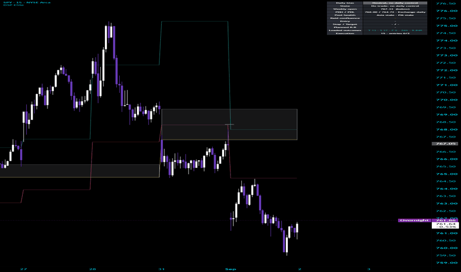
Minor H1 BIAS Analyse## 1. Purpose of the Script
The **Minor H1 BIAS Analyse** is designed to determine the short-term directional market BIAS.
It does not provide entries. Instead, it evaluates several trend, momentum, and structure conditions and classifies the market as:
Long
Short
Neutral
The script should therefore be used as a directional filter together with a separate entry strategy.
---
## 2. Structure of the Minor BIAS
The Minor BIAS is based on five components:
EMA Trend
Price vs EMA
Current Candle Direction
Previous H1 High / Low Break
Market Structure Break
Each bullish condition adds one point to the Bull Score.
Each bearish condition adds one point to the Bear Score.
The maximum possible score is:
5 Long
5 Short
---
## 3. EMA Trend
The script uses two exponential moving averages:
Fast EMA: 20
Slow EMA: 50
If the Fast EMA is above the Slow EMA:
+1 Long
If the Fast EMA is below the Slow EMA:
+1 Short
This represents the basic trend direction.
---
## 4. ATR Neutral Buffer
The script uses an optional ATR buffer around the EMAs.
Default settings:
ATR Length: 14
ATR Multiplier: 0.20
The buffer creates a neutral zone around the EMAs.
Price must move clearly above or below both EMAs before the condition becomes bullish or bearish.
This helps filter small movements and market noise.
---
## 5. Price vs EMA
For a bullish condition, price must close above both EMAs plus the ATR Buffer.
Result:
+1 Long
For a bearish condition, price must close below both EMAs minus the ATR Buffer.
Result:
+1 Short
If price remains inside the buffer area:
No Score
The dashboard displays:
Inside Buffer
---
## 6. Current Candle Direction
The script also evaluates the current candle.
Bullish Candle:
Close above Open
+1 Long
Bearish Candle:
Close below Open
+1 Short
Doji:
No Score
This adds a simple momentum component to the BIAS.
---
## 7. Previous H1 High / Low Break
The script checks whether price closes above or below the previous candle.
Close above Previous High:
+1 Long
Close below Previous Low:
+1 Short
No Break:
No Score
This filter can be enabled or disabled in the settings.
The script uses the candle close, not only the wick.
---
## 8. Market Structure
The script also analyzes the previous market structure.
Default Lookback:
5 candles
It calculates:
Structure High
Structure Low
If price closes above the Structure High:
Bullish Structure Break
+1 Long
If price closes below the Structure Low:
Bearish Structure Break
+1 Short
If neither level is broken:
Range
No Score
---
## 9. Score System
The final Minor BIAS is calculated from the Bull Score and Bear Score.
Possible Long points:
EMA Trend
Price vs EMA
Bullish Candle
Previous High Break
Bullish Structure Break
Possible Short points:
EMA Trend
Price vs EMA
Bearish Candle
Previous Low Break
Bearish Structure Break
A minimum of three points is required.
---
## 10. Minor LONG
The Minor BIAS becomes Long when:
Bull Score is at least 3
and
Bull Score is greater than Bear Score.
Example:
Bull Score: 4
Bear Score: 1
Result:
MINOR LONG
---
## 11. Minor SHORT
The Minor BIAS becomes Short when:
Bear Score is at least 3
and
Bear Score is greater than Bull Score.
Example:
Bull Score: 1
Bear Score: 4
Result:
MINOR SHORT
---
## 12. Neutral
If neither side reaches the required conditions, the BIAS remains Neutral.
Example:
Bull Score: 2
Bear Score: 2
Result:
NEUTRAL
Neutral therefore represents an unclear or mixed market situation.
---
## 13. Dashboard
The dashboard shows the current state of every component.
It contains:
BIAS
EMA Trend
Price vs EMA
H1 Candle
Previous H1 Break
Structure
ATR Buffer
It also displays the current:
Bull Score / Bear Score
Example:
4 / 1
This makes it possible to understand why the current BIAS is Long, Short, or Neutral.
---
## 14. Chart Visualization
The script can display:
Fast EMA
Slow EMA
Previous H1 High / Low
Structure High / Low
BIAS Background
BIAS Label
Dashboard
Each visualization can be enabled or disabled individually.
The calculations continue to work even when the corresponding chart elements are hidden.
---
## 15. Alerts
The script includes alerts for:
Minor H1 LONG
Minor H1 SHORT
Minor H1 NEUTRAL
These can be used to receive a TradingView notification when the directional BIAS changes.
---
## 16. Meaning for Trading
The Minor BIAS should not be treated as an entry signal.
A simple trading rule would be:
**MINOR LONG:** Prefer Long setups.
**MINOR SHORT:** Prefer Short setups.
**NEUTRAL:** Wait for clearer conditions.
The actual entry should come from a separate trading setup.
---
## 17. BIAS Strength
The score can also be used to estimate the strength of the current direction.
3 Points:
Valid directional confirmation
4 Points:
Strong confirmation
5 Points:
Very strong alignment
For example:
5 / 0 Long
represents stronger bullish confirmation than:
3 / 2 Long
even though both are classified as MINOR LONG.
---
## 18. Important Timeframe Note
The current script uses the timeframe of the active chart.
That means the calculations are only truly based on H1 when the indicator is used on a **1-hour chart**.
If the script is placed on M5 or M1, the calculations also use M5 or M1 data.
For a true H1 BIAS that remains identical on every chart, the calculations would need to use fixed 60-minute data.
---
## 19. Conclusion
The **Minor H1 BIAS Analyse** is a score-based directional filter.
It combines:
Trend
Price Position
Momentum
Previous Candle Break
Market Structure
At least three confirmations are required for a directional BIAS.
The final result is:
MINOR LONG
MINOR SHORT
NEUTRAL
Its purpose is to identify the stronger short-term market direction before a separate entry setup is considered.
++ This was only used on NQ ++
Indikator

TZ-REVETZ-REVE is a sub-panel indicator that seeks to provide a concise overview of what is going on in the market dynamics of the instrument in the period shown on the chart, i.e. short- and longer trends, analysis of ranges and volume events all in one visual. Because it has a steep learning curve, an analyis for the last/current candle of all these is also provided in four catchwords.
TZ stands for TrendZones, because depicts the TrendZones situation. TrendZones is a channel indicator which I published some time ago.
REVE stands for Range Extension Volume Expansion, for which I published several attempt's.
In this indicator I used code from their scripts. I tried to improve the visual presentation.
A new feature is the Center Zone with colored patches to indicates short up- and downtrends derived from how a three period moving average moves in relation to a nine period and twenty period MA. This results in five colors:
• White for a situation which I call “transition”, there the 3MA either moves down while above both 9MA and 20MA or moves up while below both 9MA and 20MA or some other non-color situations;
• Transparent Green indicates upward movement, which I called “rise(rising)”, here the 3MA moves up while above 9MA but below 20MA
• Lime green indicates strong upward movement, which I called “soar(soaring)”, here the 3MA moves up while above both the 9MA and the 20MA.
• Brown indicates a downward movement called “drop(dropping)”, when the 3MA moves down while below 20MA but above 9MA.
• Transparent Fuchsia indicates a strong downward movement called “plunge(plunging)”, when the 3MA moves down while below both 9MA and 20MA.
To show this, I created an indicator out of these three MA’s in which the zones in between these lines are colored with the same logic, the thick green line is 3MA, the purple thin line is 9MA, the gray thin line is 20MA: Three MA example:
I refer to the columns pointing upward and downward as ‘ticks’. They represent the range and direction of three last periods. The direction is NOT calculated as close above or below open (like in candlesticks) but as close above or below the highest of the two previous closes. The ticks get four possible colors:
• Yellow for small range up- and downticks
• Gray for ‘normal’ range up- and downticks
• Green for wide range upticks
• Purple for wide range downticks
The length of the Tick Columns is calculated through a comparison of the current True Range with the Average True Range of the last 50 periods, taken as 100 percent. The result is marked as ‘small’ when this current TR is less then 60 percent , ‘wide’ when more then 110 percent, ‘normal’ otherwise.
The TrendZones Situation is depicted with the green and blue thick line above the Center Zone and the orange and red line below it. In fact these are stretches of the same line. This line is calculated as a percent of the distance of the hl2 from the COG where Upper Curve minus Lower Curve is taken as 100 percent. The Situation line is made invisible where the candle or bar crosses the COG.
The colors are:
• Red when the bar is in the red strong downtrend zone
• Orange if the bar is in the orange downtrend zone
• Invisible when bar crosses COG (“sideways”)
• Green for the bar in the green uptrend zone
• Blue when in the strong uptrend zone.
Where the direction of the Tick coincides with the trend, the Tick column is ‘crowned’ with a dot of the same color as the Situation line.
To show this, I have put a TrendZones (updated version) in the example chart:
Trendzones Situation example:
When volume in a certain period is higher than normal, I call this a ‘volume event’. A volume event indicates that the price action is supported with many buyers and sellers. To calculate whether a volume event happened and how big it is, we need to know the ‘normal’ volume. In the case of volume, ‘average’ cannot be used, because outliers in volume are so huge that they make the average too high to find smaller volume events in the following timeframes. To avoid the outlier influence, I use the ‘median’ of fifty periods as ‘normal’, using that as 100 percent. This leads to five cohorts for the current volume:
• 0-120 percent of normal: Unremarkable volume – no marker
• 120-150 percent of normal: Much volume – gray triangle
• 150-180 percent of normal: High volume – orange triangle
• 180-210 percent of normal: Huge volume – red triangle
• 210 and higher percent of normal: Extreme volume – maroon triangle
The Volume Event Triangles are placed in the middle of the Center Zone, pointing in the same direction as the ticks.
In previous versions I tried to calculate the direction of volume markers in a way that not only leads to ‘up’ or ‘down’ but also ‘falter’. Periods with falter are often part of a reversal pattern. For these situations I created a Falter Marker, a black dot on the Center Zone border under the tick column. Although these dots are interesting, they have no practical use in my analysis. They are there because they are a nice feature if the instrument comes without volume, like some indexes.
Because this indicator is crammed with information, it has a steep learning curve. To help understand what is reported by all its features, I created four catch phrases to the right. These concern the last (current) candle or bar.
- On top a catchword for the Center Zone color patches, which represent short up- and downtrend. These can be ‘rising’, ‘soaring’, ‘dropping’, ‘plunging’ or ‘transition’.
- Then a catchword for the TrendZones Situation.
These can be: ‘S uptrend’, ‘uptrend’, ‘downtrend’, ‘S downtrend’ or ‘sideways’
- Then a catchword for Tick column.
These can be
• ‘Fwide up’ which means wide range pointing up with falter marker
• ‘wide up’ wide range pointing up
• Fwide down’ wide range pointing down with falter marker
• ‘wide down’ wide range pointing down
• Fsmall up’ small range pointing up with falter marker
• ‘small up’ small range pointing up
• ‘Fsmall down’ small range pointing down with falter marker
• ‘small down’ small range pointing down
• ‘Fup’ normal range pointing up with falter marker
• ‘up’ normal range pointing up
• ‘Fdown’ normal range pointing down with falter marker
• ‘down’ normal range pointing down
- Then a catchword for volume.
These can be ‘no volume’, ‘normal vol’, ‘much vol’, ‘high vol’, ‘huge vol’ or ‘extreme vol’.
Have fun,
Eykpunter
Indikator

Kurdistani Style CycleKurdistani Style Cycle
A composite on-chain indicator that identifies Bitcoin market cycle phases
using a weighted Z-score of MVRV, NUPL, and a SOPR proxy. It maps market
conditions into five distinct phases and overlays normalized BTC price.
═══════════════════════════════════════════════════
KEY ON‑CHAIN METRICS USED
═══════════════════════════════════════════════════
1. MVRV (Market Value to Realized Value)
MVRV = Market Cap / Realized Cap
- High values: large unrealized profit, possible market tops.
- Low values: large unrealized loss, possible market bottoms.
2. NUPL (Net Unrealized Profit/Loss)
NUPL = 1 – (1 / MVRV) (derived from MVRV to ensure consistency)
- Strongly positive (e.g., >0.75): euphoria / overheated.
- Negative: fear, potential bottoming zone.
3. SOPR Proxy
Since real SOPR requires UTXO data unavailable on TradingView, a proxy
is built from price position relative to short-term and long-term
highest/lowest bands:
Short-term position (STH):
STH_pos = (Price – STH_low) / (STH_high – STH_low) (range 0–1)
Long-term position (LTH):
LTH_pos = (Price – LTH_low) / (LTH_high – LTH_low) (range 0–1)
Raw SOPR Proxy = STH_pos – LTH_pos
Smoothed SOPR Proxy = 5-period SMA of Raw SOPR Proxy
═══════════════════════════════════════════════════
HOW THE COMPOSITE INDEX IS BUILT
═══════════════════════════════════════════════════
Step 1 – Z-Score Normalization
For each component (MVRV, NUPL, SOPR Proxy) a Z-score is calculated
with a common lookback period L (default 365):
Z = (Value – SMA(Value, L)) / StdDev(Value, L)
Step 2 – Weighted Combination (PnL Index)
User-defined weights w1, w2, w3 (default 0.4, 0.4, 0.2).
If the fraction of non‑null components meets or exceeds the
'Min Valid Weight Fraction' threshold, the PnL Index is:
PnL Index = (w1 * MVRV_Z + w2 * NUPL_Z + w3 * SOPR_Z) / (w1 + w2 + w3)
Step 3 – Bull‑Bear Indicator
The final oscillator removes the long-term trend using a simple moving
average (default length 365):
Bull‑Bear = PnL Index – SMA(PnL Index, 365)
Positive values indicate a bullish regime relative to the long-term average,
negative values indicate a bearish regime.
═══════════════════════════════════════════════════
PHASES – THRESHOLDS & INTERPRETATION
═══════════════════════════════════════════════════
The Bull‑Bear value is classified into five phases using two thresholds:
Overheated Threshold (default +1.5)
Early Bull Upper Limit (default +0.5)
Extreme Bear Threshold (default -1.5)
Phase Condition Interpretation
─────────────────────────────────────────────────────────────────────────
Extreme Bear Bull‑Bear ≤ -1.5 Possible deep bottom, extreme fear
Bear -1.5 < Bull‑Bear ≤ 0 Downtrend / consolidation
Early Bull 0 < Bull‑Bear ≤ 0.5 First signs of recovery
Bull 0.5 < Bull‑Bear ≤ 1.5 Healthy uptrend
Overheated Bull Bull‑Bear > 1.5 Euphoria, high risk of correction
Colors on the histogram:
Extreme Bear → solid blue
Bear → cyan / teal
Early Bull → green
Bull → orange
Overheated Bull → red
No data → transparent gray
Small markers:
A green dot above Early Bull columns
A red dot below Overheated Bull columns
═══════════════════════════════════════════════════
WHAT YOU SEE ON THE CHART
═══════════════════════════════════════════════════
• Gray line: the Bull‑Bear oscillator value.
• Colored columns: histogram displaying the current phase.
• Green horizontal line at zero (neutral boundary).
• Red dotted line at the Overheated Threshold (+1.5).
• Blue dotted line at the Extreme Bear Threshold (-1.5).
• Light gray/white line (optional): Z‑score of log(BTC price)
over the same lookback period, showing how far current price
deviates from its long‑term log mean.
• Information table (top‑right): shows live readings for Phase,
Bull‑Bear value, MVRV, NUPL, SOPR Proxy, BTC price, normalized
price Z‑score, and the composite PnL Index (Z).
• A star (*) next to a metric name and an orange warning dot
indicates stale (non‑updating) data, typically on intraday
timeframes where on‑chain data is not refreshed in real time.
A label on the last bar displays the current phase name.
═══════════════════════════════════════════════════
INPUT SETTINGS (fully adjustable)
═══════════════════════════════════════════════════
- MA Length for Cycle (default 365): moving average length
used to extract the cycle from the PnL Index. Shorter
values increase responsiveness but add noise.
- Z‑Score Lookback (default 365): lookback for mean and
standard deviation when normalizing MVRV, NUPL, and SOPR.
- Overheated Bull Threshold (Z) (default 1.5): Z‑score level
that triggers the Overheated phase.
- Early Bull Upper Limit (Z) (default 0.5): upper bound of
the Early Bull phase; crossing above enters the Bull phase.
- Extreme Bear Threshold (Z) (default -1.5): lower bound for
the Extreme Bear phase.
- STH Lookback (default 155): period for short‑term high/low
in the SOPR proxy calculation.
- LTH Lookback (default 365): period for long‑term high/low
in the SOPR proxy calculation.
- MVRV Weight (default 0.4)
- NUPL Weight (default 0.4)
- SOPR Weight (default 0.2)
- Min Valid Weight Fraction (default 0.5): minimum fraction
of total weight that must have valid (non‑null) data for the
composite index to be calculated. Prevents unreliable signals
when one or more components are missing.
- Show Normalized BTC Price Overlay (true/false)
- Price Symbol (default BINANCE:BTCUSDT)
- Price Normalization Lookback (default 365)
═══════════════════════════════════════════════════
DATA SOURCES & STALENESS
═══════════════════════════════════════════════════
• BTC_MARKETCAP (Market Cap) and BTC_MARKETCAPREAL (Realized
Cap) are fetched via request.security from TradingView’s
internal symbols.
• Price is fetched from the user‑selected symbol (default
BINANCE:BTCUSDT).
• On intraday timeframes (less than 1D), on‑chain data often
does not update on every bar. In those cases a star (*)
appears next to the metric and an orange dot is plotted.
Daily or higher timeframes are recommended for the cleanest
signals.
═══════════════════════════════════════════════════
PRACTICAL USAGE GUIDE
═══════════════════════════════════════════════════
- Accumulation / long‑term entries: Extreme Bear (blue columns)
often marks excellent long‑term buying zones.
- Confirmed trend change: Entering Early Bull (green columns)
after a bear phase provides a higher‑probability entry once
momentum turns positive.
- Holding during uptrend: Bull phase (orange) represents a
healthy market. Consider moving stop‑losses higher but
avoid premature exits.
- Taking profits / reducing exposure: Overheated Bull (red
columns) signals that the market is statistically stretched.
A phased exit or partial sell strategy is prudent.
- The normalized price overlay provides a second opinion: when
both the Bull‑Bear indicator and price Z‑score reach
simultaneous extremes, the signal is stronger.
═══════════════════════════════════════════════════
LIMITATIONS
═══════════════════════════════════════════════════
• The SOPR component is a proxy and not real SOPR data.
• On lower timeframes, stale data may cause slight lag.
• In long sideways markets the oscillator may whipsaw
between Bear and Early Bull. Always combine with other
technical or fundamental analysis.
• This indicator is not financial advice. Past performance
does not guarantee future results.
═══════════════════════════════════════════════════
HOW TO INSTALL
═══════════════════════════════════════════════════
Add the indicator to your chart from TradingView’s “Indicators”
panel. It will appear in a separate pane below the price chart.
Adjust the settings via the gear icon to fit your own cycle
analysis framework. Indikator

Flow Momentum Composite█ OVERVIEW
Flow Momentum Composite is a modular momentum analysis indicator designed to assess the direction and strength of market movement by combining several complementary elements of price analysis, flow pressure, market structure and historical behaviour.
Most momentum indicators answer only one question. A classic oscillator shows whether momentum is bullish or bearish. A trend indicator defines the broader market direction but may react with a lag. Divergences can point to weakening momentum, while analysis of historical similarities can provide additional information about the probable direction of the next move. Each of these approaches is valuable, but each presents only a fragment of the market picture.
Flow Momentum Composite was designed as a modular system that brings these different perspectives into one coherent framework. The indicator analyses Momentum Core, Balance Line, Flow Pressure, Structure / Trend, KNN Bias and Tension Waves, then combines their readings inside the Composite Score.
The main idea of the indicator is not to rely on a single signal, but to check whether several independent components point in the same direction. The user can control the importance of each element through individual weights, so the final assessment can be adapted to their own analysis style.
The Composite Score is calculated and displayed exclusively relative to the direction of the current candle. Points from individual modules are awarded only when that component agrees with the candle’s colour (bullish candle + bullish components, or bearish candle + bearish components). A high reading therefore represents strong agreement of the components with the current candle’s direction, not an independent oscillator ranging from strong bearish to strong bullish.
The indicator also includes additional analytical layers such as contrarian signals, divergences between price and momentum, and the Signal Confluence Barometer. These elements provide extra context and help distinguish strong directional conditions, weakening momentum and potential turning points.
The result is a multi-dimensional momentum analysis tool that moves from short-term evaluation of price movement and flow pressure, through market structure and historical similarity of conditions, to a final assessment of component agreement.
█ CONCEPTS
Momentum Core
Momentum Core is the main module of the indicator and is responsible for measuring the current strength and direction of price movement.
Instead of using price change alone, the calculation compares the change of the selected price series with ATR, so that momentum is normalised to current market volatility. The result is rescaled to the 0–100 range, where the 50 level represents the central equilibrium.
Momentum Core primarily answers the question:
Is current price momentum bullish or bearish, and how strong is it?
Balance Line
Balance Line uses the same basic momentum measurement concept as Momentum Core, but has its own calculation period and typically slower smoothing.
Its purpose is not to duplicate Momentum Core, but to create a slower reference point against which current momentum can be compared. The relationship between the two lines forms the basis of the Tension Waves module.
Balance Line answers the question:
How does current momentum relate to the slower, underlying market momentum?
Flow Pressure
Flow Pressure analyses directional market pressure using available volume or candle structure when real volume is not available.
The result is summed over a defined period and then smoothed. The visual Flow Pressure wave additionally changes intensity at extreme values.
Flow Pressure answers the question:
Does current market pressure support buyers or sellers?
Structure / Trend
Structure / Trend defines the broader market direction and provides context for short-term momentum changes.
The module uses an EMA-based basis and an ATR-dependent band. A trend direction change occurs only when price breaks the corresponding side of the band.
Structure / Trend answers the question:
What is the current broader market direction?
KNN Bias
KNN Bias uses analysis of historical market condition similarity. It compares the current state (Momentum Core, Flow Pressure, Structure / Trend) with previously stored observations and, based on the subsequent price behaviour, creates a weighted directional vote.
KNN Bias answers the question:
What happened in the past when market conditions looked similar to the present ones?
Tension Waves
Tension Waves visually represent the difference between Momentum Core and Balance Line. The greater the distance, the deeper the histogram. Deepening of the wave in the same direction is particularly important and is used by both the Composite Score and the Signal Confluence Barometer.
Tension Waves answer the question:
Is the difference between current and baseline momentum increasing?
Composite Score
Composite Score is the central element of the entire indicator. It combines five independent components: Momentum Core, Flow Pressure, Structure / Trend, KNN Bias and Tension Waves.
Each component has its own weight. Points are awarded only when the direction of a given component agrees with the colour of the current candle and additional conditions are met (for example Core continuing further in its direction, or the Tension Wave deepening).
The result is presented as a percentage of the maximum possible points. BUY/SELL signals appear only after the defined threshold is exceeded.
Composite Score answers the question:
Do the individual analysis elements jointly confirm the direction of the current candle?
Signal Confluence Barometer
Shows how many of the five components currently confirm the dominant direction (without using weights).
Signal Confluence Barometer answers the question:
How many independent elements of the indicator currently confirm the same direction?
Contrarian Signals
Appear when Momentum Core returns from an extreme Oversold or Overbought level.
They serve to identify potential direction changes after an extreme has been reached.
Divergences
Compare price behaviour with Momentum Core. A bullish divergence forms when price makes a lower low while Core makes a higher low; a bearish divergence forms when price makes a higher high while Core makes a lower high.
They serve a warning and contextual function.
Overbought / Oversold Zones
Provide reference levels for Momentum Core. They feature dynamic transparency that depends on the distance of Core from the given level.
█ FEATURES
Momentum Core
• Source – price series used for Momentum Core and Balance Line calculations.
• Length – number of bars used to measure price change relative to ATR.
• Smoothing – smoothing period applied to Momentum Core.
• MA Method – averaging method (EMA / SMA / RMA) used across all modules.
• Scaling Sensitivity – the higher the value, the faster Core reaches the 0/100 extremes at the same volatility.
Balance Line
• Length – calculation period of the Balance Line.
• Smoothing – smoothing of the Balance Line (typically higher than Core to increase distance during trends).
Flow Pressure
• Length – number of bars summed when calculating Flow Pressure.
• Smoothing – smoothing of the Flow Pressure line.
• Force candle mode instead of volume – forces calculation from candle range even when the instrument has real volume data.
• Flow Wave Height Scale – controls the height of the Flow Pressure wave above the OB line or below the OS line.
• Flow Extreme Threshold – threshold above which the Flow Pressure wave switches to a darker shade (extreme pressure).
KNN Bias
• Number of Neighbors (K) – number of nearest historical observations considered in the KNN vote.
• Memory (bars) – maximum number of stored historical observations used by the classifier.
Structure / Trend
• Trend Base Length – period of the EMA and ATR used to define the structure band.
• Band Multiplier (ATR) – ATR multiplier defining the width of the structure band.
• Color bars by structure trend – colours price chart candles according to the direction of the Structure / Trend module.
Composite Score
• Show Score Signals – enables display of BUY/SELL signals derived from the Composite Score.
• Momentum Weight / Flow Weight / Structure Weight / KNN Weight / Tension Waves Weight – individual weights of the respective components.
• Signal Threshold (% of max score) – minimum percentage of the maximum possible score required to generate a signal.
• One signal per momentum wave – limits signals to one per Momentum Core wave (resets when Core crosses the 50 level).
Tension Waves
• Show Tension Waves – displays the histogram of tension between Momentum Core and Balance Line.
• Tension Wave Transparency – base transparency of the Tension Wave histogram (deepening waves render slightly more opaque).
OB/OS Zones
• Overbought / Oversold – levels considered extreme for Momentum Core.
• Dynamic OB/OS Lines – line transparency depends on the distance of Core from the level.
• OB/OS Transparency — Near Level / Far From Level – transparency settings based on distance.
• OB/OS Line Width – thickness of the Overbought and Oversold lines.
Contrarian Signals
• Show Contrarian Signals – enables signals when Momentum Core returns from an OS/OB extreme.
Divergences
• Show Divergences on Momentum Core – enables detection of divergences between price and Momentum Core.
• Pivot Lookback (left/right) – number of bars required on each side to confirm pivots.
Colors & Transparency
• Bullish Color / Bearish Color / Neutral Color – main colours used across all modules.
• Zero Line Color (50) – colour of the horizontal centre line.
• Text Color (labels) – colour of table header text and divergence label text.
• Flow Wave Transparency – transparency of the Flow Pressure wave fill.
• Transparency: Core→Center Gradient / Core↔Balance Gradient / Divergence Line Transparency – controls fill and line transparency.
Panel
• Show Table – enables the summary table display.
• Position – position of the table on the chart.
• Text Size – text size inside the table.
Alerts
• Score — Buy / Score — Sell
• KNN Direction Change
• Contrarian — Long / Contrarian — Short
• Divergence — Bullish / Divergence — Bearish
• Barometer — Direction Change
█ APPLICATIONS
Assessing the quality and strength of market moves
The primary use of the indicator is to evaluate whether the current price move is confirmed by several independent layers of momentum, flow pressure and structure analysis.
Filtering weak impulses
Composite Score and the Barometer help distinguish moves supported by agreement of most components from moves that have only local, short-lived support.
Detecting strengthening or weakening momentum
Tension Waves show whether the difference between short-term and baseline momentum is increasing. A deepening wave in the direction of the trend can confirm strength, while lack of deepening or a reversal may signal exhaustion.
Confirming trend direction
Simultaneous analysis of Structure / Trend, Momentum Core, Flow Pressure and KNN Bias makes it possible to assess whether the broader market direction is consistent with short-term momentum and historical similarity of conditions.
Identifying potential turning points
Contrarian signals (return from OS/OB) and divergences between price and Momentum Core provide warnings about possible weakening of directional pressure.
Building a custom momentum assessment model
Thanks to the ability to individually weight the five components, the user can create their own assessment model. One trader may place greater emphasis on Momentum Core and Flow Pressure, while another may consider Structure and KNN Bias more important.
█ NOTES
• The divergence module and contrarian signals serve a warning and contextual function. They do not enter the Composite Score directly.
• Composite Score signals are best used as a confirming element of market analysis together with structure, price action, support and resistance zones, and risk management.
• All component weights are fully configurable, allowing the user to adapt the assessment model to their own trading style while retaining the same multi-layered analysis logic. Indikator


