
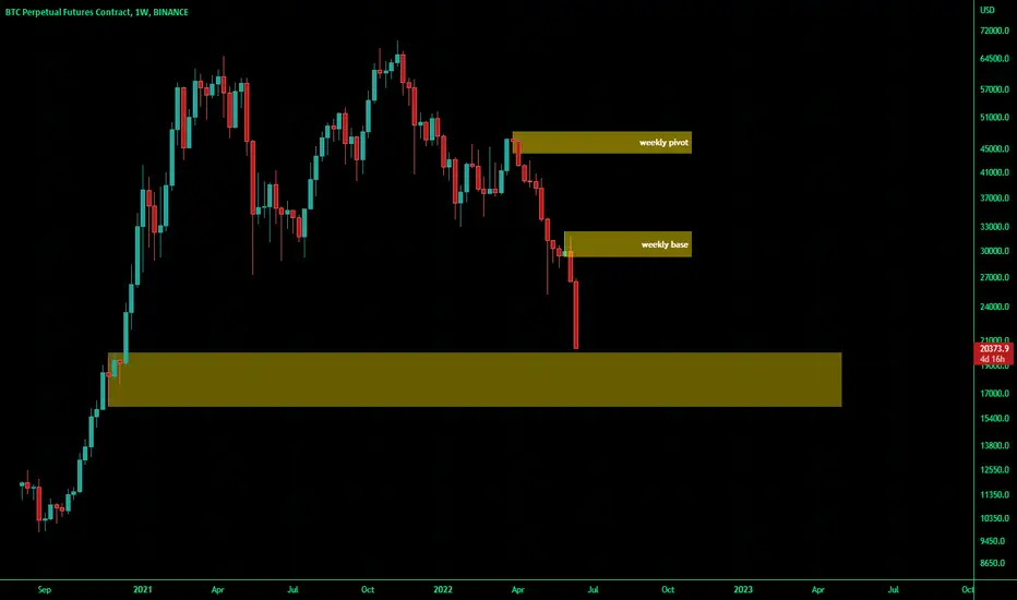
from supply and demand analysis point of view,
the areas that can clearly be seen on the chart are these yellow rectangles the analysis is like having the price stop running down on the lowest area and start an upward to the first green candle and the price will be in a trading range for while (1 year or 2 maybe )
the areas that can clearly be seen on the chart are these yellow rectangles the analysis is like having the price stop running down on the lowest area and start an upward to the first green candle and the price will be in a trading range for while (1 year or 2 maybe )

Exención de responsabilidad
La información y las publicaciones no constituyen, ni deben considerarse como, asesoramiento o recomendaciones financieras, de inversión, de trading u otro tipo, proporcionadas o respaldadas por TradingView. Obtenga más información en Condiciones de uso.
Exención de responsabilidad
La información y las publicaciones no constituyen, ni deben considerarse como, asesoramiento o recomendaciones financieras, de inversión, de trading u otro tipo, proporcionadas o respaldadas por TradingView. Obtenga más información en Condiciones de uso.