
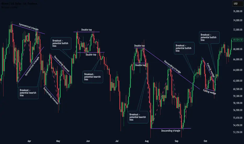
Lesson Focus: Chart Pattern Types (Practice - Part 1)
This educational chart explains how market participants often interpret price structure using chart patterns, rather than relying on indicators or individual candlesticks.
Chart patterns do not move price.
They visually represent historical interactions between buyers and sellers, helping us understand where market participation may increase or decrease.
📌 PURPOSE OF THIS CHART
In this example, BTCUSD is used strictly as a visual reference to explain common chart formations and market structure behavior.
• No trade signals are given
• No entries, exits, or profit targets are suggested
• No financial recommendations are made
The focus is understanding behavior, not predicting outcomes.
📊 CHART PATTERNS EXPLAINED
The following chart patterns are used only as descriptive tools:
• Symmetrical Triangle – price compression caused by balanced buying and selling pressure
• Double Top – an area where selling pressure previously increased
• Descending Channel – a structured downward price movement
• Descending Triangle – price compression with dominant selling pressure
• Falling Wedge – decreasing downside momentum within a contracting range
Each pattern helps illustrate how different market participants may react at specific price areas, based on historical behavior.
🧩 KEY CONCEPT
Candlesticks and patterns do not cause price movement.
They reflect past decisions made by buyers and sellers.
Market structure becomes clearer when we focus on:
• price interaction zones
• pressure buildup and release
• collective participant behavior
rather than treating indicators or patterns as standalone decision tools.
📘 SERIES CONTINUATION
This lesson builds directly on the previous chart pattern theory.
Further real-chart examples will follow to deepen structural understanding.
If you find this educational series beneficial, you are welcome to follow the profile to continue learning step by step.
ETHICAL & EDUCATIONAL NOTICE
This content is presented solely for educational and analytical purposes, based on historical price data.
It does not promote or encourage any specific trading method, financial instrument, gambling, leverage, margin usage, short selling, or interest-based activity.
Readers are encouraged to align any financial activity with their own ethical, legal, and religious principles.
⚠️ DISCLAIMER
This material is strictly educational and informational.
It does not constitute financial advice, investment recommendations, or trading instructions.
The author does not provide personalized guidance.
Any decisions made based on this content are the sole responsibility of the individual.
This educational chart explains how market participants often interpret price structure using chart patterns, rather than relying on indicators or individual candlesticks.
Chart patterns do not move price.
They visually represent historical interactions between buyers and sellers, helping us understand where market participation may increase or decrease.
📌 PURPOSE OF THIS CHART
In this example, BTCUSD is used strictly as a visual reference to explain common chart formations and market structure behavior.
• No trade signals are given
• No entries, exits, or profit targets are suggested
• No financial recommendations are made
The focus is understanding behavior, not predicting outcomes.
📊 CHART PATTERNS EXPLAINED
The following chart patterns are used only as descriptive tools:
• Symmetrical Triangle – price compression caused by balanced buying and selling pressure
• Double Top – an area where selling pressure previously increased
• Descending Channel – a structured downward price movement
• Descending Triangle – price compression with dominant selling pressure
• Falling Wedge – decreasing downside momentum within a contracting range
Each pattern helps illustrate how different market participants may react at specific price areas, based on historical behavior.
🧩 KEY CONCEPT
Candlesticks and patterns do not cause price movement.
They reflect past decisions made by buyers and sellers.
Market structure becomes clearer when we focus on:
• price interaction zones
• pressure buildup and release
• collective participant behavior
rather than treating indicators or patterns as standalone decision tools.
📘 SERIES CONTINUATION
This lesson builds directly on the previous chart pattern theory.
Further real-chart examples will follow to deepen structural understanding.
If you find this educational series beneficial, you are welcome to follow the profile to continue learning step by step.
ETHICAL & EDUCATIONAL NOTICE
This content is presented solely for educational and analytical purposes, based on historical price data.
It does not promote or encourage any specific trading method, financial instrument, gambling, leverage, margin usage, short selling, or interest-based activity.
Readers are encouraged to align any financial activity with their own ethical, legal, and religious principles.
⚠️ DISCLAIMER
This material is strictly educational and informational.
It does not constitute financial advice, investment recommendations, or trading instructions.
The author does not provide personalized guidance.
Any decisions made based on this content are the sole responsibility of the individual.

Publicaciones relacionadas
Exención de responsabilidad
La información y las publicaciones no constituyen, ni deben considerarse como, asesoramiento o recomendaciones financieras, de inversión, de trading u otro tipo, proporcionadas o respaldadas por TradingView. Obtenga más información en Condiciones de uso.
Publicaciones relacionadas
Exención de responsabilidad
La información y las publicaciones no constituyen, ni deben considerarse como, asesoramiento o recomendaciones financieras, de inversión, de trading u otro tipo, proporcionadas o respaldadas por TradingView. Obtenga más información en Condiciones de uso.