OPEN-SOURCE SCRIPT
Strong Stop Loss Heatmaps | ProjectSyndicate
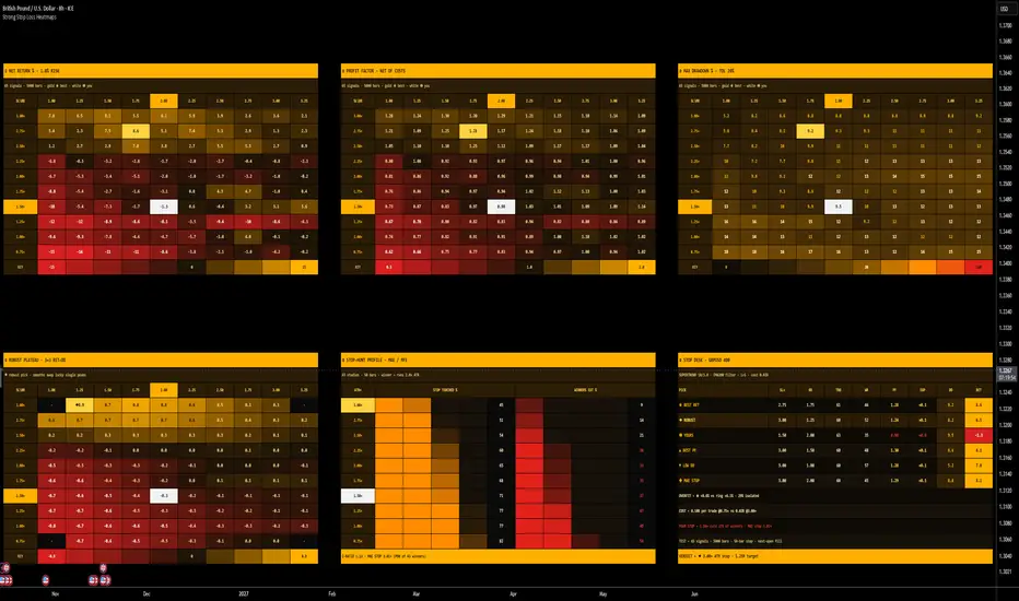
◾Strong Stop Loss Heatmaps answers the two questions that decide most of a system's results and that most traders set by habit: where should the stop go, and where should the target go. It takes the entry signals on your chart and replays every bar through 100 stop × target combinations at the same time, each one running its own one-position-at-a-time backtest, and lays the results out as four large heatmaps, an excursion study and a stop desk, all on one screen in a compact Bloomberg amber terminal.
◾Net Return, Profit Factor, Max Drawdown and a Robust Plateau are each mapped as a 10×10 grid of stop width (ATR multiples) against target size (R:R), your own setting is lit up as a white cell, the best cell burns gold, and the robust pick is marked with a diamond. The whole tool runs on one idea: a stop is a bet on how much noise the trade must survive, and a target is a bet on how far the move usually goes. Guess either one and you are trading a different system from the one you backtested. Map both and the trade-off becomes a number.
◾This is a stop-placement and exit-optimisation terminal, not a signal generator. It tells you which stop widths get hunted, which ones cut your winners before they pay, how much of your edge the spread eats at tight stops, whether the best-looking cell is a stable plateau or a lucky spike, and where the honest sweet spot sits for the entry you actually use, on any symbol, any timeframe.
🟢🔴 Summary how to use this, more details below, read entire guide. Two clean reads: find the plateau, then check the hunt. Pick the entry model you trade, set the cost to your real spread, and look at ④ Robust Plateau first, not ① Net Return. The diamond is the stop and target whose whole neighbourhood performs, which is what survives out of sample. Then read ⑤ Stop-Hunt Profile: if your stop row cuts more than a quarter of the eventual winners, your stop is inside the noise and the market is paying you to widen it. The Stop Desk puts your setting beside the best, the robust and the MAE-derived stop so you can see what you are giving up. Runs on any chart and any timeframe.
⚠️ YOUR ENTRY vs THE BUILT-IN MODELS — The heatmaps measure exits, so they need an entry to work from. Twelve built-in models are included (Supertrend flip by default) and all 100 combinations trade the identical signals, which isolates the effect of the stop and the target. To test your own system, add your indicator to the chart, pick its plot in the Custom Indicator group and switch Entry Signal to Custom Indicator. The built-in models exist to give the terminal an honest signal stream out of the box; they are not a recommendation to trade them.
🧱 The Engine — honest fills, every trade counted — Each cell is a complete backtest, not an estimate. Stops run from 0.75× to 3.00× ATR in 0.25 steps (rows, widest at the top) and targets from 1.00R to 3.25R in 0.25 steps (columns); both start points and steps are adjustable. The fill model is deliberately pessimistic:
▪️ Entry at the NEXT bar's open after a signal, never at the signal bar's close.
▪️ Stop checked before target inside the same bar. A bar that touches both is booked as a loss.
▪️ A gap through the stop or the target fills at the open, not at the level.
▪️ A time stop (50 bars by default) closes any trade still open at that bar's close.
▪️ A round-trip cost in % of price (spread + commission + slippage) is charged on every trade and converted to R, so a tight stop pays a far bigger share of it than a wide one. The Stop Desk prints the cost in R at the tightest and the widest stop side by side.
▪️ Return and drawdown compound at a fixed risk per trade (1% by default); the account can never go below zero.
Cells with fewer trades than the minimum (20 by default) show a dot and are excluded from every pick, so a thin sample can never win.
📐 Four Heatmaps · One Screen — Each map is a 10×10 grid with your stop row and target column headers lit amber, your cell burning white, and every cell carrying a hover tooltip with trades, win rate, profit factor, expectancy, cost per trade, return, max drawdown, time-stop share, average hold and longest losing streak.
◆ ① NET RETURN % — compounded return of the whole test at your risk per trade. Diverging heat: red is a losing cell, dark is flat, amber is the top of the map. Gold ★ marks the single best cell. Read the shape, not the peak: a vertical amber band means the entry wants a certain stop width whatever the target; a horizontal band means the move usually runs a certain distance.
◆ ② PROFIT FACTOR — gross wins over gross losses, net of costs. Red below 1.0, amber above 2.0. Tight-stop rows often go red here even when the return map still looks fine, because the cost in R is doing the damage.
◆ ③ MAX DRAWDOWN % — deepest peak-to-trough drawdown of each cell's equity curve. Amber sits at your drawdown tolerance (20% by default); the scale runs red at twice it. The bottom-left corner, tight stop and small target, is where drawdown lives.
◆ ④ ROBUST PLATEAU — the overfitting filter. Each cell is the average of Return ÷ Max Drawdown across itself and its eight neighbours (at least six must be valid). A lucky single cell disappears here; a true plateau survives. The ◆ diamond marks the robust pick, and that is the setting the Verdict line recommends.
Every map carries a KEY bar along the bottom so the colour scale reads directly in percent.
🎯 The Stop-Hunt Profile — MAE / MFE study — Separately from the backtests, every signal is followed for the full time-stop horizon with no stop and no target, recording its maximum adverse excursion (the worst heat it took) and maximum favourable excursion (the best it reached), both in ATR units. A signal counts as an eventual winner if it runs at least 2.0× ATR in its favour (adjustable), and its MAE before that run is stored. The card shows, for every stop width on the grid:
▪️ STOP TOUCHED % — how often price reached that distance against the entry within the horizon. This is the hunt rate.
▪️ WINNERS CUT % — what share of the eventual winners would have been stopped out at that width before they paid. Turns red above 25%.
▪️ MAE STOP — the 90th percentile of the winners' adverse excursion (adjustable): the stop just beyond the heat most winners never exceeded, lit gold on the ladder.
▪️ E-RATIO — average MFE divided by average MAE for the entry. Above 1.0 the entry has edge before any exit rule is applied; below it, no stop will save it.
🏷️ The Stop Desk — One panel compares six settings with the same columns: stop multiple, R:R, trades, win rate, profit factor, expectancy in R, max drawdown and net return.
▪️ ★ BEST RET — the top cell of the return map.
▪️ ◆ ROBUST — the plateau pick.
▪️ ◉ YOURS — your stop and target as entered.
▪️ ▲ BEST PF — the highest profit factor.
▪️ ▼ LOW DD — the smallest drawdown among profitable cells.
▪️ ✚ MAE STOP — the best target on the MAE-derived stop row.
Beneath them, four diagnostic lines:
▪️ OVERFIT — the best cell's return against the average of its eight neighbours, and how isolated it is in percent. Above 40% isolation the line turns red: the peak is a spike, not a setting.
▪️ COST — cost per trade in R at the tightest versus the widest stop.
▪️ YOUR STOP — the share of eventual winners your current stop cuts, with the MAE stop beside it for comparison. Red above 25%.
▪️ VERDICT — the robust stop and target in one line, or NO EDGE if even the plateau loses money.
🔁 Twelve Entry Models + Custom — Supertrend flip, Donchian breakout, EMA cross, MACD cross, RSI reversion, Bollinger reversion, Bollinger breakout, Stochastic cross, Parabolic SAR flip, Ichimoku Tenkan/Kijun cross, DMI/ADX cross and CCI reversion, each with its own settings, plus Long & Short, Long Only or Short Only and an optional EMA trend filter that applies to every model. The Custom Indicator group reads any script on the chart through two plot inputs and four rules: A crosses a level (oscillators and +1/−1 signal plots), price crosses A (moving averages, VWAP, bands), A crosses B (two lines), or A as the long signal and B as the short signal (arrow-style outputs), with an invert switch.
📈 On the Price Chart — Your own setting is drawn live: entry triangles, W / L markers on every closed trade, and the active stop and target as lines, so you can see the cell you are sitting in actually trade.
📋 Bloomberg Amber Terminal — Black terminal background, amber headline strips, bold monospaced figures, diverging heat from red through dark to amber for return and profit factor, sequential heat from brown through orange to red for drawdown, gold for the best cell, white for your position, and gutters that match your chart background automatically. Three maps sit across the top of the chart and the plateau, the stop-hunt profile and the stop desk across the bottom, with price still visible in between. Every table is rebuilt on every update so nothing drifts or clips on a live market, on a laptop or an ultrawide.
🔔 Native Alerts —
▪️ Your Setting: Entry — a trade opened on your stop and target.
▪️ Your Setting: Stop Hit — your setting closed at a loss.
▪️ Your Setting: Target / Win — your setting closed at a profit.
🔧 Fully Customizable — Entry signal, direction, trend filter and length; every model's parameters; ATR length, time stop, round-trip cost, risk per trade, backtest window and minimum trades per cell; stop-grid start and step, target-grid start and step, your stop and target, drawdown tolerance; winner threshold and MAE percentile for the stop-hunt study; custom-indicator plots, rule, level and invert; each card on or off; cell width, label column width, row height, cell and title text size, top offset (keeps the symbol legend clear), bottom offset, chart markers and gutter colour.
🎯 Why this is different — Most stop-loss tools give you one rule (a fixed ATR multiple, a swing low) with no evidence that it suits the entry, or an optimiser that hands you the single best cell and lets you overfit to it. This one backtests 100 stop × target combinations on your own signals with pessimistic fills and real costs, maps four metrics at once, filters the result through a neighbourhood plateau so a lucky spike cannot win, measures how often each stop width gets hunted and how many winners it would cut, derives a stop from the winners' own excursion, and puts your setting next to all of it. The chart does the filtering — you see instantly whether your stop is too tight, your target too greedy, or your best cell too lonely to trust.
🚀 Apply on any chart and any timeframe. The maps are computed from the bars you are looking at, so the answer belongs to that symbol and that timeframe. Lower the backtest window on very fast charts if your platform reports a calculation timeout.
🎯 How To Use It — Two Approaches
Everything hinges on the ◆ robust pick and the WINNERS CUT column. A gold cell with red neighbours, or a stop row that cuts a third of your winners, is where the real information sits.
◾ 1 FIND THE PLATEAU — choose a stop and target you can trust
This is the core read. The best cell is almost always too good; the plateau is what you will actually get.
▪️ Setup: select the entry model you trade (or your own indicator), set the direction and trend filter, enter your real round-trip cost, and enter your current stop and target so your cell shows white.
▪️ Read: find the ◆ diamond on ④ Robust Plateau and the ★ on ① Net Return. If they sit in the same region, the edge is stable there. If the ★ sits alone with dark or red around it, read the OVERFIT line; a high isolation figure means that cell is noise.
▪️ Action: move your stop and target toward the diamond, then confirm on ② that the profit factor there is above 1.5 and on ③ that the drawdown is inside your tolerance.
▪️ Never: pick the single best cell. The plateau map exists because the best cell does not repeat.
⚖️ The cleanest version: ★ and ◆ in the same amber region, OVERFIT under 25% isolated, your white cell on or next to the diamond, and your drawdown cell calm brown. That is a sized, repeatable exit.
◾ 2 CHECK THE HUNT — make sure the stop is outside the noise
The mirror case, and the one that explains most "right idea, stopped out anyway" trades.
▪️ Setup: set the winner threshold to the move you actually need (2× ATR by default) and the MAE percentile to how many winners you are willing to lose (90% by default).
▪️ Read: find your stop row on ⑤. STOP TOUCHED tells you how often the market reaches that distance; WINNERS CUT tells you how many of the trades that eventually paid would have died there first. Compare it with the gold MAE STOP row.
▪️ Action: if your row's WINNERS CUT is red, widen the stop toward the MAE stop and shrink size to keep risk constant. Then check the COST line: if the tight stop is paying several times the cost in R of the wide one, that is a second reason to widen.
▪️ Then: read the E-RATIO. Below 1.0 the entry itself has no edge over the horizon, and the task is a better entry, not a better stop.
⚖️ Read the Stop-Hunt Profile before you tighten anything. A 1.0× ATR stop that touches 80% of the time and cuts half the winners is not tight risk management; it is a donation.
Rule of thumb: ⭐ ★ and ◆ together, OVERFIT low → the exit is real, trade it. ⭐ ★ isolated, OVERFIT red → ignore the peak, trade the diamond. ⭐ WINNERS CUT red on your row → widen the stop to the MAE stop and size down. ⭐ E-RATIO under 1.0 or VERDICT reads NO EDGE → the entry is the problem, no stop fixes it.
⚠️ IMPORTANT NOTICE: Strong Stop Loss Heatmaps [Bloomberg] is a research and exit-optimisation tool. Every figure is a historical backtest on the bars currently loaded, under one entry model, pessimistic same-bar fills, a fixed cost assumption and fixed-fraction sizing. Real trading adds variable slippage, partial fills, session gaps, changing volatility and regime shifts, so live results will differ from the maps and can be worse. Testing 100 combinations on one sample is itself a form of data mining; the Robust Plateau and OVERFIT line reduce that risk but do not remove it, and a setting should be confirmed on other symbols, timeframes and periods before it is traded. The built-in entry models are calibration models, not recommended strategies. This is decision support, not a trade trigger or financial advice. Always combine it with your own strategy, testing and risk management. Past results do not guarantee future results.
◾Net Return, Profit Factor, Max Drawdown and a Robust Plateau are each mapped as a 10×10 grid of stop width (ATR multiples) against target size (R:R), your own setting is lit up as a white cell, the best cell burns gold, and the robust pick is marked with a diamond. The whole tool runs on one idea: a stop is a bet on how much noise the trade must survive, and a target is a bet on how far the move usually goes. Guess either one and you are trading a different system from the one you backtested. Map both and the trade-off becomes a number.
◾This is a stop-placement and exit-optimisation terminal, not a signal generator. It tells you which stop widths get hunted, which ones cut your winners before they pay, how much of your edge the spread eats at tight stops, whether the best-looking cell is a stable plateau or a lucky spike, and where the honest sweet spot sits for the entry you actually use, on any symbol, any timeframe.
🟢🔴 Summary how to use this, more details below, read entire guide. Two clean reads: find the plateau, then check the hunt. Pick the entry model you trade, set the cost to your real spread, and look at ④ Robust Plateau first, not ① Net Return. The diamond is the stop and target whose whole neighbourhood performs, which is what survives out of sample. Then read ⑤ Stop-Hunt Profile: if your stop row cuts more than a quarter of the eventual winners, your stop is inside the noise and the market is paying you to widen it. The Stop Desk puts your setting beside the best, the robust and the MAE-derived stop so you can see what you are giving up. Runs on any chart and any timeframe.
⚠️ YOUR ENTRY vs THE BUILT-IN MODELS — The heatmaps measure exits, so they need an entry to work from. Twelve built-in models are included (Supertrend flip by default) and all 100 combinations trade the identical signals, which isolates the effect of the stop and the target. To test your own system, add your indicator to the chart, pick its plot in the Custom Indicator group and switch Entry Signal to Custom Indicator. The built-in models exist to give the terminal an honest signal stream out of the box; they are not a recommendation to trade them.
🧱 The Engine — honest fills, every trade counted — Each cell is a complete backtest, not an estimate. Stops run from 0.75× to 3.00× ATR in 0.25 steps (rows, widest at the top) and targets from 1.00R to 3.25R in 0.25 steps (columns); both start points and steps are adjustable. The fill model is deliberately pessimistic:
▪️ Entry at the NEXT bar's open after a signal, never at the signal bar's close.
▪️ Stop checked before target inside the same bar. A bar that touches both is booked as a loss.
▪️ A gap through the stop or the target fills at the open, not at the level.
▪️ A time stop (50 bars by default) closes any trade still open at that bar's close.
▪️ A round-trip cost in % of price (spread + commission + slippage) is charged on every trade and converted to R, so a tight stop pays a far bigger share of it than a wide one. The Stop Desk prints the cost in R at the tightest and the widest stop side by side.
▪️ Return and drawdown compound at a fixed risk per trade (1% by default); the account can never go below zero.
Cells with fewer trades than the minimum (20 by default) show a dot and are excluded from every pick, so a thin sample can never win.
📐 Four Heatmaps · One Screen — Each map is a 10×10 grid with your stop row and target column headers lit amber, your cell burning white, and every cell carrying a hover tooltip with trades, win rate, profit factor, expectancy, cost per trade, return, max drawdown, time-stop share, average hold and longest losing streak.
◆ ① NET RETURN % — compounded return of the whole test at your risk per trade. Diverging heat: red is a losing cell, dark is flat, amber is the top of the map. Gold ★ marks the single best cell. Read the shape, not the peak: a vertical amber band means the entry wants a certain stop width whatever the target; a horizontal band means the move usually runs a certain distance.
◆ ② PROFIT FACTOR — gross wins over gross losses, net of costs. Red below 1.0, amber above 2.0. Tight-stop rows often go red here even when the return map still looks fine, because the cost in R is doing the damage.
◆ ③ MAX DRAWDOWN % — deepest peak-to-trough drawdown of each cell's equity curve. Amber sits at your drawdown tolerance (20% by default); the scale runs red at twice it. The bottom-left corner, tight stop and small target, is where drawdown lives.
◆ ④ ROBUST PLATEAU — the overfitting filter. Each cell is the average of Return ÷ Max Drawdown across itself and its eight neighbours (at least six must be valid). A lucky single cell disappears here; a true plateau survives. The ◆ diamond marks the robust pick, and that is the setting the Verdict line recommends.
Every map carries a KEY bar along the bottom so the colour scale reads directly in percent.
🎯 The Stop-Hunt Profile — MAE / MFE study — Separately from the backtests, every signal is followed for the full time-stop horizon with no stop and no target, recording its maximum adverse excursion (the worst heat it took) and maximum favourable excursion (the best it reached), both in ATR units. A signal counts as an eventual winner if it runs at least 2.0× ATR in its favour (adjustable), and its MAE before that run is stored. The card shows, for every stop width on the grid:
▪️ STOP TOUCHED % — how often price reached that distance against the entry within the horizon. This is the hunt rate.
▪️ WINNERS CUT % — what share of the eventual winners would have been stopped out at that width before they paid. Turns red above 25%.
▪️ MAE STOP — the 90th percentile of the winners' adverse excursion (adjustable): the stop just beyond the heat most winners never exceeded, lit gold on the ladder.
▪️ E-RATIO — average MFE divided by average MAE for the entry. Above 1.0 the entry has edge before any exit rule is applied; below it, no stop will save it.
🏷️ The Stop Desk — One panel compares six settings with the same columns: stop multiple, R:R, trades, win rate, profit factor, expectancy in R, max drawdown and net return.
▪️ ★ BEST RET — the top cell of the return map.
▪️ ◆ ROBUST — the plateau pick.
▪️ ◉ YOURS — your stop and target as entered.
▪️ ▲ BEST PF — the highest profit factor.
▪️ ▼ LOW DD — the smallest drawdown among profitable cells.
▪️ ✚ MAE STOP — the best target on the MAE-derived stop row.
Beneath them, four diagnostic lines:
▪️ OVERFIT — the best cell's return against the average of its eight neighbours, and how isolated it is in percent. Above 40% isolation the line turns red: the peak is a spike, not a setting.
▪️ COST — cost per trade in R at the tightest versus the widest stop.
▪️ YOUR STOP — the share of eventual winners your current stop cuts, with the MAE stop beside it for comparison. Red above 25%.
▪️ VERDICT — the robust stop and target in one line, or NO EDGE if even the plateau loses money.
🔁 Twelve Entry Models + Custom — Supertrend flip, Donchian breakout, EMA cross, MACD cross, RSI reversion, Bollinger reversion, Bollinger breakout, Stochastic cross, Parabolic SAR flip, Ichimoku Tenkan/Kijun cross, DMI/ADX cross and CCI reversion, each with its own settings, plus Long & Short, Long Only or Short Only and an optional EMA trend filter that applies to every model. The Custom Indicator group reads any script on the chart through two plot inputs and four rules: A crosses a level (oscillators and +1/−1 signal plots), price crosses A (moving averages, VWAP, bands), A crosses B (two lines), or A as the long signal and B as the short signal (arrow-style outputs), with an invert switch.
📈 On the Price Chart — Your own setting is drawn live: entry triangles, W / L markers on every closed trade, and the active stop and target as lines, so you can see the cell you are sitting in actually trade.
📋 Bloomberg Amber Terminal — Black terminal background, amber headline strips, bold monospaced figures, diverging heat from red through dark to amber for return and profit factor, sequential heat from brown through orange to red for drawdown, gold for the best cell, white for your position, and gutters that match your chart background automatically. Three maps sit across the top of the chart and the plateau, the stop-hunt profile and the stop desk across the bottom, with price still visible in between. Every table is rebuilt on every update so nothing drifts or clips on a live market, on a laptop or an ultrawide.
🔔 Native Alerts —
▪️ Your Setting: Entry — a trade opened on your stop and target.
▪️ Your Setting: Stop Hit — your setting closed at a loss.
▪️ Your Setting: Target / Win — your setting closed at a profit.
🔧 Fully Customizable — Entry signal, direction, trend filter and length; every model's parameters; ATR length, time stop, round-trip cost, risk per trade, backtest window and minimum trades per cell; stop-grid start and step, target-grid start and step, your stop and target, drawdown tolerance; winner threshold and MAE percentile for the stop-hunt study; custom-indicator plots, rule, level and invert; each card on or off; cell width, label column width, row height, cell and title text size, top offset (keeps the symbol legend clear), bottom offset, chart markers and gutter colour.
🎯 Why this is different — Most stop-loss tools give you one rule (a fixed ATR multiple, a swing low) with no evidence that it suits the entry, or an optimiser that hands you the single best cell and lets you overfit to it. This one backtests 100 stop × target combinations on your own signals with pessimistic fills and real costs, maps four metrics at once, filters the result through a neighbourhood plateau so a lucky spike cannot win, measures how often each stop width gets hunted and how many winners it would cut, derives a stop from the winners' own excursion, and puts your setting next to all of it. The chart does the filtering — you see instantly whether your stop is too tight, your target too greedy, or your best cell too lonely to trust.
🚀 Apply on any chart and any timeframe. The maps are computed from the bars you are looking at, so the answer belongs to that symbol and that timeframe. Lower the backtest window on very fast charts if your platform reports a calculation timeout.
🎯 How To Use It — Two Approaches
Everything hinges on the ◆ robust pick and the WINNERS CUT column. A gold cell with red neighbours, or a stop row that cuts a third of your winners, is where the real information sits.
◾ 1 FIND THE PLATEAU — choose a stop and target you can trust
This is the core read. The best cell is almost always too good; the plateau is what you will actually get.
▪️ Setup: select the entry model you trade (or your own indicator), set the direction and trend filter, enter your real round-trip cost, and enter your current stop and target so your cell shows white.
▪️ Read: find the ◆ diamond on ④ Robust Plateau and the ★ on ① Net Return. If they sit in the same region, the edge is stable there. If the ★ sits alone with dark or red around it, read the OVERFIT line; a high isolation figure means that cell is noise.
▪️ Action: move your stop and target toward the diamond, then confirm on ② that the profit factor there is above 1.5 and on ③ that the drawdown is inside your tolerance.
▪️ Never: pick the single best cell. The plateau map exists because the best cell does not repeat.
⚖️ The cleanest version: ★ and ◆ in the same amber region, OVERFIT under 25% isolated, your white cell on or next to the diamond, and your drawdown cell calm brown. That is a sized, repeatable exit.
◾ 2 CHECK THE HUNT — make sure the stop is outside the noise
The mirror case, and the one that explains most "right idea, stopped out anyway" trades.
▪️ Setup: set the winner threshold to the move you actually need (2× ATR by default) and the MAE percentile to how many winners you are willing to lose (90% by default).
▪️ Read: find your stop row on ⑤. STOP TOUCHED tells you how often the market reaches that distance; WINNERS CUT tells you how many of the trades that eventually paid would have died there first. Compare it with the gold MAE STOP row.
▪️ Action: if your row's WINNERS CUT is red, widen the stop toward the MAE stop and shrink size to keep risk constant. Then check the COST line: if the tight stop is paying several times the cost in R of the wide one, that is a second reason to widen.
▪️ Then: read the E-RATIO. Below 1.0 the entry itself has no edge over the horizon, and the task is a better entry, not a better stop.
⚖️ Read the Stop-Hunt Profile before you tighten anything. A 1.0× ATR stop that touches 80% of the time and cuts half the winners is not tight risk management; it is a donation.
Rule of thumb: ⭐ ★ and ◆ together, OVERFIT low → the exit is real, trade it. ⭐ ★ isolated, OVERFIT red → ignore the peak, trade the diamond. ⭐ WINNERS CUT red on your row → widen the stop to the MAE stop and size down. ⭐ E-RATIO under 1.0 or VERDICT reads NO EDGE → the entry is the problem, no stop fixes it.
⚠️ IMPORTANT NOTICE: Strong Stop Loss Heatmaps [Bloomberg] is a research and exit-optimisation tool. Every figure is a historical backtest on the bars currently loaded, under one entry model, pessimistic same-bar fills, a fixed cost assumption and fixed-fraction sizing. Real trading adds variable slippage, partial fills, session gaps, changing volatility and regime shifts, so live results will differ from the maps and can be worse. Testing 100 combinations on one sample is itself a form of data mining; the Robust Plateau and OVERFIT line reduce that risk but do not remove it, and a setting should be confirmed on other symbols, timeframes and periods before it is traded. The built-in entry models are calibration models, not recommended strategies. This is decision support, not a trade trigger or financial advice. Always combine it with your own strategy, testing and risk management. Past results do not guarantee future results.
Script de código abierto
Fiel al espíritu de TradingView, el creador de este script lo ha convertido en código abierto, para que los traders puedan revisar y verificar su funcionalidad. ¡Enhorabuena al autor! Aunque puede utilizarlo de forma gratuita, recuerde que cualquier republicación del código está sujeta a nuestras Normas internas.

Gold Algo Trading · +1100% YTD · max DD <5%
Syndicate Ultimate · 5 algo systems · 1 bundle
1 payment · lifetime access · no monthly fees
+ FX · NQ/ES · 10+ yr institutional desk
syndicate001.com
Join on Telegram
t.me/aisyndicate001
Syndicate Ultimate · 5 algo systems · 1 bundle
1 payment · lifetime access · no monthly fees
+ FX · NQ/ES · 10+ yr institutional desk
syndicate001.com
Join on Telegram
t.me/aisyndicate001
Exención de responsabilidad
La información y las publicaciones no constituyen, ni deben considerarse como, asesoramiento o recomendaciones financieras, de inversión, de trading u otro tipo, proporcionadas o respaldadas por TradingView. Obtenga más información en Condiciones de uso.
Script de código abierto
Fiel al espíritu de TradingView, el creador de este script lo ha convertido en código abierto, para que los traders puedan revisar y verificar su funcionalidad. ¡Enhorabuena al autor! Aunque puede utilizarlo de forma gratuita, recuerde que cualquier republicación del código está sujeta a nuestras Normas internas.
Gold Algo Trading · +1100% YTD · max DD <5%
Syndicate Ultimate · 5 algo systems · 1 bundle
1 payment · lifetime access · no monthly fees
+ FX · NQ/ES · 10+ yr institutional desk
syndicate001.com
Join on Telegram
t.me/aisyndicate001
Syndicate Ultimate · 5 algo systems · 1 bundle
1 payment · lifetime access · no monthly fees
+ FX · NQ/ES · 10+ yr institutional desk
syndicate001.com
Join on Telegram
t.me/aisyndicate001
Exención de responsabilidad
La información y las publicaciones no constituyen, ni deben considerarse como, asesoramiento o recomendaciones financieras, de inversión, de trading u otro tipo, proporcionadas o respaldadas por TradingView. Obtenga más información en Condiciones de uso.