Indicador
Indicador

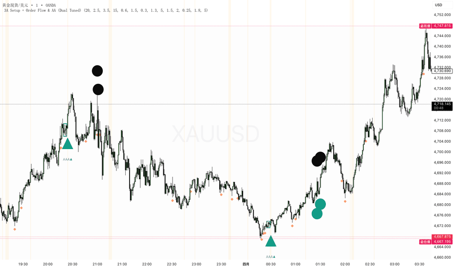
Blanco V3 (PRO MTF System)**Blanco V3 – Advanced Precision Trading System**
Blanco V3 is the next evolution of the Blanco series, designed to deliver **precision entries, stronger confirmations, and cleaner decision-making**. It builds on the foundation of Blanco V1 and V2 by enhancing timing, filtering noise, and introducing smarter multi-timeframe alignment.
At its core, Blanco V3 uses a **Zero Lag EMA (ZLEMA)** to reduce delay and detect trend direction faster than traditional indicators. Combined with advanced filters, it helps traders enter earlier while avoiding weak or late setups.
---
### ⚙️ Intelligent Trading Modes
Blanco V3 features three adaptive modes that dynamically adjust strictness:
* **Aggressive Mode**
Faster signals with more entries. Ideal for scalping and lower timeframes.
* **Balanced Mode (Recommended)**
Optimized for consistency. Balances signal quality and frequency.
* **Conservative Mode**
Focuses only on the strongest setups. Best for swing trading and higher timeframes.
Each mode automatically adjusts:
* Trend strength thresholds (ADX)
* Momentum requirements (RSI)
* Entry precision (pullback sensitivity)
---
### 📊 Signal System
Blanco V3 delivers a refined 3-layer signal structure:
#### 🔺 Entry Signals (Precision Arrows)
Small arrows mark optimized entry points using:
* Pullbacks toward the ZLEMA
* Momentum confirmation (RSI alignment)
* Strong trend validation (ADX filter)
* Candle strength (price action confirmation)
These signals are designed to **improve timing and avoid chasing price**.
---
#### 🟢 BUY / 🔴 SELL Labels (Trend Confirmation)
Larger labels appear when the overall trend shifts direction, helping traders identify:
* Swing entries
* Trend reversals
* Continuation opportunities
---
#### ❗ Elite Signals (Full Alignment)
Blanco V3 introduces enhanced **Elite Signals**, which appear only when:
* A valid entry signal is triggered
* AND all monitored timeframes are aligned
These signals represent the **highest-probability setups**, combining trend, momentum, and full market agreement.
---
### 🧠 Multi-Timeframe Intelligence
Blanco V3 includes a bright, easy-to-read dashboard showing trend direction across:
* 5-minute
* 15-minute
* 30-minute
* 1-hour
* 2-hour
* 4-hour
Each timeframe is color-coded:
* 🟢 Green = Bullish
* 🔴 Red = Bearish
---
### 🔍 Smart Confirmation Logic (NEW)
Blanco V3 improves flexibility and accuracy with:
* **Partial Alignment (4/6 or more)**
Allows earlier entries while maintaining quality
* **Full Alignment (6/6)**
Triggers ❗ Elite Signals for maximum confidence
* **Noise Reduction Filters**
Avoids sideways markets and weak momentum conditions
---
### 🎯 Strategy Philosophy
Blanco V3 is designed around one key principle:
> **Trade with the trend, enter on pullbacks, and confirm with alignment.**
It focuses on:
* Entering **after retracements**, not breakouts
* Trading only in **strong market conditions**
* Aligning with **higher timeframe direction**
---
### ⚠️ Best Use
* Best on **1H and 4H charts**
* Works best in **trending markets**
* Combine with:
* Risk management
* Support & resistance
* Market structure
---
### 📌 Quick Guide
* 🔺 Arrows = precise entries
* 🟢 BUY / 🔴 SELL = trend shifts
* ❗ = elite high-probability trades
* 📊 Dashboard = multi-timeframe confirmation
---
**Blanco V3 is built for traders who want cleaner charts, smarter entries, and higher-quality signals — all in one system.**
Indicador

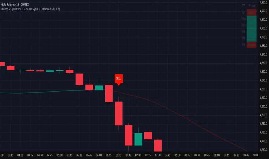
Blanco V1-(Custom TF + Super Signals)**Blanco V1 Trading System (Multi-Timeframe Confirmation)**
Blanco V1 is a high-probability trading indicator designed to identify strong market opportunities using a combination of Zero Lag EMA, trend strength, momentum, and multi-timeframe confirmation.
At its core, Blanco V1 uses a Zero Lag Exponential Moving Average (ZLEMA) to reduce delay and provide faster, more accurate trend signals compared to traditional moving averages.
The system includes three trading modes:
* **Aggressive Mode**: More signals with faster entries, ideal for lower timeframes and active trading.
* **Balanced Mode**: A mix of accuracy and frequency, recommended for most traders.
* **Conservative Mode**: Fewer but higher-quality signals, focused on strong trends and confirmation.
Blanco V1 provides two types of trade signals:
* **Entry Signals (Arrows)**: Small green and red arrows show potential entries based on pullbacks, momentum (RSI), and strong trend conditions (ADX).
* **Trend Signals (BUY/SELL Labels)**: Larger labels appear when the overall trend shifts, signaling potential swing trades.
A key feature of Blanco V1 is the **Multi-Timeframe Dashboard**, which displays trend direction across:
* 5-minute
* 15-minute
* 30-minute
* 1-hour
* 2-hour
* 4-hour
Each timeframe is color-coded:
* 🟢 Green = Bullish
* 🔴 Red = Bearish
The most powerful feature is the **Super Signal (❗)**:
* A green ❗ appears when all timeframes are bullish and a valid buy setup is present.
* A red ❗ appears when all timeframes are bearish and a valid sell setup is present.
These signals represent the highest-probability trades, combining trend alignment, momentum, and full multi-timeframe confirmation.
Blanco V1 performs best on higher timeframes such as 1H and 4H and in trending markets. For best results, combine with proper risk management and price action confirmation.
---
**Quick Guide:**
* 🔺 Arrows = entry timing
* 🟢 BUY / 🔴 SELL = trend shifts
* ❗ = strongest trades (full alignment)
Indicador

Auto Parallel Channel - Trend & Reversal TrackerThis indicator automates a highly specific and effective manual charting technique for tracking trends and identifying potential reversal zones. It is designed to help traders visualize dynamic parallel channels without the hassle of constantly redrawing lines, making it especially useful for timing short entries or spotting bottom reversals in volatile markets like crypto and forex.
How It Works:
Unlike standard channel indicators that simply connect the highest highs and lowest lows, this script uses a refined pivot-based logic. During a downtrend, it identifies the last three Pivot Lows (PL) and the last Pivot High (PH). It constructs the foundational trendline by connecting the intermediate lows and projects a perfectly parallel upper boundary starting from the last confirmed PH.
Key Features:
Custom Key Levels: Includes specific internal and external parallel levels (-0.12, 0, 0.12, 0.5, 0.88, 1.0, 1.12) to identify precise support, resistance, and breakout zones.
Dynamic Peak Tracking (Prediction Line): Features a unique "memory" line. Before a new pivot is fully confirmed, a dashed tracking line anchors to the absolute highest price seen since the last Pivot High. This acts as an early-warning prediction channel that adjusts dynamically as price pushes higher, but stays firmly anchored if price drops.
Clean Chart Management: Prevents chart clutter by automatically limiting the number of historical channels shown at once (customizable).
Smart History Extension: Old channels don't just disappear or stretch to infinity. They are systematically frozen and extended backward/forward by a user-defined number of bars, allowing you to backtest how price reacted to past channel structures.
Customizable Settings:
Pivot Length: Adjust the sensitivity of pivot detection (Default: 25).
History Extension Bars: Control how far historical channel lines project into the past/future (Default: -65).
Max Historical Channels: Keep your chart clean by limiting visible past channels (Default: 3).
Toggles: Easily turn dynamic tracking, historical lines, and pivot labels on or off.
Whether you are riding a trend or looking for the exact moment a downtrend loses momentum, this automated channel system keeps your charts clean, precise, and highly actionable. Indicador

S&P 500 Breadth BullstackCore Idea of the Indicator:
The indicator is not a classic buy/sell trigger, but rather a breadth regime scanner for the S&P 500. In other words, it measures how many stocks in each sector are trading above their 20-day, 50-day, and 200-day moving averages (Simple Moving Average - SMA), compresses that information into a color-coded view, and visualizes whether there is a true “bullstack” in the market.
In practical terms, this means it is especially useful for filtering long positions during strong market phases, scaling into them, and turning defensive earlier when market breadth starts to weaken.
Structure:
The code loads three breadth series for each of the 11 S&P 500 sectors, plus the Nasdaq-100: 20D, 50D, and 200D.
The data is retrieved using request.security() from other symbols or contexts; in Pine, this function is used to access values from other symbols or timeframes within the script.
The script also calculates three averages from the 11 sectors (tot20, tot50, tot200) to create an overall view of S&P 500 market breadth.
Color Logic:
The core idea is: 20D represents short-term momentum, 50D represents medium-term confirmation, and 200D represents the long-term trend.
The bullstackColor() function does not create a simple traffic-light system, but rather a graduated state model: green/turquoise means broad strength, white marks the transition zone, yellow/orange signals early weakness, red to near-black indicates clear breadth weakness, and pink represents a special case of negative divergence.
This divergence occurs when many stocks are still above their 200D line in the long term (b200 > 65), while short-term momentum is already breaking down significantly (b20 < 45) — a typical late-cycle/distribution signal.
Long Strategy:
For longs, the indicator is most powerful when used as a market filter:
The best entries occur when overall breadth rotates up out of capitulation through neutral (white) and then into light green, with 20D breadth picking up first as short-term momentum, 50D breadth then confirming as the medium-term trend, and 200D remaining stable as the long-term trend.
The highest-quality longs occur when not only “Total SPY” turns green, but especially cyclical sectors such as XLY, XLF, XLI, XLK, and ideally the Nasdaq block as well are participating. That usually means the rally is broad, risk-on, and more durable.
Specifically, I would derive three long setups from this:
Early long (first tranche) on the turn from capitulation into the neutral zone, when 20D breadth is clearly rising and 50D breadth is no longer declining.
Confirmation long (second tranche), when 20D > 50D > 50 and several leading sectors turn green at the same time.
Trend add-on (final tranche), when the overall market and cyclical sectors such as XLY, XLF, XLI, and XLK are already green and rotating into turquoise, while pullbacks on the price chart remain shallow (only down to the SMA20 or slightly below).
Position Management:
For position management, the color is almost more important than the entry itself: as long as the picture remains green and 20D only fluctuates slightly, that argues for holding rather than nervous re-trading.
Partial profit-taking or tighter risk management makes sense once strong green fades into pale green or white, because that often marks the transition from expansion to exhaustion.
A clear warning signal against new longs is pink: in that case, the long-term trend is still intact, but short-term momentum is already rolling over — exactly the kind of environment where late longs are often rewarded the least. Caution is warranted here, and the first partial profits should be secured.
Short Strategy:
I would trade shorts much more selectively than longs with this indicator, because breadth indicators in uptrends can often stay “too strong” longer than short setups can tolerate.
The better short opportunities do not occur on the first yellow bar, but when the overall picture shifts from white/yellow into orange/red, while 20D breadth and 50D breadth are weak at the same time and defensive sectors look better than cyclical ones. That points more to genuine market distribution rather than just a simple pullback in individual sectors.
The cleanest short entries come after a failed rebound out of a pink divergence, or when multiple sectors flip synchronously into red/dark red after a warning phase, especially if Nasdaq, Tech, and other cyclical sectors confirm the weakness.
A simple practical rule would therefore be:
Prefer longs when breadth is expanding, 20D leads first, and 50D/200D then confirm.
No fresh longs during pink divergences.
Only take shorts when the weakness is broad, synchronized, and visible across sectors.
One more important point:
The script measures market breadth, not price structure. Therefore, it is best used as a top-down filter together with price triggers in SPY/ES/QQQ or in individual stocks — for example, breadth turning green plus a breakout or trend pullback on the chart, rather than trading breadth in isolation. Indicador

SMA DynamicSince you're publishing this on TradingView, you'll want a description that looks professional and clearly explains the logic so other traders (or your future self) understand the value.
Here is a clean, effective English description for your script:
SMA Dynamic Matrix: Adaptive Multi-Timeframe Strategy
Overview
The SMA Dynamic Matrix is an intelligent, context-aware indicator designed to streamline technical analysis across multiple timeframes. Instead of cluttering your chart with dozens of moving averages, this script automatically detects your current chart interval and applies a specific "Matrix" of three Simple Moving Averages (SMAs) tailored for that timeframe.
How it Works
The indicator synchronizes perfectly with your analysis flow. When you switch timeframes, the SMA periods update instantly based on a pre-defined optimized matrix:
5 Min: 12, 24, 78 SMAs
30 Min: 13, 26, 65 SMAs
Daily: 10, 21, 63 SMAs
Weekly: 12, 27, 55 SMAs
Monthly: 12, 24, 36 SMAs
Note: To keep your charts clean, the indicator will automatically hide itself if you switch to a timeframe not included in the matrix (e.g., 1-hour or 15-min).
Visual Hierarchy
The script uses a "Heatmap" color logic for instant recognition:
Yellow Line: Short-term momentum (Fastest)
Orange Line: Medium-term trend (Intermediate)
Red Line: Major trend/Structure (Slowest/Most Significant)
Key Features
Zero Clutter: Only shows the 3 relevant averages for your current view.
High Visibility: Optimized colors (Yellow, Orange, Red) with 100% opacity for clarity on both dark and light themes.
Clean UI: Thin line weights (1px) to ensure price action remains the primary focus.
Automated Logic: No manual input changes required when switching from intraday scalping to long-term investing. Indicador

Indicador

Indicador
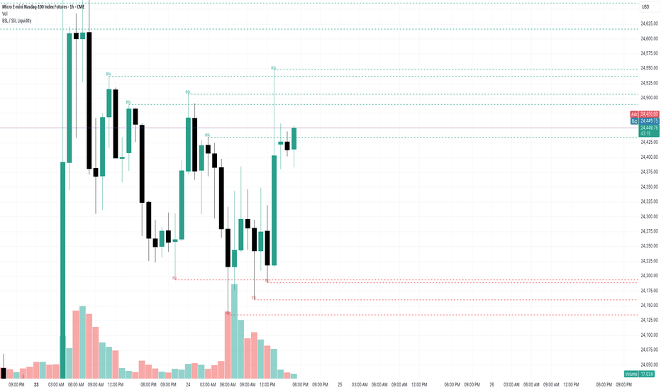
volatilty 3691. Multi-Asset & Custom Timeframe Selection
The script allows you to select a specific asset (NIFTY, BANKNIFTY, etc.) and a fixed timeframe (e.g., 15m, 1H, Daily) from the settings. It fetches data for that specific selection regardless of what chart you currently have open.
2. Volatility-Adaptive Bands
Instead of using fixed standard deviations, the script creates dynamic bands around a 25-period EMA.
It calculates an ATR (Average True Range).
It adjusts the width of the bands based on the India VIX.
If VIX is high relative to its 25-EMA, the bands widen to account for market noise. If VIX is low, the bands tighten.
3. Trend Filtering with VWAP & VIX
The code uses two primary filters to ensure high-quality entries:
VWAP Filter: For a Long signal, the price must be above the VWAP. For a Short signal, it must be below.
VIX Spike Protection: It prevents "Long" entries if the VIX is spiking (rising more than 0.8% above its EMA), as a rising VIX usually indicates a falling market or high risk.
4. Entry & Exit Logic
BUY Signal: Triggered when the price closes above the Upper Adaptive Band AND VWAP, provided the VIX is stable.
SELL Signal: Triggered when the price closes below the Lower Adaptive Band AND VWAP, provided the VIX is trending up.
Exit/Neutral: The trend turns "Sideways" if the price crosses back over the 25-EMA, acting as a trailing stop or trend-weakness indicator. Indicador

Enhanced High-Scan RSI ProOverview
This indicator is designed for professional traders who require clean, high-precision Support and Resistance levels without the "staircase" clutter found in standard pivot indicators. It focuses on the "Tide and Waves" philosophy, distinguishing between major institutional levels and minor intraday hurdles.
Built for high-speed scanning, it features an Ingenious Polarity Flip engine that automatically detects when a "broken" level has overturned its role (Support becoming Resistance and vice versa), highlighting potential retest zones in real-time.
Key Features
Dynamic Polarity (Overture) Detection: Unlike static lines, this script monitors price interaction. When a major level is breached, the line color transforms (e.g., to Yellow) to signal an S/R Flip, identifying high-probability zones for "break and retest" strategies.
Institutional vs. Retail Hierarchy: * Major Levels (Solid Bold): Represent long-term historical significance (The Tide).
Minor Levels (Thin Dashed): Highlight recent intraday swings (The Waves).
Clean Geometry Engine: Uses advanced array management to delete old, irrelevant lines. The result is a clean chart where lines float forward into the future space, providing clear targets for Stop Loss and Take Profit.
Fully Refined Settings: Every aspect is customizable, including lookback periods, line limits, colors, and styles, allowing you to tailor the "strength" of the levels to any asset (Forex, Crypto, or Stocks).
How to Use
Identify the Trend: Watch the Major Levels to determine the primary market boundaries.
Spot the Reversal: Look for price exhaustion near the Major Support (Green).
The Retest Play: When a level turns Yellow, it indicates an S/R Flip. This is your cue to look for a retest of that level to confirm a breakout or a trend continuation.
Risk Management: Use Minor Levels (Dashed) for precise Stop Loss placement or as immediate intraday targets.
Technical Specifications
Version: Pine Script v6 (Latest)
Compatibility: Optimized for all timeframes (Best results on 1H, 4H, and Daily).
Performance: Uses lightweight array logic to ensure zero lag, even on lower-end machines. Indicador

Indicador
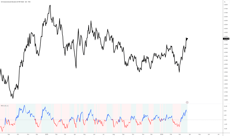
WCI - World Crisis Composite IndicatorWCI — World Crisis Composite Indicator v2.3
28 global feeds → one 0–100 threat score → one clear action.
Equities, FX, volatility, credit, commodities, yield curve — all real time. Tells you what to do at every crisis stage, including when and how much to re-enter.
━━━━━━━━━━━━━━━━━━━━━━━━━━━━━━━
ACTION SIGNAL
━━━━━━━━━━━━━━━━━━━━━━━━━━━━━━━
12-rule decision cascade. WCI score → momentum direction → Δ7 streak confirmation → ChartScore gate. Dynamic sizing: always min(Exposure%, signal ceiling).
EXIT ALL WCI > 70. Liquidate immediately.
REDUCE 10% WCI 55–70, momentum hostile.
WATCHLIST WCI 55–70, conditions met — observe only.
WAIT Streak or momentum not confirmed yet.
PILOT 25% First re-entry. WCI 40–55, COOLING, streak ✓.
SCALE IN 50% WCI 40–55 RETREATING or 28–40 COOLING.
ADD 75% WCI 28–40, RETREATING, streak ✓.
FULL DEPLOY WCI < 28. Crisis over.
Per-stock action word overlaid: BUY / WATCH / SKIP / AVOID / SELL.
━━━━━━━━━━━━━━━━━━━━━━━━━━━━━━━
FIVE SCORING MODULES
━━━━━━━━━━━━━━━━━━━━━━━━━━━━━━━
M1 Global Shock (0–25)
Equity sync crashes across SPX/NKY/DAX/SHC/SOX. Copper triple-method scoring (Z + ROC50 + SMA) catches both crash and supply-panic spike.
M2 FX Panic (0–20)
JPY/CHF/AUD/DXY + crude (200-SMA persistence + 52-wk high proximity + volume). Wheat food-crisis scoring (Z + ROC20 + breakout).
M3 Fear Gauge (0–20)
VIX complex (level + spike + term structure) + VVIX + SKEW + MOVE bond volatility.
M4 Haven Flow (0–20)
Detects both Safe Haven Rush (gold + bonds surging) AND Safe Haven Failure (gold crashing while equities fall — the 2008 pattern). Adaptive gate: gold crash > 8% in 3 days overrides equity threshold.
M5 Panic Index (0–15)
Failed bounces, put/call ratio, HYG credit stress + yield curve recession signal (inversion depth, duration, un-inversion detection, 2Y ROC).
Convergence multiplier: 3 modules = +15%, 4 = +30%, 5 = +50%.
━━━━━━━━━━━━━━━━━━━━━━━━━━━━━━━
Z-NORMALIZED GLOBAL PULSE
━━━━━━━━━━━━━━━━━━━━━━━━━━━━━━━
7 indices: SPX · NKY · DAX · HSI · SOX · EEM · IDX (your local benchmark).
Each move measured against its own 1-year standard deviation — not raw percentages. SOX down 1.2% shows gray (routine), SPX down 1.2% shows red (unusual for SPX). Every index gets one fair vote regardless of native volatility.
Pulse label cell: color shifts red → amber → gray → green based on z-normalized breadth across all indices.
━━━━━━━━━━━━━━━━━━━━━━━━━━━━━━━
DASHBOARD
━━━━━━━━━━━━━━━━━━━━━━━━━━━━━━━
8-row compact table. Colored label cells, white detail cells.
WCI Score + crisis level (color = severity)
Signal Action + size + momentum (merged from 2 rows)
7-Bar Sparkline trend + Δ7/Δ1 values
Exposure Current % + direction + signal cap + streak
Driver Dominant module + score + crisis feeds active
Mood Two-line situational read (observation + reaction)
Chart ChartScore: per-stock structural assessment
Pulse 7 global indices, z-normalized, individually colored
━━━━━━━━━━━━━━━━━━━━━━━━━━━━━━━
CHART LABELS
━━━━━━━━━━━━━━━━━━━━━━━━━━━━━━━
Placed at crisis onset transitions. 3-line compressed format:
Line 1: WCI score + action word (BUY/SELL/WATCH/AVOID/SKIP)
Line 2: Stock snapshot (drawdown, volume, relative strength)
Line 3: Trend structure (SMA position + direction)
After 7 bars: ATR-relative validation grade appended (A/B/C/D/F). Thresholds adapt per stock — A on a $5 stock ≠ A on SPY.
━━━━━━━━━━━━━━━━━━━━━━━━━━━━━━━
28 DATA FEEDS
━━━━━━━━━━━━━━━━━━━━━━━━━━━━━━━
Equities: SPX, NKY, DAX, SHC, SOX, HSI, EEM
FX: USD/JPY, USD/CHF, AUD/USD, DXY
Volatility: VIX, VIX9D, VVIX, SKEW, VIX3M, MOVE
Credit: HYG, LQD
Havens: GLD, TLT
Commodities: Crude Oil, Copper, Wheat
Rates: US 2Y, US 10Y
Sentiment: Put/Call Ratio + your local index
Works on any chart, any timeframe (daily recommended). 5 configurable alerts — set once with "Any alert() function call".
Indicador
Indicador

Indicador

Complete DMI + ADX SystemDrawing the historical data of the +DI and -DI lines is actually one of the most common ways traders visualize the "tug-of-war" between buyers and sellers.
When you load this script, you will see a green line and a red line constantly chasing each other.
The Crosses: When the Green line crosses above the Red line, the buyers have officially taken control of the momentum.
The "Jaws": When the Green line is going up and the Red line is going down simultaneously, the lines look like an alligator opening its jaws. The wider the jaws, the stronger the trend.
The Squeeze: When the Green and Red lines are tangled together in a tight knot, the market is "choppy" and there is no clear direction. (This is exactly when your Time Box breakouts are most likely to fail!).
Adding the ADX (Average Directional Index) gives you the complete "Directional Movement System." It is the missing puzzle piece that tells you if a breakout is real or just noise.
If the +DI and -DI lines are the "Steering Wheel" telling you which way the market is turning, the ADX is the "Gas Pedal" telling you how much momentum is behind that turn.
When you look at this new pane below your chart, here is the exact step-by-step checklist to read the market's mind:
1. Who is in control? (The Cross)
Look at the Green (+DI) and Red (-DI) lines. Whichever line is on top is currently winning the tug-of-war.
2. Is there actually a trend? (The ADX)
Look at the White line (ADX).
If the White line is below the dashed 25 line, the market is asleep. It is chopping sideways. Do not trust breakouts here.
If the White line is crossing above 25, the market is waking up. A strong trend is starting.
Activate the Alert in TradingView
Save your script and make sure it is loaded on your chart.
Press Alt + A (or Option + A on Mac) to open the Create Alert menu.
Condition: Click the top dropdown and select your custom indicator name (e.g., "Custom +DI & -DI History").
In the second dropdown right below it, select "DMI Bullish (+DI crosses Up)".
Trigger: Select "Once Per Bar Close" (Crucial: This prevents fake alerts if the lines cross mid-candle and then un-cross before the candle finishes).
Notifications: Choose how you want to be notified (App push, pop-up, or email).
Click Create.
Indicador

Indicador

Indicador
Indicador

Indicador
NQ ICT Semi-Auto Strategy v1NQ ICT TRADING STRATEGY DOCUMENT
1) IDENTITY
Instrument: NQ / US100
Confirmation Market: SP500
Style: ICT Scalping / Intraday
Main Session: New York Open
Secondary Session: New York PM only if model is clean
Primary Goal: A+ setups only, consistency, capital preservation, clean payouts
--------------------------------------------------
2) CORE PHILOSOPHY
I do not chase price.
I let price reach liquidity or a PD Array, then I wait for:
- liquidity sweep
- displacement
- market structure shift
- FVG / OTE entry
- SP500 confirmation
- macro alignment
Macro gives me the side.
ICT gives me the narrative.
Execution happens only after confirmation.
--------------------------------------------------
3) WEEKLY MACRO BIAS
Every weekend I check:
A) Macro Inputs
- COT
- US02Y
- US10Y
- WTI Oil
- DXY
B) Price Inputs
- US100 Weekly / Daily
- SP500 Weekly / Daily
C) Weekly Bias Rules
Bearish Weekly Bias:
- US02Y rising
- Oil rising
- DXY rising
- US100 Daily/Weekly weak
- SP500 Daily/Weekly weak
Bullish Weekly Bias:
- US02Y falling
- Oil stable or falling
- DXY weak
- US100 reclaiming key levels
- SP500 supportive
Mixed Weekly Bias:
- COT supportive but macro bearish
- US100 and SP500 in range
- conflicting signals
Weekly conclusion must be one of:
- Buy dips
- Sell rallies
- Mixed / range conditions
--------------------------------------------------
4) ICT HIGHER TIME FRAME FRAMEWORK
Before every trading day I define:
- Weekly High
- Weekly Low
- Previous Day High (PDH)
- Previous Day Low (PDL)
- Buy-side liquidity (BSL)
- Sell-side liquidity (SSL)
- Main Dealing Range
- Premium / Discount
- HTF PD Arrays
- Draw on Liquidity
Main questions:
1. Where is liquidity?
2. What is price drawing toward?
3. Is price in premium or discount?
4. Is there SMT with SP500?
5. Are we near a meaningful PD Array?
--------------------------------------------------
5) DAILY INTRADAY BIAS
Before NY Open I check:
- US100
- SP500
- NVDA
- WTI
- DXY
- US02Y
Bearish Intraday Bias:
- NQ weak
- SP500 weak
- NVDA weak
- Oil strong
- DXY strong
- Yields strong
Bullish Intraday Bias:
- NQ strong
- SP500 strong
- NVDA strong
- Oil stable or weak
- DXY weak
- Yields weak
Mixed / No Trade Bias:
- NQ and SP500 not aligned
- price stuck in the middle of the dealing range
- no displacement
- sloppy tape
--------------------------------------------------
6) MAIN ICT SETUPS
SETUP A: BEARISH PREMIUM REVERSAL
Conditions:
- Weekly bias bearish or mixed-bearish
- Price reaches premium
- Price sweeps buy-side liquidity
- SP500 confirms weakness or SMT bearish divergence appears
- Clear bearish displacement
- Bearish MSS on M1 or M5
- Entry on bearish FVG or OTE retracement
Entry:
- Sell only after confirmation
- Prefer entry after return into FVG / OTE zone
Stop:
- Above the sweep high
- Above invalidation level
Targets:
- Internal sell-side liquidity
- Equal lows
- SSL
- PDL
- Range low
- HTF draw on liquidity
--------------------------------------------------
SETUP B: BULLISH DISCOUNT REVERSAL
Conditions:
- Weekly bias bullish or mixed with bullish reaction
- Price reaches discount
- Price sweeps sell-side liquidity
- SP500 confirms strength or SMT bullish divergence appears
- Clear bullish displacement
- Bullish MSS on M1 or M5
- Entry on bullish FVG or OTE retracement
Entry:
- Buy only after confirmation
- Prefer entry after return into FVG / OTE zone
Stop:
- Below sweep low
- Below invalidation level
Targets:
- Internal buy-side liquidity
- Equal highs
- BSL
- PDH
- Range high
- HTF draw on liquidity
Note:
If macro is bearish, this setup is scalp only, not swing conviction.
--------------------------------------------------
SETUP C: RANGE EXTREME REVERSAL
Conditions:
- Market is in accumulation / chop / range
- No clear trend day
- Price reaches edge of range only
- Sweep occurs at edge
- MSS confirms reversal
Rules:
- Buy low of range only
- Sell high of range only
- No entries in the middle of the range
Targets:
- Midpoint first
- Opposite side of range second
--------------------------------------------------
7) AMD MODEL
I only want to execute after the market shows:
A = Accumulation
M = Manipulation (liquidity sweep)
D = Distribution (displacement in real direction)
Rule:
No entry during accumulation.
Wait for manipulation and then confirmation of distribution.
--------------------------------------------------
8) SMT MODEL WITH SP500
Bearish SMT:
- NQ makes a higher high
- SP500 fails to make a higher high
- Look for sell after sweep + displacement + MSS
Bullish SMT:
- NQ makes a lower low
- SP500 fails to make a lower low
- Look for buy after sweep + displacement + MSS
Rule:
SMT is confirmation, not entry by itself.
--------------------------------------------------
9) ENTRY TRIGGER RULES
I do not enter because price touched a zone.
I only enter if I have at least:
1. Liquidity sweep
2. Displacement
3. MSS
4. Return to FVG or OTE
5. SP500 confirmation or at least no contradiction
If these are not present:
NO TRADE
--------------------------------------------------
10) RISK RULES
Standard risk per trade: 0.5%
Maximum risk per idea: 1%
Maximum daily loss: 1%
Maximum number of trades per day: 2
Hard rules:
- No revenge trading
- No increasing risk after a loss
- No more than 1% risk on the same trade idea
- Respect firm rules regarding maximum single trade / same idea risk
--------------------------------------------------
11) MANAGEMENT RULES
A+ ICT Setup:
- No break-even at 1R
- Move stop to break-even at 1.5R
- First partial at 2R or at a key liquidity target
- Partial size: 20% to 30% only
- Leave a runner for HTF draw on liquidity
- Trail behind structure
Normal Setup:
- Partial allowed at 1R
- Move to break-even at 1.5R
- No early full close unless tape becomes sloppy
Messy / Headline Market:
- Take smaller targets
- Accept BE if necessary
- No forcing runners
- Focus on preserving capital
--------------------------------------------------
12) NO TRADE CONDITIONS
I do not trade if:
- Price is in the middle of the dealing range
- NQ and SP500 are not aligned
- No displacement
- No MSS
- Major news is about to release
- Tape is extremely sloppy
- I am stressed, tired, emotional, or distracted
- I already took 2 losses
- Setup is not A+ quality
--------------------------------------------------
13) HIGH IMPACT NEWS RULES
Important events:
- FOMC
- CPI
- PPI
- NFP
- Powell speeches
- Major war/oil headlines
Rules:
- No trade before major release
- Wait 5 to 15 minutes after release
- Let news high and low form
- Trade only if structure appears after volatility
- No guessing direction before confirmation
--------------------------------------------------
14) SESSION RULES
New York Open:
- Main execution window
- Best time for sweep + displacement model
- Do not chase first impulse candle
- Wait for model to develop
New York PM:
- Trade only if there is a clean continuation or clean reversal
- Otherwise skip
Monday Rule:
- Monday is not a forcing day
- If unclear, no trade
- Better to preserve capital than start the week with damage
--------------------------------------------------
15) WEEKEND PREP TEMPLATE
Weekly Bias:
...
COT:
- Nasdaq Mini:
- SP500:
Macro:
- US02Y:
- US10Y:
- Oil:
- DXY:
Price Structure:
- US100 Weekly:
- US100 Daily:
- SP500 Weekly:
- SP500 Daily:
Main Draw on Liquidity:
...
Key Weekly Levels:
...
Best Weekly Scenario:
...
Worst Weekly Scenario:
...
What to avoid:
...
--------------------------------------------------
16) DAILY PREP TEMPLATE
Date:
...
Macro Bias Today:
...
Price Bias Today:
...
Session:
...
Main Levels:
- Weekly High:
- Weekly Low:
- PDH:
- PDL:
- BSL:
- SSL:
Main PD Arrays:
...
Draw on Liquidity:
...
Preferred Setup:
...
No Trade If:
...
Risk Today:
0.5%
Max Trades:
2
--------------------------------------------------
17) POST-TRADE JOURNAL TEMPLATE
Date:
Session:
Bias:
Setup Type:
Liquidity Taken:
SMT Present:
Displacement Present:
MSS Present:
Entry Model:
Stop Placement:
Target Model:
Risk %:
Outcome:
Mistake:
Market Condition:
Was this A+?
Lesson:
--------------------------------------------------
18) PERSONAL RULES
- I do not chase missed moves
- I do not trade from the middle of the range
- I do not use break-even as emotional protection
- I only trade A+ ICT models
- No trade is a valid decision
- Payout withdrawals are not losses
- My job is execution, not prediction
- Capital preservation is a win
- I trade process, not emotion
--------------------------------------------------
19) FINAL EXECUTION RULE
For every trade I must know:
- Where liquidity is
- What price is drawing toward
- Whether price is in premium or discount
- Whether SP500 confirms or diverges
- Whether displacement and MSS are present
- Whether the setup is A+
If I do not know these clearly:
NO TRADE
--------------------------------------------------
20) MAIN OBJECTIVE
My objective is not to trade every day.
My objective is to execute only clean ICT setups with discipline,
protect capital,
stay within risk,
and build consistency for long-term payouts. Estrategia

Indicador

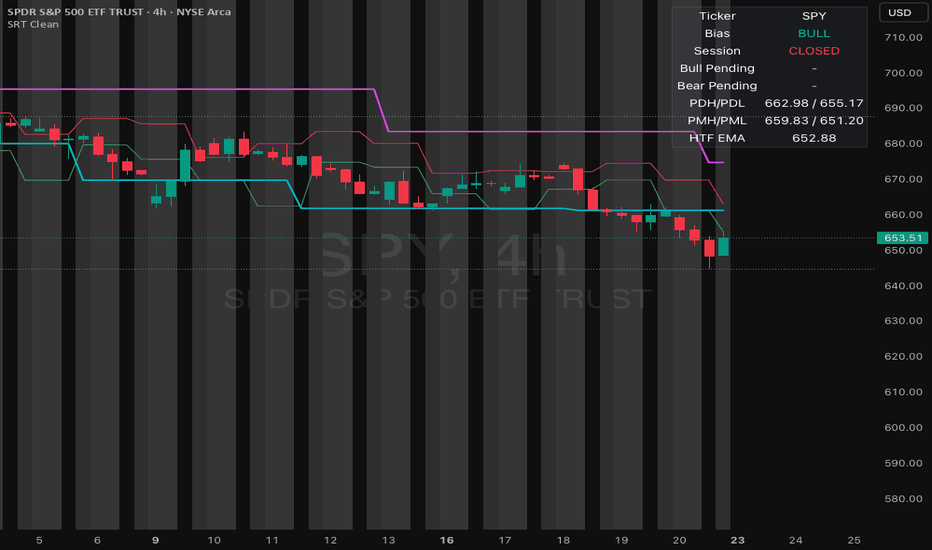
Sweep Reclaim Retest [Clean v1]Sweep Reclaim Retest is a price-action indicator built for traders who want structured entries around liquidity sweeps and failed breakouts. It tracks higher-time-frame bias, plots key reference levels, detects sweep-and-reclaim behavior, and waits for retest confirmation before printing a CALL or PUT signal on the underlying chart.
Full Description
Sweep Reclaim Retest is an overlay indicator designed to help traders identify high-quality reversal and continuation entries after liquidity grabs at important levels.
The script follows a simple logic chain:
Bias → Level → Sweep → Reclaim → Retest → Signal
Instead of signaling on the first touch of a level, the indicator waits for price to:
sweep beyond a key level,
reclaim that level,
retest it,
and confirm direction before producing a signal.
What it tracks
The script automatically monitors:
Previous Day High
Previous Day Low
Premarket High
Premarket Low
Confirmed swing highs and swing lows
Higher-time-frame directional bias using HTF close vs HTF EMA
Signal logic
Bullish setup
price sweeps below support/liquidity
closes back above it
retests and holds
then prints a CALL signal
Bearish setup
price sweeps above resistance/liquidity
closes back below it
retests and fails
then prints a PUT signal
Filters included
To reduce low-quality signals, the script includes:
higher-time-frame bias filter
trading session filter
pending setup expiry
invalidation logic
optional candle-body confirmation
optional break of prior bar high/low
optional mid-range exclusion filter to avoid dead-zone setups
Visual features
key level plotting
session bias shading
sweep markers
CALL and PUT labels
info table with current status
Best use
This script works best on the underlying chart such as SPY or XSP, especially on lower intraday timeframes. It is intended as a setup detector, not an options-chain tool. It does not select contracts, calculate Greeks, or place trades automatically.
Notes
Swing levels are based on pivot confirmation, so they appear with natural delay.
This script is designed for structure-based traders who want more discipline around entry timing.
Best results usually come from combining the signal with your own risk management, option selection rules, and market context.
Disclaimer
This indicator is for educational and informational purposes only. It does not provide financial advice or guarantee performance. Always test any script thoroughly before using it in live trading.
Here’s a cleaner TradingView-style version if you want something a little more polished and public-facing:
Sweep Reclaim Retest is an intraday price-action indicator built around liquidity sweeps, failed breaks, and retest confirmation.
The script is designed to help traders avoid chasing first touches and instead focus on a more structured sequence:
Bias → Level → Sweep → Reclaim → Retest → Signal
It tracks important reference levels such as previous day high/low, premarket high/low, and confirmed swing highs/lows. Once price sweeps beyond one of these levels and reclaims it, the script arms a pending setup. A signal is only printed if price comes back to retest the level and confirms direction.
Included features
HTF bias filter using higher-time-frame close vs EMA
session-based signal windows
previous day and premarket levels
confirmed swing levels
pending setup expiry and invalidation
optional candle confirmation
optional prior bar break confirmation
optional mid-range exclusion filter
chart shading, level lines, markers, and info table
Signal types
CALL after bullish sweep → reclaim → retest hold
PUT after bearish sweep → reclaim → retest failure
This script is intended for use on the underlying chart, not the option chart. It is especially suited for traders using SPY/XSP or similar liquid instruments as their signal source, while handling contract selection separately. Indicador