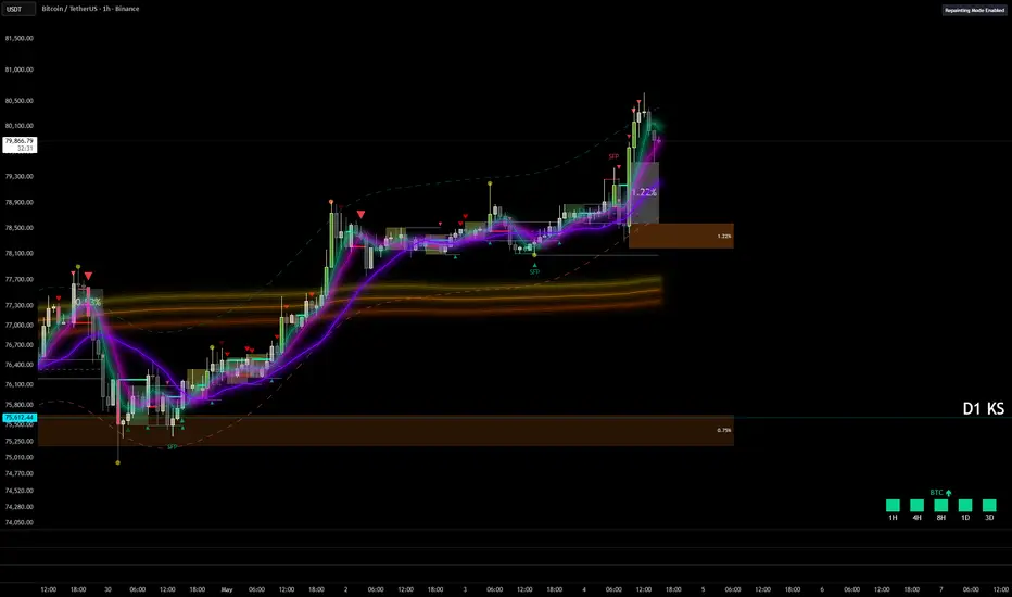
Indicador
MTIDDescription
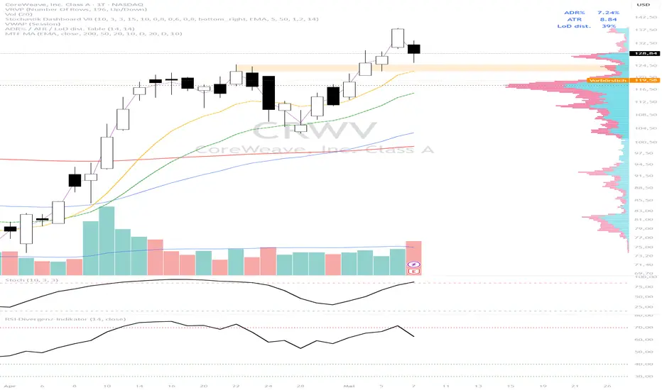
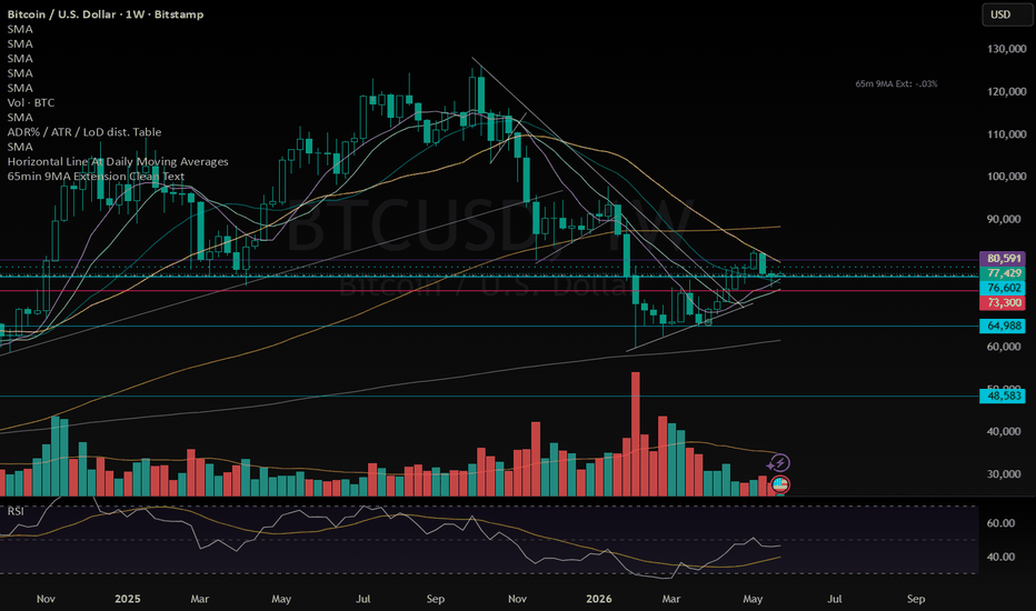
MTID is an all-in-one overlay built for swing and position traders who want price action, key statistics and fundamentals on a single pane. Six configurable moving averages, a "big move" marker, a live stats dashboard, and an 8-quarter fundamentals table are combined into one indicator with independent toggles for every section.
WHAT'S ON THE CHART
• Six moving averages — each with its own length, type (SMA/EMA), color and timeframe-visibility filter (All / Intraday+Daily / Weekly+Monthly / Intraday-only / Daily-only / Weekly-only). Default lengths 10/20/50/100/150/200 cover the most-watched values.
• Purple-Dot Big Move — flags bars whose move ≥ a configurable % AND volume ≥ a configurable threshold. Shape, size, color and timeframe-visibility are all configurable; bars can be color-coded on move direction.
• Optional bar coloring for high relative-volume bars.
STATS DASHBOARD (vertical table or horizontal headband)
• Sector & Industry (auto-detected from the symbol)
• Market Cap with currency conversion (Auto / USD / INR / EUR / GBP / JPY) and Indian (Cr/LCr) or Western (M/B/T) formatting
• 52-Week High/Low — % off the high and % off the low (daily-candle based regardless of chart TF)
• 13-Week Peak/Bottom — same idea over a quarter
• ADR (Average Daily Range %) and ATR — daily-candle based
• U/D Ratio — up-volume vs down-volume
• Float %
• Distance vs Daily SMA and Distance vs Weekly SMA — both shown simultaneously, regardless of chart timeframe
• Relative Volume (RVol)
• % above Low-of-Day (intraday session low; bar low on daily+)
FUNDAMENTALS TABLE
Last four quarters (with three more held internally for YoY math) of:
• EPS with YoY and QoQ % change
• Sales (auto-scaled units) with YoY and QoQ % change
• OPM% (Operating Margin = Operating Income / Revenue) with YoY and QoQ
• Per-quarter P/E (annualised from quarter EPS)
Plus an optional row showing the next two estimated quarters (EPS estimates, YoY/QoQ).
Header row showing Market Cap, Free-Float Mkt Cap, ROE and TTM P/E.
Vertical (full grid) or horizontal (transposed headband) layout.
IPO-FRIENDLY
Lookback windows adapt to available history. A newly listed symbol with fewer than 52 weeks (or 13 weeks, 50 bars for RVol, 20 days for ADR, etc.) still gets values computed over whatever data exists, instead of showing "N/A".
CUSTOMIZATION
• Every section independently togglable.
• Per-table position (6 anchor points), text size, layout (vertical / horizontal headband), border & frame width.
• Per-column text alignment (Left / Center / Right) for the dashboard.
• Configurable blank spacer rows at the top of each table — useful when TradingView's hover controls overlap the table.
• Fully themable colors (positive / negative / neutral, backgrounds, borders).
NOTES
• Sector, Industry, Market Cap, ROE, Float, EPS, Sales, Operating Income and EPS estimates are sourced from TradingView's request.financial / request.earnings and may be unavailable for some symbols or exchanges.
• Currency conversion uses FX_IDC daily rates.
• Built in Pine Script v6. Indicador

Indicador
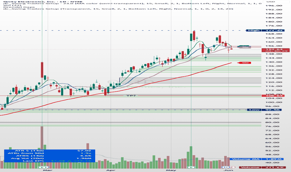
Multi-Timeframe MA Structure & RSI ConfluenceThis indicator combines multi-timeframe moving averages, RSI-based swing structure labels, and a compact RSI confluence panel into one chart overlay.
Features:
EMA/SMA 50 and 200 for 15m, 1h, 4h, Daily and Weekly timeframes
Optional automatic hiding of lower-timeframe MAs on higher-timeframe charts
EMA/SMA visual distinction using solid and dashed lines
RSI-based swing high/low labels: HH, HL, LH, LL
Developing swings marked with “?”
Structure-based label coloring: HH/HL green, LH/LL red
Regular bullish and bearish RSI divergence labels
Compact RSI panel showing RSI value, regime, momentum, RSI vs MA, recent MA cross and recent divergence
The indicator is designed as a visual market-structure and confluence tool. It does not generate buy or sell signals and should not be used as a standalone trading system.
The swing logic is inspired by RSI overbought/oversold cycle concepts originally published by BalintDavid. Indicador

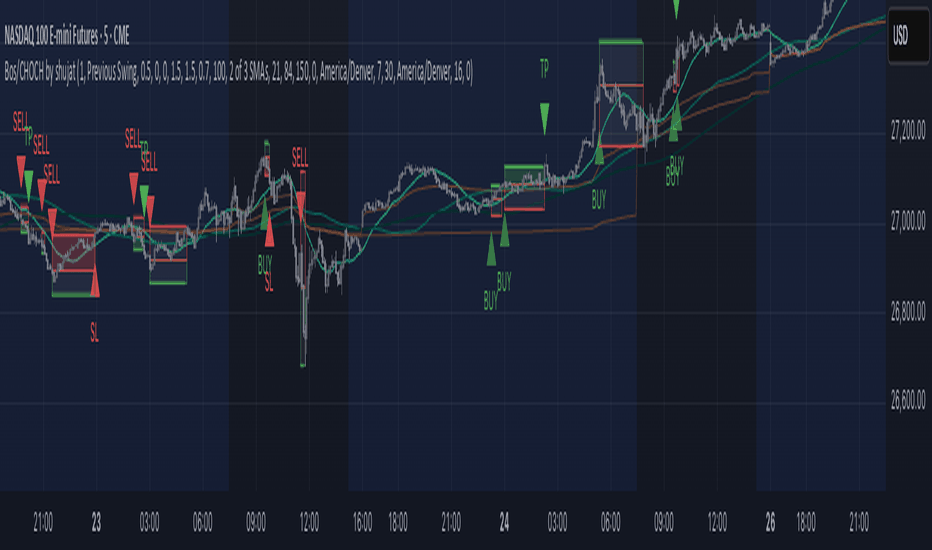
Mean Reversion at or under 200MAThis strategy is based on the 30 minute of the S&P futures chart, MES
A Long Buy will be executed if, the EMA 9 or price comes down to or under the 200 MA, AND THEN the slope of the ema 9 subsequently changes from negative to positive.
The buy will be executed either; at a retest of the local lows (defined by the lowest wick between the most recent red candle that is subsequently followed by a green candle) (a retest is defined as 70% retrace from the local highs (inversely defined from local lows) to the local lows), or if a retest of the lows fails to occur, a market order will be executed at the local highs.
With a fixed position size of 10 contracts, the take profits will be established as such; 2 contracts sold up 6 points of profit, the next two will be sold up 10 points of profit, and the remaining 2 contracts will be sold for 20 points of profit. As soon as the first trim is made, a stop loss is placed at break even. Further, as soon as the second trim is made, the stop loss will be moved to +5 profit points.
In the instance that the ema 9 returns to downward sloping, stop orders will be executed. This will trigger sells either at local lows or local highs.
Kind of just made this for a class project, but the logic is sound, and the results are formidable thus far - enjoy :) Estrategia

Indicador

Indicador

Estrategia

Estrategia

Moving Average XLMoving Average XL is a customizable multi-moving-average overlay that allows traders to plot up to three separate moving averages on the chart at the same time. Each moving average can be independently enabled, adjusted, styled, and color-coded, making it useful for trend direction, dynamic support and resistance, crossover analysis, and multi-timeframe-style trend context.
Each MA group includes the same core settings. “Show MA” turns that moving average on or off. “Length” controls the number of candles used in the calculation, with shorter lengths reacting faster to price and longer lengths smoothing price action more heavily. “Type” lets the user choose between SMA, EMA, WMA, VWMA, RMA, and HMA depending on how responsive or smooth they want the line to be. “Line Style” changes the visual display between solid, stepline, or circles. “Line Thickness” controls the weight of the plotted line, and “Color” lets the user customize each average for easier chart reading.
This indicator is designed for traders who want a clean, flexible moving average tool without unnecessary clutter. Use shorter averages to track near-term momentum, medium averages to define intermediate trend direction, and longer averages to identify major trend bias or high-probability support and resistance areas. Indicador

Indicador

Indicador

Indicador

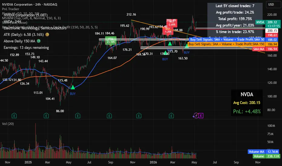
Buy/Sell Signals: SMA + Volume + Trade ProfitThis indicator generates buy and sell signals using SMA 150, SMA 50, candle color, and volume conditions.
A buy signal appears when a green candle closes above the SMA 150, remains within the selected maximum percentage above it, closes above the SMA 50, and has above-average volume.
A sell signal appears on the first candle that closes below the SMA 50 after a buy signal.
The indicator tracks each completed trade and displays the profit/loss percentage on the sell candle. It also includes a summary table showing trade count, average profit, total compounded profit, average yearly profit, time spent in trades, and yearly capital-efficiency adjusted for exposure time.
The checked time period is configurable in years. Indicador

Indicador

Indicador

EMA/SMA + Fixed Marker PivotsTrend Table — EMA/SMA + Fixed Marker Pivots
Multi-Timeframe Trend-Übersicht für saubere Top-Down-Analyse. Zeigt auf einen Blick, in welchem Trendzustand sich ein Asset auf 15m, 1H, 4H, 1D und 1W befindet — direkt am Chart, ohne Timeframe-Wechsel.
Was er macht
Der Indikator kombiniert zwei visuelle Elemente:
1. Trend-Tabelle (rechts oben)
Bewertet jeden Timeframe als UPTREND, DOWNTREND oder SIDEWAYS anhand der Position des Preises zu EMA20 und SMA50.
2. Fixed Trend Marker (Pivots am Chart)
Markiert Swing Highs (rote Punkte) und Swing Lows (grüne Punkte) mit einstellbarer Pivot Length. Dient als visuelle Marktstruktur-Hilfe — zählt aber nicht in die Tabellen-Bewertung.
Zusätzlich werden EMA20 (grün) und SMA50 (rot) auf dem aktuellen Chart geplottet.
Trend-Logik
Die Tabelle nutzt die relative Position der beiden Moving Averages zum Preis:
Uptrend: Beide MAs unter den Kerzen UND EMA20 näher am Preis als SMA50
Downtrend: Beide MAs über den Kerzen UND EMA20 näher am Preis als SMA50
Sideways: Alles dazwischen — z. B. wenn der Preis zwischen den MAs liegt oder die langsame SMA näher am Preis ist als die schnelle EMA (typisch bei Trendwechseln und Konsolidierungen)
Die Sideways-Bedingung ist bewusst streng: Sie filtert die unklaren Phasen raus, in denen die MAs gerade kreuzen oder der Preis seitwärts läuft.
Einstellungen
EMA-Länge (Default 20) und SMA-Länge (Default 50)
Pivot Length für die Swing-Punkte (Default 5)
MAs, Pivot-Punkte und Tabelle einzeln ein-/ausblendbar
Tabellenposition (6 Optionen) und Größe (tiny bis large)
Anwendung
Klassisch für Top-Down-Workflow: Höhere Timeframes geben die Richtung vor, niedrigere das Timing. Wenn 1D und 4H beide UPTREND zeigen, sucht man auf 15m/1H Long-Setups. Bei Mismatch (z. B. 1W Uptrend, 1D Sideways) heißt es: abwarten oder kleinere Position. Die Pivot-Punkte am Chart helfen dir parallel dazu, die tatsächliche Marktstruktur (Higher Highs/Lower Lows) im Auge zu behalten — unabhängig von der MA-basierten Tabellen-Bewertung. Indicador

ADX Flaeche (TIG)Here is a professional and concise description for your TradingView script, written in English.
ADX Area (SMA) with Price Scale
This indicator provides a clean, visual representation of trend strength using the Average Directional Index (ADX). Unlike the standard Wilder’s smoothing, this version utilizes a Simple Moving Average (SMA) for the final ADX calculation, making it slightly more responsive to recent price changes while maintaining clarity.
How it works:
Trend Strength Visualization: The indicator plots the ADX as an area chart.
Dynamic Coloring: When the ADX rises above the user-defined threshold (default is 20), the area turns Blue, signaling a strengthening trend. When below the threshold, the area remains Gray, indicating a weak trend or sideways market.
Integrated Price Scale: Designed specifically to keep your workspace organized, the current ADX value is displayed clearly on the price scale (y-axis) for quick reference.
Key Features:
Customizable Length: Adjust the lookback period for the ADX calculation.
Adjustable Threshold: Define your own "trend vs. range" boundary (e.g., 20 or 25).
Visual Clarity: The shaded area allows you to see at a glance whether the market is gaining momentum or losing steam without cluttering your main price chart.
How to use:
Blue Area: Look for potential trend-following entries as the trend intensity increases.
Gray Area: Exercise caution or look for mean-reversion strategies during low-volatility periods.
Slope: A rising ADX indicates an accelerating trend (regardless of direction), while a falling ADX suggests a weakening trend.
Settings:
ADX Length: 14 (Default)
Trend Threshold: 20 (Default) Indicador

Indicador

Indicador

Indicador

IND001 - Tide Flow Structure Map==================================================
WARNING
==================================================
This indicator is designed to read trend structure. It is not designed to act on every drop only because price reaches a lower or red area.
The correct use is to first check whether the market still has a supportive structure. The indicator works best when price action is stable, liquid, and structured. It is less suitable for very risky, illiquid, speculative, or erratic instruments.
The script does not predict the future. It helps the user read whether current market conditions are supportive, neutral, weakening, or risk-off.
==================================================
(1) INTRODUCTION
==================================================
IND001 - Tide Flow Structure Map is a public open-source trend-structure indicator.
The idea behind Tide Flow is simple: markets often move in phases. Some phases are healthy and structured, while others are weak, noisy, or damaged. This indicator was built to help users read those phases more clearly by combining trend direction, active flow, structure, volatility, trend strength, and optional asset-quality checks.
It is not meant to be a simple signal tool. It is meant to help the user understand the current market condition first.
==================================================
(2) OVERVIEW
==================================================
Tide Flow is mainly a structure-reading and trend-following tool. It is designed to work best when the market shows clear continuation behavior and enough stability for the curves to reflect real structure.
The main question is:
Is the current movement still healthy and structured, or is the structure starting to weaken?
Instead of using one simple signal, the indicator combines several layers of information:
main trend direction
active trend flow
upper and lower price structure
volatility
trend strength
higher-timeframe confirmation
RSI extension control
optional asset-quality filtering
Quick color key
🟨 Yellow - main trend environment
🟦 Blue - active trend flow
🟩 Green - upper structure and strength
🟥 Red - lower structure and risk
--------------------------------------------------
WHERE TIDE FLOW FITS BEST
--------------------------------------------------
Best trading styles
Swing trading - usually the best fit, because structure is clearer on higher timeframes.
Intraday / day trading - can work well on liquid and cleanly trending assets.
Position trading - suitable for following broader structure on higher timeframes.
Less suitable trading style
Scalping - usually the weakest fit, because very low timeframes often contain more noise and false shifts.
Timeframe guidance
Best fit: 1H, 4H, Daily
Good fit: 15m, Weekly
Use with caution: 5m and lower
Best asset types
liquid stocks
major crypto assets
index-related instruments
assets with stable trend structure
markets with clear continuation behavior
Less suitable asset types
very low-liquidity assets
small speculative instruments
thin or manipulated markets
assets with frequent abnormal spikes or unstable gaps
sideways markets with weak structure
Practical summary
Best overall use: swing trading
Good use: day trading on liquid trending assets
Weakest use: scalping on very low timeframes
==================================================
(3) MOST IMPORTANT: HOW TO USE IT PROPERLY
==================================================
The correct way to use this indicator is to read the market structure first, then use the table, background colors, and alerts only as extra confirmation.
Simple workflow
🟨 Start with the yellow curve.
Check whether price is above or below the main trend. If price is below the yellow curve, the broader structure is weaker and long-side ideas need more caution.
🟦 Then check the blue curve.
The blue curve shows the active trend flow. A rising or stable blue curve is healthier. A falling blue curve means the active flow is weakening.
🟩 Then check the green curve.
The green curve shows upper structure and strength. Price moving toward or above the green curve can show stronger expansion, but chasing too far above it can create poor risk-reward.
🟥 Then check the red curve.
The red curve shows lower structure and risk. Price moving close to or below the red curve means the structure is weakening or breaking.
Only after that, check the table and background colors.
The table and BG colors are helpers. They should support the structure reading, not replace it.
Use alerts only for monitoring.
An alert means a chart condition has appeared. It is not a trade instruction and does not guarantee a result.
Correct use
Use it when the market is liquid, structured, and trending clearly.
Use it to separate supportive structure from weak or risk-off structure.
Use it to avoid acting too early when price is below the main trend.
Use it with your own risk management and position sizing.
Incorrect use
Do not use it as a simple green-buy / red-sell system.
Do not act only because the table shows a stronger state.
Do not act only because the background color changes.
Do not act only because price touches the red or lower area.
Do not expect the script to predict future price movement.
The most important rule is: read the curves first. The helpers come second.
==================================================
(4) CURVES
==================================================
The indicator is built around four main curves. Each curve represents a different layer of market structure.
🟨 Yellow curve - Main trend
The yellow curve represents the broader trend environment.
Price above yellow: the broader trend condition is more supportive.
Price below yellow: the broader trend is weaker or damaged.
🟦 Blue curve - Active trend flow
The blue curve represents the active movement inside the main trend.
Price above blue: active flow is stronger.
Price around blue: the market is testing the flow.
Price below blue: the active flow is weakening.
🟩 Green curve - Upper structure
The green curve represents the upper part of recent smoothed price structure.
Price below green: price is still building inside structure.
Price at or above green: strength or expansion is increasing.
🟥 Red curve - Lower structure
The red curve represents the lower part of recent smoothed price structure.
Price above red: lower structure is still holding.
Price near red: structure is becoming weaker.
Price below red: lower structure is breaking.
==================================================
(5) LOGICAL SEQUENCE
==================================================
The indicator should be read in order. Each curve gives a different part of the full picture.
Correct reading order
🟨 Yellow curve - defines the broader environment
🟦 Blue curve - defines the active flow
🟩 Green curve - shows strength and expansion
🟥 Red curve - shows weakness and risk
What is normal
A healthier bullish structure usually develops in a stable way:
price is above the yellow curve
blue curve is flat-to-rising or rising
price respects the blue curve during pullbacks
price moves toward or above the green curve
red curve remains clearly below price
This suggests that the market structure is still functioning in a supportive way.
What is not normal
A weaker or damaged structure usually looks different:
price falls below the yellow curve
blue curve starts to flatten or decline
price cannot recover toward the green curve
price moves too close to the red curve or breaks below it
This suggests that the tide flow is no longer healthy and the market should be treated with caution.
==================================================
(6) EXAMPLE 1: CLEAN PULLBACK IN TREND
==================================================
Price is above the yellow curve, so the broader environment is still supportive. The blue curve is rising, showing that the active flow is healthy. Price pulls back toward the blue curve, respects it, and then continues toward the green curve.
Main reading
above yellow = supportive environment
blue rising = healthy active flow
pullback to blue = controlled movement
This is a structured use case because the idea is based on trend behavior, not on chasing price.
==================================================
(7) EXAMPLE 2: BREAKOUT AFTER BUILDING
==================================================
Price remains above the yellow curve and spends time moving between the blue and green curves. This shows that the market is building structure. Later, price moves above the green curve with stronger behavior.
Main reading
above yellow = supportive condition
movement between blue and green = structure building
move above green = expansion
This is a better-quality setup because the move happens after structure has already developed.
==================================================
(8) EXAMPLE 3: RECLAIM OF THE BLUE CURVE
==================================================
Price briefly moves below the blue curve but remains above the yellow curve. Soon after, price moves back above the blue curve and continues higher.
Main reading
above yellow = broader trend still valid
temporary move below blue = short-term weakness
reclaim of blue = active flow improves again
This is useful because the main structure did not break and the active flow was restored.
==================================================
(9) EXAMPLE 4: AVOIDING A WEAK CONDITION
==================================================
Price moves below the yellow curve. This means the broader trend environment is no longer supportive. A small bounce may appear, but the structure is still weak.
Main reading
below yellow = weak environment
small bounce = not enough confirmation
structure still weak = caution
This helps the user avoid acting too early in a damaged structure.
==================================================
(10) EXAMPLE 5: SIDEWAYS MARKET
==================================================
Price moves around the blue curve with no clear direction. The blue curve is flat, and price does not clearly move toward the green curve or break structure with strength.
Main reading
flat blue = weak active flow
sideways movement = unclear structure
no clean expansion = lower-quality condition
This is a situation where patience is usually better than forcing a trade idea.
==================================================
(11) OPTIONAL HELPERS: BG COLORS, TABLE, SETUP / RISK USE
==================================================
The indicator includes helper tools to make the chart easier to read. These tools are not the full system by themselves. The main reading still comes from the four structure curves.
--------------------------------------------------
1. BG COLORS - VISUAL HELP FOR IMPROVING CONDITIONS
--------------------------------------------------
Background colors can appear when the indicator detects improving structure after a weaker phase.
They can help the user notice:
improving recovery conditions
strengthening active flow
a transition from weaker structure to healthier structure
They should not be used as standalone entry signals.
BG colors are not:
direct trade instructions
standalone entry signals
a replacement for reading the curves
a guarantee that price will continue
Correct use: first read the yellow, blue, green, and red curves. Then use background colors as extra visual context only.
--------------------------------------------------
2) TABLE - QUICK SUMMARY OF CURRENT CONDITION
--------------------------------------------------
The table gives a compact summary of the current market state. It helps organize the most important checks in one place.
The table can show:
current state
direction
higher-timeframe trend
trend condition
ADX strength
ATR condition
structure zone
asset quality
quality data
quality explanation
The table is useful because it shows whether the current move is supported by more than one condition. It should still be treated as a summary panel, not as a replacement for chart reading.
--------------------------------------------------
3) SETUP / RISK USE - EXTRA CONFIRMATION ONLY
--------------------------------------------------
The indicator is first a structure-reading tool. The table, background colors, and alerts can support the reading, but they should not replace it.
A stronger long-side condition may be present when:
price is above the yellow curve
the blue curve is healthy or rising
price respects structure instead of breaking it
price moves toward or above the green curve
the table supports the stronger condition
background colors show improving structure
A weaker or risk-off condition may be present when:
price falls below the yellow curve
the blue curve weakens or turns down
price fails to recover toward the green curve
price moves close to or below the red curve
the table no longer supports the stronger condition
Simple summary
the curves explain the structure
the background colors show visual improvement
the table summarizes the internal checks
alerts help with monitoring
When these parts agree, the reading is stronger. When they disagree, the user should be more careful.
==================================================
(12) HOW EVERYTHING IS CALCULATED
==================================================
This section explains the internal logic in simple terms.
How the curves are calculated
Yellow curve: an EMA of price using the main trend length.
Blue curve: a faster EMA of price.
Green curve: recent highest highs over a lookback period, then smoothed.
Red curve: recent lowest lows over a lookback period, then smoothed.
How the main conditions are calculated
ATR checks whether volatility is active enough.
ADX checks whether trend strength is acceptable.
Higher-timeframe filter checks whether broader direction supports the trend.
RSI helps avoid overly extended long-side conditions.
The active-flow check uses the slope of the blue curve to detect weakness.
How asset quality is calculated
The optional asset-quality guard uses:
market cap
20-day average dollar volume
60-day average dollar volume
price level
These values are combined into a quality score and grouped into a quality rank. The purpose is to help avoid instruments with weak liquidity, weak size, or unstable trading conditions.
In practice, the indicator combines:
trend structure
active flow
volatility
trend strength
higher-timeframe confirmation
asset quality
liquidity quality
The purpose is not to predict the future exactly. The purpose is to judge whether current market conditions are supportive enough.
==================================================
(13) 10 POINTS: WHAT IS WRONG WHEN USING TIDE FLOW
==================================================
Using it like a simple signal tool
The indicator is not meant to be a simple green-buy / red-sell system.
Acting below the yellow curve without caution
When price is below the yellow curve, the broader environment is weaker.
Ignoring the blue curve
If the blue curve is flat or falling, the active flow is weak.
Treating every dip as an opportunity
A drop in price alone is not a valid reason to act.
Chasing price too far above the green curve
Late entries after large expansion can create poor risk-reward.
Ignoring the red curve
When price gets close to or below the red curve, structure is weakening.
Using it in sideways markets without caution
The indicator works best when the market has structure and direction.
Skipping the reading sequence
The correct order is yellow first, blue second, green third, red last.
Expecting prediction instead of interpretation
The indicator helps interpret condition. It does not predict future price.
Using it without patience
Better readings usually come when structure is clear and supportive.
==================================================
(14) ALERTCONDITION
==================================================
The indicator includes alert conditions so users can monitor important chart events.
Alerts can be used for conditions such as:
main gates becoming aligned
price moving above the upper structure curve
a long-side setup forming
recovery conditions appearing
asset quality warning
price crossing below important structure levels
price confirming below the active risk line
Alerts are only monitoring tools. They are not trade instructions, performance claims, or guarantees of future results.
==================================================
(15) SUMMARY TO USE
==================================================
Use Tide Flow as a trend-following and structure-reading indicator, not as a simple buy or sell signal tool.
Simple reading process
🟨 Start with the yellow curve to check the broader environment.
🟦 Use the blue curve to confirm active trend flow.
🟩 Use the green curve to identify strength or expansion.
🟥 Use the red curve to monitor weakness and risk.
Use the table and background colors only as helpers.
Use alerts only for monitoring chart conditions.
Avoid forcing trades in weak, sideways, illiquid, or unstable markets.
Use your own risk management and analysis.
The indicator is most useful when the market is structured, liquid, and trending clearly.
==================================================
DISCLAIMER
==================================================
This script is a public open-source indicator for educational and informational use.
It is not financial advice, investment advice, or a recommendation to buy or sell any asset.
The indicator does not guarantee profitable trades, signal accuracy, or future performance. It can produce false or late signals, especially in sideways, illiquid, volatile, or news-driven markets.
Users should always apply their own analysis, position sizing, and risk management before making any trading decision.
==================================================
PINE NOTE
==================================================
// Public open-source indicator
// Alerts identify chart conditions only
// No future performance is guaranteed
Indicador

Estrategia