Round Number Magnet Map [AGPro Series]Round Number Magnet Map
════════════════════════════════════════
🔹 OVERVIEW
Round numbers act as psychological magnets on every liquid market. Traders cluster stop orders, limit orders, and mental entries around levels like 2000, 2400, 50000. These levels attract price, get tested repeatedly, and either hold with sharp reactions or break with decisive momentum. Yet most round-number tools ship a hard-coded list (100, 500, 1000) that works on some charts and fails on others.
Round Number Magnet Map is a psychological level engine that detects the right round numbers for any symbol automatically, tracks every touch with a composite reaction grading system, and ranks the strongest magnets in a professional leaderboard. It works out of the box on Bitcoin at 100k, on Ethereum at 2k, on Solana at 10, on EUR/USD at 1.05, on the S&P 500 at 5000, and on gold at 2400 — no configuration required. Traders who prefer manual control can override the auto-detected tiers with their own comma-separated list.
The indicator is asset-agnostic, non-repainting, bar-confirmed, and optimized for speed. It is designed to be a permanent chart companion on any timeframe.
🔹 UNIQUE EDGE
What separates Round Number Magnet Map from generic round-number indicators:
1. Asset-aware auto-detection. The script reads current price magnitude and selects the correct tier spacing automatically — 10000/5000/1000 for high-cap assets, 100/50/10 for mid-cap, 0.01/0.005/0.001 for forex majors. Three nested tiers render simultaneously so both major and minor psychological levels are visible with a clear visual hierarchy.
2. Composite reaction grading. Each touch is not just counted — it is graded. The script combines three inputs: ATR reaction (how many ATRs price traveled after the touch), wick rejection ratio (how strongly the touch bar rejected the level), and relative volume (whether institutional flow confirmed the reaction). The result is a 0-100 score mapped to A/B/C/D grades, so traders can distinguish a truly respected magnet from a level that price simply grazed.
3. Broken-level recovery logic. Most tools mark a level as "broken" the first time price closes through it and leave it broken forever. That is wrong on round numbers — price oscillates around 2000, 3000, 10000 repeatedly across months and years. This engine un-breaks a level the moment price returns to its zone, so the map always reflects current reality.
4. On-chart leaderboard. The panel ranks the top 5 most-touched levels visible in the current chart window, with touch count and composite grade, so the strongest magnets are always one glance away.
5. Clean by design. Rendering is restricted to an ATR-scaled window around current price, with optional toggles to hide broken and untouched levels. The chart stays readable even on high timeframes where dozens of round numbers would otherwise clutter the view.
🔹 METHODOLOGY
Tier generation. When auto-detect is enabled, the script classifies current price into a magnitude bucket (>10000, 1000-10000, 100-1000, 10-100, 1-10, <1, etc.) and assigns a three-tier spacing. Tier 0 is the major step, tier 1 is a half-step, tier 2 is a fine step. All three tiers are generated around current price within an ATR-scaled search range, deduplicated, and capped at a configurable maximum (default 20).
Touch detection. Each level is surrounded by a zone of thickness (ATR × configurable multiplier, default 0.20). A touch is registered when a bar's high-low range intersects the zone and at least N bars have passed since the last touch on that level (cooldown, default 5). This prevents a single consolidation from inflating the touch count.
Reaction grading. Exactly N bars after a touch (default 5), the script computes:
• ATR reaction (60% weight): maximum favorable excursion from the level in the direction of the test, normalized against a target of 2 ATRs = score 100.
• Wick rejection (25% weight): the rejection wick on the touch bar relative to the bar's range.
• Relative volume (15% weight): volume on the touch bar relative to the 20-bar average.
The three components are combined into a single 0-100 composite score. Scores of 80+ are grade A, 65-80 are grade B, 45-65 are grade C, below 45 are grade D.
Break detection. A level is marked as broken only when, during a reaction grading, price has closed beyond the zone by an additional 0.3 ATR in the opposite direction of the test. This strict criterion avoids false breaks from single wicks or low-conviction closes. Broken levels are un-marked automatically when price returns to the zone.
Rendering. Active non-broken levels render as solid blue lines with an optional S/R-style zone box. Broken levels render as dashed gray lines with a BRK badge. Labels show price, touch count, and grade. Priority-0 (major) levels render with increased line width, and levels within 1 ATR of price render thicker still (magnet effect).
🔹 SIGNALS & ALERTS
The script generates four non-repainting, bar-confirmed alert conditions:
• Touch — price has entered a round-number zone.
• Held (Strong Reaction) — a touch has resolved with a composite score ≥ 60, meaning the level held with meaningful reaction strength.
• Broken — a level has been decisively broken by a strong close beyond the zone.
• Magnet Approach — price is within 0.5 ATR of a level, approaching without yet touching.
Each alert fires at bar close and carries ticker and timeframe tokens for routing to external automation.
🔹 KEY INPUTS
Detection
• Auto-Detect Tiers — asset-aware tier selection (recommended).
• Custom Tiers — comma-separated override (e.g., "1000,500,100" for BTC).
• Level Search Range — how far from price to generate levels, in ATR-scaled units.
• Max Active Levels — hard cap on rendered levels (default 20).
Touch & Zone
• Zone Thickness — size of each round-number zone in ATR units (default 0.20).
• ATR Length — period for ATR used in zone and reaction calculations (default 14).
• Touch Cooldown — minimum bars between touches on the same level (default 5).
• Reaction Window — bars after a touch used for reaction grading (default 5).
Reaction Grading
• Weight: ATR Reaction / Wick Rejection / Relative Volume — configurable composite weights. Weights are normalized automatically if they do not sum to 1.
• ATR Normalization Target — the ATR-reaction value that maps to score 100.
Visuals
• Show Zones, Show Level Labels, Hide Broken Levels, Hide Untouched Levels, Magnet Effect.
• Far Levels Transparency, Label Size, Label Offset.
Panel
• Show Panel, Panel Location (6 options), Panel Theme (Dark/Light), Panel Font Size.
Alerts
• Independent toggles for Touch, Held, Broken, Magnet Approach.
🔹 HOW TO USE
The indicator is designed for discretionary trading and framework-based decision making. A few practical patterns:
1. Use the nearest Above and Below levels in the panel as your immediate target and invalidation reference. The Strongest line on the panel is the highest-conviction magnet in view.
2. Grade A and B levels are historically respected by this market. When price approaches one, expect a reaction. When price approaches a Grade D level, expect a clean pass-through or a trap.
3. Confluence with other tools. Round numbers combined with a swing high/low, a moving average, or a Fibonacci level are far more likely to hold than a round number alone. Treat this indicator as one layer in a stacked decision framework.
4. Timeframe selection. Use higher timeframes (1D, 4H) to identify the dominant magnets for position trading, and drop to lower timeframes (1H, 15m) for execution around those same levels.
5. Broken levels are still information. A dashed level with 20+ historical touches is a zone where liquidity has been swept and where retests often provide re-entry opportunities.
🔹 LIMITATIONS & TRANSPARENCY
• This tool identifies psychological levels and grades their historical reaction quality. It does not predict price direction and it is not a trading strategy. Use it as part of a complete decision framework.
• Reaction grades are historical, not forward-looking. A level that held five times may still break on the next test, especially in strong trending conditions or during high-impact news events.
• Touch counts depend on chart history. On symbols with limited history, recent levels may have fewer touches than their true significance warrants.
• The reaction window is fixed (default 5 bars). Reactions that take longer to develop will be graded as weaker than they truly are. Adjust the window to match the instrument and timeframe.
• Extremely low-volume symbols may produce noisy reaction scores because the relative-volume component becomes unreliable. Reduce its weight to 0 in such cases.
🔹 RISK DISCLOSURE
This indicator is a technical analysis tool for educational and discretionary decision support. It does not constitute financial advice, investment advice, a solicitation, or a recommendation to buy or sell any instrument. Past reactions at any level do not guarantee future behavior. All trading involves substantial risk of loss. You are solely responsible for your trading decisions and for managing your capital.
Indicador

Key Levels Pro [AGPro Series]Key Levels Pro
🔑 Overview
Key Levels Pro is a comprehensive, non-repainting level tracker that consolidates every institutionally significant price reference into one clean overlay. Previous day, week, and month highs/lows (PDH, PDL, PWH, PWL, PMH, PML) are plotted alongside Asian, London, and New York session highs and lows. Every level is actively monitored — touch count, break count, and respect rate update in real time, giving you a live quality score for each price zone.
Most level scripts stop at drawing lines. Key Levels Pro goes further: lines automatically thicken on repeated touches, switch to dashed style when broken, and fade to muted color to signal invalidation. Zone rectangles extend back to the formation bar of each level, making historical respect visible at a glance. An ATR-aware label collision system keeps the chart readable on every timeframe, and same-price levels are intelligently deduplicated so you never see four overlapping labels at the same price.
───────────────────────────────────────────────────────
📐 Unique Edge
Unlike generic pivot or S/R scripts, Key Levels Pro tracks the behavioral quality of each level — not just its existence. A level that has been tested five times without breaking carries a different weight than a fresh, untested one. Key Levels Pro surfaces that difference automatically through line width, style, and panel data.
What makes it distinct:
🔹 Complete previous-period coverage (PDH/PDL, PWH/PWL, PMH/PML) in one overlay, without redundant current-period duplicates.
🔹 Live session tracking for Asian, London, and New York simultaneously, with automatic hiding on Daily and higher timeframes.
🔹 Per-level touch count, break count, and respect rate computed from actual historical price interaction.
🔹 Dynamic line thickening on repeated touches (width 1 → 2 → 3).
🔹 Auto-broken state with dashed style + muted color — no distracting flags or banners.
🔹 Historical zone boxes extending back to the formation bar of each level.
🔹 ATR-aware label collision resolution that stacks overlapping labels vertically.
🔹 Price-based deduplication: when two levels share the same price, the higher-priority one wins (Monthly > Weekly > Daily > Session).
🔹 ATR-normalized proximity to the nearest level above and below the current price.
───────────────────────────────────────────────────────
🔬 Methodology
Previous-period levels are pulled from the daily, weekly, and monthly timeframes using request.security() with lookahead enabled for the completed-period values. This approach is standard, transparent, and non-repainting — historical data does not change.
Session levels are tracked bar by bar using customizable session time inputs. Each session resets at its start time and tracks the running high and low until the session closes. The Asian, London, and New York sessions can each be configured independently.
Touch detection uses an ATR-based tolerance band (default 10% of ATR). When price closes within that tolerance of a level, the touch counter increments. A break is registered when price closes on the opposite side of a level compared to the prior bar. Respect rate is calculated as touches / (touches + breaks) × 100.
Line width scales with touch count: 1 touch = width 1, 2–4 touches = width 2, 5+ touches = width 3. Broken levels switch to dashed style and a muted color.
The label collision system operates in three stages: first, all enabled levels are collected into a sorted array; second, same-price levels are deduplicated based on priority (Monthly highest, Session lowest); third, an upward sweep enforces minimum vertical spacing using a blend of ATR and chart-range heuristics, ensuring labels never overlap regardless of market volatility.
───────────────────────────────────────────────────────
📊 Signals & States
This script is a visualization and data tool — it does not generate buy or sell signals.
Level states are communicated visually:
🔹 Active (solid line, full color): level has not been broken.
🔹 Touched (thicker line, 2–3px): level has been tested one or more times.
🔹 Broken (dashed line, muted slate color): level has been decisively closed through.
Info panel states:
🔹 Session: active market session (Asian / London / New York / Off-Hours / N/A on Daily+).
🔹 Near Above / Near Below: price of the closest active level on each side of the current close.
🔹 Dist Above / Below ATR: distance expressed as a multiple of ATR(14).
🔹 Touch and respect rate data for PDH, PDL, PWH, PWL.
───────────────────────────────────────────────────────
⚙️ Key Inputs
Level Groups: Toggle previous day, week, month, and session levels independently.
Session Times: Fully customizable start/end times for Asian, London, and New York sessions in exchange timezone.
Zone Style: Enable/disable S/R zones and adjust zone transparency.
Lines & Labels: Set line extension length, toggle labels, choose label density (All / Reduced / Minimal), set font size, and enable or disable same-price deduplication.
Info Panel: Toggle panel, set location (six positions), and choose theme (Dark / Light).
ATR Settings: Set ATR period and touch tolerance as an ATR multiple (0.02 to 0.50).
───────────────────────────────────────────────────────
📖 How to Use
1. Add the script to a chart — all major levels appear immediately.
2. Adjust session times if trading non-crypto markets.
3. Watch line thickness: thicker = more tested = stronger historical reaction zone.
4. Dashed + muted color = broken. Treat broken levels as potential new S/R from the opposite side (role reversal).
5. Use the panel's Near Above and Near Below fields to gauge proximity before entry or exit decisions.
6. Use "Reduced" density (default) for cleaner charts, or switch to "All" when you need session context.
7. Works on all asset classes: crypto, forex, equities, indices, commodities.
Recommended timeframes: 15m–4H for session levels; 1H–1D for previous-period levels.
───────────────────────────────────────────────────────
⚠️ Limitations & Transparency
🔹 Session tracking is session-relative and resets each new session.
🔹 Touch tolerance is an ATR-based heuristic and may need adjustment on extremely low-volatility instruments.
🔹 All data is historical. Touch count and respect rate describe past price behavior, not future outcomes.
🔹 This script is not a trading strategy, does not issue trade signals, and cannot predict market direction.
🔹 On exotic or illiquid instruments with large gaps, formation-bar zone boxes may appear truncated if the level formed outside the chart's visible range.
───────────────────────────────────────────────────────
🛡️ Risk Disclosure
This script is provided for informational and educational purposes only. It does not constitute financial advice, investment advice, or a recommendation to buy or sell any financial instrument. All trading involves risk. Past level behavior does not guarantee future results. Always use proper risk management and test any approach in a demo environment before committing real capital. Indicador

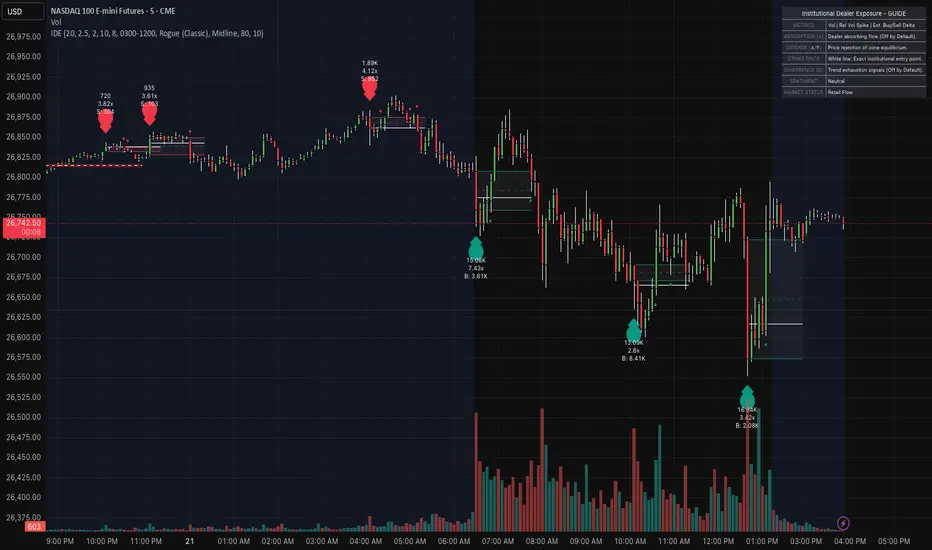
Institutional Dealer Exposure Institutional Dealer Exposure: The Market Maker Footprint
In the high-frequency world of Futures (NQ, ES, GC) , liquidity is not just a number—it is a battleground. Market Makers (Dealers) are required to provide liquidity by taking the opposite side of every retail and institutional order. When a massive " Order Flow " imbalance occurs, dealers are often forced into " unbalanced inventory " positions.
The Institutional Dealer Exposure indicator is a sophisticated volatility-volume model designed to track these forced dealer entries. By calculating the statistical deviation of price from its Volume Weighted Average Price (VWAP) in conjunction with Relative Volume spikes, this tool identifies the exact " Strike Prices " where dealers are stepping in to facilitate reversals and balance their books.
The Mathematical Engine (The "Dealer Inventory" Proxy)
The core of this indicator relies on the relationship between Volume, Price, and Fair Value. Unlike standard oscillators, this tool uses a " Z-Score " model of price-VWAP deviation:
Volume Weighted Average Price (VWAP) : We utilize VWAP as the " Anchor of Fair Value ." Dealers generally try to keep the market near this mean.
Exposure Z-Score: We calculate the Standard Deviation of the distance between the current Price and VWAP. When the Z-Score exceeds +/- 2.0 (user-adjustable), it indicates a statistical anomaly—meaning the market is " over-extended " in a way that requires institutional intervention.
Relative Volume (RVold) : A signal is only valid if it occurs during an Institutional Volatility Spike. We compare the current bar's volume to a 20-period average. If the volume is 2.5x the average (default), it confirms that " Big Money " is active.
Estimated Delta : The tool analyzes the internal candle action to estimate Buy vs. Sell pressure, providing a " B :" or " S :" metric on every bubble to show the aggressive intent of participants.
Visual Execution & Advanced Order Flow Features
The script is built for professional clarity, providing a " layered " view of the market's internal mechanics:
Exposure Bubbles: High-visibility markers that trigger only on Volume Climaxes (local peaks) . These represent the "Entry Points" of institutional hedging.
Dealer Zones: These are projected areas of interest. Unlike standard supply/demand zones, these are calculated from the high/low of the specific institutional " Climax Candle ."
The Strike Price (POC) : Every zone contains a solid white line representing the exact average price of the institutional entry. This acts as a high-precision magnet for future retests.
Internal Levels (Midline/Fib/Defense): Users can toggle between the Midline (Equilibrium), Fibonacci levels, or the " 80% Defense Line ." These show exactly where the dealer is likely to protect their position.
Auto-Invalidation : In a fast market like NQ, broken levels are dangerous. If the market closes beyond the 80% Defense Line, the zone automatically turns Gray, signaling that the institutional interest has shifted.
Professional Strategy & Market Application
This tool is optimized for the 1-Minute and 5-Minute timeframes on high-liquidity assets like Nasdaq (NQ) , S&P 500 (ES) , and Gold (GC) .
The "Dealer Rejection" Setup:
Wait for the Bubble: Identify an extreme inventory imbalance.
Watch the Midline: After the bubble, look for the Institutional Defense Signals (▲/▼). These triangles appear when price retests the zone's midline and rejects it, confirming the dealer is " defending " the level.
The Absorption Factor (Optional): Enable the " A " markers to find " Hidden Orders ." This highlights bars where massive volume was absorbed by the dealer without allowing price to continue in the direction of the trend—a classic institutional trap.
The Divergence Warning (Optional): Enable " D " markers to catch trend exhaustion. If price makes a new high but the Dealer Inventory Z-score is dropping, a reversal is imminent.
Trading the Power Hours:
Use the built-in Session Filter to focus strictly on the London and New York opens, where dealer inventory fluctuates the most. Combine this with the Higher Timeframe Trend Filter (EMA 200) to ensure you are trading alongside the broader institutional flow. Indicador

TCI Key Institutional Levels v2.0TCI Key Institutional Levels v2.0
Overview
TCI Key Institutional Levels v2.0 is a comprehensive technical analysis tool designed to automate the identification of market structure, liquidity zones, and supply/demand imbalances. Written in the latest Pine Script v6, this indicator focuses on high-probability "Institutional" footprints, providing traders with a clean, real-time map of market intent.
Core Features
Dual Structure Tracking: The script tracks both Internal Structure (short-term shifts) and Swing Structure (long-term trend). It automatically identifies Break of Structure (BOS) and Change of Character (CHoCH), labeled here as "Breakers" and "Traps" to highlight potential liquidity grabs.
Dynamic Order Blocks (OB): Identifies the specific candles where institutional buying or selling occurred. These zones are automatically mitigated (removed) once price reclaims the level, ensuring your chart stays relevant.
Fair Value Gaps (FVG): Detects price imbalances using a multi-timeframe approach. It includes an Auto-Threshold feature that filters out insignificant gaps based on recent volatility.
Institutional Highs/Lows: Highlights "Strong" and "Weak" highs and lows. A "Strong" level is one that successfully led to a break in structure, while a "Weak" level is a target for future price runs.
MTF Levels: Optionally plot Previous Daily, Weekly, and Monthly Highs/Lows to see where your current timeframe sits within the higher-order liquidity cycle.
Premium & Discount Zones: Automatically calculates the equilibrium of the current swing, helping traders avoid "buying the top" or "selling the bottom."
How to Use
Trend Alignment: Look for the "Institutional Buying" or "Selling" labels to determine the dominant swing bias.
Entry Zones: Seek confluence between Discount zones and Bullish Order Blocks for long entries, or Premium zones and Bearish Order Blocks for short entries.
Liquidity Targets: Use Equal Highs/Lows (Double Tops/Bottoms) as potential "magnet" levels where stops may be resting.
Technical Note
This script is a modernized derivative of the Smart Money Concepts framework. It has been optimized for Pine Script v6 to improve calculation speed and label management.
Disclaimer
Past performance is not indicative of future results. This tool is for educational purposes and manual technical analysis. Trading involves significant risk. Indicador

Indicador
Indicador

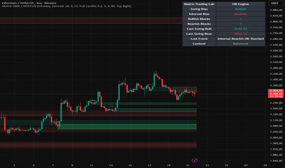
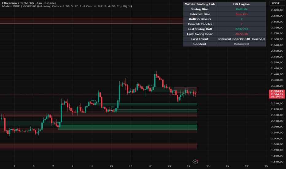
Matrix Market Structure [Institutional Edition]Matrix Market Structure Institutional is a price action analysis tool designed to help users interpret market direction through objective structural behavior.
The script focuses on swing highs, swing lows, break of structure events, and continuation patterns to organize chart movement into a cleaner decision framework.
Instead of relying only on lagging indicators, this tool helps traders observe how price is building, breaking, or transitioning structure over time.
It is intended for users who study trend behavior, directional bias, and structural shifts across multiple markets and timeframes.
Designed with clarity and usability in mind, the script aims to simplify market structure reading without overloading the chart.
This tool may help users with:
Identifying bullish or bearish structure bias
Detecting break of structure (BOS) zones
Reading swing high / swing low formations
Following continuation vs reversal behavior
Supporting trend analysis decisions
Organizing raw price action visually
Suitable for:
Price action traders
Smart money concept users
Swing traders
Intraday traders
Trend traders
Traders seeking cleaner market context
If structure-based chart analysis is part of your trading process, you may also find additional research tools available on this profile worth exploring. Indicador

Indicador
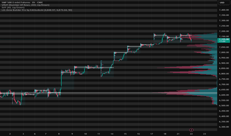
L2L Zone Builder Pro by EAStudioAIOverview
The L2L Zone Builder Pro is a dynamic, interactive background grid generator designed specifically for Level-to-Level (L2L) traders, Smart Money Concepts (SMC) practitioners, and volume traders. Instead of cluttering your chart with dozens of static horizontal lines, this tool allows you to build a clean, infinitely extending, and perfectly scaled visual matrix based on a single Key Zone (such as a High Volume Node or a critical support/resistance block).
How It Works
This indicator utilizes TradingView's interactive input.price functionality combined with a heavily optimized single-execution loop. It calculates the exact height of your selected reference zone and automatically projects alternating background grids across the entire Y-axis. The script is highly optimized to render only once, ensuring zero lag or re-rendering on every price tick, keeping your browser and platform running smoothly.
How to Use
Add the indicator to your chart.
Your cursor will turn into a crosshair. Click the first point to define the Top Level of your base zone.
Click the second point to define the Bottom Level (this sets the permanent grid spacing).
The tool will instantly generate a structural grid across the chart.
Optional: Open the indicator settings to customize the grid color and transparency to fit your chart theme perfectly.
Trading Application
This tool is perfect for analyzing volatile assets like XAUUSD or Futures indices.
Zone Mapping: Anchor the initial box to a High Volume Node (HVN) or a major consolidation zone. The extended grid will reveal symmetrical psychological levels.
SMC & LCE: Use the defined zones to anticipate liquidity sweeps and wait for a Market Structure Shift (MSS) or Level Confirm Execution (LCE) precisely at the edges of the grid.
Clean Workflow: Ideal for traders utilizing a two-screen workflow (e.g., charting on TradingView while executing on a prop firm platform), providing a distraction-free map of the market battlefield.
Elevate your chart structure and trade level-to-level with precision. Indicador
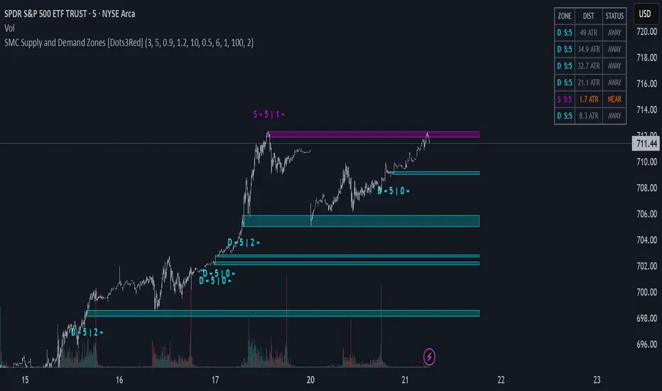
SMC Supply and Demand Zones [Dots3Red]SMC Supply & Demand Zones
This script automatically detects and visualizes Smart Money Concept (SMC) Supply and Demand zones using a three-factor confirmation model: base consolidation, impulse breakout, and volume surge .
How zone detection works
The indicator looks for a tight consolidation base (price range below ATR threshold) followed by a strong impulsive candle breaking out of that base with above-average volume. The direction of the breakout determines the zone type — bullish breakout creates a Demand zone, bearish breakout creates a Supply zone. The base range itself becomes the zone, as that is where institutional activity occurred.
Zone scoring (max 5)
Each zone is scored at birth based on three factors:
Base tightness — how compressed the consolidation was (1pt)
Impulse strength — how strong the breakout candle body was relative to ATR (2pts)
Volume confirmation — whether breakout volume exceeded the MA threshold (2pts)
Higher scoring zones render with stronger fill intensity.
Visual features
Supply and Demand zones themselves
Inactive zones (invalidated or max touches reached) can be shown or hidden via toggle
Proximity dashboard
A live table in the top-right corner shows all active zones ranked by distance from current price. Each zone displays its type, score, distance in ATR units, and status — INSIDE (gold), NEAR (orange), or AWAY (gray).
Zone invalidation
A zone is considered broken when price closes through it (configurable to wick-based) or when it has been touched too many times — both signals that the institutional order block has been absorbed.
Settings
All key parameters are tunable — base length, ATR multipliers, volume sensitivity, touch limits, score threshold, and proximity distance — making the indicator adaptable to any instrument and timeframe.
Indicador

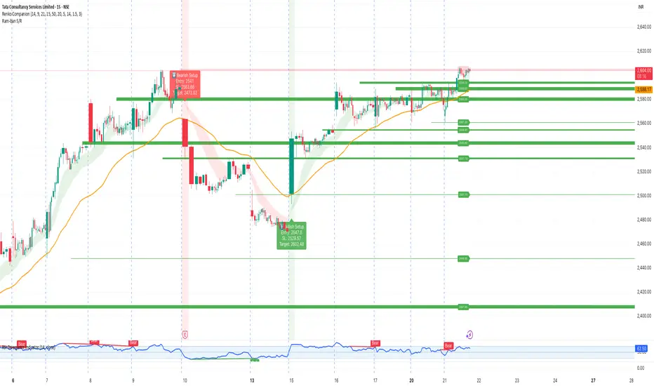
Ram-ban Support & Resistance System [% Adaptive for Stocks]📌 Overview
The Ram-ban Support & Resistance System is an advanced, fully dynamic mapping tool engineered to identify crucial market turning points without cluttering your chart. By referencing higher timeframe (HTF) pivot structures and utilizing a percentage-based mapping logic, this indicator seamlessly scales to any asset class—from Crypto and Forex to Equities and Indices—without the need for manual point adjustments.
🚀 Key Features
Adaptive % Model: Forget rigid point values. Settings for spacing, signals, and stop-loss are percentage-based, ensuring the indicator works flawlessly on BTCUSD just as well as it does on AAPL or NIFTY.
Dynamic Consolidation Heatmap: Not all levels are created equal. As price consolidates around a specific support or resistance zone, the line dynamically increases in thickness. A thicker line represents a heavily tested zone with stronger historical relevance.
Intelligent "Option Mode" (Fading): Keep your focus where the action is. Levels that are far from the current market price will automatically fade out, keeping your chart clean and eliminating noise.
Wick-Based Signal Engine: Captures sniper-like entries by looking for wick rejections at key levels. When price reaches a specified tolerance zone (%) of a major level, a Buy or Sell signal is generated.
Built-in Risk Management: Automatically calculates a dynamic Stop Loss based on your preset percentage. Visual labels tell you exactly where your invalidation point is upon entry.
Session Filtering: Confine your trading signals strictly to active market hours, filtering out erratic overnight or pre-market moves.
🛠️ How to Use
Trend Context: Use the HTF Support/Resistance rails as major boundaries. Green rails act as support (demand), red rails act as resistance (supply).
Observe the Line Thickness: A very thin line is a fresh level. A thick, bold line indicates high historical contention. Treat thick lines as high-probability reversal zones.
Trading Signals: Look for the "BUY" labels (with attached SL values) as price taps support rails. The "BOOK PROFIT" label triggers when a loaded position touches the upper resistance boundary.
Alerts: Create alerts directly from the indicator to be notified of "BUY", "BOOK PROFIT", or "SL HIT" events instantly.
⚙️ Core Settings Overview
HTF for Pivots: The default is 60 (1 Hour) to capture macro swings on lower timeframe charts (like 5m or 15m).
Min Distance Between Levels (%): Prevents the indicator from drawing too many lines close together. Adjust based on asset volatility.
Consolidation Zone Tolerance (%): How close a candle needs to close near a line to "thicken" it.
Stop Loss (%): Defines the dynamic Stop Loss label printed alongside entry signals.
⚠️ Disclaimer
This script is provided for educational and informational purposes only. It does not constitute financial, investment, or trading advice. Past performance is not indicative of future results. Trading in financial markets involves a high degree of risk. Always conduct your own research (DYOR), backtest thoroughly, and use proper risk management before putting real capital on the line. The author assumes no responsibility for any trading losses incurred.
SupportAndResistance, PriceAction, PivotPoints, DynamicLevels, DayTrading, Scalping, RiskManagement, StopLoss, Breakout, Reversal, MultiTimeframe, MTF Indicador

Break-Retest Quality [AGPro Series]Break-Retest Quality
🎯 OVERVIEW
Break-Retest Quality is a precision-focused structure toolkit that detects pivot-based breaks of structure (BOS) and grades the first retest of the broken level using a transparent, multi-factor quality score. Instead of only drawing a break line and leaving you to guess whether the retest "looked clean", the script quantifies the retest with a 0-100 score and an A / B / C / F letter grade so you can quickly separate high-conviction pullbacks from low-quality ones. It is a discretionary context tool built for price action traders, SMC / ICT practitioners and anyone who builds setups around break-and-retest logic.
The system is fully automated, non-repainting after confirmation, and works on any symbol and timeframe that TradingView supports.
📐 UNIQUE EDGE — WHAT MAKES IT DIFFERENT
Most break-of-structure indicators stop at drawing a line and an arrow. Break-Retest Quality goes further:
🔹 Every retest is scored on six independent factors and translated into an A / B / C / F grade
🔹 The acceptance zone is an ATR-scaled rectangle that changes color and state as the setup evolves (live WATCH → graded RETEST)
🔹 A "Min Grade To Display" filter keeps weak retests off the chart, so the visual footprint stays clean
🔹 A right-edge WATCH tag pins the currently active level so you never lose track of the live setup
🔹 A compact two-line retest marker shows grade, score and a short outcome tag in a minimal footprint
🔹 Built-in cooldown and single-retest-per-break logic prevent label clutter on choppy price action
This is not a repackaged BOS indicator — it is a quality filter on top of BOS / retest logic.
🧪 METHODOLOGY
1. STRUCTURE DETECTION
Pivot highs and lows are detected with a user-defined Pivot Length. A break is registered when price clears the most recent pivot by at least Min Break ATR Filter × ATR, either on a close (default) or on a wick.
2. RETEST TRACKING
After a confirmed break, the script opens an acceptance zone of ± Retest Tolerance ATR × ATR around the broken level and watches for the first price revisit within Max Bars For Retest.
3. QUALITY SCORING (0-100)
The first retest is graded on six weighted factors:
🔸 Reclaim (25 pts) — how decisively the close reclaims the correct side of the level
🔸 Rejection (20 pts) — wick / body composition on the retest bar
🔸 Depth (20 pts) — how close the extreme of the retest bar lands to the level (no excessive overshoot)
🔸 Speed (15 pts) — how quickly the retest prints after the break
🔸 Volatility (10 pts) — bar range discipline relative to ATR
🔸 Volume (10 pts, optional) — relative volume vs 20-bar SMA
Final score → Grade: A ≥ 80, B ≥ 65, C ≥ 50, F < 50.
4. CONFIRMATION LOGIC
A retest is marked "confirmed" only if the score meets the Min Grade For Confirmation threshold AND the close lands on the correct side of the broken level.
🔔 SIGNALS & ALERTS
Three TradingView alert conditions are exposed:
🔹 Structure Break Detected — fires the moment a valid break is registered
🔹 First Retest Detected — fires on the first qualifying revisit inside the acceptance zone
🔹 High-Quality Retest Confirmed — fires only when the graded retest meets the confirmation threshold
⚙️ KEY INPUTS
STRUCTURE
• Pivot Length, Use Close Confirmation, Min Break ATR Filter, ATR Length
RETEST
• Max Bars For Retest, Retest Tolerance ATR, Cooldown Bars After Completed Setup, Resolved Zone Extension
SCORING
• Show Numeric Score / Grade, Use Volume Confirmation, Min Grade For Confirmation, Min Grade To Display
VISUALS
• Show Break Line / Labels / Retest Marker / Retest Zone / Watch Zone Text / Resolved Zone Text / Active Level Glow / Right-Edge Watch Tag / Invalidation Line / Outcome Text, Use Grade Colors, Zone Forward Extension, Label Size
PANEL
• Show Panel, Panel Position, Panel Font Size, Show Last Result Row
RUNTIME
• Keep Last Setups (controls how many historical setups stay on the chart)
🧭 HOW TO USE
1. Add Break-Retest Quality to any chart and timeframe. Adjust Pivot Length to match the structure you care about (lower on intraday, higher on swing).
2. Wait for a BRK▲ or BRK▼ label to print — this confirms a structure break.
3. Observe the live acceptance zone and the right-edge WATCH tag. These mark the level and the remaining retest window.
4. When price returns to the zone, read the two-line retest marker: grade + score on the top line, short outcome tag (Strong / Valid / Weak / Failed) on the bottom line.
5. Use the panel to monitor live state, active level, remaining window and the last completed result with its full outcome description.
6. Combine with your own confluences — higher-timeframe bias, liquidity levels, session context, volume profile — before acting on any signal.
⚠️ LIMITATIONS & TRANSPARENCY
🔹 This is an analytical and educational tool, not a strategy. It does not generate buy / sell orders and does not measure historical performance.
🔹 Grades describe the geometric and relative-volume quality of the retest bar at the moment it prints. They are not predictions of future price movement.
🔹 Scores calculated at bar close are final; intra-bar readings can shift until the bar closes.
🔹 The volume factor depends on exchange-supplied volume data. Turn it off on instruments where volume is unreliable or missing.
🔹 Pivot-based structure is sensitive to the Pivot Length setting. Choose it deliberately for the timeframe and symbol you are analyzing.
📢 RISK DISCLOSURE
Trading involves substantial risk and is not suitable for every investor. Past price behavior is not indicative of future results. This indicator is provided for educational and analytical purposes only and does not constitute financial advice, investment advice, or a solicitation to trade any instrument. Always perform your own research and risk management before acting on any signal. Indicador

Auto Trendlines MTF - Break/Retest [AGPro Series]Auto Trendlines MTF - Break/Retest
🔹 OVERVIEW
Auto Trendlines MTF - Break/Retest is a multi-timeframe trendline visualization engine that automatically detects and draws the most structurally significant trendlines across three complementary scales: Micro (current timeframe), Meso (intermediate pivots), and Mega (HTF weekly/monthly overlay). Instead of relying on a single pivot scan, the engine builds a ranked candidate pool from each scale and selects the lines that best represent the active market structure around current price.
The script is designed as a pure analytical visualization tool — it does not generate trading decisions, forecasts, or directional recommendations. Its purpose is to give the chart a clean, hand-drawn-quality trendline layer that updates automatically as new pivots form.
🎯 UNIQUE EDGE
Most auto-trendline tools scan one timeframe and draw whatever fits. This engine operates differently in four specific ways:
• Three-scale MTF engine. Micro pivots on the current TF, Meso pivots with wider sensitivity, and Mega trendlines derived from Weekly/Monthly HTF pivots are computed independently and rendered together with a visual hierarchy (Mega dominant, Meso intermediate, Micro active).
• Log-space geometry. All trendline math runs in log-price space, so long-dated diagonals on volatile assets (crypto, growth stocks) do not distort visually when the chart is viewed in logarithmic mode.
• Touch-weighted ranking with violation penalty. Each candidate line is scored by touch count, line age, slope sanity, price proximity, and intra-line violations. Weak geometry, over-sloped lines, and frequently violated lines are demoted automatically.
• Q quality score (0–100) and confluence tags (x2/x3). Every drawn line carries a Q score that blends touches, freshness, geometry, relevance, and violations into a single number. Confluence tags surface when a Micro line and a Meso line sit within the same ATR band near price, highlighting multi-scale structure overlap.
🧠 METHODOLOGY
1. Pivot detection. Separate pivot streams are maintained for Micro (tight sensitivity), Meso (wider sensitivity), and Mega (HTF pivots via request.security).
2. Candidate generation. For each scale, the engine pairs anchor pivots with subsequent pivots to form line candidates, discards over-sloped ones, and computes touches, violations, and break status in log space.
3. Ranking. Candidates are scored by a weighted combination of touch count, time span, slope sanity, relevance to current price (distance in ATR), and violation count. The best non-duplicate lines are kept per scale.
4. Clutter guards. A minimum ATR separation rule prevents near-duplicate lines from stacking. Smart Focus hides far-from-price lines in Minimal/Balanced density modes to keep the chart readable.
5. Stability mode. In Locked mode, selected lines persist bar-to-bar and are only replaced when they break or fall out of the candidate pool — reducing visual repainting on lower TFs.
6. Break/Retest detection. Once a line is drawn, the engine tracks close-based breaks (with configurable tolerance) and subsequent retests within a time window, emitting labeled signals on TF ≤ 1D.
⚙️ SIGNALS & ALERTS
Break and retest events are plotted for each scale with short ASCII tags:
• µR / µS = Micro Resistance / Support break
• mR / mS = Meso Resistance / Support break
• MR / MS = Mega Resistance / Support break
• rµ / rm / rM = retest on Micro / Meso / Mega respectively
A dedicated alertcondition is exposed for every break and retest event, plus two aggregate alerts (Any BR, Any RT) for users who prefer a single alert stream. A Min Q filter lets the user suppress low-quality signals.
🛠️ KEY INPUTS
• Profile Mode. Auto by Timeframe or Manual (Clean Trader, Balanced, Analyst, Presentation, Custom).
• Density Override. Minimal, Balanced, or Bold visual density.
• Line Weight Override. UltraThin, Thin, or Normal.
• Labels / Signals / Stability / Broken-line behavior. All individually overridable.
• Mega Overlay. Full (lines + cloud + label), Lines Only, or Off.
• Advanced panels. Micro Engine, Meso Engine, Mega Engine, Ranking, Visuals, and Signals each expose their own fine-tuning controls for experienced users.
• HUD. Position, theme (Classic Gray, Premium Accent, Color Coded, Showcase), and text size.
📘 HOW TO USE
• Add the script to any liquid symbol and start on a 1H or 4H chart.
• Leave Profile Mode on "Auto by Timeframe" for a balanced default that adapts to the active TF.
• Read the HUD in the top-right corner to see the active profile, how many Micro/Meso lines are drawn, whether Mega is active, and current Q scores.
• When a line carries a Q score above ~65 and a Conf tag (x2 or x3) appears nearby, that zone is a multi-scale structural pocket — use it as a planning reference, not as a trade trigger on its own.
• Use the Break/Retest tags for situational awareness around drawn lines; combine with your own confirmation logic before acting.
⚠️ LIMITATIONS & TRANSPARENCY
• Lines are drawn from historical pivots and can only confirm after a pivot is established. The engine avoids repainting in Locked mode but cannot predict future pivots.
• Q scores and confluence tags describe structural quality, not directional probability. A high-Q line can still break.
• Mega lines depend on HTF pivot availability; on very young symbols or thin charts, Mega may fall back to a Macro-pivot source or remain hidden.
• The script is published as Public, Open Source so that every ranking rule, weight, and threshold is fully auditable in the source code.
🛡️ RISK DISCLOSURE
This script is a visualization and analysis tool only. It is not financial advice, not a trading strategy, and not a signal service. No performance claims are made or implied. Past structural behavior of trendlines does not guarantee future behavior. All trading decisions, risk sizing, and execution remain the sole responsibility of the user. Indicador

Pivot Channel Map [AGPro Series]Pivot Channel Map
🔹 OVERVIEW
Pivot Channel Map is a structural channel engine that automatically detects and classifies market structure channels from confirmed swing pivots. It organises every qualified channel into a clear 8-family taxonomy (Major / Minor × External / Internal × Up / Down) and renders them as a living map of trend, range and reversal context. The script works on all instruments and timeframes, with a focus on intraday and swing analysis.
Instead of plotting a single trendline or band, the engine maintains a continuously updated structural map: active channels, their midlines, interaction pockets around the rails, preserved broken channels, and post-break retest / reclaim signals. A compact right-corner panel summarises live channel counts, qualification state, nearest channel distance in ATR units, and the prevailing Major tilt.
The goal is to give discretionary traders a moderation-safe, clutter-controlled view of where price is inside the broader structure — not to predict future prices.
🔸 UNIQUE EDGE
Most channel indicators draw one or two parallel lines and call it a day. Pivot Channel Map adds structural classification, qualification, memory and post-event follow-through on top of the channel geometry:
- Eight channel families instead of a single pair of rails
- ATR-normalised qualification engine (Off / Balanced / Strict) to filter structurally weak channels
- Broken Channel Memory that preserves invalidated structure as faded historical context
- Interaction Zones (right-edge ATR pockets) around active channel rails
- Post-Break Retest / Reclaim tracker that tags the first valid touch after a confirmed break
- Break and React event markers on Major channels
- ATR-based distance tagging in the info panel (Near / Mid / Wide / Far)
The result is a richer structural read than a standard channel script, while still staying visually clean through emphasis, opacity and clutter controls.
🔹 METHODOLOGY
1. Pivot detection. A configurable Pivot Period drives ta.pivothigh and ta.pivotlow to produce confirmed swing pivots. The script then classifies each pivot into H / HH / LH / HL / LL / L roles and promotes / demotes them between Major (M*) and Minor (m*) status based on close breaks versus the current Major range.
2. Channel construction. From the classified pivot stream, eight channel families are built:
- Major External Up / Down
- Major Internal Up / Down
- Minor External Up / Down
- Minor Internal Up / Down
External channels trace structural HH/LL extremes, Internal channels trace LH/HL interior swings.
3. Qualification. Each candidate channel is width-measured against ATR and span-measured in bars. The Qualification Engine (Off / Balanced / Strict) filters out structurally weak channels before they are drawn.
4. Life-cycle management. Active channels are redrawn and extended forward each bar until an origin-rail or channel-rail break is confirmed. On break, the previous structure can be preserved by Broken Channel Memory (Off / Major Only / All) with its own style and opacity.
5. Event detection. Confirmed origin-rail breaks produce BREAK events; wick-through-then-close-back moves produce REACT events on Major channels. A cooldown and an ATR-based price-distance filter prevent label clusters when price oscillates around the same rail.
6. Post-break follow-through. After a confirmed break, the script tracks the first valid touch inside a configurable window and tags it as RETEST (channel-rail break) or RECLAIM (origin-rail break).
🔸 SIGNALS & ALERTS
On-chart events:
- BREAK — confirmed close-based break of a Major channel rail
- REACT — wick through the Major rail with a close back inside, filtered by bar cooldown and ATR distance
- RETEST / RECLAIM — first valid touch of the broken rail inside the post-break window
- Interaction Zone contact — visual ATR pocket around active channel rails
- Channel Quick Tags (MEX / MIN / mEX / mIN, Up / Dn) — compact family labels on active channels
Alert conditions (all 16 toggleable, Major alerts On by default, Minor Off by default):
- Break: Major External Up / Down
- React: Major External Up / Down
- Break: Major Internal Up / Down
- React: Major Internal Up / Down
- Break: Minor External Up / Down
- React: Minor External Up / Down
- Break: Minor Internal Up / Down
- React: Minor Internal Up / Down
Message frequency is configurable (All / Once Per Bar / Once Per Bar Close). Alerts include symbol, timeframe, time zone and event description.
🔹 KEY INPUTS
- Pivot Engine: Pivot Period (default 5)
- Per-family Visibility: 8 Show / Delete-Previous / Color / Style / Extend / Width groups
- Channel Qualification: Mode (Off / Balanced / Strict), Apply To (All / Major Only / Minor Only), ATR Length
- Broken Channel Memory: Scope (Off / Major Only / All), Keep (Last 1 / Last 2), Style
- Channel Midline: Show, Apply To, Scope, Style, Width, Opacity
- Active Map Clarity: Line Emphasis, Base-Line Focus, Event Markers, React Cooldown, React Min Price Distance, Quick Tags, Tag Scope, Tag Size, Event / Quick Tag Vertical Offsets
- Interaction Zones: Scope, Rails, Zone Width ATR, Extend Bars, Opacity, Zone Text
- Post-Break Retest / Reclaim: Scope, Window Bars, Label Offset ATR
- Panel: Show, Position, Font Size
- Alerts: 16 per-family Break / React toggles, Alert Name, Frequency, Time Zone
🔸 HOW TO USE
Getting started:
1. Apply the indicator on any symbol and timeframe.
2. Start with default settings: Qualification Off so the full structural map is visible.
3. If the chart feels busy on lower timeframes, switch Qualification to Balanced or Strict.
Reading the panel:
- Major Live / Minor Live — active channels per class
- Nearest Channel — closest active channel, with ATR distance and Near / Mid / Wide / Far tag
- Qualification — current filter mode and scope
- Interaction — interaction zone scope and rails
- Post-Break — tracker scope, window and prevailing Major tilt
Common workflows:
- Trend continuation: wait for price to hold an Active Major channel and look for a REACT at the rail inside the channel direction.
- Break-and-retest: after a BREAK event, watch for the RETEST / RECLAIM label inside the Post-Break window.
- Confluence: use Interaction Zones to spot where Major and Minor rails meet at the right edge of the chart.
- Higher-timeframe context: open a higher timeframe tab with the same script to map macro structure around your execution timeframe.
Suggested defaults:
- Intraday traders: 15m–1H base TF, Balanced qualification
- Swing traders: 4H–1D base TF, Balanced or Off qualification
- Higher-timeframe context: 1D–1W with Qualification Off
🔹 LIMITATIONS & TRANSPARENCY
- Pivot-based. Pivots require the configured number of bars to confirm, so the most recent swing always lags by Pivot Period bars. This is a structural property of confirmed pivots, not a bug.
- Redraw behaviour. Active channels are extended forward each bar until a break is confirmed on close. Channel end-points can therefore adjust as new pivots qualify.
- Alerts fire on confirmed conditions. Break and React alerts require barstate.isconfirmed, so intra-bar touches do not trigger alerts.
- Timeframe behaviour. On very high timeframes with limited history (e.g. weekly / monthly on newer instruments), the total pivot count can be small. Keep Qualification at Off on higher timeframes to avoid over-filtering.
- This is a visualisation / structure tool. It is not a trading strategy, it does not manage risk, and it does not generate buy / sell recommendations. All entries and exits are the trader’s responsibility.
🔸 RISK DISCLOSURE
This script is a technical analysis tool intended for educational and analytical purposes only. It does not constitute financial advice, investment recommendations, or a solicitation to buy or sell any asset. Past chart behaviour does not guarantee future results. Trading involves significant risk and can result in the loss of capital. Always do your own research, use proper risk management, and consider consulting a licensed financial advisor before making trading decisions. Indicador

Trendline Breakout - [NotLazyBear]Overextension Trendline Breakout
A multi-pivot trendline detection and breakout system that automatically draws validated support and resistance lines from looped zigzag pivots, confirms trendline integrity through clean-line scanning, and projects Fibonacci extension targets upon breakout. Uses ATR-normalized angle validation and touch-density scoring to distinguish meaningful trendlines from noise.
What It Does
OETB scans price action across a configurable range of pivot lengths (default 5–30 bars) to build a pool of swing highs and lows. It then attempts to fit trendlines through these pivots using three validation layers:
Angle Validation : Trendlines must fall within a specified angular range (default 15°–60°) relative to ATR-scaled horizontal distance, preventing flat or near-vertical lines.
Touch Density : Lines must connect at least 3 (configurable) pivot points within ATR tolerance, ensuring the trendline is genuinely respected by price.
Clean-Line Scan : No intermediate bar may violate the trendline by more than ATR tolerance — confirming the line acted as active support/resistance between its defining pivots.
When a validated trendline is broken by price (with optional ATR buffer and close confirmation), the system plots breakout markers and projects four Fibonacci targets based on the swing amplitude of the broken trendline.
Core Components
Looped Pivot Detection : Iterates through minPivLen to maxPivLen simultaneously, collecting highs and lows across multiple time scales. Duplicate bars are resolved by keeping the largest pivot length (most significant swing).
ATR-Scaled Angle Calculation : Uses a custom arctangent implementation with ATR normalization to measure trendline steepness in degrees. The X-axis is scaled by (dx/10) × ATR, making angle measurement consistent across volatile and calm markets.
Touch Scoring with Tiebreaking : When multiple candidate lines exist, selects the one with most touches; ties broken by longer span (more significant trendline).
Forming vs Confirmed Lines : Lines with 2+ touches but below minTouches are tracked as "forming" (dashed, faded) until they gather enough evidence to become confirmed.
Breakout with Fibonacci Projection : Upon break, draws 0.618, 1.0, 1.618, and 2.618 extension targets from the breakout point, colored by aggressiveness (green conservative to pink aggressive).
Age-Based Expiration : Lines older than maxAge bars (default 200) are marked expired (dotted grey) if unbroken, preventing stale trendlines from cluttering the chart.
Inputs & Parameters
Zigzag Pivots
Minimum/Maximum Pivot Length: Range of bar lengths for pivot detection (2–1000, default 5/30).
ATR Length: Volatility measurement for normalization (default 14).
ATR Deviation Filter: Toggle requiring minimum ATR distance between consecutive same-type pivots to prevent clustering.
Minimum Pivots to Connect: Touch threshold for confirmed trendlines (2–10, default 3).
Trendline Validation
Minimum/Maximum Angle: Steepness bounds in degrees (0°–89°/1°–90°, default 15°/60°). Filters out horizontal noise and near-vertical spikes.
Max Pivot-to-Pivot Span: Maximum bar distance between connected pivots (10–200, default 100).
Clean-Line Tolerance: ATR multiplier for how far price may deviate from the line between pivots (default 0.06× ATR).
Validate Through Current Bar: Extends clean-line check from last pivot to present bar, ensuring ongoing respect.
Breakout Logic
Break Requires Close Beyond Line: If true, breakout requires close; if false, wick penetration suffices (faster, more false positives).
Break Buffer: ATR multiplier added beyond the line before break registers (default 0.08× ATR).
Max Line Age: Bars before unbroken lines expire (default 200).
Fibonacci Targets
Target ratios: 0.618 (conservative), 1.0 (equal move), 1.618 (golden), 2.618 (aggressive) — all configurable.
Target Extension: Bars forward to draw target lines (default 5).
Individual color selection per target level.
Display
Toggle confirmed lines, forming lines, and breakout markers.
Color selectors for ascending support (cyan), descending resistance (orange), forming variants (faded), broken (grey), and expired (light grey).
Line width adjustment (1–4).
How to Read It
Solid Cyan Lines: Confirmed ascending support — at least 3 lows touched the line within tolerance. Price expected to bounce; break signals bearish acceleration.
Solid Orange Lines: Confirmed descending resistance — at least 3 highs touched the line. Price expected to reject; break signals bullish breakout.
Dashed Faded Lines: Forming trendlines with 2 touches but not yet confirmed. Monitor for additional touches that would validate.
Dashed Grey Lines: Broken trendlines — price has crossed through with buffer confirmation. Fib targets are active.
Dotted Light Grey Lines: Expired trendlines — exceeded maxAge without breakout, no longer relevant.
Breakout Markers:
Green ▲ below bar: Descending resistance broken upward — bullish breakout.
Red ▼ above bar: Ascending support broken downward — bearish breakdown.
Fibonacci Target Labels: "T1 (0.618)" in green, "T2 (1.000)" in blue, "T3 (1.618)" in orange, "T4 (2.618)" in pink — projected horizontally from breakout point.
Practical Usage Guidelines
Trend Continuation Trading
Enter long when price bounces off a confirmed cyan support line with rising volume.
Enter short when price rejects a confirmed orange resistance line with rising volume.
Stop-loss placed beyond the trendline by 1× ATR.
Breakout Trading
Wait for close beyond the trendline plus buffer (not just wick).
Confirm with volume expansion if available.
Target T1 (0.618) for conservative profit; scale out at T2 (1.0); trail remaining to T3/T4.
If price reverses back through the broken trendline within 3 bars, the break is likely false — exit immediately.
Forming Line Anticipation
When a dashed forming line appears, watch for the next touch. A third touch that holds validates the line and often provides a high-probability entry.
If price violates a forming line before it reaches minTouches, the line is invalidated and removed.
Important Notes
Custom Arctangent Implementation: The script includes a manual f_atan function using Taylor series expansion (12 terms) to avoid dependency on built-in math.atan, with f_atan2 handling all quadrants. This ensures consistent angle calculation across Pine versions.
Angle Normalization: The X-axis in angle calculation is normalized by (dx/10) × ATR, meaning a 10-bar move equal to 1 ATR produces a 45° angle reference. This makes angle thresholds market-adaptive.
Duplicate Resolution: When the same bar is detected as a pivot across multiple lengths, the system keeps the longest length (most significant swing) rather than creating duplicate entries.
Clean-Line Scan Performance: The validation iterates every bar between pivots and optionally to current bar. On very long spans (>100 bars) this is computationally intensive; reduce maxSpan or disable checkToNow for faster performance.
Forming Line Cleanup: Forming lines are not automatically removed when their underlying pivots age out — they expire via maxAge only. Confirmed lines are removed immediately on break or expiration.
Break Buffer Purpose: The 0.08× ATR buffer prevents false breaks from single-tick wicks. In high-volatility markets, increase buffer; in low-volatility, decrease or set to 0 for tighter triggers.
No Repainting: Pivots use standard ta.pivothigh/ta.pivotlow with symmetric right bars (pLen). Breakout detection uses confirmed close when breakOnClose is enabled. All line objects are historical and do not shift retrospectively.
Target Line Persistence: Fib target lines extend only fibExtBars forward (default 5) and are not automatically extended. They persist as static historical objects.
Indicador

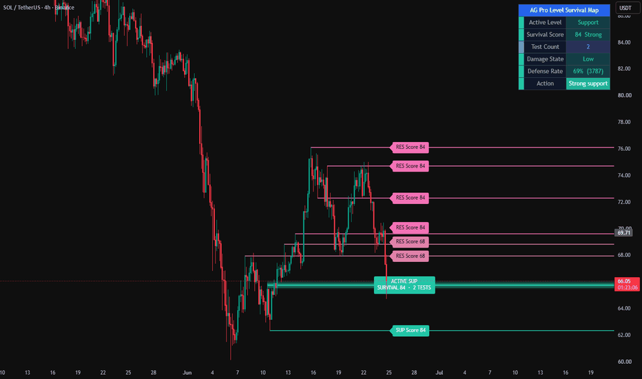
Level Survival Map [AGPro Series]Level Survival Map
🔹 Overview
Level Survival Map is a premium support and resistance framework that does not just draw lines on the chart. Every detected level carries a live Survival Score between 0 and 100 that answers one simple question: how well is this level still defending itself right now. The map highlights a single Active Level with an interaction zone and a forward projection ribbon, while nearby weaker levels fade, so traders always know which level actually matters for the current decision.
🔸 Unique Edge
Most support and resistance tools either show static pivots or basic break or retest events. Level Survival Map goes further by measuring the quality of every interaction and turning it into a single composite health score per level. Instead of being left with a wall of equally important lines, the trader sees a ranked structural battlefield with one clearly identified Active Level, a visible interaction zone and a projection ribbon for planning. The Damage State readout, the Fresh and Eroded state semantics, the automatic flip from broken support to new resistance and the cluster fade for crowded weaker levels are designed to work together as one premium, low-noise workflow.
🔹 Methodology
Pivot detection builds the raw candidate levels from swing highs and swing lows using the standard pivot window. A merge filter removes duplicates that sit within a configurable ATR distance of an existing same-type level. Each active level then accumulates four independent components over time. Close Respect rewards closes that respect the level side, for example closes above a support. Penetration Damage penalises wicks and bodies that pierce through the level zone. Reaction Quality rewards strong rejection wicks and bodies moving away from the level after a test. Test Fatigue penalises repeated tests because levels tend to weaken with each new hit. These four components are weighted and combined into a single Survival Score, then clamped between 0 and 100. A structural break caps the score at 35, heavy damage across multiple tests caps it at 28, and a confirmed sequence of opposite-side closes flips the level type while resetting its history. The Active Level is chosen as the closest same-side level to price so that the focus always follows the real decision point.
🔸 Signals and Alerts
The visual output itself is the primary signal. Line colour and thickness communicate level strength at a glance. A focused Active Level is drawn with an interaction zone, a darker core band and a forward projection ribbon so that traders can see the exact price band where reaction is most likely, and how far into the future that band is expected to remain relevant. Labels carry the Survival Score directly, so the ranking of levels is always visible without opening any settings. Broken levels switch to a dashed style and faded colour, and once enough opposite-side closes accumulate they flip type automatically, giving a clear visual signature of structural change.
🔹 Key Inputs
Pivot Left Bars and Pivot Right Bars control how strict the swing detection is. Max Active Levels caps how many concurrent levels are tracked. Level Merge Distance and Interaction Zone are expressed in ATR units so the logic adapts across timeframes and instruments. Scoring weights for Close Respect, Penetration Damage, Reaction Quality and Test Fatigue can be tuned independently, together with the fatigue penalty per extra test and the number of closes required to confirm a flip. Visual inputs cover panel position, label size, line width, focus emphasis, non-focus transparency, cluster fade, focus zone width and projection ribbon length and thickness. A Clean Map Mode is provided for screenshot and publishing workflows where only the Active Level and the nearest valid support and resistance are labelled.
🔸 How to Use
Read the map top down. First, look at the summary panel for the Active Level, its Survival Score, Test Count and Damage State. A Fresh or Strong Active Level defending its side is a high-quality decision point. A Fragile or Eroded Active Level with a Severe Damage State is a warning that the next level below or above is likely to take over. Use the projection ribbon as a planning band for reaction rather than a mechanical entry. Use the ranked non-Active labels to understand where price is likely to travel if the Active Level gives way. The tool is designed to be used as a visual framework, in combination with the trader own execution method, trend context and risk management.
🔹 Limitations and Transparency
This indicator is a visual analytical framework, not a strategy, not a signal service and not financial advice. Survival Score, Damage State and flip logic are deterministic functions of price action and ATR, so different markets and timeframes will produce different characteristic score ranges. Pivot based detection is inherently lagging by the Pivot Right Bars window, which is the expected behaviour of any structural tool and not a defect. The Active Level projection ribbon is a visual planning aid, not a forecast. Past level behaviour does not guarantee future behaviour.
🔸 Risk Disclosure
Trading involves substantial risk and is not suitable for every investor. This script is published for educational and analytical purposes only. Users are solely responsible for their own trading decisions, position sizing and risk management. Always test any tool on your own instruments and timeframes before using it in a live environment. Indicador
Session Reaction Map [AGPro Series]Session Reaction Map
🔷 OVERVIEW
Session Reaction Map is a premium intraday study that maps how price reacts to the most important daily and weekly reference levels right at the opens of the Asia, London and New York sessions. Each session open is evaluated inside a fixed measurement window, and the resulting reaction is broken down into four dimensions: dominant move, close follow-through, wick rejection and counter-move penalty. The output is a single 0-100 reaction score that is then translated into tier-coded labels, premium reaction zones, an active reference band and a compact status panel, so you can instantly read what happened at each session open without scrolling through candles.
The indicator is designed for discretionary traders, systematic traders, SMC and price action practitioners who want a clean, consistent and quantitative way to read session open behaviour around PDH, PDL, PDM, Daily Open and Weekly Open. Reactions are drawn as directional zones (bull zones above the reference and bear zones below), with up or down pointing labels centered on the reaction, so orientation is always unambiguous.
🧭 UNIQUE EDGE
Most session open tools only mark time windows or highlight levels. Session Reaction Map goes further and quantifies the quality of the reaction itself. Four independent dimensions are measured against a fixed ATR-normalized baseline, and the final score determines not only whether a label is shown but also how prominent it is. Elite scores (80+) get the strongest visuals; strong scores (70-79) get a slightly softer treatment; watch scores (55-69) are coded as caution; anything below 55 is filtered out by default.
This separation between detection (a session open near a reference) and evaluation (the reaction quality score) is the core edge. It lets you focus only on the best intraday reactions and discard noise automatically, while still being able to audit every component by adjusting the ATR length, touch tolerance, evaluation window and score thresholds.
⚙️ METHODOLOGY
Session detection uses the chosen timezone and three session windows (Asia, London, New York), each with its own editable open range. When a session open occurs, the script checks whether the open price is within an ATR based touch tolerance of any enabled reference level (Previous Day High, Previous Day Low, Previous Day Mid, Daily Open or Weekly Open). If so, a reaction window is engaged on that bar and tracked for a configurable number of bars.
During the reaction window, the live zone, reference band and dashed reference line are updated in real time. When the window completes, the final score is computed as:
• Dominant move score (up to 45 points) - scaled against 1.20 x ATR
• Close follow-through score (up to 30 points) - scaled against 0.90 x ATR
• Wick rejection score (up to 15 points) - scaled against 0.50 x ATR
• Counter-move penalty (up to -20 points) - scaled against 1.00 x ATR
The sum is clamped into the 0-100 range and mapped into four tiers: Elite, Strong, Watch and Weak. The dominant direction of the reaction (up or down) is determined by comparing the upside excursion from the reference to the downside excursion from the reference during the window.
🎯 SIGNALS AND VISUALS
• Reaction zones - rectangular areas connecting the reference level with the reaction extreme, tier-coded by score and bias
• Active reference band - a thin accent band around the current reference level during a live reaction window
• Dashed reference line - marks the exact reference price while the reaction is being measured
• Tier-coded labels - up-pointing labels below bullish reactions and down-pointing labels above bearish reactions, centered on the reaction window
• Session dots - small colored markers that optionally display only on valid events, keeping the chart clean
• Active measurement highlight - an ultra-soft background shade on bars inside a live reaction window
Labels use a ring buffer overlap check, so dense multi-session conditions do not pile labels on top of each other. When two labels would visually conflict, the higher-scored reaction wins.
🛠️ KEY INPUTS
Sessions - enable/disable and edit Asia, London and New York session windows, each with its own color and timezone.
Reference Levels - individually toggle PDH, PDL, PDM, Daily Open and Weekly Open.
Reaction Logic - ATR length, touch tolerance in ATR, evaluation bars, label score filter, minimum label score, overlap reduction (bars and vertical ATR gap).
Visuals - show/hide reference levels, session dots, dots only on valid events, reaction zones, minimum score for zones, zone transparency and extension, live reaction zone, active reference band with its ATR size and transparency, active measurement highlight, level width, label size, label offset in ATR and label background transparency.
Panel - show/hide, position (six anchor points), Dark or Light theme, font size, optional guide row.
All numerical inputs carry professional English tooltips explaining their role, so the script can be tuned for any symbol, timeframe and trading style.
📘 HOW TO USE
1. Apply the script on an intraday timeframe. It is designed for intraday use and will stay passive on daily/higher timeframes.
2. Recommended starting timeframe is 4H for swing intraday context, and 1H for tactical intraday work. Lower timeframes (15m, 30m) work too but may produce dense output.
3. Start with the default settings. Observe which sessions and which reference levels generate the most Elite and Strong reactions on your symbol.
4. Use the panel to monitor the current state: last session, last reference, bias, score, tier, label filter, zone filter and the active reaction status.
5. Treat Elite (80+) and Strong (70-79) reactions as the main signals. Watch tier is informative and Weak tier is generally discarded.
6. Align with your own confluence: higher timeframe bias, structure, orderflow, or whatever your primary framework is. The script does not issue buy or sell calls - it scores reactions, and you decide.
⚠️ LIMITATIONS AND TRANSPARENCY
• This is not a strategy and does not place orders. No backtest statistics are implied.
• Reaction scores are computed after the evaluation window completes, so they are not repainting but are confirmed with a lag equal to the evaluation window size.
• The live reaction zone updates during the window and is finalized when the window closes.
• Session behavior varies significantly by symbol (crypto vs FX vs equities) and by volatility regime. Inputs should be tuned per symbol.
• Daily and Weekly references use standard request.security with barmerge.lookahead_off to avoid look-ahead bias.
• The script is not a forecasting tool. It is a post-event quantification of how price has just reacted to a known reference level.
🛡️ RISK DISCLOSURE
Trading involves substantial risk. Past reactions, patterns, zones or scores do not guarantee future performance. This script is provided for educational and analytical purposes only and is not financial advice. Always combine any tool with your own research, a defined risk plan and proper position sizing. You are solely responsible for your trading decisions. Indicador

Aura Pivot S/R Matrix [Pineify]Aura Pivot S/R Matrix
This indicator turns confirmed swing pivots into volatility-adaptive support and resistance zones rather than single horizontal lines. The thickness of each zone is derived from a 200-bar ATR snapshot taken at the pivot bar itself — so a level formed during a quiet consolidation gets a narrower zone than one formed during a wide-range expansion, without any manual tuning per instrument. Each zone tracks forward with price until a full close breaks through it, at which point the zone is frozen and labeled as a breakout or breakdown.
Key Features
ATR-scaled zone thickness anchored to the volatility regime at the pivot bar, not the current bar
Forward-extending zones that visually "track" price until broken, then freeze as a historical record
Close-based break detection that filters out wick probes and test-and-reject candles
Per-zone state management via a user-defined type — each zone behaves as an independent object with its own lifecycle
Breakout and breakdown labels printed at the exact bar of confirmation
How It Works
Each zone is built through a three-stage pipeline — pivot confirmation, volatility-scaled construction, and lifecycle tracking.
A swing is detected when a bar's high is higher than the surrounding pivotLen bars on both sides (for resistance), or the low is lower (for support). Because the right-side requires N bars of confirmation, zones appear with a deterministic pivotLen -bar lag and do not repaint once drawn
At the moment a pivot confirms, the script measures the 200-bar ATR as it existed pivotLen bars ago — that is the volatility context at the actual swing bar, not the current bar. The zone is then drawn as a box extending ±(ATR/2) around the pivot price
Each zone is stored in an SRZone user-defined type that bundles its box, midline, label, pivot level, and a boolean broken flag. Two arrays — one for resistance, one for support — hold the active inventory
On every bar, unbroken zones have their right edge extended forward. When the close exceeds the top of a resistance zone (or falls below the bottom of a support zone), the zone stops extending, is marked broken, and a labeled marker is drawn at the break bar
How the Components Work Together
Three design decisions interact to produce the final behavior.
The pivot detection answers where market structure previously turned — these are locations where orders likely clustered and will likely cluster again on retest. The ATR scaling answers how wide the reaction range around that pivot should be, because a pivot formed during a low-volatility session does not represent the same defensive range as one formed during a volatile expansion. Combining the two produces zones that are structurally anchored but volatility-proportional.
The close-based break filter then handles the noise problem. The most common false break is a wick that tags the level, prints a panic candle, and reverses immediately. By requiring a full close beyond the zone, the indicator rewards conviction moves and ignores exploratory probes — the break is registered only when price has committed to the new regime.
Trading Ideas and Insights
Repeated tests of a fresh resistance zone without a closing break frequently precede a sustained reversal. The more times a zone is defended, the more meaningful the eventual breakout becomes
When a resistance zone breaks and then holds as support on retest, that flip is a classic structural shift — an opportunity to align with the new direction using the flipped zone as a clear invalidation level
Support zones broken during strong trending conditions rarely hold on retest. Support broken during ranging conditions often reforms because the market was simply oscillating — context from the broader trend matters
A cluster of multiple pivots at similar prices (three or four zones stacking) marks a confluence area that carries more weight than an isolated swing
Past behavior at these levels does not guarantee future reactions. Treat zones as bias filters rather than standalone signal generators.
Unique Aspects
Most S/R indicators use fixed-distance zones, round numbers, or percentage bands. This one scales zone thickness to a rolling ATR measured at the exact bar of the pivot — so a 2020 level and a 2024 level on the same chart can have very different zone widths depending on the volatility regime that produced them
Zones freeze on break rather than being deleted, preserving a visual history of which structural levels have been tested and lost. This acts as a passive context map for traders reading price action
State is managed through a UDT array rather than a flat set of lines, which makes the extend-until-broken behavior clean and predictable — each zone owns its own break detection logic
How to Use
Add the indicator to any chart and timeframe you actively trade. 1H and 4H are good starting points for swing traders; lower timeframes work but will produce more zones and benefit from a higher pivot lookback value
Identify the nearest active support zone (green) and resistance zone (red) — these are the first levels price is likely to react to
Watch for one of two outcomes: a controlled approach followed by rejection (fade setup), or a decisive close through the zone (breakout setup). The indicator labels the breakout or breakdown automatically
When a level breaks, expect a retest. Retests often offer better reward-to-risk entries than chasing the initial breakout bar itself
Customization
Pivot Lookback Length (default: 15) — Bars required on each side of a swing for confirmation. Lower values (5-10) produce smaller, more frequent zones suitable for scalping. Higher values (20-30) isolate only major structural swings and reduce chart clutter
Zone Width (ATR Multiplier) (default: 1.0) — Scales the ATR-derived zone thickness. Raise to 1.5-2.0 on volatile instruments where zones should absorb normal noise; lower to 0.5 for tighter precision-entry levels
Support / Resistance Color — Visual differentiation between bullish and bearish zones, their midlines, and labels
Zone Transparency (default: 85) — Controls the fill opacity of zone boxes. Values around 80-90 keep price action readable inside the zone
Limitations to Be Aware Of
The pivot confirmation delay equals the lookback length. A 15-bar lookback means the zone is drawn 15 bars after the actual swing high or low. This is fine for levels (they do not repaint) but unsuitable for entries at the exact swing bar
Zones do not automatically merge. When multiple pivots form within an ATR of each other, their zones will overlap on the chart. Increasing the pivot lookback reduces this visual clutter
Break detection uses close , not wicks. A bar can spike well beyond the zone and return inside without triggering a break — by design, but worth remembering on volatile instruments with large intrabar swings
Conclusion
Rather than plotting dozens of static lines, the Aura Pivot S/R Matrix treats each structural pivot as a live object with a volatility-scaled range and a clear lifecycle — active, then broken. The ATR scaling grounds each zone in the volatility context of its own formation, and the close-based break detection emphasizes conviction moves over noise. Most useful as a structural framework for swing and position traders who want to see where the market has been defended, where those defenses have been lost, and how the battleground has evolved across different volatility regimes.
Indicador

Reference Price Operating Map [AGPro Series]Reference Price Operating Map
🔹 OVERVIEW
Reference Price Operating Map is a focused overlay that consolidates the four most universally watched reference prices — Daily Open, Weekly Open, Monthly Open, and Previous Close — into a single operating map. It tracks how price interacts with each level in real time, attributes control to the reference currently leading price action, groups overlapping references into confluence clusters, and fades distant context so the active map stays clean.
The chart answers one direct question at a glance: which reference is controlling the session right now.
Built for intraday operators, swing traders, and position traders who anchor their bias to session and period opens. Works on any symbol and any intraday or daily timeframe.
🔸 WHAT MAKES IT DIFFERENT
Most open-line indicators simply draw horizontal lines for Daily, Weekly, Monthly, and Previous Close and stop there. This script goes further by adding four layers on top of those lines:
• State tracking — each reference is classified as Untouched, 1st Touch, Tested, Held, Reclaimed, or Rejected, and the state updates bar by bar as price interacts with the level.
• Control attribution — a proximity-weighted scoring system selects one reference as the current "controller" of price action, highlighted with a dominant-row background in the panel and a thicker line on the chart.
• Confluence grouping — when two or more references sit within 0.5 ATR of each other, they collapse into a single cluster label (for example "D-Open + W-Open + PClose") instead of stacking separate labels on top of each other.
• Distance-aware rendering — references far from current price are demoted to a thin gray zone with a dotted line, keeping them visible as structural context without crowding the active map.
The engine also includes a far-aware state machine: references that price has not meaningfully engaged stay in the Untouched state instead of being forced into misleading classifications.
🔷 METHODOLOGY
Reference levels are pulled directly from the higher timeframe open (Daily, Weekly, Monthly) and the previous daily close using lookahead-safe security calls on confirmed bars.
Distance classification uses ATR(14) as a volatility scale. A reference is considered "near" when price is within a configurable ATR multiple and "far" when it exceeds the far-distance threshold. This adapts the map to both low-volatility ranges and high-volatility expansions without manual tuning.
State transitions are driven by a finite state machine with six states. Key transitions:
• Untouched → 1st Touch when price enters the touch zone (default 0.25 ATR) or wicks through it.
• 1st Touch / Tested → Held when price moves cleanly away from the level on the same side.
• 1st Touch / Tested → Reclaimed when price closes on the opposite side (optionally requiring multi-bar confirmation).
• Any engaged state → Rejected when a large wick rebounds from the level with more than 60 percent wick ratio.
• Held / Rejected → Reclaimed on a confirmed cross.
The control score combines proximity (how close price is to the reference relative to ATR) with a state weight (Reclaimed and 1st Touch score highest, Held scores lowest). The reference with the highest score is tagged as controller; if no reference has meaningful engagement the panel reports No Active Control.
🔶 SIGNALS AND ALERTS
Three alert conditions are exposed:
• Reference Touched — fires the first time any reference is touched in its period.
• Reference Reclaimed — fires when any reference transitions into the Reclaimed state.
• Reference Rejected — fires when a large-wick rejection bar is registered at any reference.
On-chart, first-touch diamond markers are placed on recent bars to make period engagement easy to spot in screenshots and reviews. The panel footer reports the current controller and updates in real time.
🔹 KEY INPUTS
Reference Lines — independent toggles for Daily Open, Weekly Open, Monthly Open, and Previous Close.
Display — Show Active References Only (hide untouched references for a cleaner map), Strict Reclaim Confirmation (require multiple confirmation bars for Reclaim), Label Density (Minimal shows only the dominant reference, Normal shows all active, Detailed appends state names to labels), Show Reaction Bands, Mark First Touches.
Panel — position (four corners), font size, label font size. All default to Normal per AG Pro Series visual standards.
Sensitivity — Touch Threshold (ATR multiple defining a touch), Reclaim Confirm Bars (strict-mode confirmation count), Band Width (reaction band width in ATR), Far Distance (ATR multiple beyond which references are faded to context).
All parameters are ATR-scaled so defaults transfer cleanly across instruments and timeframes.
🔸 HOW TO USE
1. Open the panel and read the controller. If the footer shows "D-Open Controls" with a Bull bias, intraday operators treat Daily Open as the session pivot and trade with that bias until the state changes.
2. Watch the confluence label. A grouped label such as "D-Open + W-Open + PClose" means three references are stacked — a cluster of this kind is typically a higher-conviction zone than a single isolated reference.
3. Use state transitions as triggers. A Rejected state at Monthly Open during a rally is a different signal than a Reclaimed state at the same level. The state tells you what just happened at the level, not just where the level is.
4. Use the far zone as context. A Monthly Open plotted as a gray zone five ATR away from price is not an execution level — it is orientation. When price approaches it, the zone transitions into an active band and the state engine re-engages.
5. Combine with your own structure work. This map is designed to sit underneath price action analysis, order flow, or trend tools, not replace them.
🔷 LIMITATIONS AND TRANSPARENCY
• This is an indicator, not a strategy. No entries, exits, position sizing, or backtesting is performed.
• Reference prices are sourced from higher timeframe candles using confirmed lookahead. Results on intraday charts should match the official Daily, Weekly, and Monthly opens of the exchange the chart is connected to.
• State classifications are heuristic. They describe observed behavior at each level in historical terms and should not be read as forecasts. A Reclaimed state is a description of what just happened, not a prediction of what comes next.
• ATR-based thresholds mean the map adapts to volatility but can feel different on very low-volume or very thinly traded instruments. Adjust the touch threshold and far distance inputs if defaults feel too loose or too tight.
• Confluence grouping uses a 0.5 ATR window. On very wide-range days this window can become large; on very narrow ranges it can feel tight.
🔶 RISK DISCLOSURE
This indicator is provided for informational and educational purposes only. It does not constitute financial advice, investment advice, trading advice, or any other form of advice. Past performance of any level, state, or methodology shown on the chart does not guarantee future results. Trading and investing involve substantial risk of loss. You alone are responsible for your decisions, for managing your risk, and for complying with the laws and regulations that apply to you. Test any tool on a demo account or in paper trading before using it with real capital. Indicador

Price Void Atlas [AGPro Series]Price Void Atlas
🗺️ OVERVIEW
Price Void Atlas maps the chart's low-interaction price corridors — zones where price travelled fast and spent very little time — and tracks how price behaves when it returns. Unlike volume-based profiles that highlight crowded price levels, this indicator surfaces the opposite: the empty highways of the chart. Every corridor carries a live state (Fresh, Entered, Passed, Rejected) so you can read return behavior at a glance.
🧭 UNIQUE EDGE
Most volume profile and imbalance tools show where price concentrated. Price Void Atlas inverts the question: where did price refuse to concentrate? The detection engine is purely time-weighted and ATR-normalized, so it works identically on instruments without reliable volume data (forex, many altcoins, CFDs). The state machine adds a second layer — it does not just detect voids, it follows their return stories. This combination (time-based emptiness detection + entry-side-aware state tracking) is the core differentiator.
🔬 METHODOLOGY
The Scan Length window is sliced into 40 horizontal price bands. For each historical bar in the window, every band it intersects receives an ATR-normalized time weight. Bands that accumulate weight below a sensitivity-driven percentile threshold are flagged as empty. Contiguous empty bands form a corridor. Height is capped at 50% of total range to keep corridors structurally meaningful. Candidates are scored on a 65/35 weighted blend of emptiness intensity and ATR-normalized height, then the top N survivors are kept. Optional vertical proximity merging (0.3×ATR) consolidates nearby corridors into larger atlas-feel zones.
The state machine then observes price behavior per corridor:
- Fresh → never touched since birth
- Entered → price crossed inside; entry side is locked (top or bottom)
- Passed → close crossed beyond the far boundary (clean traversal)
- Rejected → close reversed beyond entry side by 35% of corridor depth
🔔 SIGNALS & ALERTS
Three independent alert channels:
- Void Entered — price re-enters an active corridor
- Void Passed — price closes through the far boundary
- Void Rejected — price reverses past its entry side
Each alert fires once per bar on confirmed close. Corridors are drawn as persistent ATR-aware rectangles with state-colored borders and labels. A dominant corridor (highest rank score) gets a thicker border as a visual hierarchy cue.
🎛️ KEY INPUTS
Core Engine
- Scan Length (100–1000): window of bars analyzed
- Sensitivity (Strict / Balanced / Loose): emptiness threshold
- Max Voids (1–6): hard cap on simultaneous corridors
- Hide Resolved Voids: removes Passed/Rejected for a clean view
- Merge Vertically Close Voids: atlas consolidation
Visual
- Panel Location (5 positions), Panel Theme (Dark / Light)
- Panel Font Size, Label Font Size (tiny → large, default normal)
- Show Entry Side Hint (↑ / ↓ arrows on Entered labels)
Alerts
- Individual toggles for Entered / Passed / Rejected
🎯 HOW TO USE
1. Apply on a chart with enough history (200+ bars recommended for 300 Scan Length)
2. Fresh amber zones are untouched voids — potential re-interaction targets
3. When price approaches a Fresh zone, the corridor turns indigo (Entered)
4. Observe whether the interaction resolves as a traversal (Passed, teal) or a turn-away (Rejected, pink)
5. Use corridor boundaries as structural reference points alongside your own system
6. The dominant corridor (thickest border) represents the cleanest void by rank score
7. Works across all timeframes; adaptive rebuild cadence keeps performance consistent
⚠️ LIMITATIONS & TRANSPARENCY
- This is an analysis aid, not a trading strategy. It does not generate buy or sell signals.
- Corridor detection requires at least Scan Length bars of history; newly loaded charts render progressively as history accumulates.
- The time-weighted emptiness metric depends on ATR stability; very low-volatility environments may produce fewer meaningful voids.
- State transitions are evaluated on confirmed bar closes to prevent intrabar repainting.
- Corridors persist across bars but are rebuilt on an adaptive cadence (5–25 bars depending on timeframe) for CPU efficiency.
- All visuals are computed from the visible historical data on the current chart; extending the lookback will refresh the atlas.
🛡️ RISK DISCLOSURE
This indicator is provided for educational and analytical purposes only. It does not predict future price movement, does not generate trade recommendations, and does not constitute financial advice. Trading involves substantial risk of loss. Past corridor interactions do not guarantee future behavior. Always conduct your own research and risk management. Indicador

Value Shift Ladder [AGPro Series]Value Shift Ladder
🔹 Overview
Value Shift Ladder is a market-structure mapping tool that extracts the most volume-accepted price shelves from a rolling lookback window and arranges them, in creation order, as the rungs of a ladder. Each rung is a volume-weighted zone where the market has recently spent the most time and traded the most contracts. The script then tracks how price interacts with every rung through a full Held → Broken → Reclaimed lifecycle and summarizes the entire chain into one readable ladder state: Rising, Falling, Mixed, Broken, Reclaiming, Building, or Neutral.
The goal is not to predict direction and not to produce buy or sell signals. The goal is to give the chart reader a continuously updated answer to one question: where is the market's current fair-value region, how is that region moving over time, and which prior value shelves are still relevant versus which have been abandoned. This makes the tool useful as a structural reference for volume-profile readers, auction-theory traders, and anyone who builds a bias from accepted-value migration rather than from trend lines or moving averages.
🔸 Unique Edge
Most volume-based tools either draw a single static profile snapshot, or plot every candidate level and leave the reader to filter. Value Shift Ladder does three things differently:
Multi-shelf chronological ladder. Instead of producing one value band, the script maintains a ranked set of up to eight volume-accepted shelves and arranges them in the order they were first registered. This preserves the migration history of accepted value instead of collapsing it into one average.
Proximity-gated visualization. Only shelves within a configurable ATR distance from current price are drawn on the chart, counted in the panel, and fed into the ladder direction state. Distant historical shelves exist in memory but do not clutter the chart or bias the readout — the ladder always reflects the value structure that is actually relevant to the current bar.
Adaptive, confidence-aware breaks. A shelf is not broken on a single close outside its band. Young shelves are strongly protected (3.0 × ATR), maturing shelves require a medium distance (1.5 × ATR), and fully-aged shelves use the user-defined break distance. Shelves that have been re-confirmed multiple times gain a 2× confidence multiplier on top of that, preventing established value regions from being lost to a single volatility spike.
🔸 Methodology
1) Volume Profile Construction
The script divides the rolling lookback window into equal price bins and distributes each bar's volume across every bin it touches, proportional to range coverage. Zero-range bars are assigned to their single bin. This produces a volume-weighted histogram of the lookback period.
2) Shelf Extraction
The top-K bins by volume are selected iteratively. After each pick, the chosen bin and its ATR-neighborhood are zeroed out before the next pick, enforcing a minimum separation between shelves and preventing a single high-volume cluster from dominating every rung. Each surviving bin becomes a shelf, anchored at its bin-center price.
3) Shelf Merging and Confidence
On every refresh, newly extracted shelves are checked against existing ones. If a new shelf falls within the ATR separation of an existing non-broken shelf, the existing shelf's volume is refreshed and its confidence score is incremented. Otherwise a new shelf is registered. Confidence is capped at ten and used downstream to scale break tolerance.
4) Lifecycle State Machine
Each shelf carries one of three states — Held, Broken, or Reclaimed. Held flips to Broken when price closes beyond an adaptive break distance for three recent bars. Broken flips to Reclaimed when price dwells back inside the band for a user-defined number of bars. Reclaimed auto-promotes to Held once the shelf has stabilized past a short age threshold.
5) Ladder Direction
Proximity-filtered active shelves are sorted by creation order. The last one, two, or three rungs are compared to produce a single state: Rising if the sequence is monotonically higher, Falling if lower, Mixed if non-monotonic, plus transient overrides for Broken, Reclaiming, Building, or Neutral conditions.
6) Pruning
Stale broken shelves expire after a timeframe-aware window. A hard cap of ten active shelves is enforced, with broken shelves removed first when the cap is hit.
🔹 Signals and Alerts
The script provides four deterministic state-change alerts, all tied to closed-bar transitions:
— New Ladder Step Formed: fires when a new volume-accepted shelf is first registered.
— Ladder Step Held: fires when an existing shelf is re-confirmed by the rolling profile.
— Ladder Step Broken: fires when a held shelf transitions to broken.
— Ladder Step Reclaimed: fires when a broken shelf transitions back to reclaimed.
These alerts describe structural state changes inside the indicator logic. They are not trade signals and do not imply expected profitability, win rate, or directional certainty.
🔸 Key Inputs
— Profile Mode (Auto / Manual): Auto derives lookback and refresh from the chart timeframe. Manual exposes both for full control.
— Manual Lookback (bars): Size of the rolling window used to build the profile.
— Manual Refresh Interval (bars): How often the profile is rebuilt.
— Profile Resolution (bins): Number of price bins the range is divided into.
— Target Shelf Count: Maximum number of shelves kept active.
— Min Volume Ratio: Minimum fraction of the top-bin volume a bin must hold to qualify as a shelf.
— Min Shelf Separation (ATR): Minimum ATR distance between two shelves.
— Break Distance (ATR): Fully-aged break tolerance.
— Reclaim Dwell Bars: Bars needed inside the band to flip Broken to Reclaimed.
— Max Visible Distance (ATR): Proximity gate for drawing and counting shelves.
— Display options: panel position, panel font size, on-chart label size, alerts toggle.
🔹 How to Use
Value Shift Ladder is designed as a structural reference rather than a signal engine. Typical reading workflows include:
— Bias framing. Read the Ladder state first. Rising or Falling indicates a one-sided migration of accepted value; Mixed indicates balance; Broken or Reclaiming highlights an active transition.
— Dominant reference. The Dominant row in the panel highlights the nearest held or reclaimed shelf within two ATR of price. Use it as the closest structural reference for scenario planning, not as an execution level.
— Proximity discipline. Because shelves more than the configured ATR distance away are not drawn, the ladder always reflects value structure that is currently relevant. When no shelves are visible, the market is between value regions — a context in which mean-reversion assumptions weaken.
— Confluence. The tool is designed to be combined with independent confirmation such as session structure, higher-timeframe bias, or volume analysis. It is not meant to stand alone as a decision source.
🔸 Limitations and Transparency
— Volume profile quality depends on the instrument's volume reporting. On symbols with unreliable or synthetic volume, shelf placement may drift.
— The profile is recomputed on the close of refresh bars. Intrabar readings on the current bar can change until the bar closes; state transitions evaluate the last three bars for breaks and the reclaim-dwell window for reclaims, so fresh transitions can flip until those bars close.
— On extremely illiquid sessions or instruments with frequent volatility spikes, the adaptive-break logic can delay transitions by design. This is a tradeoff in favor of stability.
— Past structural behavior at a shelf does not guarantee future behavior. The tool does not forecast direction and is not a trading strategy.
🔹 Risk Disclosure
This script is a structural visualization tool provided for educational and analytical purposes. It is not financial advice, not a trading strategy, and not a signal service. All trading involves risk of loss. Past market behavior is not indicative of future results. Users are fully responsible for their own trading decisions and for independently verifying the tool's behavior on their chosen instruments and timeframes before relying on it for any purpose. Indicador

Volume Shelf Reaction Map [AGPro Series]Volume Shelf Reaction Map
🔷 OVERVIEW
Volume Shelf Reaction Map is a structural price-action tool that identifies horizontal zones where volume has historically stacked — "volume shelves" — and classifies, in real time, how price reacts each time it returns to them. Instead of showing a static S/R line, it answers a sharper question: when price revisits this level, does it hold, get reclaimed, get rejected, or lose the level entirely? Fresh shelves (never revisited) are visually separated from reused ones, so the chart communicates not just where the levels are, but which ones still carry unused participation behind them.
🧭 UNIQUE EDGE
Most support/resistance and volume tools stop at drawing a zone. This script adds a reaction-state layer on top of shelf detection:
• Five reaction states per shelf: TOUCH, HELD, RECL (reclaimed), REJ (rejected), LOST
• Fresh vs Reused classification — shelves that have already been tested at least once are faded, so untouched structural levels stand out immediately
• Sticky state logic — a shelf keeps its reaction color until a new transition actually occurs, preventing flicker between bars
• Passive-window coloring — shelves whose last reaction is older than the user-defined active window fade to the neutral accent color, keeping old/stale levels visible without dominating the chart
• Strongest-shelf-only reaction tags with cooldown — reaction labels are printed only for the highest-strength shelf and only on actual state transitions, producing a clean chart even on long histories
The result is a volume-aware reaction map rather than a crowded S/R overlay.
🧪 METHODOLOGY
1. Pivot detection — standard pivot highs and lows over a configurable pivot length act as shelf candidates.
2. Volume qualification — each pivot bar is checked against a rolling 20-bar volume average; bars above the Volume Filter multiplier contribute extra weight to shelf strength.
3. ATR-based clustering — candidates within a configurable ATR multiple of an existing shelf are merged using a touches-weighted mean price, stabilizing the shelf location as evidence accumulates.
4. Confirmation — a shelf must reach the Minimum Touches threshold before it is rendered; weak candidates are pruned after one-third of the lookback window.
5. State machine — on every confirmed bar, a shelf's reaction is updated against the prior close's side (support vs resistance context), using an ATR-scaled buffer to distinguish genuine holds and losses from noise.
6. Ranking and rendering — on the last bar, shelves are sorted by strength; only the top N are drawn, with fresh shelves rendered solid and reused shelves rendered thinner and faded.
🔔 SIGNALS & ALERTS
Three alert types, each debounced per shelf so the same state cannot spam consecutive bars:
• Shelf Touched — price range intersects a confirmed shelf for the first time since its last transition
• Shelf Respected — price HELDs, RECLs, or REJs at a shelf (reaction in favor of the shelf)
• Shelf Lost — price closes through a shelf with the required ATR buffer
Reaction tags on the chart (HELD / RECL / REJ / LOST) are printed only for the strongest shelf and only on a true state transition, with a user-adjustable cooldown for historical cleanliness.
⚙️ KEY INPUTS
Shelf Detection
• Lookback Window (bars) — how far back the pivot scan reaches
• Pivot Strength — bars required on each side of a pivot
• Cluster Distance (x ATR) — how tightly nearby pivots merge
• Minimum Touches — confirmation threshold
Filters & Cleanup
• Volume Filter (x average) — participation threshold for strength weighting
• Show Fresh Shelves Only — hide already-revisited shelves
• Max Shelves to Display — cap visible shelves for chart cleanliness
• Fade Reused Shelves — dim reused shelves so fresh ones stand out
• Reaction Sensitivity (x ATR) — ATR buffer used by the state machine
• Active Window (bars) — how recently a reaction must have occurred to show in full color
Visuals
• Label & Panel Size — Tiny / Small / Normal / Large (default: Normal)
• Show Reaction Tags — toggle on-chart state labels
• Tag Cooldown (bars) — minimum bars between tags on the same shelf
Panel
• Show Info Panel, Panel Location (6 anchors), Panel Theme (Dark / Light)
Alerts
• Shelf Touched, Shelf Respected, Shelf Lost
🧰 HOW TO USE
1. Add the indicator to any liquid symbol and timeframe. Volume-aware markets (crypto, index futures, major FX) and timeframes from 15m upward tend to produce the most structured shelves.
2. Start with defaults. The Active Window of 30 bars is a reasonable middle-ground; reduce it on intraday charts (around 20) or raise it on daily/weekly (30–60).
3. Read the panel:
• Active Shelves — how many of the eligible shelves are currently drawn
• Strongest Shelf — the top-ranked shelf by strength
• Current State — live reaction state of the top shelf
• Fresh / Reused — how the displayed shelves split between untested and already-tested levels
4. Use fresh shelves as higher-quality reaction candidates; treat reused shelves as context, not primary triggers.
5. Combine the HELD / RECL / REJ / LOST reactions with your own trigger logic (e.g. break-retest, liquidity sweeps, momentum shifts). This script is a location and reaction tool — not a standalone trade system.
🧱 LIMITATIONS & TRANSPARENCY
• This indicator describes historical structure and live reactions; it does not forecast price direction.
• Pivot-based detection requires the Pivot Strength window to complete on both sides, so fresh pivots appear with a natural lag equal to the pivot length.
• On very low-volume symbols or illiquid timeframes, shelves may be sparse or unstable.
• The state machine is bar-close based; intrabar wicks can temporarily intersect a shelf without changing its state until the bar confirms.
• Max drawing limits (max_lines_count, max_labels_count, max_boxes_count) are set to 120; extremely long histories combined with large lookbacks may drop the oldest drawings.
⚠️ RISK DISCLOSURE
This script is provided for educational and analytical purposes only. It is not a strategy, not a buy/sell signal generator, and not financial advice. Trading involves substantial risk of loss. Past behavior of levels, volume, or reactions does not guarantee future outcomes. Always apply your own risk management, position sizing, and independent judgment. The author and AGProLabs accept no responsibility for decisions made based on this indicator. Indicador

Rejection Block Quality [AGPro Series]Rejection Block Quality
🔹 OVERVIEW
Rejection Block Quality is an ICT-inspired detector that identifies long-wick rejection candles at swept swing pivots and grades each block by objective quality criteria. Unlike Order Block logic — which anchors to the last opposite-direction body before displacement — a Rejection Block (RB) is born from a wick that pierces a prior swing liquidity pool and closes back inside it, with the body confirming displacement on the follow-through bar. The rectangle is drawn from the wick base to the candle body, capturing the exact zone where smart money absorbed the sweep.
🎯 UNIQUE EDGE
Three design choices separate this tool from generic wick or order block indicators:
• Swing-pivot sweep requirement — a rejection is only counted when price sweeps a confirmed swing high or low before the reversal close. Stand-alone wick patterns without liquidity context are filtered out.
• Displacement confirmation window — the candle following the rejection must travel at least 0.6× ATR in the reversal direction, within a 1–5 bar lookahead. No displacement, no block.
• Quality tiering (A / B / C) from three orthogonal factors — wick-to-body ratio, displacement magnitude, and untested freshness. An exceptional wick ratio (≥5× body) promotes a block to A tier regardless of other scores, preserving rare high-conviction rejections.
🛠️ METHODOLOGY
Detection pipeline on every bar:
1. Confirm a pivot sweep using a user-configurable lookback (default 5 bars each side).
2. Check the wick-to-body ratio against a minimum threshold (default 1.8×), with the dominant wick on the sweep side.
3. Queue the candle as a pending block and wait for displacement confirmation.
4. Measure displacement as price travel from the body reference over 1 to 5 bars, normalized by ATR.
5. On confirmation, draw the RB zone from the wick base to the body, record the tier, and begin lifecycle tracking.
Zone lifecycle tracks four events — test (price enters the zone), hold (price exits without a body close through the far edge), break (body close through the far edge), and near miss (price approaches within a configurable ATR band without entering). All events are edge-detected to prevent inflated counts when price lingers near a zone.
📊 SIGNALS & ALERTS
• New block formation label — A / B / C tier plus wick ratio, placed with anti-collision offset.
• Test markers (T) — one per zone entry event, with cooldown to prevent visual clutter.
• Break markers (B) — placed when a zone is invalidated by a body close.
• Wick border highlight — thick colored line on the originating rejection candle.
• Alerts — configurable minimum tier (A, B, or C) fires once per bar close for each qualifying new block.
⚙️ KEY INPUTS
• Detection — Pivot Length, Min Wick-to-Body Ratio, ATR Length, Min Displacement (× ATR), Displacement Confirm Window.
• Zone Management — Max Active Zones per Side, Zone Right Extension, Near-Miss Distance, Near-Miss Cooldown, Break Requires Full Body Close.
• Visuals — Show Zones, Show Tier Labels, Highlight Rejection Wick Border, Show Test / Hold / Break Markers, Zone Fill Opacity, Label Font Size.
• Panel — Show Panel, Panel Location, Panel Font Size, Panel Theme (Dark / Light).
• Alerts — Minimum Tier for Alerts.
🧭 HOW TO USE
Start on a higher timeframe (4H or 1D) to identify macro RB zones, then drill down to execution timeframes for entries. Treat A-tier blocks as the highest-conviction zones, B-tier as situational, and C-tier as context-only. Combine with trend filters, higher-timeframe structure, and risk management — a Rejection Block is a zone of interest, not a standalone buy or sell signal. Use the panel statistics to evaluate how the selected symbol and timeframe have historically respected these zones before committing to them in live decision-making.
⚠️ LIMITATIONS & TRANSPARENCY
This indicator is a structural detector, not a trading strategy. It does not forecast price direction, generate entry or exit orders, or calculate position sizing. The Success Rate statistic reflects how often past tests on detected zones held versus failed within the visible history — it is a descriptive metric, not a performance projection. Zone detection is historical and reactive: a block only appears after the displacement bar closes, so interpretation on live-forming bars is tentative. Performance varies by symbol, timeframe, and market regime.
⚠️ RISK DISCLOSURE
Trading involves substantial risk of loss. Past behavior of any pattern does not guarantee future outcomes. Use this tool as part of a complete analytical framework that includes your own risk management, position sizing, and broader market context. Nothing in this indicator or description constitutes financial advice. Indicador