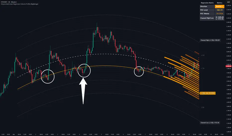
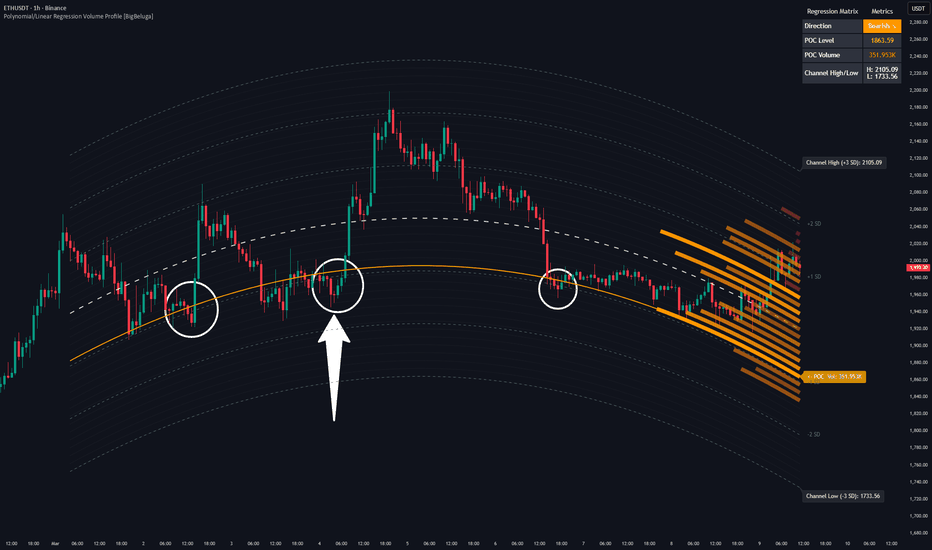
Polynomial/Linear Regression Volume Profile [BigBeluga]Polynomial/Linear Regression Volume Profile is a state-of-the-art charting framework that blends advanced statistical modeling with localized volume distribution analysis. By evolving past traditional, static horizontal volume profiles, this indicator dynamically curves the volume profile matrix around mathematical trend baselines, giving you a hyper-localized view of value zones, support, and resistance across the trend’s lifecycle.
Equipped with a switchable Ordinary Least Squares (OLS) calculation engine, traders can analyze price distribution relative to a straight path (Linear) or an adaptive structural arc (Polynomial).
🔵 RECURSIVE REGRESSION BASELINES
Adaptive Curve Fitting Engine: Choose between a straight-line trend tracking framework (Linear) or an advanced second-degree curved path (Polynomial). This non-linear baseline curves dynamically to track real institutional momentum shifts, avoiding the lag or rigid delays typical of standard moving averages.
Symmetric Grid Segmentation: The indicator slices the regression space into dynamic parallel layers above and below the center line. These tracking cells act as a structural map of the trend, automatically expanding or contracting based on the mathematical bounds of the lookback period.
Standard Deviation Wave Bands: Plots dedicated tracking envelopes at 1, 2, and 3 Standard Deviations. This maps statistical extremes instantly, highlighting key valuation zones directly on the chart.
🔵 CURVED ORDER FLOW PROFILE
Dynamic Trend-Anchored Volume Profile: Traditional volume profiles are anchored strictly to vertical price grids. This framework bends the profile horizontally along the path of the regression curve. This ensures volume is localized directly relative to the trend's value matrix rather than arbitrary static prices.
Dynamic Point of Control Matrix (POC): The tool calculates cumulative transaction weights across each regression row. The absolute highest volume cluster is highlighted across the entire lookback window as a vivid Point of Control (POC) baseline, serving as a primary target magnet for price discovery.
Gradient Density Mapping: Volume bins are colored with a responsive heat-map gradient. Low-volume zones fade into deep baseline tones, while high-volume institutional interest areas light up dynamically, reflecting heavy positional accumulation.
🔵 DATA INTERFACE & CONTROLS
Regression Matrix Dashboard (Top-Right): A neat information center providing live metrics, including current trend direction (Bullish/Bearish), the numerical value of the POC level, the exact transactional volume resting at that key node, and structural $\pm3\text{ SD}$ channel limits.
Precision Profile Scaling: Adjust the profile width parameters to limit or extend how far back profile bins stretch across your chart space to prevent layout clutter.
Complete Style Personalization: Individualized visual controls allow you to switch line architectures (Solid, Dashed, Dotted) across baselines, boundaries, and POC paths.
🔵 STRATEGIC APPLICATION
Trading the Trend Value Nodes: Treat the dynamic POC line as a trend anchor. In a strong bullish trend, pullback entries occurring at a highly concentrated, heat-mapped POC node represent low-risk, high-probability entry criteria.
Mean Reversion at Statistical Boundaries: When price extends completely out to the dynamic outer channel limit and volume density in that outer bin thins out, look for a swift mean-reversion snapback toward the baseline.
Volume Profile Breakouts: Low-volume zones (gaps in the curved profile) indicate price levels that the market skipped quickly due to high momentum. If price breaks past a thick volume node into a low-volume zone, it is likely to sprint quickly toward the next major heat-mapped node.
Structural Regime Tracking: Use the upper-right dashboard to instantly evaluate macro status. If the matrix shifts between Bullish and Bearish while price hovers consistently near a high-volume POC, it implies heavy institutional distribution is occurring before the next major expansion.
Polynomial/Linear Regression Volume Profile redefines volume structure. By wrapping the laws of order flow directly around mathematical curves, it gives trend traders an elite perspective to trade with precision, statistical logic, and institutional order flow visibility. Indicador
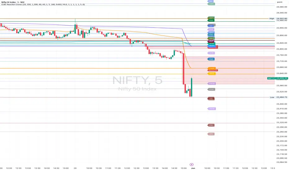
CLBS Reaction ZonesCLBS Reaction Zones is an educational market-structure indicator designed to map important reaction areas on the chart.
CLBS stands for Context, Levels, Behavior and Strategy.
This script combines multiple market reference concepts into one structured visual map. The purpose is not to generate buy or sell signals, but to help traders observe where price may react, accept, reject, rotate or expand.
Main components:
• Developing day levels
• Previous day levels
• Developing week levels
• Previous week levels
• Developing month levels
• Previous month levels
• Initial Balance High and Initial Balance Low
• Initial Balance range projection
• Developing day Point of Control, Value Area High and Value Area Low
• Daily, Weekly, Monthly, Quarterly and Yearly VWAP
• Optional VWAP bands
• Fair Value Gap zones using three-candle imbalance logic
VWAP logic:
The VWAP hierarchy uses anchored VWAP calculations for different periods. Daily VWAP resets at the start of each new day. Weekly VWAP resets at the start of each new week. Monthly VWAP resets at the start of each new month. Quarterly VWAP resets every three months. Yearly VWAP resets at the start of each new year.
VWAP is calculated using cumulative price multiplied by volume divided by cumulative volume for the selected period.
Value area logic:
The developing day value area uses a simple volume distribution model. Price is divided into buckets, volume is accumulated inside those buckets, and the highest-volume bucket becomes the developing Point of Control. Value Area High and Value Area Low are calculated around the Point of Control using the selected value area percentage.
Fair Value Gap logic:
Fair Value Gap zones are based on a three-candle imbalance model. A bullish gap is detected when the high from two candles back is below the current low. A bearish gap is detected when the low from two candles back is above the current high. Filled gaps can be removed automatically.
How to use:
Use this indicator as a market reading map. Watch how price behaves around VWAP, Initial Balance, previous session references, value area levels and fair value gaps. Reaction, acceptance and rejection around these levels can help traders build context.
This script is for educational and analytical use only. It does not provide financial advice, investment advice, trading recommendations, buy signals or sell signals. Traders should use their own analysis, risk management and decision-making.
Indicador

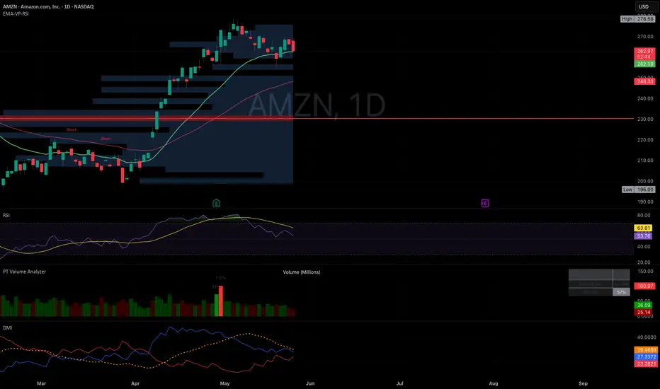
Volume Flames (hotchkiss)Volume Flames is a volume analysis indicator designed to visualize the intensity and momentum of market volume as a layered flame structure. Rather than displaying raw volume bars, it transforms volume data into a multi-layered heat gradient that rises and falls like fire — making it immediately intuitive to read at a glance how "hot" or "cold" volume pressure is at any given moment.
How it works:
The indicator stacks multiple exponential moving averages of volume on top of each other, each smoothed at a progressively faster rate. This creates a flame body with a dense dark core at the base, rising through deep reds and oranges into bright yellows and a white-hot tip. The outermost layer represents raw unsmoothed volume, giving the flame its sharp reactive spikes on high-volume bars. Gradient fills between each layer produce the signature fire glow effect.
What the signals mean:
White circles appear above the flame tip whenever volume surges significantly above its recent average — these are your burn signals, flagging explosive volume events that often precede sharp price moves. Yellow dots cluster near the base of the flame when volume momentum is building across consecutive bars, giving early warning that heat is rising before a full burn triggers. The dark maroon core columns underneath indicate baseline volume density, helping you distinguish genuine spikes from noise.
How to use it:
Watch for white circles breaking well above the flame body — that's a volume surge worth paying attention to. When yellow dots begin clustering and the flame layers start widening and brightening, it means momentum is accumulating. The taller and brighter the flame, the more volume pressure is building. A sudden spike of the white raw-volume tip far above the smoothed layers signals an aggressive market participant entering or exiting a position.
Best used on: Any liquid asset on any timeframe. Works particularly well on 1m–1h charts for intraday momentum reading, and daily charts for spotting accumulation and distribution phases. Indicador

Indicador

Liquidity Magnet ClustersLiquidity Magnet Clusters
Liquidity Magnet Pro is an educational liquidity-mapping indicator designed to help traders study where price may interact with prior volume concentration, untested Point of Control levels, value-area boundaries, and sweep-based liquidity events.
This script is not a trading strategy and does not place or simulate orders. It does not provide backtested performance results, win-rate claims, profitability claims, or financial advice. Its purpose is to organize liquidity-related information directly on the chart so traders can use it as a research and decision-support tool alongside their own market structure, risk management, and testing process.
What the script does
The indicator combines five main analytical components:
1. Rolling Volume Profile
The script builds an internal rolling volume profile from recent bars. It divides the selected lookback range into price bins and distributes each bar’s volume across the bins touched by that bar. From this profile, it identifies:
- POC: the price bin with the highest accumulated volume.
- VAH: the upper boundary of the selected value area.
- VAL: the lower boundary of the selected value area.
- HVN zones: high-volume areas that may represent prior acceptance or liquidity concentration.
- LVN zones: low-volume areas that may represent thinner auction areas or faster price traversal zones.
This profile is calculated inside Pine Script and does not rely on an external volume-profile feed.
2. Naked POC Tracker
The script snapshots the rolling POC from a selected anchor timeframe, such as 4H, Daily, Weekly, or Monthly. These historical POC levels remain active until price tests them or until they expire based on the selected maximum age.
The purpose of the Naked POC tracker is to highlight untested prior POC levels that may act as reference levels for future market interaction. To reduce chart clutter, the script can merge nearby Naked POCs into visible cluster zones instead of drawing every individual level.
3. Liquidity Sweep Detection
The script detects potential liquidity sweeps using recent swing highs and swing lows. A bearish sweep is detected when price moves above a prior swing high and then closes back below it. A bullish sweep is detected when price moves below a prior swing low and then closes back above it.
An optional above-median volume filter can be used to reduce low-conviction sweep signals.
4. A-Grade Confluence Engine
The A-Grade label is a confluence marker, not a buy or sell command. It appears only when a detected sweep also aligns with nearby liquidity geography.
The confluence score can include:
- Sweep near VAH or VAL.
- Sweep near an HVN zone.
- Sweep near an active Naked POC.
- Movement through an LVN zone.
The script uses a 0–5 scoring model. When the score reaches the selected A-Grade threshold, the script displays an A marker on the chart. A higher threshold generally produces fewer but more selective signals, while a lower threshold produces more frequent signals.
5. Liquidity Dashboard
The dashboard summarizes the current liquidity context, including:
- Current anchor timeframe.
- Current POC, VAH, and VAL.
- Distance from price to profile levels.
- Value-area bias.
- Number of active Naked POCs above and below price.
- Last sweep direction and age.
- Current HVN and LVN zone count.
How to use it
This indicator is intended to be used as a chart-reading and setup-discovery tool.
A practical workflow is:
1. Identify the current value-area context using POC, VAH, and VAL.
2. Observe whether price is trading inside value, above value, or below value.
3. Watch for untested Naked POC levels or clusters above and below current price.
4. Use sweep markers to identify possible stop-run or liquidity-grab events around recent swing highs or lows.
5. Treat A-Grade labels as areas requiring further analysis, not automatic entries.
6. Confirm any setup with your own market structure, execution rules, invalidation level, risk model, and out-of-sample testing.
Originality and usefulness
This script is designed as a liquidity-confluence framework rather than a simple signal overlay. Its purpose is to combine rolling volume-profile context, untested POC tracking, sweep detection, and a transparent scoring model into one chart-based workflow.
The components are intended to work together as follows:
- The rolling profile defines the current auction structure.
- Naked POCs identify prior untested high-volume reference levels.
- HVN and LVN zones provide context for acceptance and thin-volume areas.
- Sweep detection identifies possible liquidity events around recent swing points.
- The A-Grade score only appears when a sweep occurs near meaningful liquidity context.
This combination is intended to help traders evaluate where liquidity events occur in relation to volume-profile structure, rather than viewing sweeps or POC levels in isolation.
Important limitations
This indicator does not predict future price movement.
A Naked POC, HVN, LVN, VAH, VAL, sweep marker, or A-Grade label does not guarantee continuation, reversal, support, resistance, or profitability.
Volume-profile calculations in Pine Script are approximations based on available chart bars and the script’s selected binning method. Results may differ from exchange-native or platform-native volume-profile tools.
Signals and levels can vary depending on:
- Symbol.
- Timeframe.
- Market session.
- Available historical bars.
- Volume quality.
- Profile lookback length.
- Number of bins.
- Anchor timeframe.
- Sweep pivot length.
- Confluence threshold.
Traders should test the indicator across multiple symbols, timeframes, and market conditions before using it in any decision-making process.
Main settings
Volume Profile Engine
- Rolling Profile Lookback: controls how many bars are used to build the rolling volume profile.
- Profile Bins: controls the profile resolution.
- Value Area %: defines how much volume is included in the value area.
- HVN Percentile Threshold: controls which volume bins are classified as high-volume nodes.
- LVN Percentile Threshold: controls which volume bins are classified as low-volume nodes.
Naked POC Tracker
- Anchor Timeframe: defines the higher timeframe used to snapshot prior POC levels.
- Max Naked POC Age: controls how long untested Naked POCs remain active.
- Max Tracked Naked POCs: limits stored levels to protect object limits.
- Consumption Rule: determines whether a Naked POC is considered tested by a wick touch or by a close through the level.
- Cluster Mode: merges nearby Naked POCs into cleaner zones.
Liquidity Sweeps
- Swing Pivot Length: controls the swing-high and swing-low structure used for sweep detection.
- Liquidity Pool Lookback: limits how old a swing level can be and still qualify as sweepable liquidity.
- Require Above-Median Volume: filters sweep signals using a volume condition.
Confluence Engine
- Level Proximity: defines how close a sweep must be to a liquidity level to count as confluence.
- A-Grade Threshold: sets the minimum score required to display an A-Grade label.
Dashboard
- Dashboard Position: controls panel location.
- Dashboard Text Size: controls panel readability.
- Dashboard Theme: provides light or dark panel options.
- Dashboard Accent: controls dashboard accent color.
Alerts
The script includes alert conditions for:
- Bearish Sweep.
- Bullish Sweep.
- A-Grade Short.
- A-Grade Long.
- Value Area Break Up.
- Value Area Break Down.
- Naked POC Tested.
These alerts are informational and should not be interpreted as automatic trade instructions.
Recommended use
This indicator is best used by traders who understand auction-market concepts, volume-profile reference levels, swing liquidity, and discretionary confirmation. It is designed to support analysis, not replace a complete trading plan. Indicador

Large Order Delta Profile [TradingIQ]Hello Traders!
🔹 Large Order Delta Profile
Large Order Delta Profile is an order-flow visualization tool designed to split delta profiles across different transaction-size categories.
That is the core idea behind the tool: instead of showing one combined volume or delta profile, it separates activity by customizable dollar-value thresholds so you can compare how smaller, medium-sized, and very large transactions behaved during the same session.
This helps traders visualize where different sizes of market participants were active, where aggressive buying or selling concentrated, and whether large-order flow agreed or disagreed with smaller transaction flow .
splits the delta profile across multiple transaction-size ranges
compares smaller, medium, and large-order activity side by side
tracks bullish and bearish delta at price levels
filters trades using customizable dollar-value thresholds
supports tick, second, and minute-based granularity
builds session-based delta profiles
🔹 What the tool shows
🔸 Transaction-size delta profiles
The main feature of this indicator is that it separates market activity into different transaction-size profiles.
Each profile represents a different dollar-value range of transactions, allowing you to compare:
smaller transaction flow
medium-sized transaction flow
large-order activity
extreme large-order activity
This makes it easier to see whether large participants were active at the same price levels as smaller participants, or whether larger transactions were concentrated in completely different areas.
🔸 Large order delta distribution
The script builds a profile showing where aggressive buying and selling activity occurred during the active session.
Instead of displaying simple volume-at-price, it separates:
bullish delta
bearish delta
net directional pressure
This helps identify where buyers or sellers were more aggressive across each transaction-size category.
🔸 Custom dollar-value filters
The indicator allows you to define multiple transaction-size filters using estimated dollar value.
Each filter creates its own profile, so you can compare activity such as:
all qualifying transactions
transactions above a larger threshold
transactions above an extreme threshold
This is useful because not all market activity carries the same context.
A small transaction imbalance and a large transaction imbalance can tell very different stories.
🔸 Delta-based directional analysis
The profile uses directional estimation to classify activity as bullish or bearish.
Depending on your selected granularity:
tick-based bid/ask estimation can be used
lower-timeframe candle direction can be used
aggressive buying and selling pressure is separated
Positive delta suggests stronger aggressive buying.
Negative delta suggests stronger aggressive selling.
This helps reveal where different transaction-size groups were actively lifting offers or hitting bids.
🔸 Session-based profiling
The indicator resets and rebuilds based on a customizable session period.
This allows profiles to adapt dynamically to:
daily sessions
custom session structures
intraday profiling
higher-timeframe segmentation
The profile continuously expands as price moves beyond existing ranges.
🔸 Adaptive profile levels
The script uses ATR-based level spacing to dynamically build profile rows.
This allows the profile structure to adapt to:
high-volatility conditions
low-volatility conditions
tight ranges
expanding markets
Instead of relying on static tick spacing, the levels automatically scale with market volatility.
🔸 Visual imbalance mapping
Profile blocks expand horizontally based on the strength of bullish or bearish delta.
This creates a quick visual representation of:
where aggressive buyers dominated
where aggressive sellers dominated
which price levels showed the strongest imbalance
where directional pressure was concentrated
how imbalance differed across transaction-size groups
Bullish pressure is displayed using bullish profile coloring.
Bearish pressure is displayed using bearish profile coloring.
Optional delta labels can also display the raw imbalance values directly on the chart.
🔹 How to read it
Each component gives a different layer of order-flow context:
Transaction-size profile → which order-size group is being shown
Bullish delta → aggressive buying pressure
Bearish delta → aggressive selling pressure
Large profile expansion → stronger directional imbalance
Thin profile areas → weaker participation
Filter ranges → separated transaction-size categories
Session profile → where activity concentrated during the session
🔹 Why this tool is useful
It gives you:
a way to compare delta across different transaction sizes
a visual map of where larger orders were active
separate profiles for smaller, medium, and larger transaction flow
context around whether large-order activity confirms or conflicts with smaller flow
session-based order-flow structure
a clearer view of where aggressive participation concentrated
🔹 Best use cases
comparing small vs large transaction behavior
tracking where large participants were most active
studying aggressive buying and selling by transaction size
analyzing directional imbalance across multiple order-size groups
identifying high-participation price zones
building session-based order-flow context
🔹 Important note
This tool estimates directional pressure using lower-timeframe or tick-based data.
That means:
delta estimation is not identical to centralized exchange order books
transaction-size filters are based on estimated dollar value
large imbalance does not guarantee continuation
profiles represent historical participation, not future certainty
market conditions can shift quickly
outputs should be used as contextual analysis, not standalone signals
🔹 Inputs you can customize
The script includes flexible controls such as:
data granularity selection
session timeframe selection
profile level granularity
multiple dollar-value transaction filters
profile offsets
bullish and bearish profile colors
delta label visibility
delta label sizing
Closing Notes
Large Order Delta Profile is built around one central idea: not all transaction sizes should be viewed the same way .
By splitting delta profiles across different dollar-value thresholds, the tool helps traders compare how smaller flow, larger flow, and extreme transaction activity behave during the same session.
Rather than asking only where volume occurred, this tool helps ask which size of activity created the imbalance, where it happened, and whether larger transaction flow told a different story from the broader market .
Thank you for checking it out! Indicador

Indicador

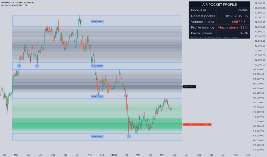
Air Pocket Profile [FEELS]Most volume tools show you where price has traded. This one also shows you where it has not — the thin zones price tends to move through quickly.
Air Pocket Profile builds a volume profile from price-range distribution, then highlights the heavy shelves where trading concentrated, the single peak-volume anchor, and the air pockets — price ranges that accumulated very little volume. A standard volume profile leaves low-volume areas as empty space. This script treats that empty space as information and draws it explicitly.
What makes it different
A traditional volume profile renders one heatmap and asks you to read the rest yourself. Air Pocket Profile separates the structure into distinct, labelled objects so the chart is readable at a glance: filled shelves, a glowing anchor line, and outlined air pocket zones with text tags. It also distinguishes recent volume from old volume by colour, marks bars that travelled through a pocket, and tracks how the volume anchor migrates over time.
How it works
The profile is built with a range-weighted distribution. Each historical bar spreads its volume across every price row it spans, from low to high, weighted by an impulse factor based on candle body size (0.7 + 0.6 × body ratio). This differs from a close-based profile, where each bar contributes only to a single row.
Row classification: with peak as the heaviest row and mean as the average row volume, each row is rescaled by min(rowVolume / mean / 2, 1) ^ contrast. Rows above average stay vivid, rows below it fade out.
-High Volume Nodes (HVN) — local maxima of the profile, ranked by volume. Shelves where price tends to slow.
-Volume Anchor — the single heaviest row, drawn as a glow line. The strongest reference level in the window.
-Air Pockets — continuous runs of rows below the air pocket threshold. Price tends to travel through them with little resistance.
-Fresh volume — volume traded within the fresh window is coloured separately, so recent levels stand apart from old ones.
-Anchor shift — the anchor position is recorded each bar and compared to its position N bars ago to report migration direction.
How to use it
-Air pockets are low-resistance ranges. When price enters one, expect faster movement and fewer reaction points until the next shelf.
-HVN levels and the anchor are high-resistance areas where price tends to slow, stall, or react.
-Profile balance shows the share of volume above vs below the anchor — directional context for the window.
-Fresh volume share shows how much of the structure was built recently.
-Anchor shift shows whether the centre of traded volume is migrating up or down.
Parameters
-Lookback — bars used to build the profile.
-Resolution — vertical row count.
-Air pocket threshold / Min pocket size — how thin and how tall a zone must be to count as a pocket.
-Profile contrast — how hard weak rows fade relative to strong ones.
-Fresh window — how many recent bars count as fresh.
-Node count — how many HVN levels to display.
-Anchor shift window / display — comparison window and direction-only vs direction-with-percent.
-Signal toggles — acceptance/rejection marks and air pocket transit marks can each be turned on or off.
Notes
Tested across BTC, ETH and other liquid assets on 1H, 4H, 1D and 1W. On instruments without volume data the profile falls back to a range-based weight. Behaviour marks are based on confirmed bars to avoid intrabar repainting. This is an analysis tool, not a signal service, and should be combined with your own risk management.
The script uses a custom range-weighted profile model and explicit low-volume zone detection to make thin areas visible. Indicador
AlgoStorm Institutional Key Levels (IKL)AlgoStorm Institutional Key Levels (IKL)
For US Index Futures and DAX.
An institutional-grade structural mapping tool built on actual Auction Market Theory (AMT) to track the true liquidity and volume nodes across centralized futures markets.
The retail trading industry has heavily distorted the word "institutional," convincing traders that algorithms are hunting their stop-losses at random pivot highs. The reality is far more objective. Real institutions, hedge funds, and market makers rely on definitive, centralized exchange volume, liquidity depth, and execution algorithms (VWAP/TWAP) to scale into positions without causing market impact.
The AlgoStorm Institutional Key Levels (IKL) indicator maps the precise mathematical benchmarks that dictate this capital flow. Designed for markets with centralized volume (CME, Eurex), it plots highly accurate session opens, Opening Ranges, Initial Balances, and Value Areas, stripping away retail noise to provide a professional framework for your intraday bias.
Technical Specifications & Architecture
Supported Markets: Universal application for centralized futures markets including US Indices (ES, NQ, YM, RTY) and European Indices (DAX/FDAX, FDXM).
Supported Timeframes: Designed specifically for 2-minute through 30-minute charts . (Note: Due to the historical buffers required for multi-session mapping, Pine Script will reject timeframes below 2-minutes).
Timezone Mastery: Flawlessly handles Daylight Saving Time (DST) transitions natively. US Futures are bound strictly to America/New_York , while DAX/Eurex Futures are strictly bound to Europe/Berlin .
Fixed-Pool Drawing Engine: Most level indicators suffer from memory bloat and chart lag due to constant object creation and garbage collection limits. The IKL utilizes a highly optimized "fixed-pool" architecture. Lines and labels are generated only once on the first bar and recycled dynamically.
Smart Label Stagger: Features a forward-pass algorithm that detects and pushes overlapping labels apart (user-adjustable separation), ensuring your chart remains pristine regardless of price compression.
US Futures Mapping (ES / NQ / YM / RTY)
All inputs trigger based on standard America/New_York session times.
Globex Structure: Previous Day High/Low (Full 18:00–17:00 session) and Overnight High/Low (18:00 to 09:30 ET).
RTH Anchors: Previous Day Close (PDC) locked exactly at the 16:00 ET cash close, and the RTH Open (09:30 ET) held all day.
Gap Fill Zone: Automatically draws an asynchronous highlight box between the PDC and current RTH open if an unfilled gap of more than 2 ticks exists.
Auction Metrics: 15-minute Opening Range (09:30–09:45 ET) and the standard Initial Balance (09:30–10:30 ET) with optional 100%, 150%, and 200% IB extension bands.
Eurex / DAX Futures Mapping (FDAX / FDXM)
A complete, standalone module built for the complex, multi-open nature of European futures. Based on Europe/Berlin time.
Asian / Pre-London Phase: Tracks Eurex overnight high/low from 01:00 CET until Frankfurt liquidity arrives at 08:00 CET.
Euro / Frankfurt Session: Plots the 08:00 CET Open and the 30-minute Euro Opening Range (08:00–08:30 CET).
Xetra Cash Session: Plots the definitive Xetra Open (09:00 CET), Xetra OPR (09:00–09:30 CET), and the Previous Xetra Close (17:30 CET) which acts as the DAX equivalent to the US PDC.
US Open Impact: Captures the 15:30 CET open and 30-minute OPR, marking the massive liquidity injection when US equity markets open.
Execution & Volume Mechanics
Algorithmic VWAPs: Plots the exact Daily and Session VWAP bands used by institutional execution desks to grade their fills. Features a full Globex Daily VWAP (resets 18:00 ET), a localized NY VWAP (resets 09:30 ET), and a dedicated Xetra VWAP (resets 09:00 CET).
Custom Value Area Engine: Features a built-in, manual array-based Volume Profile engine. It calculates the Point of Control (POC) and Value Area High/Low (VAH/VAL) for both RTH and Xetra sessions independently, bypassing standard Pine Script volume limitations. Users can customize the Value Area % and price-row tick size.
Indicador

ES Balance Inventory Market ProfileES Balance Inventory Market Profile plots projected ES market-structure levels using a major historical balance zone as the anchor.
The script starts from a user-defined base balance range and projects that balance width upward in repeated increments. The purpose is to visualize how an important historical balance area can continue to act as a structural reference framework as price moves into higher regimes.
Psychology behind the indicator:
This indicator is inspired by inventory psychology, auction-market behavior, and balance-zone theory. The core idea is that markets often behave like inventory-driven businesses: price builds around a cost basis, then moves higher when inventory is marked up for distribution or lower when inventory has to be repriced.
A major balance zone can become a psychological anchor because traders, funds, and algorithms may continue to reference prior areas where meaningful business was done. The projected levels are meant to represent repeated inventory shelves above the original balance.
When price approaches one of these shelves, the key question is not whether the level will automatically hold. The useful information comes from how market participants behave around it: acceptance, rejection, failed breakdowns, failed breakouts, reclaim attempts, compression, expansion, volume response, and volatility response.
The psychology is also rooted in memory, positioning, and auction behavior. Large historical balance areas can leave a lasting footprint because traders remember them, systematic models may reference them, and price often rotates between structural zones when liquidity, positioning, or volatility changes.
Features:
• Uses a user-defined historical balance zone as the base range
• Projects repeated balance-width levels up to 10,000
• Plots clean horizontal structure levels directly on the chart
• Right-side labels make each level easy to read
• Current market zones from 5,000 to 8,000 are visible by default
• Users can enable or disable level ranges in 1,000-point increments
• Customizable colors, label spacing, and line extension settings
Suggested use:
Use these levels as structural reference zones, not as automatic buy or sell signals. The most useful information comes from how price behaves around a level: acceptance, rejection, reclaim, failure, compression, or expansion away from the zone.
This indicator can be used alongside price action, volume, VWAP, market profile, volatility, and broader market context to support discretionary analysis.
This script does not generate trade signals, does not predict future price movement, and does not provide financial advice. It is an educational and visual market-structure tool only. Trading involves risk, and users should make their own decisions based on their own analysis and risk tolerance. Indicador
Hot zones Profile [Cartel Console]Overview
The Hot Zones Profile is a comprehensive market analysis tool designed to identify institutional interest areas through three primary lenses: Time-based Session Ranges, Volume Distribution (LVNs), and Delta-based Volume Profiles.
By combining session-specific volatility with historical volume gaps, this indicator highlights "Hot Zones" where price has historically moved quickly or is expected to find significant reaction levels.
Key Features
1. NY Session & Volatility Zones
The script tracks a specific user-defined time window (defaulting to the New York session transition). Once the session range is established, it projects a series of "Heatmap" levels based on standard deviations and range multipliers.
Bullish/Bearish Zones: Areas projected above and below the session range to identify potential overextension or reversal points.
Customization: Users can define the session time, timezone, and the extension length of these zones.
2. Heatmap Low Volume Nodes (LVN)
Market Profile theory suggests that Low Volume Nodes represent areas where price moved rapidly, often indicating a lack of auctioning or "unfair" prices.
Dynamic Detection: The script analyzes daily volume distribution to pinpoint these gaps.
Mitigation Logic: Zones can be set to "Fade" once price has re-tested and traded through them, helping traders identify which levels are still "fresh" and which have been mitigated.
Aesthetic Heatmaps: Uses glowing box visuals to represent the strength and location of these nodes.
3. Right-Side Delta Volume Profile
To provide a clear view of the current auction, the script plots a high-resolution Volume Profile on the right side of the chart.
Buy/Sell Delta: Unlike standard profiles, this highlights the "Stacked Delta," showing the ratio of buying vs. selling volume at every price level within the lookback period.
Volume Labels: Displays precise volume metrics (in Thousands) for high-activity nodes to assist in identifying Point of Control (POC) areas.
How to Use
Supply & Demand: Use the LVN zones as potential "magnets" or "rejection" zones where liquidity may be resting.
Session Bias: Use the NY Session boxes to define the intraday range and look for "Hot Zone" extensions for potential trend exhaustion.
Volume Confirmation: Observe the Right-Side Profile to see if price is currently trading in high-volume areas (balance) or low-volume areas (imbalance).
Settings
Session Time: Set your preferred anchor time (defaults to NY).
LVN Strength: Adjust how "quiet" a price level must be to qualify as a Low Volume Node.
VP Offset: Move the profile further right to clear space for price action.
Disclaimer:
This indicator is a tool for technical analysis and does not constitute financial advice. Always use proper risk management. Indicador

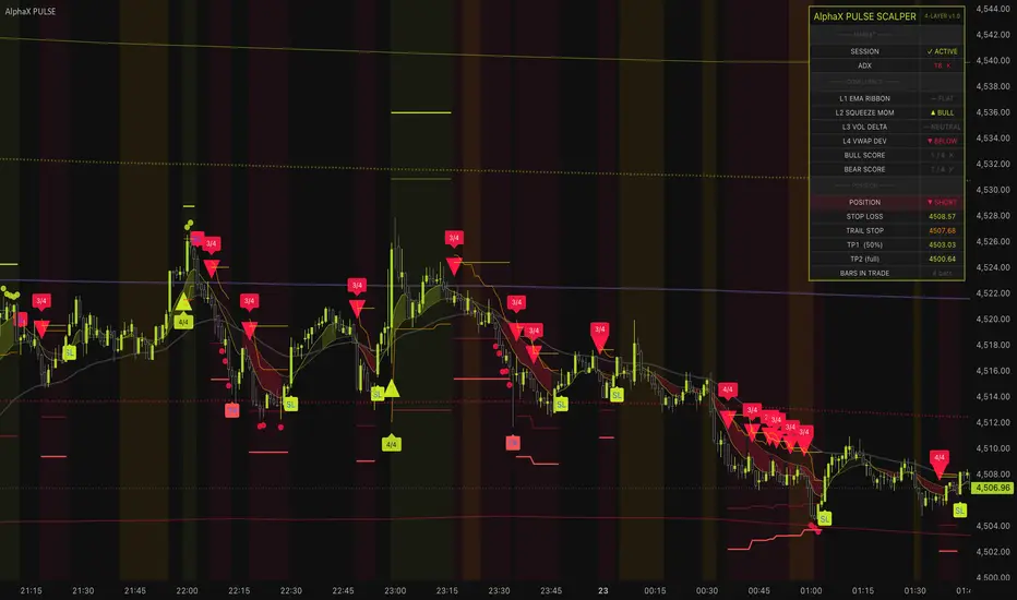
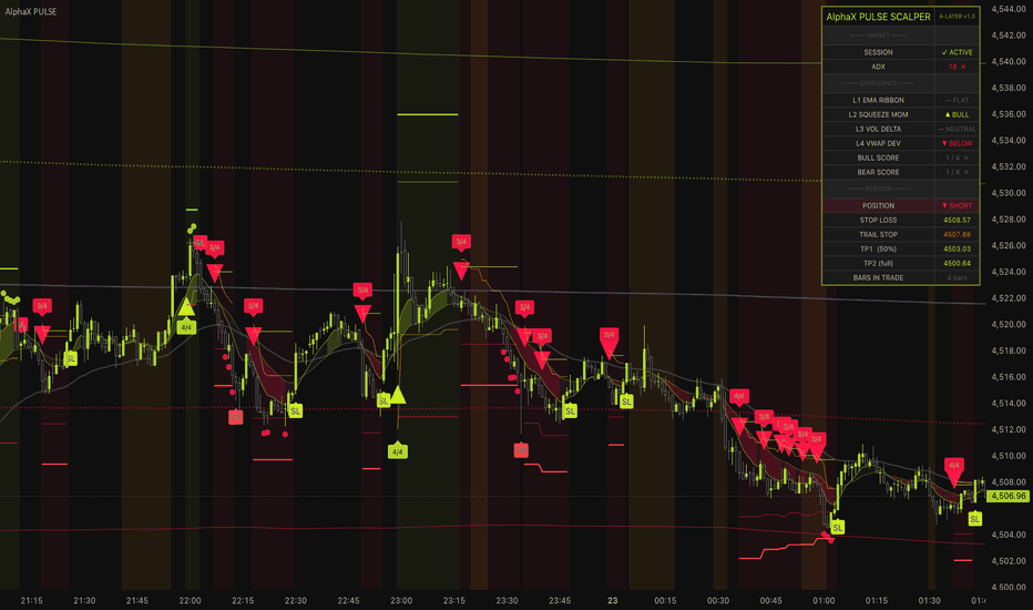
[ A L P H A X ] Pulse ScalperAlphaX Pulse Scalper — 4-Layer Confluence Scalping System with ATR Trailing Exits, Squeeze Momentum Detection & Live Scoring Dashboard
AlphaX Pulse Scalper is a professional-grade multi-confluence scalping system engineered to fire only when four independent technical engines simultaneously agree on direction. Unlike single-indicator systems that generate signals from one source of information, Pulse Scalper runs a live scoring gate across an EMA Ribbon, a Squeeze Momentum engine, a Volume Delta pressure model, and a VWAP Deviation filter — every bar, on every candle. A signal only reaches your chart when at least three of the four layers confirm. The result is a dramatically lower signal count with a dramatically higher average quality per signal. Designed for active scalpers on crypto, forex, gold, and indices across the 1-minute to 15-minute timeframes.
━━━━━━━━━━━━━━━━━━━━━━━━━━━━━━━━━━━━━━━━
🔬 The 4-Layer Confluence Engine — How It Works
Most scalping indicators fire from a single calculation — a crossover, a threshold breach, a momentum flip. The problem is that any single calculation is easily fooled by noise, spikes, and choppy price action. AlphaX Pulse Scalper is built on a fundamentally different architecture: four completely independent layers, each measuring a different dimension of market behavior , each casting a vote on every bar. Only when enough votes align does a signal fire.
This is not a filter applied on top of a signal. The confluence is the signal.
━━━━━━━━━━━━━━━━━━━━━━━━━━━━━━━━━━━━━━━━
📐 Layer 1 — EMA Ribbon (Trend Structure)
The first layer is a triple EMA ribbon using a Fast EMA (default: 8), Slow EMA (default: 21), and Signal EMA (default: 50). This layer answers a single question: is the market in a clean, structured trend right now?
Bull condition: Fast EMA above Slow EMA, Slow EMA above Signal EMA, and price closing above all three — a full stack alignment confirming upward momentum structure.
Bear condition: The full inverse — Fast below Slow below Signal, with price below all three.
Why this matters: The ribbon does not react to a single crossover. All three EMAs must be stacked in order and price must be on the correct side. This eliminates the vast majority of false crossover signals that plague simple dual-EMA systems. The ribbon is also plotted directly on the chart as a gradient-filled channel — bull fills in yellow-green, bear fills in red — giving you immediate structural context at a glance.
━━━━━━━━━━━━━━━━━━━━━━━━━━━━━━━━━━━━━━━━
⚡ Layer 2 — Squeeze Momentum (Energy Detection)
The second layer is built on the TTM Squeeze principle — one of the most reliable pre-breakout detection systems in technical analysis. It works by measuring the relationship between two volatility envelopes: Bollinger Bands and Keltner Channels.
Squeeze state: When the Bollinger Bands compress inside the Keltner Channels, the market is coiling — volatility has contracted and energy is building. These periods of compression historically precede the strongest directional moves. The squeeze state is displayed as a subtle orange background tint on the chart, and flagged on the dashboard as ⚡ BUILDING — giving you advance warning that a breakout is loading before it happens.
Momentum direction: The raw momentum value is calculated using a linear regression of price position relative to the midpoint of the recent high-low range. When this value is positive and rising , the squeeze is releasing to the upside. When negative and falling , it is releasing to the downside.
Layer 2 votes bull when: Momentum value is above zero and accelerating upward.
Layer 2 votes bear when: Momentum value is below zero and accelerating downward.
Why this matters: This layer catches the energy behind a move, not just the direction. A breakout with strong squeeze momentum behind it is fundamentally different from a breakout on low momentum — and this layer distinguishes between the two on every bar.
━━━━━━━━━━━━━━━━━━━━━━━━━━━━━━━━━━━━━━━━
📊 Layer 3 — Volume Delta (Institutional Pressure)
The third layer is a proprietary volume delta model that estimates the real buying and selling pressure behind each candle — without requiring exchange-level order flow data.
How it works: Each candle's volume is split into bullish and bearish components based on the candle's close position within its high-low range. A candle closing near its high attributes most of its volume to buyers; a candle closing near its low attributes most to sellers. These estimates are smoothed using an EMA to eliminate single-bar noise. A secondary OBV slope (On-Balance Volume) is calculated over the configured lookback and used as an independent confirmation of the dominant pressure direction.
Layer 3 votes bull when: The bull volume EMA exceeds the bear volume EMA, the delta EMA is positive, and the OBV slope is rising — all three volume signals agree on buying pressure.
Layer 3 votes bear when: The full inverse — bear volume dominates, delta EMA is negative, OBV slope is falling.
Why this matters: Price can move in any direction on any bar. Volume delta tells you whether real capital is flowing in the direction of that move. A price breakout accompanied by genuine volume pressure is a high-confidence breakout. A price breakout on weak or opposing volume is a trap. This layer is the system's protection against price manipulation and false breakouts.
━━━━━━━━━━━━━━━━━━━━━━━━━━━━━━━━━━━━━━━━
📡 Layer 4 — VWAP Deviation (Institutional Bias)
The fourth layer uses the Volume Weighted Average Price (VWAP) with dynamically calculated standard deviation bands to identify where price stands relative to institutional value.
Band structure: Two band pairs are calculated — ±1σ and ±2σ — using a volume-weighted standard deviation formula applied across the session. These bands represent statistically significant deviations from the session's fair value anchor.
Layer 4 votes bull when: Price is above VWAP (institutional bias is bullish) but has not yet extended beyond the +2σ band — confirming trend direction without chasing a stretched, overextended move.
Layer 4 votes bear when: Price is below VWAP but has not extended beyond the -2σ band.
Why this matters: VWAP is the single most widely watched intraday reference level used by institutional desks, market makers, and algorithms. Price above VWAP means institutions are net buyers for the session. Price below means net sellers. The 2σ filter prevents the system from entering during climactic exhaustion moves — precisely the moments when reversal risk is highest and reward is lowest.
The bands are plotted directly on the chart — VWAP as a purple line, ±1σ as dotted yellow-green and red circles, ±2σ as solid outer boundaries — so you always have the full VWAP context visible alongside your signals.
━━━━━━━━━━━━━━━━━━━━━━━━━━━━━━━━━━━━━━━━
🧠 The Confluence Gate — Live Scoring System
On every bar, each of the four layers independently casts its vote. The results are tallied into a live confluence score displayed in real time on the dashboard.
Bull score: 0–4 points. One point for each layer voting bullish.
Bear score: 0–4 points. One point for each layer voting bearish.
Signal fires when: The score meets or exceeds the configured minimum (default: 3 of 4), the ADX filter confirms a trending market, and the session filter confirms active market hours.
Score thresholds and what they mean:
4 / 4 — maximum confluence. All four independent engines agree. The highest-conviction setup the system can produce. Enter full size.
3 / 4 — strong confluence. Three of four layers aligned. The default threshold — high quality with reasonable frequency.
2 / 4 — weak confluence. Available if you lower the minimum, but not recommended. Two engines agreeing is not meaningful convergence.
The confluence score is printed directly on the signal label (e.g., 3/4 or 4/4 ) so you know at a glance exactly how strong every setup is at the moment it fires. The dashboard continuously displays the live bull and bear scores — even between signals — so you can watch confidence building in real time before the signal appears.
Edge triggering: Signals only fire on the bar where the score first crosses the threshold — not on every bar the score remains above it. This prevents signal spam during extended trend runs and ensures every triangle on the chart represents a distinct, fresh entry event.
━━━━━━━━━━━━━━━━━━━━━━━━━━━━━━━━━━━━━━━━
🛡 ADX Filter — Trend Quality Gate
Before any signal reaches the chart, it must also pass the ADX (Average Directional Index) filter . ADX measures the strength of the current trend regardless of direction — a reading below the threshold indicates a choppy, ranging market where trend-following signals have low reliability.
Default threshold: 20. When ADX is below this level, all signals are suppressed — even if the confluence score is 4/4. This is the system's protection against the single most common failure mode of scalping indicators: firing confidently into sideways, oscillating price action.
The ADX value and pass/fail status are displayed live on the dashboard so you always know whether the market structure supports trading at any given moment.
━━━━━━━━━━━━━━━━━━━━━━━━━━━━━━━━━━━━━━━━
🕐 Session Filter — Active Hours Gate
The Session Filter restricts signals to a configurable active trading window (default: 07:00–20:00 exchange time). Outside this window, signals are suppressed regardless of confluence score.
Why this matters for scalpers: Low-volume pre-market and post-market hours produce the most misleading signals of any period. Spreads widen, liquidity thins, and momentum moves that look compelling on the chart are frequently reversed the moment the main session opens. The session filter eliminates this entire class of false setups automatically.
The dashboard displays a clear ✓ ACTIVE or ✗ OFF-HOURS status so you always know whether the filter is open or closed.
━━━━━━━━━━━━━━━━━━━━━━━━━━━━━━━━━━━━━━━━
🎯 Dynamic ATR Exit System
AlphaX Pulse Scalper uses a fully dynamic ATR-based exit system with three simultaneously active exit mechanisms — each serving a distinct role in protecting profit.
Stop Loss: Fixed at entry based on the pivot low (bull) or pivot high (bear) minus an ATR buffer (default: 1.2× ATR). Displayed as a solid red line below price for longs, above for shorts. This is your maximum risk boundary — it does not move.
TP1 — Partial Target (50%): Set at 1.8× ATR from entry. When price reaches TP1, scale out 50% of the position and let the remainder run to TP2. A small circle marker appears at the TP1 bar.
TP2 — Full Target: Set at 3.5× ATR from entry. When price reaches TP2, the full position exits and the system resets. A labeled TP marker appears on the chart.
ATR Trailing Stop: The most important of the three. From the moment a trade opens, a trailing stop moves dynamically with price — always positioned 1.5× ATR behind the current bar's low (for longs) or high (for shorts). The trail is displayed as a live orange line on the chart. As price advances in your favor, the trail advances with it. If price reverses and hits the trail before reaching TP2, the trade exits at the trail level rather than waiting to give back all gains.
Why the trailing stop changes everything: Fixed TP levels work in textbook trends. In the real market, strong impulses often exceed TP2 before reversing — and weak impulses stall before even reaching TP1. The ATR trailing stop captures whatever the market gives, without predetermining a ceiling on your profit. In strong trending conditions, a single Pulse Scalper signal with an active trail can run 5–10× ATR before stopping out.
All three exit levels — SL, TP1, TP2, and the trailing stop — are plotted as live lines on the chart as long as a trade is active, then cleared automatically when the position closes.
━━━━━━━━━━━━━━━━━━━━━━━━━━━━━━━━━━━━━━━━
📊 Live Dashboard
The real-time dashboard displays the complete internal state of the indicator across four sections, updated on every bar.
MARKET
Session — ✓ ACTIVE or ✗ OFF-HOURS. Confirms whether the session filter is open for signals
ADX — live ADX value with ✓ or ✗ pass/fail indicator. Confirms whether market structure is trending strongly enough to trade
CONFLUENCE
L1 EMA Ribbon — current ribbon state: ▲ BULL, ▼ BEAR, or — FLAT
L2 Squeeze Momentum — current momentum state: ⚡ SQUEEZE (building), ▲ BULL, ▼ BEAR, or — FLAT. The squeeze state is the highest-value pre-signal condition the system can display
L3 Volume Delta — current volume pressure: ▲ BULL, ▼ BEAR, or — NEUTRAL
L4 VWAP Deviation — current VWAP position: ▲ ABOVE, ▼ BELOW, or — EXTENDED (price beyond 2σ, filter active)
Bull Score — live 0–4 score for bullish confluence. Background turns yellow-green when threshold is met — the signal is ready to fire
Bear Score — live 0–4 score for bearish confluence. Background turns red when threshold is met
POSITION
Position — current tracked position: ▲ LONG, ▼ SHORT, or — FLAT with background color highlight
Stop Loss — the fixed SL level currently active, color-coded red (bull) or green (bear)
Trail Stop — the current trailing stop level in orange — updates dynamically every bar the trade is open
TP1 (50%) — the first take-profit target currently active
TP2 (full) — the full exit target currently active
Bars in Trade — how many bars the current position has been open
INFO
ATR — current ATR value used for all exit calculations
VWAP — current VWAP price level for the session
Squeeze — ⚡ BUILDING when BB is inside KC (squeeze active), or — RELEASED when the squeeze has fired
━━━━━━━━━━━━━━━━━━━━━━━━━━━━━━━━━━━━━━━━
📈 Chart Visual System
Every visual element on the chart serves a specific purpose. There is no decorative clutter.
▲ Triangle (below bar) — bull entry signal. Fires when bull confluence score meets threshold, ADX passes, session is active
▼ Triangle (above bar) — bear entry signal. Fires when bear confluence score meets threshold
Score Label (3/4 or 4/4) — printed beside each signal triangle. The raw confluence count at signal time
EMA Ribbon Fill — yellow-green fill between Fast and Slow EMA during bull structure, red during bear structure. Collapses to gray during neutral
VWAP Line — purple center line marking the session's volume-weighted fair value
VWAP ±1σ Bands — dotted yellow-green and red circles marking the first standard deviation
VWAP ±2σ Bands — solid outer boundaries. Price touching these is the maximum extension zone
Orange Squeeze Background — appears during active squeeze conditions. A visual alert that energy is compressing and a breakout is approaching
Yellow-green background tint — active during open long trades. Confirms trade is live at a glance
Red background tint — active during open short trades
SL Line (red/green) — the fixed stop loss level, active while trade is open
TP1 Line (semi-transparent) — the partial target level
TP2 Line (bright) — the full exit target level
Trail Line (orange) — the dynamic trailing stop, moves with price every bar
TP marker — appears when TP2 is hit. Full exit confirmed
SL marker — appears when stop loss or trailing stop is triggered
━━━━━━━━━━━━━━━━━━━━━━━━━━━━━━━━━━━━━━━━
🚀 How to Trade with AlphaX Pulse Scalper — Step by Step
Step 1 — Check the Dashboard Before Every Session
Confirm Session shows ✓ ACTIVE
Confirm ADX shows ✓ — if ADX is below threshold, the market is ranging and no signals will fire regardless of how the layers look
Watch the Squeeze row on the dashboard — ⚡ BUILDING means a breakout setup is forming. This is your highest-alert pre-signal state
Step 2 — Watch the Confluence Scores Build
Monitor the live Bull Score and Bear Score rows in the dashboard. You can watch the scores build in real time, bar by bar, before a signal fires
When a score reaches 3/4 and the background highlights, a signal is imminent or has just fired
A 4/4 score is the highest-quality setup. Prioritize these above all else
Step 3 — Enter on the Signal Triangle
A ▲ triangle below the bar is a long signal. Enter on the close of the signal bar or the open of the next bar
A ▼ triangle above the bar is a short signal. Enter on the same basis
Read the score label — 4/4 signals warrant full position size, 3/4 signals warrant standard or slightly reduced size
Step 4 — Manage with the Live Exit Lines
The SL line is your hard stop. Never move it further away from price
Watch the orange Trail Stop line advance with price as the trade moves in your favor
At TP1, scale out 50% of the position. Move your manual stop to breakeven on the remainder
Let the trailing stop manage the rest — it will exit automatically when momentum exhausts
Step 5 — Exit and Reset
A TP marker on the chart confirms TP2 has been hit. Full exit. Dashboard resets to — FLAT
An SL marker confirms the stop or trail has been hit. Accept the loss and wait for the next setup
After any exit, do not re-enter immediately. Wait for the confluence score to rebuild from zero — this prevents revenge trading into the same noise that stopped you out
━━━━━━━━━━━━━━━━━━━━━━━━━━━━━━━━━━━━━━━━
⚠ Identifying Low-Quality Conditions — When Not to Trade
The system is designed to filter out most low-quality conditions automatically. But understanding what to look for gives you an additional edge.
Stand aside when you see:
ADX ✗ on the dashboard — the market is not trending. Any signal would be a range-bound trade against the system's core design
Dashboard shows — FLAT across all four layers — no layer has a directional conviction. The market has no readable bias
Bull and bear scores both at 1 or 2 — the layers are split. Price is oscillating without commitment in either direction
Session shows ✗ OFF-HOURS — no signals will fire and manual entries carry elevated risk from thin liquidity
Squeeze just released but score is only 2/4 — the squeeze fired but not enough layers confirmed the direction. This is a low-conviction breakout — wait for the next setup
Rapid alternation of ▲ and ▼ triangles — if you see signals in both directions within a short window, the market is too choppy. Increase the ADX threshold in settings or stand aside until a clearer trend develops
What to do:
Wait for the Squeeze dashboard to show ⚡ BUILDING — this is the highest-quality pre-signal state. The best Pulse Scalper setups almost always begin with a squeeze
Wait for ADX to climb back above threshold — a strong trend is forming
Wait for a 4/4 score on the next signal — maximum confluence only, no compromises in a difficult session
━━━━━━━━━━━━━━━━━━━━━━━━━━━━━━━━━━━━━━━━
⚡ Key Features
🔬 4-layer confluence gate — EMA Ribbon, Squeeze Momentum, Volume Delta, and VWAP Deviation must agree before any signal fires
📊 Live confluence scoring — bull and bear scores update every bar in real time, displayed on the dashboard before the signal appears
⚡ TTM Squeeze detection — Bollinger/Keltner compression identifies pre-breakout coiling with an orange background tint and dashboard flag
📈 Proprietary volume delta model — estimates buying and selling pressure without exchange-level order flow data, confirmed by OBV slope
📡 VWAP with standard deviation bands — ±1σ and ±2σ plotted live, VWAP filter prevents entries during climactic extension moves
🛡 ADX trend quality gate — suppresses all signals during choppy, non-trending market conditions
🕐 Session filter — restricts signals to active market hours, eliminating low-liquidity false setups automatically
🎯 Triple exit mechanism — fixed ATR stop loss, TP1 at 1.8× ATR, TP2 at 3.5× ATR, plus dynamic ATR trailing stop that advances with price every bar
📉 ATR trailing stop — plotted as a live orange line, adapts dynamically to volatility, captures extended runs beyond TP2 in strong trends
🏷 Confluence score label on every signal — 3/4 or 4/4 printed directly on the chart so you know signal quality at a glance
📊 28-row live dashboard — Market, Confluence, Position, and Info sections updated in real time
🔔 9 alert conditions — bull entry, bear entry, TP1/TP2 hits, stop hits, squeeze start, any exit
🎨 Cohesive dual-tone color theme — yellow-green for all bullish elements, red for all bearish elements, orange for squeeze and trail, gray for neutral
⚙ Fully configurable — all EMA periods, squeeze parameters, VWAP multipliers, ADX threshold, confluence minimum, ATR multipliers, session window, and all colors are adjustable from the settings panel
━━━━━━━━━━━━━━━━━━━━━━━━━━━━━━━━━━━━━━━━
⚙ Settings Reference
EMA Ribbon
Fast EMA — the fastest ribbon line, reacts most immediately to price (default: 8)
Slow EMA — the intermediate ribbon line (default: 21)
Signal EMA — the macro trend anchor. All three must stack in order for a ribbon vote (default: 50)
Show EMA Ribbon — toggle the ribbon fill and lines on or off
Squeeze Momentum
BB Length — Bollinger Band lookback period for squeeze detection (default: 20)
BB Mult — Bollinger Band standard deviation multiplier (default: 2.0)
KC Length — Keltner Channel lookback period (default: 20)
KC Mult — Keltner Channel ATR multiplier (default: 1.5)
Momentum Length — linear regression period for the momentum value calculation (default: 12)
Volume Delta
Volume MA Length — EMA smoothing period for bull and bear volume estimates (default: 14)
OBV Slope Length — lookback bars for OBV slope calculation (default: 10)
VWAP
Use VWAP Filter — when enabled, Layer 4 requires price to be on the correct side of VWAP (default: on)
Show VWAP Bands — toggle ±1σ and ±2σ band plots on or off
Band 1 Mult — first standard deviation band multiplier (default: 1.0)
Band 2 Mult — second standard deviation band multiplier (default: 2.0)
Confluence Gate
Min Layers Required — how many of the 4 layers must agree for a signal to fire. 2 = more signals, 3 = balanced (default), 4 = ultra-selective
Session Filter — toggle the active hours restriction on or off
Active Session — configurable session window string (default: 0700-2000)
ADX Filter
Use ADX Filter — toggle the trend quality gate on or off
ADX Length — lookback period for ADX calculation (default: 14)
ADX Minimum — threshold below which all signals are suppressed (default: 20)
Exit Settings
ATR Length — lookback period for ATR used in all exit calculations (default: 10)
SL ATR Mult — stop loss distance from entry as a multiple of ATR (default: 1.2)
TP1 ATR Mult — first take-profit distance (default: 1.8 — approximately 1.5:1 reward on a full position)
TP2 ATR Mult — full exit target distance (default: 3.5 — approximately 3:1 reward)
Use ATR Trailing Stop — toggle the dynamic trailing stop mechanism on or off
Trail ATR Mult — trailing stop distance from current bar's low or high (default: 1.5)
Show Exit Levels — toggle SL, TP1, TP2, and trail lines on the chart
Display
Show Confluence Score Label — prints the live score (e.g. 3/4) on every signal triangle
Show Dashboard — toggle the entire dashboard panel on or off
Dashboard Position — Top Left / Top Right / Bottom Left / Bottom Right
Colors
Bull / Bull Bright — yellow-green family for all bullish signals, fills, and labels
Bear / Bear Bright — red family for all bearish signals, fills, and labels
Squeeze — orange used for squeeze background tint and trailing stop line
Neutral — gray for inactive states and neutral dashboard rows
Text Light / Dash BG — dashboard typography and background
━━━━━━━━━━━━━━━━━━━━━━━━━━━━━━━━━━━━━━━━
🔔 Alert Conditions (9 total)
Entry Alerts
Bull Confluence Entry — bull score meets threshold, ADX passes, session active
Bear Confluence Entry — bear score meets threshold, ADX passes, session active
Exit Alerts
Bull TP1 Hit — price reaches the first bull take-profit level
Bull TP2 Hit — price reaches the full bull exit target
Bull Stop Hit — stop loss or trailing stop triggered on a long position
Bear TP1 Hit — price reaches the first bear take-profit level
Bear TP2 Hit — price reaches the full bear exit target
Bear Stop Hit — stop loss or trailing stop triggered on a short position
Special State Alerts
Squeeze Started — Bollinger Bands have compressed inside Keltner Channels. A breakout setup is loading
All alert messages include {{ticker}} and {{interval}} for clean webhook and notification integration.
━━━━━━━━━━━━━━━━━━━━━━━━━━━━━━━━━━━━━━━━
🎯 Recommended Settings by Instrument & Timeframe
The default configuration is optimized for XAUUSD, major forex pairs, and crypto on M1–M5 :
Min Layers at 3/4 — strong confluence without requiring perfection on every bar
ADX minimum at 20 — filters choppy intraday sessions without being overly restrictive
ATR Trail at 1.5× — gives trades enough room to breathe on fast-moving scalping timeframes
Session 07:00–20:00 — covers London and New York sessions, the highest-volume windows for forex and gold
For other instruments or timeframes, adjust:
Higher timeframes (M15, H1, H4) — increase EMA periods (Fast 13, Slow 34, Signal 89), increase ADX minimum to 25, increase TP2 to 4.5–5.0× ATR
Crypto (BTC, ETH) — increase KC Mult to 2.0–2.5 to accommodate wider volatility, increase SL mult to 1.5–2.0
Indices (NAS100, US30, SPX500) — use defaults with ADX raised to 22–25. Index trends are strong but session timing is critical — tighten session window to 09:30–16:00 for US indices
More signals — lower Min Layers to 2, disable ADX filter, widen session window
Fewer, higher-quality signals — raise Min Layers to 4, raise ADX minimum to 25, enable volume filter with ratio at 1.2×
━━━━━━━━━━━━━━━━━━━━━━━━━━━━━━━━━━━━━━━━
👥 Who This Is For
⚡ Scalpers and intraday momentum traders — the 1m–15m timeframe focus and ATR trailing exit system are built specifically for fast-moving intraday conditions
🥇 Gold (XAUUSD) and forex traders — default settings are tuned and tested on gold and major pairs during London and New York sessions
📊 Crypto and index traders — the four-layer architecture adapts across instruments without manual recalibration
🧠 Systematic traders — the live confluence score provides a quantitative signal quality reading, not just a visual arrow
📈 Traders who want to eliminate overtrading — the confluence gate, ADX filter, session filter, and edge triggering physically prevent low-quality setups from appearing on the chart
🎯 Traders who struggle with exits — the three-layer exit system (fixed SL, scaled TP1, trailing TP2) provides a complete, rules-based exit framework that removes emotion from trade management
📉 Risk-conscious traders — every trade has a defined stop, a defined first target, and a dynamic trailing mechanism. There is no ambiguity about where you exit under any scenario
━━━━━━━━━━━━━━━━━━━━━━━━━━━━━━━━━━━━━━━━
📝 Notes
All signals are confirmed on bar close — the indicator is non-repainting by design
The edge-triggered signal logic means each triangle on the chart represents a distinct new confluence event — the same setup does not generate repeated signals during extended runs
The trailing stop line on the chart is a real-time visual — it moves every bar the trade is open and accurately reflects the current stop level at all times
Maximum 500 labels and 500 lines are used — on very low timeframes with extended chart history, the oldest markers may be automatically removed by TradingView's rendering limits
The Squeeze background tint is a leading indicator — it appears before signals fire, giving you time to prepare. The strongest Pulse Scalper signals frequently begin with a squeeze
The VWAP calculation resets at the start of each session. On instruments without a defined session (perpetual crypto), the VWAP anchors to the chart's visible history. For best results on crypto, use a 24-hour session string or disable the VWAP filter and use the other three layers
The Trade Status section on the dashboard tracks position direction from signal to exit within a single chart session — it does not connect to your broker or brokerage account
━━━━━━━━━━━━━━━━━━━━━━━━━━━━━━━━━━━━━━━━
⚠ Disclaimer
This indicator is a technical analysis and visualization tool intended for educational and informational purposes only. It does not constitute financial advice or a recommendation to buy or sell any financial instrument. All signals are generated from historical and real-time price data using mathematical calculations — their accuracy or profitability is not guaranteed. Past performance of any signal type does not guarantee future results. Always conduct your own analysis, use proper risk management, and consult a licensed financial advisor before making any trading decisions. The author accepts no responsibility for any losses incurred from the use of this indicator.
━━━━━━━━━━━━━━━━━━━━━━━━━━━━━━━━━━━━━━━━
Built for scalpers who need more than a signal — a complete system that scores, filters, enters, trails, and exits with precision on every trade. Indicador
Pan Sniper Hybrid V16.0 [Cluster VP]📊 Pan Sniper Hybrid V16.0
Advanced Multi-Indicator Trading System with Cluster Volume Profile
📝 Overview
Pan Sniper Hybrid is a comprehensive trading system that combines multiple advanced indicators including Cluster Volume Profile (K-Means Algorithm), Demand/Supply Zones, Fair Value Gaps, and Nadaraya-Watson Envelope. Designed for scalping and day trading with precise entry/exit signals.
✨ Key Features
1. Cluster Volume Profile (K-Means Clustering)
Uses machine learning algorithm to identify key price levels
Automatically detects Point of Control (POC) for each cluster
Visual volume distribution across different price zones
Color-coded clusters for easy identification
2. Demand/Supply Zones (PRO Scalper Style)
Two-tier zone detection (Pair A & Pair B)
ATR-based zone depth for dynamic adjustment
Touch counter to track zone strength
Trend-filtered zones (optional)
3. Fair Value Gaps (FVG) / Order Blocks
LuxAlgo-style imbalance detection
Customizable filter by percentage
Auto-extension and break detection
Visual signals when price enters FVG zones
4. Nadaraya-Watson Envelope
Non-parametric regression for trend detection
Upper/Lower bands for dynamic support/resistance
Smooth and responsive to market changes
5. Multi-Timeframe Dashboard
Real-time trend analysis (4H/1H/15m/1m)
Overall bias indicator (STRONG BULL/BEAR)
Entry/SL/TP calculation with R:R ratio
Position customization (Top Left/Right, Bottom Left/Right)
6. Density Zones
Detects high-volume/delta concentration areas
Auto-merge nearby zones
Break detection with volume confirmation
7. Session Boxes & Opening Range
4 customizable trading sessions (Asia/London/NY)
Multi-timeframe Opening Range (OR)
Dashed border style for clarity
🎯 How to Use
For LONG Entry:
Dashboard shows "STRONG BULL" or "BULL" bias
Wait for 🐂 (Bull) or 🦈 (Shark Bull) signal
Check Bull Score ≥ 3/5 (in Strict Mode)
Entry at signal candle close
SL below nearest Demand Zone or last Pivot Low
TP at nearest Supply Zone or TP1/TP2 levels
For SHORT Entry:
Dashboard shows "STRONG BEAR" or "BEAR" bias
Wait for 🐻 (Bear) or 🦈 (Shark Bear) signal
Check Bear Score ≥ 3/5 (in Strict Mode)
Entry at signal candle close
SL above nearest Supply Zone or last Pivot High
TP at nearest Demand Zone or TP1/TP2 levels
⚙️ Settings Guide
🔒 Strict Mode:
Enable Strict Mode: Filter signals by confluence
Min Confirmations: Minimum score required (2-5)
Min Volume Ratio: Minimum volume compared to MA
Max Distance %: Max distance from Gaussian filter
Avoid Choppy Market: Filter low volatility periods
🔷 Cluster Volume Profile:
Lookback Period: Number of bars to analyze (200 recommended)
Number of Clusters: How many groups to detect (5-7 optimal)
K-Means Iterations: Algorithm precision (30 recommended)
Rows per Cluster: Volume profile resolution (20 rows)
Max VP Width: Maximum histogram width in bars
Show POC Lines: Display Point of Control lines
🎯 Demand/Supply Zones:
Zone Depth × ATR: Zone thickness (0.6 = 60% of ATR)
Pivot A/B Left/Right: Pivot detection sensitivity
Show Only In-Trend: Hide counter-trend zones
Extend Zones: How far to extend zones (bars)
📦 FVG Order Blocks:
Filter Gaps by %: Minimum gap size percentage
Max Blocks Display: Limit visible blocks (prevent clutter)
Show Entry Signals: Show arrows when price enters FVG
🔹 Density Zones:
Metric: AbsDelta or Volume
Quantile %: Threshold for high density (92% = top 8%)
Depth × ATR: Zone thickness
Merge if |Δprice| < ×ATR: Merge nearby zones
📊 Dashboard Interpretation
Timeframe
Meaning
4H (Macro)
Major trend direction
1H (Bias)
Intermediate trend
15m (Setup)
Setup confirmation
1m (Entry)
Execution signal
OVERALL
Combined bias (STRONG BULL/BEAR = All TF aligned)
DECISION
LONG / SHORT / WAIT
⚠️ Risk Management
Recommended Timeframe: 5m, 15m, 1H
Leverage: Use appropriate leverage (25x-75x max)
Position Size: Risk max 1-2% per trade
Stop Loss: Always use SL (calculated automatically)
Take Profit: TP1 at 1:2 RR, TP2 at 1:4 RR
💡 Tips
Best Performance: Use on liquid pairs (BTC, ETH, major alts)
Avoid: Sideways markets when Overall Bias = "SIDEWAY"
Combine: Wait for signals in confluence with Cluster POC
Backtest: Test settings on your preferred timeframe first
Alerts: Set up alerts for "MTF LONG" and "MTF SHORT"
📌 Disclaimer
This indicator is for educational and informational purposes only. It does not constitute financial advice. Trading cryptocurrencies involves substantial risk of loss. Past performance does not guarantee future results. Always do your own research and trade at your own risk.
🔧 Credits & Inspiration
Cluster Volume Profile: Inspired by LuxAlgo (CC BY-NC-SA 4.0)
Demand/Supply Zones: Inspired by PRO Scalper methodology
FVG Order Blocks: Based on BigBeluga's implementation
Nadaraya-Watson: Classic non-parametric regression
📞 Support
For questions, suggestions, or bug reports, please leave a comment or contact the author.
Happy Trading! 🚀 Indicador

Delta Void Profile [BigBeluga]Delta Void Profile is an advanced order flow and market structure framework engineered to reveal the "negative space" in price action. By contrasting traditional volume accumulation with a unique Inverse Liquidity Void map, this indicator identifies where the market is most anchored and where it is most fragile.
While standard profiles show where the crowd has transacted, the Delta Void Profile simultaneously highlights where the market *failed* to trade, marking the "liquidity vacuums" that often dictate explosive price movements.
🔵 THE DUAL-ENGINE FRAMEWORK
The Normal Profile (Right Side): This is your primary volume distribution. It visualizes the total relative volume transacted at each price bin within the lookback period, providing a clear view of high-interest zones.
The Inverse "Void" Profile (Left Side): This profile measures the "gap" between the maximum volume peak and the current bin. Longer bars on the left signify Volume Voids —areas where price moved too quickly for significant liquidity to build.
Intraday Delta Breakdown: Within the normal profile, the script calculates a granular Buy/Sell Delta . Each bin features a central divider and percentage labels, showing exactly which side of the market dominated that specific price node.
🔵 CORE ARCHITECTURE
Liquidity Vacuum Identification: The indicator automatically highlights the "Deepest Gap"—the price area with the least historical transacted volume relative to the peak. These zones act as magnets or "slip-zones" where price is likely to expand rapidly without resistance.
HVN & Gap Pivot Detection: Depending on your strategy, the tool automatically plots dashed structural lines at either High Volume Nodes (HVN) —representing fair value and heavy support/resistance—or at Volume Gaps —representing liquidity pockets.
Dynamic Gradient Resolution: The profile uses a color-gradient system based on volume density. Brighter, more saturated bins represent institutional interest, while faded bins represent retail noise or transitional zones.
🔵 FEATURES
High-Definition Bins: Customizable vertical resolution (Bin Count) allows you to transition from a macro structural view to a high-definition "micro-scalping" look at order flow.
Delta Efficiency Labels: Real-time percentage labels on the right-hand profile give you an immediate breakdown of supply and demand percentages for every price level.
Void Strength Labels: The inverse profile calculates and prints the "Gap Percentage," explicitly labeling areas where liquidity is significantly missing.
UI Scaling: Fully adjustable global text and label sizes ensure the profile remains readable on any screen resolution or chart layout.
🔵 STRATEGIC APPLICATION
Trading the HVN (High Volume Nodes): Use HVN levels as anchors for your stop-loss or as high-probability entry points. These are prices where the market has historically agreed on "Value".
Exploiting the Voids: When price enters a high-percentage "Gap" zone on the left profile, expect increased volatility. Because there is no "friction" from historical orders, price often "teleports" through these voids until it reaches the next high-volume cluster.
Delta Confirmation: Use the Buy/Sell percentage labels to confirm breakouts. If price is breaking an HVN resistance and the delta shows high Buy dominance, the probability of a successful breakout increases significantly.
Mean Reversion Targets: Voids often act as targets for mean reversion. If price is overextended, look for the nearest "Volume Gap" pivot as a natural magnet for a relief rally or pullback.
Delta Void Profile transforms your chart into a map of institutional activity and structural weakness. By identifying the voids in the market, you can stop trading into the "heavy" areas and start targeting the "light" areas where the real price expansion occurs. Indicador

Simplified Footprint
If you've tried using volume footprint charts and been daunted with information overload, then this 'Simplified Footprint' indicator could be just what you need instead.
The POC and value area are overlayed onto regular candles on the chart.
The delta is plotted as an oscillator, but the fun part, also in the oscillator pane, are the imbalances.
A buy imbalance is shown as a green bar. If it goes upwards part way, then it is partly displaced by the price. Up to the top, and the price has fully displaced the imbalance.
If the green buy imbalance bar goes downwards however, then it's absorbed by passive sell orders. Part way, partly absorbed, all the way down, then fully absorbed.
The colour of the bars are also more transparent with low volume, and more opaque, as the volume in that direction increases.
The sell imbalances are red and do the opposite. Downwards, and they are displaced by price, upwards and they are absorbed.
To clearly see what's going on, you want the buy imbalance columns narrower than the sell imbalance columns (or vice versa).
These colours are all transparent to some degree so you can still read them when they overlay, but having the columns different widths, like piano keys, really makes reading them easier.
The absorptions are also marked with an 'A' to avoid any doubt.
Using this 'Simplified Footprint' indicator allows you to visually read all this footprint data at a glance, on a regular chart.
To make it even simpler, you can just view it as; imbalance bars and delta going upwards are bullish, going downwards, bearish.
Obviously you might want to pay attention to the absorptions, as they indicate passive participants having an effect on the market that you wouldn't otherwise see, as they don't move the price.
To use this indicator, you just need to configure the number of ticks per row, at the top of the settings.
This can be set with a number of ticks per row, or with an Average True Range (ATR), and can be scalable across different timeframes as well.
Probably the easiest way to use it is to select the timeframe on the chart you want to use, then get an ATR reading for that timeframe.
Then use that ATR value in the 'Simplified Footprint' settings.
If you scale the ticks for different timeframes, just specify the timeframe for which the ATR (or ticks) are calibrated for.
You will also probably need to tweak the narrow imbalance column width, depending on how zoomed into the chart you are, to get a piano key look for clarity.
Although the 'ticks per row' can be scaled across different timeframes, the scaling is an approximation and may not always work well, especially if the chart is far removed from the reference timeframe.
Ideally try not to scale too far from the reference timeframe, and re-calibrate nearer to the chart timeframe if necessary.
If in any doubt, check the Pine logs for configuration details and information about the last confirmed bar.
The last couple of lines, where it says:
Last confirmed bar, rows per footprint: x
Use the above 'rows per footprint' as calibration, which should be between about 3 and 30 ideally, although more may still be OK.
The rows per footprint can be checked against the actual volume footprint, and should be the same if the ticks per row are the same.
However, the default value the actual volume footprint uses is 'auto', which cannot be replicated in this script due to the platform design.
So if you want the same number of rows per footprint, and see exactly the same imbalances, you need to configure the actual volume footprint with a manual row size and set the ticks per row to the same number as in this 'Simplified Footprint' indicator.
Indicador

Indicador

Opening Range + Session Windows + Volume ProfileOpening Range + Session Windows + Volume Profile
This is a revised repost of my previous script version that trended on the TradingView community indicators page. The script has been rewritten, renamed, and cleaned up so the publication follows TradingView House Rules more closely.
The goal of this indicator is to make intraday session structure easier to read from one chart.
Opening range levels can be useful, but they are much more useful when viewed with nearby volume-based context. A move away from the opening range is not always the same type of move. It can be moving into an area where volume previously built, away from an area where volume was thin, or toward a level where participation has already concentrated.
This script is built to help show that context visually.
📊 What the script shows
• Opening range high, low, and range box
• Configurable session windows
• Current session volume profile
• Previous session volume profile
• POC, HVN, and LVN levels
• Live and prior session node labels
• A terminal-style HUD for session state, trend, range size, POC, HVN, LVN, and impulse counts
• A pressure meter based on session volume standard deviation
• Filtered buy-volume and sell-volume impulse labels
🧠 Why it was built this way
The script is designed around one main idea: the opening range should not be viewed in isolation.
A breakout, rejection, or rotation around the opening range can look completely different depending on where volume is sitting around price. If price is moving into a high-volume area, that can suggest a different type of environment than price moving through a thinner low-volume area. If a prior POC or volume node is nearby, that may also change how a trader studies the move.
This indicator does not try to replace analysis. It simply brings the important intraday structure into one clean visual layout so the user can study the session with more context.
⚙️ How to use it
1. Set the main session and opening range times in the settings.
2. Use the opening range box to mark the first part of the session.
3. Watch how price behaves around the current and prior volume nodes.
4. Use POC, HVN, LVN, and session levels as structure references.
5. Use the HUD to quickly read session state, trend, range size, and active nodes.
6. Use the volume gauge and impulse labels to study stronger participation events.
7. Adjust the session windows to match the market and timezone you trade.
🔁 Current vs prior levels
Live session levels are labeled as LIVE .
Previous session levels are labeled as PRIOR .
This makes it easier to separate developing session structure from levels carried forward from the last completed session.
⚡ Volume impulse labels
The volume impulse labels are intentionally filtered. They are not meant to appear on every volume increase. The script only prints them when participation is stronger than normal based on the selected settings.
This helps keep the chart cleaner and prevents the indicator from turning into a label-heavy mess.
🕒 Session windows
The session windows are visual time references only. They are fully configurable from the settings and can be adjusted, enabled, or disabled depending on the market being viewed.
⚠️ Important notes
This is not a trading system.
This script does not place trades, issue alerts to buy or sell, provide financial advice, or tell the user what action to take. It is a decision-support tool for studying intraday structure, volume location, session context, and participation.
FOR PINECODERS TEAM: Promotional references, branding, and unclear wording have been removed, and this description has been expanded so users can understand the purpose of the tool without needing to read the Pine code. I cannot, within reason, direct users any further regarding specific use of this indicator as to avoid providing any form of financial advice. It is a framework tool for various use-cases outlined above.
The user is responsible for their own analysis, risk management, and execution decisions.
✅ Best used on
Intraday charts where opening range structure and volume context matter, including index futures, stocks, ETFs, and other liquid instruments with meaningful volume data. Indicador

Order Flow Momentum Divergence [theUltimator5]This indicator is the Order Flow Momentum Divergence (OFMD)
Most momentum indicators tell you what price has already done (lagging indicators). This indicator is an attempt at a leading indicator by monitoring order flow momentum through volume footprint, comparing it to price momentum, and tracking divergences.
Price momentum indicators -> RSI, MACD, stochastics, all of them lag. They are derivatives of the close. When RSI is overbought, it means price has been going up. That's it. It tells you nothing about whether the actual buying pressure behind that move is still present, exhausted, or already reversing.
Footprint delta alone has the opposite problem. It's noisy, spiky, and hard to read directionally across timeframes. A single bar with massive positive delta doesn't tell you much in isolation.
What OFMD is actually solving is the confirmation gap. Specifically: is the order flow that drove a price move still supporting it, or has it quietly shifted while price continues on inertia?
When Flow Momentum and Price Momentum agree, the move has both structural and transactional backing. When they diverge, particularly when Flow Momentum turns while Price Momentum hasn't yet, you're seeing a potential early warning that the fuel behind the move is changing before price reflects it.
In plain terms: most traders get stopped out or give back gains because they're reading price alone. They're not reading what's happening inside the price. OFMD attempts to surface that internal picture and put it on the same scale as a familiar momentum oscillator so the two can be directly compared bar by bar.
IMPORTANT - Before reading further, this indicator uses the volume footprint, which requires (at the time of creating the indicator) a premium TradingView subscription. If you do not have a access to the volume footprint function, this indicator will not function as intended.
HOW IT WORKS
OFMD runs two signals in parallel.
1) The first is Flow Momentum: a net bias score built by running footprint delta through 100 Hull Moving Averages simultaneously (lengths 2 through 101), normalizing each, and averaging the result. The output is a single -100 to +100 value that represents the aggregate directional lean of order flow across all measured timeframes at once.
2) The second is Price Momentum: a standard 7-period RSI rescaled to the same -100 to +100 range for direct comparison.
When these two signals diverge, Flow Momentum rising while Price Momentum falls, or vice versa, the indicator flags it. That divergence is the signal. The fill between the two lines intensifies as the gap widens. The chart overlay bands extend from price proportionally to signal strength, giving you a visual anchor directly on the candles without needing to cross-reference the sub-pane.
Sub-Pane Series
Show Flow Momentum Line - The purple line. Displays the aggregate order flow bias score derived from footprint delta. Opacity scales with signal strength; it fades when bias is weak and near zero, and becomes fully opaque as conviction builds.
Show Price Momentum Line - The yellow line. A 7-period RSI stretched to -100/+100 so it sits on the same scale as Flow Momentum. Crossing zero means RSI has crossed 50. It is simply a shifted visual of RSI to match the order flow momentum in order to visually watch bullish/bearish crossings.
Show Divergence Fill - Fills the area between the two lines. Color is green for bullish divergence (Flow Momentum leading up) and red for bearish (Flow Momentum leading down). Opacity increases as the gap between the signals widens. Both lines need to be enabled for the fill to render.
Show Difference Histogram (Disabled by default) - Plots the raw arithmetic difference between Flow Momentum and Price Momentum as a histogram. Green bars mean flow is ahead of price; red bars mean price is ahead of flow. Useful for gauging divergence magnitude at a glance without reading the lines themselves.
Chart Overlay
Band Mode — Controls which overlay band or combination of bands is drawn on the price chart.
Bias Band : a single band anchored to a short EMA of price, offset proportionally to Flow Momentum strength. Color shifts from purple at maximum bearish bias through neutral at zero to green at maximum bullish bias. This band tells you where order flow bias is pointing relative to current price. This line acts as a price continuation indicator.
Divergence Band : This plots the offset proportionally to the gap between Flow Momentum and Price Momentum rather than to either signal individually. Color shifts from deep orange when price momentum is leading to electric blue when flow momentum is leading. This band is suppressed when both signals are on the same side but not in strong agreement, to avoid noise. When both signals agree strongly, the Divergence Band inherits the Bias Band's color and position.
Combined (default) : renders both bands simultaneously. The Bias Band fill and the Divergence Band fill are independent in this mode. Only one line is ever drawn on the chart - the Divergence Band line, which adopts the Bias Band's color when signals are strongly aligned.
Other toggles
Enable Chart Overlay - Master switch for everything drawn on the price chart. Turning this off leaves the sub-pane intact and removes all overlay rendering.
Show Bias Band Line - Toggles the outer line of the Bias Band. Only applies when Band Mode is set to Bias Band; in Combined mode the Divergence Band line covers this role.
Show Bias Band Fill - Toggles the fill between the Bias Band line and its anchor. Fill opacity is zero when bias is within ±20 and ramps to full as bias approaches ±100, so weak signals don't clutter the chart.
Show Divergence Band Line - Toggles the outer line of the Divergence Band. This is the only line that renders in Combined mode.
Show Divergence Band Fill - Toggles the fill between the Divergence Band line and its anchor. Like the Bias Band fill, opacity is gated - it stays invisible until the divergence gap exceeds 20, then ramps proportionally. Suppressed entirely when both signals share the same sign but lack strong conviction.
Show Background Highlight - Tints the chart background green during bullish divergence and red during bearish divergence. Only activates when the gap between the two signals exceeds 50, so it fires on meaningful separations rather than routine noise. Opacity scales with gap size up to a ceiling.
Overlay Smoothing
Smooth Overlay Bands (EMA) (Enabled by default) - Applies an EMA to the four overlay band position values before they are plotted. This reduces bar-to-bar jitter on the chart overlay without touching any of the sub-pane calculations. Flow Momentum, Price Momentum, and the histogram are unaffected.
When the overlay bands aren't smoothed, the response time for divergences is quicker, but the overlay chart is noisy and can produce more false signals.
Smoothing Length - The EMA period applied to the overlay bands when smoothing is enabled. Default is 5. Lower values track price more closely with more noise; higher values produce cleaner bands with more lag. The useful range is roughly 3 to 15 for most instruments and timeframes. Indicador

Liquidity Grab Detector v4What is this and why do you need it?
The indicator shows where the market maker is hunting stops and when the price is likely to reverse afterwards.
The logic is simple: before a reversal, price often sweeps beyond a key level, takes out retail traders’ stop-losses, and then reverses back. This is called a Liquidity Grab. LGD v4 detects these moments and evaluates the quality of each signal from 0 to 100.
What you see on the chart
Colored zones — Liquidity pools where stops have accumulated. The more touches, the more stops are sitting there.
Signal label (e.g. REJ 72 or ABS 85) — The word is the reversal type, the number is the signal quality (0–100).
Green/Red background — The system is “armed” and waiting for confirmation to enter.
TP and SL lines — Appear only on a valid signal. SL is always placed behind the probe extreme, not on the level itself.
Four Types of Signals
A+ (85–100) — Rare, enter with full size
A (70–84) — Strong signal
B (50–69) — Good, use with additional confirmation
C (<50) — Skip or only in perfect context
TypeIn Simple TermsShould You Enter?ABS (Absorption)A big player absorbed all the pressure with a wall of ordersYes, full sizeREJ (Rejection)Sharp rejection — nobody wanted to continue buying/sellingYes, full sizeDIV (Divergence)Came in with volume but couldn’t holdHalf sizeEXH (Exhaustion)Quiet sweep on low volume, unclear strengthBetter to skip
Simple Entry Algorithm
Check the 1H chart — what’s the daily bias (up or down)?
Check the 5M chart — is LGD showing a signal in the same direction?
Is the signal type ABS or REJ with score above 60?
Place SL where the red box is, and TP at the next liquidity zone.
If any of these conditions aren’t met — skip the trade.
Best Trading Times
Trade Tuesday to Thursday, during the window 09:45–11:30 ET.
Avoid trading on NFP, FOMC, and CPI days — signals are unreliable during high-impact news.
What the Indicator Does
LGD v4 is a liquidity sweep detector for CME micro-futures. It combines three independent engines:
Pool Engine — Creates dynamic liquidity pools from swing highs/lows with a full lifecycle: birth → touches → sweep → death.
Sweep Scoring — Evaluates every sweep using 11 different criteria (0–100 score) and determines the type of reversal.
SFP Trigger Engine — AVWAP exhaustion + percentile rank gating + BOS confirmation.
How to Read the Chart
ElementMeaningColored zones (rectangles)Liquidity pools labeled: source × touches, health%REJ 72.4 / ABS 85.1Reversal type + score out of 100 on sweepSFP | PR 7.2BullByte-style trigger with percentile rankTeal lineImpulse AVWAP (resets on every N-bar extreme)Aqua lineDaily AVWAP (resets every day)Dark green backgroundArmed Long — system is ready, waiting for BOS upDark red backgroundArmed Short — system is ready, waiting for BOS downSFP / SFP-LSwing Failure Pattern (Pivot / Level)Green/Red boxRisk Zone: SL + TP1 + TP2
Reversal Types
TypeWhat HappenedSignal StrengthRecommended SizingABS (Absorption)Large limit order absorbed the stop flow. Huge volume, strong wick★★★★★Full sizeREJ (Rejection)Volume delta opposite to sweep direction★★★★☆Full sizeDIV (Divergence)High volume pushed into the zone, but close didn’t hold★★★☆☆Half sizeEXH (Exhaustion)Sweep on thin volume, weak rejection★★☆☆☆Skip or 1/4 size
Indicador
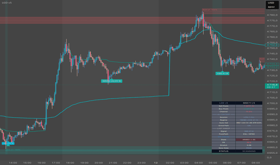
Indicador

Session Killzones & Breakouts [BigBeluga]🔵 OVERVIEW
Session Killzones & Volume Flow Profile is a professional-grade market structure tool that merges time-based "Killzone" analysis with intraday volume distribution. This advanced version covers the full global trading cycle— Asia, London, and New York —and now includes a Performance Statistics Dashboard to track historical breakout success.
By visualizing the "Point of Control" (POC) and volume distribution, it helps traders understand institutional interest zones, while the new dashboard provides a quantitative edge by showing how often each session successfully hits its expansion targets.
🔵 CONCEPT
Three-Session Cycle — Automatically encapsulates the Asia, London, and New York sessions in dynamic, color-coded zones.
Real-Time Point of Control (POC) — Continuously calculates and plots the most traded price level during the session development, highlighting the current high-interest node as it forms.
Post-Session Volume Profile — Once a session ends, a high-resolution, stepped polyline profile is generated to visualize the final "Value Area."
Breakout Expansion — Projects three mathematical price targets (Deviations) once price escapes a session's range.
Performance Dashboard — A real-time table tracking the total number of bullish/bearish breakouts and successful target hits for every session.
🔵 HOW IT WORKS (IN-DEPTH)
1️⃣ Real-Time POC & Session Development
As each session develops, the indicator tracks every price tick and volume bar from the very first minute.
Live POC Tracking: While the session is active, the indicator plots a Real-Time POC box and extension line that shifts dynamically as new volume flows in. This identifies the "fairest price" exactly when it is being negotiated.
This allows traders to see the session's internal center of gravity before the final profile is even drawn.
2️⃣ Post-Session Volume Flow Profile
Immediately after a session concludes, the indicator finalizes the data and draws a high-resolution Polyline Profile.
Longer horizontal steps in the polyline represent "High Volume Nodes" where institutional accumulation or distribution was most intense.
The final POC is locked in, providing a permanent historical anchor for future support and resistance.
3️⃣ Breakout & Target Logic
Once a session ends, its High and Low act as structural boundaries.
A confirmed close outside these boundaries triggers a Breakout Signal (Triangle) and a dashed "Tether Line" connecting the move back to its source.
Three expansion targets (Dev 1, 2, and 3) are projected. These lines are "hit-aware," meaning they stop extending exactly when price reaches the target, providing a clean visual record of the move's completion.
4️⃣ The Performance Dashboard
The indicator maintains a global tally of all session events.
Break ▲ / ▼: Tracks how many times a session has broken out in either direction.
Hit |, ||, |||: Tracks how many times those breakouts successfully reached the first, second, and third deviation targets.
This allows traders to quickly see which session is currently providing the most reliable follow-through on the current asset.
🔵 KEY FEATURES
Global Session Coverage: Dedicated settings for Asia (Pink), London (Cyan), and New York (Orange).
Real-Time POC Visualization: A live-updating POC box and extension line that identifies high-interest levels as the session unfolds.
Finalized Volume Profile: A sleek, stepped polyline generated at session end for post-session structural analysis.
Statistics Dashboard: A customizable table (position and visibility) showing breakout and target hit counts.
"Hit-Aware" Targets: Target lines (marked |, ||, |||) stop automatically upon price contact to reduce chart clutter.
High-Resolution Polylines: Optimized volume visualization that provides granular detail without sacrificing chart performance.
🔵 HOW TO USE
Monitor the Live POC: During the session, watch where the POC box is located. Price often orbits this level as the "mean," and a strong move away from it often precedes a full session breakout.
Analyze the Final Profile: Once the session ends, use the Polyline Profile to identify the "Value Area." If price returns to the session range later, these high-volume nodes often act as strong support or resistance.
Consult the Dashboard: Use the performance table to identify which session has the highest win rate for breakouts on your specific timeframe.
Target Scaling: Use Deviation 1 (|) for high-probability scalps, Deviation 2 (||) for standard trend targets, and Deviation 3 (|||) for major institutional expansion points.
🔵 CONCLUSION
Session Killzones & Volume Flow Profile is a complete institutional roadmap. By combining the "When" (Sessions) with the "Where" (Live POC & Final Profile) and the "How Much" (Dashboard Stats), it provides a data-driven framework for navigating the most profitable hours of the trading day. Indicador

Indicador

Indicador