Long
Long
 Short
Short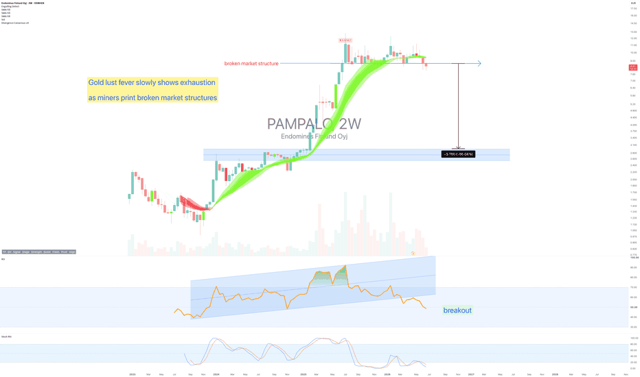
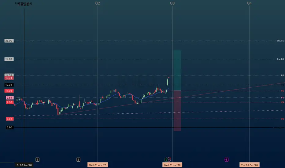
IMMR | July Q3 26' | Day ChartImmersion Corporation
"engages in the creation, design, development and licensing of patented haptic innovations and software. The firm offers touch sense platform and design services. It focuses on the following target application areas: mobile devices, wearable, consumer, mobile entertainment and other content, console gaming, automotive, medical, and commercial."
----------------------------------
IMMR revenue growing 20.01% YoY — strong top-line supports market-beating returns.
IMMR gross margin 21.25% — thin margin limits pricing power and long-run alpha.
IMMR FCF $10.43M positive — real cash generation, the #1 long-run predictor of market outperformance.
IMMR D/E ratio 0.55 — conservative leverage, balance sheet resilience favors outperformance.
-------------------------
Multiple Time-Frame Analysis; Color Code | Strength favors the higher timeframe.
Yearly timeframe = black
Monthly timeframe = pink
weekly = grey
daily = red
4hr = orange
1hr = yellow
15min = blue
5min = green if they are shown. (Level visibility on intervals is set to timeframe the level was found on and below to keep chart view organized.)
** Candle Science explained **
A Range = two or more consecutive color candles.
There are two types of ranges - accumulation and distribution.
DISTRIBUTION RANGES DEFINED: BackSide (BS) Candle - First distribution candle in a distribution range. Expectation = strong reaction to price. long wicks reaching to or away from level.
FrontSide (FS) Candle - Last distribution candle in a distribution range. Expectation = reversal, create a trend in the opposite direction. Distribution candles are used as support.
ACCUMULATION RANGES DEFINED:
Inverse BS (Inv.BS) - First Accumulation candle in an accumulation range. Expectation. = strong reaction to price. long wicks reaching to or away from level.
Inverse FS (Inv.FS) - Last accumulation candle in an accumulation range. Expectation = reversal, create a trend in the opposite direction. Accumulation candles are used as resistance.
 Long
Long
 Short
Short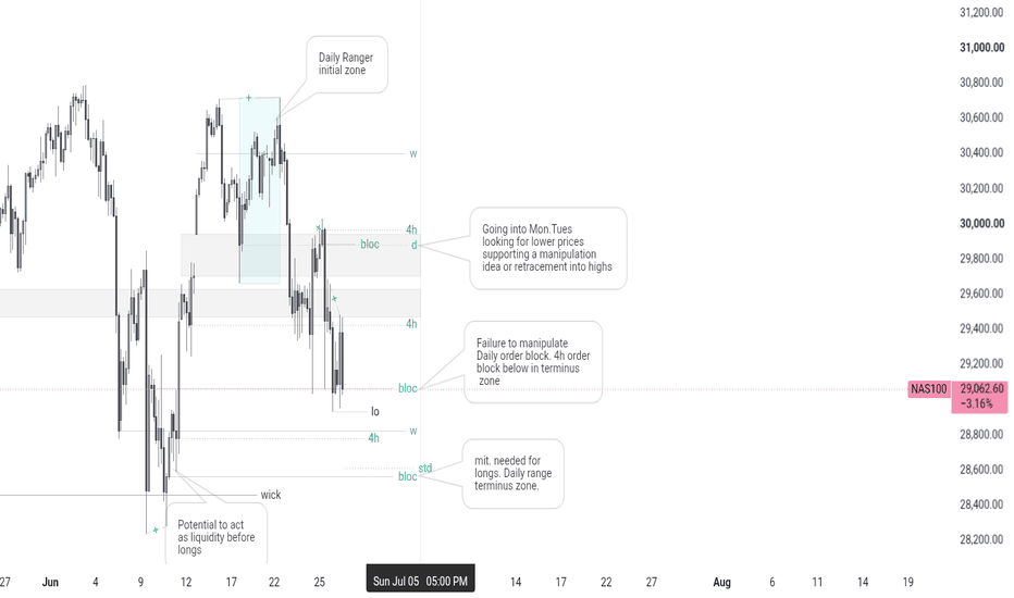
 Long
Long
NDX, SPY - Not a bubble. The numbers that prove it - June 2026** Warning, an attention span greater than 5 minutes is necessary**
But you're future wallet / purse will thank you.
Every few months a new set of indicators arrive and announce the great bubble of 2026 (previously it was 2025, but yeah charts eh?). The Buffett Indicator. The Shiller P/E. The CAPE ratio. The acronyms just keep on coming.
They've been announcing the bubble for years. The market, apparently unbothered by any of this has continued grinding upward. Youtube is now full of experts: “the market crash of 2026 is imminent”, they’ll say (In January it was “ Buy gold before it’s too late ”). Someone in the comments will now type “that’s exactly what they said before 2000.” Fair point. So, let’s look at 2000.
Now, this idea leans hard on the like-for-like comparison the charts actually draw, same bar count, same day count, side by side and lets the numbers do the talking before any interpretation.
The main 2 month chart above is the Nasdaq 100 and S&P 500 (way below at the bottom of this post). Shown on each is the two and five year prior performance until to the dot.com crash. Experts now call for the same in 2026 with the AI bubble. Let’s compare the year 2000 with 2026:
* SPX 5-year return: 230% then, 70% now
* NDX 5-year return: 568% then, 152% now
* RSI at peak: 96 then, 74 now
The conclusion is unambiguous.
Before we even consider dilution of money that led to recent uncontrolled inflation, consider this: In just 25 months from February 2020 to March 2022 the U.S. M2 broad money rose by $6.29 trillion, a 41% surge.
Let’s revisit the above table with CPI inflationary adjusted values:
* SPX 5-year return: +192% then, 37% now
* NDX 5-year return: 490% then, 103% now
You read that right. The market that crashed spectacularly in 2000 had first quintupled. This one has not. Some bubble.
Everyone is in a state over a real return of 37% / 103% from those past 5 years in a stock market that’s typically expected to pay back 10-12% year on year. The Nasdaq 100 is actually undervalued.
Again, that’s not the opinion of this analyst. This is a fact of the chart you can recreate yourself.
Relative Strength Index (RSI)
RSI at the dot-com peak: 96. RSI at today’s breakout: 74. RSI of 96 on a 2-month chart is a system at the absolute limit of momentum (a bit like Gold at an RSI of 94 in January on the 2 month as influencers were screaming buy before it's too late).
Today RSI of 74 breaks out of a multi-year ascending channel. That is a system with momentum intact and room remaining. Hidden bullish divergence in fact. These are not the same readings, past and present. They are not even close to the same reading. The chart does not lie about this.
But the Buffett indicator?
"Are you suggesting the tools used by the most successful investor in the world are wrong?"
Well... The Buffett Indicator compares total market capitalisation to GDP. GDP is a domestic measure. The moment that the largest US companies, Apple, Microsoft, Google, Amazon became primarily global businesses earning revenue across 170 countries, the GDP denominator stopped capturing what it used to capture. Buffett himself has acknowledged the indicator has limits. The man is 93. He built the tool before the internet existed. You are using it to analyse the internet economy. Brilliant.
But but.. The Shiller P/E at 41? Was 44 at the dot-com bust?
Those are extreme levels. Yes, they are. Now consider what was inside the index in March 2000 generating that P/E:
Pets.com
Webvan
Dozens of companies whose “E” in price-to-earnings was either imaginary, not yet arrived, or entirely made up.
The Shiller P/E averages 10 years of earnings. In 2000, several of those years contained earnings from companies that no longer existed. Today, the top ten names in the NDX collectively generate earnings that most countries could not match in annual GDP. Comparing a P/E of 44 built on fantasy earnings to a P/E of 41 built on Apple, Microsoft and Nvidia is like comparing two patients with the same blood pressure reading, one of whom has been bedridden for a decade and the other runs marathons. The number looks the same. The patient is completely different.
Are both wrong?
At this specific moment, in this specific market, both are missing context that the chart is not missing. The chart knows the return was 70%, not 230%. The chart knows RSI is 74, not 96. The chart knows the channel is holding. The chart does not know about the Shiller P/E. It does not need to. It has the price.
What would change this view?
A confirmed break of market structure. Combined with RSI reversal back below 70. If that prints (on this timeframe), the structural argument changes. Until it does, the burden of proof remains with the bear, not the bulls.
The crowd
The most reliable contrarian signal in any extended bull market is the growing certainty among the sidelines that a crash is imminent. They were all certain in 2021. Then 2022 happened and they claimed the credit. But then the worst, the the market went straight back up and they quietly stopped mentioning 2022.
The same crowd are at it again, a crash foretold in prophecy. In the meantime, the chart keeps telling the same story it has been telling for five years. Some people are listening to the chart. Others are in the comments with insightful analysis such as "Wrong".
A prior call worth acknowledging
In December 2025 Ww published ' S&P 500 to 10,000 inside the next 4 years ',
It is fair to say a significant number of people in the comments are not convinced. Six months on, the 5-year return has moved from 60% to 70%. RSI remains at 74. The structural argument has not changed. The bears have had six additional months to be right. The chart has had six additional months to disagree with them.
Amazing 4 years ahead
The “ S&P 500 to 10k ” has established the business cycle is very much intact.
** An RUT/NDX signal no one is giving attention to **
Growth to value stock rotation will innate a large wealth transfer not seen since 25 years ago. In fact if you’re in your mid to late 30’s or younger then you’ve never experienced this before.
The next 4 years will define your remaining years as a practicing investor. No doubt you’ve heard quote “History does not repeat itself, but It rhymes”, It means that events in history rarely happen in exactly the same way, but similar patterns tend to recur. We’re at that point in time right now, when a run away tech bubble is about to collapse.
The dot.com tech collapse was spectacular, wiping out almost 80% off the Nasdaq. As we’ve demonstrated that’s very improbable to repeat, but the conditions it caused are almost identical today.
If you purchased “Value” at the very peak of the 2000 dot.com burst, you’d have made a fortune as stocks crashed. Confused?
Despite the popular well reported narrative of the dot.com crash, there were hundreds of stocks that went in the opposite direction. Hundreds of stocks that printed 3, 5, and even 10x returns as the wider market crashed.
The extreme oversold condition on the 6 week Russel 2000 / Nasdaq 100 ratio at the 11hour of the dot.com burst resulted in a rally few will witness in their financial career. Inexperienced market participants throw their energy into 10 stocks like they’re about to cure cancer whilst ignoring value propositions generating real profit as their charts trade at 52 week lows.
Growth vs Value stock
Proof is in the portfolio
This publication is more than just another idea, it’s a live bet anyone can copy if they wish. I’ve set up a portfolio using real money, adding $1000 to every position opened. Risk managed, responsible allocations. In time we’ll return to this publication to demonstrate the reward of action taken whilst everyone else is fearful.
Is it possible this ends badly? Of course. Everything ends eventually.
Is it probable right now, with the 5-year return at 70% (not 230%), RSI at 74 (not 96), price on support and holding, and volume expanding? Is this time different? Yes. It rather is.
Good luck.
Ww
Type: Long-term bullish / educational | Timeframe: 2–4 years
S&P 500 - then and now:
==================================================
Disclaimer : This idea is for educational and informational purposes only. It is not financial advice. Investing in financial markets involves substantial risk of loss. Always do your own research and consult a qualified financial adviser before making any investment decisions. Past performance is not indicative of future results.
 Long
Long
 Short
Short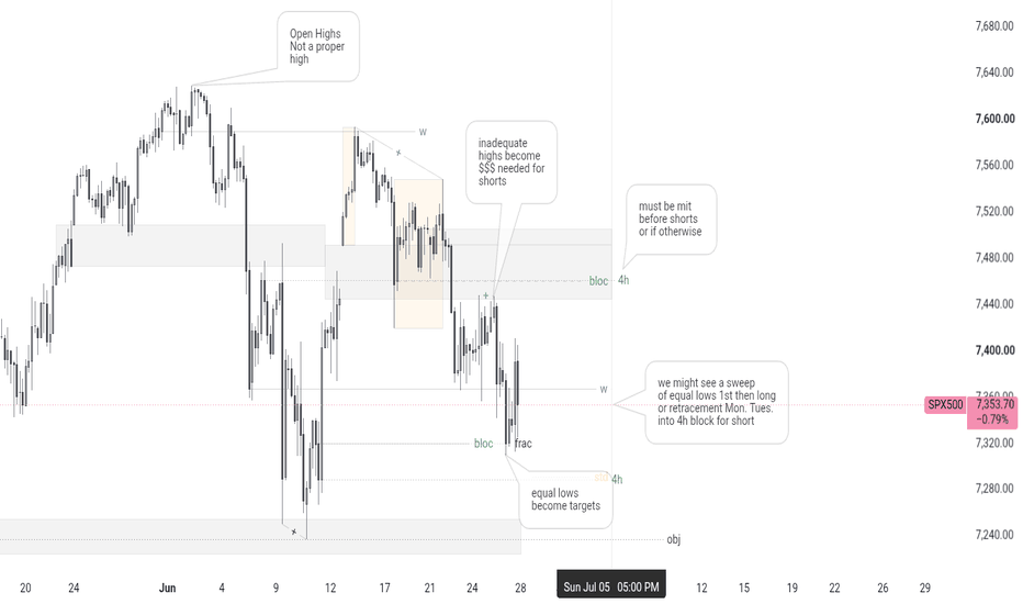
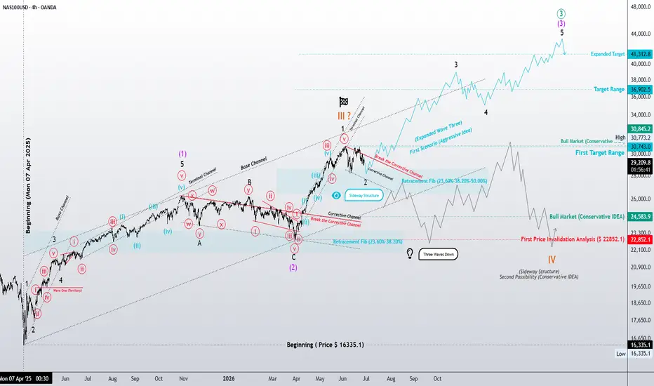
NASDAQ | Daily & 4H Elliott Wave Analysis: Structure Over BiasNASDAQ | Daily & 4H Elliott Wave Analysis: Structure Over Bias 📊
In this week's NASDAQ analysis, I'm maintaining two structurally valid Elliott Wave scenarios. The purpose isn't to predict what the market should do, but to identify where it may currently reside within the broader wave sequence.
The debate here isn't necessarily about direction. It's about position.
Scenario 1 — Aggressive Thesis: The Extended Wave III Expansion
The aggressive interpretation continues to favor a nested 1-2 wave structure across both the daily and 4-hour timeframes. Under this scenario, the market remains in a powerful impulsive sequence, suggesting that the larger Wave III has entered its acceleration phase.
Several technical observations support this view:
• Multiple nested impulse formations remain intact.
• The corrective channel on the 4H chart has been broken to the upside.
• Recent pullbacks continue to fit within typical Wave 2 retracement parameters (23.6%–50.0% Fibonacci retracement).
• Current price action suggests that corrections may be functioning as continuation structures rather than reversal patterns.
If this interpretation remains valid, the market may still be in the early-to-middle stages of an extended Wave III, where momentum expansion becomes the dominant characteristic of the trend.
Scenario 2 — Conservative Thesis: Wave III Structural Maturity
The conservative interpretation assumes that the current advance may represent the mature stages of a larger Wave III sequence.
This scenario remains firmly grounded in classical Elliott Wave validation principles:
• Wave III remains longer than Wave I, preserving the core impulsive rule set.
• Fibonacci extension clusters within the 61.8%–78.6% expansion zone continue to be monitored carefully.
• The possibility of a larger corrective phase, whether sideways or impulsive in nature, remains technically valid.
• Internal structures are being evaluated for signs of exhaustion rather than continuation.
Under this interpretation, the market may require a meaningful corrective sequence before beginning its next major advance.
The 4-Hour Perspective: A Microscope, Not a Contradiction
The 4-hour chart does not invalidate either scenario.
Instead, it provides a closer look at the internal battle taking place between acceleration and structural maturity. The lower timeframe serves as a microscope, helping us determine whether the market is:
accelerating into the core of an extended Wave III,or completing the final subdivisions of a mature Wave III before correction.
Final Thoughts
One of the greatest misconceptions in market analysis is assuming that disagreement always means opposing direction.
In Elliott Wave analysis, disagreement often exists not in direction, but in position within the structure.
Both scenarios remain structurally bullish.
The only question the market has yet to answer is:
Are we witnessing the beginning of acceleration, or the completion of expansion?
As always, the objective is not to predict the market's future, but to interpret the structure it reveals.
Markets don't guess. Markets structure.
– Patterns whisper. I listen. – Mr. Nobody 🎧📊 Long 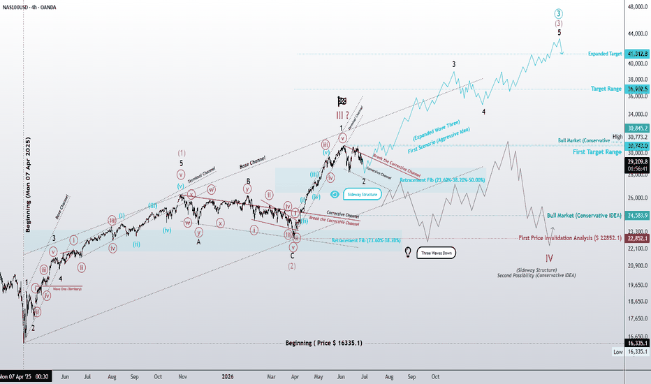
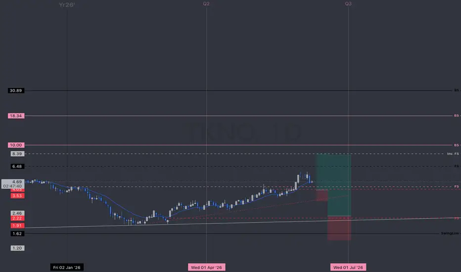
TKNO | Alpha Teknova, Inc. | Day Chart, June Q2 26'MARKET-BEATING SCORE = 5/10
TKNO | Alpha Teknova, Inc.
"engages in the manufacture of cell culture media and supplements. It provides reagents that enable the discovery, development, and production of biopharmaceutical products such as drug therapies, novel vaccines, and molecular diagnostics. Its product offerings include pre-poured media plates for cell growth and cloning, liquid cell culture media and supplements for cellular expansion, and molecular biology reagents for sample manipulation, resuspension, and purification"
Located in: Hollister, CA.
------------------------------
MARKET-BEATING SCORE
TKNO PEGY -0.52 — undervalued vs. growth rate. Strong candidate to beat the market.
TKNO EPS growth 19.65% — solid, in line with market leaders.
TKNO revenue growing 9.30% YoY — steady but below high-growth threshold (15%+).
TKNO gross margin 34.01% — decent margin, competitive business model.
TKNO FCF $-9.07M negative — cash burn is a risk factor against market-beating returns.
TKNO D/E ratio 0.43 — conservative leverage, balance sheet resilience favors outperformance.
-------------------------
Multiple Time-Frame Analysis; Color Code | Strength favors the higher timeframe.
Yearly timeframe = black
Monthly timeframe = pink
weekly = grey
daily = red
4hr = orange
1hr = yellow
15min = blue
5min = green if they are shown. (Level visibility on intervals is set to timeframe the level was found on and below to keep chart view organized.)
** Candle Science explained **
A Range = two or more consecutive color candles.
There are two types of ranges - accumulation and distribution.
DISTRIBUTION RANGES DEFINED: BackSide (BS) Candle - First distribution candle in a distribution range. Expectation = strong reaction to price. long wicks reaching to or away from level.
FrontSide (FS) Candle - Last distribution candle in a distribution range. Expectation = reversal, create a trend in the opposite direction. Distribution candles are used as support.
ACCUMULATION RANGES DEFINED:
Inverse BS (Inv.BS) - First Accumulation candle in an accumulation range. Expectation. = strong reaction to price. long wicks reaching to or away from level.
Inverse FS (Inv.FS) - Last accumulation candle in an accumulation range. Expectation = reversal, create a trend in the opposite direction. Accumulation candles are used as resistance.
Horizontal Ray tool on BS & FS levels are default support levels when dashed lines, tested when dotted lines and resistance when solid lines.
Horizontal Ray tool on Inverse BS & Inverse FS levels default as resistance and shown with a dashed line, tested when 1x dotted line, and support when solid line.
The inverse is true for the Inv. BS Inv. FS levels, they are resistance as dashed lines, tested as dotted and support as solid lines.
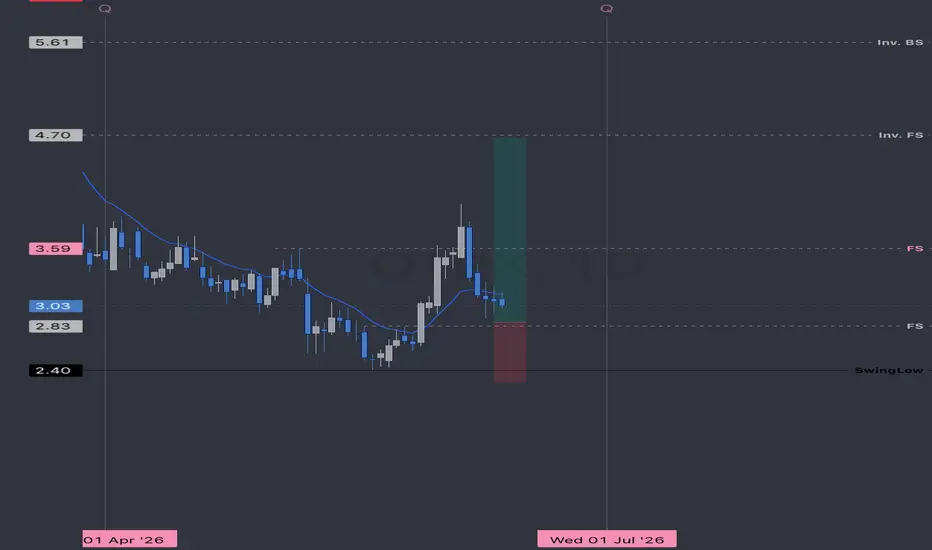
AOUT | June Q2 26' prior to earnings | Day ChartMARKET-BEATING SCORE = 2/10
AOUT revenue declining 0.61% YoY — top-line contraction is a headwind.
AOUT gross margin 43.06% — decent margin, competitive business model.
AOUT FCF $0.11M positive — real cash generation, the #1 long-run predictor of market outperformance.
AOUT D/E ratio 0.20 — conservative leverage, balance sheet resilience favors outperformance.
-------------------------
Multiple Time-Frame Analysis; Color Code | Strength favors the higher timeframe.
Yearly timeframe = black
Monthly timeframe = pink
weekly = grey
daily = red
4hr = orange
1hr = yellow
15min = blue
5min = green if they are shown. (Level visibility on intervals is set to timeframe the level was found on and below to keep chart view organized.)
** Candle Science explained **
A Range = two or more consecutive color candles.
There are two types of ranges - accumulation and distribution.
DISTRIBUTION RANGES DEFINED: BackSide (BS) Candle - First distribution candle in a distribution range. Expectation = strong reaction to price. long wicks reaching to or away from level.
FrontSide (FS) Candle - Last distribution candle in a distribution range. Expectation = reversal, create a trend in the opposite direction. Distribution candles are used as support.
ACCUMULATION RANGES DEFINED:
Inverse BS (Inv.BS) - First Accumulation candle in an accumulation range. Expectation. = strong reaction to price. long wicks reaching to or away from level.
Inverse FS (Inv.FS) - Last accumulation candle in an accumulation range. Expectation = reversal, create a trend in the opposite direction. Accumulation candles are used as resistance.
Horizontal Ray tool on BS & FS levels are default support levels when dashed lines, tested when dotted lines and resistance when solid lines.
Horizontal Ray tool on Inverse BS & Inverse FS levels default as resistance and shown with a dashed line, tested when 1x dotted line, and support when solid line.
The inverse is true for the Inv. BS Inv. FS levels, they are resistance as dashed lines, tested as dotted and support as solid lines. Long 

 Short
Short


 Short
Short Short
Short